SAM Celebrates Pride: The Talented Mr. Delafosse
In honor of Pride Month, SAM Blog features reflections by SAM voices on collection artworks that explore LGBTQIA+ art and artists. Queer lives matter every day of the year, but this month is a particular opportunity to celebrate histories of joy, advocacy, and resistance. Stay tuned for more Pride-related content on SAM Blog, including another object spotlight and a list of queer film recommendations curated by SAM’s LGBTQIA+ affinity group.
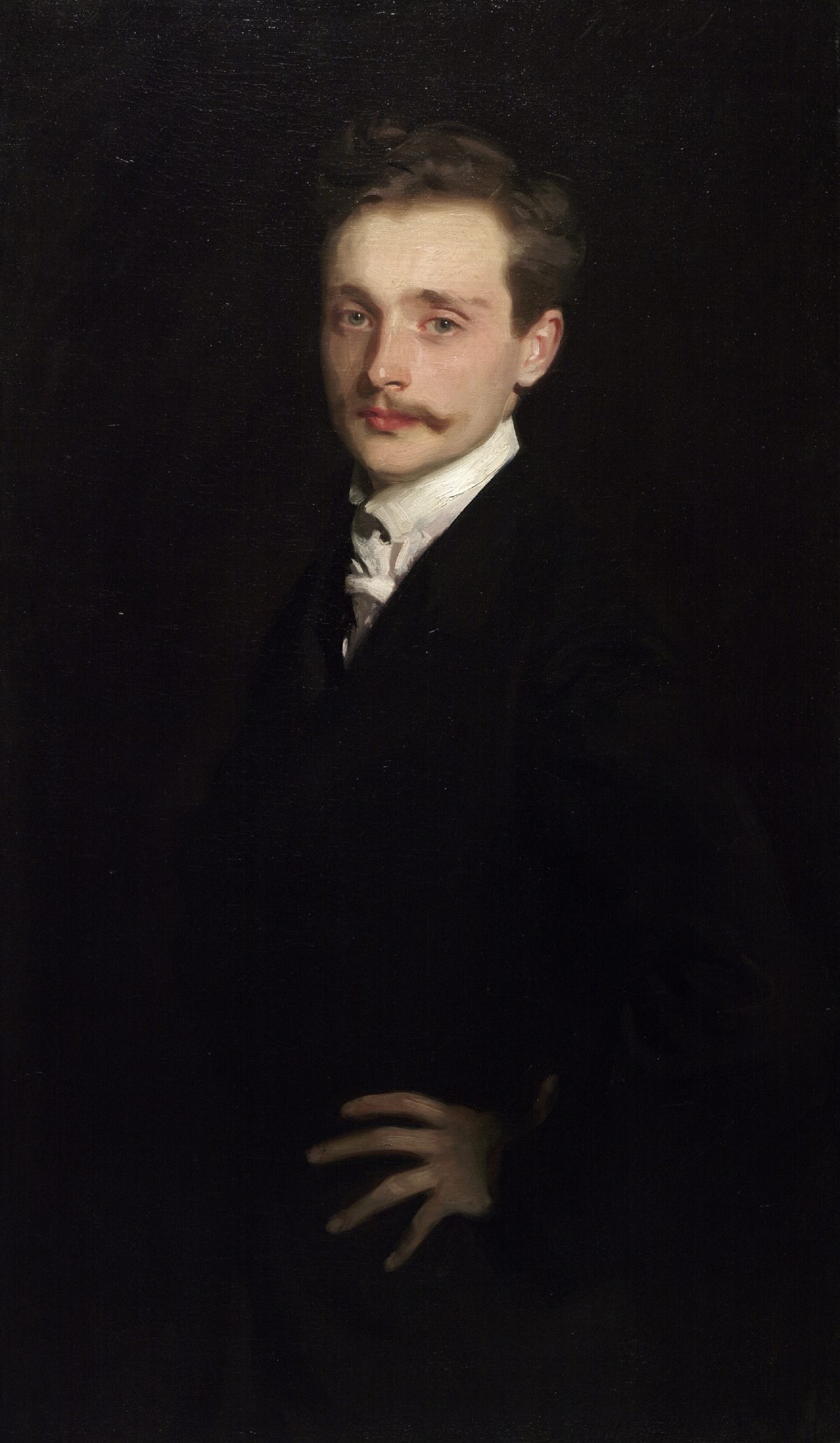
If you Google “Léon Delafosse,” you’ll get more information on John Singer Sargent’s portrait of the French composer and pianist—part of SAM’s collection since 2001—than on Delafosse’s life story: his early years of poverty, rise as a piano virtuoso and composer, and the eventual destruction of his promising career by powerful men.
Before the arrival of recordings, musicians who were not independently wealthy or well-connected needed patrons and made money by performing in the private salons of rich people. Delafosse made two famous gay friends who propelled his career in Paris: Count Robert de Montesquiou (a social snob and poet-poseur) and writer Marcel Proust. Each of these men acted as unofficial “agents” for Delafosse, promoting his talents to their powerful friends. It’s long been assumed Montesquiou, in addition to being Delafosse’s principal patron, was his lover, too, and that their fraught relationship is immortalized in Proust’s In Search of Lost Time (with the bisexual violinist Charles Morel as Delafosse and the gay Baron de Charlus as Montesquiou).
Gay sex was decriminalized in France in 1791, but men who loved other men emotionally and sexually remained (for the most part) quiet about their private lives. Men who were suspected to be homosexual, who had “feminine” voices or mannerisms, wore colorful and outlandish clothing, engaged in non-traditional (unmanly) careers were described in code words such as “dandy,” “decadent,” “artistic” and “aesthete” (admittedly better than the alternatives of the time:“sodomite,” “invert,” and “pederast”!)
Montesquiou was easily bored and his temper was volcanic. When Delafosse made the inevitable mistake (unknown, but believed to be the fact he was more interested in music than in anything or anyone), their breakup was cataclysmic. Montesquiou and his accomplice, Proust, set out to destroy Delafosse’s reputation and have him barred from important musical salons all over Paris. They succeeded. Delafosse was devastated and hopeless as he became a laughingstock in the capital.
Enter: John Singer Sargent.
Sargent (whose obsession with the male body is evident in his work) took a liking to the handsome Delafosse and in genuine friendship promoted his talents to influential Americans like arts patron Isabella Stewart Gardner. Beginning in 1895, Sargent painted Delafosse (then in his early twenties) and gave him the portrait as a lavish gift. Delafosse kept the painting until the day he died.
Pride Month is a celebration of LGBTQ+ history and a time to ponder the world as it is. Community is fragile, and examining the story of Léon Delafosse presents a warning and a quandary. In Belle Époque France, anyone who did not fit easily into standard society, whose sexual identity or gender expression made them outsiders, had to examine and monitor their appearance, their every move, their every spoken or written word. Such nonstop, intense, and protective self-scrutiny must have been exhausting, infuriating. And seeing “yourself” in another man or woman who was like you must have been frightening and intimidating, and it often led to betrayals, based not just on what was held in common but what was different: money, class, looks, and the power that those things bestow.
When I examine Sargent’s image of Léon Delafosse with contemporary eyes and in the current worldwide political climate, I wonder: is Delafosse emerging from the darkness or receding into it?
– Kevin Stant, SAM Docent
Kevin Stant has been a docent at SAM since 2002. Kevin’s next assignment will be at the Seattle Asian Art Museum; beginning August 31, he’ll give Saturday tours on the exhibition Meot: Korean Art from the Frank Bayley Collection.
Consider supporting our Community Pass Program partners who serve queer communities:
Celebrate Pride Month in Seattle with these suggested events:
Sat Jun 22
Youth Pride Disco
Break out your disco wear for this LGBTQIA+ Pride party, planned for and organized by LGBTQ+ youth between the ages of 13 and 22! Join us for drag performances, great music, friend-making activities, food and soft drinks, a quiet room, and more.
Through Sun Jun 23
Jinkx Monsoon and Major Scales: Together Again, Again!
Experience the comedy, music, and saucy stylings of two of the Pacific Northwest’s standout drag entertainers, in this wildly hilarious extravaganza set in an apocalyptic future. Check the event calendar for information about performances for teens, ASL interpretation, captions, and masking.
Fri Jun 28
Trans Pride Seattle 2024
Started in 2013, Trans Pride Seattle is an annual event organized by Gender Justice League. Visit the Volunteer Park Amphitheater from 5 to 10 pm for live music, community speakers, performances, and a resource fair all dedicated to increased visibility, connection, and love of the Seattle-area TwoSpirit, Trans, and Gender Diverse (2STGD) community.
Sat Jun 29
PrideFest Capitol Hill
Spanning six blocks of Broadway and Cal Anderson Park, this all-day market features queer local businesses, beer gardens, family and youth programming, and three stages with an unforgettable lineup of live performances.
Sun Jun 30
Seattle Pride Parade
Spend the final day of June by taking part in the 50th annual Pride Parade led by grand marshals Sue Bird and Megan Rapinoe. Then, head over to Seattle Center for the can’t-miss performances, hundreds of acts, beer gardens, food vendors, a new family area—and dancing in the iconic International Fountain.
Visit the official Seattle Pride website for even more suggested events.
Image: Léon Delafosse, ca. 1895–98, John Singer Sargent, Born Florence, Italy, 1856; Died London, England, 1925, oil on canvas, 39 3/4 x 23 3/8 in. Given in honor of Trevor Fairbrother by Mr. and Mrs. Prentice Bloedel by exchange, and by Robert M. Arnold, Tom and Ann Barwick, Frank Bayley, Jeffrey and Susan Brotman, Contemporary Art Council, Council of American Art, Jane and David R. Davis, Decorative Arts and Paintings Council, Robert B. Dootson, Mr. and Mrs. Barney A. Ebsworth, P. Raaze Garrison, Lyn and Gerald Grinstein, Helen and Max Gurvich, Marshall Hatch, John and Ann Hauberg, Richard and Betty Hedreen, Mary Ann and Henry James, Mrs. Janet W. Ketcham, Allan and Mary Kollar, Greg Kucera and Larry Yocom, Rufus and Pat Lumry, Byron R. Meyer, Ruth J. Nutt, Scotty Ray, Gladys and Sam Rubinstein, Mr. and Mrs. Allen Vance Salsbury, Herman and Faye Sarkowsky, Mr. and Mrs. Douglas Scheumann, Seattle Art Museum Supporters, Jon and Mary Shirley, Joan and Harry Stonecipher, Dean and Mary Thornton, William and Ruth True, Volunteers Association, Ms. Susan Winokur and Mr. Paul Leach, The Virginia Wright Fund, Charlie and Barbara Wright, Howard Wright and Kate Janeway, Merrill Wright, and Mrs. T. Evans Wyckoff, 2001.17. Photo: Elizabeth Mann.