With his typical artistic materials in short supply at the height of World War II, Alexander Calder sought out alternatives. His resourcefulness led to the debut of an important series of carved wood and wire forms in 1943.
In 1943, James Johnson Sweeney and Marcel Duchamp, who were in the midst of curating a major retrospective of Calder’s work at the Museum of Modern Art in New York, proposed calling these new sculptural works ‘Constellations.’
“[The Constellations] had a suggestion of some kind of cosmic nuclear gases—which I won’t try to explain,” Calder once noted. “I was interested in the extremely delicate, open composition.”
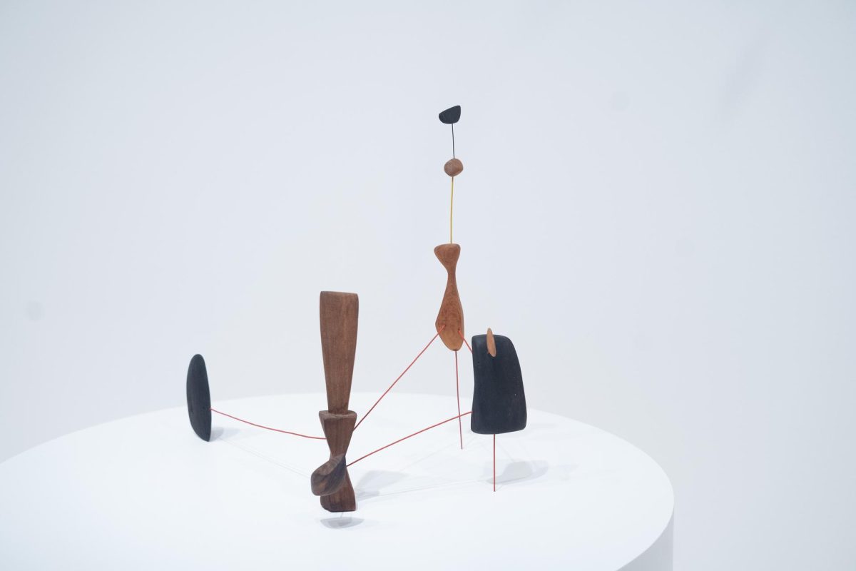
JOSÉ CARLOS DIAZ: Constellation with Red Knife is a singular work in this exhibition that really highlights the assemblage of carved wooden forms.
NARRATOR: José Diaz:
JOSÉ CARLOS DIAZ: As a youth, Calder was experienced with carving with wood, and it’s a material that actually is found in a lot of his sculptural practice.
ALEXANDER S. C. ROWER: He was fascinated by not just the look of the wood, but the particular kind of grain of the wood, the way a grain would be straight or wavy and have characteristics.
NARRATOR: Sandy Rower:
ALEXANDER S. C. ROWER: The central object, which is the tallest piece of wood in the composition, is kind of the shape of a palette knife like a painter might use to mix paint.
NARRATOR: The work is one of a series called Constellations. The name didn’t come from Calder himself but from the artist Marcel Duchamp, and the curator James Johnson Sweeney.
ALEXANDER S. C. ROWER: Calder referred to them as an open form composition like some kind of nuclear gases, and then he said, “But I won’t try to explain.”
NARRATOR: The work may reflect Calder’s interest in time and space, but it is important to note that he wasn’t concerned with the observable universe (the sun, moon, earth, etc.). Rather, he was describing a universe. Or rather, the universal—an exploration of the unifying force posited by physicists today as string theory.
JOSÉ CARLOS DIAZ: When one thinks about constellations, there is an assumption that this is a specific reference to planets and stars and elements in our known universe. However, Calder’s really interested in a universe, his universe.
ALEXANDER S. C. ROWER: They are objects tied together with these wire lines, existing in space in three dimensions.
“Since the beginning of my work in abstract art, and even though it was not obvious at that time, I felt that there was no better model for me to work from than the Universe. Spheres of different sizes, densities, colors and volumes, floating in space, surrounded by vivid clouds and tides, currents of air, viscosities and fragrances—in their utmost variety and disparity.”
– Alexander Calder
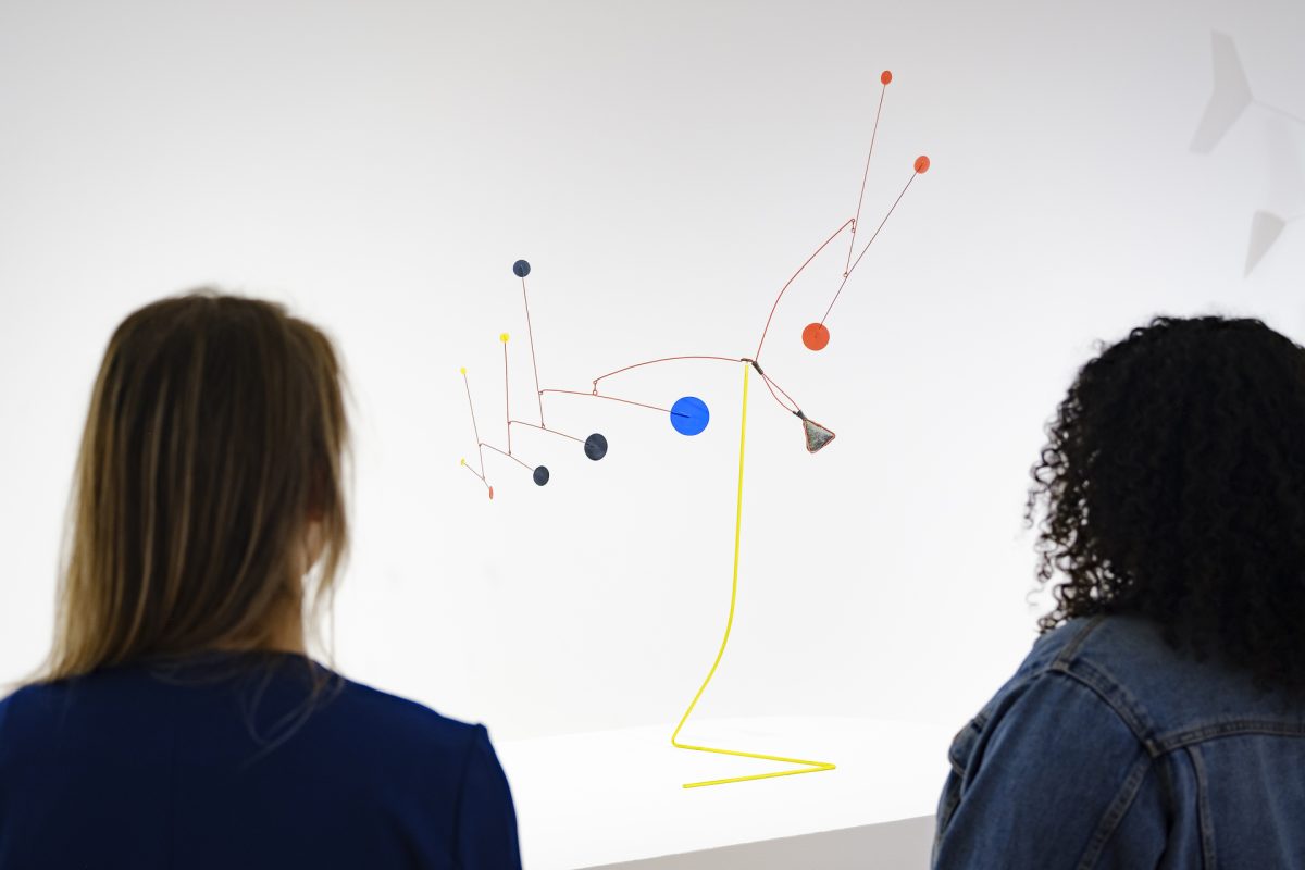
Yellow Stalk with Stone is a prime example of Calder’s experimental approach to sculpture, embracing both the transcendent and the ordinary. During the artist’s lifetime, the artwork was exhibited globally with notable stops at the Museum of Modern Art in New York, the Museu de Arte Moderna in Brazil, and the Museo de Bellas Artes in Venezuela.
Despite its global adventures, the standing mobile highlights the important role of found objects in Calder’s oeuvre. Its titular stone—found by the artist on a walking meditation around his property in Roxbury, Connecticut—invites a dialogue between found, manipulated, and artificial materials in art.
Calder: In Motion, The Shirley Family Collectioncloses Sunday, August 4 at SAM! Don’t miss your chance to see over 45 of the iconic American artist’s renowned works (including Yellow Stalk with Stone) and explore the exhibition’s free smartphone tour from the museum’s galleries. Plus, you can listen to all 16 stops of the tour on your own time via our SoundCloud.
Yellow Stalk with Stone, 1953
NARRATOR: Calder was a truly international artist. During his lifetime, this work was exhibited multiple times, including in Brazil, New York, and Venezuela. But the stone referred to in the title came from close to home; he picked it up near his studio in Roxbury, Connecticut.
The stone creates a dialogue with the man-made elements of the sculpture. Sandy Rower:
ALEXANDER S. C. ROWER: Calder’s process of creation and composition was very intuitive. It was in the moment. It was in the spirit of the moment. It wasn’t something that was planned. He didn’t make diagrammatic plans for creating his sculptures.
NARRATOR: It’s a way of working that resonates with artist Kennedy Yanko.
KENNEDY YANKO: He’s clearly thinking in a way where he needs to explore something, where he needs to understand something in his own way, to his own hand. Maybe he was in the studio, and he just had the stone and just went and placed it on there or he had been thinking about it for a while and then placed it on there, and that moment, that decision is what transforms the piece into what you wanted it to be.
NARRATOR: Found objects have an important role in Calder’s work. José Diaz.
JOSÉ CARLOS DIAZ: I really hope that visitors will walk through this exhibition and see Calder through an ecological lens. He was certainly resourceful—you’ll notice that there’s works that incorporate wood, rocks, bits of material, or discarded objects—but also the fact that Calder could make art from the most ordinary materials and make something so complex, yet so beautiful.
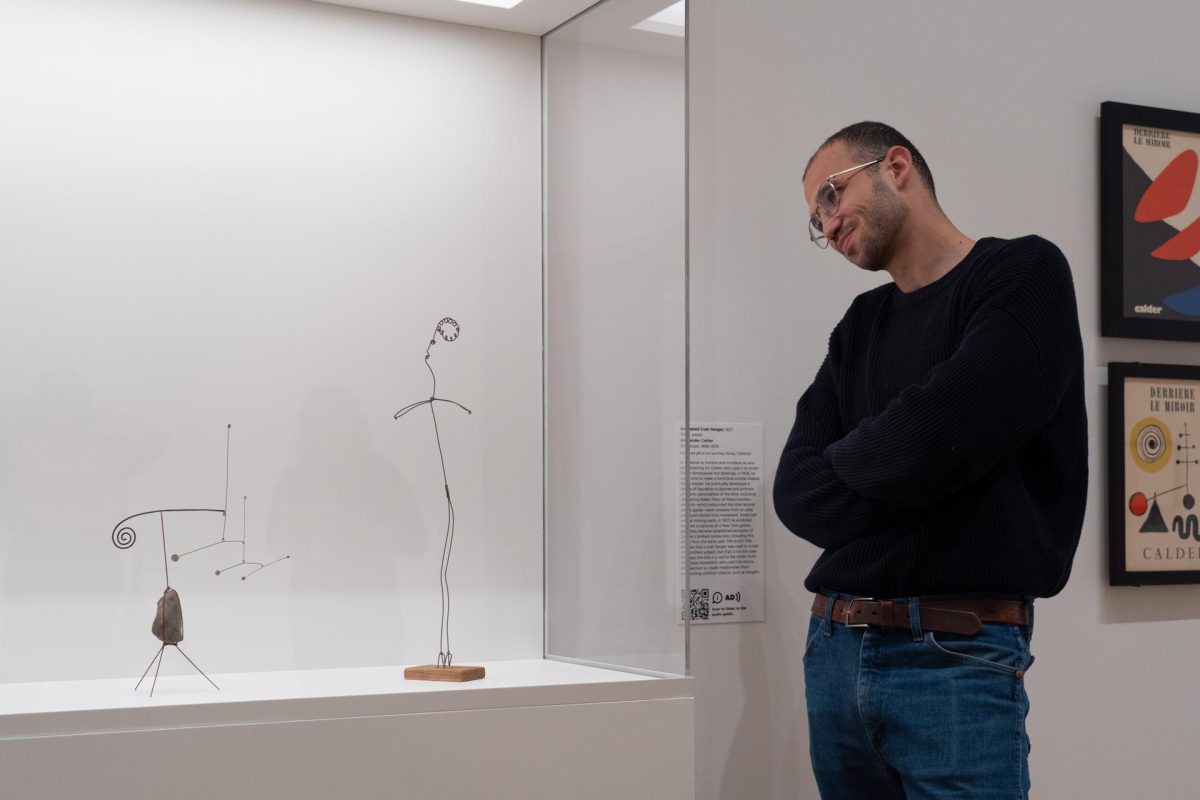
A material as humble and mundane as wire proved inspiring for Alexander Calder, who used it to create three-dimensional line drawings. During the late 1920s, he sculpted a range of wire acrobats, performers, animals, and portraits of famed figures of the day, including Fernand Léger, Josephine Baker, and Joan Miró.
These ‘drawings in space’ enthralled the international avant-garde for their projected shadows, captured voids, and challenged perceptions. His radical objects not only upended space through their transparent volumes, but also presented the reality of motion through vibrating wire lines and the inclusion of actual moving parts. As a result of these works, Calder was lauded as Le roi du fil de fer, or the king of wire.
Although intimate in size, Animated Coat Hangerspeaks volumes about Calder’s ingenuity and resourcefulness with wire. The work’s title implies that a coat hanger was used to sculpt the profiled subject, but that is not the case. Perhaps the title is a nod to the artists from the Dada movement, who used the choice of selection to create readymades from preexisting common objects, such as hangers.
Tune in to the ninth stop on the free smartphone tour of Calder: In Motion, The Shirley Family Collectionto hear SAM Susan Brotman Deputy Director for Art José Carlos Diaz and New York-based artist Kennedy Yanko share their perspectives on this simple yet surprising wire sculpture. Explore all 16 stops of the audio tour now via our SoundCloud or in our galleries by scanning the QR code next to select artworks on view.
Animated Coat Hanger, 1927
NARRATOR: Wire sculpture was Calder’s first great invention. He removed mass from sculpture and introduced transparency as well as gentle movement through vibration.
JOSÉ CARLOS DIAZ: Animated Coat Hanger is really special to this exhibition.
NARRATOR: Curator José Diaz.
JOSÉ CARLOS DIAZ: This particular work is from 1927 which is an example of one of the earliest works in the show. Calder had been so innovative with wire, so much so that we use the term drawing in space.
NARRATOR: Artist Kennedy Yanko:
KENNEDY YANKO: The fact that he would carry pliers in his pocket and just decide to start drawing is such a true thing to me, the idea of choosing a medium to represent drawing.
JOSÉ CARLOS DIAZ: But what’s really beautiful about it is the simplicity. You’ll notice the wooden base, which looks like it could have been a discarded material. You’ll notice the figurative aspect of it, sort of the profile of an individual.
KENNEDY YANKO: It’s surprising, and it’s intriguing, and somehow it’s barely there, but when you take a closer look at it, the sensibility, the delicacy, the gesture, the breasts, the face, how can a line have so much effect and so much life within it? So, I think that it’s just a gesture to like how powerful the way that the eyes can read something, and the way that the mind can fill the rest of the space. And I think with Calder’s work there’s always opportunity for that. He knows that the mind will always fill the blank spaces and always complete what needs to be there.
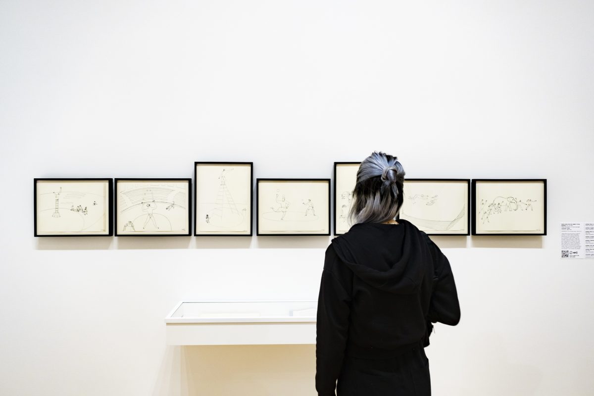
Throughout the 1920s, Alexander Calder worked as an illustrator for the National Police Gazette. On one assignment, Calder was tasked with visiting Ringling Bros. and Barnum & Bailey Circus to sketch circus life. The experience led to a newfound interest for the circus.
A series of seven lithographs on view in Calder: In Motion, The Shirley Family Collectionat SAM demonstrate Calder’s lifelong fascination with the circus. Originally drawn in 1931–32, the prints were published in New York in 1964 as part of an unbound portfolio reproducing the artist’s circus scenes. The portfolio, titled Calder’s Circus, includes a signature page by Cleve Gray and a reproduction of a letter from Joan Miró. Notably, the original line drawings were made during a time of transition for the artist: after his performative Cirque Calder (1926–31) and during his exploration of purely abstract forms—as well as voids and volumes—in his mobiles and stabiles.
On the eleventh stop of the free smartphone tour of Calder: In Motion, SAM Susan Brotman Deputy Director for Art José Carlos Diaz explains why Calder considered the circus to be a ‘highly sophisticated form of entertainment’ and shares details of the artist’s famous Cirque Calder. Listen at any time via our SoundCloud or, if you’re in SAM’s galleries, scan the QR codes next to select artworks on view to access the tour.
Group of Circus-Themed Prints, 1931–32, 1964
NARRATOR: These offset lithographs date from 1964; but they’re based on drawings that Calder made as a young man.
During the 1920s, Calder took a job illustrating for the National Police Gazette. They sent him to Ringling Bros. and Barnum & Bailey Circus to sketch circus scenes. The circus became a lifelong interest for Calder. José Diaz:
JOSÉ CARLOS DIAZ: During Calder’s youth, the circus was a great point of inspiration for him. This was a highly sophisticated form of entertainment. It had a global appeal. It included performative aspects—larger than life theatricality. It included actors, performers, and animals. And he illustrated this. He even went on to make his Cirque Calder, which was his own representation of a performative, sculptural circus that he himself was sort of the ringmaster of.
NARRATOR: The Cirque Calder dates from after Calder’s move to Paris in 1926. It was a complex and unique body of art, and included tiny performers, animals and props such as he’d observed on his sketching trips to the circus. José Diaz:
JOSÉ CARLOS DIAZ: The Cirque Calder was a reenacted performative circus made of small figurines and design sets that mimic the circus. The Cirque Calder was something that was small enough to fit in one suitcase and eventually five, and Calder would perform the Cirque Calder across the Atlantic from Paris to New York.
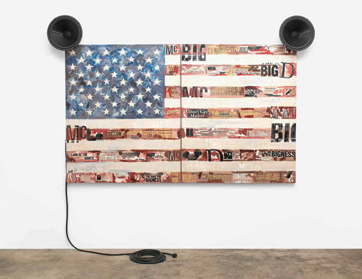
In McFlag (1996), Jaune Quick-to-See Smith critiques the commercialization of American nationalism by creating a US flag that directly connects the national symbol with corporate branding and advertising. Composed of oil, paper, and newspaper, Smith affixes speakers to the canvas to mimic the dish-like ears of Disney’s iconic mascot Mickey Mouse, and co-opts the ‘big, bigger, biggest’ language of McDonald’s slogans, to humorously depict the US government as being under the control of multinational corporations.
Many artists whose work influenced Smith’s—including Jasper Johns and David Hammons—have also taken liberties with the representation of the American flag. Here, however, Smith’s use is explicitly anti-capitalist. Artist Marie Watt reflects on McFlag as part of the free smartphone tour of Jaune Quick-to-See Smith: Memory Mapat SAM, perceiving the work as a rebuke to powerful empires. All 19 stops of the exhibition’s audio tour are accessible by scanning the QR code next to select artworks on view in SAM’s galleries or by visiting our SoundCloud. Memory Map closes this Sunday, May 12, so don’t miss out—reserve your tickets to see the exhibition before it’s gone.
McFlag, 1996
NARRATOR: Smith titled this work McFlag and gave the canvas “ears” made of speakers that resemble Mickey Mouse’s ears. She layers brand identities like McDonald’s and Disney over the American flag, and suggests that American commercialism and American nationalism have become inseparable.
MARIE WATT: I am Marie Watt, and I am an artist and member of the Seneca Nation of Indians.
I think that one of the things that Jaune Quick-to-See Smith does in this painting is she really does call upon us to think about these different constructs of empire, whether it’s nationhood or the entertainment industry. I am very much aware is when you zoom into this image and you start looking at the collage elements that have washes of paint over them, how there’s phrases like “the last frontier,” and “spirits are rich,” and “prices are low” and “big business,” and it’s interesting to reflect on the relationship between consumerism and stereotypes, between consumerism and colonization, and even consumerism and environmental degradation. And so this piece on one hand, I think is playful and funny, and yet, it also sort of looks at this darker side of empires.
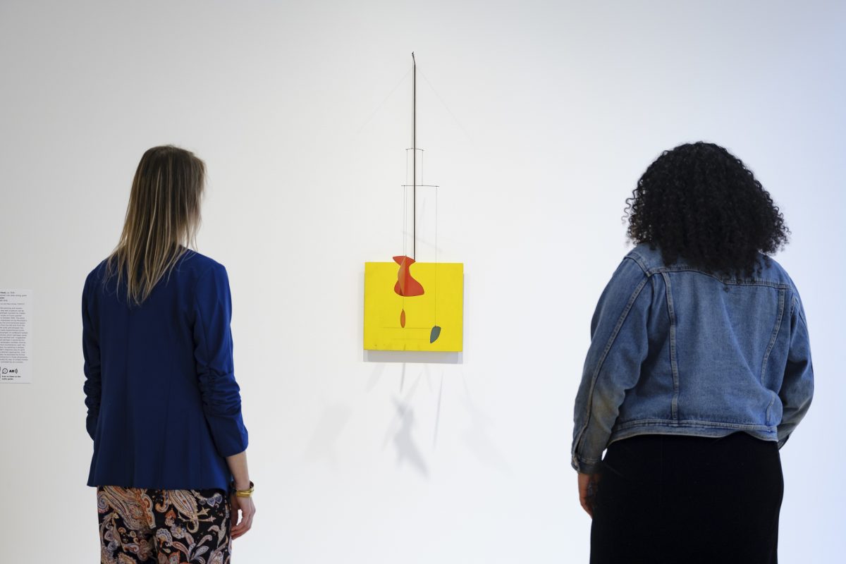
Although it was never publicly exhibited in his lifetime, Little Yellow Panelexemplifies Alexander Calder’s desire to create “paintings in motion.” This exotic wall sculpture’s origin can actually be traced to a significant moment in Calder’s development that inspired him to experiment with movement: his visit to the studio of Dutch painter Piet Mondrian in October 1930.
The artist recalled being impressed not by Mondrian’s paintings but by the environmental space of his studio: “Light came in from the left and from the right, and on the solid wall between the windows there were experimental stunts with colored rectangles of cardboard tacked on. Even the victrola, which had been some muddy color, was painted red. I suggested to Mondrian that perhaps it would be fun to make these rectangles oscillate. And he, with a very serious countenance, said: ‘No, it is not necessary, my painting is already very fast.’”
In the wake of his visit, Calder began to work in the abstract. Beginning the following year, he explored the frontal formality of painting in three dimensions but with actual motion—elements in oscillation—usually by way of simple motors. Eventually, he experimented more freely with the possibilities of movement, suspending elements to be activated by air within wood frames or in front of panels made of painted plywood. Little Yellow Panel showcases how Calder ingeniously blurred the lines between painting and sculpture to reflect a choreography of nonobjective imagery.
NARRATOR: Little Yellow Panel is part of a series of works from the mid-1930s that explored the concept of ‘paintings in motion.’ The work blurs the lines between painting and sculpture: viewed from the front, its various elements appear to be positioned against a defined yellow background. But these elements can be moved around—so the composition changes. Artist Kennedy Yanko:
KENNEDY YANKO: What I like about it is that it’s perfect. It’s a perfect piece. Where the colors show up: they’re placed perfectly with just the right amount of randomness. It’s ironic. It’s calling upon all these different things. It captures, you know, an entrance into a more minimal thought of color and form. And it also holds his curiosity. And this really feels kind of like a pivotal moment of clarity.
NARRATOR: This was an intense period of innovation for Calder. In 1930, he visited the Dutch abstract artist Piet Mondrian. Calder was excited by the way the older artist had arranged his studio: Mondrian had pinned rectangles of colored cardboard to the walls, as he experimented with different compositions. For Calder, the whole space became an installation.
Following this visit, he made his first wholly abstract compositions. It was also at this time that he invented the kinetic sculptures we know as mobiles. It was his friend the French artist Marcel Duchamp who suggested the term. Sandy Rower:
ALEXANDER S. C. ROWER: He suggested it because in French the word mobile: it refers not only to motion, but it also means your motivation or your motive—Calder’s motivation, Calder’s motions, Calder’s motives. It was like that. It was a pun.
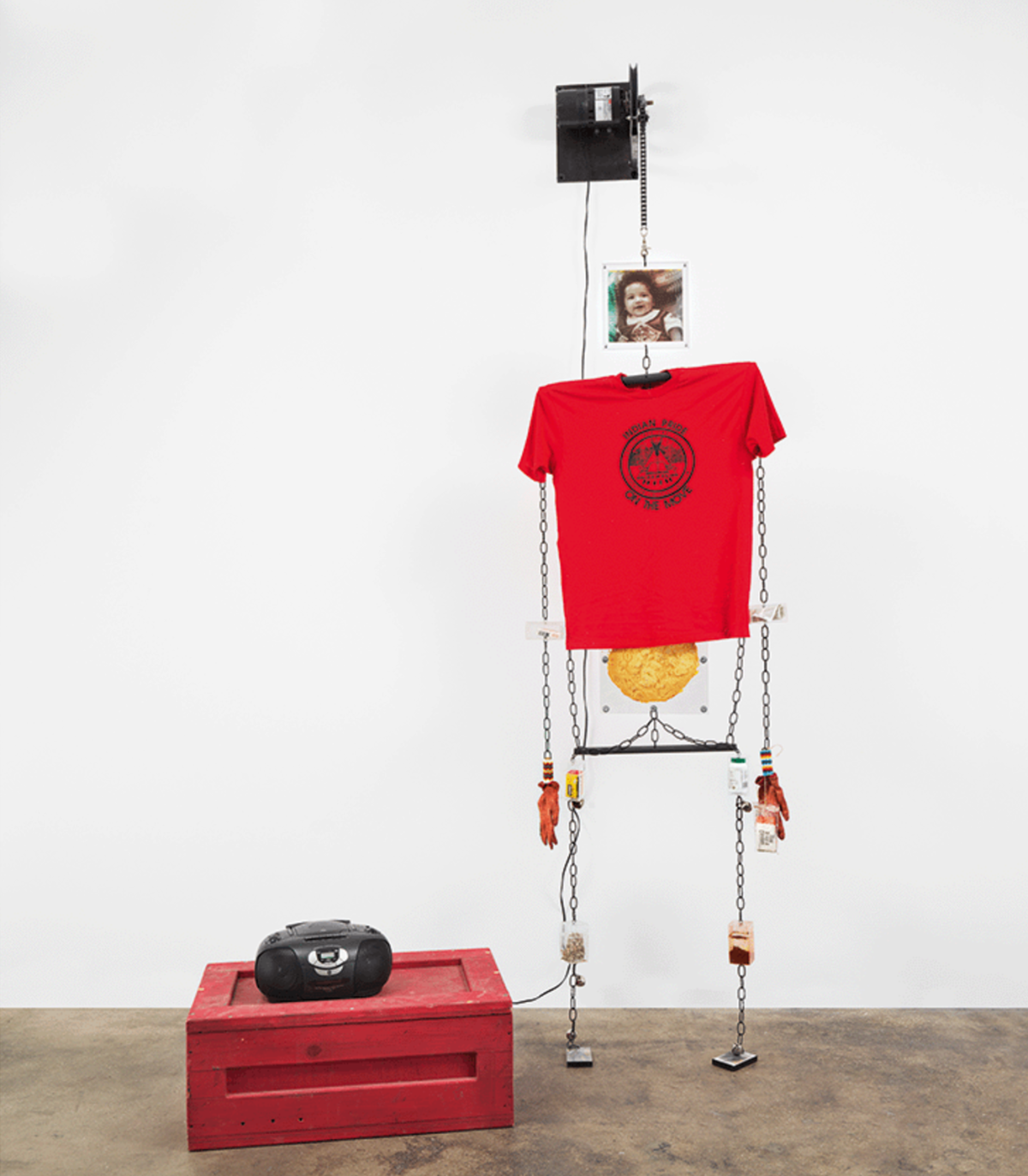
In Warrior for the 21st Century (1999), a figural sculpture periodically dances to the sound of a rattle while an unidentified voice counts to 10 in the Salish language. To create this work, Jaune Quick-to-See Smith collaborated with her son and fellow artist Neal Ambrose-Smith. The sculpture is constructed by objects including an electronic motor, metal chains, steel, deck of cards, fry bread, aspirin, cassette tapes, echinacea, and more. All of these elements, Ambrose-Smith notes, are objects “every warrior needs.”
The artists created this sculpture to reflect serious issues affecting contemporary Native Americans, and armed their warrior with items for facing the challenges of the new millennium. Included are red ochre and sage for ceremonies, as well as the Indian AIDS Hotline telephone number (an important resource given the growing rates of HIV and AIDS in Indigenous communities in the late 1990s, when this work was made). The warrior also carries a copy of the 1855 Treaty of Hellgate, which established the reservation lands of the Confederated Salish and Kootenai Nation, where Smith was born and returns to often. The treaty serves as a reminder of past struggles with the federal government and the limitations of working within a colonial legal structure to protect land, water, and resources.
Learn more about Warrior for the 21st Century from Ambrose-Smith by tuning in to the free smartphone tour of Jaune Quick-to-See Smith: Memory Map at SAM. Produced by the Whitney Museum of American Art, the tour can be accessed online via our SoundCloud or by scanning the QR codes positioned next to select works on view in the exhibition. Memory Map closes in less than one month at SAM. Don’t miss out: reserve your tickets to see it at SAM before it’s too late.
Warrior for the 21st Century, 1999
NARRATOR: In 1999, Smith was commissioned to make a work that could be packed into a small box–a time capsule. Working on the project with her son, Neal Ambrose-Smith, she set out to make the work take up as much space as possible when it was removed from its container.
NEAL AMBROSE-SMITH: And so this, the idea was born of maybe a figure and then it could dance or move. And it could be animatronic.
NARRATOR: Neal Ambrose-Smith.
NEAL AMBROSE-SMITH:So we got these guys down the street to make a motor for us to mount this thing on. And then we decided to use chains instead of ropes to hold it together because they make sound and they collapse.
And it was a lot of fun because Jaune went into this super creative mode of like, oh, we’re going to do some sound. It needs sound. And so we went to this guy’s recording studio and we brought coffee cans full of coffee beans and, you know, to make a rattle sound. And then we got somebody up on the reservation to do a recording from Sophie May, she’s one of our Salish speakers, counting one to ten for “Ten Little Indians.”
The figure itself is a combination of all the things that you might need as a warrior for the 21st century. And when I say warrior, it doesn’t necessarily mean male or female.
So the stomach is frybread and then a T-shirt from the reservation. It says Salish Kootenai on it and it’s red, which is good. And then at each of the joints, we put these little clear boxes like jewelry boxes or something to stuff things in. So there’s sage and there’s some tobacco and the feet are cassettes, you know with like powwow songs. And then there’s a snag bag connected to one of the hands, you know which are gloves. And a snag bag, for those who aren’t in the know is—at a powwow, sometimes you go in there for a snag, which is to get a date. And so a snag bag has lubricants, maybe a condom. Things for safe practice of snagging.
In Rain (C.S. 1854) (1990), long-handled silver spoons are adhered to a wood canvas. Below the spoons, oozing layers of paint, oil, wax, and ink punctuate the work’s surface like drops of rain.
Contemporary Native artist Jaune Quick-to-See Smith was inspired to create Rain (C.S. 1854) in 1990 while traveling through the northeast United States with Seneca artist G. Peter Jemison. She recalls, “When I went up to Buffalo and Syracuse [New York], the Iroquois up there were saying the maple trees were dying because of acid rain.” The incorporation of silver spoons in the work, says Smith, represents “the mouths” of the steel mill companies most responsible for the acid rain. Taken as a whole, the installation calls out the unequal distribution of both environmental harm and financial benefit as well as the sense of capitalist entitlement that allows factories to burn fossil fuels so recklessly.
Rain (C.S. 1854) is one of many environmentally-focused works Smith has created throughout her five-decade career. Tune in to the free smartphone tour of Jaune Quick-to-See Smith: Memory Mapat SAM to hear G. Peter Jemison discuss the significance of this work, its connection to Chief Seattle, and Smith’s passion for environmentalism. The exhibition closes in just over a month on Sunday, May 12—reserve your tickets to see it at SAM before it’s gone!
Rain (C.S. 1854), 1990
NARRATOR: Smith called this work Rain (C.S. 1854). G. Peter Jemison is a member of the Seneca Nation heron clan.
G. PETER JEMISON: As you move around the painting, you would be struck by this light being reflected from the spoons. And I like that idea, because it’s difficult to capture, really, what rain looks like If you try to paint it.
NARRATOR: The “C.S.” of the painting’s subtitle stands for Chief Seattle, who was a Suquamish and Duwamish chief during the middle of the 19th century.
G. PETER JEMISON: Chief Seattle, of course, is famous for making an early statement about the necessity to live in harmony with the natural world, and not to be in the process of destroying it. Perhaps Jaune’s commentary here is related to what is it, that is, now not only in the soil, but what is coming from the atmosphere. Because of the kind of air pollution that we now live with.
NARRATOR: Smith made this painting after traveling around the northeastern United States with Jemison, and encountering the effects of acid rain on forests in upstate New York.
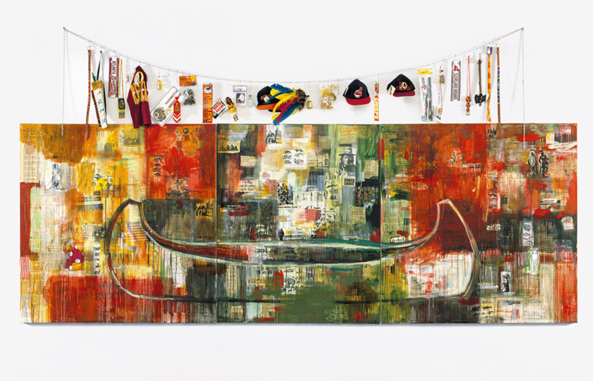
In Trade (Gifts for Trading Land with White People), images related to American colonization appear alongside newspaper headlines describing the dark reality of reservation life. Above, an array of cheap toys, souvenirs, and sports memorabilia—which speak to the commodification of Native American identity—are offered as gifts to white people in exchange for the return of stolen lands. Presented together, the large-scale mixed-media collage is illustrates the historical and contemporary inequities between the United States government and Native American communities.
Jaune Quick-to-See Smith created this work in 1992 as a response to the 500th anniversary of Christopher Columbus’ arrival in North America. Part of the series The Quincentenary Non-Celebration, the work is one of the earliest ‘trade canoes’ Smith developed across her career.
Tune in to the free smartphone tour of Jaune Quick-to-See Smith: Memory Map to hear contemporary Native American artist Jeffrey Gibson further explore the themes and significance of Smith’s trade canoe. All 19 stops of the exhibition’s are available via our SoundCloud or by scanning the QR codes next to select artworks on view. Memory Map closes Sunday, May 12—reserve your tickets to see it now at the Seattle Art Museum before it’s gone!
Trade (Gifts for Trading Land with White People), 1992
NARRATOR: This is one of Smith’s earliest “Trade Canoes.” From the beginning, she drew on the importance of canoes to Native peoples in order to make complex statements about their experience of American history.
JEFFREY GIBSON: I think for Indigenous people, it is mobility. It is the ability to be able to travel.
My name is Jeffrey Gibson. I’m an artist. I live in the Hudson Valley, and I’m a member of the Mississippi Band of Choctaw Indians and half Cherokee.
What’s interesting about this painting is we don’t know the direction. All the directions are removed. There is no front end of the canoe versus the back end of the canoe. It’s empty and it’s in a chaotic world that that version of the canoe doesn’t really make sense.
All of the kind of text and imagery that she’s put here are the things that have robbed us of knowing the Indigenous definition of a canoe. And I think putting the trash on the string above the painting, those are also just those images and those texts brought into object form, mass-produced all over the world, cheap and plentiful.
This painting of the canoe down below and all of the text and imagery that surrounds it speaks in the same way of this kind of difficult, challenging world for Indigenous people to find and navigate who they are as contemporary people, who they are as traditional people, who they are in relationship to their communities and their families. And then you hang this… I’m going to use the word trash, and I don’t mean that, but I mean it sort of like this very much throwaway culture…this kitsch and camp racist memorabilia hanging above it on the string. I think it’s sort of the audacity of this painting that makes it really successful.
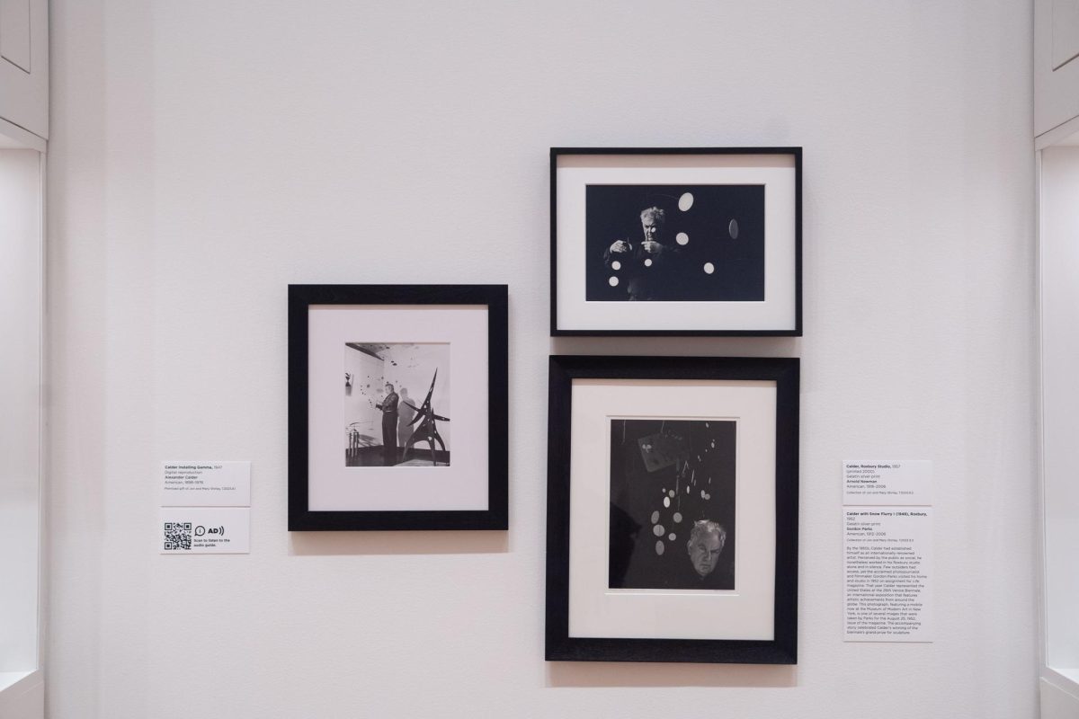
By the 1950s, Alexander Calder had established himself as an internationally renowned artist. Although the public perceived him as a social butterfly, he preferred to work in his Roxbury, Connecticut studio alone and in silence. Few outsiders were granted access to the artist’s workspace. Among them, however, was acclaimed photojournalist and filmmaker Gordon Parks.
Parks visited Calder in his home and studio in 1952 on assignment for Life magazine. That year, Calder represented the United States at the 26th Venice Biennale, an international exposition that highlights global artistic achievements. This photograph, featuring a mobile now at the Museum of Modern Art in New York, is one of several images that were taken by Parks for the August 25, 1952, issue of the magazine. The accompanying story celebrated Calder’s winning of the biennale’s grand prize for sculpture.
Learn more about this work and two other photographs of Calder in his studio by tuning in to the seventh stop on the free smartphone tour of Calder: In Motion, The Shirley Family Collectionat SAM. The full tour is available to explore on your own time via our SoundCloud or in our galleries by scanning the QR code next to select works in the exhibition.
Group of Photos: Calder Installing Gamma (1947), Alexander Calder, Roxbury Ct. (1957), and Alexander Calder (1952)
NARRATOR: These three photographs offer an intimate glimpse of Calder at work.
Let’s focus on the image to the far right of the group. It was taken by the important photographer and filmmaker Gordon Parks in 1952. That year, Calder had been selected to represent the United States at the Venice Biennale. Curator José Diaz:
JOSÉ CARLOS DIAZ: The Venice Biennale is sort of the Olympics of the art world where artists are chosen to represent their countries, and Calder actually won the Grand Prize that year.
This photo was taken for the August 25, 1952, issue of Life magazine and features Calder not installing an exhibition at the Venice Biennale but actually in his studio in Roxbury, Connecticut. This was a very private space, and for Life magazine—or really the American public—to see the artist behind the scenes would have been really captivating at the time.
NARRATOR: For artist Kennedy Yanko, the photographs offer a different perspective on the work.
KENNEDY YANKO: When you typically see Calder’s work, you’re looking up and you’re looking around. So your entire physical gesture and exploration of it changes. But you can see here how different it is when he’s so close to it and how he’s experienced it in the making. He’s living within the work, and he’s living within the sculpture, and I think that that’s what allowed all of these monumental sculptures to kind of continue to carry us. That sense of life and that sense of curiosity is how deeply immersed and present he was inside of the pieces.
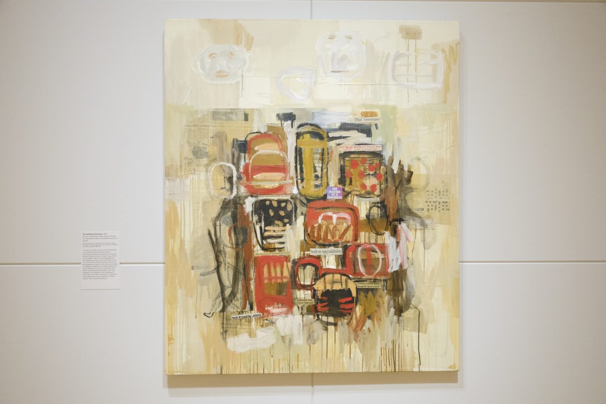
In Jaune Quick-to-See Smith’s striking abstract painting The Vanishing American (1994), a series of Native figures dressed in traditional clothing are surrounded by marks and newspaper clippings with headlines including ‘Support the Tribal Dollar,’ ‘Best if Used by 2000,’ and ‘Built-in Upgradability.’ Clustered together, the figures stand in defensive positions.
This work represents the making of a comeback. Not only the comeback of a person or community of people, but also the return of a mentality that has been erased by contemporary society’s monoculture. Learn more about the significance behind The Vanishing American directly from the artist by tuning in to the free smartphone tour of Jaune Quick-to-See Smith: Memory Mapat SAM. Originally produced by the Whitney Museum of Art, all nineteen stops of the audio tour are accessible by scanning the QR codes throughout the exhibition’s galleries or on your own time via our SoundCloud.
The Vanishing American, 1994
NARRATOR: Smith called this painting The Vanishing American. It mixes brushy abstraction with headlines clipped from newspapers. In the upper right, one reads “What Americans,” pointing loosely to the painting’s ironic explorations of identity.
JAUNE QUICK-TO-SEE SMITH: See there’s always this thing about “the vanishing Native American.” The vanishing American Indian. And we’ve been hit with that all of our lives. That, “oh you guys are so watered down.” “Oh you guys are so mixed blood, you don’t know who you are.” “Oh you’re so bastardized, you have no culture left.”
NARRATOR: Smith said she was inspired to make the painting after a community meal during medicine lodge ceremonies on the lands of the Blackfeet Nation, near her childhood home.
JAUNE QUICK-TO-SEE SMITH:And then when everybody would gather to eat, people would start talking about, “And, you know, the white people are just going to do themselves in with all their poisons and all the pesticides and everything that they’re using on our food. And so they’re just going to be the vanishing white men.” And then everybody would laugh.
So, I came back into the studio, and here I found this sign called built-in upgradability out of some New York Times or some ad or something. And I said, yeah, that really fits what the elders are saying, that we’re going to make it through this. Built-in upgradability, that’s what we have. We’ve been here for thousands and thousands of years. They just got here yesterday. They keep pretending like, oh, we just got here before them. Well, that’s not true. We’ve been here since the creation time. So the making of a comeback.
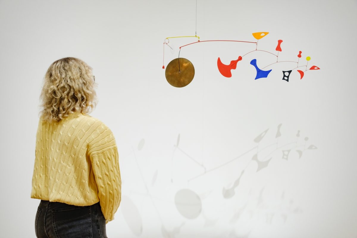
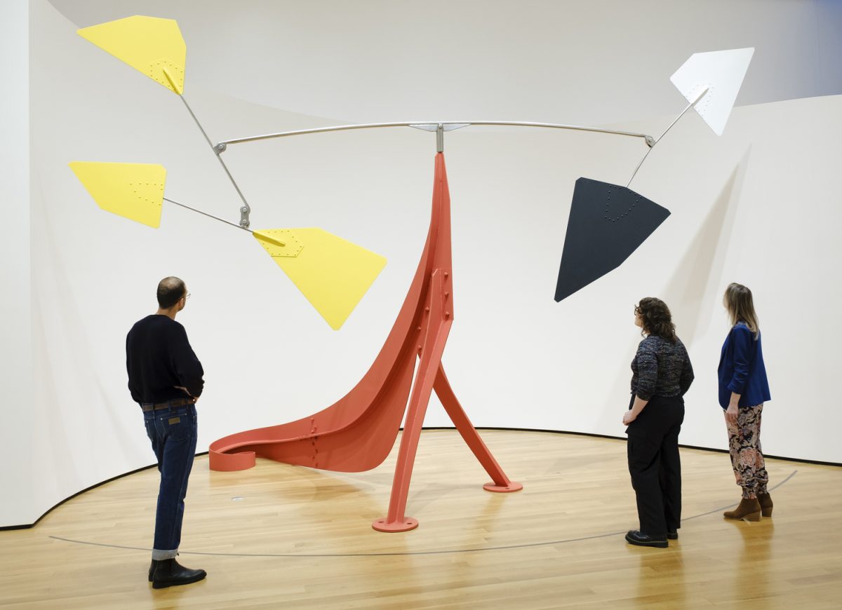
In the late 1940s, Alexander Calder developed sophisticated sculptures with pierced elements and interchanging relationships, the largest and most resolved of which is Bougainvillier. The construction of this vibrant masterpiece includes three wispy tendrils with mobile bursts, the lowermost of which is suspended by a handmade chain. Although it derives its title from the French word for the bougainvillea plant, this work—the most elegant and commanding sculpture on view in Calder: In Motion, The Shirley Family Collectionat SAM—is non-objective.
Calder’s choices for titles, whether in English or French, are not assets for artistic interpretation. He was known to intuitively name his sculptures after they were created, based on “some vague association,” as he said. “Sometimes it’s the whole thing that suggests a title to me, sometimes it’s just a detail.”
Bougainvillier made its public debut on the heels of Jean-Paul Sartre’s seminal 1946 essay, “Les Mobiles de Calder,” written by the French philosopher for the artist’s show at Galerie Louis Carré, Paris. Sartre’s words anticipated the complex environment created by a work like Bougainvillier, with its gestural lines projecting into unpredictable spaces:
“The forces at work are too numerous and complicated for any human mind, even that of their creator, to be able to foresee all their combinations. For each [mobile] Calder establishes a general fated course of movement, then abandons them to it: time, sun, heat, and wind will determine each particular dance. Thus the object is always midway between the servility of the statue and the independence of natural events.”
Calder Foundation President Alexander S. C. Rower shares more excerpts from Sartre’s essay in the tenth stop of the free smartphone tour of Calder: In Motion. Tune in now via our SoundCloud or by scanning the QR code next to Bougainvillier in the exhibition’s galleries.
Bougainvillier, 1947
NARRATOR: Bougainvillier is one of the works in the Shirley Collection most frequently requested for exhibitions. It dates from 1947, a period when Calder was focusing on standing mobiles. Calder Foundation President Sandy Rower:
ALEXANDER S. C. ROWER: The frilly lines, these wires that come out in space—even when they’re not active, you feel a tremendous sense of movement through space—are why he called it Bougainvillier. His process of titling, of course: it wasn’t that he saw a Bougainvillea vine with the beautiful purple leaves and blossoms. He made a sculpture and then, looking back in retrospect, said it’s kind of the tendrils of a line, I’ll call it Bougainvillier.
And the use of the title is not any kind of access into understanding or meaning of a work. You should really consider that the work has no meaning. But then you have to bring yourself forward and contribute and participate with the work in a way that the meaning is created. Calder always anticipated that the viewer was going to have an active role in not just experiencing his work, but in the viewer’s own interpretation.
NARRATOR: The year before Bougainvillier was made, the philosopher Jean-Paul Sartre explored these ideas in a seminal essay on Calder. Sartre captures the sense of what it’s like to experience a Calder sculpture. As he put it:
ALEXANDER S. C. ROWER: “Each of its twists and turns is an inspiration of the moment. In it you can discern the theme composed by its maker, but the mobile weaves a thousand variations on it. It is a little hot jazz tune, unique and ephemeral, like the sky, like the morning. If you miss it, it’s lost forever.”
With strokes of green, pink, yellow, gray, brown, black, blue, and orange, Untiled (Kalispell) is a colorful and abstract interpretation of the natural environment. Deriving its title from the Montana city just north of where Quick-to-See Smith grew up, the pastel and charcoal drawing counters traditional themes of US landscape painting by depicting an environment that is already inhabited. Although void of people, Smith uses symbols such as animal tracks to signify the wildlife that has always considered the natural environment its home.
Take an up-close look at the abstract details of Untitled (Kalispell) in Jaune Quick-to-See Smith: Memory Map, on view at SAM through Sunday, May 12. Then, learn more about this 1978 artwork by tuning in to the exhibition’s free smartphone tour. Its accessible by scanning the QR code in SAM’s galleries or on your own time via our SoundCloud.
Untitled (Kalispell), 1978
NARRATOR: In the late 1970s, Smith began making landscapes of Montana, where she’d grown up. With their abstract forms, her works stand outside of the US landscape tradition that began in the nineteenth century. Those painters had a white East Coast audience in mind, and painted canvases of the western landscape suggesting that the land there was as empty as it was beautiful—ready to be claimed. In the works on view here, Smith made modest gestures to show that, in fact, the landscape had always been inhabited. Jaune Quick-to-See Smith:
JAUNE QUICK-TO-SEE SMITH: You know, when I go home, I would see fields of mustard, fields of fireweed, or plowed fields. And also, because there was so much talk about the wilderness being empty space, I put bird tracks in, and sometimes little animals, horses. And in some cases here, I’ve got pictographs that you would see on the plateau. So they’re kind of made up landscapes, but they’re all based on what I would see at home.
“You have weight, form, size, color, motion and then you have noise.”
– Alexander Calder
Alexander Calder’s mobiles are recognized for their subtle movements, but their innovative use of sound is lesser known. Of over 22,000 artworks attributed to Calder, scholars have identified dozens of sound-producing mobiles. Beginning in the 1930s, Calder used sound in his abstract objects as a means to enhance ‘disparity’ within a composition. His most recognizable sonorous objects feature gongs, which he developed in earnest in the 1940s and 1950s.
Following its creation in 1948, Dispersed Objects with Brass Gonghung in the artist’s Roxbury studio, where incoming winds from the Connecticut countryside would ‘compose’ an unpredictable musical backdrop as he worked. A glimpse into this experience is offered in the Herbert Matter film Works of Calder (1950), with music by John Cage, in which elements of Dispersed Objects with Brass Gong slice through space. In the following decade, the mobile was presented as part of Philadelphia Collects 20th Century at the Philadelphia Museum of Art before being acquired by the Shirley family in 1999.
Sound objects like Dispersed Objects with Brass Gong express the possibilities that Marcel Duchamp recognized in Calder’s mobiles in 1949: “The symphony is complete when color and sound join in and call on all our senses to follow the unwritten score. Pure joie de vivre. The art of Calder is the sublimation of a tree in the wind.”
Find out if you can hear the subtle ‘ding’ of Dispersed Objects with Brass Gong by visiting Calder: In Motion, The Shirley Family Collectionat SAM. Until then, you can learn more about this work from SAM Susan Brotman Deputy Director for Art José Carlos Diaz and Calder Foundation President Alexander S. C. Rower by tuning in to the eighth stop on the exhibition’s free smartphone tour via our SoundCloud.
Dispersed Objects with Brass Gong, 1948
JOSÉ CARLOS DIAZ: One of the joys about Calder’s work is that one must be prepared for the unexpected…
NARRATOR: José Diaz:
JOSÉ CARLOS DIAZ: … whether you visit the exhibition and you see objects moving—or if you hear sounds. And so this is a wonderful example of one of Calder’s works that actually contains sound.
ALEXANDER S. C. ROWER: This particular work is one of my favorite works in the Shirley Collection.
NARRATOR: Sandy Rower:
ALEXANDER S. C. ROWER: Every object has an extraordinary shape except for the white disc—which, the white disc has the kind of purpose of being almost a rudder to drive the hammer, which is this red coil that strikes the gong. Even just people circumnavigating a gallery will activate the mobile, and it will occasionally give a little bright, you know, ‘ding.’
NARRATOR: Calder’s use of sound can be related to his love of music.
ALEXANDER S. C. ROWER: Calder was quite obsessed with music. He loved to dance. He was a famous dancer actually. If he was at a party, he would dance with a partner and then wear them out completely and then choose another partner and wear that person out completely. Which I witnessed as a young boy, of course, but much more famously was in the ‘20s and the ‘30s and ‘40s when he was out doing such things, you know.
NARRATOR: Here, the musical vibration is a way of drawing us into the work.
JOSÉ CARLOS DIAZ: There is a possibility it may never make sound during its presentation at the Seattle Art Museum, but the moment of surprise awaits.
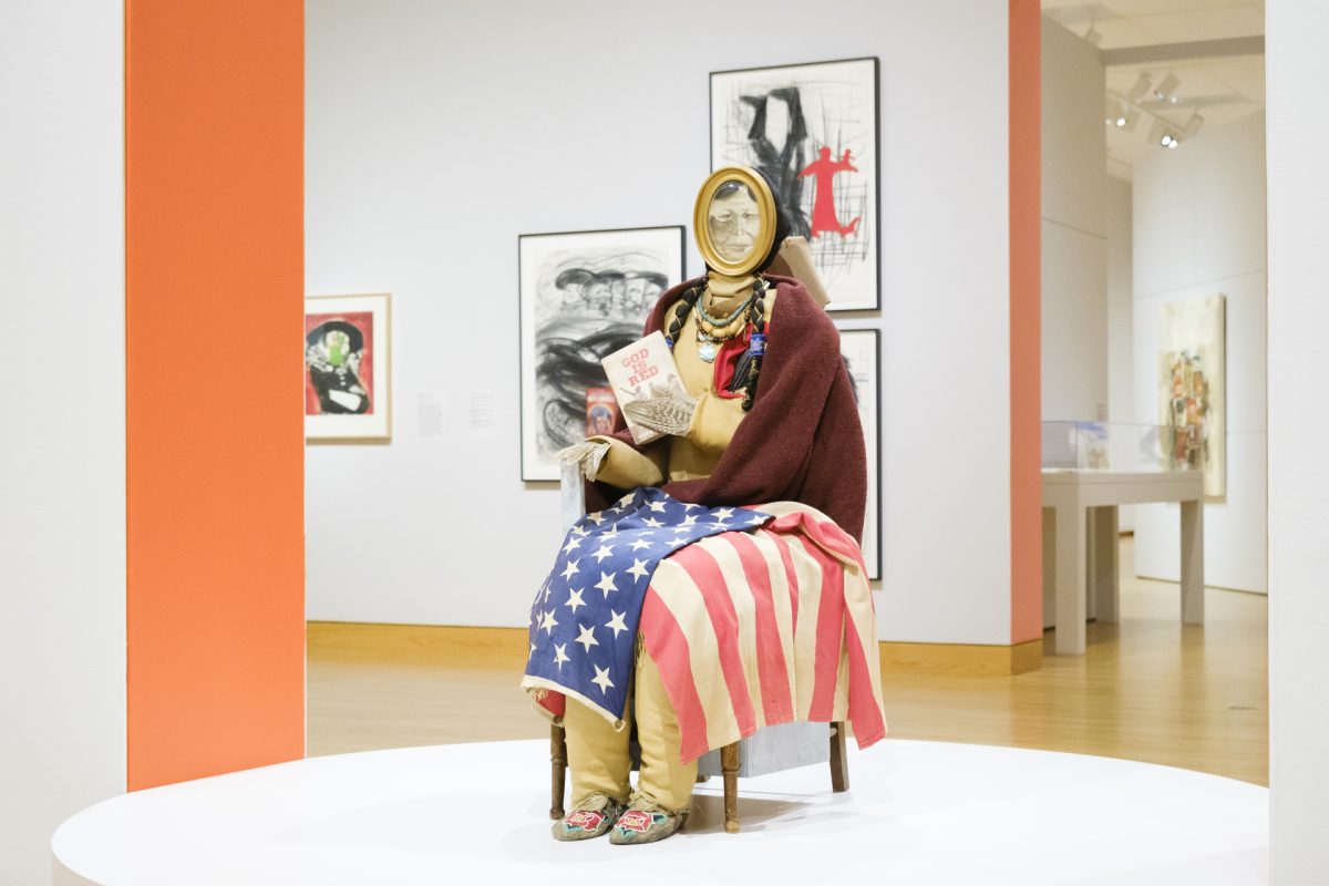
As visitors enter the galleries of Jaune Quick-to-See Smith: Memory Map, they’re greeted by the life-size sculpture of a seated woman with an American flag draped over her lap. She is Indian Madonna Enthroned (1974).
With long braids, a thicket of beaded necklaces, a wool shawl, pheasant feathers, and beaded moccasins, she is a representation of the contemporary Native experience, encompassing all of its tender beliefs and violent histories. Embedded in her chest, where her heart should be, is corn. Just behind her, a hide piece is marked “Property of BIA,” signifying the colonial governmental agency established to control Indigenous people and which is now a part of the Department of the Interior. Meanwhile, in her feathered hands, the Madonna demonstrates a sign of resistance by holding activist Vine Deloria Jr.’s God is Red, a 1972 study of Native spiritual practices.
Indian Madonna Enthroned is the subject of the third stop on the free smartphone tour of Memory Map. Produced by the Whitney Museum of American Art, the recording features Smith’s son and fellow artist Neal Ambrose-Smith—who helped restore the sculpture after many years spent in storage—discussing the significance of this work and the American flag draped along its lap. Tune in now to learn more about this Madonna!
Memory Map is now on view at SAM! Throughout the run of the exhibition, we’ll be sharing insight from the exhibition’s free smartphone tour to provide additional information about many of the works on view that can’t be found in the galleries. To access all 19 stops on the tour, scan the QR code next to select artworks on view or browse our SoundCloud on your own time.
Indian Madonna Enthroned, 1974
NARRATOR: Take a moment to look at the materials Smith used in this early sculpture, which she called Indian Madonna Enthroned. She has corn at her heart, and pheasant wings for hands. She holds a book by the Standing Rock Sioux writer Vine Deloria, which contrasts Christianity to Native religions, with their focus on the interconnectedness of all living things. While these elements suggest the figure’s connection to nature, other aspects of the work point to the ways she’s constrained by colonial forces.
Her face is literally framed. If you walk around to the back of the sculpture, you’ll see that her child also appears in a frame. Look closely at the hide behind the figure’s head on the frame of the chair, and you’ll see that Smith has stenciled on the words “Property of the BIA”—or Bureau of Indian Affairs.
Smith often collaborates with her son, the artist Neal Ambrose-Smith, who restored parts of this sculpture after many years in storage. He’s talked about the flag on the Madonna’s lap, and its symbolic complexities for Native Americans.
NEAL AMBROSE-SMITH: Many people have different identities regarding flag and flag etiquette and things that are connected to that, like war, for instance, which traditionally is the most documented way of documenting history. When we talk about history, it’s always like every 200 years because there’s a war connected to it or something. In Native identity, we talk about history through the land, and so it goes back 10,000 years, it goes back 40,000 years. We talk about the glaciers, we talk about the winds and the trees and how we’re connected to all that, and so I think for me, that aspect of that flag really brings a lot of those things together.
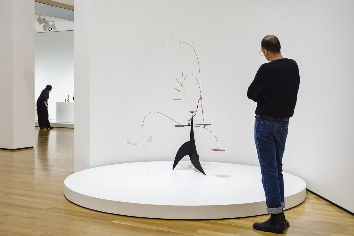
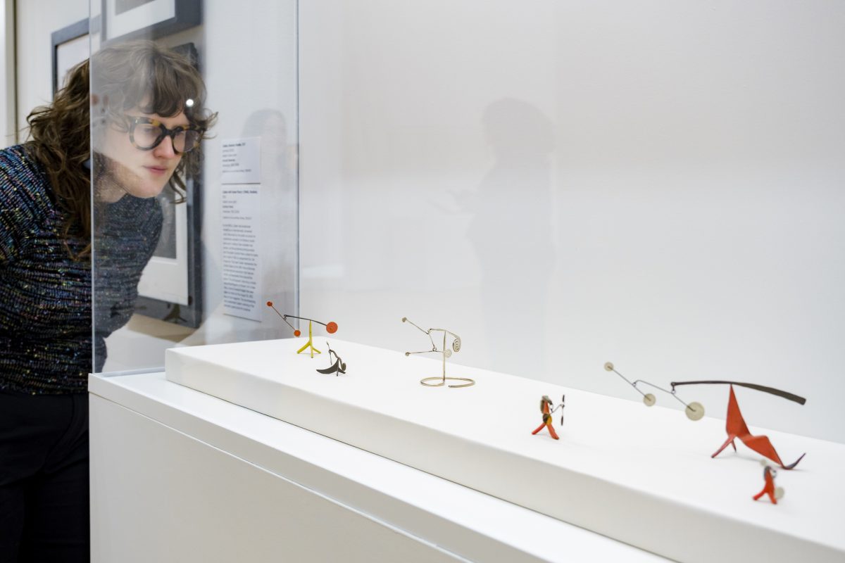
It is often assumed that Alexander Calder began experimenting with scale by making small, intimate sculptures before eventually scaling up to monumental commissions, such as The Eagle (1970), on view at the Olympic Sculpture Park. This assumption, however, is incorrect.
Calder’s understanding of scale began in his childhood when he observed his father managing sculpture projects (including the enlargement of monuments from models) for the 1915 Panama-Pacific International Exposition in San Francisco. Throughout his career, Calder worked in all sizes and scales, with a non-linear progression that was daring and fluid. Some of his small-scale works were made as maquettes for colossal objects. Others, including this collection of standing mobiles, were of a different breed, with many being constructed as gifts for family and friends.
In the sixth stop on the free smartphone tour of Calder: In Motion, The Shirley Family Collection, SAM Susan Brotman Deputy Director for Art José Carlos Diaz compares the artistry between Calder’s monumental and miniature sculptures. Tune in to this recording and many more via our SoundCloud or by scanning the QR codes next to select works in the exhibition’s galleries.
Haven’t visited Calder: In Motion yet? Check out visitsam.org/tickets to plan your next visit to SAM and get an up-close look at the intricate details of Alexander Calder’s tiniest sculptures.
Case of Small Mobiles: Untitled (1952), Black, White, Yellow and Brass on Red (1959), Untitled (1947), Two White Dots (1973)
NARRATOR: We often associate Calder with monumental sculpture. But he also worked on a small, delicate scale throughout his career. This case displays a grouping of some of Calder’s small-scale works. Calder was known for making works like these as gifts. José Diaz:
JOSÉ CARLOS DIAZ: There’s a famous story of Calder making small works encased in a cigar box for his wife, and so his wife, Louisa, can travel with these. She can display them as she saw fit. She can curate them within her own setting. But it’s also the small works’ complexity.
So, if you look at this case, you’ll notice that the small mobiles are just as detailed. You’ll notice that they’re balanced. You’ll notice that the use of metal is done with such delicacy that it has just as much attention as Calder would focus on for his larger-scaled works. You also can get a sense of the colors. The palettes are very similar to Calder’s larger scaled works. You’ll notice shapes that are similar to other large-scale works. But it’s often because Calder is working within an aesthetic that can really work within scale. And Calder was very conscious when he played with scale because it allowed him to also explore the way that these stabiles and mobiles could function in a setting, regardless of how big they are.
“It’s that maybe [my art] will start to crack this whole issue of Native Americans being invisible. Being Indigenous in making art means that you’re looking at the world through lenses that are curved or changed by your upbringing and by your worldview.”
– Jaune Quick-to-See Smith
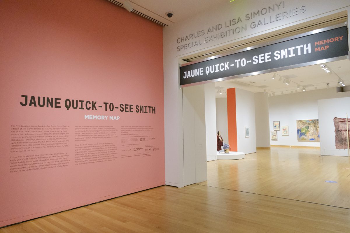
Welcome to the world of Jaune Quick-to-See Smith! With Memory Mapnow on view at SAM, we’ll be sharing excerpts from the exhibition’s free smartphone tour throughout its run in Seattle. Produced by the Whitney Museum of American Art, the tour is accessible via our SoundCloud or through your own device by scanning the QR code next to select works on view in the galleries. Verbal descriptions of some of the artworks on view are also available for low/no vision visitors.
The tour’s first stop introduces listeners to Jaune Quick-to-See Smith and the many themes her artwork explores. It also introduces listeners to the guest artists featured throughout the tour, including Neal Ambrose-Smith, Andrea Carlson, Jeffrey Gibson, G. Peter Jemison, Josie Lopez, and Marie Watt. Tune in now!
Memory Map Introduction
NARRATOR: Welcome to Jaune Quick-to-See Smith: Memory Map. Together we’ll explore five decades of Smith’s career, looking at paintings, prints, drawings and sculpture.
JAUNE QUICK-TO-SEE SMITH: Most people will never have heard of me. And that’s not off-putting.
NARRATOR: Jaune Quick-to-See Smith:
JAUNE QUICK-TO-SEE SMITH: It’s that maybe it will start to crack this whole issue of Native Americans being invisible. Being Indigenous in making art means that you’re looking at the world through lenses that are curved or changed by your upbringing and by your worldview.
NARRATOR: For Smith, who is a citizen of the Confederated Salish and Kootenai Nation, that worldview first began to form in the Pacific Northwest and western Montana. Today, Smith lives and works in New Mexico. Throughout her life and work, she has underscored the importance of the land and of Indigenous communities. As we move through the exhibition, we’ll look at the ways in which Smith addresses the traumas of Native American people with rigor, inventiveness, and critical humor.
You can use this guide to explore the works in any order you wish. As you go, you’ll be hearing not only from Smith but from writers and other artists including Neal Ambrose-Smith, Andrea Carlson, Jeffrey Gibson, G. Peter Jemison, Josie Lopez, and Marie Watt.
In 1933, Alexander Calder and his wife, Louisa, relocated to the United States from Paris, France, and purchased a farmhouse in Roxbury, Connecticut. The property was large enough to allow the artist to work on an elevated scale and an old icehouse was transformed into his new studio.
The following summer, Calder completed his first collection of outdoor works, which ranged in height from five to nine feet. Working larger proved to be expensive and experimental for the artist, so he began making models—or maquettes—in 1936 from which he could enlarge his final sculpture.
The last two decades of Calder’s life were very successful, and he received multiple high-profile commissions for outdoor sculptures. Red Curly Tail, previously displayed on the lawn of the Shirley family home is a standing mobile that evokes a sense of wonder. Other significant works Calder created during this period include El Sol Rojofor the 1968 Olympic Games in Mexico City and The Eagle(1971), now on view at the Olympic Sculpture Park on Seattle’s waterfront.
Tune in to the fifth stop on the free smartphone tour of Calder: In Motion, The Shirley Family Collectionto hear SAM Susan Brotman Deputy Director for Art José Carlos Diaz discuss the large size of Red Curly Tail and Calder’s lifelong fascination with scale. All 16 stops of the audio tour are available on our SoundCloud or via the QR codes adjacent to select works in the exhibition’s galleries. Get your tickets to experience all twelve feet of this monumental sculpture at SAM today!
Red Curly Tail, 1970
NARRATOR: Calder had started working on large outdoor sculptures in the 1930s, after he and his wife Louisa moved from Paris to a farmhouse in Roxbury, Connecticut. Red Curly Tail dates from 1970—the last decade of his life. It’s essentially a stabile with a mobile element on top, known as a standing mobile. Curator José Diaz:
JOSÉ CARLOS DIAZ: Red Curly Tail is a work that originally would have been shown outdoors, but it also has the… I guess the ambiguity or the ability to be shown inside as a freestanding sculpture without a natural environment around it but actually within other Calder works in this exhibition.
This particular work sort of peeks at you, and you have to approach it, and as you approach it you notice its bold red base. You notice the mobile aspects on top. It’s got this anthropomorphic tail that sort of hints at its quality of being something from nature, but it’s completely abstract as well.
It does give you a sense of scale because when you look at it, you have to also look left, right, and look above and realize, wow, I’m face to face with one of Calder’s outdoor works that actually plays with the sense of scale, especially when a human approaches it. It does take the subtlest air movements to make a Calder mobile move or to sway. However, the outdoor works would require massive gusts of wind. I don’t expect it to shuffle much, but I do think that you’ll always see it in a different way, and that’s really one of the incredible things about this exhibition.
“I feel that the artist should go about his work simply, with great respect for his materials. Simplicity of equipment and an adventurous spirit in attacking the unfamiliar or unknown are apt to result in a primitive and vigorous art. Somehow the primitive is usually much stronger than art in which technique and flourish abound.”
– Alexander Calder, À Propos of Measuring a Mobile
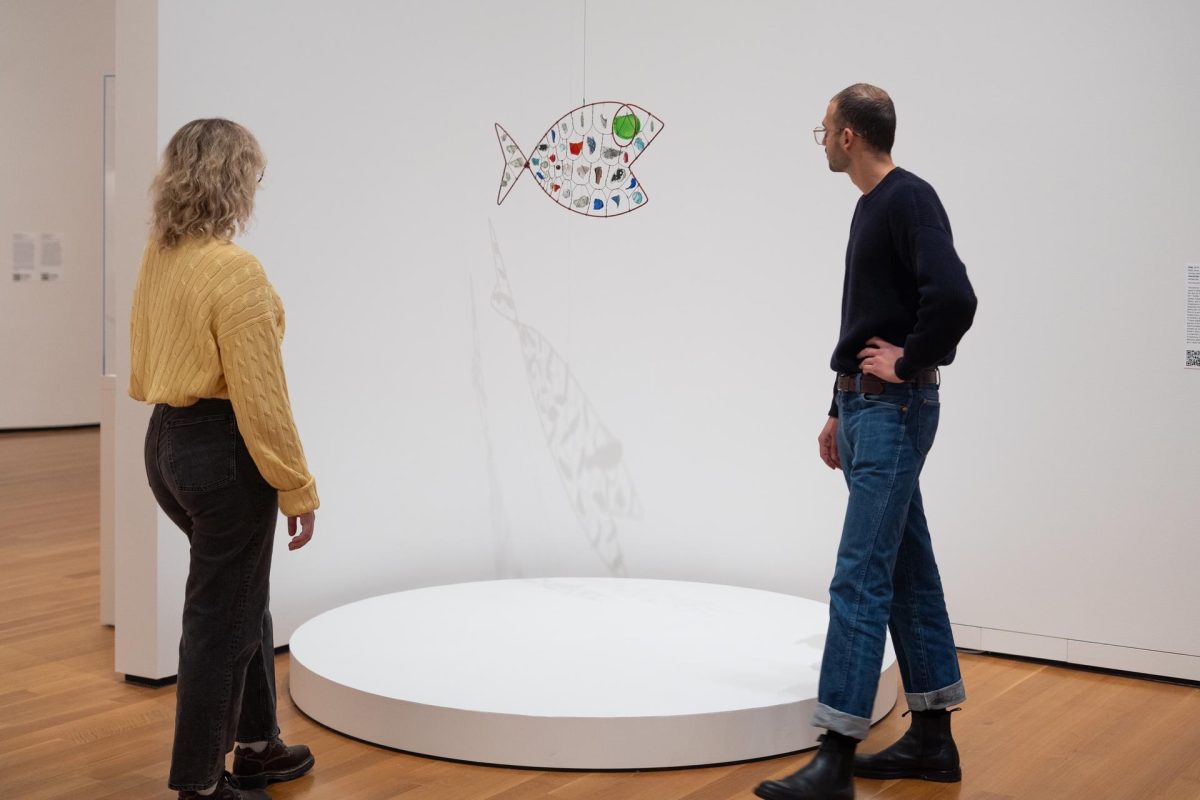
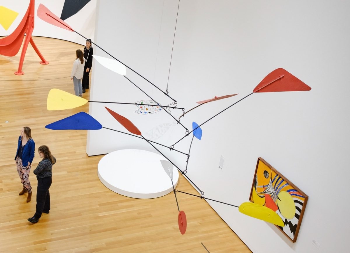
With sheet metal in short supply during World War II, Alexander Calder turned to working with bits of wood, shattered glass, ceramics, tins, and other discarded objects he collected on his farm in Roxbury, Connecticut. Between the 1940s and 1950s, he used these materials to make a dozen hanging fish. Their bodies were constructed of painted rods that were interlaced with wires to mimic scales. In each of the resulting voids, he suspended shards of glass, porcelain, and other found materials that dazzled when hit by light.
Fish—noted as John Shirley’s favorite of Calder’s works in his collection—is considered to be the earliest example of the artist’s fish mobiles.
Calder: In Motion, The Shirley Family Collectionis now on view at SAM! Scan the in-gallery QR code beside Fish on your next visit to SAM to access additional information about this work as part of the exhibition’s free smartphone tour. Or, explore all 16 stops of the audio tour on your own time via our SoundCloud.
Fish, 1942
NARRATOR: Calder made a dozen hanging fishover the 1940s and 50s. This example, dating from 1942, seems to be the first of the group. Sandy Rower:
ALEXANDER S. C. ROWER: One of the unusual things about this one compared to all the others is that there are a lot of bits of mirror; and we know about a mirror that was a bistro mirror that Calder had that got broken in a fire and he repurposed pieces of that. And you see them here: you see the kind of scraped away silvering on the glass in some of the pieces. So, this one really reflects a lot of light: doesn’t just transmute the light like a stained-glass window, like many of the fish, but actually transmutes and reflects at the same time.
NARRATOR: Exhibition curator José Diaz:
JOSÉ CARLOS DIAZ: The lighting creates a shadow, actually a colorful shadow that’s also unexpected within the space, and this is something that gives you a new take on Calder, or even an extension of the sculpture itself, as sculpture as shadow.
NARRATOR: The use of a broken mirror may say something about the time this mobile was made. During the Second World War, Calder felt that sheet metal should be reserved for the war effort; instead, he turned to discarded materials. One useful source was a dump near his studio in Connecticut.
ALEXANDER S. C. ROWER: He dug out this mound and found many bits of colored glass and assortments of bits of metal and pieces that he started to incorporate as kind of enticing objects in sculpture. Clearly this Fish has some of those and other things. You can see that there’s a piece of Chinese porcelain and some other bits of pottery from sources unknown.
Alexander Calder shares a rich history with performance art. He projected many of his ideas onto the stage, collaborating with composers, actors, and choreographers, including Martha Graham, Virgil Thomson, John Butler, and Jean Vilar. Perhaps nowhere is the expansiveness of Calder’s vision more apparent than in these collaborations, in which the disciplines of music, dance, and sculpture expand our understanding of known experience.
Calder was commissioned to create an artwork that would accompany Métaboles, a new ballet choreographed by Joseph Lazzini to music by Henri Dutilleux and produced by the Théâtre Français de la Danse. The result, Untitled (Métaboles), embodies Lazzini’s themes of variation and transformation. Its subtle movements echo the delicate movements of the figures onstage as it continually unfolds in space. The dynamic mobile made its public debut alongside the ballet’s premiere at the Odéon-Théâtre de France, Paris, in 1969. The ballet also featured costumes designed by Calder.
Calder’s interest in performance didn’t end there, however. In 1968, the year before Métaboles was realized, Calder premiered his own “ballet without dancers” known as Work in Progress at the Teatro dell’Opera in Rome. The result is approximately 19 minutes long, with Calder-designed costumes, hanging and standing mobiles, stabiles, and painted backdrops, accompanied by electronic music by three composers.
Listen to the third stop of the free smartphone tour of Calder: In Motion, The Shirley Family Collectionto hear Calder Foundation President Alexander S. C. Rower discuss how considerations of space and movement played influential roles in the artist’s creation of Untitled (Métaboles). You can explore all 16 stops on the audio tour via our SoundCloud or by scanning the QR code adjacent to select works in SAM’s galleries. Reserve your tickets to see Calder: In Motion at SAM to witness how this work ‘dances’ for yourself!
Untitled (Métaboles),1969
NARRATOR: This unusual work was made as a prop for a ballet, Métaboles, produced by Théâtre Français de la Danse, in 1969. Sandy Rower:
ALEXANDER S. C. ROWER: Here, he was invited by Joseph Lazzini, who was a choreographer, to collaborate and participate with this stage performance. And it’s a highly active work: the way the loops are connected makes it have a lot of movement. So, you could imagine it hung high above dancers and being quite free in its movement.
Calder often regarded his work in relation to choreography. I mean, his mobiles—the composition and the way they move—and if you think of them as multidimensional experiences—you begin to quickly relate them to music and dance and other arts. So, he kind of broke a lot of traditions in sculpting—what we think of traditionally as sculpting bronze and marble and clay—and he got rid of the mass, and then he introduced this activity of the sculpture responding to our space, responding to the room that we’re in or, in this case, in the theater.
NARRATOR: The work was made according to Calder’s initial model and assembly sketch.
ALEXANDER S. C. ROWER: Its qualities are extremely unusual because it was actually fabricated by set masters, so not made the way that Calder usually made his mobiles, at his foundry or in his studio with his hands himself. The fact that he could step away and allow others to introduce their aspects makes it really a collaborative thing.
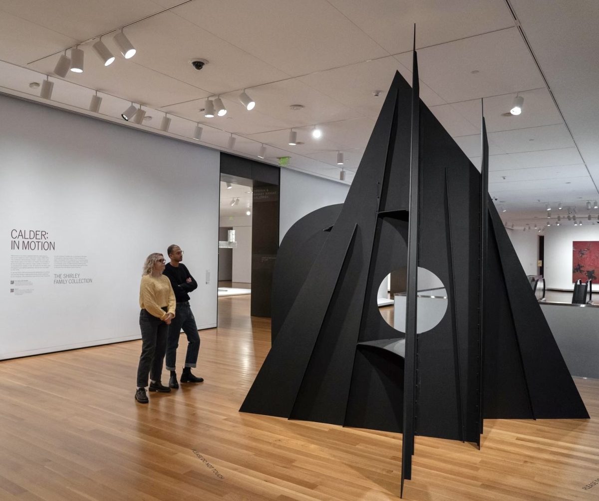
In 1975, Alexander Calder was commissioned to create a monumental sculpture for the nine-story atrium of the Hart Senate Office Building in Washington, DC. The result, Mountains and Clouds, is a towering two-part composition that stands 51 feet tall.
Mountains (1:5 Intermediate Maquette), the first artwork visitors encounter in Calder: In Motion, The Shirley Family Collectionat SAM, is a scale model—referred to as a maquette—of the stabile portion of Calder’s colossal sculpture. The artist began creating intermediate maquettes in the mid-1960s as part of the process of scaling up his colossal sculptures “to study the overlapping of the plates and the piercing of the holes.”
In November of the following year—just under a month after the opening of his highly-applauded retrospective at the Whitney Museum of American Art—the artist traveled to Washington, DC to finalize the details of the project with the architect. That evening, Calder returned to New York City, where he unexpectedly died of a heart attack. The artist’s death led to several delays in the commission’s completion with the final installation eventually taking place in 1986. Today, the stabile portion of Mountains and Clouds remains on view in the Hart Senate Building while the mobile undergoes restoration.
As a stationary work accompanied by a hanging mobile, Mountains and Clouds is the only composition of its kind that Calder created. Learn more about Mountains (1:5 Intermediate Maquette) and the sculpture it is paired with in SAM’s galleries, Femme Assise (1929), in the second stop on the free smartphone tour of Calder: In Motion. Browse all sixteen stops in the tour via our SoundCloud or by scanning the QR code next to select artworks in the exhibition.
Mountains (1:5 Intermediate Maquette), 1976
NARRATOR: In his later years, Calder focused primarily on large-scale public works. And of course, you can see one such work—The Eagle—here in Seattle in the museum’s Olympic Sculpture Park.
You’re looking at Mountains, a model for the “stabile” component of Calder’s massive 51-foot high work, Mountains and Clouds. A “stabile” is a stationary sculpture, in contrast to Calder’s moving sculptures, called “mobiles.” In the monumental work, the stabile is paired with a mobile, which hovers above it.
Calder made the full-sized sculpture for the Hart Senate Building in Washington, DC. It was one of his last projects before his death in 1976. The sculpture is made from sheet metal—one of Calder’s most favored materials.
KENNEDY YANKO: Metal is one of the most fascinating materials in the world. You know, it’s something that we are excavating from the ground. It’s coming from the earth…
NARRATOR: Kennedy Yanko is a painter and sculptor who works with metal.
KENNEDY YANKO: …and it carries what it’s known and what it’s experienced. It’s this amazing material that goes from a hard state to a liquid; and my relationship to this heavy, typically connoted as an industrial material is quite interesting because I watch it break like a twig. It actually becomes something that’s delicate to me.
NARRATOR: This late work is paired here with one of Calder’s earliest works, a wooden sculpture called Femme Assise, from 1929.
ALEXANDER S. C. ROWER: I think that’s really informative and quite interesting to have them together: you get a sense of a trajectory.
NARRATOR: Alexander S. C. Rower is President of the Calder Foundation, and the grandson of the artist.
ALEXANDER S. C. ROWER: And also, you get a sense of really the 20th century in terms of aesthetics, just in these two objects.
Calder: In Motion, The Shirley Family Collectionis now on view at SAM! As part of this SAM-exclusive exhibition, we’ve developed a free smartphone tour featuring additional insight on Calder’s life, legacy, and artistic career.
Composed of 15 stops, the tour includes interviews with collector Jon Shirley, SAM Susan Brotman Deputy Director for Art José Carlos Diaz, sculptor Kennedy Yanko, and Calder Foundation President Alexander S. C. Rower, as they share their educational and personal thoughts on artworks including Fish(1942), Toile d’araignée(1965), Bougainvillier(1947), Red Curly Tail (1970), and many more of the artist’s most iconic works.
Tune in to the tour’s introductory stop now to get acquainted with the artists, scholars, curators, and admirers who contributed to this auditory experience. Then, explore all 15 stops in the audio tour of Calder: In Motion by scanning the QR code next to select artworks in the exhibition or on your own time via our SoundCloud.
Introducing Calder: In Motion, The Shirley Family Collection
JON SHIRLEY: My name is Jon Shirley, and I am pleased to share with you Calder: In Motion, The Shirley Family Collection. The works of Alexander Calder that you will see in these galleries have been collected over the past 35 years first with my late wife Mary and now with my wife Kim. Over those years we have found that living with Calder’s work has been a beautiful and uplifting experience.
Alexander Calder was a great artist whose father and grandfather were both sculptors. In Paris in the late 1920s Calder invented a new world of sculpture—first by using just wire and then by creating abstract works of sheet metal, wood, and wire that moved. As you will see, this collection spans Calder’s art career from the 1920s until his death in 1976. The audio guide will discuss many different works that I love so please take the time to listen and learn about Calder the man and his art.
My family and I sincerely hope that you will find this visit a dynamic experience and that you return to the Seattle Art Museum for many years as we present ongoing exhibitions related to Calder and the artists inspired by Calder.
NARRATOR: The exhibition attempts to capture something of how the works were displayed in the Shirleys’ home – setting up a unique dialogue across the decades. Joining us for this encounter will be exhibition curator José Diaz…
JOSÉ CARLOS DIAZ: My name is José Diaz.
NARRATOR: …painter and sculptor Kennedy Yanko…
KENNEDY YANKO: Hi! My name is Kennedy Yanko.
NARRATOR: …and Calder Foundation President—and grandson of the artist—Alexander S. C. Rower.
ALEXANDER S. C. ROWER: Hi, I’m Alexander Rower. Everyone calls me Sandy.
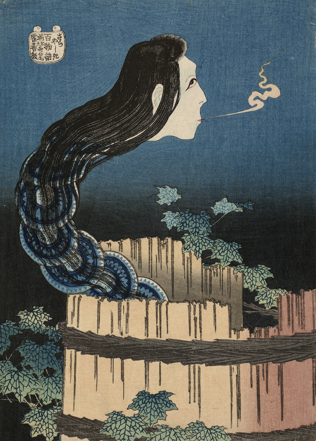
Katsushika Hokusai is renowned for his illustrations of popular Japanese ghost stories. In The Mansion of the Plates, the historic Japanese artist depicts the story of the maidservant Okiku, who was accused of breaking a precious porcelain plate that belonged to the master of the mansion in which she worked. She then either committed suicide by throwing herself into a well or was killed by her enraged master and thrown into the well.
It is said that Okiku’s ghost rises from the well night after night to count the mansion’s plates in a haunting moan: “One… two… three,” followed by a horrible shriek when her count comes up short. In Hokusai’s clever yet unusual version of the scene, the plates themselves rise from the well one after another, making up the snake-like neck of the ghostly head.
Learn more about Hokusai’s artistic interpretation of this supernatural tale from the curator of Hokusai: Inspiration and Influence from the Museum of Fine Arts, Boston Dr. Sarah Thompson and Tufts University Professor Susan Napier by tuning in to the seventh and final stop of the exhibition’s free smartphone tour. Explore all seven stops on the tour by scanning the QR code adjacent to select artworks in SAM’s galleries or on your own time via our SoundCloud. Don’t miss your final chance to see Hokusai: Inspiration and Influence in Seattle before the exhibition closes at SAM this Sunday, January 21—get your tickets now!
The Mansion of the Plates, about 1831–32
SARAH THOMPSON: Professor Susan Napier teaches international literary and cultural studies at Tufts University. She is known for her comprehensive studies of Japanese comics and animated films, manga and anime, and the connections between present-day popular culture and the floating world of Hokusai’s time. She is especially interested in fantastic and supernatural images such as Hokusai’s ghost prints.
SUSAN NAPIER: What we have in front of us is, even by Hokusai’s unique and extraordinary standards, one of his most amazing prints. This is darker, stranger, and weirder than even his other ghost prints, which are also often pretty dark and strange and weird, ’cause we’re really trying to figure out: What are we seeing? What’s going on here? And we see this creature coming out of what looks like a wooden bucket. It’s actually a well. And it’s female. We can tell that by the hair, the long hair, and the fairly delicate features. But what is that on her neck—or is that her neck?
In fact, they are ceramic plates. They’re dishes. It’s a very famous story. It’s about a young girl, a serving girl named Okiku, and she served in the mansion of a very prominent samurai. At least that’s how the story goes, the most popular version. And this samurai, her master, made advances to her, which she steadfastly rejected. And he did it again, and she still rejected him. And he grew angrier and angrier. So, at one point he decides he’s really going to teach her a lesson, and he breaks one of a set of ten ceremonial, very beautiful, very valuable plates that the mansion owns. And this is actually a major crime in that era. And she could have been punished by death for breaking a plate. He accuses her of having broken the plate. She denies it, says she didn’t do it; he says, “Well, I’m sorry. If you don’t give in to me, I’m going to tell everyone that you broke the plate, and you’re going to be put to death.” So there are two versions of what happens next. One is that she is so upset and traumatized by the whole thing that she plunges into a well in the mansion’s garden and dies. The other one is that he actually throws her into the well in a rage and essentially murders her.
Well, it’s really the most eerie and unique part of this. Apparently after the girl had died, people began hearing strange sounds from the well. And they would come out and they’d hear a girl’s voice counting, and she would be counting, “One, two, three, four, five, six, seven, eight, nine.” And you are kind of waiting for her to say ten. And instead of saying ten she gives out this terrible hideous scream. And (laughs) I love stories like that because—Japanese literature and folklore is full of stories of ghosts, and particularly ghostly women. Really, Japanese ghosts tend to be female on the whole. But this one is such an interesting story in that she’s not just revenging herself, which she probably is by haunting the well, but also kind of imploring and asking to be noticed and to be—for people to understand what has happened to her.
This ghost story, the whole story of the plates, is still referred to in modern Japanese popular culture. And you see a—there’s an episode of a very popular anime series called Maison Ikkoku, in which one of the characters dresses up as Okiku and hides in a well one night and ends up not being able to get out and has a lot of misadventures. I think it’s sort of like a Halloween festival kind of thing. But it’s generally comic and quite funny. But if you want a really scary vision that was inspired by this Hokusai image of the plate mansion, you have to look at the very, very popular and very scary Japanese horror film Ringu, or The Ring. Because if you’ve seen it, you’ll probably never forget one of the most important and terrifying images of a young girl with long black hair covering her face, and she’s coming very slowly, climbing out of a well towards you. And it is really a riveting and terrifying scene. And it is absolutely kind of an homage to Hokusai’s picture of the plate mansion.
As a founding member of the 1970s Pattern and Decoration movement, American artist Robert Kushner favors geometric and floral patterns within his work. Like many of the artists in this movement, Kushner resisted conforming to the minimal compositions that dominated American artistic conventions at the time, opting instead to look beyond the nation’s borders for artistic inspiration.
His 1999 painting, White Cyclamen I, on view as part of Hokusai: Inspiration and Influence from the Museum of Fine Arts, Bostonat SAM, features aesthetic resonances from Islamic tile work, Iranian carpets, and Japanese ceramics and woodblock prints. As part of the free smartphone tour of the ongoing SAM exhibition, Kendall DeBoer, Curatorial Assistant in the Department of Contemporary Art at the Museum of Fine Arts, Boston, spoke directly with the artist about how the work of historic Japanese artists, including Katsushika Hokusai, influenced the creation of this work and many others across Kushner’s oeuvre.
Tune in to this recording blick clicking the link above or by scanning the QR code adjacent to this artwork in the exhibition’s galleries. Listen to all seven stops of the audio tour of Hokusai: Inspiration and Influence via our SoundCloud. The exhibition closes later this month on Sunday, January 21. Don’t miss out—reserve your tickets to see it at SAM before it’s too late!
White Cyclamen I, 1999
KENDALL DEBOER: In the mid-1970s and 1980s, the Pattern and Decoration movement in the United States declared independence from the reigning Western aesthetics of masculinist Minimalism and defied Modernism’s rejection of ornamentation. Reveling in beauty and looking to global influences, Robert Kushner is considered one of the founders of this significant movement in American art. His colorful, blossoming, exuberant, sparkling canvases incorporate transhistorical points of aesthetic reference, including but not limited to Japanese woodblock prints. The magnified florals, like White Cyclamen I, pay homage in particular to Hokusai’s large flower prints.
While working on this exhibition, we were in touch with the artist directly. Thinking about Hokusai and his relevance to contemporary artists, Robert shared the following thoughts, which I will read on his behalf:
“When I look at the flower compositions of Hokusai, and indeed other Japanese masters, I am always drawn to the precision of line, the exactness of observation of the plant forms, and the grace with which they inhabit an open indeterminate flat space. Even more inspiring to me is the intentional and skillful flattening of the drawn lines. A single thin line can enclose the form of a flower’s petal or leaves, allowing the flat, unshaded white paper behind to create a three-dimensional volume. In my own paintings, such as White Cyclamen I, I try to paint with my own version of this manner of engaged, enlivened, observed, accurate, delicate, bold lines. Looking one way, the curving whiplash lines of my cyclamen and its leaves are scattered shapes on the colored surface behind them. But then, there is a magical moment when those lines coalesce into the volumetric form of the living flower that is before me. This is a wonderful lesson to be offered by Hokusai, a Japanese painter and printmaker from two hundred years ago.”
– Lily Hansen, SAM Marketing Content Creator
Image: White Cyclamen I (detail), 1999, Robert Kushner, American born 1949, oil, acrylic, and gold leaf on panel, Courtesy of the artist and D.C. Moore Gallery, New York, NY.
Katsushika Hokusai’s influence knows no bounds. Nearly four centuries after his death, the Japanese master and his woodblock prints continue to inspire the work and practice of contemporary artists. One such artist is Merion Estes.
With strong ties to early Los Angeles feminist art spaces and a pioneering role in the Pattern and Decoration movement, Merion Estes typically depicts landscapes and seascapes. She combines found imagery from printed fabrics with collaged materials and spray paint to build up lively texture and vivid color, often with a political tone. In Chemical Falls, on view in Hokusai: Inspiration and Influence from the Collection of the Museum of Fine Arts, Bostonat SAM, Estes blends visual pleasure with the horror of environmental crises, specifically citing Hokusai as an influence on her ongoing treatment of natural scenes.
Learn more about this 2016 work from Kendall DeBoer, Curatorial Assistant in the Department of Contemporary Art at the Museum of Fine Arts, Boston, by tuning in to the fifth stop of the exhibition’s free smartphone tour. Explore all seven stops on the tour by scanning the QR code adjacent to select artworks in SAM’s galleries or on your own time via SoundCloud. Hokusai: Inspiration and Influence closes on Sunday, January 21. Reserve your tickets to see Estes’s work, alongside more than 300 artworks by Hokusai and his contemporaries, now!
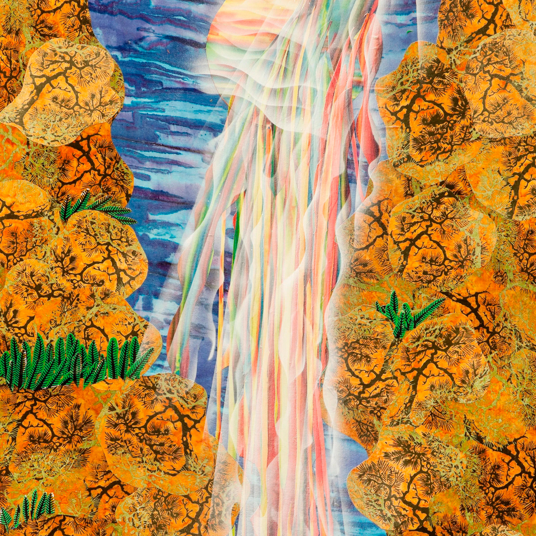
Chemical Falls, 2016
KENDALL DEBOER: Chemical Falls by Merion Estes is a more recent example of a theme the artist has frequently visited throughout her over fifty years of art making: beautiful landscapes and environmental degradation. As is her process for many of her artworks, Estes created Chemical Falls by combining collage elements with a section of found, printed, mass-produced fabric, which she then spray painted in high-keyed and striking colors. Building up layers of pigment and texture, Estes presents us with a breathtaking waterfall that is as alluring as it is otherworldly—and laced with the sinister specter of polluted waters.
Born in Salt Lake City, Utah, in 1938, Estes received her BFA in 1970 at the University of New Mexico. She then quickly earned her MFA in 1972 at the University of Boulder Colorado before moving to Los Angeles, California. In LA, Estes would become a key figure in early feminist arts organizations like Womanspace and Double X. She was also part of the Pattern and Decoration movement in the United States, which often intersected with feminist art concerns. Pattern and Decoration artists rejected the austerity of Minimalism and Conceptualism, which they felt relied on sexist and racist assumptions, in favor of championing ornament, aesthetic beauty, and artistic production traditionally categorized as “women’s work,” like fiber arts. These interests persist in Chemical Falls, with its fabric basis, layers of patterned land masses, and geometric striations of water.
Many pattern and decoration artists felt the European canon of Western art history was too narrow in scope and therefore looked elsewhere for artistic precedents. Quite a few of these artists found inspiration in Japanese prints, including Estes, who has looked to Hokusai as an ongoing influence throughout her career. The intense verticality and perspectival view of Chemical Falls feels in direct conversation with Hokusai’s series A Tour of Waterfalls in Various Provinces. Comparing Chemical Falls to Hokusai’s work The Amida Falls in the Far Reaches of the Kisokaidō Road from 1832 reveals similar treatment of linear falls pouring between curving, earthy cliffs dotted with sprigs of green vegetation. Each work features a circular form near the top of its composition, perhaps a source for the waterfalls. These parallels show the continued relevance of Hokusai in Estes’s work.
– Lily Hansen, SAM Marketing Content Creator
Image: Chemical Falls, 2016, Merion Estes, American, born 1938, printed fabric and spray paint on canvas, courtesy of the artist.
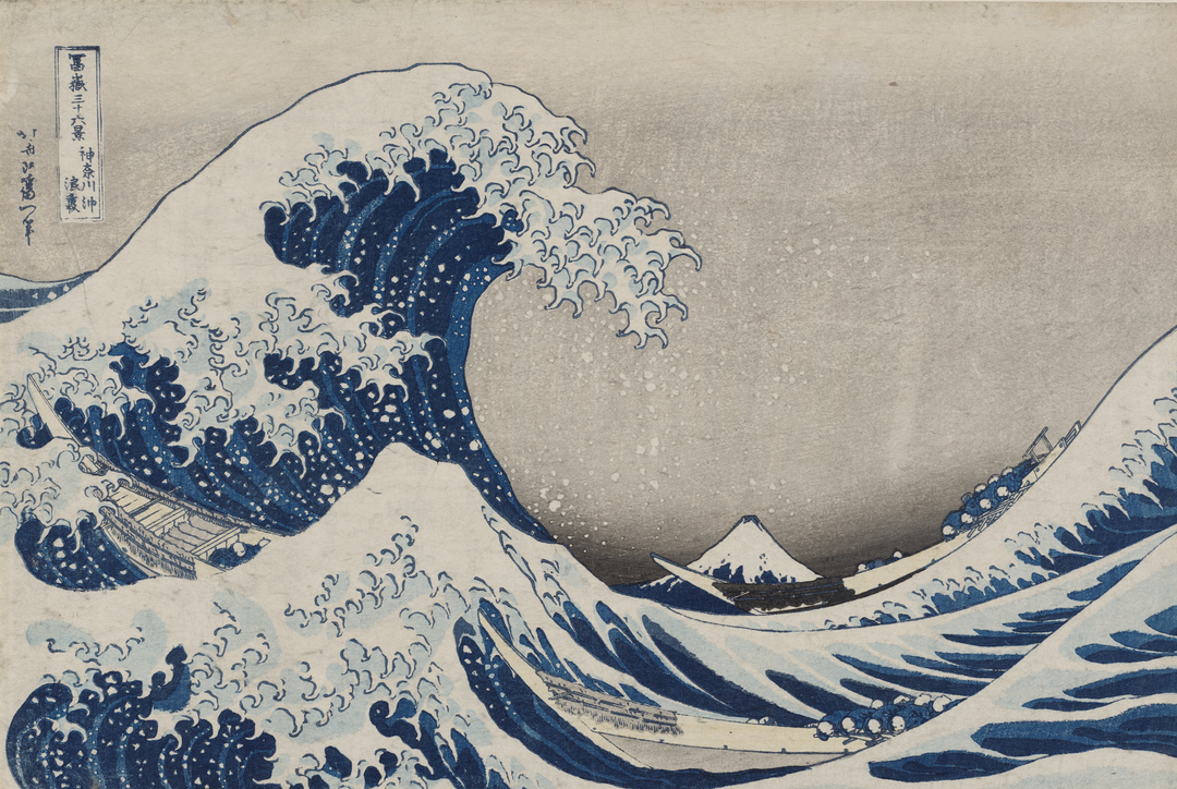
If there’s one work by Katsushika Hokusai you’ve definitely seen before, it’s Under the Wave off Kanagawa. More commonly referred to as the Great Wave, this iconic woodblock print has been cited everywhere from book covers to Lego sets, anime, and even an emoji (🌊). To offer a closer look at this infamous print, Dr. Sarah Thompson, Curator of Japanese Art at the Museum of Fine Arts, Boston, called in an expert: Dr. Christine Guth.
Many first time viewers of the original print find themselves surprised by its small size, she explains, as the work has been reprinted an infinite number of times in various proportions, skewing our perception of its original size. However, with its commanding depiction of a wave, it’s been interpreted a multitude of ways, including as an expression of the powerful force of nature.
Listen to the recording now for Dr. Guth’s full discussion of the Great Wave. All seven stops on the free audio tour of Hokusai: Inspiration and Influence can be accessed via QR code in SAM’s galleries or on our SoundCloud. The exhibition closes in just over a month—get your tickets to see it before it’s too late!
Under the Wave off Kanagawa, about 1830–31
DR. SARAH THOMPSON: Dr. Christine Guth is one of the most distinguished scholars of Japanese art in the English-speaking world. Her book Hokusai’s Great Wave: Biography of a Global Icon was a huge help to me in planning this show, and I am delighted that she has agreed to tell us more about it in person.
DR. CHRISTINE GUTH: So, maybe this is the first time you’ve looked at this print in the original. And when you see it in reproductions you have the impression that it’s a huge work of art, but it’s very small. And it wasn’t intended as a unique work of art, but was printed many, many times. There were probably about 3,000 impressions made during Hokusai’s lifetime. It had a huge impact on Hokusai’s contemporaries, but they would’ve looked at it very differently than we do today. For instance, as you look at the print today, probably the first thing you notice is the giant cresting wave with its rather menacing claw-like extensions.
And then, you see the tiny Mount Fuji in the background. Now, certainly Hokusai’s Japanese contemporaries would have seen that as well, but they may have paid more attention than we do to the boats cutting through the waves, because Hokusai intended this image to represent a particular moment in time and place. And what it suggests is boats carrying the first catch of bonito of the season from the fish market in Osaka to Edo, because fresh sashimi made from bonito was a real delicacy.
One of the distinguishing qualities of the series of Thirty-six Views of Mount Fuji is not only that it shows the mountain from many different vantage points, but it captures it at different seasons and different points in the day. And I think that this print evokes that in the sense that the first catch was usually in the fourth month. That would be May today. So, there’s a very strong seasonal quality to the series. Today when people look at this print, some people see it as threatening and some people see it as an expression of the force of nature. And in fact, that was used very often after the terrible tsunami in Japan in 2011. And one of the great strengths of this print is the way it can speak to so many people across time and space. That’s what’s made this a global icon.
On the third stop on the free smartphone tour of Hokusai: Inspiration and Influence from the Collection of the Museum of Fine Arts, Boston, exhibition curator and Curator of Japanese Art at the Museum of Fine Arts, Boston, Dr. Sarah Thompson is joined by Michiko Adachi, Bettina Burr Associate Conservator at the Museum of Fine Arts, Boston, for a conversation on Katsushika Hokusai’s unintentionally collaborative Album of Miscellaneous Sketches Including Designs for Artisans.
This collection of sketches, although believed to be mostly drawn by Hokusai, was passed between many of the artist’s students and peers, with each contributing new drawings. Learn more about this album and its contents by tuning in to the audio recording above. Then, explore all seven stops on the exhibition’s free smartphone tour on our SoundCloud or by visiting the exhibition in-person at the Seattle Art Museum. Hokusai: Inspiration and Influence closes Sunday, January 21, 2024. Reserve your tickets to see it now in the heart of downtown Seattle!
Album of Miscellaneous Sketches Including Designs for Artisans, about 1830s–40s
DR. SARAH THOMPSON: The Asian Conservation Studio at the MFA are the people who clean and repair the art objects so that they appear at their very best in exhibitions, and who make sure that they are always stored and exhibited in the safest possible conditions. Michiko Adachi, who handles works on paper, will tell you more about an especially interesting object that she has treated.
MICHIKO ADACHI: This book with sketches and preparatory drawings is part of the Hokusai school drawing collection. The collection was believed to have been purchased by William S. Bigelow when he was living in Japan in the 1880s, from Hokusen, who had been a pupil of Hokusai.
These books are immensely fun to look through as each page holds something entirely different, from a more finished drawing, to design work, to even just a small sketch of a mouse. They were probably drawn or added throughout the years by multiple students and artists as drawings were often passed along. For this book, it is thought that a large percentage of the drawings were drawn by Hokusai himself.
These drawings are usually drawn on a thin, translucent paper in black ink, cut and pasted onto a thicker paper bound in a book format. Often you can see the artist making an outline in lighter gray ink before the final sketch, or red ink to place a grid or to make corrections. Artists also made corrections in their drawings by pasting another sheet of paper onto the desired area. The original drawing is usually still visible because the paper is translucent and often not completely pasted down, giving you a glimpse into the artistic process. You can see one of these corrections in the rectangular design work in the bottom right of this book. On the right-hand side, there are three animals surrounding two figures. The artist had initially drawn a circular pattern on the body of the animals, but later decided to change this by pasting a piece of paper on top and then drawing the animals again without the pattern on its body. If you look closely the circular pattern is still visible through the pasted paper.
A grant from the Toshiba International Foundation allowed for the conservation and imaging of a select group of Hokusai school drawings, such as this book, enabling us to share this small but special collection. You can flip through this book on the screen located next to the book.
In The Story of Minamoto no Yoshitsune and Jōruri-hime, Katsushika Hokusai depicts a famous scene from classical Japanese literature with a modern twist. While the narrative of the 12th-century story remains the same—the young samurai Minamoto no Yoshitsune hears Princess Jōruri-hime playing the koto and duets with her on his flute, jumpstarting a passionate love affair—the costumes worn by some of the characters reflect the fashion and style of the 18th century.
While under the tutelage of Kasukawa Shunshō in the 1780s, Hokusai designed many of these works, known as perspective prints, which incorporate exaggerated versions of the Western-style vanishing point perspective within elegant settings. In the second stop on the free smartphone tour of Hokusai: Inspiration and Influence from the Collection of the Museum of Fine Arts, Boston, exhibition curator Dr. Sarah Thompson discusses where Hokusai likely learned this artistic technique and points out how he achieved this perspective in this work.
Tune in to this audio recording now on our SoundCloud to learn more about The Story of Minamoto no Yoshitsune and Jōruri-hime or by scanning the QR code accompanying the artwork in the exhibition’s galleries. Hokusai: Inspiration and Influence is now on view through Sunday, January 21, 2024 at the Seattle Art Museum—get your tickets now!
The Story of Minamoto no Yoshitsune and Jōruri-hime, late 1780s
DR. SARAH THOMPSON: Let’s take a close look at an early work by Hokusai, a color print with the signature “Shunro” that he used in the 1780s when he was a student of Katsukawa Shunshō.
The scene is a modernized parody version of a famous story from classical Japanese literature, in which a young samurai, Minamoto no Yoshitsune, hears the sound of a lady named Jōruri-hime playing the koto at night. He stands at her garden gate and plays a duet with her on his flute, and this is the beginning of a passionate love affair. In the print, the flute player wears the costume of the 12th century when the story is set, but the lady and her attendants wear modern 18th-century clothes. When Hokusai was in his twenties he designed many works of this type, called perspective prints because they use an exaggerated version of Western-style vanishing point perspective. He probably learned this technique by looking at artists such as Utagawa Toyoharu and Shiba Kōkan, whose work you can see hanging nearby; and he combined it with the things that he had learned from his own teacher, Shunshō: drawing elegant figures in various poses and arranging them in an attractive setting.
In this picture, Hokusai uses two different systems of perspective to give the effect he wants. The building in the left half of the picture is drawn with converging lines that recede toward a distant vanishing point to give the impression of a very large, spacious interior. But in the garden scene to the right, Hokusai uses a traditional Asian perspective, with a high horizon line and distant objects placed higher in the picture, as you can see in, for example, the large painted screens by Shunshō also in this exhibition. For Japanese artists in the late 18th and early 19th centuries, Western perspective was an attractive and effective drawing technique, but was not necessarily the only option. In the famous landscape prints that Hokusai designed almost 50 years later, in the 1830s, he uses Western perspective most of the time but still feels free to alter it occasionally for a special effect.
You may know Katsushika Hokusai for being the creator of the infamous woodblock print The Great Wave—officially titled The Great Wave off Kanagawa (about 1830–31)—but what other artworks of his do you know? In the introductory stop on the free smartphone tour of Hokusai: Inspiration and Influencefrom the Collection of the Museum of Fine Arts, Boston, exhibition curator Dr. Sarah Thompson offers insight on another of Hokusai’s most recognizable woodblock prints: Fine Wind, Clear Weather (1830).
The audio recording begins with a brief introduction from Dr. Thompson, Curator of Japanese Art at the Museum of Fine Arts, Boston, about the exhibition and the many artworks on view that derive inspiration directly from The Great Wave. Dr. Thompson then introduces Kendall DeBoer, Curatorial Assistant in the Department of Contemporary Art at the Museum of Fine Arts, Boston, who collaborated with Dr. Thompson in curating this exhibition and the contemporary artworks that are featured within it.
Dr. Thompson then turns her attention to Fine Wind, Clear Weather. More commonly referred to as Red Fuji, the print comes from the same series of prints as The Great Wave, called Thirty-six Views of Mount Fuji. As the title makes evident, Red Fuji depicts the sacred Mount Fuji, the tallest mountain in Japan admired for its beautiful symmetrical shape. Although not as universally recognized as The Great Wave, Red Fuji has served as inspiration for other artists looking to capture the mountain’s picturesque views. Among the artworks inspired by this print on view elsewhere in the galleries, points out Dr. Thompson, are Yoshitomo Nara’s 1999 parody print White Fujiyama Ski Gelände and Toyota Hokkei’s 19th-century print Mount Fuji.
Hear more from Dr. Sarah Thompson, Kendall DeBoer, and other artists and scholars as part of the free smartphone tour of Hokusai: Inspiration and Influence now on our SoundCloud. Or, if you’re in SAM’s galleries, scan the QR code accompanying select artworks to be routed directly to each stop on the audio tour. The exhibition is on view at SAM’s downtown location through Sunday, January 21, 2024—reserve your tickets now to see Red Fuji and so much more!
Fine Wind, Clear Weather, 1830
DR. SARAH THOMPSON: Hello, and welcome to the exhibition “Hokusai: Inspiration and Influence.” I’m Sarah Thompson, the curator in charge of Japanese prints at the Museum of Fine Arts, Boston. In this show, we’ll be focusing on the most famous and influential of all Japanese artists: the painter, book illustrator, and print designer Katsushika Hokusai. Even if his name is new to you, you probably already know his most famous work, the woodblock print that has been given the nickname the Great Wave and has become one of the best-known visual images in the world. You will see a number of works based on it in this show, which looks at Hokusai in terms of the many other artists that he interacted with, both directly and indirectly. The works in the exhibition include about one-third by Hokusai himself; about one-third by other artists in Japan during his lifetime, from 1760 to 1849; and about one-third by other artists around the world, from the 1850s right up to the present, who learned about Hokusai’s work later on and found inspiration for their own work in it.
For works of contemporary art related to Hokusai, I’m lucky to have the help of my colleague Kendall DeBoer of our Contemporary Art department, and I’ll ask her to introduce herself now.
KENDALL DEBOER: Hi, I’m Kendall DeBoer, and I’m a curatorial assistant in the Department of Contemporary Art here at the MFA Boston. I specialize in contemporary craft and unconventional materials, and I’ve been delighted to work alongside Sarah on this show as a collaborator, bringing in contemporary artworks influenced by Hokusai. You’ll be hearing from me later on in this tour.
DR. SARAH THOMPSON: Now I’d like to look at one of Hokusai’s most famous images after the Great Wave, the woodblock print that has been nicknamed the Red Fuji. It’s from the same series of prints as the Wave—which you will see later in the show—called Thirty-six Views of Mount Fuji and published in the early 1830s, when Hokusai was already in his seventies. These prints were commercial products, mass produced, and sold in stores. Hokusai did the drawings, and other people then carved the wooden printing blocks—one for each color—and did the printing. Hokusai’s Fuji series was a huge, best-selling success, and it made landscape a major subject in Japanese printmaking for the first time.
Sacred Mount Fuji was an ideal choice of subject for this breakthrough print series, because it is the tallest mountain in Japan and it has a beautiful symmetrical shape that has attracted artists for centuries. The real title of this print, written in the upper left corner along with the series title, is actually Fine Wind, Clear Weather. It’s probably early morning, and the mountain—which appears in different colors in different weather conditions—looks reddish in the dawn sunlight.
Hanging near Red Fuji is a print made in 1999 by the well-known contemporary Japanese artist Yoshitomo Nara, who created a humorous parody showing Mount Fuji as a ski slope by painting over a reproduction of the famous print and then using color xerox to make limited-edition prints of his painting. Also nearby is a 19th- century print by Hokusai’s most successful student, Hokkei, who specialized in designs for privately commissioned prints, known as surimono. This image, from a series of three prints showing lucky things to dream about at new year, looks similar to some of the prints in Hokusai’s Fuji series, but it was probably made a little earlier, in the 1820s. Since Hokusai designed the Fuji prints late in life, many of his students, such as Hokkei, were already successful artists in their own right by that time. So, did Hokkei base his work on an earlier design by his teacher Hokusai? Could Hokusai have been inspired by the work of his own former student? Were both of them looking at depictions of Fuji by earlier artists? Or were they both looking at the mountain itself? There are many possible kinds of relationships between works of art, so keep these ideas in mind as you look at other comparisons throughout the show.
“I wanted to make my paintings the way I want people to see me, you know, I just wanted to show Blackness in a different way. Why can I not be Black and be happy?”
– Amoako Boafo
After witnessing a rare moment of playfulness between his siblings in 2019, Amoako Boafo decided to commemorate the moment in a portrait. Happy Siblings marks the first of Boafo’s paintings to include members of his immediate family.
Despite the portrait’s use of muted colors, Boafo still finds the painting to be joyful. Brightness, he says, does not equate beauty. Tune in to the eighth stop of the SAM-exclusive smartphone tour of Amoako Boafo: Soul of Black Folkson our SoundCloud to learn more about this work and how the artist incorporates his family into his art. Or, if you’re in the galleries, scan the QR code next to this work to access this and nine other recordings related to the exhibition. Soul of Black Folks closes this Sunday, September 10—get your tickets to see it at SAM’s downtown location before it’s too late!
Happy Siblings, 2019
NARRATOR: Boafo painted this portrait of his siblings in 2019.
AMOAKO BOAFO: It’s not often that I see them playful like that. So, when I saw it, I’m like, let me capture this moment and let me just put it down.
NARRATOR: The portrait was a way of including the artist’s family in his practice.
AMOAKO BOAFO: I wanted to find a way to get my family into my painting because they have an idea of what painting is, and they like what I’m doing, but they don’t really know much about it.
I mean, the thing is that they don’t come to the studio, you know, because they have other things to do, and they feel like when they come, they will disturb me, which I don’t think it is true; but instead of waiting for them to come around I want to go to them.
NARRATOR: Interestingly, for this joyful image, Boafo has chosen a muted paint color, buff titanium, for his brother’s shirt.
AMOAKO BOAFO: I don’t think it has to be bright to be beautiful. Because this color palette has a lot of white in the background, which is plain. So it gives it a lot of shine.
NARRATOR: It also makes a strong contrast with his siblings’ skin color.
AMOAKO BOAFO: You know, dark… dark helps with light.
NARRATOR: This image of light and joy is important for Boafo.
AMOAKO BOAFO: I have done a lot of paintings on my struggle. But then I had to change that for myself. I wanted to make my paintings the way I want people to see me, you know, I just wanted to show Blackness in a different way. Why can I not be Black and be happy?
– Lily Hansen, SAM Marketing Content Creator
Image: Happy Siblings, 2019, Amoako Boafo, oil on canvas, 63 x 63 in., Jesse Williams Collection.