Object of the Week: Gwendolyn Knight

When Jacob Lawrence was just a teenager in Harlem beginning to explore visual art as a way of commenting on the world around him, a local art teacher walked him straight into the local offices of the Works Progress Administration (WPA) to apply for an art project. The boy was too young, they were told, but he would be welcome to re-apply when he met the age requirement. Lawrence himself all but forgot about that invitation. His teacher, though, made sure he followed through, and one imagines the two were almost equally excited when Lawrence secured a project—his first paying art job, painting in the easel division of the Federal Arts Project.

The teacher was Augusta Savage, a well-known sculptor who had studied in Europe and in New York City, with Hermon MacNeil of the National Sculpture Society, among others. Her name carried a large amount of respect in the art community of Harlem, because she had talent and because she had settled back among her people after gaining education and exposure. She achieved a “professional” status that made her the admiration of students and local artists. There were moments in Savage’s career when her skill and grit brought financial and critical success: She earned commissions for portraits of race activists W.E.B. DuBois and Marcus Garvey, and also for a monumental piece displayed at the 1939 New York World’s Fair.

"Gwendolyn Knight" by Augusta Savage

Partly by her choice, and partly for the difficulty of her time, which was marked by economic depression and racial discrimination, Augusta Savage’s legacy would be her students. Through her Harlem Art Workshop, affiliated with the State University of New York, Savage directed one of the largest free art instruction programs in New York City. Her efforts earned her an appointment as director of the Harlem Community Art Center, supported by the WPA. Through these programs, Savage’s Harlem students were offered a rare technical training and art education.

Savage once said “I have created nothing really beautiful, really lasting”—and we might debate her on this point—“but if I can inspire one of these youngsters to develop the talent I know they possess, then my monument will be in their work.” We can safely say she accomplished what she set out to do: Jacob Lawrence, for one, listed her first among the people who encouraged him as a young artist. We might also like to thank Augusta for bringing together, through her studio, Jacob and the woman who would become his wife and muse, Gwendolyn Knight. It might have been Gwen’s sense of self-assuredness that inspired Augusta to create the memorable portrait we are looking at today.

Newspaper clipping featuring "Gwendolyn Knight" by Augusta Savage

SAM’s painted plaster portrait of Gwendolyn Knight perfectly illustrates Augusta Savage’s devotion to Gwen and all of her students. Masterfully made, it captures the nuances of Gwen’s facial features and exudes the grace and dignity for which the subject was known. Savage’s training in classical realism shines through in the portrait. It’s moving to consider that Savage had shown her work in such a hallowed space as the Grand Palais in Paris, but she debuted this portrait of Gwendolyn Knight in an exhibition of student work, held at the Harlem Y.W.C.A. in February, 1935. Not only that, but it was cast in fragile plaster and then painted; with few exceptions, Savage never had the funds to cast her works in lasting, costly bronze.

The students’ art at the 1935 Y.W.C.A. show, like Savage’s, drew on the culture and experiences of African Americans. It was a celebration of their solidarity. Augusta Savage’s lasting achievement was to create a place where aspiring artists could learn the skills of their craft while proudly exploring who they were, where they could be built up and encouraged, and made to believe in their value. Hers is a legacy worth considering as we celebrate Martin Luther King, Jr. Day this weekend.

—Jeffrey Carlson, SAM Collections Coordinator

Images: Gwendolyn Knight, 1934-1935, Augusta Savage (born Green Cove Springs, Florida, 1892; died New York City, 1962), painted plaster, 18 1/2 x 8 1/2 x 9 in. Gift of Gwendolyn Knight Lawrence, 2006.86, Photo: Natali Wiseman. Gwendolyn Knight detail, Photo: Natali Wiseman. “Negro Students Hold Their Own Art Exhibition,” New York Herald Tribune, February 15, 1935, Reproduced from the Collections of the Manuscript Division, Library of Congress.

Object of the Week: Head from a statue of Pharaoh Thutmosis III

There are two terms you simply must hang onto in the event that you’re watching Jeopardy and “Art of Ancient Egypt” comes up as a column and pharaonic sculptures features in one of the answers: uraeaus and nemes. The nemes is the distinctive, striped headcloth donned by our Egyptian king here and probably best worn by King Tut himself—whose tomb treasures, coincidentally, featured in one of the most important exhibitions in SAM’s history: the 1978 Treasures of Tutankhamun. My personal all-time favorite photo from the SAM archives features our own Chris Manojlovic, Director of Exhibition Design, enraptured by Tut’s mask. The other term, uraeus, refers to the coiled cobra above the figure’s forehead, which was both a symbolic presence, signifying that its wearer was royalty, and a protective force, whose breath and venom would keep harm from coming to the king.

An installation photo from the 1978 exhibition "Tut"

This cool Egyptian head lives amid our ancient art collection on the 4th floor downtown. S/he has had a long and interesting journey. The Egyptian artist(s) who crafted it worked with simple saws and drills made of copper to carve out the head and a complete, life-size body that was once attached to it. When they had established the form, they created a smooth surface by using stone scrapers over the hard basalt. A lively first life for the statue might have included performance in rituals and standing guard in a festival or funerary temple.

Dating ancient material like this piece is very tricky and relies mostly on judgments of style. SAM’s sculpture has a date of mid-15th century B.C., in 18th Dynasty Egypt (about 1543 B.C.-1292 B.C.), but in the first years after it entered the museum’s collection, expert opinions placed it in the much later Ptolemaic period (305 B.C.-30 B.C.). Because ancient Egyptian art idealized individuals—aiming to show them as gods—even the subject is a matter of debate. We think it depicts Thutmosis III, but it’s possible that instead the face represents Queen Hatshepsut, the woman who totally stole his thunder, usurped his throne, and pushed him to the background for her more than 20 years of rule.

Our Head from a statue of Pharaoh Thutmosis III was cultivated from a 1937 excavation at the Temple of Armant in Egypt. Sir Robert Mond, pioneering chemist, collector, and archaeologist, financed the excavation, and notable archaeologist Oliver H. Myers directed the project. The basalt head was a highlight from their findings. Multiple restorations have the figure looking as good as s/he does now. Sections of the nose, cheek, uraeus, the upper lobe of the left ear, the upper and lower lobes of the right ear, and a segment of the headdress have been restored. One restoration, later reversed, is documented in the photo below, where simulations of the chin and right jaw are affixed to the original.

A historic photo of the Egyptian head documents a restoration to the chin and right jaw, now removed

For some time in 2002-2003, this striking sculpture joined Andy Warhol screenprints of Mick Jagger and Muhammad Ali, as well as Nigerian carved wood figures, for the SAM exhibition Hero/Antihero. Mounted at the same time as a show devoted to George Washington, Hero/Antihero explored the idea of the hero and the effect heroes have had on art and belief throughout history. The Egyptian pharaohs, each worshiped like or as God, offer a fascinating example of people venerating other people.

—Jeffrey Carlson, SAM Collections Coordinator

Images: Head from a statue of Pharaoh Thutmosis III, mid-15th century B.C., Egyptian, basalt, 11 1/2 x 14 x 11 in., Eugene Fuller Memorial Collection, 52.70. Installation photo from the 1978 exhibition “Tut”, Photo: Paul Macapia, Seattle Art Museum. A historic photo of the Egyptian head documents a restoration to the chin and right jaw, now removed, Photo: Seattle Art Museum

Object of the Week: Trapsprung

As we welcome 2016, SAM nears its 83rd anniversary as an institution. It’s an organization with a rich and, at points, dramatic history. From its early years SAM has also shown a commitment to being part of history as it develops—not becoming a place where we all gawk at history as it gathers dust.

Our founding director, Dr. Richard Fuller, set up a regular exhibition program for living Northwest artists. Much of the gallery space at the Asian Art Museum in Volunteer Park was, in the museum’s formative years, a site for rotating displays of contemporary work. Often Dr. Fuller would purchase a painting from a show on behalf of the museum, using money from his own pocket, but representing the museum, and later very informally accessioned it into the permanent collection. For the artists he deemed worthy, he provided complementary display space and buying power via SAM. In addition to his role as an important patron to Northwest artists—notably Mark Tobey, Morris Graves, and Kenneth Callahan—Dr. Fuller also worked out agreements with some artists to support them through living stipends. He employed some of them, like Callahan, to help him at the museum with installing, packing, and shipping art, or promoting shows in the local papers.

Kenneth Callahan

In the photo above, a smiling, sweeping Callahan oozes appreciation—and he should! While employed by SAM, and with the financial and emotional support of Dr. Fuller, he produced powerful work like First Seed into the Last Harvest (1943), a favorite of mine in Pacific Northwest Modernism.

First Seed Into Last Harvest

Our current director, Kim Rorschach, continues to encourage SAM’s engagement with contemporary art. One acquisition representative of her time at the helm is Lynette Yiadom-Boakye’s Trapsprung (2013), a remarkable oil painting that’s currently hanging in the Brotman Forum near our admissions desk. In the picture, a life-size ballerina emerges from a flat background, full of dynamism and grace in her movement.

Born in 1977, Yiadom-Boakye is a British artist of Ghanaian descent. In her work, Yiadom-Boakye is interested in making interventions in history and reality. Her work features human figures and can be called representational in that sense. The figures are almost always people of color, and they are always posed actively, portraying self-confidence, and not passive presences. They’re figures, but they’re not exactly portraits: Yiadom-Boakye works using her imagination rather than representing specific individuals from life studies or photos.

What makes her work especially compelling is her desire to insert people of color into monumental paintings (and the sometimes exclusive stories that have traditionally played out there), such as her ballerina in Trapsprung. She’s writing a new history, an inclusive one, and it’s freshly assertive, exciting, and imaginative.

Here’s to all that we know 2016 holds—including a blockbuster show for another artist interested in new histories, Kehinde Wiley—and to what we have yet to discover!

—Jeffrey Carlson, SAM Collections Coordinator

Images: Trapsprung, 2013, Lynette Yiadom-Boakye, British, b. 1977, oil on canvas, 78 3/4 x 70 7/8 in., Seattle Art Museum, General Acquisition Fund. Seattle Art Museum Archives. First Seed into Last Harvest, 1943, Kenneth Callahan, American, b. 1905, tempera on canvas, 14 1/2 x 18 1/4 in., Seattle Art Museum, Eugene Fuller Memorial Collection.

Object of the Week: Virgin and Child

Wandering through our European art galleries at SAM one day, I overheard a visitor lamenting the space we had given to older art with Christian themes. His voice dripping with disdain, he said, “Oh, pictures of Mary and Jesus. I’d rather look at myself in the mirror!” Besides drawing laughter from his companion and from myself, his comment got me noodling and then writing this blog post.

Allow me to make a case for Mary-and-Jesus pictures this timely week.

A lot has changed since the holiday season of 1967, when SAM sent out a Christmas card with a reproduction of its great Francesco Bassano Adoration of the Magi painting, and since December 19, 1968, when the Beacon Hill News-Journal sported a similar reproduction of the Bassano, while inviting Seattleites to a long list of local Christmas services.

American museums today take the responsibility to honor the diversity of the human race , the American population, and the specific communities they serve very seriously by representing a range of viewpoints in the galleries. Religious as well as ethnic diversity and identity freedom are all at the forefront of these conversations. Diversity and inclusion are necessarily central to museum hiring practices, too. These core concepts represent steps forward to a more equitable global community. I believe SAM is rightly approaching diversity and inclusion with its focus and humility, understanding that it has areas in which to grow, aiming to address those head-on, and setting its sights on better serving our delightfully diverse city and world.

Painting on view at the Seattle Art museum

A painting like SAM’s Virgin and Child by the Master of San Torpè of Siena, dated to the end of the 13th century or early 14th century, does achieve a number of important goals for the museum. Simple in composition and small in scale, Virgin and Child has a very intimate presence. Whatever the artist’s ambition in creating the work—maybe a genuine sense of devotion to God or a devotion to being exceptionally good at his craft—he produced a picture of quality that has handsomely withstood 700 years.

Remarkable as a work of art, the painting shows a high level of craftsmanship and gives us a window onto a significant period in art history. Works produced in this Proto-Renaissance style of the 13th and 14th centuries directly precipitated, well, the Renaissance, with its focus on humanist ideas and a visual art that encouraged scientific perspective and a mimetic approach to representing the world. The religious subject, the Madonna and Child, is very representative of the time and place when it was painted, one of the most important themes for the period. I find the aesthetic really intriguing: the balance of heavenly gold and august blue gives the painting an appropriately impressive air, and the figures have oddly proportioned features like those crazy fingers.

Many of our visitors won’t experience a connection to the roles Mary and Jesus play in Christian theology, but quite a few more—I daresay all of our visitors—were born to mothers. The maternal affection Mary shows for her baby as she cradles him, the kind of loving, protective care that she embodies—these are essentially human feelings. To illustrate the longings of the human soul in visual art is, for me, one of the great challenges for an art museum, and one that this historical piece takes up well.

Very warm wishes to all this holiday season!

P.S. To those who celebrate Christmas, I hope it’s a very merry one!

—Jeffrey Carlson, SAM Collections Coordinator

Images: Virgin and Child, ca. 1325, Master of San Torpè, Italian, active ca. 1290-ca. 1320, egg tempera and gold on wood, 21 1/8 x 14 1/8 in. Seattle Art Museum, Samuel H. Kress Collection, 61.152. Beacon Hill News-Journal, 1968.

Object of the Week: Qing Dynasty Robe

In the States, fashion seems like a primarily European product. Italian and French designers command the most respect here. Television and print ads cause us to marvel at how good folks look while just strolling the streets of Paris and Milan.

The Eurocentric focus of today’s fashion culture can make us forget that other cultures of lookin’ really good have existed all over the globe for thousands of years. Traditional China is one of those places where clothing communicates a lot about the wearer.

Qing Dynasty Robe

In this late Qing dynasty (1644-1912) robe at SAM, the wealth and style of the owner shines. The budding flora and curving tendrils of the embroidery blanket the surface of the robe, covering every inch of its fabric with beautiful, precise ornamentation. The sumptuous silk and embroidery in gold-wrapped thread tell us straight away that the owner of the robe was a person of means and importance. This rich purple hue has a visual impact recognized around the world, as in Europe, where, for a long, long time, purple has been the color most associated with royalty.

To be sure, the owner of the robe wanted respect as someone with high social status. History shows us that it’s a very human desire to show off, to draw attention to ourselves, and to set ourselves apart with luxury. That’s nothing new.

Qing Dynasty Robe

Interestingly, clothing in traditional China was also thought to express the internal state of the wearer. Symbols adorning the robe could convey positive traits and blessings of fortune on the person who donned them. Looking at this robe, the large white cuffs feature the shou character—a symbol for the Chinese blessing of longevity— directly at the center. The shou also signals this as a burial robe. Those Qing dynasty elites—always on fleek, even in the grave!

The robe is one of over 900 works that joined SAM’s collection around the 75th anniversary of the museum, an era when the collection grew significantly in size and importance. Come check it out soon at the Asian Art Museum in Volunteer Park.

—Jeffrey Carlson, SAM Collections Coordinator

Images: Robe, late 19th century, silk with gold embroidery, Chinese, Qing dynasty (1644-1912).

Object of the Week: Basket in the shape of a boat

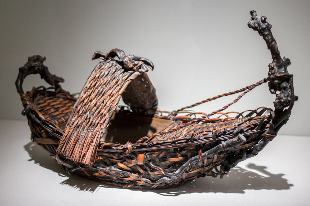
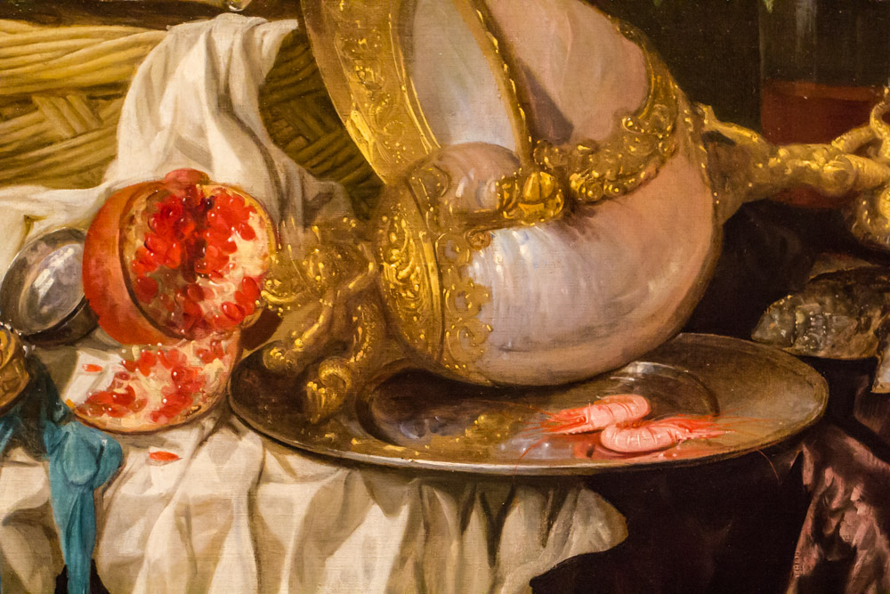
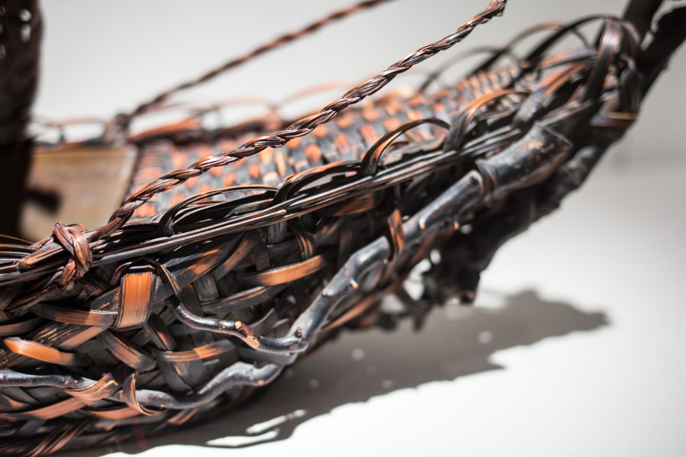
Most days at SAM, this bamboo Basket in the shape of a boat draws attention only for its remarkable artistry and creativity. The maker shows an ability to see the life inside the bamboo, and then to channel it toward the creation of a symbol—the boat—and a form—the basket. The medium seems to effortlessly transform: In places it’s gnarled like wood, or frayed like raffia, or braided like rope, always contributing to the total picture of boat-ness. The piece was produced in Japan during a 20th century revival of interest in traditional Japanese craft, when bamboo baskets gained an elevated importance in the country’s artistic production. As fine an artistic example as it is, this week, it takes on another meaning as a reminder of a dark period in U.S. and world history.

Basket in the shape of a boat (detail)

The day after the Japanese attack on Pearl Harbor, President Franklin Delano Roosevelt issued a now famous Declaration of War address (you can listen to it here):

Yesterday, December 7th, 1941—a date which will live in infamy—the United States of America was suddenly and deliberately attacked by naval and air forces of the Empire of Japan.

The United States was at peace with that nation and, at the solicitation of Japan, was still in conversation with its government and its emperor looking toward the maintenance of peace in the Pacific.

Indeed, one hour after Japanese air squadrons had commenced bombing in the American island of Oahu, the Japanese ambassador to the United States and his colleague delivered to our Secretary of State a formal reply to a recent American message. And while this reply stated that it seemed useless to continue the existing diplomatic negotiations, it contained no threat or hint of war or of armed attack.

It will be recorded that the distance of Hawaii from Japan makes it obvious that the attack was deliberately planned many days or even weeks ago. During the intervening time, the Japanese government has deliberately sought to deceive the United States by false statements and expressions of hope for continued peace.

The attack yesterday on the Hawaiian islands has caused severe damage to American naval and military forces. I regret to tell you that very many American lives have been lost. In addition, American ships have been reported torpedoed on the high seas between San Francisco and Honolulu.

Yesterday, the Japanese government also launched an attack against Malaya.

Last night, Japanese forces attacked Hong Kong.

Last night, Japanese forces attacked Guam.

Last night, Japanese forces attacked the Philippine Islands.

Last night, the Japanese attacked Wake Island.

And this morning, the Japanese attacked Midway Island.

Japan has, therefore, undertaken a surprise offensive extending throughout the Pacific area. The facts of yesterday and today speak for themselves. The people of the United States have already formed their opinions and well understand the implications to the very life and safety of our nation.

As Commander in Chief of the Army and Navy, I have directed that all measures be taken for our defense. But always will our whole nation remember the character of the onslaught against us.

No matter how long it may take us to overcome this premeditated invasion, the American people in their righteous might will win through to absolute victory.

I believe that I interpret the will of the Congress and of the people when I assert that we will not only defend ourselves to the uttermost, but will make it very certain that this form of treachery shall never again endanger us.

Hostilities exist. There is no blinking at the fact that our people, our territory, and our interests are in grave danger.

With confidence in our armed forces, with the unbounding determination of our people, we will gain the inevitable triumph — so help us God.

I ask that the Congress declare that since the unprovoked and dastardly attack by Japan on Sunday, December 7th, 1941, a state of war has existed between the United States and the Japanese empire.

World War II brought about all kinds of terrible things, including racial conflict. Executive Order 9066, signed by President Roosevelt on February 14, 1942, authorized military authorities to exclude “any and all persons” from designated areas of the country as necessary for national defense. In practice, the government targeted only Japanese resident aliens and Japanese Americans. The U.S. government uprooted more than 120,000 Americans of Japanese ancestry from homes and placed them under armed guard for up to four years. Sixty-five percent of these people were American citizens (these statistics according to the Smithsonian Institute).

A local connection to that dark time exists, too: Exclusion Order Number 1, issued on March 24, 1942, dictated that all Japanese resident aliens and Americans of Japanese ancestry on Bainbridge Island be removed under military guard. Herded into one of 10 camps in geographic isolation, these and other Japanese Americans endured the war in terrible conditions until the mass imprisonment came to an end in December of 1944. The formal ceremony that communicated Japan’s surrender took place on September 2, 1945, aboard the USS Missouri in Tokyo Bay.

There was a lot of healing to be done, to say the very least, and in the years following the war, SAM played its role in bringing about a rapprochement between the Japanese American community and the many other people groups that make up our nation.

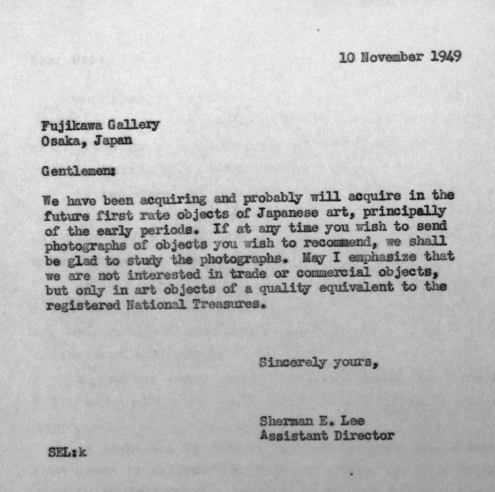
Already by the fall of 1949, SAM assistant director Sherman Lee was in communication with the Osaka-based Fujikawa Gallery about acquiring historical Japanese art. The gallery certainly had in mind that brokering art deals would contribute to a development of mutual understanding between Japan and the U.S.:

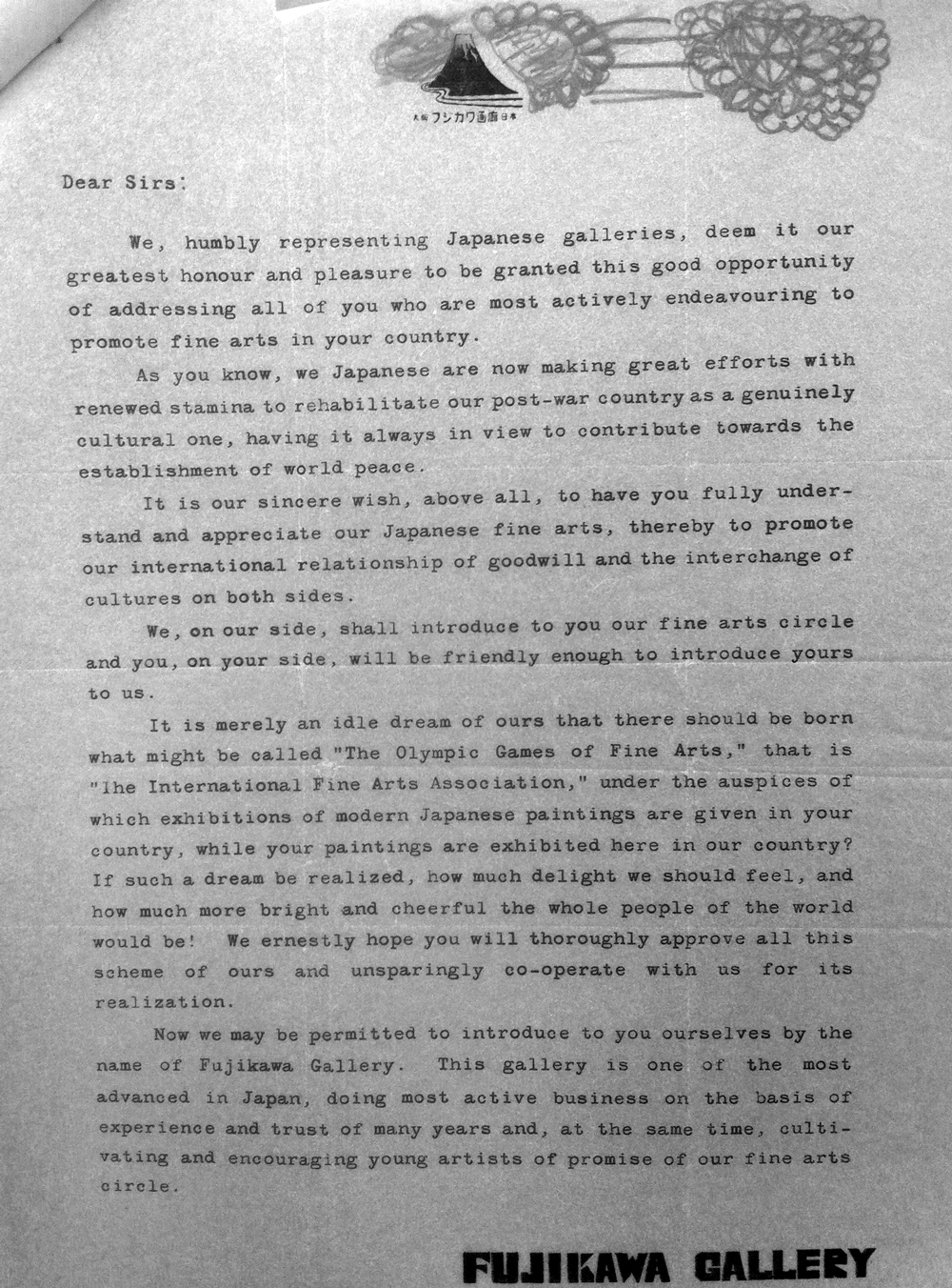
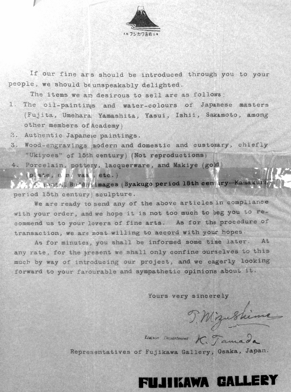
“As you know, we Japanese are now making great efforts with renewed stamina to rehabilitate our post-war country as a genuinely cultural one, having it always in view to contribute towards the establishment of world peace. It is our sincere wish, above all, to have you fully understand and appreciate our Japanese fine arts, thereby to promote our international relationship of goodwill and the interchange of cultures on both sides.”

Letter from Sherman Lee to Fujikawa

Fujikawa’s response is below.

Response from Fujikawa to Sherman Lee

Response from Fujikawa to Sherman Lee

For Lee’s and SAM’s part, engaging with Fujikawa at least demonstrates a lack of the xenophobic fear that inspired war-time decisions like the internment camps.

In the summer of 1951, SAM hosted its first post-war exhibition of Japanese art. From May 9 through June 3 of that year, visitors to the Volunteer Park museum could enjoy Paintings by Japanese Children, a show organized by the Japan-American Society of the Younger Generation in Japan. Two years later, an exhibition that was quite a bit more ambitious came to Seattle.

Dr. Fuller with Consul Saito of Japan at the opening of the 1953 exhibition

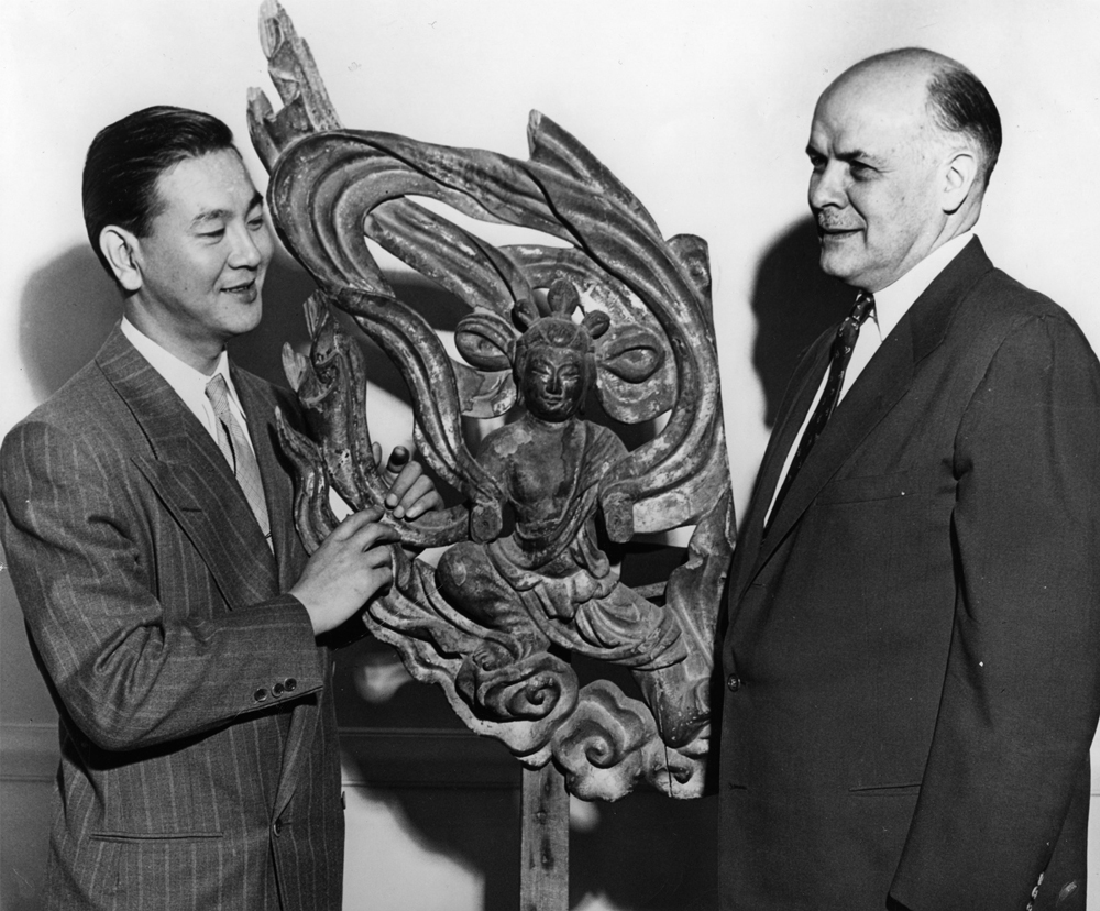
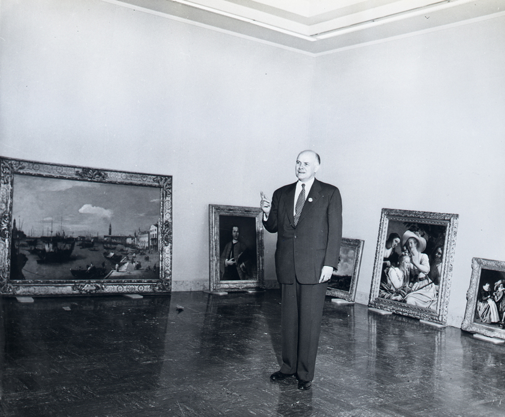
The Official Japanese Exhibition of Painting and Sculpture, on view July 9 through August 9, 1953, marked a very important moment for the museum, as it became the site of a highly publicized international exhibition. In its 20 years, SAM had previously hosted one such international show—on the art of India, in 1944—but the 1953 Japanese exhibition became its most important display yet. The museum was open seven days a week for the running of the show, bringing in paid attendance of over 57,000 and a total attendance of more than 73,000. In order “to help defray the heavy expense of this exceptional exhibition,” director Dr. Richard Fuller imposed a stiff charge of an additional 50 cents for entry. Below, you can see Dr. Fuller with his wife Betti (they were married in 1951) and visiting dignitaries, accompanying a truck full of the Japanese artworks and, in a darn questionable move, drawing all kinds of attention to their cumulative value.

Japanese exhibition mobile ad

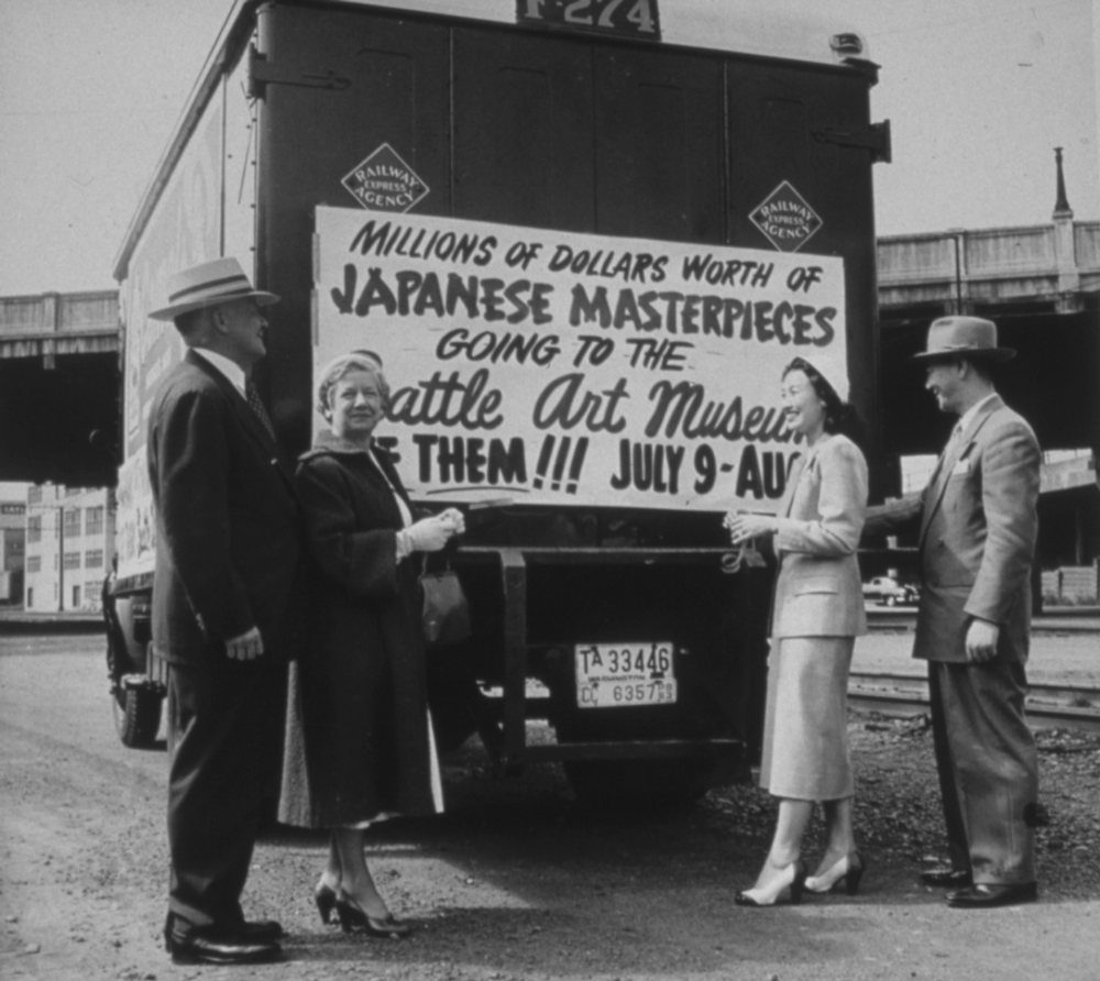
More important than its effect of raising the museum’s visibility on the local and international stages, the 1953 exhibition communicated a sense of solidarity. At a time when racist thinking toward Japanese Americans definitely lingered, the show offered a peace branch, encouraging people from diverse backgrounds to engage and enjoy Japan’s fascinating art culture.

From my perspective, that remains the hope for SAM today: to be a meeting place for people where, through thoughtfully and artfully made objects, we can learn to appreciate each other better.

—Jeffrey Carlson, SAM Collections Coordinator

Images: Basket in the shape of a boat, 20th century, Japanese, bamboo, 13 3/4 x 23 1/2 x 12 1/2 in. Seattle Art Museum, Gift of Esther Rose Fallick. Basket in the shape of a boat (detail). Letter from Sherman Lee to Fujikawa. Response from Fujikawa to Sherman Lee. Dr. Fuller with Consul Saito of Japan at the opening of the 1953 exhibition. Japanese exhibition mobile ad.

Object of the Week: Banquet Still Life

Broadly interesting human passions inspire remarkable works of art. That is why love, justice, spirituality, and food feature in so many great art collections.

Among foodie picture genres, the Dutch still life ranks at the very top, and at SAM, we have a fine example in Abraham van Beyeren’s 1653-1655 painting, titled Banquet Still Life. The picture overwhelms us with indulgence, offering up a visual feast. Working our way through the painting clockwise, starting at 12, we find: peaches, whole and sliced, red and green grapes, and a sliced fig overflowing a plooi, or pleated, silver platter; an orange and orange slice in a silver tazza, a kind of wide bowl on a stem; a small oyster and lemon wedge; a silver platter holding two pink shrimp and supporting a highly valuable, exquisitely decorated nautilus cup, tipped onto its side; a red pomegranate with a quarter section cut out, revealing its delightfully juicy seeds; a pocket watch and blue ribbon; candied orange peels in a blue and white Chinese porcelain bowl; a silver charger holding a knife, a half-peeled lemon, and a roemer, which is a German pouring vessel made of green glass, decorated with glass knobs called prunts; more bunches of red grapes; a small bread roll, with a hefty piece torn off; a roast chicken; two Venetian wine glasses half-full of white and pink adult beverages; and a silver wine ewer. Hungry much?

Banquet Still Life (detail)

Nearly lost in all the delicious foods and fine glassware and silver is a moralizing message. This is a luxurious meal that has been left abruptly, as we deduce from the half-peeled lemon, the broken bread roll, and the cornucopia of delicacies left unconsumed. At the center of the picture, the pocket watch ticks away time, reminding us that physical pleasures like this are fleeting, and that we should give our immediate attention to more substantial, lasting things. Was the artist fully convinced of that, I wonder?

The banquet still life as a genre was a product of its time, arising from a culture of display. In 17th century Holland, where marine trade brought goods and wealth into port cities like Amsterdam, newly rich Dutch citizens felt the need to show off their wealth. The term pronk—literally translated as flamboyance or ostentatiousness—describes that desire to display, to impress others. Banquet Still Life is a pronk picture if there ever was one.

Banquet Still Life (detail)

Van Beyeren and his peer painters of the foodie still life found an unlikely revival with artists of French Impressionism in the 19th century. In general, the landscape genre better suited the Impressionist goal of capturing candid moments of daily life with a sense of energy in the handling of paint. Still life had also been pushed to the margins of European art history and carried a less impressive legacy for the Impressionists to pick up on. So there are relatively few examples, but some of the Impressionists did work in still life—notably Cézanne and Manet—and they worked with the Dutch masters in mind.

Oysters by Eduoard Manet

Manet’s Oysters, on view at SAM in Intimate Impressionism from the National Gallery of Art, offers an illuminating comparison. Like van Beyeren long before him, Manet paints the shellfish and halved lemon with an eye to making them appetizing. Looser brushwork and a moody color palette show that Manet was less concerned with realistic representation and more interested in making artistic interventions.

These two schools of painting approached food from radically different perspectives: as a showy display of wealth and as a scene of private life; as a memento mori and as a celebration of the moment; as an opportunity to showcase precise skill in representation and as a chance to play with forms and paint. We can all come together around food.

—Jeffrey Carlson, SAM Collections Coordinator

IMAGES: Banquet Still Life, ca. 1653-55, Abraham van Beyeren, Dutch. ca. 1620/1621-1690, oil on canvas, 42 1/8 x 45 1/2 in. Seattle Art Museum, Samuel H. Kress Collection 64.146. Banquet Still Life (detail). Banquet Still Life (detail). Oysters, 1862, Edouard Manet, French, 1832-1883, oil on canvas, 15 7/16 x 18 7/16 in. National Gallery of Art, Gift of the Adele R. Levy Fund, Inc.

Object of the Week: Airstream Turkey

Our global culture is pretty good at making visual associations. As kids, many of us grew up pointing to the sky, calling out animals and faces suggested by the eccentric outlines of the clouds. Now, we play the meme game: How funny is Ryan Gosling if we cut him out of a movie role and paste him into all these different come-on scenarios? How well does a scrunched-up, pouty kid face express all your life’s frustrations? So funny! So well! And for me, it’s hilarious how quickly and creatively we make these connections. If a movie star or a top athlete makes a crazy face one night, there’s a trending meme of her or him the next morning.

In art, too, visual associations go a long way. They can be poignant, suggesting parallels across time and across cultures, causing us to re-think our views about the world. They can be as silly as a Ryan Gosling meme, putting a sign or symbol or person into a new context and pointing out just how important context is for how we understand these things.

Patti Warashina’s Airstream Turkey was born out of a similar, this-looks-like-that approach to digesting the huge diversity of images we experience every day, bringing together the forms of a trailer, a turkey, a bread loaf, and a chafing dish lid. Warashina applied low-fire glaze and low-fire luster to the ceramic piece, giving it the shiny metallic quality of a vintage trailer. Wings and feathers morph into streamlined horizontal details; reductive legs jut into the air like maneuverable levers. Airstream Turkey pranks us visually and playfully, thoughtfully keeping the eye engaged.

With her idea of a turkey vehicle, Warashina seems to have been onto something. Just such an avian Airstream makes a notable appearance in Tom Robbins’ 1990 postmodern novel Skinny Legs and All, in which the First Veil opens:

“It was a bright, defrosted, pussy-willow day at the onset of spring, and the newlyweds were driving cross-country in a large roast turkey.

The Turkey lay upon its back, as roast turkeys will; submissive, agreeable, volunteering its breast to the carving blade, its roly-poly legs cocked in a stiff but jaunty position, as if it might summon the gumption to spring forward onto its feet, but, of course, it had no feet, which made the suggestion seem both empty and ridiculous, and only added to the turkey’s aura of goofy vulnerability.

Despite its feetlessness, however, its pathetic podalic privation, this roast turkey—or jumbo facsimile thereof—was moving down the highway at sixty-five miles an hour…”

Today, let’s do some associations around the word “Thanksgiving”: gratefulness—smiles—family—love—warm food—mashed potatoes and gravy.

Happy (postmodern) Thanksgiving from SAM!

—Jeffrey Carlson, SAM Collections Coordinator

IMAGE: Airstream Turkey, ca. 1969, Patti Warashina, American, 1940- , earthenware with low-fire glaze and low-fire luster, 9 1/2 x 9 1/2 in. Seattle Art Museum, Gift of Anne and Sidney Gerber, 94.86, © Patti Warashina.

Object of the Week: The Doge’s Palace and the Grand Canal, Venice

The unique collection we have at SAM largely reflects the specific art interests of a series of generous donors. Much of the museum’s African and Modern art, for example, came as transformational gifts, adding prominent facets to the identity of the collection. The European paintings at SAM offer more great stories of generosity and collecting passions.

the-doges-palace-and-the-grand-canal-venice-letter

The Doge’s Palace and the Grand Canal, Venice, a fabulous Venetian view painting by Luca Carlevariis (1663-1729), was purchased for SAM with funds from one local art patron, Floyd A. Naramore. In a letter dated January 6, 1951, Mr. Naramore writes to SAM director Richard Fuller that the painting is “given as an expression of my appreciation of what you and your mother have done for the city of Seattle and the lovers of art and also as a means of expressing my own interest in art and the museum.” In the letter, Mr. Naramore mentions a gift of $500—the final installment in a total payment of $1,800 to David M. Koetser Gallery, New York. The market for Carlevariis paintings has changed quite a bit in the last 60 years: In 2011 a similar view by Carlevariis, of a comparable size, sold at a Christie’s auction for just over $4 million!

The artist was a kind of ambassador for Venice in his art. Born in the small town of Udine in 1663, Luca Carlevariis moved to Venice in 1679 and there found a city that truly inspired him. He produced etchings and paintings that focused on the then-and-now touristy spots near Piazza San Marco. His vedute, or view paintings, became popular as souvenirs for Northern Europeans visiting Venice as part of their cultural education. This 18th-century phenomenon, known as the Grand Tour, brought Carlevariis a steady supply of patrons who would purchase his works like we (or our parents) would a postcard. Carlevariis was one of the earliest painters of Venetian vedute, although the later Canaletto is the name most popularly associated with them.

SAM has an insightful webpage on The Doge’s Palace and the Grand Canal, Venice that points out several monuments included in the view, such as the Lion of St. Mark, the basilica of Santa Maria della Salute, the Biblioteca Marciana, and of course, the Doge’s Palace. Also featured on the page is an introduction to the fascinating world of the Grand Tour.

When The Doge’s Palace and the Grand Canal, Venice entered SAM’s collection, in 1950, it marked the beginning of an especially important decade for the growth for the European paintings collection. The relationship the museum developed with the Kress Foundation was central to that growth.

the-doges-palace-and-the-grand-canal-venice-kress-collection

Samuel H. Kress (1863-1955) built a family fortune in retail by founding a five-and-dime store and building it into a national chain. An art lover, Kress began to seriously collect Italian paintings in the 1920s, and also became devoted to philanthropy. The Kress Foundation, as part of its mission to help small art collections during the hard economic times surrounding the Great Depression, developed something called the Regional Galleries program that served the Foundation’s desire to get the whole Kress Collection on view and would also disperse the artworks democratically around the country. SAM was chosen as one of the 18 regional museums to receive paintings from the Kress Foundation. In the 1954 photo above, Dr. Fuller plays curator and arranges an installation of the Kress paintings at SAM’s Volunteer Park building. Behind him, you’ll spot another Venetian veduta that graces SAM’s collection, Bacino di San Marco, attributed to the Workshop of Canaletto.

—Jeffrey Carlson, SAM Collections Coordinator

Images: The Doge’s Palace and the Grand Canal, Venice, ca. 1710, Luca Carlevariis, Italian, Venice, 1663-1729, oil on canvas, 37 3/4 x 75 3/4 in., Seattle Art Museum, Gift of Floyd A. Naramore, 50.70. A letter from Floyd A. Naramore to SAM, 1951. Dr. Richard Fuller with the Samuel H. Kress collection, 1954.

Object of the Week: Mask with ear spools

Some 1500 years ago in the holy city of Teotihuacan in Mexico —“the place where the gods were created”—this small mask was formed from a mold, enlivened with a strong and spiritual presence that remains in it today. One has to see the piece in person to feel and experience the weight of history that it carries. The natural patina that has changed the color of the ceramic material to a range of earth tones gives the mask an aura of importance. It presented a very different face in its days of use in the Teotihuacan culture.

Picture this same intense figure in bright red and white paint, now part of a larger sculpture group decorated with hatching patterns, discs, mystical eyes, and spirals, with plumes of fragrant smoke rising above him and moving toward you. Masks from Teotihuacan were often decorated with pigments, and small traces of red remain on the hair of SAM’s Mask with ear spools. Experts think it was probably part of a large incensario, or incense-burner. From those early days of the mask’s history, it has entered a new chapter, where it engages visitors to our small but awesome Meso-American gallery, joined by Peruvian ceramics, Aztec stone figures, gold, and jade.

The mask was found near Azcapotzalco, an area in the northwest part of Mexico City. It was purchased in 1949 from Earl Stendahl of Stendahl Art Galleries, an important dealer in Los Angeles first known for bringing Modern art to the West Coast and for representing the California Impressionists. Later, Stendahl turned to Pre-Columbian art, and it was this area that became the gallery’s specialty. The mask entered SAM’s collection in early 1950.

The face in Mask with ear spools is staring us down. He occupies a space between art that creates the illusion of life and art that symbolizes life, using a form of representation based on line and shape. The large ear spools are symmetrical discs with perfectly rounded orbs at their centers. The band of hair has precise, vertical lines all the way across it, like a flexible ruler taped to this man’s forehead. The eyes are rendered as thin almond slivers, whose shape is echoed in the arching lines of the eyelids and brow. A prominent nose, again perfectly symmetrical, with curvy, thickset lips below it, and a strong, angular jaw complete his look.

From the 2nd century B.C.–7th c. A.D. Teotihuacan, his place of origin, was an important Mexican city—at its height, the sixth-largest city in the world, and a political, cultural, and religious center. The drama of the city’s story relates not only to its riches but also its fast decline and almost total disappearance. We’re grateful to have a piece of that fascinating story here at SAM!

Jeffrey Carlson, SAM Collections Coordinator

IMAGE: Mask with ear spools, Mexican, Teotihuacan, ca. 100-600, 4 7/8 x 7 1/4 x 2 in., Eugene Fuller Memorial Collection, 50.32.

Object of the Week: The Origin of the Cornucopia

In SAM’s large oil painting by Flemish artist Abraham Janssens, The Origin of the Cornucopia (ca. 1619), one of three figures in the foreground grasps the stem of a round, ridged, colorful squash. The picture honors the harvest, abundance, and most importantly today—the day before Halloween—the pumpkin.

The Origin of the Cornucopia

Pumpkins are totally trending. Fall is the pumpkin’s moment, when it takes over as the most visible symbol of an entire season. It’s a rare food or drink establishment that doesn’t have pumpkin on its menu this time of year. On my last trip to get an oil change, the service center was advertising pumpkin spice motor oil. It’s abundant, and it’s no johnny-come-lately, either. The pumpkin, scientific name Cucurbita pepo, has been growing in North America for roughly 5,000 years and is indigenous to the Western hemisphere. Our name for it has been around since the late 17th century, coming from the French pompon and traceable back to the Greek pepōn, meaning “large melon.”

Like the pumpkin, which sometimes stands in for the whole season, Janssens’ Origin of the Cornucopia was likely painted as an allegory of fall. The specific scene relates to one of Hercules’ battles in Greek mythology. During a victory over a river god who has taken the form of a bull, Hercules tears off one of the bull’s horns. River nymphs take up the horn and fill it with a variety of fruits and vegetables. In Ovid’s Metamorphoses, the defeated river god, Achelous, sings: “My Naiads filled it full of fragrant flowers/And fruits, and hallowed it. From my horn now/Good Plenty finds her wealth and riches flow.” These poetic lines offer a fitting caption for the scene in front of us, where visual riches are bountiful.

The Origin of the Cornucopia

In the Janssens painting, three massive figures—the Naiads, or water nymphs—gather delectable fruit and vegetables with which to stuff their “horn of plenty,” choosing from cauliflower, grapes, figs, artichokes, and the squash, all painted by the artist in great detail. The figures on the right and left lounge on vessels gushing out water—a reference to their roles in mythology and to water’s importance in the harvest. Every element up to the crowns of wheat suggests health and growth. In the past, the painting has been dated to as early as 1609, but it’s now put at about 1619. Either way, it marks one of the earliest depictions of the origins of the cornucopia.

The Origin of the Cornucopia

The Origin of the Cornucopia hangs on the wall of our fourth floor galleries devoted to classical European art. It has played an important role in SAM’s relatively small European collection since its acquisition in the summer of 1972, when it was given to the museum as a 75th birthday present to our founding director, Richard E. Fuller. Before its time at SAM and the gallery from which the museum acquired it, the painting is said to have lived in a French provincial castle. I imagine it hanging over a dinner table, every inch of it covered with an autumn feast.

–Jeffrey Carlson, Collections Coordinator

Image: The Origin of the Cornucopia, ca. 1619, Abraham Janssens, Flemish, Antwerp, ca. 1575-1632, oil on canvas, 43 3/4 x 68 1/16 in., Seattle Art Museum, PONCHO in honor of Dr. Richard E. Fuller’s 75th Birthday.

Object of the Week: Lion Stool

There is an old Asante saying, “Only the lion drinks from the palm-wine pot of the leopard.”

The phrase has a lot of charm for those who come to it unaware of the story and significance behind it. You might tuck it away for a moment when you want to say something with gravity to make everyone around you feel impressed and a bit confused.

And then it also holds wisdom for us when we become one of the initiated. During the 20th century in Ghana, lions overtook leopards as the main symbol of strength and leadership. They had overtaking to do because lions aren’t native to Ghana; they seem to have appeared, with many other alien things, during the Colonial era. Before lions were known in the region, the leopard garnered similar respect, filling a symbolic role and signifying strength, power, and importance. The old king was ousted when a stronger one arrived. Even the leopard became submissive to the lion, allowing him to lap at the proverbial palm-wine pot.

The lessons are there for all of us. No matter how high we rise, there’s likely someone higher. Leaders shouldn’t be too comfortable. There’s another one ready to take their place.

Lions commad respect.

SAM’s Ghanaian Lion Stool (after 1957) gives a visual form to the lion’s rise to power in the country where it was made. In the painted wood sculpture, the lion forms the base, imparting authority to whoever would sit there.

The stool is an intriguing combination of foreign and native parts. The lion, an outsider, is joined to the stool, an entrenched, deeply significant part of Asante culture. For the Asante, the stool is the primary vehicle for communicating the idea of leadership. Bright yellow and silver enamel paint gives the stool an eye-catching presence. A key, an object that here and all over the world represents access, hangs on the side of the lion, where it adds to the impression of power and wealth. The stool isn’t something that strikes me as characteristically African in aesthetic, and that is another indication that its meaning is more global, and more accessible, than we first imagine.

This is one of art’s great gifts: To connect us with people and places, times and traditions that would otherwise remain totally unfamiliar and inaccessible to us. On display in SAM’s 4th-floor galleries, the Ghanaian Lion Stool confronts most of its viewers with something unfamiliar, but it rewards those who care enough to investigate.

—Jeffrey Carlson, SAM Collections Coordinator

Images
1. Ghanaian, Lion Stool, after 1957, wood, paint, 16 9/16 x 20 13/16 x 11 7/8 in. Gift of Katherine White and the Boeing Company, 81.17.545.
2. Lions command respect.

Object of the Week: Blanket Stories: Three Sisters, Four Pelts, Sky Woman, Cousin Rose, and All My Relations

Why do we say stories are woven?

They are built from many parts that only convey our meaning when arranged just so. A story is like a blanket—another woven object—with its threads arranged precisely for bodily comfort and visual delight. In Blanket Stories: Three Sisters, Four Pelts, Sky Woman, Cousin Rose, and All My Relations, artist Marie Watt has woven together the stories of a wide range of people in an impressive, inviting stack of blankets. For Watt, a daughter of the Turtle Clan of the Seneca Nation, Native culture provides a source of inspiration for community-focused works like this one.

Blankets strike emotional chords within many of us. For most everyone, the sight of a blanket brings on the thought of a story, and then its telling. On Indigenous Peoples’ Day, here’s a sampling of some visitor revelations inspired by Marie Watt’s Blanket Stories:

“The rough wool blankets remind me of bundling up on sea voyages to ward off the bitter, crisp chill of the Baltic Sea. It was the blanket that could save your life and keep you from hyperthermia for an extra 30 minutes in hopes of rescue. For me however, it brought me closer to my ancestry of fisherman clans and an ocean women that sometimes feels so far away for an immigrant raised on foreign shore. —CVF”

“When I see these blankets it fills my mind with memories of my mother and grandmother. Making forts with the blankets and being sick and feeling them against my face. —Mariel Grumby, 2007”

“One of the wool blankets reminds me of an old army blanket belonging to my dad. I loved the weight of the blanket, despite its scratchy surface. It provided warmth and smiles and a sense of security—all the wonderful characteristics of my father. —J. Mainer, 10-8-2007”

“When I was about 7 or 8 years old, I lost my baby blanket on a family vacation to Disneyland. It remains on of the most traumatic experiences of my childhood. –KB”

“When I see this stack of blankets, I have an overwhelming compulsion to charge it, like a bull to a matador. I imagine that when I make contact I will scream, ‘Yeeeeeaarrrgh!’ and throw my arms upward like the wings of a triumphant war bird, flinging blankets in all directions and giving the surrounding land a fuzzy-warm feeling. Sincerely, The Unknown Guard”

“I live in New York City, and one day found a homeless woman in front of my house…with nothing to protect her from the elements. I went upstairs and got a blanket off my bed and gave it to her. I sometimes wonder what ever happened to that blanket. I loved it.”

“Every blanket looks important. I’d like to unfold each one and snuggle with it a little. I have my blankie, which was given to me at birth, by my parents 22 years ago. Recently, my grandma asked me how much longer I expect to carry it around with me. Without hesitation, I answered ‘forever.’ —CM & TM”

Jeffrey Carlson, SAM Collections Coordinator

IMAGE: Blanket Stories: Three Sisters, Four Pelts, Sky Woman, Cousin Rose, and All My Relations, 2007, Marie Watt, American, born 1967, wool blankets, satin binding, with salvaged industrial yellow cedar timber base, 150 x 40 x 40 in. Seattle Art Museum, General Acquisition Fund, in honor of the Seattle Art Museum © Marie Watt.

Object of the Week: Gui

Imagine cooking up some morning oatmeal over the stove, and then using a ladle to serve it up from this 13th-century B.C. Chinese food vessel. Culture swag.

The form of the vessel is known as a gui, and it was developed in the Shang period (which lasted from roughly 1600 to about 1100 B.C.). At this time in Chinese history, the invention of bronze casting precipitated a higher level of artistry than was possible before, with materials like clay, stone, and wood. The strength of bronze meant it had great versatility in terms of its shape and also held great possibility for decoration. Structural integrity became less of a concern, so the makers focused more on aesthetics. The precision of line and extravagant detail available to artisans when working in bronze encouraged the experimentation and advancement that leaves us with stunning examples like SAM’s gui, on view at the Asian Art Museum.

The decorative scheme, covering the entire surface of the vessel, is repeated on both sides of the bowl. Abstract patterns and beast-like figures meld together and create an impressive total visual effect. The ornament breaks down into three registers: the lip, the foot, and the main, central register. The spiral designs we see used all over the vessel as filler ornament are known as leiwen. The upper register features pairs of beasts known as kui dragons that face a pretty intimidating head in the middle. The central register features a creature known as a taotie—a widely used and important design element for the period. The flange right in the middle forms a kind of nose or beak; the eyes are about halfway up the register and equidistant from the flange on either side; scythe-like horns rise up on either side. This and the other beast-like creatures in the upper and lower registers show a remarkable vision that blends representation and design. The ram heads that crown the handles show how both can play into function, too.

Gui (detail)

The scheme is perfectly symmetric—a mirror image on either side—which makes it especially interesting that the maker formed it from a ceramic piece, (mold composed of three parts). Like most bronze vessels of the early Bronze Age in China, the gui was designed for serving food in the rituals of the aristocracy. Today we can’t make use of its function, but we can definitely still admire its craftsmanship. Gorge with your eyes!

Jeffrey Carlson, SAM Collections Coordinator

IMAGE: Gui (vessel for serving grain), Chinese, 13th c. B.C., bronze, 5 3/8 x 10 3/4 x 7 in. Seattle Art Museum, Margaret E. Fuller Purchase Fund, 56.34.

Object of the Week: Fishing Boats at Étretat

There’s nothing like a good rivalry to spice up a moment in history. I’d say it’s a rare historical note that isn’t improved by some verbal sparring or a gauntlet being thrown. Happily for us, the European Impressionists not only created a remarkable group of paintings, but also produced a natural rivalry in Edouard Manet (1832-1883) and Claude Monet (1840-1926). Manet was a leading influence in the years before Impressionism flowered, and when it did, Monet took the torch from him, becoming the new movement’s unquestioned leader.

In John Rewald’s History of Impressionism, we read about Manet’s first encounter with the younger Monet. The scene is the Paris Salon exhibition of 1865:

The two canvases shown by Monet were views of the Seine estuary, done near the lighthouse of Honfleur. Since the works at the Salon were now hung in alphabetical order to prevent favoritism, Monet’s works found themselves in the same room with Manet’s. When the latter entered this room on the opening day, he had the disagreeable surprise of being congratulated by several persons upon his seascapes. Having studied the signatures on the two pictures attributed to him, Manet at first thought it to be some cheap joke; his anger was conceivably not lessened by the fact that the seascapes continued to have more success than his own works. He left in a rage and openly complained to some friends: ‘I am being complimented only on a painting that is not by me. One would think this to be a mystification.’

Although in time Monet and Manet grew to be friendly artist-peers, sometimes painting together outdoors, such was Manet’s frustration at the Salon that he refused his first chance to meet Monet. “Who is this rascal who pastiches my painting so basely?” spouted Manet, in a masterful artist burn.

Oysters by Edouard Manet

“Oysters” by Edouard Manet, 1862.

Argenteuil by Claude Monet

“Argenteuil” by Claude Monet, ca. 1872.

The two names were often confused in those years of Monet’s ascension and are sometimes still confused today, even with 150 years of distance. Comparisons were always inevitable, given the similarity of their names. It’s a great chance for some amusement, too. A famous caricaturist in 19th century Paris, Andre Gill, sketched a figure painting by Monet and attached the caption “Monet ou Manet?—Monet. Mais, c’est a Manet que nous devons ce Monet; bravo, Monet; merci, Manet.” (“Monet or Manet?—Monet. But it is to Manet we owe this Monet. Bravo, Monet; Merci, Manet.”) Cartoons over the years have picked up on the joke and taken it a number of directions. One of my favorite renditions is this Harry Bliss cartoon, originally published in The New Yorker (and for the record, it was Manet).

Comic "I said, was it Manet or Monet who had syphilis?"

Not only for the syphilis, fate was pretty cruel to Manet: Here’s an artist who cared deeply about being recognized and accepted, who continually submitted paintings to the Salon in search of official stamps of approval—and he was frequently confused with, or overshadowed by, a younger artist who ends up leading the Impressionist movement and becoming one of the most popular artists of all time. And the two were only separated by one letter!

Today, being so far removed from the historical moment makes it easier for us to appreciate Manet’s work on its own, and his contributions to art and painting are widely recognized. Here at the Seattle Art Museum, we also love Monet: our permanent collection features the beautiful harbor scene Fishing Boats at Étretat. So we all arrived at a happy ending. But, just because those rivalries are so much fun, here’s one more spat from Impressionist lore.

On one occasion, Manet went to Argenteuil and set up to paint the Monet family—the artist, his wife, Camille, and his son, Jean—in their garden (this painting is The Monet Family in Their Garden at Argenteuil, owned by the Metropolitan Museum of Art). Colin Bailey, a scholar of French painting and director of the Morgan Library and Museum, recounts what happened next: “While Manet was at work, Renoir arrived, borrowed paints, brushes, and a canvas from Monet, and executed a vivid close-up of Camille and Jean, joined by the rooster. Irritated by Renoir’s intrusion, Manet is reported to have told Monet, ‘He has no talent, that boy. Since he’s your friend, you should tell him to give up painting!’”

Madame Monet and Her Son by Auguste Renior

“Madame Monet and Her Son” by Auguste Renior, 1874.

Come tour our brand new exhibition Intimate Impressionism from the National Gallery of Art to see Renoir’s painting of that day in the garden—and judge his talents for yourself! And don’t miss a related SAM Talks event this month with Colin Bailey and SAM’s own director, Kimerly Rorschach. —Jeffrey Carlson, SAM Collections Coordinator

References Bailey, Colin. “The Floating Studio.” The New York Review of Books, April 23, 2015. Rewald, John. The History of Impressionism, 4th revised edition. New York: New York Graphic Society, 1973.
Images: Fishing Boats at Étretat, 1885, Claude Monet, French, 1840-1926, oil on canvas, 29 x 36 in. Partial and promised gift of an anonymous donor, 92.88. Oysters, 1862, Edouard Manet, French, 1832-1883, oil on canvas, 15 7/16 x 18 7/16 in., National Gallery of Art, Washington, DC, Gift of the Adele R. Levy Fund, Inc. Argenteuil, ca. 1872, Claude Monet, French, 1840-1926, oil on canvas, 19 13/16 x 25 11/16 in., National Gallery of Art, Washington, DC, Ailsa Mellon Bruce Collection Cartoon by Harry Bliss, © Condé Nast Collection. Madame Monet and Her Son, 1874, Auguste Renoir, French, 1841-1919, oil on canvas, 19 13/16 x 26 3/4 in., National Gallery of Art, Washington, DC, Ailsa Mellon Bruce Collection

Object of the Week: The Poem of Ariwara no Narihira (Ariwara no Narihira Ason)

Unheard of
even in the legendary age
of the awesome gods:
Tatsuta River in scarlet
and the water flowing under it.

(Poem by 9th-century poet Ariwara no Narihira; translation by Joshua Mostow, from Pictures of the Heart: The Hyakuni Isshu, in Word and Image).

We’re welcoming the first week of fall here in Seattle. The Autumnal Equinox—when night and day are nearly the same in length, and summer officially gives way to fall—took place Wednesday, September 23. Most people won’t be checking their calendars for that date, but instead will know the change by the fresh chill in the air and the striking color contrasts we start to see in nature. It’s my favorite season for the beauty and the change visible all around us.

There are plenty of reasons to celebrate fall. Long before the term “fall” was coined, and also before the French-derived “autumn” entered the vernacular, the same season was known simply as “harvest.” It meant a time of reaping, gathering, enjoying abundance, and cozying up for winter.

The collection at Seattle Art Museum includes a memorable homage to fall: a print work by Japanese artist Katsushika Hokusai (1760-1849). One of the most important producers of ukiyo-e, a grouping of woodblock prints from Japan’s Edo period (1615-1868), Hokusai is represented by 27 works at SAM, including prints and ink drawings on paper and silk. Through the aesthetic in his work, Hokusai became an important influence on the European Impressionists. Seattleites and our visitors will have the opportunity to see many of the best of the Impressionists in the upcoming exhibition, Intimate Impressionism from the National Gallery of Art, opening October 1.

Hokusai’s tribute to fall, The Poem of Ariwara no Narihira (Ariwara no Narihira Ason), gives visual form to the poem at the top of this post. There’s a lot happening in the print. Blue-green hills set a backdrop in the distance while auburn leaves rise above them. The color contrasts that we identify with fall are beautifully visualized here. Closer to us, several pairs of figures are bustling about—active, but also joyful in their work. Beaming smiles match the visual warmth of the scene. A flowing river cuts across the landscape with an infectious life and energy, carrying a bunch of colorful maple leaves with it. Both the print and the poem that inspired it capture the sense of mystery and magic surrounding the cycle of the seasons. It’s a phenomenon beyond our control that informs everything—how we work, play, dress, and live.

Jeffrey Carlson, SAM Collections Coordinator

To learn more about this artwork and other treasures in SAM’s collection, visit our website.

IMAGE: The Poem of Ariwara no Narihira (Ariwara no Narihira Ason), ca. 1838, Katsushika Hokusai, Japanese, 1760-1849, woodblock print: ink and color on paper, 10 1/4 x 14 3/4 in., Gift of Mary and Allan Kollar, in honor of the 75th Anniversary of the Seattle Art Museum, 2010.47.5.

Object of the week: Pomponne II de Bellièvre

Did you know that in the 1930s the Mona Lisa hung in the halls of the newly opened Seattle Art Museum in Volunteer Park on Capitol Hill? And that it was joined by other European masterworks from the Louvre, the Uffizi, and other renowned collections?

They were all here. Or rather, editions of the originals were here. SAM’s founding director Richard E. Fuller initially devoted some of the museum’s gallery space—which was at a premium—to a display of faithful facsimiles of European Old Master paintings. Showing replicas alongside originals might seem problematic or just plain tacky to us today, but we can’t say his choice wasn’t a practical one. Collecting European paintings was never a priority for Fuller, and the costs for these kinds of historical works were often above his budget. Still, Fuller understood the importance of this chapter in the history of art-making. Even while he and his mother, Margaret MacTavish Fuller, were building the museum’s collection by selecting Asian art objects and patronizing local painters, Fuller couldn’t imagine telling a story of art history without the Old Masters.

Asian Art Museum in the 1930s

About 100 years before Fuller was hanging his facsimiles, American painter Samuel Morse (1791-1872) was considering the same issue. Morse’s first profession was painter; he would later become the inventor of the electromagnetic telegraph, immortalized in the term “Morse” code. Like Richard Fuller, Morse was deeply interested in connecting the art of the European masters with America’s present and future cultural production. How to bring the best of European painting to America, so that our local artists might learn and grow from its examples? Using the skills and technology available to him, Morse began a monumental painting that would feature dozens of Old Master artworks in miniature, for the instruction and reference of his fellow American painters.

Gallery of the Louvre by Samuel F. B. Morse

Morse worked on what would become his masterpiece, Gallery of the Louvre, between 1831-1833, in both Paris and New York. The painting depicts the Salon Carré, a prominent gallery in the Louvre. The artwork has an impressive scale, at roughly six by nine feet. Within Morse’s “gallery picture,” one can spot references to important artists such as Titian, Veronese, Caravaggio, Rubens, and Watteau. A portrait by Anthony van Dyck, much like the SAM’s own Pomponne II de Bellièvre, is prominently featured. See if you can spot Leonardo da Vinci’s Mona Lisa.

Thanks to a traveling exhibition organized by the Terra Foundation for American Art—the proud owner of Gallery of the Louvre—this significant historical painting is now on display at SAM in Samuel F. B. Morse’s Gallery of the Louvre and the Art of Invention. To view this massive work is to see and appreciate Morse’s skillful execution and his faithful attention to the like-minded artists who came before him. Come see and enjoy!

—Jeffrey Carlson, SAM Collections Coordinator

IMAGES: Pomponne II de Bellièvre, 1638-39, Anthony van Dyck, Flemish, 1599-1641, oil on canvas, 54 x 43 1/2 in., Purchased with a major grant from an anonymous donor; additional funds provided by Louise Raymond Owens; Norman and Amelia Davis; Oliver T. and Carol Erickson; Seattle Art Museum Guild; Pauline Ederer Bolster and Arthur F. Ederer in memory of their sister, Milli Ederer Kastner; Mr. and Mrs. James D. Burns; gift in memory of Andrew Price by Mrs. Mary Price and their family; bequest of Mr. and Mrs. Archibald Stewart Downey; bequest of Charles Moseley Clark; Max R. Schweitzer; gift of Mr. and Mrs. Douglas Stimson, Thomas D. Stimson Memorial Collection; Eugene Fuller Memorial Collection; Silver Anniversary Fund; Margaret E. Fuller Purchase Fund; Seattle Art Museum Purchase Fund by exchange, 98.15. Photo: Seattle Art Museum Archives. Gallery of the Louvre, 1831–33, Samuel F. B. Morse, American, 1791–1872, oil on canvas, 73 3/4 x 108 in., Terra Foundation for American Art, Daniel J. Terra Collection, 1992.51. Photography © Terra Foundation for American Art, Chicago.

Object of the Week: Amor Caritas

One of the many wonderful qualities of visual art is its ability to lead people forward in response to tragedy. Amor Caritas, a bronze relief sculpture at SAM by Augustus Saint-Gaudens (1848-1907), was meant to serve just that purpose.

Saint-Gaudens was born in Dublin, Ireland, and immigrated to the U.S. with his family when he was just seven months old. He lived through the divisive years in America leading up to the Civil War and the catastrophic war at a formative time in his life. While his experience of the Civil War left a lasting mark on his art, its effects didn’t surface in the way one might expect.

Amor Caritas detail

Saint-Gaudens contributed to the American Renaissance, a broad movement that flourished in the decades following the Civil War that inspired not just art and architecture, but also politics and finance. The visual artists of the American Renaissance looked to the iconic examples of ancient Greece and Rome for inspiration, aiming to express an equally grand vision for America and its culture. The foundation of their art was a firm belief that art could inspire healing and progress.

In the figure of Amor Caritas—a composition that Saint-Gaudens returned to multiple times and that earned him international recognition—the artist felt that he had achieved a perfect female form, and that was essential to his purpose. Feminine beauty here personifies our human capacity for amor (love) and caritas (charity). Physical beauty provides a visual form for these lofty, encouraging sentiments.

Amor Caritas detail

I find it very telling that in a private letter, Saint-Gaudens wondered about titling the sculpture “Peace on Earth” or “to know is to forgive.” For the artist, each of these themes was equally present in the idealized human form. As today marks fourteen years since the terrorist attacks on September 11, 2001, we can appreciate the artist’s positive response to a tragedy of his day, and the call this sculpture gives for us, as people, to move forward in a spirit of love, togetherness, and forgiveness.

—Jeffrey Carlson, SAM Collections Coordinator

Amor Caritas, modeled 1898, cast probably 1898, Augustus Saint-Gaudens, bronze, lost wax cast, bronze: 39 7/8 x 4 1/2 in., frame: 52 x 32 x 6 3/8 in., Gift of Ann and Tom Barwick, the General Acquisition Endowment, the Gates Foundation Endowment, the Utley Endowment, the American Art Endowment, and the 19th Century Paintings Fund, in honor of the 75th Anniversary of the Seattle Art Museum, 2006.4.
SAMBlog