Object of the Week: Dawn Shapes
Organized by artists in an empty storefront on East 9th Street, the now-iconic 1951 Ninth Street Show was “a boisterous call for attention by a new generation,” and marked a formal announcement of Abstract Expressionism.1 Despite initial discussion about whether the inclusion of women would negatively impact the exhibition’s reception, Helen Frankenthaler was one of eleven women (and sixty-one men) who participated in the watershed presentation. At 22 years old, she was also the youngest.
Considered the progenitor of Color Field painting, Frankenthaler’s process involved “diluting her paints to the fine consistency of watercolors, she applied the liquid to unprimed canvas, laid on the floor, so that it soaked through in broadly spreading stains, creating opalescent veils of color, bright yet soft, not quite like anything seen before.”2
This technique was acknowledged by many of her fellow artists and art critics as a revelation.
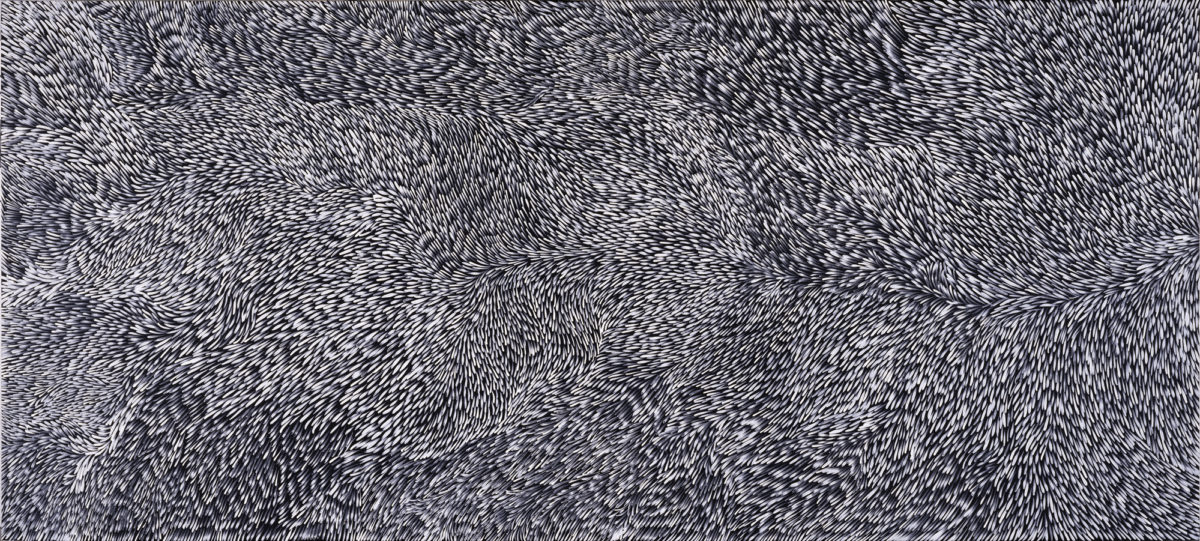
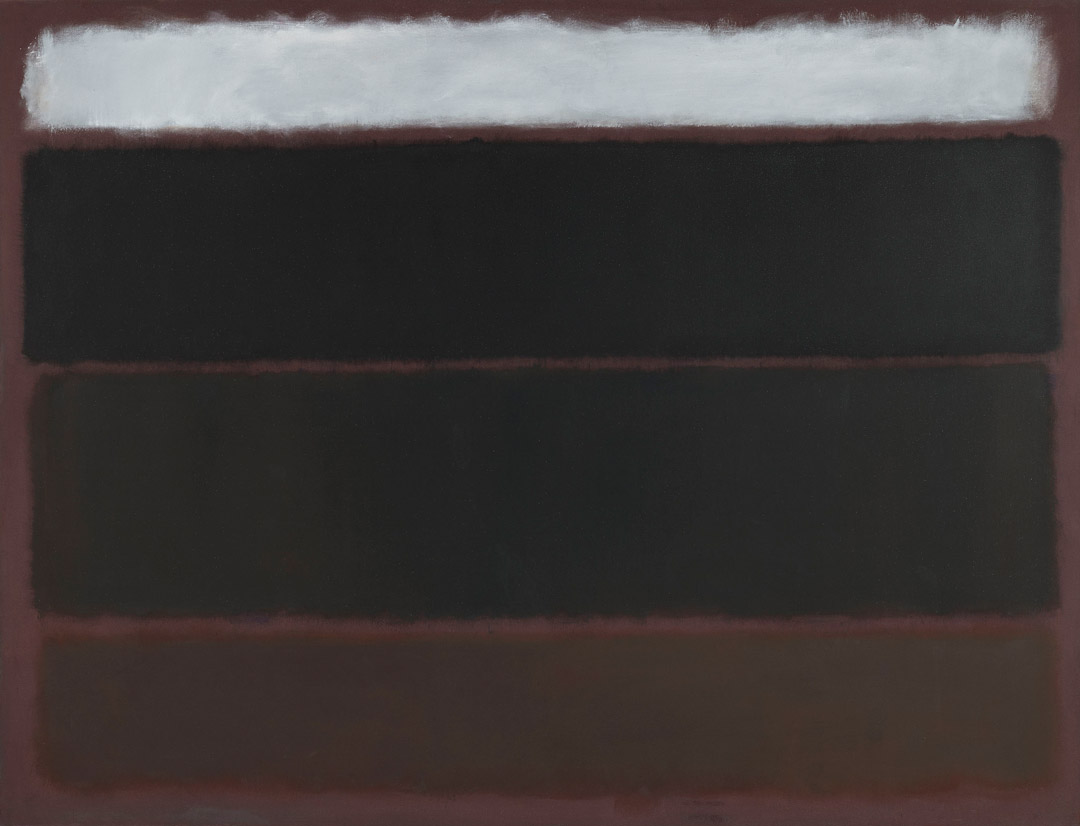
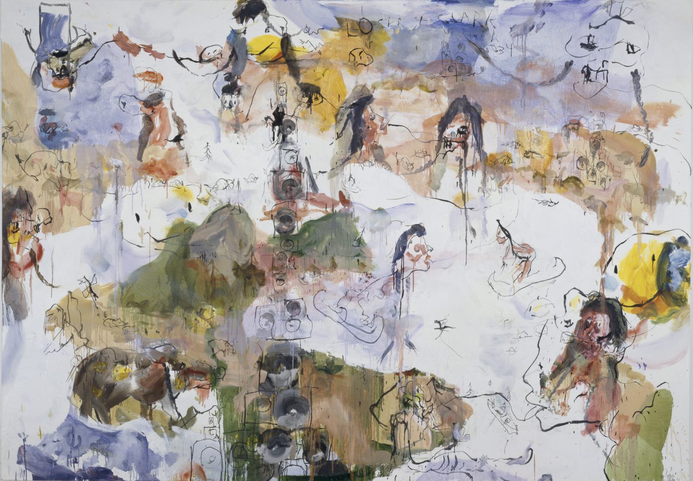
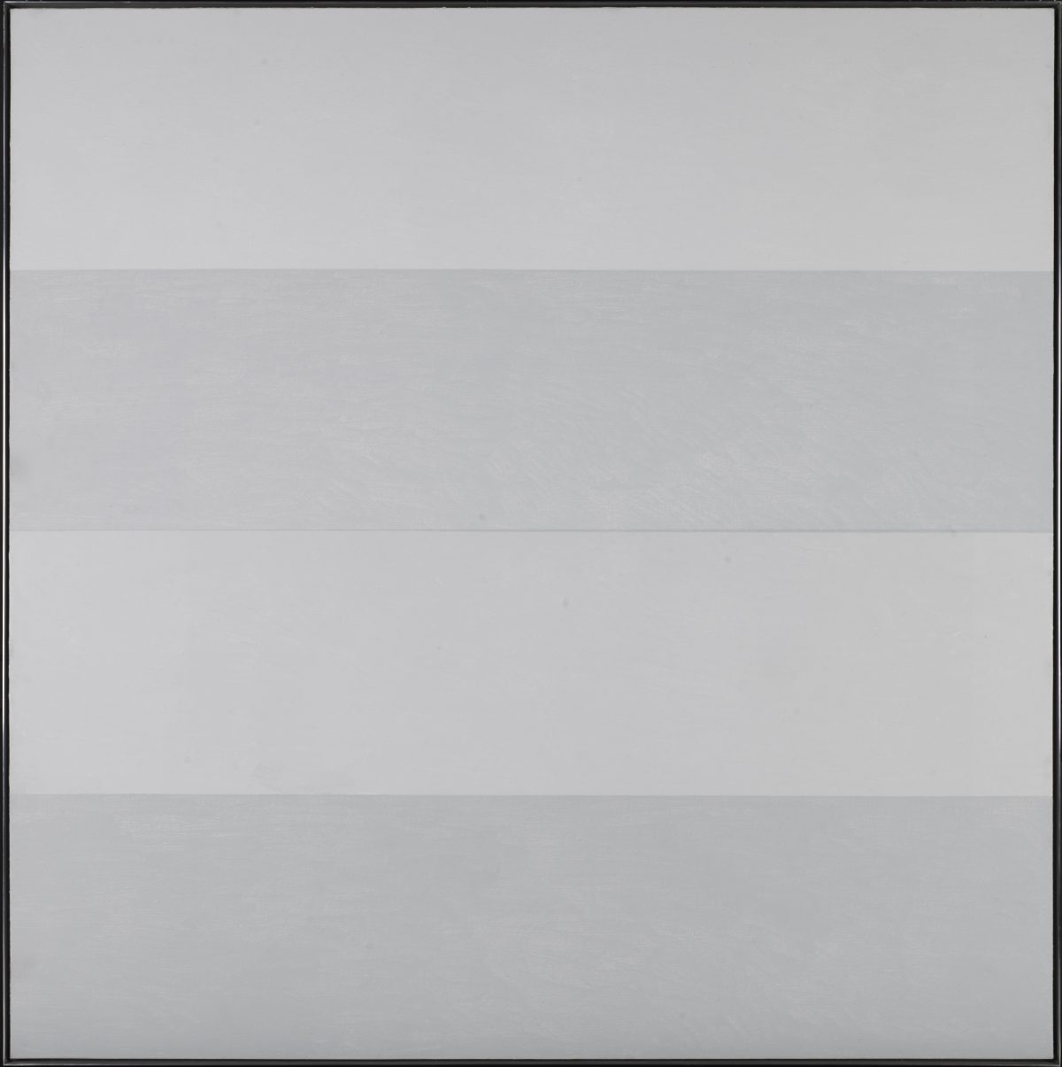
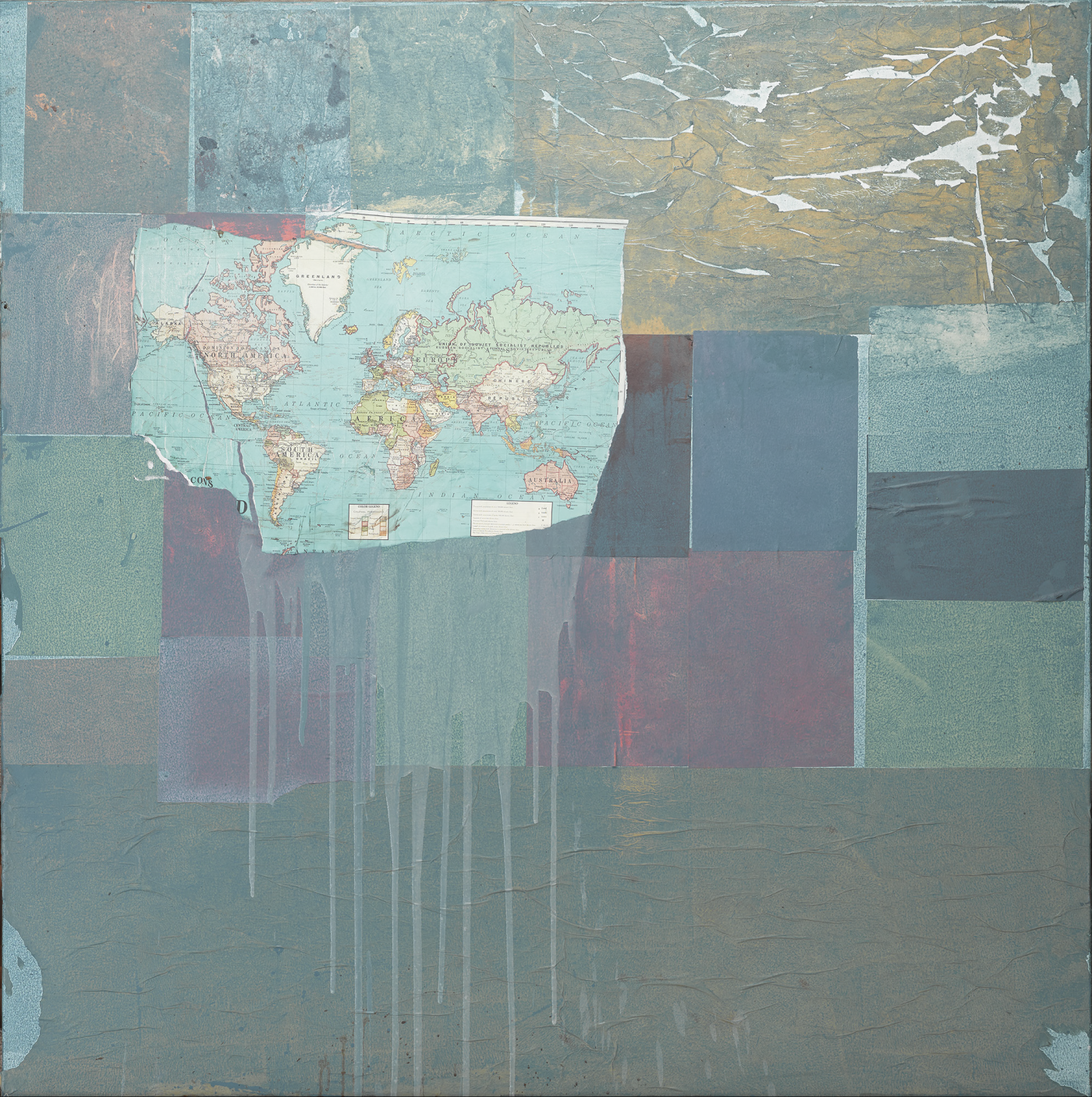
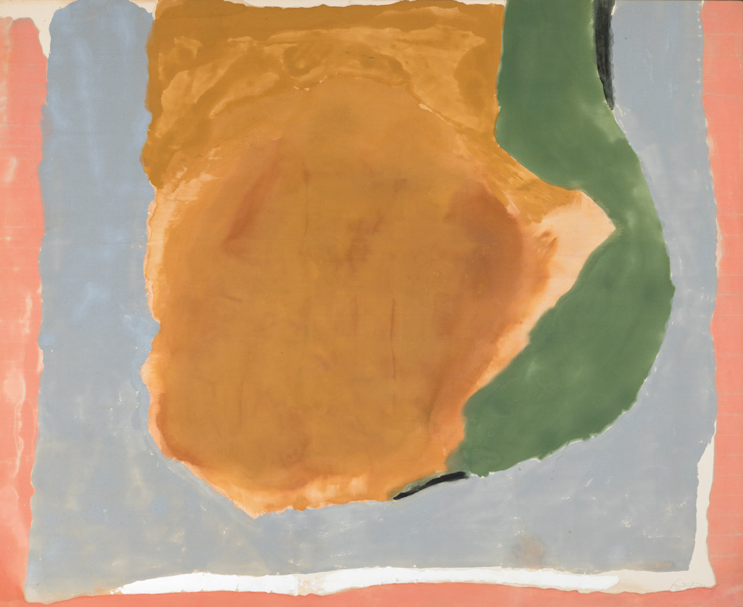
Painted in 1967, close to twenty years after the Ninth Street Show, Dawn Shapes is a large-scale exemplar of her pioneering soak stain technique. Currently on view in Frisson: The Richard E. Lang and Jane Lang Davis Collection, the painting is also given scholarly treatment by Elizabeth A. T. Smith in the accompanying catalogue:
Of foremost significance in Dawn Shapes is how Frankenthaler configured and manipulated the predominant area of ochre at the painting’s center. Here, she achieved a nuance range of yellow and more earthen hues—from dark mustard to dusky orange to peach—applied through a combination of pouring and brushwork to enhance the subtlety of the variations in density and tone. The resulting form, while emphatic, lacks clear definition, evoking various possible associations, from the mutable conditions of visibility at dawn to the gathering of storm clouds and the emergence of sunbeams peeking around and through them. This suggested condition of indistinctness gave rise to the title she ultimately chose for the work.3
As penned in a Museum of Modern Art press release for a 1989 retrospective of her paintings, “All of Frankenthaler’s works suggest a kind of place. Some call on the experiences of her travels within this country and in Europe; others of her living and working in New York City, Connecticut, and Cape Cod. Her titles evoke places of personal and artistic interest as well: natural, religious, mythological, and imaginary. For the artist, the physical painting in itself becomes a place, an environment into which we look.”4 Indeed, painted during a highly productive time in her career, Dawn Shapes exemplifies Frankenthaler’s achievement of spatial tension between pools of contrasting color and their relationship with areas of unprimed canvas. The result is an atmospheric painting whose complex shapes and subtle colors pull us in and ask us to stay a while.
– Elisabeth Smith, SAM Collections and Provenance Associate
[1] Claudia Roth Pierpont, “How New York’s Postwar Female Painters Battled for Recognition,” The New Yorker, Oct. 8, 2018, www.newyorker.com/magazine/2018/10/08/how-new-yorks-postwar-female-painters-battled-for-recognition.
[2] Ibid.
[3] Elizabeth A. T. Smith, “Helen Frankenthaler: Dawn Shapes, 1967,” in Frisson: The Richard E. Lang and Jane Lang Davis Collection (Seattle: Seattle Art Museum, 2021): p. 154.
[4] “Helen Frankenthaler: A Paintings Retrospective, June 5 – August 20, 1989,” Press Release, Museum of Modern Art, assets.moma.org/documents/moma_press-release_327543.pdf?_ga=2.188142184.1750926861.1635457018-948855472.1630077759.
Image: Dawn Shapes, 1967, Helen Frankenthaler, Acrylic on canvas, 77 1/4 × 94 1/2 in., Gift of the Friday Foundation in honor of Richard E. Lang and Jane Lang Davis, 2020.14.5 © Artist or Artist’s Estate.