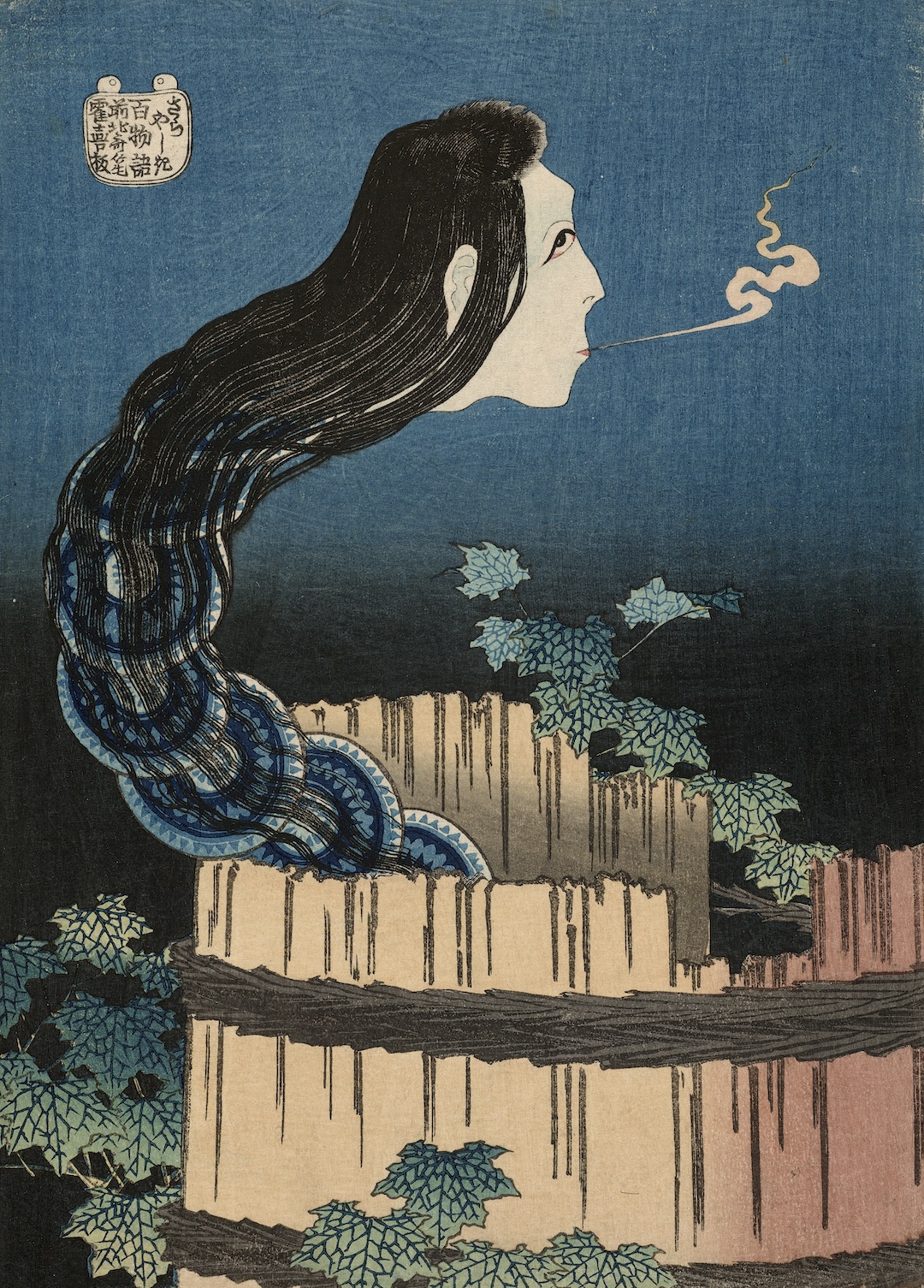
SAM Celebrates Pride: Watch These Queer Films Recommended by SAM Staff
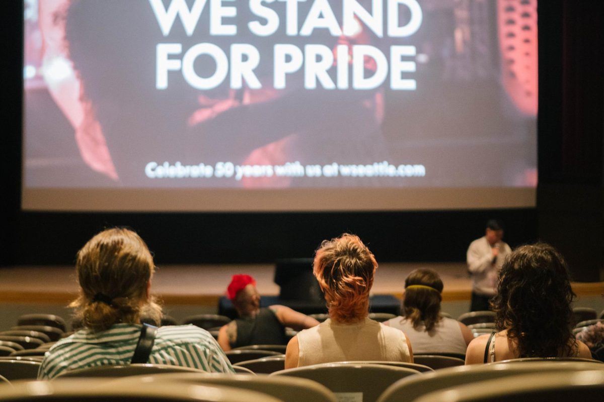
In honor of Pride Month, SAM Blog features reflections by SAM voices on LGBTQIA+ art and artists. Queer lives matter every day of the year, but this month is a particular opportunity to celebrate histories of joy, advocacy, and resistance. Check out more Pride-related content on SAM Blog, including two object spotlights and this list of queer film recommendations curated by SAM’s LGBTQIA+ affinity group.
Each of the films listed below resonated with a SAM staff member for its depiction and representation of queer life. This collection showcases a wide range of cinema with the intention of representing the diverse spectrum of queer experience. From campy 90’s comedies such as But I’m a Cheerleader to heart felt explorations of identity like Moonlight, the euphoria, rage, tragedy, and joy of queerness are all celebrated here. While each movie is distinct in tone and genre, they are connected by themes of acceptance, belonging, and autonomy.
Be sure to also check out Free to Be, SAM’s Pride Spotify playlist curated entirely by staff!
But I’m A Cheerleader (1999)
Directed by Jamie Babbit
But I’m a Cheerleader is a hilariously quirky coming-of-age story that prescribes comedy and camp as antidotes for gender norms and homophobia. When quintessential high schooler Megan (a young Natasha Lyonne!) is sent away to conversion therapy by her parents, she resists being labeled as a lesbian– she’s a cheerleader dating a football player! But as she and her friends undergo “treatment” (in the form of simulating heteronormative domesticity in 1950s dresses), she falls in love with cool girl Graham and embraces her queerness and the expansive complexity of real identities. Highlights include: RuPaul, the most saturated pink and blue tones you’ve ever seen, jorts.
– Savannah Di Giovanni, SAM Board Relations Associate
Portrait of a Lady on Fire (2019)
Directed by Céline Sciamma
This is a quiet, intimate look at the love between two women who are forced to adhere to societal norms in the 18th century. Privately, however, they are able to explore their love for one another while creating art. I love this movie because it highlights queerness in an era we often overlook in the community as well as inserts queerness into the period drama genre and its tropes we have come to know from its heteronormative counterparts.
– Emily Roberts, SAM Visitor Experience Lead
Queer for Fear: The History of Queer Horror (2022)
Directed by Bryan Fuller, Tom Maroney, and Sam Wineman
This is one of my favorite documentaries, and connects to me personally as someone who’s loved horror all my life. The representations of otherness explored in the genre have always resonated with me, before I had the words to identify my own difference. Queer people are not a monolith, and I enjoy media that engages with all our experiences, as well as the resonance horror aesthetics can have for people who have been marginalized.
– Jonathan Davidson, SAM Customer Service Center Representative
Bound (1996)
Directed by Lana and Lily Wachowski
I got to see a theatrical screening of this movie at SIFF recently, and it was great to see audiences still laughing and gasping along nearly 30 years later. A crackling debut, and a strong argument for handing a few million dollars to as many first-time Trans filmmakers as possible.
– Lane Belton, SAM Donor Services Representative
Am I OK? (2022)
Directed by Tig Notaro and Stephanie Allynne
I really enjoyed this movie because it is not just a typical “coming of age” story, but it portrays a woman in her 30s struggling to come to terms with her sexuality in a very real way. Not only is Lucy feeling like she’s realizing her sexuality “too late” and just generally lost as to what she wants to next in life a very relatable and not often portrayed narrative, this movie does a great job of showing the awkwardness, the unsureness, and the fumbling that comes with real life.
– Leah Kogan, SAM Membership Communications Associate
My Beautiful Laundrette (1986)
Directed by Stephen Frears
This is one of my go to comfort movies. It explores the intersection of queerness, class, race, and cultural identity with such tenderness all while being set in a run-down laundromat. An important reminder that we are nothing without our community.
– Petra Jouflas, SAM Development and Finance Coordinator
I Saw the TV Glow (2024)
Directed by Jane Schoenbrun
This movie is absolutely beautiful visually and so deeply unsettling emotionally that you are sucked into the horror without any jump scares. Its message about not connecting to your body/life and that there has to be some kind of escape into a reality that will bring you more joy sits with you long after the credits. If you’ve ever experienced any amount of gender dysphoria or derealization you will find this movie both haunting and also strangely comforting.
– Jasmine, SAM Customer Service Center Representative
Consider supporting our Community Pass Program partners who serve queer communities:
Celebrate Pride Month in Seattle with these suggested events:
Sat Jun 22
Youth Pride Disco
Break out your disco wear for this LGBTQIA+ Pride party, planned for and organized by LGBTQ+ youth between the ages of 13 and 22! Join us for drag performances, great music, friend-making activities, food and soft drinks, a quiet room, and more.
Through Sun Jun 23
Jinkx Monsoon and Major Scales: Together Again, Again!
Experience the comedy, music, and saucy stylings of two of the Pacific Northwest’s standout drag entertainers, in this wildly hilarious extravaganza set in an apocalyptic future. Check the event calendar for information about performances for teens, ASL interpretation, captions, and masking.
Fri Jun 28
Trans Pride Seattle 2024
Started in 2013, Trans Pride Seattle is an annual event organized by Gender Justice League. Visit the Volunteer Park Amphitheater from 5 to 10 pm for live music, community speakers, performances, and a resource fair all dedicated to increased visibility, connection, and love of the Seattle-area TwoSpirit, Trans, and Gender Diverse (2STGD) community.
Sat Jun 29
PrideFest Capitol Hill
Spanning six blocks of Broadway and Cal Anderson Park, this all-day market features queer local businesses, beer gardens, family and youth programming, and three stages with an unforgettable lineup of live performances.
Sun Jun 30
Seattle Pride Parade
Spend the final day of June by taking part in the 50th annual Pride Parade led by grand marshals Sue Bird and Megan Rapinoe. Then, head over to Seattle Center for the can’t-miss performances, hundreds of acts, beer gardens, food vendors, a new family area—and dancing in the iconic International Fountain.
Visit the official Seattle Pride website for even more suggested events.
Photo: Chloe Collyer.