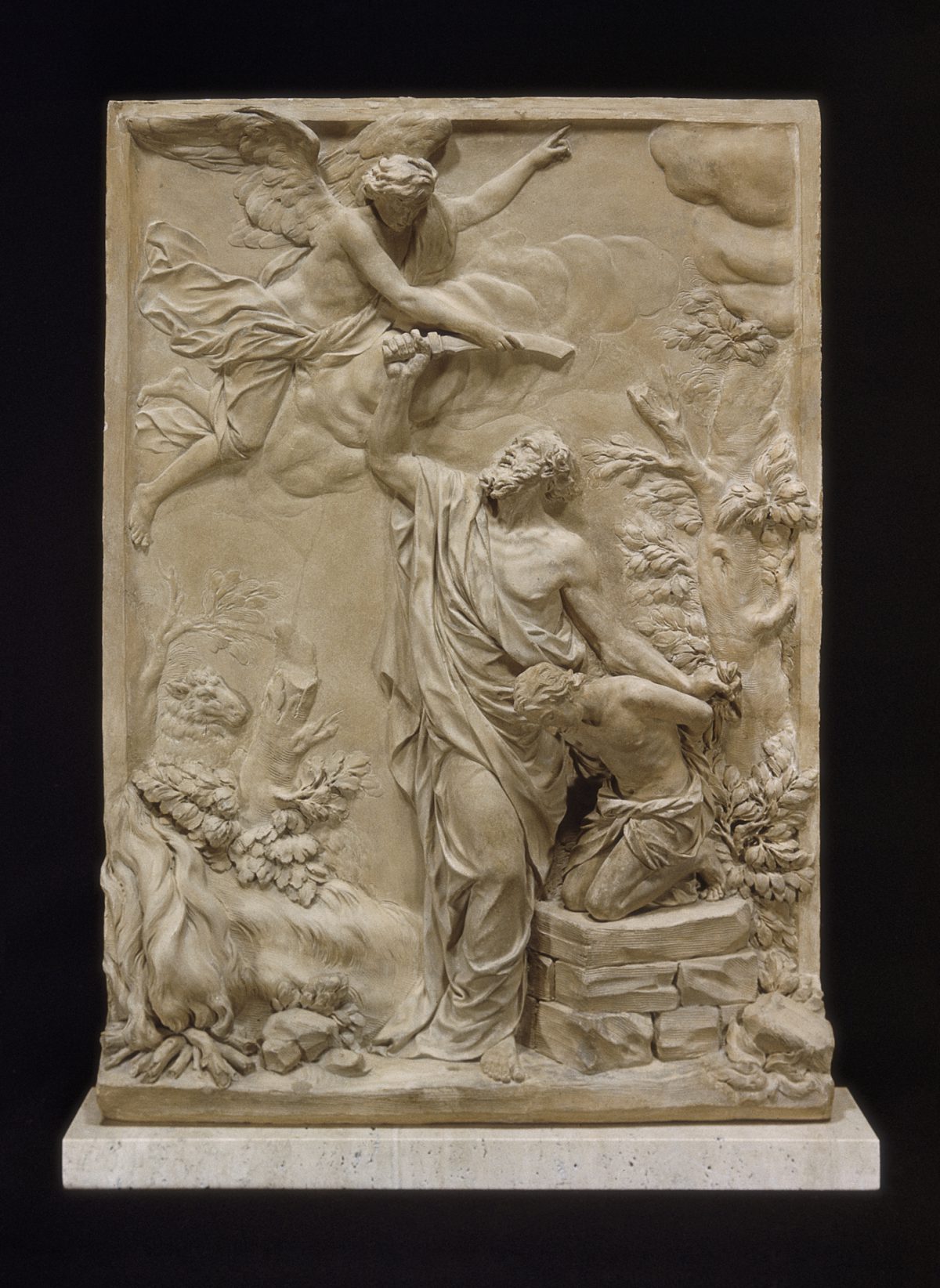
Object of the Week: The Creation of Eve
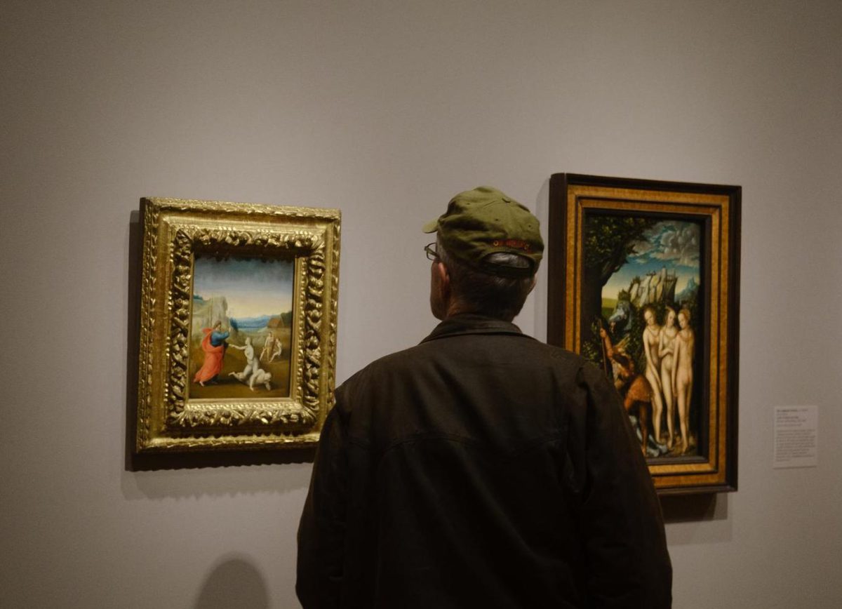
At the dawn of world history God gives life to the first humans under a luminous pastel sky. This small panel, painted around 1510 by Renaissance artist Bartolomeo di Paolo, known as Fra Bartolomeo, is titled The Creation of Eve and is currently on view in SAM’s European art galleries. While the religious content of this picture, based on the book of Genesis, would have been immediately recognizable to its prevalently Christian audience in 16th century Italy, the way Fra Bartolomeo chose to visualize this biblical story sheds light on Renaissance ideas around the role of women and the arts in early-modern western society that can still inspire us today.
At the center, Eve rises from the side of a sleeping Adam, reaching for support as she prepares to take her first step into the world. Her right hand is met by the Creator’s, who lifts and blesses her—his fluttering cloak and the motion of his feet indicating forward movement. His commanding presence contrast with her crouched pose and unstable balance, highlighting her suspended state of becoming. Scholars have termed this way of depicting Eve’s creation “emergence iconography” to stress the image’s departure from the Genesis text, where the first woman is said to have been modeled by God from a rib taken from Adam. The challenges to a naturalistic and efficient representation posed by that plot led artists to evolve this solution, which was interpreted most famously by Michelangelo in the Sistine ceiling just a few years before Fra Bartolomeo painted this picture.
In addition to emphasizing the corporeality of Eve’s body, softly modeled to accentuate the underlying structure of bones and muscles and imbued with the illusion of gravity, Fra Bartolomeo’s composition offers a visual translation of the first woman’s role as a companion and an equal to Adam that early Christian theologians had formulated in their interpretation of scriptures. They reflected on the fact that in Hebrew (the original language of Genesis) the term tsela used in the creation passage meant both “rib” and “side,” focusing on the latter translation to argue for the equality of man and woman, whose union they intended as the basic unit of human society.
This idea materializes in Fra Bartolomeo’s Creation of Eve, unique among Renaissance depictions of this popular subject matter for combining the creation episode with a group portrait of the first family (Adam, Eve, and their children Cain and Abel are featured in the middle ground) and a cityscape in the distance to signify the modern accomplishments of their descendants. Sixteenth-century Florence—where this picture was likely painted—was a city-state whose strong tradition of independent self-governance and artistic excellence were a point of civic pride for artists and patrons alike.
Here, the omission of the episode of The Fall that traditionally followed the creation of Eve in most Genesis cycles also suggests our artist’s intent to celebrate humanity’s achievements rather than emphasize the consequences of the first sin. In this respect, God’s physical hold on Eve’s hand may evoke the Renaissance trope of the artist as a divinely inspired creator, further exalting the intellectual potential of the visual arts.
While this picture offers a limited representation of humanity that reflects the ableist, heteronormative canons of its time, it also speaks to present-day concerns around bodily autonomy by reminding us of a time when Renaissance humanism affirmed confidence in the human potential to achieve greatness through free will, and in the dignity and beauty of the human body.
– Gloria de Liberali, SAM Guest Contributor & Art History Ph.D
Photo: Alborz Kamalizad.