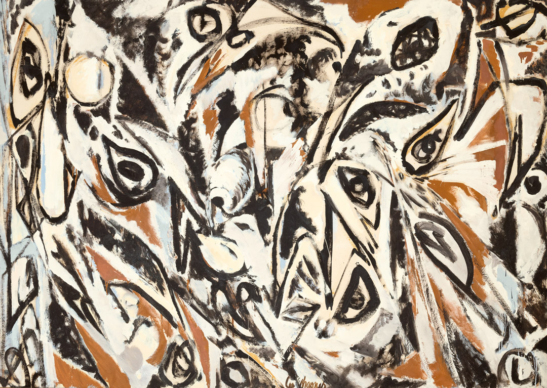
Object of the Week: Sequential Views

Constantly growing and in flux, the built and natural environments in which we live have proven to be enduring sources of artistic inspiration. Like his fellow Los Angeles-based artists Ed Ruscha and Catherine Opie, Robbert Flick (born 1939, Amersfoort, Netherlands) is deeply inspired by the sprawling city and its changing landscape, both urban and natural.

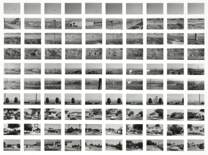
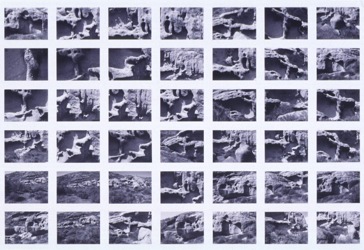
From the late 1970s through 1990, Flick worked diligently on a series titled Sequential Views. Unsatisfied with the information conveyed by a single image—common in American landscape photography—Flick would take multiple images of a chosen site at predetermined intervals. Part performance, Flick’s prescriptive approach to photography resulted in multiple images and a more complete understanding of the landscape around him. After developing the negatives, he would organize the images manually in a grid—an analog technique whose compositions further convey a more experiential understanding of time, space, and place.1

Beginning with the urban cityscape, such as the 1980 work above—a view of LAX looking north from Imperial Highway—Flick eventually expanded the series to include parts of the Midwest and parks such as Red Rocks, Joshua Tree, and Vasquez Rocks (the latter two of which are examples in SAM’s collection). Vasquez Rocks is today a Natural Area and Nature Center located in the Sierra Pelona Mountains north of Los Angeles in Antelope Valley, known for its iconic rock formations’ sedimentary layering. In S.V. 105 at Vasquez Rock #6, Flick’s gridded views appear to overlap and repeat at times, creating an episodic and almost cinematic rhythm. The slight shifts between each frame—evident in the placement of a rock formation or cropped shadow—make clear just how many different ways there are to see and represent the world around us.2

 Elisabeth Smith, SAM Collections and Provenance Associate

1 Lisa Hostetler, “Episode 3: Landscapes in Passing,” Smithsonian American Art Museum, https://americanart.si.edu/artist/robbert-flick-5776.

2 Museum of Contemporary Photography, “Robbert Flick,” https://www.mocp.org/detail.php?t=objects&type=browse&f=maker&s=Flick%2C+Robbert&record=0.

Images: Robbert Flick, S.V. 105 At Vasquez Rock #6, 1983-1985, gelatin silver photograph, 9 x 17 1/2 in., Mary Arrington Small Estate Acquisition Fund, 86.5.10, © Robbert Flick. Robbert Flick, SV017/80, LAX, from Imperial Looking North from Sequential Views, 1980, gelatin silver print, Smithsonian American Art Museum, Transfer from the National Endowment for the Arts through the Photography Museum of Los Angeles, 1990.38.44, © 1980, Robbert Flick.

Object of the Week: Serious Games I-IV

The link between new technologies and the violence of war—physical and psychological—is a focus for artist Harun Farocki (1944–2014), whose essayistic films and videos pointedly address the ways in which the production and circulation of images are inextricable from, among many aspects of contemporary life, geopolitics and the development of the military apparatus.

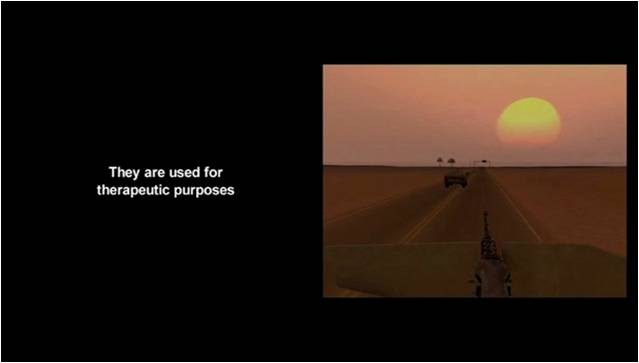
His four-part video Serious Games I-IV (2009-10) is an installation comprised of four video works that examine the use of virtual reality and gaming for United States military recruitment, training, and therapy. Hauntingly, many of the simulations and trainings captured were in preparation for missions in Afghanistan. 
A still of Farocki's Serious Games in which marines complete simulated missions.
In one video, Marine recruits stationed in 29 Palms, California, attend simulation exercises where the distinction between combat and gaming is blurred. Focusing on four Marines and their laptop-based drills, Farocki highlights the ways in which such virtual computer environments have become a substitute for the real, and vice versa, ultimately prompting us to consider the ways in which technology, politics, and violence intersect. In another video, Farocki presents a workshop organized by the Institute for Creative Technologies, a research institute developing therapeutic tools for veterans experiencing Post-Traumatic Stress Disorder. Perversely, the same virtual reality and simulation technologies used for military recruitment and training are used in its aftermath.

As the United States is confronted with the serious and heartbreaking consequences of its 20-year presence and withdrawal from Afghanistan, Serious Games is a critical document that reflects just one arena within a series of systems and decisions that brought us to this moment. And while Farocki’s term “operative images” was used to describe his 2001 video work Eye/Machine, it can most certainly extend to Serious Games: “These are images that do not represent an object, but rather are part of an operation.”1

– Elisabeth Smith, SAM Collections and Provenance Associate


1 Harun Farocki, “Phantom Images,” in Public, no. 29 (2004): 17.

Serious Games I-IV, 2009-10, Harun Farocki, Three two-channel color video installations, one single-channel color video installation, 44 min. Anne Gerber Fund, Helen and Max Gurvich Fund and General Acquisition Fund, 2012.12.1.4 © Harun Farocki.

Object of the Week: The Survival Series

For decades, language and its public dissemination has been at the center of Jenny Holzer’s practice. A previous Object of the Week post by Rachel Hsu chronicles the artist’s Inflammatory Essays, multi-colored posters anonymously wheat pasted throughout New York City in the late 1970s and early 80s. Each poster and its essay, as the title suggests, are provocative and confrontational, drawn from writings of dictators and anarchists, functioning as subversive critiques of power that might otherwise go unnoticed.

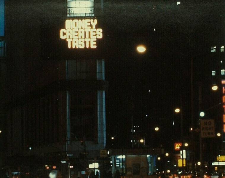
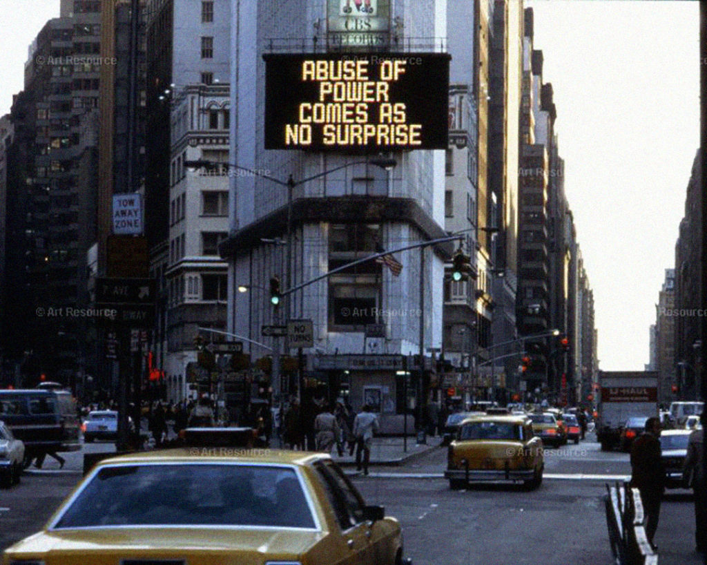
Just a few years later in 1982, phrases such as “ABUSE OF POWER COMES AS NO SURPRISE” and “MONEY CREATES TASTE” were projected on a digital billboard in Times Square. Part of a body of work known as her Truisms, these succinct and unnerving assertions speak to deeper truths about the often-contradicting ideologies and values that undergird our society.

In addition to the Inflammatory Essays and Truisms, another work by Holzer in SAM’s collection is the cast aluminum plaque that reads: “DON’T WATCH THE UNDERCLASS, IT’S MORE LIKELY THAT THE WARLORDS WILL KILL YOU.” Her aphorisms poetically call attention to self-evident and often universal truths, in this case about power, propaganda, and its abusers. Subverting the traditional use of a plaque—designed to mark historic sites, events, and people—Holzer deftly shifts the plaque’s intrinsic power and authority in new directions. The work is as potent a message today as it was nearly thirty years ago, speaking to Holzer’s penchant for identifying lasting social and political issues.

In an early interview, Holzer stated that, “From the beginning, my work has been designed to be stumbled across in the course of a person’s daily life. I think it has the most impact when someone is just walking along, not thinking about anything in particular, and then finds these unusual statements either on a poster or in a sign.”1  

Today, our bloated media ecosystems look a little different, forcing us to scroll and sift through endless grids of text and image. And while this might not be the type of public, egalitarian viewing experience that Holzer once imagined for her work, there is something exciting about it being posted on Instagram—our new commons—and (hopefully) jolting us out of our normal routines and ways of thinking.

– Elisabeth Smith, SAM Collections and Provenance Associate


1 Jeanne Siegal, “Jenny Holzer’s Language Games” in Arts Magazine, December 1985. pp. 64-68.

The Survival Series: Don’t Watch the Underclass, It’s More Likely That the War Lords Will Kill You, 1983-85, Jenny Holzer, Cast aluminum, 6 x 10 x 1/4 in., Gift of the Collectors’ Forum in honor of Susan Garcia, 98.19 © Artist or Artist’s Estate

Object of the Week: Torso Fruit

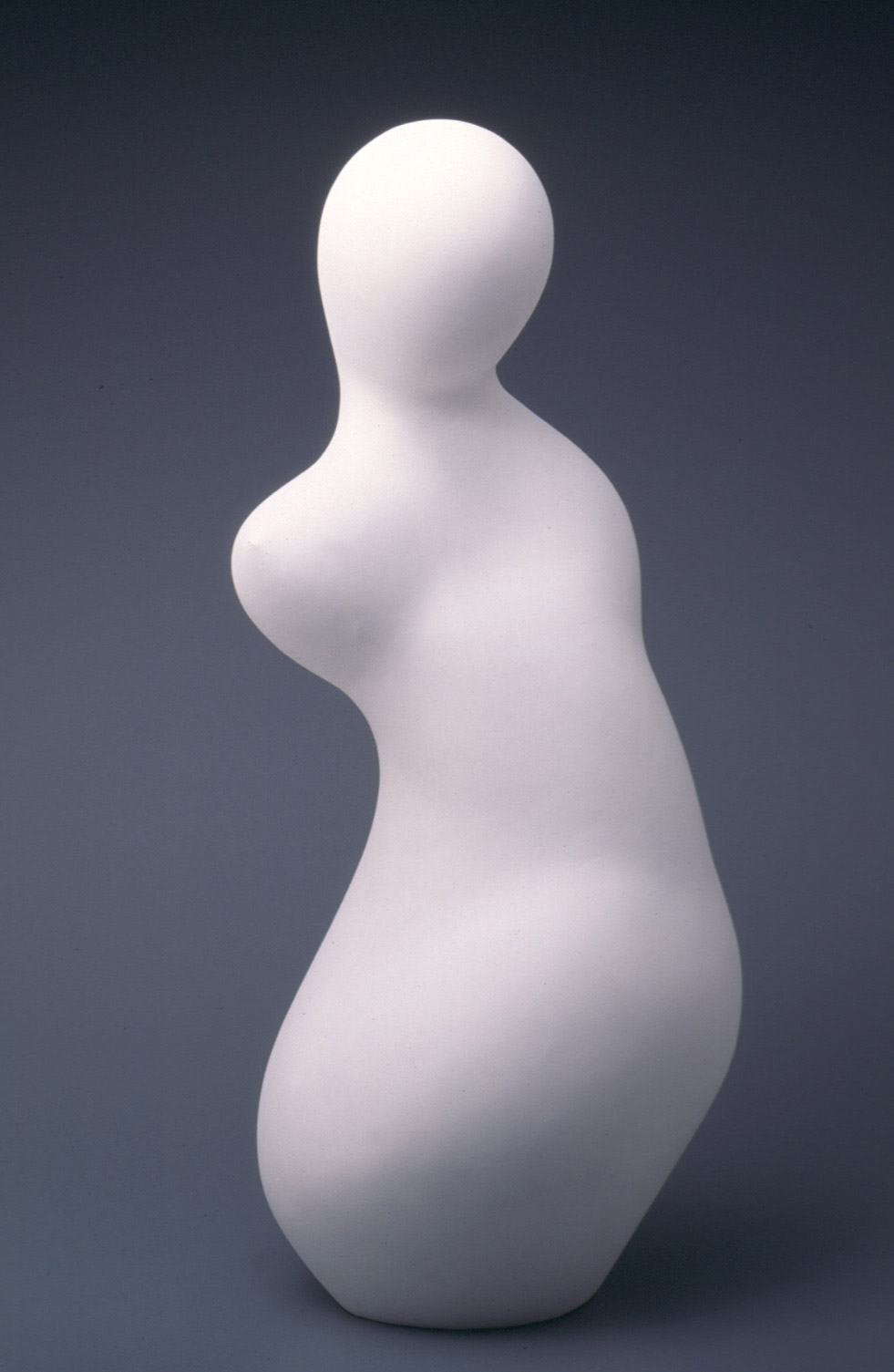
Among some of the newly installed works in Seattle Art Museum’s third floor galleries is this 1960 plaster sculpture by French artist Jean Arp (1886-1966), titled Torso Fruit.

As a sculptor, painter, and poet, Arp’s life and career defy easy categorization and span multiple art movements, putting many current-day résumés to shame. Born Hans (Jean) Peter Wilhelm Arp in Strasbourg, Germany (now France), Arp—of French Alsatian and German descent—pursued art as a young adult, eventually traveling from his native Strasbourg to Weimar, Germany; Paris, France; and Munich, Switzerland, where in 1912 he came into contact with Wassily Kandinsky, briefly exhibiting with the Der Blaue Reiter group. Returning to Paris in 1914, his cohort grew to include Sonia and Robert Delaunay, Amedeo Modigliani, and Pablo Picasso, to name a few. At the onset of World War I, Swiss neutrality drew Arp to Zürich, where he met his future wife and collaborator, Sophia Taueber, and, together with Hugo Ball, Tristan Tzara, and others, became a founding member of the radical and multi-disciplinary Dada movement. Dada led Arp to Surrealism and, later, Abstraction-Création—and this just brings us to the 1930s!

Though a later work, Torso Fruit is a wonderful example of Arp’s biomorphic style that began in the early 1930s. Biomorphism, as compared with other modes of abstraction and Surrealism, was considered by some artists to be a more intuitive and, therefore, truer reflection of the subconscious. With organic shapes that connect to the natural world, biomorphism was a formal strategy through which Arp could introduce chance and spontaneity into his practice (holdovers from Dada and Surrealism). In the words of Arp, “I only have to move my hands . . . The forms that then take shape offer access to mysteries and reveal to us the profound sources of life.”1

Arp produced sculptures in a variety of mediums ranging from bronze to marble, but plaster was often a first edition due to its malleability and susceptibility to touch and, ultimately, chance. As the title suggests, Torso Fruit blurs the distinctions between the form of the human body and other forms of the natural world. Even without the title, however, its sensuous, rounded contours suggest a fecund or growing form—a metamorphic process that Arp felt a duty, as an artist, to emulate and honor.

– Elisabeth Smith, SAM Collections and Provenance Associate

1 Christie’s, “Playful, ambiguous, sensuous — the alluring art of Jean Arp,” https://www.christies.com/features/Jean-Arp-Collecting-Guide-10372-1.aspx.

Torso Fruit, 1960, Jean Arp, plaster with paint, 30 x 14 x 12 in., gift of Mme. Jean Arp, 77.1 © Artist or Artist’s Estate

Object of the Week: Pool with Splash

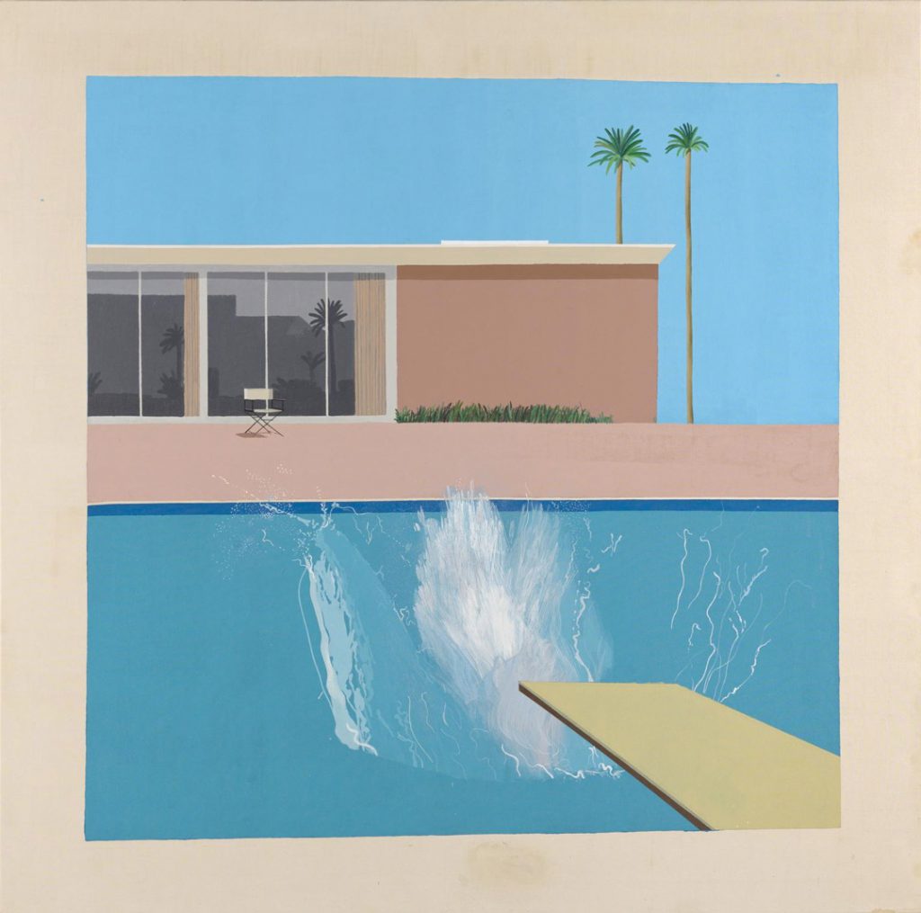
Having grown up in Los Angeles, there is something uniquely comforting about the scene of a sun-drenched swimming pool. David Hockney, of course, is one artist whose pools come immediately mind: his bright, seductive paintings of the 1960s and 70s are highly evocative images of life and culture in Southern California, and have rendered his name nearly synonymous with the subject matter. 

David Hockney, A Bigger Splash, 1967

For Hockney, “In the swimming pool pictures, I had become interested in the more general problem of painting the water, finding a way to do it. It is an interesting formal problem; it is a formal problem to represent water, to describe water, because it can be anything. It can be any color and it has no set visual description.”[1]

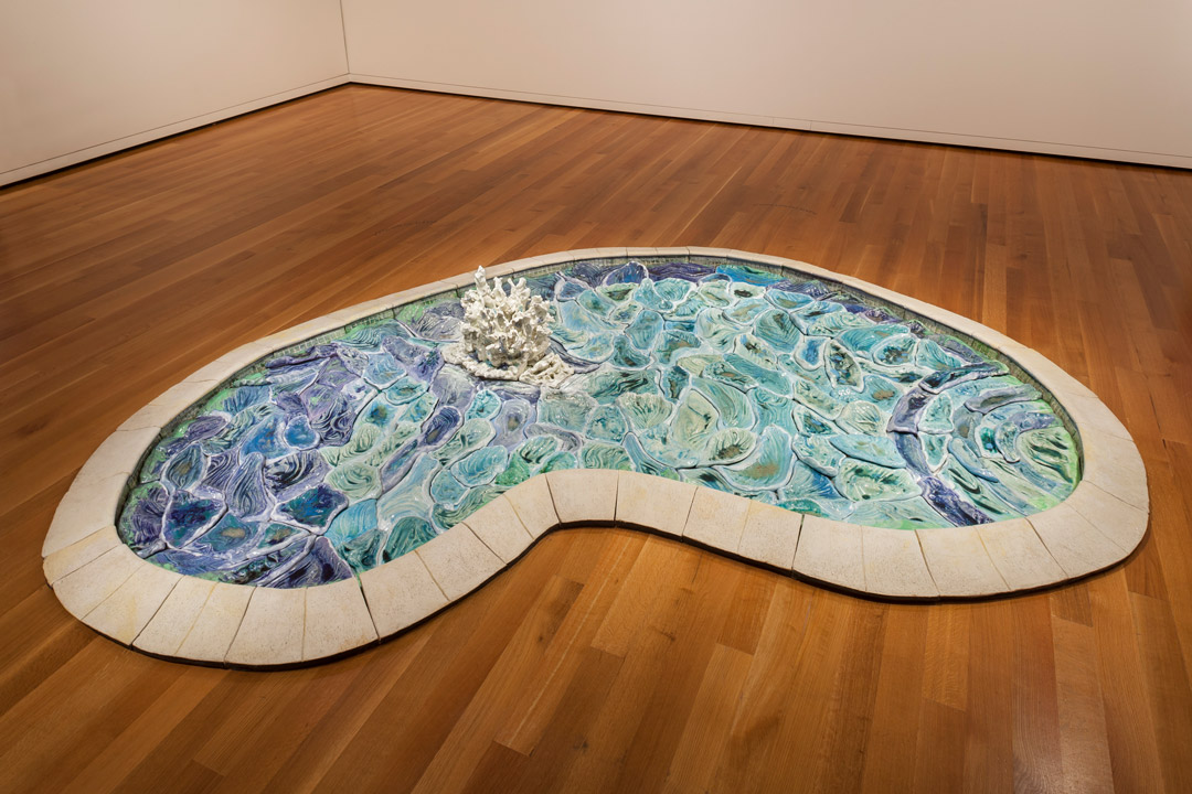
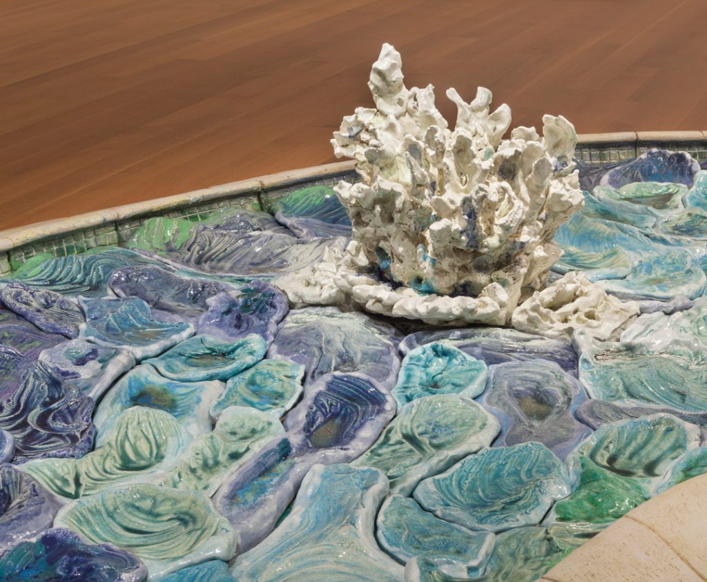
If Hockney’s iconic pools are, broadly speaking, defined by their spatial flatness, color relationships, and reduction of form through painting, Robert Arneson’s sculptural Pool with Splash is a perfect counterpoint. His exploration of the pool and its contents takes shape through ceramics: each ripple and refraction of light is represented as an immutable piece⁠—fitted together like a puzzle⁠—with blue and green glazes. And much like Hockney’s A Bigger Splash, Arneson’s Pool is punctuated with a foamy burst, invoking the presence of a swimmer.

Along with his contemporaries Peter Voulkos, Bruce Conner, Viola Frey, Jay DeFeo, and others, Arneson is considered part of the “Funk Art” movement⁠—a loose affiliation of artists originally included in the 1967 exhibition curated by Peter Selz, Funk, at the University Art Museum at the University of California, Berkeley.

Arneson’s irreverent work and playful sense of humor, along with an interest in everyday objects and personal narrative, are just some of the movement’s characteristics⁠ (a reaction to the non-objectivity of abstract expressionism that dominated the 1950s). Arneson’s commitment to ceramics is also notable, and part of a larger effort to elevate the medium which, at the time, was considered merely decorative or utilitarian, and pejoratively relegated to a realm of “craft.” Measuring nearly 12 feet wide at its largest point, Pool with Splash is hardly utilitarian and its use as decoration is up for debate. Here, Arneson wryly upends the once-strict divisions separating “fine art” and “craft,” all the while making clear his mastery of ceramics. Now, if only we could swim in it!

– Elisabeth Smith, SAM Collections and Provenance Associate


[1] Matthew Sperling, “The Pull of Hockney’s Pool Paintings,” in Apollo Magazine, February 2017, www.apollo-magazine.com/david-hockney-pool-paintings.
Images: Pool with Splash, 1977, Robert Arneson, ceramic with glaze, 18 1/2 x 145 x 116 in., Gift of Manuel Neri, 82.156. A Bigger Splash, 1967, David Hockney, acrylic on canvas, 95 1/5 x 96 in., Tate Modern, London

Object of the Week: Salt cellar

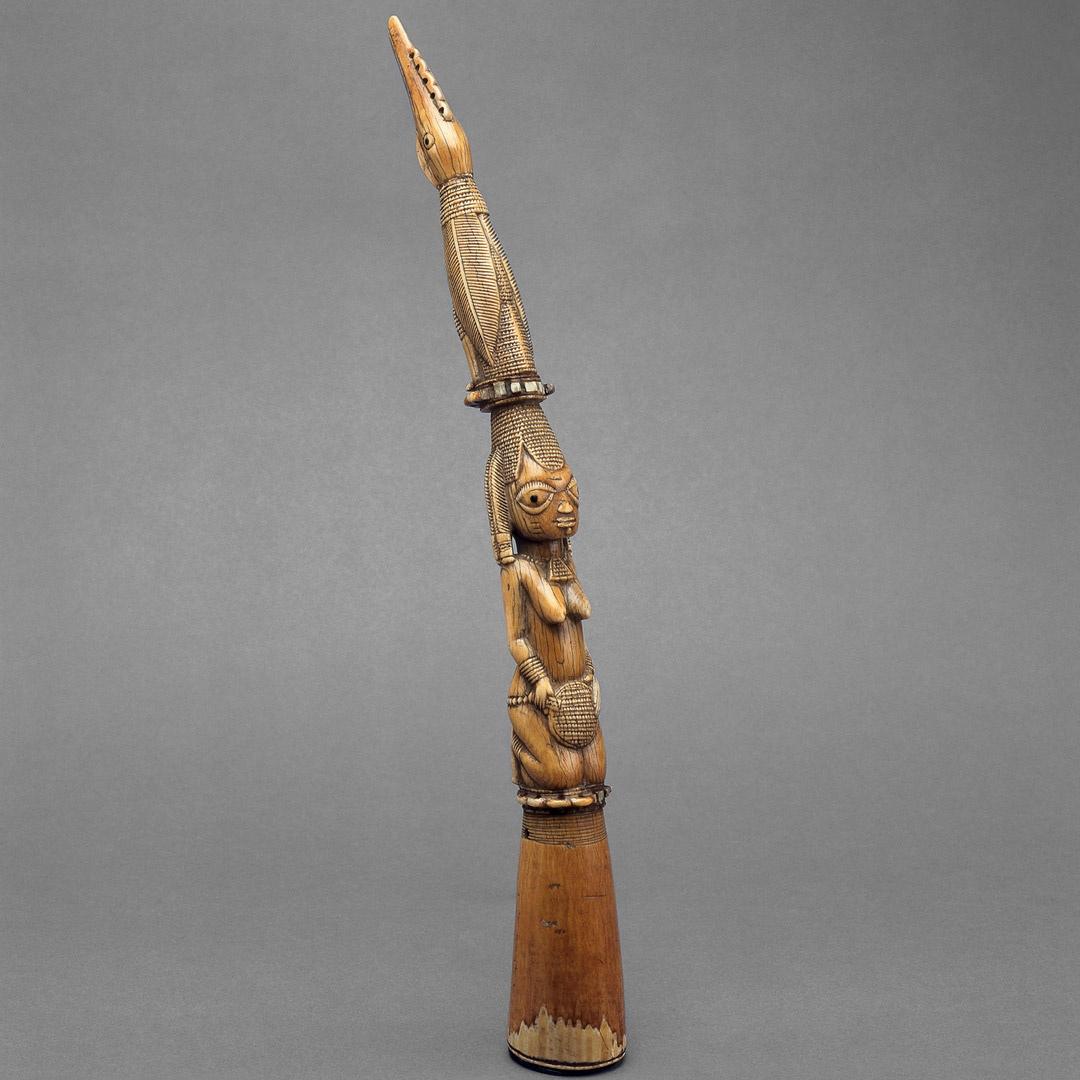
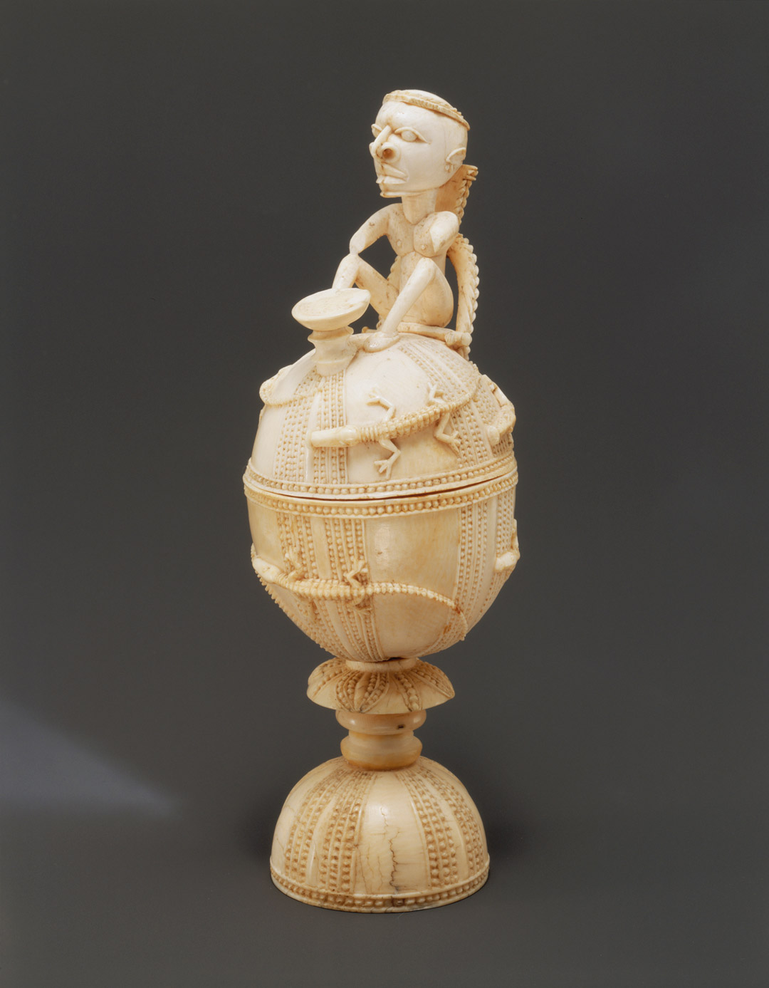
In the 15th-16th century, this ivory salt cellar would have belonged to a wealthy European collector, adding precious salt to their meals or variety to their cabinet of curiosities. The crocodile motif, masterfully carved by Sapi artisans in Sierra Leone, would have evoked the “newly discovered” African continent. We can understand this combination of foreign taste and local craftsmanship as an early form of commissioned “tourist art,” and exotic items like this one became increasingly popular in European collections. 

The Portuguese arrived on the shores of Sierra Leone in 1460, which began a short period of relative cross-cultural harmony. In the 15th and 16th centuries, urban life on the West African coast did not look vastly different from urban life in Lisbon, so Portuguese merchants were quickly able to establish relationships, trading for vast amounts of gold, ivory, pepper, and other goods. Curiosities like this salt cellar were also valuable African exports, so Portuguese merchants commissioned items to sell to collectors in Portugal. Artistic patronage structures in Sierra Leone were similar to those in Europe, which meant Portuguese patrons could request specific designs be used in commissioned works, often bringing an etching or other model to demonstrate their wishes. This exchange of ideas led to a confluence of European and African designs in many of these exported ivories. 

Emma George Ross writes that ivories like this one have been described as “emerging from a period that predates power imbalances and racist imagery. Therefore, the shared African and Portuguese aesthetic that they reflect is one that was achieved through the negotiation of equals.”1 However, the rosy picture of “negotiation among equals” is at odds with the 175,000 enslaved people who were taken from Africa to Europe and the Americas during this early period of Afro-Portuguese contact. The slave trade grew exponentially with increasing Dutch and British involvement in the 17th century. 

Because of the consequent power imbalance and rise of white supremacy, the African makers of carved ivories in European princely collections were often erased. Only in the 20th century did researchers rediscover the Sapi and Benin origins of certain carved ivories, returning this cross-cultural collaboration to the art historical narrative and establishing the category of “Afro-Portuguese ivories.” 

– Linnea Hodge, Former (and much-missed) SAM Curatorial Division Coordinator 

1 Ross, Emma George. “Afro-Portuguese Ivories.” In Heilbrunn Timeline of Art History. New York: The Metropolitan Museum of Art, 2000–. http://www.metmuseum.org/toah/hd/apiv/hd_apiv.htm (October 2002)

Sources:

Bortolot, Alexander Ives. “The Transatlantic Slave Trade.” In Heilbrunn Timeline of Art History. New York: The Metropolitan Museum of Art, 2000–. http://www.metmuseum.org/toah/hd/slav/hd_slav.htm (October 2003)

Clarke, Christa. “Lidded Saltcellar.” Khan Academy. https://www.khanacademy.org/humanities/art-africa/west-africa/sierra-leone/a/lidded-saltcellar

Ross, Emma George. “Afro-Portuguese Ivories.” In Heilbrunn Timeline of Art History. New York: The Metropolitan Museum of Art, 2000–. http://www.metmuseum.org/toah/hd/apiv/hd_apiv.htm (October 2002)

Ross, Emma George. “The Portuguese in Africa, 1415–1600.” In Heilbrunn Timeline of Art History. New York: The Metropolitan Museum of Art, 2000–. http://www.metmuseum.org/toah/hd/agex/hd_agex.htm (October 2002)

Image: Salt cellar, ca. 1490-1530, Sierra Leone, ivory, 8 1/8 x 2 9/16 x 2 11/16 in., Nasli and Alice Heeramaneck Collection, 68.31.

Object of the Week: Canoe Breaker

I draw on the lessons of our ancestors. Our ancestors left an incredible legacy of art and, in order to honor them, it’s our responsibility to relearn that legacy, whether it’s through the art, whether it’s through the song, or through the dance. When people would travel to the mainland, there’s this incredible body of water that’s very treacherous, and a storm can come up and without warning. And so, before the people crossed the water, they prepared themselves on three levels…. They prepared themselves physically; they would actually practice paddling the canoe. And they would mentally prepare themselves, they would visualize their destination. And creativity is exactly the same thing, you visualize, you get an idea like that. And so, our challenge is to hold the idea and bring it to fruition. 

Robert Davidson

Robert Davidson is arguably one of the most versatile, creative, and visionary artists of our time. Born in 1946 in Masset village, Haida Gwaii, Davidson—countering the effects of colonialism—was able to tap the memories of his elders and help revive ancient Haida art styles, revitalizing the visual heritage of his people.

His story is nothing short of remarkable and has unfolded over 40 years through numerous artworks ranging from wood and metal to paper and canvas; original songs and dances of his Rainbow Creek Dancers; and in public exhibitions, publications, and awards. His masterful feel for cedar, from monumental totem poles to expressive masks, links him to generations of some of the most accomplished artists of all time, including his maternal relative, Charles Edenshaw (ca. 1839-1920).[1] The trajectory of his carving places him among the masters who pushed Haida art to a breathtaking sophistication and refinement.

As his engagement with Haida culture and art has grown and his artistic practice has matured, Davidson has crafted an individual and distinctive approach to abstraction that is grounded in tradition yet expressive of the experiences, intellect, and creativity of an artist in his own time. In the early 1980s, he began to paint largescale paintings in gouache, experimenting with color, composition, and figural abstraction. A decade later, while still engaged with carving projects, he incorporated acrylic painting into his practice, adopting a hard-edge technique that has precision and crispness but retains elasticity and movement. The subjects (he gives us clues in the titles) might refer to personal experiences, musings on Haida art, or legends drawn from the corpus of Haida oral traditions.

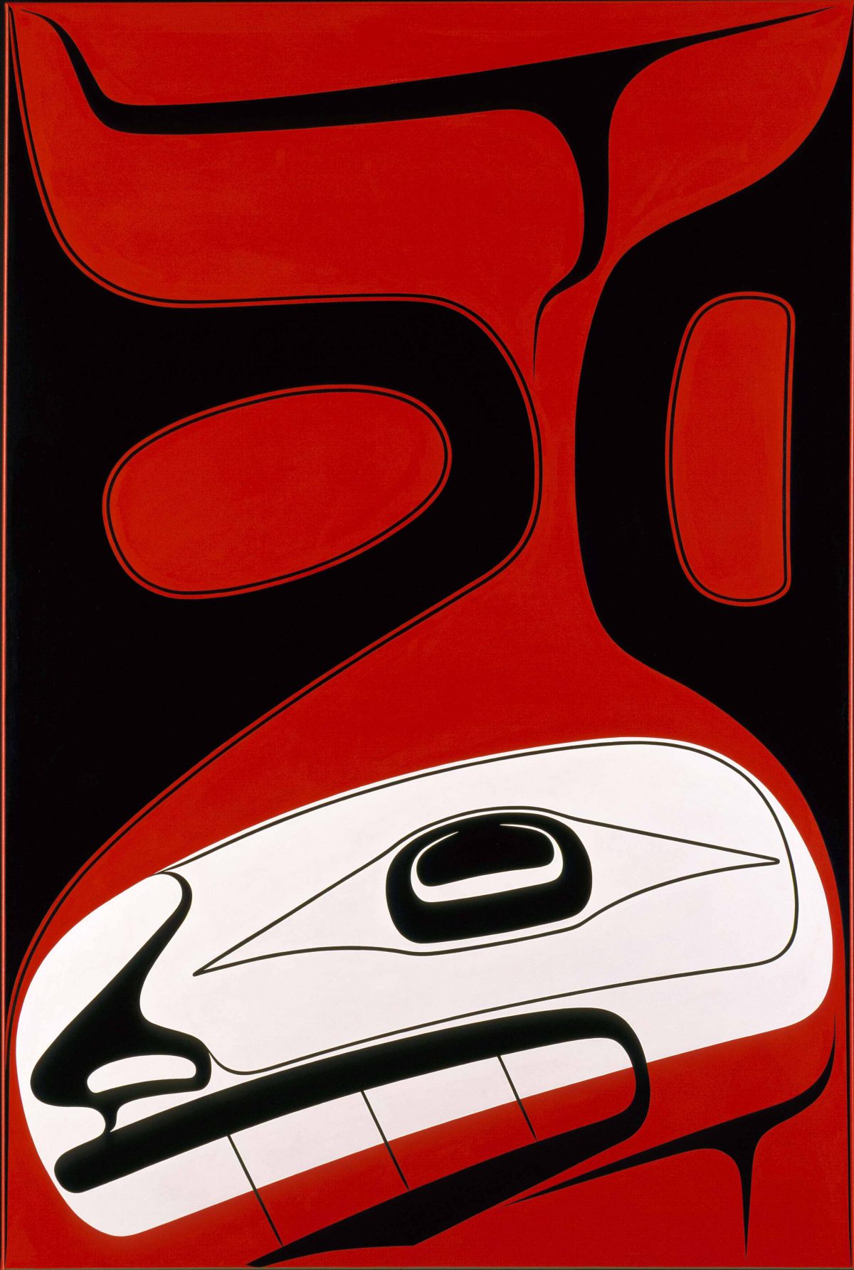
Haida Gwaii (formerly Queen Charlotte Islands) is an archipelago of two large and more than 150 small islands that lie sixty miles off the British Columbia mainland. Formed by glacial erosion, floods, tsunamis, and changing sea levels, this cluster of islands sits at the juncture of the Pacific and North American tectonic plates. Here the ocean drops precipitously from three hundred to three thousand feet, creating an environment rich in marine resources and marked by dramatic climatic events, including gale-force winds. In Canoe Breaker, Davidson introduces his audience to a powerful force and its ancient origins: Southeast Wind.

Southeast Wind has ten brothers or, in some accounts, nephews, who are manifestations of his powerful force. John Swanton, an ethnologist with the Bureau of American Ethnology from 1900-1944, recorded a story told to him by a Haida man named Abraham in the winter of 1900 about Master-Carpenter who went to war with Southeast Wind because he was sending too much rainy, stormy weather to the people. After four failed attempts to make a seaworthy canoe, Master-Carpenter succeeds and sets out on his mission. He seizes the matted hair (kelp) of Southeast Wind and pulls him into the canoe. The Wind sends the first of his nephews, Red Storm Cloud, who turns the sky red, followed by Taker off the Tree Tops who blows so hard that tree branches come down around Master-Carpenter in his canoe. Next, Pebble Rattler brings rolling waves that violently toss the rocks and Tidal Wave covers the canoe with water. Other brothers bring mist and melted ice. During all this wind activity, Master-Carpenter is putting medicine on himself that he has brought with him for the task, as Haida travelers and fisherman (since the beginning of time) are keenly observant of the weather—perhaps a metaphor for preparing for the unknown, as in performing a new song or creating an art work.

Southeast Wind is represented in this painting by an image of the killer whale, which becomes human when on land. A human-like nose and eye signal this transformative nature. The large ovoid is its head, and a black three-pointed shape defines the lower jaw. Black U-shapes with red ovals indicate the pectoral and dorsal fins, and the tail is shown at the very top. The entire image is dematerialized without being wholly abstract and shows how Davidson’s art practice moves effortlessly from figuration to abstraction.

– Barbara Brotherton, Curator of Native American Art


[1] See Charles Edenshaw work in SAM’s Collection: Platter, argillite carving: 91.1.127
Image: Canoe Breaker: Southeast Wind’s Brother, 2010, Robert Davidson, acrylic on canvas, 60 × 40 in., Gift of The MacRae Foundation, the Native Arts of the Americas and Oceania Council, and Ancient and Native American Art Acquisition Fund, 2013.35 © Robert Davidson

Object of the Week: Dead or Alive

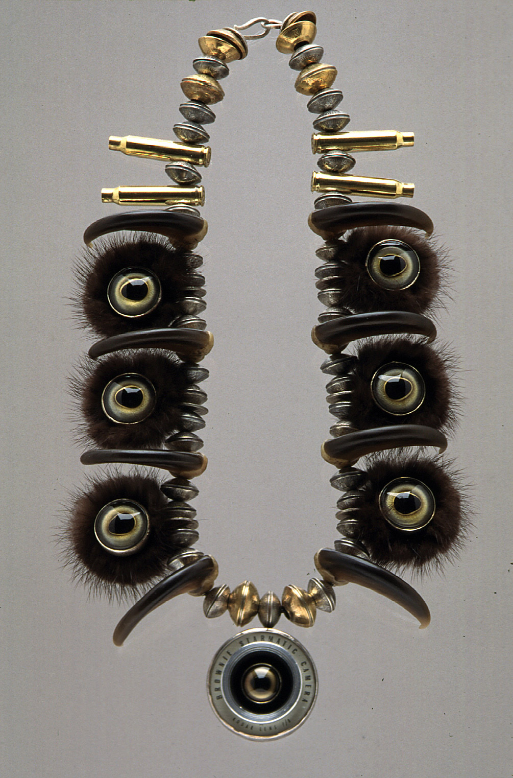
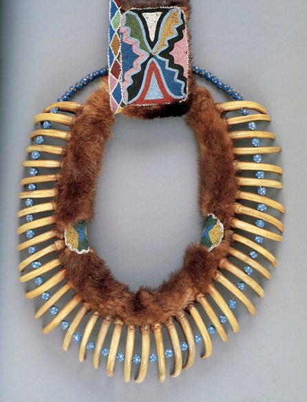
Nancy Worden made art that ignited conversations with narratives to be worn, inviting curiosity so as to bypass shyness. A necklace in the museum’s collection illustrates her gifts, and emerged after she visited the Seattle Art Museum in 1993. There she saw what she calls a “very powerful and haunting piece”––a Mesquakie bear claw necklace from the Chandler-Pohrt collection in an exhibition entitled Art of the American Indian Frontier.[1]  Here’s what she saw:

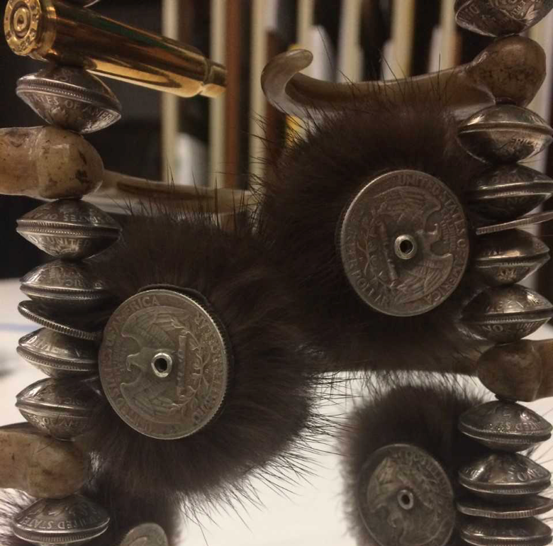
This Mesquakie necklace features 40 claws from several massive grizzly bears who hunted buffalo on the plains of the Midwest. It was once worn in reverence for bears and offered a link to the spiritual essence of their tremendous force. Struck by the visual strength of that necklace, Nancy sought out claws of resin, mink fur, quarters, buttons and other elements to create her own. For her, it brought up concerns about how hunting was enacted in Kittitas County, where she grew up. Her next inspiration came from the news. As she recounts, “While I was working on the necklace, Princess Diana was killed, fleeing from cameras that hunted her her whole adult life. So it seemed fitting to put her photo in the piece––set in a camera lens. The piece is about hunting and shooting, using a camera as a gun. ‘Dead or Alive’ is an old cliché from the movies and seemed an appropriate title for a piece about an obsession with capturing animals or a beautiful person. For some reason we have to have a piece of them to take home, whether they are dead or alive.”

What is behind the camera lens at the bottom of the necklace is a portrait of Princess Diana, wearing a crown––a conventional sign of royalty. Meanwhile, she is surrounded by imitation bear claws and beads made out of quarters, mink, and camera parts. The assembly would not go unnoticed when worn, and would prompt a story that reflects on Nancy’s desire for imaginary connections to be made. 

Dead or Alive was featured in the SAM exhibition, A Bead Quiz, in 2010. Nancy once said, “You can pretty much look at everything as whether or not it’s a potential bead.” On the occasion of the exhibition, SAM filmed a trip to her studio to witness the vast array of beads she discovered or invented–– from oranges to typewriter balls to pennies with mirrors. Here is a trip back to that visit.

– Pam McClusky, SAM Curator of African and Oceanic Art


[1] This bear claw necklace is seen in: David W. Penney, Art of the American Indian Frontier: The Chandler-Pohrt Collection (Seattle and London: University of Washington Press, 1992). Cat. no. 45.
Images: Dead or Alive, 1997, Nancy Worden, silver, brass, mink, resin bear claws, coin, taxidermy eyes, military buttons, and found objects, 24 x 2 3/4 x 1 1/2 in., Anne Gould Hauberg Northwest Crafts Fund and Mark Tobey Estate Fund, 98.29 © Artist or Artist’s Estate. Bear Claw Necklace, ca. 1835, Native American, Meskwaki (“Red Earth People”) Nation, bear claws, otter fur, glass beads, ribbon, horsehair and cloth, 67 1/2 x 14 x 4 in., The Detroit Institute of Arts, Founders Society Purchase with Funds from the Flint Ink Corporation, 81.64. Photos: Pam McClusky. Video by and courtesy of Aaron Bourget, 2010.

Object of the Week: Raven Releasing the Sun

The Warmth of the Sun
Recently, we have really been feeling the heat of the sun! This wonderful and mysterious celestial body is a life-giving force and, without its presence, we would be in darkness with our companion species and without food resources. For millennium, Indigenous Peoples have understood the connectedness of humans to the forces of the land, water, and sky.

Raven, a wily trickster and culture hero, is credited with bringing humankind many important gifts to aid in their survival, like water, light (in the form of the sun, moon, and stars), and ceremony. His questionable deeds and adventures—and especially his voracious appetite—are well documented in orally transmitted stories (later written down by anthropologists) that form a corpus of oral traditions that demonstrate important teachings about Indigenous values and wisdom. These “legends” formed part of the “encyclopedia knowledge,” called hečusəda in the Lushootseed language of our region, whose teachings reveal the knowledge that humans need to live respectfully in the world, and which would be passed down through the generations.

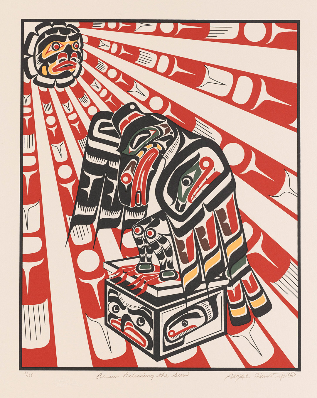
In this famous story, the world is in darkness and humans are suffering. A great chief is the only one with light, which he keeps in his treasure box. Raven disguises himself as a hemlock needle so that the chief’s daughter would drink it and become pregnant, thereby giving the chief a beloved grandson, Raven himself, in the form of a human child. The raven-child is unrelenting in his desire for his grandfather’s treasure box and will not stop crying until he is given it. With the box safely in hand, he reverts to his raven form, flies through the house’s smoke hole, and releases the sun, moon, and stars, thus illuminating the world for all of its creatures.

In this print by George Hunt, Jr., Raven Releasing the Sun, the artist shows the crafty protagonist in the moment after he has opened the chief’s treasure box and released the first of its precious items—the sun—which the artist has depicted as a mask-like face. The rays of the sun are so formidable as to reveal themselves as bold, red tapering lines embedded with formline ovoids, U-shapes, and three-pointed “trigons”—the building block of Northwest Coast design.

George Hunt, Jr. is a part of the renowned Hunt family of artists that goes back generations to the village of Fort Rupert (Tsaxis), British Columbia.1 Descendants of the Kwaguł people, who still live there, trace their occupancy to at least 6,000 years. In 1849 the Hudson’s Bay Company opened a fort there and drew an active exchange between Indigenous People of the coast and the traders.

In the early twentieth century, famed anthropologist Franz Boas collaborated with George Hunt (1854-1933), who provided invaluable cultural material (art objects and cultural information) to Boas’s expanding exhibitions at the American Museum of Natural History, New York, and to the many volumes Boas published on the Kwakwaka’wakw (Kwakiutl). George Hunt was half Tlingit, the son of a high-ranking chief’s daughter, Mary Ebbetts Hunt (Anislaga) from Klukwan, Alaska, and an English fur trader. He was born in Fort Rupert in 1854 and deeply enmeshed in Kwaguł art, culture, and ceremony. George Hunt, Jr, the artist of this print, is a directly connected to this lineage. He is a well-known carver and painter, like his relatives Mungo Martin, Henry Hunt, and Tony Hunt. Interestingly, his native name Nas-u-niz means “Light Beyond the World.” This story of Raven was likely brought to the Hunt family by George’s great-great-grandmother, Mary Ebbetts Hunt, herself an accomplished weaver.2

The Newest United States Forever Postage Stamp

Rico Lanáat’ Worl (Tlingit/Athabascan), Raven Story, Forever Stamp Series 2021

“Many depictions of this story show Raven with the Sun in his mouth representing the stealing of the Sun. I was trying to showcase a bit of drama . . . The climax of the story is after Raven has released the sun and the moon and has opened his grandfather’s final precious box, which contained the stars. In this design I am imagining Raven in a panicked state of escape—transforming from human form to raven form and holding on to as many stars as he can while trying to escape the clan house.”  – Rico Worl

– Barbara Brotherton, SAM Curator of Native American Art


1 For more information about Fort Rupert, see www.sfu.ca/brc/virtual_village/Kwakwaka_wakw/tsaxis–fort-rupert-.html.

2 See a Chilkat Robe woven by Mary Ebbetts Hunt (1823-1919) in the collection of the Honolulu Museum of Art: blog.honoluluacademy.org/verifying-the-artist-of-a-very-special-chilkat-robe/

Image: Raven Releasing the Sun, 1985, George Hunt Jr.. silkscreen on Arches buff paper, 20 x 15 in., Gift of R. Bruce and Mary-Louise Colwell, 2018.29.191. © Artist or Artist’s Estate.

Object of the Week: Diamond Dust Shoes

“I’m doing shoes because I’m going back to my roots. In fact, I think I should do nothing but shoes from now on.”[1]

– Andy Warhol, July 24, 1980

When invoked, Andy Warhol brings to mind a near-infinite number of iconic images. From soup cans to politicians to celebrities, his Pop aesthetic and reputation lives on: “With an irreverent attitude toward art and a glorification of glamour, Warhol, paradoxically, fused high art, low culture, high society, and the avant-garde, transforming the art of an age and cultivating a lifestyle of celebrity.”[2]

Throughout the 1960s and 70s, Warhol was a prolific explorer of painting, photography, printmaking, drawing, fashion, television, and film. The Factory cemented Warhol’s reputation and legacy. However, in the 1980s, the last decade of his life, Warhol pivoted away from the images of celebrity that made him a household name, and returned to what in 1966 he had referred to as “just a phase [he] went through”: painting.[3]

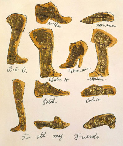
It was in this context that Warhol began a body of work known as his Diamond Dust Shoes. Searching for a new direction to take his work, he honed in on earlier subjects and processes. In the case of the Shoes series, Warhol went “back to [his] roots” as a commercial artist, working in the 1950s for Vogue, Harper’s Bazaar and I. Miller and Sons, where he illustrated, among many things, women’s footwear.[4]

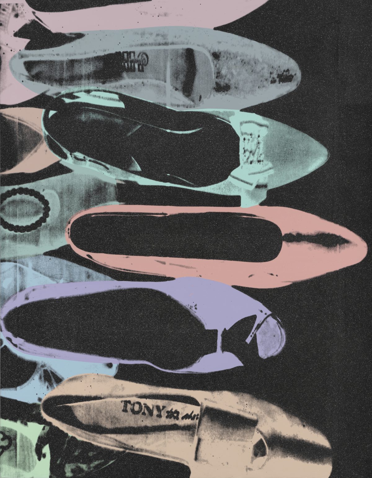
Harkening back to what was once an ad-campaign assignment for Halston, Warhol purchased a selection of women’s shoes that he arranged on the floor. After taking photographs of the strewn compositions, he sent the images to his printer, Rupert Smith, to be screened and coated with diamond dust.[5] Diamond Dust Shoes (1980-81)in SAM’s collection—a gift of the Virginia and Bagley Wright Collection last year—is acrylic, silkscreen ink, and diamond dust on linen. The graphic contrast of pastel purples, greens, and blues is striking when set against the dark black background, and further heightened by the subtle glittering of diamond dust.

Diamond Dust Shoes rather poignantly connects Warhol’s later work to his origins as a young illustrator in New York, collapsing the time, space, and difference between the two modes of artistic production. The throughline, of course, is Warhol’s continued involvement and fascination with fashion, cultural consumption, mass-produced images, celebrity, advertising, and a little (or lot of) glamour.

– Elisabeth Smith, SAM Collections and Provenance Associate

[1] Andy Warhol, entry for Thursday, July 24, 1980, in The Warhol Diaries, ed. Pat Hackett (New York: Grand Central Publishing, 1989), 206.
[2] Joseph D. Ketner, “Warhol’s Last Decade: Reinventing Painting,” in Andy Warhol: The Last Decade (Munich, Germany: Delmonico Books-Prestel), 15.
[3] Andy Warhol in an interview with Gretchen Berg, “Andy Warhol: My True Story,” Nov. 1, 1966, in I’ll Be Your Mirror: The Selected Any Warhol Interviews, 1962–1987, ed. Kenneth Goldsmith (New York: Carroll & Graf Publishers, 2004), 88.
[4] “A la Recherche du Shoe Perdu Portfolio by Andy Warhol,” Guy Hepner, www.guyhepner.com/artist/andy-warhol-art-prints-paintings/a-la-recherche-du-shoe-portfolio-by-andy-warhol/.
[5] Philips Auction, “Andy Warhol’s ‘Diamond Dust Shoes,” www.phillips.com/article/29694970/warhol-diamond-dust.
Images: Diamond Dust Shoes, 1980-81, Andy Warhol, acrylic, silkscreen ink, and diamond dust on linen, 90 x 70 in., Gift of the Virginia and Bagley Wright Collection, in honor of the 75th Anniversary of the Seattle Art Museum, 2020.15.38 © The Andy Warhol Foundation for the Visual Arts, Inc. “To All My Friends”, ca. 1957, Andy Warhol, American, 1928-1987 (artist), gold leaf and ink on Strathmore paper, 9 x 8 in., 1998.1.2055, The Andy Warhol Museum, Pittsburgh; Founding Collection, Contribution The Andy Warhol Foundation for the Visual Arts, Inc. © The Andy Warhol Foundation for the Visual Arts, Inc.

Object of the Week: Blocks

Quilt-making, as a genre, is as vast and varied as America itself, and the stories and histories embedded in each unique quilt, pieced together and often stitched by many hands, are part of what makes the craft a quintessential form of American art.

This is especially the case for the quilts of Gee’s Bend, where generations of Black women “have created hundreds of quilt masterpieces dating from the early twentieth century to the present.”1 The quilts are not bound to “traditional” techniques and results, but rather take the form of the quilt and reimagine it altogether. “Housetop,” “bricklayer,” and “my way” are just some of the many styles made by Gee’s Bend women, whose ingenuity and use of salvaged fabric, worn garments, and textile scraps have earned them international acclaim.

Boykin, Alabama, historically known as Gee’s Bend, sits at a bend of the Alabama River, framed on three sides by the natural boundary. This geographic isolation has kept the rural, Black community small—though 44 miles southwest of Selma, its current population hovers just over 250. Many still living in Boykin are the descendants of enslaved men and women who worked the fields belonging to Mark H. Pettway, who in 1845 purchased the land from Joseph Gee. Upon the abolition of slavery, many continued working for the Pettways as sharecroppers and tenant farmers—an extension of servitude, or simply slavery by another name. In the late 1930s, the Farm Security Administration, created as part of the New Deal, established Gee’s Bend Farms, Inc., a cooperative pilot project designed to support and sustain the Gee’s Bend community. The government subdivided properties, built homes, and sold tracts of land, giving its African American families control of the land they worked for the first time.2 

Celebrated today for their singular aesthetic sensibility, the quilts of Gee’s Bend were born out of geographic isolation, a scarcity of materials, and a need for warmth. Yet, despite these limitations, hundreds of quilted artworks have been produced—each maker pushing the boundaries of what a quilt is and can be. Annie Mae Young is one such woman, who, in her words, “never did like the book patterns some people had,” and instead opted for quilts characterized by their larger blocks and long, meandering strips.3

Annie Mae Young and Strip Medallion quilt. Souls Grown Deep Foundation. Image: Roland Freeman, 1993.

Impressively, Young completed her first quilt while a child, with knowledge that was passed down through her family, from mother to daughter. She started cutting and piecing “anything [she] could find” around the age of 13 or 14, often “old dress tails and pants legs.”4 Ultimately, it was a photograph of Young in front of her 1976 Strip Medallionquilt—an iconic “work clothes” quilt featuring red, yellow, and brown corduroy stripes, and bands of denim—that catapulted Gee’s Bend quilts into the national imagination in the late 1990s.5 In 2002, the exhibition The Quilts of Gee’s Bend, organized by the Museum of Fine Arts, Houston,showcased over 60 quilts and travelled to 12 venues around the country, cementing the legacy of the community of women and their craft.

With repetition and rhythm, Blocks (2003)is visually organized in an improvisational manner with a bold palette—an exemplar of Young’s work and style. Her individuality and innovation as a quilter is evident, but the quilt also represents the community of which she was an active member, the endurance of matrilineal knowledge, and the power of collective work to breed beautiful acts.

– Elisabeth Smith, SAM Collections & Provenance Associate


1 “Gee’s Bend Quiltmakers,” Souls Grown Deep Foundation, www.soulsgrowndeep.org/gees-bend-quiltmakers.

2 Stephens, Kyes. “The History of Gee’s Bend, Alabama,” Auburn University, www.auburn.edu/academic/other/geesbend/explore/history.htm.

3 “Annie Mae Young (1928-2013), Alberta, Alabama,” Souls Grown Deep Foundation, www.soulsgrowndeep.org/artist/annie-mae-young.

4 “Annie Mae Young,” Souls Grown Deep Foundation.

5 “Annie Mae Young,” in Outliers and American Vanguard Artist Biographies,National Gallery of Art, www.nga.gov/features/exhibitions/outliers-and-american-vanguard-artist-biographies/annie-mae-young.html.

Image: Blocks, 2003, Annie Mae Young, quilted fabric, 90 1/2 x 74 in., General Acquisition Fund, in honor of the 75th Anniversary of the Seattle Art Museum, 2005.199, © Annie Mae Young.

Object of the Week: Untitled

“One of the most modernist gestures of the last century was the effort of liberation. Creative work is not just about representation, or creating a cultural mirror. . . . Creation, whether in writing, music and visual making, has also been about inventing a form or space to exist, especially if the world didn’t let one be free.”[1]

– Julie Mehretu

For over two decades, Julie Mehretu (born 1970, Addis Ababa, Ethiopia) has produced a body of work defined by a commitment to the politics of abstraction.[2] Through mark making, layering, and other techniques, Mehretu’s drawings and paintings are built up of complex symbols and historical referents—architectural fragments and art/historical citations—that are celebrated for their articulation of the contemporary moment in which we live.

Mehretu’s drawing in SAM’s collection, Untitled, is an earlier work by the artist, created in 2001. A palimpsest of frenzied marks—seeming to emerge from nowhere—is interspersed with arching lines of yellow and blue and muted forms of mauve and mint green. Both abstract and representational, the contoured forms at once advance and recede, creating a visually dynamic composition that teems with energy. As the eye moves, one can make out architectural elements from various perspectives: a hall of arcades, industrial posts and beams, wide stairways, and cantilevered balconies; however, just as these elements come into focus, they morph and blend into the geometric forms and marks around them (rubble? fire? explosions?)—all mutable and contingent.

The topographical nature of this drawing connects it to Mehretu’s larger practice, which engages, among many things, in a form of mapping “of no location.”[3] Collapsing time, space, and place, Mehretu creates new cityscapes and narratives that encapsulate the tensions between evolution and destruction, growth and dissolution, stability and entropy. Her personal biography and experiences, too, inform her investment in these themes, exploring the complexities and possibilities inherent in forces such as globalization, migration, diaspora, capitalism, political conflict, and climate change.[4]

Perhaps best articulated by art historian Julia Bryan-Wilson:  “[Mehretu’s] canvases, richly layered and replete with visual incident, evoke a number of urgent themes: the simultaneous decentering and consolidation of power, the frenzied temporalities that cannot be captured by simplistic narratives of progress or regression, the continuing ascendance of ethnonationalism, and the possibility that many small, accumulated gestures might gather momentum and propel change.”[5]

– Elisabeth Smith, SAM Collections and Provenance Associate


Image: Untitled, 2001, Julie Mehretu, Ink and pencil on Mylar, 21 1/2 x 27 3/8in., Gift of the ContemporaryArtProject, Seattle, 2002.30

[1] Mark Benjamin, “An Interview with Julie Mehretu: The Mark of an Artist,” in Rain Magazine, September 3, 2000, rain-mag.com/julie-mehretu-the-mark-of-an-artist.
[2] Julia Bryan-Wilson, “Julie Mehretu,” in Artforum, February 2020, http://www.artforum.com/print/reviews/202002/julie-mehretu-81917.
In her review of the current mid-career retrospective organized by the Los Angeles County Museum of Art and Whitney Museum of American Art, Bryan-Wilson contends that Mehretu’s abstraction is an “abstraction that is insistently Black, insistently feminist, and . . . insistently queer.”
[3] “Julie Mehretu,” Whitecube, whitecube.com/artists/artist/julie_mehretu.
[4] “Julie Mehretu,” Whitney Museum of American Art, whitney.org/exhibitions/julie-mehretu.
[5] Wilson, Artforum, http://www.artforum.com/print/reviews/202002/julie-mehretu-81917.

Object of the Week: Gray Jar

With a simple and rustic appearance, this gray jar embodies an unassuming aesthetic that proliferated throughout Korea’s Joseon Dynasty (1392-1910). Utilized for a wide range of objects including tea cups, utensils, and kimchi jars, this style of pottery became emblematic of everyday items and was produced in great quantities during this period.

Despite the seemingly mundane appearance of items such as this jar, Japanese philosopher Yanagi Soetsu (1889-1961) saw a beauty in them that had been taken for granted. As a young man living in Korea in the 1920s, he quickly became enamored with Joseon pottery, considering it to be equal to the fine art of scroll painting across China, Japan, and Korea, as well as the exquisite sculptures of Europe.[1] Yanagi began avidly collecting various items and within a year opened a small folk museum in Seoul where he encouraged the masses to come and celebrate the simple beauty of his featured items, which he categorized as mingei. Meaning “art of the people,” mingei aesthetics embodied what Yanagi outlined as the “criterion of beauty,” which declared that objects should be made not by great masters of the arts, but rather by anonymous craftspeople; furthermore, the objects should be simple, functional, and made of natural materials.[2]

In his critical collection of writings, The Unknown Craftsman, Yanagi describes the concept of mingei in detail: “It is my belief that while the high level of culture of any country can be found in fine arts, it is also vital that we should be able to examine and enjoy the proofs of the culture of the great mass of the people. . . . The former are made by the few for the few, but the latter, made by the many for many, are a truer test. The quality of the life of the people of that country as a whole can best be judged by the folkcrafts.”[3]

Epitomizing the mingei aesthetic, this gray jar includes unique regional features that are easily overlooked but situate it as a one-of-a-kind piece. For example, the grayish-white surface of the jar is rough and uneven as it was made from clay with impurities that produced bubbles during the firing process. This small feature of individualism speaks to the rarity and perhaps unintended beauty of the jar, as well as countless other simple and functional objects that Yanagi Soetsu held in such high esteem.

– Caitlin Sherman, SAM Blakemore Intern for Japanese and Korean Art


[1] https://mingei.org/about/history-of-mingei
[2] Curatorial remarks, Xiaojin Wu
[3] https://mingei.org/about/history-of-mingei
Image: Gray jar, 17th or 18th century, Korean, stoneware with glaze, 6 3/8 in. x 4 3/8 in. x 22 3/8 in., Gift of Allen Parrot, 51.228

Object of the Week: Summer Evening & Woman in Summer Attire

As another breathtaking Seattle summer quickly approaches, our craving for freedom, both from the chilly Pacific Northwest damp and from the seemingly endless shadow of the pandemic, grows ever more desperate.

In this state, we can easily empathize with the two women portrayed in Uemura Shoen’s Summer Evening and Kajiwara Hisako’s Woman in Summer Attire, both painted in the first quarter of the twentieth century. Each of the two works might at first glance be identified within the tradition of bijinga (美人画), a term used to describe idealized images of beautiful women which emerged in the mid-Edo period (around 1603-1868). However, though Shoen and Hisako were both trained in the bijinga genre in Kyoto, they were motivated to resist its conventions by the desire to represent thoroughly modern women. Their subjects have complexity and agency; they demand more than what social convention has prescribed for them, and long for liberation from the domestic interior that confines them.

In Summer Evening, Uemura Shoen (1875-1949) depicts an elegantly dressed young woman whose back is turned to the viewer as she looks out from a covered balcony. In her left hand she holds a paper fan, and the loosely tied, gold-accented sash, subtle bird motif in the kimono’s patterning, and basket weave on the hem suggest the refinement of a geisha. The diagonal lines in the drapery of her kimono indicate motion, and we sense that though she may be paused in observation, the cessation of movement will be brief. We have no way of knowing whether she is awaiting a guest, enjoying the moonrise, or looking longingly after one who has just departed. This ambiguity leaves us wondering, and enhances the appeal of the image.

Kajiwara Hisako (1896-1988) was well known for her unpretentious paintings of working class or professional women, and this work is considered one of the most evocative examples of her distinctive approach. In Woman in Summer Attire, the sitter actively meets the viewer’s eyes rather than passively looking away. She pierces us with a stare that at once reflects a sense of boredom and defiance; her ambiguous expression leaves this work open to a variety of interpretations.

Shoen and Hisako blended traditional media and format with modern themes in their artistic practice at a time when Japan was undergoing rapid industrialization and globalization in response to invasive influence from the West. These and other works by Shoen and Hisako stand out amongst those of their contemporaries because they not only resist the male gaze, but are in fact crafted in the female gaze. There is an overwhelming feeling of anticipation, even impatience, in the women they portray.

Tori Champion, SAM Blakemore Intern for Japanese and Korean Art

Images: Summer Evening, ca. 1900, Uemura Shoen, color on silk, 84 7/16 x 24 1/2 in., Gift of Griffith and Patricia Way, in honor of the 75th Anniversary of the Seattle Art Museum, 2009.70.11. Woman in Summer Attire, 1921, Kajiwara Hisako, ink and color on silk, 79 5/8 x 22 3/4 in., Gift of Laura Elizabeth Ingham in honor of Amalia Partridge Ingham, 94.149

Object of the Week: Flower Ball

During his time in New York in 1994, Japanese artist Takashi Murakami developed a style of art he describes as “East-meets-West” or “high-meets-low.”[1] Featuring bright colors and a vivid style that is ingenious in its simplicity, Murakami quickly became a renowned contemporary artist, collaborating with prominent cultural figures such as Kanye West and Pharell Williams.

Flower Ball speaks to the beauty of individuality and diversity. Each flower is unique in its colorations and size, situated harmoniously to create the illusion of a three-dimensional ball. The smiling, emoji-like faces at the center of each flower embody a sense of joy and innocence, and have become one of Murakami’s most featured motifs.

Murakami has become increasingly concerned with using his joyful artwork to balance out what he sees as sorrow or tragedy associated with minority groups in America.[2] This topic is a personal one for Murakami, based on his own experiences as an outsider in New York. The prominence of the Black Lives Matter (BLM) movement in response to anti-Black violence has also had an impact on Murakami’s artistic motivations. His simple pop-art images, bold and effervescent, attempt to offer an equilibrium to sadness, highlighting the joy and beauty of diversity. “If my art can effect any change here and now,” Murakami explains, “I want to contribute it not only to give back but to give power to the Black community plagued by the racial injustice.”[3]

This discussion regarding the necessity of celebration and inclusion in the face of tragedy and exclusion is more essential than ever in the current climate of not only the BLM movement, but the recent violence towards Asian Americans as well. The divisiveness and inequities revealed by the COVID-19 pandemic and continued racial discrimination have created unsafe spaces for many groups, with countless instances of vitriol and violence.

Works like Flower Ball remind us that differences between individuals are beautiful and vital––a concept embodied in the diversity of each iconic flower situated together in harmony. As a global art museum, SAM promotes the voices of Black, Indigenous, Asian American and Pacific Islanders (AAPI), Latinx, immigrant communities, minority groups, and all other diverse actors who contribute to the beauty of art, media, culture, and society here in America and across the globe.

– Caitlin Sherman, SAM Blakemore Intern for Japanese and Korean Art


[1] https://hbr.org/2021/03/lifes-work-an-interview-with-takashi-murakami
[2] https://hbr.org/2021/03/lifes-work-an-interview-with-takashi-murakami
[3] https://www.instagram.com/p/CBPI4YRl5gB/?utm_source=ig_embed&ig_rid=f0315211-5e0c-4448-87b3-76a3475193a6
Image: Flower Ball, 2002, Takashi Murakami, acrylic on canvas, 98 1/2 in., Gift of Richard and Elizabeth Hedreen, 2016.24.1 2002 © Takashi Murakami/Kaikai Kiki Co., Ltd. All Rights Reserved. Photo: Jueqian Fang

Object of the Week: Hanging Scroll

Intrigue, deception, mistaken identity, and overlapping love triangles carry Chapter 51 of the Tale of Genji to the heights of drama. Caught in between a love for two suitors who could not be more different, except in their indefatigable adoration for her, Ukifune struggles to discover where her heart truly lies. On the one hand, the prince Niou is handsome and charming, but impetuous and inconstant. On the other, the general Kaoru is understated and sensitive, but formal and overly mannered. Isolated from society in a remote mountain residence where Kaoru is keeping her, the desired lady is agonized by indecision, knowing that her life depends on a man’s provision. Ukifune, the central character’s name and also the title of this chapter, means “floating boat,” and is suggestive of Ukifune’s state of adriftness. 

The scene depicted in this hanging scroll invites us into a rare moment of calm amidst the turmoil. Niou has managed to evade the watchful eyes of Kaoru’s guards, and has absconded with Ukifune in the middle of the night, to a boat that will take them to a place across the river Uji where they can be alone. Under the gaze of the winter moon, the couple drifts through silent mists and icy waters towards the other shore.

“Without a word, he took Ukifune up in his arms and carried her off. Jijū followed after and Ukon was left to watch the house. Soon they were aboard one of the boats that had seemed so fragile out on the river. As they rowed into the stream, she clung to Niou, frightened as an exile to some hopelessly distant shore. He was delighted. The moon in the early-morning sky shone cloudless upon the waters. They were at the Islet of Oranges said the boatman, pulling up at a large rock over which evergreens trailed long branches.”[1]

The artist, Kiyohara Yukinobu (1643-1682), was one of only a few known women artists permitted to publicly practice her craft in Edo-period (1603-1868) Japan. Yukinobu lived in Kyoto and was likely trained by her father in the tradition of the Kano school. Celebrated for her exacting brushwork and meticulous detail, Yukinobu was also known for her portrayals of legendary women of history. The Tale of Genji, said to be the first novel, was written in the eleventh century by a female writer, Murasaki Shikibu. In another hanging scroll by Yukinobu titled Murasaki Shikibu Gazing at the Moon, the author is captured in the process of drafting Genji.

This moment of passage across the nighttime waters is one that has drawn many artists across the centuries, but Yukinobu’s approach is unique. In the text, the couple are accompanied by a boatman and an attendant, but Yukinobu has chosen to depict them alone, sharing a private embrace. The artist may have been thinking of an exchange earlier in the chapter:

“Niou sent for an inkstone. He wrote beautifully, even though for his own amusement, and he drew interesting pictures. What young person could have resisted him? ‘You must look at this and think of me when I am not able to visit you.’ He sketched a most handsome couple leaning towards each other. ‘If only we could be together always.’ And shed a tear.”[2]

We can compare Yukinobu’s interpretation to that of one of her seventeenth-century near-contemporaries, Tosa Mitsuyoshi, in his five-volume set of handscrolls depicting scenes from the novel. Mitsuyoshi chooses the same scene, but paints Ukifune and Niou sitting apart, looking away from one another, rather than locked in a warm embrace. We are positioned with a bird’s eye view of the couple, and Niou’s back faces us, effectively excluding us from any intrusion we might make on the couple’s private escape. In contrast, Yukinobu encourages us to share this moment that is at once blissfully serene and full of anxious uncertainty. Our view is unobstructed, our gaze unfettered; we see deeply into the emotional state of each of the vessel’s passengers. We are immersed in the scene, traveling invisibly alongside Ukifune and Niou, and are invited to contemplate the tender stillness of time’s passage.

– Tori Champion, SAM Blakemore Intern for Japanese and Korean Art


[1] Murasaki Shikibu and Edward Seidensticker (translator), The Tale of Genji (New York: Knopf, 1976), 991.
[2] Ibid., 983.
Images: Hanging scroll, ca. 1670, Kiyohara Yukinobu, ink and color on silk, 13 15/16 × 22 13/16 in., Gift of Frank D. Stout, 92.47.322. Illustrations of Genji Monogatari:  Vol. 2, The Sacred Tree, 17th century, Tosa Mitsuyoshi, color and platinum on paper, 10 1/2 in. x 29.9 ft, Eugene Fuller Memorial Collection, 52.40.2

Object of the Week: Lined Robe

This show-stopping bingata robe comes from Okinawa, the southernmost islands of Japan. With brilliant colors and a rhythmic pattern of cherry blossoms, swallows, irises, and flowing water, it is descended from an important textile tradition. See if you can spot it during your next visit to the Asian Art Museum, which reopens to the public at the end of May.

Bingata textiles are created with a paste-resist technique using either stencils or freehand motifs. The name refers to this process, not to the fiber or weave of the textile itself. This bingata robe is made of silk, but cotton and ramie were also used as a base. In paste-resist dyeing, a thick, water-soluble paste is applied to a textile in order to keep pigment or dye from coloring selected areas. For bingata, this paste is traditionally made from a cooked rice flour mixture. When the paste is dry, multiple layers of pigment are then brushed onto the open areas with thick, short brushes. Once the pigment has dried, the resist paste is washed away but the color remains. The process can be repeated many times to create detailed designs of many colors.

A Japanese katagami (paper stencil). Resist paste is applied to the open/white areas. When the paste is dry and the stencil removed, dyes or pigments are applied to the paste-free area, bringing to life the irises and their leaves.

Okinawa was an independent kingdom known as Ryukyu until it was formally annexed by Japan in 1872.  In 1879, Japan’s central government abolished the Ryukyu monarchy and renamed the region Okinawa. Under the Ryukyu monarchy, the production and consumption of bingata was tightly connected to the royal court. Expensive and labor-intensive, bingata was reserved for members of the monarchy. Family workshops, patronized primarily by the royal family, produced bingata from start to finish. The large-scale pattern and yellow ground of this striking robe are characteristic of the garments worn by the highest-ranking members of the Ryukyu royal family.[1]

When the Ryukyu monarchy was abolished, bingata was in danger of disappearing. Without the patronage of the royal family, bingata production collapsed. In the following decades, increasing popularity of western-style dress and the violent conflicts of World War II (some of which occurred on Okinawa) further diminished interest in traditional textiles like bingata. After World War II, descendants of bingata family workshops worked to revive the craft. The patterns of bingata were applied to objects other than garments, including folding screens, greeting cards, calendars, and placemats. Today, Okinawan makers apply the colors and patterns of bingata to a range of garments and accessories in an expression of regional identity.

– Rachel Harris, SAM Asian Art Conservation Associate


[1] Rathburn, William Jay. “Okinawan Weaving and Dyeing,” in Beyond the Tanabata Bridge: Traditional Japanese Textiles (Thames and Hudson/Seattle Art Museum, 1993), 196.
Images: Lined robe, early 20th century, Japanese, plain weave silk crepe with paste-resist stencil decoration (Oki., bingata) lined with modern replacement silk broadcloth, 47 3/4 in. long (from collar) x 43 in. wide, Gift of the Virginia and Bagley Wright Collection, 89.155. Paper stencil (katagami), late 19th century, Japanese, mulberry bark paper treated with persimmon juice and silk thread, 19 x 14 1/2 in., Eugene Fuller Memorial Collection, 33.1782

Object of the Week: Essence of Spring, Chevreuse Valley

Born Jean Baptiste Armand Guillaumin, Armand Guillaumin was born in Paris, France, to a working-class family in 1841. And while he might not have achieved the same level of recognition as his contemporaries Claude Monet, Paul Cézanne, or Camille Pissarro, Guillaumin was embedded in this important circle of Impressionist artists.

Guillaumin’s youth was spent in central France, where he studied art locally. After moving to Paris at the age of sixteen, he continued his education by attending evening drawing classes after working shifts at his uncle’s clothing store. In 1861, he enrolled at the Académie Suisse, further supporting himself through employment at the Paris-Orléans railway and, later, Paris’s Department of Roads and Bridges.[1]

For Guillaumin, his interest in the ephemerality of light and color connected him with his fellow classmates Cézanne and Pissarro, who would become lifelong friends. His work was included in the famous 1863 Salon des Refusés—a “historical launching pad”and, a decade later, the first Impressionist exhibition of 1874.[2]

During this formative period, Guillaumin’s mode of employ and proximity to the French railway system allowed him to travel (albeit locally) and explore the quickly industrializing landscape. Interestingly, many scholars also believe his financial situation and full-time employment impacted the time he could devote to his artistic career. Still, given his background and preoccupations as a member of the Impressionist circle, Guillaumin was committed to depicting working class scenes, landscapesoften with modern infrastructure such as bridges or viaductsand the changing environment on the outskirts of Paris.

The mid-1880s are understood as a turning point for the artist, as he started focusing primarily on color. For this reason, he is often positioned as a bridge between Impressionism and Fauvism.[3] His painting Essence of Spring, Chevreuse Valley, ca. 1885, is one such painting, depicting an idyllic countryside with rolling forested hills and a gentle pastel-colored sky.

Lyrical sections of bold, saturated colorwhere forest abuts grassare interspersed with flowering cherry trees and, behind them, small cottages and homes. Unlike some of Guillaumin’s other paintings from this period, where the encroaching and expanding reach of Paris looms like a specter (this might resonate for those reading here in Seattle), the Chevreuse Valley’s transition into springits atmospheric effects and energytakes center stage.

– Elisabeth Smith, SAM Collections & Provenance Associate


[1] Fine Arts Museums of San Francisco, “Armand Guillaumin,” https://art.famsf.org/armand-guillaumin. Selected bibliography: Gray, Christopher. Armand Guillaumin (Chester, Connecticut: Pequot Press, 1972); Rewald, John. History of Impressionism (New York: Museum of Modern Art, 1973).

[2] Pissarro, Joachim. Pioneering Modern Painting: Cézanne and Pissarro 1865–1885 (New York: Museum of Modern Art, 2005), 28.

[3] Fine Arts Museums of San Francisco, “Armand Guillaumin.”

Image: Essence of Spring, Chevreuse Valley, ca. 1885, Jean Baptiste Armand Guillaumin, oil on canvas, 26 x 48 in., Gift of Mr. and Mrs. Philip E. Renshaw, 67.147

Object of the Week: Sarong (kain kapala)

When I first saw this Javanese sarong on display, its indigo dye was its commonality with other works on view in the 2016 Seattle Asian Art Museum exhibition, Mood Indigo: Textiles from Around the World. The label for this particular textile was striking: “step into a sarong and you enter via a network of symbols that support your place in a cosmic sacred landscape.” 

Every label for Mood Indigo, written by Pam McClusky, Curator of African and Oceanic Art,was beautifully informative and poetic, but this sarong was more than a costume or uniform: It promised to be fully transportive—beyond Earth—while recalling living things on our planet, with its plants and depiction of night and day. It is replete with delicate flowers on the trim, intricately veined flora against a dotted night sky, and a lighter sky contoured with broad diagonal lines, with butterflies and birds with trailing tails.

Batik—the Indonesian textile-based process in which designs are applied with wax to cloth that is then dyed—is a celebrated Javanese cultural tradition practiced on a national scale. In its early history, however, batik designs were tightly regulated as a court art, with certain designs reserved for reigning Javanese families to wear, signifying and legitimizing their power within a kingdom. To describe batik as only an aesthetic demonstration of the wearer’s authority, however, falls short of its greater ambitions as a means of contributing to the balance of the cosmos. 

Very generally speaking, in the context of the universe within ancient Javanese culture, bringing society to align with the harmony and balance of the cosmos also meant centering the aristocratic family, from which order and prosperity would follow. The practice of wearing certain batik designs differed between courts and regions, but certain symbols would be consistent, such as winged, long-tailed birds, indicative of royalty in reference to the prominent Hindu deity Vishnu, or his son, Skandi-Karkitteya. Patterns of plant life with animals, which were also part of the categories reserved for royalty, referred to fertility and the growth promised by Javanese sovereignty. The design might be dictated depending on the type of clothing (sarong were usually worn around the waist, and in full ensembles, with an accessory such as a type of knife known as a kris), and would complete a ritual ensemble aimed to place the wearer in greater cosmic alignment. 

These traditions far preceded this 19th-century sarong. The early symbolism of batik design, and its regulation, was highly influenced by Hinduism and Buddhism, and was worn for a wide variety of ceremonies and more mundane purposes as well. By the time of the production of this particular sarong, Java would have already been colonized by Dutch and British rule, interrupting certain categories of batik design, though the original meaning of specific symbols would persist. 

Given the centuries-long endurance of batik to its present-day status as emblematic of Indonesian culture (in Java in particular), its practice and lexicon of patterns are protected, and its practice widely encouraged. In 2009, batik was recognized by UNESCO as a Masterpiece of Oral and Intangible Heritage of Humanity from Indonesia. 

Though it was not part of the original intention for this garment to be worn by just anyone, the transcendental state of being that was extended to the wearer asserts their place on a micro- and macro-cosmic scale: as participating in Javanese culture and sustaining Javanese traditions, as well as as their particular station in the broader context of the universe, as a point from which harmony and growth for a whole kingdom can emanate, wherever they go. 

Hannah Hirano, SAM Coordinator for Museum Services and Conservation

1 Robert Wessing, “Wearing the Cosmos: Symbolism in Batik Design,” Crossroads: An Interdisciplinary Journal of Southeast Asian Studies 2, no. 3 (1986): pp. 40-82, https://www.jstor.org/stable/40860214
2 “Decision of the INTERGOVERNMENTAL COMMITTEE: 4.Com 13.44,” 2009, https://ich.unesco.org/en/decisions/4.COM/13.44
Image: Sarong (kain kapala), 19th century, Javanese, Cotton, factory plain weave; wax resist (batik); natural/synthetic indigo dye
87 x 42 1/2 in. Eugene Fuller Memorial Collection, 37.35.

Object of the Week: Figurative Weight (abrammuo)

Expanded vaccine eligibility—and this amazing spring weather—is making the prospect of gathering with friends and family a palpable reality. As I imagine and anticipate what these reunions will look and feel like, an Asante work currently on view in the galleries comes to mind: a figurative weight (abrammuo) in the form of two men meeting.

Vast quantities of gold were traded in the Asante empire from 1400 to 1900, and these copper alloy figures were used to balance scales when measuring gold dust. Each miniature sculpture has an attendant proverb, immediately transforming such “business dealings into daily exhibitions of eloquence” and “small-scale momentary exhibitions.”[1] In this case, the proverbial wisdom on offer is: “They have ended up like Amoako and Adu.” 

Who are these men? Amoako and Adu are two old friends who meet after years of being apart, having encountered their own share of misfortune along the way. Now poor, or as poor as they were when they last saw one another, the proverb is about wasted opportunity and, ultimately, the lasting endurance of friendship. Their dynamic, swaying posture offers a reflection of this life—full of ups and downs—but now their heads crane forward as they reconnect and share stories.

This has been a trying year, to say the absolute least, full of collective misfortune, trauma, and challenges—locally, nationally, and globally. But in these difficult times, the wit and wisdom of proverbs like that of the Asante might offer a long view, connecting our current moment to both the past and future. And when we reunite with our loved ones this spring and summer, hopefully we can revel in the important strength of our relationships—the ultimate currency.

– Elisabeth Smith, SAM Collections and Provenance Associate


[1] Pamela McClusky, Art from Africa: Long Steps Never Broke a Back (Seattle: Seattle Art Museum with Princeton University Press, 2002), 79.
Image: Figurative Weight (abrammuo): Men Meeting, Ghanaian, copper alloy, 1 3/8 x 1 1/16 x 13/16 in., Gift of Katherine White and the Boeing Company, 81.17.361

Object of the Week: Loser + Clark

“I’m making landscapes that I can live in through an ongoing definition of contemporary life and art. Not about America, but from America.”

– Brad Kahlhamer

It is a painting that, for many SAM staff, is one of the first and last artworks seen during a given workday—a painting embedded in the daily commute from the staff entrance to various offices. And, having worked from home for a majority of the past year, it is both a ritual and an artwork deeply missed.

The painting, titled Loser + Clark, is by artist Brad Kahlhamer. Completed in 1999, the work was featured in a solo exhibition at Deitch Projects, New York, that same year. Its size—84 x 120 inches—is large. The paint, applied in “brushy, sinewy networks,” is set against a white ground.[1] The artist’s light washes of color form an abstracted landscape, upon which shapes and forms are scattered, almost floating: “animals, figures in canoes, wobbly Happy Faces, skyscraper-like stacks of music amplifiers, scrawled phrases, portraits and self-portraits.”[2] Loser + Clark,[3] like other works included in the 1999 exhibition, ironically titled Friendly Frontier, came out of a then-recent trip Kahlhamer had made to Montana and the Dakotas—a trip taken to deeper explore and experience the history and mythology of the American landscape.[4] 

Kahlhamer was born in Tucson in 1956 to Native parents, and adopted by German-American parents as an infant. Raised between Arizona and Wisconsin, and later living in New York City as an adult, the artist considers his upbringing a nomadic one.[5] Relatedly, his paintings function as what he calls a “third place”: “distinct from the ‘first place’ of his Native American heritage, and the ‘second place’ of his . . . upbringing with his adoptive parents”—a way to express and understand two different realities.[6] Viewing both himself and his artwork as “tribally ambiguous,” Kahlhamer embraces notions of cultural hybridity to produce a vision of America that is uniquely his own.[7] 

The artist’s biography informs the mythology of his work, which is infused with rich symbolism. Red, white, and blue, for example, represent Kahlhamer’s version of the American flag, “constructed out of sky, water, and the American earth.” Color, too, holds meaning: the color black is the East, and his towers of black amplifiers signify skyscrapers and urban development; “blue [is] for the sky, the wind, and velocity. Browns and reds [are] for the earth and for flesh. Yellow [is] for understanding. Transparency and openness [are] about possibility.[8] 

For the artist’s 2019 exhibition at the Minnesota Museum of American Art, A Nation of One, Kahlhamer’s notion of the “third place” was presented as a space that is at once a site of singularity and isolation, as well as unification. And while the term means something very specific within the context of Kahlhamer’s life and work, isolation and unity have certainly been ever-present themes this past year. But even more than that, the painting offers space to reflect on what America is—real and imagined—and what it might mean to be American. It is also a vital reminder, every day, that we are on Indigenous land.

Elisabeth Smith, SAM Collections and Provenance Associate

[1] Holland Cotter, “Art in Review: Brad Kahlhamer,” The New York Times, Oct. 29, 1999, www.nytimes.com/1999/10/29/arts/art-in-review-brad-kahlhamer.html
[2] Ibid
[3] The title Loser + Clark is no doubt meant to skewer the mythologizing of Lewis and Clark’s exploration and the colonial project of Western expansion more broadly.
[4] Meghan Dailey, “Brad Kahlhamer: Deitch Projects,” Artforum, 1999, www.artforum.com/print/reviews/200001/brad-kahlhamer-237
[5]  For a wonderful in-depth conversation with the artist, see Kahlhamer’s interview with Susan Harris from the Brooklyn Rail: www.brooklynrail.org/2020/12/art/BRAD-KAHLHAMER-with-Susan-Harris
[6] “Brad Kahlhamer: Friendly Frontier,” Deitch Projects, www.deitch.com/archive/deitch-projects/exhibitions/friendly-frontier
[7] Brad Kahlhamer, “About,” www.bradkahlhamer.net/about
[8] Deitch Projects, www.deitch.com/archive/deitch-projects/exhibitions/friendly-frontier.
Image: Loser + Clark, 1999, Brad Kahlhamer, oil on canvas, 84 x 120 in., Gift of the ContemporaryArtProject, Seattle, 2002.25 © Brad Kahlhamer

Asian Art Conservation During the Pandemic Pause

As we prepare to reopen the Asian Art Museum to the public on May 28, we’re sharing some of the work that has happened inside the museum while it has been closed. The Asian Paintings Conservation Center will not be open when we reopen, but there will be a monitor outside of it where you can learn more about what SAM staff is doing to ensure that Asian artworks are cared for and can be enjoyed by generations to come.

Though limited due to the pandemic, conservation activities have continued at the Asian Paintings Conservation Center. With generous, multi-year funding from The Andrew W. Mellon Foundation, the staff has used this time to ensure the new center operates and is fully stocked with the specialized tools and materials required for the conservation of Asian paintings. Grant funding allowed the team to acquire pigments, tools, adhesives, technical furniture, and many different types of paper in anticipation of reopening.

While waiting, the studio has been used extensively by SAM’s conservation team. Chief conservator Nick Dorman used our new Leica stereo-binocular microscope to examine and document a late 14th-century Tibetan thangka painting scheduled for display. Consisting of pigments painted on a cotton support, the thangka depicts four mandalas, universes of Buddhist deities. To ensure the painting can withstand exhibition, Dorman examined it for evidence of flaking and lifting pigments, as well as delicate areas. He also examined and documented the condition of the cotton fabric support. Given the painting no longer has its original textile mounting fabrics, this work, as in many Western museums, is in a frame with a blue silk-covered mat. The current treatment constitutes the minimum necessary set of measures to ensure the painting is safe for display. The staff looks forward to doing more comprehensive research once the studio is fully operational. In the meantime, we can all look forward to exploring the dense imagery and exquisite detail of this thangka when the Asian Art Museum reopens.

Image: Four Mandalas, Late 14th Century, Tibetan, Watercolor on cloth, 27 x 23 1/4 in. (68.58 x 59.06 cm) Overall h.: 34 5/16 in. Overall w.: 29 5/8 in., Gift of Mrs. John C. Atwood, Jr., 66.120.

Object of the Week: Sky Landscape I

Louise Nevelson was a pioneering American artist, perhaps best known for her large-scale monochromatic wooden wall sculptures. Born Leah Berliawsky in Kiev, Russia (now Ukraine), Nevelson emigrated with her family to the United States in the early 20th century. After moving to New York from rural Maine in the 1920s, Nevelson enrolled at the Art Students League, where she pursued painting. In the years that followed, she studied with some of the most preeminent artists of her day, such as Hans Hofmann and Diego Rivera.

Cubist principles influenced her earliest abstract sculptures, which were comprised of wood and other found objects. Collage and assemblage techniques continued to inform her compositions, which began taking more ambitious shape in the late 1950s. Found wooden fragments were stacked and nested to create monumental walls, architectural in scale and unified by a monochromatic finish. The sculptures, most often painted black, were done so due to the color’s harmony and, for Nevelson, the belief that black isn’t a “negation of color. . . black encompasses all colors. Black is the most aristocratic color of all. . . . . it contains the whole thing.”[1]

This dynamic relationship between color, light, sculpture, and space motivated Nevelson throughout her career, especially as she explored the possibilities of sculpture as it translated outdoors. Her first outdoor steel sculpture, Atmosphere and Environment X, in the collection of the Princeton University Art Museum, was made in 1969. Sky Landscape I is a part of this later body of work, where Nevelson continued her sculptural explorations in the round.[2]

Sky Landscape I and its dynamic forms, stretching upward and curling inward, is no stranger to the Olympic Sculpture Park, where it has been on view as a loan since 2007. As of last month, however, the piece officially entered the museum’s permanent collection as a gift of Jon A. Shirley. The work is the first sculpture by Nevelson in the collection.

With longer days and spring enlivening the Olympic Sculpture Park, it is the perfect time to visit and take in Sky Landscape I anew––its abstract forms inviting interpretation as a landscape nested within a landscape.

– Elisabeth Smith, SAM Collections and Provenance Associate


[1] Diana MacKown, Dawns & Dusks (1976): p. 126.
[2] This work, like other aluminum outdoor works by Nevelson from this period, were made with the potential for even larger realization. In 1988, the American Medical Association in Washington, D.C. commissioned a more monumental version; standing 30 feet tall, it is located at the intersection of Vermont Ave and L Street NW.
Images: Sky Landscape I, 1976-1983, Louise Nevelson (born Louise Berliawsky), welded aluminum painted black, 10 ft.  x 10 ft.  x 6 ft. 2 in., Gift of Jon A. Shirley, 2021.4 copy Estate of Louise Nevelson/Artists Rights Society (ARS), New York. Louise Nevelson, Cascade VII, 1979, wood painted black. 8 ft. 6 in. x 10 ft. 7 in. x 1 ft. 4 in., 9 elements plus base, 10 parts total, photo: Pace Gallery

Object of the Week: Bundle

Don’t imitate me;

it’s as boring

as the two halves of a melon.

– Basho, translated by Robert Hass

They say that imitation is the sincerest form of flattery. Indeed, Tanaka Yu’s ceramic sculptures convincingly appear as vessels wrapped in knotted furoshiki (wrapping cloth). And still, even after we are made aware of the work’s materiality, it is difficult to see the object as anything other than a textile whose woven structure conceals an object underneath. Here, imitation serves another purpose.

For Yu, who studied oil painting before working in ceramics, this effect of concealment allows her to invoke that which is hidden, prompting her viewers to consider the sculpture’s purpose, and ideas of functionality versus non-functionality. Within the context of Japan’s centuries-long history and tradition of ceramics, too – firmly rooted in the functionality of the object –Yu’s conceptual sculptures turn utility on its head. 

However, for all its conceptual rigor, Yu’s Bundle series evidences a mastery of clay as well. Though the pieces appear to be slab-built, they are in fact coil-built. The artist, using Shigaraki-blended clay, deftly transforms the earthen material, exploiting its inherent and renowned plasticity, into a lightweight cloth. The distinctive yellow color, whose pigment is applied in thin layers by brush, further accents the newfound drapes and folds of the sculpture. The choice of color also refers to the type of yellow cloth often used to wrap a ceramic vessel within its storage box.

Yu’s Bundle, recently acquired by SAM, is a seductive work, and one that benefits from close looking, consideration, and reflection. The artist shows us that imitation, in this case, is far from boring, and can raise important questions about the use-value of objects and the functions they serve. 

– Elisabeth Smith, SAM Collections and Provenance Associate

1Shigaraki is considered one of the “Six Ancient Kilns” in Japan. The clay found in the Shigaraki area is rich in iron and feldspar, among other compounds, that informs its unique texture and color once fired.

Images: Bundle, 2019, Tanaka Yu, Matte-glazed stoneware, 24 3/8 x 16 1/2 x 16 1/2 in., Gift of Gordon Brodfuehrer in honor of the Monsen family, 2020.21.3 ©️ Artist or Artist’s Estate Image courtesy of Joan B Mirviss LTD, photo: Kani Hazuki.

Object of the Week: Untitled #2

I hope I have made it clear that the work is about perfection as we are aware of it in our minds but that the paintings are very far from being perfect- completely removed in fact- even as we ourselves are.1

– Agnes Martin

In 1985, Agnes Martin painted Untitled #2. In her distinctive six-feet by six-feet scale, the painting’s composition balances washes of soft color with hand-drawn horizontal graphite lines. Lean in to look closely and you can see the imperfections of a human hand drawing with pencil. Lean back and the painting surrounds you with atmospheric bands of color and space.

This poem, like the paintings, is not really about nature. It is not about what is seen. It is what is known forever in the mind.2

– Agnes Martin

Martin believed that who we are shapes what we see. She thought that paintings could provide transformative and non-prescriptive experiences for the viewer. In her writings, she described that “the life of the work depends upon the observer, according to his own awareness of perfection and inspiration.”3 Rather than asking the artist, “What does this painting mean?” Martin asks the viewer to consider, “What does this painting mean to you?”

When we live our lives it’s something like a race – our minds become concerned and covered over and we get depressed and have to get away for a holiday. And then sometimes there are moments of perfection and in these moments we wonder why we ever thought life was difficult.4

– Agnes Martin

When I first saw Untitled #2 hanging in SAM’s galleries, I felt peace and wonder. The simplicity of the repeating forms encouraged me to stay still. Martin once wrote she liked a painting “because you can go in there and rest.”[5] Untitled #2 offered me that restful space––an opportunity to quiet the mind. I wonder as I write this, what this painting means to you. Is it one you walk by in the galleries or does it also draw you in? I like to imagine Martin would not care either way. She would just hope you found something that gives you a definite response, a moment of perfection, a chance to feel something new. 

Regan Pro, SAM Kayla Skinner Deputy Director for Education and Public Engagement


1 Agnes Martin, Writings, Pace Gallery, 1992, p. 15.
2 Agnes Martin, Writings, Pace Gallery, 1992, p. 15.
3 Ibid, p. 32.
4 Ibid, p. 31.
5 Ibid, p. 36.
Images: Untitled #2, 1985, Agnes Martin, paintings, acrylic on canvas, 72 x 72 in., Gift of The American Art Foundation, 95.39 © Agnes Martin. Waters, 1962, Agnes Martin, India ink on paper, 8 1/8 x 7 5/8 in., Gift of Margaret Smith, 84.186 © Agnes Martin. Untitled, 1963, Agnes Martin, gouache, ink, and graphite on paper, 8 7/16 x 8 1/2 in., Gift of Margaret Smith, 84.189 © Agnes Martin

Object of the Week: Reduction

The most powerful earthquake ever recorded in Japan devastated the Tohoku (Northeast) region on March 11, 2011. The 9.0-magnitude temblor triggered a tsunami over 100-feet high, which in turn caused a meltdown at the nuclear power plant in Fukushima. Within just a few hours, several towns in the region were wiped off the map. It was horrifying.

The magnitude of the triple disaster was beyond measure, not only in terms of its physical devastation, but its psychological impact on Japanese people. Fears about radiation contamination are still present, even today. Many Japanese artists responded to the catastrophe in their own creative ways, but Kondo Takahiro (born 1958), a ceramic artist, was so shocked that he was unable to work for a while. He was compelled to think deeply about human survival and our relationship with nature.

Months later, Takahiro started making his Reduction series. Modelled on his own body, the sculptural figure sits in a meditative posture, as if in contemplation. According to the artist’s own commentary, the figure is pondering what the essence of the world is. He titled the series Reduction with a suggestion that devastating events like the 3.11 disaster could diminish the Japanese people. The glittery silver drops created by his patented “silver-mist” glaze can also be understood as a reference to the radioactivity in Fukushima. Between 2012 and 2017, Takahiro created 21 life-size ceramic sculptures for the Reduction series. Even though all 21 pieces were molded in the same shape, each figure has varied glazes, affording each its own unique look. The work in SAM’s collection is covered with a gray-green glaze, with a dripping bluish glaze throughout the surface—together, the combination recalls an ancient bronze vessel aged with patina.

Reduction is a timely work in response to disconcerting contemporary events, but the piece is also timeless, speaking eloquently to human conditions and our relationship with nature. It is currently displayed atop the restored 1933 fountain located in the heart of SAM’s Asian Art Museum: the Garden Court. Takahiro’s signature “silver-mist” glaze drips down the body like falling water, echoing the trickling water in the fountain. Natural light filters through the Garden Court ceiling, altering the sculpture’s color and appearance every instant. The setting resonates well with Reduction’s intention of examining our relationship with nature, as well as with the artist’s concept of ceramic art being a unity of water, fire, and earth.

As we commemorate the 10th anniversary of the 3.11 triple disaster, our battle against an unprecedented pandemic—one year after its outbreak—is not over. In such times of crisis, Reduction is a poignant reminder how fragile our world is, and how human beings have made it so.

Xiaojin Wu, Atsuhiko & Ina Goodwin Tateuchi Foundation Curator of Japanese and Korean Art

Images: Reduction, 2015, Takahiro Kondo, porcelain with blue underglaze and “silver mist” overglaze, 33 7/16 × 25 9/16 × 17 11/16 in., Robert M. Shields Fund for Asian Ceramics, 2019.5 © Takahiro Kondo. Installation view Asian Art Museum, 2020, photo: Natali Wiseman.

Object of the Week: Rebekah at the Well

Rebekah is one of the most prominent women in the Hebrew Bible—a woman, whose act of kindness, decidedly shapes her future:

Rebekah went one evening to fill her water-jar at the well. As she was returning, a stranger in charge of a string of laden camels stopped the comely young girl and asked for a drink. She gave it to him and offered to draw water for his camels as well. He bestowed upon her a gold earring and two gold bracelets. The man was [Eliezer,] Abraham’s trusted servant, sent to find a wife for his master’s son Isaac from among his kinfolk. Having earlier enlisted the help of an angel, he knew that this was the girl he sought.[1]

In this image, photographer Eveleen Tennant Myers (British, 1856-1937) pays homage to an important female figure, but also establishes herself as an artist of merit—one that employs skillful darkroom techniques, staging, and an austere composition to create a truly modern photograph.

Myers was born in 1856 to English society matron Gertrude Collier Tennant (1819-1918). Her mother’s connections and patronage of artists, and her own social position, allowed her to pursue her interests as a freelance artist, rather than a commercial one who depended on a steady income to make a living. Through her mother, Myers was acquainted with the cultural elite of her time: the writers Gustave Flaubert and Victor Hugo and painters Edward Burne-Jones, Frederic Leighton, and Edward John Poynter. As a girl, she was a sitter for Julia Margaret Cameron and this encounter had a profound impact on her pursuit of photography.[2] As a young woman, she sat for some of England’s most prominent painters, including John Everett Millais and George Frederick Watts, and became familiar with the act of being a model.

Myers married poet and psychical researcher Frederic William Henry Myers (1843-1901) in 1879. He had seen her portrait by Millais, and exclaimed to his friend, the writer George Eliot, “I have fallen in love with the girl in that picture.”[3] Around 1888, in the early years of motherhood, Myers began her work as a photographer using her own children as models.

Working under the well-known Cambridge photographer, Albert George Dew-Smith (1848-1903), Myers developed a firm grasp of the technical and expressive subtleties of the medium. Her experience as a model allowed her to develop an easy rapport with her subjects—the politicians, scientists, scholars, writers, and artists of her day—and assisted her in becoming a successful portraitist. Wanting to develop her artistic practice she worked to perfect her “pictorialist” compositions and darkroom techniques—she experimented with poses, settings, and costuming, and, like Cameron, often emulated poses and compositions of great master paintings.[4]

Rebekah at the Well, created in 1891, is one of her best known “aesthetic” photographs. It establishes Myers as an important women photographer in late Victorian England. In depicting the Biblical matriarch, Myers implores the staging and costumes she might have seen in amateur theater productions, but it’s the austerity of the figure that makes the photograph modern.[5] A critic of the day noted that Myers masterly handles the drapery of Rebekah’s robe, “reminding one of the folds of a Greek chitôn in some marble of the Attic age.” Her expertise in the darkroom is demonstrated in the tonal values achieved in the model’s dark hair and folds of her gown. “The structure of the living person is felt beneath the dress, which clothes but does not conceal the limbs.” [6]

As we celebrate Women’s History Month, I chose this work as its creation involved a number of women: the women who played a role in creating an artist, Myers’s mother and Cameron; Rebekah, the woman who inspired the image; the model; and Myers, the photographer who constructed Rebekah at the Well.

– Traci Timmons, SAM Senior Librarian


[1] This succinct telling comes from Joan Comay, Who’s Who in the Old Testament, together with the Apocrypha (London: Weidenfeld and Nicolson, 1971): p. 320; see also Chiara de Capoa, Old Testament Figures in Art (Los Angeles: J. Paul Getty Museum, 2003): p. 102-107.
[2] Judy Oberhausen and Nic Peeters, “Eveleen Myers (1856-1937): Portraying Beauty: The rediscovery of a late-Victorian aesthetic photographer,” The British Art Journal v. 17, no. 1 (Spring 2016), pp. 94-102.
[3] Judy Oberhausen and Nic Peeters, “Excavating the Work of Eveleen Myers: The Rediscovery of a Late Victorian Photographer,” Understanding British Portraits, https://www.britishportraits.org.uk/blog/excavating-the-work-of-eveleen-myers-the-rediscovery-of-a-late-victorian-photographer/ (accessed 2/25/2021) and Oberhausen, “Eveleen Myers,” p. 94.
[4] Oberhausen, “Eveleen Myers,” p. 94-96.
[5] Ibid., p. 99.
[6] John Addington Symonds, “Mrs. F.W.H. Myers,” Sun Artists, no. 7 (April 1891): pp. 53-54.
Image: Rebekah at the Well, 1891, Eveleen Myers, photogravure, 7 x 4 7/16 in., Mary Arrington Small Estate Acquisition Fund, 85.241.7.2

Yes/And: A Q&A with New SAM Curator Natalia Di Pietrantonio

Following the debut of the reinstalled and reimagined Asian Art Museum, SAM deepened its commitment to South Asian art by appointing Natalia Di Pietrantonio as the museum’s first-ever Assistant Curator of South Asian Art. In this new role, she’ll foster the next direction of the South Asian collection at SAM and collaborate with curatorial colleagues, especially Xiaojin Wu, Curator of Japanese and Korean Art, and FOONG Ping, Foster Foundation Curator of Chinese Art. Rachel Eggers, Associate Director of Public Relations, interviewed her to learn when she fell in love with South Asian art, her first exhibition for the museum, and the natural beauty of Seattle.

Tell us about your background and how you came to specialize in South Asian art.

I’ve loved art since I was very young and decided to study art history at UC Davis. During a required Asian art survey course, I found myself falling in love with South Asian art. It was completely unexpected! I had not been exposed to South Asian art before then, but starting with that one class it became my career.

I further developed this interest in the classroom of Heghnar Watenpaugh, a notable Islamicist who brought a gender studies approach to the study of art history. Based on a research paper that I wrote during one of Professor Watenpaugh’s courses, I decided to continue my studies and pursue graduate work at Columbia University. After completing a masters at Columbia, I completed a PhD at Cornell University. Both Columbia and Cornell have wonderful South Asian centers with excellent language programs, which were pivotal resources that enabled my research. After I completed my studies, I held two postdoctoral positions: one as the Consortium for Faculty Diversity Visiting Professor in South Asian Art History at Scripps College, and the other as a postdoctoral fellow at the Bard Graduate Center’s Islamic Art and Material Culture. Being hired in both South Asian and Islamic art history fields highlights my interdisciplinary training and diverse professional experience.

My personal and familial background is very different from my chosen career. Both of my parents were immigrants to this country: my father from Italy and my mother from Mexico. My mom in particular was very unsure of my chosen path in the arts but she remained supportive. As a museum curator, however, she recalls her own experiences in museums and sees a lot of value in my work bridging scholarship with community engagement and education through the arts.

Your inaugural exhibition for SAM at the Asian Art Museum, Skin as Allegory (working title), is tentatively scheduled for late 2021. How did you choose the focus for the show?

Due to Covid-19, we’ve had to be nimble. Initially, my first show would have concentrated solely on our historical permanent collection. However, as I became more aware of the important holdings within the private collections of the Seattle community, I expanded the theme of the exhibition to weave in these special works. Skin as Allegory will be the first special exhibition at the Asian Art Museum that blends contemporary and historical objects from South Asia. It will explore visual practices that contain representations and refigurations of the human body, featuring objects from the 3rd millennium BC to present day in a range of diverse material such as terracotta, bronze, metal, painting, and textiles.

You’ll see the poignant works of Chila Kumari Burman (b. 1957) and F.N. Souza (1924-2002) who were active members of British Black Arts Movement after they immigrated to London. In their work, they connect the representation of the body to the broader development of feminist, gender, and racial justice as they struggled against anti-Black racism as South Asians in England. Through their art, they fought for social and racial justice on behalf of communities who were part of the British crown’s former colonies, including those from Africa and Asia. Alongside these exciting loans will be works from our permanent collection, such as photographs by Pushpamala, whose work restages herself and her body to question gender norms in religious and national mythologies within the Indian public sphere.

As you see it, what is the future of this newly formed curatorial department at the Seattle Art Museum?

The future of the South Asian collection is in the hands of all of you! I see my role as an educator, facilitator, and more importantly someone who cares for the collection. I have many ideas of how we can grow the collection while at the same time balancing the need to do justice to our current permanent collection. I have devoted the majority of my career to the study of South Asian objects and have the privilege of working on behalf of this collection everyday. However, I also work on behalf of the public; curators do not act alone. Internally, we work in teams with wonderful colleagues. Externally, we speak and network with many students, collectors, donors, and art lovers.

SAM is the largest museum in the Pacific Northwest, and I have a duty to preserve and honor the current South Asian collection. At the same time, I need to explore how the collection can better reflect the Pacific Northwest community in all of its diversity. For instance, we can become a center for South Asian folk art, showcase more contemporary South Asian female artists, or highlight more artworks in new media to reflect this tech city. It’s a yes/and, not an either/or. I look forward to holding conversations with all of you about how you would like me to honor and grow the South Asian collection.

This exciting new position at SAM came at a very challenging moment in the world. How has it been for you, joining the museum in the midst of a global pandemic?

The SAM staff has been very welcoming. But it has been somewhat difficult to connect with the rest of the Seattle community. The general public is integral to curatorial practice. As a nonprofit, SAM holds its art collection in a public trust. For my work to be meaningful, it has to reflect public needs and desires. For the safety and health of everyone during the pandemic, we must all physically distance ourselves based on the information and advice coming from public health experts. Right now, a large part of my job as a curator and cultural facilitator cannot be undertaken in the usual manner of one-to-one meetings or large group gatherings.

So I, along with the rest of the SAM team, have moved to digital platforms to continually serve the public and bring art into your homes. I have also embraced more of the research aspect of my job, such as writing and researching on SAM’s permanent collection, since it can be undertaken in a more isolated fashion. In this regard, I recently published a research article in one of the most influential journals in my field, Modern Asian Studies. I look forward to the day when we can all safely be in front of the art again and develop more lively connections.

Tell us what you’ve been enjoying about Seattle so far. Any favorite places or experiences?

I have been enjoying the natural beauty of Seattle, waking up everyday to the sight of snowcapped mountains and the Puget Sound. As a former Californian, I forgot how much I missed seeing the mountains everyday! To live with such beauty is truly a gift. To soak up the sunshine as much as possible, I’ve been taking long walks to the Arboretum. My favorite place in Seattle so far is Golden Gardens Park. Any place where I can see and hear the ocean will forever be my favorite place to be.


This newly-created position would not be possible without the vision and generosity of the following individuals

Mimi Gardner Gates 
Anu and Naveen Jain
Rajesh Jha and Sudha Mishra
Shirish and Mona Nadkarni
Sanjay Parthasarathy and Malini Balakrishnan
Suri and Mala Raman
Darshana Shanbhag and Dilip Wagle
Gursharan and Elvira Sidhu
Rubie and Pradeep Singh
Narender and Rekha Sood
Vijay and Sita Vashee

Skin as Allegory Supporting Sponsor
Blakemore Foundation
Images: As One III, 2017, Brendan Fernandes, 1979, digital print, 34 x 48 in., Gift of Christopher and Alida Latham, 2019.27.1 © Artist or Artist’s Estate. Motherland—The Festive Tableau, from the Mother India project, 2009 (print date 2012), Pushpamala N. Archival Inkjet print, 45 x 30 in., Bill and Melinda Gates Foundation Art Acquisition Fund, 2015.25.1 © Pushpamala N.

Object of the Week: The Lost Boys

Artist Andy Warhol said, “Everybody has their own America, and then they have the pieces of a fantasy America that they think is out there, but they can’t see…” Before getting started, it’s important to acknowledge the America that I live in: I am a white, cis-gendered, able-bodied woman who was born in the northeast United States during the 1980s. I am looking at a work of art created by Kerry James Marshall: a Black, cis-gendered, able-bodied man who was born in the segregated South during the 1950s. Both Marshall and I are artists and educators, but sadly I don’t have a MacArthur Genius Award or paintings in any major museums. I’ll be approaching this work of art using my own lens and the same facilitation strategy I use for my (now virtual) tours of SAM’s collection: Visual Thinking Strategies (VTS).[1] VTS is used to spark dialogue and empower people to approach a work of art using their own observations and experiences, asking three simple questions. I encourage you to follow along and ask yourself these questions, noticing where our backgrounds may overlap or differ.

The first question of VTS is, “What’s going on in this picture?” This is a portrait of a young boy––his skin is a rich, dark black matte, and his features are defined by white outlines. He has heavy-lidded, almost tired eyes and his mouth is neutral, conveying an expression that is difficult to read. Radiating outward from his head are straight thin lines, evocative of a halo. The background is divided horizontally: the bottom third is a golden color, almost a desert landscape; the top is a deep blue overlaid with white shapes, bringing to mind a sky with clouds, though closer inspection reveals that the organic shapes are actually white roses. The paint looks to be hastily applied, as evidenced by the drip down the forehead of the young man. The drip, although white, mimics blood, similar to depictions of Christ or another martyr and links this to religious iconography.

The next question, “What do you see that makes you say that?” challenges our assumptions and biases. As we conclude Black History Month after a year of increased visibility in mainstream media of the racial inequities for Black Americans, I’ve seen myself get caught up in the imagery of Black trauma, recounting video and photos of the brutal murders of Brianna Taylor, George Floyd, and Ahmaud Aubrey. I start to wonder if calling this Black figure a martyr is Marshall’s intention, or my own prejudice? Marshall’s own words confirm that I need to dig deeper: “I paint things I care about. It would have been easy to represent these places (and situations) as zones of hopelessness and despair, but I know they’re more complex than that.” 

As I read the label, the curatorial voice chimes in and indicates that Marshall is memorializing Black boys who have lost their lives, stating that the leading cause of death for young, Black men is homicide. In fact, when comparing statistics among racial groups, Black youth (0-18 years old) are seven times more likely to die by homicide than white youth.[2] As an educator, I also can’t help but think about the school-to-prison pipeline and the fact that Black students are three and half times more likely than their white classmates to be suspended or expelled, and that Black youth disproportionately make up those youth incarcerated in juvenile detention centers.[3]

The final question is, “What more can we find?” The language here is intentional—creating meaning is a generative process. This is where, if I were actually speaking to people, I would hear different perspectives and my understanding of a work would evolve. However, when at home, I take this question as an invitation to start researching. After procrastinating on this blog post, watching hours of interviews with Marshall, I was especially struck by one quote by the artist: “If you’re constantly being reminded of the ways in which your history and your narrative as a people were rooted in loss and decay, then you’re in deep trouble. Once you make a certain kind of peace with the past, then you should be completely oriented towards speculation about the future.”[4]

I challenge my initial response to this work. I start to see glimmers of hope in the white roses— symbols of youth, innocence, and new beginnings. I begin to unpack the ways that this painting may embody Afrofuturism, the cultural movement that explores the intersection of the African diaspora with technology, science, and liberation. A few Google searches quickly link the Eurocentric religious iconography that I saw in my art history classes to contemporary icons such as Solange Knowles’s appearance on SNL

In asking, “What more can we find?” we open ourselves up to dialogue and start to imagine a different world, a different America––maybe one that’s fantasy, or maybe one that could be our reality? Marshall’s work gives me hope and I’m reminded of the contemporary author and educator bell hooks’s words, The function of art is to do more than tell it like it is––it’s to imagine what is possible.”

– Kelsey Donahue, SAM Assistant Manager for Gallery Learning

[1] “Visual Thinking Strategies,” www.vtshome.org
[2] “Health Equity: Leading Causes of Death – Males – United States, 2017,” Center for Disease Control, www.cdc.gov/healthequity/lcod/men/2017/index.html
[3] “Our Demands,” Black Lives Matter, Seattle, blacklivesseattle.org/our-demands.
[4] “Kerry James Marshall,” Art21, art21.org/artist/kerry-james-marshall.
Image: The Lost Boys (A.K.A. Untitled), 1993, Kerry James Marshall, collage of acrylic on paper, 28 x 30 in., Gift of the Collectors’ Forum, 97.32 © Artist or Artist’s Estate

With Love From Dick and Jane

The Friday Foundation has gifted 19 significant Abstract Expressionist artworks from the Richard E. Lang and Jane Lang Davis Collection to SAM. In recognition of this occasion, SAM’s Jon and Mary Shirley Curator of Modern and Contemporary Art, Catharina Manchanda, sat down with Lyn Grinstein, President of the Friday Foundation, to discuss the gift’s impact, her late mother and stepfather Jane Lang Davis and Richard Lang, and their love for Seattle and the Seattle Art Museum.

Catharina Manchanda: Tell us a little bit about the history of Jane and Richard Lang’s collection.

Lyn Grinstein: My mother had always been a visual arts person, but we had lived overseas most of our lives and moved a lot, so she didn’t have the chance to collect art. Dick cared deeply about Seattle and about the Seattle Art Museum, a critical pillar in the cultural community. When they married in 1966, my mother could finally settle down and Dick was about to discover contemporary art.

In 1968 they bought a house in Medina and spent the next two years completely remodeling it. By 1970 they were in a new house, with a new living room, and a new couch with a big empty wall above it. And Mom said to Dick, “I think we should get just one really good painting to put above the sofa.”

Dick had graduated from Stanford University and had made great connections there, so they went to his friend, Dr. Al Elsen, an eminent art historian in the Stanford Art Department. With his guidance, they ended up with their first acquisition, the 1951 Franz Kline masterpiece, Painting No. 11. The exhilaration of learning, selecting, negotiating, and acquiring that first painting was addicting, and they were hooked, eventually filling their house with art.

Manchanda: Tell us a little bit about watching the house gradually fill up with art. What was it like from your perspective?

Grinstein: Mom and Dick had a wonderful time with it. We would all gather when a new crate arrived, and I remember particularly when the Adolph Gottlieb was delivered. It came shortly before Christmas, and when I saw it, I said, “It looks like a great big Christmas decoration with that beautiful red burst.” Mom gave me this, “I’m going to pretend you didn’t say that” look.

Her office—where that ferocious 1960 Lee Krasner, Night Watch, and the brutally self-confrontational 1976 Philip Guston, The Painter, were facing each other—had been converted from a two-car garage, so the ceilings were low, and the room felt compressed. She enjoyed the tension between these two floor-to-ceiling tough paintings.

She created a mood of peace for the bedroom. Joan Mitchell’s The Sink was installed over the bed and dominated the room, flanked by Helen Frankenthaler’s contemplative Dawn Shapes. My mother and I sat on that bed, in front of that Mitchell and discussed every important decision in my life from the time I was 33 years old.

Manchanda: The Alberto Giacometti always looked so gorgeous in the living room near the windows.

Grinstein: Giacometti’s slender Femme de Venise II looked exactly like my mother. When they acquired it, she had that same hairstyle, and she had those long hands and legs and elongated body. I have a photo of her with her hair just like the Femme, standing in that living room in that same spot when the house was first completed.

Manchanda: What attracted Dick and Jane to these artists?

Grinstein: Abstract Expressionist art is so profoundly raw. When you think about the artists who were producing it, they were part of a community comprising intellectuals, many of whom had fled the most awful horrors in Europe. In America they had found a place where they could continue their rigorous inquiries without fear. That whole community—writers, architects, musicians, visual artists—met and exchanged ideas, each intensifying and clarifying the concepts of the other.

I think that was what attracted Mom and Dick to it. Neither one of them was a sentimental person. They were both smart, thoughtful, gutsy, and had lived through the Great Depression and World War II. They were strong people and the art they loved was created by equally strong people.

Manchanda: Dick and Jane were longtime SAM Trustees and it’s extraordinary that this collection is coming to SAM at this time. What do you think their hopes were for SAM and the city of Seattle?

Grinstein: When they were collecting in the 1970s and early 1980s, the Northwest was considered a young, quickly-evolving region. Some people really cared about experiencing and sharing art, like Jinny Wright and Mom. And some, like Dick, cared especially about the civic progress and had high aspirations for the city. He knew that a world-class museum would be essential to Seattle’s evolution.

As trustees of the Friday Foundation, our assignment is to consider all the expressed intentions and indications of the benefactors throughout their lives, and work to realize them today. Those intentions had to then be transformed through significant gifts to fulfill their vision. And the big vision was that Seattle would be a globally important player, and the visual and performing arts would be critical contributors, attracting international recognition.

The Langs hoped that the most significant artworks in their collection would join others already at SAM, and those yet to be given from the region’s premiere collections. They knew that the extraordinary quality of these works together would enable SAM to mount internationally significant exhibitions, for SAM as well as in partnership with their peer institutions around the world. If we do a good job, these works will provide an emotional and intellectual escape from the noise of everyday life.

Let’s bring everyone in and invite them to get inside themselves. That’s what these paintings can do for us if we give them time and quiet attention. They will talk back to you. Find the fire of the Clyfford Still, the calm of the Mitchell, the twilight of the Mark Rothko. These are powerful human emotions, and they are just under the surface of these objects. But it takes time, and it takes the commitment of the viewer to linger and absorb the emotions within these works. We hope everyone who passes through the galleries at SAM will give themselves the precious gift of lingering with these distinguished and profound objects.

A dedicated exhibition, Frisson: The Richard E. Lang and Jane Lang Davis Collection, will present all 19 works at Seattle Art Museum in fall 2021.

Images: Installation view of the Lang Residence, 2020, courtesy of Friday Foundation, photo: Spike Mafford. Nightwatch, 1960, Lee Krasner, oil on canvas, 70 x 99 in., Gift of the Friday Foundation in honor of Richard E. Lang and Jane Lang Davis, 2020.14.4, © Artist or Artist’s Estate. Crimson Spinning No. II, 1959, Adolph Gottlieb, oil on canvas, 90 x 72 in., Gift of the Friday Foundation in honor of Richard E. Lang and Jane Lang Davis, 2020.14.9, © Artist or Artist’s Estate. Installation view of the Lang Residence, 2020, courtesy of Friday Foundation, photo: Spike Mafford. Femme de Venise II, 1956, Alberto Giacometti, Bronze, Height: 48 in., Gift of the Friday Foundation in honor of Richard E. Lang and Jane Lang Davis, 2020.14.8, © Artist or Artist’s Estate. Installation view of the Lang Residence, 2020, courtesy of Friday Foundation, photo: Spike Mafford. The Painter, 1976, Philip Guston, oil on canvas, 74 × 116 in. (188 × 294.6 cm), Gift of the Friday Foundation in honor of Richard E. Lang and Jane Lang Davis, 2020.14.11, © Artist or Artist’s Estate. 
SAM Stories