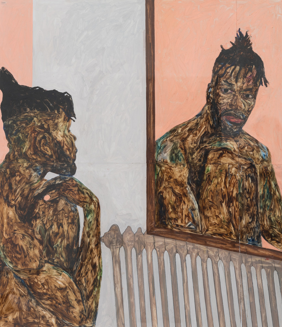
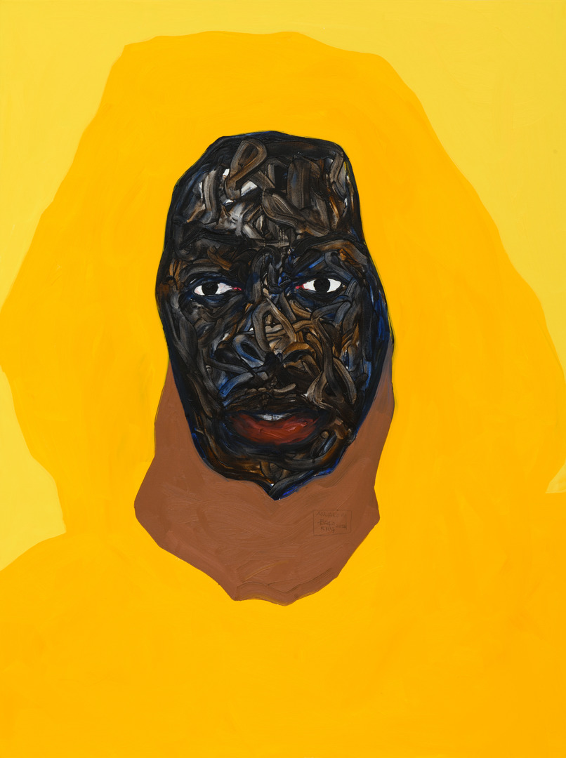
In Boafo’s Words: Steven Onoja
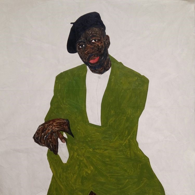
This 2018 portrait is of Steven Onoja, a well-known contemporary photographer and close friend to Amoako Boafo. Although Onoja typically finds himself behind the camera, Boafo asked the Nigerian photographer to take a chance in front of his canvas and allow him to paint his portrait. The result is an intimate painting that highlights Boafo’s early foray into sculpting the skin of his subjects through finger painting.
From his choice in clothing and facial expression, it’s clear Onoja is well-respected in his industry. This was a deliberate choice by Boafo. In discussing this painting on the seventh stop of the SAM-exclusive smartphone tour of Amoako Boafo: Soul of Black Folks, the artist explains how choices such as these inform the spirit and character of his subjects. Although viewers likely do not know Onoja personally, the way Boafo artistically depicts him gives you insight into the man he is.
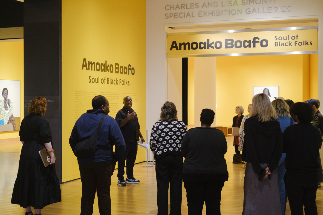
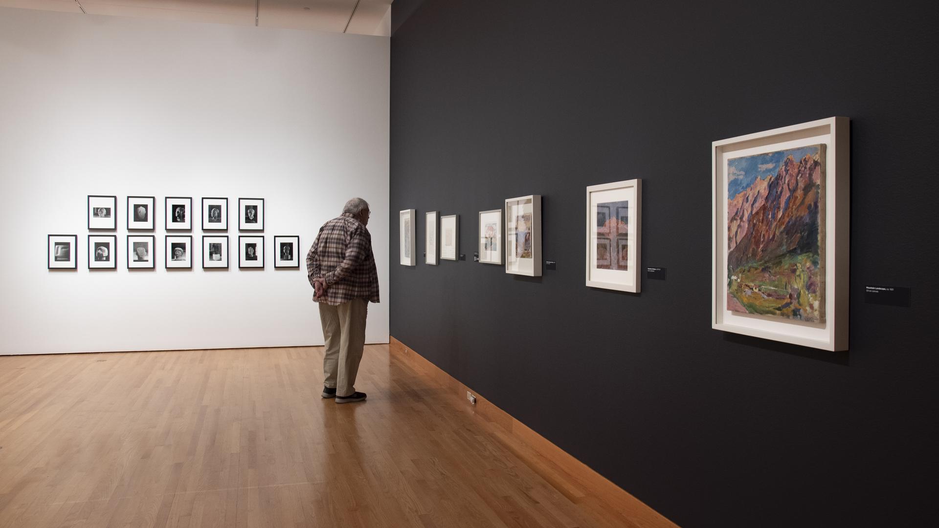
Learn more about Boafo’s intentional artistic choices by exploring all nine stops of the exhibition’s audio tour on our SoundCloud. If you’re in SAM’s galleries, use your phone to scan the QR code accompanying select works to be routed to the adjoining recording. Soul of Black Folks closes in just a few weeks at SAM—get your tickets to see the exhibition before it closes on Sunday, September 10!
Steven Onoja, 2018
AMOAKO BOAFO: Steven is a photographer that I know. I like the kind of pictures that he takes; the way he poses; and just the way he carries himself; and I wanted to just capture that.
NARRATOR: As so often in Boafo’s work, fashion plays an important role.
AMOAKO BOAFO: Now you don’t know Steven, but in just the way he’s dressed, you can already sense who he is; and for me, fashion… it gives you a bit of the person and their character and their image and their spirit without you… or without them saying anything.
NARRATOR: The painting dates from 2018 and it gives an insight into Boafo’s evolving practice.
AMOAKO BOAFO: You can see clearly like this is an old painting, or early stages of me developing my language with my finger painting and my color palette, and you can tell this is all flat tones with just the face as the busy space.
NARRATOR: The flatness of the painted surface, together with the simplified forms, allow Boafo to incorporate abstraction into his art.
AMOAKO BOAFO: Figuration can also be abstraction in a way. You can see this is clearly a figure. But then you cannot really tell how the jacket is worn. You cannot tell from where the trousers and the arm of the jacket meets. I mean, I like the idea of painting figures and portrait because it tells a certain story that I like and I want to explore in that area, but that doesn’t mean that I don’t have or add a bit of abstraction to my work as well.
– Lily Hansen, SAM Marketing Content Creator
Image: Steven Onoja, 2018, Amoako Boafo, oil on canvas, 63 x 55 in., Courtesy of Derek Forjour Collection, New York City.