Hokusai Smartphone Tour: Fine Wind, Clear Weather

You may know Katsushika Hokusai for being the creator of the infamous woodblock print The Great Wave—officially titled The Great Wave off Kanagawa (about 1830–31)—but what other artworks of his do you know? In the introductory stop on the free smartphone tour of Hokusai: Inspiration and Influencefrom the Collection of the Museum of Fine Arts, Boston, exhibition curator Dr. Sarah Thompson offers insight on another of Hokusai’s most recognizable woodblock prints: Fine Wind, Clear Weather (1830).

The audio recording begins with a brief introduction from Dr. Thompson, Curator of Japanese Art at the Museum of Fine Arts, Boston, about the exhibition and the many artworks on view that derive inspiration directly from The Great Wave. Dr. Thompson then introduces Kendall DeBoer, Curatorial Assistant in the Department of Contemporary Art at the Museum of Fine Arts, Boston, who collaborated with Dr. Thompson in curating this exhibition and the contemporary artworks that are featured within it.

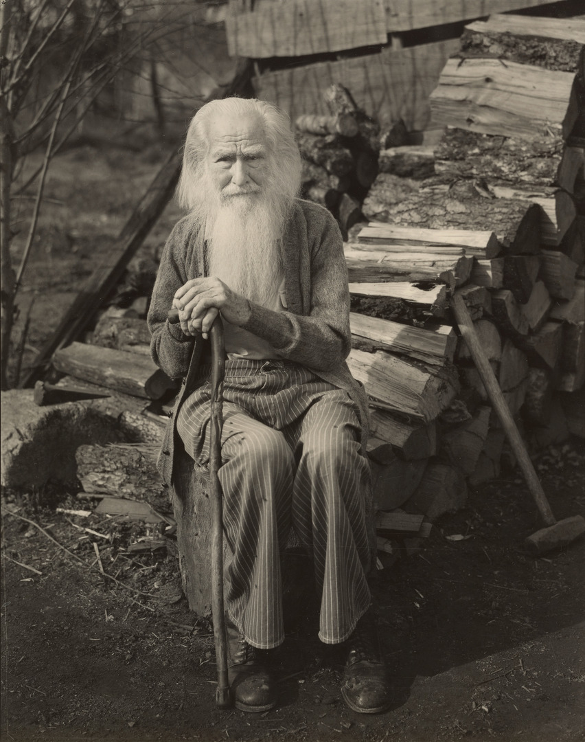
Dr. Thompson then turns her attention to Fine Wind, Clear Weather. More commonly referred to as Red Fuji, the print comes from the same series of prints as The Great Wave, called Thirty-six Views of Mount Fuji. As the title makes evident, Red Fuji depicts the sacred Mount Fuji, the tallest mountain in Japan admired for its beautiful symmetrical shape. Although not as universally recognized as The Great Wave, Red Fuji has served as inspiration for other artists looking to capture the mountain’s picturesque views. Among the artworks inspired by this print on view elsewhere in the galleries, points out Dr. Thompson, are Yoshitomo Nara’s 1999 parody print White Fujiyama Ski Gelände and Toyota Hokkei’s 19th-century print Mount Fuji

Hear more from Dr. Sarah Thompson, Kendall DeBoer, and other artists and scholars as part of the free smartphone tour of Hokusai: Inspiration and Influence now on our SoundCloud. Or, if you’re in SAM’s galleries, scan the QR code accompanying select artworks to be routed directly to each stop on the audio tour. The exhibition is on view at SAM’s downtown location through Sunday, January 21, 2024—reserve your tickets now to see Red Fuji and so much more!

Fine Wind, Clear Weather, 1830

DR. SARAH THOMPSON: Hello, and welcome to the exhibition “Hokusai: Inspiration and Influence.” I’m Sarah Thompson, the curator in charge of Japanese prints at the Museum of Fine Arts, Boston. In this show, we’ll be focusing on the most famous and influential of all Japanese artists: the painter, book illustrator, and print designer Katsushika Hokusai. Even if his name is new to you, you probably already know his most famous work, the woodblock print that has been given the nickname the Great Wave and has become one of the best-known visual images in the world. You will see a number of works based on it in this show, which looks at Hokusai in terms of the many other artists that he interacted with, both directly and indirectly. The works in the exhibition include about one-third by Hokusai himself; about one-third by other artists in Japan during his lifetime, from 1760 to 1849; and about one-third by other artists around the world, from the 1850s right up to the present, who learned about Hokusai’s work later on and found inspiration for their own work in it.

For works of contemporary art related to Hokusai, I’m lucky to have the help of my colleague Kendall DeBoer of our Contemporary Art department, and I’ll ask her to introduce herself now.

KENDALL DEBOER: Hi, I’m Kendall DeBoer, and I’m a curatorial assistant in the Department of Contemporary Art here at the MFA Boston. I specialize in contemporary craft and unconventional materials, and I’ve been delighted to work alongside Sarah on this show as a collaborator, bringing in contemporary artworks influenced by Hokusai. You’ll be hearing from me later on in this tour.

DR. SARAH THOMPSON: Now I’d like to look at one of Hokusai’s most famous images after the Great Wave, the woodblock print that has been nicknamed the Red Fuji. It’s from the same series of prints as the Wave—which you will see later in the show—called Thirty-six Views of Mount Fuji and published in the early 1830s, when Hokusai was already in his seventies. These prints were commercial products, mass produced, and sold in stores. Hokusai did the drawings, and other people then carved the wooden printing blocks—one for each color—and did the printing. Hokusai’s Fuji series was a huge, best-selling success, and it made landscape a major subject in Japanese printmaking for the first time.

Sacred Mount Fuji was an ideal choice of subject for this breakthrough print series, because it is the tallest mountain in Japan and it has a beautiful symmetrical shape that has attracted artists for centuries. The real title of this print, written in the upper left corner along with the series title, is actually Fine Wind, Clear Weather. It’s probably early morning, and the mountain—which appears in different colors in different weather conditions—looks reddish in the dawn sunlight.

Hanging near Red Fuji is a print made in 1999 by the well-known contemporary Japanese artist Yoshitomo Nara, who created a humorous parody showing Mount Fuji as a ski slope by painting over a reproduction of the famous print and then using color xerox to make limited-edition prints of his painting. Also nearby is a 19th- century print by Hokusai’s most successful student, Hokkei, who specialized in designs for privately commissioned prints, known as surimono. This image, from a series of three prints showing lucky things to dream about at new year, looks similar to some of the prints in Hokusai’s Fuji series, but it was probably made a little earlier, in the 1820s. Since Hokusai designed the Fuji prints late in life, many of his students, such as Hokkei, were already successful artists in their own right by that time. So, did Hokkei base his work on an earlier design by his teacher Hokusai? Could Hokusai have been inspired by the work of his own former student? Were both of them looking at depictions of Fuji by earlier artists? Or were they both looking at the mountain itself? There are many possible kinds of relationships between works of art, so keep these ideas in mind as you look at other comparisons throughout the show.

– Lily Hansen, SAM Marketing Content Creator

Image: Fine Wind, Clear Weather (Gaifū kaisei), also known as Red Fuji, from the series Thirty six Views of Mount Fuji (Fugaku sanjūrokkei), about 1830–31 (Tenpō 1–2), Katsushika Hokusai, Japanese, 1760–1849, woodblock print (nishiki-e); ink and color on paper, Museum of Fine Arts, Boston, Nellie Parney Carter Collection—Bequest of Nellie Parney Carter, Photograph © Museum of Fine Arts, Boston.
In Boafo’s Words: Happy Siblings

“I wanted to make my paintings the way I want people to see me, you know, I just wanted to show Blackness in a different way. Why can I not be Black and be happy?”

– Amoako Boafo

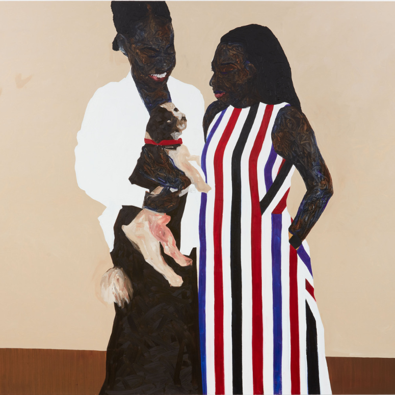
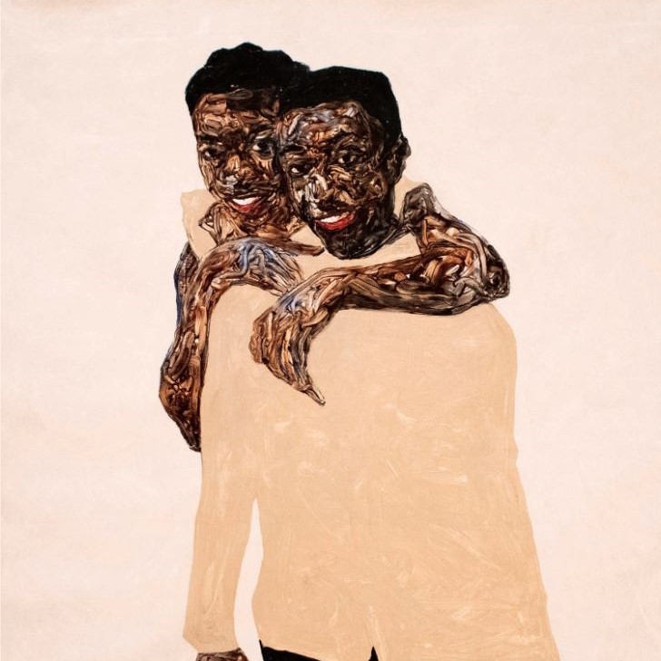
After witnessing a rare moment of playfulness between his siblings in 2019, Amoako Boafo decided to commemorate the moment in a portrait. Happy Siblings marks the first of Boafo’s paintings to include members of his immediate family.

Despite the portrait’s use of muted colors, Boafo still finds the painting to be joyful. Brightness, he says, does not equate beauty. Tune in to the eighth stop of the SAM-exclusive smartphone tour of Amoako Boafo: Soul of Black Folks on our SoundCloud to learn more about this work and how the artist incorporates his family into his art. Or, if you’re in the galleries, scan the QR code next to this work to access this and nine other recordings related to the exhibition. Soul of Black Folks closes this Sunday, September 10—get your tickets to see it at SAM’s downtown location before it’s too late!

Happy Siblings, 2019

NARRATOR: Boafo painted this portrait of his siblings in 2019.

AMOAKO BOAFO: It’s not often that I see them playful like that. So, when I saw it, I’m like, let me capture this moment and let me just put it down.

NARRATOR: The portrait was a way of including the artist’s family in his practice.

AMOAKO BOAFO: I wanted to find a way to get my family into my painting because they have an idea of what painting is, and they like what I’m doing, but they don’t really know much about it.

I mean, the thing is that they don’t come to the studio, you know, because they have other things to do, and they feel like when they come, they will disturb me, which I don’t think it is true; but instead of waiting for them to come around I want to go to them.

NARRATOR: Interestingly, for this joyful image, Boafo has chosen a muted paint color, buff titanium, for his brother’s shirt.

AMOAKO BOAFO: I don’t think it has to be bright to be beautiful. Because this color palette has a lot of white in the background, which is plain. So it gives it a lot of shine.

NARRATOR: It also makes a strong contrast with his siblings’ skin color.

AMOAKO BOAFO: You know, dark… dark helps with light.

NARRATOR: This image of light and joy is important for Boafo.

AMOAKO BOAFO: I have done a lot of paintings on my struggle. But then I had to change that for myself. I wanted to make my paintings the way I want people to see me, you know, I just wanted to show Blackness in a different way. Why can I not be Black and be happy?

– Lily Hansen, SAM Marketing Content Creator

Image: Happy Siblings, 2019, Amoako Boafo, oil on canvas, 63 x 63 in., Jesse Williams Collection.

In Boafo’s Words: Steven Onoja

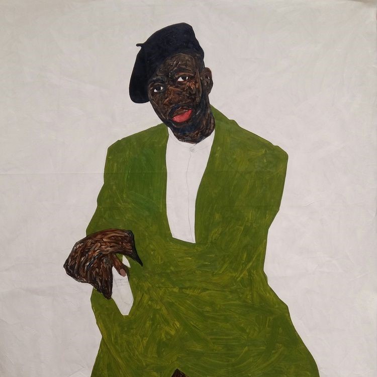
This 2018 portrait is of Steven Onoja, a well-known contemporary photographer and close friend to Amoako Boafo. Although Onoja typically finds himself behind the camera, Boafo asked the Nigerian photographer to take a chance in front of his canvas and allow him to paint his portrait. The result is an intimate painting that highlights Boafo’s early foray into sculpting the skin of his subjects through finger painting.

From his choice in clothing and facial expression, it’s clear Onoja is well-respected in his industry. This was a deliberate choice by Boafo. In discussing this painting on the seventh stop of the SAM-exclusive smartphone tour of Amoako Boafo: Soul of Black Folks, the artist explains how choices such as these inform the spirit and character of his subjects. Although viewers likely do not know Onoja personally, the way Boafo artistically depicts him gives you insight into the man he is.

Learn more about Boafo’s intentional artistic choices by exploring all nine stops of the exhibition’s audio tour on our SoundCloud. If you’re in SAM’s galleries, use your phone to scan the QR code accompanying select works to be routed to the adjoining recording. Soul of Black Folks closes in just a few weeks at SAM—get your tickets to see the exhibition before it closes on Sunday, September 10!

Steven Onoja, 2018

AMOAKO BOAFO: Steven is a photographer that I know. I like the kind of pictures that he takes; the way he poses; and just the way he carries himself; and I wanted to just capture that.

NARRATOR: As so often in Boafo’s work, fashion plays an important role.

AMOAKO BOAFO: Now you don’t know Steven, but in just the way he’s dressed, you can already sense who he is; and for me, fashion… it gives you a bit of the person and their character and their image and their spirit without you… or without them saying anything.

NARRATOR: The painting dates from 2018 and it gives an insight into Boafo’s evolving practice.

AMOAKO BOAFO: You can see clearly like this is an old painting, or early stages of me developing my language with my finger painting and my color palette, and you can tell this is all flat tones with just the face as the busy space.

NARRATOR: The flatness of the painted surface, together with the simplified forms, allow Boafo to incorporate abstraction into his art.

AMOAKO BOAFO: Figuration can also be abstraction in a way. You can see this is clearly a figure. But then you cannot really tell how the jacket is worn. You cannot tell from where the trousers and the arm of the jacket meets. I mean, I like the idea of painting figures and portrait because it tells a certain story that I like and I want to explore in that area, but that doesn’t mean that I don’t have or add a bit of abstraction to my work as well.

– Lily Hansen, SAM Marketing Content Creator

Image: Steven Onoja, 2018, Amoako Boafo, oil on canvas, 63 x 55 in., Courtesy of Derek Forjour Collection, New York City.

In Boafo’s Words: Red Collar

When first looking at Amoako Boafo’s 2021 portrait, Red Collar, viewers can’t help be drawn to the striking multicolored dress that dominates the center of the painting. It comes as a surprise to many when they eventually realize that the artwork draws its title not from the striped dress, but rather from the dog’s small red collar.

On this sixth stop of the SAM-exclusive audio tour of Amoako Boafo: Soul of Black Folks, the artist explains how the painting’s striped dress came to be. Although he originally planned to adorn the subject’s dress in an intricate pattern using his paper transfer technique, his decision to use of gesso—a thin, white paint often applied to surfaces such as wood panels or canvas to allow for a smoother surface—to prep the canvas, made a paper transfer impossible. Finger painting a design on the dress was also not an option, the artist explains in the recording, because he reserves this technique for the exposed body. In the end, he decided to use a paintbrush to create the dress’s stripes.

Hear more from Boafo by exploring all nine stops of the free smartphone tour of Soul of Black Folks at SAM on our SoundCloud. Or, if you’re in the galleries, scan the QR code accompanying each work to be routed to the adjoining recording.

Red Collar, 2021

NARRATOR: The two women, with their dog, are friends of the artist in Ghana. But he painted the portrait in California. A striking feature of the painting is the boldly striped dress. In fact, this design was not Boafo’s original intention. In Los Angeles, he was working with a different canvas surface, which he had prepared using gesso.

AMOAKO BOAFO: So gesso is another layer that’s used to prepare canvas, and I like to do that because when I gesso the canvas and it dry, I sandpaper it, and it gives me a smooth surface for me to be able to move my fingers when I’m painting because when it’s rough, my fingertips hurts a little bit.

NARRATOR: Initially, Boafo had planned to create a pattern using the paper transfer technique he describes in Stop 3, The Menu.

AMOAKO BOAFO: I wanted to do a transfer print, but then with the gesso on that canvas, the print could not hold, and so I had to find different ways to resolve, and that’s how I got to the pattern that she was wearing.

NARRATOR: Boafo created the stripes using a brush. As usual, finger painting is reserved for the skin and body of his characters.

AMOAKO BOAFO: The exposed body—like face, arm, and hair—those are the only spaces that I use my finger. Anything outside that, the painting of the dog, the clothes, the background, everything else is done with a brush.

NARRATOR: For Boafo, this distinction creates a particular intimacy with the characters.

AMOAKO BOAFO: Not that when I paint with a brush it’s not good or I don’t like it, but there’s a different kind of joy and happiness in being able to, like, touch a mood and move things around to form something. There’s a different feeling with that.

– Lily Hansen, SAM Marketing Content Creator

Image: Red Collar, 2021, Amoako Boafo, oil on canvas, 84 x 108 in., The Hornik Collection.

In Boafo’s Words: Self Portrait – Masked

“I always want people to know that I’m looking. Even when I’m not there, I’m still looking. If you’re looking at my painting, my painting is looking at you, and I’m looking at you.”

– Amoako Boafo

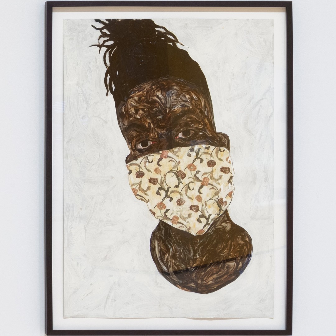
The image of a face mask is now synonymous with the height of the COVID-19 pandemic. It comes as no surprise then to learn that Amoako Boako painted Self Portrait – Masked in 2020.

In the fifth stop of the free smartphone tour of Amoako Boafo: Soul of Black Folks at SAM, the artist discusses the evolution of his artistic process while in lockdown in Ghana. Although the mask covers the majority of his face, the artist still finds beauty in his intricately patterned mask and direct gaze. Taken as a whole, this image demonstrates how communication continues despite lacking most facial features.

Explore all nine stops in the exhibition’s audio tour now on our SoundCloud or scan the QR code accompanying any work to tune in while exploring SAM’s galleries. The exhibition closes in less than one month—reserve your tickets to see it before it closes on Sunday, September 10!

Self Portrait – Masked, 2020

NARRATOR: Self-Portrait – Masked, dates from 2020. Boafo was in Ghana when COVID struck. This shaped his experience of the lockdown: for most people he knew, staying home was just not an option.

AMOAKO BOAFO: I mean, it was a different case there because almost everybody, I mean the larger population, the work they do is hand to mouth, which means if you don’t go to work in the next day or two days, you might not have anything to eat.

So, I did not have the sense of just staying home and just staying in and not doing anything. You know, I was out there trying to support as much as I could.

NARRATOR: Wearing a mask is linked in our minds with the horrors of COVID. But Boafo’s mask is not just about protection from disease: it is covered with his distinctive patterning.

AMOAKO BOAFO: We all know—when COVID happened—we all know what it did and the impact it had. There wasn’t anything beautiful about it. But I needed to make the painting in a way that it still would be beautiful for you to look at.

NARRATOR: Above the mask, Boafo’s eyes meet ours directly.

AMOAKO BOAFO: Well, I always want people to know that I’m looking. Even when I’m not there, I’m still looking. If you’re looking at my painting, my painting is looking at you, and I’m looking at you.

– Lily Hansen, SAM Marketing Content Creator

Photo: Installation view of Amoako Boafo: Soul of Black Folks at Contemporary Arts Museum Houston, 2022, photo: Sean Fleming.

In Boafo’s Words: Umber Brown Belt

“I want my characters to pose with this kind of self-confidence, and in this painting, the character’s pose is exactly what I want to achieve. She’s present in the space.”

– Amoako Boafo

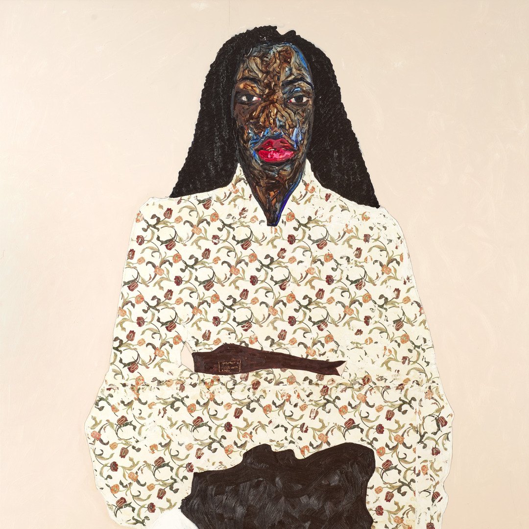
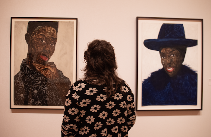
Self-confidence is an essential characteristic in all of Amoako Boafo’s portraits. Not only is this accomplished through his subjects’ poses, but also by the artist’s use of vibrant colors, an unflinching gaze, and distinct fashion. In Umber Brown Belt, the subject exudes self-confidence in her decision to directly face the viewer. This confidence is further emphasized by the artist’s choice to give her bright red lips, an intimate stare, and an intricate floral blouse.

On the fourth stop of the free smartphone tour of Amoako Boafo: Soul of Black Folks at SAM, the artist explains the reasons behind his creative hallmarks. Listen to the audio recording now on our SoundCloud to learn more about the artistic choices in Umber Brown Belt or scan the QR code accompanying the work to tune in while exploring SAM’s galleries. The exhibition closes Sunday, September 10—reserve your tickets before it’s too late!

Umber Brown Belt, 2020

NARRATOR: Umber Brown Belt is a portrait of a woman from the artist’s neighborhood. The belt of the title cinches her lavishly patterned floral blouse. For Boafo, his use of pattern is connected to the patterned fabrics common in his home city of Accra, the capital of Ghana.

AMOAKO BOAFO: You cannot go a day without seeing anything with a pattern in Accra, anything colorful in Accra. So, I think, whenever I’m painting and I’m making those outfits with the print, I think of the patterns that I see daily, and the colors that I do come across. That’s what I think of and how I interpret them.

NARRATOR: Dress is important for Boafo in presenting his characters.

AMOAKO BOAFO: The way you appear in certain spaces, people think of you the way you are dressed. I want my characters to pose with this kind of self-confidence, and in this painting, the character’s pose is exactly what I want to achieve. She’s present in the space.

NARRATOR: This idea of presence is significant for Boafo.

AMOAKO BOAFO: Everything is connected to my experience in certain spaces and locations where I find myself and how people look at you and how you feel. I think, you know, most of the spaces that I’ve been before have not been that inviting. Sometimes you are there but not really there. And the thing is that I want to change that kind of ideas with my paintings. I want to be present. I want people to feel my presence.

NARRATOR: There’s one final detail you may have noticed: the woman’s hands are left unpainted.

AMOAKO BOAFO: The energy that I want from the painting, if I’m already getting it, it doesn’t make sense to add more because sometimes adding more: it’s not necessarily good.

– Lily Hansen, SAM Marketing Content Creator

Image: Umber Brown Belt, 2020, Amoako Boafo, paper transfer and oil on canvas, 82 5/8 x 66 7/8 in., Courtesy the Collection of Marilyn & Larry Fields.

Muse/News: Boafo’s Presence, History Digs, and Pastel Bauhaus

SAM News

Amoako Boafo: Soul of Black Folks, the Ghanaian artist’s debut museum solo exhibition, is now on view at the Seattle Art Museum! Evening Magazine interviewed Ramzy Lakos, SAM’s Educator for Digital Learning, about working with the artist to create a Seattle-exclusive smartphone tour for visitors that shares the artist’s perspective

“It’s very personal, I think, to paint someone’s skin using your fingers. And it also leaves a trace of the artist on the painting itself. And I think that’s something he wants you to feel; he wants you to feel like he’s there in the gallery with you.”

And at the Seattle Asian Art Museum, don’t miss historical Japanese prints and Toulouse-Lautrec works in Renegade Edo and Paris. KUOW’s Mike Davis recommends the show in the most recent edition of his “adventures in art.” And in a recent Stranger Suggests, Charles Mudede recommended the “expertly curated” exhibition.

“This was not the stuff of the warrior class. This was the floating world of fleeting and popular pleasures: music, theater, whore houses. Also fleeting was the nightlife of Belle Époque Paris brilliantly and famously captured by the prints of Henri de Toulouse-Lautrec.

Local News

“Seattle’s Museum of Museums to shut down after three years”: The Seattle Times’ Margo Vansynghel reports on the sad loss for the city’s museum community. 

In her latest ArtSEA post, Brangien Davis of Crosscut shares details about “the fancy new entrance to the Colman Dock ferry terminal” debuted recently by Waterfront Seattle as part of the massive waterfront renewal project. 

“Unearthing Japanese American history at a dig site in North Seattle”: The Seattle Times’ Tat Bellamy-Walker on the former site of Green Lake Garden Co. and the archaeology project to reveal its story as home to a Japanese American community before WWII-era incarceration.

“‘We’re digging up these histories, but this history is all around us,’ [archaeologist Alicia] Valentino said. “These people didn’t just disappear. They’re in the community today.’”

Inter/National News

In another archaeology story, Hadami Ditmars reports for the Art Newspaper on the discovery of a “1,000-year-old fish trap and the remains of the ancestral village of ȾEL¸IȽĆE (pronounced Tel-eech).”

Melena Ryzik for the New York Times on the new Louis Armstrong Center, which joins the Louis Armstrong House Museum in Queens for even more ways to celebrate the famed jazz trumpeter, singer, and bandleader.

“It Was Like Pastel Bauhaus”: Artnet speaks with artists Gary Panter and Wayne White about working with the late Pee-wee Herman to bring “Pee-wee’s Playhouse” to life.

“Paul [Reubens], Ric, and Wayne, we’re all painters,’ Panter said. ‘We really brought the sensibility of art and art history to the set. Paul was more of a conceptual artist. He had a lot of input, and we had endless ideas.’”

And Finally

“Meet the diplomat in Seattle who’s become a social media star by folding origami cranes.”

– Rachel Eggers, SAM Associate Director of Public Relations

Photo: L. Fried.

In Boafo’s Words: Reflection I

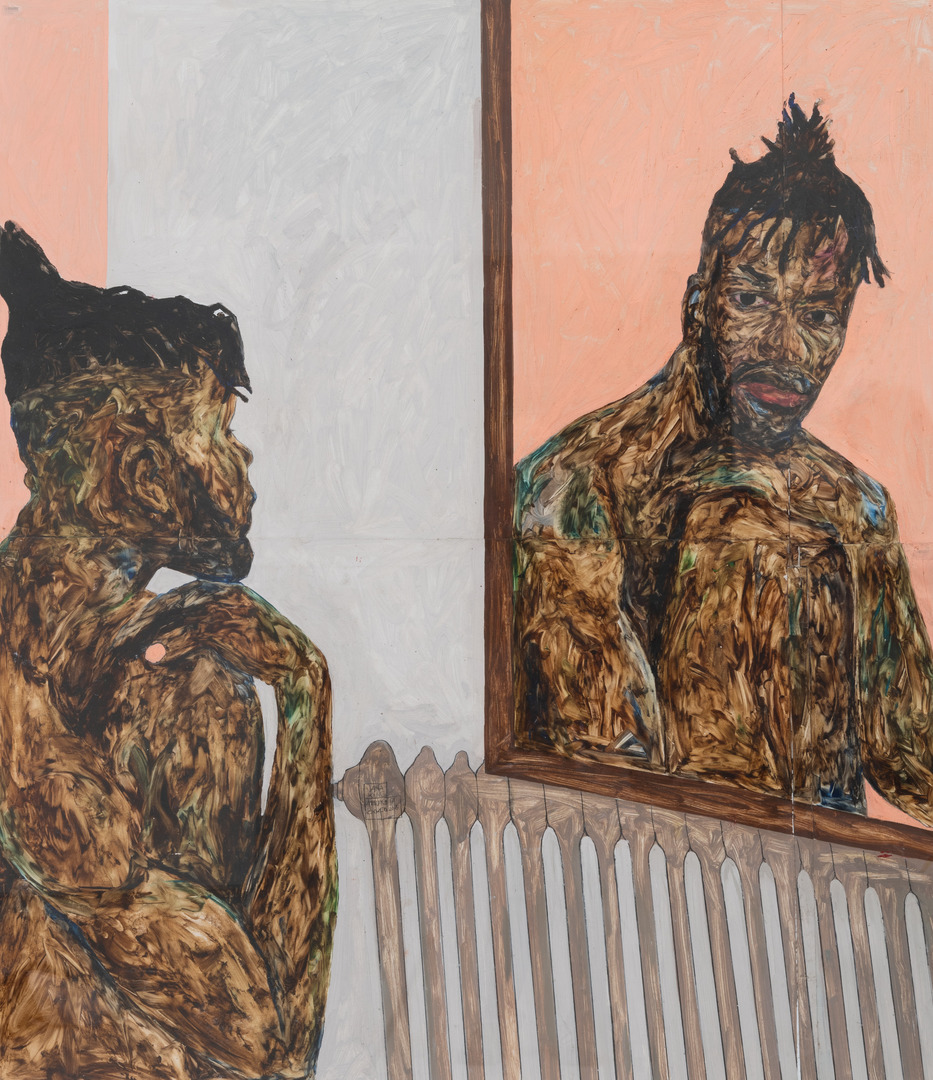
Reflection I marks Amoako Boafo’s first self-portrait following his move from Accra, Ghana to Vienna, Austria. With his head resting on his hand, Boafo resembles artist Auguste Rodin’s famed sculpture The Thinker, a work that has come to symbolize both the suffering and salvation found in self-reflection.

In addition to Rodin, many consider this self-portrait to allude to W.E.B. Du Bois and his notion of the double-consciousness as outlined in The Souls of Black Folks (1903), for which Boafo’s exhibition is named. This concept interrogates the idea that Black people constantly have to look at themselves through the eyes of ‘others.’ In looking at himself in the mirror, Boafo challenges the ‘othered’ gaze often applied to the Black body—a theme explored by the artist within many of his works.

Tune in to the free smartphone tour of Amoako Boafo: Soul of Black Folks to learn more about Reflection I and eight more of Boafo’s portraits. It can be accessed on your own time via our SoundCloud or by scanning the QR code accompanying each work in SAM’s galleries. Get your tickets to see the exhibition today!

Reflection I, 2018

NARRATOR: Boafo painted Reflection I in 2018, after leaving Ghana to study in Vienna, Austria. The radiator under the mirror deliberately points out the change to a European setting. The new environment sparked a period of self-evaluation for the artist: it led him—for the first time—to paint himself.

AMOAKO BOAFO: Working with myself helped me understand who I am as an artist and a human being. Making that image also help others look at themselves and think of things differently. It is a way that I wanted to experience my masculinity myself and not what society sees to be normal. I wanted to see how it looks like when you explore more of the flesh.

NARRATOR: As part of this exploration, Boafo has developed a distinctive skin color palette of umber brown and ultramarine blue. He applies the paint directly to the canvas using his fingers.

AMOAKO BOAFO: I wasn’t able to move forward with the brush painting the way I wanted my characters to feel, the way I want to express their feeling, because for me, painting is just more than capturing the perfection of a person. There is character. There is feeling. There is energy. The brush could not give me that kind of feeling. And so I arrived at painting with my finger.

NARRATOR: Here, the artist meets his own gaze in the mirror.

AMOAKO BOAFO: I think sometimes we look away from our experiences, and painting being a tool for me to express myself, I don’t want to shy away from the experiences. I want to look at it. I want people to see me looking at it because for me I feel like that’s the space where I get to be myself.

– Lily Hansen, SAM Marketing Content Creator

Photo: Reflection I (detail), 2018, Amoako Boafo, oil on paper, 51 1/8 x 43 3/8 in., Image and work courtesy Roberts Projects, Los Angeles and Private Collection, photo: Robert Wedemeyer.

In Boafo’s Words: Jean Jacques Ndjoli

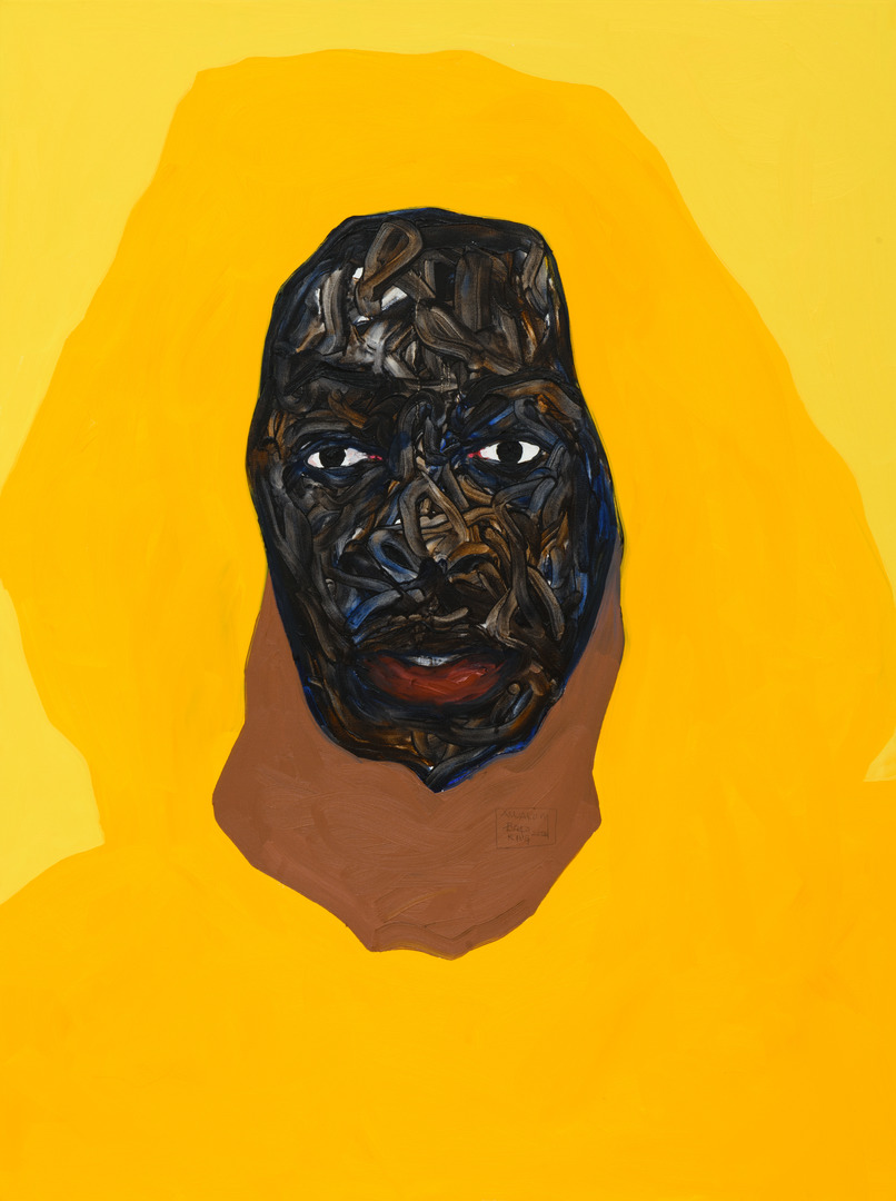
Before entering the galleries of Amoako Boafo: Soul of Black Folks at SAM, visitors are greeted by a 2020 portrait of contemporary fashion designer and stylist Jean Jacques Ndjoli. Hanging amidst a wall covered in Boafo’s well-known Monstera plant print, the portrait offers an introduction to the artist’s signature style with its vibrant yellow hues and the apparent use of his distinct finger painting technique.

Learn more about this artwork and eight more of Boafo’s portraits by tuning in to our free smartphone tour of the exhibition on our SoundCloud. Or, if you’re in the galleries, scan the QR code accompanying each work to be directed to the relevant stop on the tour. The exhibition closes Sunday, September 10—get your tickets to see it before it’s gone!

Jean Jacques Ndjoli, 2020

AMOAKO BOAFO: This is a painting I did in LA [where] it’s sunny all the time. You know, you are guaranteed to get your fresh pressed orange juice.

NARRATOR: To capture that mood, the artist focuses on one color.

AMOAKO BOAFO: You have three shades of yellow. So, the overall pullover is the cadmium yellow hue, and then the background, I tinted it with white, and then I added a bit of brown to the yellow hue to have that inner pullover.

NARRATOR: Boafo is a figurative painter. In other words, he paints recognizable figures and objects. But this image goes beyond straightforward representation. The flat, simplified forms of the hooded pullover become abstract areas of color.

They also create a strong visual tension with the thickly finger-painted skin of the face.

AMOAKO BOAFO: I think of colors that, you know, just highlight the face and the figure.

NARRATOR: The important thing for Boafo is to elevate and celebrate his characters.

AMOAKO BOAFO: I consciously think about how to elevate the characters and place element or colors that only elevates them or complement them and not compete and take away from them.

I think the thing with celebration is that we don’t do it that often, and I think it would be good that we celebrate others more often: for people to know that we see what they are doing, and they are appreciated and noticed for what they are doing.

– Lily Hansen, SAM Marketing Content Creator

Image: Jean Jacques Ndjoli, 2020, Amoako Boafo, oil on canvas, 40 x 30 in., Collection of Josef Vascovitz and Lisa Goodman, courtesy of Roberts Projects, Los Angeles.

In Boafo’s Words: Introducing Soul of Black Folks

“I like people to be with me through the journey of making [a] painting, even though they’re not in the studio space. I want people to come to the show and feel like they made the paintings with me…”

– Amoako Boafo

Amoako Boafo: Soul of Black Folks is now on view at SAM! As part of the contemporary Ghanaian artist’s Pacific Northwest solo debut, we developed an audio tour of additional artistic insight. Featuring interviews with Boafo and exhibition curator Larry Ossei-Mensah, the tour highlights eight of the artist’s portraits created between 2016 and 2022 and is exclusive to Seattle audiences.

The tour kicks off with a brief introduction to the exhibition and Boafo’s artistic process. This stop includes a discussion of the exhibition’s title—drawing its inspiration from W.E.B. Du Bois’s seminal 1903 ethnographic study The Souls of Black Folk—and the artist’s distinct finger painting technique used to sculpt the skin of his subjects. The recording concludes with Boafo explaining what he hopes Seattle visitors will take away from experiencing his artwork.

Explore all nine stops of our smartphone tour in SAM’s galleries by scanning the QR code accompanying each of the featured works on view or listen to it on your own time on our SoundCloud. Get your tickets to see the exhibition at the Seattle Art Museum through Sunday, September 10!

Soul of Black Folks: Introduction

NARRATOR: Welcome to the Seattle Art Museum and to Amoako Boafo: Soul of Black Folks. This is the first solo museum exhibition in the United States for Ghanaian artist Amoako Boafo. The show brings together over 30 works created between 2016 and 2022. It has been guest curated by Larry Ossei-Mensah.

The title of the exhibition is inspired by the seminal ethnographic study, The Souls of Black Folk, by W.E.B. Du Bois, dating from 1903. The book was an assessment of Black life at the turn of the 20th century. Boafo’s work offers a visual equivalent for our times: it can be seen as an exploration of Black life in all its breadth of experience and emotion. The exhibition is a celebration of the humanity of Black people in 2023.

Boafo’s paintings combine skillful brushwork with finger-painting: specifically, he uses his fingers to mold and sculpt the bodies of his subjects—subjects that he refers to as ‘characters.’ We’re delighted that Boafo will be joining us throughout the tour, offering insights into his artistic process and inspiration. 

AMOAKO BOAFO: I like people to be with me through the journey of making the painting, even though they’re not in the studio space. I want people to come to the show and feel like they made the paintings with me because there is all the choices of colors and movement that you see, and you feel like you are part of the painting, or you are there when the painting was made.  I want people to have that feeling when they come.  

– Lily Hansen, SAM Marketing Content Creator

Photo: Alborz Kamalizad.

Inside SAM’s World of Compelling Cloth: French Coverlet

While many of us source our coverlets—more commonly referred to today as a bedspread—from big-name companies, in 18th century France these objects were typically handwoven and dyed with meticulous precision by local artisans. They often featured intricate embroidery details that took hours to craft. In the sixth stop of our smartphone tour of Ikat: A World of Compelling Cloth at SAM, we take a close look at a French coverlet from the late 18th century and explore its fabric, known as Chiné à la branche. Browse all seven stops of our free smartphone tour from the exhibition’s galleries before it closes on Monday, May 29 or in your own time here.

How was Chiné à la branche used?
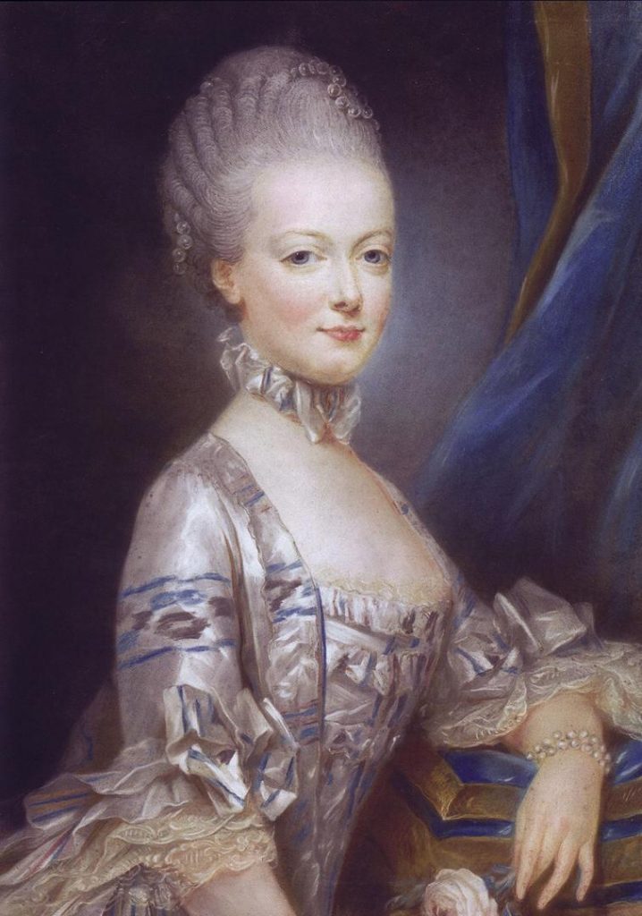
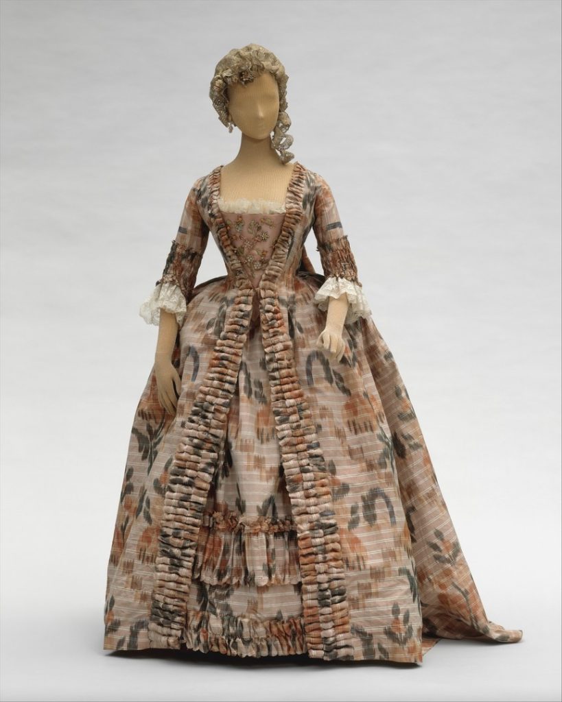
European ikat fabrics were incredibly expensive to produce, which is one of the reasons Chiné à la branche is most closely associated with royalty. Marie Antoinette had a particular affinity for the fabric, having her court clothes and palace furnishings made of various Chiné à la branche designs. The more popular designs in court were soft, blurred floral patterns, which were used for everything from dresses to upholstery.

How did industrialization affect ikat?
Industrialization led to the French abandoning the slow and costly production of ikat. Rather than hand-dying individual bundles, they were able to print patterns directly onto the warp threads. The dress shown above is stylized to look like ikat, but technically does not follow the traditional ikat process.

Verbal Description of French Coverlet

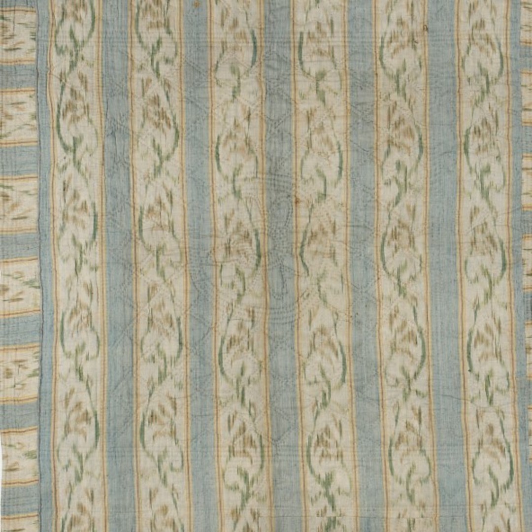
This coverlet was made in the late 18th century and measures five feet, six inches tall and four feet, nine inches wide. The ikat top layer of this coverlet is made of silk and linen thread and the back is made of silk. The layers are connected by quilted embroidery. This coverlet—or, bedspread—has both the colorful print-like pattern of the weave and a textured pattern created by the quilting process that joins the ikat fabric with other layers of the piece. The backing of this bedspread is a pink silk fabric. Between the silk backing and the ikat top layer, there’s about half an inch of batting—or, filling—that would make the coverlet a more effective warming layer for a bed.

First, we’ll examine the woven pattern of the ikat, which is precise in its execution, but has an intentional blurry quality around the edges. The pattern is a repeat of vertical stripes: a powder-blue stripe about three inches wide sits next to a cream colored stripe about five inches wide. This set of stripes is repeated six times across the coverlet. Within the cream colored stripe, there’s more detail. Thin lines on both edges of the cream stripe in pale yellow, dusty rose, and black frame an abstract design of flowers.

The stems and leaves of the flowers are a soft, mossy green and run down the center of the cream stripe in alternating curved lines that are reminiscent of vines. Splashes of the same dusty rose color form the blossoms of the flowers. Both the blossoms and the stems have irregular edges that artists in France nickname ‘flambé’—or, flaming—an aesthetic that was desirable at the time. On the sides of the coverlet, there are two strips of the fabric that have been cut off and attached perpendicularly to the rest of the bedspread, making the pattern horizontal on the edges.

Now let’s focus on the quilting that joins the layers together. The quilted stitching is done in a clear thread so that the lines themselves are only visible by the indentation and texture they create on the surface of the bedspread. In the center of the piece, there is a circle surrounded by eight symmetrical petal shapes, forming a simple flower shape like a large daisy. The daisy has three rings encircling it and then diamond shapes fill up most of the coverlet until about a foot from the edges where they are boxed in. Around the diamonds, small hearts and daisies alternate in a border to the quilting.

– Lily Hansen, SAM Marketing Content Creator

Photo: French Coverlet, late 18th century. Collection of David and Marita Paly. Silk, warp ikat, linen weft, quilted embroidery. 66 in. x 57 in. Marie Antoinette, Archduchess of Austria by Joseph Ducreux. 1769. Pastel on parchment. © Château de Versailles. Robe à la Française, French, 1760–70, Silk. © The Metropolitan Museum of Art.

Inside SAM’s World of Compelling Cloth: Woman’s Robe (Mashru)

Mashru is an Arabic word meaning ‘permitted’ or ‘allowed.’ In many Islamic cultures, a mashru is a garment made of a silk-cotton blend worn my individuals of all social classes. This stop of the smartphone tour of Ikat: A World of Compelling Cloth explores the history of mashru garments with additional content not found in SAM’s galleries. Learn about these garments below and see an example for yourself by visiting the exhibition at SAM’s downtown location before it closes Monday, May 29. Plus, explore all of the stops in SAM’s free verbal description tour on SoundCloud.

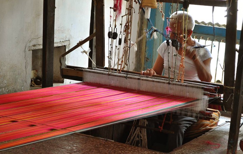
One ikat textile that has traveled across Asia is the satin-woven fabric known in India as mashru. This type of silk-cotton blend is called mashru. Mashru cloths were worn by men and women across the Islamic world. In some Islamic cultures, Muslims are not permitted to wear pure silk garments, so textile makers in India experimented by adding cotton into the silk weave, creating a garment that was soft and lightweight, but also acceptable to wear.

Verbal Desciption of Woman’s Robe (Mashru)

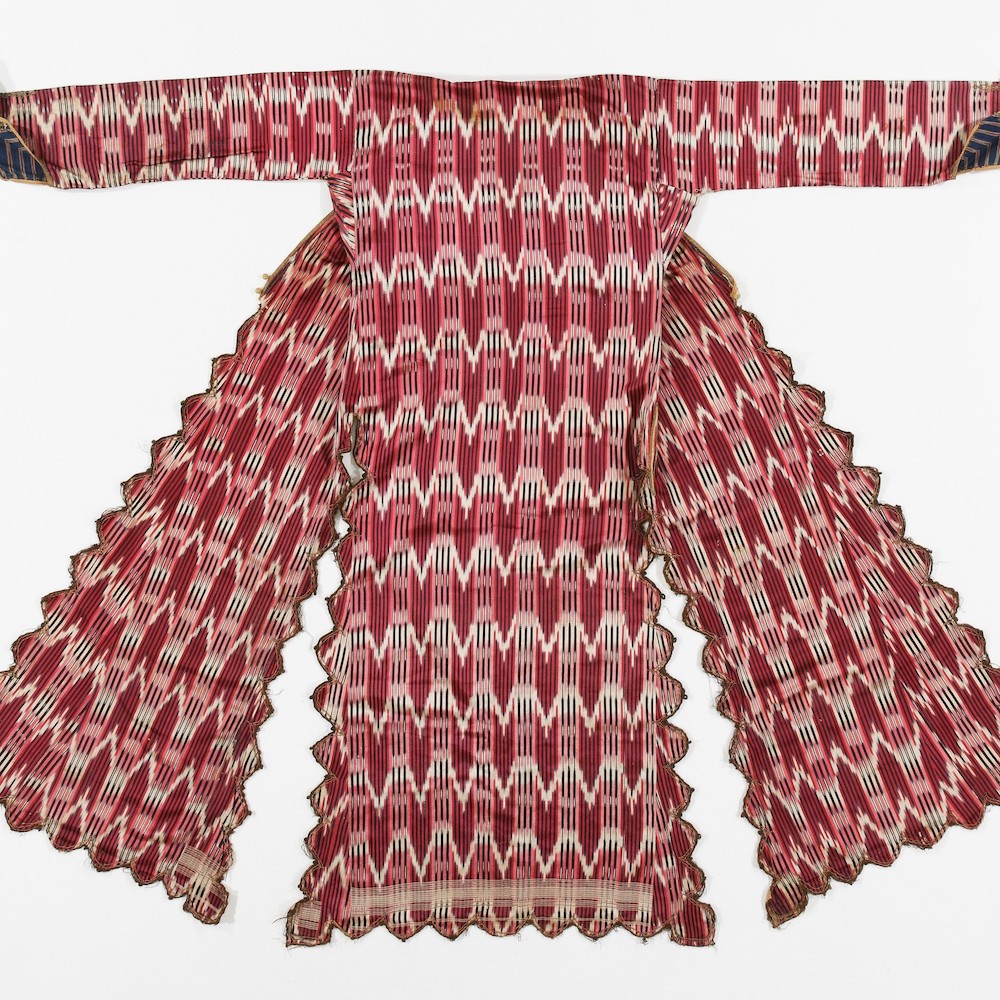
This garment is a mashru. Mashru is spelled M-A-S-H-R-U. The robe was made in Syria in the 19th century and measures five feet, six inches tall by four feet, five inches wide. The garment is made of silk and cotton thread and metallic embroidery. The robe is hung on a ‘T’ frame with the arm sleeves stretched out and the back of the garment facing the viewer. A dense pattern of stripes and arrowhead shapes defines this woman’s robe from Syria. The robe’s hem extends down to the wearer’s knees and the long sleeves reach to the wrists.

Let’s start by talking about the pattern on the outside of the garment. Long, thin vertical stripes alternate in cherry red, black, and light pink. Layering on top of these stripes are horizontal bands of white arrowhead shapes which create a complex illusion of depth. By contrast, the inside of the robe is lined with a soft cream white cotton. The inside of the sleeves are decorated with a cotton ikat cloth with blue and white stripes.
Now, let’s focus on the structure of the robe. The body of the robe is made three vertical panels of fabric—roughly equal in size—that hang down separate from one another so you can imagine how they might sway and twirl as the wearer moved about. To join these panels together and close up the robe, the wearer would fasten a series of balls and loops found along the edge of each panel which is scalloped with reprieving triangle patterns. As we zoom into that edge, notice how metallic thread is embroidered into decorative designs, adding weight and stiffness.

The rest of the robe is thin and lightweight; the surface is silky smooth. This comes from the blend of fibers used here: silk for the warp threads—which run vertically—and cotton for the weft threads which run horizontally. This type of silk-cotton blend is called a mashru, an Arabic word meaning permitted or allowed. Mashru cloths were worn by men and women across the Islamic world. In some Islamic cultures, Muslims are not permitted to wear pure silk garments so textile makers in India experimented by adding cotton into the silk weave, creating a garment that was soft and lightweight, but also acceptable to wear.

– Lily Hansen, Marketing Content Creator

Photos: Mushruu (woman’s Ottoman robe), 19th century, Silk Road (garment made in Ottoman world; ikat cloth possibly Syrian), silk warp ikat and cotton weft, metallic embroidery, 53 x 66 in., Collection of David and Marita Paly. Traditional Mashru Weaving in Gujurat, India.

Inside SAM’s World of Compelling Cloth: Chief’s Poncho

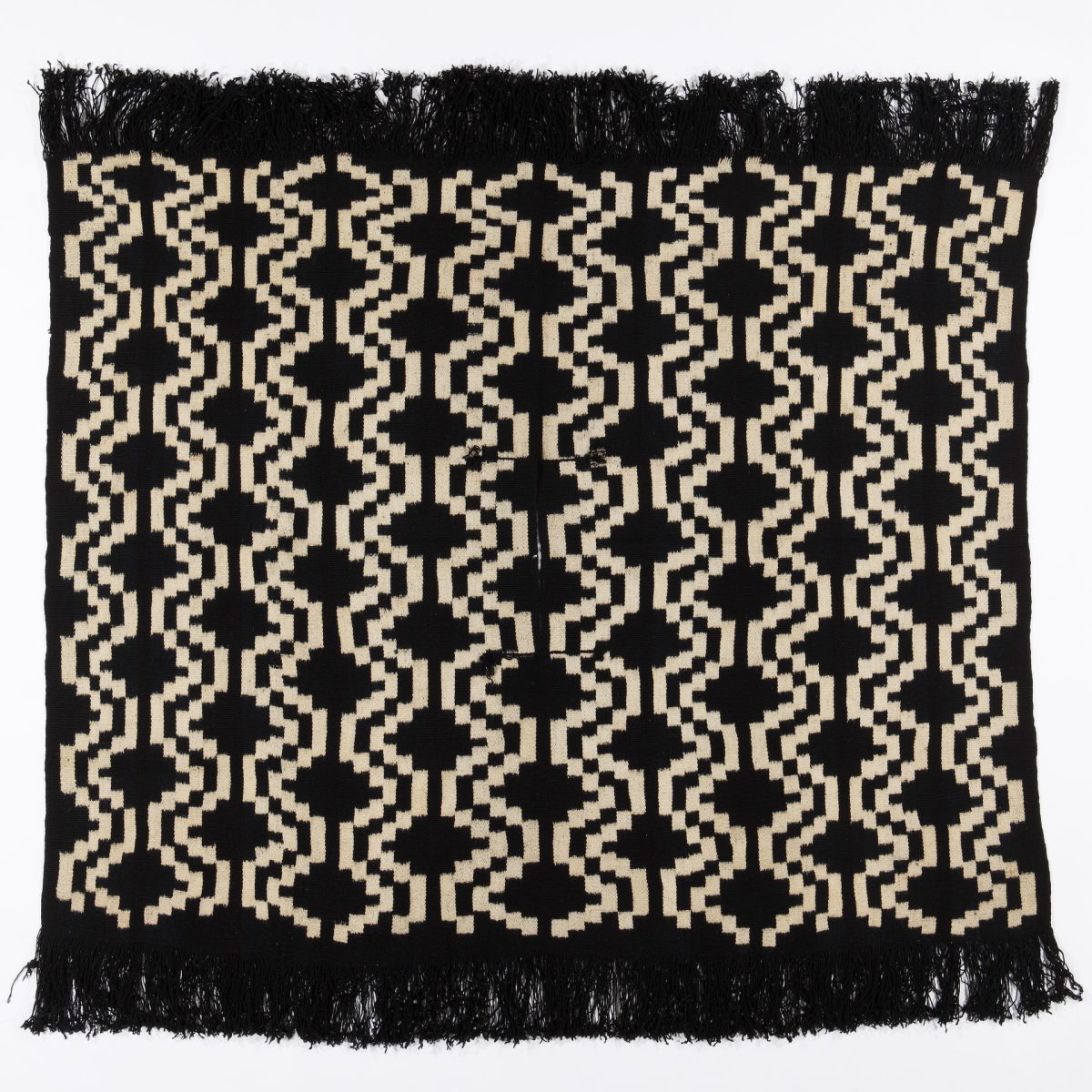
This stop on SAM’s smartphone tour of Ikat: A World of Compelling Cloth explores an indigo and cream poncho created by the Mapuche people of Chile in the late 19th century. It includes photos and text not found in the exhibition’s galleries as well as a verbal description of the textile intended for visitors with low to no vision, or anyone interested in taking a closer look at the artworks.

Scroll below to learn about Chile’s Mapuche people, the connection between weaving and land rights, the significance of stepped crosses on Mapuche textiles, and a thorough explanation of one particular poncho on view in SAM’s galleries. You can explore all seven stops of the exhibition’s smartphone tour and thirteen available verbal descriptions while visiting SAM or on your own time. And don’t forget: Ikat is on view at SAM’s downtown location through Monday, May 29—don’t miss it, get your tickets today!

Who are the Mapuche?

The Mapuche are the largest group of indigenous people in Chile and make up about 9% of the country’s population. Mapuche culture has existed in Southern Chile and Southwestern Argentina since 500 BC, but the current relationship between the Mapuche and the Chilean State is fraught. The government has stripped away land rights from the indigenous groups, and has met protests with a variety of human rights abuses.
How are land rights and weaving connected?

As the Mapuche people lose their land, they also lose access to the raw materials used in traditional crafts, such as weaving. Indigenous forests are being cut down and replaced with more profitable logging materials, like eucalyptus and pine. Many of the indigenous species being destroyed are used by the Mapuche for dying wool, creating drums, and even in medicines.

What is a Stepped Cross?

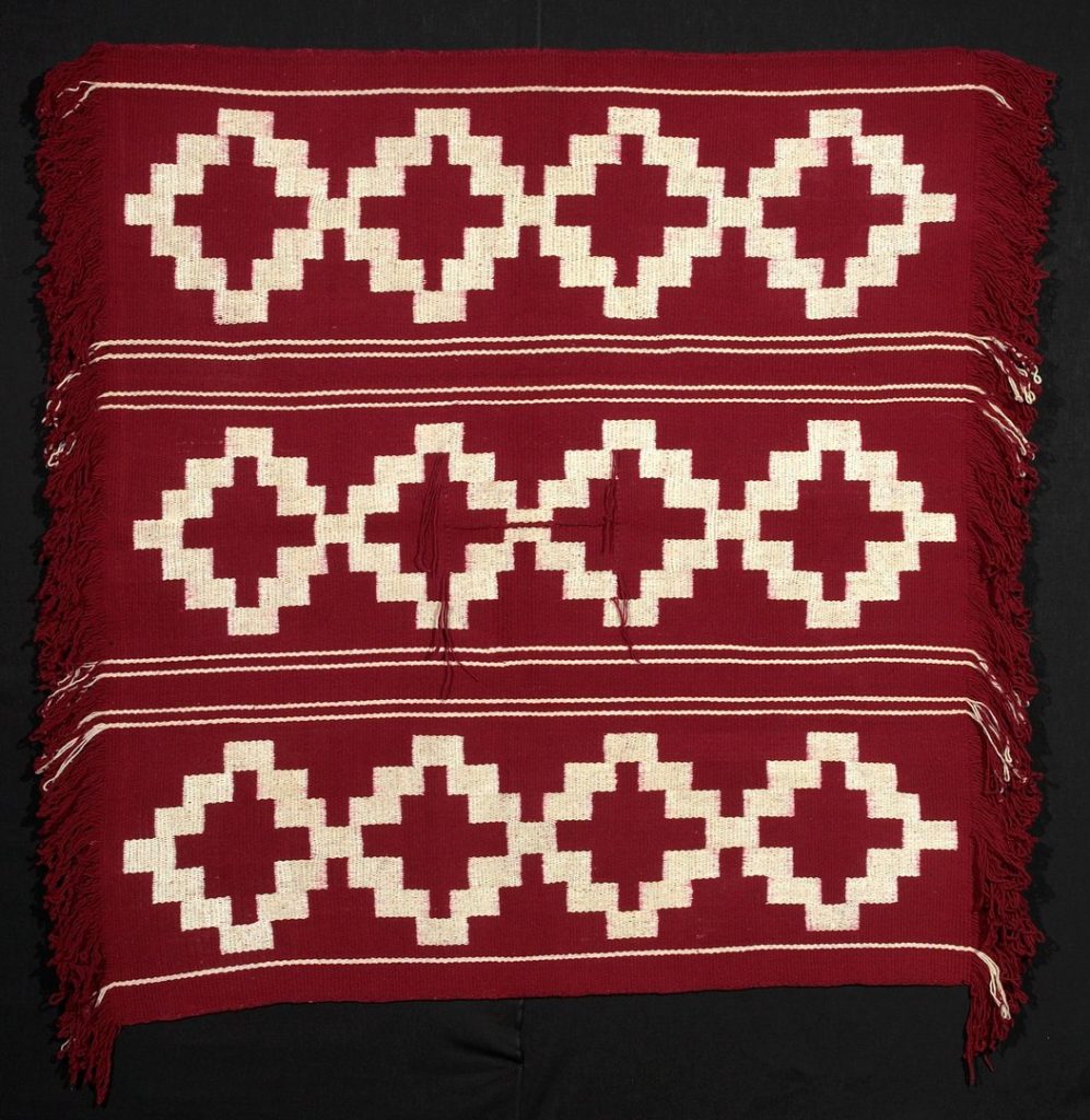
A stepped cross, also known as a gemil, or chief’s mantle, is a design featured frequently in Mapuche weaving. It represents the art of handcrafting, science, and knowledge. A poncho with these bold geometric patterns and deep indigo hue would be worn by a distinguished leader in the community. The deep, almost black, indigo color indicates the “celestial vault”. On a man’s garment, this signifies the wearer is accomplished beyond the parameters of humanity.

Verbal Description of Mapuche Poncho

Woven in Chile by the Mapuche people in the late 19th century, made of sheep’s wool and dyed with indigo. It is four feet and ten inches tall by four feet and eleven inches wide. This poncho is made by the Mapuche, which is the largest group of Indigenous people in Chile. It would be worn by a chieftain, a mature man of elevated position in their community. Lying flat, the poncho is a square shape. There is a vertical slit in the middle of the square meant for a person’s head to fit through. When worn, the front and back sides of the poncho hit just below the waist of an average sized man. The poncho appears to be black and white, but upon closer inspection, the colors are the deepest shade of indigo and a warm beige. The indigo hue was achieved from months of dyeing and oxidation, creating a color so rich and intense it seems almost darker than black. The pattern on the poncho is made of geometric designs of stepped crosses and lines in indigo with the surrounding space being a warm cream color. Nine equidistant vertical lines cover the poncho. Sitting on the lines are staggered stepped crosses. The stepped crosses look like pixelated diamonds, with three steps on each side. An indigo fringe sits on two edges of the poncho—what would be the front and back when worn by a person. Symmetry is a very important part of the textile. If you folded the poncho onto itself in any direction, it would create a perfect inversion every time. The poncho is made of woven Spanish merino wool; thick and rough but still pliable. When worn by a chieftain, the fabric wouldn’t simply fall flushed to its wearer, but pucker and lift as the sturdy wool tries to maintain its shape.
– Lily Hansen, SAM Marketing Content Creator

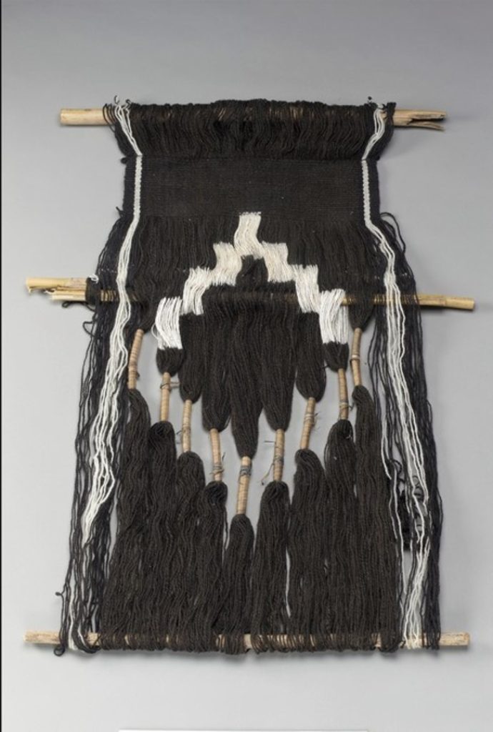
Photos: Mapuche, late 19th century, Chile, warp ikat sheep’s wool, indigo, 58 x 59 in., Collection of David and Marita Paly. Mapuche protesters wearing traditional clothing © Negro Ramírez. Loom and weaving with “cacique’s mantle” design Nancy Epulef Barra, Mapuche, b. 1971 wood, wool yarn, vegetal dye/dyes © National Museum of the American Indian. Chief’s Mantle (Manta de Cacique) Chile, Mapuche, 20th century wool; ikat © Minneapolis Institute of Art.

Inside SAM’s World of Compelling Cloth: Agbada

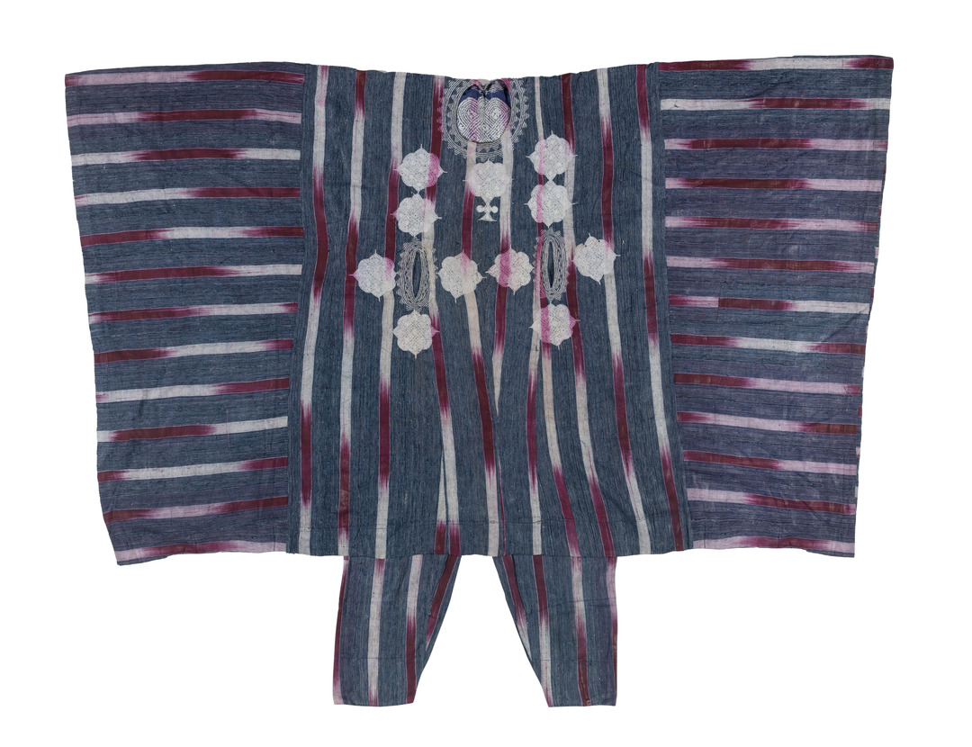
Not all of the stops on SAM’s smartphone tour of Ikat: A World of Compelling Cloth feature artist interviews and other audio content. Some stops, such as this one focused on a traditional Yoruba agbada, offers additional exhibition information via pictures and text accompanied by a verbal description of the artwork on view. Look below to learn about the importance of these traditional men’s tunics and how they’re made. Browse through all seven stops of the exhibition’s free smartphone tour and listen to its thirteen available verbal descriptions now, then purchase your tickets to see the exhibition at SAM’s downtown location before it closes on Monday, May 29.

What is an Abgada?
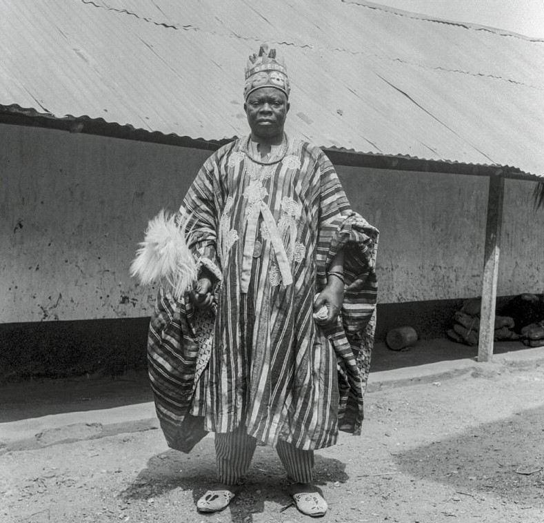
An agbada is a long, flowing robe with wide sleeves worn by men in some parts of West Africa, often decorated with embroidery. Traditionally, agbada were prestigious garments associated with royalty. These days, agbada are more common with a wide variety of styles to fit the occasion.

What is Aso-Oke?

Agbada are traditionally made from Aso-Oke fabric, which is a hand-loomed cotton cloth of the Yoruba people in Nigeria. The style of Aso-Oke fabric featured on the garment in this gallery is known as ‘Etu,’ which is made to imitate the striped blue and white colors of the Guinea Fowl for which it is named.

Verbal Description of Agbada

This garment is called an agbada—spelled A-G-B-A-D-A—which is the Yoruba word for a men’s tunic. This garment dates from the early 20th century. The garment is exceptionally oversized to create a strong impression, as it measures four and a half feet tall by five feet wide. The agbada is Aso-Oke strip-woven, which is a Yoruba term that specifically describes this type of handwoven cloth, which incorporates cotton, ikat, and cotton hand-embroidery. The base fabric in this garment is a dark blue cotton, resembling denim. Layering over the blue cotton are thinner strips that gradually shift from red to white. The stripes are vertical on the bodice of the garment, but horizontal on the sleeves. At the center of the garment, are two pockets for resting your hands, like the pockets on a hoodie. Along the neckline, adorning the front of the agbada, around the frontal pockets, is intricate white embroidery. If you look closely at the embroidery, you can see where the red stripes have bled onto the white thread, turning them light pink. The neckline’s embroidery appears as point-side down adjacent triangles that give the impression of a lacey necklace. The embroidery on the front consists of eleven rounded medallion-like shapes that form a symmetrical grouping around the pockets. The medallions are about the size of a fist and their shapes resemble chain links. The embroidery around the pockets is similar to the neckline with lacey pointed bands encircling the pocket openings.

– Lily Hansen, SAM Marketing Content Creator

Photos: Agbada (tunic) and pants, mid-20th century, Africa (Yoruba), cotton, tunic: 47 x 88 in., pants: 36 x 32 in., Collection of David and Marita Paly. Ori of Otun, photograph by William Buller Fagg. Nigeria, 1949-1950. Royal Anthropological Institute London. © RAI. A late C19th image of an aso oke weaver, one of the earliest known photos of aso oke production. Photographer unknown, courtesy Foreign & Commonwealth Office Archive, London.

Inside SAM’s World of Compelling Cloth: Rowland Ricketts on Zurashi

As part of Ikat: A World of Compelling Cloth at SAM, exhibition curator Pam McClusky commissioned textile artist Rowland Ricketts and weaver Chinami Ricketts to create a site-specific installation showcasing the importance of ikat as a living tradition and the repetitive nature of its creation. Their large-scale immersive installation, titled Zurashi/Slipped, welcomes visitors to the exhibition’s galleries with an indigo wave of threads that flow from floor to ceiling.

Listen to the recording above to hear directly from Rowland about the process of creating Zurashi/Slipped and what he hopes visitors get out of their hand-woven work. Then, explore all seven stops of the exhibition’s free audio tour on our SoundCloud and reserve your tickets to see the exhibition before it closes on Monday, May 29.

Rowland Ricketts on Zurashi/Slipped

One thing that I hope [with this installation, is for] people to viscerally experience ikat. This installation is made up of some 6000 odd lines hanging down with patterns on them and it’s very repetitive, as Chinami has said. Even making the work was a very repetitive [process] as we were measuring the same things over and over, binding the same things over and over, and dyeing the same things over and over. But there is a really powerful accumulation in this work and through its process that is really a foundation for all the works in the exhibit, right? All things made with ikat do have this repetitive nature of binding and dying and unbinding and weaving, so I think I I hope that that’s palpable to people.

– Lily Hansen, SAM Marketing Content Creator

Photo: Alborz Kamalizad.

Inside SAM’s World of Compelling Cloth: How Ikat is Made

By now, you’ve likely seen or heard the word ‘ikat.’ From advertisements on the side of King County Metro buses to the gorgeous graphic gracing SAM’s lightbox in downtown Seattle, the word is everywhere. But what is an ‘ikat’ and how is it made? In this first stop as part of the smartphone tour of Ikat: A World of Compelling Cloth at SAM, Ramzy Lakos, the museum’s educator for digital learning, gives an overview of this time-honored textile and lays out the many intricate steps necessary in creating an authentic ikat.

Listen to the recording above to familiarize yourself with the subject at the focus of this limited-run exhibition at SAM and explore all seven stops of the exhibition’s free audio tour on our SoundCloud.

How to Make an Ikat

RAMZY LAKOS: Let’s talk about how ikat textiles are made. Techniques, materials, and tools vary all over the world, but we’ll cover some of the basic details in this audio stop.

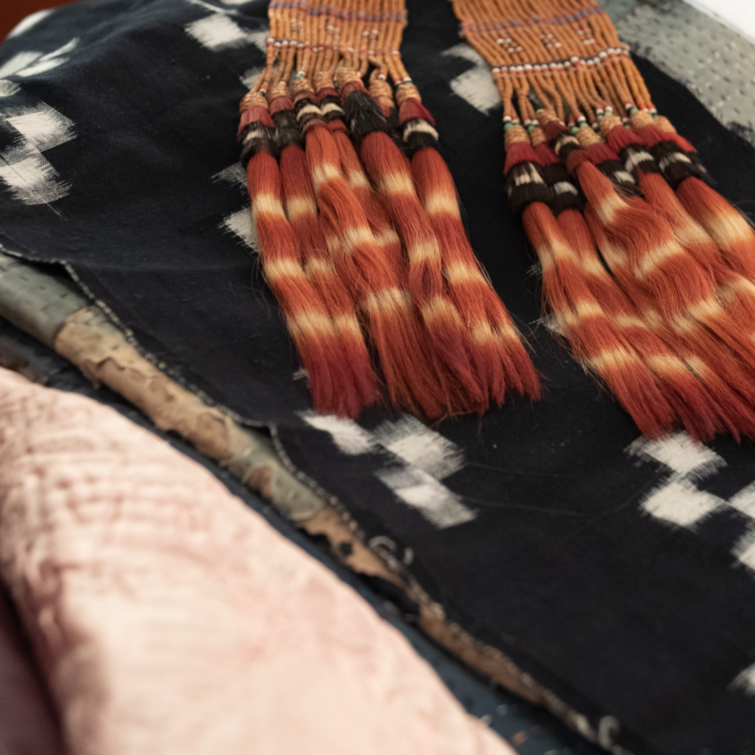
The process that defines ikat textiles is known as resist dyeing, which requires binding threads  with a material that repels liquid dye. Traditionally, materials like palm and banana fiber were used to bind the thread, but plastic is [becoming] increasingly common. After they are tied off, the bundles of thread are submerged in liquid dye. Those areas that are tied off will remain the color of the original thread, and the exposed patches of thread slowly take on the new color. The longer the threads soak in the dye, the deeper and more vibrant the final result. By tying off different sections of thread for each new color, the dyer can create increasingly complex multicolored patterns. 

Dyes are traditionally made using organic materials. A few examples include indigo leaves, ginger root, onion and pomegranate skins, and cochineal insects. However, synthetic dyes have been popular since the late 19th century. 

After the dyeing process is complete, the weaving process begins. To create a textile, a weaver takes the dyed threads and stretches them over a frame called a loom. The threads stretched over the loom are known as the warp. To create a solid cloth, the weaver passes a thread side to side, over and under the taught warp threads—this is known as the weft. At this stage, the weaver takes care to match each thread to the next so the design lines up correctly. 

There are a few kinds of ikat. The most common is known as a single warp ikat, where only the vertical threads are resist-dyed. Less common and more challenging is single weft ikat, where the horizontal threads are resist-dyed. The final and most complex category is double ikat, where both the warp and the weft threads are resist dyed, so two different designs have to be lined up on the loom. 

The visual signature of an ikat is a movement at the edges of a design that result from the slight shifts of individual yarns during the dyeing and weaving process.  All over the world, there are regions where ikat was discovered and cultivated as a unique way to embed images in cloth. 

– Lily Hansen, SAM Marketing Content Creator

Photo: L. Fried.

Alberto Giacometti: Head of a Man in Profile

Although Alberto Giacometti is most often remembered for his towering statues and landscape paintings, the artist began every new project with a sketch. Preferring either a ballpoint pen or pencil, he referred to the act of drawing as the “basis” for all of his artworks.

In Alberto Giacometti: Toward the Ultimate Figure—the extensive retrospective which shares its name with the ongoing special exhibition at SAM and is available for purchase at SAM Shop—contributing writer Catherine Grenier writes of Giacometti: “The numerous drawings he made of the same motif show the simplification he carried out in his sculptures… In many of them, the natural movement, the inclination of the body, the folding of the leg show that they are drawings made while looking at scenes in the street” (33).

Guided by SAM Museum Educator Lauren Kent, this audio recording from SAM’s smartphone tour Alberto Giacometti: Toward the Ultimate Figure guides visitors in a close-looking activity at one of Giacometti’s sketches, Head of a Man in Profile. Visit SAM’s downtown location through Sunday, October 9 to experience Toward the Ultimate Figure and listen to all seven stops in the audio tour.

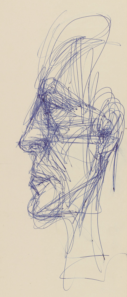
Head of a Man in Profile, ca. 1959

NARRATOR: Giacometti once said that ‘drawing is the basis for everything’. Here’s SAM educator Lauren Kent on Head of a Man, a lively portrait in ballpoint pen.

MUSEUM EDUCATOR LAUREN KENT: Take a moment to stand in front of this drawing and take it in with your eyes. Zoom in to notice the details of the lines and marks on the paper. Let yourself get lost in these details. Then, zoom out to notice how it all comes together. Take out your finger to draw in the air. Find a starting point and trace the path of the lines that you see. Experiment with moving very slowly, like an ant walking along its path (voice slows down). Now, speed up and move quickly, chasing everywhere Giacometti drew with his ballpoint pen.

What shapes, angles, and movements does your finger make? Which areas do you return to and repeat over and over again? Which areas don’t you touch at all?

How do you think Giacometti was feeling when he made this drawing? What was the energy in the studio like? Do you think that he knew this model? What do you see that makes you say that?

– Lily Hansen, SAM Marketing Content Creator

Image: Head of a Man in Profile, ca. 1959, Alberto Giacometti, Swiss, 1901–1966, blue ballpoint pen on paper, 65 × 19.3 cm, Fondation Giacometti, © Succession Alberto Giacometti / ADAGP, Paris, 2022.

Alberto Giacometti: Walking Man I & Tall Woman IV

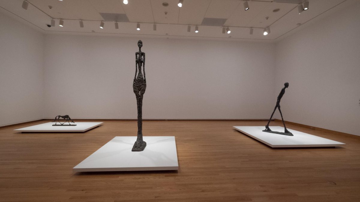
In 1958, Alberto Giacometti was invited to compete for a public artwork for the Chase Manhattan Bank in New York. Envisioning three outdoor sculptures including a Large Head, a Tall Woman, and a Walking Man, Giacometti set out to make them in plaster. After a year of several attempts—three versions of Walking Man, four of Tall Woman, and two of Large Head—Giacometti abandoned the commission due to his dissatisfaction with the results.

Discussing the abandoned project, Giacometti was quoted as saying, “I can see they are a failure, or rather, not fully achieved—they are all wide off the mark in a big way.” Despite the artist’s self-assessment, the sculptures were soon celebrated as some of his most iconic works.

In SAM’s ongoing exhibition, Alberto Giacometti: Toward the Ultimate Figure, Giacometti’s initial vision for the plaza is recreated with Walking Man I, Tall Woman IV, and the addition of Dog (Le Chien) (1951). In this audio recording, SAM Educator Yaoyao Liu guides visitors through a close-looking exercise of the two towering artworks Giacometti envisioned for the Chase Manhattan Plaza. Listen to all seven stops of the smartphone tour when you visit Toward the Ultimate Figure at SAM’s downtown location through October 9.

Walking Man I (1960) & Tall Woman IV (1960)

NARRATOR: Commissioned together in 1958, Walking Man I and Tall Woman IV were intended as outdoor sculptures for New York City’s Chase Manhattan Bank Plaza. Though the sculptures were never delivered, this initial context can help us think about how they relate to one another. Here’s SAM Educator Yaoyao Liu to guide you in a close looking exercise.

YAOYAO LIU: In the gallery, take time to move slowly around each sculpture, taking in details such as color, texture, and form. Then move back and view the two sculptures as a pair. What did you notice looking up close at each one, then seeing both at the same time? Where do you see connections between these two sculptures? And where do you see differences?

– Lily Hansen, SAM Marketing Content Creator

Image: L. Fried.

Alberto Giacometti: Man with a Windbreaker

In Alberto Giacometti’s never-ending pursuit of a new vision of the human form, the artist often turned to nature for inspiration. Many of his early artworks—most notably in his paintings and sketches—focused on the dynamic landscapes of his upbringing in Stampa, Switzerland. This motif remained as his career progressed, yet his exploration with nature and man’s relationship to it was explored in new ways.

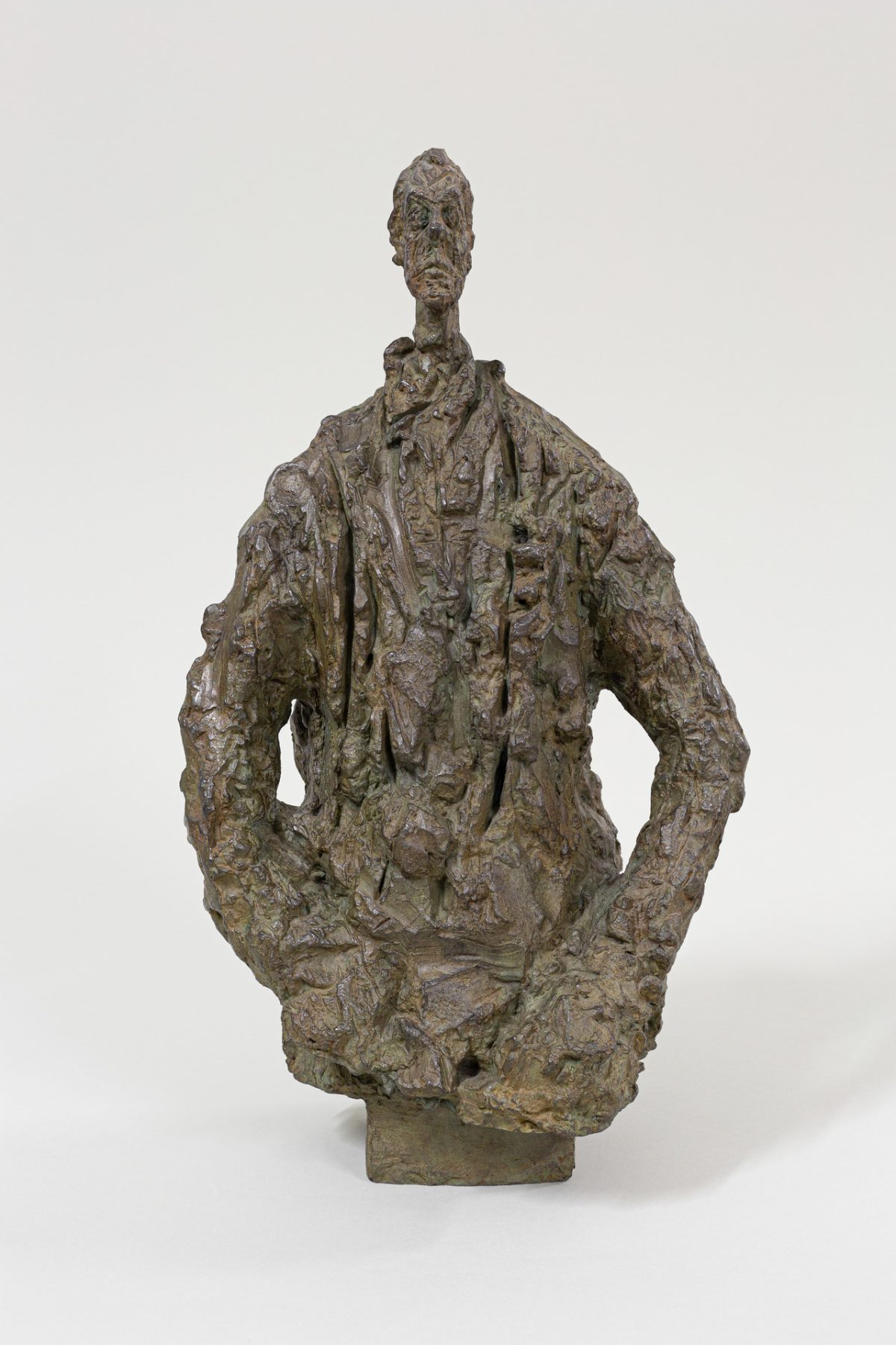
With its tiny head perched on an oversized mound, of which only the figure’s arms can be identified, Man with a Windbreaker (1953) is one of Giacometti’s sculptures which best demonstrates his evolving relationship to nature. While he experimented with scale, texture, and perspective in nearly all of his artworks during this artistic period, this sculpture stands out for its evocation of a geological concretion, with some scholars going so far as to call it a stalagmite.

In this audio recording, SAM Associate Director of Interpretation Erika Katayama discusses Man with a Windbreaker, comparing the rough texture of the mound to a “rocky mountainside.” Tune in to this, and seven other audio recordings which accompany artworks on view in Alberto Giacometti: Toward the Ultimate Figure, when you visit the exhibition at SAM’s downtown location through October 9.

Man with a Windbreaker, 1953

NARRATOR: Giacometti’s experimentations with scale and texture come to the fore in Man with a Windbreaker. Associate Director of Interpretation Erika Katayama:

ERIKA KATAYAMA: At this point in his career, Giacometti is constantly manipulating perspective and scale as a means for him to capture his vision of the human figure. Notice the dramatic contrast of proportion in this sculpture. The tiny head sits atop a large, almost mountainous body. The rough texture of his clothes reminds me of a rocky mountainside. As a viewer, this gives us the illusion that the body of the man is close to us, looming large, whereas the tiny head is far away.

VOICE OF GIACOMETTI: For me, any deformation is entirely involuntary. I simply try to recreate what I see. My struggle is to grasp and possess an appearance that constantly escapes me. I try to express what I see, but unfortunately I never manage to make something that truly resembles it.

– Lily Hansen, SAM Marketing Content Creator

Photo: Man with a Windbreaker, 1953, Alberto Giacometti, Swiss, 1901–1966, bronze, 50 × 28.6 × 22.5 cm, Fondation Giacometti, © Succession Alberto Giacometti / ADAGP, Paris, 2022.

Alberto Giacometti: The Cage

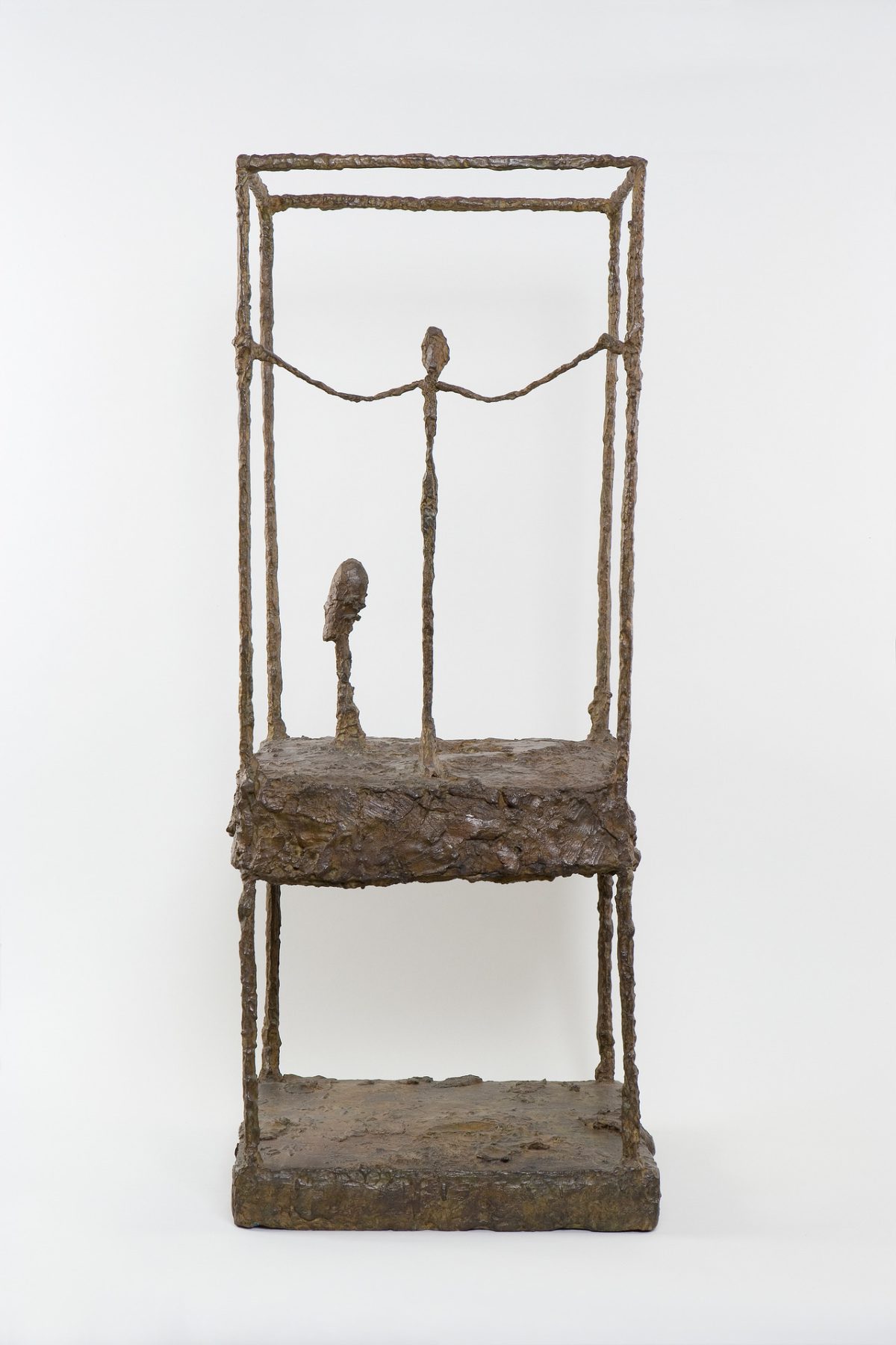
In both his paintings and sculptures, Alberto Giacometti used the architectural device of a cage to surround and outline specific constraints for his artistic vision. While Giacometti used a physical frame to demarcate the borders of his paintings, in his sculptures, the artist built physical cages in which to constrain his artworks. First utilized in Cage (1930–31) and Suspended Ball (1930–31), Giacometti returned to the idea of the enclosure as a framing device nearly twenty years later as he began to think more deeply about the self-referential interior of the sculpture compared to its surroundings.

The Cage, First Version is reminiscent of a display case. The upper portion presents a figure and a bast as if laid out in a vitrine. The standing figure is not proportional to the considerably larger head, thus disrupting a reading of these figures within a conventional perspectival space. Placed at the outer edge, the standing figure holds on to the armature that marks the perimeter, looking out beyond. The cage, just as the figures themselves, are composed of the same nubby bronze texture that Giacometti is often recognized for.

Listen to the audio recording above to hear SAM Associate Director of Interpretation Erika Katayama discuss Giacometti’s continuous use of cages, frames, and proportionality throughout his artistic career. All eight audio recordings—produced by the Seattle Art Museum as part of the free smartphone tour of Alberto Giacometti: Toward the Ultimate Figure—can be found by scanning the QR codes accompanying selected artworks on view in the exhibition through October 9.

The Cage, First Version, 1949–50

NARRATOR: Giacometti uses cages and frames as a way to further explore the relationship between the viewer and the object, the sculpture and its surroundings. Associate Director of Interpretation Erika Katayama:

ERIKA KATAYAMA: The cage functions both symbolically and psychologically in this work, forming a space which encloses the subjects within. And as a viewer, we see the standing figure and the oversized head, which are not in correct proportion to each other, yet they both exist within the bounds of the cage—and so we have to consider them in relation to one another.

NARRATOR: How does the cage shape how you view this piece? Try imagining it without the cage, what changes?

– Lily Hansen, SAM Marketing Content Creator

Photo: The Cage, First Version, 1949–50, Alberto Giacometti, Swiss, 1901–1966, bronze, 90.5 × 36.5 × 34 cm, Fondation Giacometti, © Succession Alberto Giacometti / ADAGP, Paris, 2022.

Alberto Giacometti: Tall Thin Head

“When viewed from different vantage points, Tall Thin Head seems to be two distinct heads. From the front the head is narrow; the effect is like looking straight on at a knife edge. From the side, the profile is full-bodied and dramatically silhouetted, completely contradicting the frontal view.”

– Valerie Fletcher

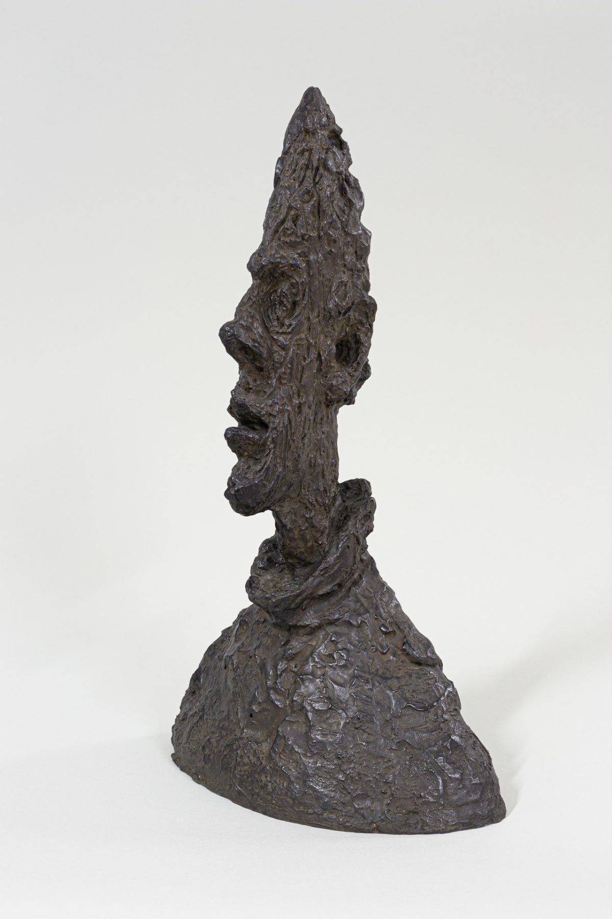
Alberto Giacometti used a variety of artistic devices to disrupt the viewers’ interpretation of space. His 1954 portrait bust Tall Thin Head—or Grand tête mince—was just one of a series of busts made by the artist in the 1950s which played with scale, perspective, and texture. From the front, the sculpture looks flat and vague, but when viewed from the side, however, a detailed portrait emerges revealing the angular features of a male figure.

The sculpture, modeled after his brother, Diego Giacometti, falls into a familiar trend seen across Giacometti’s artistic career. Since the beginning of his artistic life, Giacometti preferred to work with those closes to him as models, especially Diego and his wife Annette. Sitting for him required long hours of concentration, and both his brother and wife also assisted with various aspects of managing his studio and career. For the artist, working with consistent models allowed him to better pursue his vision, unveiling the stranger beneath the familiar.

This audio recording marks the third stop in SAM’s free smartphone tour which accompanies Alberto Giacometti: Toward the Ultimate Figure. Listen now to experience a close-looking art activity led by SAM educator and teaching artist Lauren Kent and tune in to all eight stops in the tour when you visit the exhibition at SAM’s downtown location through October 9.

Tall Thin Head, 1954

NARRATOR: Perspective can change everything in a sculpture, and that rings true especially for Giacometti’s later work. Here’s SAM educator Lauren Kent to guide you in a close looking activity for Tall Thin Head.

LAUREN KENT: As you approach Tall Thin Head, position yourself so that you are in front of the sculpture, looking at the face straight on. What do you see? What do you think about what you see? What do you wonder? Does this sculpture express an emotion or remind you of anything?

Slowly move about a foot in one direction around the sculpture, then stop. What do you notice now? What do you see that you didn’t before? What has changed?

Move another foot in a circle around the sculpture and stop once more. What do you notice here? What do you see now that you didn’t before? What has changed?

Continue moving in a full circle around the head. Observe how it expands and contracts. Observe all of the different ways that it looks and feels at each angle. You can keep an eye on Tall Thin Head as you walk through the rest of this gallery.

 Lily Hansen, Marketing Content Creator


1 Alberto Giacometti: 1901-1966, Valerie Fletcher, p.180.

Image: Tall Thin Head, 1954, Alberto Giacometti, Swiss, 1901–1966, bronze, 64.5 × 38.1 × 24.4 cm, Fondation Giacometti, © Succession Alberto Giacometti / ADAGP, Paris, 2022 ALL IMAGES: © Succession Alberto Giacometti / ADAGP, Paris, 2022.

Alberto Giacometti: Reliquary Figure

Alberto Giacometti’s vision of a new human form was heavily inspired by Cycladic, African, and ancient Egyptian art. In 1927, the artist purchased a sculpture from Gabon—then one of France’s colonies in West Africa—and placed it in the center of his studio. Giacometti studied such non-European works in the Parisian museums he visited, where he found himself fascinated by African sculptures that emphasized volumes and geometric voids.

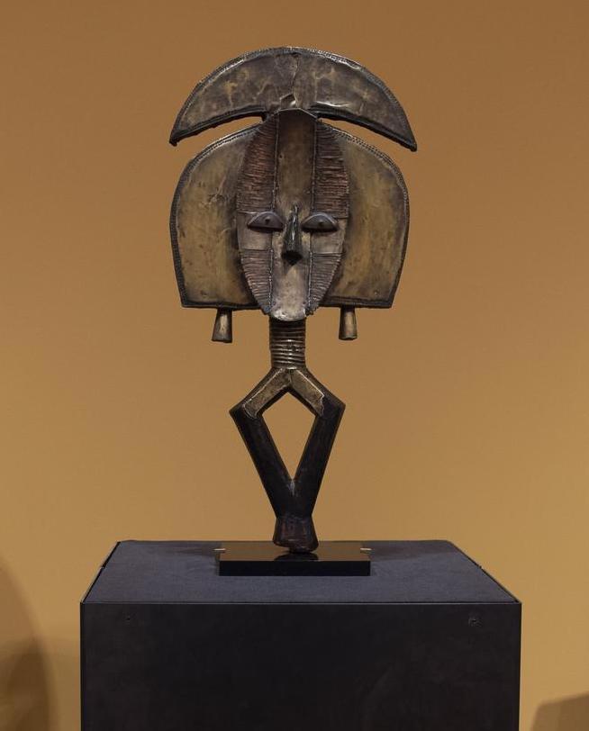
Giacometti and many of his artistic peers greatly admired such artworks for their unique power and approaches to stylized form, which they thought offered visionary and radical alternatives to European academic models of representation. This admiration for non-European art’s visual power was at times marked by a lack of knowledge about the origins of works brought from the colonies to the West. Giacometti may not have known, for example, that the figure he owned once guarded sacred remains of the Kota people of Gabon. In Alberto Giacometti: Toward the Ultimate Figure, African sculptures from SAM’s private collection—including this early 20th century Reliquary Figure from Kota, Gabon—are placed alongside Giacometti’s bronze and plaster sculptures to illustrate the Giacometti’s fascination with the structure and composition of ancient African artworks.

Listen to SAM Curator of African and Oceanic Art Pam McClusky discuss the influence of artworks such as Reliquary Figure on Alberto Giacometti’s artistic development in this audio recording from SAM’s free smartphone tour of Toward the Ultimate Figure. Discover all eight recordings when you visit the exhibition at SAM’s downtown location through October 9.

Reliquary Figure, early 20th century

NARRATOR: Like many European artists living and working in Paris in the 20th century, Giacometti found inspiration in works of African sculpture. Here’s curator of African and Oceanic Art Pam McClusky on this Reliquary Figure from SAM’s collection.

PAM MCCLUSKY: Giacometti sits with a sculpture like this in his studio, as can be seen in a photo nearby. It served as a mysterious muse that transforms a face and body into dynamic forms coated with a flashing metal surface. It offered a bold fresh vision of a very strong archetype. Giacometti bought his sculpture, similar to the one in front of you, from a fellow artist in 1927, and no doubt they talked about how its inventive geometric shapes replaced anatomical correctness. Yet, what they saw was not what the Kota intended. In its original setting, this figure stood guard over a bundle of sacred ancestral remains. The reflective face was meant to draw attention to their presence and repel any harm to them. Giacometti gave this unknown agitator a place of honor, and drew inspiration from it for his own reframing of the human body.

– Lily Hansen, SAM Marketing Content Creator

Image: Reliquary Figure, 20th century, Wood, copper and brass, 23 3/4 × 11 1/2 × 2 1/4 in. (60.3 × 29.2 × 5.7cm), Gift of Dr. Oliver E. and Pamela F. Cobb, 2014.3, photo: L. Fried.

Alberto Giacometti: The Mountain Road

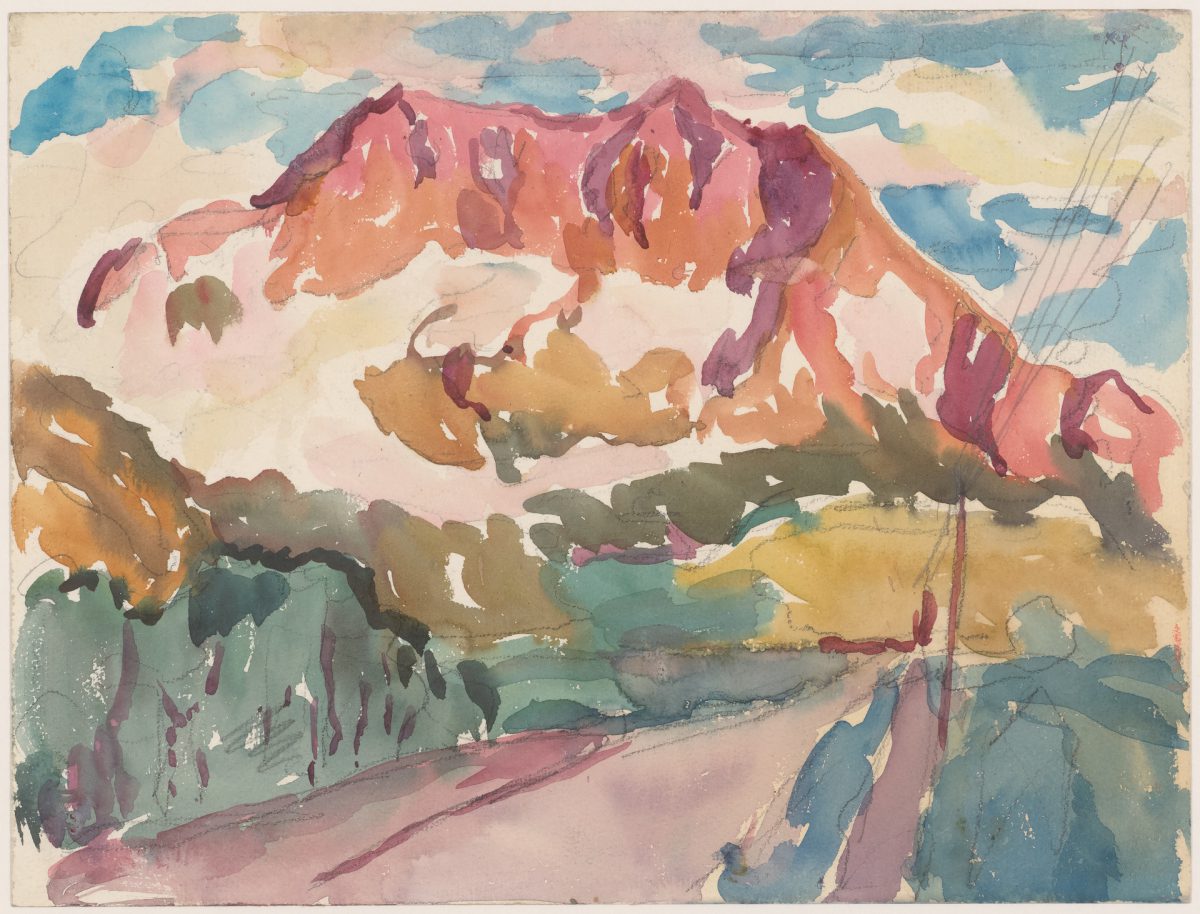
Although Alberto Giacometti may be most remembered for his delicate yet commanding bronze sculptures and busts, his artistic career began with vibrant watercolor paintings and drawings that capture the mountainous landscape of Giacometti’s home in Stampa, Switzerland. Scenes from the village and dramatic views of the surrounding mountains are depicted in his early paintings which draw inspiration from his father, Giovanni Giacometti, a celebrated post-impressionist painter.

In The Mountain Road (ca. 1919), a thin, lavender road marks the entry point to a large, mountainous landscape. On the left, dark green trees line the road, while on the right, a telephone lines follow the road. Colors of blue, pink, red, and yellow complete the painting, depicting a segment of the Swiss Alps on a summer day. Placed beside one another, watercolor paintings such as The Mountain Road offer a striking departure from the gothic sculptures which defined his later career and illustrate Giacometti’s development as a postwar era artist.

In this audio recording, Erika Katayama, SAM Associate Director of Interpretation, discusses Giacometti’s early artistic inspirations in Switzerland and the influence of his famous father in his artistic development. Tune in to all eight recordings as part of the free smartphone tour of Alberto Giacometti: Toward the Ultimate Figure when you visit the exhibition at our downtown location through October 9.

Photo: L. Fried.

The Mountain Road, ca 1919

ALBERTO GIACOMETTI: “I could spend every day looking at the same garden, the same trees, and the same backdrop.”

NARRATOR: Alberto Giacometti was talking about the views of his small town of Stampa, Switzerland, where he grew up surrounded by towering mountains and trees. It was there that he began his journey as an artist. Associate Director of Interpretation Erika Katayama:

ERIKA KATAYAMA: So Giacometti came from a family of artists, and his early works like this watercolor landscape, are reminiscent of the style of his father Giovanni, who was a post-impressionist painter. Alberto loved his hometown of Stampa Switzerland, and although he moved to Paris in the 1920s, he came back to visit throughout his life, drawing inspiration from the alpine landscape and channeling it into the shapes and textures of his sculptures.

– Lily Hansen, SAM Marketing Content Creator

Image: The Mountain Road, ca. 1919, Alberto Giacometti, Swiss, 1901–1966, watercolor and pencil on paper, 22 × 29 cm, Fondation Giacometti, © Succession Alberto Giacometti / ADAGP, Paris, 2022.

Imogen Cunningham: Double Image, Sutter St. and Fillmore

Imogen Cunningham often took photographs of unsuspecting strangers on the street. Uncomfortable with confrontation, she found beauty in capturing daily public life without interference. At times, she used windows, spun around, or bent over and pretended to be searching for something in her purse to distract from the sound of her camera’s click. She called these surreptitious photographs “stolen pictures.”

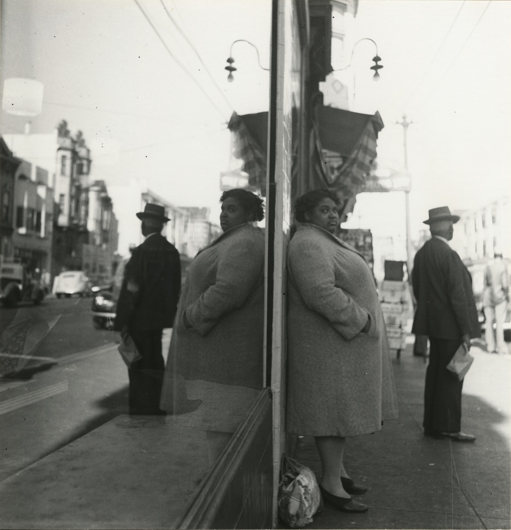
Double Image, Sutter St. and Fillmore marks a stark contrast from Cunningham’s typical street photographs. In this image, her subject—a Black woman dressed in a long coat, stockings, and heels—has spotted Cunningham. Waiting for the bus, her right eyebrow is raised as she looks directly into the camera.

The woman’s stare is intensified as the image is cleverly reflected off of a storefront window, dividing the composition down the center, and creating a “doubled” illusion. Cunningham was fascinated with this effect and often used mirrors or glass to create this perspective.

In this audio recording produced by the J. Paul Getty Museum, Chris Johnson, chair of the photography department at the California College of the Arts, discusses Cunningham’s “stolen pictures” and the changing dynamic shared between Cunningham and her subject after being spotted. Tune in to all 13 recordings as part of the free smartphone tour of Imogen Cunningham: A Retrospective when you visit the exhibition at our downtown location through February 6.

Double Image, Sutter St. and Fillmore, ca. 1940

Narrator: Taken in Cunningham’s San Francisco neighborhood, this photograph captures two figures waiting for a bus. On the right, a man wearing a hat holds a paper bag. In the center, a woman stands dressed in a winter coat with her purse at her feet.

Chris Johnson: She’s giving Imogen a very strong direct gaze and there’s nothing reticent about that gaze and I think Imogen liked that because she was a strong outspoken woman herself.

Narrator: The image is doubled in the reflection of the storefront window on the left. Cunningham was fascinated with this effect, something she first encountered in the compositions of eighteenth-century Japanese prints. She often used mirrors or glass to create this perspective. The doubling effect places the woman in the center of the image and creates a dynamic between individuals, including the photographer.

Chris Johnson: The implied relationship between the photographer and the woman who’s giving her that gaze… between the black woman and the white man who is presumably ignoring both of them, Imogen and this black woman are in their own world. The white man is in his other world. He has his back turned to us. So Imogen is affirming her allegiance to this black [woman] and I really think the meaning of the image resides there.

Narrator: These “stolen pictures”, as Cunningham called her street scenes, were sometimes taken without the subject’s knowledge and represented a stylistic departure for her. But in this case, the central figure directly confronts Cunningham, and us.

Chris Johnson: Isn’t this a clear example of photographic seeing, you know, the way that the camera sees differently than the way eyeballs see?

– Lily Hansen, SAM Marketing Content Creator

Photo: Double Image, Sutter St. and Fillmore, ca. 1940, Imogen Cunningham, American, 1883–1976, gelatin silver print, 7 3/4 × 7 1/2 in., Collection of the Oakland Museum of California, Gift of the Junior League of Oakland, A67.130.33, © 2021 The Imogen Cunningham Trust.

Imogen Cunningham: Hand Weaving with Hand

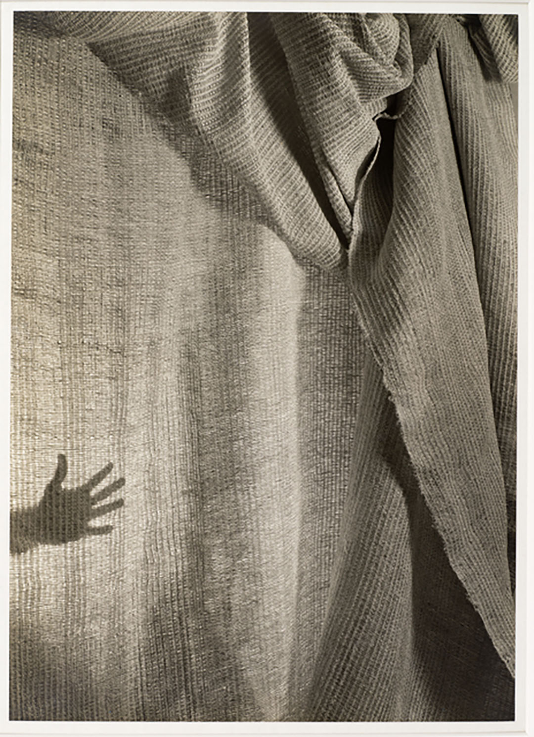
Hands play a prominent role in the work of Imogen Cunningham. Many of her most recognizable photographs focus on the movement of hands and their connection to the body. In Hand Weaving with Hand, the shadow of a hand with spread fingers protrudes from the lower left side of the image. Although the majority of the photograph is composed of a thin, rumpled fabric with vertical stripes, it is the ambiguity of this shadowed hand which captures the viewer’s attention.

Tune in to this audio recording to hear nonbinary Black transfem choreographer and dancer Randy Ford explore Cunningham’s use of hands throughout her work and relate it to her own dance production, Queen Street. Hear this and other audio recordings as part of the free smartphone tour of Imogen Cunningham: A Retrospective when you visit the Seattle Art Museum.

Hand Weaving with Hand, 1945

Narrator: While the right side of this photograph is dark, filled with billowing folds of a draped cloth, the left portion is backlit, and the fabric hangs flat. Behind the weaving, a light silhouettes a hand with fingers splayed. This hand is what first caught the eye of Seattle native Randy Ford, a dancer and choreographer.

Randy Ford: So I just think the hands are very interesting. You know, we create a lot of things with our hands. You know, we draw. We open doors. We close doors. We celebrate with our hands. They just play a really huge part in our lives and choreograph what we do every day. I don’t think of dance as just something that you do with your legs and your body and your torso. You know you can do a lot of expressing with just your hands, which is probably just why I again gravitated toward this shadow of a hand on this masterpiece of a sheet. The hands really kind of direct us a lot of places.

Narrator: In her portraits, Cunningham often zeroed in on hands—tickling the keys of a piano, delicately playing a violin, or shaping the rim of a clay pot. This singular, open palm appears to almost clap the suspended weaving. Is this the hand that made it? Is it presenting the cloth proudly… lovingly? As with so many of Cunningham’s photographs, the layering—in this case of fabric, lighting, and shadow—and ambiguity allow for multiple interpretations. Randy Ford, who recently told her own complex transition story in her dance production, Queen Street, can relate.

Randy Ford: I love making work that, is definitely visually appealing, but I also want people to realize what they’re looking at or maybe where their feelings are coming from. There’s definitely just a lot of depth within this simple-looking image and that’s why I chose it. It was very simple but still complex. It had like a little bit of a story. It invoked something about creation for me as a choreographer and director and an artist myself. I always kind of just wonder what are the beginnings of things? You know, things aren’t just the way they are just because they appear to us.

– Lily Hansen, SAM Marketing Content Creator

Photo: Hand Weaving with Hand, Imogen Cunningham, 1945. Gelatin silver print, Image: 13 1/4 x 9 1/2 in. Collection of The Imogen Cunningham Trust.

Imogen Cunningham: Mills College Amphitheater

In June 1920, Imogen Cunningham’s husband, Roi Partridge, accepted a teaching position in the art department at Mills College, a private liberal arts school for women in Oakland, California. With their three young sons, Cunningham and Partridge moved from San Francisco to an old house situated near campus which initially had neither plumbing nor electricity.

While in Oakland, Cunningham established herself as a well-educated woman and progressive role model in the community. She offered Mills College students uncensored advice about their professional aspirations and her home came to be recognized as a safe haven for private discussions about sexuality and family planning.

One important stream of income for Cunningham at this time was photographing Mills College student portraits, dance performances, and campus architecture. Her photograph, Mills College Amphitheater (ca. 1928), captures the curved concrete design of the college’s outdoor auditorium. The image, likely inspired by the work of American photographer Paul Strand, plays with abstract geometric forms created by sunlight and shadows.

In this audio recording from the free smartphone tour of Imogen Cunningham: A Retrospective at the Seattle Art Museum, nonbinary black transfem choreographer and dancer Randy Ford discusses the significance of this image within Cunningham’s larger body of work. She points out Cunningham’s decision to forgo photographing the amphitheater’s stage, opting instead to play with the shadows and sunlight of the empty audience.

Mills College Amphitheater, ca. 1928

Randy Ford: My name is Randy Ford. I use she/her and goddess as pronouns, and I’m a nonbinary Black transfem, just out here trying to live and make art that’s going to change the world.

Narrator: Imogen Cunningham’s photo of an outdoor amphitheater reminded Randy, a choreographer and dancer, of the Langston Hughes Performing Arts Institute in Seattle where she staged her first full-length performance, Queen Street.

Randy Ford: I’m also a Greek drama nerd, and so this just looks like a Greek amphitheater like back in the day. It looks like a coliseum.

Narrator: The photograph was actually taken at Mills College, a women’s liberal arts college in Oakland, California, where Cunningham’s husband taught. She often photographed architectural elements on campus, including the amphitheater. There is no stage in Cunningham’s abstract interpretation. Instead, we see only curved concrete rows and rectangular steps highlighted by sunlight and shadows.

Randy Ford: Cunningham was very much just like, yeah, you know, the audience is the show. It’s not always about what’s on stage. It’s kind of like what’s the environment? What’s the tone? What time of day is it? Was this right before the performance? Was this an empty show where no one showed up? Audience plays a huge role in live performance. As a live performer, I live for an interactive audience. Just let me know you’re here. Let me know you feel me because, performers are also humans.

– Lily Hansen, SAM Marketing Content Creator

Photo: Mills College Amphitheatre, Imogen Cunningham, ca. 1928, Gelatin silver print, Image: 8 1/8 x 12 1/4 in, Collection of Gary B. Sokol.

Imogen Cunningham: Ruth Asawa Family And Sculpture

In 1950, Imogen Cunningham’s son Randal introduced her to Japanese-American artist Ruth Asawa. Despite their 43-year age difference—Asawa was 24 and Cunningham was 67 at the time—the two artists quickly developed an unbreakable bond.

“Asawa and Cunningham placed a priority on relationships and refused to choose between the life of family and their art,” explained art historian and curator Daniel Cornell of their friendship. “They shared a similar fate as the critics who labeled their work feminine as a way to suggest its inherent inferiority to the work of male artists.”1

Over the next two decades, Cunningham and Asawa’s careers regularly intertwined. For the cover of the June 1952 issue of Arts & Architecture magazine, Cunningham photographed a few of Asawa’s wire sculptures, developed four individual prints, and mounted them on a single board. In 1964, Aperture magazine used a photograph Cunningham had taken of another of Asawa’s sculptures on the cover of its winter issue.

Imogen Cunningham’s photograph for the cover of Arts & Architecture featuring Ruth Asawa’s sculptures on view at SAM. Photo: Natali Wiseman

In a drafted letter recommending Asawa for a Guggenheim Foundation grant, Cunningham wrote of her friend: “However remote and obscure Ruth Asawa’s project may seem to most of us, I have very strong reasons to believe that she can achieve a real improvement in building ornament by carrying it out… To me, she is what I call an unfailingly creative person and there are very few of them.”2

Listen to this audio recording to discover the backstory of one particular photograph Cunningham took of Asawa and her family in 1957. Produced by the Seattle Art Museum, this recording includes a discussion by Japanese and Chinese Canadian photographer Kayla Isomura on the significance of Ruth Asawa Family and Sculpture and its influence in her own work. Learn more about this image from SAM’s personal collection and Ruth Asawa’s legacy here, then see it on view alongside Ruth Asawa’s sculptures now in Imogen Cunningham: A Retrospective at SAM through February 6.

Ruth Asawa Family and Sculpture, 1957

Narrator: Photographer Kayla Isomura.

Kayla Isomura: I really enjoyed this image actually because of how candid and sort of natural it is, and it’s so every day in a way, but there’s also this interesting juxtaposition of just the art that takes up so much of the space. I’m not even sure if I should be looking at the sculpture or the kids, but I think just all of that put together, for me it just seems very intriguing as an image.

Narrator: Cunningham often photographed Asawa’s sculptures, but this image incorporates the domestic studio. Beneath the central sculpture sits a baby drinking from a bottle and a girl with a stick. Partially hidden by the suspended work, a third child watches as his mother pulls wire from a spool to begin another looped sculpture. A fourth child crouches on top of a low table.

Kayla Isomura: It doesn’t feel like the family or the kids are necessarily aware that the camera is there. They’re just kind of doing their own thing.

Narrator: Like her sculptures, in which open weaving reveals forms inside the forms, multiple facets of Asawa’s life are on view. You can see several of Asawa’s sculptures in this gallery. Asawa, her parents, and five siblings were among approximately 120,000 Americans of Japanese descent incarcerated during World War II. In her work, The Suitcase Project, Kayla, a fourth-generation Japanese and Chinese Canadian, asked Japanese Americans and Canadians what they would pack if they were forced into an internment camp. The process raised questions about the complex relationships among artist, subject, and identity.

Kayla Isomura: Something that in recent years that I’ve really come to consider is this sort of question of who is allowed to do this work. Do you have that connection, or do you feel this as part of your identity if this is what you want to do? Or can you work with somebody who has a closer connection if you do not? So is it enough that the subjects in their work, are maybe being represented? Or, does it matter equally as much that the person behind the work, you know, has that direct connection, to whatever it is that they’re documenting? And I think those are the questions that I have.

– Lily Hansen, SAM Marketing Content Creator

Photo: Ruth Asawa Family and Sculpture, 1957, Imogen Cunningham, Gelatin silver print10 3/8 x 10 3/8 in. (26.4 x 26.4 cm), Gift of John H. Hauberg, 89.43 © Imogen Cunningham Trust.

1 Daniell Cornell et al., The Sculpture of Ruth Asawa: Contours in the Air (Berkeley:
University of California Press, 2006), 148.

2 Imogen Cunningham, undated draft of Asawa recommendation (probably 1971),
Imogen Cunningham Papers.

Imogen Cunningham: Self-Portrait with Grandchildren in Funhouse

In Self-Portrait with Grandchildren in Funhouse, Imogen Cunningham captures a moment of joy with two of her young grandchildren, Joan and Loren, as they experiment with the effects of a warped mirror. Despite the playful nature of the image, Cunningham remains stoic in photographing herself. Her face points down as she looks into the viewfinder of her black and silver-lined rectangular camera which she steadies with both hands. She is small in comparison to her grandchildren, whose elongated arms stretch the entirety of the image, but identifiable by her white hair, gemmed cap, and metallic glasses.

Tune in to this audio recording to hear Imogen Cunningham’s granddaughter, Meg Partridge, discuss Cunningham’s relationship with her grandchildren. Produced by the J. Paul Getty Museum, Partridge describes how this image came together and emphasizes Cunningham’s signature artistic style. Listen to this and other audio recordings as part of the free smartphone tour of Imogen Cunningham: A Retrospective when you visit the exhibition at the Seattle Art Museum through February 6, 2022.

Self-Portrait with Grandchildren in Funhouse, 1955

Narrator: An outing with two of her granddaughters and a fun house mirror provided Imogen Cunningham with an irresistible subject. Meg Partridge, granddaughter of Imogen Cunningham.

Meg Partridge: Imogen was really being very playful as she always was with photography.

Narrator: Partridge was only two when this photograph was taken, and too young to tag along. Instead, we see her older sister Joan, in the middle with both hands raised, and her cousin Loren, on the right with a hyper-elongated arm.

Meg Partridge: Imogen did not spend a lot of time taking grandchildren places and doing grandmotherly-like things. She enjoyed children once they became, as I would say, of interest to her. They could be articulate. They could have opinions. They could share thoughts.

Narrator: Cunningham worked while raising her three sons, and continued to do so once their children came along.

Meg Partridge: Looking at her work, you can see some of the same subjects coming in again and again. So we see many photographs of Imogen looking into her camera and photographing herself in a reflection or often in a shadow as well. But another is a very sort of surrealistic view that she took with her camera.

Narrator: Unlike the distorted versions of her granddaughters, her reflection in the self-portrait remains relatively true. We get just a glimpse of her grey hair beneath an embroidered cap and one-half of her eyeglasses, as her hands adjust the dials on her ever-present rolleiflex camera.

Meg Partridge: She was able to capture great shots that were unexpected because she had a camera around her neck and she just always wore it.

– Lily Hansen, SAM Marketing Content Creator

Image: Self-Portrait with Grandchildren in Funhouse, 1955, Imogen Cunningham, American, 1883–1976, gelatin silver print, 8 3/4 × 7 5/16 in., The J. Paul Getty Museum, Los Angeles, 2006.25.2, © 2021 The Imogen Cunningham Trust.

Imogen Cunningham: My Father At Ninety

Around 1901, Imogen Cunningham purchased her first camera. Aware of his daughter’s interest in photography, Cunningham’s father, Isaac Burns Cunningham, built her a darkroom in a woodshed on their property in Seattle. With her photography career in full bloom, Cunningham returned to the site of the original darkroom more than 30 years later to photograph her first and biggest supporter, her father.

Seated on a log in front of split wood, Cunningham intimately captures her aging father. In this recording produced by the J. Paul Getty Museum, Meg Partridge, the granddaughter of Imogen Cunningham, reflects on Cunningham’s loving relationship with her father and reveals the supportive role he played throughout her career. Listen to this and other audio recordings when you visit Imogen Cunningham: A Retrospective at the Seattle Art Museum.

My Father at Ninety, 1936

Meg Partridge: In all the photographs Imogen took of her father, you can just see that relationship between the two. You experienced that relationship a bit when you look into the eyes of Isaac Burns in this photograph.

Narrator: Cunningham had a host of ways for getting her subjects to relax and reveal a bit of themselves. She’d chat them up, catch them off guard, or mesmerize them with her own fluid, busy movement, all in order to, as she once said, “gain an understanding at short notice and at close range.” But with this sitter, those techniques weren’t necessary. Her father’s guard was never up.

Meg Partridge: Imogen was very close to her father. I think there was a real similar interest in their curiosity and their intellect and their pursuit of information.

Narrator: Isaac Burns Cunningham was a freethinker. His formal education was interrupted by the Civil War, yet he was a voracious reader and a student of all religions. He supported his large family with a wood and coal supply business. In his daughter, named for the Shakespearian character he found most noble, he nurtured a love of nature and art, buying her first set of watercolors and arranging painting lessons on weekends and summers.

Meg Partridge: This is from a very low-income, frugal family that didn’t have a lot of extra money to spare. Isaac Burns also made her a darkroom in his woodshed. So that’s how Imogen got started actually processing her own work as a teenager in Seattle.

Narrator: Like her father, Imogen Cunningham lived into her nineties. When asked in an interview two months before her death at age ninety-three which one of her photographs was her favorite, she replied, “The one I’m going to take tomorrow.”

– Lily Hansen, SAM Marketing Content Creator

Image: My Father at Ninety, 1936, Imogen Cunningham, American, 1883–1976, gelatin silver print, 9 3/4 × 7 11/16 in., The J. Paul Getty Museum, Los Angeles, 87.XM.74.12, © 2021 The Imogen Cunningham Trust.

SAM Stories