Object of the Week: Foolish Extravagance

This etching by Francisco José Goya y Lucientes (1746-1828), titled Foolish Extravagance, is part of series titled Los Disparates (The Follies) from 1815/16–1823/24. Completed by an artist who lived through the oppressive Spanish Inquisition, among other sociopolitical events, each print from the series variously address themes of foolishness, misrepresentation, abuse of power, and fear.

Disparates was published posthumously in 1864 by The Royal Academy of San Fernando, from the 18 (of 22) plates in their possession. When The Royal Academy first produced this edition, they did so under the title Los Proverbios, sending scholars on a quest to match the prints with their respective proverbs. Later proofs by the artist—with handwritten titles beginning with the word “disparates”—shifted their meaning: these images were not illustrative of proverbs, but rather of follies. In the time since, the series has evaded clear interpretation, and “any promise of clear symbolic meaning that these things might offer is empty.”[1]

In Foolish Extravagance, four bulls twist, jerk, and careen one on top of another, seemingly free-falling against an amorphous black background. Offering little information, this black void heightens the sense of disorientation and absurdity that the image conveys. Lacking any rationalism that would be signaled by a horizon line, or other compositional cues, this and other etchings from Los Disparates evidence an absence of reason and coherent meaning.

Elisabeth Smith, SAM Collection & Provenance Associate

Image: Foolish Extravagance, 1815, Francisco José Goya y Lucientes, aquatint and etching, 8 5/16 x 12 3/4 in., Manson F. Backus Memorial Collection, 35.133
[1] Douglas Cushing, “Beyond All Reason: Goya and his Disparates,” Blanton Museum of Art, February 23, 2015, https://blantonmuseum.org/2015/02/beyond-all-reason-goya-and-his-disparates-2/.

Object of the Week: Two Totems with Man No. 56

Artist James Castle was born in Garden Valley, Idaho in 1899. The fifth of seven children, he was born deaf, and spent his whole life unable to speak, read, write, or sign. Castle started drawing at the age of six, leading to a lifetime of creativity with art serving as his own personal form of communication.

In 1931, Castle moved with his family to Boise, Idaho, where Castle remained until his death in 1977. There was much that was unconventional about the artist: largely self-taught, his primary drawing materials included soot from the family woodstove, mixed with his saliva, which he would apply to an upcycled piece of cardboard (e.g. a milk carton) with a found utensil, oftentimes a sharpened stick. His drawings were heavily influenced by the environment he lived in, and were sometimes a mix of highly realistic and abstract imagery. He also drew many scenes from the family’s previous homes, which are believed to be recreated from memory.

Though Castle was seemingly content to produce artworks for himself and his family, in 1951 his nephew shared some of the drawings with his art professors in Oregon, who immediately expressed interest. Thus began a new stage of Castle’s life, in which Castle’s work continuously garnered more attention, culminating in an exhibition of his works at the Boise Art Museum, the highest honor he achieved during his lifetime.

Today Castle is considered one of the most recognized self-taught artists. Two Totems with Man No. 56, in SAM’s collection, was produced using stove soot and saliva to make charcoal, which was then applied using a matchstick to a found salvaged piece of cardboard. As with many of the artist’s pieces, it has a knotted string hanger. A more abstract example of Castle’s oeuvre, the meaning behind the totems in Two Totems continues to evade scholars, although it is a motif Castle returned to often. Even so, with this and other works, we are able to gain valuable insight into how Castle viewed the world around him.

Hayley Makinster, SAM Curatorial Intern

Image: Two Totems with Man No. 56, 20th century, James Castle, stove soot drawn with matchstick on cardboard, 6 3/4 x 9 3/4 in., General Acquisition Fund, 74.33 © Artist or Artist’s Estate

Object of the Week: Couplet

Oracle-bone script (jiaguwen) is a form of Chinese writing that emerged during the Shang Dynasty—dating from the 14th–11th century BCE—and is considered the earliest known form of systematic Chinese script.

Some of the oldest oracle-bone inscriptions were short texts inscribed on the flat shoulder blade bones of oxen and shells of tortoises. Such bones were used for divination, a process which involved the inscription of a question with a bronze pin—lending the script its characteristic angularity—and then heating the bone to reveal cracks, which would be divined for answers.

The symbols used eventually became words, which were later developed into a Chinese script that is recognized today as part of China’s long tradition of calligraphic arts. This work by Rao Zongyi, titled Couplet, utilizes the ancient script, brought to life for a contemporary audience.

Rao—a poet, calligrapher, painter, and scholar of the humanities—produced the couplet in 1971 while a visiting professor at Yale University. Composed by Rao, the poem describes in red ink a kun-style operatic performance by Chang Ch’ung. Together the two scrolls read: The wind makes the snow dance amidst the sunlight, the music hangs like clouds on her garments.

Elisabeth Smith, SAM Collection and Provenance Associate

Couplet, 1971, Rao Zongyi, red ink on paper, 74 5/16 x 14 3/16 in., Gift of Chang Ch’ung-ho and Hans Frankel from their collection, 2010.9.6.1-.2 © Artist or Artist’s Estate

Object of the Week: Time-(B)

Two identical, white clocks sit on a scale. One—reading 12:15—appears the heavier of the two, sitting ever so slightly below its counterpart at 12:04. Of course, the minute discrepancy (pun intended) between the weights of the two clocks—correlating with their respective times—is impossible, but the power of the photographic image lies in its ability to convince us otherwise.

Ever a master of the conceptual punchline, photographer Kenji Nakahashi plays with our interpretation of time and its assumed objectivity. His longstanding interest in the documentary value and, again, assumed objectivity of photography—a time-based medium—is also at play, and clearly inextricable. In his characteristically understated way, Nakahashi tackles the subjectivity of both time and photography in one fell swoop.

Born in present-day Ibigawa, Japan, Nakahashi moved to New York City in 1973, where he lived until his death in 2017. His time in Japan was formative, but living and working in the United States is where Nakahashi developed a robust studio practice centered on everyday objects and materials. This is when he began turning the mundane—such as two clocks and a scale—into a source of poetic beauty, conceptual rigor, and humor. For Nakahashi, such small observations and actions became an important activity that allowed him to render the world anew.

Elisabeth Smith, Collection and Provenance Associate

Time-(B), 1980, Kenji Nakahashi, ektacolor print, sheet: 11 x 14 in., Gift of Mr. and Mrs. Kazuo Kondo, 95.35 ©Artist or Artist’s Estate

Object of the Week: Study for Aleko’s Horse

Marc Chagall was a prolific artist, producing numerous pieces in a variety of media. Renowned for his richly colored, idiosyncratic style of painting that weds abstraction and Cubism, some of his lesser-known masterpieces revolved around the theater. Chagall’s relationship with the stage began in 1911, when he worked on set designs for the Ballets Russes. He continued to contribute to Russian-based stage designs throughout the ‘20s, before moving to Paris in 1923.[1] While this was an artistically productive period for Chagall, the Nazi occupation of France made living in Paris unsafe for the artist, who was Jewish. With the assistance of organizations working to extricate artists and intellectuals from Europe, Chagall and his wife immigrated to New York for the duration of World War II, arriving in the United States in 1941.  

In 1942, Chagall was hired by the Ballet Theater of New York to design the ballet costumes and sets for a new play. Based on the poem “The Gypsies,” by Alexander Pushkin, the ballet Aleko featured music by Tchaikovsky.[2] The ballet follows the story of Aleko, the protagonist who falls in love with a Romani girl named Zemfira. Their love is not everlasting, however, and by the fourth act Aleko kills Zemfira and her new lover in a fit of jealous rage. While Chagall had worked on set designs before, this was the first time he applied his skills to a ballet. He ultimately designed four backdrops—one for each act—and over 70 costumes. While the ballet’s production was to be completed in New York, union rules forbade Chagall from painting his own sets. As a result, production moved to Mexico City, an environment which greatly influenced Chagall’s designs. Heavily inspired by both Russian folklore and Mexican art and architecture, Chagall produced beautifully whimsical hand-painted ballet costumes and backdrops, including numerous design studies.

Chagall’s Study for Aleko’s Horse is one such study, merging images from both the second and fourth acts of the play. The study’s rich, vibrant colors and whimsical subject matter capture the dynamic and psychological aspects of the story. In the second act, which revolves around a lively carnival, Aleko and Zemfira are still in love. By the fourth act, Aleko dreams of strange and nightmarish fantasies, with images that twist and swirl before his eyes. Aleko’s nightmares take him to the brink of insanity—and, jealous and enraged, he kills Zemfira, in love with another man.[3] The juxtaposition of these two scenes represents the dramatic turn of events, synthesized in Chagall’s study as a densely layered, colorful dreamscape.

Hayley Makinster, SAM Curatorial Intern

[1] Stephanie Barron, “Marc Chagall and Twentieth-Century Designs for the Stage,” LACMA Unframed, 1 August 2017. https://unframed.lacma.org/2017/08/01/marc-chagall-and-twentieth-century-designs-stage
[2] Liesl Bradner, “Marc Chagall Reveals his Theatrical Side in LACMA’s ‘Fantasies for the Stage,’” LA Times, 23 July 2017. https://www.latimes.com/entertainment/arts/la-ca-cm-chagall-lacma-20170714-story.html
[3] Leland Windreich, “Massine’s ‘Aleko,’” Dance Chronicle 8, no. ¾ (1985): 156-160, http://www.jstor.org/stable/1567580
Image: Study for Aleko’s Horse, 1953-56, Marc Chagall, Oil on canvas, 18 × 24 in. (45.7 × 61 cm), Gift of Gladys and Sam Rubinstein, 2014.26.9 Estate of Marc Chagall/Licensed by Artists Rights Society (ARS), NY

Object of the Week: Aphrodite Torso

Ancient Greek art is often associated with beautiful marble statuary depicting heroic subjects, and beautiful male and female bodies. However, until the Hellenistic period of Greek history, the female nude was not portrayed in large sculptural works, passed over instead for heroic male nudes. This all changed when Praxiteles, one of the most renowned Attic sculptors of the 4th century BCE, designed the first life-sized female nude statue. Purchased by the Temple of Aphrodite at Knidos, his revolutionary nude portrayal of the goddess Aphrodite became famous, and was a well-known tourist attraction in its day. As was the tradition, the Aphrodite statue would have been brightly and realistically painted. According to historians, this produced a statue so lifelike that men would fall in love with her instantly. Praxiteles’ creation led to a new era of Greek sculptural work that now included the life-sized female nude in the artistic repertoire, inspiring thousands of copies and derivations.

Designed during the 2nd century BCE, this statuette in SAM’s collection depicts the nude torso of Aphrodite, carved by an unknown artist. While this statuette is not life-sized, the pervasive popularity of Praxiteles’ work (lasting well into the Roman Empire) would have influenced both the subject and style of this statuette. Although her legs and arms are missing—most likely broken in antiquity—it appears from the curve of her shoulders that Aphrodite would have been adjusting her hair. While she was often depicted emerging from the sea, this statuette might have portrayed the goddess wringing seawater out of her hair. Discovered in Egypt, this statuette was a byproduct of the constant trade between Hellenistic Greece and their colonized counterparts throughout the Mediterranean. Although Egypt was a Greek state by the 2nd century BCE, the Ptolemaic rulers continued to favor Egyptian art and iconography over Greek works. The presence of this statue in Egypt could mean that it belonged to a Greek government official living in Egypt at the time.

Hayley Makinster, SAM Curatorial Intern

Image: Aphrodite Torso (after Praxiteles), 2nd century B.C., Egyptian, marble, 13 1/16 x 5 1/4 x 4 3/8 in., Norman and Amelia Davis Classical Collection, 61.74

Object of the Week: Kylix

A kylix is a type of ancient Greek drinking vessel, designed to hold wine for members of a symposium, or an after-dinner drinking party. Seated on cushion-covered couches along the walls of the host’s dining room, these party-goers would recline on their left elbow while drinking with their right hand. Because of their recumbent positions, kylikes were the perfect vessel to drink from. Relatively shallow, and with a handle on either side of the cup, men, and sometimes their consorts could drink without spilling while reclining with ease.

The outside of this particular kylix is decorated with a symposium scene, depicting various red figures. Each man holds a skyphos – another type of wine-drinking vessel – while dancing with an upraised hand. The inside, or tondo, of the kylix introduces yet another scene, and would have been revealed as the attendee finished his wine. The scene depicts two youths reclining on a couch while flinging the contents of a kylix with their right hand. While this may appear like a rowdy moment brought on by an excess of wine, the two men are instead playing kottabos. A fairly challenging drinking game, kottabos was a common feature of the after-dinner festivities, and the kylix was the equipment of choice. Partiers would loop their right index finger through the handle, aim, and fling the dregs of their wine at the target, which was usually a bowl balanced on a stand or floating in water. Playing required agility and good aim, and missing could result in dosing your fellow guests with wine! Perhaps the reward of cakes or sweetmeats made the mess worthwhile.

Hayley Makinster, SAM Curatorial Intern

Images: Red-figure Kylix (cup) with Symposion Scene, active ca. BC 700 – 480
Painter of the Paris Gigantomachia, ceramic, 5 1/8 x 16 1/8 in., Gift of the Norman and Amelia Davis Classical Collection, 59.30

Object of the Week: Tsuba

A tsuba is a hand guard of a Japanese sword, mounted between the handgrip and the blade, to protect the user’s hand. Either carved or molded, they also help balance the sword, which is comprised of a number of complicated—but equally important—components.

While highly practical in its purpose, there is, as with all things, room for ornamentation and embellishment. This 19th-century example in SAM’s collection, made of copper alloy with gold and silver inlay, depicts an elegant nighttime landscape. Under the arc of the crescent moon, the spray of gold plants and flowers appear to be basking in the moonlight, also gold.

Prior to the 17th century, the functionality of a tsuba was more important than its decoration. From the 17th century onward, tsuba became more elaborate, with carving and molding techniques more sophisticated. Designs on tsuba—such as this one—often draw their subject matter from Japanese folklore and nature, and importantly signal the status of the sword’s owner.

Currently, on view in SAM’s third-floor galleries, this tsuba is part of the exhibition Gentleman Warrior: Art of the Samurai, which explores lesser-known aspects of samurai culture, including patronage of the arts. From the tea ceremony to Noh theater, the samurai class helped advance various artistic practices in the service of showcasing both their military might and cultural prowess.

Elisabeth Smith, SAM Collection and Provenance Associate

Image: Tsuba: Plants in Landscape and Moon in Inlay, 19th century, Japanese, copper alloy with gold and silver inlay, 2 5/8 x 2 1/2 x 3/16 in., Eugene Fuller Memorial Collection, 34.95. Photo: Elizabeth Mann

Object of the Week: Milk Container

The fall weather has arrived and, with it, decorative gourd season. [1] This Pokot gourd, however, is not purely decorative or ornamental, but carries with it important food traditions and community symbolism.

Like this elegant vessel, inscribed with geometric patterns, such milk containers are made by Pokot women to contain a thick, yogurt-like dairy beverage (also known as mala ya kienyeji or kamabele kambou) that is prepared from cow’s or goat’s milk, and mixed with the ashes of the cromwo tree—a tree endemic to western Kenya. Produced by Pokot communities for generations, the beverage is prepared by fermenting milk inside dried hollow gourds, later adding cromwo ash for its antiseptic properties, aromatic flavor, and distinctive color.

To make the gourd vessel, the hard skin of a calabash gourd is hollowed out, dried, and smoked using cromwo wood. The milk is then poured into the gourd, whose natural bacteria magically assists in the fermentation and acidification process. Once the milk begins to coagulate, whey is removed and fresh milk is added. This process repeats for one week, with the addition of an occasional shake.

Historically a staple of the Pokot diet, ash yogurt’s presence has decreased significantly due to shifts in livestock farming, as well as other environmental and economic factors. While the yogurt beverage is still made by some families, it is far less abundant. Still, the tradition persists. As poetically described by a food activist and scholar of global fermentation processes: “the gourd itself is the vehicle of perpetuation.”[2]

Elisabeth Smith, SAM Collection & Provenance Associate

[1] Colin Nissan’s “fist-pumping celebration of fall” was first published online by McSweeney’s in 2009 and has since proven to have consistent longevity on the internet, in no small part due to the efficiency with which the essay captures the American mania for autumn.
[2] Sandor Ellix Katz, The Art of Fermentation: An In-Depth Exploration of Essential Concepts and Processes from Around the World (White River Junction, Vermont: Chelsea Green Publishing, 2012), pp. 181-182.
Image: Milk container, Pokot, gourd, leather, and metal, 7 1/2 in., diam.: 4 1/4 in., Gift of Katherine White and the Boeing Company, 81.17.1053

Object of the Week: We Are All in This Together

The words “we are all in this together” announce themselves in bold, sans-serif force, asserting the urgency and agency of the message. Created by artist Mark Mumford in 2002, the work—whose title is the same as the text—was created in the context of and in response to the protests that took place before the Bush administration’s invasion of Iraq in 2003.

As with many artists who work with language, Mumford is interested in the slippages of syntax and the ways in which words carry a multitude of meanings. In the case of We Are All in This Together, the message can be read as either empowering and uplifting, or apathetic and resigned. For the artist, “meaning hovers on the threshold of realization, and where the knotty relationships between seeing and reading, reading and believing, believing and seeing are given a full and lively expression.”

Currently on view in the Brotman Forum, the work transforms the entrance of the Seattle Art Museum into a shared textual experience that is visible from the outside of the museum as well. Though made over 15 years ago, the work carries more political significance than ever. The words especially ring true today—a day designated for climate strikes around the world—when millions of people will march for urgent climate action. As is the case with any issue, we can choose either action or resignation; whichever you choose, there’s no denying that we are all in this together.

Elisabeth Smith, Collection & Provenance Associate

Images: We Are All in This Together, 2002, Mark Mumford, vinyl lettering produced from CD formatted for a MAC with both a FreeHand and an EPS version of the artwork, dimensions variable, Gift of Carlos Garcia and James Harris in honor of Kimberly Richter Shirley, 2003.60 © Mark Mumford. Installation view, Seattle Art Museum, 2019.

Object of the Week: Still Life with Fruit and Vegetables, After Juan Sanches Cotan

From very far away, one sees the softly rendered image of a still life, complete with various citrus fruits, root vegetables, and leafy greens. Their shapes are loose and open, lacking definition aside from the sharp color contrasts between the bright yellow of the lemon, orange of the carrot, and deep black of the background. As one moves closer to the work, peering intently at it, the fruits and vegetables in the window sill reassert their construction in a pointillist fashion. Each “brushstroke” turns out to be a dot of distinct color, contributing to the ambiguous outlines and shapes.

However, the work is not a painting with layers of dots of color. Rather, Brazilian-born artist Vik Muniz created Still Life with Fruit and Vegetables, After Juan Sanches Cotan by layering cut and hole-punched paper scraps from magazines into a collage. To add yet another dimension to the work, Muniz then photographed the collage, which resulted in the final work: an enlarged chromogenic print. This photo is based on a still life by Juan Sanches Cotan, a notable Spanish Baroque painter, known for his austere yet deeply realistic still lifes.

The optical relationship between part and whole has been something that has interested Muniz for many years:

It’s like the fur in Vermeer’s painting of The Woman Reading a Letter at the Frick. You get up close and you can’t see fur anymore, just a blur of brushstrokes. Then you go back and it’s fur again. . . . I think art without pretenses of being more than a visual exercise can indeed be powerful and complete.1

Throughout his career, he has used elements such as sugar to construct portraits of children working on sugar plantations, peanut butter and jelly to recreate the Mona Lisa, and garbage to depict pickers in one of Brazil’s largest garbage dumps. His works connect past and present and create illusions of famous and recognizable works.

Emma Ming Wahl, SAM Curatorial Intern

1 Vik Muniz, “Bomb Magazine: Vik Muniz by Mark Magill.” Vik Muniz. Accessed September 10, 2019. http://vikmuniz.net/library/vik-muniz-by-mark-magill.

Image: Still Life with Fruit and Vegetables, after Juan Sanches Cotan, 2004, Vik Muniz, Chromogenic print, 72 x 99 1/2 in. (182.9 x 252.7cm) Gift of Jeffrey and Susan Brotman, Jane Davis, Barney A. Ebsworth, Henry and Mary Ann James, Janet Ketcham, Sally Neukom, Virginia Wright, and Ann Wyckoff in honor of Chiyo Ishikawa, 2004.93.

.

Object of the Week: Birdcage

In a scene from the 2008 Disney animated movie, Mulan, Mulan’s grandmother holds a caged cricket, closes her eyes, and crosses a bustling street in China. Like the pet cricket in Mulan, the practice of domesticating and keeping animals in cages such as crickets and birds traces back to China’s earliest records.

This birdcage in SAM’s collection, pictured here, was likely created during the late Qing dynasty (1644-1911) or Republican period (1850-1920). In China, a pronounced appreciation for bird keeping arose during the Qing dynasty. During this period, the Qianlong Emperor (1711-1799) particularly enjoyed raising pet birds, and the emperor’s fascination subsequently permeated China. As aviculture spread throughout the country, many men would stroll through the early morning streets, swinging their birdcages back and forth like a pendulum. To this day, Chinese bird keepers swing cages to encourage birds to grip to their perch, an exercise which prevents birds’ feathers from falling off.

As much as aviculturists value their birds, they equally value the craftsmanship of the birdcages. The maker of this birdcage remains unknown. Crafted from hardwood, ivory, and metal, intricate carvings and patterns are etched into the wood. Ivory insets depict beautiful landscapes, evoking scenes of the world where the bird once flew free. Also notable is the cage’s design, which reflects recognizable architectural features of a pagoda, such as steps trailing up to the door and the two-storied structure. Pagodas originated as sacred places to preserve Buddhist relics, and this distinct structure can be found throughout China’s built environment.

While intricately handcrafted birdcages have diminished recently due to industrialization, the cage markets in Beijing, Shanghai, Guangzhou, and Hong Kong continue to thrive, allowing this rich artistic tradition to live on. See this work on view at SAM in Pure Amusements: Wealth, Leisure, and Culture in Late Imperial China.

Lauren Farris, SAM Emerging Arts Leader Intern

Image: Birdcage, 1850-1920, Chinese, wood, metal, ivory, 26 x 12 1/2 x 12 1/2in., Gift of Henry and Mary Ann James, in honor of the 75th Anniversary of the Seattle Art Museum, 2007.11.

Object of the Week: Yuka

It wouldn’t be too difficult to argue that we live in a youth-obsessed culture. If we only take a moment to look around, we can see it everywhere. It pops up in advertisements, in movies, and in TV. It works its way into our minds with anti-ageing skin creams and anti-graying hair dyes. It settles into our society and fills us with the irrefutable fear of getting older. To be young—or so our culture seems to suggest—is to be wild, uninhibited, and free. And, conversely, to be old is to be slow, sidelined, and ignored.

While this is never fully true in reality, it is difficult to deny that, in our current society, old age is a thing that many people fear. Some might argue that this is even more prevalent for women, who are judged more frequently on their looks than men and who, as such, feel more pressure to maintain a youthful appearance. How many times have you heard a woman complain about “getting old”? It is because women have so much more to lose when they lose their youth.

In her series My Grandmothers, however, photographer Miwa Yanagi presents a fascinating and poignant counterargument to our societal fear of aging.

For My Grandmothers, Yanagi interviewed a variety of women between the ages of fourteen and twenty, asking them to describe what they thought their lives would look like in fifty years. She then staged photos to capture these descriptions. The photo above is titled Yuka, named for a woman who imagined herself living on in the U.S. with her younger, playboy lover. Yuka, with bright red hair and a cigarette, riding down the Golden Gate Bridge in the sidecar of a motorcycle, hardly fits our stereotypical idea of an old woman. She is laughing with abandon, unashamed and unconstrained.

With Yuka, as with the other portraits in the series, Yanagi explores the idea that old age is liberating rather than limiting. Women, no longer defined by their beauty and (as one critic noted) by their reproductive abilities, are free to live for themselves, on their own terms, by their own rules. According to Yanagi, young women today are restricted by society’s expectations and are unable to express their true desires for the lives that they want to live. When they are freed from their youth, they are freed from those confines. Old age, it seems, is not so much our great nightmare as it is our ticket to a more liberating life.

See this photograph in person at the Seattle Asian Art Museum when it reopens in early 2020!

Isabelle Qian, SAM Curatorial Intern

Image: Yuka, 2000, Miwa Yanagi, chromogenic print, Plexiglas, Dibond mounted on aluminum with text panel, 63 x 63 in., additional text: 15 5/8 x 15 5/8 in., Gift of Janet Ketcham, 2004.33, © Artist or Artist’s Estate.

Object of the Week: Disc with dragon motif

From some of the first recorded dragons found in Mesopotamian art, to the dragons found snarling onscreen and in books, numerous cultures have fostered their own myths and beliefs about dragons. Still, most of the dragons we encounter today are the fearsome fire-breathing creatures of the European tradition who lay waste to cities and hoard mounds of gold.

In Chinese culture, however, the dragon is highly revered and a symbol of good fortune. Originally associated with the stars and constellations that appear in the spring, dragons began to represent the seasons of rain and the coming of summer.1 Instead of bringing fire and destruction, Chinese dragons brought rain for crops and livestock.

In many areas of China, the dragon symbolizes harmony and prosperity. The number nine has long been associated with heaven and dragons have often been described in nines—leading to this number being deemed particularly auspicious. Later, dragons even began to be equated to the imperial throne and the reigning emperor through architecture and garments.

Far more sinuous and twisting than their Western European counterparts, Chinese dragons had bird-like wings with long plumes and whiskers. In this jade disc from the 8th century B.C., two dragons intertwine and almost chase each other across the mossy green stone. Each deeply abstracted line flows through one another. If one looks close enough, one can glimpse the dragon’s long coiling snout, the orb-like eye, and the curving jaw. Tangled with their bodies and tails, these two creatures’ plumes function as the outer ring of the disk.

These stone rings, or bi disks, were often carved with sky imagery and buried with the dead. There, dragons signified heaven, harmony, and balance within the natural order of life.2 Rather than functioning as harbingers of doom and destruction, the dragon in Chinese culture and mythology continues to be a symbol of luck and prosperity, hoping to bring balance to many.

  – Emma Ming Wahl, SAM Curatorial Intern

1 Wilson, J. Keith. “Powerful Form and Potent Symbol: The Dragon in Asia.” The Bulletin of the Cleveland Museum of Art 77, no. 8 (1990): 286-323. http://www.jstor.org/stable/25161297.

2 Lopes, Rui Oliveira. “Securing the Harmony between the High and the Low: Power Animals and Symbols of Political Authority in Ancient Chinese Jades and Bronzes.” Asian Perspectives 53, no. 2 (2014): 195-225. http://www.jstor.org/stable/24569921.

Image: Disc with dragon motif, 10th  – 8th century B.C., Chinese, Nephrite, Diameter: 9 5/8 in., Eugene Fuller Memorial Collection, 39.11.

Object of the Week: Bullet

As we have seen too many times in recent weeks, a single bullet can destroy a life, a family, and a community. In this photograph by Harold Edgerton, a bullet is frozen in time and space, its trajectory and destruction momentarily bound.

Born in Nebraska in 1903, Edgerton studied electrical engineering at MIT. His academic background, coupled with his interest in motion and high-speed photography, allowed him to produce images that made visible the imperceptible. After earning his PhD in 1931, Edgerton developed and improved upon various stroboscopic models—a repeatable flash device better known today as a ‘strobe’—ultimately applying for 45 patents between the years 1933 and 1936. The high-powered repetition of the strobe allowed Edgerton to effectively freeze objects in motion in order to capture them on film, resulting in iconic photographs that bring together science, technology, and art.

The history of photography is inextricable from the history and development of military technology—to borrow from French theorist Paul Virilio, “For men at war, the function of the weapon is the function of the eye”—making the bullet a fitting subject for Edgerton to capture.[1] In this photograph, printed in 1961, the bullet serves to represent technological achievement and photographic mastery; today, however, it is hard to see a single bullet as anything other than destructive, especially when they are rarely singular, more often multiplied in the hundreds and deployed in seconds.

Elisabeth Smith, SAM Collection & Provenance Associate

[1] Paul Virilio, War and Cinema: The Logistics of Perception (London: Verso, 1989), p. 20.
Image: Bullet, 1961, Harold Edgerton, gelatin silver photograph, 9 1/2 x 8 5/8 in., The Harold and Esther Edgerton Family Foundation, 96.48 © Edgerton Family Foundation

Object of the Week: Daedalus/Upliftment

In Daedalus/Upliftment, a young Black man struggles to take flight. His gaze is fixed on the ground instead of the sky, with eyes downcast and obscured by gold sunglasses. One hand is outstretched to conceal himself. The other grasps a plume of pheasant feathers, with a rope tied around his wrist. A wreath of ostrich feathers adorns his neck, draping his chest and blending into bright white pants. The feathers symbolize the deities Yoruba Orisas Obatala of wisdom, and Osun of love.

This full-body portrait portrays someone steady, yet vulnerable, someone who embodies the emotional juxtapositions of freedom and captivity, hope and doubt. The dazzling high-tops—inlaid with gold leaf and spray paint detail, dripping to the edges of the canvas—paired with grayscale triangle-patterned socks are captivating. Although a symbol of value, the gold sneakers carry much weight: a strain against the aspirations and ability to rise.

Daedalus/Upliftment is from Dr. Fahamu Pecou’s 2015 series, I Know Why The Caged Bird Blings, the series title inspired by Maya Angelou’s poem, “I Know Why The Caged Bird Sings.” A visual/performing artist and scholar, Pecou concentrates on Black masculinity in his work. Pecou probes today’s media representations, expectations, and images of Black men removed from Black agency—including stereotypes of violence—and their emotional toll on readings and performances of Black masculinity. In 2017, Pecou was the subject of a retrospective exhibition “Miroirs de l’Homme” (Mirrors of the Man) in Paris, France and a recipient of the 2016 Joan Mitchell Foundation “Painters and Sculptors” Award.[1]

Pecou continues to lead speaking engagements across the nation, and gave a TED Talk in Atlanta, Georgia, “An artist’s counterpoint to black masculinity and identity stereotypes,” sharing his own testimonies as a Black man in America.

Daedalus/Upliftment alludes to the Greek myth of Daedalus and Icarus. Daedalus built wings of feathers and wax for himself and his son, Icarus, to escape their prison. Despite Daedalus’ warning, Icarus flew too close to the sun, melting the wax on the wings, falling and drowning in the ocean. Pecou reinterprets this classic tragedy and questions the actions of Daedalus as Icarus’ father. Daedalus/Uplifting provokes a meditation on paternalism and masculinity, with “the breakdown of intergenerational communication and the emotional complexities within the Black male experience that trouble the desire and ability to take flight.”[2]

In the far-right corner of the stark white background, Pecou leaves us a surrealist poem:

Uplift meant

Uplift men

up… lift men

UP! lift men…

Up.

– Rachel Kim, SAM Curatorial Intern

Image: Daedalus/Upliftment, 2016, Fahamu Pecou, acrylic, gold leaf and spray paint on canvas, 84 × 48 in., Bill and Melinda Gates Foundation Art Acquisition Fund, 2016.20 © Artist or Artist’s Estate
[1] “The Official Website of Visual/Performing Artist and Scholar Dr. Fahamu Pecou.” https://www.fahamupecouart.com/
[2] Fahamu Pecou: https://www.instagram.com/p/BItROlBDUIg/?hl=en

Object of the Week: Mirror with the Judgment of Paris

Homer’s paired stories of The Iliad and The Odyssey have fascinated artists and creators for centuries, generating art, literature, and music. One such artwork, The Judgement of Paris, is an Etruscan piece from around the 4th–3th centuries BCE, and is currently on view at the Seattle Art Museum.

This ancient work illustrates the critical moment that ultimately led to a 10-year war that ravaged the Mediterranean. Deftly etched into the back of a circular mirror, a riveting scene leaps out: four figures tangle with one another, three clad in traditional Greek garments with delicate folds and drapery, and one almost nude (save for a few accessories). This nude woman on the left, the goddess Aphrodite, faces the other three as they each raise their hands to their mouths­­—in shock at her attire or, possibly, at the decision that has just been made in this scene.

The figure hidden behind the remaining two clothed women is Paris, a young man ordered by Zeus, the king of the gods, to determine the most beautiful goddess. Each of the three goddesses represented here—Hera, Athena, and Aphrodite—offer him a bribe. Hera swears to make him a king, Athena promises wisdom and bravery in battle, and Aphrodite pledges the world’s most beautiful, albeit married, mortal woman: Helen. Paris’s fateful decision to align himself with Aphrodite and sail with Helen to Troy would eventually enable the deeply destructive Trojan War of which Homer wrote.

I find this scene quite interesting due to its historical and cultural references, but also for its touch of irony. Used for numerous occasions, ranging from funerals to weddings, mirrors in Etruscan culture feature mythological moments that deal with physical appearance, specifically “any tale in which vanity or comeliness gained its rewards.”[1] Although Paris’ choice did reward him a love affair with Helen, it also caused one of the longest and most famous sieges in literary history. This seductive tableau—simultaneously puzzling and inviting—raises questions surrounding sexuality, fidelity, and appearance in classical cultures.

Emma Ming Wahl, SAM Curatorial Intern

Mirror with scene of the Judgment of Paris, 4th–3rd century B.C., Etruscan, bronze, 10 3/8 x 7 in., Eugene Fuller Memorial Collection, 48.36
[1] Nigel Spivey, Etruscan Art (London: Thames and Hudson Ltd., 1997), 77.

Object of the Week: Slow Cooker

With these works, we have created art pieces that serve as cultural and historical artifacts that value and document the experiences, struggles, and achievements of those who have found their way, often through migration and exceptional sacrifice, to new places where they now work to contribute meaningfully within their communities.

  – Margarita Cabrera

Soft vinyl covers the customary porcelain, metal, and glass of this trusty kitchen crockpot. While the clear lid is left exposed, plush fabric replaces the sturdy handles and appliance parts. Red stitching adds a playful contrast against the sky blue base, and the remaining long, loose threads speak to homemade craftsmanship.

Slow Cooker is part of artist Margarita Cabrera’s soft sculpture series, which reimagines commercial objects from bicycles and cars to household tools and cleaning supplies. Cabrera was a featured artist in Pop Departures, a 2014 exhibition at SAM that explored contemporary artists who look to Pop Art for artistic inspiration or critique. The malleable and everyday forms of Cabrera’s sculptures draw on stylistic elements of works by Pop artist Claes Oldenburg.

Cabrera is an artist, activist, and community organizer. She infuses her art with socio-political and personal reflection as a Mexican American. Topics of cultural identity, migration, violence, inclusivity, labor, and empowerment—with a focus on US-Mexico border issues—are at the forefront of Cabrera’s art practice.[1] In her transformative justice initiatives, Cabrera organizes artistic collaborations in local communities. For her 2010 outreach project, Space in Between, Cabrera partnered with Latinx immigrants from Mexico and Central America to create sculptures of Southwestern US desert plants.[2] Using fabric from the uniforms of Border Patrol forces, the soft sculptures recall embroidery techniques from Los Tenangos, Hidalgo, Mexico and traditions of Otomi Indigenous communities. The workshops empowered the participants to share their journeys of tremendous danger and sacrifice, crafting dialogues of unity, healing, and resistance.

Playful and interactive, the collapsible textures of Slow Cooker invite touch and public engagement. The bold, bright colors are illustrative of traditional woven Mexican designs. Slow Cooker provokes us, and perhaps teases us, as consumers and viewers, to reconsider these unassuming objects and the hands that made them. Cabrera shatters the invisibility of immigrant laborers in factory, farm, and service jobs—engaging the need for active listening and policy change at the ground level, igniting a political conversation that remains urgent and necessary.

Rachel Kim, SAM Curatorial Intern

[1] “Margarita Cabrera.” © Margarita Cabrera, https://www.margaritacabrera.com/sample-page/
[2]“Margarita Cabrera: Space in Between. February 10 – June 10, 2018.” Ruth and Elmer Wellin Museum of Art, Hamilton College, https://www.hamilton.edu/wellin/exhibitions/detail/margarita-cabrera-space-in-between-1-1-1-1-1-1-1
Image: Slow Cooker, 2003, Margarita Cabrera, vinyl, thread, and appliance parts, 13 × 8 × 10 in., Modern Art Acquisition Fund and General Acquisition Fund, 2015.7.2 © Artist or Artist’s Estate

Object of the Week: In Case of Fire

In Case of Fire is striking. Disorienting and surreal, the black-and-white landscape unfurls into the supernatural. A tree is anchored in a sea storm, a larger-than-life chicken is perched on the remains of a sinking home, animals and human figures are scattered against scenes of disaster.

Just as the flames and embers of fire possess movement, this linocut—a print carved onto linoleum block—captures the turbulent motion of winds, hills, and water swirling in waves across the surface. This fantastical presentation is of an apocalypse. Yet, despite the chaotic and apocalyptic imagery, In Case of Fire feels intuitively familiar. The fragmented images are contained in a single frame, and recall the nature of dreams with their strangely linear order of otherwise disconnected events and forms. Fishing and work-a-day motifs reflect the roles of labor and personal memory.

Seattle-based artist Barbara Earl Thomas is a storyteller. Though born and raised in the Pacific Northwest, Thomas remains deeply connected to her Southern roots: Thomas’s parents had “left behind family and friends and a history rooted in slavery and sharecropping to take up 1940s war jobs.”[1] As an art student at the University of Washington, Thomas studied under Jacob Lawrence, who remained her close mentor and friend until his passing in 2000.

The composition and dramatic scope of In Case of Fire is inspired by folklore, myths, Biblical tales, and magical realism, drawing on the storytelling traditions passed through generations in Black history. An active figure in writing, arts administration, and public art commissions, Thomas maintains a social responsibility in her artwork. She invokes issues of inequity and injustice across communities and writes, “It is the chaos of living and the grief of our time that compels me, philosophically, emotionally, and artistically. I am a witness and a chronicler: I create stories from the apocalypse we live in now and narrate how life goes on in midst of the chaos.”[2]

Rachel Kim, SAM Curatorial Intern

[1]Upchurch, Michael. “Barbara Earl Thomas’ Linocuts Blend the Surreal with the Lyrical.” The Seattle Times, Apr. 12, 2013. https://www.seattletimes.com/entertainment/barbara-earl-thomasrsquo-linocuts-blend-the-surreal-with-the-lyrical/
[2] “Barbara Earl Thomas.” Claire Oliver Gallery. https://www.claireoliver.com/artists/barbara-earl-thomas/
Image: In Case of Fire, 2014, Barbara Earl Thomas, linocut, 24 × 36 in., Modern Art Acquisition Fund; Gift of John D. McLauchlan in memory of his wife, Ebba Rapp, by exchange, 2017.14.2. © Artist or Artist’s Estate

Object of the Week: A Feast

As we continue through summer, a season known for family dinners, picnics, and midnight feasts, food becomes a large figure in our lives. Many are connected to it on an intimate level through memories and desires. Painted on a massive sixty-foot scroll, A Feast (2001) by Li Jin dramatizes this deeply important role that food plays in everyday life, specifically in Chinese life and culture. The scroll begins and ends with an essay in light ink calligraphy, written by the artist’s friend, detailing the cultural significance of food. He bookends both essay halves with the declaration that you must “eat as much as you can.”

Juxtaposing this essay, Li Jin offers a sumptuous feast for the eyes with many paintings of dishes and ingredients. He not only gives us plates of steamed crab, sandwiches, and hotpot, but he also presents pig and chicken heads with whole onions and skewers of radish. Combining raw ingredients with more gourmet dishes, he fashions a work that at once showcases the relationship between the Chinese people and food alongside a dazzling display of the consumption of food.

Surrounding these loosely painted images in bold colors, simplified Chinese characters march through the space detailing many different recipes of foods not depicted. Through this unconstrained method of painting, paired with calligraphy, the scroll becomes more alive with action and realism. In the words of the artist, “the scroll could have been lengthened indefinitely. The continuous presentation of food simulates a real feast, where tables can be added to accommodate more dishes.”[1]

Born in 1958 in Tianjin, China, Li Jin’s work has continually evolved as he reflects upon the ways in which people connect to nature and his attempts to represent life in an honest and lifelike manner.[2] His work in A Feast capitalizes upon these enthusiastic and unapologetic qualities as he crafts a world where everyone is invited to the table to join together and eat as much as they can, a philosophy fitting for the possibilities and simple joys of summertime.

Emma Ming Wahl, SAM Curatorial Intern

[1] “A Feast,” SAM Collection Online, last updated December 2012, http://art.seattleartmuseum.org/objects/30404/a-feast?ctx=a1efcea2-91cb-470f-a4a4-d9d18c33d912&idx=0
[2] “Li Jin,” Inkstudio, last updated 2019, https://www.inkstudio.com.cn/artists/63-li-jin/overview/
Image: A Feast, 2001, Li Jin, ink on Xuan paper, 33 x 708 5/8 in., Partial gift of Meg Maggio and the Courtyard Gallery, Beijing and partial purchase with funds from Rebecca and Alexander Stewart, John and Shari Behnke, and the Modern Art Acquisition Fund, 2003.119 © Li Jin

Object of the Week: Four Seasons series: Indian Summer

In Indian Summer, a bucolic scene is obviously staged. There is a printed mountain backdrop, a cut-out cardboard deer, fake plants, and Western-themed props strewn across a manicured bed of Astroturf. The Native artist Wendy Red Star sits poised amid the artificial flora and fauna. She wears traditional Apsáalooke (Crow) regalia and stares stoically into the distance.

Indian Summer is from the larger photographic series Four Seasons, which includes Fall, Winter, and Spring. When I first viewed Indian Summer, I was reminded of bright, color-saturated storefronts with eerie mannequins and design sets—frozen behind walls of glass. In Four Seasons, Red Star plays on the commercialism of Native identity and satirically recalls the dioramas of Native people exhibited at natural history museums.

Red Star was raised on the Apsáalooke (Crow) reservation in Montana, and received the Seattle Art Museum’s Betty Bowen Award in 2016. Through reclamatory, unsettling, and playfully witty art that is also collaborative and intergenerational, Red Star dismantles the narratives of Natives by white photographers, archives, and media: depictions that remove Native agency and preserve stereotypes of Natives as stoic, passive, and distant.

In an interview with SAM, Red Star reflected on her role as an artist and cultural archivist: “Native voices have historically been silenced, unable to explain or even place our own narrative within the larger society. As a Native person I have witnessed the lack of inclusion for Native artists in particular in the contemporary art world, many of whom struggle for inclusion in important exhibitions.”

“Also troubling is a prevailing but antiquated expectation of what Native art should be, whether from the 19th century or the 21st. This leaves many Native artists feeling segregated into categories of “traditional” work and without a place in the contemporary art world. I consider my practice and the act of annotating, revealing, and erasure a reclamation of my own history and identity. The act is so much more than a rejection of the colonial gaze, it is a deliberate act to take authority and rewrite histories in humanist way.”

This week, fireworks, barbecues, patriotic fanfare, and heavy traffic usher in another 4th of July holiday. Prior to yesterday’s processions at the White House, Trump had tweeted “It will be the show of a lifetime!” ensuring more tanks and military planes. In the wake of continued injustices toward immigrants in this country, it remains precisely that: a show. Ongoing histories of racism, genocide, nativism, and imperialism get to masquerade as nationalism under a venerating sheen of red-white-and-blue. On the cultural archive of Native experience and presence, Wendy Red Star removes and probes these veneers of unaccountable histories—dismantling and rewriting false colonial narratives to engage Native voices past, present, and future.

Rachel Kim, SAM Curatorial Intern

Images: Four Seasons series: Indian Summer, 2006, printed 2016, Wendy Red Star, Archival pigment print on Sunset Fiber rag, Sheet: 23 × 26 in. (58.4 × 66 cm), Image: 21 x 24 in., Gift of Loren G. Lipson, M.D., 2016.13.4. Four Seasons series: Fall, 2006, printed 2016, Wendy Red Star, Archival pigment print on Sunset Fiber rag, Sheet: 23 × 26 in. (58.4 × 66 cm), Image: 21 x 24 in.. Gift of Loren G. Lipson, M.D., 2016.13.1. Four Seasons series: Winter, 2006, printed 2016, Wendy Red Star, Archival pigment print on Sunset Fiber rag, Sheet: 23 × 26 in. (58.4 × 66 cm), Image: 21 x 24 in., Gift of Loren G. Lipson, M.D., 2016.13.2, ©️ Wendy Red Star. Four Seasons series: Spring, 2006, printed 2016, Wendy Red Star, Archival pigment print on Sunset Fiber rag, Sheet: 23 × 26 in. (58.4 × 66 cm), Image: 21 x 24 in., Gift of Loren G. Lipson, M.D., 2016.13.3, ©️ Wendy Red Star.

Object of the Week: untitled (cosmos)

As the first official week of summer comes to a close, a palpable shift has taken place. With longer days and later nights, more time is already spent outdoors, whether on a porch, patio, or campground. Personally, summer often equates with more time spent looking at the night sky, along with a whole host of other associations—certain smells, foods, activities, and feelings.

In untitled (cosmos) by William Cordova, a fragmented expanse of black space is peppered with stars and planets, evoking the universe. Closer inspection reveals that among these celestial bodies are also archaeological artifacts and other suspended objects. Functioning then as a fictional astronomical and astrological map, it references the relationship that ancient cultures, such as the Inca, had with the cosmos—determining, or at least heavily informing, human events and actions.

Like the act of observing the night sky, the fragility and fugitive nature of this photographic map—held together by mere electrical and scotch tape—serves to remind us of our own ephemerality, and perhaps even make space for the contemplation of time and space, spirituality and identity.

Born in Lima, Peru, Cordova moved to Miami at an early age. He later lived in Houston, Chicago, and New York, but Peruvian cosmology, Andean architecture, and his personal history continued—and continue—to inform his work. Often working with found and discarded materials, Cordova’s varied and multimedia practice also means to address the economies of certain materials and objects, “challenging the functionality of art as a purely aesthetic pursuit.”[1]

Elisabeth Smith, SAM Collection & Provenance Associate

[1] “William Cordova,” Sikkema Jenkins & Co., https://www.sikkemajenkinsco.com/william-cordova.
Image: untitled (cosmos), 2006-09, William Cordova, exposed photo and paper collage, electrical and scotch tape, 61 × 86 in., Gift of Dennis Braddock and Janice Niemi, 2018.15. © Artist or Artist’s Estate

Object of the Week: Tangerine (Mandarine)

Crisp contours and soft, natural lines form a focus: a fruit—a tangerine—hanging on its stem, framed by four leaves and suspended against a backdrop of white. There are no colors, fine details, or surrounding imagery that confirm it is specifically a tangerine. Yet there is an impulse to see from minimal curves a familiar shape, the ubiquitous form of tree-bearing fruit. From this abstract presentation, the tangerine exudes simple elegance and playful whimsy.

This piece by Ellsworth Kelly is one of 28 lithographs from Suite of Plant Lithographs, published in 1966. As a medium, lithography involves etching a smooth stone and using the repelling properties of oil and water to transcribe images onto paper. In addition to tangerines, the series includes lithographs of various flowers, branches, seaweed, leaves, and other fruits.

Since his passing in 2015, Ellsworth Kelly remains an influential force in Minimalism, Hard-Edge painting, Color Field painting, and Postwar European abstraction. From an early age, Kelly was drawn to the bright watercolor studies of birds by James Audubon. During World War II, Kelly was enlisted into the Ghost Army, a regiment of artists tasked with developing camouflage strategies and inflatable tanks to confound enemy troops. From this wartime experience, Kelly deepened his understanding of abstract colors, forms, and shadows. 1

On his artistic process, Kelly reflected, “I’m constantly investigating nature – nature, meaning everything,” and noted, “I think that if you can turn off the mind and look only with the eyes, ultimately everything becomes abstract.” 2

Tangerine (Mandarine) is visibly different from Kelly’s more recognizable pieces, including this painting from SAM’s collection, White Curve V (1973). Kelly’s work is often recognized by its geometric patterns and shapes punctuated by bold colors and hard lines.

Despite these labels, Kelly transcends them. In White Curve V, the composition initially appears to be flat, simple, and non-representational. Another reading reveals a striking similarity to a close-up of the moon and sky. The color block curves appear to be moving, as they follow natural processions of receding or expanding horizons and seas.

Kelly once said, “I think what we all want from art is a sense of fixity, a sense of opposing the chaos of daily living, What I’ve tried to capture is the reality of flux, to keep art an open, incomplete situation, to get at the rapture of seeing.” 3 From Kelly’s admiration and curiosity for the natural world, it is through his art we are encouraged to see our realities with eyes of wonder and reverence.

– Rachel Kim, SAM Curatorial Intern

1 Rachel Gershman, “Ellsworth Kelly: American Painter and Sculptor.” ©2019 The Art Story Foundation, https://www.theartstory.org/artist-kelly-ellsworth.htm

2 Rachel Gershman, “Ellsworth Kelly: American Painter and Sculptor.” ©2019 The Art Story Foundation.

3 Holland Cotter, “Ellsworth Kelly, Who Shaped Geometries on a Bold Scale, Dies at 92.” New York Times, Dec. 27, 2015.

Images: Tangerine (Mandarine), 1964-65, Ellsworth Kelly, lithograph on Rives BFK paper, 35 1/4 in. x 24 in., Eugene Fuller Memorial Collection, 67.46, © Ellsworth Kelly. White Curve V, 1973, Ellsworth Kelly, oil on canvas
93 1/4 × 91 1/8 in., Gift of Virginia and Bagley Wright (by exchange) with funds from the Margaret E. Fuller Purchase Fund and with funds from the National Endowment for the Arts, 76.10, © Ellsworth Kelly.

Object of the Week: Man and Girl at Crossing

Born in Harlem in 1919, Roy DeCarava came of age amid the flourishing artistic activity of the Harlem Renaissance. Trained as a painter, he would not take his first photograph until the late 1940s, and even then it was to assist his painting practice. However, DeCarava soon turned exclusively to photography, using the medium to produce a record of everyday Black life in Harlem.

In 1952, DeCarava became the first Black artist to receive a Guggenheim Fellowship in photography. A series of photographs—“subdued pictures of everyday Harlem existence, from intimate family moments to street play and subway gloom”—were made using the grant, and would eventually be published in 1955 with accompanying text by Langston Hughes in The Sweet Flypaper of Life.[1]

DeCarava, also a musician, would go on to photograph many jazz greats like Billie Holiday, Duke Ellington, Count Basie, and Thelonious Monk, seeking to create a visual equivalent of jazz’s improvisational structure and off-time beat. The artist considered the camera, like the piano, to be an instrument of expressive potential, and mobilized it as a tool. The relationship he saw between jazz and photography hinged on the belief that “in between that one-fifteenth of a second, there is a thickness.”[2]

For the artist, photography was a way to counter his observation that “black people were not being portrayed in a serious and artistic way.”[3] As a result, his images illustrate ordinary Black life perceptively and immediately. His pictures are thoughtful and considered—often exploring light and shadow to assist in his subtly dramatic compositions.

In Man and Girl at Crossing from 1978, we see just how sensitive DeCarava was to the quiet and contemplative moments that surrounded him. It’s an uneventful scene—a man and a young girl wait to cross Schenectady Avenue in East Flatbush. Brooklyn had seen a rainy day that day, and the gloom sits heavy on the wet cement and asphalt. Framed by the crosswalk and sidewalk before them, the two figures are powerfully silhouetted—paused in a still moment of togetherness before continuing on their way.

Elisabeth Smith, SAM Collection & Provenance Associate


[1] Alan Thomas, “Literary Snapshots of the Sho-Nuff Blues,” In These Times, March 27–April 2, 1985, 20.
[2] Randy Kennedy, “Roy DeCarava, Harlem Insider Who Photographed Ordinary Life, Dies at 89,” New York Times, October 28, 2009, accessed June 13, 20169, http://www.nytimes.com/2009/10/29/arts/29decarava.html.
[3] Randy Kennedy, “Roy DeCarava, Harlem Insider Who Photographed Ordinary Life, Dies at 89.”
Image: Man and Girl at Crossing, 1978, Roy DeCarava, gelatin silver photograph, 13 x 8 15/16 in., Gift of the American Telephone and Telegraph Co., 82.61 © Roy DeCarava

Object of the Week: Fountain

Situated beside the sublime glass and steel edifice of the Seattle Public Library Central branch stands Fountain of Wisdom (1958–60), designed by George Tsutakawa. This piece was the artists’ first public fountain commission after a prolific career as a painter, sculptor, and teacher in the Pacific Northwest. Within the Seattle Art Museum’s collection is Fountain (1971), a bronze metal sculpture that helps tell the story of Tsutakawa’s unique Japanese-American experience.

Tsutakawa was born in Seattle in 1910 and spent his early years in Capitol Hill, not far from Volunteer Park. At the age of seven, like many American-born kibei, he was sent to Japan for an education in Japanese art and culture. When he returned to Seattle a decade later, he studied sculpture at the University of Washington and spent his summers working in the Alaska canaries. Drafted into the US Army during World War II, Tsutakawa returned to UW as a graduate student on the GI Bill. Soon after, he began his teaching career in the School of Art.

During the mid-1950s, artist Johsel Namkung introduced Tsutakawa to a book called Beyond the High Himalayas. Included were descriptions of ritually stacked stone structures accumulated by travelers at mountain passes as private and public spiritual offerings.[1] The influence of these obos proved to be profoundly impactful on Tsutakawa, forming the basis of much of the rest of his life’s work. After creating a series of abstract wooden sculptures, Tsutakawa translated obos into metal sculptures and public fountains.

Fountain stands over five feet tall and is composed of a single vertical axis that holds a stack of abstract forms: a footed base, a pronged shallow bowl, intersecting parabolic-shapes, and a hallowed ovoid. It is easy to imagine this sculpture as a fountain, water flowing over and through the bronze forms; the symmetry adding to its geometry.

From 1960 until his death in 1997, Tsutakawa designed and fabricated over 70 fountains. His work can be found all along the West Coast, as well as in Washington, DC, Florida, Canada, and across Japan. Fortunately for Seattleites, a crowd-sourced map has been created to help us locate this important artists’ public works.

– Steffi Morrison, SAM Blakemore Intern for Japanese and Korean Art

[1] Kingsbury, Martha. George Tsutakawa. Seattle: Bellevue Art Museum and University of Washington Press, 1990.
Image: Fountain, 1971, George Tsutakawa, welded sheet bronze, 65 x 37 x 45 in., Gift of Mr. and Mrs. Langdon S. Simons, Jr., 86.276 © George Tsutakawa Estate

Object of the Week: Twins

The work, Twins, created by photographer and video artist, Sue De Beer (American, born 1973), depicts two entwined twin teenage girls. De Beer’s work examines the internal conflicts of high school-aged girls—a period of both happiness and great terror. De Beer describes Twins as a “depiction of an impossible situation, a companion who is not an other; a state of pure completion, the strength and horror of desire without fear.”[1] What makes this work even more interesting is that De Beer portrays her subjects through her own likeness. Rather than a pair of identical twins, this image is a digitally-manipulated photograph of the artist herself. Using her own body to explore the identity of others is a technique the artist utilizes, to great effect, in other work, like Two Girls and her seminal video work, Making Out With Myself.

In her correspondence with Seattle gallerist Linda Farris (American, 1945-2005), De Beer explains:

“Much of my work takes place at high school age, a time of heightened experience, and often a time of ‘first’ experience: sexual experience, drug experience, intellectual experience. High school is the first time since birth that your height has stabilized, when your mind had learned enough to begin to analyze information, rather than just accumulate it. You have all of the physical equipment you will carry with you for the rest of your life, but it is all so new and unfamiliar, your agony and pleasure is heightened by the newness of being ‘complete,’ fully formed, and yet blank, without experience.” [2]

Twins, along with two other De Beer works, more visceral and violent—Two Girls and Untitled, from Heidi 2—came to SAM as part of the ContemporaryArtProject gift. CAP was the brainchild of Farris, who assembled a group of private collectors that were willing to share their private spaces with challenging images and objects. Farris selected daring new works that touched her very personally and passionately. In 2002, this group graciously gifted this work to SAM. The thirty-three artworks in the CAP collection include painting, photography, and video unified by a strong feminist perspective with an overarching theme: identity as a complex convergence of the cultural, social, and sexual selves.[3]

Learn more about the 33 works from the ContemporaryArtProject.

– Traci Timmons, SAM Senior Librarian

Image: Twins, 1998, Sue de Beer, color digital C-print, 35 13/16 x 49 3/8 in., Gift of the ContemporaryArtProject, Seattle, 2002.15 ©Laura Parnes
[1] Paul M. Smith, “Identity Paradox – Austin Museum of Digital Art,” Amoda.org, 2002, http://www.amoda.org/events/exhibit-02/.
[2] Email correspondence between Sue De Beer and Linda Farris, July 3, 1999.
[3] Seattle Art Museum and Tara Reddy Young, SAM Collects ContemporaryArtProject (Seattle: Seattle Art Museum, 2002), 8, 9, 40.

Object of the Week: Crow

In 2016, the Seattle Asian Art Museum invited acclaimed Japanese artist Tabaimo to study the museum’s collection and curate an exhibition. The resulting presentation, Tabaimo: Utsutsushi Utsushi, was based on the concept of utsushi, which literally means “copying or paying homage to a master’s work.” Tabaimo selected several historical objects from SAM’s Asian art collection to present alongside her own work, some of which she produced specifically for the show. The last gallery of the exhibition featured the museum’s beloved pair of 17th-century Crows screens and Tabaimo’s response, a video installation that imagines new possibilities for the screens’ depicted action.

The subject of the Crows screens is a murder[1] of black-feathered birds set against squares of gold leaf. Descending en masse from the top left-hand corner of each screen, the crows wind their way down to a rocky crag along the bottom edge. In photographs of the screens, the birds appear as silhouettes, though an in-person viewing reveals the unique texture of each creature’s feathers, eyes, beak, and claws. The dynamism of the scene is created through the movements of the individual crows. In some places, they fly towards each other, suggesting an impending clash; in the upper right-hand corner, two birds take part in a midair tussle; and even those grounded crows spread their wings, look about, and caw. 

In Tabaimo’s video utsushi of Crows, the birds are flattened into black silhouettes floating against a background of gold squares. Here, the squares take part in the action too. One by one, they sink into the pictorial space revealing rectangular hollows into which the feathered-beasts fly. An exhibition text explains:

In Japanese culture, it is a custom to tidy things up at the end of an event. Crows are often associated with untidiness because they look for food among garbage and create litter. Tabaimo does not intend for us to leave the gallery with a clear understanding of the exhibition, but rather, she would like to invite lively discussions by ending it in an ambiguous way, just as the crow brings untidy debris.[2]

– Murphy Crain, Asian Art and Gardner Center Coordinator

[1] Not a killing! A group of crows is called a murder.
[2] Tabaimo: Utsutsushi Utsushi exhibition brochure
Images: Crow, 2016, Tabaimo, single-channel video installation, 4 min. 10 sec., Asian Art Acquisition Fund, 2017.5 ©Artist or Artist’s Estate. Crows, early 17th century, Japanese, pair of six panel screens; ink and gold on paper, 61 9/16 x 139 5/16 in., Eugene Fuller Memorial Collection, 36.21.1.

Object of the Week: White Light Painting (Inner Band Series)

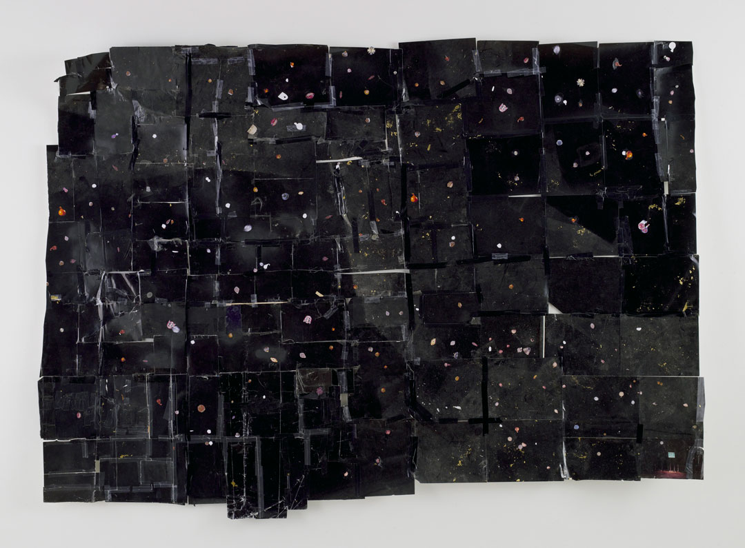
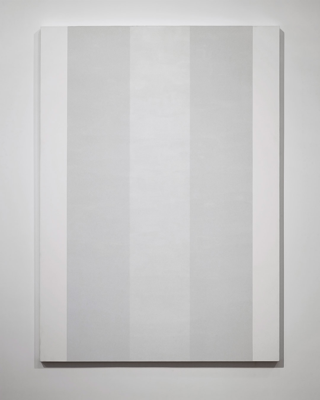
A photograph of Mary Corse’s White Light Painting (Inner Band Series) provides an idea at best of the composition of the painting—a large but shallow rectangular support, the canvas neatly stretched over the bars. Three vertical bands, varying slightly in tone with an almost silvery color seen in photographs, stretch from the top to the bottom of the canvas, framed by narrower matte white bands on the right and left margins. The delineations between the center three stripes in the image are blurry, but discernible.

White Light Painting (Inner Band Series) as it exists in a photograph is an entirely different painting from the actual painting in life. In the presence of the painting, its light, shadow, and color is elusive, and the thresholds of the three central bands—made of smooth layers of inherently colorless silica glass microspheres—recede and advance. As the viewer moves around the painting, the three central bands change value subtly in opposite directions. The outer bands of microbeads appear dimmer near the bottom of the painting and become more incandescent near the top, while the center band becomes more incandescent closer to the bottom of the painting, to a shimmering, undulating effect, up and down, as each band flashes in and out of visibility. The outermost stripes of matte acrylic white paint on the margins assume different hues according to the refraction of the light—briefly glowing pinkish green, then back to white, then nearly a dim gray in contrast to the flare emanating from the center as the silica glass microspheres bend light to create a prismatic field.

This is Corse’s goal: to instill dimension in her paintings not with illusion or figurative ground, but by using light as it comes into existence in the perception of the viewer, in real time, as the painting refracts it. It would be careless to assume that her paintings are simply about their shimmering finish.

Corse resists the easy association with California Light and Space artists. Though she lives in Topanga Canyon and shares some interests with those artists in her particular attention to light and space, the phenomenological  experience of artworks and, perhaps distantly, her use of an industrial material for its surface qualities, Corse’s use of light is informed by its metaphysics, not by her particular locale.

It does happen that Corse began using silica glass microspheres in her paintings following an encounter with the material just outside Los Angeles. On a sunset drive in Malibu in 1968, she noticed the luminosity of the street signs and street markings. Corse had been searching for ways to incorporate light in her paintings, and turned to the microbeads, which are used in retroreflective paint for pavement marking. In her Inner Band series, the iridescent effect can be compared to the meticulous, seamless finishes of West Coast Minimalist paint applications, and yet it isn’t so mechanically applied that the surface appears manufactured.

Most notable to me are the ways this painting refers to and departs from the self-reflexive qualities of modern painting in the 1960s, in their attention to flatness and abstract use of form and color. The arrangement of the bands of microspheres in White Light Painting (Inner Band Series) at once describes and affirms the flatness of the surface in the evenness of the layers, and also breaks the plane apart into fugitive planes of light. Additionally, the contour of the bands, while elusive, are straight and rectangular, stretching vertically from the top to the bottom of the canvas. Even as the bands appear to flare and fade, they repeat the length and the form of the painting itself.

Corse’s color is not inherent to any pigment in the painting, but exists in flux in the eye of the viewer. Whereas other paintings use tints or shades for color, Corse’s microspheres use pure light, and the random, polychromatic color that comes from its refraction.

Experiencing White Light Painting (Inner Band Series) is deeper than the experience of looking or simply beholding it—you are apprehended by the painting as you spend time with it, paying attention to it and witnessing its permutations. It exists in glances of light, in full silvery columns, in the soft apparent glow at its margins, and the fluttery animation of its surface as you walk past. It is spectacular for its sparkle, but even more so for its ability to resist expectations of a definitive state of being.

Hannah Hirano, SAM Coordinator for Museum Services and Conservation

References

Clark, Robin, ed. Phenomenal: California Light, Space, Surface. Berkeley, CA: University of California Press, The Museum of Contemporary Art San Diego, 2011.

Griffin, Jonathan. “’I paint for my sanity’ – an interview with Mary Corse.” Apollo International Art Magazine, August 4, 2018. https://www.apollo-magazine.com/i-paint-for-my-sanity-an-interview-with-mary-corse/

Miranda, Carolina A. “The ‘whoa’ moment and Mary Corse: The painter who toys with light is finally getting her due.” Los Angeles Times, November 2, 2017. https://www.latimes.com/entertainment/arts/miranda/la-et-cam-mary-corse-kayne-griffin-corcoran-20171102-story.html

Nichols, Matthew. “Mary Corse Is More Than a California Artist.” Art in America, February 8, 2012. https://www.artinamericamagazine.com/news-features/news/mary-corse-lehmann-maupin/

Image: White Light Painting (Inner Band Series), 1997, Mary Corse, acrylic, silica, glass microspheres, 60 × 84 in., Gift of the Virginia and Bagley Wright Collection, in honor of the 75th Anniversary of the Seattle Art Museum, 2014.25.12, © Artist or Artist’s Estate.

Object of the Week: Imogen Cunningham and Grandchildren at Fun House

I still feel that my interest in photography has something to do with the aesthetic, and that there should be a little beauty in everything.

– Imogen Cunningham

See Imogen Cunningham: A Retrospective at Seattle Art Museum, November 18, 2021–February 6, 2022

Imogen Cunningham was a seminal female American photographer, active in the Pacific Northwest (where she was born and raised) and the San Francisco Bay Area. This image of the artist and her grandchildren, taken in the reflection of a fun house mirror, is representative of Cunningham’s larger practice that spanned decades: experimental, technical, and the stuff of everyday life.

Cunningham is perhaps best known for her abstracted botanical photography, though she also produced images of the human nude, industrial landscapes, and street scenes. Here, her subject matter is much more personal and takes on an emotional valence.

It is often perpetuated that Cunningham was forced to choose between her career and motherhood, ultimately choosing the latter when she closed her portrait studio. However, this narrative is not quite accurate—Cunningham managed her responsibilities as both a mother and an artist, developing a photographic practice that blended art and life seamlessly. Neither roles were without sacrifice, of course, but Cunningham did her best to juggle her identities as a mother and artist—identities that, to this day, are either presented as mutually exclusive or not discussed nearly as much as they should be.

Moyra Davey’s Mother Reader is a major achievement in this regard. Published over fifteen years ago, the volume brings together testimonials, diaries, and essays by women artists, writers, and creative thinkers whose lives were forever altered—both positively and negatively—by pregnancy, childbirth, and motherhood. It is an amazing resource that focuses on the intersection of motherhood and creative life, honestly exploring the varied experiences of being a mother. In Margaret Mead’s essay “On Being a Grandmother,” Mead, a cultural anthropologist and contemporary of Cunningham, writes:

However, I felt none of the much trumpeted freedom from responsibility that grandparents are supposed to feel. Actually, it seems to me that the obligation to be a resource but not an interference is just as preoccupying as the attention one gives to one’s own children. I think we do not allow sufficiently for the obligation we lay on grandparents to keep themselves out of the picture—not to interfere, not to spoil, not to insist, not to intrude—and, if they are old and frail, to go and live apart in an old people’s home (by whatever name it may be called) and to say that they are happy when, once in a great while, their children bring their grandchildren to visit them.

When taken into consideration with this photograph, one can’t help but wonder what Cunningham’s experience was like as a grandmother. Was she able to spend real time with her daughter’s children? Did she feel a similar tension between acting as a resource and an interference? How did being an artist and grandmother differ from being an artist and mother? This early selfie suggests that she and her grandchildren had some adventures and joyful times, but it is just one glimpse into their relationship after all. Even still, we’re fortunate Cunningham chose to share it with us—there’s certainly a little beauty in it.

Elisabeth Smith, SAM Collection & Provenance Associate

Image: Imogen Cunningham and Grandchildren at Fun House, San Francisco, 1955, Imogen Cunningham, gelatin silver print, 8 3/4 x  7 1/8 in., Gift of John H. Hauberg, 89.38 (1955), 2009 ©Imogen Cunningham Trust

Object of the Week: Mola

Ancient Andean cultures used complex recording devices known as quipu, fashioned from tally cords, which allowed for the communication and recording of information essential to daily life. The quipu were essential tools for many Andean communities: they were a medium that enabled reading, writing, and, importantly, remembering. Such Indigenous practices nearly disappeared due to colonial suppression. Not unlike the quipu, the Cuna mola—or blouse—produced in the San Blas Islands represents the resilience of a community in the face of colonization.

The Cuna Indians are an Indigenous people who live along the Atlantic coast of Panama and Colombia. In the 16th century they were driven by the Spanish from their original home in Colombia, and moved west toward the coast. Mola, as we know them today, evolved from elaborate body painting. In the mid-18th century, when European settlers introduced cloth to the region, women began to wear simple blouses, painting them with natural dyes in the same manner they had previously decorated their bodies.

To make these elaborate blouses, an artist—importantly a woman—begins with multiple pieces of different colored cloth, and bastes one on top of the other. After cutting multiple designs, the maker then hems the edges with fine stitches. From there additional elements are added, such as embroidery, positive appliqué, or incisions that reveal the layers of cloth below. This reverse appliqué technique is an intricate and time-intensive process that has been mastered and handed down from generation to generation.

The history of the mola is inextricable from the history of colonialism in Latin America. It evolved in spite of European contact and continues to be shaped by contact with non-Native people today. For example, traditional Cuna designs—on both the body, originally, and the blouses—include abstracted linear patterns, stylized flora and fauna, and figures from Cuna mythology. When interactions with outsiders increased due to the construction of the Panama Canal, motifs such as trademarks, slogans, and American products appeared. Further, in the first decades of the 20th century, the Panamanian government tried to ban many Cuna customs, including their language and traditional dress. A resistance was mounted, and in 1925 the Dule Revolution resulted in the autonomy of the Cuna people, granting them the right to govern their own territory and culture autonomously. The mola can thus be seen as a vibrant textile tradition that represents the strength and resilience of the Cuna people.

Elisabeth Smith, Collection & Provenance Associate


Images: Mola, 1950s-60s, Cuna, Panamanian, cotton cloth and cotton thread, 21 × 25 in., Gift of an anonymous donor, 2018.26.10 © Artist or Artist’s Estate. Mola, 1950s-60s, Cuna, Panamanian, cotton cloth and cotton thread, 22 1/2 × 25 in., Gift of an anonymous donor, 2018.26.6 © Artist or Artist’s Estate.

SAMBlog