Hokusai Smartphone Tour: The Story of Minamoto no Yoshitsune and Jōruri-hime
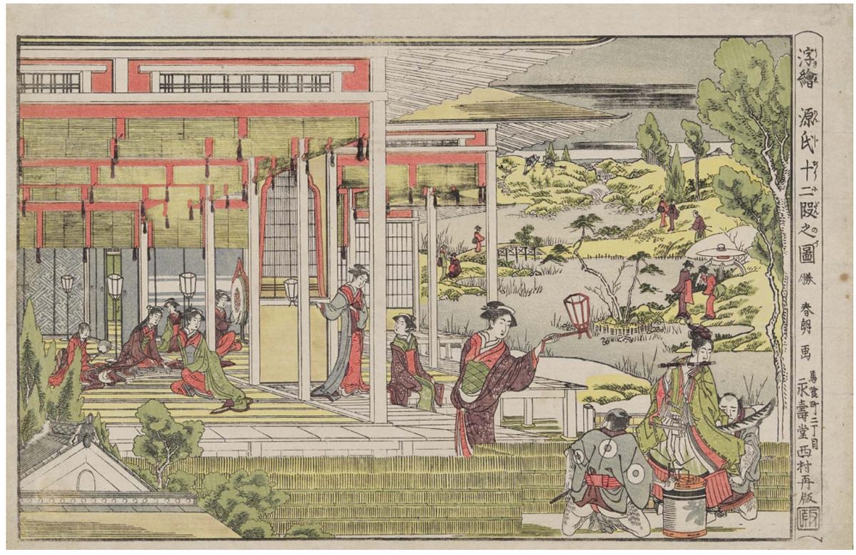
In The Story of Minamoto no Yoshitsune and Jōruri-hime, Katsushika Hokusai depicts a famous scene from classical Japanese literature with a modern twist. While the narrative of the 12th-century story remains the same—the young samurai Minamoto no Yoshitsune hears Princess Jōruri-hime playing the koto and duets with her on his flute, jumpstarting a passionate love affair—the costumes worn by some of the characters reflect the fashion and style of the 18th century.
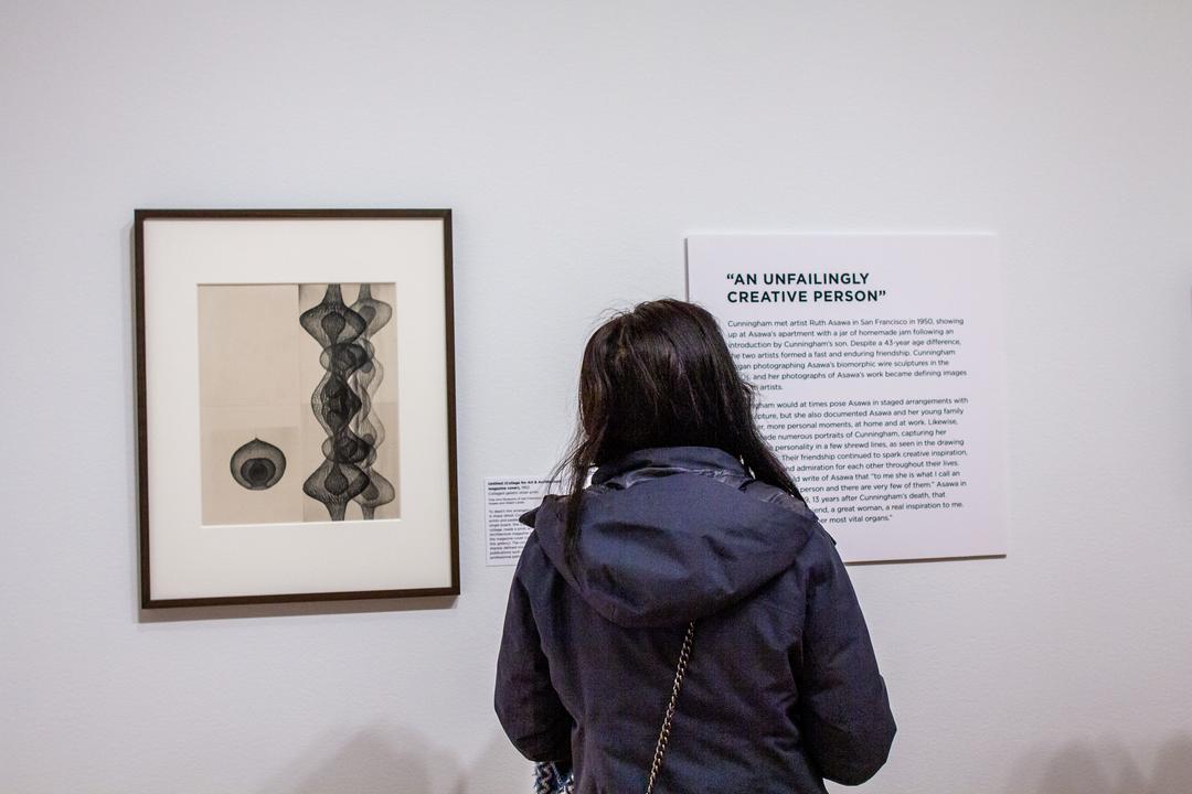
While under the tutelage of Kasukawa Shunshō in the 1780s, Hokusai designed many of these works, known as perspective prints, which incorporate exaggerated versions of the Western-style vanishing point perspective within elegant settings. In the second stop on the free smartphone tour of Hokusai: Inspiration and Influence from the Collection of the Museum of Fine Arts, Boston, exhibition curator Dr. Sarah Thompson discusses where Hokusai likely learned this artistic technique and points out how he achieved this perspective in this work.
Tune in to this audio recording now on our SoundCloud to learn more about The Story of Minamoto no Yoshitsune and Jōruri-hime or by scanning the QR code accompanying the artwork in the exhibition’s galleries. Hokusai: Inspiration and Influence is now on view through Sunday, January 21, 2024 at the Seattle Art Museum—get your tickets now!
The Story of Minamoto no Yoshitsune and Jōruri-hime, late 1780s
DR. SARAH THOMPSON: Let’s take a close look at an early work by Hokusai, a color print with the signature “Shunro” that he used in the 1780s when he was a student of Katsukawa Shunshō.
The scene is a modernized parody version of a famous story from classical Japanese literature, in which a young samurai, Minamoto no Yoshitsune, hears the sound of a lady named Jōruri-hime playing the koto at night. He stands at her garden gate and plays a duet with her on his flute, and this is the beginning of a passionate love affair. In the print, the flute player wears the costume of the 12th century when the story is set, but the lady and her attendants wear modern 18th-century clothes. When Hokusai was in his twenties he designed many works of this type, called perspective prints because they use an exaggerated version of Western-style vanishing point perspective. He probably learned this technique by looking at artists such as Utagawa Toyoharu and Shiba Kōkan, whose work you can see hanging nearby; and he combined it with the things that he had learned from his own teacher, Shunshō: drawing elegant figures in various poses and arranging them in an attractive setting.
In this picture, Hokusai uses two different systems of perspective to give the effect he wants. The building in the left half of the picture is drawn with converging lines that recede toward a distant vanishing point to give the impression of a very large, spacious interior. But in the garden scene to the right, Hokusai uses a traditional Asian perspective, with a high horizon line and distant objects placed higher in the picture, as you can see in, for example, the large painted screens by Shunshō also in this exhibition. For Japanese artists in the late 18th and early 19th centuries, Western perspective was an attractive and effective drawing technique, but was not necessarily the only option. In the famous landscape prints that Hokusai designed almost 50 years later, in the 1830s, he uses Western perspective most of the time but still feels free to alter it occasionally for a special effect.
– Lily Hansen, SAM Marketing Content Creator
Image: The Story of Minamoto no Yoshitsune and Jо̄ruri-hime (Genji jū̄nidan no zu), from the series Perspective Pictures (Uki e), 1780s (Tenmei era), Katsushika Hokusai, Japanese, 1760–1849, woodblock print (nishiki-e); ink and color on paper, William Sturgis Bigelow Collection, Photograph © Museum of Fine Arts, Boston.