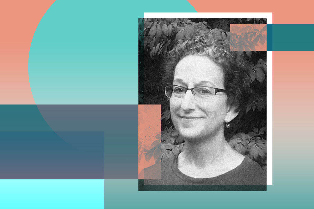
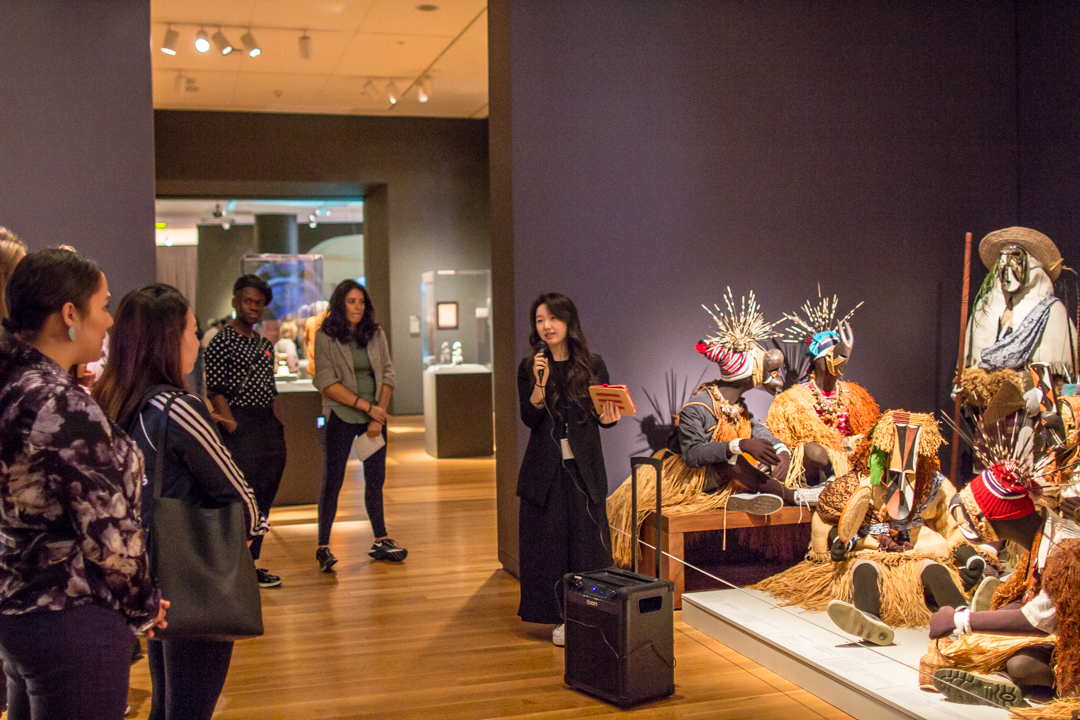
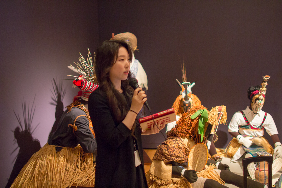
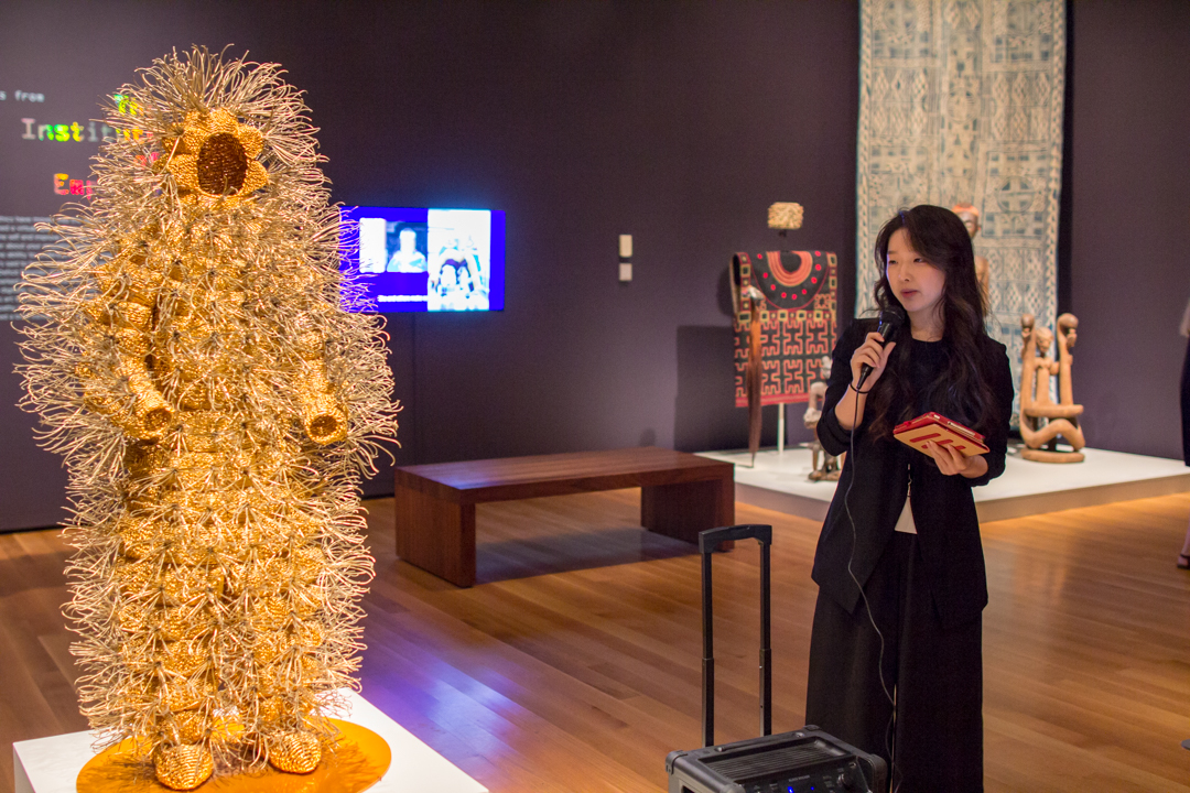
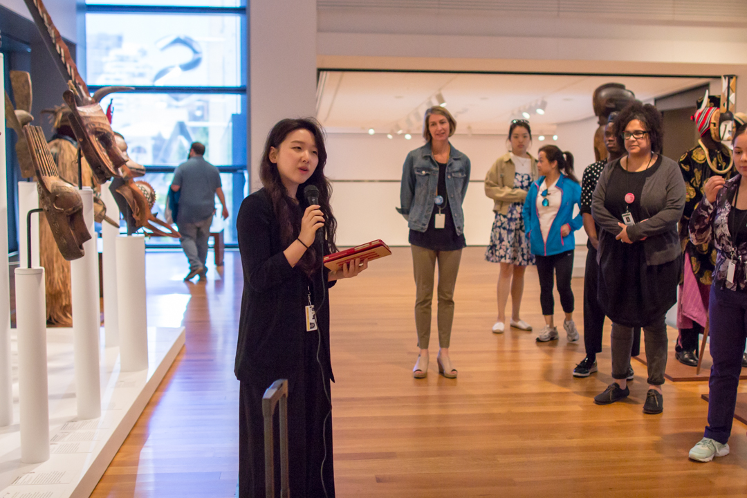
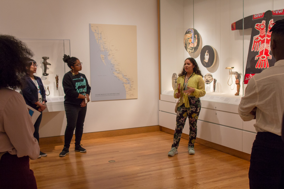
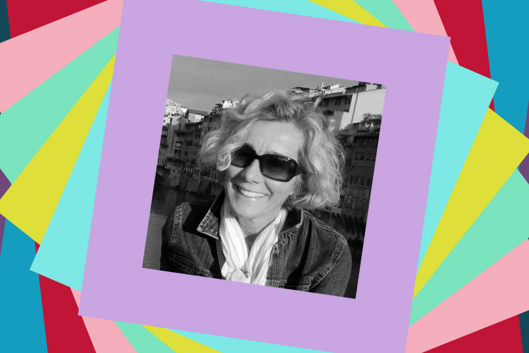
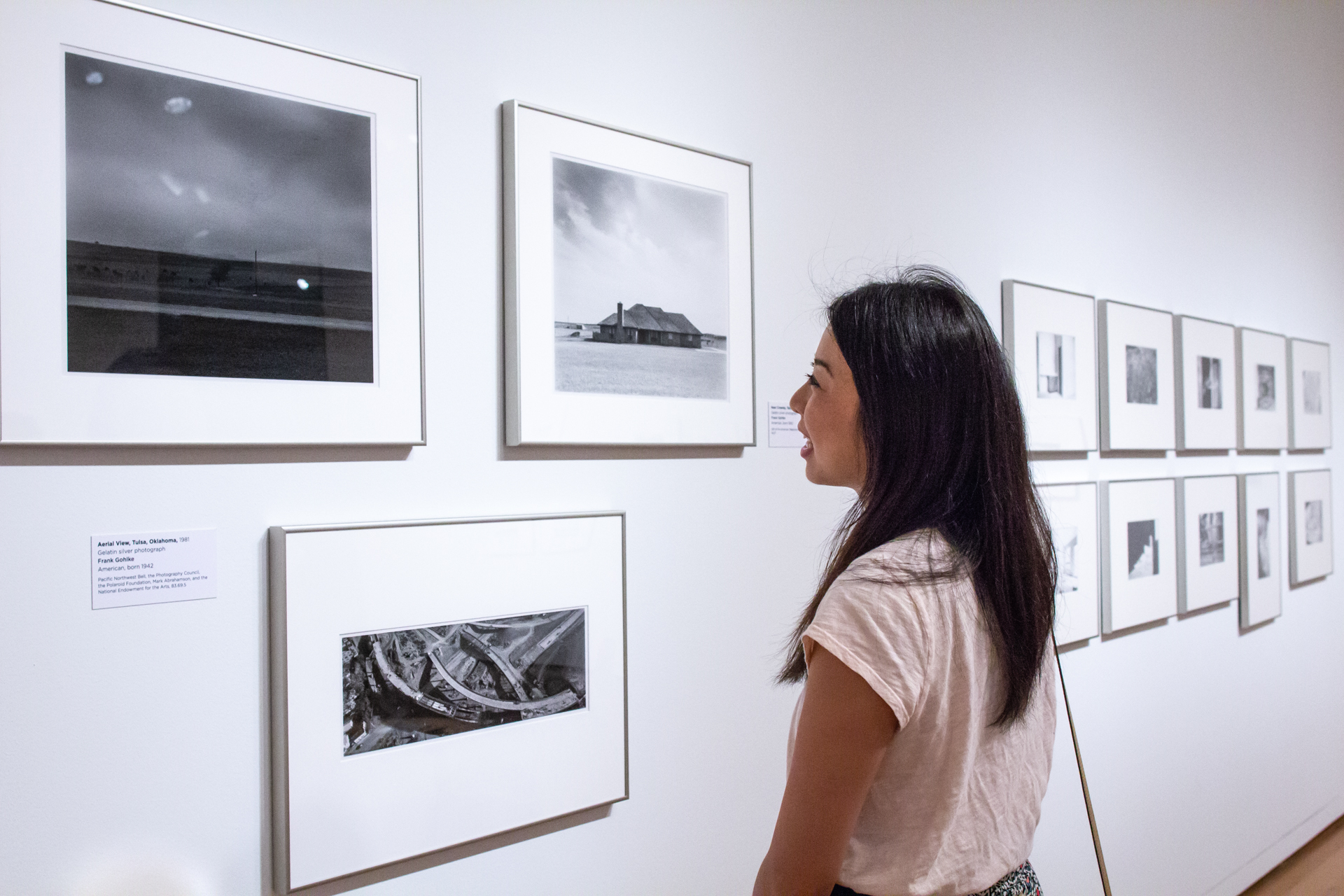
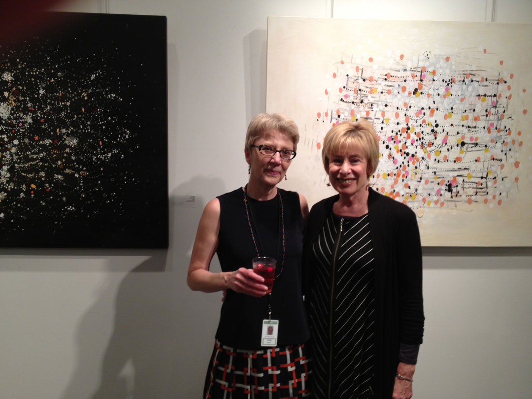
Volunteers make SAM go! Some of our docents, like Leanne Hawkins, have been volunteering since the 1980s when SAM’s only location was our original home in Volunteer Park (now one of our three locations, Volunteer Park is home of the Seattle Asian Art Museum). Every volunteer has their own reasons for contributing their talents to SAM. For Leanne, the opportunity to see art across centuries through the eyes of children and youth always allows her to learn something new about an artwork. Our Manager of Volunteers asked Leanne some questions so you can get to know her and get familiar with the important role SAM’s volunteer play in the museum.
SAM: What is your current role?
Leanne Hawkins: I am the Docent Executive Committee (DEC) chair, though my title as part of the SAM Volunteer Association Executive Committee is Docent Program Chair.
How long have you been volunteering at SAM?
Counting my year of docent training in 1998, plus perhaps a year or so volunteering once a month on Thursday nights in the early 1980s at the original SAM, I’ve been a SAM volunteer for about 21 years.
Why is the Seattle Art Museum (SAM) important to you?
My association with SAM has provided so many ways to learn about artists, eras, cultures, and perspectives that are new to me, or different from what is comfortable for me, and I appreciate the opportunities to be delighted, amused, sometimes upset—but never bored. Most of my docent tours are with school groups, ranging from kindergartners through high schoolers, and I love seeing SAM and its myriad objects through their eyes and reactions—I always learn something new, for which I’m grateful.
What is one of your favorite artworks in SAM’s collection, and why?
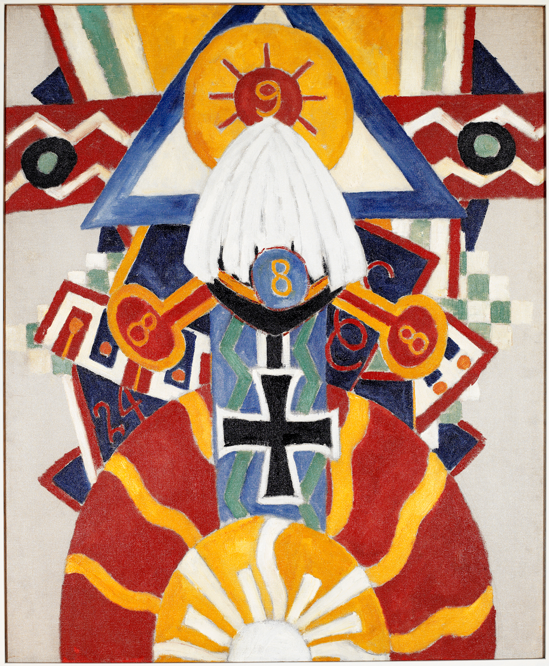
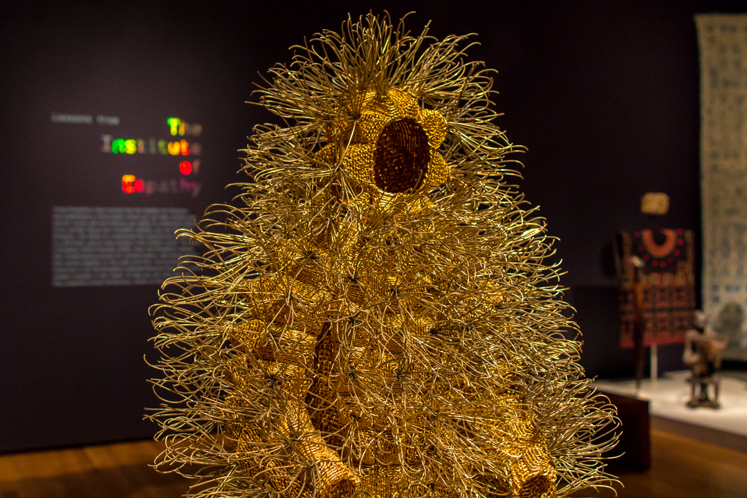
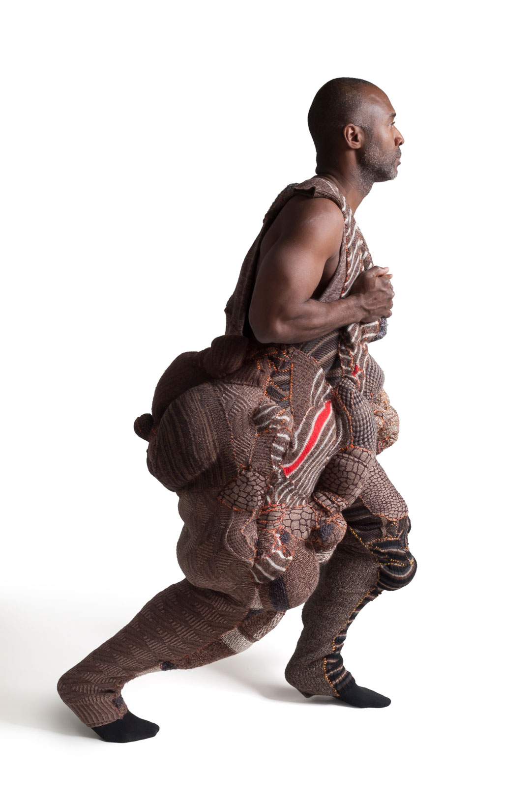
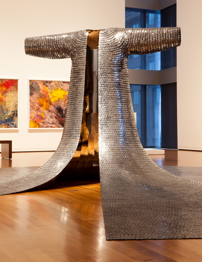
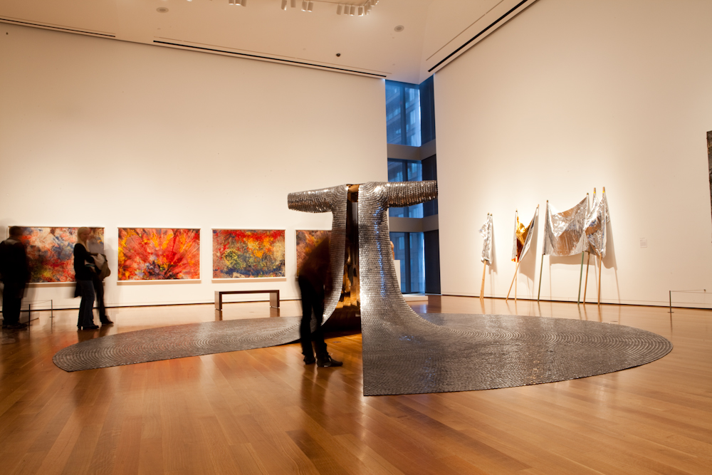
This is tough. I feel a kinship with so many of the works. But one of my all-time favorites, which I hope comes back on view soon, is Some/One by Do-Ho Suh. For those who may not have seen the piece in a while, it looks like a chainmail tunic on steroids—the skirt can overflow a gallery space. From a distance, it’s elegant, evocative, imposing. When you get closer and find out that the “chainmail” is thousands of dog tags, each individually stamped with a name and ID number, all of which are made up—well, it provokes a lot of intense looking and thoughtful discussion.
When not at SAM, what do you do for fun?
My favorite non-volunteer activities are reading, doing needlework, attending concerts and lectures, weeding the yard, and walking in places near and far from home.
What is something that most people might not immediately know about you?
I’m often told that I seem calm and organized, but I’m actually quite emotional and reactive. Raising two sons helped me perfect my poker face.
What is a simple hack, trick, or some advice that you’ve used over time to help you better fulfill your role at SAM?
As a docent, I see my role as a facilitator. I’m here to help people, especially children and youth, feel more comfortable thinking about and responding to art. To do that, I supply a framework for guests to look and ponder, and then I try to ask questions that stimulate robust discussion. I also try to have fun, a bit of self-deprecating humor often sets people at ease in the museum.
– Danie Allinice, Manager of Volunteer Programs

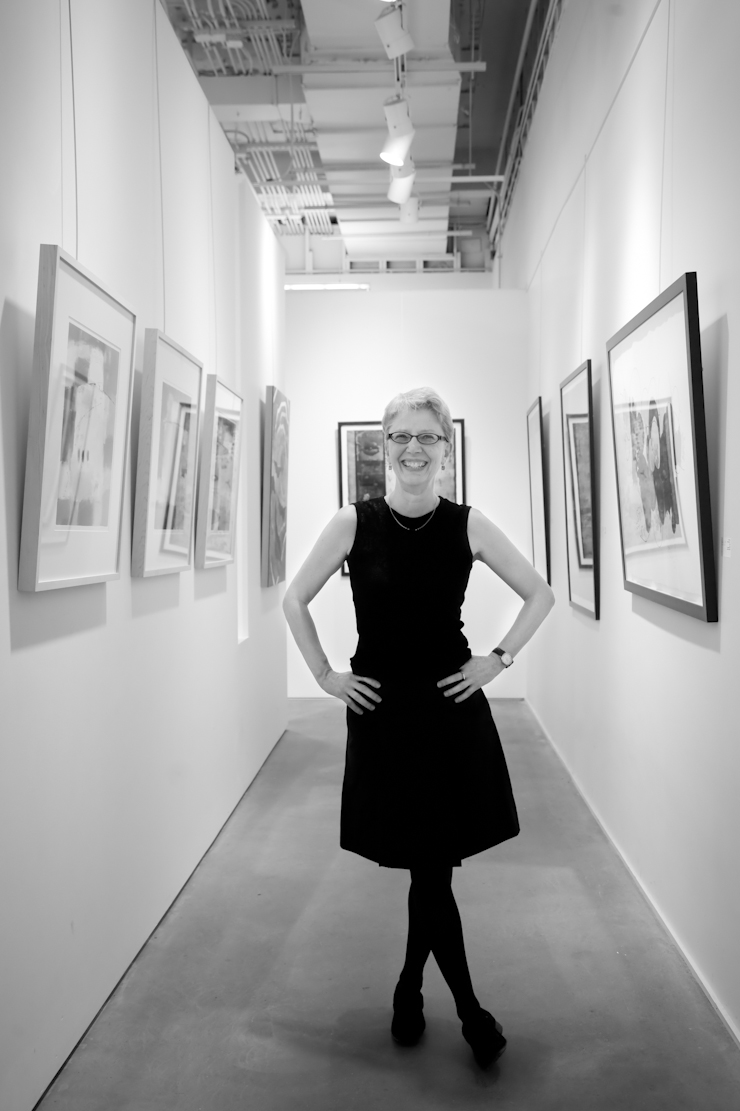
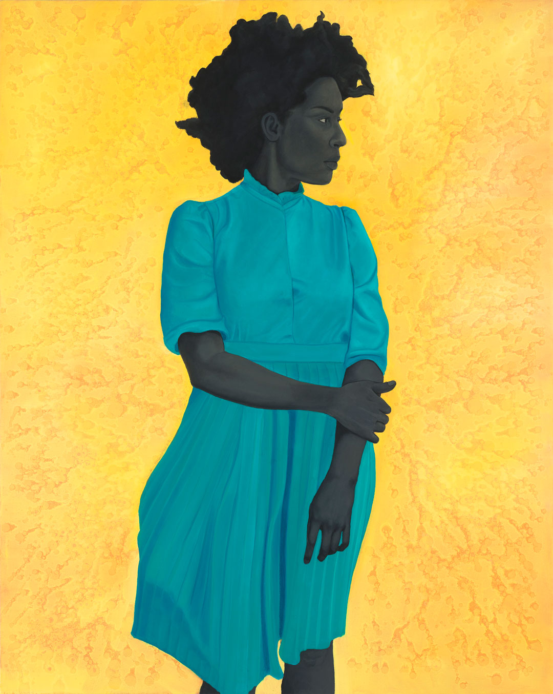
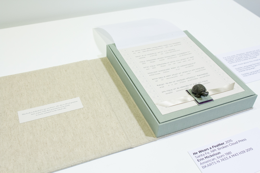
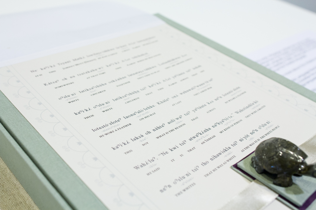
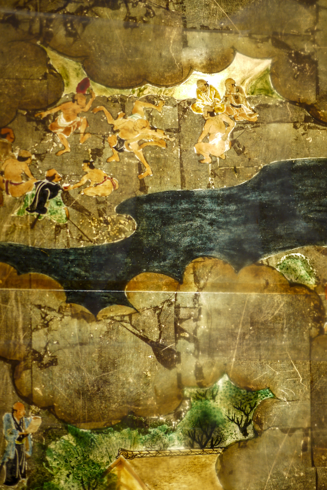
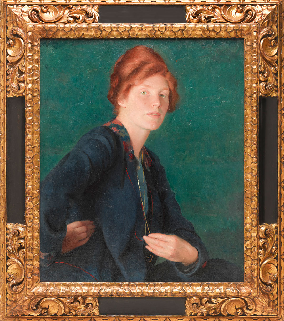
 Seattle Art Museum, photo: Nathaniel Willson
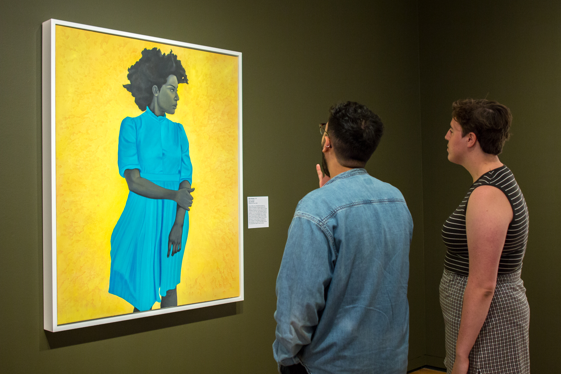
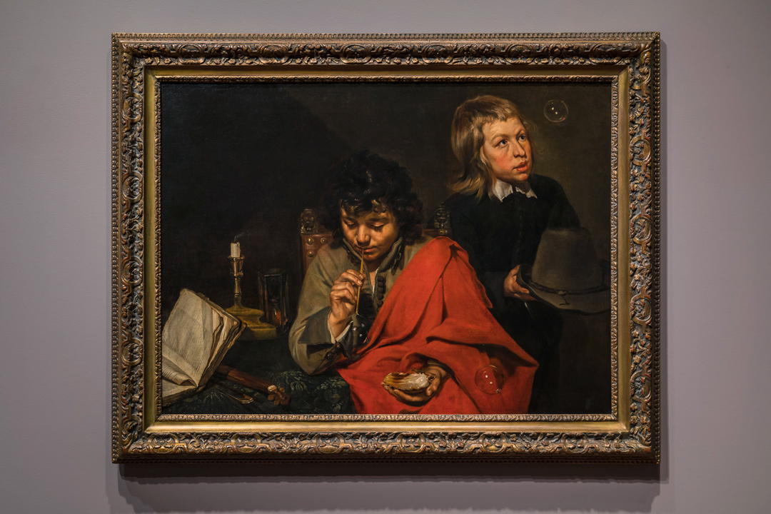