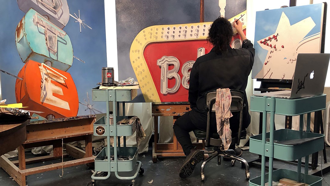
SAM Gallery artist Kellie Talbot travels across the country with her husband, cat, and duck, in a truck pulling her mobile studio, an Airstream trailer they named Mr. Salsa. Kellie Talbot’s America on view at SAM Gallery September 4–29, showcases some of her newest works. Talbot has established a national reputation for her oil paintings of the neon signs scattered across America. In the last two years, her family has driven 36,000 miles, through 29 states, in pursuit of source material for her paintings. She plans her route, knowing where certain signs are located, but is always open to possibilities and unexpected opportunities. Some of her favorite signs and memories come from happening upon them. One unexpected ice storm led them to Vaughn, NM (population 446), where Talbot found one neon sign after another. She was out in the snow, climbing on her Airstream trailer to get photographs for future paintings. When she’s traveling the country, Talbot says “I photograph almost every sign I come across because when I am in collecting mode I don’t want to pass up any potential. Sometimes it’s more obvious. Some of those obvious ones have an iconic shape or beautiful neon that just demands to be painted.”
Once Talbot returns to her studio in Seattle or New Orleans, she relies on reference photos from her trip, to paint photorealist paintings of the signs that represent the landscape of American artifacts, craftsmanship, and history. Talbot describes how “once I am in my studio I spend a lot of time with my reference material planning out a body of work. I like to have a balance of close-ups mixed with landscapes. I like there to be a push and pull of sorts. Some signs are small but I paint them big while others I can enlarge just portions. Almost every sign has the potential to be painted. I just have to find the aspect of that sign I want to paint.” Talbot is often drawn to a particular letter or shadows from a sign. Focusing on a smaller portion of the sign allows the viewer to enjoy the shapes, shadows, and colors in a new way. Talbot intentionally includes the rust and decay in the neon signs she paints. These details aren’t negatives to the artist, they are signs of time and experience, both an elegy and a hope.
Meet the artist at the opening reception on Thursday, September 5, 6–7:30 pm at SAM Gallery.
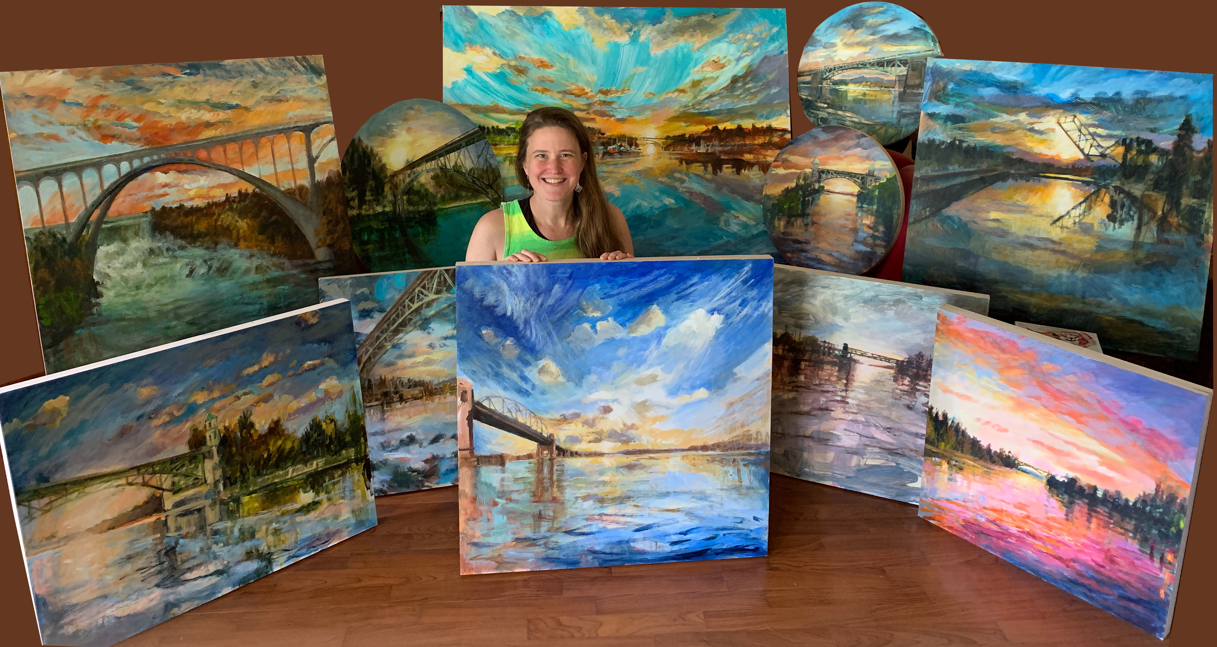
For her recent commission for the Seattle Cancer Care Alliance (SCCA), SAM Gallery artist Niki Keenan created 11 paintings focused on healing environments. SCCA brings together the leading research teams and cancer specialists of Fred Hutch, Seattle Children’s, and UW Medicine. The treatment rooms in their newly expanded SCCA outpatient clinic in South Lake Union feature Keenan’s work.
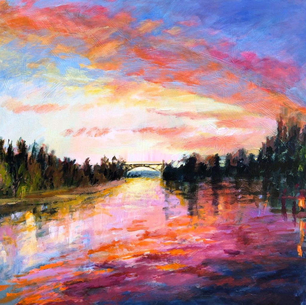
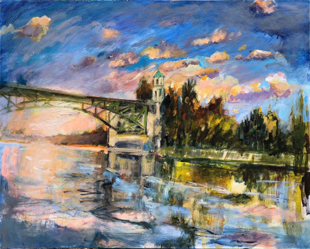
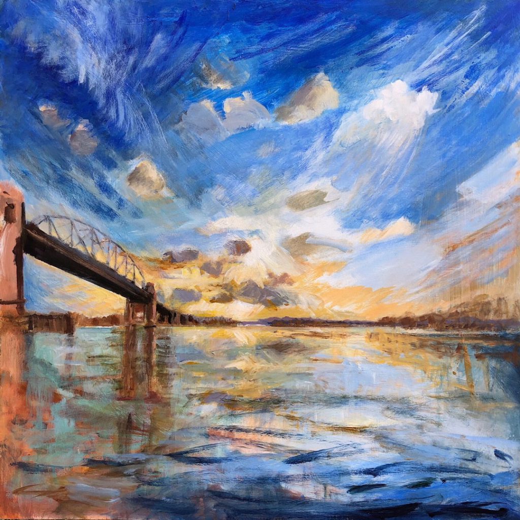
Niki Keenan’s paintings are inspired by the natural world, specifically sunrises and sunsets in Seattle. She uses dynamic, bold colors to paint water scenes with bridges and reflections from the vantage point of a boat. Keenan writes, “Each of the paintings in this series depicts a Pacific Northwest bridge, most of them are in Washington State, one is in British Columbia, Canada. I use these bridges as a way to frame the sky, as a way to show off the sun’s rays dancing around the architecture and as an anchor to a specific place. These brilliant sunsets and sunrises are happening all around us and by showing them happening in places we recognize, it makes the experience a shared one. Also, I believe bridges are symbolic of journeys in that they help us get where we want to go.”
In the new treatment rooms at SCCA, Keenan hopes her paintings will help transport viewers and give them something new to focus on, during their treatments. She believes “being transported during times of stress and uncertainty, is such a gift and so vital for healing. Paintings can literally turn a regular wall into a portal and the place you get to go in my paintings is full of hope, happiness, light.”
Keenan began showing her work at the SAM Gallery in 2018 and was quickly discovered by local collectors. SAM Gallery supports local artists and their careers by increasing their exposure and finding audiences for their work.
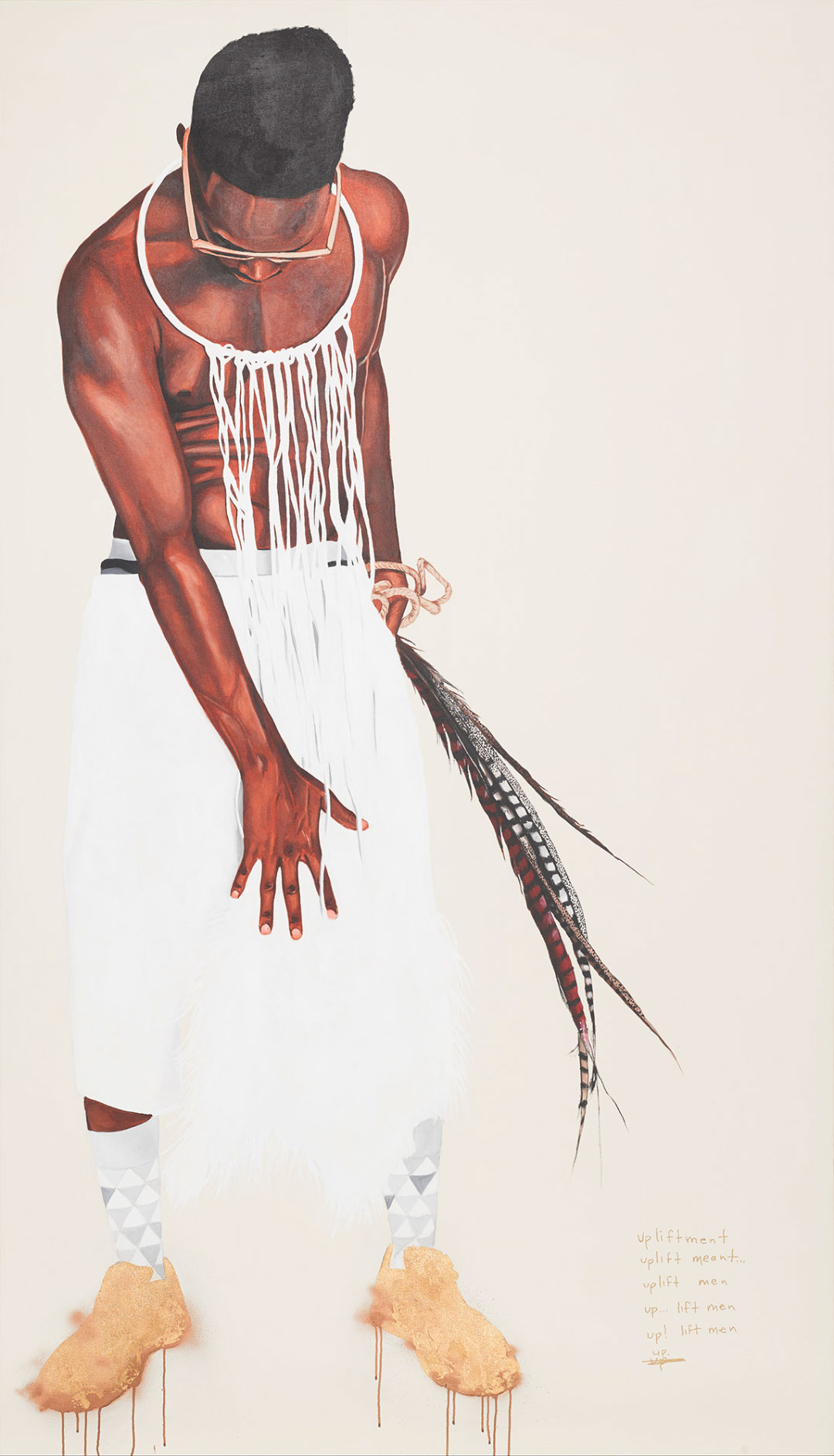
In Daedalus/Upliftment, a young Black man struggles to take flight. His gaze is fixed on the ground instead of the sky, with eyes downcast and obscured by gold sunglasses. One hand is outstretched to conceal himself. The other grasps a plume of pheasant feathers, with a rope tied around his wrist. A wreath of ostrich feathers adorns his neck, draping his chest and blending into bright white pants. The feathers symbolize the deities Yoruba Orisas Obatala of wisdom, and Osun of love.
This full-body portrait portrays someone steady, yet vulnerable, someone who embodies the emotional juxtapositions of freedom and captivity, hope and doubt. The dazzling high-tops—inlaid with gold leaf and spray paint detail, dripping to the edges of the canvas—paired with grayscale triangle-patterned socks are captivating. Although a symbol of value, the gold sneakers carry much weight: a strain against the aspirations and ability to rise.
Daedalus/Upliftment is from Dr. Fahamu Pecou’s 2015 series, I Know Why The Caged Bird Blings, the series title inspired by Maya Angelou’s poem, “I Know Why The Caged Bird Sings.” A visual/performing artist and scholar, Pecou concentrates on Black masculinity in his work. Pecou probes today’s media representations, expectations, and images of Black men removed from Black agency—including stereotypes of violence—and their emotional toll on readings and performances of Black masculinity. In 2017, Pecou was the subject of a retrospective exhibition “Miroirs de l’Homme” (Mirrors of the Man) in Paris, France and a recipient of the 2016 Joan Mitchell Foundation “Painters and Sculptors” Award.[1]
Daedalus/Upliftment alludes to the Greek myth of Daedalus and Icarus. Daedalus built wings of feathers and wax for himself and his son, Icarus, to escape their prison. Despite Daedalus’ warning, Icarus flew too close to the sun, melting the wax on the wings, falling and drowning in the ocean. Pecou reinterprets this classic tragedy and questions the actions of Daedalus as Icarus’ father. Daedalus/Uplifting provokes a meditation on paternalism and masculinity, with “the breakdown of intergenerational communication and the emotional complexities within the Black male experience that trouble the desire and ability to take flight.”[2]
In the far-right corner of the stark white background, Pecou
leaves us a surrealist poem:
How old was artist Jeffrey Gibson when he started going to the club? How do Peter, Paul, and Mary influence Gibson’s work? What did Nietzsche have to say about hammers? Find out in this video of info nuggets about Gibson’s sculpture, Like A Hammer, on view at SAM in the special exhibition of the same name!
Jeffrey Gibson: Like a Hammeris a major museum exhibition presenting a significant selection of this contemporary artist’s exuberant artwork created since 2011. Gibson’s complex work reflects varied influences, including fashion and design, abstract painting, queer identity, popular music, and the materials and aesthetics of Native American cultures. The more than 65 works on view include beaded punching bags, figures and wall hangings, abstract geometric paintings on rawhide and canvas, performance video, and a new multimedia installation.
See more of Gibson’s club kids on view through May 12!
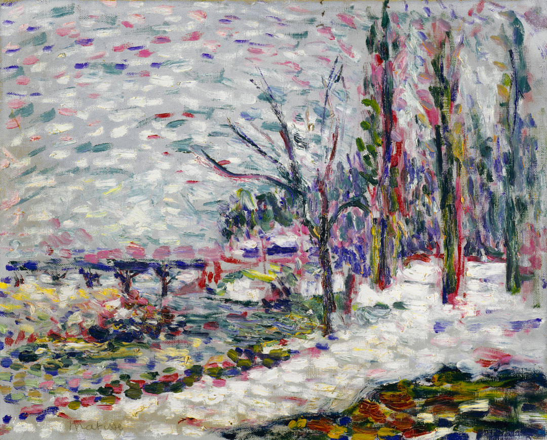
“An artist should express his feeling with the harmony or idea of color which he possesses naturally. He should not copy the walls, or objects on a table, but he should, above all, express a vision of color, the harmony of which corresponds to his feeling.”[1] – Henri Matisse
During the rise of modernism, which occurred between the late 19th century to the early 20th century,[2] artists began to move away from representation towards abstraction, and they changed the types of painting that were traditionally accepted in the Western world. At this time, artists started to return to the basic natures of paintings such as colors, lines, shapes, and textures, rather than words and representations in order to communicate and interact with their audience.
Winter Landscape on the Banks of the Seine, which Matisse began in 1904 and finished in 1905, contains quick vibrant dabs of color pigments against the dreary grey and stark white background of the canvas. Matisse did not literally paint a winter setting along Paris’ River Seine. He painted the emotions that this setting produced within him. By arranging cool and warm tones on a two-dimensional canvas, Matisse was able to successfully convey the feeling of gentleness and serenity within his work. He left behind these emotions for Seattle Art Museum visitors to explore and perceive.
Widely recognized as one of the most important and innovative colorists during the post-impressionism movement, Henri Matisse focused on creating harmonious, unified, and balanced arrangements of colors on two-dimensional canvases to evoke emotions within his audience. Though Henri Matisse’s mother was a painter, he did not have a direct path into the world of art. He began to study law in Paris and even though he considered it to be tedious and uninteresting, he still passed the bar exam in 1888. He reluctantly started to practice law after he graduated because his father arranged a job for him in a law office. His career path was altered, however, when he received art supplies from his mother in 1889. “From the moment I held the box of colors in my hands, I knew this was my life,”[3] Matisse stated.
Happy birthday to Henri Matisse (December 31, 1869–November 3, 1954)! Thank you for your legacy and contribution to the world of art.
– Trang Tran, SAM’s Emerging Arts Leader Intern
[1] Jack D. Flam, Matisse On Art (New York: Phaidon Press Limited, 1973), 51.
[2] “What is Modern Art?” Museum of Modern Art, accessed 20 Dec 2018, https://www.moma.org/learn/moma_learning/themes/what-is-modern-art/
[3] “The Personal Life of Henri Matisse,” Henri Matisse, accessed 23 Oct 2018, http://www.henri-matisse.net/biography.html.
Image: Winter Landscape on the Banks of the Seine, ca. 1904-05, Henri Matisse, oil on canvas, 12 3/4 x 15 3/4 in., Gift of Norman Davis, 91.88
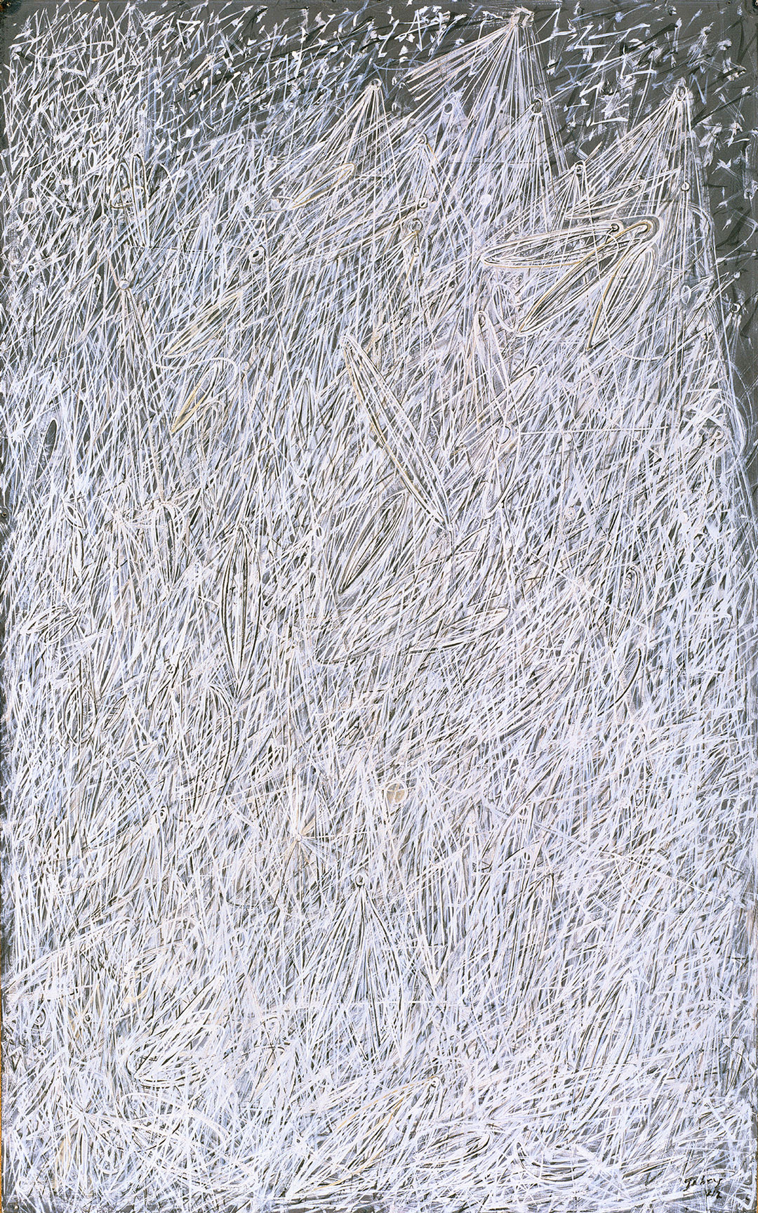
Cloud cover in the Pacific Northwest makes stargazing difficult at times, but that didn’t stop Mark Tobey from painting White Night in 1942.
Featuring the artist’s signature “white writing” treatment—a dense and abstract calligraphic mode of painting—White Night manages to evoke a sense of spirituality while also conjuring the night sky. After the artist’s conversion to the Baha’i Faith in 1918 and subsequent study of Zen painting in Kyoto, Japan, Tobey would indeed, throughout his long career, explore the relationship between the spiritual and the abstract in art. In the words of the artist, “I believe that painting should come through the avenues of meditation rather than the canals of action.”
It is a difficult endeavor to paint something felt rather than known. Yet somehow Tobey is able to capture the awesome power and energy of the night sky. Of course, the sky we see today is very different from what Tobey would be giving representation to in 1942. The first satellite was launched into space fifteen years later, ushering in a new era of space exploration and forever altering our relationship with the cosmos. In this context, White Night becomes a rather prescient painting—somehow predicting the invisible activity that would soon populate the night sky, and the images of space such satellites would capture.
The Geminid meteor shower is tonight, and while we might not be able to experience it through the winter clouds, we can still look up and recall this painting’s dynamic and mysterious energy.
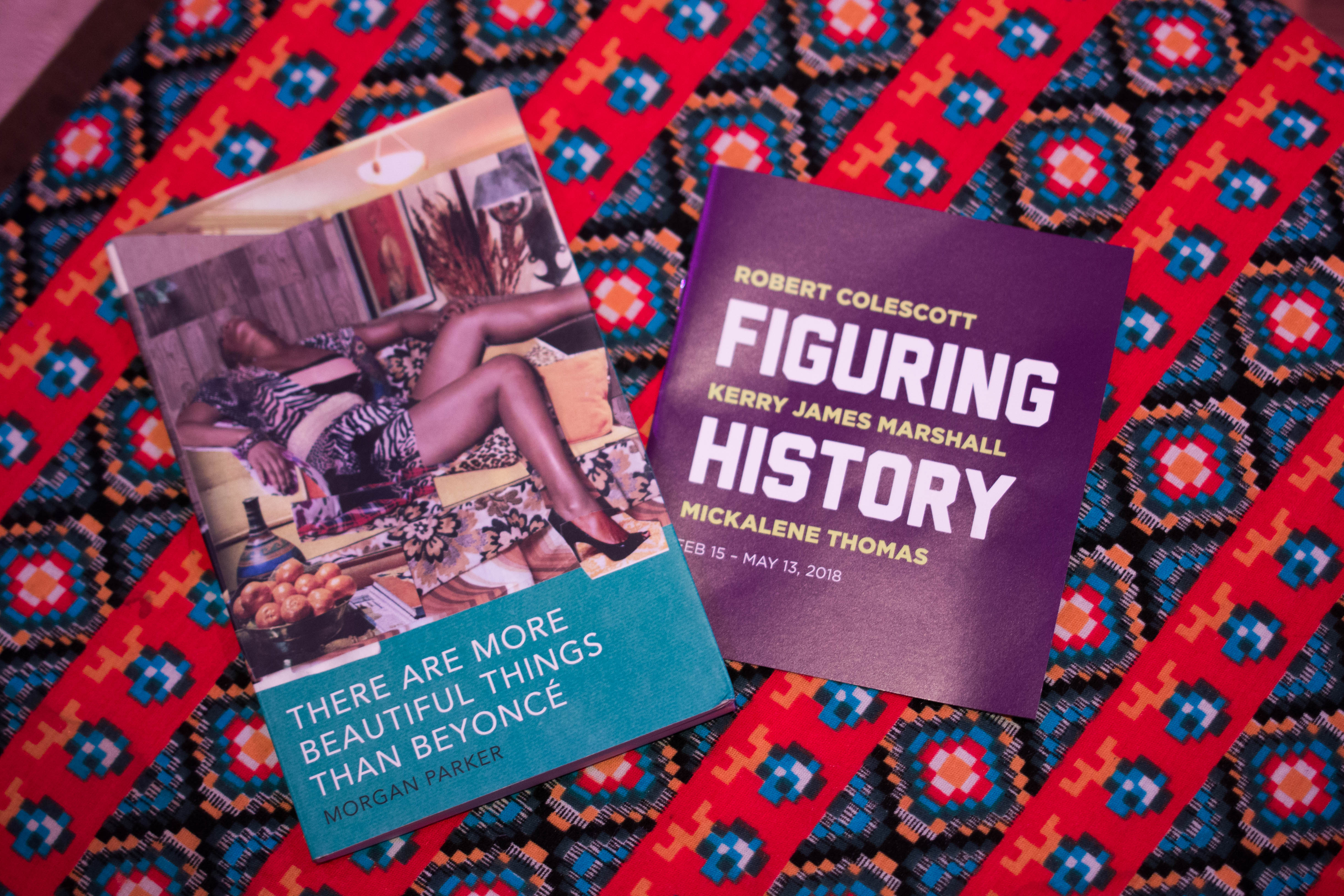
As National Poetry Month comes to a close, if you’re not sure what to read, visit the library inside of the exhibition Figuring History: Robert Colescott, Kerry James Marshall, Mickalene Thomas, closing May 13. While there you’ll notice a book of poetry by Morgan Parker titled There Are More Beautiful Things Than Beyoncé (Tin House, 2017). It’s a recent favorite read of this particular copywriter and the cover of the first edition (now sold out) featured a Mickalene Thomas artwork. More importantly, within the pages of this smart, irreverent, and deeply personal collection of poetry is a piece inspired by Thomas, reprinted below! Morgan Parker simultaneously brings great depth to listening to Drake and immense weight to racial discrimination as she fearlessly invokes generations of social injustices within her powerful and playful prose. Parker stopped by the exhibition while visiting Seattle and shared some thoughts on Figuring History as well!
We Don’t Know When We Were Opened (Or, The Origin of the Universe) after Mickalene Thomas
By Morgan Parker
A sip of liquor from a creek. Saturday syndicated
Good Times, bare legs, colors draped like
an afterthought. We bright enough to blind you.
Dear anyone, dear high-heel metronome, white
noise, hush us, shhhhh, hush us. We’re artisinal
crafts, rare gems, bed of leafy bush you call
us superfood. Jeweled lips, we’re rich
We’re everyone. We have ideas and vaginas,
history and clothes and a mother. Portrait-ready
American blues. Palm trees and back issues
of JET, pink lotion, gin on ice, zebras, fig lipstick.
One day we learned to migrate. One day we studied
Mamma making her face. Bright new brown, scent of Nana
and cinnamon. Shadows of husbands and vineyards,
records curated to our allure, incense, unconcern.
Champagne is how the Xanax goes down, royal blue
reigning. We’re begging anyone not to forget
we’re turned on with control. We better homes and gardens.
We real grown. We garden of soiled panties.
We low hum of satisfaction. We is is is is is is is is
touch, touch, shine, a little taste. You’re gonna
give us the love we need.
SAM: Reading We Don’t Know When We Were Opened there’s a lot of assonance that creates repetition and fragmentation that feels to me like a sonic equivalent to Mickalene’s visual fragmentation. What in Thomas’ work inspired you and this poem, formally or thematically?
Morgan Parker: I’ve always loved Mickalene’s work, for the glitter and the color and the attention and the audaciousness. Her work is a celebration, and it’s also a politically intentional decolonization of the art history canon. She builds new worlds and revels in those worlds. I wanted my poem to reflect her work and add to it, translate it in my own words.
How do you think the persona poem and the way that Mickalene Thomas casts her models as art historical figures and tropes relate? Mickalene’s figures are looking right at you and this alters their role—makes them dimensional, such as in a painting like Tamika sur une chaise longue avec Monet. Where do you think that same dimension lives persona poems?
God I love this painting. I like to think of all my first-person poems as playing with dimensionality. I’m interested in using the singular figure, or voice, to call up cultural figureheads and historical tropes. Persona poems are an extension of that—they have two first-person speakers.
What stuck with you from your visit to the exhibition? Any lingering or new thoughts?
Kerry James Marshall’s Souvenir I always makes me cry. It was also fantastic to see Robert Colescott’s work in person, as I’ve been thinking about it a lot lately. I love the way it engages stereotypes and recasts history so playfully and comically. In a different way than Mickalene, there’s trickery in acknowledging the audience’s gaze—that’s something I’ll be thinking over for a while.
Morgan Parker is the author of There Are More Beautiful Things Than Beyoncé and Other People’s Comfort Keeps Me Up at Night. In 2019, a third collection of poems, Magical Negro, will be published by Tin House, and a young adult novel will be published with Delacorte Press. Her debut book of nonfiction will be released in 2020 by OneWorld. Parker is the recipient of a 2017 National Endowment for the Arts Literature Fellowship, winner of a Pushcart Prize, and a Cave Canem graduate fellow. She is the creator and host of Reparations, Live! at the Ace Hotel. With Tommy Pico, she co-curates the Poets with Attitude (PWA) reading series, and with Angel Nafis, she is The Other Black Girl Collective. She lives in Los Angeles.
– Chelsea Werner-Jatzke, Content Strategist & Social Media Manager
Seattle and the surrounding area means many things to many people. Even among the artists whose work is on display in Inside Game at SAM Gallery, there are varied reactions to relocating here or living on the outskirts of this still slightly wild city. From the subdued silence of Seattle compared to Texas, to the striking shades of green crowding the San Juan Islands, the locale has a distinct impact on the inspirations and introspection of local artists. See for yourself with a visit to SAM Gallery to see work from the artists in Inside Game, on view through May 6.
I remember when I first visited Seattle five years ago deciding if we wanted to live here, we arrived early to a restaurant, sitting with my back to the empty patio. After our two-hour lunch, I turned around to a patio packed with people, but it was still so quiet I was shocked. No hootin’ and hollerin’ like back in Texas. And that has been my experience here. Everyone keeps to themselves. Daily life on public transit everyone is silent. No nods hello from acquaintances on the street. This in turn magnifies the tons of daydreaming I do since I’m not talking. So the work I’ve made while in Seattle is very introspective. The result is from concentrated ideas that have been in my head like salt water taffy moving over and over, changing a little, but tracing an obsessive path in my brain. I always wait with anticipation to see how people will respond to my work, because these are my images based on ideas based on daydreams with vague appearances from things in my life. The artist community here has been super welcoming, so this is my attempt to connect with my other fellow Seattleites.
I live and paint in a rural outpost of Seattle—San Juan Island—where I have dwelt upon the same piece of land for over 35 years. Our house is in a clearing in the woods. Vegetation overflows around us: fir trees, cedars, alders, maples, willows, thickets of salmonberry and elderberry, wetland grasses, nettles. Summer brings endless shades of green. In winter, we are presented with all sorts of bare branches crisscrossing, fallen limbs and trees, trees broken off and still standing. It is a cacophony of messy nature. There are no vistas: all is seen from a close-up viewpoint, all the edges, the complexity along those edges. Nothing stands out as a focal point. One never quite knows where to look. So, one just keeps looking, here, there, here again, eyes always in motion. The eye gathers all those disparate bits of vision, flickering, changing, moving, and somehow assembles them into a semblance of unity. These particular paintings of mine in Inside Game are exactly that way.
Images: Lambent Rabble, Elizabeth Lopez, 48 x 36 in., mixed media on canvas. Owl Light, Dana Roberts, 48.5 x 52 in., oil on linen.
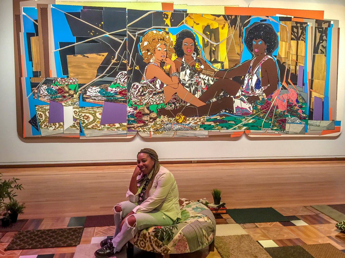
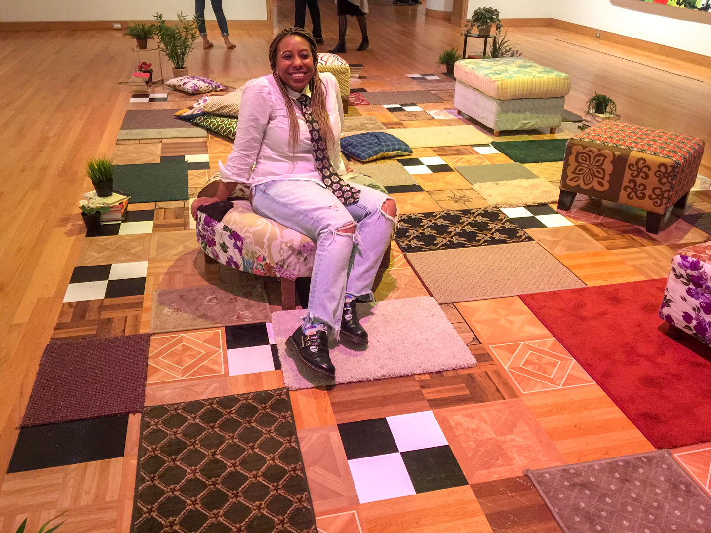
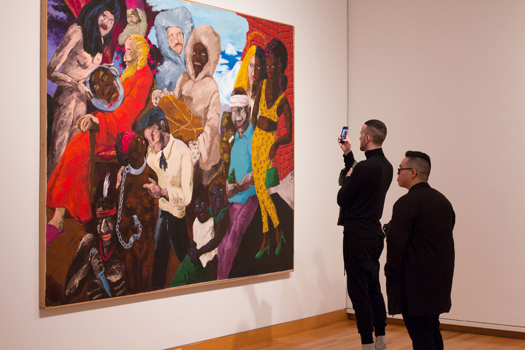
In February, as I prepared to enter the Seattle Art Museum for the Community Celebration for Figuring History: Robert Colescott, Kerry James Marshall, Mickalene Thomas, what seemed like endless thoughts swirled around in my mind. It was Black History month and opening weekend for the movie Black Panther— the joy and exuberance of Black culture was palpable in the air.
This was in stark contrast to just over a year earlier, when the collective anguish and discontent of Black society was reeling in the wake of the latest barrage of Black bodies murdered in the streets and broadcast in ‘real time’ for all to view. I still recall the gut-wrenching emotion of watching a Black father, murdered in his vehicle, minutes away from where my own father lived. I remember this pain so vividly because it was not the first time I’d felt it. It was not the first time the Black community watched their brothers, fathers, and sons murdered at the hands of those sworn to protect and serve. It was not the first time we were dehumanized in the public theater. It was not the first time we were criminalized for being. It was history repeating itself.
The weight and memory of historical trauma accompanied me into the museum, tugging at my coat with each breath of Black excellence I inhaled. As I stood in gratitude for Mickalene Thomas, Kerry James Marshall, and Robert Colescott, I also stood in sorrow of the circumstances that produced such beautiful stories and art. In each historical work I found traces of my own story. In Colescott’s Matthew Henson and the Quest for the North Pole, (pictured at the top of this post) the images of Black bodies being simultaneously brutalized and fetishized depict the story of my great-great-grandmother who was raped by her oppressor, giving birth to my great-grandfather who would later be praised for his “passable” complexion, wavy hair, and light eyes. Marshall’s Souvenir II portrays a cloud of witnesses, prominently featuring Martin Luther King Jr. and John F. Kennedy, hallmarks in the home of my own, and many other Black grandmothers across the country, and emblematic of the complicated socio-political relationship we share with this nation.
In Thomas’ Resist, the Civil Rights era struggle of my parents was laid in front of me through a collage of violent vignettes. As I watched this piece I saw my uncle’s resistance, which left him brutally beaten and jailed for having the audacity to seek a human existence. I also saw my father and his siblings, the first to integrate the school systems in North Carolina. I felt the collective fear and courage he carried with him as the only Black student in his school. And as my chest tightened, breath shortened and fists clinched I remembered where I stood—rooted in the past, squarely in the present, carrying my portion of the mantle of Black excellence. As I gathered myself, I walked out of the museum breathing in the joy and exuberance of Black culture. Each breath gradually healing the wounds of my genetic trauma.
– Benji Anderson, Artist (@benjipnewton)
Benji Anderson is an artist, theologian and philosopher. Three identities that suffered separate existences for much of Benji’s life. Born in the South and raised in the Mid West, his early cultural learnings taught Benji that it was not only prudent, but necessary to compartmentalize his identities. Surprisingly it was through his academic journey that Benji began to fully exist as a being capable of complex, and seemingly contradictory identity. As a Master of Divinity student, Benji embarked on a process of deep self-excavation, which, upon completion of his degree, provided Benji with the license to live authentically.
As theologian and philosopher, Benji is concerned with the quality and depth of life. As artist, Benji concerns himself with the creative expression of his theosophical existence. Using a variety of mediums Benji endeavors to create multi-sensory pieces that thrust the viewer into the experience of the artist – not simply as a voyeur, but as a participant.
Seattle is often cited as a great place to live because of the ease of access to the outdoors. With mountains encroaching on the city’s skyline from every direction and terrains ranging from rain forest to desert in the state of Washington, it’s easy to understand why we’ve got a reputation as a city of landscape painters and nature poets. In Outside Influences, on view in SAM Gallery through April 4, Dan Hawkins, Ryan Molenkamp, Kate Protage, and Chris Sheridan depict both the cityscape as well as our moss and stone backyard—taking their inspiration from everything outside themselves and filtering it through their particular medium to create unique and striking scenes of Seattle and its surroundings. This artwork begs for reflection on the artist life in Seattle and Molenkamp provides.
When I moved to Seattle in 2001 to pursue an art career it didn’t make a lot of sense . . . frankly moving anywhere to pursue an art career didn’t make a lot of sense, but I had the bug, the itch, and I found Seattle to be a welcoming place to grow. The city was full of artists and galleries and a lot of DIY spaces to show art, but it always felt like it had a chip on its’ shoulder. Very little attention was ever given to what was happening here, unless it was in music. But the scene was tight. I remember in particular during the recession years strong unity among artists in this town. If no one was going to buy art at least we could all go out and support each other over 2-buck-chuck and a Rainier. Those days have given way to a more expensive Seattle, one that has priced out a lot of artists and venues. At the same time the new Seattle is full of opportunity for artists to actually make a living at this business. The success of the Seattle Art Fair, as well as the continued success of galleries like SAM Gallery and Linda Hodges Gallery (plug—I show with Linda, too) shows that this city is ready to be more than a forgotten corner of the art world. I’m excited to have a small voice in the conversation that gives me the privilege to pursue a career in the city I love.
Image: Cascade 7, 2018, Ryan Molenkamp, acrylic on panel, 40 x 34 in.
The Seattle Art Museum collection spans ancient and contemporary art across continents—perfect for examining historical artworks through the critical framework of Figuring History: Robert Colescott, Kerry James Marshall, Mickalene Thomas. While you’re here, listen to new collection audio tour additions from creative community members on objects from our collection or use the question and information below as way of looking again at the works you see at SAM regularly.
How does the narrator of a story change how the story is told?
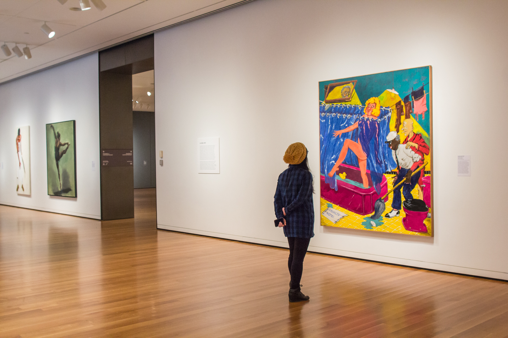
Susanna and the Elders, an oft-painted Old Testament tale, is recast in a contemporary context by Robert Colescott in the image of his painting, above. This subject is popular throughout art history for featuring the nude female figure and also allowing viewers to morally condemn the lecherous elders. Colescott inserts himself in this scene as a Peeping Tom in the window to show how, in his presentation of the nude female form, the artist is complicit with the elders, as are the viewers as they too watch Susanna bathe.
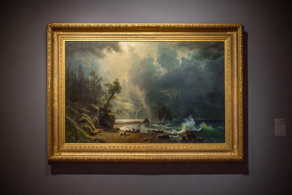
Albert Beirstadt had not visited inland Washington when he painted Puget Sound on the Pacific Coast in 1870. It was likely commissioned by a shipping magnate making money from the West coast who wanted a painting to get America imagining where their future modern seaport might soon arise. Because of the patron, this pioneering painting of the past is actually a new maritime civilization’s prologue.
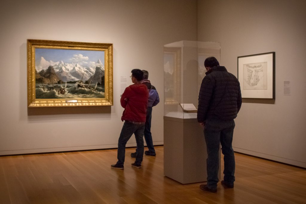
Louis-Philippe Crépin depicts lives lost in the name of discovery in Shipwreck Off the Coast of Alaska. At the right are two Tlingit witnesses who helped search for survivors of the La Pérouse expedition. The French expedition and the shipwreck became part of the Tlingit oral tradition. However, when La Pérouse named this the Bay of the French, it was clear from the trading skills of the Tlingit, that this expedition was not the first to find this bay.
– Chelsea Werner-Jatzke, Content Strategist and Social Media Manager
Photos: Installation view of Close Ups at Seattle Art Museum, 2018, photo: Natali Wiseman. Puget Sound on the Pacific Coast, 1870, Albert Bierstadt, born Solingen, Prussia, 1830; died New York City, 1902, oil on canvas, 52 1/2 x 82 in., Gift of the Friends of American Art at the Seattle Art Museum, with additional funds from the General Acquisition Fund, 2000.70, photo: Natali Wiseman. Installation view of Extreme Nature at Seattle Art Museum, 2018, photo: Natali Wiseman.
What do you know about the three artists in Figuring History: Robert Colescott, Kerry James Marshall, Mickalene Thomas? Take a minute to learn more about the people behind the paintings currently on view at SAM as we share 10 surprising facts about each of them. This month we’re focused on Robert Colescott. Colescott’s work is bold, colorful, often satirical, and packed with meaning.
Colescott’s parents were accomplished musicians who played jazz, blues, and classical music. The apple doesn’t fall far from the tree, Colescott also had musical talent—growing up he played the drums and always kept a drum kit in his studio.
Despite painting and drawing from a young age, Colescott originally wanted to go into international relations. He decided to pursue his passion for art since he was told at the time there wouldn’t be a future for him in the field as an Black person.
Robert Colescott married five times.
Colescott was thrust into international spotlight as the first Black painter to have a solo exhibit at the Venice Biennale in Italy.
Robert Colescott’s older brother Warrington Colescott is an also an artist best known for his etchings.
Oski wow wow! Colescott graduated from the University of California, Berkeley where he received both his bachelors and masters.
A world traveler, Colescott spent an year in Paris at an atelier studying with artist Fernand Léger.
In the early 1950s, Colescott moved to Seattle and taught junior high school in the Seattle Public School District.
Colescott was a veteran—he volunteered to serve in the US Army after graduating High School in 1942 and fought in the 86th Blackhawk Division during World War II.
Colescott has five sons and a grandson. His grandson, Colescott Rubin, is also a jazz musician and played at the opening celebration of Figuring History in front of his grandfather’s painting, Les Demoiselles d’Alabama: Vestidas.
See Colescott’s work in person at the Seattle Art Museum. Figuring History: Robert Colescott, Kerry James Marshall, Mickalene Thomas will be on view until Sunday May 13!
– Nina Dubinsky, Social Media Coordinator
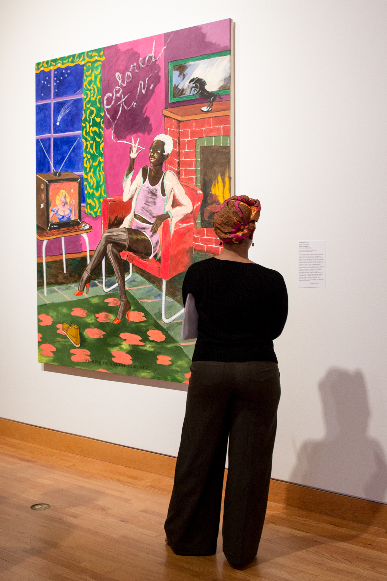
Image: Installation view Figuring History: Kerry James Marshall, Mickalene Thomas, 2018, at Seattle Art Museum. Photo: Natali Wiseman
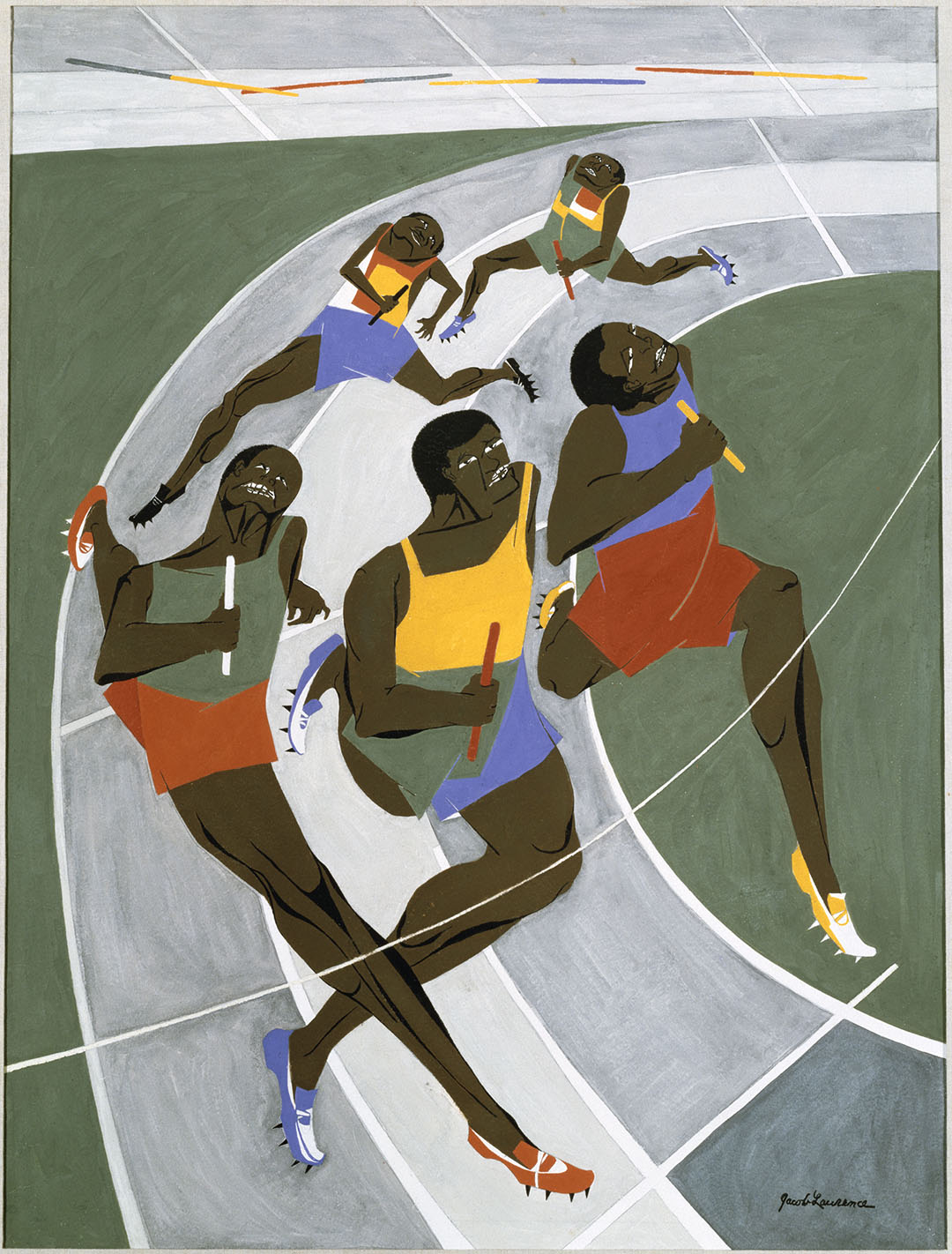
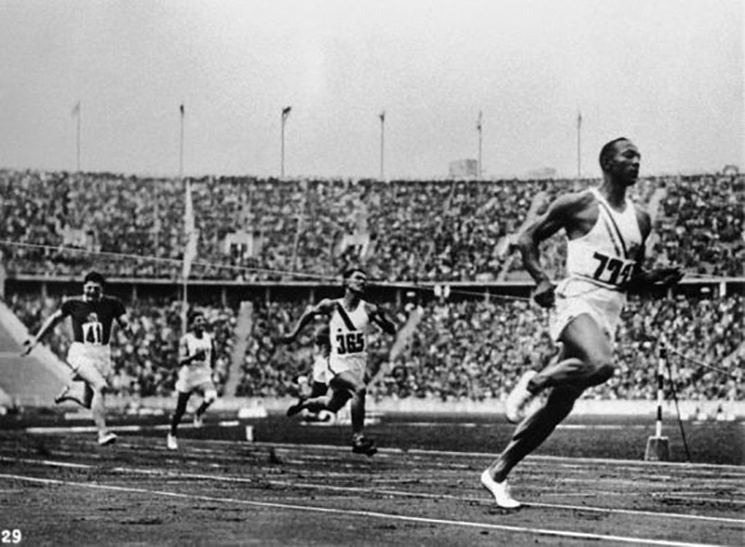
I always loved running—it was something you could do by yourself and under your own power. You could go in any direction, fast or slow as you wanted, fighting the wind if you felt like it, seeking out new sights just on the strength of your feet and the courage of your lungs.
— Jesse Owens
One of 29 artists commissioned to design a poster for the 1972 Summer Olympic Games in Munich, Jacob Lawrence chose to highlight the achievements of Black athletes.[1] In his Study for the Munich Olympic Games Poster, five runners, depicted in Lawrence’s characteristic graphic flatness, recall the figurative style of Greek vase painting—an apropos homage on the occasion of the Games of the XX Olympiad.
The iconic colors of the five interlocking Olympic rings—blue, yellow, black, green, and red—recur throughout the study, from batons and jerseys to shorts and shoes. Framed by the curvature of the track, the runners’ physicality and strength are difficult to ignore. Together, their musculature, movement, and form encapsulate the excitement and competitive finish of the relay—where gold, silver, and bronze are determined by mere tenths of seconds.
Known for his stylistic experimentation and depictions of African American life, Lawrence’s commission also has special importance within the context of the Civil Rights Movement and history of the modern Olympic Games. Created only four years after the 1968 Mexico City Summer Olympics, and on the occasion of the first Olympics held in Germany since 1936, his representation of Black athletes is especially meaningful.
In the 1968 Olympic Games, American athletes Tommie Smith and John Carlos respectively won the gold and bronze medals in the 200 meter race.[2] Upon climbing the podium, with the Star Spangled Banner playing behind them, both Smith and Carlos, donning black gloves, raised their right and left fists and bowed their heads—a symbol of protest and strength on an international stage.[3] Though interpreted by many as an explicit demonstration of Black Power, for Smith, it was a human rights salute: “It was a cry for freedom and human rights. We had to be seen because we couldn’t be heard.”[4]
Just 32 years earlier, in 1936, the Summer Olympics were held in Berlin. Though Germany had won the bid in 1931, prior to the rise of the Nazi Party, Adolf Hitler’s rhetoric of white supremacy and antisemitism was already well established. For Hitler, the Olympics became a stage upon which Germany could prove his theories of racial superiority. It was within this Olympic setting—in which athletes of color and Jewish heritage were openly discriminated against—that Owens won four gold medals, set two world records, and came away the most successful athlete of that year’s games.
For Smith, Carlos, and Owens, these Olympic victories allowed them to transcend—and publically challenge—the political divisions and discrimination taking place in the United States and abroad. Similarly, Lawrence’s Study for the Munich Games Poster, depicting all Black athletes, is an important work that finds its place within this complicated history of the Olympic Games.
– Elisabeth Smith, Collections Coordinator
[1] Other artists included Hans Hartung, Oskar Kokoschka, Pierre Soulages, David Hockney, and Josef Albers, to name just a few.
[2] Tommie Smith won the 200 meter race with a world-record time of 19.83 seconds.
[3] It is believed that Smith raised his right fist, and Carlos his left, to represent Black unity, forming “an arch of unity and power.” BBC News, “1968: Black athletes make silent protest,” http://news.bbc.co.uk/onthisday/hi/dates/stories/october/17/newsid_3535000/3535348.stm.
[4] Rick Campbell, “An Olympic moment—from 1968,” Houston Chronicle, August 5, 2008, http://blog.chron.com/40yearsafter/2008/08/an-olympic-moment-from-1968.
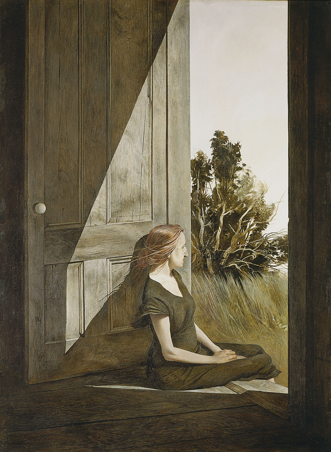
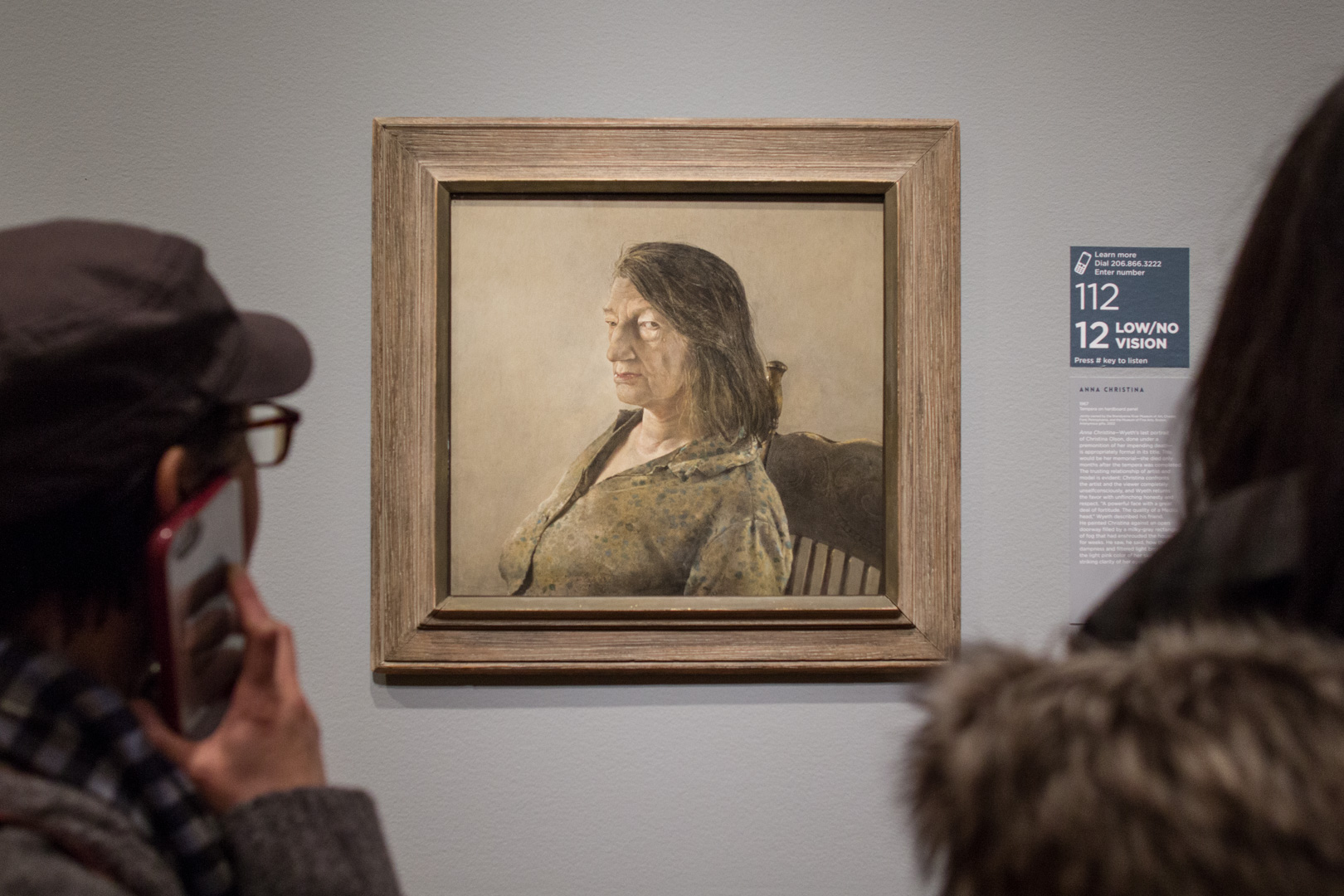
One day I came in and saw [Christina] on the back door step in the late afternoon. She had finished all her work in the kitchen and there she was sitting quietly, with a far-off look to the sea. At the time, I thought she looked like a wounded seagull with her bony arms, slightly long hair back over her shoulder, and strange shadows of her cast on the side of the weathered door, which had this white porcelain knob on it. ―Andrew Wyeth
Andrew Wyeth met Christina Olson through his wife Betsy and first painted her in 1947. He would paint Christina every summer in Cushing, Maine for the next 20 years until her death in January, 1968. As Betsy explains it, “The key to the Olson pictures is Andy’s relationship with Christina—absolutely at ease with him.” Christina Olson, a New-England native, refused a wheelchair for much of her life, despite being without the use of her legs. Rather, she used her upper body to pull herself through the fields and house where she lived and worked. Her tenacity and intelligence captivated Andrew Wyeth and their friendship blossomed easily.
I think one’s art goes as far and as deep as one’s love goes. I see no reason for painting but that. If I have anything to offer, it is my emotional contact with the place where I live and the people I do. – Andrew Wyeth
Even in death, Andrew continued to draw inspiration from Christina through her house and the objects that had defined her. Wyeth considered this painting of the two entrances to her home a double portrait of the siblings, Alvaro and Christina Olson. When first introduced to the Olson siblings, Andrew was initially taken with Alvaro and painted his portrait before he become focused on the indomitable Christina. Alvaro died on Christmas night, 1967, and Christina, without him, died only weeks later. The house and remnants left abandoned in their wake struck Wyeth as symbolic of the lives they lived—the shadowy Alvaro, who only posed for Wyeth once and remained always in the background as Wyeth painted in the Olson house; and, by contrast, the brilliant, captivating Christina.
The challenge to me was to do justice to her extraordinary conquest of a life which most people would consider hopeless . . . limited physically but by no means spiritually. – Andrew Wyeth
Anna Christina is Wyeth’s last portrait of Christina Olson. She died only months after the tempera was completed. The trusting relationship of artist and model is evident: Christina confronts the artist and the viewer completely unselfconsciously, and Wyeth returns the favor with unflinching honesty and respect. “A powerful face with a great deal of fortitude. The Quality of a Medici head,” Wyeth described his friend. He painted Christina against an open doorway filled by a milky gray rectangle of fog that had enshrouded the house for weeks.
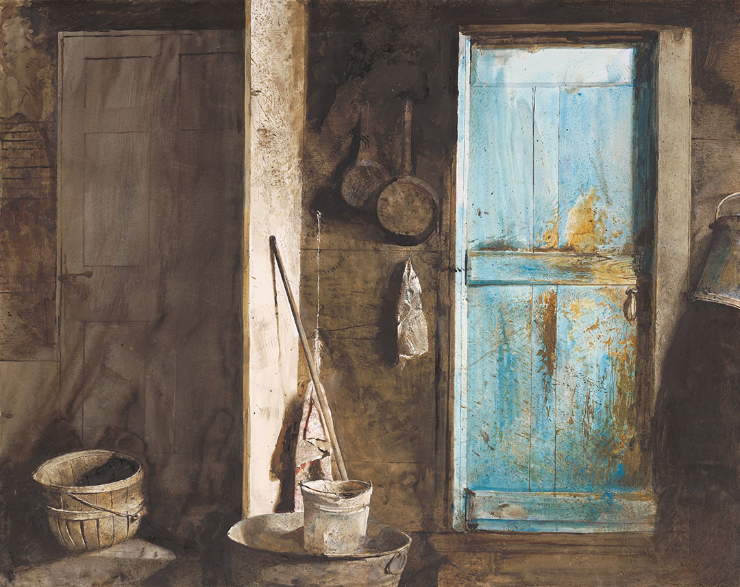
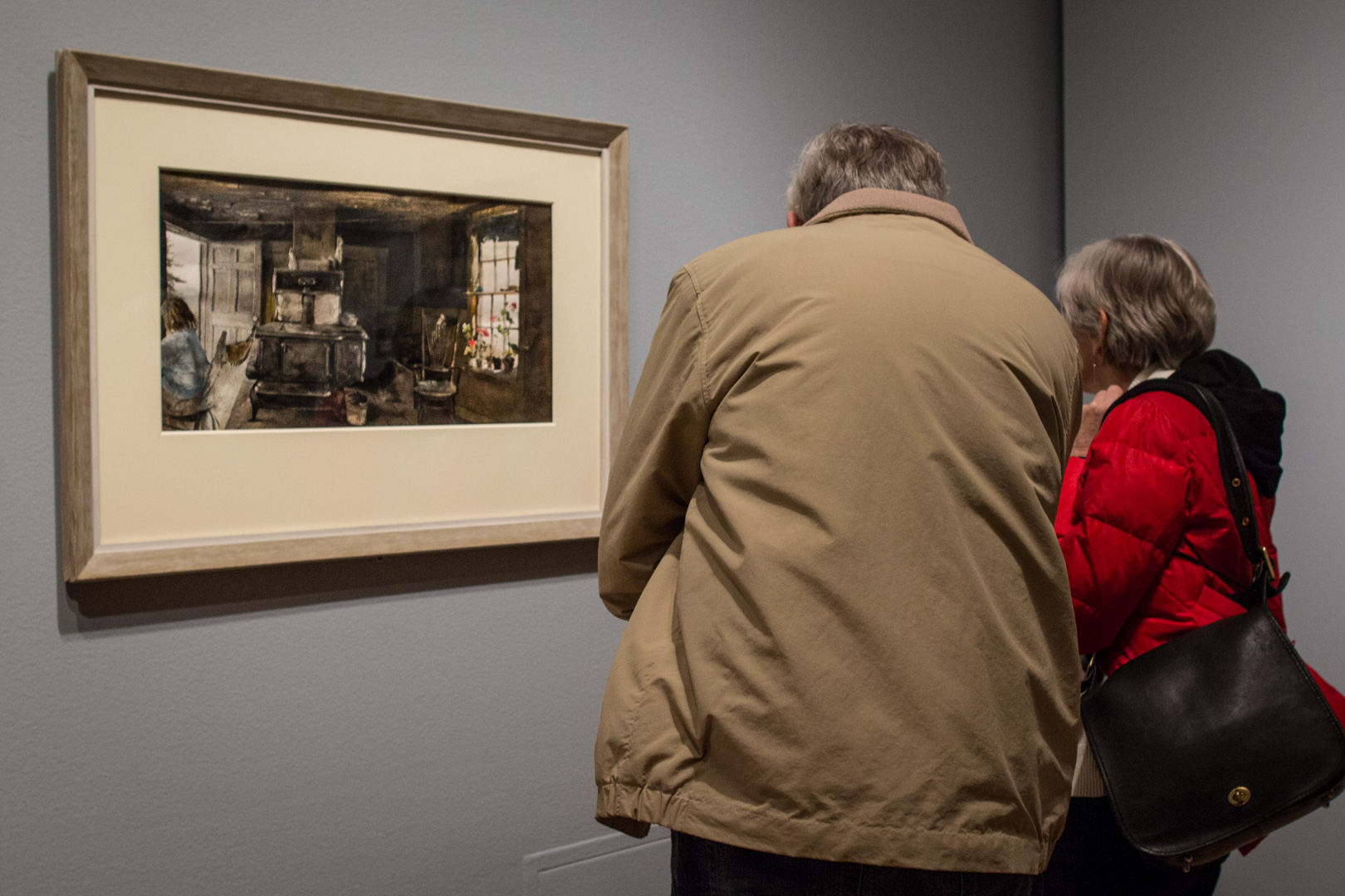
This drybrush is intended to be a portrait of the Olson house both outside and inside. Outside is total fragility. Inside is full of secrets. There’s Christina sitting in the kitchen, on the left, and everything’s in there—the stove, the geraniums, the buckets, and the trash. I had to overdo it here and reveal all the secrets. I like to paint in places that are not too nice. ― Andrew Wyeth
Andrew Wyeth saw the world around him resounding with hidden meaning. Occasionally considered a magical realist for his emphasis on the inner life of objects such as the stove or the bucket in this painting, Wyeth was certainly a storyteller. His paintings can be seen as stills in a moving image—the story of Christina’s Olson’s life surrounding her and continuing right outside the open door of her kitchen.
This curtain that had been lying there stale for year began slowly to rise, and the birds crocheted on it began to move. My hair about stood on end. – Andrew Wyeth
Christina Olson was a muse for Andrew Wyeth that helped launch his career. As a subject she is forever seated due to the degenerative disease that made her a paraplegic, but in Wyeth’s paintings, the figure of Christina stands out, singular and strong in the stories of Wyeth’s characters. See Andrew Wyeth: In Retrospect before it closes, January 15.
– Chelsea Werner-Jatzke, Content Strategist & Social Media Manager
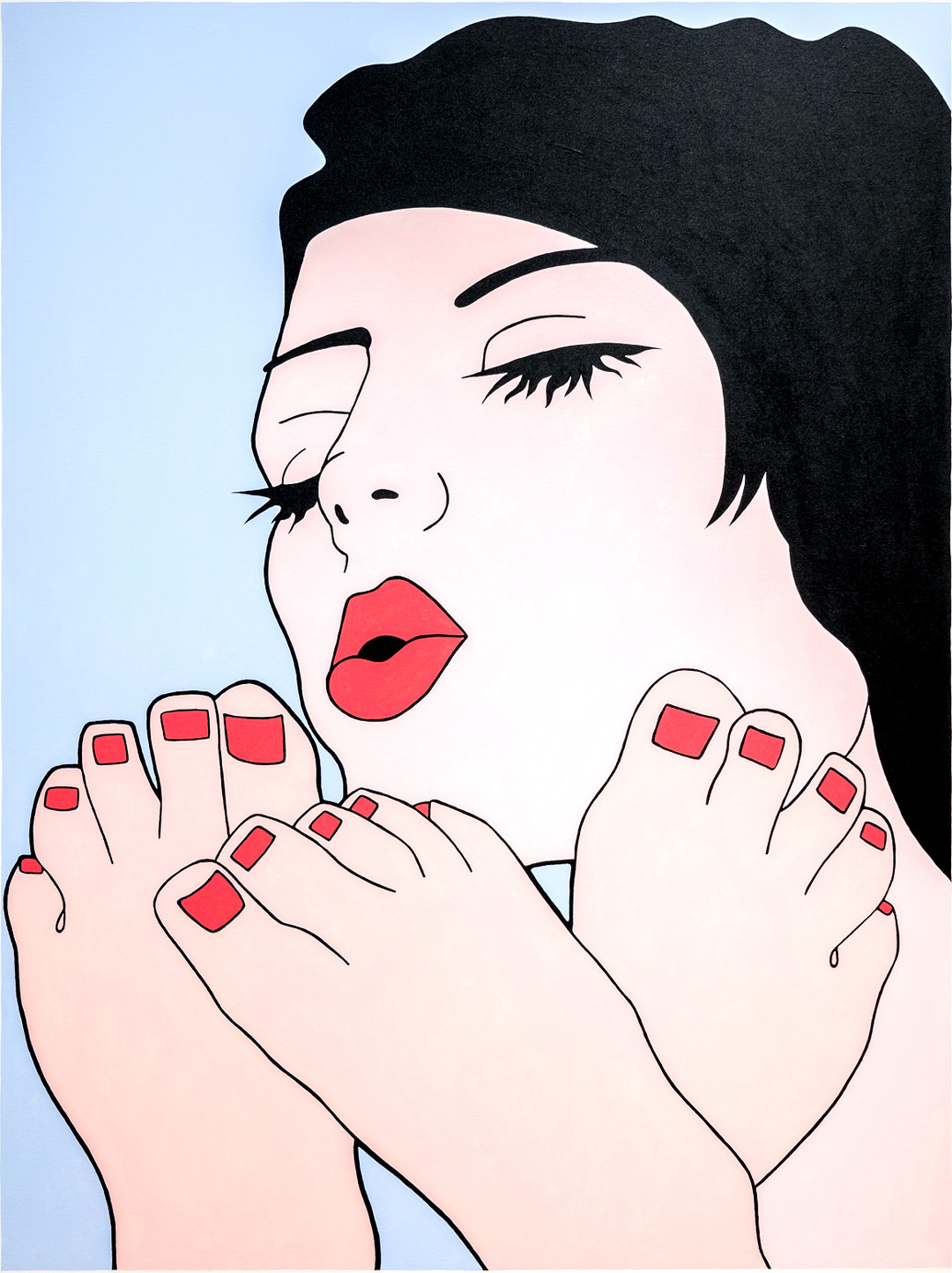
New Year’s Eve ushers in and allows for all sorts of behavior. For some, it might be a night to reflect on the past year while making resolutions for the next, but for others it is a social occasion during which one can celebrate freely, throwing caution—and social mores—to the wind. This work by John Wesley, titled Nail Police, seems to be a proponent of the latter.
At first the work appears relatively benign, with a cartoon-like image of a woman drying toenail polish—a standard beauty routine. Upon closer look, Nail Police reveals more erotic undertones, and raises further questions: Why are there three feet instead of two? Is the woman pictured even painting toes at all? Is the painting in fact an adult fantasy rendered ambiguous?
One of Wesley’s many strengths as an artist is his ability to create images that are at once explicit and enigmatic. And, like his highly stylized paintings, Wesley has defied easy categorization throughout his career. His flat, graphic figures and distinctive color palate of periwinkle blue and pale pink often align him with artists who share a Pop sensibility, although Wesley associates his uncanny, dreamlike compositions with Surrealism. However, his painting style, which bears little trace of the human hand, has also been espoused by many Minimalist artists, most notably Donald Judd.
Interested in our mass consumption of media, Wesley regularly begins his paintings by tracing images from publications such as newspapers and fashion magazines—dogs, birds, women, and cartoon characters—which are then converted into gouaches and, ultimately, acrylic paintings. This process allows certain characteristics to be reduced to their most basic elements. Here, this can be seen in the contours of the woman’s feet, or the treatment of her full lips and eyelashes.
Regardless of how you might read this image, the last night of the year is as good a time as any to paint the town—and maybe even your toenails—red. However you celebrate, Happy New Year!
“The difference between me and a lot of painters is that I have to have a personal contact with my models . . . . I have to become enamored. Smitten. That’s what happened when I saw Helga.” – Andrew Wyeth
Andrew Wyeth painted Helga Testorf in secret for 13 years before the world, and his wife, saw the paintings for the first time. The secrecy and intimacy of these paintings stirred quite the scandal when they were first exhibited and they continue to be a source of much conjecture into the details surrounding Wyeth’s relationship with one of his greatest muses. Find out more about the character of Helga both within, and outside of, Wyeth’s life and paintings during a talk given by Patricia Junker, SAM’s Ann M. Barwick Curator of American Art, in the Andrew Wyeth: In Retrospect galleries.
“Remember, he’s a Bergman . . . He’s creating a world they [his models] don’t realize and they’re acting out a part without any script.” – Betsy Wyeth
Andrew Wyeth: In Retrospect is on view at Seattle Art Museum through January 15 and the next Wyeth Wednesday tour with Patricia Junker will take place January 3.
– Chelsea Werner-Jatzke, Content Strategist & Social Media Manager
Seattle is one of those rare places where it isn’t considered droll to talk about the weather. The SAM Gallery artists in ColorExcursion, on view December 8 through January 7, offer an escape from grey days into exuberant artwork. Below, three of the artists in this show share the ways that living in Seattle and the surrounding area impact the way they see the world. For such a moody and dramatic locale, you may be surprised by their vibrant, lively work. If you’re looking to recharge your senses, come to SAM Gallery for the Color Excursion Opening Reception on Thursday December 7, talk to the artists about their work, and find out how you can rent or buy artwork from SAM Gallery.
This year I moved from Green Lake to Whidbey Island. Previously my work originated from a contemplative state of creation. I found inspiration through travel and memory and emotions but now living on Whidbey, I’m in it. On the island your surroundings are constantly in flux. The winds whip in and carry things away, the storms batter the shoreline leaving treasures on the beach. The nights are deep and dark and full of creatures. Everything feels alive and in a state of change. The beauty and the drama of my surroundings constantly barrage my eyes and fill my brain with endless creative ideas and the solitude of the island allows these ideas to come to fruition in my studio.
When invited to make a body of work for Color Excursion, I was elated. I’m addicted to color. I mix my own colors using wax and powdered pigments and when working with this medium it becomes something else, something more tactile. It’s hard to explain, it’s like I’m making a soup but I’m loading it with saturated color until it’s thick, and I want to eat it. That’s what initially drew me to encaustic painting and I think it’s what draws people to want to touch an encaustic painting.
The use of color in my work is an unapologetic form of escapism from the long stretches of grey weather that continually blankets my Pacific Northwest home. Each year my palette of luminous, unnatural hues provides a defiant objection to winter’s approach. Pulsing fluorescent paints massage the naked eye with ultraviolet light, creating an energized glow impervious to dull environments. Maroon does not belong to me. Tubes of brown remain unopened. There is safety in muteness. My paintings speak to extroversion, experimentation, and play. Through color, I aim to activate.
Color Excursion immediately brought to mind the idea of travel, taking an excursion lavish with color. My work in this show was inspired by a trip to South America one year ago. Although the paintings for this show do not reflect Seattle, much of my work is inspired by my daily routines and surroundings. For example, the Across the Lake, Cloud Dreams, Inside a Cloud, and Inside a Leaf series are all the result of my daily walks in my Seattle neighborhood.
I let my experiences germinate and then abstract them on the canvas, translating a memory of a place or an experience. I work in layers of color and compose the image while working. My paintings are oil on canvas or board. Working with oil means that each layer needs to have a bit of time to dry before the next layer can be applied. I find that when I return to the piece it changes and evolves in surprising ways.
This new work at SAM Gallery is from a series of unique digital mixed media prints called the Gardeners Journal. The nature of the Northwest has always been a part of my life having grown up in eastern Washington. With this body of work, it becomes a touchstone away from the tech-focused culture of our evolving city. My digital print studio keeps me in front of a computer monitor much of the time. As a retreat from the stream of social media I find refuge out my window, a slight turn of the head away from the monitor. I have found the organic shapes and colors of my garden to be a creative counterpoint to the drone of data. By exploring abstracted shapes and forms found in nature, this new work provides endless metaphors and narratives and visually blend the creative tools of traditional art making with new digital possibilities to find a balanced voice in the moods and aesthetics of the region.
Images: Detail of Leslie Stoner’s studio, photo: Alison Blomgren. Afterglow Two, Liz Tran, 30 x 24 in., mixed media on panel. Easter Island, Chile, Sheryl Westergreen, 36 x 36 in., oil on canvas. Like a garden splashed across the landscape, Stephen Rock, 36 x 36 in., pigmented print, watercolor, gouache.
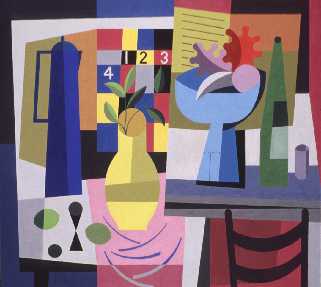
As we prepare for the last 31 days in our 2017 calendars, it becomes clear how quickly time flies. Where did the year go? In this 1956 work by Northwest artist Wendell Brazeau, Still Life with Calendar, time is certainly a preoccupation, as well as developments in abstraction imported from Europe during the years following World War II.
A painting that could only exist after the pictorial revolution brought about by Cubism, and Paul Cézanne before that, this work is a marker of an important moment in American painting when European theories made their way to artists living and working in the United States. Like many, Brazeau studied in Paris and worked first-hand with the European avant-garde, bringing such ideas back to the Northwest and pollinating the region with new modernist theories.[1]
One of the main genres of Western art, the still life takes many forms; whether arrangements of symbolic objects that point to the brevity of human life,[2] or celebrations of material wealth, the still life has fascinated artists for centuries. In more recent art history, the still life has become a foundation for formal experimentation.
Indeed, here flat geometric forms and bright planes of color unify a spatially ambiguous plane. We see lemons or limes perched precariously on the left-hand corner of the table, as well as a chair, coffee pot, flower vase, and fruit basket, all nearly sliding from their fixed positions. Behind this array of multi-toned vessels and objects we also see a small section of an incomplete calendar—a tongue-in-cheek inclusion that seems to simultaneously honor and scrap the genre’s interest with the passage of time. A knowing departure from the still life paintings of the 16th and 17th centuries, Still Life with Calendar playfully explores the possibilities of abstraction while wittily honoring the subject’s antecedents.
[1] Brazeau studied art at the University of Washington for both his undergraduate and graduate degrees. For more, please see Barbara Johns, Modern Art from the Pacific Northwest in the Collection of the Seattle Art Museum (Seattle: Seattle Art Museum, 1990), 16.
[2] Vanitas, for example, contain objects—such as musical instruments, skulls, candles, and flowers—that serve to remind the viewer of their own mortality, as well as the worthless pursuit of earthly goods and pleasures.
Sam Gilliam’s 1977 painting Union tantalizes with its tactility. It’s rhythm, texture, color, and shade; bright and inviting, dark and rough. It’s free-form abstraction raked as a zen garden, and grounded by geometric shape.
Over the course of his career Gilliam has shown a deep interest in painting as a physical process. He made waves in the art world in the late ‘60s and early ‘70s, when he displayed paint on canvas in innovative ways. He began suspending his canvases, hanging them by corners like linen sheets on a laundry line, or pinning them up at certain points, allowing the canvas to cascade downward in thick, heavy folds. While this body of work created a sculptural experience of the canvas, his series of Black Paintings, of which Union is a prime example, created a sculptural experience with paint. In these works he used a shag-rug rake to create a notched surface texture that unifies the painting.
Interestingly, Gilliam started out as a representational painter. Born in Tupelo, Mississippi, in 1933, he studied at the University of Louisville, earning his BA in 1955 and his MA in 1961. In the ‘60s he relocated to Washington, DC, where fate awaited. In DC Gilliam joined up with the artists who would become known as the Washington Color School—a group working in abstract modes to press the expressive potential of color.
In his own milieu Gilliam was a sponge, always soaking up wisdom, but also dispensing it. Discussing artists who have influenced him in a recent interview, he begins with Kenneth Noland and Morris Louis but covers a staggering range after them, speaking smoothly on Paul Klee, Jasper Johns, Robert Rauschenberg, Yvonne Rainer, Claude Monet, Georges Braque, Arthur Dove, Tintoretto, Alice Denney, Jan van Eyck, and David Smith. Add to that mix: jazz music, especially the tunes of Miles Davis, John Coltrane, and Thelonious Monk; curators like Walter Hopps, one-time director of the Washington Gallery of Modern Art; symbols, like the American flag; and Washington’s urban design, its circular hub and radiating arteries.[1] Gilliam links his own productivity with his ability to recognize fine material: “There’s a mental connection that’s very good between the activity of painting and, let’s say, the visual and the listening process from the outside, which is always stimulating.”[2]
Though Gilliam’s beginnings were tied to the figure, his future was bound in colorful abstraction. His first one-man show in DC, held at Adams-Morgan Gallery in 1963, featured exclusively representational paintings, while his second show, held just a year later, featured no representational works.[3] Gilliam recounts that one of the DC artists, Tom Downing, played a large part in encouraging this shift: “Tom saw an exhibition of mine that was entirely figurative plus a series of watercolors on a grid, which were Klee-like. He suggested that, obviously, the figurative painting was unnecessary and that the watercolors were right in. So, I guess he’s the one that got me started making abstract paintings.”[4]
Gilliam’s work now graces prominent collections all over the country, and his Black Paintings have been collected by many important museums, including the Museum of Modern Art, the Denver Art Museum, and the Whitney Museum of American Art. We can safely say that his influences, and his innovations, have served him well.
Check out Union and a group of earlier paintings in the Sam Gilliam exhibition on view now at SAM!
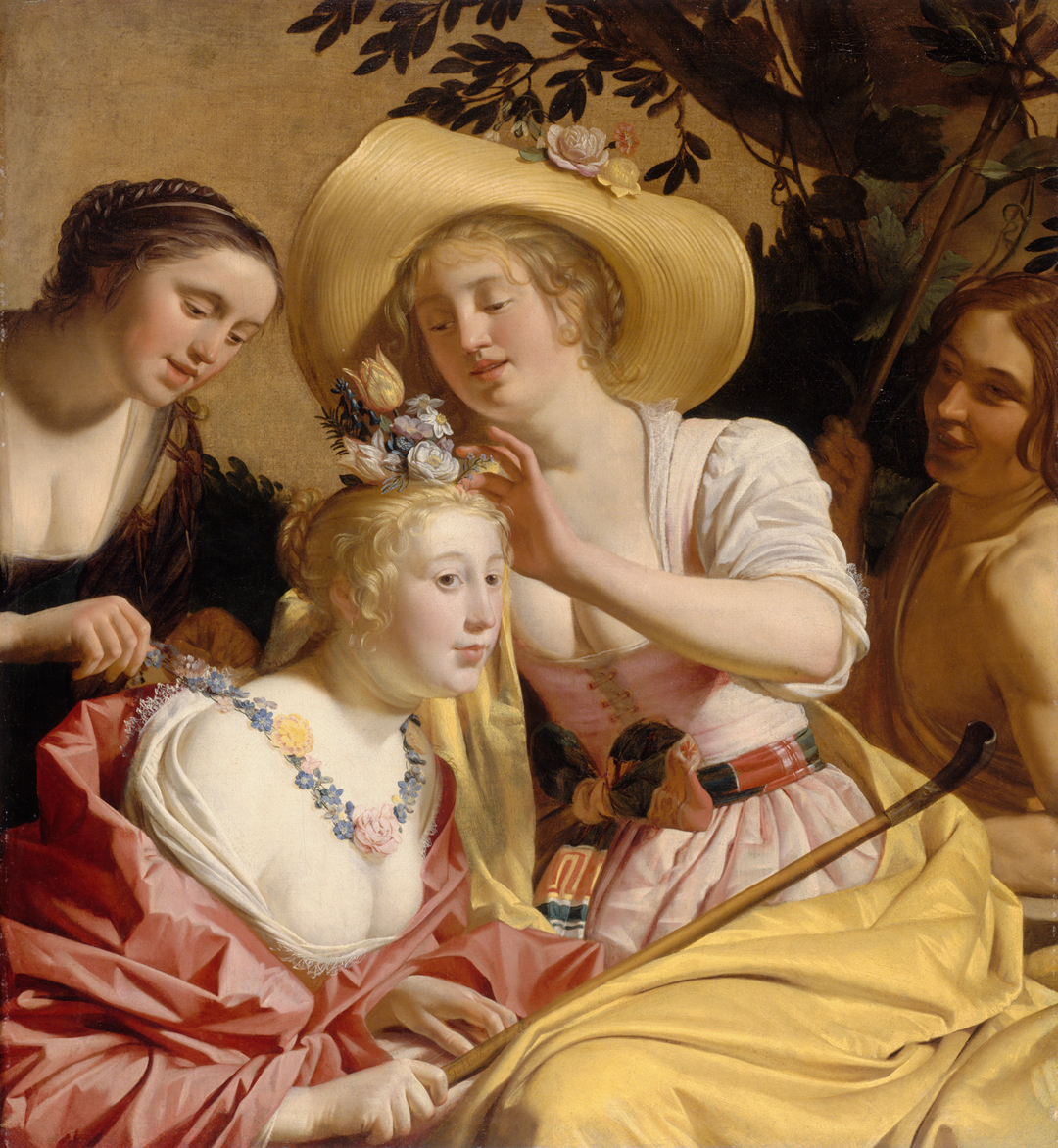
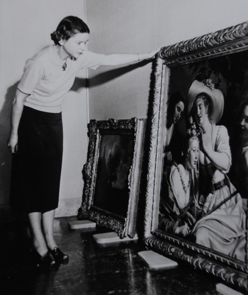
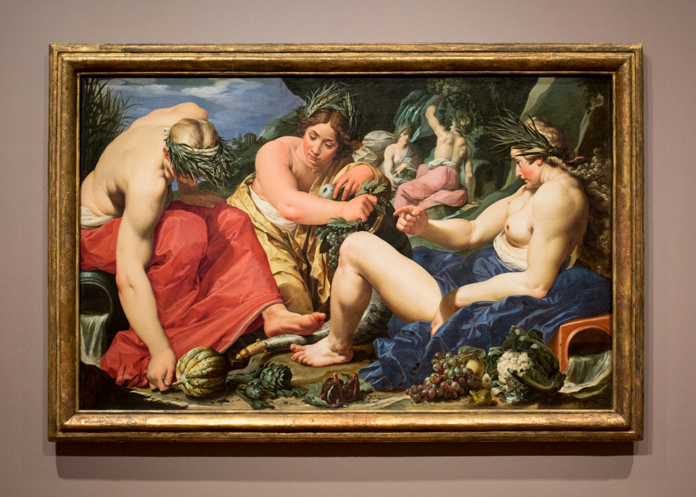
In an old photo from SAM’s archive, we see the inimitable Dottie Malone examining the museum’s painting by Dutch master Gerrit van Honthorst before it was exhibited in the two newly finished Kress galleries in October, 1954. There’s something of straitlaced concern visible on her face; her left arm fully outstretched, she seems to be keeping the painting at a safe distance. She’s at least not visibly impressed. I wonder if the low-cut blouses of the three shepherdess figures, and the abundant flesh laid bare, didn’t quite meet with her approval. If she were scandalized in the ‘50s, she would have been far from the last. The painting is coming up on 400 years old and can still sometimes draw a blush or a stern look of disapproval. What an accomplishment!
Besides being sexy, Honthorst’s A Shepherdess Adorned with Flowers is masterfully painted, rosy pinks and mellifluous yellows playing against the porcelain skin of its heroines. Theatrical light, a reminder of Caravaggio’s lasting influence on Honthorst, captures the figures as actors in a stage play—and in a sense, that’s what they are. Painted to accommodate courtly and aristocratic taste, pastoral scenes like this one offered a momentary escape from the pressures and strictures of the early modern world. Blatantly artificial, they conjured an idealized world of love and leisure, reflecting nostalgic desires for intimacy with nature and human desires for release from the morals and rituals that governed daily life. Responding to a world that disallowed dalliances, Honthorst imagines a more primal world that blithely sanctions them. Given the look of availability about the main figure, few would be surprised to hear that literary and visual traditions of the time linked the shepherdess and the sex worker.
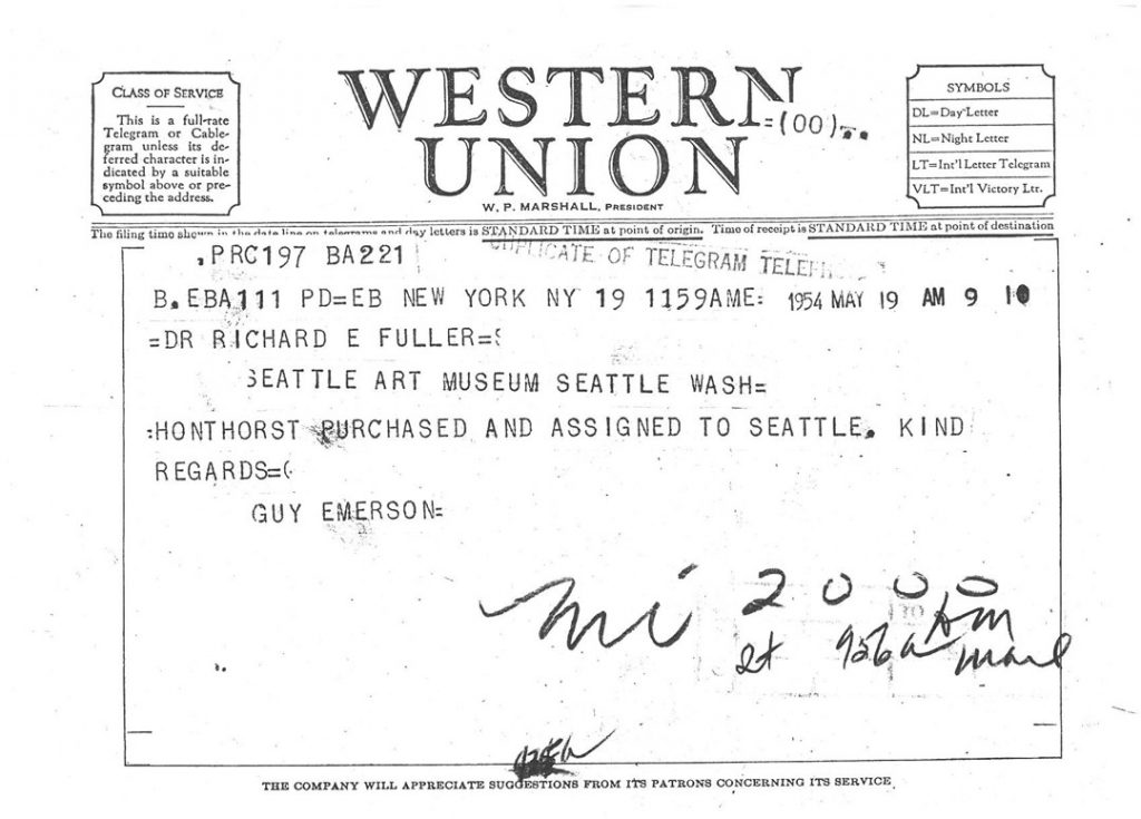
Officially acquired in 1961, SAM had the painting seven years earlier than that. On May 12, 1954, Kress Foundation art director Guy Emerson wrote to Dr. Fuller with updates on the Foundation’s recent activities, including a mention of our fine Honthorst painting: “I am enclosing a photograph of a painting by our old friend Honthorst which we all saw at Knoedler’s last week and like very much. Mr. Kress thought that it ought to go to the National Gallery and Walker and Modestini felt that it was the best Honthorst they had seen in America. It is gay and fresh and full of color and life.” In short order, the Kress Foundation had acquired the painting with Dr. Fuller and SAM in mind.
The Honthorst arrived in a batch of artworks from the Kress Foundation that also included Bernardo Strozzi’s Hagar and the Angel, Veronese’s Venus and Adonis, Abraham van Beyeren’s Banquet Still Life, and Massimiliano Soldani’s bronze The Lamentation over the Dead Christ. October 15, 1954 marked the first display of the Honthorst in Seattle, the grand opening of SAM’s Kress galleries, and the confirmation of an important relationship between the museum and the foundation.
–Jeffrey Carlson, SAM Collections Coordinator
A Shepherdess Adorned with Flowers, 1627, Gerrit van Honthorst (Dutch, 1590-1656), oil on canvas, 43 9/16 x 39 13/16 in. Seattle Art Museum, Samuel H. Kress Collection, 61.156, Photo: Paul Macapia.
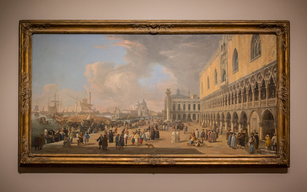
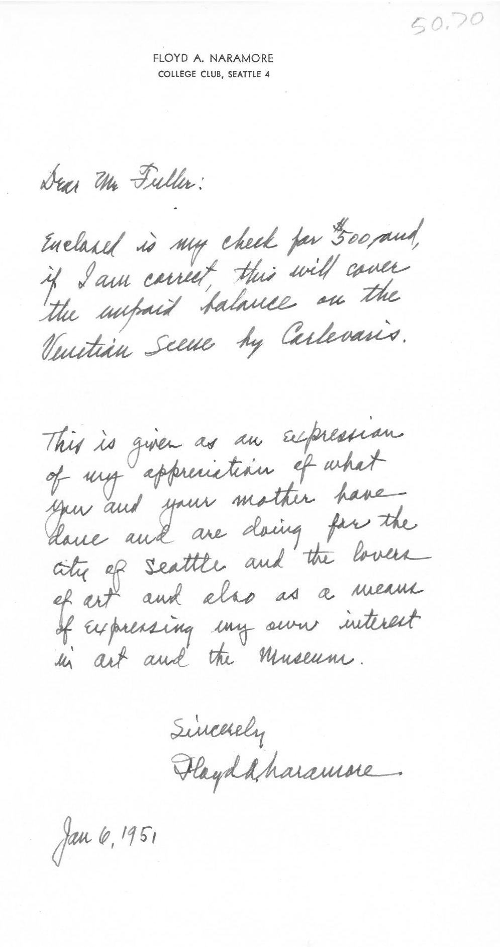
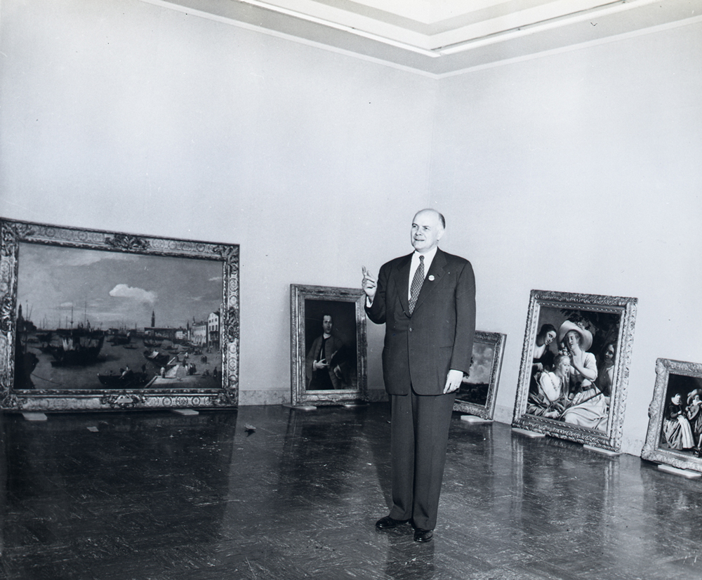
As an arts institution situated in a once very isolated part of the country, the Seattle Art Museum grew and developed into the museum it is today only by the generosity and boldness of its supporters. Our co-founders, Dr. Richard Fuller and Margaret MacTavish Fuller, both played central roles in SAM’s success story. Another figure who became crucial to the museum in its formative years was Sherman E. Lee, who served as Assistant Director and Associate Director over four years at SAM, 1948–1952.
Lee was a specialist in Asian art, and Dr. Fuller brought him on board specifically to grow this part of the collection, but his impact would be felt in much broader ways. It was Lee who had the vision to convincingly lobby for Seattle to be included in a regional galleries program launched by the Kress Foundation during Lee’s tenure at SAM. The Kress Collection was a five-and-dime fortune converted into a nearly unmatched holding of European Old Master artworks. As a result of Lee’s ambition, Seattle and SAM became one of 18 regional sites selected to host pieces of the same prestigious collection that fills much of the Renaissance galleries at the National Gallery of Art in Washington, DC.
Not only was SAM chosen to receive some of the fine Kress pictures, but in a moment of plucky brilliance, Lee negotiated for an even better group of artworks than were originally intended for Seattle. In May 1950, Lee made his case to Kress Foundation art director Guy Emerson, writing that “our Ancient, Medieval, and Oriental collections contain many master works comparable to some of the famous paintings in the National Gallery and those in Mr. Kress’ marvelous living room. Consequently, we are interested in seeing our own Western tradition of painting represented by works which will bear comparison with the others.”1 His is a bold proclamation of Northwest arts pride, the fruits of which we’re still enjoying today, as the Kress artworks remain the core of SAM’s European painting and sculpture collection.
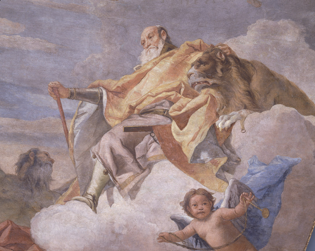
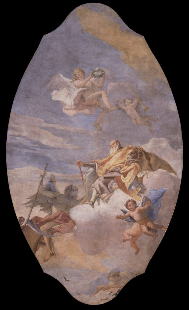
As good as Sherman Lee was for SAM, and for the Cleveland Museum of Art, where he would serve as director from 1958 until 1983, he and SAM almost missed big on one of the most memorable pieces in our collection. Looking over the original list proposed by the Kress Foundation, Lee was enthused about a sketch by Giovanni Battista Tiepolo but had reservations about the related ceiling fresco, transferred to canvas: “one or two of the proposed gifts are extraordinarily exciting, notably the Tiepolo sketch (incidentally, the ceiling itself is too large for us).”2
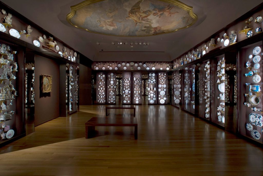
Too big?! Incidentally?! Thank goodness that wasn’t the end of the conversation. Imagine if we missed out on the remarkable Tiepolo ceiling The Triumph of Valor over Time because of its awesome dimensions. What a loss it would have been. In the end, accommodations were made, with SAM raising the ceiling height of its Kress-devoted gallery five feet in order to provide a suitably illusionistic viewing experience.
Today, The Triumph of Valor over Time looms above the Porcelain Room, where its 18th-century aesthetic and pastel palette play well with the artfully arranged decorative objects filling the space. In a nearby gallery you’ll spot the masterful little bozetto, or painting sketch, that initially caught Sherman Lee’s eye.
—Jeffrey Carlson, SAM Collections Coordinator
IMAGES: The Triumph of Valor over Time, ca. 1757, Giovanni Battista Tiepolo (Italian, 1696-1770), fresco transferred to canvas, 200 x 90 in. Samuel H. Kress Collection, 61.170, Photo: Paul Macapia. Installation view of the Porcelain Room at the Seattle Art Museum, Photo: Paul Macapia.
1 Quoted by Marilyn Perry in “The Kress Collection,” in A Gift to America: Masterpieces of European Painting from the Samuel H. Kress Collection, ex. cat., New York: Harry N. Abrams, Inc. in association with the North Carolina Museum of Art; The Museum of Fine Arts, Houston; the Seattle Art Museum; and The Fine Arts Museums of San Francisco, 1994; p. 28.
“After many years in my studio I found that the light from the surface was my predominant media. The interface of light and surface . . . . While ‘light and surface’ is a rather technical triptych of words, my emotional concern is how it feels to make the art.”
—Larry Bell
In 1960s Los Angeles, a loosely-affiliated group of artists began working not with paint and canvas, clay and wood, charcoal and pen, but with two less concrete mediums: light and space. The so-called (perhaps unimaginatively) Light and Space artists were responding to new ideas about viewer perception in art, and experimenting with new materials that were suddenly widely available from Southern California-based industries: polyester resin, coated glass, Plexiglas, neon.
While artists in New York were working with similarly industrial materials and playing with the viewer’s perception of space, the emphasis on light as a medium became unique to the L.A. group. This seems to have been no accident, but a response to the place itself—there’s a certain quality of radiant light that exists in Southern California, where the sun always shines, reflecting on the waves and cars and surfboards and refracting through the immutable smog. Say what you will about L.A., but they don’t make light like that anywhere else.
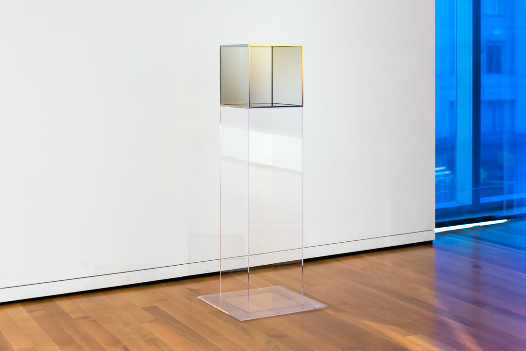
So it stands to reason that Larry Bell in his Venice Beach studio, immersed in California light and with direct access to newly available materials, would become interested in the emotive potentials of light and surface. Bell began his career as a painter, but soon became fascinated with the properties of glass after working at a picture framing shop. He experimented simultaneously with abstract painting and small constructions of cracked glass, and it wasn’t long before the two parallel practices began to merge—until he added glass onto a painting itself:
“Adding glass [to a canvas] was totally intuitive. I liked the work’s feeling of simplicity, and the fact that the imagery now included the wall behind the canvas. This led to incorporating the light in front of the canvas in an ‘unpainterly’ way. I chose mirrors to replace the clear glass. I scraped away the silvering so that the reflected light and the transmitted light created the shape of a tesseract, which was also the shape of the canvases.
Representing volume, created with light, reflected and transmitted, was now part of my process. . . . Unconsciously, I had become a sculptor.”
Bell’s Untitled of 1967, on view in SAM’s Light and Space exhibition, is the result of this unconscious metamorphosis. A perfect cube made of coated glass, the work is a pure expression of volume, space contained and revealed. The thin, metal film which coats the glass allows the light filtering through the material to reflect and refract in unique ways. The edges emerge and disappear, and the sides darken and lighten as you move around the work. Though all six sides of the cube are identical, no two people will experience the same view of the whole—everything depends on your position in relation to the object, and its position in relation to a ray of light.
For many of the Light and Space artists, an artwork only reached its full potential when it was engaged in this relationship with a viewer—an object in an empty room without anyone to look at it is, in essence, not doing its job. Bell was no exception to this belief: “In my opinion all artwork is stored energy. The art releases its power whenever a viewer becomes a dreamer.” Dream on, friends, and come see what kind of energy this enigmatic box releases for you.
—Carrie Dedon, Modern and Contemporary Art Curatorial Assistant
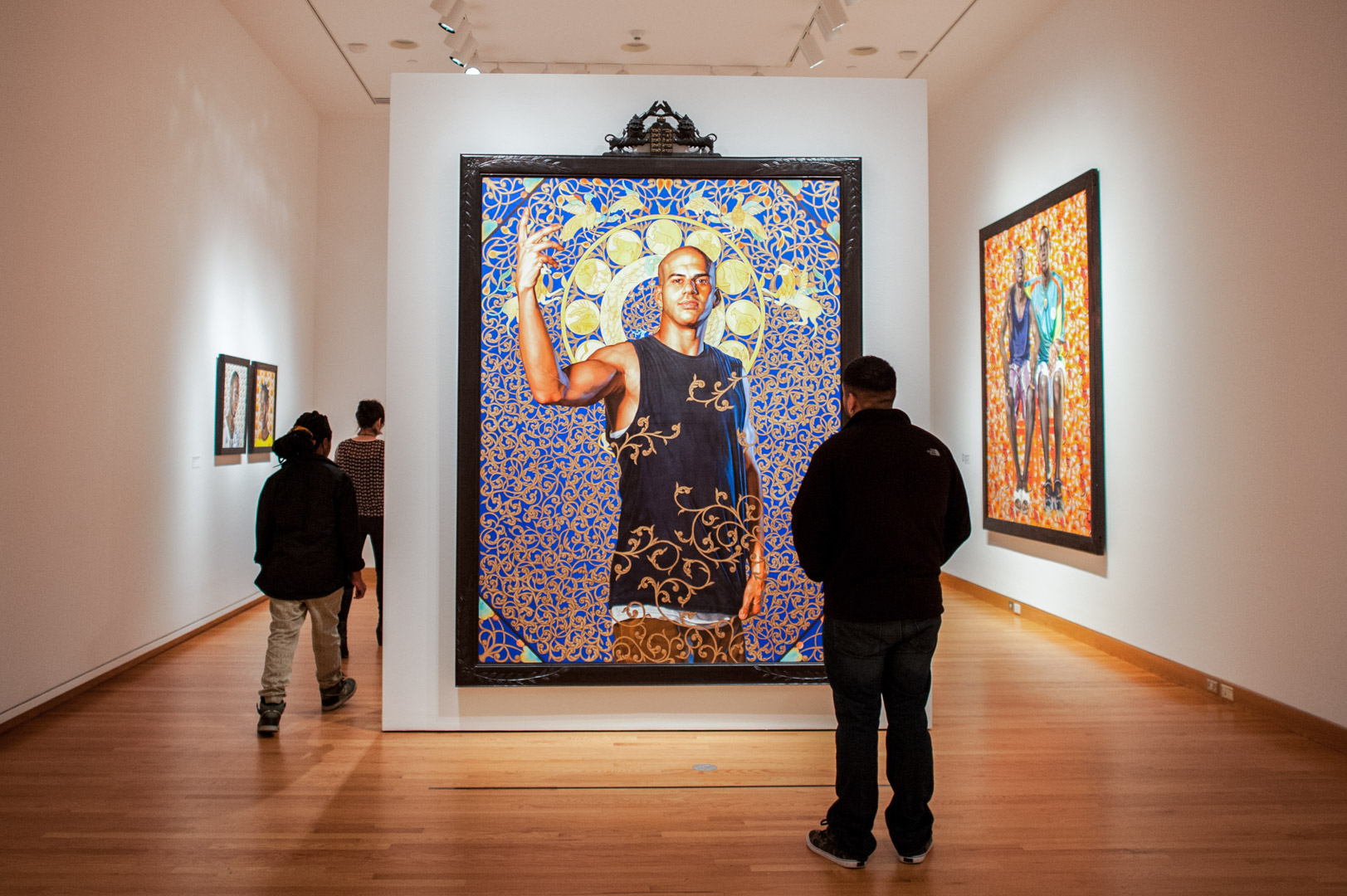
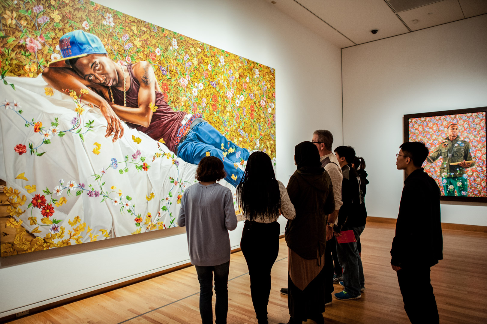
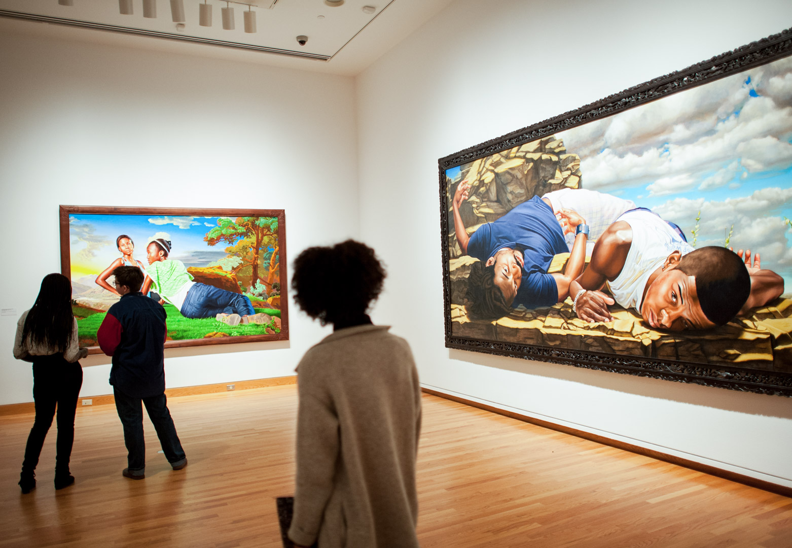
“The history of painting by and large has pictured very few black and brown people, and in particular very few black men. My interest is in countering that absence.”
Kehinde Wiley
Experiencing a meteoric rise on the art scene, Los Angeles native Kehinde Wiley has assumed his place as an influential contemporary American artist. Graduating from the influential Yale School of Art, Wiley received his MFA from the program in 2001. The artist went from the Ivy League to a leading art program—residency at The Studio Museum in Harlem. It was there that a lot of things came together for Wiley in the context of the show he was working on: he found inspiration in the assertive and self-empowered young men of the neighborhood. This kicked off the artist’s serious work in portraiture on modes of representation and the black body.
“It’s almost like he’s looking back into history to envision a new present and a new future,” said Catharina Manchanda, Seattle Art Museum’s Jon & Mary Shirley Curator of Modern & Contemporary Art.Kehinde Wiley: A New Republic is a 14-year retrospective of the artist’s work that features 60 works, including his signature portraits of African American men reworked in the grand portraiture traditions of Western culture, as well as sculptures, videos, and stained glass windows.
The Brooklyn Art Museum organized the exhibition, which is traveling to a number of cities around the country, experiencing a rousing reception. “He’s received a great amount of attention in part because the work is so captivating, but perhaps what adds special urgency to the work are the political discussions Americans have been having over the course of the last year regarding the lives of black men and women in this country,” Manchanda said. “There is so much possibility in this moment. It’s my hope that this exhibition will engage viewers in an important conversation, as well as create a galvanizing experience that will last long after they leave the galleries.”
Wiley does not copy traditional portraiture styles from the 18th and 19th centuries, but rather creates mashups where he’s drawing from many sources, like a jazz artist improvising or a hip hop artist mixing pieces of songs together using different ideas and references. The same process—mining elements and then combining them from various sources—fuels Wiley’s work: classic portraiture styles and floral wallpaper designs from the 19th century, among others, serve as inspiration. Altered in color as much as detailing, these compositions frame and elevate his contemporary subjects.
Also on view in the exhibition is the full length film, An Economy of Grace, which documents Wiley as he steps out of his comfort zone to create a series of classical portraits of African-American women for the first time. The exhibition includes works from this project and highlights Wiley’s collaboration with fashion designer Riccardo Tisci at the couture firm Givenchy to design gowns inspired by 19th- and 20th century paintings.
Don’t miss this exhibition— which closes very soon on May 8! We also invite you to hear from scholar and independent curator Tumelo Mosaka, who will be at Seattle Art Museum on Thursday, April 14, to explore topics related to the exhibition and Wiley’s unapologetic ability to address the historical absence of the black figure by creating portraits of his own desire.
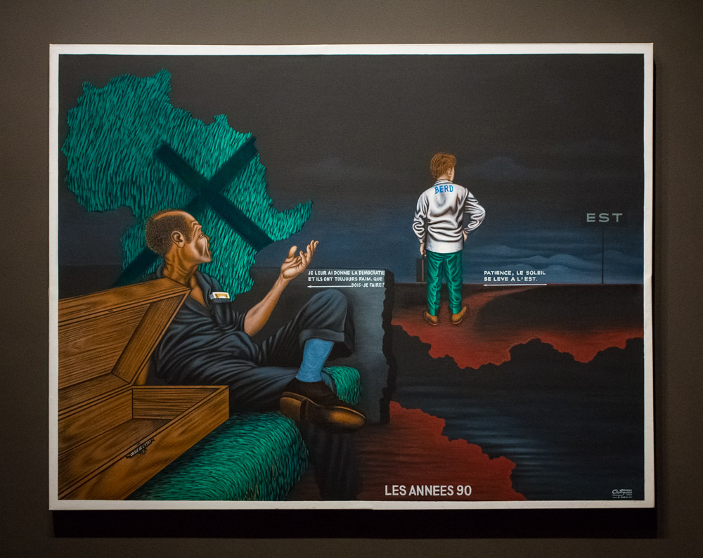
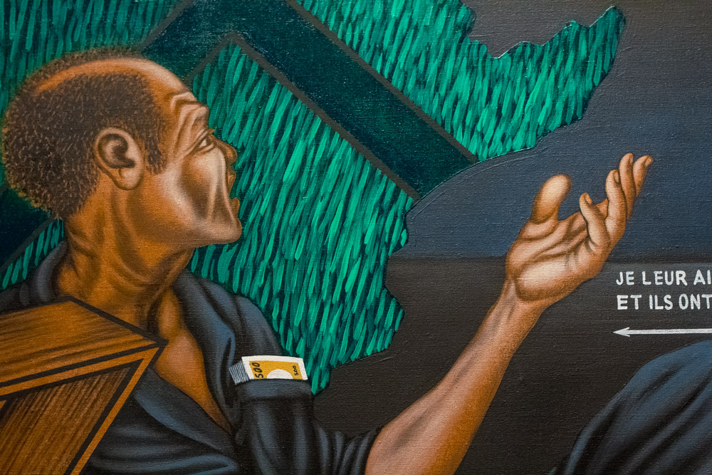
Congolese artist Chéri Samba has said that he likes to incorporate text into his narrative paintings because it keeps the viewer’s eye on the art longer. For visitors who find Samba’s acrylic painting of The Nineties in our Emblems of Encounter installation, it’s not just the French text that needs deciphering. Untangling what’s happening in the picture—as well as thinking about how the text informs the scene—all takes time and effort. Samba has created an image rich with symbolism and relationships for sorting out, and there’s plenty to delve into before even getting to the language.
Most clearly, the scene shows us two men. In the lower left, a figure in a blue suit, sleeves rolled up, lounges passively. His pocket is stuffed with cash, while the chest next to him is noticeably empty. His brown skin contrasts the fair skin of the second man. He looks and gestures toward this figure, who stands near the center of the composition, donning green pants and a white jacket, and gripping a briefcase in his left hand. He’s not looking back at the seated figure to receive the gesture. Instead, he gazes outward purposefully, toward the portion of the canvas where threatening clouds have lifted just a bit.
There’s a ground in a burnt sienna color very nearly connecting them both, except for a path of moody blue water. The scale of the figures—the man in the blue suit fills about twice as much of the canvas as the other man—also communicates to us that there’s distance between them. Our view of the water ends as it comes to what looks like a grey stone wall, its edge jagged like the irregular coastlines of the two land masses on which the figures stand. With the rough wall, forming a barrier between the men, there’s further separation where connection seems more natural.
The man in the blue suit is seated on a grassy green surface. Above and behind him, we see the outline of the continent of Africa, filled in with the same fertile green, composed of many short marks, as blades of grass in a field. The artist has laid a symbol onto the map, and because of its shape and function we’d expect this to be an “x”–only one arm of this symbol is significantly longer than the others, so the shape more closely resembles a cross.
Samba’s painting offers a biting satire of hypocrisy and greed, in a scene reflecting on corrupt leadership and rapacious opportunism. Judging by the work’s title, The Nineties, we imagine the artist is reflecting on a specific time period and likely responding to certain wrongs. That he painted this only in 1991 adds even more weightiness to the picture; it seems to be a dark vision of what he foresaw unfolding as much as a rebuke of events he had already witnessed.
In Emblems of Encounter, Samba’s thoughtful critique joins a group of objects that chart 500 years of the complex and difficult history of European-African interaction. Considering The Nineties, even without the specific narrative laid out, I’m reminded that our understanding of nuanced histories depends, to a large extent, on what side of the shore we stand as we perceive them.
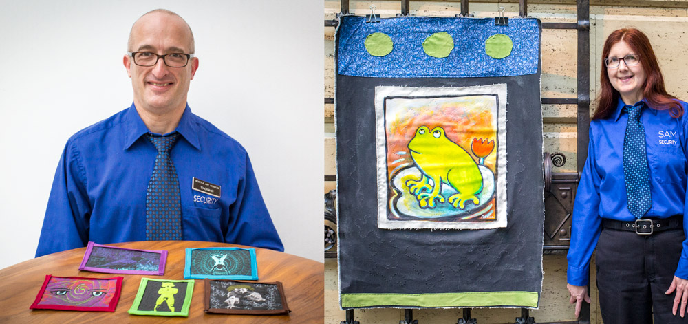
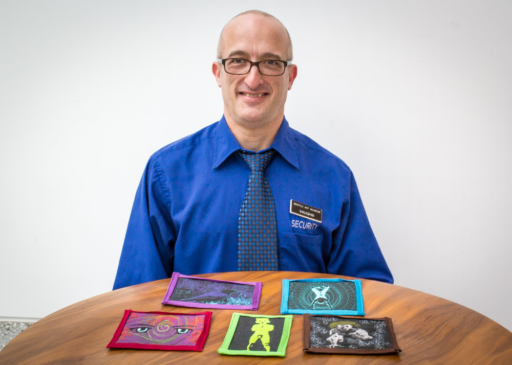
The last time you visited SAM, did you have any idea that many of the Visitor Services Officers (VSOs) who protect the art in the museum are also visual artists themselves, as well as writers, musicians, and thespians? It’s true!
One former SAM VSO, Aaron Bourget, worked at SAM in 1996 and moved on to start his own photography and videography business that focuses on documenting artists. Last year, Aaron made a documentary on the guards and working artists who protect SAM’s art collection called Art of the Guardin’ Variety.
According to the film’s Vimeo page, it is “an informal portrait of the working artist and a glimpse of the talent behind the badge.” It watches like a love letter to Aaron’s time working behind the scenes of the museum, and to those who continue protecting it today. In it, he interviewed many current VSOs about what the experience is like working in a museum while artists themselves.
Vaughn Meekins, a textile artist and six-year veteran of SAM, affirms that no one spends as much time with the art as those hired to guard it.
“You come to this job because you have a passion for art, and you want community in some regard,” Meekins said in his interview for the film. “I’m an artist, whether I’m doing security, or cooking food in the kitchen, to me it’s all art.”
Rebecca Bush, a VSO at the Asian Art Museum since 2009 who creates multimedia paintings, shares the same sentiment.
“Lots of people expect that we’re here to say ‘don’t touch!’ But when you’re approachable, it can be a great experience for the visitors,” Bush said. “I like working here as an artist because I like being in the presence of art, and seeing people enjoying art. As an artist, it’s fulfilling to see people do so.”
To get even more insight into the lives of the artists who guard the art, watch Art of the Guardin’ Variety at: https://vimeo.com/101584343.
Our mission statement here—“SAM connects art to life”—truly guides much of our work and many of the decisions our leadership team makes. We see art as a response to life and as something that should be accessible to everyone in their different journeys. Believing our art is relevant, we want to show people how it’s relevant. It’s why we have a blog series where we talk about our collection objects!
In the museum space, we also connect art to art. When SAM expanded in 2007, the curators made a point of bringing their permanent collection displays together in thoughtful ways. We published a book at the time, called Bridging Cultures, which outlined the curators’ thinking. If art connects to life, and if all of us who share life are interconnected, then all art is somehow linked too. Finding those points of connection can be difficult. I love wandering our permanent collection galleries because these connections across people and across time become clearer and more meaningful to me.
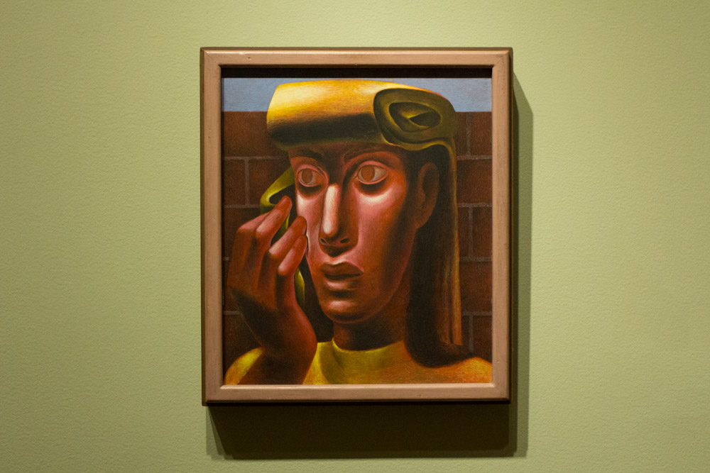
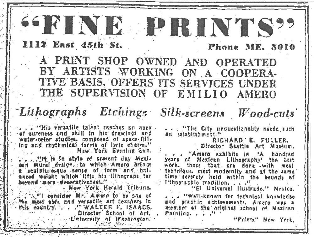
Mexican American artist Emilio Amero was born in Ixtlahuaca in 1901. He trained at the Fine Arts School of San Carlos, and in 1924, he worked as an assistant to Diego Rivera on a mural project at the Ministry of Education Building in Mexico City. In 1955 Amero finally realized his own mural, not in his native Mexico, but in Norman, Oklahoma, where he had taken up a teaching post at the university about a decade earlier. He worked in a wide range of materials over his career, but his work in lithography was particularly significant. So, why are three Amero paintings, including this striking Head of a Woman, hanging in our gallery of Pacific Northwest Modernism, alongside works by Mark Tobey and Guy Anderson?
From 1941-1947, Amero brought his talents to Seattle. Invited to teach at the University of Washington on a Walker-Ames Fellowship, Amero established a reputation as a skilled artist and teacher. A 1942 advertisement for a print shop Amero ran quotes Walter F. Isaacs, then director of the School of Art at the University of Washington, who calls him “one of the most able and versatile art teachers in this country.” In 1943 Amero moved to the faculty at Cornish School of the Arts. For the school’s 30th year, opening of September that year, he served as director and instructor of painting, drawing, commercial and graphic arts—joined on the faculty, as he is today in our galleries, by Guy Anderson, who taught children’s art. Not to brag on us, but we have an important collection of Amero paintings that is a monument to his time here.
Like other notable artists working in Seattle at the time, many of whom grew up in the Pacific Northwest, Amero was geographically far from the forms of Modernism developing in New York. His vision was essentially different because it was rooted in Mexico. There, Modernism developed after the Social Revolution of 1910, as artists like Amero and Rivera shrugged off what had become an oppressive European influence, looking instead to ancient indigenous Mexican art. The heritage of Amero’s native Mexico inspired his form of Modernism much like the land and peoples of the Pacific Northwest inspired Tobey and Anderson.
—Jeffrey Carlson, SAM Collections Coordinator
Image:Head of a Woman, 1947, Emilio Amero (Born Ixtlahuaca, Mexico, 1901; died Norman, Oklahoma, 1976), tempera on panel, 18 1/4 x 15 1/2 in. Seattle Art Museum, Eugene Fuller Memorial Collection, 47.134, Photo: Natali Wiseman. Caption for ad: Seattle Daily Times, August 9, 1942, p. 30.
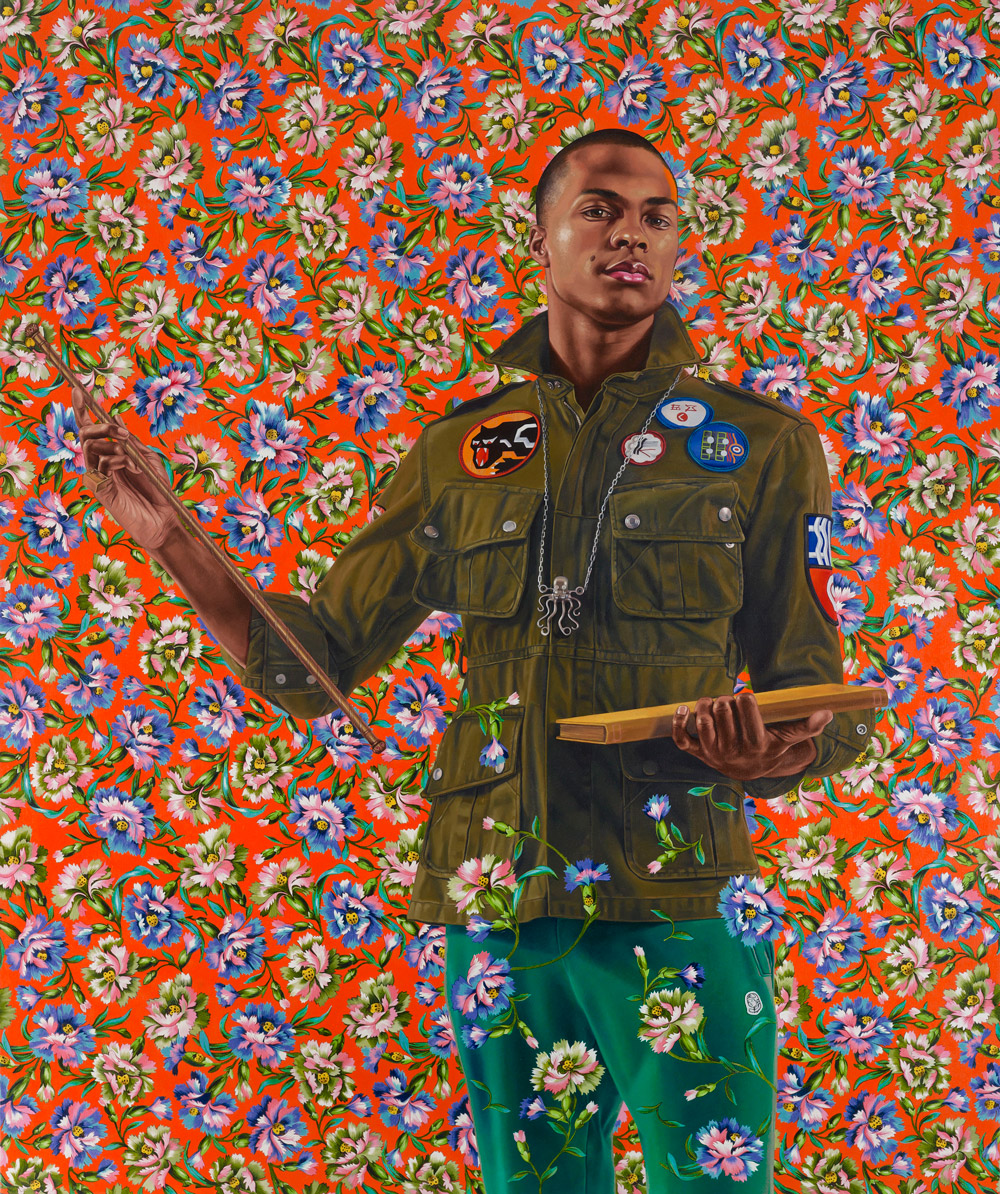
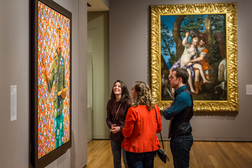
You simply can’t miss the eye-catching posters and banners all over Seattle advertising our next special exhibition, Kehinde Wiley: A New Republic. When you come for the free opening celebration this week—and do come!—you’ll see huge paintings from private and public collections across the world, including a gem from SAM’s own collection.
Anthony of Padua, a painting in the very traditional method of oil on canvas, measures six feet tall by five feet wide. The figure is imposing, the decoration bright and busy. His is an empowering posture borrowed from the aristocratic patrons of art history and conferred to a young person of color. The rococo frills that surround him speak of the joy of excess.
He brings together, as Kehinde Wiley’s work often does, two worlds of swagger. The original swagger portrait (a real term in art history used even by stuffy academics) developed in Europe in the 17th and 18th centuries. At the time, those who had the funds to do so might pay an artist to paint them in a very flattering pose, wearing elegant and expensive dress, accompanied by symbols of their knowledge or power. The idea was to show off your status, wealth, and noble character. You wanted to impress those around you and those who would see your painting long after you were gone.
More recently, swagger has been mostly informed by looks, attitudes, and language developed in street culture. Kehinde Wiley’s work picks up on both points of reference, which, when we think about it, are not so different. Urban Dictionary’s top definition describes swagger as “How one presents him- or herself to the world. Swagger is shown from how the person handles a situation. It can also be shown in the person’s walk.” The way to attain it has changed across cultures and across time, but swagger has always been about getting respect by portraying self-confidence. It’s always played out through language, body language, and dress.
To build his new swagger portraits, Wiley has developed a practice of “street-casting” to choose the models for his portraits. Wherever he might find himself looking—and Wiley has taken subjects from places as diverse as Brooklyn and Brazil, India and Israel—he strolls the streets, more or less living his life, but also waiting for a moment of connection with another individual. He’s allowing chance to play a role in selecting who makes it into these paintings, and then onto the walls of a gallery or museum. The models come to the artist’s studio with the instruction to wear everyday clothing and express their personal style. That’s just how the model for Anthony of Padua posed and is portrayed here: with his own coat and patches, teal pants, and octopus necklace.
Anthony of Padua arrived at SAM in 2013, shortly after he was painted. Here, he was not destined for the Modern and Contemporary galleries, but found his home right away in the European Baroque galleries, surrounded by the likes of Veronese and Anthony van Dyck—one of the most successful to ever do a flattering portrait.
The historical figure who informs the title of SAM’s Kehinde Wiley painting is Anthony of Padua, who lived 1195-1231, and who was canonized in 1232. I like to think that SAM’s painting, if only because it shares his name and a resemblance to another artist’s depiction of him, carries some of the presence and virtues of the saint. In life, Anthony of Padua became known as a devoted student, one with a remarkable memory, and as a convincing, charismatic orator. In the Catholic tradition, he cares for, and hears prayers from, the poor, the elderly, expectant mothers, travelers, and seekers of lost things. Fittingly for us here in Seattle, he is also the patron of fishermen, domestic animals, and mariners.
The unique collection we have at SAM largely reflects the specific art interests of a series of generous donors. Much of the museum’s African and Modern art, for example, came as transformational gifts, adding prominent facets to the identity of the collection. The European paintings at SAM offer more great stories of generosity and collecting passions.
The Doge’s Palace and the Grand Canal, Venice, a fabulous Venetian view painting by Luca Carlevariis (1663-1729), was purchased for SAM with funds from one local art patron, Floyd A. Naramore. In a letter dated January 6, 1951, Mr. Naramore writes to SAM director Richard Fuller that the painting is “given as an expression of my appreciation of what you and your mother have done for the city of Seattle and the lovers of art and also as a means of expressing my own interest in art and the museum.” In the letter, Mr. Naramore mentions a gift of $500—the final installment in a total payment of $1,800 to David M. Koetser Gallery, New York. The market for Carlevariis paintings has changed quite a bit in the last 60 years: In 2011 a similar view by Carlevariis, of a comparable size, sold at a Christie’s auction for just over $4 million!
The artist was a kind of ambassador for Venice in his art. Born in the small town of Udine in 1663, Luca Carlevariis moved to Venice in 1679 and there found a city that truly inspired him. He produced etchings and paintings that focused on the then-and-now touristy spots near Piazza San Marco. His vedute, or view paintings, became popular as souvenirs for Northern Europeans visiting Venice as part of their cultural education. This 18th-century phenomenon, known as the Grand Tour, brought Carlevariis a steady supply of patrons who would purchase his works like we (or our parents) would a postcard. Carlevariis was one of the earliest painters of Venetian vedute, although the later Canaletto is the name most popularly associated with them.
SAM has an insightful webpage on The Doge’s Palace and the Grand Canal, Venice that points out several monuments included in the view, such as the Lion of St. Mark, the basilica of Santa Maria della Salute, the Biblioteca Marciana, and of course, the Doge’s Palace. Also featured on the page is an introduction to the fascinating world of the Grand Tour.
When The Doge’s Palace and the Grand Canal, Venice entered SAM’s collection, in 1950, it marked the beginning of an especially important decade for the growth for the European paintings collection. The relationship the museum developed with the Kress Foundation was central to that growth.
Samuel H. Kress (1863-1955) built a family fortune in retail by founding a five-and-dime store and building it into a national chain. An art lover, Kress began to seriously collect Italian paintings in the 1920s, and also became devoted to philanthropy. The Kress Foundation, as part of its mission to help small art collections during the hard economic times surrounding the Great Depression, developed something called the Regional Galleries program that served the Foundation’s desire to get the whole Kress Collection on view and would also disperse the artworks democratically around the country. SAM was chosen as one of the 18 regional museums to receive paintings from the Kress Foundation. In the 1954 photo above, Dr. Fuller plays curator and arranges an installation of the Kress paintings at SAM’s Volunteer Park building. Behind him, you’ll spot another Venetian veduta that graces SAM’s collection, Bacino di San Marco, attributed to the Workshop of Canaletto.
—Jeffrey Carlson, SAM Collections Coordinator
Images: The Doge’s Palace and the Grand Canal, Venice, ca. 1710, Luca Carlevariis, Italian, Venice, 1663-1729, oil on canvas, 37 3/4 x 75 3/4 in., Seattle Art Museum, Gift of Floyd A. Naramore, 50.70. A letter from Floyd A. Naramore to SAM, 1951. Dr. Richard Fuller with the Samuel H. Kress collection, 1954.
In SAM’s large oil painting by Flemish artist Abraham Janssens, The Origin of the Cornucopia (ca. 1619), one of three figures in the foreground grasps the stem of a round, ridged, colorful squash. The picture honors the harvest, abundance, and most importantly today—the day before Halloween—the pumpkin.
Pumpkins are totally trending. Fall is the pumpkin’s moment, when it takes over as the most visible symbol of an entire season. It’s a rare food or drink establishment that doesn’t have pumpkin on its menu this time of year. On my last trip to get an oil change, the service center was advertising pumpkin spice motor oil. It’s abundant, and it’s no johnny-come-lately, either. The pumpkin, scientific name Cucurbita pepo, has been growing in North America for roughly 5,000 years and is indigenous to the Western hemisphere. Our name for it has been around since the late 17th century, coming from the French pompon and traceable back to the Greek pepōn, meaning “large melon.”
Like the pumpkin, which sometimes stands in for the whole season, Janssens’ Origin of the Cornucopia was likely painted as an allegory of fall. The specific scene relates to one of Hercules’ battles in Greek mythology. During a victory over a river god who has taken the form of a bull, Hercules tears off one of the bull’s horns. River nymphs take up the horn and fill it with a variety of fruits and vegetables. In Ovid’s Metamorphoses, the defeated river god, Achelous, sings: “My Naiads filled it full of fragrant flowers/And fruits, and hallowed it. From my horn now/Good Plenty finds her wealth and riches flow.” These poetic lines offer a fitting caption for the scene in front of us, where visual riches are bountiful.
In the Janssens painting, three massive figures—the Naiads, or water nymphs—gather delectable fruit and vegetables with which to stuff their “horn of plenty,” choosing from cauliflower, grapes, figs, artichokes, and the squash, all painted by the artist in great detail. The figures on the right and left lounge on vessels gushing out water—a reference to their roles in mythology and to water’s importance in the harvest. Every element up to the crowns of wheat suggests health and growth. In the past, the painting has been dated to as early as 1609, but it’s now put at about 1619. Either way, it marks one of the earliest depictions of the origins of the cornucopia.
The Origin of the Cornucopia hangs on the wall of our fourth floor galleries devoted to classical European art. It has played an important role in SAM’s relatively small European collection since its acquisition in the summer of 1972, when it was given to the museum as a 75th birthday present to our founding director, Richard E. Fuller. Before its time at SAM and the gallery from which the museum acquired it, the painting is said to have lived in a French provincial castle. I imagine it hanging over a dinner table, every inch of it covered with an autumn feast.
–Jeffrey Carlson, Collections Coordinator
Image:The Origin of the Cornucopia, ca. 1619, Abraham Janssens, Flemish, Antwerp, ca. 1575-1632, oil on canvas, 43 3/4 x 68 1/16 in., Seattle Art Museum, PONCHO in honor of Dr. Richard E. Fuller’s 75th Birthday.
There’s nothing like a good rivalry to spice up a moment in history. I’d say it’s a rare historical note that isn’t improved by some verbal sparring or a gauntlet being thrown. Happily for us, the European Impressionists not only created a remarkable group of paintings, but also produced a natural rivalry in Edouard Manet (1832-1883) and Claude Monet (1840-1926). Manet was a leading influence in the years before Impressionism flowered, and when it did, Monet took the torch from him, becoming the new movement’s unquestioned leader.
In John Rewald’s History of Impressionism, we read about Manet’s first encounter with the younger Monet. The scene is the Paris Salon exhibition of 1865:
The two canvases shown by Monet were views of the Seine estuary, done near the lighthouse of Honfleur. Since the works at the Salon were now hung in alphabetical order to prevent favoritism, Monet’s works found themselves in the same room with Manet’s. When the latter entered this room on the opening day, he had the disagreeable surprise of being congratulated by several persons upon his seascapes. Having studied the signatures on the two pictures attributed to him, Manet at first thought it to be some cheap joke; his anger was conceivably not lessened by the fact that the seascapes continued to have more success than his own works. He left in a rage and openly complained to some friends: ‘I am being complimented only on a painting that is not by me. One would think this to be a mystification.’
Although in time Monet and Manet grew to be friendly artist-peers, sometimes painting together outdoors, such was Manet’s frustration at the Salon that he refused his first chance to meet Monet. “Who is this rascal who pastiches my painting so basely?” spouted Manet, in a masterful artist burn.
“Oysters” by Edouard Manet, 1862.
“Argenteuil” by Claude Monet, ca. 1872.
The two names were often confused in those years of Monet’s ascension and are sometimes still confused today, even with 150 years of distance. Comparisons were always inevitable, given the similarity of their names. It’s a great chance for some amusement, too. A famous caricaturist in 19th century Paris, Andre Gill, sketched a figure painting by Monet and attached the caption “Monet ou Manet?—Monet. Mais, c’est a Manet que nous devons ce Monet; bravo, Monet; merci, Manet.” (“Monet or Manet?—Monet. But it is to Manet we owe this Monet. Bravo, Monet; Merci, Manet.”) Cartoons over the years have picked up on the joke and taken it a number of directions. One of my favorite renditions is this Harry Bliss cartoon, originally published in The New Yorker (and for the record, it was Manet).
Not only for the syphilis, fate was pretty cruel to Manet: Here’s an artist who cared deeply about being recognized and accepted, who continually submitted paintings to the Salon in search of official stamps of approval—and he was frequently confused with, or overshadowed by, a younger artist who ends up leading the Impressionist movement and becoming one of the most popular artists of all time. And the two were only separated by one letter!
Today, being so far removed from the historical moment makes it easier for us to appreciate Manet’s work on its own, and his contributions to art and painting are widely recognized. Here at the Seattle Art Museum, we also love Monet: our permanent collection features the beautiful harbor scene Fishing Boats at Étretat. So we all arrived at a happy ending. But, just because those rivalries are so much fun, here’s one more spat from Impressionist lore.
On one occasion, Manet went to Argenteuil and set up to paint the Monet family—the artist, his wife, Camille, and his son, Jean—in their garden (this painting is The Monet Family in Their Garden at Argenteuil, owned by the Metropolitan Museum of Art). Colin Bailey, a scholar of French painting and director of the Morgan Library and Museum, recounts what happened next: “While Manet was at work, Renoir arrived, borrowed paints, brushes, and a canvas from Monet, and executed a vivid close-up of Camille and Jean, joined by the rooster. Irritated by Renoir’s intrusion, Manet is reported to have told Monet, ‘He has no talent, that boy. Since he’s your friend, you should tell him to give up painting!’”
“Madame Monet and Her Son” by Auguste Renior, 1874.
Come tour our brand new exhibition Intimate Impressionism from the National Gallery of Art to see Renoir’s painting of that day in the garden—and judge his talents for yourself! And don’t miss a related SAM Talks event this month with Colin Bailey and SAM’s own director, Kimerly Rorschach. —Jeffrey Carlson, SAM Collections Coordinator
References Bailey, Colin. “The Floating Studio.” The New York Review of Books, April 23, 2015. Rewald, John. The History of Impressionism, 4th revised edition. New York: New York Graphic Society, 1973.