Memory Map Smartphone Tour: The Vanishing American

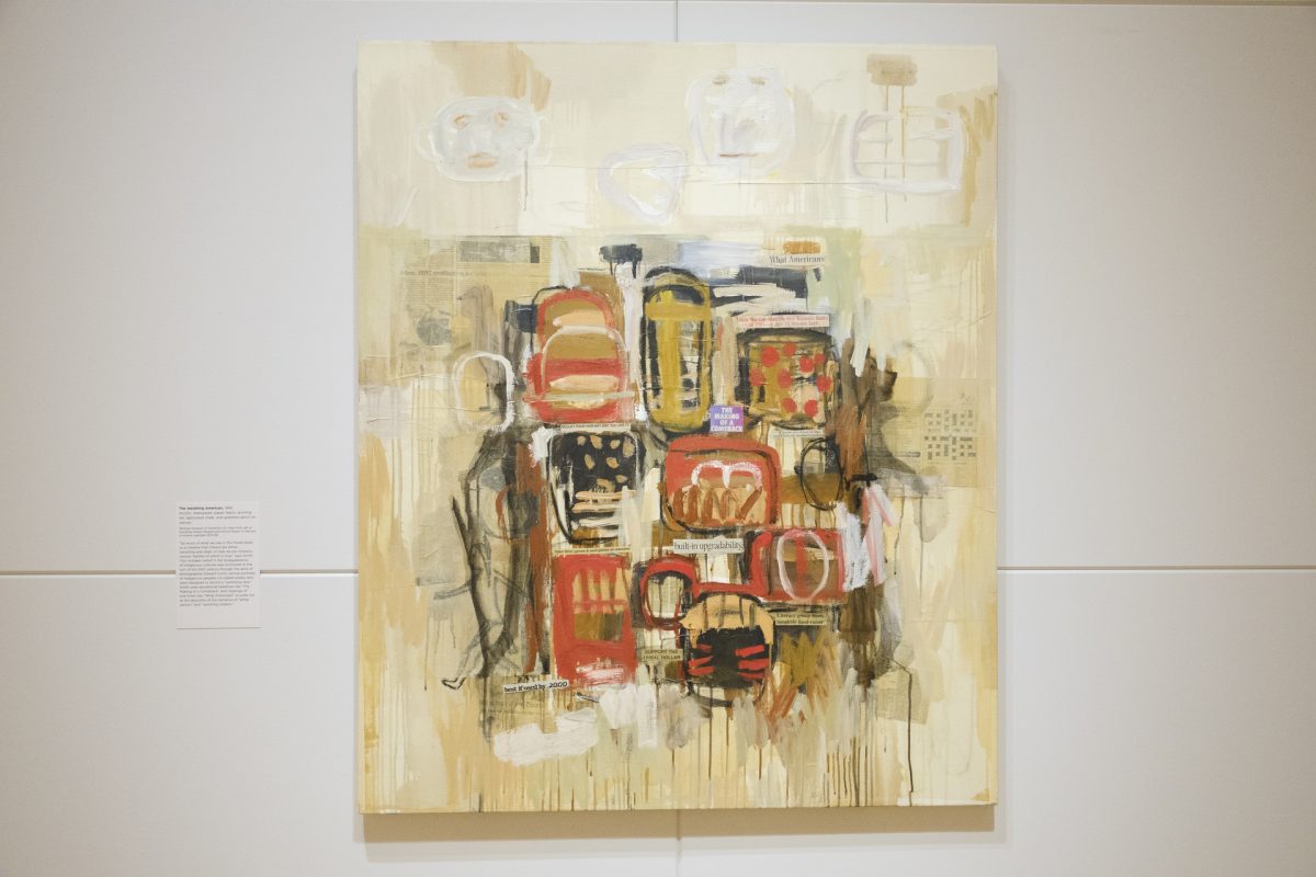
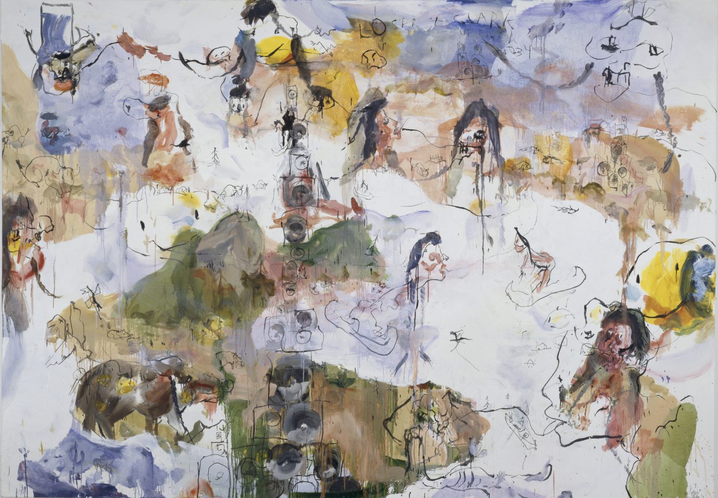
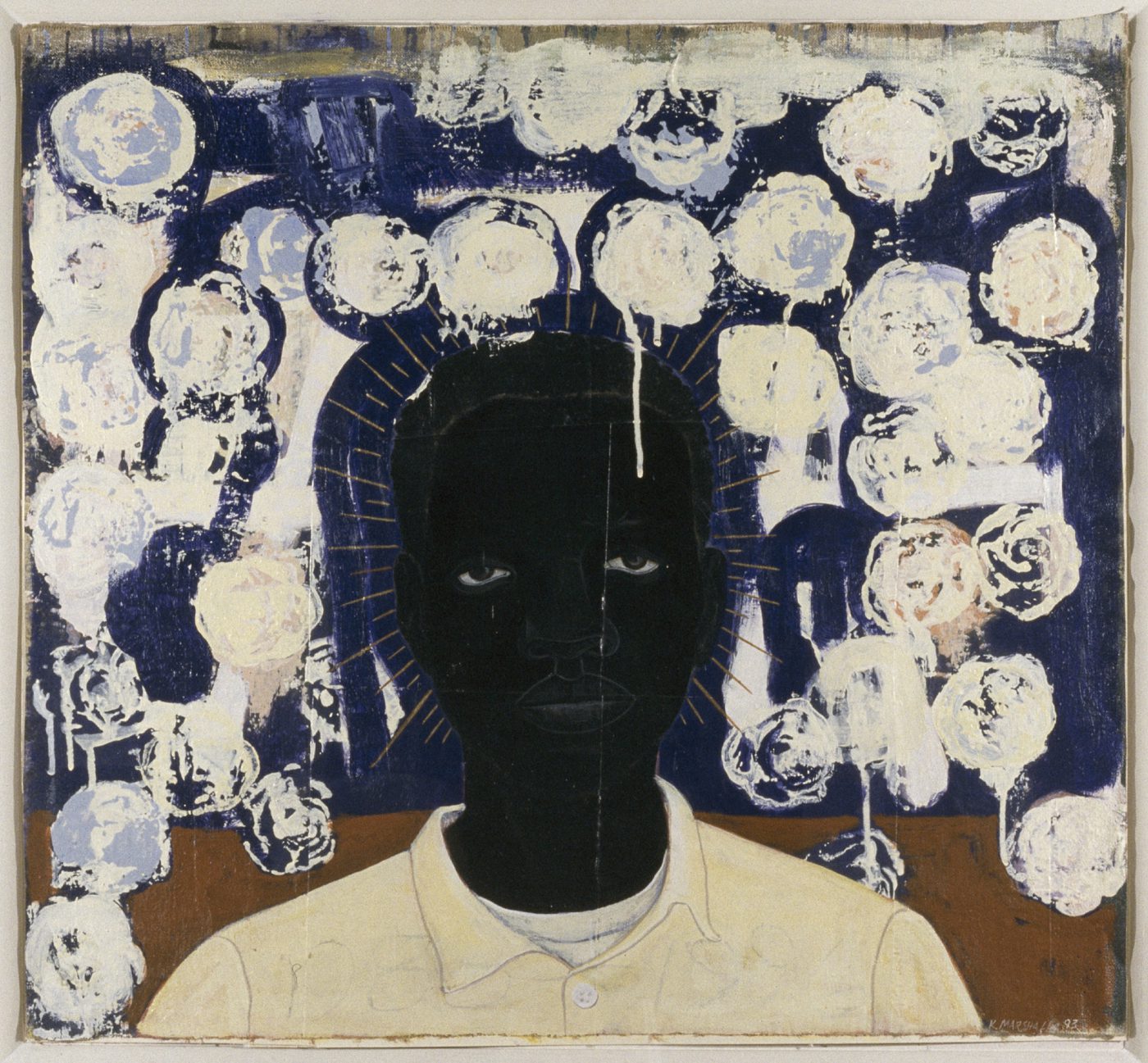
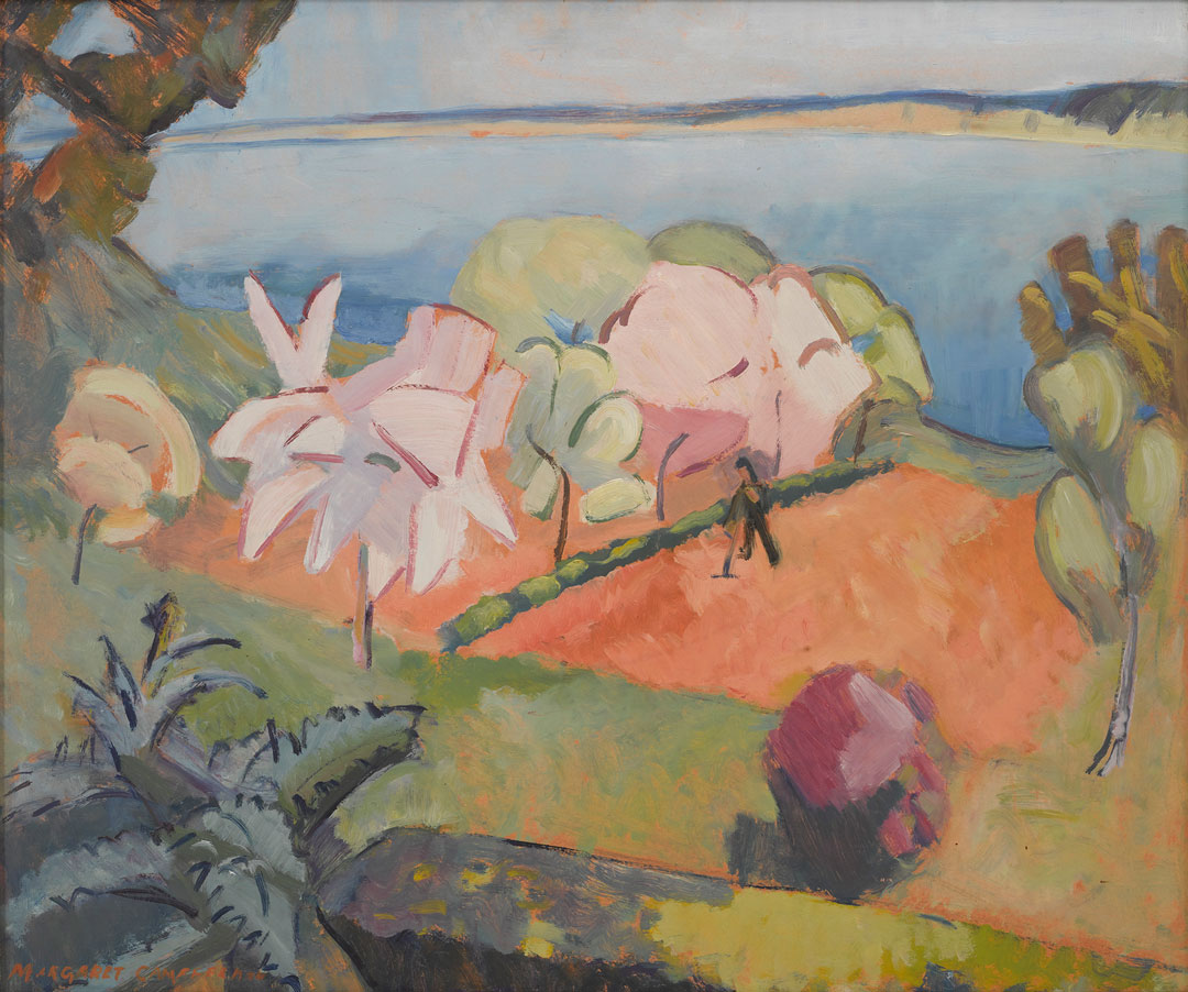
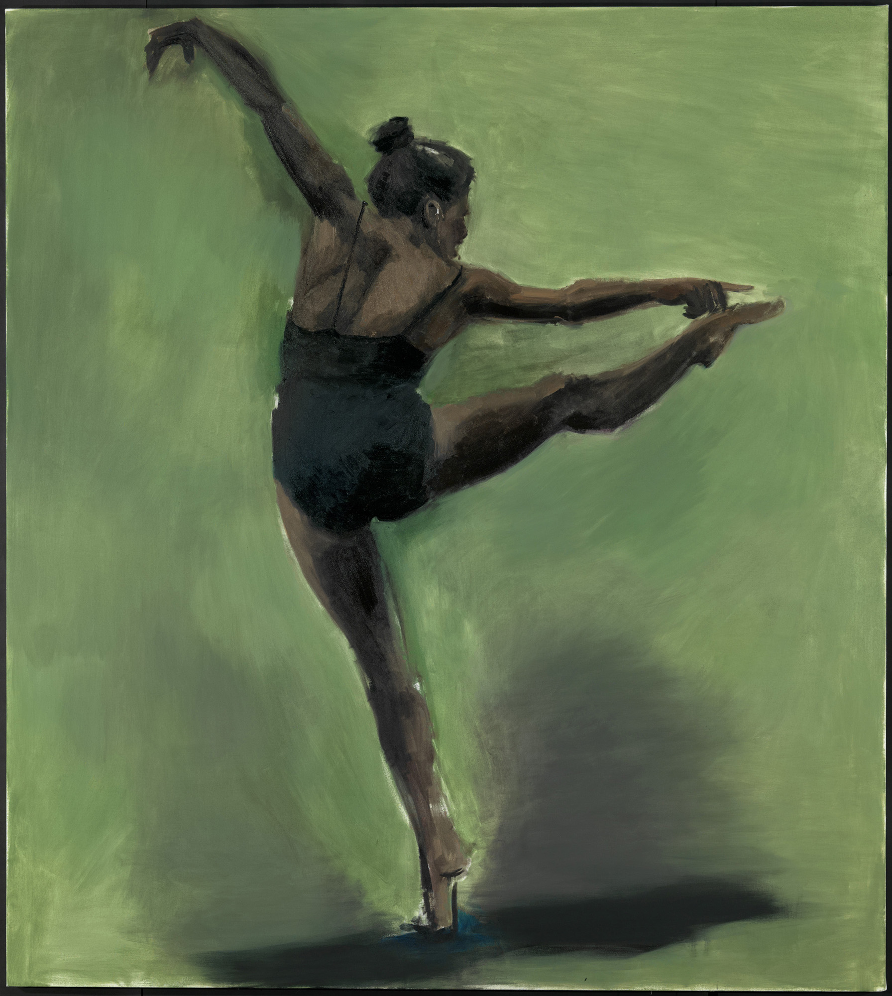
In Jaune Quick-to-See Smith’s striking abstract painting The Vanishing American (1994), a series of Native figures dressed in traditional clothing are surrounded by marks and newspaper clippings with headlines including ‘Support the Tribal Dollar,’ ‘Best if Used by 2000,’ and ‘Built-in Upgradability.’ Clustered together, the figures stand in defensive positions.

This work represents the making of a comeback. Not only the comeback of a person or community of people, but also the return of a mentality that has been erased by contemporary society’s monoculture. Learn more about the significance behind The Vanishing American directly from the artist by tuning in to the free smartphone tour of Jaune Quick-to-See Smith: Memory Map at SAM. Originally produced by the Whitney Museum of Art, all nineteen stops of the audio tour are accessible by scanning the QR codes throughout the exhibition’s galleries or on your own time via our SoundCloud.

The Vanishing American, 1994

NARRATOR: Smith called this painting The Vanishing American. It mixes brushy abstraction with headlines clipped from newspapers. In the upper right, one reads “What Americans,” pointing loosely to the painting’s ironic explorations of identity. 

JAUNE QUICK-TO-SEE SMITH: See there’s always this thing about “the vanishing Native American.” The vanishing American Indian. And we’ve been hit with that all of our lives. That, “oh you guys are so watered down.” “Oh you guys are so mixed blood, you don’t know who you are.” “Oh you’re so bastardized, you have no culture left.”

NARRATOR: Smith said she was inspired to make the painting after a community meal during medicine lodge ceremonies on the lands of the Blackfeet Nation, near her childhood home. 

JAUNE QUICK-TO-SEE SMITH: And then when everybody would gather to eat, people would start talking about, “And, you know, the white people are just going to do themselves in with all their poisons and all the pesticides and everything that they’re using on our food. And so they’re just going to be the vanishing white men.” And then everybody would laugh.

So, I came back into the studio, and here I found this sign called built-in upgradability out of some New York Times or some ad or something. And I said, yeah, that really fits what the elders are saying, that we’re going to make it through this. Built-in upgradability, that’s what we have. We’ve been here for thousands and thousands of years. They just got here yesterday. They keep pretending like, oh, we just got here before them. Well, that’s not true. We’ve been here since the creation time. So the making of a comeback.

– Lily Hansen, SAM Marketing Content Creator

Photo: Alborz Kamalizad.

Object of the Week: Coulee Dam Construction

With its natural beauty and landscape, a huge influx of people began moving to the West during the 19th and 20th centuries. The construction of dams throughout America’s landscape was considered an outstanding achievement for the nation’s economy and became a defining moment in America’s history. In the 1930s, President Franklin D. Roosevelt implemented the New Deal’s Public Works Administration (PWA), a government-sponsored relief program meant to subside the economic impacts of the Great Depression. The creation of this program resulted in the creation of many iconic structures throughout the country, such as what we now know as the Grand Coulee Dam. Artist Z. Vanessa Helder spent two years documenting and painting the formation of the Coulee Dam, creating a series of works that tell the dynamic story of its completion. 

In Coulee Dam Construction: Skip Way and Grout Shed, Helder captures the dam’s evolution in its final years of construction in her bold precisionist style. The perfectly straight diagonal lines formed from the building equipment draw our eyes to the man-made gash in the mountains, formed by several years of hard labor done by local industrial workers. The red construction buildings and materials provide a bold contrast between themselves and the gray and beige background of the dirt and debris of fallen rock. Further contrasting the soil and shale foreground, the mountain top and sky boast brilliant shades of green, orange, and blue. These stark contrasts between the focal points of Helder’s painting showcase the commanding presence of the industrial boom in the Northwest and the strength and perseverance of the environment around it. 

Today, the Grand Coulee Dam still stands, and the impacts that it has had on the environment continue to develop since its construction that Helder captured in the 1930s. Dam construction left a colonial imprint on the landscape, contributing to the loss of local biodiversity, flooding, pollution, and poorer water quality. While there was a high amount of public support of projects such as the dam due to the increase in local jobs and increased infrastructure, it has become time to re-evaluate our means of energy production. Human intervention in nature is a prevalent theme that emerges from the art of Helder. Looking at Coulee Dam Construction: Skip Way and Grout Shed, we can re-examine the reasoning for why these dams were built and how the environment and people are affected nearly a century after its completion.

– Kari Karsten, SAM Emerging Museum Professional Curatorial Intern

Image: Coulee Dam Construction: Skip Way and Grout Shed, 1939, Z. Vanessa Helder, American, 1904–1968, Transparent watercolor, 18 1/4 x 14 7/8 in., Framed: 30 1/4″ x 27 3/4″ in., Eugene Fuller Memorial Collection, 39.54.

Conservation & Color: Monet’s Fishing Boats at Étretat

Take a close look at Monet’s 1885 painting Fishing Boats at Étretat with Nicholas Dorman, SAM’s Jane Lang Davis Chief Conservator. Dorman shares about the canvas, the colors, and the layers of revisions that makes SAM’s single Monet painting sing. As the inspiration for the current Monet at Étretat exhibition at Seattle Art Museum, Fishing Boats at Étretat was closely examined and conserved, revealing much about the context of Monet’s artistic development at this pivotal moment in his career. Learn all about advances in paint and the cumbersome process of plein air painting in 19th-century France in this video.

One of the Monet at Étretat galleries is dedicated to Monet’s process and features an easel similar to one Monet would have used, as well as the backs of two paintings. This demonstrates the physically demanding process Monet embarked on in painting outside, and the materials available to work with at the time. The exhibition features 10 paintings created by Monet and 12 works by other artists of his era, as well as other materials addressing the artist’s engagement with the fishing village of Étretat on the Normandy Coast of France in the mid-1880s. Get your tickets today to see Monet at Étretat on view at Seattle Art Museum through October 17.

– Chelsea Werner-Jatzke, SAM’s Content Strategist & Social Media Manager

Object of the Week: Summer Evening & Woman in Summer Attire

As another breathtaking Seattle summer quickly approaches, our craving for freedom, both from the chilly Pacific Northwest damp and from the seemingly endless shadow of the pandemic, grows ever more desperate.

In this state, we can easily empathize with the two women portrayed in Uemura Shoen’s Summer Evening and Kajiwara Hisako’s Woman in Summer Attire, both painted in the first quarter of the twentieth century. Each of the two works might at first glance be identified within the tradition of bijinga (美人画), a term used to describe idealized images of beautiful women which emerged in the mid-Edo period (around 1603-1868). However, though Shoen and Hisako were both trained in the bijinga genre in Kyoto, they were motivated to resist its conventions by the desire to represent thoroughly modern women. Their subjects have complexity and agency; they demand more than what social convention has prescribed for them, and long for liberation from the domestic interior that confines them.

In Summer Evening, Uemura Shoen (1875-1949) depicts an elegantly dressed young woman whose back is turned to the viewer as she looks out from a covered balcony. In her left hand she holds a paper fan, and the loosely tied, gold-accented sash, subtle bird motif in the kimono’s patterning, and basket weave on the hem suggest the refinement of a geisha. The diagonal lines in the drapery of her kimono indicate motion, and we sense that though she may be paused in observation, the cessation of movement will be brief. We have no way of knowing whether she is awaiting a guest, enjoying the moonrise, or looking longingly after one who has just departed. This ambiguity leaves us wondering, and enhances the appeal of the image.

Kajiwara Hisako (1896-1988) was well known for her unpretentious paintings of working class or professional women, and this work is considered one of the most evocative examples of her distinctive approach. In Woman in Summer Attire, the sitter actively meets the viewer’s eyes rather than passively looking away. She pierces us with a stare that at once reflects a sense of boredom and defiance; her ambiguous expression leaves this work open to a variety of interpretations.

Shoen and Hisako blended traditional media and format with modern themes in their artistic practice at a time when Japan was undergoing rapid industrialization and globalization in response to invasive influence from the West. These and other works by Shoen and Hisako stand out amongst those of their contemporaries because they not only resist the male gaze, but are in fact crafted in the female gaze. There is an overwhelming feeling of anticipation, even impatience, in the women they portray.

Tori Champion, SAM Blakemore Intern for Japanese and Korean Art

Images: Summer Evening, ca. 1900, Uemura Shoen, color on silk, 84 7/16 x 24 1/2 in., Gift of Griffith and Patricia Way, in honor of the 75th Anniversary of the Seattle Art Museum, 2009.70.11. Woman in Summer Attire, 1921, Kajiwara Hisako, ink and color on silk, 79 5/8 x 22 3/4 in., Gift of Laura Elizabeth Ingham in honor of Amalia Partridge Ingham, 94.149

Masterpiece Moments: Five Beautiful Women by Hokusai

Did you know that you can experience art by the famous Japanese artist Katsushika Hokusai at the Seattle Asian Art Museum? Learn all about Hokusai’s Five Beautiful Women, guided by Illsley Ball Nordstrom Director and CEO Amada Cruz. A household name in Japan and known widely worldwide, Hokusai is well regarded for his iconic prints of the Great Wave and Red Fuji. Hokusai enjoyed a prolific 70 year career, during which he created an estimated tens of thousands of woodblock prints. His creative energy and genius can also be found in his paintings, which unlike prints, were not produced in multiples and are more rare, such as this work in our collection.

SAM was selected to participate in the Bank of America ‘Masterpiece Moment’ program—a new series of videos that showcase works of art in the collections of 25 museum partners across the United States. For more than three decades, Bank of America has generously supported a variety of programs at SAM. The Art Conservation program is one major initiative that most recently helped restore Alexander Calder’s The Eagle at the Olympic Sculpture Park. Additionally, the Museums on Us program supports SAM’s ongoing operations and gives their cardholders special access to SAM.

Painted in 1810, Five Beautiful Women features women of different social backgrounds in an intriguing hierarchy and differentiated by their clothing. The garments and accessories prompt us to consider clothing and its relationship to our identity. At the top, a woman in a kimono decorated with an iris design and lavish obi sash is from a high-ranking warrior family. Below her, a young woman from a wealthy merchant family wears a shibori tie-dyed kimono and is practicing flower arrangement. In a black kimono with floral designs and butterfly-shaped hat, the woman in the middle is a lady-in-waiting in the residence of a shogun or daimyo, a Japanese feudal lord. A high-class courtesan, identified by her front-tied obi with a peacock feather pattern, is below her. Anchoring the work is a women in a simple brown kimono wearing a checkered obi sash and she reclines on the floor reading a book. Some scholars suggest she is a widow because of her plucked eyebrows and somber colored robes.

Bank of America recognizes the power of the arts to help economies thrive, educate and enrich societies, and create greater cultural understanding. The Masterpiece Moment program was launched to both celebrate great works of art and provide critical funding for museums across the country, including SAM, during a very difficult time. We are deeply grateful to Bank of America for their incredible support of SAM. Learn more about this wonderful Hokusai work in SAM’s collection by visiting the Masterpiece Moment website. New videos are released every other Monday, and we hope you’ll follow along!

Object of the Week: Essence of Spring, Chevreuse Valley

Born Jean Baptiste Armand Guillaumin, Armand Guillaumin was born in Paris, France, to a working-class family in 1841. And while he might not have achieved the same level of recognition as his contemporaries Claude Monet, Paul Cézanne, or Camille Pissarro, Guillaumin was embedded in this important circle of Impressionist artists.

Guillaumin’s youth was spent in central France, where he studied art locally. After moving to Paris at the age of sixteen, he continued his education by attending evening drawing classes after working shifts at his uncle’s clothing store. In 1861, he enrolled at the Académie Suisse, further supporting himself through employment at the Paris-Orléans railway and, later, Paris’s Department of Roads and Bridges.[1]

For Guillaumin, his interest in the ephemerality of light and color connected him with his fellow classmates Cézanne and Pissarro, who would become lifelong friends. His work was included in the famous 1863 Salon des Refusés—a “historical launching pad”and, a decade later, the first Impressionist exhibition of 1874.[2]

During this formative period, Guillaumin’s mode of employ and proximity to the French railway system allowed him to travel (albeit locally) and explore the quickly industrializing landscape. Interestingly, many scholars also believe his financial situation and full-time employment impacted the time he could devote to his artistic career. Still, given his background and preoccupations as a member of the Impressionist circle, Guillaumin was committed to depicting working class scenes, landscapesoften with modern infrastructure such as bridges or viaductsand the changing environment on the outskirts of Paris.

The mid-1880s are understood as a turning point for the artist, as he started focusing primarily on color. For this reason, he is often positioned as a bridge between Impressionism and Fauvism.[3] His painting Essence of Spring, Chevreuse Valley, ca. 1885, is one such painting, depicting an idyllic countryside with rolling forested hills and a gentle pastel-colored sky.

Lyrical sections of bold, saturated colorwhere forest abuts grassare interspersed with flowering cherry trees and, behind them, small cottages and homes. Unlike some of Guillaumin’s other paintings from this period, where the encroaching and expanding reach of Paris looms like a specter (this might resonate for those reading here in Seattle), the Chevreuse Valley’s transition into springits atmospheric effects and energytakes center stage.

– Elisabeth Smith, SAM Collections & Provenance Associate


[1] Fine Arts Museums of San Francisco, “Armand Guillaumin,” https://art.famsf.org/armand-guillaumin. Selected bibliography: Gray, Christopher. Armand Guillaumin (Chester, Connecticut: Pequot Press, 1972); Rewald, John. History of Impressionism (New York: Museum of Modern Art, 1973).

[2] Pissarro, Joachim. Pioneering Modern Painting: Cézanne and Pissarro 1865–1885 (New York: Museum of Modern Art, 2005), 28.

[3] Fine Arts Museums of San Francisco, “Armand Guillaumin.”

Image: Essence of Spring, Chevreuse Valley, ca. 1885, Jean Baptiste Armand Guillaumin, oil on canvas, 26 x 48 in., Gift of Mr. and Mrs. Philip E. Renshaw, 67.147

Object of the Week: Loser + Clark

“I’m making landscapes that I can live in through an ongoing definition of contemporary life and art. Not about America, but from America.”

– Brad Kahlhamer

It is a painting that, for many SAM staff, is one of the first and last artworks seen during a given workday—a painting embedded in the daily commute from the staff entrance to various offices. And, having worked from home for a majority of the past year, it is both a ritual and an artwork deeply missed.

The painting, titled Loser + Clark, is by artist Brad Kahlhamer. Completed in 1999, the work was featured in a solo exhibition at Deitch Projects, New York, that same year. Its size—84 x 120 inches—is large. The paint, applied in “brushy, sinewy networks,” is set against a white ground.[1] The artist’s light washes of color form an abstracted landscape, upon which shapes and forms are scattered, almost floating: “animals, figures in canoes, wobbly Happy Faces, skyscraper-like stacks of music amplifiers, scrawled phrases, portraits and self-portraits.”[2] Loser + Clark,[3] like other works included in the 1999 exhibition, ironically titled Friendly Frontier, came out of a then-recent trip Kahlhamer had made to Montana and the Dakotas—a trip taken to deeper explore and experience the history and mythology of the American landscape.[4] 

Kahlhamer was born in Tucson in 1956 to Native parents, and adopted by German-American parents as an infant. Raised between Arizona and Wisconsin, and later living in New York City as an adult, the artist considers his upbringing a nomadic one.[5] Relatedly, his paintings function as what he calls a “third place”: “distinct from the ‘first place’ of his Native American heritage, and the ‘second place’ of his . . . upbringing with his adoptive parents”—a way to express and understand two different realities.[6] Viewing both himself and his artwork as “tribally ambiguous,” Kahlhamer embraces notions of cultural hybridity to produce a vision of America that is uniquely his own.[7] 

The artist’s biography informs the mythology of his work, which is infused with rich symbolism. Red, white, and blue, for example, represent Kahlhamer’s version of the American flag, “constructed out of sky, water, and the American earth.” Color, too, holds meaning: the color black is the East, and his towers of black amplifiers signify skyscrapers and urban development; “blue [is] for the sky, the wind, and velocity. Browns and reds [are] for the earth and for flesh. Yellow [is] for understanding. Transparency and openness [are] about possibility.[8] 

For the artist’s 2019 exhibition at the Minnesota Museum of American Art, A Nation of One, Kahlhamer’s notion of the “third place” was presented as a space that is at once a site of singularity and isolation, as well as unification. And while the term means something very specific within the context of Kahlhamer’s life and work, isolation and unity have certainly been ever-present themes this past year. But even more than that, the painting offers space to reflect on what America is—real and imagined—and what it might mean to be American. It is also a vital reminder, every day, that we are on Indigenous land.

Elisabeth Smith, SAM Collections and Provenance Associate

[1] Holland Cotter, “Art in Review: Brad Kahlhamer,” The New York Times, Oct. 29, 1999, www.nytimes.com/1999/10/29/arts/art-in-review-brad-kahlhamer.html
[2] Ibid
[3] The title Loser + Clark is no doubt meant to skewer the mythologizing of Lewis and Clark’s exploration and the colonial project of Western expansion more broadly.
[4] Meghan Dailey, “Brad Kahlhamer: Deitch Projects,” Artforum, 1999, www.artforum.com/print/reviews/200001/brad-kahlhamer-237
[5]  For a wonderful in-depth conversation with the artist, see Kahlhamer’s interview with Susan Harris from the Brooklyn Rail: www.brooklynrail.org/2020/12/art/BRAD-KAHLHAMER-with-Susan-Harris
[6] “Brad Kahlhamer: Friendly Frontier,” Deitch Projects, www.deitch.com/archive/deitch-projects/exhibitions/friendly-frontier
[7] Brad Kahlhamer, “About,” www.bradkahlhamer.net/about
[8] Deitch Projects, www.deitch.com/archive/deitch-projects/exhibitions/friendly-frontier.
Image: Loser + Clark, 1999, Brad Kahlhamer, oil on canvas, 84 x 120 in., Gift of the ContemporaryArtProject, Seattle, 2002.25 © Brad Kahlhamer

Object of the Week: The Lost Boys

Artist Andy Warhol said, “Everybody has their own America, and then they have the pieces of a fantasy America that they think is out there, but they can’t see…” Before getting started, it’s important to acknowledge the America that I live in: I am a white, cis-gendered, able-bodied woman who was born in the northeast United States during the 1980s. I am looking at a work of art created by Kerry James Marshall: a Black, cis-gendered, able-bodied man who was born in the segregated South during the 1950s. Both Marshall and I are artists and educators, but sadly I don’t have a MacArthur Genius Award or paintings in any major museums. I’ll be approaching this work of art using my own lens and the same facilitation strategy I use for my (now virtual) tours of SAM’s collection: Visual Thinking Strategies (VTS).[1] VTS is used to spark dialogue and empower people to approach a work of art using their own observations and experiences, asking three simple questions. I encourage you to follow along and ask yourself these questions, noticing where our backgrounds may overlap or differ.

The first question of VTS is, “What’s going on in this picture?” This is a portrait of a young boy––his skin is a rich, dark black matte, and his features are defined by white outlines. He has heavy-lidded, almost tired eyes and his mouth is neutral, conveying an expression that is difficult to read. Radiating outward from his head are straight thin lines, evocative of a halo. The background is divided horizontally: the bottom third is a golden color, almost a desert landscape; the top is a deep blue overlaid with white shapes, bringing to mind a sky with clouds, though closer inspection reveals that the organic shapes are actually white roses. The paint looks to be hastily applied, as evidenced by the drip down the forehead of the young man. The drip, although white, mimics blood, similar to depictions of Christ or another martyr and links this to religious iconography.

The next question, “What do you see that makes you say that?” challenges our assumptions and biases. As we conclude Black History Month after a year of increased visibility in mainstream media of the racial inequities for Black Americans, I’ve seen myself get caught up in the imagery of Black trauma, recounting video and photos of the brutal murders of Brianna Taylor, George Floyd, and Ahmaud Aubrey. I start to wonder if calling this Black figure a martyr is Marshall’s intention, or my own prejudice? Marshall’s own words confirm that I need to dig deeper: “I paint things I care about. It would have been easy to represent these places (and situations) as zones of hopelessness and despair, but I know they’re more complex than that.” 

As I read the label, the curatorial voice chimes in and indicates that Marshall is memorializing Black boys who have lost their lives, stating that the leading cause of death for young, Black men is homicide. In fact, when comparing statistics among racial groups, Black youth (0-18 years old) are seven times more likely to die by homicide than white youth.[2] As an educator, I also can’t help but think about the school-to-prison pipeline and the fact that Black students are three and half times more likely than their white classmates to be suspended or expelled, and that Black youth disproportionately make up those youth incarcerated in juvenile detention centers.[3]

The final question is, “What more can we find?” The language here is intentional—creating meaning is a generative process. This is where, if I were actually speaking to people, I would hear different perspectives and my understanding of a work would evolve. However, when at home, I take this question as an invitation to start researching. After procrastinating on this blog post, watching hours of interviews with Marshall, I was especially struck by one quote by the artist: “If you’re constantly being reminded of the ways in which your history and your narrative as a people were rooted in loss and decay, then you’re in deep trouble. Once you make a certain kind of peace with the past, then you should be completely oriented towards speculation about the future.”[4]

I challenge my initial response to this work. I start to see glimmers of hope in the white roses— symbols of youth, innocence, and new beginnings. I begin to unpack the ways that this painting may embody Afrofuturism, the cultural movement that explores the intersection of the African diaspora with technology, science, and liberation. A few Google searches quickly link the Eurocentric religious iconography that I saw in my art history classes to contemporary icons such as Solange Knowles’s appearance on SNL

In asking, “What more can we find?” we open ourselves up to dialogue and start to imagine a different world, a different America––maybe one that’s fantasy, or maybe one that could be our reality? Marshall’s work gives me hope and I’m reminded of the contemporary author and educator bell hooks’s words, The function of art is to do more than tell it like it is––it’s to imagine what is possible.”

– Kelsey Donahue, SAM Assistant Manager for Gallery Learning

[1] “Visual Thinking Strategies,” www.vtshome.org
[2] “Health Equity: Leading Causes of Death – Males – United States, 2017,” Center for Disease Control, www.cdc.gov/healthequity/lcod/men/2017/index.html
[3] “Our Demands,” Black Lives Matter, Seattle, blacklivesseattle.org/our-demands.
[4] “Kerry James Marshall,” Art21, art21.org/artist/kerry-james-marshall.
Image: The Lost Boys (A.K.A. Untitled), 1993, Kerry James Marshall, collage of acrylic on paper, 28 x 30 in., Gift of the Collectors’ Forum, 97.32 © Artist or Artist’s Estate

Lunchtime Artist Spotlight: Kristen Ramirez

Take a lunch break for a conversation and some art making with Kristen Ramirez, a Seattle-based interdisciplinary artist. Ramirez toggles between many media and practices and tends to use hard-edge geometric forms in her large-scale murals and public works. Ramirez’s work has a clear visual connection to artists like Anne Truit, Frank Stella, and Kenneth Noland, featured in SAM’s collections.

Want to make art with Kristen? Be ready with a piece of paper, blue tape (aka painters tape), and some mark-making tools (like markers, paint, or crayons). If you have scrap wood and old house paint, all the better.

About the artist

Ramirez is also an educator and arts administrator, championing aspiring artists and established artists alike. Ramirez has taught at the University of Washington, Edmonds Community College, Pratt Fine Arts Center, Path with Art, and Cornish College of the Arts. She currently manages public art projects for the City of Seattle’s Office of Arts & Culture and Seattle’s Department of Transportation (SDOT).

SAM Performs: Cross Section Dances

“Moving images
When you stare at something for a while it starts to move.
When you focus/think on it long enough it will move you.” 

– Michele Dooley

Action painting is akin to an artist dancing around their canvas. In this video Michele Dooley, Nia-Amina Minor, and Amanda Morgan, three Seattle-based contemporary dance artists, reinterpret Franz Kline’s movements in Cross Section.

Cross Section came into SAM’s collection earlier this year as part of a gift made to the Seattle Art Museum from the Wright Collection in honor of the museum’s 75th Anniversary. Though it’s been on view before, it’s inclusion in City of Tomorrow: Jinny Wright and the Art That Shaped a New Seattle marks it’s debut as part of our Modern and Contemporary Collection. This exhibition presents 64 works, all from the Wright Collection, created between 1943–2003 that define bold and experimental art movements across the United States and Europe. City of Tomorrow features but a fraction of the many works that Jinny and her husband Bagley gifted to SAM over the years. Kline’s Cross Section is a striking example of the Abstract Expressionist art movement.

“There is movement present in a painter’s trace. In the remnants of each brush stroke one can sense action, physicality and gravity. What does it feel like to be a paint brush to watch and listen to it’s swipe and feel each stroke embodied. What does it feel like to move with and through a painting? In the wash of this physicality there are the inevitable left overs and spillages. That space of imperfection and slippage draws me in.” 

– Nia-Amina Minor

Like many abstract expressionist artists, Kline trained as a figurative artist but chose to work abstractly, believing that the basic elements of art—line, color, shape—could evoke a transcendent experience for a viewer. In Cross Section, thick strokes of black and white paint are layered, emphasizing movement in the composition. This work is often referred to as an example of action painting because it can be seen as a record of its making.

Though City of Tomorrow is closing on January 18, the impressive artworks in this exhibition will be on view again as part of SAM’s collection galleries—all thanks to the visionary voyage of Jinny Wright. Through her arts initiatives, donations, and fundraising, Jinny’s legacy lives not only in the art collections and institutions she helped build, but also in her staunch belief that contemporary artists define their time.

“When approaching making movement in response to this work, I immediately was drawn to how abstract it was. Only having black and white strokes leave so much room for interpretation and storytelling. I imagined I was a part of the black strokes, weaving in and out of the white portions. There’s a moment where I slowly slip my shoes off; this was improv, but I envisioned that I was leaving the black strokes to enter white strokes, intertwining them both, one not existing without the other.” 

– Amanda Morgan

Object of the Week: Leaves

Gloria Petyarre’s thirteen-foot-long canvas, Leaves, is a work that stops you in your tracks. It invokes the senses: hearing, seeing, and even feeling. The intricate, seemingly endless, white strokes evoke the movement and gentle patterns of leaves on, or fallen from, trees, the delicate movement of waist-high grass in a wind-swept field, or the long, waving fur of an animal on the move.

This feathery, leafy style that has become a common theme in Petyarre’s work was developed over decades. In the late 1970s, Petyarre came to prominence as a batik painter, before taking up painting on canvas in the late 1980s. Her use of sophisticated batik-making techniques, combined with the referencing of body markings associated with women’s ceremonies, shaped the unique forms of painting done in the Utopia area of Australia’s Northern Territory in the 1980s.[1]

In the 1990s, her work progressively increased in size and painterly precision. She began supplanting her dots and lines with elongated drop-forms in feathery layers “that move over the surfaces of her work with the velocity of wind in foliage or the fluidity of water currents.”[2]

This more painterly leaf design seems a natural progression.

“Petyarre grew up learning traditional techniques of reading the landscape to identify foods, medicinal plants, and everything else that was needed to thrive. Sitting under mulga bushes, helping the elder women prepare their seeds for small cakes, she would see the leaves swirl overhead. At the same time, she could listen to elders discussing the days when grasses and wildlife were more abundant.”[3]

Gloria Petyarre is part of an extraordinary family of women artists. Her six sisters—Kathleen, Nancy, Ada, Myrtle, Violet, and Jean—are all internationally acclaimed artists. Gloria’s niece Elizabeth Kunoth Kngwarray, and great-niece Genevieve Kemarr Loy, are well-known artists, as is her niece, Abie Loy Kamerre, whose work, Awelye “Women’s Ceremony,” is also in SAM’s collection. Petyarre’s and her artistic family’s work draws on the surroundings and rituals of their community in Utopia, in Australia’s Central Desert, Northern Territory. Gloria and her sisters had a classical education in an aboriginal world view that has survived tens of thousands of years in an arid spinifex country. Growing up, they walked across their vast estate, moved according to the principles of rotational land navigation, and honored the other species they learned from.

These Utopian women began painting to enlighten outsiders and rebel against the white cattle ranchers who took over their land. As these outsiders began moving in, they polluted water holes and demonstrated a disinterest in the features of the landscape. An inspiration to create came from recognizing that outsiders were ignorant of the depth of knowledge they had about their environment. These artists turned to painting to demonstrate how they had managed to maintain and honor their country, with all its species, foodstuffs, and medicines. They relied on a seed economy, and noticed that leaves had strong medicines to offer, with particular potency when they were falling off the trees. Petyarre’s work offers an urgent reminder of Indigenous knowledge of the landscape—what may seem like scruffy sandhills can be a utopian ideal, filled with vibrant resources that we need to learn to recognize better.[4] She created this work as a study of leaves swirling through space. With her knowledge of the medicinal properties of certain plants, “she takes it upon herself to focus attention on the moment that the leaves fly.”[5]

The next time you visit SAM, make sure to spend a few minutes with this work, you’ll see it right when you enter the museum. What senses does Leaves invoke in you?

– Traci Timmons, SAM Senior Librarian

[1] Art Gallery of New South Wales, Gloria Tamerre Petyarre Artist Profile, https://www.artgallery.nsw.gov.au/collection/artists/petyarre-gloria-tamerre/, accessed December 2, 2020.
[2] Ibid.
[3] Pamela McClusky, Wally Caruana, Lisa G. Corrin, and Stephen Gilchrist, Ancestral Modern: Australian Aboriginal Art: Kaplan & Levi Collection ([Seattle]: Seattle Art Museum, 2012): 114.
[4] Interview with Pamela McClusky, December 7, 2020.
[5] Pamela McClusky, “Completing the Map,” in Chiyo Ishikawa et al., A Community of Collectors: 75th Anniversary Gifts to the Seattle Art Museum (Seattle: Seattle Art Museum, 2008): 76, 81.
Image: Leaves, 2002, Gloria Tamerr Petyarre, synthetic polymer paint on canvas
70 7/8 x 157 1/2 in., Gift of Margaret Levi and Robert Kaplan, in honor of Virginia and Bagley Wright, and in honor of the 75th Anniversary of the Seattle Art Museum, 2012.21 ©Gloria Petyarre

Object of the Week: Map of the World

Brenna Youngblood’s abstract paintings are invariably more layered—literally and figuratively—than first meets the eye. Originally trained as a photographer, Youngblood works with an extensive personal archive of photographs and objects that she collages onto the surfaces of her densely painted canvases. In a 2013 interview she discussed the importance of this textured surface, and the integration of everyday objects into it:

“Surface is and has always been integral to my practice. The transformation of the surface of my paintings mimics objects, materials, and textures from the real world (i.e. rusted metal, wood). . . . I like introducing familiar objects like the light bulb, the door handle, and wood grain. The paintings are ‘a slice of life’, if you will. They definitely reflect the everyday not just for myself, I think for others as well. They are not only for looking at.”[1]

Youngblood is part of long tradition of artists who incorporate everyday objects into their work—we may immediately think of artists like Jasper Johns, with his thermometers imbedded into the canvas, or Robert Rauschenberg, with his photographs collaged onto their surfaces. In Youngblood’s paintings, the objects that she includes often go beyond the language of abstraction and allude to social or political topics. They are, as she says, “not only for looking at,” but speak to larger real-world issues.

In Map of the World (2015), a map of former colonial territories is embedded in the upper left quadrant of the painting, layered over an otherwise abstract, painterly surface. The political borders indicated on the map are long outdated, but the histories of colonialism that they represent still hold very real ramifications today. The sense of these histories bleeding into the present is suggested by the dripping paint that runs off the map, and the patchwork of rectangular forms just underneath that are themselves reminiscent of political boundaries.

We know that maps are never neutral—the distortions that privilege the northern hemisphere in most map projections are ubiquitous and well-documented, and the political claims they represent are contentious at best. However, they also become such a banal part of our everyday life that we stop looking at them critically, or consider what they really signify. In blending the map of the world (or one version of it) with the formal language of abstraction, Youngblood subtly but pointedly refers to these larger issues, asking us to dive deeper into the surface.

– Carrie Dedon, SAM Assistant Curator of Modern and Contemporary Art

[1] Brenna Youngblood, interview with Rosanna Albertini, “Not Only for Looking At,” in Flash Art, September 2013, http://honorfraser.com/pdf/press/2013FlashArtBY
Image: Map of the World, 2015, Brenna Youngblood, map, acrylic, and construction paper on canvas, 60 x 60 in., General Acquisition Fund, 2016.7.1 © Brenna Youngblood Courtesy the artist and Honor Fraser Gallery

Object of the Week: Between Rabbit and Fox

Acquired last year and newly installed in SAM’s third floor galleries, Jeffrey Gibson’s 2017 painting Between Rabbit and Fox is a commanding and alluring work. Measuring 70 x 50 1/8 inches, the painting’s luminous acrylic and graphite surface, with its alternating and overlapping blocks and triangles of color, captivates from even across the gallery.

A citizen of the Mississippi Band of Choctaw Indians and also of Cherokee heritage, Gibson grew up between the United States, Germany, and Korea. Much like his personal background, which evades easy categorization, Gibson’s artistic practice engages a wide range of materials, ideas, and forms. He has characterized his mode of making in the context of anthropophagia, borrowing from Brazilian poet Oswald de Andrade (1890-1954), whose concept centers on the idea of metaphorically cannibalizing, or absorbing, other cultures as a way to gain strength and assert creative autonomy.[1]

Abstraction is inextricable from the long and unique histories of Indigenous visual and material culture in America. Gibson, deeply invested in these histories, also forges his own connections to Modernist geometric abstraction. Whether he blends the hard edge abstraction we see in parfleche designs with the abstraction of Modernist painting, or reimagines traditional beadwork for entirely new applications, Gibson is able to succinctly explore complex themes of cultural hybridity and the history of abstraction and craft.

Gibson has, over time, learned to embrace and celebrate a certain state of “in-between-ness”—being between different cultures and different aesthetic histories.[2] And as the title of the painting Between Rabbit and Fox suggests, even the pattern we see is in-between. Like a highly abstracted Rorschach test or Magic Eye stereogram, our eye flits about the surface of the canvas, seeing both a stylized rabbit and fox flash before our eyes. This state of indeterminacy—of being in flux—is important for Gibson, and it’s important for us, as viewers, to experience and embody this hybridity (if even for a moment) as well.

Elisabeth Smith, SAM Collections and Provenance Associate

[1] “Innovation and Tradition: Jeffrey Gibson Interviewed by Emily Zimmerman,” Bomb Magazine, May 6, 2019, https://bombmagazine.org/articles/innovation-and-tradition-jeffrey-gibson-interviewed.
[2] Jasmyne Keimig, “Jeffrey Gibson’s Like a Hammer Strikes Today,” The Stranger, Feb. 28, 2019, https://www.thestranger.com/slog/2019/02/28/39366995/jeffrey-gibsons-like-a-hammer-strikes-today.
Image: Between Rabbit and Fox, 2017, Jeffrey Gibson, acrylic and graphite on canvas, 70 x 50 1/8 in., Purchased with funds from the Contemporary Collectors Forum and General Acquisition Fund, 2019.30 © Artist or Artist’s Estate

Asia Talks: Artist Hung Liu with Laila Kazmi

Learn about the art and experiences of Chinese contemporary artist Hung Liu in this virtual artist talk. Hung Liu immigrated to the U.S. as a young adult to attend art school. Her life and artwork offer incredible perspectives on identity and migration, especially in the way she brings together China’s past with American experiences. While the Asian Art Museum remains closed, the Gardner Center for Asian Art and Ideas continues to offer thought-provoking virtual events featuring prominent contemporary artists speaking on some of today’s most pressing topics. Our hope for this series is that the work and words of the artists can help to sustain us through this difficult time.

Hung Liu is a primarily a painter who works with photography as part of her practice. Recently she has also worked with shaped canvases for painting that are assembled to create 3-dimensional work. She is also Professor Emerita at Mills College, where she began teaching in 1990. The National Portrait Gallery in Washington DC organized a large-scale retrospective exhibition of her work that was planned for this summer, but had to be postponed because of the virus closures. Instead it will be on view there next year, from May 2021 thru Jan 2022, titled Hung Liu: Portraits of Promised Lands, 1968-2020.

Laila Kazmi worked with SAM’s Gardner Center to organize and host this talk. She is an Emmy-award winning filmmaker, a producer, and co-founder of Kazbar Media.

Coming up, the Gardner Center’s popular Saturday University Lecture Series begins October 3. Color in Asian Art: Material and Meaning features eight free talks that dip into dimensions of color and pigment. From legend and ritual, to trade and cultural exchange, to technical innovation and changing artistic practices—the use of bold colors has been considered alternatively excessive, precious, or brilliant throughout history. What rare pigments and closely guarded techniques produced some artworks, and what artistic innovations and social changes produced others? Join us to enjoy a spectrum of talks on colors produced from the earth, sea, fire, plants, and insects.

Rising Up with Daedalus

Listen in as DJ Riz Rollins discusses Daedalus/Upliftment by Fahamu Pecou. During SAM’s special exhibition, Figuring History: Robert Colescott, Kerry James Marshall, Mickalene Thomas, the in-gallery audio tour featured Seattle area community members discussing works of art in SAM’s collections by Black artists.

In 2019 Rachel Kim, SAM’s Curatorial Intern unpacked this painting as part of our Object of the Week series. Kim writes: Daedalus/Upliftment alludes to the Greek myth of Daedalus and Icarus. Daedalus built wings of feathers and wax for himself and his son, Icarus, to escape their prison. Despite Daedalus’ warning, Icarus flew too close to the sun, melting the wax on the wings, falling and drowning in the ocean. Pecou reinterprets this classic tragedy and questions the actions of Daedalus as Icarus’ father. Daedalus/Uplifting provokes a meditation on paternalism and masculinity, in the artist’s own words, through “the breakdown of intergenerational communication and the emotional complexities within the Black male experience that trouble the desire and ability to take flight.”

We highly recommend following Pecou on Instagram to see more of this artist’s paintings and to hear directly from him on his work and current events.

Image: Daedalus/Upliftment, 2016, Fahamu Pecou, acrylic, gold leaf and spray paint on canvas, 84 × 48 in., Bill and Melinda Gates Foundation Art Acquisition Fund, 2016.20 © Artist or Artist’s Estate

SAM Performs: Trapsprung Dances

In Lynette Yiadom-Boakye’s Trapsprung, a dancer reaches to the tip of their outstretched leg while balancing perfectly on the toes of their other leg. In Interview Magazine, the artist describes being drawn to “the very kind of visceral physical power and grace of dancers, and their occasional closeness to losing control.”

A split second before or after the moment in this painting, and the dancer’s balance will shift into another movement. Here, though, the dancer’s strength and poise are captured in an instant, while Yiadom-Boakye’s brushwork evokes the energy of the movement. Painted from memory and imagination, Yiadom-Boakye features portraits of Black people exclusively, creating images that explore “the wider possibility of anything and everything.” In the current socio-political climate, David Rue, Public Engagement Associate at SAM, initiated a project that celebrates and elevates incredible Black artists living and working in the city of Seattle through connecting them with this work by a prominent Black artist in SAM’s collection. Local artists Amanda Morgan, Michele Dooley, and Nia-Amina Minor, responded to Trapsprung in brief, personal dance works, and offered reflections on the artwork and their lived experiences.

It’s easy to assume that each and every work made by Black artists living right now will only be about police brutality, slavery, or protest. Plot twist! While these are important conversations to be had, it’s also critical to remember that we’re a very dynamic group of people capable of exploring a multitude of artistic experiences. 

What I believe is on the other side of this socio-political monstrosity is the beauty, power, and grace that exists within Black artists. These are qualities that I see within Lynette Yiadom-Boakye’s work as well as within the dancers commissioned to respond to Trapsprung. Now is the time to celebrate and elevate their artistic excellence. 

David Rue

On my first visit to the Seattle Art Museum I immediately took notice of Trapsprung.  A Black ballerina dancing in a piece of art is not a common subject that you find in much of the art that is created, so I instantly saw myself in the work, being a Black ballerina myself. The aspect about the piece that I probably enjoy the most though is the perspective and action taking place within it. We are placed behind her and given her perspective as she moves; she moves with intent and direction as opposed to being static and placed in the space only to be seen. I think this demonstrates what women, and particularly Black women are capable of. We are not there to just be viewed or seen, we are a statement in just our being and use this as our power to go forth in all we do rather than let this inhibit us. I like to think the woman in that portrait would take on the world as such. 

Amanda Morgan

Amanda Morgan is originally from Tacoma, WA and is currently a corps member at Pacific Northwest Ballet. She joined the company in 2016 as an apprentice and was promoted to corps in 2017. In addition to dancing, Morgan is a choreographer and founder of her own project titled “The Seattle Project”, which aims to collaborate with multiple artists in Seattle and create new work that is accessible to the community. She has choreographed for PNB’s Next Step at McCaw Hall (2018, 2019), Seattle International Dance Festival (2019), and curated her own show at Northwest Film Forum this past February of 2020. She is currently continuing to still create and connect with artists during this time, and has a dance film coming out in collaboration with Nia-Amina Minor for Seattle Dance Collective this July.

Unstoppable.

Power and dynamic combined with softness and beauty.

Remembering all it is and what it feels like to be a Black woman.

Always acknowledging how much strength and resilience it requires to become the Black dancer in this artwork and the Black artist that painted it.

Michele Dooley 

Michele Dooley is a native of Philadelphia and began her dance training at The Institute of the Arts under the direction of Cheryl Gaines Jenkins. She graduated from the High School for Creative and Performing Arts under the direction of LaDeva Davis and earned a BFA in dance at The University of the Arts, under the direction of Donna Faye Burchfield. While earning her degree, she spent three seasons with Eleone Dance Theatre. Michele trained at Bates Summer Intensive, BalletX summer program, and DCNS Summer Dance Intensive, worked with choreographers such as Gary Jeter, Tommie Waheed-Evans, Dara Meredith, Milton Myers, Nora Gibson, and Ronen Koresh, among others. 

I see her and she’s flying.

Purposefully turned away from a world that is often drawn to her image partly because she makes it look so easy. But I see the effort, the commitment, and I can stand to learn something from the subtlety.  I remember reading that a bird’s wings have evolved to provide lift and reduce drag.  They use their strongest muscles to lift while their wing anatomy minimizes turbulence, friction, and all that would drag them down to the ground. 

I see her and she’s flying.

Nia-Amina Minor

Nia-Amina Minor is a movement based artist and dance educator from South Central Los Angeles. She holds a MFA from the University of California, Irvine and a BA from Stanford University. Nia-Amina is a co-founder of Los Angeles based collective, No)one Art House, as well as a Company Dancer and Community Engagement Artist Liaison with Spectrum Dance Theater.

Virtual Art Talks: Monet at Étretat with Chiyo Ishikawa

Learn more about Claude Monet’s mid-career painting series made during a winter spent on the coast of France with SAM’s Susan Brotman Deputy Director for Art & Curator of European Painting & Sculpture, Chiyo Ishikawa. Though Ishikawa is retiring this year, after 30 years with SAM, she will return for the planning of Monet of Étretat, opening May 2021.

Focused around SAM’s colorful Monet painting, Fishing Boats at Étretat, 1885, the exhibition considers the artist’s engagement with Étretat, a seaside village in Normandy known for its stunning chalk cliffs. During a difficult period in his life, Monet traveled there alone and painted over 80 works, immersing himself in the place and committing himself to the process of painting in all kinds of conditions. He went there in the off-season, interested not in the summer tourist scene but in the daily fishing activity and the timeless rock formations. SAM’s focused exhibition will feature 11 works by Monet, plus contemporaneous paintings by other artists who worked at the same site. Watch this talk and look forward to the exhibition while you stay home with SAM.

We are humbled by the generosity of our donors during this unique time. Your financial support powers SAM Blog and also sustains us until we can come together as a community and enjoy art in the galleries again. Thanks to a generous group of SAM trustees, all membership and gifts to SAM Fund will be matched up to $500,000 through June 30!

Object of the Week: Anthony of Padua

Kehinde Wiley’s signature portraits of everyday men and women riff on specific paintings by Old Masters, replacing the European aristocrats depicted in those paintings with contemporary Black subjects, drawing attention to the exclusion of African Americans from historical and cultural narratives. His portraits are a thoughtful remix of grandiose patterns and hip-hop; there’s an intention behind their gaze, and often-subtle symbolism, which I’ll expand on.

After receiving his MFA from the Yale School of Art in 2001, Wiley’s career flourished. You may have been introduced to Wiley’s art in a number of ways.

1. A Major Commission
In 2005, VH1 commissioned Wiley to paint portraits of the honorees for that year’s Hip Hop Honors program. The theme was “the golden age of hip hop,” evidenced by custom portraits of the pioneering honorees: Notorious B.I.G., Grandmaster Flash and the Furious Five, LL Cool J, Big Daddy Kane, Ice T, and Salt-N-Pepa.

2. A Major Tour
The Brooklyn Museum organized a national exhibition tour Kehinde Wiley: A New Republic (2015–17), which included a stop at SAM in 2016, and featured SAM’s painting, Anthony of Padua. SAM’s manager of interpretive technology, Tasia Johnson, utilized an app in which visitors could scan the painting with their smartphones and learn more about the symbolism of some of the works on view.

Wiley’s 2013 painting is based on Jean-Auguste-Dominique Ingres’ late-19th-century stained glass window depicting Saint Anthony of Padua. In Ingres’ work, the Franciscan Saint holds a lily, the infant Jesus, and a Bible, symbolizing his purity, theological scholarship, and gifts as a preacher dedicated to Christ. Unlike Saint Anthony’s pose, meant to convey a Franciscan commitment to poverty and humility, Wiley’s portrait is infused with worldly seduction: his Anthony’s skin is flawless, his lips are pink, and his gaze, looking down at us, is seductive and empowered. A second depiction of Saint Anthony of Padua, an altar painting in Italy, is even more similar to Wiley’s sitter. Unlike the Ingres version, however, this saint’s body language is more open, facing the viewer. It’s clear that all versions have similarities: Saint Anthony’s left arm holds a book, and his right hand holds a flower or stick.

The orange panther patch on Wiley’s model’s jacket––prominently displayed on his right shoulder––is similar to that worn by the 66th Infantry Division of the US Army during World War II. The black panther was also selected as an emblem of power for the Black Panther Party, which used organized force for political advancement during the 1960s fight for civil rights.

Military jackets like the one worn by the sitter are not only US Army uniforms, but also high fashion pieces worn by celebrities like Queen Latifah. The item became popular for civilian-wear during the 1960s, when counterculture youth subversively wore army green jackets as antiwar commentary. With a young black man replacing a European saint in Wiley’s painting, the jacket’s history as a form of social commentary is further amplified.

3. A TV Cameo: Empire
In season one of Fox’s Empire, Wiley’s paintings were prominently featured in the home of the formidable Lyon family. There is a clear correlation between Empire and Wiley’s work: both are steeped in the bravado and style of hip-hop culture, and serve to upend antiquated notions regarding class, racial identity, and the politics of power. 

4. Celebrities as Collectors
They’re just like us! Celebrities are also fans of Wiley’s work. Alicia Keys and Swizz Beatz apparently own a massive painting, and Neil Patrick Harris and David Burtka own three paintings as of 2014.

5. The Obama Portrait
In February 2018, the official portrait of President Barack Obama was unveiled at the National Portrait Gallery. The NPG welcomed record attendance figures that year with 2.3 million, which is due in no small part to the new portrait by Wiley, as well as a portrait of First Lady Michelle Obama by Amy Sherald.

I visited NPG in November 2018. I stood in line at the main entrance at least 30 minutes prior to opening hours and there were already dozens of like-minded visitors cued in line. When the doors opened, the museum staff––without any prompts––immediately announced which floors the Obama portraits were on. The floodgates had opened. Along the way, there were individual signs giving you clues that you were on the right path.

The painting depicts President Obama sitting in a chair seemingly floating among foliage. Surrounding him are chrysanthemums (the official flower of Chicago), jasmine (symbolic of Hawaii, where Obama spent most of his childhood), and African blue lilies (alluding to the president’s late Kenyan father). When I finally came face-to-face with the portrait, I knew it would be the closest I would ever be to him. 

Tina Lee, SAM Exhibitions and Publications Manager

Images: Installation view of Anthony of Padua, 2013, Kehinde Wiley, oil on canvas, 72 × 60 in., Gift of the Contemporary Collectors Forum, 2013.8 © Kehinde Wiley, photo: Natali Wiseman. President Barack Obama, 2018, Kehinde Wiley, oil on canvas, 84 x 58 in. ©2018 Kehinde Wiley

SAM Creates: Drawing from Margaret Gove Camfferman

Margaret Gove Camfferman was an early Northwest modernist whose colors and compositions reveal her love of the Pacific Northwest landscape. The soft palette of colors, blooming trees, and gentle light on the Sound reveal as much about the painter in that moment as the scene she painted. To learn more about Landscape before starting this art activity, click here!

Create your own landscape inspired by Camfferman’s work by choosing a landscape to work from. You can work from real life, a photograph, or an imagined landscape. For materials, you will need paper, pencil, and—if available—any kind of paint, pastels, crayons, or markers to add color.

Once you find your inspiration, start by completing some thumbnail sketches. Draw a series of little boxes on your paper and experiment with your composition. Keep it loose, and draw the scene in a few different ways. Compose in both portrait and landscape formats to see what is most effective.

To create the illusion of space in your work, start by thinking about where the horizon line is. In Camfferman’s Landscape the horizon line is in the upper third of the painting, and her vanishing point is obscured by the tree in the upper left corner. She uses them as tools in her composition to provide the illusion of space.

As you’re sketching, think about what objects are in the foreground (closest to you), middle ground, and background (furthest from you). Objects in the foreground are larger than objects in the middle or background in order to make them appear closer to you.

After finding a composition you like, translate it into a larger drawing; you can still work fairly small if you want—think of this as a study. In pencil, draw the basic shapes in the landscape, leaving out the details.

Now, add color: setting up your palette in advance can help you control the mood and tone of your composition. Working with a limited palette of colors that relate to one another creates harmony in the work. If you need inspiration, check out Coolors for samples of warm, cool, pastel, or vintage color palettes. Like Camfferman, skip the details and try using planes of color to create form and volume in your landscape.

After you’ve laid down some of the larger shapes, add some finer lines to help tell your story.

Take this further by creating a series of works, recording the daily changes in nature and the landscape we live in. Share your work with us using the hashtag #StayHomeWithSAM.

Kelsey Donahue, SAM Assistant Manager for Gallery Learning & Lynda Harwood-Swenson, SAM Assistant Manager for Studio Programs

Object of the Week: Landscape

On Earth Day, we tend to take stock of the impact humans have had on our planet: how our polluting, mining, deforestation, and other acts have affected this round wonder that we call home. Amidst the COVID-19 crisis, however, the Earth is seeing a brief respite from this negative human activity—we’ve all seen the reports of air pollution temporarily plummeting. As many of us are limiting our contact with others, staying at home, or even sheltering in place, the Earth’s beauty—blooming flowers, the sounds of animals, lapping waves, or the sound of wind through the trees—has become a source of comfort. I’d like to focus on those gifts the Earth provides for this Earth Day post.

For my family, this time of human isolation has brought an enhanced appreciation of nature and all of the beauty that can be found right in our own yard and neighborhood. We’ve been taking two walks a day (practicing social distancing, of course) and spending whatever time we can in our backyard. We’ve noticed many more flowering trees and plants, and the new gardens that people are eagerly starting. Friends who live in apartments have mentioned pulling chairs up close to a window so that they can be closer to nature while they work from home—even if they lack a view, the sounds of birds help.

Margaret Gove Camfferman’s Landscape elicits this sense of the appreciation of nature for me. This work, sometimes called Orchard on Sound, was painted for the Public Works Art Project of Washington in 1933.[1] The view is from Camfferman’s property on Whidbey Island looking across to Camano Island. It demonstrates a deep awareness of her surroundings. How much I appreciate these flowering fruit trees, the shrubs and other trees, the view of the Sound and the cliffs across the water. Camfferman moved to Langley in 1915, soon after she married the Dutch painter Peter Camfferman, whom she had met in New York. They built their home, called Brachenwood, there and established the Camfferman Art Colony on the property, which included cabins for visiting artists and instructors.[2]

Camfferman, who often painted flowers and landscapes, studied with artist Robert Henri in New York (we even have a painting of her by him in SAM’s collection) and André L’Hôte in Paris. Landscape, which was painted shortly after returning from France, illustrates her development toward modernism. One scholar notes that her work “relied on the theme of nature for her point of departure and attempted to create an analogy between music and painting.”[3] (We recently shared an art activity inspired by Georgia O’Keefe’s work, Music, Pink and Blue, No. 1 which helps us better understand that connection between music and art. Check it out!)

Obviously, nature was important to Camfferman, and, perhaps, it’s more important now to many of us—especially during the current COVID-19 crisis. Has your perception and appreciation of nature changed during this time?

– Traci Timmons, SAM Senior Librarian

[1] Rebecca Bruckner and Cindy Beagle, Pioneering Women Artists: Seattle, 1880s to 1940s (Seattle: Kinsey Gallery, Seattle University, 1993), p. [9].
[2] David Martin, An Enduring Legacy: Women Painters of Washington, 1930-2005 (Bellingham, WA: Whatcom Museum of History & Art, 2005), p. 57.
[3] Bruckner and Beagle, Ibid.
Image: Landscape, ca. 1933, Margaret Gove Camfferman, oil on board, 25 x 29 3/8 in., Public Works of Art Project, Washington State, 33.213 © Margaret Gove Camfferman

Virtual Art Talks: Abstract O’Keeffe

SAM’s locations may be temporarily closed, but our curators are still here to connect you to art! Here’s Dr. Theresa Papanikolas, SAM’s Ann M. Barwick Curator of American Art, to give you an overview of Georgia O’Keeffe: Abstract Variations. This installation featuring 17 works by this American master opened just one week before we had to make the difficult decision to close for the safety of our community. Tune in for a lecture developed just for you and learn more about the works on view at SAM. We can still appreciate these artworks and the artist who made them, even if can’t visit them at the moment.

Georgia O’Keeffe: Abstract Variations features 17 works from the 1910s to the 1930s. At the heart of the installation is Music, Pink and Blue, No. 1, a recent addition to SAM’s collection and a gift of late Trustee Barney A. Ebsworth. The first complete expression of O’Keeffe’s personal brand of modernism, Abstract Variations brings Music, Pink and Blue, No. 1 together with Music, Pink and Blue, No. 2, from the collection of the Whitney Museum of American Art, for the first time in Seattle, along with loans from museums across the country.

If you value the ways SAM connects art to your life, consider making a donation or becoming a member today!

Stay Home with SAM is supported in part by
This image has an empty alt attribute; its file name is OAC_logoblack-rgb-150x150.png

Object of the Week: The Important an Unimportant

Since John Baldessari’s death last week, there has been a commensurate stream of articles recounting his outsized influence as a pioneering artist and educator, with a prolific career spanning decades.

With beginnings as a painter, Baldessari, like many artists of the 1960s and 70s, eventually gravitated toward conceptual art and the pre-eminence of ideas over objects. However, unlike many of his contemporaries, Baldessari imbued his conceptual art practice with humor and wit, employing “a sort of Dada irony and sometimes colorful Pop Art splashes . . . to rescue conceptual art from what he saw as its high-minded self-seriousness.”[1]

Baldessari’s enduring interests included the relationship between text and image—which often meant pitting them against one another to challenge their assumed accuracy—and the appropriation of images from photography and film. His 1999 painting, The Important an Unimportant (from the Tetrad Series), in SAM’s collection is an exemplar work in this regard, a combination of digital printing, hand lettering, and acrylic paint on canvas.

The composition, made up of quadrants, juxtaposes square images—a glass with red daisies, a woman’s finger pointing down, and two skeleton hands playing an organ—with a textual element that reads, “the important an unimportant.” If these sequences appear heterogeneous and somewhat anachronistic, it is because they are. For example, the excerpt in the upper right is lifted from Goya’s 1797 painting The Duchess of Alba, painted while the duchess mourned her husband’s death. In the lower left, a still from Erich von Stroheim’s 1928 silent film, The Wedding March, is a not-so-subtle harbinger of the fate which befalls the romance and aristocratic aspirations of the film’s protagonist lovers. The text in the lower right, even, is an excerpt from Portuguese writer Fernando Pessoa (1888-1935), “for whom nullity was a muse.”[2]

Taken together, these citations enrich our understanding of Baldessari’s wide range of influences. And whether we know the exact origins of his chosen references or not, the appropriated images and texts are here imbued with new meaning. We are invited—and, importantly, required—to participate as viewers to consider their relationship to one another and the history of visual representation more broadly.

A serial creator, Baldessari always adhered to his now-famous maxim to “not make any more boring art.” A simple enough credo, such a motivation directly impacts us as viewers, who are on the receiving end—simultaneously empowered and challenged by his work. Perhaps best articulated by New York Times art critic Roberta Smith, “[Baldessari’s] work amuses, unsettles, questions and makes you look twice and think thrice; laugh out loud; and in general gain a sharpened awareness of the overlapping processes of art making, art viewing, and art thinking.”[3]

Elisabeth Smith, SAM Collection & Provenance Associate

Image: The Important an Unimportant, 1999, John Baldessari, digital printing, hand lettering, and acrylic paint on canvas, 94 x 94 in., Gift of the Virginia and Bagley Wright Collection, in honor of the 75th Anniversary of the Seattle Art Museum, 2014.25.6 ©️ Artist or Artist’s Estate
[1] Jori Finkel, “John Baldessari, Who Gave Conceptual Art a Dose of Wit, Is Dead at 88,” The New York Times, Jan. 5, 2020, https://www.nytimes.com/2020/01/05/arts/john-baldessari-dead.html.
[2] Adam Kirsch, “Fernando Pessoa’s Disappearing Act,” The New Yorker, Aug. 28, 2017, https://www.newyorker.com/magazine/2017/09/04/fernando-pessoas-disappearing-act.
[3] Roberta Smith, “Tweaking Tradition, Even in Its Temple,” The New York Times, Oct. 21, 2010, https://www.nytimes.com/2010/10/22/arts/design/22baldessari.html.

Macha Theater Works Visits Flesh and Blood

This dramatization of Artemisia Gentileschi’s painting Judith and Holofernes certainly brings out the blood in Flesh and Blood: Italian Masterpieces from the Capodimonte Museum, currently on view at SAM.

One of the few successful female painters of her time, Gentileschi’s famous painting is hanging at SAM in Flesh and Blood, an exhibition of Renaissance and Baroque paintings. Judith and Holofernes provides one of the characters from the play, Blood Water Paint, recently restaged at Seattle’s 12th Ave Arts Studio by Macha Theatre Works. Playwright Joy McCullough‘s YA novel adaptation of Blood Water Paint won the 2019 Washington State Book Award and we couldn’t pass up the chance to bring these actors into the galleries to recreate a scene for you!

See this important artwork at SAM during Flesh and Blood, on view January 26. This exhibition offers a rare opportunity to experience the fierce beauty of art from the 16th and 17th centuries. Renowned Renaissance artists such as Titian and Raphael join Baroque masters including Artemisia Gentileschi, Jusepe de Ribera, Guido Reni, and Bernardo Cavallino to reveal the aspirations and limitations of the human body and the many ways it can express love and devotion, physical labor, and tragic suffering.

Blood Water Paint

Based on true events, Blood Water Paint unfolds lyrically through interactions with the women featured in Artemisia’s most famous paintings and culminates in her fierce battle to rise above the most devastating event in her life and fight for justice despite horrific consequences.

Macha Theatre Works

Macha Theatre Works is a fearless female non-profit arts organization showcasing exceptional artists, delivering innovative education programs, and staging new theatrical works that feature strong female characters.

Seattle Historical Arts for Kids Visits Flesh and Blood

The paintings in Flesh and Blood: Italian Masterpieces from the Capodimonte Museum span the High Renaissance and the Baroque eras, so it’s only fitting that the Early Music Youth Academy from Seattle Historical Arts for Kids would play these two pieces by Salamone Rossi in SAM’s galleries while this exhibition is hanging through January 26.

Rossi’s music displays the transition from late Renaissance compositions to more Baroque-style arrangements. This selection, “Gagliarda detta la Norsina” and “Passeggio d’un Balletto” was published in 1607. Behind the talented youths performing this music, glimpse Artemisia Gentileschi’s Judith and Holofernes, painted sometime between 1612 and 1617. You can also spot Ribera’s Saint Jerome, 1626, and The Virgin of the Souls with Saints Clare and Francis, 1622–23, by Battistello Caracciolo. Don’t miss seeing these paintings that have never before been exhibited in Seattle—Get tickets to visit SAM today!

Muse/News: Mirrors in art, Kusama’s parade, and the pumpkin

SAM News

Flesh and Blood: Masterpieces from the Capodimonte Museum continues to wow. Ashley Nelson reviews the exhibition for Seattle University’s Spectator, calling it “a treat for the art enthusiasts and novices alike.” And the Seattle Times includes it on their list “the hottest events” in November.

Here’s London-based magazine Elephant on the symbolism of mirrors in contemporary art, with Zanele Muholi’s self-portrait Bona, Charlottesville, 2015 as a jumping-off point. See it at SAM before it closes November 3.

Local News

Tantri Wija for the Seattle Times with “unusual things to do” for Halloween if you’re too cool for trick-or-treating.

Who made that portrait of Earl, though? Real Change reports on the return of Earl Lancaster’s landmark barbershop to the “powerful corner” of 23rd and Union.

The Stranger’s Jasmyne Keimig reviews Robert William’s The Father of Exponential Imagination, now on view at the Bellevue Arts Museum.

“A technically skilled draftsman, Williams’s works are often psychedelic, depicting an alternate, surreal reality. Jaws unhinge so that the tongue can become a sort of beast to ride, Tarzan-like men wrestle with aliens, and hungry spirits reach toward burgers covered in demons.”

Inter/National News

There will be a Yayoi Kusama-designed balloon in the Macy’s Thanksgiving Day Parade this year called Love Flies Up to the Sky. Yes.

The US Army announced this week a new reserve group of curators, conservators, and archaeologists—yes, like the Monuments Men and Women—charged with protecting cultural heritage in the Middle East.

Lee Lawrence for the Wall Street Journal on the Brooklyn Museum’s overhauled galleries of Chinese and Japanese art; other thematic presentations, including at the Seattle Asian Art Museum, are mentioned.

“As difficult as it can be to trace the stories and power plays behind objects, presenting a permanent collection involves the even more daunting task balancing what curators want to say with what they can, given the strengths and weaknesses of their museums’ holdings. One current trend is to structure displays thematically. When the Seattle Asian Art Museum reopens in February 2020, for example, its installation will use works from different times and places to explore such common concerns as identity and worship.”

And Finally

It’s a Halloween tradition! Once again, here’s The Pumpkin Dance.

– Rachel Eggers, SAM Associate Director of Public Relations

Image: Installation view Flesh and Blood: Italian Masterpieces from the Capodimonte Museum at Seattle Art Museum, 2019, photo: Natali Wiseman

Object of the Week: Study for Aleko’s Horse

Marc Chagall was a prolific artist, producing numerous pieces in a variety of media. Renowned for his richly colored, idiosyncratic style of painting that weds abstraction and Cubism, some of his lesser-known masterpieces revolved around the theater. Chagall’s relationship with the stage began in 1911, when he worked on set designs for the Ballets Russes. He continued to contribute to Russian-based stage designs throughout the ‘20s, before moving to Paris in 1923.[1] While this was an artistically productive period for Chagall, the Nazi occupation of France made living in Paris unsafe for the artist, who was Jewish. With the assistance of organizations working to extricate artists and intellectuals from Europe, Chagall and his wife immigrated to New York for the duration of World War II, arriving in the United States in 1941.  

In 1942, Chagall was hired by the Ballet Theater of New York to design the ballet costumes and sets for a new play. Based on the poem “The Gypsies,” by Alexander Pushkin, the ballet Aleko featured music by Tchaikovsky.[2] The ballet follows the story of Aleko, the protagonist who falls in love with a Romani girl named Zemfira. Their love is not everlasting, however, and by the fourth act Aleko kills Zemfira and her new lover in a fit of jealous rage. While Chagall had worked on set designs before, this was the first time he applied his skills to a ballet. He ultimately designed four backdrops—one for each act—and over 70 costumes. While the ballet’s production was to be completed in New York, union rules forbade Chagall from painting his own sets. As a result, production moved to Mexico City, an environment which greatly influenced Chagall’s designs. Heavily inspired by both Russian folklore and Mexican art and architecture, Chagall produced beautifully whimsical hand-painted ballet costumes and backdrops, including numerous design studies.

Chagall’s Study for Aleko’s Horse is one such study, merging images from both the second and fourth acts of the play. The study’s rich, vibrant colors and whimsical subject matter capture the dynamic and psychological aspects of the story. In the second act, which revolves around a lively carnival, Aleko and Zemfira are still in love. By the fourth act, Aleko dreams of strange and nightmarish fantasies, with images that twist and swirl before his eyes. Aleko’s nightmares take him to the brink of insanity—and, jealous and enraged, he kills Zemfira, in love with another man.[3] The juxtaposition of these two scenes represents the dramatic turn of events, synthesized in Chagall’s study as a densely layered, colorful dreamscape.

Hayley Makinster, SAM Curatorial Intern

[1] Stephanie Barron, “Marc Chagall and Twentieth-Century Designs for the Stage,” LACMA Unframed, 1 August 2017. https://unframed.lacma.org/2017/08/01/marc-chagall-and-twentieth-century-designs-stage
[2] Liesl Bradner, “Marc Chagall Reveals his Theatrical Side in LACMA’s ‘Fantasies for the Stage,’” LA Times, 23 July 2017. https://www.latimes.com/entertainment/arts/la-ca-cm-chagall-lacma-20170714-story.html
[3] Leland Windreich, “Massine’s ‘Aleko,’” Dance Chronicle 8, no. ¾ (1985): 156-160, http://www.jstor.org/stable/1567580
Image: Study for Aleko’s Horse, 1953-56, Marc Chagall, Oil on canvas, 18 × 24 in. (45.7 × 61 cm), Gift of Gladys and Sam Rubinstein, 2014.26.9 Estate of Marc Chagall/Licensed by Artists Rights Society (ARS), NY

Art Zodiac: The Balanced Ballerina of Libra

For Libra season I’ve chosen to discuss Lynette Yiadom-Boakye. A British artist whose work focuses on people of color, Yiadom-Boakye’s painting, Trapsprung is currently on view on SAM’s third floor. The subject of the painting is a ballerina with her back to you one leg effortlessly lifted into the air in a battement to the side. More than a painting of grace, Yiadom-Boakye is calling attention to the lack of women of color in ballet, in depictions of ballerinas, and to the racism that accompanies a dark-skinned woman in that métier. Listen to choreographer, Donald Byrd on Trapsprung to hear more about the painting.

Yiadom-Boakye was born in 1977. And guess what? Pluto was in Libra from 1971 to 1983 (excluding a part of 1972 when it retrograded into Virgo for a hot minute)! As I mentioned in last month’s article, in evolutionary astrology, Pluto represents the structure of our soul. It is our actions and thoughts, strengths and weaknesses, all accumulated from our previous incarnations. Because Yiadom-Boakye’s soul is represented by Libra, her paintings can be seen as realizing the need to seek justice for the underrepresented and undervalued black body. Yiadom-Boakye wants to bring balance through social justice. This is what the ultimate Libra archetype strives towards. 

Libra is the 7th sign of the zodiac, and the sun transits the Libra constellation from September 23 to October 22. Libras like to get everyone’s input before they make a decision because they are the sign of “we” as opposed to Aries, the sign of “me.” Libras want fairness most of all. They ask all involved their opinions and needs, and then think through the impact on the group. Once things are balanced in their minds, they make a decision that best fits everyone. Libras use their verbal dexterity and charm to cajole others into agreement so a calm resolution is achieved. If you aren’t being treated fairly, then Libra is the friend to call because they will use their diplomacy and tact to help you out. Libra wants equality so that peace can reign. 

Yiadom-Boakye’s soul-need isn’t to prove herself or be seen for her own power, rather she strives to support equity and social justice through her work.

– Amy Domres, SAM’s Director of Admissions 
Amy is also a Psychospiritual Evolutionary Astrologer and Healer at Emerald City Astrology

Image: Trapsprung, 2013, Lynette Yiadom-Boakye, oil on canvas78 3/4 × 70 7/8 in., General Acquisition Fund, 2014.11 © Lynette Yiadom-Boakye. Courtesy of the artist, Jack Shainman Gallery, New York and Corvi-Mora, London

Twice as Nice: SAM Staff Artists Tie FTW

Every year Seattle Art Museum’s Community Gallery is dedicated to artwork by its staff and the eclectic outcome is a thing of true beauty—as colorful and strange as all the art lovers and artists that work here. This year, in a true testament to the volume of excellent work that was on view July 31 to September 1, not one but two talented SAM staff members were voted as faves by their peers. Ashley Mead, Assistant Registrar-Rights and Reproductions, and Natali Wiseman, Design Studio Manager, tied for our hearts this time around. Learn more about these two artists their obsessions with color, and their love for SAM’s Australian Aboriginal collection in this interview!

SAM: How does this work fit into your larger artmaking practice? Have you always worked in this medium?

Ashley Mead: It doesn’t? Or rather, because I’m inconsistent in my practice it totally fits with my larger artmaking practice. I just couldn’t tell you how. I’ve worked with paper for a few years and in collage for one year, and only because I agreed to do a portrait before I remembered that I can’t draw. Other than that, I dabble in just about every medium I can get my hands on—hence the inconsistency.

Natali Wiseman: I have always painted, but this is the first painting I’ve made in a few years. Previously I did a lot of really detailed illustrative painting, which completely broke me, so I took a long break. I wanted to try something a lot looser with less clean edges. Playing with dimensional paint was fun and new. For the last several years I have mostly been doing screen printing and collage, so it was nice to get back into painting.

What inspired the piece in the art show? Is there a story behind the work or is it part of a series?

Mead: It’s based on a photo of me, Ted, and Michael Besozzi taken at the Smith Tower on my birthday two years ago. We looked so good I wanted to know what we’d look like in paper—we’re definitely more colorful and less serious in this work than in the photo.

Wiseman: I have a 1960s craft book from my mom that has detailed instructions on making “chemical gardens”, also known as ammonia gardens (or sometimes you can buy them in kits, called “magic gardens”). The gardens are these melty piles of color, which I felt compelled to paint with overgrown fungal-looking flowers. There is something interesting to me about creating synthetic gardens.

What artists or artworks are inspirations to you in general?

Mead: Oh goodness. I’m a fan of color, that’s probably the biggest thing that draws me to a piece or artist. Specifics though, Van Gogh has always been a favorite. Mickalene Thomas is a more recent love. Oh, and I love our Australian Aboriginal collection. That’s just a short hodgepodge list.

Wiseman: This is hard! Color is a big deal for me. I love Sister Corita Kent’s work. I really like the Light and Space movement and color field painting. I also love Judy Chicago, Lynda Benglis, Richard Tuttle, Kenneth Noland, Jack Whitten, Gehard Richter, Wayne Thiebaud, Helen Frankenthaler, David Hockney . . . I suppose there could be a theme there. I love surrealism, particularly Rene Magritte, Man Ray, and Leonora Carrington. At SAM, I find the work in the Aboriginal Australian gallery to be very inspiring and meditative.

What other art projects are you working on right now or looking forward to?

Mead: All of them! I have about a half dozen commissions and half-million ideas, so good luck to me on figuring out what to focus on next.

Wiseman: More gardens, and I have some collages in the works. Hoping to do more large-scale screen printing, too. And I really want to get into ceramics! 

– Chelsea Werner-Jatzke, SAM Content Strategist & Social Media Manager

Photos: Lawrence Cenotto

Muse/News: Physicality at SAM, labs at the new Burke, and the wonder of Beverly Pepper

SAM News

Fall arts previews continue hitting newsstands! The New York Times and The Seattle Times both recommend our major fall exhibition, Flesh and Blood: Italian Masterpieces from the Capodimonte Museum.

“. . . physicality will be on full, glorious display at the Seattle Art Museum.”

Artnet and In Other Words released their findings and features on the representation of women in the art world. SAM was one of 26 prominent American museums to share data about their acquisitions and exhibitions. The takeaway? While all museums claim greater attention to women artists, “just 11 percent of all acquisitions and 14 percent of exhibitions over the past decade were of work by female artists.”

Local News

Don’t miss the Seattle Times’ full fall arts coverage—which recommends getting out of the house to experience art, with recommendations for music, theater, books, and more.

Crosscut’s Samantha Allen asks what’s lost when a city defined by its beloved neon signs makes the shift to LED.

Press got to visit the new Burke Museum recently. Seattle Met’s Stefan Milne wasn’t overly impressed with the mastodon and T-rex skulls, but loved the labs.

“All over the museum—sometimes behind glass, but also out in the open—you see people doing the actual work of keeping natural history and science alive.”

Inter/National News

Artsy is out with its “Vanguard” list for 2019, with their picks for artists who are “emerging,” “newly established,” and “getting their due”—including SAM favorites Jeffrey Gibson, Ebony G. Patterson, and Jacolby Satterwhite.

Here’s Artnet on a weathered oil painting depicting Saint Jerome that turned out to be by Anthony van Dyck. Art collector Albert B. Roberts picked it up at an auction for $600; it’s now on view at the Albany Institute of History & Art.

Megan O’Grady for the New York Times Style Magazine on Beverly Pepper, the sculptor whose Persephone Unbound and Perre’s Ventaglio III grace the Olympic Sculpture Park.

“Public art can sometimes feel ponderously corporate or impersonal, but the unroofed splendor of Pepper’s site-specific works can prompt unexpectedly potent encounters . . . They are framing devices for wonderment.”

And Finally

A Friday for the future.

– Rachel Eggers, SAM Associate Director of Public Relations

Image: Danae, 1544–45, Titian, Italian, 1488/90–1576, oil on canvas, 34 15/16 x 44 3/4 in., Museo e Real Bosco di Capodimonte.

Object of the Week: Still Life with Fruit and Vegetables, After Juan Sanches Cotan

From very far away, one sees the softly rendered image of a still life, complete with various citrus fruits, root vegetables, and leafy greens. Their shapes are loose and open, lacking definition aside from the sharp color contrasts between the bright yellow of the lemon, orange of the carrot, and deep black of the background. As one moves closer to the work, peering intently at it, the fruits and vegetables in the window sill reassert their construction in a pointillist fashion. Each “brushstroke” turns out to be a dot of distinct color, contributing to the ambiguous outlines and shapes.

However, the work is not a painting with layers of dots of color. Rather, Brazilian-born artist Vik Muniz created Still Life with Fruit and Vegetables, After Juan Sanches Cotan by layering cut and hole-punched paper scraps from magazines into a collage. To add yet another dimension to the work, Muniz then photographed the collage, which resulted in the final work: an enlarged chromogenic print. This photo is based on a still life by Juan Sanches Cotan, a notable Spanish Baroque painter, known for his austere yet deeply realistic still lifes.

The optical relationship between part and whole has been something that has interested Muniz for many years:

It’s like the fur in Vermeer’s painting of The Woman Reading a Letter at the Frick. You get up close and you can’t see fur anymore, just a blur of brushstrokes. Then you go back and it’s fur again. . . . I think art without pretenses of being more than a visual exercise can indeed be powerful and complete.1

Throughout his career, he has used elements such as sugar to construct portraits of children working on sugar plantations, peanut butter and jelly to recreate the Mona Lisa, and garbage to depict pickers in one of Brazil’s largest garbage dumps. His works connect past and present and create illusions of famous and recognizable works.

Emma Ming Wahl, SAM Curatorial Intern

1 Vik Muniz, “Bomb Magazine: Vik Muniz by Mark Magill.” Vik Muniz. Accessed September 10, 2019. http://vikmuniz.net/library/vik-muniz-by-mark-magill.

Image: Still Life with Fruit and Vegetables, after Juan Sanches Cotan, 2004, Vik Muniz, Chromogenic print, 72 x 99 1/2 in. (182.9 x 252.7cm) Gift of Jeffrey and Susan Brotman, Jane Davis, Barney A. Ebsworth, Henry and Mary Ann James, Janet Ketcham, Sally Neukom, Virginia Wright, and Ann Wyckoff in honor of Chiyo Ishikawa, 2004.93.

.

SAMBlog