Object of the Week: Study for the Munich Olympic Games Poster

I always loved running—it was something you could do by yourself and under your own power. You could go in any direction, fast or slow as you wanted, fighting the wind if you felt like it, seeking out new sights just on the strength of your feet and the courage of your lungs.

— Jesse Owens

One of 29 artists commissioned to design a poster for the 1972 Summer Olympic Games in Munich, Jacob Lawrence chose to highlight the achievements of Black athletes.[1] In his Study for the Munich Olympic Games Poster, five runners, depicted in Lawrence’s characteristic graphic flatness, recall the figurative style of Greek vase painting—an apropos homage on the occasion of the Games of the XX Olympiad.

The iconic colors of the five interlocking Olympic rings—blue, yellow, black, green, and red—recur throughout the study, from batons and jerseys to shorts and shoes. Framed by the curvature of the track, the runners’ physicality and strength are difficult to ignore. Together, their musculature, movement, and form encapsulate the excitement and competitive finish of the relay—where gold, silver, and bronze are determined by mere tenths of seconds.

Known for his stylistic experimentation and depictions of African American life, Lawrence’s commission also has special importance within the context of the Civil Rights Movement and history of the modern Olympic Games. Created only four years after the 1968 Mexico City Summer Olympics, and on the occasion of the first Olympics held in Germany since 1936, his representation of Black athletes is especially meaningful.

In the 1968 Olympic Games, American athletes Tommie Smith and John Carlos respectively won the gold and bronze medals in the 200 meter race.[2] Upon climbing the podium, with the Star Spangled Banner playing behind them, both Smith and Carlos, donning black gloves, raised their right and left fists and bowed their heads—a symbol of protest and strength on an international stage.[3] Though interpreted by many as an explicit demonstration of Black Power, for Smith, it was a human rights salute: “It was a cry for freedom and human rights. We had to be seen because we couldn’t be heard.”[4]

Just 32 years earlier, in 1936, the Summer Olympics were held in Berlin. Though Germany had won the bid in 1931, prior to the rise of the Nazi Party, Adolf Hitler’s rhetoric of white supremacy and antisemitism was already well established. For Hitler, the Olympics became a stage upon which Germany could prove his theories of racial superiority. It was within this Olympic setting—in which athletes of color and Jewish heritage were openly discriminated against—that Owens won four gold medals, set two world records, and came away the most successful athlete of that year’s games.

For Smith, Carlos, and Owens, these Olympic victories allowed them to transcend—and publically challenge—the political divisions and discrimination taking place in the United States and abroad. Similarly, Lawrence’s Study for the Munich Games Poster, depicting all Black athletes, is an important work that finds its place within this complicated history of the Olympic Games.

– Elisabeth Smith, Collections Coordinator

[1] Other artists included Hans Hartung, Oskar Kokoschka, Pierre Soulages, David Hockney, and Josef Albers, to name just a few.
[2] Tommie Smith won the 200 meter race with a world-record time of 19.83 seconds.
[3] It is believed that Smith raised his right fist, and Carlos his left, to represent Black unity, forming “an arch of unity and power.” BBC News, “1968: Black athletes make silent protest,” http://news.bbc.co.uk/onthisday/hi/dates/stories/october/17/newsid_3535000/3535348.stm.
[4] Rick Campbell, “An Olympic moment—from 1968,” Houston Chronicle, August 5, 2008, http://blog.chron.com/40yearsafter/2008/08/an-olympic-moment-from-1968.
Images: Study for the Munich Olympic Games Poster, 1971, Jacob Lawrence, gouache on paper, 35 1/2 x 27 in., PONCHO, 79.31 © Jacob Lawrence. Tommie Smith (center) and John Carlos (right) extend gloved hands skyward during the playing of the Star Spangled Banner in Mexico City on October 16, 1968. Jesse Owens running at 1936 Olympics in Berlin.


Object of the Week: Untitled (Woman standing)

Weems, desiring freedom while poised in the face of a troubling historical ground, beckons the viewer with the question: can you see me, which is not a matter of faculty but one of recognition.

– Adrienne Edwards, “Scenes of the Flesh: Thinking-Feeling Carrie Mae Weem’s Kitchen Table Series Twenty-Five Years On,” 2016

Untitled (Woman standing) is one of 20 carefully staged photographs in the Kitchen Table Series by Carrie Mae Weems. Focusing on the daily life and domestic space of a subject played by the artist, the photographs are often read as autobiographical. While self-representation is no doubt central to this body of work (loosely based on Weems’s own experiences), Untitled (Woman standing)—and the rest of the Kitchen Table Series—is a meditation on the way Black women are represented in American culture more broadly.

Together, the photographic series stages intimate scenes, all taking place around the kitchen table. Captured from the same vantage point, we see a range of quotidian moments: Weems’s character embracing—and being embraced by—her lover, playing cards with her daughters, seeking consolation from friends, and, every once in a while, by herself in moments of sadness, contemplation, happiness, pleasure, and, in this instance, confidence. The series represents the various roles she inhabits as a mother, friend, daughter, romantic partner, and sexual being.

Interested in systems of power and oppression, Weems mobilizes photography to challenge the medium’s assumed authenticity and explore its fictional possibilities, ultimately controlling the narrative she presents to viewers. And while Weems’s character is often the focus, she is never the sole subject of the composition—the evolution of her relationships is a central topic. In addition, curator Adrienne Edwards calls attention to the role the table plays in the series, addressing its presence as an important conceit:

Along with Weems, it [the kitchen table] is a recurring figure in the photographs. The table’s symbolic significance is a direct reference to the structures that shape and reinforce the intersection of the concepts of race, gender, and class that are at the center of Weems’s art.[1]

Throughout the series, the table acts as a witness to the cast of characters in the domestic space. Here, it is as if Weems, pressing down on the table surface, is pushing against its stability and order in an attempt to upend it. Similarly, the hanging lamp can be seen as a metaphor for illumination—shedding light on “fundamental issues concerning American society and culture and black women’s role in it”—while also pointing to another use for such a light: interrogation.[2]

In the words of the artist, “My responsibility as an artist is to work, to sing for my supper, to make art, beautiful and powerful, that adds and reveals; to beautify the mess of a messy world, to heal the sick and feed the helpless; to shout bravely from the rooftops and storm barricaded doors and voice the specificity of our historical moment.”[3]

– Elisabeth Smith, Collections Coordinator

[1] Adrienne Edwards, “Scenes of the Flesh: Thinking-Feeling Carrie Mae Weems’s Kitchen Table Series Twenty-Five Years On,” in Carrie Mae Weems: Kitchen Table Series (Bologna, Italy: Damiani, 2016), 10-11.
[2] Edwards, 14.
[3] Lauren Hansen, “Meet MacArthur Award Winner Carrie Mae Weems,” The Week, http://theweek.com/captured/459535/meet-macarthur-award-winner-carrie-mae-weems.
Untitled (Woman standing) from the “Kitchen Table” Series, 1990, Carrie Mae Weems, gelatin silver print, 28 1/4 x 28 1/4 in., Gift of Vascovitz Family, 2012.13.3, © Carrie Mae Weems. Clockwise from left: Untitled (Man and mirror), Untitled (Woman and phone), Untitled (Woman and daughter with children); Untitled (Woman playing solitaire) from the “Kitchen Table Series,” 1990, Carrie Mae Weems.

Object of the Week: Money Tree

In honor of Black History Month, Object of the Week will—throughout the month of February—highlight works by celebrated black artists in the SAM Collection.

Walk through Harlem any given day and you will see David Hammons’ work. The work he does for people who cannot go to SoHo and gallery-hop. The people that he knows. The people he comes from. Bottles stuck on top of bare branches protruding from the ground. From vacant lots and cracks and crevices in the sidewalk. Hammons transforms them. Creates visual music and something to smile about in an environment that doesn’t offer a lot in the way of jokes.  

— Dawoud Bey, “David Hammons: Purely and Artist,” 1982

David Hammons is often described as an elusive figure, an artist who has openly rebuked and skirted the art world, despite his successes within it.[1] A master of materials and the meanings they carry, Hammons deftly reworks objects—often found or discarded—in novel ways, representing Black experience through symbol and metaphor, “physically composed from the material elements of his experience.”[2] As Hammons once put it: “outrageously magical things happen when you mess around with a symbol.”[3] Well, when he messes around with a symbol.

Working outside traditional arts institutions, Hammons imbues his sculptures, installations, photography, and performance with potent signifiers mined from materials grounded in Black urban life. Take, for example, the tree pictured here: pierced with a circular band, the trunk becomes a sculptural object whose form and tongue-in-cheek title, Money Tree, obliquely reference a basketball hoop. Despite the endless wealth to which the title alludes, the rather barren scene warrants a more nuanced interpretation.

For Hammons, basketball—a sport dominated by Black athletes—is not a guarantee of economic success, but rather acts as both a “foil and object of devotion” in Black communities.[4] Though speaking specifically to a 1983 piece titled Higher Goals (pictured below), a sculptural work that also mobilizes basketball as metaphor, Hammons’ own words can provide some insight:

It’s an anti-basketball sculpture. Basketball has become a problem in the black community because kids aren’t getting an education. They’re pawns in someone else’s game…. It means you should have higher goals in life than basketball.[5]

Treated with equal parts empathy and irony, Money Tree acknowledges the reality that, for many Black communities, basketball is regarded as an opportunity to excel within a society whose systems unfairly work against people of color. In a country that deeply reveres professional sports and its athletes, basketball is thus seen as an avenue to success. Yet, Money Tree also undercuts this very notion, simultaneously functioning as a cautionary tale and pointed commentary on race and class in America.

– Elisabeth Smith, Collections Coordinator

[1] In the essay “Wreaking Havoc on the Signified: David Hammons,” Coco Fusco articulates: “No account of Hammons’ art is entirely devoid of references to his streetwise, resolutely anti-elitist persona. He has become infamous for his acerbic appraisals of high art, and his willed cultivation of a split between a black interpretative community to which he directs his messages, and a now admiring (once indifferent) white art world he loves to snub, tease and confuse.” Coco Fusco, “Wreaking Havoc on the Signified: David Hammons,” Frieze, May 7, 1995, https://frieze.com/article/wreaking-havoc-signified.
[2] Kellie Jones, “The Structure of Myth and the Potency of Magic,” in David Hammons: Rousing the Rubble (Cambridge, MA: MIT Press, 1991), 16.
[3] Holland Cotter, “David Hammons Is Still Messing With What Art Means,” The New York Times, March 24, 2016, https://www.nytimes.com/2016/03/25/arts/design/david-hammons-is-still-messing-with-what-art-means.html.
[4] Franklin Sirmans, “Searching for Mr. Hammons,” in David Hammons: Selected Works (New York: Zwirner & Wirth, 2006), np.
[5] David Hammons quoted by Douglas C. McGill, “Hammons’ Visual Music,” in The New York Times, July 18, 1986, section 3, p. 15. Image: Higher Goals, 1983, fifty-five foot tall basketball poles, 121st Street and Frederick Douglas Boulevard, Harlem.
Image: Money Tree, 1992, David Hammons, gelatin silver photograph, 16 1/2 x 11 in., Gift of Greg Kucera and Larry Yocom, 97.77, © David Hammons. Higher Goals, 1983, David Hammons, 55′ tall basketball poles, 121st Street and Frederick Douglas Boulevard, Harlem. Photo: Dawoud Bey. © David Hammons

Object of the Week: Chop Plate

When you think of Rockwell Kent, Herman Melville’s 1930 edition of Moby Dick might first come to mind, as his illustrations for the great American novel are, for many, as beloved as the story of the whale itself. A celebrated draughtsman, printmaker, author, and explorer, Kent’s highly stylized brand of social realism was reproduced in many contexts, and has since become inextricable from the American visual culture of the 1930s and 40s. The artist’s prolific output is difficult to summarize, but a large majority of his work depicts human figures set against the natural world—compositions informed by his interest in transcendentalist philosophy.

Also a self-proclaimed pacifist and socialist, Kent’s political leanings often imbued his work with a proletarian sentiment: images of the working class transitioning from an agrarian to industrial society. With this in mind, Kent’s predilection for working in mediums that saw mass production and widespread distribution—such as bookplates, book jackets, prints, advertisements, and posters—might also explain his willingness to work with California-based Vernon Kilns on designs for a line of dinnerware, perhaps the most utilitarian of the aforementioned objects.

Adapted from the illustrations Kent created for his 1935 book titled Salamina, a chronicle of his life and travels while in Greenland, this hand-tinted chop plate (a round platter) focuses our attention on the strong, kneeling body of a beautiful young woman: Salamina.[1] Rendered with Kent’s characteristic graphic sensibility, her body and surrounding landscape are comprised of geometric highlights and shadows. In the middle ground, between her feet and the mountains behind her—colorful triangles of blue, yellow, and brown—are an adobe-style house and bird’s nest. While these details are suggestive of the American Southwest, they are likely of Greenland (during the summer, of course) and present a romanticized portrait of both a person and a place, basking in golden hour light. With the addition of the doves and flowers, it evinces an air of nostalgia for a time when human beings lived in harmony with the natural world.

Unfortunately for Kent, this line of dinnerware (as well as two others made for Vernon Kilns) is a lesser-known aspect of his career. Due to its short production span and the fallout resulting from the artist’s outspoken political views, many people are unaware of the series and Kent’s contributions to the American decorative arts.[2]

– Elisabeth Smith, Collections Coordinator

Image: Chop plate, 1939, Rockwell Kent, ceramic with hand-tinted decoration, 1 x 13 7/8 in., Decorative Arts Purchase Fund and General Acquisition Fund, 98.37
[1] Salamina, Kent’s housekeeper and romantic companion while living in Greenland, is understood as the model for this work, after which the dinnerware set is named.
[2] During the McCarthy era, Kent was called before the House Un-American Activities Committee in 1953 to clarify his political views and associations. Though he denied being a member of the Communist Party, his reputation plummeted; the subsequent blacklisting resulted in decreased sales, exhibitions, and overall popularity.

Object of the Week: Mask Okpesu Umuruma (Frighten Children)

If your social media feeds were anything like mine this past week, they were full of artful (and not-so-artful) selfies matched with portrait doppelgängers in museums around the world. Thanks to the Google Arts & Culture app, the public is now able to see their best selfies instantly paired with paintings in over 1,200 museum collections.

What fascinates me about the viral popularity of this app is its simplicity—that one’s photographic likeness with a historical subject can generate such universal entertainment. But what is it that we seek to learn about ourselves through this mediated experience? Or, perhaps this activity is less about self-realization than it is a performative gesture allowing us to—however momentarily—embody the identity of someone other than ourselves.

Though markedly different, this performative and participatory impulse lies at the heart of many masquerades that take place in African communities. Such events vary dramatically from village to village, but masquerades incorporate masks, costumes, sound, and performance to explore human nature, spirituality, and social relationships. This notion of masking and disguise allows performers to distance themselves from both player and audience, an escapism facilitated by activated personification. This Okpesu Umuruma mask by Nigerian artist Chukwu Okoro, with its asymmetrical and contorted features, is meant to frighten children—its very presence a symbol and cautionary tale of greed and self-interest. (I wonder what they would have to say about selfies . . . ) Worn during the Afikpo play known as Okumpka, the mask becomes just one of a large cast of characters that satirically expose the actions—both good and bad—of members in the Afikpo community.

No doubt the history of masquerade is a long one, with contemporary examples taking place on occasions such as Halloween, Día de Muertos, Purim, Mardi Gras—the list goes on. The Google Arts & Culture app, a by-product of the selfie age in which we currently live, underscores the degree to which self-interest drives much of our digital lives these days. In fact, I wonder if these activities, in which so many of us participate, point to a deeper desire for truly shared experiences such as masquerades and parades—activities which require an active and communal participation in person.

– Elisabeth Smith, Collections Coordinator

Image: Mask Okpesu Umuruma (Frighten Children), 1960, Chukwu Okoro, Mgbom village, Afikpo, wood with raffia backing, pigment, 10 x 5 3/4 x 5 1/2 in., Gift of Simon Ottenberg, in honor of the 75th Anniversary of the Seattle Art Museum, 2005.50 © Chukwu Okoro

Object of the Week: Veronica Smith, Phillip Hunter Jr., and Kent Carrington, at the City of St. Jude staging area, March 25th, 1965

The concepts contained in words like ‘freedom’, ‘justice’, ‘democracy’ are not common concepts; on the contrary, they are rare. People are not born knowing what these are. It takes enormous and, above all, individual effort to arrive at the respect for other people that these words imply.

– James Baldwin, “The Crusade of Indignation,” The Nation, July 7, 1956

This black and white photograph, taken by photojournalist Dan Budnick in 1965, is one of a series that Budnick had hoped to publish in a Life magazine photo-essay. Taken during critical events of the civil rights movement, the photographic series captures such moments as the 1958 Youth March for Integrated Schools, the 1963 March on Washington, and Dr. Martin Luther King, Jr.’s I Have a Dream speech delivered that same day.

This image in particular depicts three young activists—Veronica Smith, Phillip Hunter, Jr., and Kent Carrington—holding the American flag while participating in the famous five-day march from Selma to Montgomery, Alabama. Led by Dr. King, the march protested the discriminatory laws suppressing black voters’ rights in the South and would eventually lead to the passage of the landmark Voting Rights Act. Stoic, calm, and courageous, Smith, Hunter, and Carrington are engulfed in a sea of stars and stripes—symbols of the freedom and equality for which they were fighting. The flags, acting as a visual barrier separating them from their fellow marchers, can perhaps be read as a metaphor for the segregation these activists sought to end.

While the civil rights movement often conjures struggles faced in the past, Dr. King’s call for racial equity, social justice, and religious tolerance is as relevant today as it was fifty years ago. Progress has no doubt been made since the 1960s, but it is also important to acknowledge that the fight against racism—in all its insidious and systemic forms—is not a past but current event. Many of us will celebrate Dr. King’s legacy by observing his birthday on Monday, January 15, but our individual efforts to achieve equal rights—for all marginalized communities—is an ongoing project that transcends a single day.

– Elisabeth Smith, Collections Coordinator

Image: Veronica Smith, Phillip Hunter Jr., and Kent Carrington, at the City of St. Jude staging area, March 25th, 1965, 1965, Dan Budnik, Gelatin silver photograph, 14 x 11 in., Gift of Getty Images, 2000.43, © Artist or Artist’s Estate

Object of the Week: Ostrich

Today—January 5—is National Bird Day. Established to raise awareness of the issues affecting avian populations around the world, National Bird Day brings public attention to the welfare of birds living in captivity, bird breeding mills, and other such topics.

In the spirit of this feathered holiday, we highlight an engraving by French printmaker Simon Charles Miger, titled Ostrich. Created at the turn of the 19th century, this print was published in La Menagerie du Museum National d’Histoire Naturelle—a scholarly work that surveyed and catalogued various animal species on display at the Museum National d’Histoire Naturelle in Paris, France.

The 1801 engraving depicts an ostrich, with its long limbs and feathered body, strutting across a landscape reminiscent of the bird’s native Africa. Rendered in profile, the bird occupies the majority of the composition, making clear Miger’s interest in foregrounding its anatomical likeness.

While La Menagerie indeed illustrates animals who were at the time living in captivity, its production points to important advances made during the Enlightenment, a time when European interest in the natural world grew significantly. Like other artist-naturalists John James Audubon and Alexander Wilson, Miger made important contributions to our understanding of the natural world, producing works that supported the then-burgeoning conservation movement.

– Elisabeth Smith, Collections Coordinator

Image: Ostrich, 1801, Simon Charles Miger, engraving, 17 5/16 x 12 3/16 in., Gift of an anonymous donor, 70.55

Object of the Week: Nail Police

New Year’s Eve ushers in and allows for all sorts of behavior. For some, it might be a night to reflect on the past year while making resolutions for the next, but for others it is a social occasion during which one can celebrate freely, throwing caution—and social mores—to the wind. This work by John Wesley, titled Nail Police, seems to be a proponent of the latter.

At first the work appears relatively benign, with a cartoon-like image of a woman drying toenail polish—a standard beauty routine. Upon closer look, Nail Police reveals more erotic undertones, and raises further questions: Why are there three feet instead of two? Is the woman pictured even painting toes at all? Is the painting in fact an adult fantasy rendered ambiguous?

One of Wesley’s many strengths as an artist is his ability to create images that are at once explicit and enigmatic. And, like his highly stylized paintings, Wesley has defied easy categorization throughout his career. His flat, graphic figures and distinctive color palate of periwinkle blue and pale pink often align him with artists who share a Pop sensibility, although Wesley associates his uncanny, dreamlike compositions with Surrealism. However, his painting style, which bears little trace of the human hand, has also been espoused by many Minimalist artists, most notably Donald Judd.

Interested in our mass consumption of media, Wesley regularly begins his paintings by tracing images from publications such as newspapers and fashion magazines—dogs, birds, women, and cartoon characters—which are then converted into gouaches and, ultimately, acrylic paintings. This process allows certain characteristics to be reduced to their most basic elements. Here, this can be seen in the contours of the woman’s feet, or the treatment of her full lips and eyelashes.

Regardless of how you might read this image, the last night of the year is as good a time as any to paint the town—and maybe even your toenails—red. However you celebrate, Happy New Year!

Elisabeth Smith, Collections Coordinator

Image: Nail Police, 2002, John Wesley, Acrylic on canvas, 63 x 48 in. (160 x 121.9 cm), Gift of American Academy of Arts and Letters, New York and Hassam, Speicher, Betts and Symons Funds, 2004.90, © Artist or Artist’s Estate.

Object of the Week: Wrapping cloth (furoshiki)

A riddle for you: what do you call a beautifully woven, dyed object that reveals itself while concealing others? A multi-purpose Japanese textile known as furoshiki, of course! With origins in the early 17th century, furoshiki is used today for a variety of purposes, ranging from utilitarian to purely aesthetic. (Hint: it also functions as great gift wrap . . . )

Dating as far back as the Edo period in Japan (1603–1868), furoshiki was first used to keep together one’s personal belongings while bathing in public bath houses. Since then, furoshiki has expanded to wrap and carry just about anything. This wrapping cloth in particular was created through a process of indigo dyeing that involves the application of paste as a resist. To make the fan and rope design, the artist would have painted the resist directly onto the fabric, which would in turn block the penetration of indigo dye into its cotton fibers. Before each submersion, the paste would be reapplied in order to achieve the subtle and varying shades of blue seen here.

In addition to being a work of art in its own right, furoshiki falls within a larger tradition of tsutsumi, the Japanese art of wrapping and packaging. Employing a number of different materials and techniques, tsutsumi was meant to protect, and often transport, gifts in a simple and elegant manner; traditionally, an artfully wrapped gift was meant to be contemplated before being opened, if opened at all.

Beginning with a simple square of cloth, furoshiki can become any number of utilitarian (and reusable!) objects with a simple pleat, twist, or knot: a purse, a lunchbox, a bottle carrier, gift wrap—you name it. For a small sampling of its possible permutations and folded formats, just take a look at the graphic below. Christmas is in four days, so plenty of time to become furoshiki masters!

Elisabeth Smith, Collections Coordinator

Image: Wrapping cloth (furoshiki), 1868-1912, Japanese, cotton, freehand paste-resist dyeing, 65 3/8 x 64 3/4 in., Gift of the Christensen Fund, 2001.500.

Object of the Week: Drug jar

The winter months bring with them a wide range of traditions to which we look forward: holidays, gift-giving, new resolutions, and, of course, the good ol’ winter cold. We each develop our own methods of combatting (or coping with) stubborn winter germs, and this time of year often has me thinking about the ways in which we administer medicine and think about health more broadly. The history of medicine is of course a long and complicated narrative, but it is a history that would not exist without important contributions from the Muslim world.1

Dating back to the 14th century, this Islamic drug jar points to a rich moment of cross-cultural exchange and advances in science and medicine—fields all but forgotten during Europe’s Middle Ages, and that were fortunately recovered by Islamic scholars. During the medieval period, Muslim physicians saw significant advances in public health, diagnosing such major diseases as smallpox and measles, and the creation of urban hospitals and sanitation systems.

Vessels like this drug jar would have held medicinal herbs, roots, syrups, pills, or aromatic waters, and the top would have been covered with parchment and tied with string. The concave jar mimics the curved shape of bamboo stems, a formal homage to the material traditionally used to store medicines in Indonesia, a country that first felt the presence of Islam as early as the 9th century.

The choice to retain the shape of Indonesia’s bamboo containers is an interesting one that would eventually make its way into the ceramic traditions of Moorish Spain and Italy—clear evidence that more than just medical knowledge was shared during this period of global trade and expansion. Certainly, this earthenware jar is a far cry from the Emergen-C packets and plastic-encased medicine we buy today. Its very form acts as a reminder of the Muslim world’s role in both modern science and ceramics, as well as how differently we package and distribute medicine today.

– Elisabeth Smith, Collections Coordinator

1 For a great read on early Islamic medicine, and its relationship to the Western world, I recommend this article by Jonathan Lyons in Lapham’s Quarterly.
Image: Drug jar, 14th century, Islamic, earthenware with white slip and glaze, 12 x 4 3/4 in., girth: 23 1/2 in., Eugene Fuller Memorial Collection, 60.44.

Object of the Week: Choir of Pieterskerk, Leiden

This week we’re looking an important art historical genre: portraiture. Only, this “portrait,” by Dutch artist Anthony van Borssum, features not the human figure, but a 17th-century church interior as its subject.

Choir of Pieterskerk, Leiden presents a detailed rendering of Leiden’s late-Gothic Pieterskerk church. However, absent from the scene are the ornate religious sculptures and paintings that one would expect to find in a Catholic church. Stripped bare after the iconoclasm (or beeldenstorm) of the Protestant Reformation, this Dutch Reformed church’s whitewashed walls and columns appear austere, decorated only by heraldic banners that obscure the stained glass windows behind them. The materials used to create this work—pen, bistre (a pigment made from soot), and watercolor—only add to the church’s restrained and unadorned appearance.

As the Dutch empire grew during the 17th century, so did its art market, and church interiors like this one (as well as still lifes, landscapes, and portraits) were popular during the period. Characterized by soaring verticality, vaulted ceilings, and dramatic lighting—all of which diminish the presence of the human figure—the church interior, as a genre, conveys a sense of spirituality, despite the near total absence of religious iconography.

Dutch Reformed churches were non-secular spaces, but van Borssum and his contemporaries approached church interiors to explore light, color, spatial volume, and perspective. In this context, Pieterskerk becomes less a religious site than a patient sitter, a creative subject readily awaiting its likeness to be captured.

– Elisabeth Smith, Collections Coordinator

Image: Choir of Pieterskerk, Leiden, 17th century, Anthony van Borssum, pen, bistre, and watercolor on paper, 14 9/16 x 9 1/4 in., LeRoy M. Backus Collection, 52.34

Object of the Week: Still Life with Calendar

As we prepare for the last 31 days in our 2017 calendars, it becomes clear how quickly time flies. Where did the year go? In this 1956 work by Northwest artist Wendell Brazeau, Still Life with Calendar, time is certainly a preoccupation, as well as developments in abstraction imported from Europe during the years following World War II.

A painting that could only exist after the pictorial revolution brought about by Cubism, and Paul Cézanne before that, this work is a marker of an important moment in American painting when European theories made their way to artists living and working in the United States. Like many, Brazeau studied in Paris and worked first-hand with the European avant-garde, bringing such ideas back to the Northwest and pollinating the region with new modernist theories.[1]

One of the main genres of Western art, the still life takes many forms; whether arrangements of symbolic objects that point to the brevity of human life,[2] or celebrations of material wealth, the still life has fascinated artists for centuries. In more recent art history, the still life has become a foundation for formal experimentation.

Indeed, here flat geometric forms and bright planes of color unify a spatially ambiguous plane. We see lemons or limes perched precariously on the left-hand corner of the table, as well as a chair, coffee pot, flower vase, and fruit basket, all nearly sliding from their fixed positions. Behind this array of multi-toned vessels and objects we also see a small section of an incomplete calendar—a tongue-in-cheek inclusion that seems to simultaneously honor and scrap the genre’s interest with the passage of time. A knowing departure from the still life paintings of the 16th and 17th centuries, Still Life with Calendar playfully explores the possibilities of abstraction while wittily honoring the subject’s antecedents.

– Elisabeth Smith, Collections Coordinator

Image: Still Life with Calendar, 1956, Wendell Brazeau, oil on board, 41 3/4 x 46 in., Northwest Annual Purchase Fund, 56.254 © William A. Brazeau
[1] Brazeau studied art at the University of Washington for both his undergraduate and graduate degrees. For more, please see Barbara Johns, Modern Art from the Pacific Northwest in the Collection of the Seattle Art Museum (Seattle: Seattle Art Museum, 1990), 16.
[2] Vanitas, for example, contain objects—such as musical instruments, skulls, candles, and flowers—that serve to remind the viewer of their own mortality, as well as the worthless pursuit of earthly goods and pleasures.

Object of the Week: Tlingit Basket

Around this time of year, the cornucopia could very well be the most ubiquitous Western symbol of abundance, evoking a more agrarian past. However, this Tlingit “berrying basket” (kadádzaa yéit)—made by Tlingit women and children for harvesting berries—holds similar cultural (and more practical) significance for the indigenous peoples of the Pacific Northwest, as it would be used to collect special foods for the culmination of potlatch feasts.1

The potlatch ceremony, as practiced by the Tlingit (as well as many other indigenous groups in the Pacific Northwest and Canada2), centers on gift-giving. Potlatches take place for a variety of reasons, ranging from births and deaths to weddings and house building. Often replete with dancing, singing, storytelling, and the distribution of gifts, an important aspect of these lavish celebrations is the communal feast, to which such baskets contribute.

As both a practical and aesthetic object, this berrying basket features a traditional Tlingit embroidery design identified as “head of salmon berry,” a modern motif likely copied from an oil cloth pattern.3 Decorative yellow triangles and trapezoids punctuate the zigzagging black and brown bands. Slightly wider than it is tall, flared baskets such as this would be used to collect berries by knocking them right off the bush.

While the imagery of baskets overflowing with corn, squash, and grapes might appear hackneyed during these autumn months, food plays an undeniably central role in our social gatherings. Whether your get-togethers take years to plan (as is the case with some potlatches!), a few weeks, days, or hours (there is no shame in take-out . . . ), these celebrations with friends and family surely incorporate enough food to fill a berrying basket, many times over.

– Elisabeth Smith, Collections Coordinator

This basket in particular was one of many produced in the late 19th and early 20th centuries, sold as souvenirs to tourists. Though derivative of traditional Tlingit berry and cooking baskets, it features the traditional geometric embroidery designs developed by the Tlingit.
2 This includes the Haida, Kwakwaka’wakw, Makah, Nuxalk, and Tsimshian, to name only a few.
3 Frances Lackey Paul, Spruce Basketry of the Alaska Tlingit (Lawrence, Kansas: Haskell Institute, 1944).
Image: Kak (basket) Kadádzaa yéit (berrying basket), ca. 1900, Tlingit, spruce root, maidenhair fern stem, and grass (twining and false embroidery), 11 1/2 x 10 in., Gift of John H. Hauberg, 83.234

Object of the Week: The rising of the new moon figure

With the night sky subsuming our ever-shortening days, darkness takes on new meaning. Some might embrace these early evenings and winter constellations, while others surely count the days until the spring. No matter where we land on the spectrum, I think we can all agree that it is increasingly difficult to appreciate darkness as a larger force in our lives, especially with all the technology helping us override our circadian rhythms.

At the risk of sounding like a horoscope, a new moon begins tomorrow evening, November 18, and our night sky will be even darker than usual. While we might not be as in tune with the lunar calendar as preceding generations (or, if we are, we likely use an app), for the Tabwa people in the Democratic Republic of the Congo, the moon—and its absence—is certainly worth noting.

Though hard to make out, this figurative male Tabwa sculpture features traditional iconography called balamwezi, triangular patterns that reference the rising of the new moon and lunar phases. Balamwezi roughly translates to “the rising of a new moon,” and is a metaphor that contains both darkness and light. A moment of transition and rebirth, the new moon brings complete darkness while also holding the promise of illumination. To quote the scholar Allen F. Roberts, “balamwezi patterning was a visual proverb insofar as it conveyed its sense of uncertainty, transformation, and . . . the courage to persevere, even in the darkest hours.”1

In Tabwa culture, darkness—representing obscurity, ignorance, danger, and destruction—is balanced by more positive attributes such as light, wisdom, safety, and hope.2 Ultimately, forging a nuanced connection between darkness and light makes inextricable their disparate attributes and associations. Perhaps this way of thinking can change our own behaviors and attitudes toward darkness, and what better time than during the onset of tomorrow’s new moon!

– Elisabeth Smith, Collections Coordinator

1 Allen F. Roberts, A Dance of Assassins: Performing Early Colonial Hegemony in the Congo Page (Bloomington: Indiana University Press, 2013), 87.
2 Rosalind Hackett, Art and Religion in Africa (New York: Cassell, 1996), 126.
Image: Male figure with balamwezi (the rising of the new moon) pattern, Tabwa, wood, 34 x 7 3/4 x 8 in., Gift of Katherine White and the Boeing Company, 81.17.790.

Object of the Week: Woman Selling Flowers

There’s something intimate about this hanging silk scroll by Japanese artist Ito Shōha. In the rural scene we see a young working woman, in layers of white and indigo-dyed clothing, carrying freshly cut flowers. These details help her appear specific, individual. Set against a hazy ochre background and soft green leaves, her unassuming beauty is echoed throughout the bucolic image. Modest in both style and composition, this unpretentious scene might appear banal to today’s viewers, but it is exactly this ordinariness that makes the work radical.

Woman Selling Flowers

Shōha—one of the leading artists of her day—painted Woman Selling Flowers in the mid-1920s. This work reflects many of the artistic changes that took place during the Taishō (1912–1926) and early Shōwa (1926–1989) periods in Japan. On the heels of the Meiji Restoration, the Taishō era in particular saw years of unprecedented cultural transformation. Many artists during this time were exposed to Western art, and their exposure resulted in a shift away from the conservative artistic traditions that defined previous generations.

This painting by Shōha is best categorized as bijinga, a traditional Japanese genre that takes up beautiful women as its subject. Bijinga most often depicts geishas and courtesans, and helped establish an ideal standard of female beauty in Japan. In Woman Selling Flowers, however, Shōha offers up a more modern take on the genre, naturalistically representing a middle-class woman from Shirakawa (a northeast suburb of Kyoto) conducting her daily business.1 Absent are the highly stylized elements that typify bijinga, such as hair, dress, and makeup. Rather than representing an idealized female form, the woman here appears beautifully ordinary.

Shōha’s brand of bijinga was met with critical acclaim for depicting the contemporary life of women without idealization.2 No doubt her own experiences as a woman informed the treatment of her subject in Woman Selling Flowers, and earned her a leading role as a bijinga artist. Shōha’s intimate—and authentic—focus on the daily life of women in Japan connects this scroll to the other works on view in Talents and Beauties: Art of Women in Japan, the newest installation on view in our Japanese galleries. A visit to Talents and Beauties offers an important and wide-ranging glimpse into the diverse ways women are represented in Japanese art, and many works, such as this one, carry larger social and political significance.

– Elisabeth Smith, Collections Coordinator

Image: Woman Selling Flowers, late 1920’s, Ito Shōha, ink and colors on silk. 84 1/2 x 22 7/8 in., Gift of Griffith and Patricia Way, in honor of the 75th Anniversary of the Seattle Art Museum, 2010.41.56
1 Michiyo Morioka and Paul Berry, Modern Masters of Kyoto: The Transformation of Japanese Painting Traditions (Seattle, WA: Seattle Art Museum, 1999), 268.
2 For more on the life and work of Ito Shōha, please see Morioka and Berry, 266-267.

Object of the Week: Untitled (2 Pieces)

For my first Object of the Week post as SAM’s new Collections Coordinator, I have chosen to highlight Untitled (2 Pieces) (1978) by American sculptor Richard Nonas. With a personal interest in modern and contemporary art, I have always found Nonas to be an under-recognized figure with an elusive body of work. But what is Object of the Week for, if not to engage deeper with art even if we feel challenged or uncomfortable in the process? We should never expect art to be straightforward—an important fact that challenges us to ask questions in order to better understand and appreciate an object’s history, meaning, and making—no matter how difficult or elusive it may be.

In Untitled (2 pieces) two steel brick-like forms, each measuring 6 x 2 x 22 inches, rest one on top of the other. Despite the weight of their physical makeup, there is a certain lightness to the stacked arrangement—a tenderness if you will. The patina on the steel surfaces further softens the cold, industrial material, adding a sense of age to these familiar yet enigmatic objects.

For decades, Nonas has created sculptural installations defined by their minimal aesthetic, intimate scale, geometric forms, and use of everyday materials such as wood, granite, and steel. Unlike his Minimalist contemporaries Donald Judd, Carl Andre, and Robert Morris, Nonas was distinctly interested in the emotional and spiritual qualities of artwork, rather than the removal of such expressions (a hallmark of Minimalism). For Nonas, the physical presence of his sculptures is just as important as the relationship—and emotional interaction—between object and viewer.

Prior to entering the art world in the 1970s, Nonas was an anthropologist. For ten years he conducted field work in northern Ontario, the Yukon Territory, Mexico, and Arizona.1 Speaking about his time in Mexico, the artist recalled “the extraordinary way those people conceived and perceived the world spatially, the ways they situated themselves contextually were unlike anything I knew in my own culture.”2 Nonas translated his observations and experiences as an anthropologist into an artistic practice aimed at challenging our notions of place and time.

His sculptural installations treat space as a medium, and transcend the cultural and historical associations we might bring to them. Just as the field of anthropology demands that we ask critical questions about cultures, objects, and the people who make them, Nonas’s sculptures, too, force us to search for meaning within the works and ourselves:

And making sculpture? I start with memories of how places feel. The ache of that desert, those woods, that room opening out. Places I’ve been, places I’ve seen and felt. And felt always with some component of unease, apprehension, disquiet, fear even, discomfort certainly. Memories of places that seem always slightly confusing, slightly ambiguous. Places whose meaning slips away, but not too far away.3

The world and spaces we occupy are constantly in flux, and Nonas seeks to embrace this contingent and ever-shifting aspect of our lived experience through his sculpture. Holding no singular interpretation or prescribed meaning, his pared down objects readily accept our all-too-human responses of uncertainty and doubt.

In addition to examining one of two Nonas sculptures in our collection, my hope is that Untitled (2 Pieces) might also act as an introduction and larger framework for future Object of the Week posts: By looking closely at SAM’s collection and asking questions what can we learn about an object, artist, people, or culture? And what can we learn by opening ourselves up to a particular work?

– Elisabeth Smith, Collections Coordinator

Image: Untitled (2 pieces), 1978, Richard Nonas, steel, 6 x 2 x 22 in. and 6 x 2 x 20in., The Dorothy and Herbert Vogel Collection: Fifty Works for Fifty States, a joint initiative of the Trustees of the Dorothy and Herbert Vogel Collection and the National Gallery of Art, with generous support from the National Endowment for the Arts and the Institute for Museum and Library Services, 2008.29.21
1 Susan Cross, Richard Nonas: The Man in the Empty Space (North Adams, MA: MASS MoCA, 2016), 4.
2 Alex Bacon, “In Conversation: Richard Nonas with Alex Bacon,” Brooklyn Rail, March 4, 2013, http://brooklynrail.org/2013/03/art/richard-nonas-with-alex-bacon.
3 Cross, Richard Nonas: The Man in the Empty Space, 4.

Object of the Week: Commoner’s Firefighting Jacket

As Halloween approaches and our thoughts turn to the weird and witchy, we wanted to highlight an early-nineteenth-century firefighter’s coat, called hikeshibanten, since it features a spooky spider. Made in the Edo period in Japan, these firefighter’s coats were reversible, and this design is actually on the interior of the jacket, only visible when the jacket has been turned inside out. A large spider—with an endearing face—looms over the shoulder of the jacket, where it hovers menacingly over an abandoned go board (Pacific Northwesterners may have unnerving flashbacks to the giant house spiders that descend on Seattle in the autumn). The range of tonalities centers on indigo, white, black, and greyish-brown, with red accents on the fan; this color palette visually unites the work, creating parallels between the spider’s eyes and the go pieces.

The method of dyeing used, tsutsugaki, is a type of resist dyeing. The design was drawn on the cotton using rice paste, and these initial lines are visible now as the lightest areas of the design. The spider and the go board were dyed their respective colors, and covered with more rice paste to block any other dye from entering the area. Then the fabric was dipped into indigo multiple times, dried, soaked in hot water again, and the rice paste was scraped off to reveal the layering of colors; this whole process could take 20 days.[1]

But why is this spider on a firefighting jacket at all? The jacket tells a story from the life of Minamoto no Yorimitsu (948–1021), a warrior-hero. The story is as follows: Yorimitsu was sick, and was resting in bed. He was visited by a priest—but the priest was actually a giant spider (tsuchigumo) in disguise! Yorimitsu, being very clever, sees through the disguise, and attacks the spider with his sword, wounding him. Yorimitsu’s four attendants, called the Four Heavenly Kings, were playing a game of go while guarding him, and leapt up to track the spider back to his den.[2]

This narrative was popular in theatrical productions, and there was a song in Noh theatre specifically about tsuchigumo, the intimidating earth spider. The story appears frequently in woodblock prints in the nineteenth century as well. The jacket shows the moment when the go game was abandoned, with tsuchigumo retreating back to his web. So great was the hurried effort to find the spider that the attendants left behind their personal effects, scattering go pieces in their haste.

The human figures in this story are removed from the jacket’s design and the firefighter symbolically takes their place. The firefighter becomes imbued with Minamoto no Yorimitsu’s special powers as a warrior-hero, and the design works as a talisman to protect the firefighter from harm. Firefighting was an especially important occupation in Edo, where most of the buildings were made of wood. The job was both dangerous and glamorous, valorized as a crucial masculine exemplar in Edo.[3] So while these jackets were for a real, practical, dangerous job, they are also imbued with a sort of glamour, which helps explain why such an effort was taken to dye the jackets with symbolic designs. After battling a fire, the coats would be worn reversed to make the designs visible, a stunning effect that visually linked the clothing to success and survival.[4]

Listed in our records as a “commoner’s firefighting jacket,” the ordinariness of the hikeshibanten is one of the things I find so compelling about it. These jackets were objects of both use and beauty, and of hidden, personal importance to the wearer. There are several Edo firefighter’s coats in SAM’s collection, and this one is my favorite. Textiles often have an intimate history with their owners, and this firefighter’s coat makes me think about the capacity for cloth to protect us, define us, and celebrate us. This firefighter, whose name is now lost to time, found solace in Yorimoto’s defeat of tsuchigumo, literally clothing himself in a hero narrative.

– Anna Wager, Blakemore Intern

Image: Commoner’s firefighting jacket (hikeshibanten), Japanese, cotton cloth with indigo dye (sashiko and tsutsugaki), 38 1/2 x 50 in., Gift of the Christensen Fund, 2001.414
[1] Richard Mellott, “Katazome, Tsutsugaki, and Yuzenzome,” in Beyond the Tanabata Bridge: Traditional Japanese Textiles, Seattle: Thames and Hudson and the Seattle Art Museum, 1993, 51-57, 55.
[2] For more on this narrative and related woodblock prints, see Kuniyoshi: From the Arthur R. Miller Collection, edited by Timothy Clark, London: Royal Academy of Arts, 2009, 268.
[3] Michiyo Morioka, “Sashiko, Kogin, and Hishizashi,” in Beyond the Tanabata Bridge: Traditional Japanese Textiles, Seattle: Thames and Hudson and the Seattle Art Museum, 1993, 107-129, 121.
[4] Morioka, 124.

Object of the Week: Funerary Portrait

This ancient Funerary Portrait uses Greco-Roman methods to honor the deceased and allows us to lock eyes with a 2,000 year-old Egyptian tradition. One of the most extraordinary aspects of Egyptian art is the consistent portrayal of the human form. Developed around the year 2900 BC, during the Predynastic period, this style of portraying the human form remained consistent for 3,000 years, through the time of the Romans, and remains recognizable to most contemporary viewers. Maybe there’s something else recognizable about this Funerary Portrait?

Image: Egyptian Funerary Portrait, 1st–2nd century, tempera on wood, 16 5/16 x 8 1/2 in., Eugene Fuller Memorial Collection, 50.62.

Object of the Week: Breakfast Series

On Monday, October 9, we celebrated Indigenous Peoples’ Day and the contribution of these communities to global economy, governance, and culture. It is also a day to expose the ongoing suffering of indigenous peoples world-wide as a result of more than 200 years of colonization. In this work of art by  Sonny Assu, called Breakfast Series,  we are initially confronted by the familiar colorful cereal boxes of our youth, luring us with their smiling animal mascots promoting sugar-laden cereals. Upon closer inspection, we see that Assu has turned the pop art inspired graphics on the five boxes into commentaries about highly charged issues for First Nations people—such as the environment, land claims, and treaty rights. Tony the Tiger is composed of Native formline design elements, the box of Lucky Beads includes a free plot of land in every box, and contains “12 essential lies and deceptions.” The light-hearted presentation, upon further investigation, exposes serious social issues.

The cereal boxes and their contents become a metaphor for the unhealthy government commodity food forced upon Natives and First Nations, and that took the place of the healthy diet of fish, seafood, venison, berries, and wild greens that indigenous people thrived upon for thousands of years. Food sovereignty—the right of access and control over native foods and community health—has become an increasingly significant issue as indigenous people struggle at disproportionate rates with diabetes, heart disease, and cancer.

– Barbara Brotherton, Curator of Native American Art

Image: Photo: Ben Benschneider. Breakfast Series, 2006, Sonny Assu (Gwa’gwa’da’ka), Kwakwaka’wakw, Laich-kwil-tach, Wei Wai Kai, born 1975, five boxes digitally printed with Fome-cor, 12 x 7 x 3 in. each, of 5, Gift of Rebecca and Alexander Stewart, in honor of the 75th Anniversary of the Seattle Art Museum, 2006.93, © Sonny Assu.

Object of the Week: Two Plane Vertical Horizontal Variation III

It’s early October and the sun is still shining in Seattle. These early fall days in the Northwest always feel like something special: a lull between the over-scheduled blaze of the summer and the damp grayness of winter, when Seattleites can still take advantage of the great outdoors. And what better way to do so than with a stroll through the Olympic Sculpture Park, visiting some old favorites—or maybe some sculptures you may have missed among the summer crowds.

Tucked away at the top of the park’s signature Z-path is George Rickey’s Two Plane Vertical Horizontal Variation III (1973). A deceptively simple composition, the sculpture consists of two stainless steel square elements, mounted slightly offset from each other on a tall pole. The surfaces of the squares are burnished in a gestural, almost painterly pattern, perhaps belying Rickey’s early background as a painter. Overall, its simplified geometric forms, lines, and planes are reminiscent of a history of constructivism—an early 20th century avant-garde movement on which Rickey published a book in 1967—and the aesthetics of the New York minimalist artists who were his contemporaries. What really distinguishes Rickey’s work, though, is not its form or material, but a different element altogether: movement.

Rickey was one of the pioneers who brought movement to abstract sculpture. Referring to them as “useless machines,” his kinetic works are meticulously engineered so that their components shift, rotate, or spin with even the slightest breeze. In the case of Two Plane Vertical Horizontal Variation III, the seemingly simple squares are in fact compound pendulums, spinning around a central point (the heart of the plane) in parallel paths. They respond directly to the effects of nature, from the most dramatic windstorm to the lightest gust of air.

It is fitting that Two Plane Vertical Horizontal Variation III is located so near Alexander Calder’s iconic Eagle, as Calder’s kinetic sculptures were a major influence on Rickey’s own “useless machines.” But where Calder’s work exudes a playful, organic, biomorphic quality, Rickey’s is rooted in geometric exactitude, an interest in the poetry of a precisely engineered object. He recalls the development of these ideas when he began making kinetic works in 1949:

I committed myself to a completely new technology, a new esthetic, new criteria, a new kind of response from others and a new antiphony between myself and the new object I held in my hand. I had to wonder whether Calder had said it all; when I found he had not, I had to choose among the many doors I then found open. I had to learn to be a mechanic and to recall the physics I had learned at 16. . . . I had embarked on a long-term project—to make an art in which every object had to be preconceived and had to be able to go through its motions completely and satisfactorily, or I had made nothing at all.1

The sculpture is only truly activated when this order with which it was designed—based in an acute understanding of mathematics, engineering, and physics—comes into contact with the disorder of nature. Rickey intended this interaction—he meant for his kinetic sculptures to be installed outdoors, bearing all of the elements—and it is in this interplay between science and nature where the work is its most lyrical. So the next time you’re taking advantage of a sunny fall day in the sculpture park, I invite you to stay awhile and watch the sculpture at work—spinning precisely and gracefully as it heralds every change in the weather.

– Carrie Dedon, Assistant Curator of Modern and Contemporary Art

1 George Rickey, interviewed by John Gruen, in “The Sculpture of George Rickey: Silent Movement, Performing in A World of Its Own,” ArtNews, April 1980, p. 94.
Image: Two Plane Vertical Horizontal Variation III, 1973, George Rickey, stainless steel, 97 x 68 x 68 in., Gift of Martin Z. Margulies, 2007.263, Art © Estate of George Rickey/Licensed by VAGA, New York, NY

Object of the Week: Mann und Maus

As you’re pondering your Halloween costume this year and watching politicians locked in a game of cat and mouse, you may want to stop by SAM for a bit of inspiration. Installed in Big Picture: Art after 1945 is Katharina Fritsch’s Mann und Maus (Man and Mouse). An enormous mouse towers like a dark specter over a sleeping figure of a man, who is as white as his downy bed. The man seems undisturbed while the animal appears alert and ready to pounce. A bizarre mirage? A nightmarish vision? Or, a secret story of affection? It all depends on your point of view.

When the German artist Katharina Fritsch made this sculpture in 1991/1992, she was working in the context of the recent fall of the Berlin Wall (1989) and the beginning of a rejoinder of long-divided East and West Germany. Following World War II, allied forces divided the country—the East fell under Russian control, the western portions under that of the United States, Britain, and France. The division into East and West became the fault line of the so-called Iron Curtain. Given the extreme ideological differences on either side of that border, reunification was an unexpected and momentous event, with enormous new social and economic challenges. Fritsch was born and raised in West Germany and grew up during the post-war years. Artistically, Fritsch came into her own in the 1980s, part of an artistic and cultural cohort skeptical and ironic vis-à-vis government and symbols of power. Characteristic of Fritsch is the manipulation of scale that renders the most ordinary domestic animals and objects uncanny or strangely surreal. Mann und Maus makes a nice bookend to another celebrated work by the artist called the Rat King—a circle of sixteen rats, their tails tied in a knot and facing outward in what looks like a defensive military formation. The fact that each rat is 12-feet tall, however, turns the tables and puts us, as viewers circling that formation, in a rather uncomfortable defensive position. Scale remains a key ingredient in the theatrical staging of power relationships, a timeless topic that the artist leaves up to the viewer to interpret. For English-speaking audiences, the title of our work, Mann und Maus, will bring to mind John Steinbeck’s 1937 novel Of Mice and Men, a story worth rereading in view of a global surge in migration and displacement.

– Catharina Manchanda, Jon and Mary Shirley Curator of Modern and Contemporary Art

Image: Mann und Maus, 1991-92, Katharina Fritsch, polyester resin and paint, 90 1/2 x 51 1/2 x 94 1/2in., Gift of the Virginia and Bagley Wright Collection, in honor of the 75th Anniversary of the Seattle Art Museum, 2007.118 © 2013 Artists Rights Society (ARS), New York / VG Bild-Kunst, Bonn.

Object of the Week: Children Drinking Milk

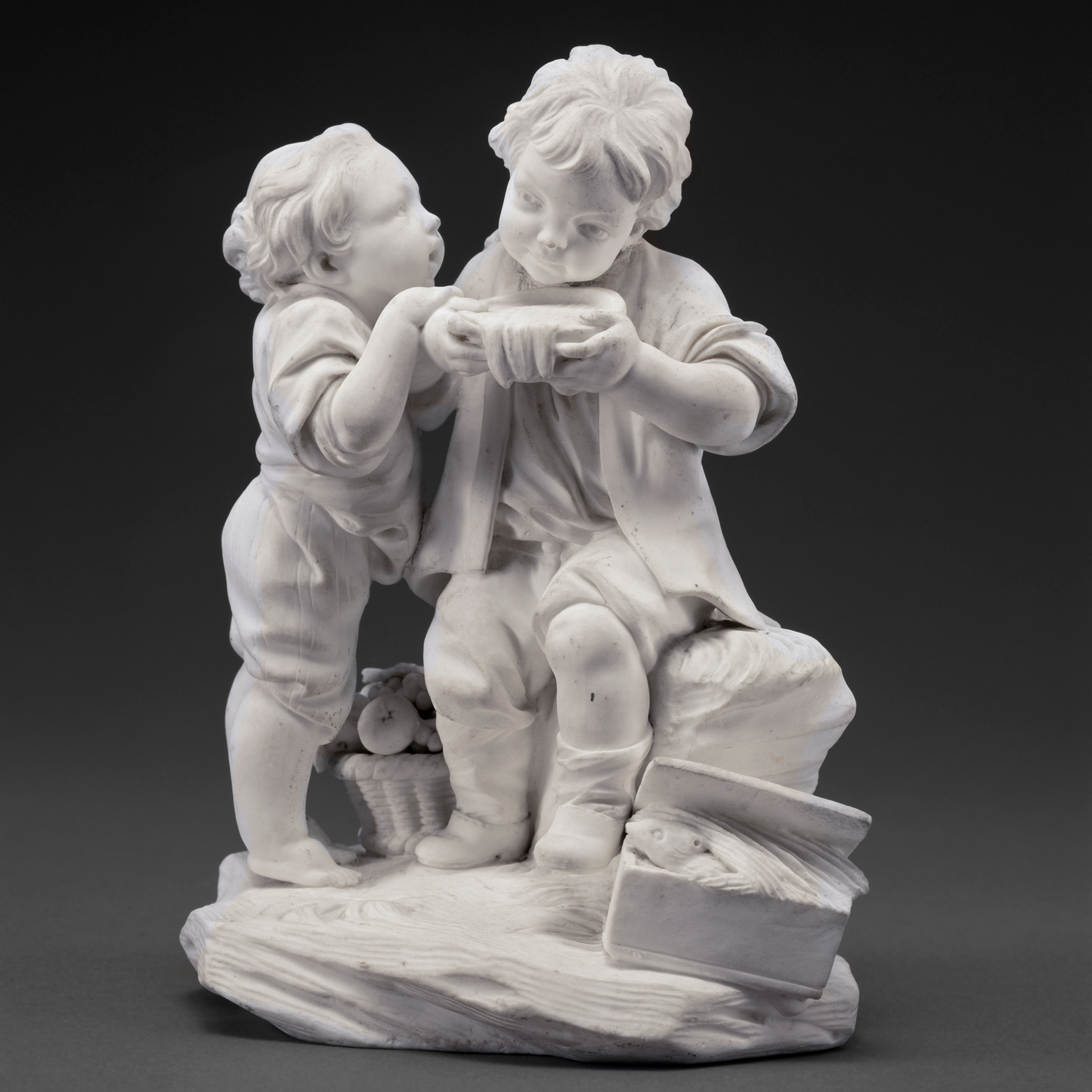
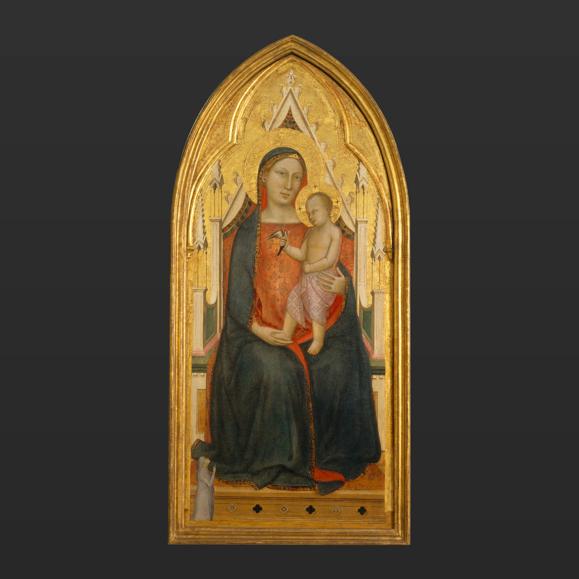
This small porcelain sculpture, which measures less than seven inches tall, is one of a thousand remarkable objects found in SAM’s Wyckoff Porcelain Room. It’s a reminder that every object here has a story. Through this work, Children Drinking Milk, we learn the story of European porcelain collecting in Seattle among a group of women with a strong desire for learning, who had the wherewithal to work with knowledgeable dealers, grow spectacular collections, and then share their objects with SAM and all of its visitors.

Children Drinking Milk, made at the Sèvres Manufactory between 1766 and 1773, is an example of unglazed biscuit porcelain.[1] This technique allowed for the modeler, Etienne-Maurice Falconet (French, 1716-1791), to create detailed designs which wouldn’t be diminished by glazing. For Children Drinking Milk, the unglazed technique allowed Falconet to create details such as the older boy, enjoying the bowl of milk, looking cunningly out of the corner of his eye at a younger boy, who is anxiously waiting for his turn. [2] Falconet, a court sculptor and chief modeler in the Sèvres Manufactory, is one of the most well regarded modelers of biscuit porcelain. He was adept at translating the drawings and designs of artists, like François Boucher (French, 1703-1770), into detailed three-dimensional objects like this one. [3] Children Drinking Milk was considered one of the “Falconet children” representing characters familiar on the streets of eighteenth-century Paris.[4]

So how did Children Drinking Milk get here?

Eighteenth-century European porcelain collecting in Seattle really developed out of the interest of one woman, Blanche M. Harnan (American, ca.1888-1968). Harnan’s interest originated as a result of a study group in which she was involved that focused on world geography and culture. Through her daughter’s interest in teapots, she discovered that the study of ceramics provided a rewarding history of styles and taste in eighteenth-century Europe. Harnan acquired an extensive research library and began collecting European porcelain for study purposes. Her enthusiasm attracted other Seattle women and, under her leadership, the Seattle Ceramic Society was founded in the 1940s.[5]

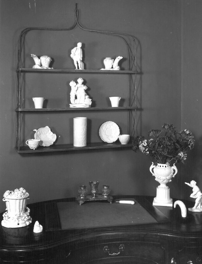
In the 1950s and 1960s, the group established a relationship with New York porcelain dealer, William H. Lautz Antique Porcelains, one of the premier European porcelain dealers in the US. Because Lautz and the Seattle Ceramic Society were 3,000 miles apart, an interesting way of doing business arose between the two. Lautz would photograph items from his showroom and send them along, with corresponding descriptions and price lists, in binders to the Society. The members would make their selections and notify Lautz. Lautz would carefully pack the items in a crate and send them to Seattle. The crate would be unpacked, and then returned, empty, with a check in the bottom for payment. Lautz would refer to this as his “Seattle scheme.”[6] We know from documentation that Children Drinking Milk came from Lautz. The Bullitt Library holds several of Lautz’s binders sent to the Seattle Ceramic Society and the work appears several times. In a letter sent from Lautz—after the piece was donated to SAM—he reveals his own insights on the piece:

“The French name of the figure, or group rather, that I have called the soup or milk drinkers is ‘Les Gourmands’ or ‘Enfant Buveurs de Lait.’ We might even call them the greedy ones…”[7]

Blanche Harnan continued developing her own collection and leading the Seattle Ceramic Society, which would grow to three units and garner more than sixty members. She would also develop an important affiliation with the Seattle Art Museum. Harnan was appointed Honorary Curator of Porcelain in 1954, “in recognition of her knowledge in a specialized field and in appreciation of her service to the Museum.”[8] At the time, the museum was beginning to build its European porcelain collection and welcomed exhibitions of the Society’s collections, like the 1956 exhibition, 18th Century English Porcelain: A Special Exhibition. The exhibition was arranged and the catalogue written by Harnan and another important Seattle Ceramic Society member, Martha Isaacson (American, 1901-2000).

Since the days of those exhibitions, many of the Seattle Ceramic Society members have generously given objects in their collections to SAM. Many of those are currently on view in the Wyckoff Porcelain Room. Importantly, several significant pieces in SAM’s European porcelain collection were donated to SAM by the Seattle Ceramic Society in honor of Blanche M. Harnan—note “Blanche M. Harnan Ceramic Collection, Gift of the Seattle Ceramic Society” on an object’s credit line.

I wonder what we can learn from those other 999 objects?

– Traci Timmons, Librarian

Images: Children Drinking Milk, 1766-1773, Sevres Porcelain Manufactory, Model by Etienne-Maurice Falconet (French, 1716-1791). Soft paste porcelain, 6 5/8 x 5 3/8 x 3 7/8 in. (16.8 x 13.7 x 9.9 cm), Blanche M. Harnan Ceramic Collection, Gift of the Seattle Ceramic Society, Unit 2, 56.179. Photograph sent in binder to the Seattle Ceramic Society showing Children Drinking Milk in William H. Lautz Antique Porcelains, New York, 1950s.
[1] This is the name given to porcelain and other pottery after having undergone the first firing, and before being glazed, painted, or otherwise embellished. For more, see: Gordon Campbell. “Biscuit.” Grove Art Online. Oxford Art Online. Oxford University Press, accessed September 20, 2017, http://www.oxfordartonline.com/subscriber/article/grove/art/T2070959.
[2] Emerson, Julie, Jennifer Chen, and Mimi Gardner Gates. Porcelain Stories, From China to Europe. Seattle: Seattle Art Museum, 2000, pg. 216
[3] Savill, Rosalind. “François Boucher and the Porcelains of Vincennes and Sèvres.” Apollo 115, no, 241, pp. 162-170.
[4] “Eighteenth-Century Porcelain in Seattle.” Antiques 85 (January 1964), p. 82.
[5] Emerson, Julie. The Collectors: Early European Ceramics and Silver. Seattle: Seattle Art Museum, 1982, pp. 6-7.
[6] Nelson, Christina H. and Letitia Roberts. A History of Eighteenth-Century German Porcelain: The Warda Stevens Stout Collection. Memphis: Dixon Gallery and Gardens; Easthampton, MA; New York: Hudson Hills Press, 2013, p. 20. Also see Kuhn, Sebastian. “Collecting Culture: The Taste for Eighteenth-Century German Porcelain,” in Cassidy-Geiger, Maureen et al. The Arnhold Collection of Meissen Porcelain, 1710-50. New York, NY: Frick Collection in association with D. Giles London, 2008, p. 107-108.
[7] Letter to SAM Registrar’s Office from William Lautz dated July 9th, 1965.
[8] Seattle Art Museum. Annual Report of the Seattle Art Museum: Forty-Ninth Year, 1954. Seattle Art Museum Libraries: Digital Collections, accessed September 21, 2017, http://samlibraries.omeka.net/items/show/29.

Object of the Week: Sea Change

“It’s an important painting on several levels. It’s really important within the Seattle Art Museum collection because it’s the only Pollock painting on display in Washington state. It’s a painting that marks the transition from his earlier style of painting to his classic drip technique.” – Nicholas Dorman, SAM Chief Conservator

We’re revisiting this video of our Chief Conservator working on Jackson Pollock’s Sea Change in 2014. In Nicholas Dorman’s words, the rocks and textures of the painting mean “it’s a brutal swab shredder” to remove a varnish that was applied to the painting in the 1970s. This particular varnish would have changed color over time and influenced the experience of the painting. See what Sea Change looks like now, on view in Big Picture: Art after 1945.

Artwork: Sea Change, 1947, Jackson Pollock, American, Artist and commercial oil paint, with gravel, on canvas, 57 7/8 x 44 1/8 in. (147 x 112.1 cm), Gift of Signora Peggy Guggenheim, 58.55, © 2007 The Pollock-Krasner Foundation

Object of the Week: Virgin and Child with Donor

Seattle has been under a smoky haze for days now because of forest fires north, east, and south of us. Ash covered my kitchen table yesterday morning. The sun no longer sparkles—it looks like an opaque orange egg yolk, and its light struggles to get through the smog. If we were in the midwest I would think a tornado was imminent. Meanwhile, on the other side of the continent, Harvey and Irma have battered their way through neighborhoods wielding the weapons of wind and water.

When I was thinking about an object to write about for this unsettling week, I considered atmospheric abstractions; a Dutch painting about an explosion in a gunpowder factory; a hazy landscape. But then I had another thought. These massive climate events make me feel small and helpless. What have people in the past done in the face of such intimidating natural force? They turned to higher powers.

In ancient civilizations people made offerings to the gods. Later, supplications could be made to royalty, once believed to be divinely endowed. But in 14th-century Christian Europe, most prayers were directed heavenward—to God, his son Jesus, the Virgin Mary, or a pantheon of saints, each associated with specific conditions or complaints. Saint Christopher was supposed to protect you if you were traveling; Saint Roch was invoked against the plague; Saint Martin of Tours was the patron of the poor. For protection from bad weather, people turned to the little known Saint Medard.

We don’t have an image of Saint Medard, but we do have an image of a man kneeling in earnest prayer as he gazes up at the Madonna and Child.

The figure is easy to miss because he is so much smaller than the Virgin and Child who are the main subject of the painting, originally the central panel of an altarpiece that he paid to have painted. This man was not asking for deliverance from a momentary crisis such as a flood or fire. He was thinking longer term and bigger picture—specifically, eternal life beyond this brief earthly existence. For him, the Virgin Mary represented solace through her various roles: protective mother, Queen of Heaven, and embodiment of the living Church.

I love this painting, which is currently undergoing conservation and will be back on view in the European galleries by the end of this year. In the past I have always focused on the serene splendor of the Virgin, who remains a loving mother while embodying queenly demeanor. But, feeling small these days in the face of catastrophic world events, I feel a new identification with that tiny donor, praying away for all eternity.

– Chiyo Ishikawa, Susan Brotman Deputy Director for Art and Curator of European Painting and Sculpture

Image: Virgin and Child with Donor, late 1340s, Bernardo Daddi, Italian, Florence, active ca. 1280-1348, egg tempera with gold on wood, 43 x 18 1/2 in., Samuel H. Kress Collection, 61.151, photo: Eduardo Calderon.

Object of the Week: Diversion Tunnel Construction

Viewers of this photograph, Diversion Tunnel Construction, Fort Peck Dam, Montana, 1936, by Margaret Bourke-White (American, 1904–1971) will likely appreciate the machine-age composition, the eccentric geometric design, and the surprising beauty evoked in a steel liner. For this Labor Day edition of Object of the Week, however, I’d like to look more closely at the worker, crouched down, performing his labor and appreciate Bourke-White’s first associations with social documentary photography.

Bourke-White began her career in the 1920s and quickly became recognized for her images capturing machines, factories, and commodities of the industrial age. She was working on corporate commissions when the great financial collapse of the late 1920s and early 1930s began to alter profoundly the American economic landscape. Subsequently, she began turning her focus from symbols of industry to human subjects directly affected by the Great Depression.¹

Bourke-White became a staff photographer for the new Life magazine in 1936 and photographing the construction of the Fort Peck Dam in northeast Montana was her first assignment. The Fort Peck Dam was part of President Franklin Delano Roosevelt’s New Deal program that responded to the devastating poverty and unemployment of the day.

Life reported: “The dam is intended to give work to Montana’s unemployed and incidentally to promote carriage of commerce on the Missouri [River]… It has paid wages to as many as 10,000 veterans, parched farmers and plain unemployed parents…”² The Army Corps of Engineers, ultimately responsible for the dam’s construction, estimated the number of workers to be even higher.³

Historian, Rafe Sigmundstad, describes the construction of the dam’s diversion tunnels—of which the steel liner shown in Bourke-White’s photograph is a part—giving us a sense of the dangerous work needed to complete the complicated dam structure.

“The Missouri River flows through four diversion tunnels running under the east abutment of the Fort Peck Dam. How they got there is quite a story. Gangs of workers took turns cutting into the shale with coal saws that would pivot about an axis to make a 15-foot cut. Then the material was blasted out of the tunnel, scooped into railcars and removed while more digging commenced. This happened day in and day out. Three shifts totaling 4,000 men worked on the tunnels day and night, removing about 5 million cubic yards of material to make way for the tunnels. Residents grew used to the constant noise of the blasting. Serious landslides occurred during the excavation, due to bentonite fault seams in the bedrock. The bedrock itself, known as bearpaw shale, was extremely high in water volume and some 300 yards thick.”4

In addition to the construction photos, Bourke-White documented the people and the newly constructed Fort Peck City built by the Army engineers to house the workers on the dam. The city was built to house the workers, not their families. For additional housing, rent was charged which left the married worker without enough money to house the family elsewhere. Consequently, workers with families moved farther afield into self-constructed shanty towns.5

When the editors of Life sent Bourke-White on this assignment, what they expected were the construction photos that only Margaret Bourke-White could take, but what they got was a human document of American frontier life.6 On this Labor Day, take a moment to think about the human effort that went into constructing our roads, bridges, dams, office buildings, and homes.

—Traci Timmons, Librarian*

*This author acknowledges the negative impact the Fort Peck Dam had on the Fort Peck Assiniboine and Sioux Tribes. To learn more, read The History of the Fort Peck Assiniboine and Sioux Tribes, 1800-2000 by David Reed Miller (Helena, Mont: Fort Peck Community College, 2008), p. 319-344.

Image: Wind Tunnel Construction, Fort Peck Dam, Montana, 1936, Margaret Bourke-White, gelatin silver photograph, sheet: 20 x 16 in. Gift of friends in memory of Willis Woods, 88.24, © Time Inc., All Rights Reserved
¹ Corwin, Sharon. “Constructed Documentary: Margaret Bourke-White from the Steel Mill to the South” in Corwin, Sharon, Jessica May, and Terri Weissman. American Modern: Documentary Photography by Abbott, Evans, and Bourke-White. Berkeley, Calif.: Univ. of California Press, 2010, p. 108.
²Life. “Franklin Roosevelt has a Wild West” in Life vol. 1, no. 1 (November 23, 1936), p. 10.
³U.S. Army Corps of Engineers. Omaha District. Fort Peck Dam. http://www.nwo.usace.army.mil/Missions/Dam-and-Lake-Projects/Missouri-River-Dams/Fort-Peck/ (accessed 8/16/2017).
4 Sixty-one workers lost their lives. Sigmundstad, Rafe. Fort Peck Dam. http://www.fortpeckdam.com/historypages/?p=10 (accessed 8/16/2017).
5 Life, p. 10.
6 Bourke-White, Margaret, and Theodore M. Brown. Margaret Bourke-White, Photojournalist: March 15 – Apr. 23, 1972; Andrew Dickson White Museum of Art. Ex. Cat. Ithaca, New York: Cornell University, 1972, p. 59.

Object of the Week: Audience of a Prince

“I think of Chinoise as very much a part of the conversation of the global diaspora and the spreading of cultures from one place to another.” – Saya Woolfalk

Hear from mixed media installation artist Saya Woolfalk on her favorite things in SAM’s collection and gain a new perspective on the Chinoise Tapestries, one that layers the histories evident in the intricate embroidery of these objects. The Audience of a Prince tapestry is part of a suite of four European chinoiserie tapestries from the workshop of Judocus de Vos that depict imaginary interpretations of life in Asia. In the early eighteenth century (circa 1703-07), Judocus de Vos owned the largest workshop in Brussels, with twelve looms. The tapestries feature magical scenes of exotic figures clothed in flowing robes and elaborate headdresses, fantastic animals, botanical studies, and purely imaginative flights of fancy. This suite of Flemish tapestries was commissioned for the Duke Leopold-Philippe d’Arenberg’s residence in Brussels in 1717, when it was fashionable for wealthy Europeans to create rooms evoking an exotic, foreign atmosphere.The d’Arenberg family of Edingen (Enghien, Belgium) had a long history of collecting tapestries. Recent research in the d’Arenberg archives by Koenraad Brosens, University of Leuven, has uncovered three documents that record these tapestries. The earliest document records the original commission of 1717. The four tapestries in SAM’s collection are the only tapestries from this suite known to exist today.

Artwork: “Audience of a Prince”, Judocus de Vos, commissioned in 1717, Wool, silk, metallic threads, 146 7/16 x 58 1/4 in. (370.8 x 148 cm), Gift of Guendolen Carkeek Plestcheeff Endowment for the Decorative Arts, Anonymous, General Acquisition Fund, Mildred King Dunn, Richard and Betty Hedreen, Decorative Arts Acquisition Fund, Margaret Perthou-Taylor, Bill and Melinda Gates Foundation Art Acquisition Fund, Ann Bergman and Michael Rorick, Mr. and Mrs. David E. Maryatt, 2002.38.4.

Object of the Week: Les Demoiselles d’Alabama: Vestidas

Sometimes our reactions and reflections on artwork do not take the shape of words. Sometimes the most accurate portrayal of emotion and thought is an ephemeral, physical reaction. David Rue, dancer and SAM’s Public Programs Coordinator, had just such a reaction to Robert Colescott’s Les Demoiselles d’Alabama: Vestidas while leading an Art & Social Justice Tour in January of 2017. Enjoy this video of Rue’s response to the vibrant colors of Colescott’s “outsider’s” perspective. Colescott’s artistic identity as an African American painter led to a lifelong practice of inventing new narrative scenarios to address the persistent racial tensions in the US. See more work by Colescott in Figuring History: Robert Colescott, Kerry James Marshall, Mickalene Thomas opening at SAM, February 15, 2018.

Artwork: Les Demoiselles d’Alabama: Vestidas, Robert Colescott, American, 1925—2009, 1985, acrylic on canvas, 96 x 92 in., General Acquisition Fund, Bill and Melinda Gates Foundation Art Acquisition Fund, Margaret E. Fuller Purchase Fund, and Patricia Denny Art Acquisition Fund, 2016.12.

Object of the Week: House of the Head

This summer, thousands of people are stepping into Infinity Mirror Rooms filled with lanterns, polka dots, pumpkins, and 115 mirrors. As of this week, 90,000 visitors in Seattle have seen infinity in Yayoi Kusama: Infinity Mirrors. Every Infinity Mirror Room makes the most of mirrors. What you may not realize is that mirrors have a long history in art and you can seen some of that history in SAM’s other galleries. The oldest mirror on view is from the 3rd century BC, an Etruscan bronze with an incised back depicting a woman who only wears a cap, necklace, and fancy shoes. Three figures stare at her, as if wondering if she forgot to put on a dress—but it happens to be a scene of seduction by Aphrodite, the Goddess of Love.  (48.36)

There are other small mirrors incorporated into sculptures on view: the Box of Daylight Raven Hat (91.1.124) on the 3rd floor and SAM’s very own mirrored room, which suspends 1,000 porcelains in a gilt rimmed infinity in the renowned Porcelain Room. On my walk through the galleries, however, one mirrored object calls out for attention. It only has four mirrors and is not an attention grabber—unless you happen to be tuned into art of the Yoruba culture of Nigeria. (93.157)

What looks like a small temple, or a crown, has an unusual name and concept to back it up. In Yoruba, it is called an ile ori, or House of the Head. One’s ori is not only your head, but your destiny. Before a person is born, he or she must visit the molder of spiritual heads to choose a destiny and personality which guide one’s character and fate. It is inside you, invisible to others, and is your “inner head,” which is embodied by a small abstract sculpture that is kept hidden in its own house. As seen in this house for the head, it has geometric shapes and numerical calculations, like any residence. Cowrie shells coat the entire surface, befitting the head of a wealthy person. Mirrors embellish the openings, flashing to signal the presence of a significant head held inside. When you want to “get your head together,” this house allows you to concentrate on how to align your thoughts with your destiny.

As I look at this quiet shrine, it leads me back to admire what the Yoruba Supreme Being, Odumare, stands for. He is the Prime Mover and Infinite Intelligence who created himself/herself and the universe. One Yoruba diviner and professor, Kola Abimbola, says the Yoruba have a GPS for life with a system and oracle known as Ifa. In search of more GPS and a dose of Yoruba confidence and creativity, I took a spring vacation in Nigeria. I was there to witness friends becoming chiefs and in the process, a spirit from the otherworld sat down to enact a hilarious conversation about the joys and pitfalls of raising children. Here she is making her point, offering her own version of Infinite Intelligence.

– Pam McClusky, Curator of African and Oceanic Art

Images: House of the Head (Ile Ori), 20th century. Nigerian, Yoruba, cloth, mirrors, cowrie shells, leather, Gift of Mark Groudine and Cynthia Putnam, 93.157. Mirror with scene of the Judgement of Paris, 3rd century BC., Etruscan, Bronze, Eugene Fuller Memorial Collection, 48.36. Sketch of scene on the mirror back Egungun Mother in Erin Osun, 2017, Photo: Pam McClusky.

Object of the Week: Saint Augustine in Ecstasy

“Murillo is an exceptional painter of human emotion, which is one reason why this is my favorite painting in SAM’s collection.”– Jeffrey Carlson, SAM Collections Coordinator

This is Jeffrey Carlson’s last Object of the Week post as his last day at SAM was yesterday! 😞

To say goodbye, we live streamed one last our charming Collections Coordinator speaking about his favorite painting in SAM’s collection, Saint Augustine in Ecstasy by Bartolomé Murillo. While working as SAM’s Collections Coordinator Jeffrey contributed 93 Object of the Week posts to our blog, sharing his knowledge and love of SAM’s collection of artwork from around the world with audiences far and wide. He will be missed, but we wish him well on his next adventure!

Artwork: “Saint Augustine in Ecstasy” by Bartolomé Estebán Murillo, 1665–75. bit.ly/SAMArtAug

Object of the Week Special Edition: The Western Mystery

This blog series is designed to focus on art works on SAM’s collection but this week we’re bringing you a special feature on Spencer Finch: The Western Mystery. This nebulous formation of suspended glass panes is currently installed at the Olympic Sculpture Park in the PACCAR Pavilion and will be on view through March 3, 2019. So, while not actually an artwork owned by SAM, this piece will be hanging above the heads of visitors to the sculpture park for years to come. Find out more about the artist and this mesmerizing art work from Carrie Dedon, Assistant Curator of Modern & Contemporary Art.

SAMBlog