Object of the Week: Water Babies
Once a founding member of the Society of Independent Artists, a close friend of fellow member Marcel Duchamp, an artist called original and innovative, and an active participant in the programs of the Société Anonyme—John Covert lived and died, well, anonymously.
Given Covert’s very short career, we should not be surprised that he is not a household name. His period of creative maturity lasted eight years, from 1915 to 1923. A stay in Paris just before this period proved uncharacteristically unfruitful—Covert later lamented that he wasn’t able to connect with the artist-intellectual circle there—and the disappointment of the Paris trip was a harbinger of a sad fortune. Covert returned to the US and contributed to an important moment for modern art, playing his role as a founder of the Society of Independent Artists, and serving as its first secretary in 1917. Working from his studio in New York, Covert received brief visibility with a solo exhibition of his paintings at M. de Zayas Gallery. Little came of it; in the larger art world he remained unknown and unappreciated. Pressed by poverty, he found himself unable to eat regularly, with no income to show for his artistic endeavors. He finally closed his studio in 1923.
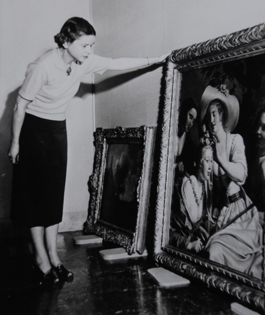
During the second quarter of the 20th century Covert’s work was known only to friends and one-time peers. So few of his works were seen publicly that the artist did not develop any kind of reputation. He was actually thought to have destroyed all his works when he closed his studio, but that widely held belief changed in 1959, when eight Covert paintings arrived at SAM. In fact, the artist’s friend Kathleen Lawler had preserved some of Covert’s works, and it was Lawler’s brother-in-law that donated them to the museum. On September 18 of that year, SAM director Dr. Richard Fuller wrote a note of thanks to the donor, Paul Denby Mackie, expressing his admiration for Covert’s work, saying “Although he is not well known he played an important part in the development of modern art which I feel sure will be more widely appreciated in years to come.” Kudos to Dr. Fuller for seeing what many directors, especially at that time, would not have seen.
The arrival of the Covert paintings at SAM encouraged new study of the artist’s work. The Dallas Museum for Contemporary Arts included Covert in its 1960 exhibition American Genius in Review. It’s cruel that he died a recluse that same year. The visibility of the Dallas exhibition provoked more interest, leading to graduate dissertations and theses that have placed Covert’s work amid the traditions of symbolist art and New York Dada. Four of Covert’s works have essentially been on permanent view since SAM’s expansion in 2007. He is, as Dr. Fuller anticipated, more widely appreciated than in 1959. However much Covert’s legacy grows in the future will depend to a large extent on SAM’s collection of Covert paintings (now seven), their exhibition and reception.
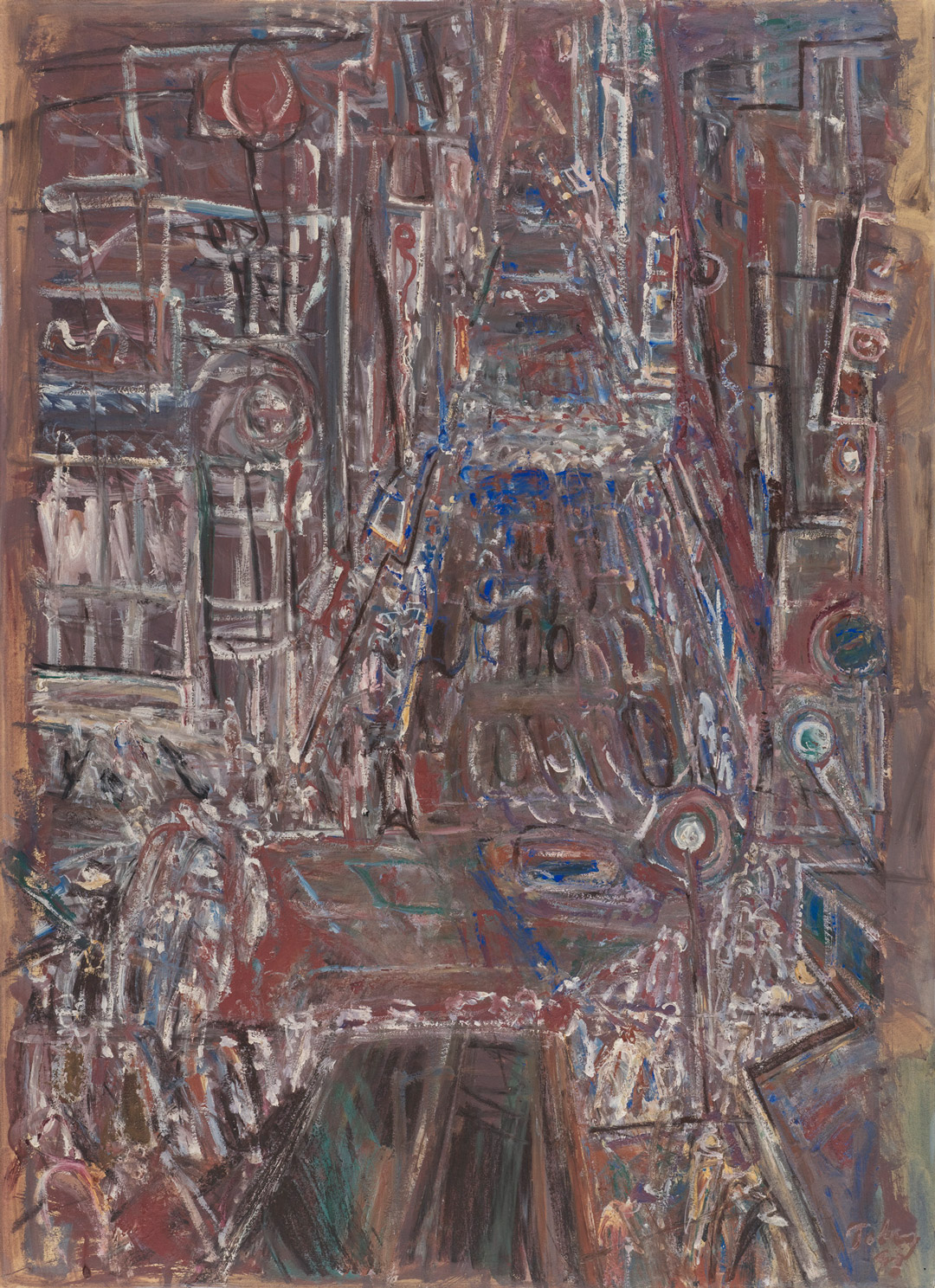
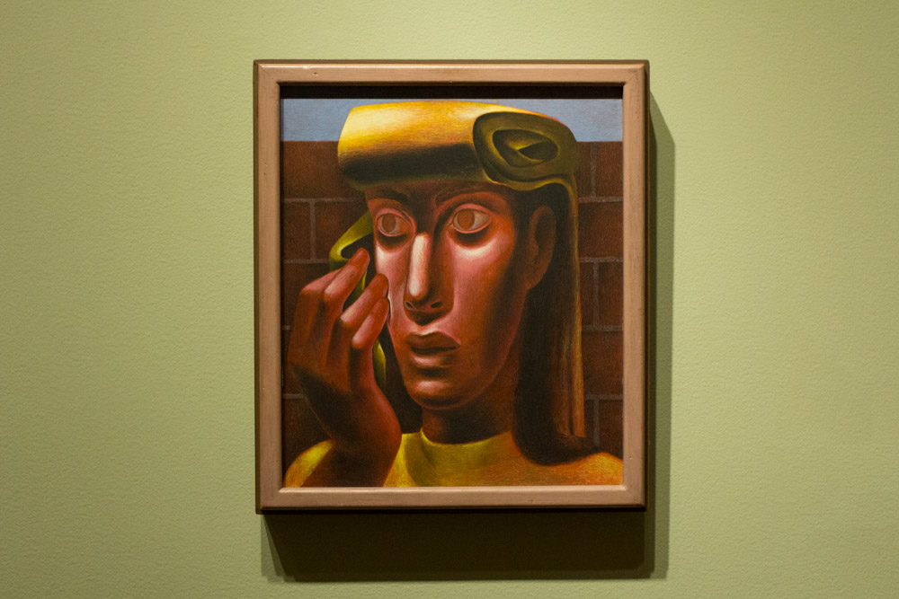
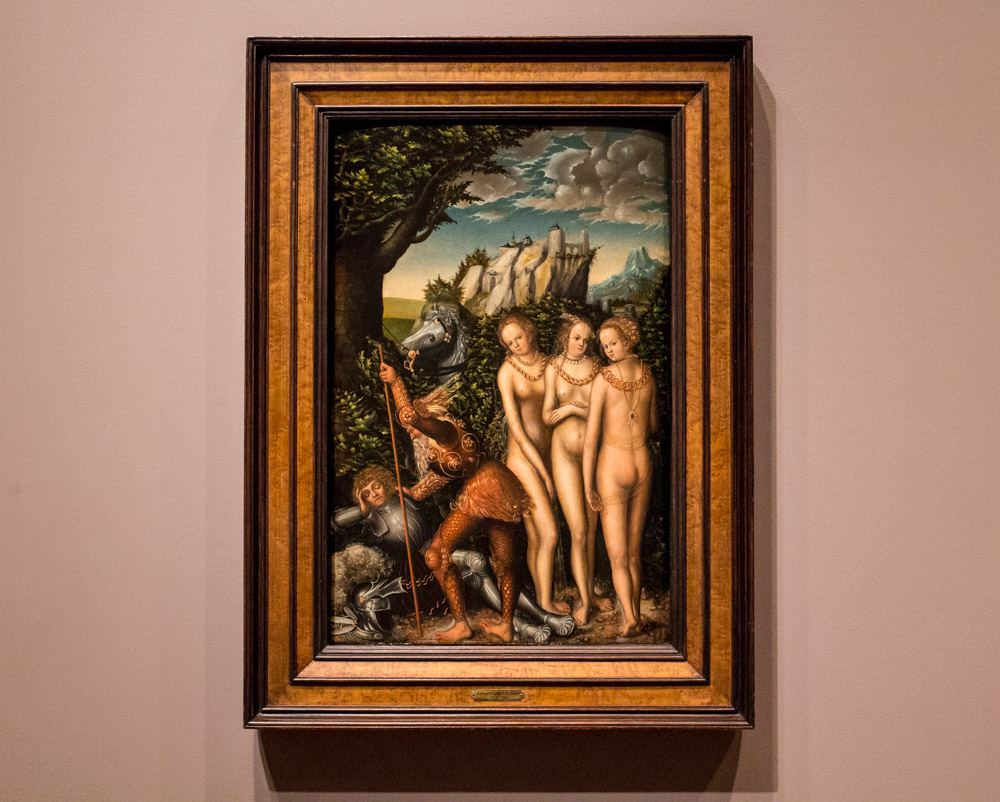
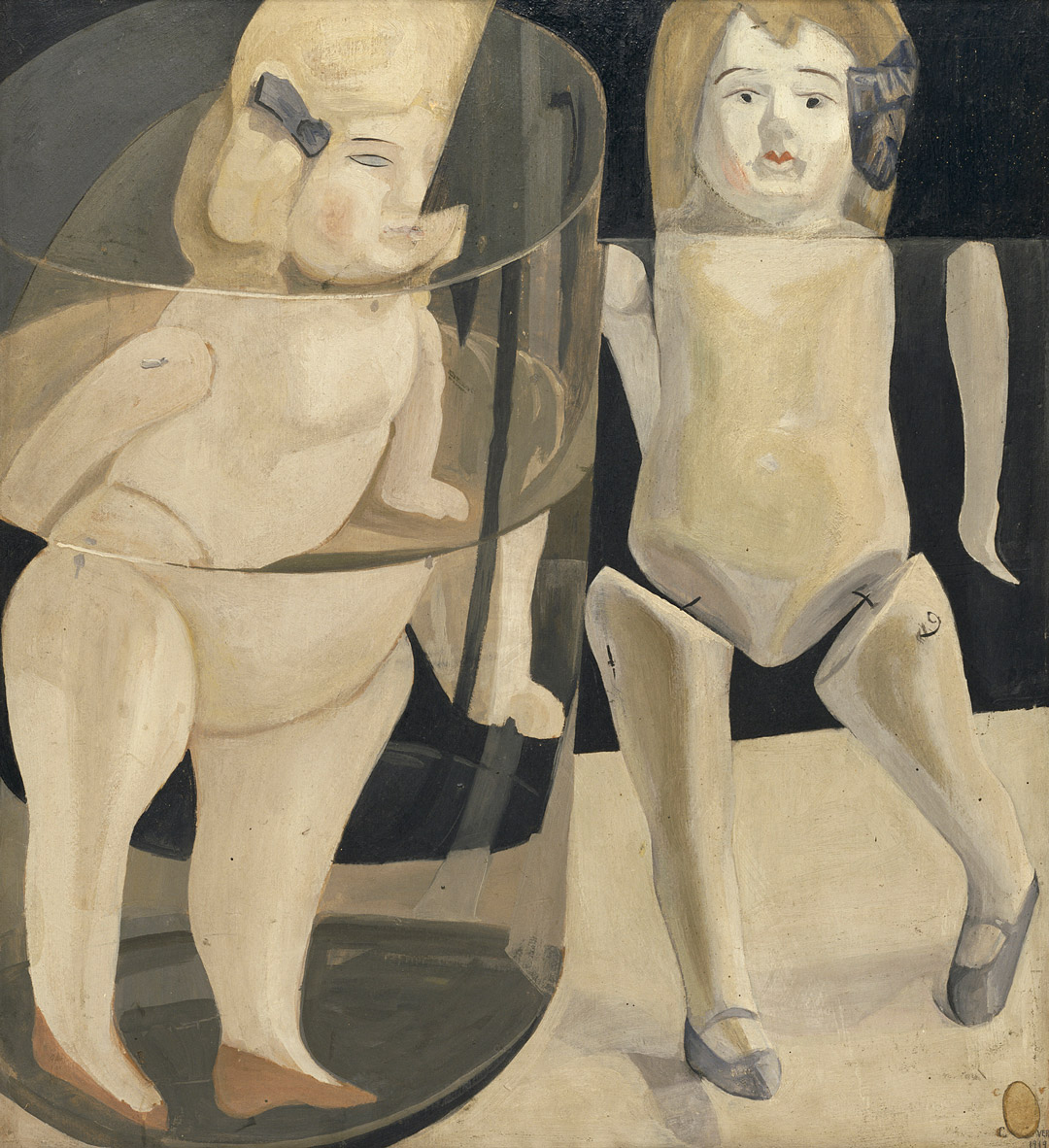
I find Covert’s work a quirky kind of fascinating, and especially magnetic to me is Water Babies. In this painting, the artist plays with the visual phenomenon of refraction. A peculiarity of physics, refraction makes our eye see an object bending and changing form as it is partially submerged under water, while our mind understands that the object itself remains unchanged. By painting the visual effect of refraction, Covert offers the viewer a chance to muse on reality, our perception of reality, and the slippery boundary that separates the two. The dolls would be creepy enough rendered as straight illustrations, but with certain parts disjointed and enlarged, they are like the beginnings of a bad horror film. Water Babies is memorable, even if the artist’s name isn’t.
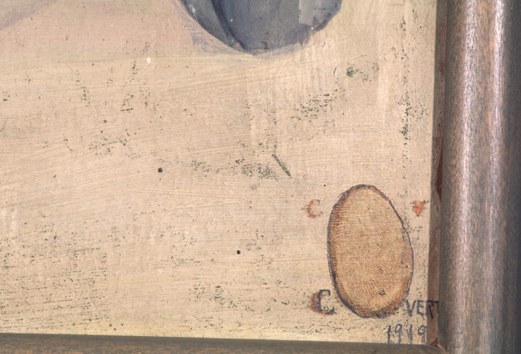
At the lower right, Covert has signed the painting, with his fingerprint standing in to form the “O.” It’s not an especially graceful signature. To the left of the thumbprint, near its top, he incised the painting with a “C”, and opposite the thumbprint, a “V”—apparently an unsatisfactory first attempt. The finished signature, along the bottom of the thumbprint, seems to have been first incised and then traced in with graphite. The thumbprint, too, is encircled in graphite. Altogether, the signature serves as an odd, very personal, memento of a distinctive artist who may never be truly recognized.
—Jeffrey Carlson, SAM Collections Coordinator