Object of the Week: Head of a Woman

Our mission statement here—“SAM connects art to life”—truly guides much of our work and many of the decisions our leadership team makes. We see art as a response to life and as something that should be accessible to everyone in their different journeys. Believing our art is relevant, we want to show people how it’s relevant. It’s why we have a blog series where we talk about our collection objects!

In the museum space, we also connect art to art. When SAM expanded in 2007, the curators made a point of bringing their permanent collection displays together in thoughtful ways. We published a book at the time, called Bridging Cultures, which outlined the curators’ thinking. If art connects to life, and if all of us who share life are interconnected, then all art is somehow linked too. Finding those points of connection can be difficult. I love wandering our permanent collection galleries because these connections across people and across time become clearer and more meaningful to me.

Mexican American artist Emilio Amero was born in Ixtlahuaca in 1901. He trained at the Fine Arts School of San Carlos, and in 1924, he worked as an assistant to Diego Rivera on a mural project at the Ministry of Education Building in Mexico City. In 1955 Amero finally realized his own mural, not in his native Mexico, but in Norman, Oklahoma, where he had taken up a teaching post at the university about a decade earlier. He worked in a wide range of materials over his career, but his work in lithography was particularly significant. So, why are three Amero paintings, including this striking Head of a Woman, hanging in our gallery of Pacific Northwest Modernism, alongside works by Mark Tobey and Guy Anderson?

From 1941-1947, Amero brought his talents to Seattle. Invited to teach at the University of Washington on a Walker-Ames Fellowship, Amero established a reputation as a skilled artist and teacher. A 1942 advertisement for a print shop Amero ran quotes Walter F. Isaacs, then director of the School of Art at the University of Washington, who calls him “one of the most able and versatile art teachers in this country.” In 1943 Amero moved to the faculty at Cornish School of the Arts. For the school’s 30th year, opening of September that year, he served as director and instructor of painting, drawing, commercial and graphic arts—joined on the faculty, as he is today in our galleries, by Guy Anderson, who taught children’s art. Not to brag on us, but we have an important collection of Amero paintings that is a monument to his time here.

Amero Ad in Seattle Times

Like other notable artists working in Seattle at the time, many of whom grew up in the Pacific Northwest, Amero was geographically far from the forms of Modernism developing in New York. His vision was essentially different because it was rooted in Mexico. There, Modernism developed after the Social Revolution of 1910, as artists like Amero and Rivera shrugged off what had become an oppressive European influence, looking instead to ancient indigenous Mexican art. The heritage of Amero’s native Mexico inspired his form of Modernism much like the land and peoples of the Pacific Northwest inspired Tobey and Anderson.

—Jeffrey Carlson, SAM Collections Coordinator

Image: Head of a Woman, 1947, Emilio Amero (Born Ixtlahuaca, Mexico, 1901; died Norman, Oklahoma, 1976), tempera on panel, 18 1/4 x 15 1/2 in. Seattle Art Museum, Eugene Fuller Memorial Collection, 47.134, Photo: Natali Wiseman. Caption for ad: Seattle Daily Times, August 9, 1942, p. 30.

Object of the Week: Seated Figure with Conch Shell

Some historic cultures have made learning about them easy for us by producing the things they did. The size and significance of their monuments or the influence of their visual art and literature make sure that these people are known and remembered. Other cultures have left a quieter presence that requires investigating, digging, researching, and lots of thinking about relatively few objects. To me, these cases are all the more amazing because they show us how much we can learn with only a little bit to go on.

SAM’s Seated figure with conch shell (ca. 300 B.C.–A.D. 400) hails from one of these materially quiet cultures: early Colima, in West Mexico. The state of Colima, with its capital city also called Colima, lies straight West of Mexico City, and its landscape is dominated by the Volcán de Colima—or the Volcán de Fuego—one of the most active volcanoes in Central America.

Scholars in Pre-Columbian (before Europeans arrived) Mesoamerica (a region and grouping of indigenous cultures in what is now southern Mexico and northern Central America) have learned much of what they know about cultures in West Mexico from figures like this one. Unlike other regions of Mexico that are visibly marked by Aztec temple complexes and monumental stone sculptures, West Mexico has left today’s art historians much smaller mementos. In Colima, specifically, ceramic figures are the most common form of material culture to survive. A lot of these were found in burial tombs, so they likely had a significant place in the Colima people’s vision of the afterlife.

In SAM’s figure, the forms are essentialized and rounded. The facial features are simple shapes: a long, angular nose; oval, protruding eyes with slits across the middle that look a lot like coffee beans. Triangular ears point outwards from the sides of his head. The circular holes at their centers seem primed for functional use; maybe he once donned a pair of colorful earrings? He has a small mouth with lips turned down slightly, suggesting the seriousness of his role. The figure’s coloring comes from a slip with red pigment applied to the figure by its maker, and the black spots are patina. The all-over smoothness was accomplished by rubbing a stone along the clay surface.

Seated figure with conch shell

The conch shell has special importance to our understanding of this figure and to early Colima, where shell trumpets would sound to mark special ceremonies and community events. The conch also seems to have symbolized wealth and status, and that might have developed from people associating it with these important happenings.

Oh, and that’s a big damn shell! It’s enormous compared to the figure. It matches the length of his torso and has significantly more volume. Why is it so big? Maybe the people in early Colima found really huge conch shells. Maybe the scale is meant to emphasize the importance of the conch shell in the life of the community, with its role extending from important moments in life to the eternity of death. I wonder, too, if the scale suggests something about the size of the figure, meaning that this was a small person—even a child? Personally, I like that reading because it fits with the figure’s relaxed, kind of undignified pose. Imagine he’s just learning to play his shell trumpet, and he’s the figure someone picks to accompany you to the afterlife!

—Jeffrey Carlson, SAM Collections Coordinator

Image: Seated figure with conch shell, ca. 300 B.C.-A.D. 400, Mexican, West Mexico, Colima, ceramic, 14 1/4 x 12 5/16 x 9 5/8 in. Seattle Art Museum, Eugene Fuller Memorial Collection, 64.103, Photo: Natali Wiseman.

Object of the Week: Colored Vases

“An artist can only raise new questions and offer insight into social change after reflecting on the feelings of the time. I don’t see art as a highly aesthetic practice…Rather than thinking of my projects as art, they attempt to introduce a new condition, a new means of expression, or a new method of communicating. If these possibilities didn’t exist, I wouldn’t feel the need to be an artist.” –Ai Weiwei1

“At different times I’ve worked in different mediums. For me, the variation is not an artistic judgment, but a necessary choice. It’s just as normal to eat with chopsticks, as it is to eat with forks or hands. Different circumstances call for different tools. I try to express ideas with the most appropriate available materials and forms.” –Ai Weiwei2

“Making choices is how the artist comes to understand himself. These choices are correlated to one’s spiritual predicament, and the goal is a return to the self, the pursuit of spiritual values, and the summoning of spirits. These choices are inherently philosophical.” –Ai Weiwei3

Ai Weiwei is super active in the world of contemporary art, posting to his Instagram, posing as a drowned Syrian refugeedecorating Berlin’s Konzerthaus with 14,000 life jackets. Not all of the commentary about him is positive, and I’m sure that’s as he would like it. He’s stated in the past that he desires uneasiness; that he deliberately moves away from the self-indulgent comfort of creating things to use his skills or to get praise. He wants to think critically and to act on his convictions. He wants to unsettle and to motivate. Definitely from his own perspective, he is a conceptual artist, a political activist, and an advocate for self-discovery.

Ai’s art still depends—in a really essential way—on its visual impact. The striking visuals he’s able to concoct are the rhetoric he uses to promote his provocative agenda. He may not think of art as a “highly aesthetic practice,” but the work speaks for itself. Just think of his Sunflower Seeds. The work is less than compelling as a printed phrase: “One hundred million hand-sculpted, hand-painted porcelain beads, made to look like sunflower seeds.” As a realized artwork, it captivated people.

Ai thinks about the forms as a means to an end—his end is pointing others to self-consciousness, sparking in us a challenge to accepted systems of belief, provoking critical responses and inspiring action—but they’re still necessary means. They are his way of communicating. He can’t even be sure that his art will communicate what he wants it to do. All he can be sure of is that viewers will experience the physical artwork. Many of us who look at his works will come away with different conclusions; such is the open-endedness of art, politically-driven or otherwise. All we have is the thing, so I say, let’s look closely at it.

SAM’s one work by Ai Weiwei, Colored Vases, is on view at the Asian Art Museum in Volunteer Park. It delivers what it promises. Nine ceramic vases are arranged in a pattern much like a bowling pin setup—there are three rows, with four vases in the back row, three in the middle row, and two in the front row—only the headpin is missing. The artist has applied a base coat of industrial paint in a bold hue—such as yellow, pink, lime green, or plum—to each vase. A second color in high contrast to the base layer covers the lips and shoulder of the vase, then drips down the body. Some vases have long drips like the tendrils of a plant, while others are shorter, like polychrome stalactites. The paint drips are irregular, and they seem natural.

Contrast is especially important to this work: there’s contrast between the traditional form of the ceramic vases and the bright and contemporary paint colors applied to them; contrast between the two colors on one vase, and contrast in the range of colors among the whole group; contrast between the normally grainy texture of a ceramic pot and the flatness of industrial paint. There’s probably contrast, too, between what Ai Weiwei thought of and what you take away.

—Jeffrey Carlson, SAM Collections Coordinator

Sources:

“Reconsidering Reality: An Interview with Ai Weiwei.” In Ai Weiwei: According to What? Edited by Deborah E. Horowitz. Prestel Verlag: Munich, London and New York, 2012. Published in conjunction with the exhibition of the same name, organized by the Mori Art Museum, Tokyo, in association with the Hirshhorn Museum and Sculpture Garden, Smithsonian Institution, Washington, D.C., and displayed at the Hirshhorn Museum and Sculpture Garden, Washington, D.C., October 7, 2012-February 24, 2013; the Indianapolis Museum of Art, Indianapolis, Indiana, April 5-July 28, 2013; Art Gallery of Ontario, Toronto, Ontario, August 31-October 27, 2013; Pérez Art Museum Miami, Miami, Florida, November 28, 2013-March 16, 2014; and Brooklyn Museum, Brooklyn, New York, April 18-August 10, 2014.

“Making Choices.” Translated by Philip Tinari, from The Grey Book, November, 1997. Reproduced in Ai Weiwei. Phaidon Press: New York, 2009.


i. According to What, 38
ii. According to What, 39
iii. Ai Weiwei, “Making Choices,” 128

Image: Colored Vases, 2010, Ai Weiwei (Chinese, born 1957), ceramic with industrial paint, approx. 17 x 22 in. each. Seattle Art Museum, Purchased with funds from the Estate of Robert M. Shields, 2013.33, Photo: Nathaniel Willson.

Object of the Week: Salad Days

Giving tours to young people through our big Jane Lang Davis Gallery in the Modern and Contemporary collection can be difficult. It’s impossible to avoid the fact that there’s a really large painting of a naked woman on the wall! Even if, as the tour guide, one forgets about it momentarily, kids will always bring the attention straight to that piece. Their stifled laughter, or even outright laughter, will probably derail conversation about anything else happening in the gallery. Once my focus is drawn to it, I feel simultaneously uncomfortable and totally compelled by the image. I get why they’re staring and pointing.

There’s a name for the painting with the naked woman: Salad Days. She’s just one half of a two-panel piece that measures seven by fourteen feet, rendering relational discord on a huge scale. The artist is contemporary American painter Eric Fischl. He has been creating uncomfortably naked paintings since the early 1980s, and there are few artists out there who do it better, or with more unsettling creep factor.

Fischl has described himself as a storyteller, an artist who aims to create scenes that are full of meaning. Whether that meaning is positive or negative does not matter to him; whether the viewer’s senses are offended does not matter either. Instead, he’s interested in radical openness and honesty. Many of Fischl’s paintings focus on awkward territory: enduring down time in an unhappy relationship, singing in the shower, or lounging unceremoniously in the buff. Over and over, he confronts viewers with scenes that are unusual for their bare honesty.

Of course there’s a very long history of naked people in art, and Fischl is hardly the first, last, or only artist to engage the subject. Most of these artists are working in one of two traditions: nude art, or naked art. The nude is an idealized figure, on display for the viewer, situated in a context that justifies, or makes more art history appropriate, the lack of clothes. Nakedness is all about the lack of clothes and flying in the face of propriety. Fischl fits squarely in the naked camp.

Venus and Adonis by Paolo Veronese

SAM’s collection has great examples of the nude genre too…

Salad Days pictures a private moment, and in doing so, turns it into something highly public. The woman’s physical nakedness comes to represent a psychological nakedness, where her private thoughts and actions come to the surface. This, like much of Fischl’s work, is a voyeuristic, intimate vignette—not an idealized display set up for our consumption. Imagining two sides of a conversation happening over the phone, he invites us to imagine how others act when we can’t see them. You’ll be thinking about it the next time you’re on a call…

IMAGE: Salad Days, 1984, Eric Fischl (American, born 1948), oil on linen, two panels, 84 x 168 in. Seattle Art Museum, Gift of the Virginia and Bagley Wright Collection, in honor of the 75th Anniversary of the Seattle Art Museum, © Eric Fischl. Venus and Adonis, 1570s, Paolo Veronese (Italian, 1528-1588) and workshop, oil on canvas, 88 3/8 x 66 ¼ in. Seattle Art Museum, Samuel H. Kress Collection, Photo: Natali Wiseman.

“I’ve never seen anything in my life as beautiful as you are.”

Desire was never more perfectly pictured. Photographer George Hurrell captured a magic moment between the lovely Greta Garbo and debonair John Barrymore on the set of the 1932 film Grand Hotel. Here’s hoping your Valentine’s Day is just as dreamy!

—Jeffrey Carlson, SAM Collections Coordinator

Image: Greta Garbo and John Barrymore, ca. 1932, printed 1980, George Hurrell (American, 1904-1992), gelatin silver photograph, 16 1/6 x 18 7/8 in. Seattle Art Museum, Gift of Dr. Farel Rosenberg, 84.220.9.

Object of the Week: Mosaic from the House of Menander with Zeus

One of the things we sometimes say around here about Dr. Richard Fuller, SAM’s founding director, is that he liked to collect things he could hold in his hand, and that maybe this had something to do with his love for rocks and geology. Even while he was planning for the museum’s opening in 1933 and then seeing it through its first years, Dr. Fuller pursued his second passion at the University of Washington. He studied geology through the whole of the 1920s, first earning his bachelor’s, then his master’s, and finally his doctorate, in 1930. Beginning in 1926 he also taught part-time at UW, and that led to his being named research professor in 1940. His connections in the world of archaeology brought him a fortuitous letter that same year.

The letter, reproduced here, came from Charles Rufus “C.R.” Morey, a distinguished professor of art and archaeology at Princeton University. He had recently published a volume on excavation findings at the ancient city of Antioch (The Mosaics of Antioch, published by Longmans, Green and Co. in 1938), a book that would be one of his many contributions to the field of art history. He was also a founding member of the College Art Association, which still remembers C.R. with its annual Charles Rufus Morey Book Award.

Letter to Dr. Fuller from Charles Rufus Morey

Writing on behalf of the Committee for the Excavation of Antioch and its Vicinity, Morey offers Dr. Fuller and the Seattle Art Museum its pick of recently excavated mosaics. As Morey explains, they’re offered at bargain prices—25% to 50% off! Now, one of the reasons I feel a real kinship to Dr. Fuller is that he was always looking for a deal. He was wealthy, but not so wealthy, he figured, that he didn’t need to be smart with his resources and to push them as far as they would go. Thankfully for SAM, Dr. Fuller saw in Morey’s letter a great opportunity to build the museum’s collection of antiquities.

Dr. Fuller responded in a letter dated May 27, 1940, that the museum would like to purchase one item, the “fragment of the Sea God,” adding that he wished to “express our appreciation of the generous opportunity which you present for our participation in the extremely important excavations of your committee.” In SAM’s annual report for 1940, Dr. Fuller describes the chosen mosaic as a “very vigorous portrayal of Neptune.” This is the mosaic now hanging in our ancient art galleries on the fourth floor, titled Mosaic from the House of Menander with Zeus.

Later scholars have identified the main figure as Zeus, and not Neptune, but I would say that he’s very vigorous, indeed. He is seated on a throne, grasping a scepter in his left hand and reaching outward with his right. A halo or nimbus encircles his head and symbolizes his divinity. Almost unbelievably, SAM’s mosaic once formed part of the floor of a luxurious urban villa, about five miles outside of Antioch. Because they were durable and allowed for color and decoration, mosaics were actually used quite often as pavements in former provinces of the Roman Empire. I’ll speak for myself here, but my feet are totally unfit to tread on this, and I’m glad it’s hanging on the museum’s wall instead.

—Jeffrey Carlson, SAM Collections Coordinator

Images: Right: Mosaic from the House of Menander with Zeus, 3rd-4th century, Roman, limestone and marble tesserae, 38 11/16 x 32 1/4 in. Seattle Art Museum, Eugene Fuller Memorial Collection, 40.181.1; Left: Mosaic from the House of Menander with Figure, 3rd-4th century, Roman, limestone and marble tesserae, 15 x 23 1/4 in., Eugene Fuller Memorial Collection, 40.181.2, Photo: Natali Wiseman. Letter to Dr. Fuller from Charles Rufus Morey.

Object of the Week: Anthony of Padua

You simply can’t miss the eye-catching posters and banners all over Seattle advertising our next special exhibition, Kehinde Wiley: A New Republic. When you come for the free opening celebration this week—and do come!—you’ll see huge paintings from private and public collections across the world, including a gem from SAM’s own collection.

Anthony of Padua, a painting in the very traditional method of oil on canvas, measures six feet tall by five feet wide. The figure is imposing, the decoration bright and busy. His is an empowering posture borrowed from the aristocratic patrons of art history and conferred to a young person of color. The rococo frills that surround him speak of the joy of excess.

He brings together, as Kehinde Wiley’s work often does, two worlds of swagger. The original swagger portrait (a real term in art history used even by stuffy academics) developed in Europe in the 17th and 18th centuries. At the time, those who had the funds to do so might pay an artist to paint them in a very flattering pose, wearing elegant and expensive dress, accompanied by symbols of their knowledge or power. The idea was to show off your status, wealth, and noble character. You wanted to impress those around you and those who would see your painting long after you were gone.

More recently, swagger has been mostly informed by looks, attitudes, and language developed in street culture. Kehinde Wiley’s work picks up on both points of reference, which, when we think about it, are not so different. Urban Dictionary’s top definition describes swagger as “How one presents him- or herself to the world. Swagger is shown from how the person handles a situation. It can also be shown in the person’s walk.” The way to attain it has changed across cultures and across time, but swagger has always been about getting respect by portraying self-confidence. It’s always played out through language, body language, and dress.

To build his new swagger portraits, Wiley has developed a practice of “street-casting” to choose the models for his portraits. Wherever he might find himself looking—and Wiley has taken subjects from places as diverse as Brooklyn and Brazil, India and Israel—he strolls the streets, more or less living his life, but also waiting for a moment of connection with another individual. He’s allowing chance to play a role in selecting who makes it into these paintings, and then onto the walls of a gallery or museum. The models come to the artist’s studio with the instruction to wear everyday clothing and express their personal style. That’s just how the model for Anthony of Padua posed and is portrayed here: with his own coat and patches, teal pants, and octopus necklace.

Anthony of Padua in Seattle Art Museum's European Galleries

Anthony of Padua arrived at SAM in 2013, shortly after he was painted. Here, he was not destined for the Modern and Contemporary galleries, but found his home right away in the European Baroque galleries, surrounded by the likes of Veronese and Anthony van Dyck—one of the most successful to ever do a flattering portrait.

The historical figure who informs the title of SAM’s Kehinde Wiley painting is Anthony of Padua, who lived 1195-1231, and who was canonized in 1232. I like to think that SAM’s painting, if only because it shares his name and a resemblance to another artist’s depiction of him, carries some of the presence and virtues of the saint. In life, Anthony of Padua became known as a devoted student, one with a remarkable memory, and as a convincing, charismatic orator. In the Catholic tradition, he cares for, and hears prayers from, the poor, the elderly, expectant mothers, travelers, and seekers of lost things. Fittingly for us here in Seattle, he is also the patron of fishermen, domestic animals, and mariners.

—Jeffrey Carlson, SAM Collections Coordinator

Images: Anthony of Padua, 2013, Kehinde Wiley (American, born 1977), oil on canvas, 72 x 60 in. Seattle Art Museum, Gift of the Contemporary Collectors Forum, 2013.8, © Kehinde Wiley. Photo: Robert Wade.

Object of the Week: The Judgment of Paris

I was raised up believing I was somehow unique,
like a snowflake, distinct among snowflakes, unique in each way you can see.
And now after some thinking, I’d say I’d rather be
a functioning cog in some great machinery,
serving something beyond me.

– “Helplessness Blues,” Fleet Foxes

Why do I visit museums and what do I hope to encounter there?

There are as many answers to that question as there are people to answer it, and actually more, because I would respond differently depending on the day. I might want something challenging and make it my goal to find something like that, or I might want to be awed by something made with otherworldly skill. But why would I go to the museum? What’s so significant about what’s here, and does it matter that I have to be here—and nowhere else—to see it? On some days I make the case for the museum by saying that the art in our galleries tells important stories in the history of the world, including ones that are still unfolding today.

Standing face-to-face with an original and unique artwork can be a deeply moving experience. I remember vividly when I “met” Michelangelo’s David at the Galleria dell’Accademia in Florence and Picasso’s Guernica at the Museo Nacional Centro de Arte Reina Sofía in Madrid. I would argue, though, that the uniqueness—the idea that this thing is one-of-a-kind, and that only when I am standing with my two feet here, at this specific spot in the world, can I know it this way—is only part of the specialness of the museum. What completes it is the network of art-making across the whole of human history. It wouldn’t matter much to us if this were the only David by Michelangelo if not for the artist’s role in shaping the visual art of his time and managing to influence artists hundreds of years after his death. That entire conversation is what makes this moment of emphatic punctuation so gripping.

SAM’s painting of The Judgment of Paris by Lucas Cranach the Elder is not exactly notable for its uniqueness (though it is a pristine original). It’s a great painting because of its place in the story.

A highly productive artist and one who was especially drawn to this theme, Cranach produced at least ten similar paintings. There are wonderful examples in the collections of the Kimbell Art Museum in Fort Worth, Texas; the Metropolitan Museum of Art in New York; the St. Louis Art Museum; and several European museums. Cranach has sometimes been criticized for the very fact that he was so productive. He established a studio and could be seen—from one perspective—as churning out pretty pictures, maybe investing less in the paintings, and making the artworks less remarkable.

The Judgment of Paris (detail)

From another perspective, he was a trailblazer: a skilled and highly successful artist. Cranach was a pioneer for the nude painting in Northern Renaissance art. In The Judgment of Paris, he’s couching his sexy idea in a scene from classical mythology that made it culturally acceptable. He paints the goddesses in three different, seductive poses. As the story goes, Paris, who is represented in the picture by the dozing fellow in armor, was on a hunting trip in the woods when he got lost, tied up his horse, and fell asleep. Mercury, here shown as an older man with an elaborate plumed costume, came to him in a dream to present him with Juno, Minerva, and Venus. His task: to choose the fairest. Maybe Cranach was remarking on the difficulty of rating goddesses when he painted these three almost indistinguishable nudes. That they are anatomically a bit awkward reflects the newness of the nude in Northern European art when Cranach was working.

The Judgment of Paris (detail)

While there are others like it, there are certain charms to this painting one can only enjoy in person. Cranach painted it on an unusually thick piece of oak that has gone back to its original curvature, as panels tend to do over time. The flat frame around the curved panel creates a quirky and interesting viewing experience. The intimate size of the painting and the precision of its detail are other features one can really only appreciate in the gallery. Apparently the painting is also magnetic to fingers: SAM conservators have had to care for it multiple times after folks put their grubby paws on it. If you feel so compelled, just think: it might be your last opportunity to see the original.

—Jeffrey Carlson, SAM Collections Coordinator

Images: The Judgment of Paris, ca. 1516-1518, Lucas Cranach the Elder (German, Wittenberg, 1472-1553), oil on wood, 25 x 16 1/2 in. Seattle Art Museum, LeRoy M. Backus Collection, 52.38.

Object of the Week: Sea Bear Crest hat

An encounter with a sea bear would not be easily forgotten. Among the Haida people, oral histories sustain the memory of this imposing, magical spirit, with its origins at the beginning of the world. A hybrid animal with features of the whale and bear, the sea bear had all the subtle swiftness of the whale and the predatory power of the bear, carrying the mass and presence of both. Traversing land and sea freely, it commanded respect in all domains. Rows of intimidating teeth, set in powerful jaws, made it so. On the back of its neck, a dorsal fin gave him stability and agility in the water, and when he emerged from its surface, as we see him do here, whomever he encountered would take notice.

Before I learned a little bit about this Haida Sea Bear Crest hat, I might have called it (adjective) animated, pointing out that I see a quality of life and energy reflected in it. Turns out that its maker also intended it to be actively (verb) animated, or even danced. It’s a hat, after all, and it was worn as part of a ceremonial costume. The sea bear marked the crest of a particular family or lineage, so displaying it was a show of family pride. Carved wooden hats—for me, even worse to think about wearing something wooden on your head than wearing something wooden on your feet, so gimme clogs—were common in the art of the Northwest Coast Native peoples. In literature, they’re sometimes called “helmets,” and that is maybe a term we would have an easier time connecting to the sea bear.

Sea Bear Crest Hat (detail)

Over 150 years, wear to the paint and wood has made the hat’s features much more quiet than they would have been. Both carving and painted design were meant to contribute to a striking figure. Today, the red pigment that once animated the lips, tongue, and ears of the sea bear is only barely visible. Without looking closely, one might even miss his serious front claws.

Many people have played a part in the life of this piece, from its maker to its performers, and later, collectors. Two figures from this last category are especially significant to us. John H. Hauberg, who donated the piece in December of 1983, has been a hugely influential contributor to SAM. His foundational gifts established the Native art collection as a strength of the museum and placed it on a level of national regard. Interestingly, Hauberg actually acquired the piece from another well-known figure in this corner of the art world: Northwest Modern painter Mark Tobey.

Sea Bear Crest Hat (detail)

The Sea Bear Crest hat features in the display Pacific Currents, on view now in our third floor galleries. If you find him, peer under the brim of the “hat” to get a better sense for how this artwork would have been worn and performed (and to see the fine work of our world-class mount-makers).

—Jeffrey Carlson, SAM Collections Coordinator

Images: Sea Bear Crest hat (Tsa.an Xuu.ujee Dajangee), ca. 1870, Haida, red cedar and paint, 10 1/2 x 15 3/4 in. Gift of John H. Hauberg, 83.228. Photos by Natali Wiseman.

Object of the Week: Gwendolyn Knight

When Jacob Lawrence was just a teenager in Harlem beginning to explore visual art as a way of commenting on the world around him, a local art teacher walked him straight into the local offices of the Works Progress Administration (WPA) to apply for an art project. The boy was too young, they were told, but he would be welcome to re-apply when he met the age requirement. Lawrence himself all but forgot about that invitation. His teacher, though, made sure he followed through, and one imagines the two were almost equally excited when Lawrence secured a project—his first paying art job, painting in the easel division of the Federal Arts Project.

The teacher was Augusta Savage, a well-known sculptor who had studied in Europe and in New York City, with Hermon MacNeil of the National Sculpture Society, among others. Her name carried a large amount of respect in the art community of Harlem, because she had talent and because she had settled back among her people after gaining education and exposure. She achieved a “professional” status that made her the admiration of students and local artists. There were moments in Savage’s career when her skill and grit brought financial and critical success: She earned commissions for portraits of race activists W.E.B. DuBois and Marcus Garvey, and also for a monumental piece displayed at the 1939 New York World’s Fair.

"Gwendolyn Knight" by Augusta Savage

Partly by her choice, and partly for the difficulty of her time, which was marked by economic depression and racial discrimination, Augusta Savage’s legacy would be her students. Through her Harlem Art Workshop, affiliated with the State University of New York, Savage directed one of the largest free art instruction programs in New York City. Her efforts earned her an appointment as director of the Harlem Community Art Center, supported by the WPA. Through these programs, Savage’s Harlem students were offered a rare technical training and art education.

Savage once said “I have created nothing really beautiful, really lasting”—and we might debate her on this point—“but if I can inspire one of these youngsters to develop the talent I know they possess, then my monument will be in their work.” We can safely say she accomplished what she set out to do: Jacob Lawrence, for one, listed her first among the people who encouraged him as a young artist. We might also like to thank Augusta for bringing together, through her studio, Jacob and the woman who would become his wife and muse, Gwendolyn Knight. It might have been Gwen’s sense of self-assuredness that inspired Augusta to create the memorable portrait we are looking at today.

Newspaper clipping featuring "Gwendolyn Knight" by Augusta Savage

SAM’s painted plaster portrait of Gwendolyn Knight perfectly illustrates Augusta Savage’s devotion to Gwen and all of her students. Masterfully made, it captures the nuances of Gwen’s facial features and exudes the grace and dignity for which the subject was known. Savage’s training in classical realism shines through in the portrait. It’s moving to consider that Savage had shown her work in such a hallowed space as the Grand Palais in Paris, but she debuted this portrait of Gwendolyn Knight in an exhibition of student work, held at the Harlem Y.W.C.A. in February, 1935. Not only that, but it was cast in fragile plaster and then painted; with few exceptions, Savage never had the funds to cast her works in lasting, costly bronze.

The students’ art at the 1935 Y.W.C.A. show, like Savage’s, drew on the culture and experiences of African Americans. It was a celebration of their solidarity. Augusta Savage’s lasting achievement was to create a place where aspiring artists could learn the skills of their craft while proudly exploring who they were, where they could be built up and encouraged, and made to believe in their value. Hers is a legacy worth considering as we celebrate Martin Luther King, Jr. Day this weekend.

—Jeffrey Carlson, SAM Collections Coordinator

Images: Gwendolyn Knight, 1934-1935, Augusta Savage (born Green Cove Springs, Florida, 1892; died New York City, 1962), painted plaster, 18 1/2 x 8 1/2 x 9 in. Gift of Gwendolyn Knight Lawrence, 2006.86, Photo: Natali Wiseman. Gwendolyn Knight detail, Photo: Natali Wiseman. “Negro Students Hold Their Own Art Exhibition,” New York Herald Tribune, February 15, 1935, Reproduced from the Collections of the Manuscript Division, Library of Congress.

Object of the Week: Head from a statue of Pharaoh Thutmosis III

There are two terms you simply must hang onto in the event that you’re watching Jeopardy and “Art of Ancient Egypt” comes up as a column and pharaonic sculptures features in one of the answers: uraeaus and nemes. The nemes is the distinctive, striped headcloth donned by our Egyptian king here and probably best worn by King Tut himself—whose tomb treasures, coincidentally, featured in one of the most important exhibitions in SAM’s history: the 1978 Treasures of Tutankhamun. My personal all-time favorite photo from the SAM archives features our own Chris Manojlovic, Director of Exhibition Design, enraptured by Tut’s mask. The other term, uraeus, refers to the coiled cobra above the figure’s forehead, which was both a symbolic presence, signifying that its wearer was royalty, and a protective force, whose breath and venom would keep harm from coming to the king.

An installation photo from the 1978 exhibition "Tut"

This cool Egyptian head lives amid our ancient art collection on the 4th floor downtown. S/he has had a long and interesting journey. The Egyptian artist(s) who crafted it worked with simple saws and drills made of copper to carve out the head and a complete, life-size body that was once attached to it. When they had established the form, they created a smooth surface by using stone scrapers over the hard basalt. A lively first life for the statue might have included performance in rituals and standing guard in a festival or funerary temple.

Dating ancient material like this piece is very tricky and relies mostly on judgments of style. SAM’s sculpture has a date of mid-15th century B.C., in 18th Dynasty Egypt (about 1543 B.C.-1292 B.C.), but in the first years after it entered the museum’s collection, expert opinions placed it in the much later Ptolemaic period (305 B.C.-30 B.C.). Because ancient Egyptian art idealized individuals—aiming to show them as gods—even the subject is a matter of debate. We think it depicts Thutmosis III, but it’s possible that instead the face represents Queen Hatshepsut, the woman who totally stole his thunder, usurped his throne, and pushed him to the background for her more than 20 years of rule.

Our Head from a statue of Pharaoh Thutmosis III was cultivated from a 1937 excavation at the Temple of Armant in Egypt. Sir Robert Mond, pioneering chemist, collector, and archaeologist, financed the excavation, and notable archaeologist Oliver H. Myers directed the project. The basalt head was a highlight from their findings. Multiple restorations have the figure looking as good as s/he does now. Sections of the nose, cheek, uraeus, the upper lobe of the left ear, the upper and lower lobes of the right ear, and a segment of the headdress have been restored. One restoration, later reversed, is documented in the photo below, where simulations of the chin and right jaw are affixed to the original.

A historic photo of the Egyptian head documents a restoration to the chin and right jaw, now removed

For some time in 2002-2003, this striking sculpture joined Andy Warhol screenprints of Mick Jagger and Muhammad Ali, as well as Nigerian carved wood figures, for the SAM exhibition Hero/Antihero. Mounted at the same time as a show devoted to George Washington, Hero/Antihero explored the idea of the hero and the effect heroes have had on art and belief throughout history. The Egyptian pharaohs, each worshiped like or as God, offer a fascinating example of people venerating other people.

—Jeffrey Carlson, SAM Collections Coordinator

Images: Head from a statue of Pharaoh Thutmosis III, mid-15th century B.C., Egyptian, basalt, 11 1/2 x 14 x 11 in., Eugene Fuller Memorial Collection, 52.70. Installation photo from the 1978 exhibition “Tut”, Photo: Paul Macapia, Seattle Art Museum. A historic photo of the Egyptian head documents a restoration to the chin and right jaw, now removed, Photo: Seattle Art Museum

Object of the Week: Trapsprung

As we welcome 2016, SAM nears its 83rd anniversary as an institution. It’s an organization with a rich and, at points, dramatic history. From its early years SAM has also shown a commitment to being part of history as it develops—not becoming a place where we all gawk at history as it gathers dust.

Our founding director, Dr. Richard Fuller, set up a regular exhibition program for living Northwest artists. Much of the gallery space at the Asian Art Museum in Volunteer Park was, in the museum’s formative years, a site for rotating displays of contemporary work. Often Dr. Fuller would purchase a painting from a show on behalf of the museum, using money from his own pocket, but representing the museum, and later very informally accessioned it into the permanent collection. For the artists he deemed worthy, he provided complementary display space and buying power via SAM. In addition to his role as an important patron to Northwest artists—notably Mark Tobey, Morris Graves, and Kenneth Callahan—Dr. Fuller also worked out agreements with some artists to support them through living stipends. He employed some of them, like Callahan, to help him at the museum with installing, packing, and shipping art, or promoting shows in the local papers.

Kenneth Callahan

In the photo above, a smiling, sweeping Callahan oozes appreciation—and he should! While employed by SAM, and with the financial and emotional support of Dr. Fuller, he produced powerful work like First Seed into the Last Harvest (1943), a favorite of mine in Pacific Northwest Modernism.

First Seed Into Last Harvest

Our current director, Kim Rorschach, continues to encourage SAM’s engagement with contemporary art. One acquisition representative of her time at the helm is Lynette Yiadom-Boakye’s Trapsprung (2013), a remarkable oil painting that’s currently hanging in the Brotman Forum near our admissions desk. In the picture, a life-size ballerina emerges from a flat background, full of dynamism and grace in her movement.

Born in 1977, Yiadom-Boakye is a British artist of Ghanaian descent. In her work, Yiadom-Boakye is interested in making interventions in history and reality. Her work features human figures and can be called representational in that sense. The figures are almost always people of color, and they are always posed actively, portraying self-confidence, and not passive presences. They’re figures, but they’re not exactly portraits: Yiadom-Boakye works using her imagination rather than representing specific individuals from life studies or photos.

What makes her work especially compelling is her desire to insert people of color into monumental paintings (and the sometimes exclusive stories that have traditionally played out there), such as her ballerina in Trapsprung. She’s writing a new history, an inclusive one, and it’s freshly assertive, exciting, and imaginative.

Here’s to all that we know 2016 holds—including a blockbuster show for another artist interested in new histories, Kehinde Wiley—and to what we have yet to discover!

—Jeffrey Carlson, SAM Collections Coordinator

Images: Trapsprung, 2013, Lynette Yiadom-Boakye, British, b. 1977, oil on canvas, 78 3/4 x 70 7/8 in., Seattle Art Museum, General Acquisition Fund. Seattle Art Museum Archives. First Seed into Last Harvest, 1943, Kenneth Callahan, American, b. 1905, tempera on canvas, 14 1/2 x 18 1/4 in., Seattle Art Museum, Eugene Fuller Memorial Collection.

Object of the Week: Virgin and Child

Wandering through our European art galleries at SAM one day, I overheard a visitor lamenting the space we had given to older art with Christian themes. His voice dripping with disdain, he said, “Oh, pictures of Mary and Jesus. I’d rather look at myself in the mirror!” Besides drawing laughter from his companion and from myself, his comment got me noodling and then writing this blog post.

Allow me to make a case for Mary-and-Jesus pictures this timely week.

A lot has changed since the holiday season of 1967, when SAM sent out a Christmas card with a reproduction of its great Francesco Bassano Adoration of the Magi painting, and since December 19, 1968, when the Beacon Hill News-Journal sported a similar reproduction of the Bassano, while inviting Seattleites to a long list of local Christmas services.

American museums today take the responsibility to honor the diversity of the human race , the American population, and the specific communities they serve very seriously by representing a range of viewpoints in the galleries. Religious as well as ethnic diversity and identity freedom are all at the forefront of these conversations. Diversity and inclusion are necessarily central to museum hiring practices, too. These core concepts represent steps forward to a more equitable global community. I believe SAM is rightly approaching diversity and inclusion with its focus and humility, understanding that it has areas in which to grow, aiming to address those head-on, and setting its sights on better serving our delightfully diverse city and world.

Painting on view at the Seattle Art museum

A painting like SAM’s Virgin and Child by the Master of San Torpè of Siena, dated to the end of the 13th century or early 14th century, does achieve a number of important goals for the museum. Simple in composition and small in scale, Virgin and Child has a very intimate presence. Whatever the artist’s ambition in creating the work—maybe a genuine sense of devotion to God or a devotion to being exceptionally good at his craft—he produced a picture of quality that has handsomely withstood 700 years.

Remarkable as a work of art, the painting shows a high level of craftsmanship and gives us a window onto a significant period in art history. Works produced in this Proto-Renaissance style of the 13th and 14th centuries directly precipitated, well, the Renaissance, with its focus on humanist ideas and a visual art that encouraged scientific perspective and a mimetic approach to representing the world. The religious subject, the Madonna and Child, is very representative of the time and place when it was painted, one of the most important themes for the period. I find the aesthetic really intriguing: the balance of heavenly gold and august blue gives the painting an appropriately impressive air, and the figures have oddly proportioned features like those crazy fingers.

Many of our visitors won’t experience a connection to the roles Mary and Jesus play in Christian theology, but quite a few more—I daresay all of our visitors—were born to mothers. The maternal affection Mary shows for her baby as she cradles him, the kind of loving, protective care that she embodies—these are essentially human feelings. To illustrate the longings of the human soul in visual art is, for me, one of the great challenges for an art museum, and one that this historical piece takes up well.

Very warm wishes to all this holiday season!

P.S. To those who celebrate Christmas, I hope it’s a very merry one!

—Jeffrey Carlson, SAM Collections Coordinator

Images: Virgin and Child, ca. 1325, Master of San Torpè, Italian, active ca. 1290-ca. 1320, egg tempera and gold on wood, 21 1/8 x 14 1/8 in. Seattle Art Museum, Samuel H. Kress Collection, 61.152. Beacon Hill News-Journal, 1968.

Object of the Week: Qing Dynasty Robe

In the States, fashion seems like a primarily European product. Italian and French designers command the most respect here. Television and print ads cause us to marvel at how good folks look while just strolling the streets of Paris and Milan.

The Eurocentric focus of today’s fashion culture can make us forget that other cultures of lookin’ really good have existed all over the globe for thousands of years. Traditional China is one of those places where clothing communicates a lot about the wearer.

Qing Dynasty Robe

In this late Qing dynasty (1644-1912) robe at SAM, the wealth and style of the owner shines. The budding flora and curving tendrils of the embroidery blanket the surface of the robe, covering every inch of its fabric with beautiful, precise ornamentation. The sumptuous silk and embroidery in gold-wrapped thread tell us straight away that the owner of the robe was a person of means and importance. This rich purple hue has a visual impact recognized around the world, as in Europe, where, for a long, long time, purple has been the color most associated with royalty.

To be sure, the owner of the robe wanted respect as someone with high social status. History shows us that it’s a very human desire to show off, to draw attention to ourselves, and to set ourselves apart with luxury. That’s nothing new.

Qing Dynasty Robe

Interestingly, clothing in traditional China was also thought to express the internal state of the wearer. Symbols adorning the robe could convey positive traits and blessings of fortune on the person who donned them. Looking at this robe, the large white cuffs feature the shou character—a symbol for the Chinese blessing of longevity— directly at the center. The shou also signals this as a burial robe. Those Qing dynasty elites—always on fleek, even in the grave!

The robe is one of over 900 works that joined SAM’s collection around the 75th anniversary of the museum, an era when the collection grew significantly in size and importance. Come check it out soon at the Asian Art Museum in Volunteer Park.

—Jeffrey Carlson, SAM Collections Coordinator

Images: Robe, late 19th century, silk with gold embroidery, Chinese, Qing dynasty (1644-1912).

Object of the Week: Basket in the shape of a boat

Most days at SAM, this bamboo Basket in the shape of a boat draws attention only for its remarkable artistry and creativity. The maker shows an ability to see the life inside the bamboo, and then to channel it toward the creation of a symbol—the boat—and a form—the basket. The medium seems to effortlessly transform: In places it’s gnarled like wood, or frayed like raffia, or braided like rope, always contributing to the total picture of boat-ness. The piece was produced in Japan during a 20th century revival of interest in traditional Japanese craft, when bamboo baskets gained an elevated importance in the country’s artistic production. As fine an artistic example as it is, this week, it takes on another meaning as a reminder of a dark period in U.S. and world history.

Basket in the shape of a boat (detail)

The day after the Japanese attack on Pearl Harbor, President Franklin Delano Roosevelt issued a now famous Declaration of War address (you can listen to it here):

Yesterday, December 7th, 1941—a date which will live in infamy—the United States of America was suddenly and deliberately attacked by naval and air forces of the Empire of Japan.

The United States was at peace with that nation and, at the solicitation of Japan, was still in conversation with its government and its emperor looking toward the maintenance of peace in the Pacific.

Indeed, one hour after Japanese air squadrons had commenced bombing in the American island of Oahu, the Japanese ambassador to the United States and his colleague delivered to our Secretary of State a formal reply to a recent American message. And while this reply stated that it seemed useless to continue the existing diplomatic negotiations, it contained no threat or hint of war or of armed attack.

It will be recorded that the distance of Hawaii from Japan makes it obvious that the attack was deliberately planned many days or even weeks ago. During the intervening time, the Japanese government has deliberately sought to deceive the United States by false statements and expressions of hope for continued peace.

The attack yesterday on the Hawaiian islands has caused severe damage to American naval and military forces. I regret to tell you that very many American lives have been lost. In addition, American ships have been reported torpedoed on the high seas between San Francisco and Honolulu.

Yesterday, the Japanese government also launched an attack against Malaya.

Last night, Japanese forces attacked Hong Kong.

Last night, Japanese forces attacked Guam.

Last night, Japanese forces attacked the Philippine Islands.

Last night, the Japanese attacked Wake Island.

And this morning, the Japanese attacked Midway Island.

Japan has, therefore, undertaken a surprise offensive extending throughout the Pacific area. The facts of yesterday and today speak for themselves. The people of the United States have already formed their opinions and well understand the implications to the very life and safety of our nation.

As Commander in Chief of the Army and Navy, I have directed that all measures be taken for our defense. But always will our whole nation remember the character of the onslaught against us.

No matter how long it may take us to overcome this premeditated invasion, the American people in their righteous might will win through to absolute victory.

I believe that I interpret the will of the Congress and of the people when I assert that we will not only defend ourselves to the uttermost, but will make it very certain that this form of treachery shall never again endanger us.

Hostilities exist. There is no blinking at the fact that our people, our territory, and our interests are in grave danger.

With confidence in our armed forces, with the unbounding determination of our people, we will gain the inevitable triumph — so help us God.

I ask that the Congress declare that since the unprovoked and dastardly attack by Japan on Sunday, December 7th, 1941, a state of war has existed between the United States and the Japanese empire.

World War II brought about all kinds of terrible things, including racial conflict. Executive Order 9066, signed by President Roosevelt on February 14, 1942, authorized military authorities to exclude “any and all persons” from designated areas of the country as necessary for national defense. In practice, the government targeted only Japanese resident aliens and Japanese Americans. The U.S. government uprooted more than 120,000 Americans of Japanese ancestry from homes and placed them under armed guard for up to four years. Sixty-five percent of these people were American citizens (these statistics according to the Smithsonian Institute).

A local connection to that dark time exists, too: Exclusion Order Number 1, issued on March 24, 1942, dictated that all Japanese resident aliens and Americans of Japanese ancestry on Bainbridge Island be removed under military guard. Herded into one of 10 camps in geographic isolation, these and other Japanese Americans endured the war in terrible conditions until the mass imprisonment came to an end in December of 1944. The formal ceremony that communicated Japan’s surrender took place on September 2, 1945, aboard the USS Missouri in Tokyo Bay.

There was a lot of healing to be done, to say the very least, and in the years following the war, SAM played its role in bringing about a rapprochement between the Japanese American community and the many other people groups that make up our nation.

Already by the fall of 1949, SAM assistant director Sherman Lee was in communication with the Osaka-based Fujikawa Gallery about acquiring historical Japanese art. The gallery certainly had in mind that brokering art deals would contribute to a development of mutual understanding between Japan and the U.S.:

“As you know, we Japanese are now making great efforts with renewed stamina to rehabilitate our post-war country as a genuinely cultural one, having it always in view to contribute towards the establishment of world peace. It is our sincere wish, above all, to have you fully understand and appreciate our Japanese fine arts, thereby to promote our international relationship of goodwill and the interchange of cultures on both sides.”

Letter from Sherman Lee to Fujikawa

Fujikawa’s response is below.

Response from Fujikawa to Sherman Lee

Response from Fujikawa to Sherman Lee

For Lee’s and SAM’s part, engaging with Fujikawa at least demonstrates a lack of the xenophobic fear that inspired war-time decisions like the internment camps.

In the summer of 1951, SAM hosted its first post-war exhibition of Japanese art. From May 9 through June 3 of that year, visitors to the Volunteer Park museum could enjoy Paintings by Japanese Children, a show organized by the Japan-American Society of the Younger Generation in Japan. Two years later, an exhibition that was quite a bit more ambitious came to Seattle.

Dr. Fuller with Consul Saito of Japan at the opening of the 1953 exhibition

The Official Japanese Exhibition of Painting and Sculpture, on view July 9 through August 9, 1953, marked a very important moment for the museum, as it became the site of a highly publicized international exhibition. In its 20 years, SAM had previously hosted one such international show—on the art of India, in 1944—but the 1953 Japanese exhibition became its most important display yet. The museum was open seven days a week for the running of the show, bringing in paid attendance of over 57,000 and a total attendance of more than 73,000. In order “to help defray the heavy expense of this exceptional exhibition,” director Dr. Richard Fuller imposed a stiff charge of an additional 50 cents for entry. Below, you can see Dr. Fuller with his wife Betti (they were married in 1951) and visiting dignitaries, accompanying a truck full of the Japanese artworks and, in a darn questionable move, drawing all kinds of attention to their cumulative value.

Japanese exhibition mobile ad

More important than its effect of raising the museum’s visibility on the local and international stages, the 1953 exhibition communicated a sense of solidarity. At a time when racist thinking toward Japanese Americans definitely lingered, the show offered a peace branch, encouraging people from diverse backgrounds to engage and enjoy Japan’s fascinating art culture.

From my perspective, that remains the hope for SAM today: to be a meeting place for people where, through thoughtfully and artfully made objects, we can learn to appreciate each other better.

—Jeffrey Carlson, SAM Collections Coordinator

Images: Basket in the shape of a boat, 20th century, Japanese, bamboo, 13 3/4 x 23 1/2 x 12 1/2 in. Seattle Art Museum, Gift of Esther Rose Fallick. Basket in the shape of a boat (detail). Letter from Sherman Lee to Fujikawa. Response from Fujikawa to Sherman Lee. Dr. Fuller with Consul Saito of Japan at the opening of the 1953 exhibition. Japanese exhibition mobile ad.

Object of the Week: Banquet Still Life

Broadly interesting human passions inspire remarkable works of art. That is why love, justice, spirituality, and food feature in so many great art collections.

Among foodie picture genres, the Dutch still life ranks at the very top, and at SAM, we have a fine example in Abraham van Beyeren’s 1653-1655 painting, titled Banquet Still Life. The picture overwhelms us with indulgence, offering up a visual feast. Working our way through the painting clockwise, starting at 12, we find: peaches, whole and sliced, red and green grapes, and a sliced fig overflowing a plooi, or pleated, silver platter; an orange and orange slice in a silver tazza, a kind of wide bowl on a stem; a small oyster and lemon wedge; a silver platter holding two pink shrimp and supporting a highly valuable, exquisitely decorated nautilus cup, tipped onto its side; a red pomegranate with a quarter section cut out, revealing its delightfully juicy seeds; a pocket watch and blue ribbon; candied orange peels in a blue and white Chinese porcelain bowl; a silver charger holding a knife, a half-peeled lemon, and a roemer, which is a German pouring vessel made of green glass, decorated with glass knobs called prunts; more bunches of red grapes; a small bread roll, with a hefty piece torn off; a roast chicken; two Venetian wine glasses half-full of white and pink adult beverages; and a silver wine ewer. Hungry much?

Banquet Still Life (detail)

Nearly lost in all the delicious foods and fine glassware and silver is a moralizing message. This is a luxurious meal that has been left abruptly, as we deduce from the half-peeled lemon, the broken bread roll, and the cornucopia of delicacies left unconsumed. At the center of the picture, the pocket watch ticks away time, reminding us that physical pleasures like this are fleeting, and that we should give our immediate attention to more substantial, lasting things. Was the artist fully convinced of that, I wonder?

The banquet still life as a genre was a product of its time, arising from a culture of display. In 17th century Holland, where marine trade brought goods and wealth into port cities like Amsterdam, newly rich Dutch citizens felt the need to show off their wealth. The term pronk—literally translated as flamboyance or ostentatiousness—describes that desire to display, to impress others. Banquet Still Life is a pronk picture if there ever was one.

Banquet Still Life (detail)

Van Beyeren and his peer painters of the foodie still life found an unlikely revival with artists of French Impressionism in the 19th century. In general, the landscape genre better suited the Impressionist goal of capturing candid moments of daily life with a sense of energy in the handling of paint. Still life had also been pushed to the margins of European art history and carried a less impressive legacy for the Impressionists to pick up on. So there are relatively few examples, but some of the Impressionists did work in still life—notably Cézanne and Manet—and they worked with the Dutch masters in mind.

Oysters by Eduoard Manet

Manet’s Oysters, on view at SAM in Intimate Impressionism from the National Gallery of Art, offers an illuminating comparison. Like van Beyeren long before him, Manet paints the shellfish and halved lemon with an eye to making them appetizing. Looser brushwork and a moody color palette show that Manet was less concerned with realistic representation and more interested in making artistic interventions.

These two schools of painting approached food from radically different perspectives: as a showy display of wealth and as a scene of private life; as a memento mori and as a celebration of the moment; as an opportunity to showcase precise skill in representation and as a chance to play with forms and paint. We can all come together around food.

—Jeffrey Carlson, SAM Collections Coordinator

IMAGES: Banquet Still Life, ca. 1653-55, Abraham van Beyeren, Dutch. ca. 1620/1621-1690, oil on canvas, 42 1/8 x 45 1/2 in. Seattle Art Museum, Samuel H. Kress Collection 64.146. Banquet Still Life (detail). Banquet Still Life (detail). Oysters, 1862, Edouard Manet, French, 1832-1883, oil on canvas, 15 7/16 x 18 7/16 in. National Gallery of Art, Gift of the Adele R. Levy Fund, Inc.

Object of the Week: Airstream Turkey

Our global culture is pretty good at making visual associations. As kids, many of us grew up pointing to the sky, calling out animals and faces suggested by the eccentric outlines of the clouds. Now, we play the meme game: How funny is Ryan Gosling if we cut him out of a movie role and paste him into all these different come-on scenarios? How well does a scrunched-up, pouty kid face express all your life’s frustrations? So funny! So well! And for me, it’s hilarious how quickly and creatively we make these connections. If a movie star or a top athlete makes a crazy face one night, there’s a trending meme of her or him the next morning.

In art, too, visual associations go a long way. They can be poignant, suggesting parallels across time and across cultures, causing us to re-think our views about the world. They can be as silly as a Ryan Gosling meme, putting a sign or symbol or person into a new context and pointing out just how important context is for how we understand these things.

Patti Warashina’s Airstream Turkey was born out of a similar, this-looks-like-that approach to digesting the huge diversity of images we experience every day, bringing together the forms of a trailer, a turkey, a bread loaf, and a chafing dish lid. Warashina applied low-fire glaze and low-fire luster to the ceramic piece, giving it the shiny metallic quality of a vintage trailer. Wings and feathers morph into streamlined horizontal details; reductive legs jut into the air like maneuverable levers. Airstream Turkey pranks us visually and playfully, thoughtfully keeping the eye engaged.

With her idea of a turkey vehicle, Warashina seems to have been onto something. Just such an avian Airstream makes a notable appearance in Tom Robbins’ 1990 postmodern novel Skinny Legs and All, in which the First Veil opens:

“It was a bright, defrosted, pussy-willow day at the onset of spring, and the newlyweds were driving cross-country in a large roast turkey.

The Turkey lay upon its back, as roast turkeys will; submissive, agreeable, volunteering its breast to the carving blade, its roly-poly legs cocked in a stiff but jaunty position, as if it might summon the gumption to spring forward onto its feet, but, of course, it had no feet, which made the suggestion seem both empty and ridiculous, and only added to the turkey’s aura of goofy vulnerability.

Despite its feetlessness, however, its pathetic podalic privation, this roast turkey—or jumbo facsimile thereof—was moving down the highway at sixty-five miles an hour…”

Today, let’s do some associations around the word “Thanksgiving”: gratefulness—smiles—family—love—warm food—mashed potatoes and gravy.

Happy (postmodern) Thanksgiving from SAM!

—Jeffrey Carlson, SAM Collections Coordinator

IMAGE: Airstream Turkey, ca. 1969, Patti Warashina, American, 1940- , earthenware with low-fire glaze and low-fire luster, 9 1/2 x 9 1/2 in. Seattle Art Museum, Gift of Anne and Sidney Gerber, 94.86, © Patti Warashina.

Object of the Week: The Doge’s Palace and the Grand Canal, Venice

The unique collection we have at SAM largely reflects the specific art interests of a series of generous donors. Much of the museum’s African and Modern art, for example, came as transformational gifts, adding prominent facets to the identity of the collection. The European paintings at SAM offer more great stories of generosity and collecting passions.

the-doges-palace-and-the-grand-canal-venice-letter

The Doge’s Palace and the Grand Canal, Venice, a fabulous Venetian view painting by Luca Carlevariis (1663-1729), was purchased for SAM with funds from one local art patron, Floyd A. Naramore. In a letter dated January 6, 1951, Mr. Naramore writes to SAM director Richard Fuller that the painting is “given as an expression of my appreciation of what you and your mother have done for the city of Seattle and the lovers of art and also as a means of expressing my own interest in art and the museum.” In the letter, Mr. Naramore mentions a gift of $500—the final installment in a total payment of $1,800 to David M. Koetser Gallery, New York. The market for Carlevariis paintings has changed quite a bit in the last 60 years: In 2011 a similar view by Carlevariis, of a comparable size, sold at a Christie’s auction for just over $4 million!

The artist was a kind of ambassador for Venice in his art. Born in the small town of Udine in 1663, Luca Carlevariis moved to Venice in 1679 and there found a city that truly inspired him. He produced etchings and paintings that focused on the then-and-now touristy spots near Piazza San Marco. His vedute, or view paintings, became popular as souvenirs for Northern Europeans visiting Venice as part of their cultural education. This 18th-century phenomenon, known as the Grand Tour, brought Carlevariis a steady supply of patrons who would purchase his works like we (or our parents) would a postcard. Carlevariis was one of the earliest painters of Venetian vedute, although the later Canaletto is the name most popularly associated with them.

SAM has an insightful webpage on The Doge’s Palace and the Grand Canal, Venice that points out several monuments included in the view, such as the Lion of St. Mark, the basilica of Santa Maria della Salute, the Biblioteca Marciana, and of course, the Doge’s Palace. Also featured on the page is an introduction to the fascinating world of the Grand Tour.

When The Doge’s Palace and the Grand Canal, Venice entered SAM’s collection, in 1950, it marked the beginning of an especially important decade for the growth for the European paintings collection. The relationship the museum developed with the Kress Foundation was central to that growth.

the-doges-palace-and-the-grand-canal-venice-kress-collection

Samuel H. Kress (1863-1955) built a family fortune in retail by founding a five-and-dime store and building it into a national chain. An art lover, Kress began to seriously collect Italian paintings in the 1920s, and also became devoted to philanthropy. The Kress Foundation, as part of its mission to help small art collections during the hard economic times surrounding the Great Depression, developed something called the Regional Galleries program that served the Foundation’s desire to get the whole Kress Collection on view and would also disperse the artworks democratically around the country. SAM was chosen as one of the 18 regional museums to receive paintings from the Kress Foundation. In the 1954 photo above, Dr. Fuller plays curator and arranges an installation of the Kress paintings at SAM’s Volunteer Park building. Behind him, you’ll spot another Venetian veduta that graces SAM’s collection, Bacino di San Marco, attributed to the Workshop of Canaletto.

—Jeffrey Carlson, SAM Collections Coordinator

Images: The Doge’s Palace and the Grand Canal, Venice, ca. 1710, Luca Carlevariis, Italian, Venice, 1663-1729, oil on canvas, 37 3/4 x 75 3/4 in., Seattle Art Museum, Gift of Floyd A. Naramore, 50.70. A letter from Floyd A. Naramore to SAM, 1951. Dr. Richard Fuller with the Samuel H. Kress collection, 1954.

Object of the Week: Mask with ear spools

Some 1500 years ago in the holy city of Teotihuacan in Mexico —“the place where the gods were created”—this small mask was formed from a mold, enlivened with a strong and spiritual presence that remains in it today. One has to see the piece in person to feel and experience the weight of history that it carries. The natural patina that has changed the color of the ceramic material to a range of earth tones gives the mask an aura of importance. It presented a very different face in its days of use in the Teotihuacan culture.

Picture this same intense figure in bright red and white paint, now part of a larger sculpture group decorated with hatching patterns, discs, mystical eyes, and spirals, with plumes of fragrant smoke rising above him and moving toward you. Masks from Teotihuacan were often decorated with pigments, and small traces of red remain on the hair of SAM’s Mask with ear spools. Experts think it was probably part of a large incensario, or incense-burner. From those early days of the mask’s history, it has entered a new chapter, where it engages visitors to our small but awesome Meso-American gallery, joined by Peruvian ceramics, Aztec stone figures, gold, and jade.

The mask was found near Azcapotzalco, an area in the northwest part of Mexico City. It was purchased in 1949 from Earl Stendahl of Stendahl Art Galleries, an important dealer in Los Angeles first known for bringing Modern art to the West Coast and for representing the California Impressionists. Later, Stendahl turned to Pre-Columbian art, and it was this area that became the gallery’s specialty. The mask entered SAM’s collection in early 1950.

The face in Mask with ear spools is staring us down. He occupies a space between art that creates the illusion of life and art that symbolizes life, using a form of representation based on line and shape. The large ear spools are symmetrical discs with perfectly rounded orbs at their centers. The band of hair has precise, vertical lines all the way across it, like a flexible ruler taped to this man’s forehead. The eyes are rendered as thin almond slivers, whose shape is echoed in the arching lines of the eyelids and brow. A prominent nose, again perfectly symmetrical, with curvy, thickset lips below it, and a strong, angular jaw complete his look.

From the 2nd century B.C.–7th c. A.D. Teotihuacan, his place of origin, was an important Mexican city—at its height, the sixth-largest city in the world, and a political, cultural, and religious center. The drama of the city’s story relates not only to its riches but also its fast decline and almost total disappearance. We’re grateful to have a piece of that fascinating story here at SAM!

Jeffrey Carlson, SAM Collections Coordinator

IMAGE: Mask with ear spools, Mexican, Teotihuacan, ca. 100-600, 4 7/8 x 7 1/4 x 2 in., Eugene Fuller Memorial Collection, 50.32.

Object of the Week: The Origin of the Cornucopia

In SAM’s large oil painting by Flemish artist Abraham Janssens, The Origin of the Cornucopia (ca. 1619), one of three figures in the foreground grasps the stem of a round, ridged, colorful squash. The picture honors the harvest, abundance, and most importantly today—the day before Halloween—the pumpkin.

The Origin of the Cornucopia

Pumpkins are totally trending. Fall is the pumpkin’s moment, when it takes over as the most visible symbol of an entire season. It’s a rare food or drink establishment that doesn’t have pumpkin on its menu this time of year. On my last trip to get an oil change, the service center was advertising pumpkin spice motor oil. It’s abundant, and it’s no johnny-come-lately, either. The pumpkin, scientific name Cucurbita pepo, has been growing in North America for roughly 5,000 years and is indigenous to the Western hemisphere. Our name for it has been around since the late 17th century, coming from the French pompon and traceable back to the Greek pepōn, meaning “large melon.”

Like the pumpkin, which sometimes stands in for the whole season, Janssens’ Origin of the Cornucopia was likely painted as an allegory of fall. The specific scene relates to one of Hercules’ battles in Greek mythology. During a victory over a river god who has taken the form of a bull, Hercules tears off one of the bull’s horns. River nymphs take up the horn and fill it with a variety of fruits and vegetables. In Ovid’s Metamorphoses, the defeated river god, Achelous, sings: “My Naiads filled it full of fragrant flowers/And fruits, and hallowed it. From my horn now/Good Plenty finds her wealth and riches flow.” These poetic lines offer a fitting caption for the scene in front of us, where visual riches are bountiful.

The Origin of the Cornucopia

In the Janssens painting, three massive figures—the Naiads, or water nymphs—gather delectable fruit and vegetables with which to stuff their “horn of plenty,” choosing from cauliflower, grapes, figs, artichokes, and the squash, all painted by the artist in great detail. The figures on the right and left lounge on vessels gushing out water—a reference to their roles in mythology and to water’s importance in the harvest. Every element up to the crowns of wheat suggests health and growth. In the past, the painting has been dated to as early as 1609, but it’s now put at about 1619. Either way, it marks one of the earliest depictions of the origins of the cornucopia.

The Origin of the Cornucopia

The Origin of the Cornucopia hangs on the wall of our fourth floor galleries devoted to classical European art. It has played an important role in SAM’s relatively small European collection since its acquisition in the summer of 1972, when it was given to the museum as a 75th birthday present to our founding director, Richard E. Fuller. Before its time at SAM and the gallery from which the museum acquired it, the painting is said to have lived in a French provincial castle. I imagine it hanging over a dinner table, every inch of it covered with an autumn feast.

–Jeffrey Carlson, Collections Coordinator

Image: The Origin of the Cornucopia, ca. 1619, Abraham Janssens, Flemish, Antwerp, ca. 1575-1632, oil on canvas, 43 3/4 x 68 1/16 in., Seattle Art Museum, PONCHO in honor of Dr. Richard E. Fuller’s 75th Birthday.

Object of the Week: Lion Stool

There is an old Asante saying, “Only the lion drinks from the palm-wine pot of the leopard.”

The phrase has a lot of charm for those who come to it unaware of the story and significance behind it. You might tuck it away for a moment when you want to say something with gravity to make everyone around you feel impressed and a bit confused.

And then it also holds wisdom for us when we become one of the initiated. During the 20th century in Ghana, lions overtook leopards as the main symbol of strength and leadership. They had overtaking to do because lions aren’t native to Ghana; they seem to have appeared, with many other alien things, during the Colonial era. Before lions were known in the region, the leopard garnered similar respect, filling a symbolic role and signifying strength, power, and importance. The old king was ousted when a stronger one arrived. Even the leopard became submissive to the lion, allowing him to lap at the proverbial palm-wine pot.

The lessons are there for all of us. No matter how high we rise, there’s likely someone higher. Leaders shouldn’t be too comfortable. There’s another one ready to take their place.

Lions commad respect.

SAM’s Ghanaian Lion Stool (after 1957) gives a visual form to the lion’s rise to power in the country where it was made. In the painted wood sculpture, the lion forms the base, imparting authority to whoever would sit there.

The stool is an intriguing combination of foreign and native parts. The lion, an outsider, is joined to the stool, an entrenched, deeply significant part of Asante culture. For the Asante, the stool is the primary vehicle for communicating the idea of leadership. Bright yellow and silver enamel paint gives the stool an eye-catching presence. A key, an object that here and all over the world represents access, hangs on the side of the lion, where it adds to the impression of power and wealth. The stool isn’t something that strikes me as characteristically African in aesthetic, and that is another indication that its meaning is more global, and more accessible, than we first imagine.

This is one of art’s great gifts: To connect us with people and places, times and traditions that would otherwise remain totally unfamiliar and inaccessible to us. On display in SAM’s 4th-floor galleries, the Ghanaian Lion Stool confronts most of its viewers with something unfamiliar, but it rewards those who care enough to investigate.

—Jeffrey Carlson, SAM Collections Coordinator

Images
1. Ghanaian, Lion Stool, after 1957, wood, paint, 16 9/16 x 20 13/16 x 11 7/8 in. Gift of Katherine White and the Boeing Company, 81.17.545.
2. Lions command respect.

Object of the Week: Blanket Stories: Three Sisters, Four Pelts, Sky Woman, Cousin Rose, and All My Relations

Why do we say stories are woven?

They are built from many parts that only convey our meaning when arranged just so. A story is like a blanket—another woven object—with its threads arranged precisely for bodily comfort and visual delight. In Blanket Stories: Three Sisters, Four Pelts, Sky Woman, Cousin Rose, and All My Relations, artist Marie Watt has woven together the stories of a wide range of people in an impressive, inviting stack of blankets. For Watt, a daughter of the Turtle Clan of the Seneca Nation, Native culture provides a source of inspiration for community-focused works like this one.

Blankets strike emotional chords within many of us. For most everyone, the sight of a blanket brings on the thought of a story, and then its telling. On Indigenous Peoples’ Day, here’s a sampling of some visitor revelations inspired by Marie Watt’s Blanket Stories:

“The rough wool blankets remind me of bundling up on sea voyages to ward off the bitter, crisp chill of the Baltic Sea. It was the blanket that could save your life and keep you from hyperthermia for an extra 30 minutes in hopes of rescue. For me however, it brought me closer to my ancestry of fisherman clans and an ocean women that sometimes feels so far away for an immigrant raised on foreign shore. —CVF”

“When I see these blankets it fills my mind with memories of my mother and grandmother. Making forts with the blankets and being sick and feeling them against my face. —Mariel Grumby, 2007”

“One of the wool blankets reminds me of an old army blanket belonging to my dad. I loved the weight of the blanket, despite its scratchy surface. It provided warmth and smiles and a sense of security—all the wonderful characteristics of my father. —J. Mainer, 10-8-2007”

“When I was about 7 or 8 years old, I lost my baby blanket on a family vacation to Disneyland. It remains on of the most traumatic experiences of my childhood. –KB”

“When I see this stack of blankets, I have an overwhelming compulsion to charge it, like a bull to a matador. I imagine that when I make contact I will scream, ‘Yeeeeeaarrrgh!’ and throw my arms upward like the wings of a triumphant war bird, flinging blankets in all directions and giving the surrounding land a fuzzy-warm feeling. Sincerely, The Unknown Guard”

“I live in New York City, and one day found a homeless woman in front of my house…with nothing to protect her from the elements. I went upstairs and got a blanket off my bed and gave it to her. I sometimes wonder what ever happened to that blanket. I loved it.”

“Every blanket looks important. I’d like to unfold each one and snuggle with it a little. I have my blankie, which was given to me at birth, by my parents 22 years ago. Recently, my grandma asked me how much longer I expect to carry it around with me. Without hesitation, I answered ‘forever.’ —CM & TM”

Jeffrey Carlson, SAM Collections Coordinator

IMAGE: Blanket Stories: Three Sisters, Four Pelts, Sky Woman, Cousin Rose, and All My Relations, 2007, Marie Watt, American, born 1967, wool blankets, satin binding, with salvaged industrial yellow cedar timber base, 150 x 40 x 40 in. Seattle Art Museum, General Acquisition Fund, in honor of the Seattle Art Museum © Marie Watt.

Object of the Week: Gui

Imagine cooking up some morning oatmeal over the stove, and then using a ladle to serve it up from this 13th-century B.C. Chinese food vessel. Culture swag.

The form of the vessel is known as a gui, and it was developed in the Shang period (which lasted from roughly 1600 to about 1100 B.C.). At this time in Chinese history, the invention of bronze casting precipitated a higher level of artistry than was possible before, with materials like clay, stone, and wood. The strength of bronze meant it had great versatility in terms of its shape and also held great possibility for decoration. Structural integrity became less of a concern, so the makers focused more on aesthetics. The precision of line and extravagant detail available to artisans when working in bronze encouraged the experimentation and advancement that leaves us with stunning examples like SAM’s gui, on view at the Asian Art Museum.

The decorative scheme, covering the entire surface of the vessel, is repeated on both sides of the bowl. Abstract patterns and beast-like figures meld together and create an impressive total visual effect. The ornament breaks down into three registers: the lip, the foot, and the main, central register. The spiral designs we see used all over the vessel as filler ornament are known as leiwen. The upper register features pairs of beasts known as kui dragons that face a pretty intimidating head in the middle. The central register features a creature known as a taotie—a widely used and important design element for the period. The flange right in the middle forms a kind of nose or beak; the eyes are about halfway up the register and equidistant from the flange on either side; scythe-like horns rise up on either side. This and the other beast-like creatures in the upper and lower registers show a remarkable vision that blends representation and design. The ram heads that crown the handles show how both can play into function, too.

Gui (detail)

The scheme is perfectly symmetric—a mirror image on either side—which makes it especially interesting that the maker formed it from a ceramic piece, (mold composed of three parts). Like most bronze vessels of the early Bronze Age in China, the gui was designed for serving food in the rituals of the aristocracy. Today we can’t make use of its function, but we can definitely still admire its craftsmanship. Gorge with your eyes!

Jeffrey Carlson, SAM Collections Coordinator

IMAGE: Gui (vessel for serving grain), Chinese, 13th c. B.C., bronze, 5 3/8 x 10 3/4 x 7 in. Seattle Art Museum, Margaret E. Fuller Purchase Fund, 56.34.

Object of the Week: The Poem of Ariwara no Narihira (Ariwara no Narihira Ason)

Unheard of
even in the legendary age
of the awesome gods:
Tatsuta River in scarlet
and the water flowing under it.

(Poem by 9th-century poet Ariwara no Narihira; translation by Joshua Mostow, from Pictures of the Heart: The Hyakuni Isshu, in Word and Image).

We’re welcoming the first week of fall here in Seattle. The Autumnal Equinox—when night and day are nearly the same in length, and summer officially gives way to fall—took place Wednesday, September 23. Most people won’t be checking their calendars for that date, but instead will know the change by the fresh chill in the air and the striking color contrasts we start to see in nature. It’s my favorite season for the beauty and the change visible all around us.

There are plenty of reasons to celebrate fall. Long before the term “fall” was coined, and also before the French-derived “autumn” entered the vernacular, the same season was known simply as “harvest.” It meant a time of reaping, gathering, enjoying abundance, and cozying up for winter.

The collection at Seattle Art Museum includes a memorable homage to fall: a print work by Japanese artist Katsushika Hokusai (1760-1849). One of the most important producers of ukiyo-e, a grouping of woodblock prints from Japan’s Edo period (1615-1868), Hokusai is represented by 27 works at SAM, including prints and ink drawings on paper and silk. Through the aesthetic in his work, Hokusai became an important influence on the European Impressionists. Seattleites and our visitors will have the opportunity to see many of the best of the Impressionists in the upcoming exhibition, Intimate Impressionism from the National Gallery of Art, opening October 1.

Hokusai’s tribute to fall, The Poem of Ariwara no Narihira (Ariwara no Narihira Ason), gives visual form to the poem at the top of this post. There’s a lot happening in the print. Blue-green hills set a backdrop in the distance while auburn leaves rise above them. The color contrasts that we identify with fall are beautifully visualized here. Closer to us, several pairs of figures are bustling about—active, but also joyful in their work. Beaming smiles match the visual warmth of the scene. A flowing river cuts across the landscape with an infectious life and energy, carrying a bunch of colorful maple leaves with it. Both the print and the poem that inspired it capture the sense of mystery and magic surrounding the cycle of the seasons. It’s a phenomenon beyond our control that informs everything—how we work, play, dress, and live.

Jeffrey Carlson, SAM Collections Coordinator

To learn more about this artwork and other treasures in SAM’s collection, visit our website.

IMAGE: The Poem of Ariwara no Narihira (Ariwara no Narihira Ason), ca. 1838, Katsushika Hokusai, Japanese, 1760-1849, woodblock print: ink and color on paper, 10 1/4 x 14 3/4 in., Gift of Mary and Allan Kollar, in honor of the 75th Anniversary of the Seattle Art Museum, 2010.47.5.

Object of the week: Pomponne II de Bellièvre

Did you know that in the 1930s the Mona Lisa hung in the halls of the newly opened Seattle Art Museum in Volunteer Park on Capitol Hill? And that it was joined by other European masterworks from the Louvre, the Uffizi, and other renowned collections?

They were all here. Or rather, editions of the originals were here. SAM’s founding director Richard E. Fuller initially devoted some of the museum’s gallery space—which was at a premium—to a display of faithful facsimiles of European Old Master paintings. Showing replicas alongside originals might seem problematic or just plain tacky to us today, but we can’t say his choice wasn’t a practical one. Collecting European paintings was never a priority for Fuller, and the costs for these kinds of historical works were often above his budget. Still, Fuller understood the importance of this chapter in the history of art-making. Even while he and his mother, Margaret MacTavish Fuller, were building the museum’s collection by selecting Asian art objects and patronizing local painters, Fuller couldn’t imagine telling a story of art history without the Old Masters.

Asian Art Museum in the 1930s

About 100 years before Fuller was hanging his facsimiles, American painter Samuel Morse (1791-1872) was considering the same issue. Morse’s first profession was painter; he would later become the inventor of the electromagnetic telegraph, immortalized in the term “Morse” code. Like Richard Fuller, Morse was deeply interested in connecting the art of the European masters with America’s present and future cultural production. How to bring the best of European painting to America, so that our local artists might learn and grow from its examples? Using the skills and technology available to him, Morse began a monumental painting that would feature dozens of Old Master artworks in miniature, for the instruction and reference of his fellow American painters.

Gallery of the Louvre by Samuel F. B. Morse

Morse worked on what would become his masterpiece, Gallery of the Louvre, between 1831-1833, in both Paris and New York. The painting depicts the Salon Carré, a prominent gallery in the Louvre. The artwork has an impressive scale, at roughly six by nine feet. Within Morse’s “gallery picture,” one can spot references to important artists such as Titian, Veronese, Caravaggio, Rubens, and Watteau. A portrait by Anthony van Dyck, much like the SAM’s own Pomponne II de Bellièvre, is prominently featured. See if you can spot Leonardo da Vinci’s Mona Lisa.

Thanks to a traveling exhibition organized by the Terra Foundation for American Art—the proud owner of Gallery of the Louvre—this significant historical painting is now on display at SAM in Samuel F. B. Morse’s Gallery of the Louvre and the Art of Invention. To view this massive work is to see and appreciate Morse’s skillful execution and his faithful attention to the like-minded artists who came before him. Come see and enjoy!

—Jeffrey Carlson, SAM Collections Coordinator

IMAGES: Pomponne II de Bellièvre, 1638-39, Anthony van Dyck, Flemish, 1599-1641, oil on canvas, 54 x 43 1/2 in., Purchased with a major grant from an anonymous donor; additional funds provided by Louise Raymond Owens; Norman and Amelia Davis; Oliver T. and Carol Erickson; Seattle Art Museum Guild; Pauline Ederer Bolster and Arthur F. Ederer in memory of their sister, Milli Ederer Kastner; Mr. and Mrs. James D. Burns; gift in memory of Andrew Price by Mrs. Mary Price and their family; bequest of Mr. and Mrs. Archibald Stewart Downey; bequest of Charles Moseley Clark; Max R. Schweitzer; gift of Mr. and Mrs. Douglas Stimson, Thomas D. Stimson Memorial Collection; Eugene Fuller Memorial Collection; Silver Anniversary Fund; Margaret E. Fuller Purchase Fund; Seattle Art Museum Purchase Fund by exchange, 98.15. Photo: Seattle Art Museum Archives. Gallery of the Louvre, 1831–33, Samuel F. B. Morse, American, 1791–1872, oil on canvas, 73 3/4 x 108 in., Terra Foundation for American Art, Daniel J. Terra Collection, 1992.51. Photography © Terra Foundation for American Art, Chicago.

Object of the Week: Amor Caritas

One of the many wonderful qualities of visual art is its ability to lead people forward in response to tragedy. Amor Caritas, a bronze relief sculpture at SAM by Augustus Saint-Gaudens (1848-1907), was meant to serve just that purpose.

Saint-Gaudens was born in Dublin, Ireland, and immigrated to the U.S. with his family when he was just seven months old. He lived through the divisive years in America leading up to the Civil War and the catastrophic war at a formative time in his life. While his experience of the Civil War left a lasting mark on his art, its effects didn’t surface in the way one might expect.

Amor Caritas detail

Saint-Gaudens contributed to the American Renaissance, a broad movement that flourished in the decades following the Civil War that inspired not just art and architecture, but also politics and finance. The visual artists of the American Renaissance looked to the iconic examples of ancient Greece and Rome for inspiration, aiming to express an equally grand vision for America and its culture. The foundation of their art was a firm belief that art could inspire healing and progress.

In the figure of Amor Caritas—a composition that Saint-Gaudens returned to multiple times and that earned him international recognition—the artist felt that he had achieved a perfect female form, and that was essential to his purpose. Feminine beauty here personifies our human capacity for amor (love) and caritas (charity). Physical beauty provides a visual form for these lofty, encouraging sentiments.

Amor Caritas detail

I find it very telling that in a private letter, Saint-Gaudens wondered about titling the sculpture “Peace on Earth” or “to know is to forgive.” For the artist, each of these themes was equally present in the idealized human form. As today marks fourteen years since the terrorist attacks on September 11, 2001, we can appreciate the artist’s positive response to a tragedy of his day, and the call this sculpture gives for us, as people, to move forward in a spirit of love, togetherness, and forgiveness.

—Jeffrey Carlson, SAM Collections Coordinator

Amor Caritas, modeled 1898, cast probably 1898, Augustus Saint-Gaudens, bronze, lost wax cast, bronze: 39 7/8 x 4 1/2 in., frame: 52 x 32 x 6 3/8 in., Gift of Ann and Tom Barwick, the General Acquisition Endowment, the Gates Foundation Endowment, the Utley Endowment, the American Art Endowment, and the 19th Century Paintings Fund, in honor of the 75th Anniversary of the Seattle Art Museum, 2006.4.

The Masks We Wear / The Ghosts We Share

Artist Sam Vernon’s stunning black-and-white graphics just took over the PACCAR Pavilion of the Olympic Sculpture Park. The installation, How Ghosts Sleep: Seattle, is a prelude to Disguise: Masks and Global African Art, which opens June 18 at the Seattle Art Museum.

Her project for the sculpture park’s pavilion began with a visit to see the Seattle Art Museum’s collection of African masks and the Art Deco architecture of the Asian Art Museum. Afterwards, she mixed in designs from textiles and inspiration from formal studies of leaves, trees, flowers, and animals; which she fit into a frame of bold, abstract shapes.

sam-vernon-osp-3

sam-vernon-osp-12

And all that’s before you get to the ghosts. Her wallpaper covers the interior of the pavilion and fabric canopies hover overhead, filling your eyes with visions of hidden characters who emerge from and then disappear into the walls and ceiling. Vernon has digitally combined photocopied drawings of ghost characters with a hand-drawn/collaged pattern of disembodied figures so that the ghosts are no longer visible—they’re masked. If it sounds layered, it is.

It’s a heady, expressive environment that Vernon hopes will “allow spectators to live in the world of the work rather than next to the work…”

sam-vernon-osp-14

sam-vernon-osp-7

When I met Sam, she was just coming from the sculpture park with Loide Marwanga, the graphic designer who worked with her on the installation. They had just spent their first day in Seattle overseeing the installation of Vernon’s wallpapers and canopies.

Even though it was the end of the day, Vernon was full of energy and enthusiasm (maybe her super cool black-and-white Nike sneakers helped her keep her pep). She said she couldn’t wait to see it all come together.

sam-vernon-osp-13

What’s it been like working on this installation, working with SAM, working with SAM curator Pam McClusky and consultant curator Erika Dalya Massaquoi?

From the project’s conception, I wanted to create an installation to highlight the stunning architecture of the space, stimulate the imaginations of all who enjoy the park and explore the proposition of disguise as a drawing technology. It’s been an honor to work with Pam and Erika—they’re innovative, open, and willing to deeply engage in the critical aspects of my work and practice. Bringing this project to fruition is truly a team effort and I can’t thank them enough for their scholarship, insight, and thoughtfulness.

sam-vernon-osp-4

sam-vernon-osp-5

sam-vernon-osp-15

sam-vernon-osp-8

What speaks to you about the exhibition of Disguise: Masks and Global African Art as a whole? What are you excited about?

I’m drawn to the way in which Pam and Erika have developed a challenging exhibition by including a diverse group of artists working in different parts of the world. We have varied conceptual ideas and unique subjective approaches addressing the past, present and future of disguise as it relates to the museum’s collection and contemporary media.

It’s exciting to be included in an international dialogue about this complex reality—it offers significant links between us and our perceptions of space and time. In this way the exhibition generates important questions about connectivity instead of converging answers for fluent coherence.

sam-vernon-osp-6

What do you think about the Olympic Sculpture Park? When you first saw the site, what did you think?

The Olympic Sculpture Park is breathtaking! I was immediately drawn to the views of the water and the works of one of my favorite artists, Louise Bourgeois.

sam-vernon-osp-2Artist Sam Vernon and graphic designer Loide Marwanga

Artist Sam Vernon and graphic designer Loide Marwanga

Follow Sam on Facebook and Instagram to see pictures of her time in Seattle & the art that’s drawn her eye while she’s been here.

Words: Maggie Hess
Photos: Natali Wiseman

Mr.’s Caterpillar (or: The Importance of Living On)

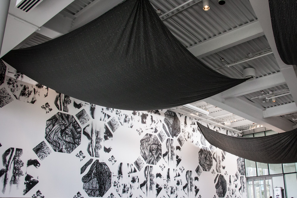
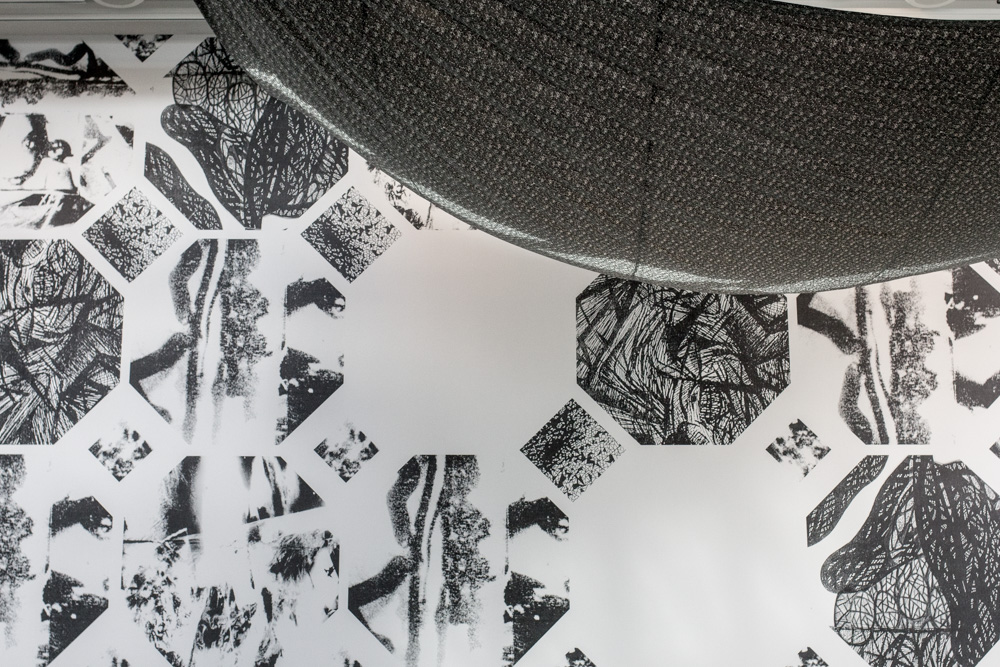
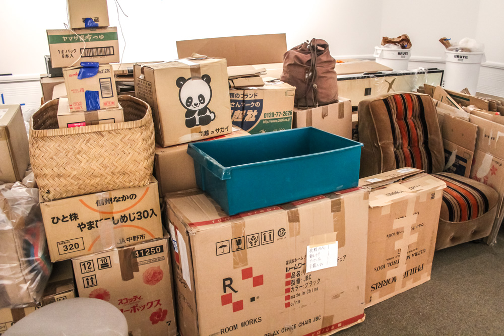
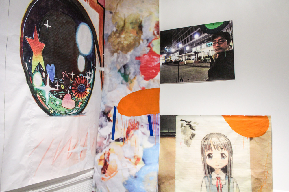
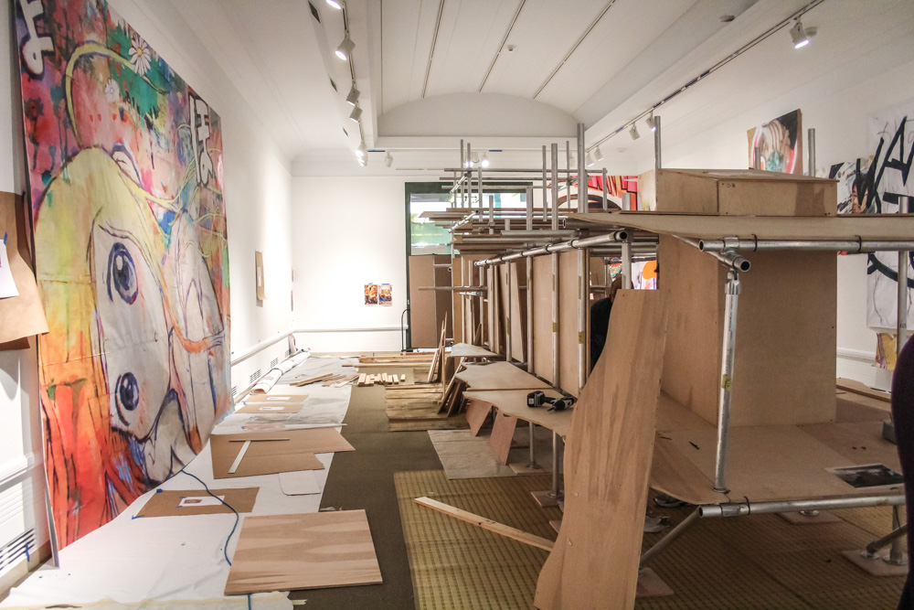
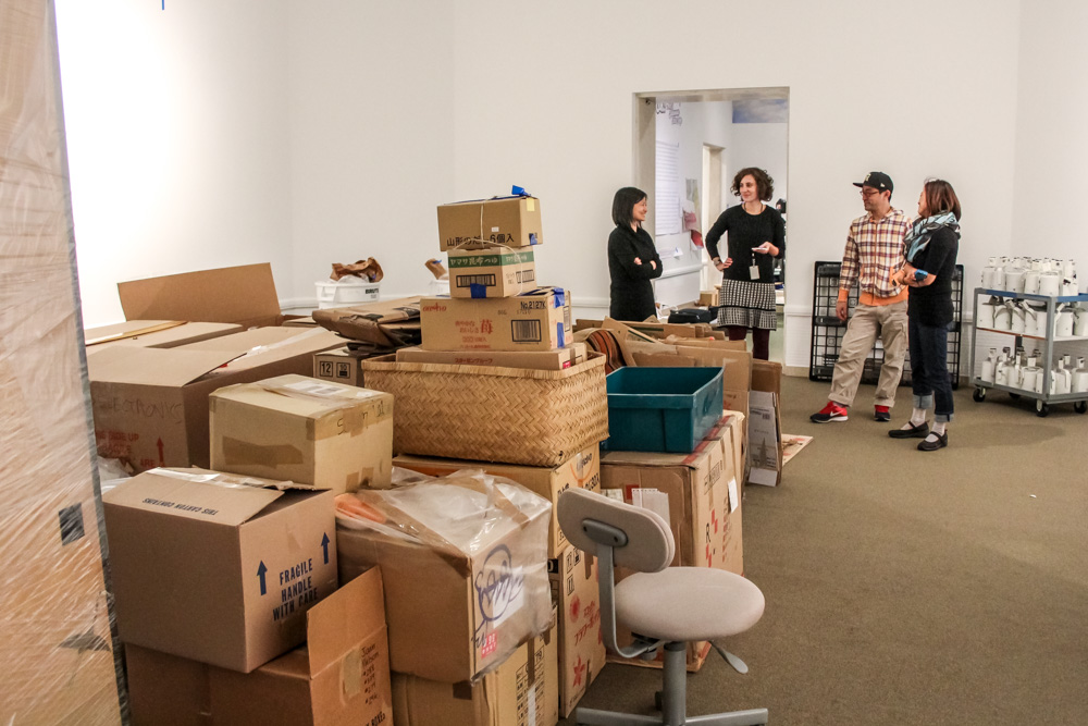
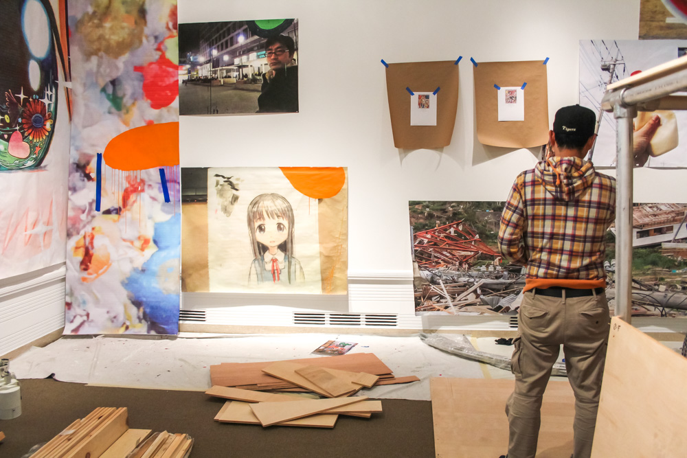
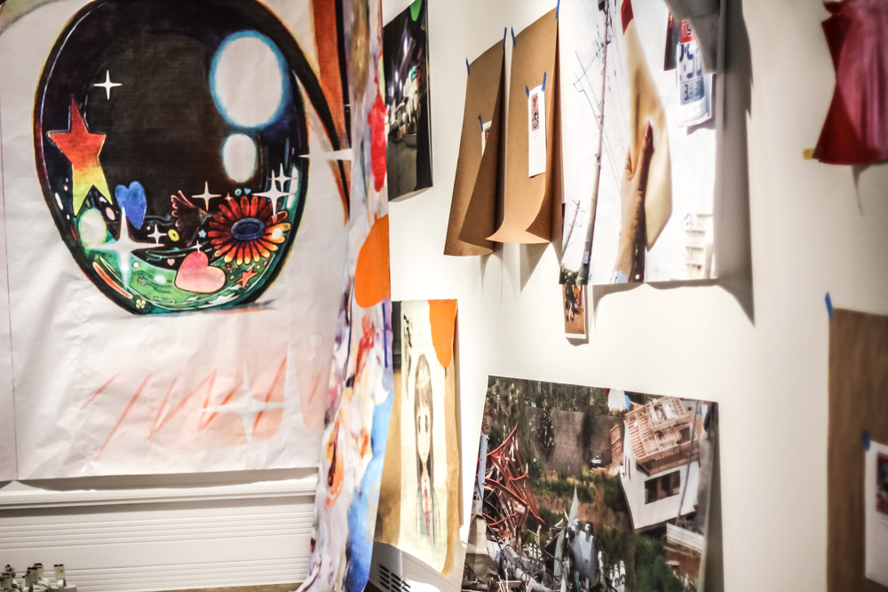
When we arrive at the Asian Art Museum, the Tateuchi Galleries are filled with cardboard boxes. Each room has a low tower built up in the middle, away from the walls. You can see flashes of a panda sticker on many of them, the logo of a moving company. Some of Mr.’s paintings are already hung, and a few are leaning against the walls. In a couple of places, an 8.5×11 piece of paper with a picture of a painting is taped to the wall with masking tape, giving us a clue of what will be going there.

mrs-caterpillar-22

mrs-caterpillar-7

mrs-caterpillar-21

mrs-caterpillar-25

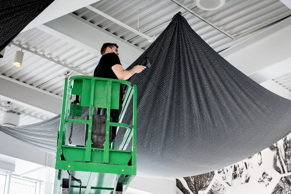
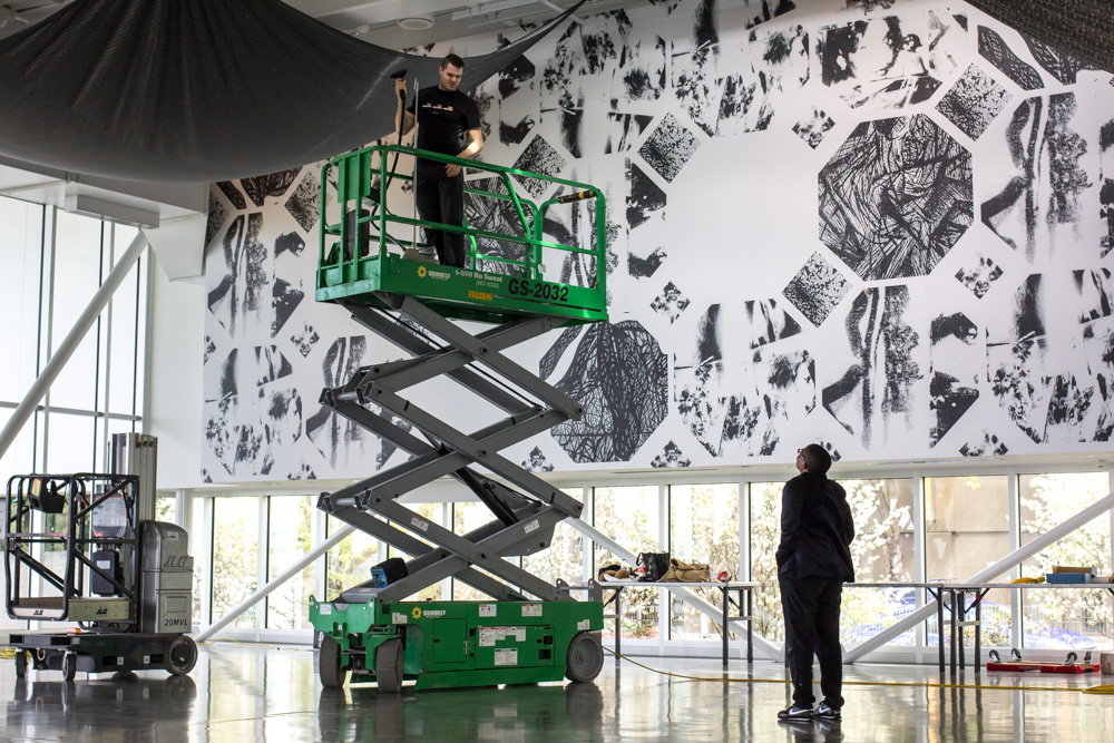
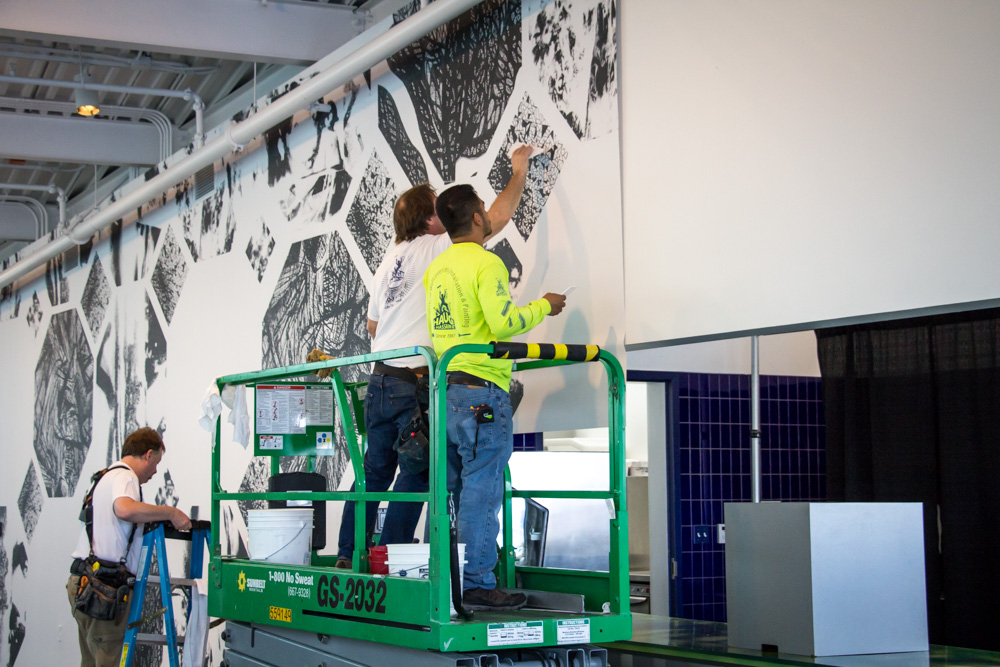
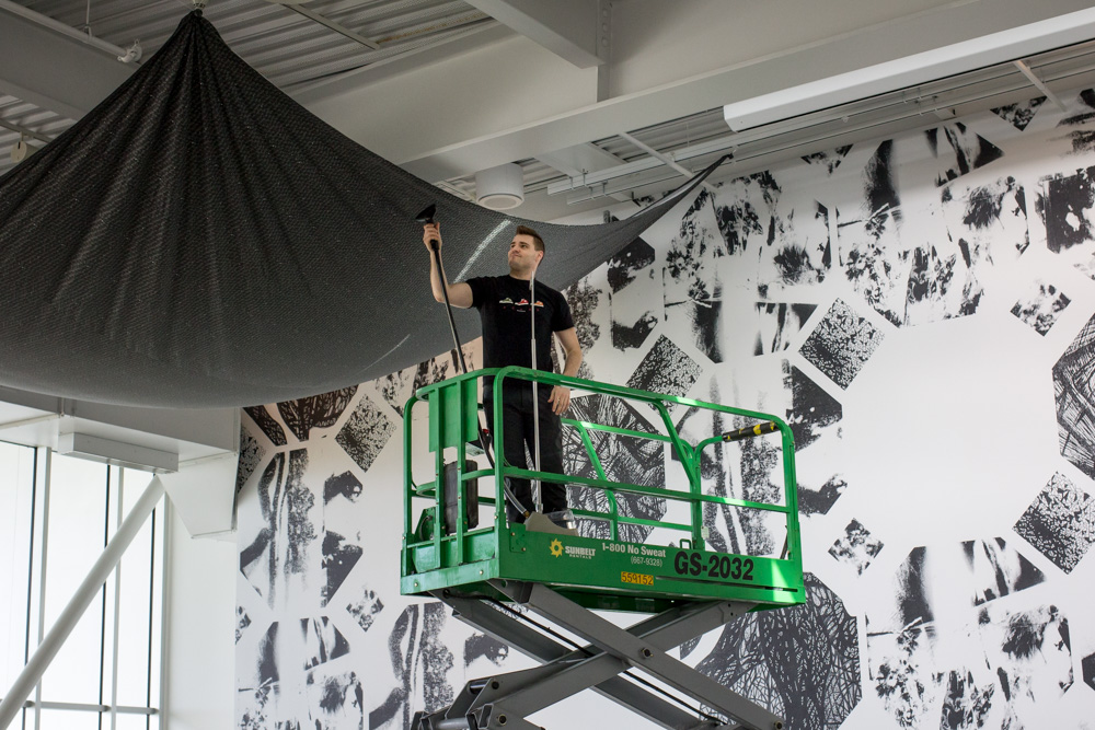
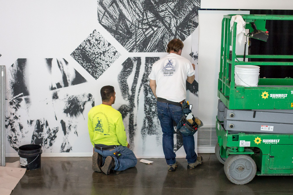
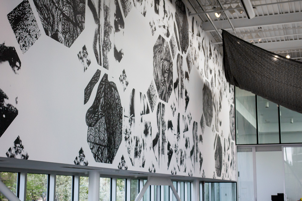
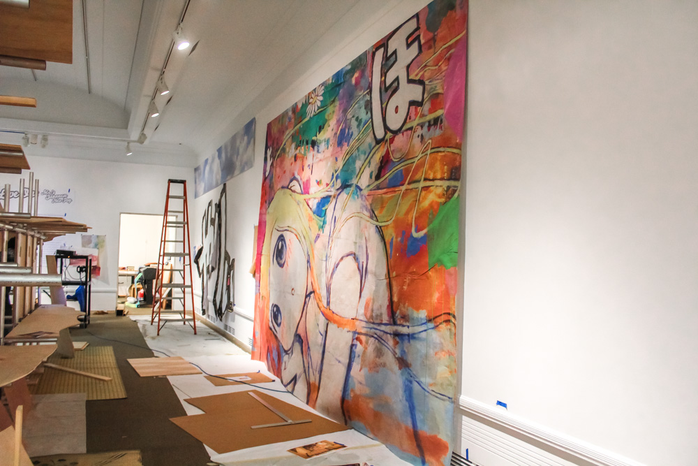
The paintings are huge—much larger than we would have guessed—the size of entire gallery walls. We watch as four art preparators carefully lift and place one panel of three, sliding it along a rail toward the other two until you can just barely discern the seam.

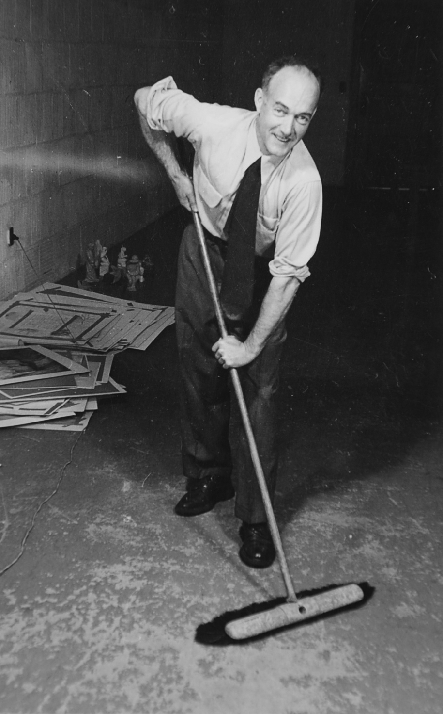
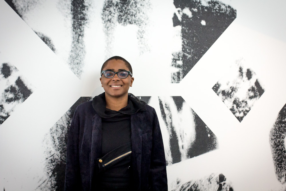
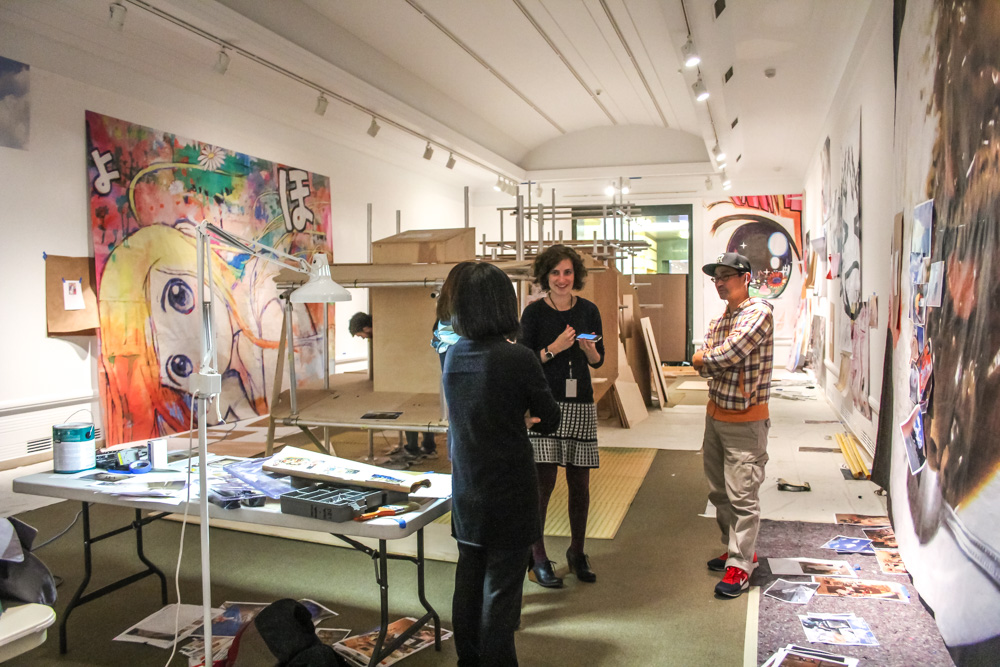
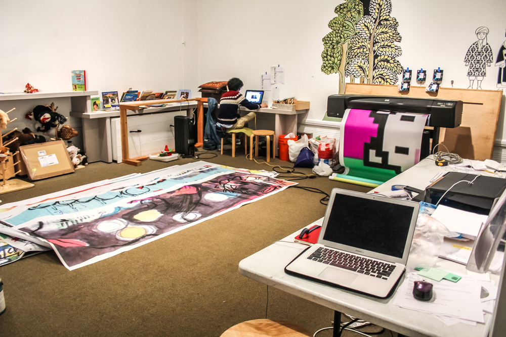
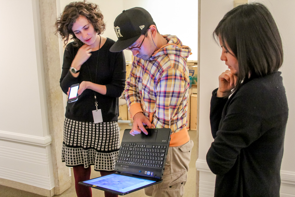
Mr. is sitting at a folding table, working on a laptop. He’s surrounded by printouts of his paintings, plans that show how to build the installation in front of him, and photographs he’s taken. He wears a striped hoodie and glasses and jeans, and he seems perfectly happy to take a break and talk about what he’s working on. He doesn’t speak much English, and I speak no Japanese, so we chat with the aid of SAM’s Curator of Japanese and Korean Art, Xiaojin Wu, and Mr.’s assistant, Kozue, who’s also based here in Seattle. The necessary triplicate of the interview means we move through the galleries slowly, standing amidst the cardboard boxes and the sounds of drills nearby. Everyone is so patient it’s hard to tell how much time is passing.

mrs-caterpillar-17

mrs-caterpillar-2

mrs-caterpillar-19

mrs-caterpillar-3

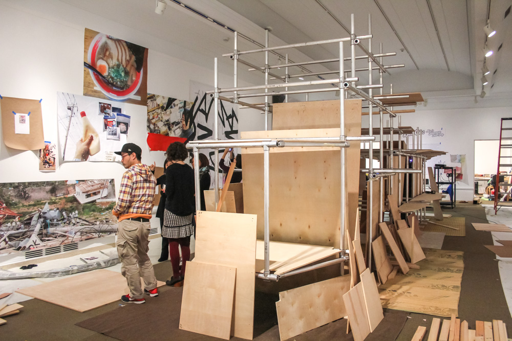
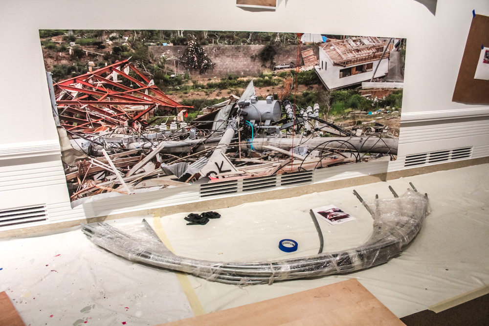
The installation he’s stationed in front of is the centerpiece of the exhibition, a tribute to the March 11, 2011 Tōhoku tsunami and ensuing earthquake. Most recently, it was shown at the Lehmann Maupin Gallery in New York. When it’s finished, it’s about the size of a train car, made up of what Mr. calls “stuff.”

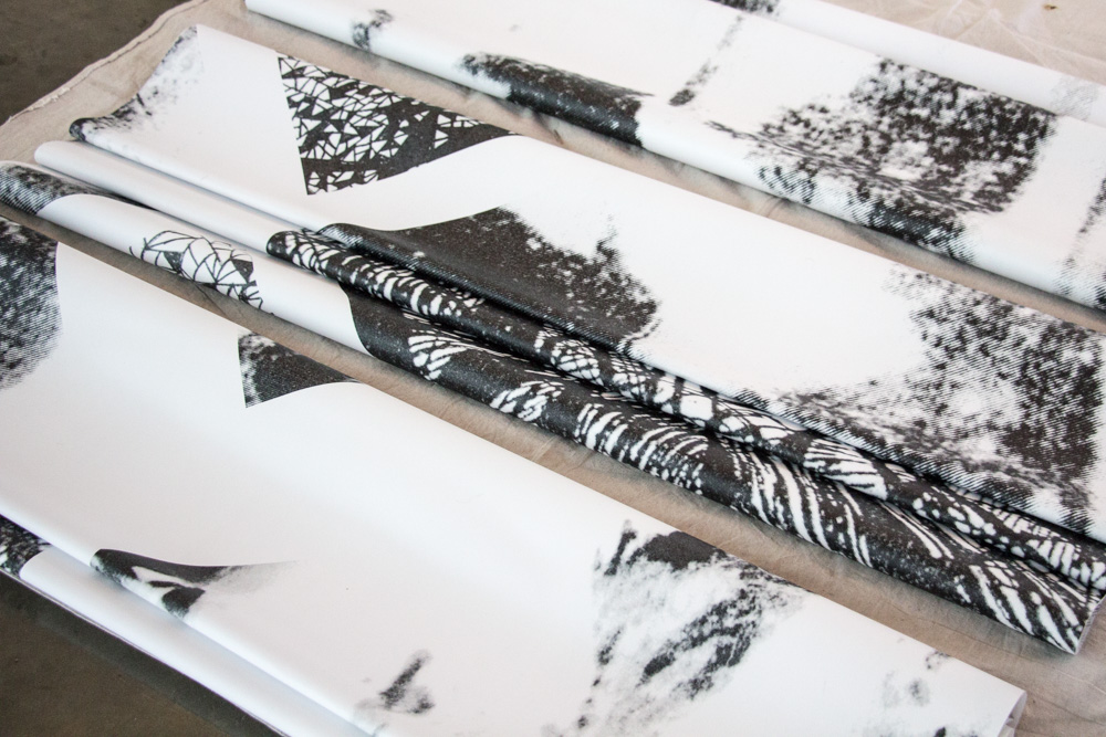
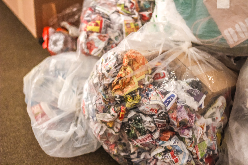
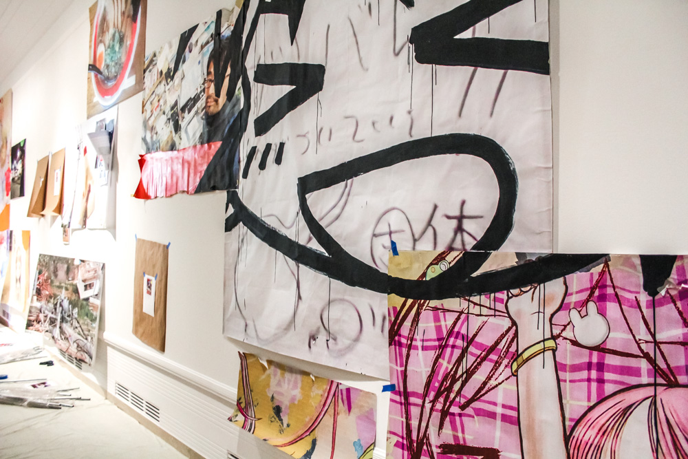
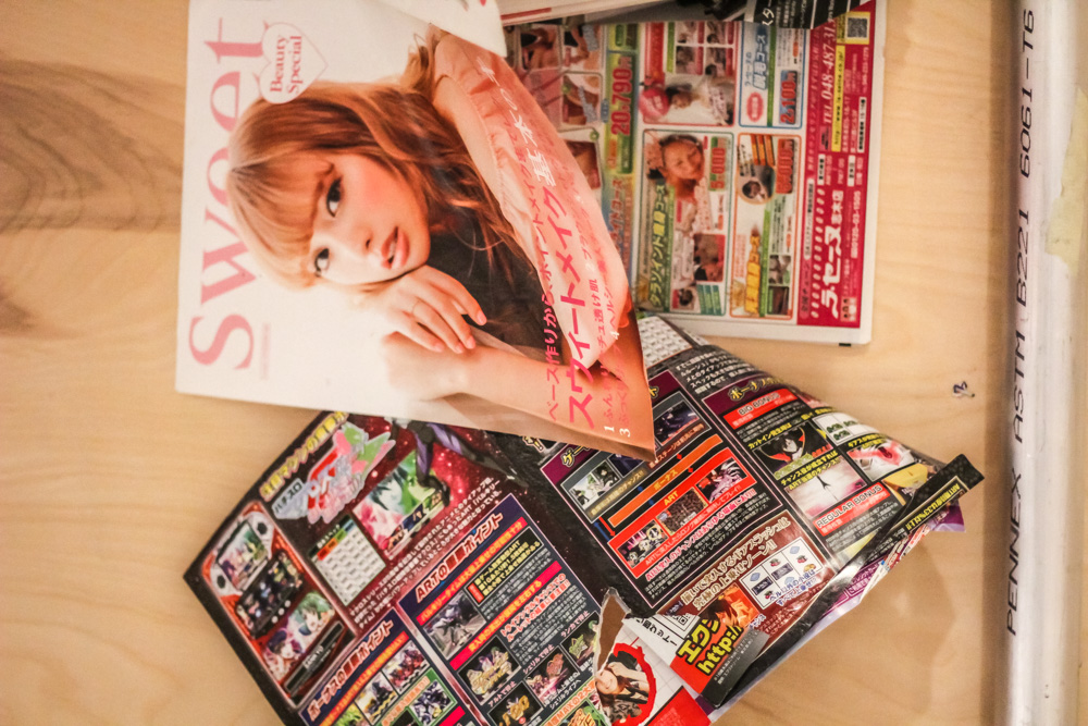
Right now, it’s just a skeleton made from pipes and plywood. It looks something like an erector set, and Mr. refers to it affectionately as the “caterpillar.” The art preparators working in this gallery say that it’s like putting together a puzzle. They have sketches to follow, but they’re not exact, and they’re figuring it out with Mr. as they go. It will be a massive structure, made up of hundreds of everyday objects of Japanese life that Mr. spent three months collecting. Some crates were shipped from New York City, where they were stored after the Lehmann Maupin show. Some crates were shipped from Japan. Mr.’s translator points out a box of curry, emphasizing that all of these are real things used every day in Japan. I ask if the installation changes every time he constructs it, and he says it’s hard to keep it the same, so by nature it varies. Mr. is creating new paintings with which to surround the installation. And this is the first time that Mr.’s photographs of the aftermath of the tsunami will be on display.

mrs-caterpillar-10

mrs-caterpillar-11

mrs-caterpillar-16

mrs-caterpillar-14

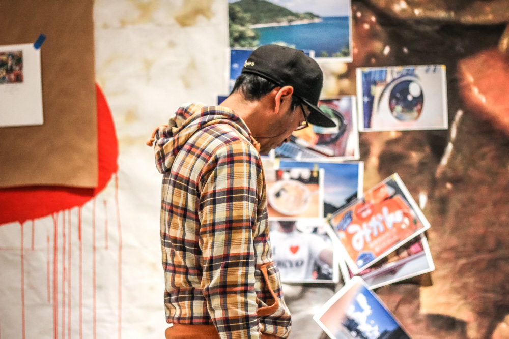
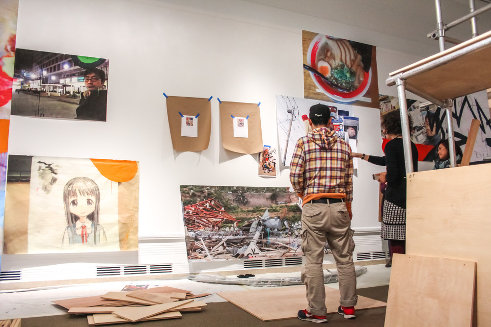
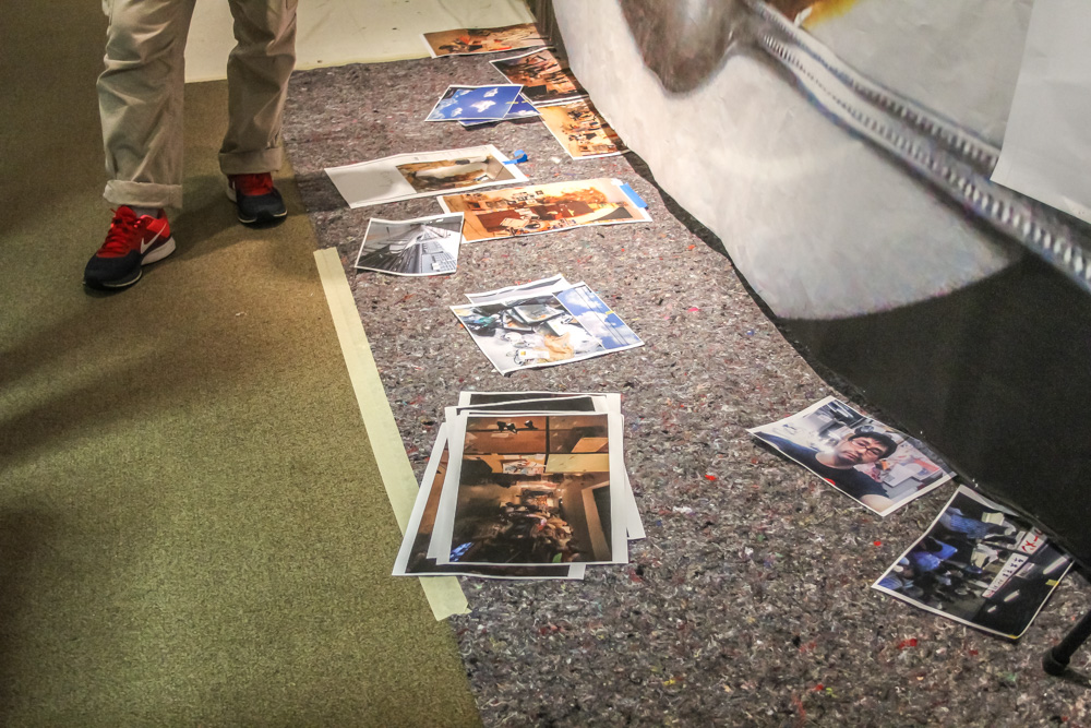
During the tsunami, Mr. was living in Saitama, Japan, just outside of Tokyo. One hundred days after the tsunami hit, Mr. went to the site and took hundreds of photographs. He pulls his laptop off the table to show me some of the pictures and brings it with us as we look at the wall where they’ll be plastered in a collage from bottom to top.

“I went,” Mr. says, which sound a bit like a pronouncement because in the midst of all the Japanese, he says it in English. Which—this one is. He went there. He saw it in person. He witnessed.

A hundred days after the tsunami, he explains, means it was almost summer. There was a factory nearby that had been making canned fish, and it smelled terrible. While Mr. looks through his photos to find what he wants to show me, I ask Xiaojin why she thinks it’s important that Seattle see the artwork.

“I think at the beginning we were attracted to Mr.’s work because of the tsunami installation. The tsunami was such a huge event that impacted so many Japanese people’s lives that you can look around and almost all the Japanese contemporary artists, in some way, have responded to it. But Mr.’s response is quite unique. He uses the daily items he collected. But he also went to the place and documented the aftermath, so I think it’s very meaningful for us to show that. And somehow, even though his main body of works is made up of paintings, some of the works he made even earlier tie into that idea of disaster and how we respond to it. We think it will be very interesting for the Seattle audience to see a different perspective of Japanese Pop art. Even though the paintings look like anime/manga, they are not just about this—even they have more to them, a little bit deeper meanings. You can get a bit deeper, see beyond the surface…beyond those big eyes, those smiles.” Xiaojin laughs suddenly as she references the happy-go-lucky anime faces, like there’s something bubbly just in talking about it.

Mr. draws my attention to his laptop and shows me the photos of collapsed buildings, tipped cars, downed power lines. Everything looks askew, and gray, covered in silt and dust. In some photos, Mr. is wearing a mask.

mrs-caterpillar-23

mrs-caterpillar-4

“When you first went to the tsunami site, did you experience it more as an artist, looking to make artwork, or were you just there to see and experience it as a citizen, as a civilian who’d been part of this disaster?” I ask.

Both Xiaojin as she listens to my question in English, and then Mr. as she translates it into Japanese, nod solemnly. Mr. talks for a long time.

“He was saying the tsunami just impacted everybody in Japan, everyone in the entirety of Japan,” Xiaojin starts. “So he never thought, I’ll go in there as an artist. He just wanted to go and see and experience, but after this experience, his thoughts have just changed so much, and the Fukushima nuclear disaster was also, after…it’s still going on.”

Mr. starts speaking again as Xiaojin slow down. She murmurs in agreement as he talks, a thoughtful sound.

“He says there are two types of people that the tsunami had an impact on. One is directly those people who lived there, lost their home, and really, they probably had the worst damage. But the second kind is just like him, who didn’t really directly experience the tsunami but they lost power, or water, or the supermarket didn’t have enough supplies, so they experienced it indirectly. But just on different levels, everybody was involved.”

mrs-caterpillar-20

mrs-caterpillar-6

mrs-caterpillar-8

mrs-caterpillar-13

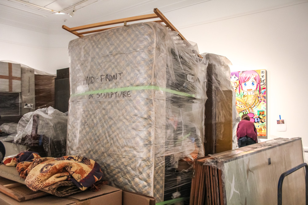
The next week, when I go back to the Asian Art Museum, the installation is nearly complete. Above the screen that blocks gallery access, I can see a mattress, folded into a u shape over the top of the structure. The installation crams so many pieces of life together that it seems impossible it will hold, in the way an over packed suitcase may burst open at any moment. It’s about trauma, but also about the possibilities of what will come next.

The title of the installation? Give Me Your Wings – think different. No wonder Mr. has nicknamed the skeletal structure the caterpillar.

Live On: Mr.’s Japanese Neo-Pop is now on view at the Asian Art Museum.

Words: Maggie Hess, Copywriter
Photos: Natali Wiseman & Stephanie Fink

Women in Film: Reel Girl tours and Riot Grrrl scores

Tonight SAM downtown is centering its lens on women in film with tours by local leaders in the film world and a special screening of Lynn Hershmann Leeson’s recent documentary !Women Art Revolution (2010, 83 mins) starting at 7:30 pm in Plestcheeff Auditorium.

!Women Art Revolution traces the impetus and organization of the Feminist Art Movement during the 1960’s through its rise from a subculture of women artists during the anti-war and civil rights era to its difficult acceptance into our cultural narrative.  The film, for which Leeson collected footage and interviews for 40 years to create, discloses the Feminist Art Movement through interviews with artists such as Yoko Ono, Carolee Schneemann, Eleanor Antin, Judy Chicago, Rachel Rosenthal, and the Guerrilla Girls among others. The candid interviews describe how women artists took a cue from groups such as The Black Panthers to organize and speak out against cultural institutions for engaging in gender discrimination.

The film features an original soundtrack by Carrie Brownstein, guitarist of Washington Riot-Grrrl rockers Sleater-Kinney, whose roaring guitar riffs provide a very pertinent sonic landscape to the film. Sleater-Kinney, named after I5 off-ramp No. 108 in Lacey, Washington, declared an indefinite hiatus in 2006. You can check out Brownstein’s current group Wild Flag performing “Romance” live from Mellow Johnny’s Bike Shop during KEXP’s broadcast at South by Southwest in 2011 here. The soundtrack also features songs by Janis Joplin, Laurie Anderson, The Gossip (Olympia natives), Erase Errata, and Tribe 8.

In addition to the screening of !Women Art Revolution SAM is hosting two My Favorite Things: Highly Opinionated Public Tours by local women working in the film world; Beth Barrett and Robin Held. As Programming Manager of the Seattle International Film Festival Beth Barrett will share her favorite works and, hopefully, have a couple of highly opinionated comments of her own to offer. Robin Held, Executive Director of Reel Grrls a local organization that empowers young women through creating film and digital media, will co-lead a tour of Elles with local dancer-choreographer Catherine Cabeen.

– Ryan Peterson, Program Assistant

!Women Art Revolution movie poster

Taking a tour for the team: Athletes take the reins of Elles

With this week’s My Favorite Things:  Highly Opinionated Public Tours at SAM Downtown two local athletes will be giving  tours in conjunction with Elles: Women Artists from the Centre Pompidou, Paris. Katie Hultin, goal keeper for the Seattle Sounders, and Parisa Asgharzadeh, of the local Seattle Breakers Women Rugby Team, will each be taking the reins of tour guide beginning at 6:30 and 6:45 PM respectively. As athletes take over the galleries, the way physical activity is shared by athletes and artists alike came to mind.


In 1992, the Seattle Arts Commission installed what is arguably the city’s most iconic piece of public sculpture. Jonathan Borofsky’s Hamming Man is known by practically everyone who is familiar with SAM. Tourists passing by on Ride the Ducks tours take snapshots of the sculpture as they pass by on First Avenue, and fellow workers downtown can feel a silent bond with the steady swings of the hammer. Of his sculpture, Borofsky stated, “The Hammering Man is a worker. The Hammering Man celebrates the worker. He or she is the village craftsman.” The Hammering Man reminds us that whether we are laborers, artists, or athletes our physical efforts become rewarded when we work together toward, as Borofsky upholds, “a happier and more enlightened humanity.”


This week’s My Favorite Things tours made me think of the Hammering Man not only for the relationship of physical activity that artists and athletes both share, but because of an anecdote I remember as an undergraduate student in Art History at the University of Washington. In one of my early survey of Western Art classes, we were given a writing assignment on a piece of public sculpture. Borofsky’s Hammering Man was one of the works we could choose to write about, and the TA for this class, who was very knowledgeable with Seattle’s offering of public sculpture, had her own highly opinionated critique of the monumental laborer on SAM’s First Avenue doorstep. It was her view that the gender of the sculpture was a woman rather than a man, and that this is an observable, if not subtle, fact that could be seen in a curve just below the stationary arm of the sculpture. Although I didn’t quite agree, the point she made is significant for alluding to the tendency to see the Hammering Man as a man, rather than a woman, or a figure that is inclusive of more than one gender representing a diverse population.  The oversight is unfortunate yes, but my TA’s slightly tongue-in-cheek claim reminded us of the activity and achievements of women artists, athletes, and laborers.

Our tour guides this week will undoubtedly have some interesting points about their own experiences with the art on view in the Elles exhibitions, and I’m excited to hear how they feel about some of the works on display.  I feel that artists and athletes alike are working toward similar outcomes in their craft. After the countless hours of training one’s body to perform at the highest level of physical activity the ability to carry out the actions and designs of the game exist for the sublime moment when we finally capture a win. Shutouts and upsets are going to happen, but whether it’s the art of the game, or art for itself, it is the physical elation of that eventual success that we work so hard to create.


– Ryan Peterson, Program Assistant

SAMBlog