Object of the Week Landscape: Autumn

With the onset of fall, some lament the end of summer, but the vivid beauty of the season and the assuring rhythm of change just make me grateful to be alive in such a scenic place. I find it worth musing on: Tuning into the natural artistry of the moment makes it easier to lose those long, warm summer days.

But if you’re still in need of centering, we’re your blog!

Helping us to embrace the autumnal mood, this six-panel Japanese folding screen depicting Autumn poetically pictures a misty chill over the water and the hillsides. Exposed but stubborn trees dot the landscape with green. All across the screen figures enjoy the waning bounty of land and sea, busily preparing for the coming winter: fishing, traveling, gathering. The screen embodies a visual poem to fall.

Landscape: Autumn

To lead you further down the path to fall zen, here is an offering of seasonal poems from the master of the haiku, Matsuo Bashō (1644-1694):

None is travelling
here along this way but I,
this autumn evening.

The first day of the year:
thoughts come—and there is loneliness;
the autumn dusk is here.

Autumn wind
through an open door—
a piercing cry.

On a withered branch
a crow has alighted:
nightfall in autumn.

—Jeffrey Carlson, SAM Collections Coordinator

Image: Landscape: Autumn, 16th century (Muromachi period, 1333-1573), Attributed to Sesson Shukei (Japanese, 1504-1589), ink and color on paper, 66 15/16 x 138 3/16 in. Seattle Art Museum, Eugene Fuller Memorial Collection, 68.127, Photos: Paul Macapia.

Object of the Week: Guanyin

Have you ever purchased something at full price, feeling slightly guilty about it, only to find a sale item that suits you even better? Something similar happened to Dr. Fuller in the early 1930s, as he was seeking to expand his Chinese art collection in new directions.

[Fuller] acquired . . . a large Guanyin in pale glaze with ivory tone from Yamanaka in 1931 for $2,500. With a dated inscription of 1615, the Guanyin is among the few extant figures commissioned by patrons of the Kaiyuan Temple in Zhanzhou (in modern-day Fujian province). Seven months after that acquisition, Fuller encountered a whiter blanc de chine Guanyin of similar size. It was allegedly bought from Spain after the revolution and was priced at $900 by Roland Moore. Fuller bought it at once. The price gap between the two Guanyin probably bothered Fuller, especially because the latter work is whiter and hence more attractive, with a more elaborately carved base positioning the Guanyin on an auspicious beast emerging from or riding on water. Commenting on the Yamanaka Guanyin from Zhangzhou, Fuller noted that ‘years of incense smoke discolored its crackled glaze.’ He proposed exchanging the Guanyin for a Tianlongshan sculpture in 1934 . . . and Yamanaka graciously accepted. Luckily, the Guanyin remained in Seattle. Yamanaka resold the work to Fuller for $750. He made the right decision to keep the Yamanaka Guanyin because it matches the Moore Guanyin beautifully.1

The best decision, as we all know, is to walk away with both! Not only do the two Guanyin complement each other in form, as former SAM Chinese art curator Josh Yiu notes, but the message carried by the Guanyin bodhisattva is one that resonates deeply today, and Dr. Fuller’s choice to buy back his original porcelain Guanyin doubly enhances its life-giving presence at SAM. Known as Lord of Mercy, Guanyin represents boundless love and compassion. In the Mahayana doctrine, extending love to all people figures as an important step on the path to enlightenment.

Guanyin

The second, whiter Guanyin purchased by Dr. Fuller will graciously greet you on your next visit to the Chinese art galleries at the Asian Art Museum.

—Jeffrey Carlson, SAM Collections Coordinator

1 Josh Yiu, A Fuller View of China, Seattle, Wash.: Seattle Art Museum, 2014; 56-63.
Image: Guanyin (detail), 17th18th century, Chinese, Qing dynasty (1644-1912), Dehua ware: porcelain, 33 1/2 x 9 x 9 in. Seattle Art Museum, Eugene Fuller Memorial Collection, 33.38, Photo: Natali Wiseman. Guanyin, 1615, Chinese, Ming dynasty (1368-1644), Dehua ware: porcelain, 34 x 10 x 9 1/4 in. Seattle Art Museum, Eugene Fuller Memorial Collection, 33.39, Photos: Natali Wiseman. Guanyin (detail).


Rowland Ricketts on “Mobile Section”

Mood Indigo: Textiles From Around the World is a chance to absorb a unique spectrum of global history from Flanders to Africa, tapestries to kimonos—the exhibition balances ancient fragments with the inclusion of an immersive contemporary installation by Rowland Ricketts, an artist working in traditional indigo dying techniques. “Mobile Section” is made up of a large, indigo-dyed textile, 11½ ft. tall by 30 ft. circumference, dried indigo plants, and a video illustrating the indigo cultivation and dying process. Watch this video with the artist for more information on his process and how, beyond the blue, indigo is about the deep connection of the physical labor that connects Ricketts to other people who have also worked with indigo.

Field recordings of Rickett’s indigo process—growing, processing, vatting, and dyeing—were synthesized in collaboration with sound artist Norbert Herber and the audio reacts to the movements of visitors in the gallery as they move around the large hanging textile. The work plays upon the notions of materiality and immateriality, and is a true multisensory experience.

You’ve got one more month to see Mood Indigo at the Asian Art Museum in Volunteer Park before it closes October 9. So go on, give yourself the blues.


Object of the Week: Keet Shagoon (Killer Whale)

Family, thresholds, and the mutually beneficial relationship between collecting and creating tell the story of Preston Singletary’s carved glass screen Keet Shagoon (Killer Whale).

Singletary was raised here in Seattle. His parents were artistic; his father painted and wrote poetry, and his mother wove textiles and crocheted. Their engagement with the arts encouraged Singletary to pursue art-making. As a young artist he studied with friend and mentor Dante Marioni at the renowned Pilchuck Glass School, where he would work with mentors Benjamin Moore and Lino Tagliapietra, among others. He joined and contributed to a studio glass movement driven by a close cohort of Pilchuck artists. He was also, intrinsically, part of a second family of artists, who were Native artists. On this side, Singletary lists Joe David, Robert Davidson, and Dempsey Bob as important influences. By the example and encouragement of Singletary’s Native peers, including Marvin Oliver, he was led to explore his ancestral history through his artistic practice, and he began incorporating Northwest Coast Native design into his work in 1987. In several ways SAM’s 2003 Keet Shagoon represents the culmination of that trajectory in Singletary’s career. It is a contemporary re-imagining of an interior house screen, one of the most important items of clan property, which served to display the clan’s heritage through images representing its ancestors and benefactors. The killer whale is Singletary’s family crest symbol.

Interior house screens held an important ceremonial role in Native life. In the cedar plank house, they separated the chief’s quarters from the rest of the living area and provided a portal through which he could make a dramatic entrance. The work’s form represents a threshold, and Singletary has also remarked on how the medium of glass can be “a threshold to the future for the cultural growth of Native people.” There’s more. In 2003, SAM exhibited 13 of Singletary’s works in the Native American Galleries in an exhibition called Preston Singletary: Threshold. In his artist statement Singletary explained the importance of the term for him, as he came to see himself standing at the nexus of ancient Northwest Coast Native traditions, his own world, and the future. Native art, with its roots in the physical world of cedar and pigment, and its spiritual significance, seemed to him a link between the earth and the cosmos. Finally, SAM’s purchase of Keet Shagoon memorialized another poignant moment of transition: the passing from life to death.

Yéil X’eenh (Raven Screen), ca. 1810, attributed to Kadyisdu.axch’.

Yéil X’eenh (Raven Screen), ca. 1810, attributed to Kadyisdu.axch’.

John H. Hauberg (1916-2002) was a successful businessman in forest resource management and lumber, a Native arts enthusiast, and an astute collector who worked directly with Native owners, dealers, and auctioneers to form an exceptional private collection. Hauberg’s generous gifts to SAM over the years 1983–1991 built the foundation of the museum’s notable Native American art collection. Acquiring Keet Shagoon in honor of Hauberg, a year after his passing, was a fitting choice. The Pilchuck Glass School, at which artist Preston Singletary had learned his craft, had been funded by Hauberg and his first wife, Anne Gould Hauberg in 1971; and SAM’s famous Raven Screen, which had directly inspired Singletary to produce Keet Shagoon before his 2003 show at SAM, had been donated by Hauberg in 1979. SAM wouldn’t have Keet Shagoon—and we all wouldn’t be able to enjoy it—without both of their contributions.

—Jeffrey Carlson, SAM Collections Coordinator

Images: Keet Shagoon (Killer Whale), 2003, Preston Singletary (Tlingit, born 1963), fused and sand carved glass, 72 x 92 x 3/8 in. Seattle Art Museum, Purchased in honor of John H. Hauberg with funds from the Mark Tobey Estate Fund, John and Joyce Price, the Native American Art Support Fund, Don W. Axworthy, Jeffrey and Susan Brotman, Marshall Hatch, C. Calvert Knudsen, Christine and Assen Nicolov, Charles and Gayle Pancerzewski, Sam and Gladys Rubinstein, SAM Docents, SAMS Supporters, Frederick and Susan Titcomb, and Virginia and Bagley Wright, 2003.12, © Preston Singletary, Photo: Susan Cole. Yéil X’eenh (Raven Screen), ca. 1810, attributed to Kadyisdu.axch’ (Tlingit, Kiks.adi clan, active late 18th-early 19th century), spruce, paint, 105 3/4 x 129 in. Seattle Art Museum, Gift of John H. Hauberg, 79.98, Photo: Paul Macapia.

Be A Part of Something Big: Volunteer for Middle Fork

Artist John Grade is looking for volunteers to help sculpt the 60-foot addition to his sculpture, Middle Fork, which will be installed in SAM’s Brotman Forum in January. SAM employees have been helping out in Grade’s studio over the last few months and we all agree, you should consider volunteering as well.

middlefork-studio-2

John Grade’s studio is large and located at the fringes of Seattle. It’s easy to understand why he would require a space as large as an airplane hangar if you’ve experienced his artwork. Grade creates organic shapes from the natural world at life size and impresses viewers with the grand scale of everyday objects such as, in the case of Middle Fork, trees.

Expect a warm welcome from Grade’s crew of studio assistants, though you may have to venture pretty far into the space before you’re noticed over the sound of the electric sanders. In an open room with several workstations scattered towards the back, you’ll notice sections of the original 40-foot long Middle Fork sculpture bubble wrapped and arranged unceremoniously around the room.

middlefork-studio-7

middlefork-studio-9

More than a view behind-the-scenes, this is an experience you can inhale—quite literally if you’re not wearing your dust mask. Particles of the artistic process will coat your clothes, so dress for sawdust and be prepared to focus in on the details for a few hours. “It’s fun to be part of something big by doing something small,” said Natali Wiseman, senior designer at SAM. And small is right—the four-hour minimum volunteer shift flies by and you’ll be impressed by the section of the sculpture that you’ve created—how much, or how little you’ve gotten done, depending on your outlook.

middlefork-studio-5

middlefork-studio-4

“Volunteering for Middle Fork is a great opportunity to get an insider’s look into John’s creative process,” says David Rue, public programs coordinator. “It’s refreshing to see how many helping hands are responsible for such a beautifully large-scale project, and it feels great to integrate community building with hands-on art making.” When John Grade began Middle Fork in 2014 it was being constructed at Mad Art in South Lake Union. The store-front gallery space was open to the public and passerbys were welcome to lend a hand in laying a couple, or a couple hundred, blocks of the sculpture.

middlefork-studio-6

middlefork-studio-3

Far from the inaccessible side of the art world, Middle Fork has been touched and built by toddlers, teenagers, and Amazon employees alike. Megan Peterson, assistant registrar for exhibitions describes the process as “an honor. I appreciate how open John is to allowing each person the freedom to put their unique stamp on the work they do.” Don’t worry about being too precise or technically skilled. The sculpture is sturdy and, like nature, difficult to mess up. Each inches-long cedar piece you place is only one part of what will eventually be a 100-foot long whole, hanging at SAM.

middlefork-studio-16

middlefork-studio-13

“It’ll be a particularly special feeling once Middle Fork is installed knowing that my hands helped contribute to its existence,” Rue added. If you’re interested in volunteering, contact Lauren at John Grade’s studio: volunteer@johngrade.com.

—Chelsea Werner-Jatzke, Copywriter & Content Strategist

Photos: Natali Wiseman.

Object of the Week: Tapestry of America

The tapestries of the continents that feature in Mood Indigo: Textiles from Around the World at the Asian Art Museum are simply stunning art objects, almost too much to see, each offering a near-constant barrage of decorative detail that takes time and energy to decipher. Happily, their aesthetic abundance encourages return visits. As particularly exaggerated allegorical portrayals, the tapestries provoke more thoughts about the values of the culture that produced them than the actual life of 17th-century inhabitants of Asia, Africa, and America. Or maybe we think Native women did lounge about, attended by tobacco-smoking cherubs, petting alligators?

Tapestry of America (detail)

As an American citizen, I find the Tapestry of America especially interesting to consider. On a staff tour of Mood Indigo, SAM curator Pam McClusky pointed out one detail that has echoed in my brain since, prodding me to think on it whenever I see the tapestry. Near the feet of the enthroned lady of America stand three stacks of gold coins, with a small pile next to them. The coins are ignored by the figures and occupy an unimportant place in the composition; they are as easily overlooked by the viewer as by America and her active attendants. With this detail, the makers of the tapestry commented on the value of money in cultures other than their own. America, we see, is laughably uninterested in gold and riches.

Tapestry of America (detail)

It’s clear that cultural tensions are surfacing here, but what exactly are they, and where do they originate? University of Washington professor of history Benjamin Schmidt helps us to identify what’s happening in the tapestry in his 2015 book Inventing Exoticism: Geography, Globalism, and Europe’s Early Modern World.

Writing on the late 17th and early 18th centuries in Europe, Schmidt points to maps and other material objects that reflect consistent opinions on what was European, what was not, and how the European related to things non-European. Of course, implicit in those ideas was an assumption that Europeans did it better. Take, for instance, commodities. Schmidt writes that “Europeans, even as they dearly coveted them, believed only they understood an object’s ‘true’ material value, while non-European peoples, notwithstanding their casual regard of them, failed to grasp the worth of those very goods they so richly possessed.”1 The maddening judgment present in the picture visualizes Schmidt’s thesis perfectly: Gold coins would sit at the feet of the Natives; they just didn’t understand true value.

Tapestry of America (detail)

A related point revealed in the tapestry is the Europeans’ readiness to take. Schmidt explains how, in their portrayals of exotic lands, early modern Europe developed a habit of thinking about the broader world as a consumable commodity, theirs for the taking.2 This “exotic” other world was essentially “agreeable” and ripe for plundering. So, even as the makers of the tapestry ridicule its subject for valuing anything above gold, we also see Europe’s greedy desire for tobacco reflected in the smoking cherub. Tobacco, like everything else, could probably be taken, because it probably wasn’t valued rightly.

Profound cultural differences and centuries of difficult history have made the Tapestry of America a charged work, one that is rewarding to engage.

—Jeffrey Carlson, SAM Collections Coordinator

1 Benjamin Schmidt, Inventing Exoticism: Geography, Globalism, and Europe’s Early Modern World, Philadelphia: University of Pennsylvania Press, 2015; 256-257
2 Schmidt, Inventing Exoticism, 228.
Images: Installation view of Mood Indigo: Textiles from Around the World at Asian Art Museum, © Seattle Art Museum. Photo: Natali Wiseman. Tapestry of America (detail), late 17th c., Jacob van der Borcht (Flemish) and Jan Cobus (Flemish), wool, 156 x 144 1/8 in. Seattle Art Museum, Gift of the Hearst Foundation, Inc., 62.1991, Photos: Natali Wiseman.

Object of the Week: Persephone Unbound

Beverly Pepper’s Persephone Unbound draws out a tension that is central to the human experience, echoed in our mythology, and enacted in both art and life: the contrast between restraints and the desire to be released from them.

A work in cast bronze, the varied textures of the sculpture’s several facets give the appearance, instead, of poured concrete, in various states of leveling and finish. Near its base the surface of the sculpture bears the kind of textural depth that marks stucco walls, but here they are magnified to the sculpture’s monumental scale. As the eye scans upward to take in ten feet of vertical mass, passing over gravelly sections and dripping globs, more discrete forms begin to emerge, and the visual impression of human manufacture and intervention becomes more acute. The sculpture’s tallest arm is clean-cut, smoothly finished. Where initially the work might seem a monolithic rock formation roughly hewn, it emerges as a precisely chosen crystallization of contrasts, something in between natural and (wo)manmade. It’s a work that strikes me as if it’s perpetually in formation.

The artist has given us a particularly leading title as a way into her thinking. Persephone’s role in Greek mythology elicits sympathy for the character, and for the reader, a sense bitter loss. Persephone is an aching reminder of what could be. Hers is a pure beauty only sometimes accessible; her abundance, pleasant as it is to enjoy, is fleeting, ever accompanied by the foreboding of its imminent end. She wishes to be free, we wish her to be free, but that’s not the way of things.

What would it mean if Persephone were unbound? What if the goddess of spring growth were also the goddess of growth all the time, everywhere, forever?

The myth explains the reality of changing seasons, an immutable truth of the natural world. But Persephone Unbound begs us to imagine what restrictive realities exist that are of our own making—how have we limited ourselves, and one another, by lack of imagination, or belief, or desire? What about our world is not as good as it could be?

Persephone Unbound is one of seven works by Beverly Pepper in SAM’s collection. A widely recognized sculptor, Pepper has been the subject of solo exhibitions at the Metropolitan Museum of Art, the Brooklyn Museum of Art, Ohio’s Columbus Museum of Art, the Albright-Knox Art Gallery, and the San Francisco Museum of Modern Art. The sculpture has been an integral part of the Olympic Sculpture Park since the park’s opening in January of 2007.

[youtube id=”z9lrVZdaluk” mode=”normal” autoplay=”no”]

—Jeffrey Carlson, SAM Collections Coordinator

Image: Persephone Unbound, 1999, Beverly Pepper (American, born 1924), cast bronze, 122 x 31 1/2 x 21 in. Seattle Art Museum, Gift of Jon and Mary Shirley, 2009.14 © Beverly Pepper, Photo: Paul Macapia.

Object of the Week: Water Babies

Once a founding member of the Society of Independent Artists, a close friend of fellow member Marcel Duchamp, an artist called original and innovative, and an active participant in the programs of the Société Anonyme—John Covert lived and died, well, anonymously.

Given Covert’s very short career, we should not be surprised that he is not a household name. His period of creative maturity lasted eight years, from 1915 to 1923. A stay in Paris just before this period proved uncharacteristically unfruitful—Covert later lamented that he wasn’t able to connect with the artist-intellectual circle there—and the disappointment of the Paris trip was a harbinger of a sad fortune. Covert returned to the US and contributed to an important moment for modern art, playing his role as a founder of the Society of Independent Artists, and serving as its first secretary in 1917. Working from his studio in New York, Covert received brief visibility with a solo exhibition of his paintings at M. de Zayas Gallery. Little came of it; in the larger art world he remained unknown and unappreciated. Pressed by poverty, he found himself unable to eat regularly, with no income to show for his artistic endeavors. He finally closed his studio in 1923.

During the second quarter of the 20th century Covert’s work was known only to friends and one-time peers. So few of his works were seen publicly that the artist did not develop any kind of reputation. He was actually thought to have destroyed all his works when he closed his studio, but that widely held belief changed in 1959, when eight Covert paintings arrived at SAM. In fact, the artist’s friend Kathleen Lawler had preserved some of Covert’s works, and it was Lawler’s brother-in-law that donated them to the museum. On September 18 of that year, SAM director Dr. Richard Fuller wrote a note of thanks to the donor, Paul Denby Mackie, expressing his admiration for Covert’s work, saying “Although he is not well known he played an important part in the development of modern art which I feel sure will be more widely appreciated in years to come.” Kudos to Dr. Fuller for seeing what many directors, especially at that time, would not have seen.

The arrival of the Covert paintings at SAM encouraged new study of the artist’s work. The Dallas Museum for Contemporary Arts included Covert in its 1960 exhibition American Genius in Review. It’s cruel that he died a recluse that same year. The visibility of the Dallas exhibition provoked more interest, leading to graduate dissertations and theses that have placed Covert’s work amid the traditions of symbolist art and New York Dada. Four of Covert’s works have essentially been on permanent view since SAM’s expansion in 2007. He is, as Dr. Fuller anticipated, more widely appreciated than in 1959. However much Covert’s legacy grows in the future will depend to a large extent on SAM’s collection of Covert paintings (now seven), their exhibition and reception.

I find Covert’s work a quirky kind of fascinating, and especially magnetic to me is Water Babies. In this painting, the artist plays with the visual phenomenon of refraction. A peculiarity of physics, refraction makes our eye see an object bending and changing form as it is partially submerged under water, while our mind understands that the object itself remains unchanged. By painting the visual effect of refraction, Covert offers the viewer a chance to muse on reality, our perception of reality, and the slippery boundary that separates the two. The dolls would be creepy enough rendered as straight illustrations, but with certain parts disjointed and enlarged, they are like the beginnings of a bad horror film. Water Babies is memorable, even if the artist’s name isn’t.

John Covert's signature

At the lower right, Covert has signed the painting, with his fingerprint standing in to form the “O.” It’s not an especially graceful signature. To the left of the thumbprint, near its top, he incised the painting with a “C”, and opposite the thumbprint, a “V”—apparently an unsatisfactory first attempt. The finished signature, along the bottom of the thumbprint, seems to have been first incised and then traced in with graphite. The thumbprint, too, is encircled in graphite. Altogether, the signature serves as an odd, very personal, memento of a distinctive artist who may never be truly recognized.

—Jeffrey Carlson, SAM Collections Coordinator

Image: Water Babies, 1919, John Covert (born Pittsburgh, Pennsylvania, 1882; died Pittsburgh, Pennsylvania, 1960), oil on paperboard, 25 1/4 x 23 in. Seattle Art Museum, Gift of Paul Denby Mackie in memory of Kathleen Lawler and Nona Lawler Mackie, 59.152, © Seattle Art Museum, Photo: Paul Macapia.

Object of the Week: Bell with five-pronged handle

SAM’s Bell with five-pronged handle, one of the works you can visit now at the Asian Art Museum, looks an angry and forbidding object. Pointed prongs wend upward from the bell’s handle, emanating from the mouths of snarling lions, curving like the teeth of a predator. A band of decoration on the handle features a circle of human faces, each one with its brow angrily furrowed. Come hither and ring me! it does not bid you. It looks like something that could just as easily be found here.

Yet the bell has a striking form, and looking more closely reveals the thoughtfulness of the work’s form and decoration. To dig into the concepts present in the work we have to think about vajra. A Sanskrit term, vajra means both “diamond” and “thunderbolt,” carrying the connotations of strength and power that those things embody—an indestructible jewel, a boom and flash of energy. More than a concept, the vajra is also a visual form. Looking back at the bell, the five prongs at the top make up a vajra. A vajra can feature different numbers of prongs, and elsewhere on the bell one will find single and three-prong vajras in decorative motifs, as well as the torture-y five-prong vajra at its top. The form of the vajra has specific meaning in the Buddhist visual language, in which it signifies the vow of a Buddha or bodhisattva. Everything on the bell has meaning: Lotus blossoms, enflamed jewels, and more vajras on the body of the bell signify the presence of the Buddha, his law, and his priesthood.

Detail of the base of the Bell

Situated in GOLD: Japanese Art from the Collection, the Bell with five-pronged handle joins other fine art and functional objects, including portable shrines, hanging scroll paintings, a sword stand, a fan, ceremonial kimono, netsuke, sake cups, and a folding screen. One of my other favorite works in the show lies somewhere between functional and purely formal: a Hooded Cape meant to be worn by the wife of a Japanese feudal lord on the specific occasion of a fire. I have to think the absurdity of that purpose essentially makes it a decorative object.

The bell and its company in GOLD reveal a culture that has infused religious and philosophical symbolism into its functional objects. “Used” or not in their first lives, they all now have a second existence as museum artworks, as examples of exceptional craftsmanship and markers of cultural stories. Gilt bronze amid other works in gold leaf, gold lacquer, gold thread, and pure gold, the bell shows, on the part of its maker, an appreciation for eye-catching aesthetics, complemented by a desire for stimulating thought.

—Jeffrey Carlson, SAM Collections Coordinator

IMAGE: Bell with five-pronged handle, 12th-13th century, Japanese, Late Heian period (794-1185)-early Kamakura period (1185-1333), gilt bronze, 9 1/4 x 4 1/4 x 1/4 in. Seattle Art Museum, Eugene Fuller Memorial Collection, 49.237, Photo: Natali Wiseman.

Object of the Week: High Level of Cat

CatDrumArtist PaletteThinking FaceFace Without Mouth

(When words fail, emoji. Inspired by the artist’s playful incorporation of visual puns into his work, I decided to unpack the layered concepts of High Level of Cat by David Hammons, now on view in Big Picture: Art After 1945, solely in emojis. We welcome your translations in the comments!)

ManNew York CityArtist PaletteSpeakerHaircutPaperclipThrowing away litter

CatSaxophoneDrum

CatSkull & CrossbonesCoffinWeary Cat Face

Confounded Face

Post OfficeArtist PaletteMuted SpeakerElderly Man

Hand Pointing Up

Artist PaletteRight Left ArrowMusic NotesTrumpetSaxophoneGuitar

Artist PaletteRight Left ArrowEarEyesNoseTongue

Confused Face

Artist PaletteMan With TurbanMan with Gua Pi MaoGirlElderly WomanRainbow

Artist PaletteFlag for United StatesFlag for TurkeyFlag for FranceFlag for JamaicaFlag for Cameroon

Face with Tears of Joy

Artist PaletteNo EntryMoney BagDollarsWealthy

Smiling FaceClapping Hands

Pile of PooArtist Palette

Angry Face

ManClapping Hands

—Jeffrey Carlson, SAM Collections Coordinator

IMAGE: High Level of Cat, 1999, David Hammons (American, b. 1943), wood, taxidermied cat and mixed media, 96 x 24 x 24 in. Seattle Art Museum, Gift of the Virginia and Bagley Wright Collection, in honor of the 75th Anniversary of the Seattle Art Museum, 2009.50, © David Hammons, Photo: Natali Wiseman.

Object of the Week: A Shepherdess Adorned with Flowers

In an old photo from SAM’s archive, we see the inimitable Dottie Malone examining the museum’s painting by Dutch master Gerrit van Honthorst before it was exhibited in the two newly finished Kress galleries in October, 1954. There’s something of straitlaced concern visible on her face; her left arm fully outstretched, she seems to be keeping the painting at a safe distance. She’s at least not visibly impressed. I wonder if the low-cut blouses of the three shepherdess figures, and the abundant flesh laid bare, didn’t quite meet with her approval. If she were scandalized in the ‘50s, she would have been far from the last. The painting is coming up on 400 years old and can still sometimes draw a blush or a stern look of disapproval. What an accomplishment!

Dottie Malone examining the painting

Besides being sexy, Honthorst’s A Shepherdess Adorned with Flowers is masterfully painted, rosy pinks and mellifluous yellows playing against the porcelain skin of its heroines. Theatrical light, a reminder of Caravaggio’s lasting influence on Honthorst, captures the figures as actors in a stage play—and in a sense, that’s what they are. Painted to accommodate courtly and aristocratic taste, pastoral scenes like this one offered a momentary escape from the pressures and strictures of the early modern world. Blatantly artificial, they conjured an idealized world of love and leisure, reflecting nostalgic desires for intimacy with nature and human desires for release from the morals and rituals that governed daily life. Responding to a world that disallowed dalliances, Honthorst imagines a more primal world that blithely sanctions them. Given the look of availability about the main figure, few would be surprised to hear that literary and visual traditions of the time linked the shepherdess and the sex worker.

Officially acquired in 1961, SAM had the painting seven years earlier than that. On May 12, 1954, Kress Foundation art director Guy Emerson wrote to Dr. Fuller with updates on the Foundation’s recent activities, including a mention of our fine Honthorst painting: “I am enclosing a photograph of a painting by our old friend Honthorst which we all saw at Knoedler’s last week and like very much. Mr. Kress thought that it ought to go to the National Gallery and Walker and Modestini felt that it was the best Honthorst they had seen in America. It is gay and fresh and full of color and life.” In short order, the Kress Foundation had acquired the painting with Dr. Fuller and SAM in mind.

Telegram

The Honthorst arrived in a batch of artworks from the Kress Foundation that also included Bernardo Strozzi’s Hagar and the Angel, Veronese’s Venus and Adonis, Abraham van Beyeren’s Banquet Still Life, and Massimiliano Soldani’s bronze The Lamentation over the Dead Christ. October 15, 1954 marked the first display of the Honthorst in Seattle, the grand opening of SAM’s Kress galleries, and the confirmation of an important relationship between the museum and the foundation.

–Jeffrey Carlson, SAM Collections Coordinator

A Shepherdess Adorned with Flowers, 1627, Gerrit van Honthorst (Dutch, 1590-1656), oil on canvas, 43 9/16 x 39 13/16 in. Seattle Art Museum, Samuel H. Kress Collection, 61.156, Photo: Paul Macapia.

Object of the Week: Bent-corner chest

Spewing facts can bore just about anyone, but there are some really good facts that are enchanting. Here’s a big hat tip to the Seattle Aquarium for its fun-fact billboards and ad banners around town, from which I’ve discovered how ridiculously sweet otters are and some other awesome tidbits. As in conversations about marine animals, facts figure importantly in talking about art because they illuminate the rare, remarkable, phenomenal aspects of great artworks. They lend substance to our imaginings on art and they can also inspire new thoughts and creative responses.

One simple fact about SAM’s Bent-corner chest spurred me on to investigate it further: The four sides of the chest have been formed from a single plank of wood. “Tell me more, chest!” I said.

Bent-corner chest

It boggles my mind to think about forming four sides of a box from a single plank of wood, and apparently it boggles many minds because the bent-corner technique is unique to Native artists of the Northwest Coast. Beginning with a long plank of wood, the artists would shape the walls of the box by carving some portions thinner, readying the plank for folds. At the points where the plank will bend, they cut notches across the plank, called kerfs. Cutting the kerfs carves out the needed space for the wood to fold into itself. The plank is steamed—traditionally over hot rocks and seaweed—making it pliable enough to bend. From there, the artists make three folds, bringing the walls together at 90-degree angles. The fourth corner is joined together with an adhesive. The joined corner remains visible, so the makers would orient that corner toward the back of the room where the chest is placed, and the whole decorative program for the chest would be planned out accordingly, with the primary designs on the opposite, frontal side. It’s a show of perfect craftsmanship and thoughtful presentation.

The designs on SAM’s chest were executed by Captain Richard Carpenter, who is especially important as one of only a handful of named Native artists of the 19th century. Captain Carpenter’s English name communicates his role as a carver and boat maker, and he was also a second-ranked chief. The evenly distributed, sinuous formlines we see are characteristic of Captain Carpenter’s style, as are the large areas of negative space, enlivened with bright blue and red paint.1

Bent-corner chest

Purpose and symbolism converge in the Bent-corner chest, which would have served as storage space—housing clan regalia and heirlooms—and as a seat for a chief. Literally supported by the chest and the items inside that represent the clan’s tradition, the chief has a physical connection to these objects of importance. He also assumes a position of symbolic power as the clan’s guide and protector, figuratively supported by its history.

What does your seat say about you?

—Jeffrey Carlson, SAM Collections Coordinator

1 Martha Black, Bella Bella: A Season of Heiltsuk Art, Toronto, Ontario, Canada: Royal Ontario Museum; Vancouver, B.C., Canada: Douglas & McIntyre; Seattle, Wash.: University of Washington Press, 1997: 110-111.
Bent-corner chest, ca. 1860, Captain (Richard) Carpenter (Du’klwayella) (Heiltsukw, Waglisla, 1841-1931), yellow cedar, red cedar, paint, 21 1/4 x 35 3/4 x 20 1/2 in. Seattle Art Museum, Gift of John H. Hauberg and John and Grace Putnam 86.278, Photo: Natali Wiseman.

Object of the Week: Black pottery vase in shape of hu

SAM’s remarkable Black pottery vase in shape of hu is among the museum’s earliest acquisitions. The vase’s object number, 33.6, communicates that it was the sixth piece formally accessioned in the museum’s inaugural year of 1933, and of the objects added to the collection that year, the vase is the first to survive deaccessioning; sadly, 33.1 through 33.5 are no longer with us.

Dr. Fuller purchased this Warring States period ceramic jar for $150 from a New York dealer named Roland Moore. Roland, the son of a Chinese dealer named Rufus, continued in the family business, selling mainly snuff bottles and ceramics.1  The vase is just one of 259 items that Fuller purchased from Moore, and though not every one of these selections was a home run, Fuller did benefit from the connection, establishing the beginnings of a strong Asian ceramics collection that we enjoy today.

Dr. Fuller, who has been proven over time a very successful collector, was still developing his taste at this early stage. He landed on the Black pottery vase in shape of hu at a moment when he was moving beyond his initial collecting interest—snuff bottles—and looking to jades and ceramics. While expanding the art forms he considered for acquisition, he simultaneously became interested in adding Chinese works from various dynasties to increase the breadth of the collection. This vase, with its intriguing decorative designs, and its 3rd-century B.C. date, added new dimensions to SAM’s Chinese collection.

For me, the vase is a tour de force in imitation. Though ceramic, it imitates bronze by its burnished shade of brown-black, echoing patina. The taotie mask that adorns two sides of the vase is a typically bronze decorative motif, but here it is, carefully worked onto the body of an earthenware piece. At the historical moment when the vase was made, ceramic offered an economic alternative to costlier bronze; hence we see a ceramic dressed up as a bronze.

Fascinating geometric and animal designs adorn the vase. As our eye scans it, we notice that horizontal ridges attempt to organize the decoration into separate registers. On the neck and on the largest register of the body, scaly beasts look backward toward curling tails. Jagged vertical lines mark the first register below the neck; the second register features nesting triangles interspersed with sawtooth serrations; in another register beneath that, irregular diamonds run across the vase, linked together by script-like horizontal lines.

Throughout the vase, an interesting dialogue occurs between the potter and the decorator—maybe a conflict between a regimented and more freeform approach to artistic decoration. The indented bands that separate the vase into its various registers would have been formed when the vase was initially thrown, probably on a potter’s wheel; the incised decoration was added later. On the middle of the vase, notice how the legs and feet of the dragon creatures transgress the boundaries of their register, creeping over the horizontal bands. I liken this decoration to coloring outside the lines. It’s as if the dragon, mysterious and powerful, refused to be contained by the space allotted to it. Elsewhere, too, we see incised design overlapping the structuring horizontal bands and playfully interacting with the form of the vase, creating a final impression of an artwork that is, itself, a conversation.

—Jeffrey Carlson, SAM Collections Coordinator

IMAGE: Black pottery vase in shape of hu, ca. 3rd century B.C., Chinese, Warring States period (481-256 B.C.), black earthenware with incised decoration, 13 13/16 in.; girth: 31 1/4 in.; diam. top: 4 1/2 in. Seattle Art Museum, Eugene Fuller Memorial Collection, 33.6, Photo: Paul Macapia.
1 Josh Yiu, A Fuller View of China, Seattle, Wash.: Seattle Art Museum, 2014; 36-37.

Object of the Week: Crystal Math

Don’t do this, but. . . If you were to bring a stack of Marvel comics to the Seattle Art Museum, ride the escalator to the third floor, take a left turn, pass the video installation, and look up at the wall to your left, you’d find installed on that wall a custom-built box that fits your comics perfectly. However, it’s sideways, and it’s a museum artwork.

The piece you’d be looking at is sardonically called Crystal Math. It visualizes a collaborative effort between brothers Oscar Tuazon and Eli Hansen. As brothers do, they’ve worked together on projects since their childhoods and this piece represents the particular interests of Tuazon in architecture and Hansen in glass art. Their collaborative art takes on traditional views that separate “high” and “low” art forms into different contexts. Crystal Math thoughtfully, playfully mingles them all.

The humble material of plywood, simply arranged into a box, contrasts the precious blown glass, artfully made. The cerebral architectural theory that informs the glass geodesic domes, which are references to the visionary Buckminster Fuller, contrasts the world referenced by the pipe-like spout on the upper dome, recalling drug paraphernalia. Then there’s the fact that Tuazon and Hansen have incorporated a box fashioned by their father for holding their comic books into an art installation on the wall of a major museum. Thinking about this piece in terms of high or low art forms, fine art or craft, really leads us nowhere; thinking about it as a creative act brings us to all kinds of fun readings.

Tuazon, who won the Betty Bowen Award in 2007, is a local artist with international appeal. He and his brother were born on the Port Madison reservation on the Kitsap Peninsula, just East of Poulsbo and North of Bainbridge Island, and they attended high school in Port Townsend. Tuazon studied at Cooper Union in New York and also completed the Independent Study Program through the Whitney Museum of American Art before moving back to the Northwest and working in Tacoma. He moved to Paris, a biographical detail that reflects his many connections abroad, and has now settled in Los Angeles. Tuazon has exhibited work in Zurich, Brussels, Berlin, Geneva, Rome, Oslo, Paris, and Tokyo, as well as in New York and LA.

Both Tuazon and Hansen participated in the residency program at Pilchuck Glass School, and right now Crystal Math joins works by other Pilchuck students, most notably Dale Chihuly, in SAM’s galleries. It also offers a point of connection to Graphic Masters: Dürer, Rembrandt, Hogarth, Goya, Picasso, R. Crumb. Not only does Graphic Masters feature the art of a legend in comics, R. Crumb, who I’m sure would be pleased to hear of Tuazon’s and Hansen’s comic book box, but it also juxtaposes work that many would consider traditional with Crumb’s notably anti-traditional illustrations. Plywood and print works, Picasso and pipes—they’re all coming together at SAM!

—Jeffrey Carlson, SAM Collections Coordinator

IMAGE: Crystal Math, 2007, Oscar Tuazon (American, b. 1975) and Eli Hansen (American, b. 1979), blown, cut, assembled glass and plywood, 36 x 30 in. Seattle Art Museum, Gift of Merrill Wright, in honor of the 75th Anniversary of the Seattle Art Museum, 2007.69, © Oscar Tuazon and Eli Hansen, Photo: Natali Wiseman.

SAM Creates: Bleu de Travail (working blues)

Get in the mood for Summer at SAM open studio sessions with this short video by artist and videographer, Rachael Lang featuring a hand-dyed Isvald Indigo dress and the whimsical evening sky of Seattle.

Every Saturday in July you can learn to dye fabrics with Izzie Klingels at the Olympic Sculpture Park. These interactive open studio hours explore traditional methods of indigo dyeing using natural, organic indigo to create a communal installation celebrating indigo and indigo workers.

“It’s such a multi-dimensional dye, with luminance and depth that you don’t find with other dyes,” Izzie Klingels told City Arts Magazine in a 2015 article on her hand-dyed clothing line, Isvald Indigo. Using repurposed clothing typically sourced from thrift stores, Klingels clothing line is the most recent of her many endeavors which have included illustration, video, branding, and nail art to name a few.

“My style is loose and experimental,” she says. “You stitch or tie a design and you don’t really know how it will look exactly until you untie it.” Be prepared to bring a sense of experimentation to the Sculpture Park as you create pieces for the installation. Inspired by Mood Indigo: Textiles from Around the World on view at the Asian Art Museum through October 9, we’re sharing the unique abilities of blue to evoke moods by offering a way to become intimate with the process of dyeing using indigo.

Indigo-bearing plants have had a huge impact on our visual world. Once artists discovered plants containing the gift of blue, an infatuation with indigo began. Nothing compares with this dye’s ability to capture the blues of nature—a midnight sky, early dawn, or an impression of the sea. It can also define a mood—of melancholy, of mystery in the dark hues, or joy and vitality in lighter variations. Show us your true colors beginning Saturday July 9, 11 am.

Object of the Week: Crown (Ade)

Delicate beadwork, strung together in pleasing patterns and color combinations, blankets the surface of a Yoruba crown, or ade, made to be worn only by a king, or Oba. The great care and effort applied by the crown’s makers remain evident for us to see and appreciate.

Minute beads are artfully arranged over every inch of its surface. The crown, standing about one and a half feet tall, has an imposing presence even on its own. It comprises three sections, or registers. On the lowest register, a circular face looks out toward the viewer. His countenance is marked by big, protruding white eyes; triangles and a prominent “V” that suggest his forehead; vertical and horizontal bands that make for decorative cheeks; and a black mound that forms a nose. On either side of the face, diamond patterning alternates between blue, beige, gold, blue-striped white, and turquoise beads. The patterning leads around the crown to a second, identical head on the back that we can’t see as the piece is installed.

Crown (Ade) (detail)

A rung of horizontal beads separates the lower register with the faces from a second, higher register, marked by the striking verticals of four peaks, or towers. Three outer towers originate, at their base, in horizontal bands, progressing upward in alternating chevrons of white, blue, and pink beads, capped by more horizontal bands—looking a bit like wine bottle necks. The three outer peaks encircle a central tower that bears lively color bands of gold, green, pink, sky blue, and navy blue, culminating in a half-dome of swirling, intertwined gold and green beads.

Atop the central tower, and the tallest feature of the crown, rests a figure of two birds fused together at their mid-sections, one head facing toward us, and the other facing opposite. The whole piece is visually remarkable and worth admiring at close range for a good while.

Crown (Ade) (detail)

Many years now after its completion, the crown continues to exude reverence—aimed by its makers at its wearer. For the Yoruba, the crown transcends its widely applied role as a decorative accessory: It embodies the essence of kingship, marking the king as a mediator between heavenly and earthly realms. Consider that if the king is absent, and the crown is placed on his throne, the king’s subjects observe the same strict level of protocol as if the king himself were there. That is a tremendous amount of respect to accord headwear, and it’s a level of respect that has driven artists to produce wonderfully crafted pieces like SAM’s Yoruba Crown.

It was not only meticulously but thoughtfully done. Symbolic meaning lives in the patterns, colors, and imagery. Certain colors are associated with certain gods in the Yoruba pantheon, while the frontal face may represent Ododuwa (Odua), the mythic father of the Yoruba. By donning this crown of fabric and glass beads, the wearer boldly, visibly communicated that he could trace his lineage back to the mythical founder of the Yoruba kingdoms.

—Jeffrey Carlson, SAM Collections Coordinator

Image: Crown (Ade), Yoruba, 19th-20th century, cloth, glass beads, fiber, height: 17 in.; diameter: 8 in. Seattle Art Museum, Gift of Dr. Oliver E. and Pamela F. Cobb, 91.251, Photos: Natali Wiseman.

Object of the Week: The Triumph of Valor over Time

As an arts institution situated in a once very isolated part of the country, the Seattle Art Museum grew and developed into the museum it is today only by the generosity and boldness of its supporters. Our co-founders, Dr. Richard Fuller and Margaret MacTavish Fuller, both played central roles in SAM’s success story. Another figure who became crucial to the museum in its formative years was Sherman E. Lee, who served as Assistant Director and Associate Director over four years at SAM, 1948–1952.

Lee was a specialist in Asian art, and Dr. Fuller brought him on board specifically to grow this part of the collection, but his impact would be felt in much broader ways. It was Lee who had the vision to convincingly lobby for Seattle to be included in a regional galleries program launched by the Kress Foundation during Lee’s tenure at SAM. The Kress Collection was a five-and-dime fortune converted into a nearly unmatched holding of European Old Master artworks. As a result of Lee’s ambition, Seattle and SAM became one of 18 regional sites selected to host pieces of the same prestigious collection that fills much of the Renaissance galleries at the National Gallery of Art in Washington, DC.

A full view of The Triumph of Valor over Time by Giovanni Battista Tiepolo

Not only was SAM chosen to receive some of the fine Kress pictures, but in a moment of plucky brilliance, Lee negotiated for an even better group of artworks than were originally intended for Seattle. In May 1950, Lee made his case to Kress Foundation art director Guy Emerson, writing that “our Ancient, Medieval, and Oriental collections contain many master works comparable to some of the famous paintings in the National Gallery and those in Mr. Kress’ marvelous living room. Consequently, we are interested in seeing our own Western tradition of painting represented by works which will bear comparison with the others.”1 His is a bold proclamation of Northwest arts pride, the fruits of which we’re still enjoying today, as the Kress artworks remain the core of SAM’s European painting and sculpture collection.

As good as Sherman Lee was for SAM, and for the Cleveland Museum of Art, where he would serve as director from 1958 until 1983, he and SAM almost missed big on one of the most memorable pieces in our collection. Looking over the original list proposed by the Kress Foundation, Lee was enthused about a sketch by Giovanni Battista Tiepolo but had reservations about the related ceiling fresco, transferred to canvas: “one or two of the proposed gifts are extraordinarily exciting, notably the Tiepolo sketch (incidentally, the ceiling itself is too large for us).”2

Too big?! Incidentally?! Thank goodness that wasn’t the end of the conversation. Imagine if we missed out on the remarkable Tiepolo ceiling The Triumph of Valor over Time because of its awesome dimensions. What a loss it would have been. In the end, accommodations were made, with SAM raising the ceiling height of its Kress-devoted gallery five feet in order to provide a suitably illusionistic viewing experience.

Installation view of SAM's Porcelain Room

Today, The Triumph of Valor over Time looms above the Porcelain Room, where its 18th-century aesthetic and pastel palette play well with the artfully arranged decorative objects filling the space. In a nearby gallery you’ll spot the masterful little bozetto, or painting sketch, that initially caught Sherman Lee’s eye.

—Jeffrey Carlson, SAM Collections Coordinator

IMAGES: The Triumph of Valor over Time, ca. 1757, Giovanni Battista Tiepolo (Italian, 1696-1770), fresco transferred to canvas, 200 x 90 in. Samuel H. Kress Collection, 61.170, Photo: Paul Macapia. Installation view of the Porcelain Room at the Seattle Art Museum, Photo: Paul Macapia.
1 Quoted by Marilyn Perry in “The Kress Collection,” in A Gift to America: Masterpieces of European Painting from the Samuel H. Kress Collection, ex. cat., New York: Harry N. Abrams, Inc. in association with the North Carolina Museum of Art; The Museum of Fine Arts, Houston; the Seattle Art Museum; and The Fine Arts Museums of San Francisco, 1994; p. 28.
2 Ibid., 29.

Object of the Week: Decorative Astrolabe

When SAM acquired a quiet and exquisite Persian Decorative astrolabe in 2009, it was enacting a throwback to the collecting philosophy of our founding director, Dr. Richard Fuller. A trained geologist who put great store in studying things closely—in practicing connoisseurship, to use a pretty untrendy word—Fuller aimed to detect the intricacies of art objects through time and attention. He was deeply interested in how things were made, a perpetual tinkerer. He also seems to have enjoyed discovering why things were made a certain way, and especially how they were first used. Many of us won’t think of an object’s function as particularly relevant to an assessment of that thing as art, but it definitely factored into Dr. Fuller’s deliberations.

In his memoir on the founding and growth of SAM, A Gift to the City, Dr. Fuller writes a straightforward apology for the museum’s collecting strategy: “Within our limited means we endeavor to acquire authentic items of high aesthetic quality and, if possible, functional interest. I strive for items that reflect the creative talent of each period and which, in geologic terms, serve as index fossils for their specific time and culture.”1

In sum, he looked for beautiful objects that told stories. In this framework it mattered significantly whether an object visibly reflected a certain people or time or place, and readily apparent signs of an original use or context were coveted. Functional objects were not only not avoided but embraced. There is logic to this: If we want to know something about people who are distanced from us, seeing their stuff and knowing exactly how it is, or was, used can be very helpful.

Decorative Astrolabe, Persian

I love the Persian Decorative astrolabe because it is an “index fossil” of the kind Dr. Fuller was always after, but it also has subtle and crafty ways of teaching us.

First, the ways that it falls into his categories: As the single most important astronomical tool of the Middle Ages, the astrolabe holds great functional interest. Astrolabes were, at one time, widely used by navigators, astronomers, mathematicians, and theologians to solve problems related to the motion of celestial bodies. The astrolabe stands as a symbol of the many scientific accomplishments of an era and the specific culture of medieval Islam. It’s also suitably small. Dr. Fuller bought many little things, maybe reflecting his reserved personality, but definitely reflecting his desire to leverage limited funds to the greatest effect. Finally, it has “high aesthetic quality,” to borrow Dr. Fuller’s geologic nomenclature. Precisely and carefully decorated, it would no doubt have passed this portion of the test. Calligraphic script dances across the surfaces of its interlocking discs, broken up by elegant decorative patterns.

In one clear way SAM’s Decorative astrolabe differs from Dr. Fuller’s expectations. It was likely never functional but always a decorative object. Other technologies began to replace the astrolabe for its functional use in the 17th century; this example, dating to the 19th century, was probably never needed for navigating the seas or charting planetary movements. It’s a vestigial tool, a once-functional object rendered obsolete.

So we look at this object, and it seems to, but doesn’t really, tell us how its original audience related to it. It’s cheeky, throwing us for a loop. Of course, that doesn’t mean that it doesn’t have stories. It just means the stories are different than what we expected to hear. It opens up so many new questions, like why, in the 19th century, in Persia, the memory of the astrolabe remained so strong that an artisan produced this fine example?

Decorative astrolabe, 19th c., Persian, Qajar period (1794-1925), brass, 4×3 in., Seattle Art Museum, Gift of Jeff Strickler, 2009.65.1, Photos: Natali Wiseman.
1 A Gift to the City: A History of the Seattle Art Museum and the Fuller Family, Seattle: Seattle Art Museum, 1993; p. 24.

Object of the Week: Elevator screen from the Chicago Stock Exchange

The unfortunate thing about clichés is that they disguise the nuance of truth. When we remember Louis Sullivan, we whip out the phrase “form follows function” and, by doing so, suggest the famed architect as a harbinger for a minimal style of building, one that came to define the modernist movement in architecture. SAM’s Elevator screen from the Chicago Stock Exchange shows Sullivan, instead, as a master of creative ornamentation. What gives?

Sullivan often gets the epithet “father of modern architecture.” His legacy might be a bit misunderstood by some. His most famous quote derives from an essay so drily titled that it’s a wonder anyone ever read it: “The Tall Office Building Artistically Considered.” It’s actually very dramatically written. He spells out his purpose for the treatise in a masterful passage of overblown rhetoric, posing this rhetorical:

“Problem: How shall we impart to this sterile pile, this crude, harsh, brutal agglomeration, this stark, staring exclamation of eternal strife, the graciousness of those higher forms of sensibility and culture that rest on the lower and fiercer passions? How shall we proclaim from the dizzy height of this strange, weird, modern housetop the peaceful evangel of sentiment, of beauty, the cult of a higher life?”1

In what follows, Sullivan lays out his philosophy on architecture. First of all, we find that, for Sullivan, “form” most closely meant ornamentation. So when he says “form ever follows function,” he means something like “ornamentation comes after use.” He is not saying that form (ornament) doesn’t matter—a misinterpretation that led many to understand him saying decorative elements were unnecessary. Sullivan’s approach was to address function first, and then get creative with the form, “to proceed step by step from general to special aspects.”2

Elevator Screen from the Chicago Stock Exchange by Louis Sullivan

How did he come to this conclusion? Everywhere in nature, he says, the essence of a thing is reflected by, and embodied in, its shape.3 Efficient shapes make for sensible things that work well and survive. Are we arrogant enough to go against what’s natural and sensible? For, Sullivan proclaims, “It is the pervading law of all things organic and inorganic, of all things physical and metaphysical, of all things human and all things superhuman, of all true manifestations of the head, of the heart, of the soul, that the life is recognizable in its expression, that form ever follows function. This is the law.”4

First things first, Sullivan argues: Let’s get the use right, and then, working from that base, let’s have fun making it look good. With the Chicago Stock Exchange building, a fine example of a “tall office building” of the late 19th century, Sullivan brought his ideas to fruition. He saw the chief characteristic of skyscrapers, as we know them, as being “lofty”: “The force and power of altitude must be in it.”5 We see that power in the tall and commanding screen that has a strong presence in SAM’s American art galleries.

Elevator Screen from the Chicago Stock Exchange by Louis Sullivan

In ornamentation, too, we see Sullivan’s philosophy at work: The geometric shapes that decorate the grill, futuristic-looking circles and spheres, were actually made to represent seed germs for this, the nation’s largest agricultural stock exchange. There’s an important place for ornamentation in Sullivan’s design. The details just had to be smart, and they had to fit.

–Jeffrey Carlson, SAM Collections Coordinator

Image: Elevator screen from the Chicago Stock Exchange, ca. 1893-1894, Louis Sullivan (American, 1856-1924), Lintel, columns and kick plates: cast iron electroplated with copper; Grilles: cast and wrought iron protected with a Bower and Barff finish; Decorative T-shaped elements: electroformed copper; 114 x 165 x 6 in. Seattle Art Museum, The Guendolen Carkeek Plestcheeff Endowment for the Decorative Arts, the Gates Foundation Endowment, the General Acquisition Fund, and an anonymous gift in honor of Julie Emerson, 2008.81
1“The Tall Office Building Artistically Considered,” in The Western Architect XXXI (January 1922): 3
2 3
3 10
4 11
5 4

Object of the Week: Pike Street, Seattle

“The Market will always be within me. Established back in 1907 by the farmers themselves—not for the tourist trade, but as a protest against the high prices paid to commission men—it has been for me a refuge, an oasis, a most human growth, the heart and soul of Seattle. . . .

For me every day in the Market was a fiesta. But, alas, wars came: the old men I had learned to know died; more and more stalls were empty; the Japanese were sent away. Mrs. Morgan, who ran a flower stand, said, ‘Mr. Tobey, the Market ist deadt’ The years dissolve, and I return to visit the Market. A few old friends remain—the brothers of the fish stall, but the interesting sign above their heads has been stolen. The chairs that ascended the incline directly below them, upon which tired shoppers used to rest, have been torn out. But the main part of the Market is still active, still varied, exciting, and terribly important in the welter of overindustrialization. There is the same magic as night approaches: the sounds fade; there is an extra rustle everywhere; prices drop; the garbage pickers come bending and sorting; the cars leave the street which reflects the dying sun. The windows are all that remain of light as the sun sets over the Olympics. A few isolated figures appear and disappear, and then the Market is quiet, awaiting another day.”1

Mark Tobey, Breaker of Art Traditions – Seattle Times, 1946

The Seattle Times published this bio sketch on Tobey on March 17, 1946. Author Margaret Callahan links Tobey’s penchant for working in the public market to the difficulty he faced in finding an affordable private studio.

ark Tobey and the Public Market

The Seattle Art Museum hosted an exhibition on Mark Tobey and the Public Market in August, 1963, leading to the publication of a book on the same topic: Mark Tobey: The World of a Market (1964). The back cover features this image of Tobey, at home among the papayas.

—Jeffrey Carlson, SAM Collections Coordinator

Image: Pike Street, Seattle, 1941-1942, Mark Tobey (American, born Centerville, Wisconsin, 1890; died Basel, Switzerland, 1976), opaque watercolor with pastel on paper mounted on paperboard, 28 1/4 × 21 3/8in. Gift of the Marshall and Helen Hatch Collection, in honor of the 75th Anniversary of the Seattle Art Museum, 2009.52.111 © Mark Tobey / Seattle Art Museum
1 Mark Tobey, Mark Tobey: The World of a Market, Seattle, Wash.: University of Washington Press, 1964, introduction

Object of the Week: Basinjom mask and gown

In one gallery of the Mood Indigo show at the Asian Art Museum—and you’ll know it when you find it—Basinjom presides. He’s an intimidating presence, often stopping folks right in their tracks. My wife insisted she couldn’t look too long at him, or else she would have nightmares.

Basinjom mask and gown

Here in the U.S. most of us have no problem understanding that a name is significant. Baby name books and websites and blogs are an expansive directory, allowing parents to match a name that means something with a vision for their child. Basinjom, literally meaning “God’s Medicine,” carries a purposeful name. He is not just a mask or costume, but a healing masquerade, appearing in Ejagham civilizations in Nigeria and Cameroon, where he acts as a powerful restorative force in his community. He has a spiritual aura that gives clear reason for the first part of his name, but the second part is more esoteric. It’s hard to conceive of him as a “medicine.”

Basinjom mask and gown

SAM curator Pam McClusky explains that “Medicine, in Ejagham terms, is a knowledge of plants and herbs that God provided to fight witches and criminals. Medicine can be manifested in the form of a mask or be located in a container or even a person.”1 When Basinjom is called upon, he acts as detective, judge, and healing agent. He points out the root of witchcraft, which is the seed of discord and ruin in the community, and then banishes it.

Like any medicine, Basinjom is made of many essential ingredients:

  • A knife (isome), an iron instrument whose blade has been perforated with eyes to enable Basinjom to see the place of the witches.
  • A rattle made of wicker to hear the sound that evil makes.
  • Blue feathers of a very strong “war bird,” or touraco, that cannot easily be shot by a gun.
  • Porcupine quills, which prevent intrusion from strong elements, even thunder and lightning.
  • Eyes that act as mirrors to see into other worlds, especially at night.
  • A snout like the mouth of the crocodile, which can speak for the people about controversial things. Eggs are broken over this snout to feed Basinjom.
  • Inside the mouth, a piece of the King Stick, the most powerful tree in the forest, used to protect bodies.
  • On the back of the head, many herbs that have been collected and pounded together with liquids to serve as a medicinal protection. On top, a mirror enables Basinjom to “see behind,” and a small upright peg with an amulet serves as a bodyguard.
  • Deep black and blue cloth, a color that will “not hold death,” because in darkness no human or witch can perceive you.
  • Raffia used for hair and a hem as an element from the forest, a dangerous realm that weak men should avoid.
  • A genet cat skin, invoking the spirit of an animal familiar who snatches fowls and shields Basinjom from harm. Next to Basinjom, eyes of the owl, alluding to enhanced vision in the deep forest and the bird’s long, strange legs.2

Basinjom is unforgettable. There’s a great chance to engage with him tonight at the Art Globally: Indigo Allure event, where there will be plenty of people around to make sure he’s on his best behavior and no nightmares are had!

—Jeffrey Carlson, SAM Collections Coordinator

Images: Basinjom mask and gown, Ejagham, Nigeria and Cameroon, collected 1972, cotton cloth, wood, feathers, porcupine quills, mirrors, herbs, raffia, cowrie shells, rattle, eggshell, knife, genet cat skin, indigo dye, height: 85 in., Gift of Katherine White and the Boeing Company, 81.17.1977, Photo: Stephanie Fink. Basinjom mask and gown (detail), Photo: Natali Wiseman. Basinjom performs in Cameroon, 1973.
1 Pamela McClusky, Art from Africa: Long Steps Never Broke a Back, p. 218.
2 Pamela McClusky, Art from Africa: Long Steps Never Broke a Back, p. 220.

Object of the Week: Self-portrait

One day here at SAM I received a phone call from a visitor who had enjoyed her time at the museum and who had felt particularly attached to a couple of the paintings here, and who was sorely wishing she had written down the name of the artist because his work was really touching. There was one, in particular: It was a portrait (a self-portrait, she wondered?), and the man had a moustache (our van Dyck, I wondered?), and she thought she remembered there were other portraits of the same guy in that room. Ah. Morris Graves.

The facial hair was a helpful descriptor, but so was the defining characteristic this woman singled out when describing the painting: vulnerability.

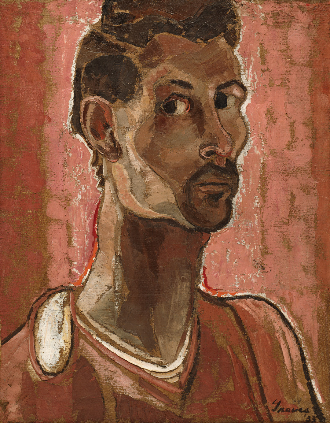
Graves’s Self-portrait of 1933 is a rare subject for the artist, who most figured was too private a man to put himself out there by painting himself much. Against a soft abstract background, his form emerges, defined by a rhythmic, undulating outline. His head is perched upon an impossibly long neck. He gazes sidelong out of the canvas with a look that wants to tell us something, and many have thought they knew exactly what.

Graves, though, was a hard character to pin down. He was interesting. Frederick Wight, who was director of the Art Gallery at UCLA, met Graves and later described him as “an exceedingly tall thin figure, with large transfixed, rather alarmed eyes . . . He is shy and self-aware to a degree, aloof yet (you suspect) ruthless in his self-determination . . . In short he is very birdlike: receding, private, mobile, and migratory . . . he has the willful steely quality of a bird—its fierce capacity to survive.”

Nancy Wilson Ross, a friend and confidant of Graves’s, called him “mysterious,” saying he carried moods redolent of changing seasons. Ross ended on the same comparison as Wight: “Like the birds Graves knows so intimately, he is a migratory creature; not so much willfully nomadic as purposefully so.”

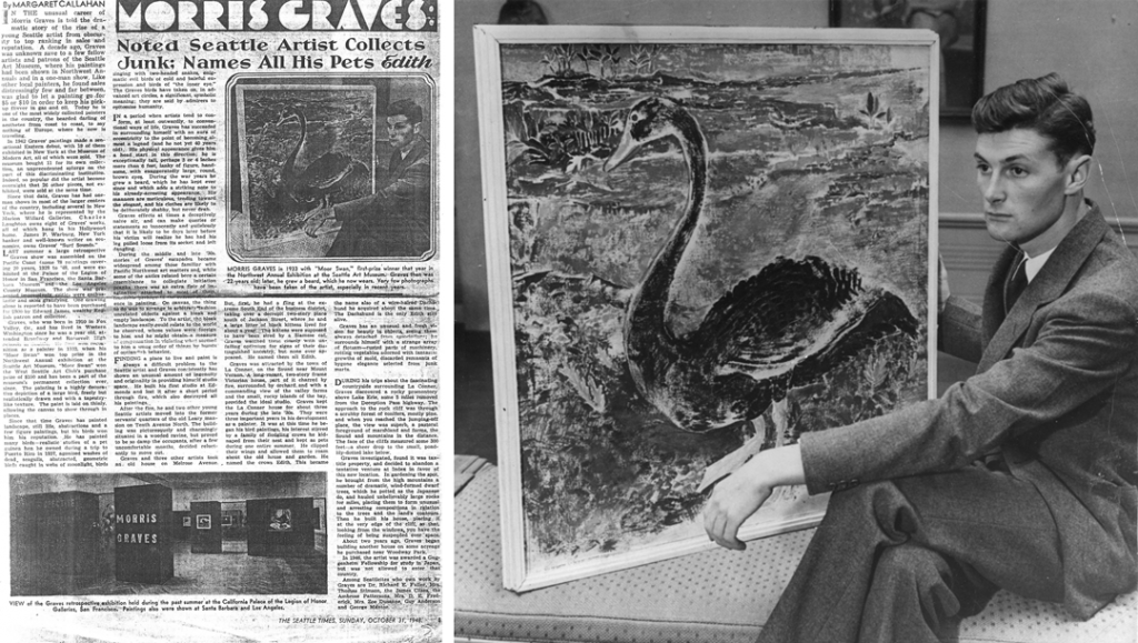
Author Margaret Callahan attached some curious distinctions to Morris Graves when publishing the photo in The Seattle Times in 1948.

No doubt Graves’s seasons of mood meant that he left different impressions on the many who encountered him. Besides, perceptions vary: “steely” and “birdlike” to one might look like unapproachable and withdrawn or even admirably stoic to another. We might get a totally different animal to fill the metaphor.

Theodore Wolff, an art critic who produced a catalogue essay on Graves, was struck by his encounter with the artist—so moved that he typed up the following letter:

Dear Morris:
Just a word to say how very happy I am to finally have met you. I am most particularly pleased at the extraordinary quality of strength and sturdiness you radiate; you resemble your Joyous Young Pines much more than you do any of your birds (!!).¹

Bird? Pine?

One would think that going to the source would provide clarity, but Graves’s own letters produce more questions, revealing more quirks and intricacies of character. He is alternately kind and sensitive, harsh and resentful. There are moments of resolute pride and of defeated self-doubt. At times Graves is fully convinced of his importance and the value of his art. On December 5, 1932, at an early stage of his career around the time he produced his Self-portrait, he boasted in a letter to his intimate friend Merita Mills:

I know I can paint in all the violent color and draw all the magnificent lines I want to someday, and be thrilled with the results; smug as it sounds, I just am unavoidably sure I can do it.²

The verve with which he began his career finds a sad bookend in the self-deprecation that shows up in some of his last letters. In 1997, Graves wrote to SAM curator Vicki Halper, saying

My painted images have, somehow, only been very minor Shinto haikus trying to communicate my mind’s range of humanitarian, rational, and irrational experiences and ideas.

I’m a fifth-rate rural American painter of the 1930s and 40s. I gladly surmise that you have all along been aware of this.
–Morris³

What makes the Self-portrait so fascinating and magnetic is that it seems to reveal something of how Graves saw himself. But what’s in a self-portrait? Are we really learning anything? As a description of oneself, is it any more truthful than another’s description—or any more complete? For me, a self-portrait does reveal; it just doesn’t reveal everything. No one picture, in paint or in words, could convey all the complexity of Morris or of you or of me, and to think we know him from this painting can’t be quite right.

The Self-portrait doesn’t say everything there is to say about Morris Graves. Gladly, we get more doses of the artist’s self-reflection in the third floor PONCHO Gallery. Hanging right next to Self-portrait is Morning, a painting where the figure, a slender shirtless man, squirms uncomfortably on his bed, a voyeuristic display in front of us. Across the room from these hangs the solitary Moor Swan, a painting Graves exhibited in the 1933 annual show of Northwest artists at SAM, in which it won the big $100 purchase prize. A period photo reproduced here captures Morris with his winning piece, and Morris, it must be said, is looking very birdlike, indeed.

Some have read the Moor Swan as a symbolic self-portrait. I’m okay with that, as long as we remember: He is the bird and the pine; He is the moustache and the swan.

Jeffrey Carlson, SAM Collections Coordinator

IMAGES: Self-portrait, 1933, Morris Graves (born Fox Valley, Oregon, 1910; died Loleta, California, 2001), oil on canvas, 25 1/2 x 19 3/4 in., Seattle Art Museum, Gift of Florence Weinstein in memory of Max Weinstein, 85.268, © Morris Graves Foundation. Photo published by The Seattle Times, 1933, 1945, 1948.
¹Reproduced in Morris Graves: Selected Letters, p. 97.
²Reproduced in Morris Graves: Selected Letters, pp. 254-255.
³Reproduced in Morris Graves: Selected Letters, pp. 316-317.

Object of the Week: The Mom Call

Eyes gravitate toward Brian Jungen’s work. On the surface, unexpected combinations make us wonder at the artist’s creativity. Looking more deeply, we find Jungen exploring identity in a way that resonates and challenges.

Jungen’s sculptural work The Mom Call acts like a stage where the forces of artistic choice and influence collide. The artist’s choices are unique. They also make very clear references to the life experiences that have shaped him. A combination of family and artistic heritage helped to bring about these choices, and in Jungen’s work, we see the artist physically molding a multi-faceted identity for himself.

In The Mom Call, Jungen has appropriated a chair produced for a notable 1940 design competition. By sampling the winning chair, he brings into his work the exclusive, European, bourgeois connotations linked to high-end design. The chair, though, is swallowed up in American elk hide, which is drawn taut by tarred twine according to traditional Native methods, forming a funny-looking—but functional—drum. Jungen was born in Fort St. John, British Columbia, to a Swiss-Canadian father and a Native mother of the Dane-zaa Nation. That dual heritage plays out in fascinating ways in Jungen’s work, where we can see him navigating his ancestries and finding a place among them.

A defining characteristic to his work is the clever re-use of objects. The creative vision Jungen displays when transforming Nike Air Jordans into Native-inspired masks, or when constructing whale skeleton replicas from petroleum-based plastics, is the meat and potatoes of his artistry, and he traces that habit of re-appropriating back to his mom. As a child, he would watch his mother and her family use objects outside of their original purposes to get stuff done. This “improvisatory recycling,” as Jungen calls it, was driven by necessity, but it also reflected a habit of looking at things for their potential, rather than their intention. Jungen learned from his mother how to be resourceful, how to deconstruct a known thing and create a new meaning for it.

Back to The Mom Call: The clean lines and the industrial, artificial quality of a modern piece of designer furniture give way to a sloping, organic form. The elk hide covers the chair, hiding its details but revealing its form, and changing its use, but not in a one-to-one transition. When we look at The Mom Call, we’re several steps removed from the item’s original function—chair as chair becomes chair as art object becomes chair-drum as functional art object (and museum exhibit, and so on). Influences, uses, interpretations, contexts, and perspectives all come into play. In this piece, Jungen displays original thinking about forms and how they communicate to us.

Tragically, Jungen lost both his parents in a fire when he was just seven. Through his art, the legacy of both his folks, but especially that of his mom—a woman who he says was “always trying to extend the life of things” 1—remains.

P.S. Brian Jungen’s mom made a difference—as moms do! Happy Mother’s Day to my mom and all our SAM Blog-reading moms!

Image: The Mom Call, 2011, Brian Jungen (Canadian, born 1970), Organic Chair by Eero Saarinen and Charles Eames, American elk hide, tarred twine, steel, granite, 80 1/4 x 33 x 29 1/2 in. Seattle Art Museum, Gift of the Contemporary Collectors Forum, 2014.34, © Brian Jungen, Photo: Natali Wiseman.
1 Source

Object of the Week: Country Ball 1989-2012

In 2013 SAM acquired a video work by contemporary artist Jacolby Satterwhite that would later feature in the SAM-organized exhibition Disguise: Masks and Global African Art (an iteration of which has just opened at the Brooklyn Museum to wide recognition). Though Disguise was still in the planning stages, Satterwhite’s video, called Country Ball 1989-2012, had so much eclectic visual interest, and it was displayed with such a distinctly digital vision, that it was chosen early on as a representative piece for the Seattle show.

"Country Ball 1989-2012" by Jacolby Satterwhite

Country Ball 1989-2012 is a maelstrom of dancing figures and neon elements, a wild ride for its nearly thirteen minutes of running time. Here’s the artist himself talking through his thoughts and creative process:

Using the whole computer-generated landscape and the various vignettes that appear throughout the video, the artist brings together different modes of communication to create a new way of expressing that is distinctly his. Dance comes to the fore as a versatile language with meaning in a range of contexts. As the artist narrates, the genus of the work lies in a Mother’s Day cookout in the park (by the way, thank you to all the moms!), enlivened by choreographed dance. The artist himself performs dance in eccentric dress to add his own movement and personality to the work. Even the viewer’s perspective seems to dance as it meanders through this dynamic virtual landscape.

Re-presenting a home video and introducing the artist’s original dance performance, and itself being a museum-owned artwork, Country Ball 1989-2012 illustrates what a wide spectrum of contexts and environments feature dance as an act of importance and value.

—Jeffrey Carlson, SAM Collections Coordinator

IMAGES: Country Ball 1989-2012, 2012, Jacolby Satterwhite, HD digital video with color 3D animation and sound, running time 12:39 mins., Seattle Art Museum, Modern Art Acquisition Fund, 2013.3, © Jacolby Satterwhite.

Object of the Week: Mount Rainier, Bay of Tacoma—Puget Sound

How great is SAM’s painting by Sanford Robinson Gifford of Mount Rainier, Bay of Tacoma—Puget Sound?

Consider:

1. It’s been made into a cake. In 1990, when the museum acquired the painting, we celebrated its arrival with a cake that sported a frosting facsimile.

It's a cake with a painting on it!

2. It features “the original Tacoma Dome.” In 2011, SAM’s awesome marketing team (still awesome, by the way) produced a pithy billboard with a reproduction of the Gifford painting, beckoning Seattleites to come see the Beauty and Bounty exhibition in which it starred that summer.

"The Original Tacoma Dome" billboard

3. Its artistic merits, of course. Gifford had an immaculate sense for atmospheric light and color that gave rise, in later scholarship, to the very appropriate term luminism.

4. The vision it provides of life in the Puget Sound at a time when natives lived here in harmony with the land.

Here’s the story. Gifford traveled to the Washington Territory in the summer of 1874, and he was clearly moved by the imposing view of Mount Rainier from Commencement Bay in Tacoma. He sketched out several different compositions in pencil from various vantage points across the bay. We even know the day when he produced the drawing that inspired this painting: September 1. Later, in the winter of 1875, he worked up the full painting in his New York studio.

You can see Gifford's pencil lines demarcating the horizon line and dome of Rainier due to a thin paint layer that has become even more transparent with age.

You can see Gifford’s pencil lines demarcating the horizon line and dome of Rainier, due to a thin paint layer that has become even more transparent with age.

Gifford, like his rough contemporary Albert Bierstadt, excelled in producing romantic visions of the West that appealed to East Coast and, increasingly, international audiences, for whom the rugged terrain and the different lifestyle of the natives here carried the appeal of the exotic. Gifford’s Mount Rainier, Bay of Tacoma—Puget Sound is a romanticized view: He would have seen more evidence of the lumber industry beginning to transform the landscape around the time he visited. Still, the artist communicates a sense of awe and discovery that seems entirely genuine. His painting helps me see the true beauty of Mt. Rainier and the diverse landscape of Puget Sound with fresh eyes and a greater sense of appreciation. Gifford reminds us that in the Pacific Northwest, as much as anywhere, we have an abundance of natural beauty for which to be thankful, that we might appreciate it, enjoy it, and always aim to take good care of it.

—Jeffrey Carlson, SAM Collections Coordinator

Images:  Mount Rainier, Bay of Tacoma—Puget Sound, 1875, Sanford Robinson Gifford (American, born Greenfield, N.Y. 1823; died New York City 1880), oil on canvas, 21 x 40 in. Seattle Art Museum, Partial and promised gift of Ann and Tom Barwick and gift, by exchange, of Mr. and Mrs. Louis Brechemin; Max R. Schweitzer; Hickman Price, Jr., in memory of Hickman Price; Eugene Fuller Memorial Collection; Mr. and Mrs. Norman Hirschl; and the Estate of Louise Raymond Owens, 90.29, Paul Macapia. Photo: SAM Archive. Photo: SAM Archive. Mount Rainier, Bay of Tacoma—Puget Sound (detail).

Object of the Week: Italian Room

A powerful quality exclusive to older objects is their ability to spark our imagination as we reflect on where in the world these things have been before they arrived in front of us. It can be totally captivating. The display of historic artworks in our galleries at SAM is only the latest chapter in a long story for each of these pieces. The period room installed on the fourth floor—called the Italian Room a bit anachronistically but not without reason—is a great case study in the life of an art object.

The wood panels hang in a metal stud framework erected during SAM’s expansion in the 2000s, but they are installed at the exact angles and dimensions of the historic room’s specifications. About 145 original pieces comprise the installation. How and why did they come here?

Details of the Italian Room at Seattle Art Museum

An Italian art dealer named Renato Bacchi acquired the room in the 1920s from its original installation in a building scheduled to be remodeled, perhaps “saving” it. The building was located in Chiavenna, a town in northern Lombardy, in a breathtakingly beautiful mountainous region. In the mid-1930s the room, in boards, passed from Bacchi to the German-born antiques dealer Adolph Loewi, who installed it in a Venetian palazzo that served as his gallery space. The Jewish Loewi was persecuted by the Fascist Italian government and moved, with his paneled room, to the U.S. in 1939. Loewi had become one of the most successful international dealers in period rooms, and he proved successful once again, finding a buyer in the notable Northwest architect John Yeon, who had encountered Loewi and his paneled room in Los Angeles. The room enjoyed another interesting chapter as Yeon’s dining room in the architect’s San Francisco flat. This custom installation was a highlight of Yeon’s renovation of the once-rundown building that housed it. Ed Hardy later rented that apartment.

After Yeon passed away in 1994 the building was sold, but Yeon’s partner, Richard Louis Brown, saw that the room was professionally de-installed that it might have another life somewhere else. From his own home in Portland, Brown set about finding a new home for the paneled room, and with SAM, he had a taker. The timing was just right; the museum, in plans for its expansion, would finally have the space to consider a permanent display for such a period room. In 2000, Brown officially donated the Italian Room, doing so in memory of John Yeon. Folks were invited to view the conservation and installation of the room in progress, and since the grand reopening of the expanded SAM in 2007, the Italian Room has been a focal point of the collection.

Italian Room at Seattle Art Museum

In the same year that he brought SAM’s Italian Room to the U.S., dealer Adolph Loewi imported another of the period rooms he would end up dealing: the Gubbio Studiolo now in the collection of the Metropolitan Museum of Art. See, old things have wonderful stories—not just about where they’ve been, but about who and what they’ve encountered along the way.

—Jeffrey Carlson, SAM Collections Coordinator

Images: Italian Room, ca. 1575-1600, spruce, willow, and fir, 171 9/16in. x 200 5/16 in. Seattle Art Museum, Gift of Richard Louis Brown in memory of John Yeon, 2000.218, Photo: Nathaniel Willson. Photo: Collin Shulz. Photo: Collin Shulz. Photo: Nathaniel Willson.

Object of the Week: Buddha

Celebrations of spring are happening all around us. It’s opening week for baseball and Masters Tournament time in golf. Here in Seattle, the sun is shining, the flowers are blooming, and all of a sudden it’s like we live in a populous city. You never have a sense for how many people live (and vacation) here until the sun comes out!

Flowers outside of the Asian Art Museum

Flowers bloomin’ outside of the Asian Art Museum

As wonderful and anticipated as these developments are, today we’re focused on another springtime celebration: It’s Buddha’s birthday!

To be precise, it’s Buddha’s birthday in the Japanese tradition; the same event is remembered on various dates in spring across the world. Many Asian countries commemorate Buddha’s birth on the first full moon of the 4th month in the Chinese lunar calendar (which falls in May). Japan adopted the Gregorian, or Western, calendar in the 19th century and moved its celebration of Buddha’s birthday up to April 8, about a month earlier.

Thankfully for both our regular visitors and out-of-towners, we have a bevy of fine Buddhist art at the Asian Art Museum to help everyone celebrate appropriately. The new installation Awakened Ones: Buddhas of Asia highlights some of the finest representations of Buddha in the museum’s collection, including this stunning wood sculpture coated with gold lacquer. Called an Amida Buddha for its symbolic form, the figure was crafted during the late Heian period (794-1185) in Japan. Its maker used the yosegi-tsukuri technique, carving wood blocks, hollowing them out, and then assembling them together. The Buddha strikes a meditative pose that exudes total peace.

Installation view of Awakened Ones: Buddhas of Asia

In Japanese Buddhist traditions special connections exist between Buddha and the flower that make celebrating him in the springtime especially appropriate. Hana-Matsuri, the Floral Festival, is a memorial service performed at temples throughout Japan on Buddha’s birthday. Those who make pilgrimages to the temples bring offerings of fresh spring flowers and libations of tea. For its original installation in a Kyoto temple, this Buddha sculpture would have been seated on a lotus pedestal.

Installation view of Awakened Ones: Buddhas of Asia

The company he keeps in Awakened Ones, where he is surrounded by sculptures and paintings from China, India, Korea, Nepal, and Pakistan, leaves one with a sense for the wide reach of Buddhist teachings and the many ways Buddha is pictured and remembered.

—Jeffrey Carlson, SAM Collections Coordinator

IMAGES: Buddha, ca. 1130, Japanese, wood with gold lacquer, 37 1/4 x 27 x 17 in. Seattle Art Museum, Gift of the Monsen Family, 2011.39, Photo: Natali Wiseman. Photo: Natali Wiseman. Installation view of Awakened Ones:Buddhas of Asia at Asian Art Museum, © Seattle Art Museum, Photo: Natali Wiseman. Installation view of Awakened Ones:Buddhas of Asia at Asian Art Museum, © Seattle Art Museum, Photo: Natali Wiseman.

Object of the Week: Stranger Here

I’m a stranger here
I’m a stranger everywhere
I would go home
But I’m a stranger there.

 I’d rather drink muddy water
I’d rather sleep on a hollow log
Than to stay here in this city
Being treated like a dirty dog.

 That’s why I got up this mornin’
And I put on my walkin’ shoes
I’m goin’ down the road, down the road
Cause I got them walkin’ blues

One of the newest works in the Seattle Art Museum collection is Whitfield Lovell’s Stranger Here. Lovell’s piece was inspired by a police mugshot, circa 1910s, depicting a sharp-dressed man of color, and its title comes from an old blues song, whose lyrics we share above. Stranger Here pays homage to a man whose story has been forgotten but whose image remains.

This three-dimensional portrait uses charcoal on found wood, fringe fabric, and an antique lantern to evoke the spirit of the time when the sitter’s picture was taken. The fringe, draped around the man’s bowler hat like drawn curtains, gives the piece a theatrical presence and also creates a sense that something significant is being revealed. In the theater, it’s a dramatic, expectant moment when the curtain is finally drawn and some anticipated spectacle unveils itself. Here, the curtain frames the image and encourages us to pay notice to what we find behind it.

The idea of anonymity, and being disconnected from one another, is especially important to Lovell’s work. Does it bother us that we don’t know the man? That we are denied his story? That we don’t understand all of what we are seeing or truly grasp its significance? In case we might have passed by, missing this quiet figure softly modeled in charcoal, the artist gives us a lantern by which to see.

One floor above Lovell’s piece, in our special exhibition Kehinde Wiley: A New Republic, hangs another stranger’s portrait inspired by a mugshot. Kehinde Wiley’s Mugshot Study from 2006 pictures a young person of color, his anonymity emphasized by the case number printed below his image. In life, these two men were separated by a century, but here at SAM they share more similarities than differences: both gaze out of their frame resolutely, meeting the viewer’s eye, embodying strength, yet expressing a sad tiredness from their life’s walk.

–Jeffrey Carlson, SAM Collections Coordinator

Image: Stranger Here, 2000, Whitfield Lovell (American, born 1959), charcoal on wood, with fabric and lantern, 42 x 29 1/2 x 8 in. Seattle Art Museum, Gift of Norman and Constance Rice, 2016.1, © Whitfield Lovell, Photo: Natali Wiseman.

Object of the Week: Camel

Of the nearly 24,000 objects in SAM’s collection, two sculptures have probably had the broadest impact on visitors’ experience of the museum since it opened in 1933. They have proven a popular attraction for visitors of all ages, newcomers and regulars alike. For a long time, though, they weren’t even physically in the museum. They’re the greeters, the guardians. They are: the camels.

Writing in 1968—35 years after the arrival of our Chinese camels and the opening of our doors—SAM founding director Dr. Richard Fuller proclaimed the camels “unquestionably the most popular items” in the museum’s collection. No doubt this was partly because he enthusiastically encouraged kids to have a go at riding them.

Riding the Camel

Kids on the Camel

Standing on the Camel

Chosen specifically by Dr. Fuller and his mother, SAM co-founder Margaret MacTavish Fuller, to be the symbolic guardians of the museum, they were installed on either side of the front entrance. Former SAM curator and historian Josh Yiu reflected on their significance: “They were the first works of art that children and adults alike experienced at the Seattle Art Museum. The camels achieved an iconic status because they introduced art, the museum, and China to the general public.”1

Asian Art Museum Exterior in 1933

Dr. Fuller also clearly saw in the pair of marble bactrians an impressive aesthetic achievement, one that complemented the striking Art Deco design of SAM’s original building in Volunteer Park and echoed the cultural focus of its artworks. In his personal correspondence from 1933, Fuller wrote the following justification:

“Granting that the sculptor had made no attempt to achieve lifelike forms, I think that there is no question but that his results are great works of art…Viewed purely from the view-point of artistry, I personally think that it would be almost impossible to have modern sculpture designed that could have coincided more perfectly with the spirit that we endeavored to attain in the design of the building, and it seems especially fortunate that they should, at the same time, emphasize our interest in Oriental art.”

Camel

In 1986 conservation concerns won out, and the camel-riding tradition came to a sad, but necessary end (hundreds-of-years-old marble sculptures, folks). We no longer sanction it, at least! The Chinese camels journeyed downtown for the inaugural installation here in 1991, and today replicas flank the front doors to the Asian Art Museum.

Camel replica being installed

You can still see (not ride) the originals in our grand stairway.

—Jeffrey Carlson, SAM Collections Coordinator

1 Josh Yiu, A Fuller View of China, Seattle, Wash.: Seattle Art Museum, 2014; 46.

IMAGES: Camel, Chinese, late 14th-mid-17th century, marble, each 101 1/2 x 56 x 36 1/2 in. Seattle Art Museum, Eugene Fuller Memorial Collection, 33.814.1, 33.814.2, Photo: Jasmine Boothroyd. Photos: SAM Archive.

Object of the Week: Les Années 90 (The Nineties)

Congolese artist Chéri Samba has said that he likes to incorporate text into his narrative paintings because it keeps the viewer’s eye on the art longer. For visitors who find Samba’s acrylic painting of The Nineties in our Emblems of Encounter installation, it’s not just the French text that needs deciphering. Untangling what’s happening in the picture—as well as thinking about how the text informs the scene—all takes time and effort. Samba has created an image rich with symbolism and relationships for sorting out, and there’s plenty to delve into before even getting to the language.

Most clearly, the scene shows us two men. In the lower left, a figure in a blue suit, sleeves rolled up, lounges passively. His pocket is stuffed with cash, while the chest next to him is noticeably empty. His brown skin contrasts the fair skin of the second man. He looks and gestures toward this figure, who stands near the center of the composition, donning green pants and a white jacket, and gripping a briefcase in his left hand. He’s not looking back at the seated figure to receive the gesture. Instead, he gazes outward purposefully, toward the portion of the canvas where threatening clouds have lifted just a bit.

Les Années 90 (detail) by Cheri Samba

There’s a ground in a burnt sienna color very nearly connecting them both, except for a path of moody blue water. The scale of the figures—the man in the blue suit fills about twice as much of the canvas as the other man—also communicates to us that there’s distance between them. Our view of the water ends as it comes to what looks like a grey stone wall, its edge jagged like the irregular coastlines of the two land masses on which the figures stand. With the rough wall, forming a barrier between the men, there’s further separation where connection seems more natural.

The man in the blue suit is seated on a grassy green surface. Above and behind him, we see the outline of the continent of Africa, filled in with the same fertile green, composed of many short marks, as blades of grass in a field. The artist has laid a symbol onto the map, and because of its shape and function we’d expect this to be an “x”–only one arm of this symbol is significantly longer than the others, so the shape more closely resembles a cross.

Samba’s painting offers a biting satire of hypocrisy and greed, in a scene reflecting on corrupt leadership and rapacious opportunism. Judging by the work’s title, The Nineties, we imagine the artist is reflecting on a specific time period and likely responding to certain wrongs. That he painted this only in 1991 adds even more weightiness to the picture; it seems to be a dark vision of what he foresaw unfolding as much as a rebuke of events he had already witnessed.

Emblems of Encounter installation at Seattle Art Museum

In Emblems of Encounter, Samba’s thoughtful critique joins a group of objects that chart 500 years of the complex and difficult history of European-African interaction. Considering The Nineties, even without the specific narrative laid out, I’m reminded that our understanding of nuanced histories depends, to a large extent, on what side of the shore we stand as we perceive them.

—Jeffrey Carlson, SAM Collections Coordinator

Image: Les Années 90 (The Nineties), 1991, Cheri Samba (Congolese, born 1956), acrylic on canvas, 59 x 77 x 1 1/2 in. Seattle Art Museum, Margaret E. Fuller Purchase Fund, 93.81, © Cheri Samba. Les Années 90 (The Nineties) (detail). Salt cellar, ca. 1490-1530, Sapi culture, Sierra Leone, ivory, 6 3/4 x 3 5/8 in. Seattle Art Museum, Gift of Nasli and Alice Heeramaneck, 68.30.
SAMBlog