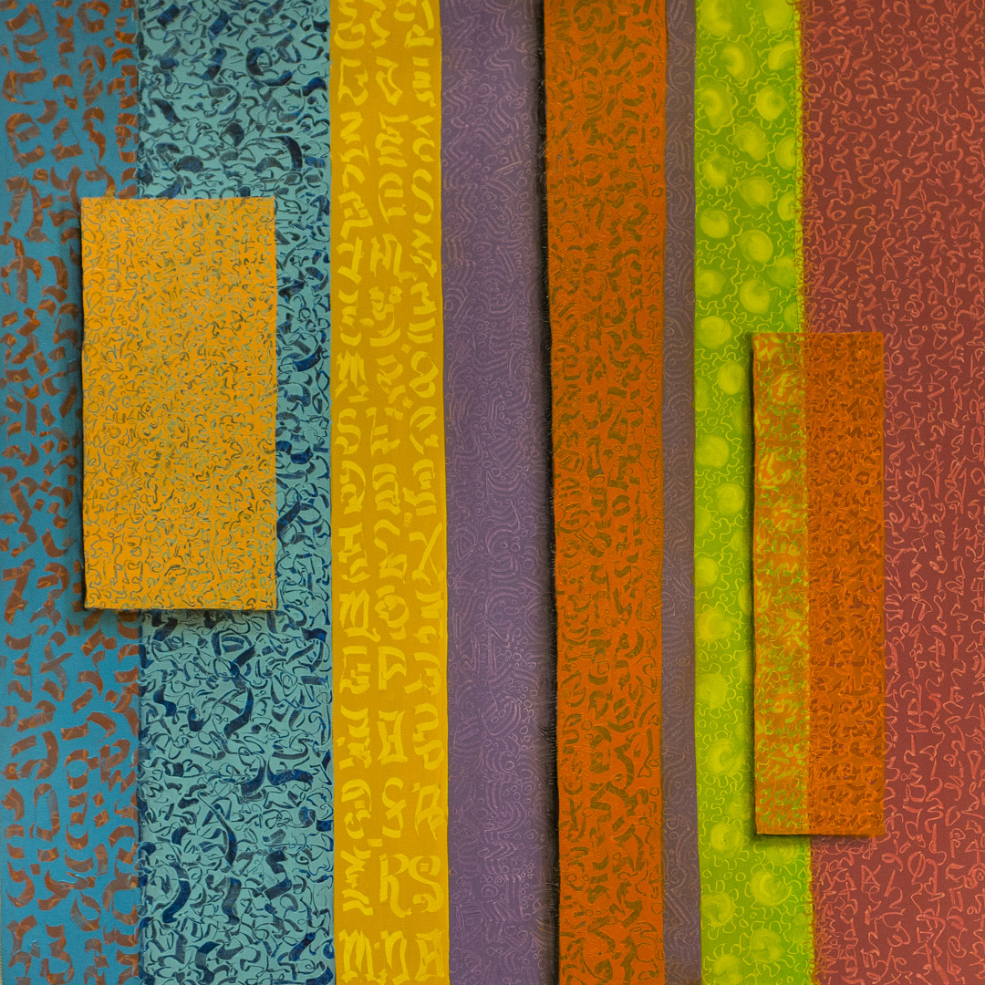
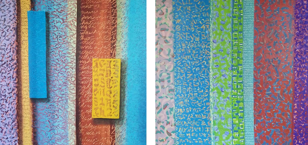
Object of the Week: March of the Weavers

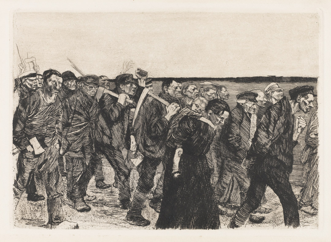
In 2015 SAM acquired this small—but powerful—etching by German artist Käthe Kollwitz. March of the Weavers is the fourth plate of six in a series Kollwitz called Ein Weberaufstand (The Rise of the Weavers). This series proved to be one of the most important works of her early career, as its public display in Berlin in 1898 catapulted her to national recognition. With the content of The Rise of the Weavers, Kollwitz was responding to a theatrical play by Gerhard Hauptmann, titled The Weavers, which told the story of an 1844 revolt over wages. In her diary, Kollwitz remembers the excitement and inspiration she gleaned from viewing that play, as well as the challenges she faced producing the series:

“A great event took place during this time: the Freie Buehne’s première of Hauptmann’s The Weavers. The performance was given in the morning. I no longer remember who got me a ticket. My husband’s work kept him from going, but I was there, burning with anticipation. The impression the play made was tremendous. The best actors of the day participated, with Else Lehman playing the young weaver’s wife. In the evening there was a large gathering to celebrate, and Hauptmann was hailed as the leader of youth.

“That performance was a milestone in my work. I dropped the series on Germinal and set to work on The Weavers. At the time I had so little technique that my first attempts were failures. For this reason the first three plates of the series were lithographed, and only the last three successfully etched: The March of the Weavers, Storming the Owner’s House, and The End. My work on this series was slow and painful. But it gradually came, and I wanted to dedicate the series to my father. I intended to preface it with Heine’s poem, ‘The Weavers.’ But meanwhile my father fell critically ill, and he did not live to see the success I had when this work was exhibited. On the other hand, I had the pleasure of laying before him the complete Weavers cycle on his seventieth birthday in our peasant cottage at Rauschen. He was overjoyed. I can still remember how he ran through the house calling again and again to Mother to come and see what little Kaethe had done. In the spring of the following year he died.”1

Kollwitz might have contented herself with the satisfaction of sharing her art with proud family members had it not been for the timely help of a friend:

“I was so depressed because I could no longer give him the pleasure of seeing the work publicly exhibited that I dropped the idea of a show. A good friend of mine, Anna Plehn, said, ‘Let me arrange everything.’ She entered the series for me, sent it in to the jury, and a few weeks later it was in the show at the Lehrter Station. Later I heard that the jury—Menzel was one of the members—had voted that the Weavers be given the small gold medal. The Kaiser vetoed the recommendation. But from then on, at one blow, I was counted among the foremost artists of the country. Max Lehrs, director of the Dresden collection of engravings and drawings, bought the series and succeeded in procuring the gold medal for it. To this day the Weavers is probably the best-known work I have done.”2

In The March of the Weavers and the series of which it is part, Kollwitz expressed solidarity with the working force. Her concerns were not only socio-political, but also aesthetic. Physical effort visualized in moving masses captured her imagination. For Kollwitz, celebrating workers became a cathartic release, one she would return to throughout her career:

“My real motive for choosing my subjects almost exclusively from the life of the workers was that only such subjects gave me in a simple and unqualified way what I felt to be beautiful. For me the Koenigsberg longshoremen had beauty; the Polish jimkes on their grain ships had beauty; the broad freedom of movement in the gestures of the common people had beauty. Middle-class people held no appeal for me at all. Bourgeois life as a whole seemed to me pedantic. The proletariat, on the other hand, had a grandness of manner, a breadth to their lives . . . And portraying them again and again opened a safety-valve for me; it made life bearable.”3

–Jeffrey Carlson, SAM Collections Coordinator
1 Käthe Kollwitz, Diary and Letters, ed. Hans Kollwitz, transl. Richard and Clara Winston, Chicago: Henry Regnery Company, 1955; 42.
2 Kollwitz, Diary and Letters, 42-43.
3 Kollwitz, Diary and Letters, 43.
Image: Weberzug (March of the Weavers), 1893-1897, published ca. 1931, Käthe Kollwitz (German, 1867-1945), etching, 10 3/4 x 15 3/4 in. Seattle Art Museum, Gift of DeAnn and David Finkel, in memory of Harriet Clayton and Daniel Clayton, 2015.20.1, 2015.20.1 © 2017 Artists Rights Society (ARS), New York

Expansive Terratopia: Chinese Landscape in Poetry

The Way dissolves into rivers
The Way coagulates into mountains.

–Sun Ch’o, Fourth Century [1]

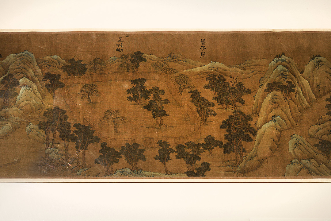
Shan Shui, or river and mountains, is a Chinese term for landscape.[2] During the Six Dynasties (220 AD–589 AD) Shan Shui became a popular style of landscape painting as well as referring to a specific form of landscape poetry. In Terratopia: The Chinese Landscape in Painting and Film at the Asian Art Museum you will see examples of Shan Shui painting as the exhibition displays centuries of works to examine the role of landscape as an enduring subject of artistic, philosophical, and environmental reflection from the 3rd to the 21st century. In the paintings of the exhibition, you’ll notice calligraphy on pieces such as Wangchuan Villa (17th Century). The inscription refers to a series of Shan Shui poems by Wang Wei whose country retreat at Wang River is depicted in the painting. Wang’s couplets, focused on the natural landscape of his retreat, are collected, with the poems of fellow poet Pei Di, as the Wheel River Sequence. A sample of these poems, meant to convey imagery and tranquility are below.

Deer Park

No one seen. In empty mountains,
hints of drifting voice, no more.

Entering these deep woods, late sun-
light ablaze on green moss, rising.

Magnolia Park

Autumn mountains gathering last light,
one bird follows another in flight away.

Shifting kingfisher-greens flash radiant
scatters. Evening mists: nowhere they are.

Vagary Lake

Flute-song carries beyond furthest shores.
In dusk light, I bid you a sage’s farewell.

Across this lake, in the turn of a head,
mountain greens furl into white clouds.[3]

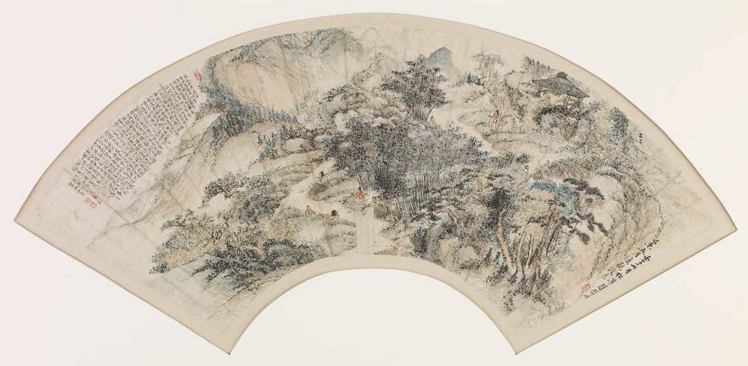
Perhaps one of the most iconic pieces of writing that begins to unfold a long history of the role of poetry in Chinese landscape painting is written on The Orchid Pavilion Gathering created in 1732 by Chen Fu based on the original work of Wang Xizhi (303-361), the whereabouts of which has been unknown since the Tang Dynasty. This calligraphy is the Lanting Xu (Preface to the Poems Composed at the Orchid Pavilion), written as a preface to a collection of poems generated during the famed Orchid Pavilion Gathering of literati. Read the Lanting Xu to begin your own journey into the poetry associated with the works of art you can see at Asian Art Museum before Terratopia closes.

“First Inscription: In the ninth year of the Eternal Harmony era in the beginning of the last month of spring when the calendar was in kuei-ch’ou [353], we met at the Orchid Pavilion in Shan-yin, Kuei-chi to celebrate the Bathing Festival. All the worthy men assembled; the young and the senior gathered together. Here were lofty mountains and towering hills, thick groves and tall bamboo. And, there was a clear, rapid stream reflecting everything around that had been diverted to play the game of floating wine-cups along a winding course. We sat down in order of precedence. Though we had none of the magnificent sounds of strings and flutes, a cup of wine and then a poem was enough to stir our innermost feelings. This was a day when the sky was bright and the air was pure. A gentle breeze warmed us. Upwards we gazed to contemplate the immensity of the universe; downwards we peered to scrutinize the abundance of living things. In this way, we let our eyes roam and our emotions become aroused so that we enjoy to the fullest these sights and sounds. This was happiness, indeed! Men associate with each other but for the brief span of their lives. Some are content to control their innermost feelings as they converse inside a room. Some are prompted to give rein to their ambitions and lead wild, unfettered lives. There is all the difference between controlled and abandoned natures, just as the quiescent and the frenzied are unalike. Yet, both take pleasure from whatever they encounter, possessing it but for a while. Happy and content, they remain unaware that old age is fast approaching. And, when they tire of something, they let their feelings change along with events as they experience a deep melancholy. What they had taken pleasure in has now passed away in an instant, so how could their hearts not give rise to longing? Furthermore, a long or short life depends on the transformation of all things: everything must come to an end. An ancient said, “Life and death are the greatest of matters, indeed!” Isn’t this reason enough to be sad? Whenever I read of the causes of melancholy felt by men of the past, it is like joining together two halves of a tally. I always feel sad when I read them, yet I cannot quite understand why. But I know that it is meaningless to say life and death are the same; and to equate the longevity of P’eng-tsu with that of Shang-tzu is simply wrong. Future readers will look back upon today just as we look back at the past. How sad it all is! Therefore, I have recorded my contemporaries and transcribed what they have written. Over distant generations and changing events, what gives rise to melancholy will be the same. Future readers will also feel moved by these writings.”

This is your final weekend to see the historical paintings and the contemporary film work of Yang Fudong in Terratopia before it closes on Sunday, February 26. As it says in the Preface to the Poems Composed at the Orchid Pavilion, “. . . life depends on the transformation of all things: everything must come to an end.”

If all this poetry has you yearning for more landscapes, come to Seattle Art Museum to see Seeing Nature: Landscape Masterworks from the Paul G. Allen Family Collection, on view through May 23. And keep in mind, the Asian Art Museum is temporarily closing for renovation beginning Monday but installations featuring SAM’s Asian art collection will continue to be on view at the Seattle Art Museum for all to take retreat within.

–Chelsea Werner-Jatzke, Copywriter & Content Strategist

Images: Wangchuan Villa, 17th century, Wang Wei, Chinese, ink and color on silk, 36 ft x 11 13/16 in., Seattle Art Museum, Eugene Fuller Memorial Collection, 47.142, photo: Mark Woods. The Orchid Pavilion Gathering (detail), 1732, color added 1739, Chen Fu, Chinese, active 1730s, ink and color on paper, 13 1/4 X 25 7/8 In., Seattle Art Museum, Eugene Fuller Memorial Collection, 52.138, photo: Elizabeth Mann.
[1] “Yu T’ien-t’ai-shan fu” (Fu-poem of My Wanderings on Mount T’ien-t’ai), Wen-hsü an, 2 vols. (Shanghai), Chapter XI, pp 223–227
[2] Frodsham, J.D. “Landscape Poetry in China and Europe.” Comparative Literature 19, no. 3 (Summer, 1967): pp. 193-215 http://www.jstor.org/stable/1770207
[3] Wang Wei, The Selected Poems of Wang Wei, trans. David Hinton. New York: New Directions, 2006.

Migrations & Marches: Congressman John Lewis, Writer Andrew Aydin, & Artist Nate Powell

On February 22 Congressman John Lewis presented his graphic novel trilogy, MARCH, during Migrations & Marches, a SAM event taking place at Benaroya Hall in order to accommodate a larger audience. The event was presented as an educational opportunity for regional youth and a majority of the seats were reserved for students and their families. As a result, public seating was limited and the event sold out almost immediately. To allow more people to take part in this exciting program, we stayed open late to host a free live stream of the talk in Plestcheeff Auditorium. We also kept the Jacob Lawrence: The Migration Series exhibition open and free until 9 pm. If you missed it, not to worry! You can tune in from the comfort of your home anytime, right here!

Created with co-writer Andrew Aydin and New York Times best-selling artist Nate Powell, MARCH, recently the winner of the National Book Award for Young People’s Literature, recounts the story of the civil rights movement through the eyes of one of its most well-known figures and shares important lessons about nonviolent activism and empowerment. Congressman John Lewis is an American icon whose commitment to justice and nonviolence has taken him from an Alabama sharecropper’s farm to a seat in Congress, from a segregated schoolroom to the 1963 March on Washington, and from being beaten by state troopers to receiving the Medal of Freedom from the first African-American president.

Photo: Robert Wade

Object of the Week: Spear Thrower

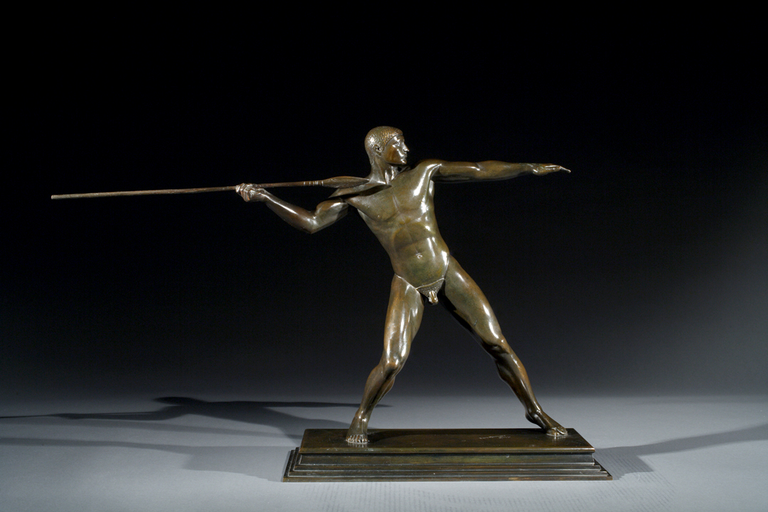
In his bronze sculpture of a Spear Thrower, Paul Manship depicts an athlete in motion. The sculpture has balance and equilibrium as the figure reaches back and prepares to hurl his spear forward. He’s pictured at the moment just before the energy is transferred, with his full weight on the back leg, where the muscles bunch and bulge with exertion. If he’s hurting from the effort, his face doesn’t show it; his look is one of resolve and otherworldly gracefulness. His spear creates a strong horizontal line that is carried across the sculpture by the figure’s fully extended left arm. His features are ripped and generalized; he is an ideal form and not an individual one. With this sculpture Manship celebrated ideas like human strength and achievement, and the beauty of the athlete’s body.

Important links between works of visual art exist everywhere, and part of what SAM and other art museums can do for us is point out this vast web of interconnectedness. Its intricacy and complexity mean that there is always more to discover. For instance, Paul Manship, an American born in Minnesota, was inspired by Indian art, as well as archaic Greek art and the Italian Renaissance that renewed appreciation for classical Greek ideas and developed them further.

In the form of Spear Thrower Manship made a direct reference to this Bronze statue of Zeus or Poseidon at the National Archaeological Museum in Athens. Done in what’s called the “severe style” around 460 BCE, it is a true landmark in the history of art, and remains one of the best-known examples of Early Classical Greek sculpture. It was to this school of art-making, and to this particular work, that Manship looked when he cast the Spear Thrower in 1921.

Interesting comparisons, if less apparent ones, exist even in SAM’s own collection. Have a look at our Black-Figure Amphora displayed on the fourth floor, amid other works from the ancient Mediterranean. Revelers stride across the scene in dynamic poses that have them twisting and contorting their bodies in displays of balance and gracefulness. Each figure stands on a single foot, supported by a powerful, muscular leg. Clean, sinuous lines mark the contours of the figures. All these traits surface visibly in Manship’s work of 2,300 years later.

We’d be doing Manship a disservice, though, if we understood him as only looking backwards. In SAM’s Spear Thrower, as in Manship’s famous Prometheus fountain at Rockefeller Center, he innovated a combination of classical, idealized bodies and a distinctly Modern, streamlined aesthetic that secured him a prominent place in the web of art history.

–Jeffrey Carlson, SAM Collections Coordinator
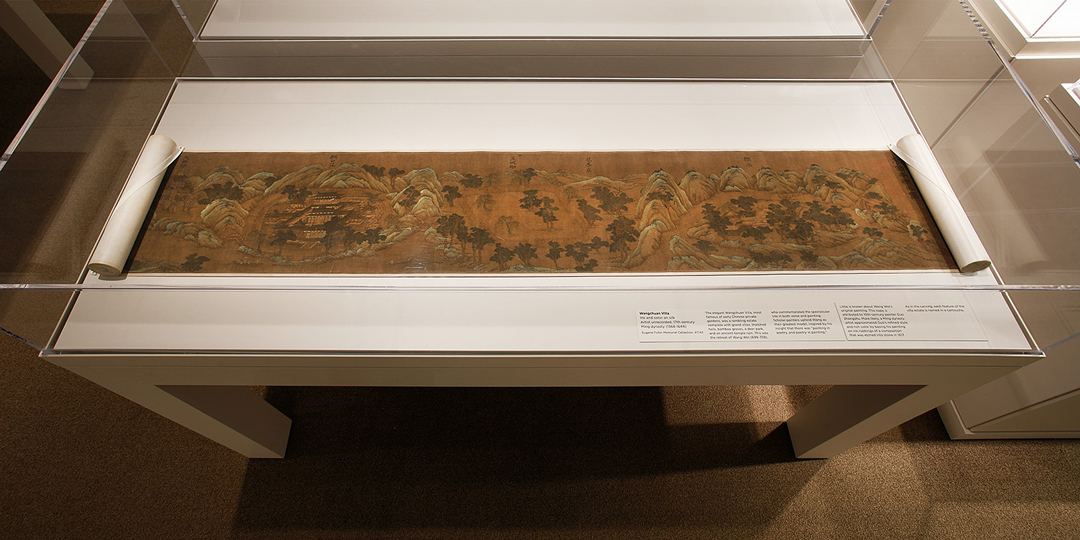
Image: Spear Thrower, 1921, Paul Manship (American, born St. Paul, Minnesota, 1885; died New York City, 1966), bronze, 20 x 31 1/2 x 7 5/8 in. Seattle Art Museum, Bill and Melinda Gates Foundation Art Acquisition Fund, General Acquisition Fund and the American Art Acquisition Fund, 2008.2. Black-Figure Amphora, (Two Handled Vessel) with Donysiac Revels, ca. 525 – 500 B.C. Greek, Attica, ceramic, 17 1/16 x 10 5/8 in., diam.: 28 cm, Norman and Amelia Davis Classical Collection, 63.119.

Object of the Week: Amulet with mummified monkey

Each of us carries with us a lens, or lenses, through which we view the world, and that lens colors and shapes our perception of, and response to, all the sights, sounds, and smells we encounter. It’s no different when we’re viewing art. Each of us brings to the experience of viewing art our own sets of questions. Art historians produce scholarship that discusses a certain object, maker, or concept—but the questions they ask in the process reveal as much about the perspective of the scholar as they do about the object or artist under discussion. Likewise, it’s fascinating to tour through the galleries and eavesdrop on the unfiltered musings of museumgoers to the variety of art we have on display at SAM. Those comments say something about the art and the speaker.

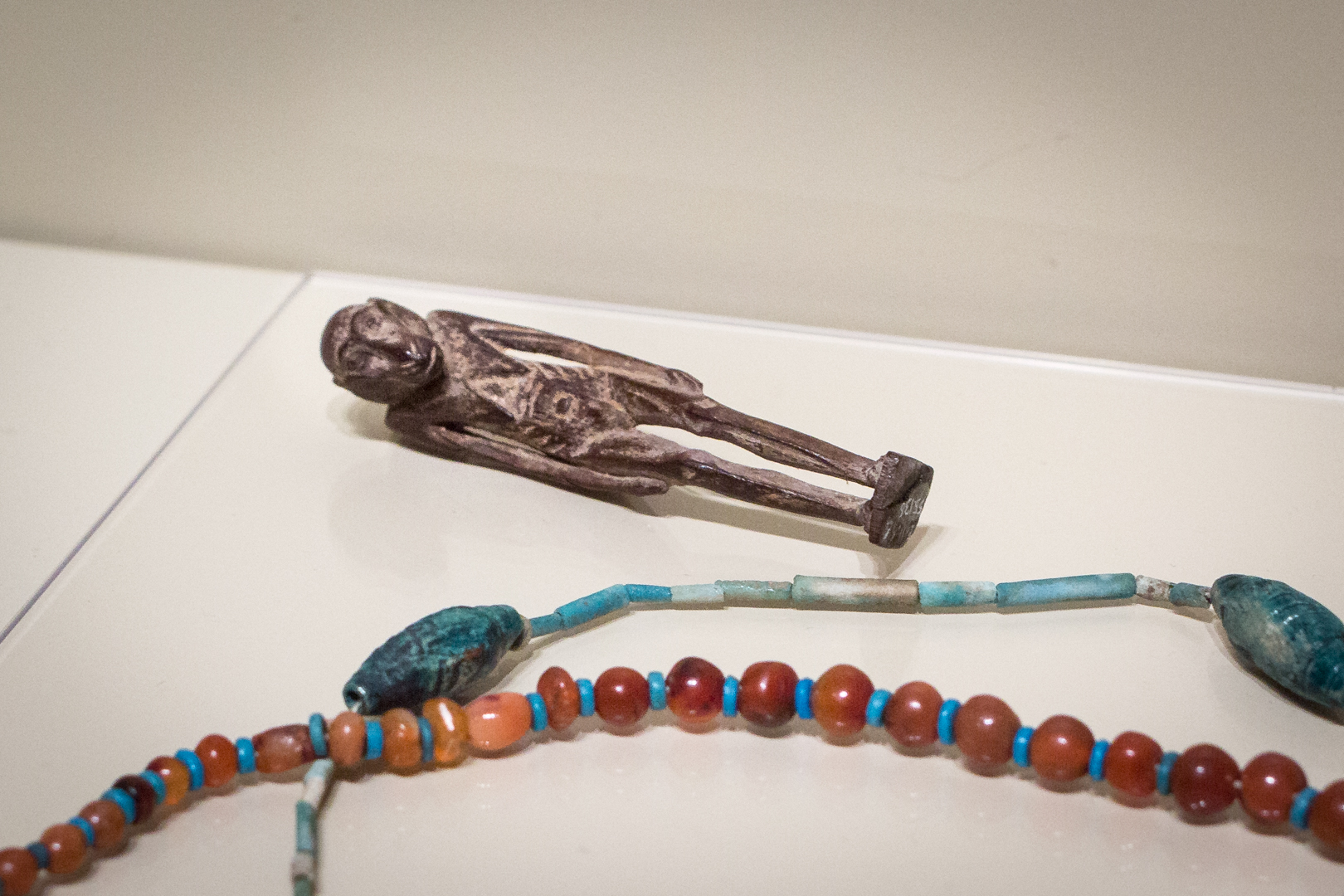
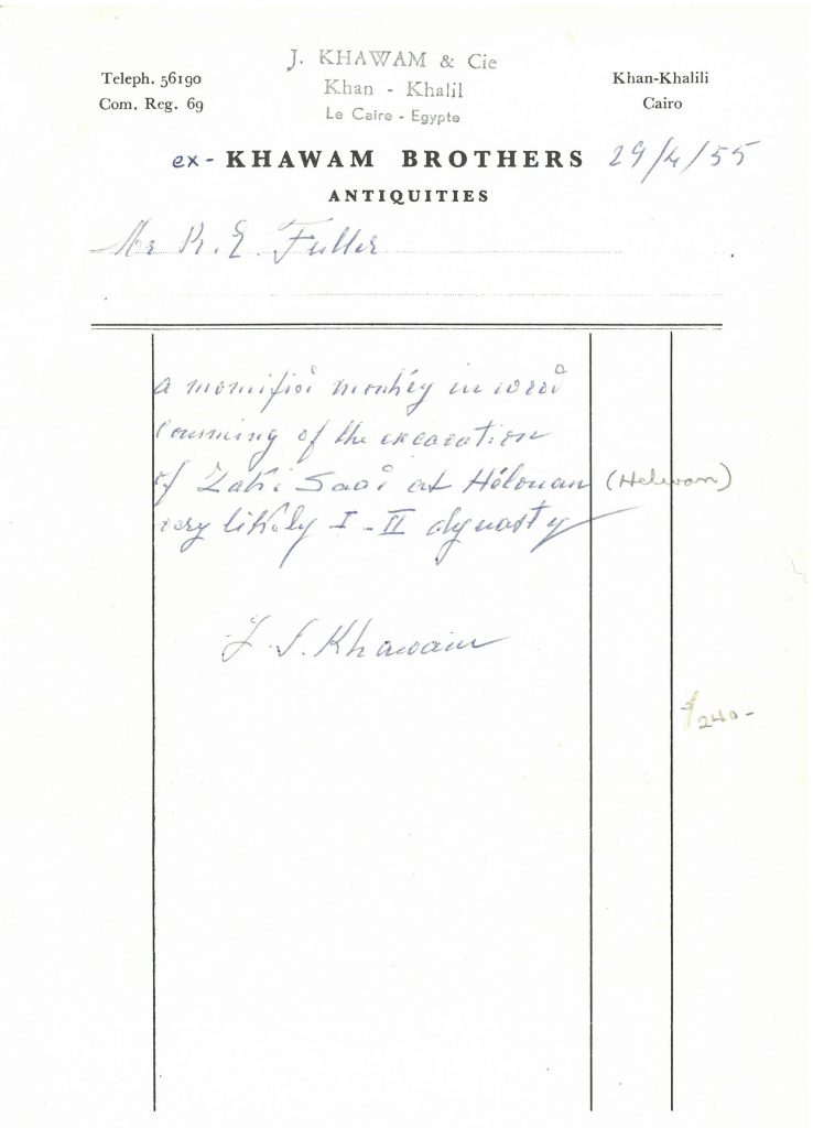
One object that’s commented on less frequently than I’d wish is this diminutive wood Amulet with mummified monkey—a piece that acts, for me, as an ever-present reminder of Dr. Fuller and his collecting principles, so neatly reflected in this ancient, tiny figurative sculpture. Dr. Fuller, who held a Ph.D. in geology and maintained scholarly pursuits in that field throughout his tenure leading SAM (1933–1973), collected many small, old, and odd things. Disinterested in value, he instead sought out rarity. His guiding question was: Does it have a unique character—an “essential factor”? That question drove him to acquire items like this mystifying Amulet, about which little was known when Dr. Fuller purchased it from J. Khawam & Cie, Cairo, for $240 in 1955.

It had few facts to recommend it, but it was a curious piece that provoked questions for Dr. Fuller and would do the same for others. Shortly after acquiring the Amulet, Dr. Fuller received this letter from William K. Simpson, a research associate at the American Research Center in Cairo:

Simpson’s desire to research and publish the Amulet with mummified monkey encouraged Dr. Fuller to seek out expert opinions from fields that were tangentially related to the piece, aiming to solve some of the quandaries it presented. Outside experts brought to the Amulet their own questions. Professor Bror L. Grondal of the College of Forestry at the University of Washington examined the piece in 1956 to determine what kind of wood composes it:

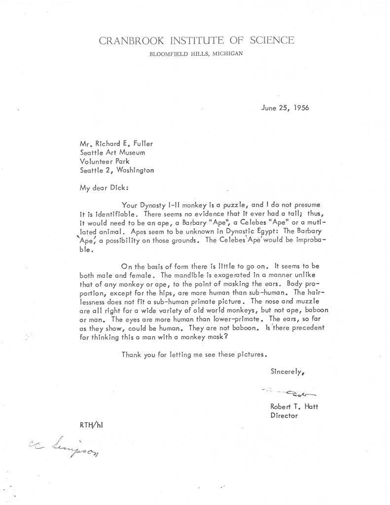
Meanwhile, Robert T. Hatt, a mammalogist at the Cranbrook Institute of Science in Michigan, had been researching ancient and contemporary animals of the Near East. In his letter of June 25, 1956, Hatt shared with Dr. Fuller his thoughts and questions regarding what species of monkey (or ape) might be represented in the Amulet:

Each of us brings to the experience of viewing art our own sets of questions—but to make our contribution, we have to actually ask them. Your curiosity could spark mine or someone else’s, and whether or not we ever arrived at fixed answers, the summation of our questions reveals infinitely more than one viewpoint ever could.

—Jeffrey Carlson, SAM Collections Coordinator
Images: Amulet with mummified monkey, ca. 2920-2649 B.C., Egyptian, Early Dynastic period, wood, 3 3/16 x 11/16 x 7/8 in. Seattle Art Museum, Eugene Fuller Memorial Collection, 55.136, Photo: Natali Wiseman.

Blue Sun: Interview with Victoria Haven

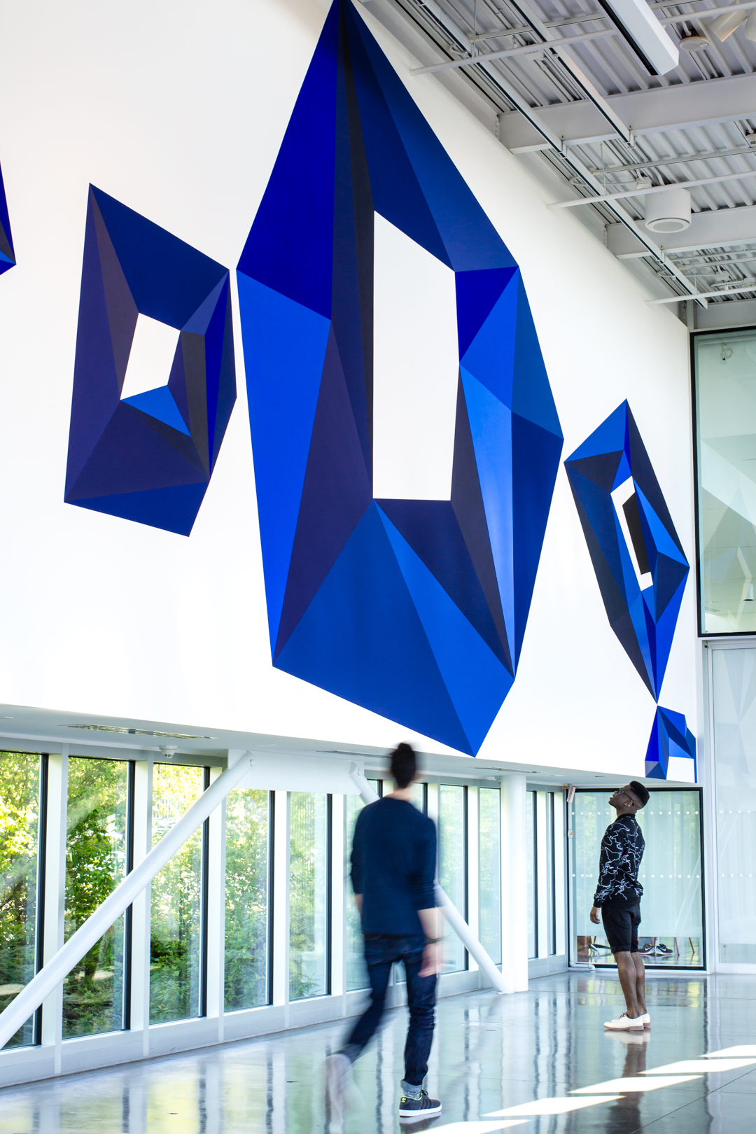
Hovering overhead in the Olympic Sculpture Park’s PACCAR Pavilion is the work of Seattle native, artist Victoria Haven. Blue Sun is a wall drawing inspired by a 2015 video project where the artist filmed the large-scale demolition and development of South Lake Union over a ten-month period. One of the more dramatic examples of Seattle’s rapidly changing urban core, Haven captured over 500,000 still frames through her art studio window and created a time-lapse video piece. Editing and viewing this footage piqued Haven’s interest in the movement of light and shadow and how light impacts a space differently depending on the objects, or in this case architecture, it encounters. With the Olympic Sculpture Park as a canvas for light and shadow, Haven approached the PACCAR Pavilion with a curiosity and intent that she shares with us in this interview about the bold crystalline forms that traverse the entire length of the east wall. Blue Sun closes March 5—don’t miss it!

SAM: How do you see Blue Sun functioning as a sculptural painting in dialogue with the sculptures around it?

Victoria Haven: The first thing I did upon being offered the opportunity to create a work for the Pavilion wall, was to spend many hours in the space considering both the interior architecture (windows, walls, floor, chairs) and the exterior forms in the Sculpture Park; the most visible being Serra’s Wake to the North and Calder’s Eagle to the West. These colossal structures are incrementally transformed throughout the day as dramatic shadows appear and recede, based on the intensity and variety of natural light. I tried to capture this dynamic sensibility in the bold shapes and implied motion of my wall painting.

Also at play are the Olympic Mountains in the distance, which I consider an extended border of the park, as they are visible from nearly every vantage point—including the Pavilion where my work is sited. The composition and forms of Blue Sun are in conversation with these works and others (i.e. Tony Smith’s Wandering Rocks), in terms of scale and geometry, as well as being a direct response to the monumentality of the peaks to the West.

There is movement to this piece. Do you ascribe a narrative to the work? If so, is this narrative motion cyclical, linear, other?

There is an implied motion/movement in this work in that it is a sequence of forms presented horizontally, and (for most Western trained eyes) from left to right. These forms create an arc that points to the cyclical nature of the sun’s transit across the sky, referring to both daily and cosmological durations. In this sense, it operates as a narrative—or perhaps a framework or container for a narrative—by addressing two vastly different time-scales via repetition.

The geometric forms of Blue Sun appear in a lot of your work. Why are these forms useful or important to this piece?

I consider all of my work, whether in two dimensions or in three, to operate within the discipline of drawing. Line is the essential component of my practice, and I employ it as a tool which allows me to define and describe space.

When I first began making work that emphasized the space between two and three dimensions (i.e. the Oracles 1999/2009, Wonderland 2004, etc) it looked like a kind of DIY extrusion of the grid. I often begin with a single line or shape that mutates and proliferates to become an expanded wire-frame-like structure. The geometries I employ, though they may suggest mathematical systems, are usually intuitive and wonky.

Oracle 4, 2009, Victoria Haven

Wonderland, 2004, Victoria Haven

In the case of Blue Sun, I saw it in a flash. I had the vision of a large blue crystalline form repeating but transforming across the space (echoing the sun as it appeared in the time-lapse). It was one of those rare and lucky moments when the ideas that had been gestating in my mind merged instantly with the space in the Pavilion.

My challenge was figuring out how the piece would have the same strength of that original vision, with the emotional punch of something between joy and oppression. The space requires the work to have a powerful visual impact, from afar as well as up-close. To accomplish this I drew from my deep well of mind and body memory; drawing and painting line upon line and edge upon edge to create these enigmatic forms as well as the negative space that defines them.

You filmed 10 months of footage for Studio X, the piece that inspired Blue Sun. Did you watch all 10 months of the footage? What was it about the blue sun spots that made them jump out from within so much footage?

Yes!! I not only WATCHED all 10 months of footage, I (along with my studio assistant Elliot Bosveld) edited over 500,000 still frames that became the 24-hour time-lapse video, Studio X—a video projection which documents the radical transformation of this city, shot from the fourth-story windows of my studio in Seattle’s South Lake Union neighborhood.

In the process of filming and editing Studio X, certain recurring patterns unfolded. What struck me most as I sorted through day after day (293 in all) of altered city and sky, was not only the massive construction site my neighborhood had become, but the subtler recurring moments that stood out among the drama; the trees that would appear to wiggle in the distance, and the sun (when it showed up) stuttering across the sky in 30 second intervals.

Still from Studio X, 2015, Victoria Haven

I was captivated by how my low-fi camera transformed the glowing celestial orb into a blue blob, with a halo of fractured pixels and varying values. It was also this aspect of the sun’s repeated and consistent trajectory that opened-up the work beyond the frame-by-frame depiction of gentrification and development on a human scale toward a broader poetic geological timeline. I knew I wanted to isolate this feature and explore an abstract version of this phenomenon. This commission for the Olympic Sculpture Park Pavilion wall provided me with the perfect opportunity to do so.

—Chelsea Werner-Jatzke, Copywriter/Content Strategist

Images: Installation view of Blue Sun, 2016, Victoria Haven, American, b. 1964, acrylic, 57 x 14 ft., Seattle Art Museum, 2016 Commission, photo: Natali Wiseman. Installation view of Blue Sun (detail)Oracle 4, 2009, Victoria Haven, selenium toned silver gelatin print 19″ x 15.75”  Edition of 6. Wonderland, 2004, Victoria Haven, shelf paper, adhesive, Yupo, pins. View of title lettering from Blue Sun. Still from Studio X, 2015, Victoria Haven, dual screen video projection, dimensions variable.

Object of the Week: Dark Figures with Green

Two historical moments, remembered well, can bring us to a fuller appreciation of Lester Johnson’s Dark Figures with Green.

When you next come to Seattle Art Museum and stand in front of Johnson’s ominous painting, if you situate yourself in the right spot, you can catch a glimpse of Jackson Pollock’s Sea Change (1947) in your peripheral view. Maybe the connection will be immediately clear to you, or maybe not, but Johnson’s way of aggressively scratching out figures in a dark and contained palette grew out of the expressive freedom pioneered by Pollock and the Abstract Expressionist school. Lester Johnson’s paintings of the 1950s and ‘60s picked up that mode of creating and took it in a different direction. Johnson was about economy: working to create an impact with limited means. Dark Figures with Green looms over us and says “Look what can I do with only this.” Black. Brown. Green. Three figures. Rough. Heavy.

In February of 1966, the influential art critic Harold Rosenberg put eloquent words to what Lester Johnson was doing:

To respond to Lester Johnson’s work is to respond to painting, rather than to technical minutiae, or to art history, to the social environment, to a tickle of the optical nerve. With painting undergoing an annual revolution of de-definition (Is it theatre? the display business? an illustrated lecture? science fiction?) to paint amounts to imposing arbitrary restrictions on painting. An artist who is satisfied to apply pigment to a flat surface is likely to appear slow and intellectually unadventurous . . . .

Johnson has chosen to build his art upon Action Painting through tightening its procedures. An heir of de Kooning, Kline, Pollock, Hofmann, Guston, he emphasizes an essential principle of their work continually obscured by the clichés of art journalism: that an action is not a letting go, a surrender to instantaneity, except as a ruse. Painting that is an action is a struggle against limits, those within the artist himself, those which he finds in the situation of art, those which he deliberately sets up on the canvas. Mere stroking and slopping of paint resulted in tiresome caricatures of Action Painting that marked its phase of mass acceptance.

Johnson has had the insight to go in a direction opposite to looseness. Distrusting the easy effect obtainable through color, texture, and non-representational shapes, he followed a course analogous to that of de Kooning in his ‘women’ paintings and of Guston in the compositions of the past four years, both of whom brought into play as a counterforce to spontaneity the more or less felt presence of objects and the human figure.1

Johnson was a painter exploring what he could achieve by putting more restrictions on himself than most would do, because adding those restrictions clarified and highlighted his creativity in solving the problem. He was a painter, part of a school of abstract artists, who took away color, texture, and abstract forms from his own toolbox. The things he’s able to accomplish with what’s left—just the figure and a few tones—are impressive. Imagine a great right-handed pitcher like Felix Hernandez announcing he’s decided to start throwing with his left arm, just to see how well he could do—or if Russell Wilson held a presser to tell everyone that he’s done running when he plays quarterback; it’s only standing still from here on out. It’s kind of like that. Rosenberg describes Lester Johnson’s achievement this way: “[He] divined that the freedom of the artist is best served by establishing the boundaries that will most effectively challenge his capacity to act.”2

In September and October of 1983 Dark Figures with Green hung in a timely exhibition of Lester Johnson’s early work at New York City’s Zabriskie Gallery. The show, Lester Johnson: The Early Paintings 1957-1967, was a hit. Johnson’s pithy, powerful statements brought him a posthumous moment. SAM curator Bruce Guenther was there to select Dark Figures with Green from among the pictures. Zabriskie Gallery wrote to Guenther on November 17 about the frenzy of interest in Johnson’s work from other parties:

Bring some folks with you to see Seattle’s Lester Johnson, so you can impress them with the story of the Abstract Expressionist who refused abstraction, and the museum who plucked one of his paintings out of New York when the Met and the Whitney were climbing over one another to get a hold of one.

—Jeffrey Carlson, SAM Collections Coordinator
1 Harold Rosenberg, “Lester Johnson: The Image as Counterforce,” Art News 64 (February, 1966): 10, 48-49, 64-65.
2 Rosenberg, “The Image as Counterforce.”
Image: Dark Figures with Green, 1967, Lester Johnson (American, 1919-2010), oil on canvas, 73 x 48 3/8 in. Seattle Art Museum, Mary Arrington Small Estate Acquisition Fund, 84.1, © Lester Johnson.

Object of the Week: Figure of a Man Dancing

The next time you’ve got an itch to dance, why not come and get a Precolumbian spark from SAM’s Teotihuacán Figure of a man dancing? Standing upright, he strides forward on his left foot, both arms bent at the elbows, with his left arm swinging forward, like he’s in an exaggerated march. It’s a dynamic pose that immediately tells us he’s in motion. Do you not wonder what comes next? Maybe he’s doing an early version of the twist, or struttin’, or putting down a move something like this.

When you look closely at this small ceramic figure, you’ll see a difference in the way the head has been rendered, compared to the rest of the body. The head is detailed, marked by contoured eyebrows, incised eyes, a prominent nose with flared nostrils, and protruding oval lips. Conversely, the arms, legs, hands, and feet are softly rounded and simple in form. Scholarship has shown us that the artist formed the body by hand—making the shape of the arms, torso, and legs very general—but formed the head by pressing clay into a delicate mold.1 This creates a contrast between the suggestive form of the body and the refined detail that appears in the face. The accentuation of the facial features communicates their importance, while the simplified forms of the body seem to be blurred by the vigorous movement of the figure.

Somewhat like classical marble statuary from the Golden Age of Greece, this Teotihuacán figure points back to the high point of an influential, art-centered civilization. Teotihuacán reached its pinnacle of achievement around 350-600 CE, a time when the city spanned nine square miles, and the population reached 200,000.2 We art nerds really geek out about this era because not only had Teotihuacán become a large-scale, international metropolis, but its civilization seems to have supported artists and encouraged their work. The city’s builders constructed massive temples and palaces, painters decorated halls with frescoes depicting the underworld, and artisans innovated new ways to adorn bodies and buildings, shaping fine stones and marine objects into beautiful decoration.3 Many of us are well versed in the ways European cultures have looked back to ancient Greece as a cultural example; similarly, the art and architecture of Teotihuacán became an important influence on the cultures that followed it in Middle America.

SAM’s Figure of a man dancing fits neatly into this picture, too, as one of many anthropomorphic figurines produced in Teotihuacán when the city was thriving. We can learn several things from the artist’s choice of subject. That the figure dances leaves us with a positive impression of a lively existence in Teotihuacán. Second, that this culture provided an environment where folks could use time and resources to produce dancing figurines reflects the value this city placed on its artistic production.

—Jeffrey Carlson, SAM Collections Coordinator
1 Before Cortes: Sculpture of Middle America, exhibition catalogue, New York: Metropolitan Museum of Art, distributed by New York Graphic Society, 1970; cat. 120.
2 Rubén Cabrera Castro, “The Metropolis of Teotihuacán,” in Mexico: Splendors of Thirty Centuries, exhibition catalogue, New York: Metropolitan Museum of Art, and Boston: Little, Brown, 1990; 89.
3 Castro, “The Metropolis of Teotihuacán,” 89.
Image: Figure of a man dancing, ca. 400-650, Mexican, Teotihuacán, ceramic, 4 1/16 x 3 1/2 in. Seattle Art Museum, Eugene Fuller Memorial Collection, 65.25, photo: Natali Wiseman.

Encounter the Experiential Art of Paige Barnes at Olympic Sculpture Park

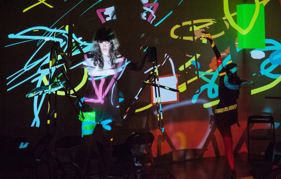
If you’re visiting the Olympic Sculpture Park in the next three months you might encounter the new artist in resident of SAM’s pilot residency program as part of Winter Weekends. Paige Barnes is a movement artist whose dancing is sinewy and soft. Even the angles she creates from ankle to elbow appear like feather tips, tilting and adjusting to the surrounding atmosphere. While at the Olympic Sculpture Park her movements are directed by visitors’ pulses.

Having recently completed a degree at Bastyr University to become a licensed acupuncturist practitioner, Barnes uses a medical vocabulary to describe the quality of the pulses informing her movement, but is not approaching the pulse diagnostically. In fact, once she takes a pulse there is no exchange until after she takes the visitor’s pulse again, after the multimedia performance, and notes any differences in heart rate and quality in reaction to the experience.

“fast flick & that knee flick It’s not the birds but the burrows that wild flying beetle who is all marmalade.” –Vanessa DeWolf, Video: Vida Rose

Far from medical in her vocabulary, is the text of Vanessa DeWolf, a writer working with Barnes who crafts a personalized poem for the visitor in response to Barnes’ dance. Visitors are given this poem, as well as a walking score based on different parts of the body that offers a suggested guide through the park. As Barnes dances, animator Stefan Gruber begins drawing. His digital marks are highly repetitive, leaving ghostly traces behind on the projected image of his work in progress. During a break in Barnes’ movement, bassist Evan Flory-Barnes begins a solo that continues once the dancing begins again. Making her way back across the room, Barnes comes to rest in front the visitor, whose pulse has beat all this creative energy into action. DeWolf reads aloud the piece she’s been writing this entire time and Gruber plays the animated version of the drawing he’s been making. Played linearly, the marks make a line drawing that moves and morphs, the previously disjointed marks now a visual echo of Barnes’ movement.

“And with her long unbroken beach and owls softly cooing this might be the softest hunt ever” –Vanessa DeWolf, Video: Sage Mailman 

Hesitant and fluid, occasionally staccato, intermittently delicate, Barnes creates improvised repetitions that flow like the blood, sometimes thick and viscous, sometimes thin and light. This chain reaction of artistic media is using landscape is a metaphor for the body: the liver is a meridian, the kidneys are a water element controlling fear and willpower.

Glimpse the process of this residency taking place Saturdays–Mondays in the PACCAR Pavilion. Weekends, Barnes and DeWolf will take pulse readings from 2–3 people and Mondays, the entire artist crew will take 2 pulse readings. Attend the Winter Weekend Art Encounters to see the ongoing outcomes of these pulse readings. The Friday, January 27 Art Encounter, Bridging Pulse, will be informed by the prior public pulse readings and feature the core group of artists. February’s Friday 24 Art Encounter will not include animation but will feature 10 dancers interacting with each other and responding to multiple pulse reading stations. For the third and final Art Encounter on March 31 will present Vanessa DeWolf’s writing as a lead character in a more intimate and contained performance.

“I’m available as a marble ten the pages open to where I will find it again” –Vanessa DeWolf, Video: Bruce Clayton Tom

At each Art Encounter you’ll notice a pulsing light directed outwards from the PACCAR Pavilion. This is the work of Amiya Brown, yet another collaborator in Page Barnes’ menagerie. Let this light, programmed to pulse at the pace of various Northwest lighthouses guide you safely towards these subtle and beautiful encounters.

–Chelsea Werner-Jatzke, Copywriter & Content Strategist

Object of the Week: Church Interior

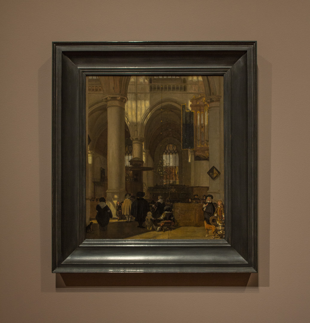
Emanuel de Witte earned recognition as one of the great architectural painters of the 17th century. The years of De Witte’s life and career encompass the height of the genre for which he is known: the church interior. In SAM’s Church Interior a mood, and a moment, unfolds. Gentle light falls over the scene, entering the church through the windows directly across from us, and from windows that we know are above and behind us. The details of the painting, especially the architectural decoration and the faces of the figures, reveal a soft and painterly touch. Had De Witte rendered the scene with hard lines and the crisp details of a hyper-realistic style, the impression created by the picture would be entirely different.

Scholarship and x-rays of the painting have revealed that the figure group at the lower right of Church Interior originally included a showy fifth figure. De Witte often repeated figures and figure groups in different paintings, as if building a visual library of motifs, and then selecting the best one for his needs in a particular painting. The figure group in SAM’s painting recurs in a De Witte painting of a Protestant Baroque Church in the collection of the Wallraf-Richartz Museum in Cologne, France—only in that picture, a well-heeled man of arms occupies the space in the foreground that is vacant in SAM’s painting. Originally De Witte placed this figure in SAM’s Church Interior too, painting over him at a later stage in the process, and opening up the scene by doing so.

Knowing that a large, eye-catching figure once occupied the open space in Church Interior has changed the way I look at the painting. De Witte’s choice to exclude the jaunty figure in SAM’s painting seems studied and very purposeful. The still and peaceful mood of the church is enhanced by the open space, and we, as the viewer, are invited into the picture, with a clear pathway for entering the moment. Here, the subtraction of one dominating detail creates equality among the other details of the painting. The eye dances across the picture, picking them out like notes on a musical score.

By leaving space in the foreground De Witte also opened up the possibility for a subtle, silent dialogue on which, as a dog lover, I’m especially keen. The furry friends at the lower left and lower right corners of the picture seem to be gazing across the scene at one another, uniting the scene in a charming, unconventional way. Elsewhere, glances among the figures, as well as the play of light and shadow, connect the scene through an artful arrangement of harmonious patterns and tones. De Witte leaves us with a poetic and unified picture.

—Jeffrey Carlson, SAM Collections Coordinator
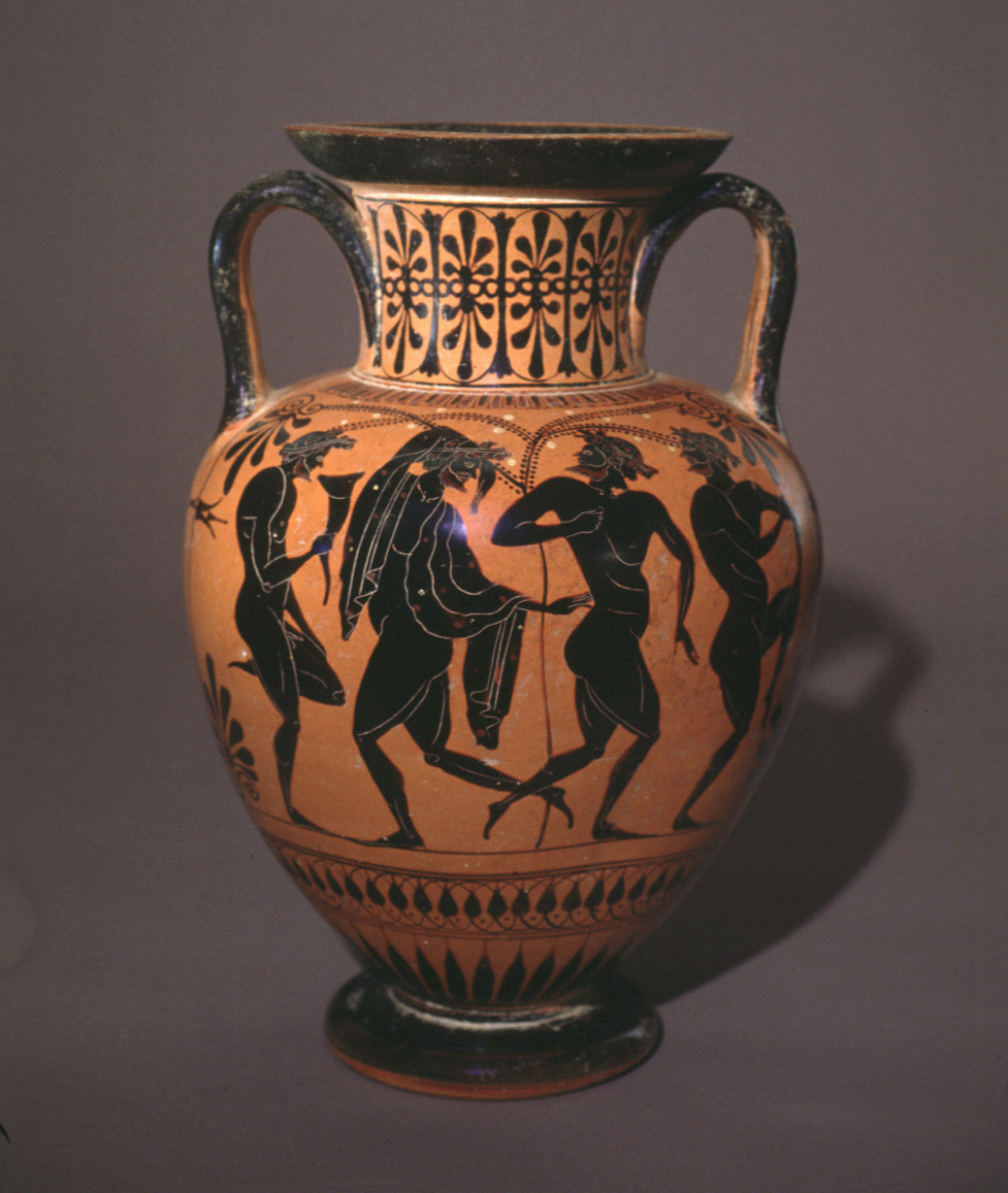
Image: Church Interior, ca. 1670, Emanuel de Witte (Dutch, 1617-1692), oil on wood, 18 7/8 x 16 1/2 in. Seattle Art Museum, Samuel H. Kress Collection, 61.176, Photo: Natali Wiseman.

Object of the Week: Scenes of Life in and around the Capital

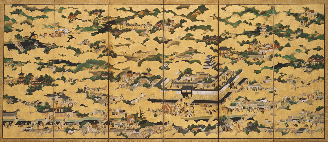
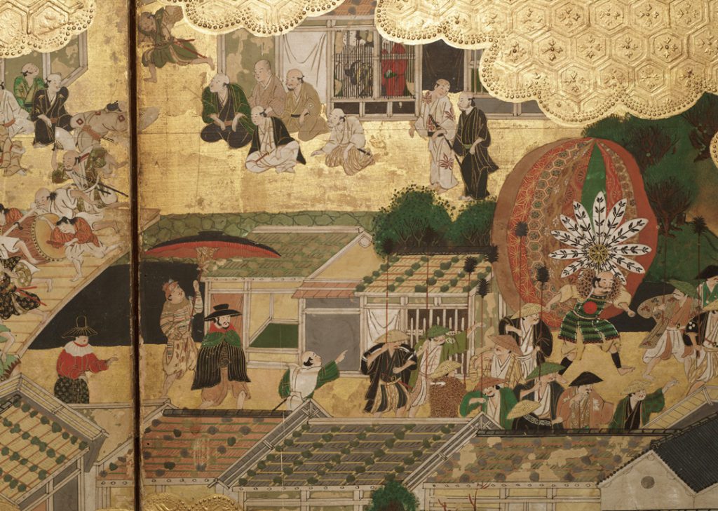
SAM’s six-panel screen picturing Scenes of Life in and around the Capital serves to celebrate the ancient imperial capital of Kyoto, giving a flattering impression of the city as one that is full of jovial activity. Gold leaf, in the form of clouds, covers a large area of the screen and lends to Kyoto an air of royalty and prosperity. As a compositional element, the clouds divide this very large panel into bite-sized vignettes. When your eye scans across the panel, and up and down, it encounters figures sitting, running, parading, and celebrating in scenes alternately private and public. Both rural and urban citizens have a place here, as life in the city blends seamlessly with the surrounding countryside, and the city’s attractions are enjoyed by locals and tourists alike. What your eye won’t find in its flyover of Japan’s ancient capital is any element that disagrees with the established order and the abiding image of prosperity. The humdrum of day-to-day life, the majority of which involves work, doesn’t fit into the picture. Neither does illness, disease, or death much affect this heavenly realm.

The screen has interesting things to say about how we see, and how we aim to be seen. As I look at the screen, I’m reminded of spinning around and above Seattle during a special brunch in the Space Needle’s SkyCity restaurant (an experience I hope everyone has a chance to enjoy). To look over a city with great energy, lots happening, and an incredible geographic diversity brought, for me, feelings of joy and pride. Surely Kyoto’s citizens in the Edo period appreciated everything their city offered—its rich culture and vibrant lifestyle—in a similar way. It’s also worth noting how, from the top of the Space Needle, or standing in front of this screen, we take up the perspective of a passive observer. We watch others go about their lives without being seen ourselves and, with no fear of being caught watching, we’re encouraged to watch even more closely.

It’s this aspect of looking that contemporary artist Tabaimo has pointed to in her exhibition at the Seattle Asian Art Museum, Tabaimo: Utsutsushi Utsushi. In the show, Scenes of Life in and around the Capital relates meaningfully to Tabaimo’s video work Haunted House, seen nearby. Haunted House mimics the movement of an eye scanning a long row of houses, while our view is limited to a small circle, as if we are viewing these scenes through a telescope. In Haunted House and in SAM’s screen, stories present themselves one at a time, providing the viewer a steady stream of entertainment.

Tabaimo’s installation of the screen encourages us to take pause and ask: How do we see each other? From what perspective? With what agendas? From there, we might also ask how and why we present ourselves to the world, and whether that image carries pretension much like the screen’s gilded view of ancient imperial Kyoto.

—Jeffrey Carlson, SAM Collections Coordinator
IMAGES: Scenes of Life in and around the Capital, second half 17th century, Japanese (Edo period, 1603-1868), ink, color, and gold on paper, 67 7/8 x 149 3/4 in. Seattle Art Museum, Purchased with funds from Mildred and Bryant Dunn and the Floyd A. Naramore Memorial Purchase Fund, 75.38.1. Haunted House (detail), 2003, Tabaimo, video installation, © Tabaimo / Courtesy of Gallery Koyanagi, Photo: Patrick Gries.

Object of the Week: Split

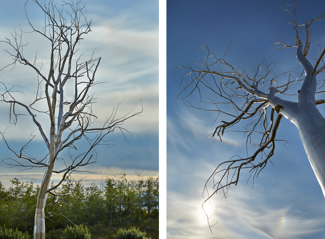
Roxy Paine’s polished stainless steel tree Split rises fifty feet high above SAM’s Olympic Sculpture Park, brazenly confronting its natural surroundings with its own manmade-ness.

In many ways, Split embodies contrast. Smooth and reflective, it rejects the rough texture and earthy brown color of tree bark. There is an immediately recognizable contrast between its machine-age manufacturing and the organic growth process of trees, a juxtaposition heightened by the earth on which Split is installed. Within the work itself, Paine has built up the sculpture in such a way that its two main limbs diverge, heading in opposite directions, as if visualizing some internal conflict in the tree, like two camps of its cells decided their differences were irreconcilable and they roughly parted ways. Nearby, in Neukom Vivarium, a nurse log gives birth to life in varied forms while the log itself decays—a celebration of natural regenerative processes that have been occurring for a long time. In Split, we see something quite different, as the artist confronts us with our views and actions related to art, nature, and beauty, in a relatively new world of industrial production.

Yet Split shares with its woody neighbors a common tree-ness. Its form tells us straight away that it represents a tree. Though made, not grown, it, too, had to be planted.

The act of planting a tree holds a special significance. It is a generative act, one that makes a positive contribution to the landscape in the form of an oxygen-producing, eye-pleasing, life-giving organism. One factor that makes it special is the longevity of the reward. Planting a tree requires the investment of a certain amount of time and labor, but we have a sense that it’s well worth it because trees last (longer than us, often). The lifespan of the tree, and the richness of the reward for planting it, overwhelms any cost. Good vibes attend the planting of a tree because we have a sense that what we’re doing will benefit so many folks beyond ourselves. Here’s another rewarding quality to planting a tree: our investment multiplies. We can’t exactly watch it happen, but with patience, over time, we can mark a tree’s growth. The payoff continually increases. This is the ecological equivalent to putting away savings.

In 2017 SAM will celebrate the 10th anniversary of the Olympic Sculpture Park, itself a remarkable contribution to Seattle, and home to important works like Split. Moving from one year to the next always provides a chance to reflect on transitions and trajectories, and after this turbulent year, that seems especially the case. As we turn over a collective new leaf at SAM, in our city, in our country, and in our world, my hope is that we remember the value of planting, of making positive additions, each of us in our own unique way.

—Jeffrey Carlson, SAM Collections Coordinator
Images: Split, 2003, Roxy Paine (American, b. 1966), polished stainless steel, height: 50 ft. Seattle Art Museum, Gift of the Virginia and Bagley Wright Collection, in honor of the 75th Anniversary of the Seattle Art Museum, 2016.17.3, © Roxy Paine, Photos: Benjamin Benschneider.

Object of the Week: Pojagi (wrapping cloth), Sango po (food covering)

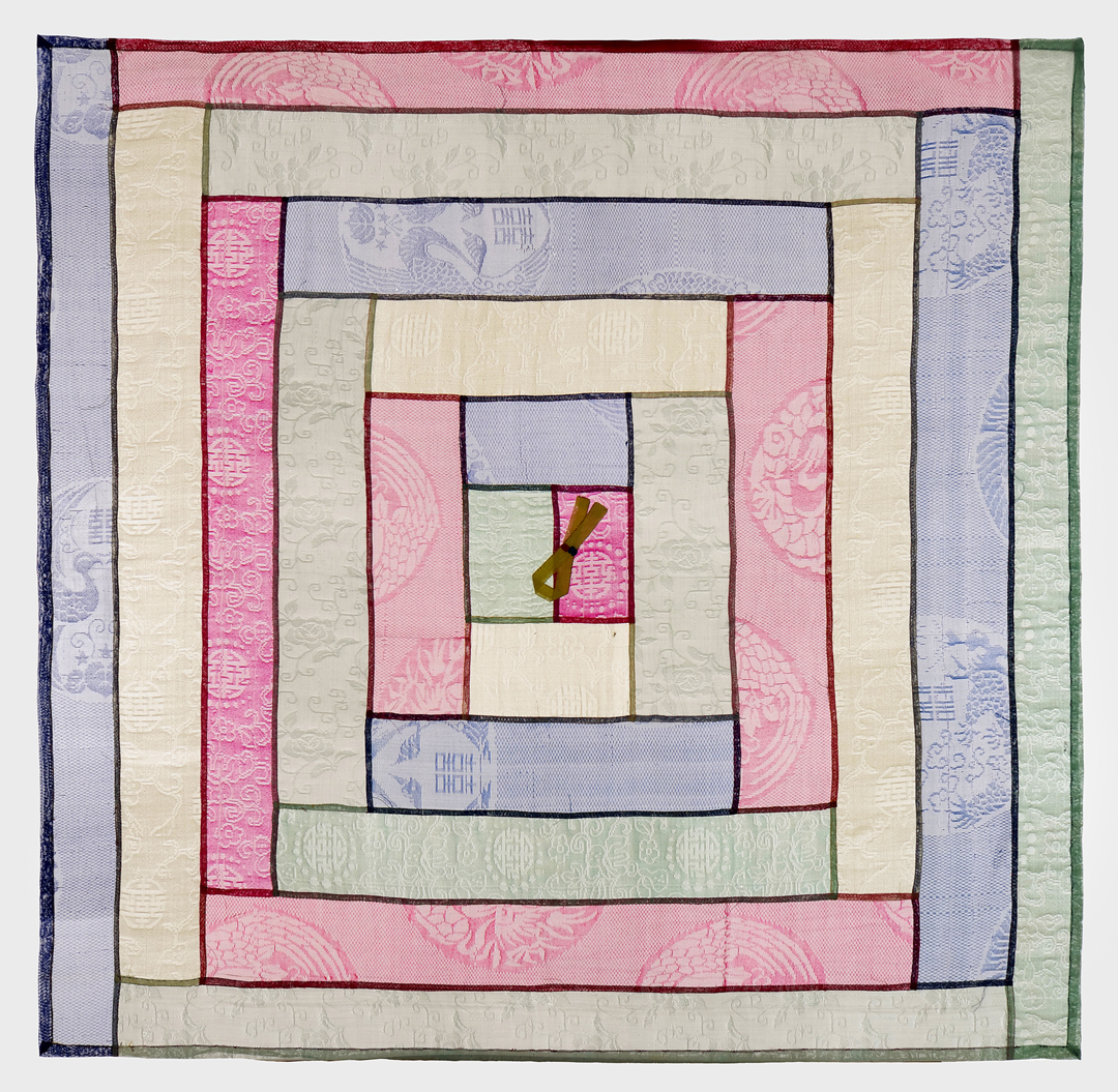
In Korea, gifts and food dishes might come wrapped in decorative cloths called pojagi. This tradition shows respect for the receiver of the gift as well as for the gift itself—and I wish my gift-wrapping game were this good!

SAM’s Korean Pojagi (wrapping cloth), Sango po (food covering), dating to the late 19th century, bears intricate designs stitched into bands of luminous color, all neatly organized. The rectangular pieces of fabric act like nesting blocks of diminishing size, each fitting perfectly inside the last as our eye moves toward the center of this carefully crafted textile. The little tab at the middle of the cloth would have been used to lift it off of a tray.

The five colors present in the Pojagi—blue, red, yellow, black, and white—corresponded to five blessings: longevity, wealth, success, health, and luck. Whatever your gift wrapping looks like this holiday season . . .

May all these blessings and more be yours! Happy holidays from SAM!

—Jeffrey Carlson, SAM Collections Coordinator
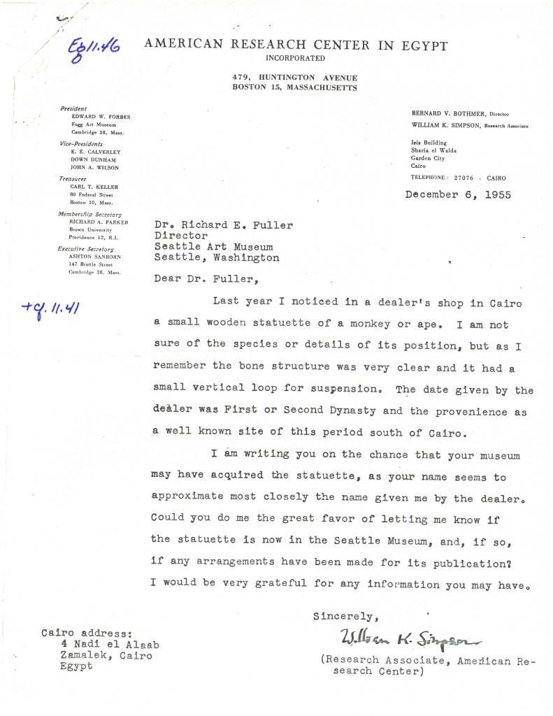
Image: Pojagi (wrapping cloth), Sango po (food covering), late 19th century, Korean (Choson Dynasty, 1392-1910), Ramie gauze: patched and stitched, 29 1/2 x 29 1/2 in. Margaret E. Fuller Purchase Fund, Asian Art Acquisition Fund and the Korean Art Purchase Fund, 96.21

After 10 Years, the Grass Keeps Getting Greener

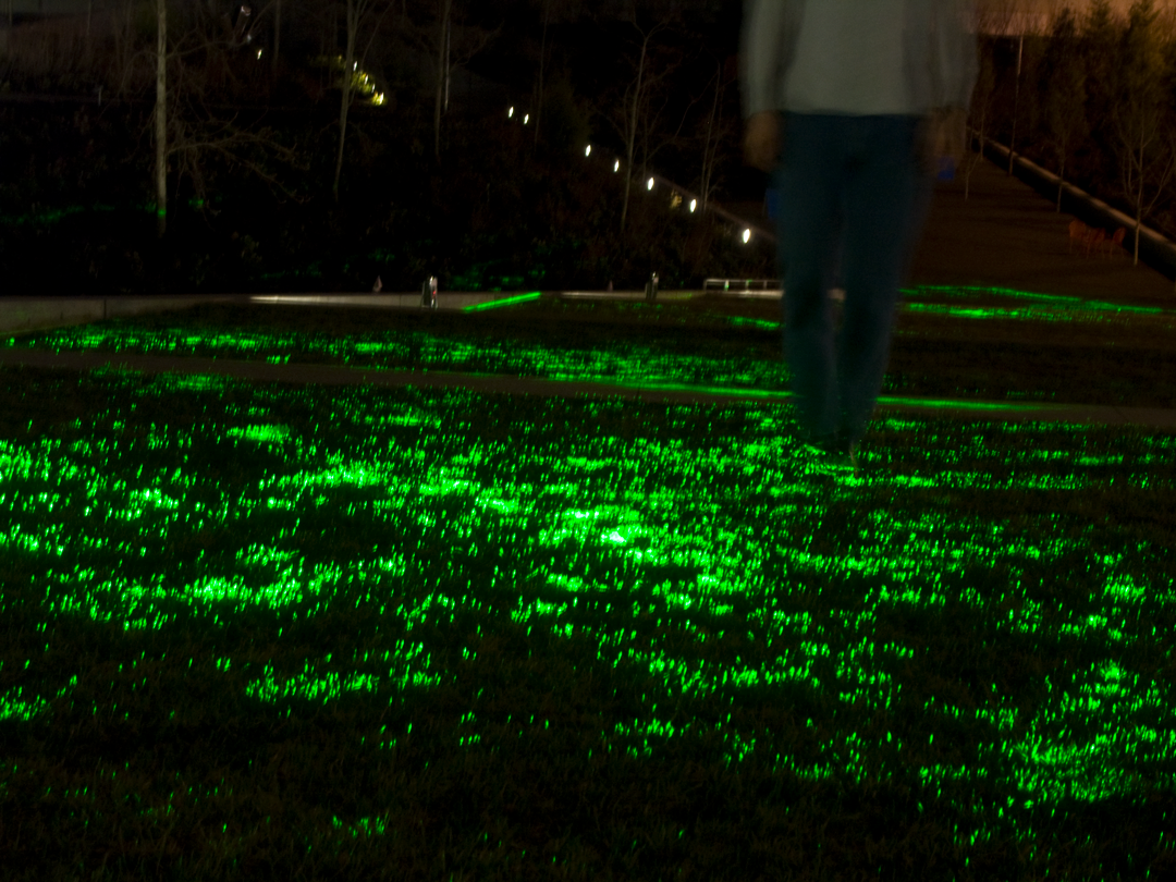
We’re celebrating the Olympic Sculpture Park turning 10 with a laser show! Installed for this year’s SAM Lights on December 15, Greener by Iole Alessandrini and Ed Mannery is an art installation made from light that was originally on view at the grand opening of the park in 2007. Missed SAM Lights? Not to worry! Greener will light up the terrace through January 16.

In the 10 years since the laser grid of Greener cast SAM visitor’s in its net, artist Alessandrini has had some time to reflect on the light sculpture, her practice, and what it means for an artwork and a sculpture park to interact and create visual connections for visitors. A Seattle transplant from Italy, Alessandrini began her Laser Project Series with Optical Engineer Ed Mannery in 2001 during a residency at Bellevue Art Museum. As Iole Alessandrini has had said of her work, “It is the intersection between these two creative expressions—art and architecture—” through which her work moves. At the Olympic Sculpture Park, Greener covers over 2,500 square feet of grass in the Gates Amphitheater between Richard Serra’s Wake and the PACCAR Pavilion.

See this work in the twilight hour between sunset and park closure for optimal viewing!

SAM: How does nature factor into your focus on architecture and design?

Iole Alessandrini: Since early studies on light-art at the University of Washington (1996), I have been captured by the symbiotic and antithetic relationship between natural and artificial light. Symbiotic—in that natural and artificial light make things visible; antithetic—as the sun dominates over artificial light. Within enclosed spaces the laser of our installations is free from sun’s interference and it appears radiant. In outdoor environments, the light from both the sun and the laser interplay with each other in a symbiotic and antithetic way. This unique interplay manifests when the sun sets and the sky darkens. During this transition, the light from the art prevails to become visible in itself, while revealing the natural landscape surrounding people.

 What about the interplay between the tangible and intangible interests you and drives your work?

I think of light as a medium that I can model, shape and bend. Perhaps as one who shapes clay; I shape light. The singular wave-behavior of laser, which directs the rays to move parallel to each other, gives the laser-light the distinctive shape of a beam. In the presence of dust or smoke the light-beam becomes visible yet intangible.

With the installation Greener, Optical Engineer Ed Mannery and I used cone optics to direct the beam to form a plane. It is the nature of light to be evident when objects reflect it. In the park, the light-planes intersecting the grass-blades reveal this natural phenomenon and look as if they are lit from within. Both grass and light are evident yet the light remains intangible.

At SAM Olympic Sculpture Park installing Greener for the 10th anniversary of the park’s opening.

A photo posted by @iolealeassandrini on

Is movement crucial to all your light-based works? I’m thinking of something like “Three of Us” which captures movement through laser projections as compared to Greener which inspires movement through laser projections.

Many of our projects involve a direct connection with viewer and light. The Three of Us is a photo of a unique phenomenon of light captured with the camera as people move through the laser-planes. The project Untitled at Jack Straw Production (2004) provided us the first opportunity to document this phenomenon. I photographed a woman’s hands as she moved them back and forth rapidly through the plane. This picture created the series which I titled Shroud as it shows a flat subject taking on a ghostly aspect through the interface with the light plane. The photos are unique as they resemble holograms and they are of great interest to me. I am an avid researcher of motion in photography as seen in the work by Eadweard Muybridge, Jules Etienne Marey and Harold Edgerton.

How is Greener activated by the interaction of park visitors?

Contemplating the work from a distance vs. interacting with it—as in immersing oneself in the light—are distinctive ways in which Greener can be experienced.  Yesterday at the park during its opening, we observed that dynamic at play. In both cases it was satisfying to witness the sense of wonder and engagement coming from people staring at and interacting with 2,500 square feet of light under their feet. Greener visually connects different aspects of the Olympic Sculpture Park, from Serra’s Wake to the PACCAR Pavilion causing visitors to walk and step over the grass and the light of our installation.

Do you see Greener differently after the last 10 years? What does the passage of time lend to the work and it’s relationship to the park?

We were pleased to see that even after 10 years the technology continues to work. It works in function, and it works in keeping visitors engaged and mesmerized. Their appreciation of the art, the landscape, and the architecture speaks volumes, making Greener an aesthetic expression and synthesis of them all.

–Chelsea Werner-Jatzke, Copywriter/Content Strategist

Photos: Courtesy of Iole Aleassandrini

Object of the Week: South Wind, Clear Dawn (Gaifu kaisei)

Refined compositions and striking color combinations characterize one of the most recognizable Japanese art forms: the ukiyo-e print. Ukiyo-e are woodblock prints produced during the late Edo period (1615-1868) in Japan. In Tabaimo: Utsutsushi Utsushi, Japanese artist Tabaimo (b. 1975) honors two acknowledged masters of ukiyo-e: Katsushika Hokusai (1760-1849) and Utagawa Hiroshige (1797-1858).

Speaking to their impact on her contemporary work in digital media, Tabaimo explains, “I often copy colors and designs from Japanese woodblock prints by Hokusai, Hiroshige, and others. By adding them to my line drawings, I incorporate ‘distinctive Japanese colors’ and ‘distinctive Japanese designs’ into my work. The strong impression and unique power of the prints becomes part of my work, and allows me to complete my original work. Many of my works use this method of art making.”

Because Tabaimo is looking back to the artists of her culture’s history, borrowing color patterns and design elements, her work feels like the continuation of a conversation. By including some of the same formal elements associated with a traditional Japanese art, Tabaimo picks up that thread of history, honoring it, but also carrying it forward. As her existing and new works are displayed in the Asian Art Museum, interspersed with some of the treasures of SAM’s Asian art collection, we can appreciate even better how art history has informed Tabaimo’s work, the work of contemporary Japanese artists, the work of contemporary digital media artists, et cetera.

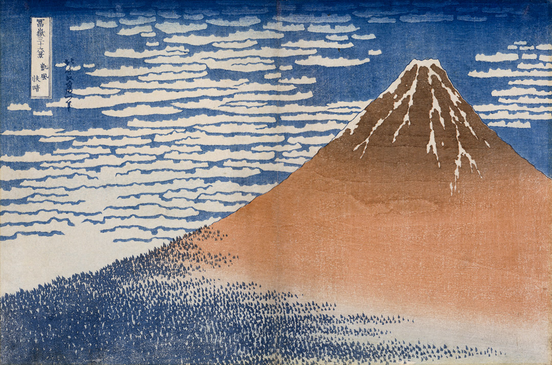
Here, we are highlighting one memorable ukiyo-e from Katsushika Hokusai that you’ll find in Tabaimo: Utsutsushi Utsushi. Titled South Wind, Clear Dawn (Gaifu kaisei), the print has been commonly referred to as Red Fuji—which, I have to say, turns my mind to produce, and not landscapes. Nonetheless, we can see why the color of the print has been singled out as the identifying characteristic. The mountain peak is a rich, chocolatey brown, and the snowcap leaks down the mountain into textured trails, like an icing stingily applied. Where the snow trails end, brown fades in a gentle gradient to the soft red for which the print is known. Lower down, an army of conical, gray-blue trees (faded from green) carpets the base of the mountain. With the trees’ diminutive size against imposing Fuji, and the way different arms of the forest reach across the mountain’s base and up its side, they are like an invading arboreal-ant army. The line of the mountain divides the print cleanly into foreground and background, where a deep blue sky fends off rolling clouds.

Part of the series Thirty-six Views of Mount Fuji (Fugaku sanjurokkei), the Red Fuji would stand out from the rest because it was so rare that the mountain would appear with this hue. It only occurred under special conditions, in late summer or early fall, and when the winds were blowing from the south. SAM’s version is from the second printing, notable because the mountain reveals marbled woodgrain, a poetic remnant of the wooden block from which this scene was printed.

As they have for Tabaimo, may the distinctive colors and designs of your histories also lead you forward.

—Jeffrey Carlson, SAM Collections Coordinator
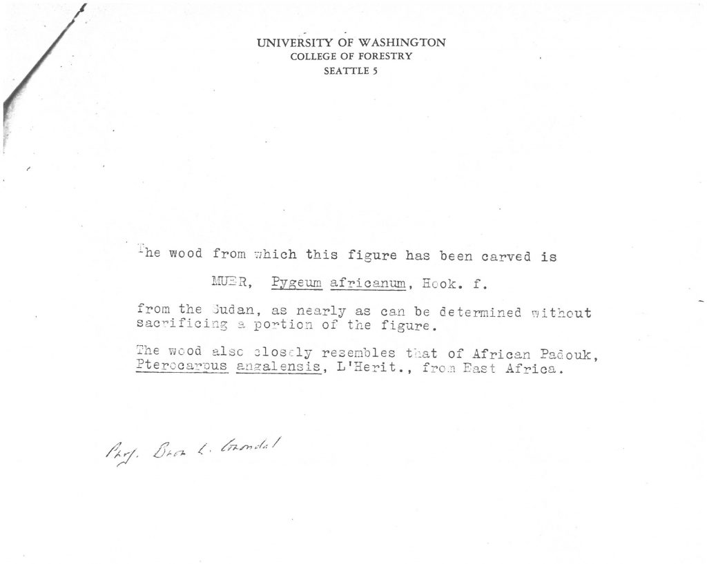
Image: South Wind, Clear Dawn (Gaifu kaisei), from the series Thirty-six Views of Mount Fuji (Fugaku sanjurokkei), ca. 1830-32, Katsushika Hokusai (Japanese, 1760-1849), woodblock print, sheet: 9 7/8 x 14 3/4 in. Seattle Art Museum, Gift of Mary and Allan Kollar, in honor of the 75th Anniversary of the Seattle Art Museum, 2010.15.

Object of the Week: Die Orden der Nacht

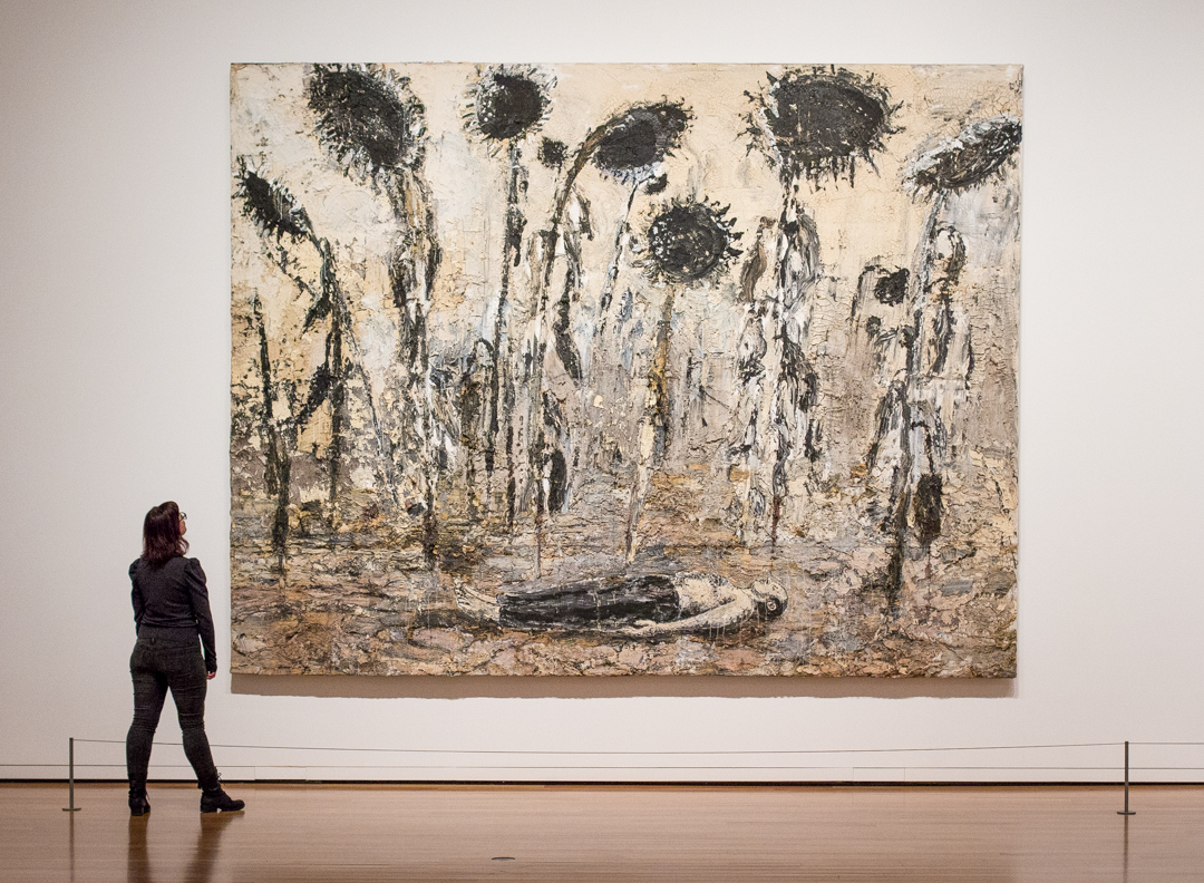
At times an artwork has so much to say that I approach it and, admittedly, fail to meet the challenge. I’m not able to engage with the artist at the intellectual height or emotional depth that they have established in the piece. I just can’t always get there. One of the ways I encourage myself is by returning to these works to see if they teach me more on the next visit. Lately I’ve been returning regularly to Anselm Kiefer’s Die Orden der Nacht (translated as The Orders of the Night), which is hanging in a haunting installation called Material Difference, part of the larger Big Picture: Art after 1945 show at Seattle Art Museum.

First, it is huge, ambitious, and awe-inspiring. An oppressive energy emerges from the canvas. In the picture, a figure lies supine as giant sunflowers loom above, their seeds black and charred, their wilting stems and downcast petals seeming both sad and malicious. Wide-reaching symbolism informs the picture. When Kiefer says “These sunflowers are black like the firmament,” he assigns cosmic significance to them, to go along with their tremendous proportions.1 The man lying flat on the soil from which the sunflowers grow also links to a range of mythologies that tell of creation sprouting from suffering.

We can say, for sure, that it’s not an easy painting to digest. Kiefer believes firmly that art should be difficult—to make, and to understand—and that the challenge it offers can also bring growth.

He has caked paint all over the canvas in thick sloshings, building the picture outward as he has filled it horizontally and vertically. The surface shows cracks from the artist’s heavy application of paint, and this natural reaction of the medium also contributes to the mood of the painting. Like cracks in dried mud, they leave behind impressions of drying up and drought. Up close, one can see the paint applied aggressively, in big, slashing marks.

One of three really exemplary works by Anselm Kiefer in SAM’s collection, Die Orden der Nacht figured prominently in the two most important recent exhibitions of Kiefer’s work, the first displayed at London’s Royal Academy of Arts from September to December of 2014, and the second at Paris’s Centre Pompidou, from December of 2015 through April of this year. The celebrated Pompidou show was a globally important one, marking the first Kiefer retrospective in 30 years to be held in France, where the artist has made his home since 1992.

Also praised by art critics, the 2014 exhibition of Kiefer’s work at the Royal Academy in London united Die Orden der Nacht with another work of the same name by Kiefer. An earlier work, dating to 1988, this other Die Orden der Nacht is an illustrated book, comprising 40 pages, drawn in lead and bedazzled with diamonds. Though a large book, with dimensions of about three feet by two feet, it represents another face to Kiefer’s work that is different in many ways, including its size. With this and other illustrated books, the artist whose effectiveness seems, at first, so linked to the scale on which he is working—dwarfing viewers with the massive dimensions of his paintings, making grand gestures in lavish outlays of materials—moves into intimate territory, creating poetic images that approach the seemingly un-Kiefer idea of beauty. One artist has produced both bodies of work.

To view SAM’s Die Orden der Nacht next to the museum’s other two dark and enigmatic Kiefers, Die Welle (1990) and Untitled (1983), gives one a great introduction to Kiefer, and only an introduction. As much as we like to know artists, the great ones continue to challenge us. As much as we like to define artworks and achieve a sense of resolution,

–Jeffrey Carlson, SAM Collections Coordinator
1 Quoted by Christian Weikop in “Forests of Myth, Forests of Memory,” in Anselm Kiefer, exhibition catalogue, London: Royal Academy of Arts, 2014; 38.
Image: Installation view of Die Orden der Nacht, 1996, Anselm Kiefer (German, born 1945), acrylic, emulsion, and shellac on canvas, 140 x 182 1/4 in. Seattle Art Museum, Gift of Mr. and Mrs. Richard C. Hedreen, 99.85, © Anselm Kiefer, Photo: Natali Wiseman.

Object of the Week: Round-corner wood-hinged cabinet

“Why are we drawn to a work of art?” is an interesting question, but it’s also a clumsy one that is too broad to tell us much. “Why are you drawn to a work of art?” That might get us somewhere. What about an artwork compels you, reader, to pull out your phone for a selfie, or take down a note with the artist’s name, or fix an image of it in your head, so you can tell your friends about it later? What makes it resonate with you, in thought or emotion? One person might respond to the look of a piece—qualities like exceptional craftsmanship, a vision of beauty, or a herculean effort of construction—while another cares most about the conceptual content, the artwork’s associations with history, the way it offers timely social commentary, or how it prompts imagination.

Here’s some proof that art rocks: Art, and readings of art, are as diverse as people. Individual perspective colors our experience of art, as it does the rest of life. What we’re looking for, we can find. And different folks might see a wide range of facets to the exact same piece.

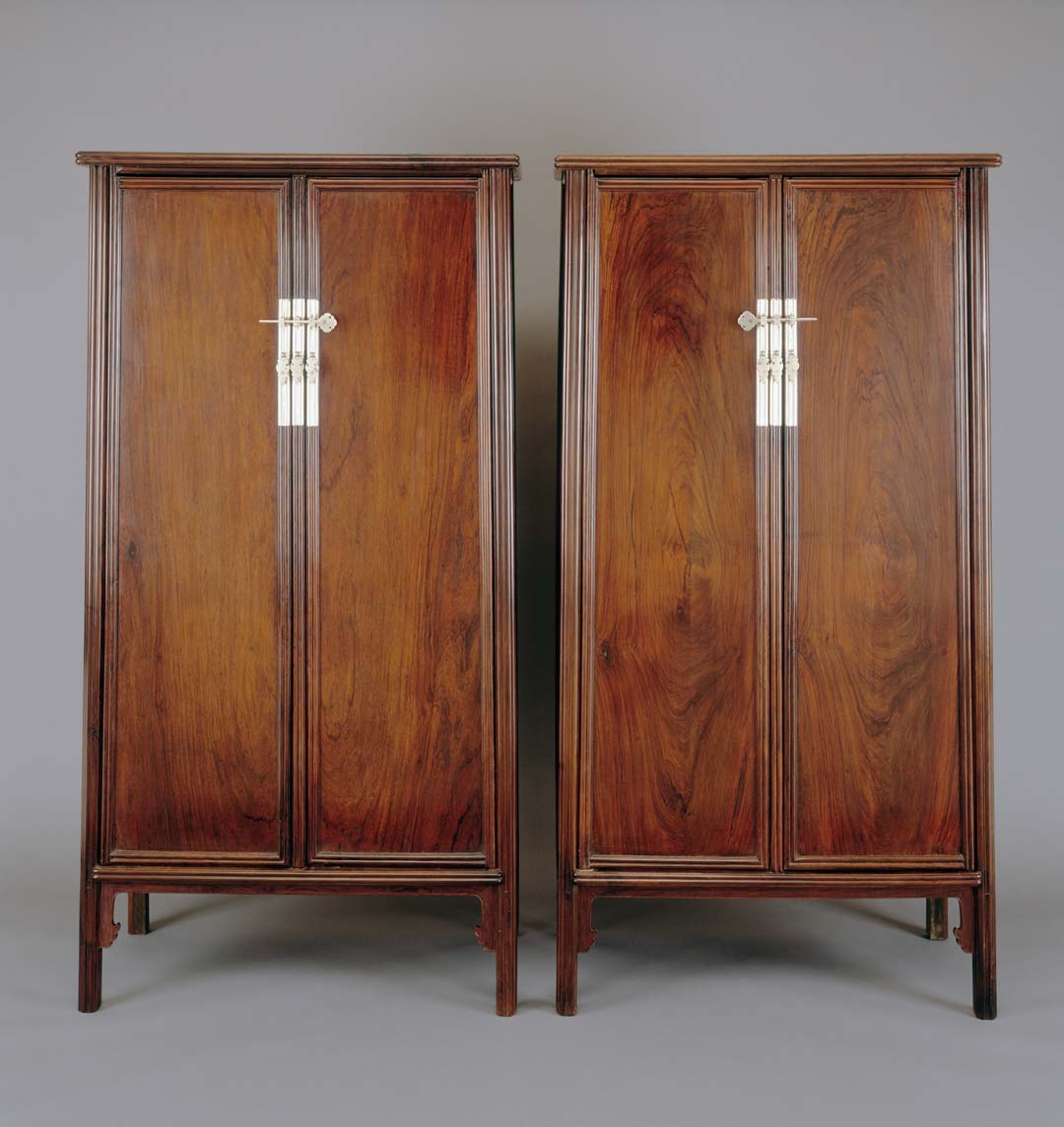
SAM’s Round-corner wood-hinged cabinets welcome visitors to the first gallery of Tabaimo: Utsutsushi Utsushi. That they are a nearly identical pair, “a set of twins,” fascinated artist-curator Tabaimo, who is interested in how we read multiples. Even though our eyes see and our brains understand that there are two, we can still experience a sense of confusion because the boundary between them is slippery.

The cabinets date to the 16th century, when they were fashioned from a precious wood called huanghuali. The rich marbling of the wood grain acts as a natural ornament for the tall, quietly stunning single-panel doors. While the beauty of the wood itself takes center stage on the panels, the difficult method of construction and finely carved trim provided plenty opportunity for artisans to strut their stuff, and strut they did, notably in the softly rounded upper corners for which the cabinets are titled.

These were high-ticket items, reserved for the court and elite classes. They acted as status symbols, speaking wealth and prestige over their owners, and also fulfilled the most basic of utilitarian functions, as storage for books, scrolls and other scholar’s accoutrements. Grand wardrobe cabinets like these took the place of closets in traditional Chinese homes, and when you picture a closet in your head, and then you look at these cabinets, you understand why. They looked really good while they were hiding stuff.

Because huanghuali wood was a choice material during an important period in the making of Chinese furniture, it still carries an association with that time and culture, kind of like how marble sculpture can bring to mind Golden Age Greece for those of us familiar with the European art tradition. Tabaimo is not the first artist to pick up the historical associations of huanghuali wood and bring them into a conversation about contemporary ideas. Chinese dissident artist Ai Weiwei has used huanghuali wood in spherical constructions like LACMA’s Untitled, Divine Proportion that are boldly un-utilitarian, contrasting the storied functional use of huanghuali.

Don’t miss Tabaimo’s playful installation at the Asian Art Museum that animates these cabinets with the artist’s unique vision, and remember to bring your perspective to the equation.

–Jeffrey Carlson, SAM Collections Coordinator
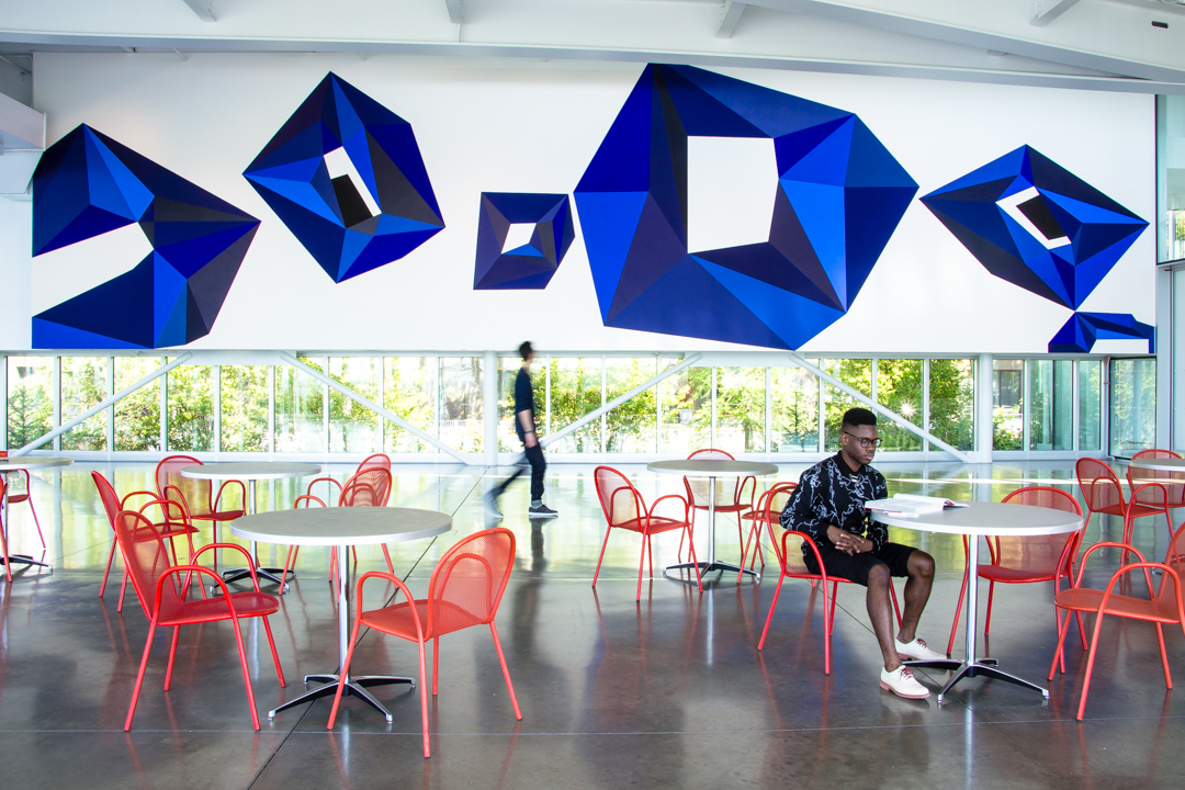
Image: Round-corner wood-hinged cabinet (gui), 16th century, Chinese, huanghuali wood, 72 x 37 x 20 in. Seattle Art Museum, Sarah Ferris Fuller Memorial Collection and an anonymous donor, 89.20.1 and 89.20.2, Photo: Paul Macapia.

Object of the Week: Kitchen Range

In 1959–1960 Walter Mattila organized a retrospective exhibition for the Northwest artist Earl Thomas Fields. The show had two venues: the public bank in Fields’ native Woodland, Washington; and a gallery in Mattila’s Portland, Oregon. Mattila was not a curator but a historian, one especially interested in Finnish immigration to the US. In the early 1970s, the Finnish American Historical Society of the West published volumes of Mattila’s work on the subject as the Finnish Emigrant Studies Series. He was understandably drawn in by the story of a young Finnish artist from the rural Northwest.

Earl Fields’ father Charles was the first native of Pielavesi, Finland, to settle in Woodland as a farmer. Like his father, Earl was a trailblazer. While his older brothers were pressed into logging jobs that would augment the farm’s income, Earl became the first Finn from the Woodland community to graduate high school and go on to attend the University of Washington. Earl was not only a strong thinker but a creative one. He earned his bachelor’s degree in fine art in 1925, and after traveling and sketching up and down the West Coast—sometimes joined on these trips by Kenneth Callahan, among others—Fields went on to attain an MFA, also from UW, in 1933. Still, his heart stayed with his family. Earl devoted the large part of his early work, from the 1920s up until World War II, to the Finnish people, and to farm life in the Woodland area.

Highly sensitive to the story of the Finns in the Northwest, Mattila wrote this about Earl Fields’ work in August of 1959:

There is not much left of the strange interlude of the Finnish emigrants in the Woodland country. Fortunately one of the Pielavesians was an artist and a brave one to persist being an artist in the hills. Even more than Americans today, the emigrants, Finns like others, had to keep a sharp eye on the dollar. To them a house painter was more of a performer than a portrait painter because he was sure of so much money an hour. And portraits weren’t bread.

Earl Fields painted the slashing Finns who lived in the disappearing forest on the fading frontier. His pioneers are genuine, simple, strong and resigned to their hard lot. The things they didn’t have—you feel that in his paintings.

The day will soon come when the spirit and people of this strange interlude in the Woodland hills survive largely in Earl Fields’ paintings.1

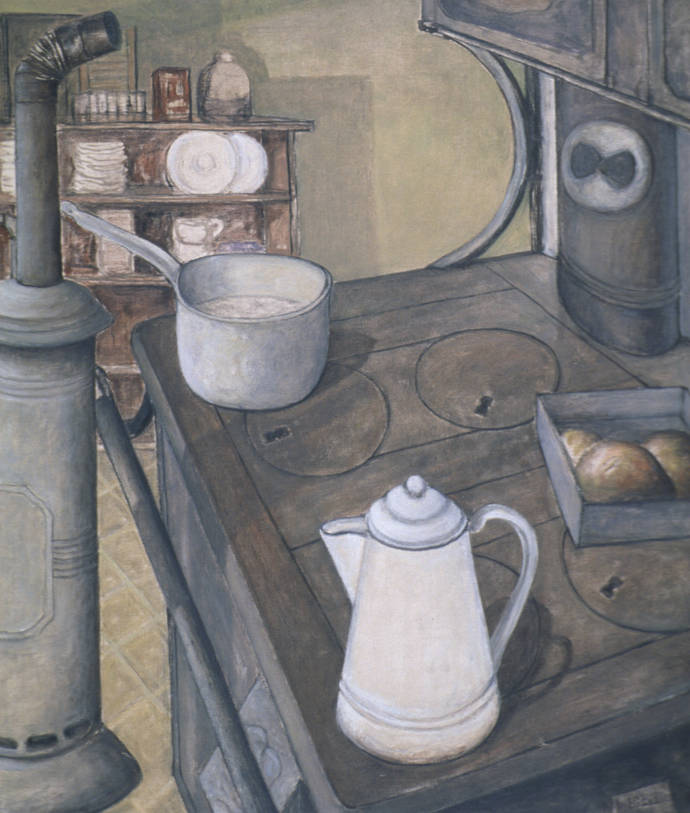
If this community’s history relied on being remembered in the painting of Earl Fields, then their history would be in danger, since Fields has been all but forgotten—unfortunately, in my view. Mattila may have been drawn to Fields’ work by the story, but its bare simplicity kept his attention. The visual element that Mattila found most gripping was Fields’ ability to depict a lack of things, a sense of going wanting. In paintings like Kitchen Range (1932) this feeling of poverty remains palpable.

Fields’ work as an artist is inextricably linked to SAM. He was part of the SAM family for nearly 40 years himself, and he also traveled in a circle of better-known artists, including Callahan, Morris Graves, and Mark Tobey, who were all heavily involved at the museum. During the Great Depression, SAM served an important social role in Seattle as an employer and patron of local artists, allowing them to continue creating. Fields was one beneficiary of that generosity. He first joined the museum as an assistant upon its opening in 1933. In 1941, he was appointed staff photographer, a role in which he earned a reputation as a meticulous and creative documenter of three-dimensional objects. He remained on staff until 1972, retiring from SAM just one year before Dr. Fuller, who had hired him.

Kitchen Range inspires thanksgiving in me because of “the things they didn’t have,” to borrow Mattila’s words. I’m thankful for bread; for the unique voices of artists and the stories they represent; for the diverse cultural histories remembered by their work; for the museums that have supported them and preserved their work so we might learn from it.

Happy Thanksgiving, all!

–Jeffrey Carlson, SAM Collections Coordinator
1 Walter Mattila, “Finnish folk arrive at turn of century,” Lewis River News, Woodland, Wash., Aug. 12, 1959.
Image: Kitchen Range, 1932, Earl Fields (American, born Pielavesi, Finland, 1898; died Seattle, 1975), oil on canvas, 36 1/4 x 32 1/4 in. Seattle Art Museum, Public Works of Art Project, Washington State, 33.216.

Yves Saint Laurent: The Perfection of Exhibition Design

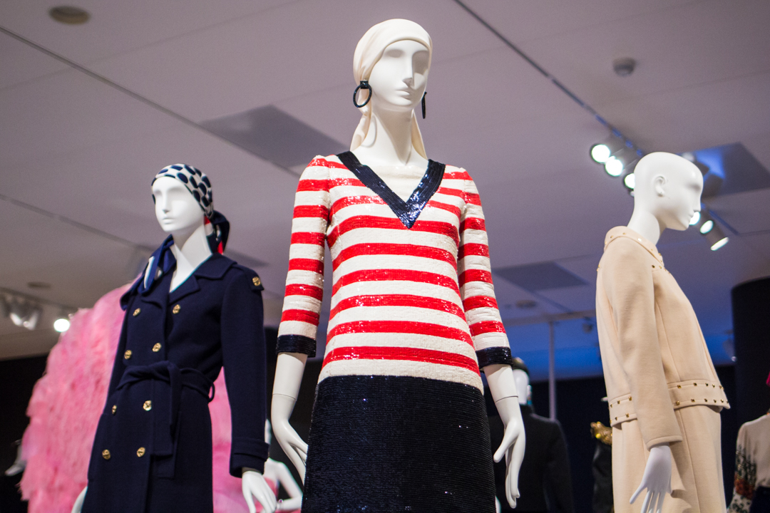
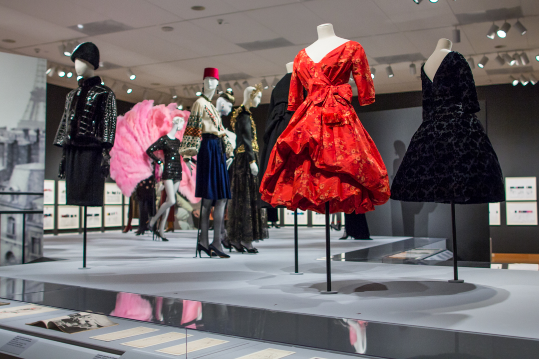
The design and installion of the Yves Saint Laurent: The Perfection of Style exhibition was a large undertaking and involved constructing elaborate stages and catwalks. The galleries are completely transformed to create an experience unique to the art of fashion. By building out into the galleries to execute this design, our capacity is limited. If you’re purchasing tickets online or in person and notice that we are selling timed tickets, this exhibition layout is the reason why. Each section of the exhibition approaches a different era or design technique used by Yves Saint Laurent. Take a quick walk through it with us!

The Little Prince of Fashion - Installation view of Yves Saint Laurent: The Perfection of Style at Seattle Art Museum

The Little Prince of Fashion
Beginning with the Winter 1955 collection, Dior, the world’s most celebrated couturier, began to include his young assistant’s designs in the collections. A black dress draped with a white scarf caused a sensation when it appeared in the now-iconic photograph by Richard Avedon, Dovima with Elephants.

The Beatnick Couturier
In 1962, Yves Saint Laurent and Pierre Bergé co-founded the haute couture house at 30 bis rue Spontini in Paris. From that moment, the collections drew their inspiration from street life and pop culture. Saint Laurent proclaimed, “You no longer need to be rich to have style.” In 1966, Saint Laurent and Bergé launched the SAINT LAURENT rive gauche label. A pioneer in luxury ready-to-wear, the brand succeeded beyond their wildest expectations, enjoying worldwide acclaim. The shy young man in the black tie had evolved into a long-haired beatnik couturier. He exemplified the synchronicity between appearance and lifestyle.

The Celebrity Couturier
During the 1970s, Saint Laurent’s status went from fashionable couturier to superstar on a par with Mick Jagger or David Bowie. This emboldened him to court scandal personally and in his work. In November 1971, to promote his men’s fragrance Pour Homme, he released a nude photograph of himself taken by Jeanloup Sieff. Saint Laurent told the press: “I wanted to shock.”

A Living Legend
From the 1980s until the maison de couture’s closing, every move by the couturier contributed to the creation of his mythic persona. The first such event was the large retrospective exhibition in 1983 at the Metropolitan Museum of Art in New York. Curated by Diana Vreeland, it celebrated twenty-five years of creations. It was the first time that a living couturier was the subject of a museum show. Saint Laurent was only forty-seven years old. Another global milestone was reached in 1992, this time in Seville, where Saint Laurent’s iconic styles were shown in a fashion retrospective at Expo 92.

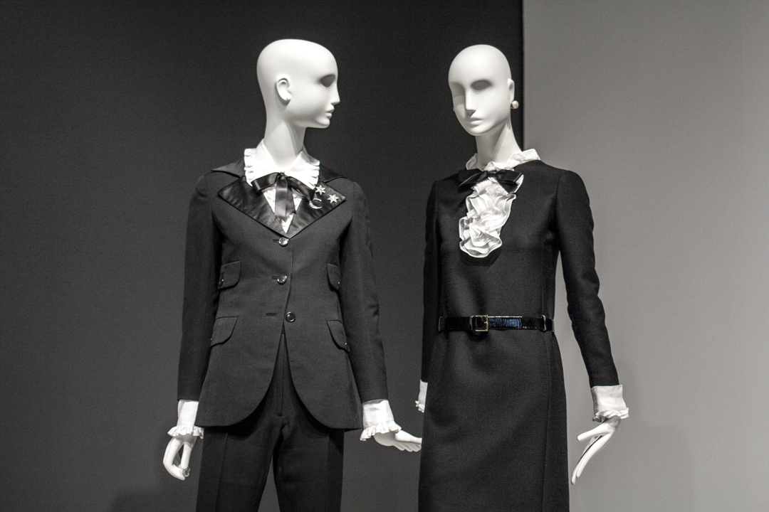
The Genders - Installation view of Yves Saint Laurent: The Perfection of Style at Seattle Art Museum

The Genders
The play between masculine and feminine is seen in Saint Laurent garments that borrow from menswear: the Winter 1963 motorcycle jacket, the Winter 1967 pantsuit inspired by film noir gangsters, the trench coat drawn from British World War I officers, and the jumpsuit, the uniform of aviators. The exploration of fashion that transcends gender culminated in the redesign of the safari jacket, inspired by big game hunters of France’s colonial past. In an emblematic photograph from 1969, Saint Laurent and Betty Catroux stand together, wearing nearly identical safari jackets that express their own new gender. Worn with thigh-high boots, Betty Catroux exemplifies rock and roll while Yves adopts an androgynous pose. Saint Laurent proposed that men concede part of their virility to women and that women accept men’s feminine side.

A Modular Wardrobe
The younger generation, which had adopted jeans and T-shirts as a sign of belonging to a more egalitarian society, saw haute couture as a symbol of inequality. With his ready-to-wear line, Saint Laurent offered an alternative to haute couture, creating styles that were more affordable and easier to wear. “Attitude” replaced “well-dressed.”

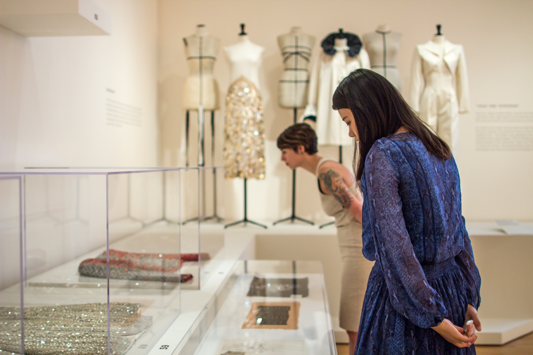
The Alchemy of Style - Installation view of Yves Saint Laurent: The Perfection of Style at Seattle Art Museum

The Alchemy of Style
The production of an haute couture garment was a complex process that began with a sketch. Saint Laurent’s drawings included specifics about ergonomics, “drape” and the equilibrium that must be maintained between the fabric and the body. He would then meet with his chefs d’ateliers (workshop heads) to give them his drawings to be translated onto a toile, the preliminary garment made of white cotton. The toile was then fitted on the mannequin cabine (fitting model) and presented to Saint Laurent. Once Saint Laurent had approved the toile after three or four fittings, it was time to choose the fabrics, colors and adornments, such as exclusively-made buttons. Then the toile was laid flat to create the paper pattern that would be used to cut the fabric. If the fabric was to be embroidered, the motif was either drawn in pencil or a paper cutout of the motif was applied to the toile. Sometimes the process was simplified, by draping the fabric directly onto the model’s body. Saint Laurent declared, “I can’t make any decisions without them.” The models were, he said, his “reality.” Finally, a few days before the fashion show, in the large Second Empire style salon, Saint Laurent would choose among the many accessories displayed on trays and other embellishments.

The Pop Moment
Saint Laurent’s first incorporation of fine art into fashion was the iconic Mondrian dress from 1965. Its design was based on Piet Mondrian’s signature geometric compositions from the 1920s, which marked a breakthrough in modern painting. The designer would next turn his attention to the artists of his own time who embodied the youthful spirit of Pop Art. Tom Wesselmann, Roy Lichtenstein, and Andy Warhol found inspiration for their boldly colored imagery in advertising, comic books, and ordinary mass-produced objects. Experimentation, humor, and a sense of freedom also emerged in popular music and film—and through Saint Laurent, in fashion. He later said, “I participated in the transformation of my era. I did it with clothes, which is surely less important than music, architecture, painting . . . but whatever it’s worth, I did it.”

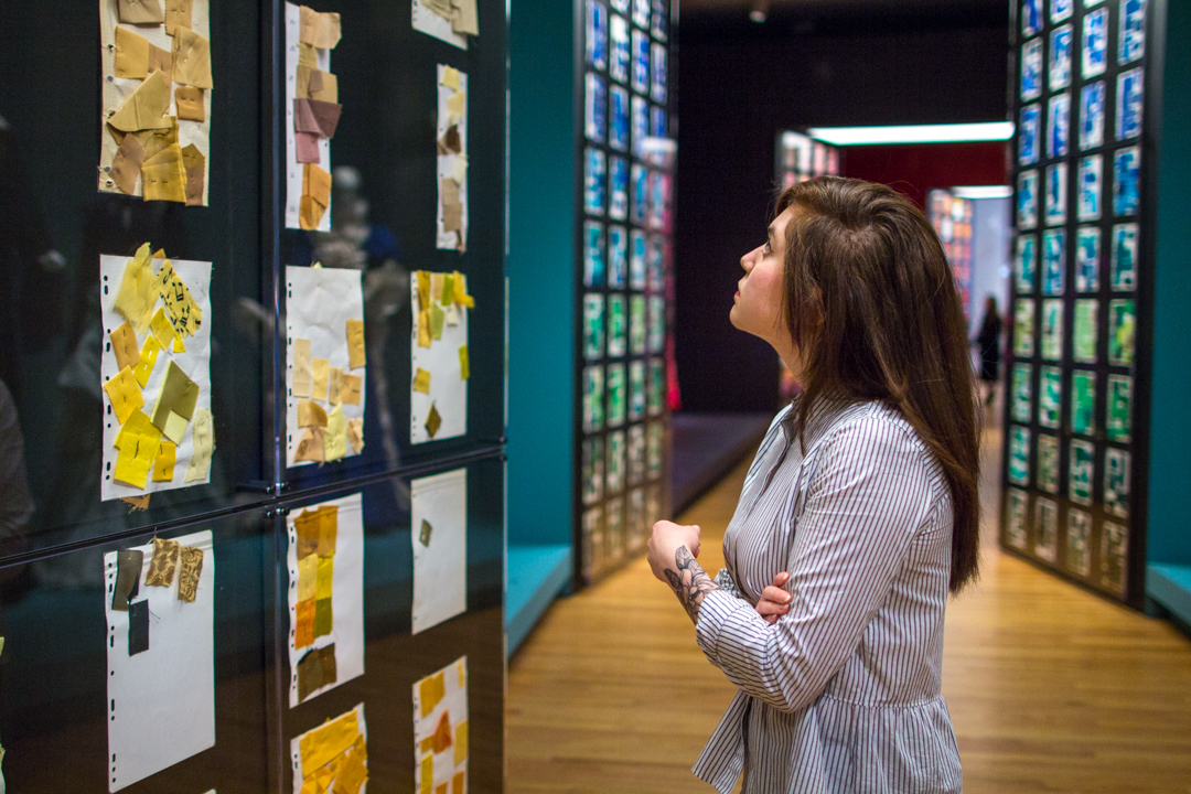
From Darkness to an Explosion of Color - Installation view of Yves Saint Laurent: The Perfection of Style at Seattle Art Museum

From Darkness to An Explosion of Color
The next galleries conduct you through a large selection of pages of échantillons de tissu—fabric samples that he used as a reference to his preferred hues, including his favorites, pink and blue. Near these pages, color-coordinated gowns from forty years of his career display key elements of the Saint Laurent style. The young Saint Laurent used a rather dark color palette. When he discovered Morocco in 1966 he was shocked by the intensity of the blue sky, the beauty of the Majorelle Garden which Pierre Bergé and he saved from destruction and bought in 1980, and the varied hues of traditional garments worn in the medina. In addition, his admiration for the paintings of Henri Matisse helped Saint Laurent to expand his palette into an explosion of intense colors that would become a strong element of his style going forward. From black, which he considered a real color, to the exploration of this colorful palette, Saint Laurent’s sensitivity to color is noticeable in every aspect of his style.

Images: Installation views of Yves Saint Laurent: The Perfection of Style at Seattle Art Museum, Photos: Natali Wiseman.

Object of the Week: Crows

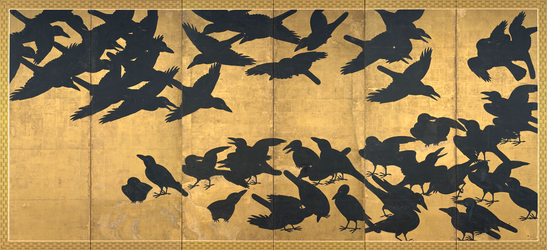
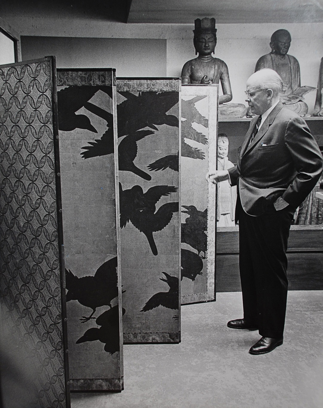
The six-panel Crows screen is a monument in SAM’s Asian art collection and also forms an integral part of Tabaimo: Utsutsushi Utsushi, where it serves as a reference point for a digital aviary. In what other company have the Crows flown?

Back in 1936, the exceptional screen featured in a display of Japanese Buddhist Art at the gallery Yamanaka & Co., from which SAM purchased it. In 1953 it mingled with other Japanese painted screens in an exhibition at the Portland Art Museum. Birds, Blossoms, Bees and Bugs—The Nature of Japan (1976) brought the screen to Los Angeles for a look at Japanese art inspired by the environment. Dozens of permanent collection displays at the Seattle Art Museum have flocked around the Crows. A 1994 installation marking the reopening of the Volunteer Park building as the Seattle Asian Art Museum situated the screen among Japanese netsuke, bronze waterdroppers, jewelry, and lacquers. Flights of Fancy (1998-1999) placed it among newer acquisitions of painting and sculpture, while Signs of Fortune, Symbols of Immortality (2000-2001) engaged its spiritual content. A Fuller View of China, Japan, and Korea (2013-2014) considered the Crows among the countless contributions to the museum from co-founders Dr. Richard Fuller and Margaret MacTavish Fuller.

Dr. Fuller in storage with Crows screen

Wherever the words “Asian” and “masterpiece” were used in a show title at SAM, the Crows screen was there. Masterpieces of Japanese Art from the Collection of the Seattle Art Museum (1998-1999) displayed it among some other remarkable Japanese paintings, like the Hell of Shreaking Sounds scroll from the Heian period, and Bokkei Saiyo’s Moonlit Landscape. Care for the Crows took center stage in Five Masterpieces of Asian Art: The Story of their Conservation (2007). Over 2009–2010, they took a rare flight out of Seattle for Luminous Jewels: Masterpieces of Asian Art from the Seattle Art Museum, which traveled to the Suntory Museum, Tokyo; Kobe City Museum; Yamanashi Prefectural Museum of Art; MOA Museum, Atami; and Fukuoka City Museum, before landing back home.

As truly great artworks do, the Crows have spoken loudly in a range of themed and cultural contexts, amid a variety of fellow works. This restless murder continues to spark new and innovative ideas from its perch at the Asian Art Museum.

–Jeffrey Carlson, SAM Collections  Coordinator
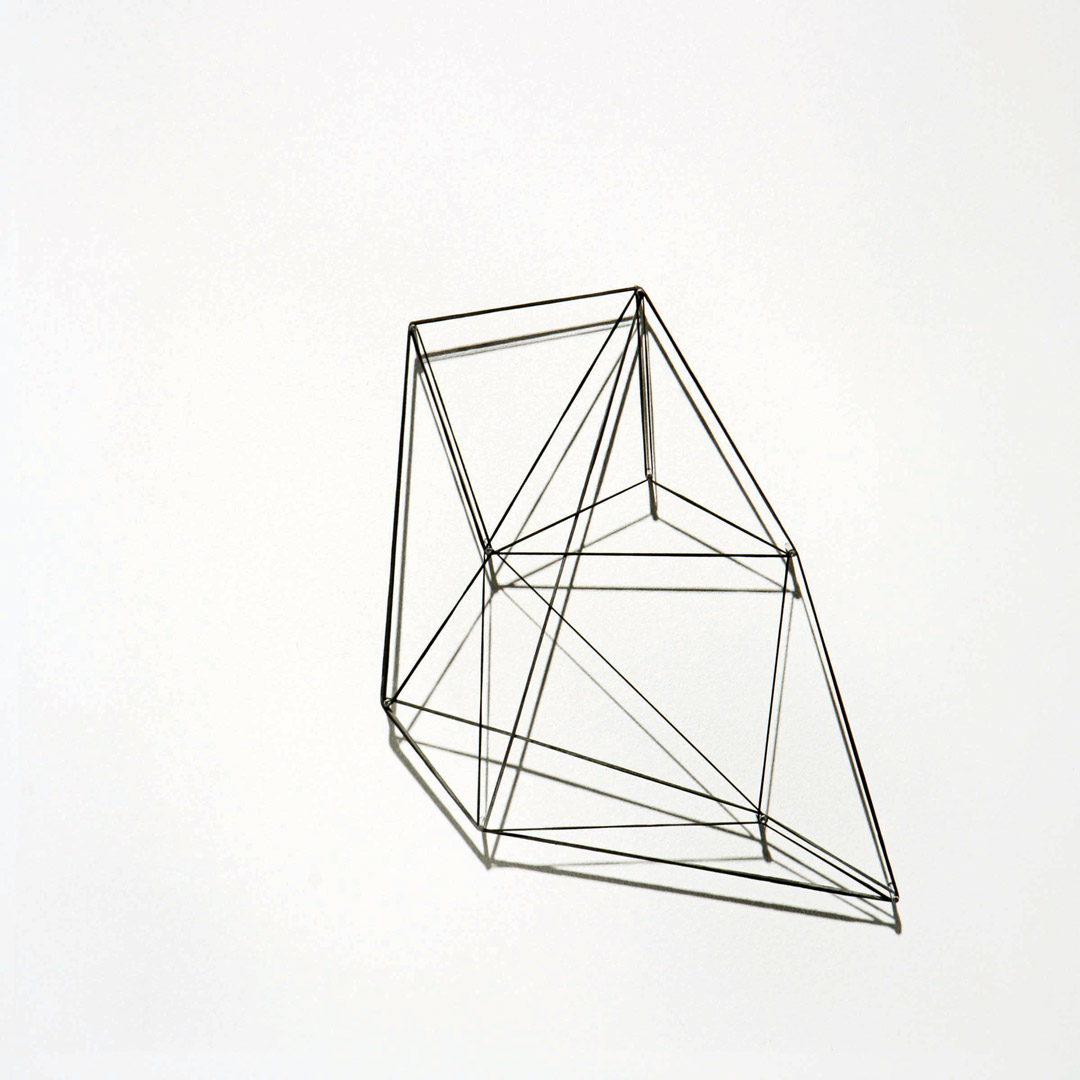
Image: Crows, early 17th century, Japanese, Edo period (1603-1868), pair of six panel screens; ink and gold on paper, 61 9/16 x 139 5/16 in. Seattle Art Museum, Eugene Fuller Memorial Collection, 36.21.1. Photo: Paul V. Thomas.


Object of the Week: Attic stater

Big and small both have their place at SAM. Touring through the Modern and Contemporary galleries, you might be struck by the visual of Ellsworth Kelly’s Blue Green Red II, conspicuous at over seven feet tall and more than eight feet wide. You’ll have to look much harder to find our Object of the Week in the Ancient Mediterranean gallery.

The Attic stater with Athena in Corinthian helmet and Nike measures slightly smaller than a US dime, at just 11/16 of an inch in diameter. That means you could fit 18,828 of these staters (at .37 square inches) inside the blue and green half-ovals (about 6,966.52 square inches) of the massive Ellsworth Kelly.

Enough about the big and Modern; today we’re looking at something little and old. If you could hold it, the Attic stater would feel very solid and heavy. It weighs 8.52 grams—which doesn’t sound like a lot, but compare it to the US quarter, at 5.67 grams, and the one Euro coin, at 7.5 grams. Significantly smaller, the Attic stater out-hefts them both, and that is because of its density as pure gold.

Attic Stater with Athena in Corinthian Helmet and Nike

This coin was struck in the 4th century BCE in the region of the world called Macedonia, then controlled by Alexander the Great. On the front, or obverse, appears the head of Athena, the Greek goddess linked to wisdom and learning. She wears a triple-crested Corinthian helmet that is ornamented with a coiled serpent. The portrait of Athena may be based on her likeness in the monumental bronze sculpture by Phidias that once dominated the Acropolis, Athena Promachos. On the back, or reverse, one would find Nike, whose presence on the coin was meant as a forecast of victory for Alexander’s troops, and Greek lettering that spells out “of Alexander.”

Coinage offers a less-traveled route to understand one of history’s most fascinating people. Alexander the Great’s policies in this area—the new coin types he created, the standards he used, and his impressive list of mints, or production centers—have shown him to be a brilliant economist. His choice to honor the Greek gods Athena and Nike on his coins reflects his well-known admiration for Greece and her culture, but it also seems to have been a political move aimed at flattering Athens, whose fleet Alexander needed for a military excursion to Persia. Alexander, whose father Philip had followed the Thracian standard in some of his coinage, hitched his wagon full to the Attic standard, which was the strongest economically and promised to maintain the flow and value of his monies in the future. This Attic stater was struck at Amphipolis, one of two principal royal Macedonian mints (the other being Pella, the main city in Macedonia). While Philip produced more coinage from Pella, Alexander moved his headquarters to Amphipolis, which had the practical advantage of proximity to the gold and silver mines, importantly increasing wealth in his rapidly expanding empire. 1

–Jeffrey Carlson, SAM Collections  Coordinator
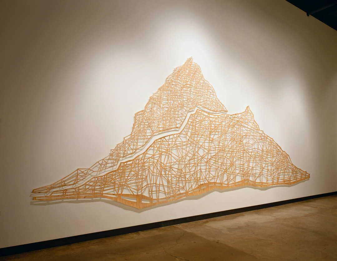
1 Charles Seltman, Greek Coins, A History of Metallic Currency and Coinage Down to the Fall of the Hellenistic Kingdoms, London: Methuen, 1955; 204-207.
Image: Attic stater with Athena in Corinthian helmet (obv.) and Nike (rev.), 336-323 B.C., Greek, Macedonia, gold, diameter: 11/16 in. Seattle Art Museum, Norman and Amelia Davis Collection, 62.181.

Object of the Week: Father Time

Lurking deep in SAM’s dark halls, a scythe-wielding, wizened figure strides toward you—and he can’t wait to turn the clocks back on Sunday.

As an allegory meant to inspire ruminations on aging, Father Time figures as part of a larger story of allegory in the fine and decorative arts of the 18th century. In paintings and sculpture, as in porcelain, personifications of the four seasons, four elements, four (known) continents, five senses, and twelve months acted out their meaning by looking the part and carrying symbolic items. Artists tapped into established systems of iconography—such as Cesare Ripa’s Iconologia (1603), which established fundamental characteristics for allegories of the four continents—to create these groupings. For collectors and connoisseurs, the challenge of spotting every symbolic reference in the appearance and accoutrements of the figure provided an opportunity to show off one’s learning.

"Father Time", ca. 1745, Meissen manufactory

Here, the German porcelain figure of Father Time combines a couple of symbolic and mythological traditions in an allegorical mishmash that honors an 18th-century tradition of incorporation. His bald dome, resplendent in hard paste porcelain, marks his advanced age. Wisps of hair cascading over his ears and the long locks of a flowing beard complete his look. He’s not a harvester of death, as his threatening scythe might suggest. The scythe symbol developed from a lack of verbal distinction between the Greek god of agriculture, named Cronus, and their word for time, chronos. Father Time’s wings were a contribution by Renaissance artists to an already confused allegory. A youthful boy lounges at his feet, grasping a yellow flower. The boy’s presence, and the flower, mimicking humanity’s life cycle at an accelerated tempo, reminded viewers that age, and his companion death, would come for all.

Appropriately meta, Father Time presents a watch holder in his left hand. Originally the porcelain figure would have served to store and display a pocket watch, and in the symbolic program of the artwork, the pocket watch fills the place of the hourglass that one would expect to find in representations of Father Time.

"Father Time", ca. 1745, Meissen manufactory

As it allegorizes and visualizes time, SAM’s porcelain figure enters into a long tradition that includes masterpieces dating back to the Renaissance, like Bronzino’s An Allegory of Venus and Cupid. That it aims to incorporate an actual time-keeping element places it more in the line of contemporary thinking. One of the notable, innovative works to do this recently is Christian Marclay’s video installation The Clock (a portion of which can be viewed here). In the same vein, Maarten Baas’s Analog Digital Clock comprises a video work in which the artist manually creates a representation of a digital clock, continually painting, obscuring, and then re-painting the clock’s minute digits as they pass.

However you’re keeping time this weekend, I say forget counting minutes and make your minutes count.

–Jeffrey Carlson, SAM Collections  Coordinator
Image: Father Time, ca. 1745, Meissen manufactory, German, hard paste porcelain, height: 14 1/2 in. Seattle Art Museum, Gift of Martha and Henry Isaacson, 91.103, Photos: Natali Wiseman.

Object of the Week: Standing figure (Nkondi)

SAM’s Congolese Standing figure (Nkondi) meets and enraptures visitors in our African art galleries. Beads, feathers, and knots of string secured to the wooden figure with countless iron nails lend him a startling and uncomfortable presence. Why has he been on the receiving end of this aggressive, symbolic gesture of driving nails?

Across the country, in exhibitions at great museums like the Smithsonian Institution’s National Museum of African Art, the National Gallery of Art, the Cleveland Museum of Art, San Francisco’s de Young Museum, the Wadsworth Atheneum, and the Philadelphia Museum of Art, the Nkondi has confronted viewers with his own appearance—and with wrong assumptions about his purpose.

Standing figure (Nkondi), Congolese

Not only has he been exhibited extensively, the Nkondi has an interesting provenance. He was collected by Merton Simpson (1928-2013), one of the most significant dealers of African and tribal art in the second half of the 20th century. Interestingly, Simpson first opened his gallery—Merton D. Simpson Gallery—in the early 1950s in order to support what he considered his primary work: painting. An artist for life, Simpson served in the Air Force and was asked to paint General Dwight D. Eisenhower, which he did, earning $100 for his effort. Simpson became part of the New York Abstract Expressionist school, crossing paths with artists like Jackson Pollock and Robert Motherwell, who would critique Simpson’s paintings in the frame shop where Simpson worked. Later he joined the politically focused Spiral Group of artists, which also counted Romare Bearden among its members.1

No slight to Simpson’s visual art, his accomplishments as a dealer of traditional African art surpassed what he did in painting. When Simpson passed away in 2013, a New York Times obituary reflected on his incomparable taste and expertise, his success and renown as an art dealer, and the significance of his doing so as an African American. Heinrich C. Schweizer, then head of the African and Oceanic art department at Sotheby’s, remarks that “Over the course of the ’60s and ’70s Simpson became the most important dealer in the US in this field . . . Worldwide, you could say he was one of the two or three leading dealers, and certainly a powerhouse in the US, and this was especially remarkable for an African-American, who began doing this in the time of segregation.” The same article quotes an equally admiring Lowery Stokes Sims, the highly respected retired Curator Emerita at the Museum of Arts and Design: “When I worked at the Met I would go to the gallery and see some of the most incredible African art I’d ever seen in my life. It was really showstopping. And occasionally he’d show his own work . . . For an African-American who came up in the art world in the 1970s, he was truly one of those unsung pioneers, crucial in establishing our place in the art world.”2

Standing figure (Nkondi), Congolese

SAM’s Nkondi was purchased from Simpson in 1968 by another exceptional collector of African art, Katherine White, whose transformational 1981 gift—of which the Nkondi was part—forms the core of the museum’s African collection.

Since the Nkondi has arrived at SAM, the museum has been telling his true story and deconstructing “fetish” myths about him. Congolese advisor Fu Kiau Bunseki has offered critical insights on the Nkondi’s role as a sign of authority, and as a hearer and keeper of agreements. Check out the SAM website for rich insights on the thoughtful symbolism that informs each element of this memorable figure.

–Jeffrey Carlson, SAM Collections  Coordinator
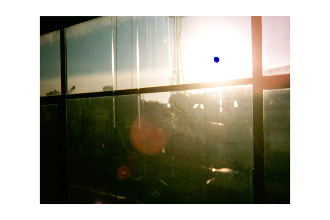
Oral history interview with Merton D. Simpson, 1968 November, Archives of American Art, Smithsonian Institution
Bruce Weber, “Merton D. Simpson, Painter, Collector and Dealer in African Art, Dies at 84,” New York Times, March 14, 2013, http://www.nytimes.com/2013/03/14/arts/design/merton-d-simpson-artist-and-gallery-owner-dies-at-84.html
Image: Standing figure (Nkondi), Congolese, wood, iron, fiber, beads, string, glass, feathers, chalk, 31 11/16 x 13 3/8 x 8 11/16 in. Seattle Art Museum, Gift of Katherine White and the Boeing Company, 81.17.836, Photos: Natali Wiseman.

2016 Betty Bowen Award Winner Wendy Red Star

We talked with Wendy Red Star, the 2016 Betty Bowen Award winner, to discuss her art and ideas of cultural archiving, inclusion, expectations, and engaging communities through a creative process. Raised on the Apsáalooke (Crow) reservation in Montana, Wendy Red Star works cross-generationally, looking in particular at matrilineal relationships within Crow culture and ceremony. She has critically examined historical portraits of Crow leaders by white photographers and taken apart stereotypical representations of Native American women in a variety of popular culture contexts. Her work centers on photography but sculpture, video, fiber arts, and performance are also important to her practice.

Learn more about this artist’s compelling work which will be featured in an installation at the Seattle Art Museum beginning November 10. And don’t miss an opportunity to celebrate the winner of the Betty Bowen Award during the ceremony on the 10th, beginning at 5:30 pm, honoring Wendy Red Star as well as  Dawn Cerny and Mark Mitchell who both received special recognition this year. The ceremony and reception following the artists’ remarks are free and open to the public.

Seattle Art Museum: You’ve described yourself as a cultural archivist in the past, can you describe how your work fills this role?

Wendy Red Star: My practice is collaborative and research-based. I am in pursuit of an on-going excavation of historical Native American imagery and material culture. I like to bring these “artifacts” to life in a contemporary visual arts context. Through an art practice that is driven largely by process, I want to unpack the fraught relationship and history of Native images, portraits, self-representation, and do so with wit, humor, and subtle satire in order to have levity in my art without sacrificing integrity.

red-star_medicine-crow

SAM: You’ve literally annotated a series of images of Crow chiefs. Do you consider your larger body of work to be an annotation? How are your cultural annotations in conversation with the erasure or removal aspects your other work?

WRS: Native voices have historically been silenced, unable to explain or even place our own narrative within the larger society. As a Native person I have witnessed the lack of inclusion for Native artists in particular in the contemporary art world, many of whom struggle for inclusion in important exhibitions. Also troubling is a prevailing but antiquated expectation of what Native art should be, whether from the 19th century or the 21st. This leaves many Native artists feeling segregated into categories of “traditional” work and without a place in the contemporary art world. I consider my practice and the act of annotating, revealing, and erasure a reclamation of my own history and identity. The act is so much more than a rejection of the colonial gaze, it is a deliberate act to take authority and rewrite histories in humanist way.

SAM: How do you see your work in conversation with SAM’s collection, if at all?

WRS: My recent work has had at its center an intensive engagement with my own Crow community and I am seeking to expand that focus into the broader contemporary art world to explore how other artists are grappling with narrative and performative aspects of their work, and how to continue exploring ways of creating greater accessibility and a sense of openness. I am inspired by the work of conceptual artist Fred Wilson who SAM has worked with and the ways in which I could further reappropriate and reimagine the photographic possibilities inherent in portraiture, staging and candid images, institutional critique, and curating museum objects in broader historical and contemporary contexts. SAM is an institution that is open to this process and I find that very exciting and necessary.

SAM: Tell us a bit about your process—how does the fabrication aspect of your creative process add dimension to the final product?

WRS: The actual making of my work happens fairly quick. The majority of my time is spent engaging in research and processing ideas while out walking with my dog in the woods. Once I have settled on an idea the execution happens in many different forms but is almost always image driven witha  focus on richness of color and cultural content.

apsaalooke_fem3

SAM: How does clothing design fit into your practice? Are you intrigued by your work being up at the same time as Yves Saint Laurent: The Perfection of Style?

WRS: My grandmother, Amy Bright Wings, made sure I participated in Crow cultural traditions. She provided me with a traditional elk tooth dress, a shawl, beaded belt, and moccasins—all objects that I have since integrated into my artwork. I soaked up as much of my grandmother’s knowledge as I could by watching her continually making. Although she never actually showed me directly how to make traditional Crow regalia, I learned through the process of immersion. Traditional Native regalia has signifiers that state the honors and virtues of the owner and maker of each individual garment. Every piece of traditional clothing is made with intention and striking beauty virtues that I use to help guide me in all aspects of my art making. I am a self taught seamstress learning the basics about nine years ago when my daughter was born. I have a deep admiration for the construction of garments, fine tailoring, and the sculptural aspect of making clothing. I am looking forward to viewing Yves Saint Laurent: The Perfection of Style and seeing the elegant construction and display of clothing. I suspect it will provide me with many ideas.


ABOUT THE BETTY BOWEN AWARD

Betty Bowen (1918–1977) was a Washington native and enthusiastic supporter of Northwest artists. Her friends established the annual Betty Bowen Award as a celebration of her life and to honor and continue her efforts to provide financial support to the artists of the region. Since 1977, SAM has hosted the yearly grant application process by which the selection committee chooses one artist from the Northwest to receive an unrestricted cash award, eligible to visual artists living and working in Washington, Oregon, and Idaho. The award comes with an unrestricted cash award of $15,000.


Images: Apsáalooke Feminist 1, 2016, Wendy Red Star, digital print on silver rag, 34 x 40 in., Courtesy of the artist, ©Wendy Red Star.
Peelatchiwaaxpáash/Medicine Crow (Raven), 2014, Wendy Red Star, inkjet print with red ink, 16 x 11 in., Courtesy of the artist, ©Wendy Red Star.
Apsáalooke Feminist 3, 2016, Wendy Red Star, digital print on silver rag, 34 x 40 in., Courtesy of the artist, ©Wendy Red Star.

My Favorite Things: Barbara Earl Thomas on Vuillard’s Dining Room

Fresh for your viewing pleasure, the newest video of our My Favorite Things YouTube series featuring Seattle-based artist, Barbara Earl Thomas.

Thomas’ storytelling and humor move seamlessly across media as she works in both painting and writing. Earlier this year Thomas won the Stranger Genius Award in visual art and later this year she’ll be honored with a Governor’s Arts and Heritage Award. With a social commitment to her community that is broad and inclusive, she values good citizenship and social responsibility. Numbered among the SAM collection is Echo Tides, a 1991 painting by Thomas depicting the tension between transition and stability.

In her My Favorite Things interview, Barbara Earl Thomas unpacks her interest in Edouard Vuillard’s Dining Room, Rue de Naples, ParisDining Room portrays the home of Vuillard’s longtime family friends. Thomas is drawn to the sensuous and gentle responses to color, light, and form in the painting, noting, “My house looks like this, my living room looks like this. But when I paint, I don’t paint like this.” Responding strongly to the use of Vuillard’s established painterly technique, Barbara Earl Thomas explains, “You get an indication to everything, but nothing is in clear view.”

Watch the interview, and head to our My Favorite Things playlist on YouTube to watch more of our artist interviews.

Object of the Week: Door from the Ca’Rezzonico, Venice

It’s a fait accompli that countless works of art from cultures across the world can no longer be seen in their original contexts, and the works’ relationship to their original surroundings, including their connection to related pieces, has been forever changed. In SAM’s collection, consider ancient fragments like the Achaemenid Relief from Imperial Reception Hall with servant bearing wine: to whom does he offer his honorary libation? Or, think about the ladies greeting visitors at the top of the escalators on our third floor, in Robert Colescott’s Les Demoiselles d’Alabama: Vestidas: Their nude counterparts are striking poses in the collection of the Greenville County Museum of Art in South Carolina. When related works end up separated, the relationship between them is not severed but altered. When the landing spot for related works is an art museum, new relationships blossom: between an artwork and its new surroundings, and between its new home and the homes of its fellows.

blog-ootw-door-from-venice-detail

SAM’s Door from the Ca’ Rezzonico has starred in the decorative arts collection since shortly after the museum’s move downtown—originally as a long-term loan, and eventually as part of the permanent collection. This lacquered and gilt wooden door features chinoiserie designs, elements that reflect the merging of Asian and European aesthetics. The upper panel pictures a figure on horseback with noticeably Caucasian features, donning flowing robes and a turban in a confluence of diverse cultural associations. As it is currently situated in a gallery focused on Venice as a site of exchange, the Door from the Ca’ Rezzonico exemplifies, and symbolizes, a portal to mutual understanding.

blog-ootw-door-from-venice-detail-2

Aside from the visual interest it carries, the door has established for the museum a special connection to its original site and the site of its sister. The door comes from an opulent palace along the Grand Canal in Venice, the Ca’ Rezzonico. At one point an extravagant private residence, the Ca’ Rezzonico now serves as a museum for the decorative arts, and its collection features a lacquered door in the same design scheme as SAM’s door. Another bond exists between SAM’s door and one in the collection of the Art Institute of Chicago. Adolph Loewi, an antiques and decorative arts dealer based in Los Angeles—who also handled SAM’s Italian Room—was responsible for splitting these doors, at one point joined together in the Ca’ Rezzonico, into two.

As artworks shift context over time, silver linings do emerge, and one of them is the persistent hope that separated pieces might one day be reunited again.

—Jeffrey Carlson, SAM Collections Coordinator
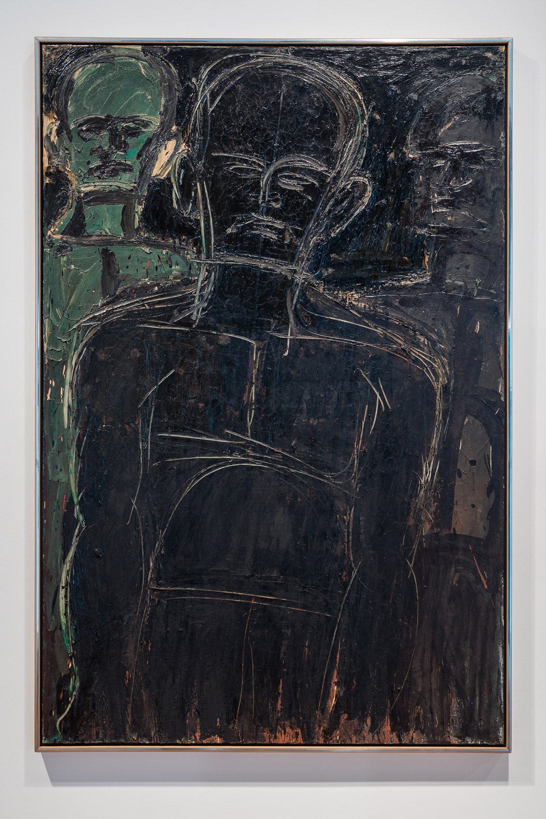
Images: Door from the Ca’Rezzonico, Venice, ca. 1760, Italian, wood, oil lacquer, gilt, 110 3/4 x 56 in. Seattle Art Museum, Gift of Richard Louis Brown, in honor of Julie Emerson, 2014.17, photos: Natali Wiseman.

Object of the Week: Echo

A recent addition to SAM’s collection and an huge impact on the landscape of the Seattle’s waterfront, Echo is the monumental sculpture installed at the Olympic Sculpture Park in 2014. Learn more about this visually confounding sculpture from the artist, Jaume Plensa, and Catharina Manchanda, SAM’s Jon and Mary Shirley Curator of Modern and Contemporary Art. Originally modeled on the nine-year-old daughter of the owner of a Chinese restaurant near the artist’s studio, Plensa elongated and abstracted the girl’s features with computer modeling. The sculpture references Echo, the mountain nymph of Greek mythology. Find out what it took to create and install such an intensely large-scale work.

Object of the Week: Woman and Girl (Frau und Mädchen)

In the 1960s Donald E. Gordon, a scholar of the German artist Ernst Ludwig Kirchner, was producing a new catalogue raisonné on the artist, with the help and cooperation of Roman Norbert Ketterer, a collector and dealer who also served as executor of the Kirchner Estate. Gordon was a professor of art history at Dickinson College in Pennsylvania, where he served as chairman of the Department of Fine Arts. He had secured two Fulbright fellowships that took him to Germany for direct study of many Kirchner works, first at the University of Hamburg in the mid-1950s, and then at the University of Marburg in the mid-‘60s. By way of his study and connections Gordon familiarized himself with the entirety of Kirchner’s oeuvre. He successfully produced the catalogue raisonné, published by Harvard University Press in 1968, a herculean effort because of Kirchner’s productivity in painting and graphic arts. The same year marked the premiere of a retrospective exhibition on Kirchner that Gordon had organized, and for which he also authored the exhibition catalogue. The Seattle Art Museum Pavilion, this museum’s first space dedicated to the display of modern and contemporary art, was the first of three venues to host the Kirchner exhibition. Ernst Ludwig Kirchner debuted there on November 23.

Amid impressive amounts of researching and writing Gordon was wheeling and dealing, too. He came upon Woman and Girl (Frau und Mädchen) in the collection of Mrs. Maria Möller-Garny, the widow of Ferdinand Möller, a Nazi-era art dealer. Woman and Girl (Frau und Mädchen) had fallen under Hitler’s ridiculous category of “degenerate art,” prompting Nazi officials to remove the painting from the Staatliche Gemäldegalerie in Dresden. Because it was taken from a state-funded museum by the government in power, it was a legal seizure at the time. Tellingly, Möller, though in the business of dealing, recognized it as a fine example of Kirchner and kept the painting in his private collection until he died. In April of 1968, seven months before the doors opened on the Kirchner retrospective in Seattle, Gordon provided the connection between Frau Möller-Garny and SAM (for a small fee, of course). Gordon’s letter to Möller-Garny notifying her of the museum’s intention to buy, part of which we have reproduced here, is fun whether or not Sie lesen Deutsch.

Gordon's letter to Möller-Garny

The next week, Gordon wrote to Thomas Maytham, then Associate Director at SAM,

Both Mrs. Möller-Garny and I are pleased that you were able to secure the Seattle Art Museum’s decision so promptly, and hope that the sale may be consummated with similar dispatch. From my long knowledge of and admiration for this masterpiece, I am also personally happy at the prospect of its permanent entry into a major American museum collection.

The purchase was heralded in Seattle, timely because of the Kirchner retrospective in which it featured, and high-profile because of Kirchner’s importance in the history of Modern art. On November 17, 1968, Seattle Post-Intelligencer’s Northwest Today featured a color reproduction on the front page—unfortunately adjacent to a rhetorical headline wondering about this city’s aesthetic potential.

November 17, 1968, Seattle Post-Intelligencer’s Northwest Today with a color reproduction of Woman and Girl (Frau und Mädchen)

—Jeffrey Carlson, SAM Collections Coordinator
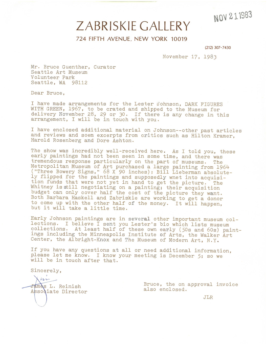
Image: Woman and Girl (Frau und Mädchen), ca. 1922-1923, Ernst Ludwig Kirchner (German, 1880-1938), oil on canvas, 66 1/8 x 46 7/8 in. Seattle Art Museum, Gift of Dr. and Mrs. Richard E. Fuller, 68.120, Photo: Paul Macapia.

Norbert Herber on “Mobile Section”

“Everyone has a part to play in this tradition, whether you work with indigo or not. Anyone who wears blue jeans has a part to play in this tradition.” – Norbert Herber

What sound does a seed make? How about compost? Experience how digital images and color can translate to timber in the hands of Norbert Herber.

As you enter Mood Indigo: Textiles From Around the World you encounter a contemporary compliment to the historic scope of the exhibition exploring this vibrant dye. A collaboration between textile artist Rowland Ricketts and sound artist Norbert Herber, “Mobile Section” is a responsive and immersive installation combining a large-scale, hanging textile and field recordings of Ricketts’ indigo dyeing process synthesized using data from various conditions that produced the dye and color gradations of the cloth in the installation. Sensors in the gallery register people as they move around the installation and accelerate or decelerate the sound mix so that the audio element on “Mobile Section” will never sound the same twice.

See this work before it’s too late—it will be on view through October 9 in the exhibition Mood Indigo: Textiles From Around the World at the Asian Art Museum in Volunteer Park.

FTW! Wendy Wees Winning at Art

Wendy Wees is one of 41 talented artists exhibiting work in SAM’s kick-rear-end staff art show, on view through October 2 in the first floor Community Gallery off South Hall at Seattle Art Museum. Wees won recognition from her peers at the show’s opening on September 7, when her piece was selected by viewers as the favorite from this group of thoughtful, diverse artworks. One intriguing quality of Wees’s painting relates not to what it reveals, but to what it denies the viewer.

Her award-winning painting, titled Verticalverses017.ptg, is part of a new, exploratory series for the artist that she calls Vertical Verses. These colorful works, appropriately arranged in vertical bands, play with script in a way that recalls, and references, Mark Tobey’s “white writing.” In her process, Wees paints on the vertical bands in layers, in some passages allowing the color blocks to visibly overlap and bleed into one another. Then, using a range of tools, she carves beautifully calligraphic characters into the color blocks, scraping at the paint and revealing the layer beneath. These characters lead the eye fluidly down and back up the canvas. Within each band, Wees works in the same script style, filling the color block to create an all-over design pattern, and showing impressive control in doing so. From one color block to the next, the characters and their stylistic influences change: Wees varies the shape, curvature, and width of the marks, as well as their impression of energy. The final result is a lively piece that features a range of scripts resembling, in different passages, Latin and Islamic manuscripts, Chinese and Japanese calligraphy, and fanciful doodles.

The characters in Wees’s Vertical Verses draw us in, and then stunt our understanding. They are unintelligible, part of a category called “asemic” writing—a term that describes lettering with no semantic content. Literally speaking, the groupings of characters don’t mean anything. But the forms, as visual art, prove absorbing and more than capable of communicating.

More work from the Vertical Verses series by Wendy Wees

For Wees, as for other artists who have employed asemic marks, such as Tobey, the choice to imagine and invent characters rather than working with a known and recognized alphabet, is liberating. First, denying viewers the access to one straightforward message opens up myriad possibilities of individual readings. The work prods a lazy viewer into activity, as the viewer’s role in creating meaning, always present, comes to the fore. In this way the artwork’s ability to communicate becomes dramatically enhanced. Wees wants viewers to actively engage with her work, and her unintelligible script prompts this kind of interaction. “I find that people are drawn into the paintings because there are layers of ‘visual stories,’” she explains. “Viewers are searching for the meaning. I have seen them inspecting the work close up and then standing way back, and then being drawn in again.” Finally, the part of her work that is youthful and whimsical, maybe a reflection of her background as an illustrator, finds its best expression in an art that moves her viewers into an imaginative mode of thinking with bilateral idea-sharing. At the heart of Wees’s creativity is her belief in art’s transformative power. “Art is a powerful mode of communication which transports viewers to other worlds, other feelings and different thoughts and ideas,” says Wees. “It does not have to be a complex response,” she adds, pointing to the way her paintings communicate on a visceral level without stating anything explicitly.

Wees has worked for SAM for almost ten years and has devoted much of that time to the SAM Shop. In her current role as Retail Sales Associate, one of her responsibilities is to assist with crafting new shop displays, for which her team draws inspiration from SAM’s rotating special exhibitions. It’s a role that encourages and sparks Wendy’s creativity. As an artist, Wees also counts access to SAM’s permanent collection as an invaluable encouragement to her own work.

Her persistent efforts as a practicing artist have earned Wees representation at Gunnar Nordstrom Gallery in Bellevue, situated adjacent to Bellevue Square, where she received an exhibition in 2014. In addition to showing at Gunnar Nordstrom Gallery, Wees has exhibited at Soulard Art Gallery in St. Louis (2013); Rob Schouten Gallery on Whidbey Island (2012, 2010); Krab Jab Studio in Georgetown (2011); Columbia Art Gallery in Hood River, Oregon (2010); and the Frye Art Museum (2001).

Congratulations and thanks to Wendy for her thoughtful painting and her important work in the SAM Shop! You can see more of Wendy’s work at Gunnar Nordstrom Gallery’s website.

—Jeffrey Carlson, SAM Collections Coordinator
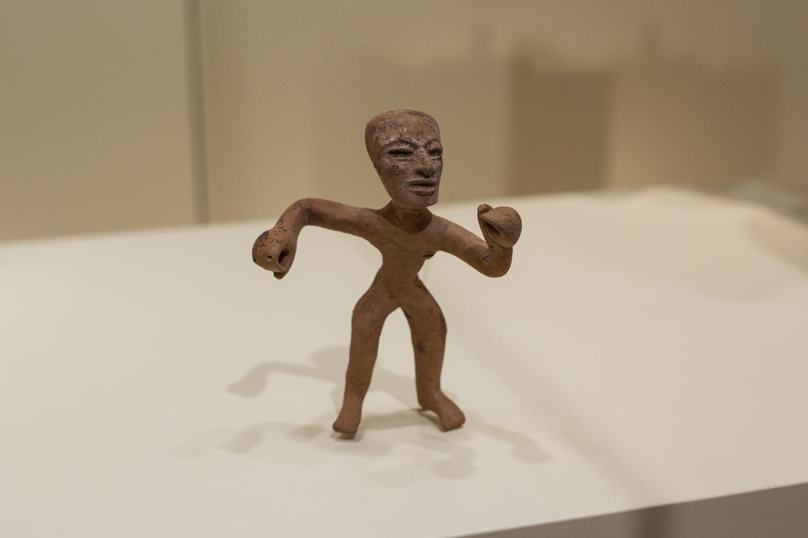
Images: Courtesy of Wendy Wees, from the series Vertical Verses.
SAM Stories