Muse/News: Art News from SAM, Seattle, and beyond

SAM News

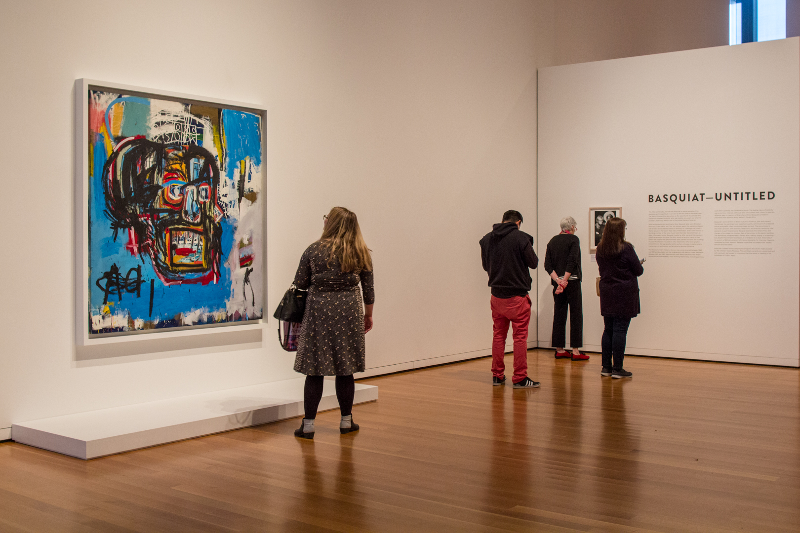
Definitely not that same old, same old: Seattle Times photojournalist Alan Berner was there to capture opening day of Basquiat—Untitled on Wednesday; his image ran on the front page of the Seattle Times’ Thursday edition. See more of his images in their online gallery.

Stories on the painting also appeared on KOMO News and on Crosscut.

“The piece is a stunner. A thickly sketched, disembodied skull floats on a vivid blue background that disintegrates in places, revealing primary colors and countless more layers of paint. The skull is possibly alive, and definitely vibrating. Its square mouth is agape, exposing piano-key teeth. At lower left, an uppercase A sits next to its lowercase sibling, as in a children’s primer. It looks like it might be a sound, like Aaaah. But is the skull shouting or singing?” –arts writer Brangien Davis.

Local News

Geekwire shares that New York-based conceptual artist Tavares Strachan is the first-ever artist-in-residence at nonprofit research organization the Allen Institute; his show at the Frye Art Museum is on view through April 15.

Lizz Giordano of Crosscut reports on the passage of an ordinance by the King County Council that tightens its control over arts and culture agency 4Culture—and what it will mean for the arts in Seattle.

The National Arts Education Association was in town last week. Here’s a Q&A with their convention speaker, artist Barbara Earl Thomas, on her years as an artist and community leader.

Inter/National News

Never seen a ceiling, but got a lot of walls: six-year-old Blue Ivy Carter placed the winning bid at the Los Angeles’ Wearable Art Gala for a work by Samuel Levi Jones.

“It’s definitely art. I would say. I think…” You’ve got to see Will Ferrell and Joel McHale visiting a contemporary art exhibition, Stories of Almost Everyone at the Hammer Museum.

The New York Times Style Magazine with “an ode to joyful, self-consciously naïve design,” including drawings by Andy Warhol and Gregory Blackstock (now on view at the Greg Kucera Gallery).

And Finally

“Ich möchte eine Weissweinschorle”—“I would like a white wine spritzer”: A new tongue-in-cheek book teaches important German phrases for navigating the art world.

—Rachel Eggers, SAM Manager of Public Relations

Photo: Installation view of “Basquiat—Untitled” at Seattle Art Museum, 2018, photo: Natali Wiseman.

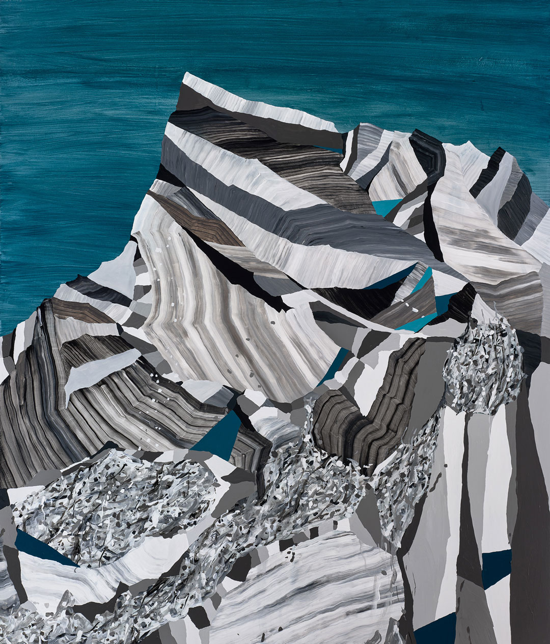
SAM Gallery Artists on Seattle: Ryan Molenkamp

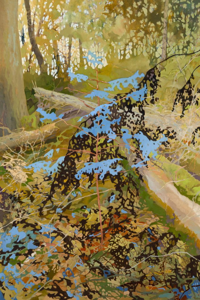
Seattle is often cited as a great place to live because of the ease of access to the outdoors. With mountains encroaching on the city’s skyline from every direction and terrains ranging from rain forest to desert in the state of Washington, it’s easy to understand why we’ve got a reputation as a city of landscape painters and nature poets. In Outside Influences, on view in SAM Gallery through April 4, Dan Hawkins, Ryan Molenkamp, Kate Protage, and Chris Sheridan depict both the cityscape as well as our moss and stone backyard—taking their inspiration from everything outside themselves and filtering it through their particular medium to create unique and striking scenes of Seattle and its surroundings. This artwork begs for reflection on the artist life in Seattle and Molenkamp provides.

Ryan Molenkamp

When I moved to Seattle in 2001 to pursue an art career it didn’t make a lot of sense . . . frankly moving anywhere to pursue an art career didn’t make a lot of sense, but I had the bug, the itch, and I found Seattle to be a welcoming place to grow. The city was full of artists and galleries and a lot of DIY spaces to show art, but it always felt like it had a chip on its’ shoulder. Very little attention was ever given to what was happening here, unless it was in music. But the scene was tight. I remember in particular during the recession years strong unity among artists in this town. If no one was going to buy art at least we could all go out and support each other over 2-buck-chuck and a Rainier. Those days have given way to a more expensive Seattle, one that has priced out a lot of artists and venues. At the same time the new Seattle is full of opportunity for artists to actually make a living at this business. The success of the Seattle Art Fair, as well as the continued success of galleries like SAM Gallery and Linda Hodges Gallery (plug—I show with Linda, too) shows that this city is ready to be more than a forgotten corner of the art world. I’m excited to have a small voice in the conversation that gives me the privilege to pursue a career in the city I love.

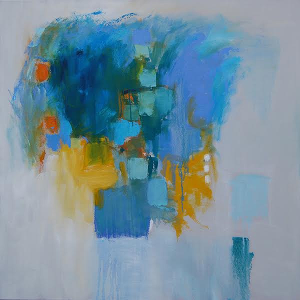
Image: Cascade 7, 2018, Ryan Molenkamp, acrylic on panel, 40 x 34 in.

Object of the Week: Woman’s Kimono

This time of the year (on the West Coast, at least) always reminds me of my favorite line from the poem Spring by Edna St. Vincent Millay: “Comes like an idiot, babbling and strewing flowers.”1 With cherry blossoms blooming, flowers cropping up overnight, and the impending spring equinox, it’s hard not to feel deep excitement about the changing season.

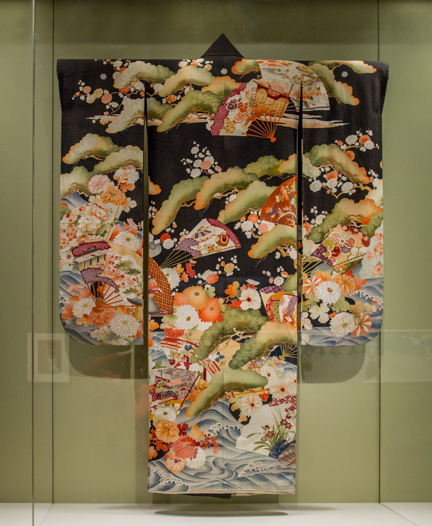
The pictured kimono, or furisode, perfectly captures the frenzied energy with which spring arrives. Turbulent waves rushing forward, overlapping with flowers, trees, and fans, together evoke the lush abundance of March, April, and May. Set against a black background, the colorful composition feels especially saturated—almost unreal. Luckily for us, just a quick glimpse outside offers a very real reminder that spring indeed brings with it unbelievable hues of pink, purple, orange, and green.

Made of silk, this furisode is one of a few examples in the SAM collection exhibiting yuzen: a freehand paste-resist dyeing method. Developed in late 17th-century Kyoto—where the production of kimono textiles reached its peak—yuzen allowed artists to create designs painted by hand with a rice-paste coating. This process ultimately liberated designers from the repetitive patterns associated with other dyeing techniques, such as shibori. Resulting in large pictorial images such as this spring landscape, yuzen brought a wholly new aesthetic to kimono decoration.

The furisode is a kimono distinguished by its long, billowing sleeves that, when worn, sway gracefully as the wearer moves; its elegance is echoed throughout its form and sumptuous design. If you’re in the galleries and need a vernal pick-me-up, this beautiful kimono can be found in Talents and Beauties: Art of Women in Japan on the third floor.

Elisabeth Smith, Collections Coordinator

Image: Woman’s kimono (furisode), 20th century, Japanese, silk crepe with embroidery and paste-resist dyeing (yuzen-zome), 64 5/8 x 49 1/4 in., Gift of Jean B. Rolfe, 81.14, photo: Natali Wiseman
1 For the full poem by Edna St. Vincent Millay: https://www.poetryfoundation.org/poems/44728/spring-56d223f01f86e.

Layering Histories in SAM’s Collection

The Seattle Art Museum collection spans ancient and contemporary art across continents—perfect for examining historical artworks through the critical framework of Figuring History: Robert Colescott, Kerry James Marshall, Mickalene Thomas. While you’re here, listen to new collection audio tour additions from creative community members on objects from our collection or use the question and information below as way of looking again at the works you see at SAM regularly.

How does the narrator of a story change how the story is told?

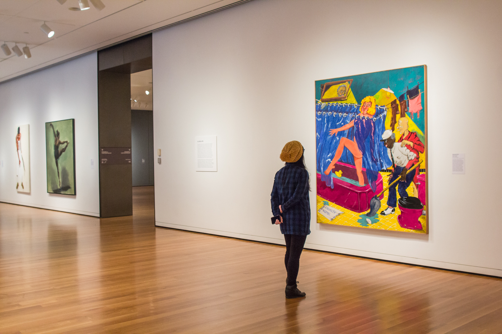
Susanna and the Elders, an oft-painted Old Testament tale, is recast in a contemporary context by Robert Colescott in the image of his painting, above. This subject is popular throughout art history for featuring the nude female figure and also allowing viewers to morally condemn the lecherous elders. Colescott inserts himself in this scene as a Peeping Tom in the window to show how, in his presentation of the nude female form, the artist is complicit with the elders, as are the viewers as they too watch Susanna bathe.

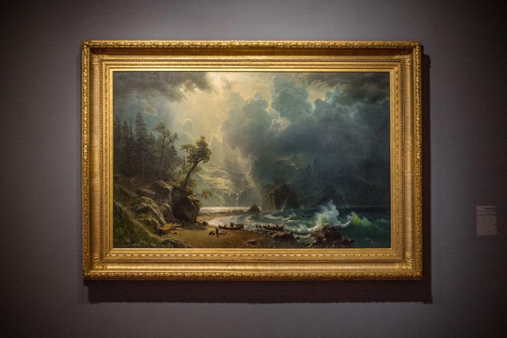
Albert Beirstadt had not visited inland Washington when he painted Puget Sound on the Pacific Coast in 1870. It was likely commissioned by a shipping magnate making money from the West coast who wanted a painting to get America imagining where their future modern seaport might soon arise. Because of the patron, this pioneering painting of the past is actually a new maritime civilization’s prologue.

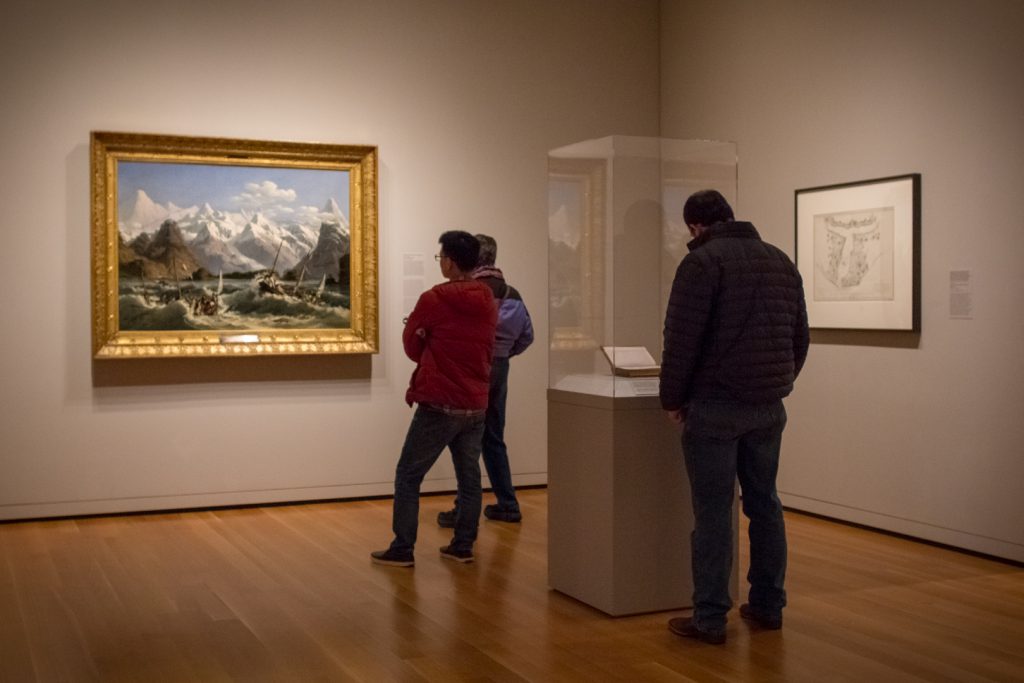
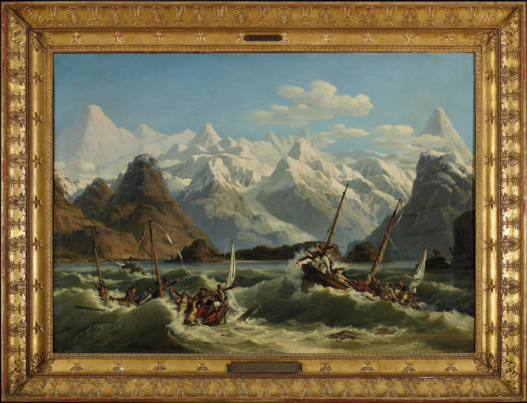
Louis-Philippe Crépin depicts lives lost in the name of discovery in Shipwreck Off the Coast of Alaska. At the right are two Tlingit witnesses who helped search for survivors of the La Pérouse expedition. The French expedition and the shipwreck became part of the Tlingit oral tradition. However, when La Pérouse named this the Bay of the French, it was clear from the trading skills of the Tlingit, that this expedition was not the first to find this bay.

– Chelsea Werner-Jatzke, Content Strategist and Social Media Manager

Photos: Installation view of Close Ups at Seattle Art Museum, 2018, photo: Natali Wiseman. Puget Sound on the Pacific Coast, 1870, Albert Bierstadt, born Solingen, Prussia, 1830; died New York City, 1902, oil on canvas, 52 1/2 x 82 in., Gift of the Friends of American Art at the Seattle Art Museum, with additional funds from the General Acquisition Fund, 2000.70, photo: Natali Wiseman. Installation view of Extreme Nature at Seattle Art Museum, 2018, photo: Natali Wiseman.

Encountered in Orbit: Artists in Residence at Olympic Sculpture Park

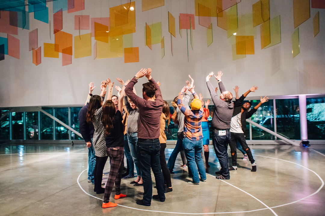
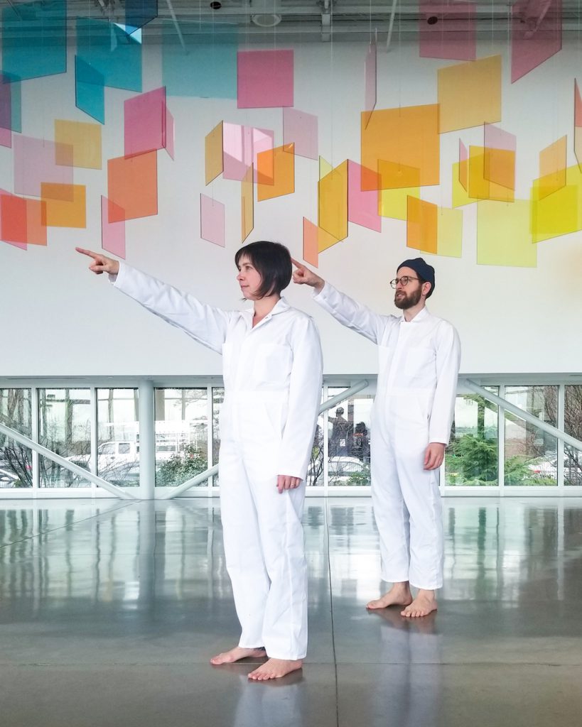
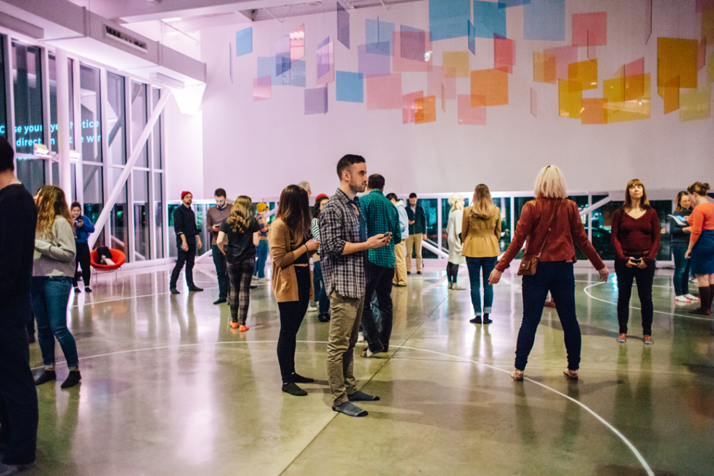
“We look to a blue dot on our phones to locate ourselves,” Tia Kramer points out. “Orbiting Together offers a new way engage with unseen objects that make that technology possible. Through text messages we instruct participants to poetically enact gestures that respond to the function of the satellites orbiting overhead.” Orbing Together is the participatory experience of the current Olympic Sculpture Park artists in residence, Tia Kramer, Eric Olson, and Tamin Totzke. When you opt in to Orbiting Together you get texted instructions, or scores, on how to orient yourself to the space around you once or twice a day, wherever you are, at the same time as anyone else signed up, according to satellite movement over the park. The residency culminates in a final Art Encounter, a participatory experience and performance, at the Olympic Sculpture Park, Friday, February 23.

The functions and properties of the satellites triggering the text messages inform the scores you receive. Some of the messages are sent along with images and information on the satellite that sends them. When writing the scores, the artists are considering binaries. Both the binaries of computers that direct satellites across the skies above us as well as, “how to hold divergent concepts in your mind and body at the same time,” Kramer says.

The three artists in residence bring unique backgrounds to the project. Tamin Totzke, with an MFA in choreography, offers movement practices that inform the scores. Tia Kramer is a site-specific performance artist, educator, and social choreographer interested in gestures and actions of human connection in the everyday. Eric Olson uses his programming and technical skills to create participatory art practice and social engagement. They all consider the Art Encounter portion of their residency as making the irony of the project clear.

“We’re asking people to consider the somatics of our relationship to technology, while using technology to create connection,” Olson points out. Somatics is the making of meaning through intentional movement that allows you to perceive yourself and the world around you. While the project points out how we isolate ourselves from each other and our environments by referring to satellites thousands of miles away to tell us the name of the street we are on, it also uses cell phones and social media to prompt group actions.

Because it requires your phone to take part, the balance between documenting and experiencing is also an inherent tension to the project. Orbing Together is at once a chance to re-orient in space outside of your phone, while using your phone to facilitate that orientation. “We’re playing with parody. We’re using an ad agency technology to facilitate personal agency.” Eric Olson says.

By creating a database of all the satellites that move over Seattle daily (most pass over multiple times a day), tracking which zip codes they travel through, and using advertising technology that sends text messages, Orbiting Together is bridging space through simultaneity.

With people opted in across the world, the Olympic Sculpture Park becomes a location that people the world wide are orienting themselves by, while paying closer attention to their immediate surroundings. For the final Art Encounter at the Olympic Sculpture Park there will be a blend of visitor participation and performers in attendance. It will not be immediately apparent who is a performer and who is an audience member. The performers will create a complete presentation of the gestures that have been texted throughout the project. There’s still time to take part, text “TOGETHER” to “206 IN 01 SKY.” Also coming up this weekend is a send off celebration and artist tour of the Olympic Sculpture Park, Sunday February 25, 10:30 am–noon. Meet in PACCAR Pavilion to join the artists in residence for a tour of the park with inspired exercises.

– Chelsea Werner-Jatzke, Content Strategist and Social Media Manager

Images: Jen Au, Nina Dubinsky, Jen Au

SAM Gallery Artists on Seattle: Jason Gouliard, Patty Haller, and Anna Macrae

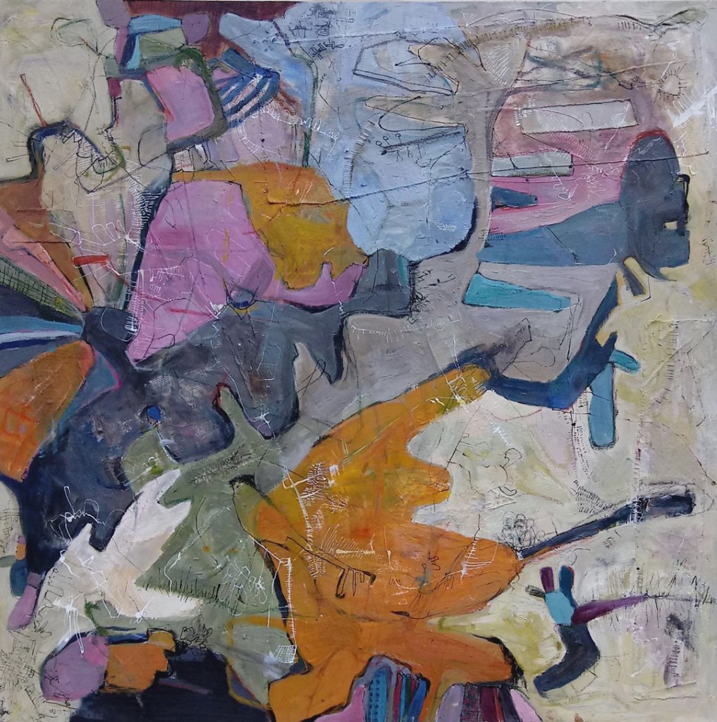
What does it mean to be local in a city that is rapidly growing? This month hear from two of SAM Gallery’s newest artists whose work is on view in New Art, New Artists through February 5. One of these artists transplanted to Seattle four years ago and the other comes from a family that has lived here for four generations. Hear how Seattle influences the creative output of these artists and then come see work by some of SAM Gallery’s newest regional artists in all their complexity, interest, and beauty, regardless of where they are from.

Jason Gouliard

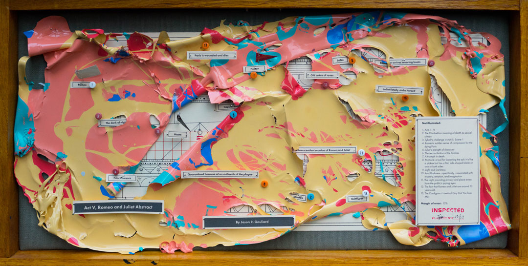
Having moved from Austin, Texas to the Pacific Northwest four years ago to pursue a career in the tech industry, I wouldn’t say that my work is specifically inspired by Seattle—Though I do try to create work that is as complex and layered as the city I now call home. My paintings explore the intersection between abstraction and meaning. Abstract assemblages with recognizable reference points. I think of them as earnest attempts at condensing rich, complex subject matter down to drips of paint through juxtaposing traditional abstract expressionist painting methods with cartography, proofreader’s marks, and amateur roadside museum techniques of display, classification, and critique.


Patty Haller

I’m a fourth generation Seattleite, most comfortable in a mossy wet forest in the fog, on a darkening late-November afternoon, even. My paintings explore complexity in the forest, analyzing the layers of plant growth we see all around us in the Pacific Northwest. I have a studio at Magnuson Park where I’m surrounded by soccer families, dog walkers, and artists. Every day I see people doing healthy things together, and I truly appreciate how Seattle values this. Showing at SAM Gallery only amplifies my pride of place. It’s a hub for art lovers. I’m meeting new people and enjoying Seattle’s active social media community. I love that our SAM Gallery show coincided with Andrew Wyeth: In Retrospect, whose work is an enduring influence on me. I remember seeing an image of Helga Testorf in a book in my Nathan Hale High School art class. Helga’s braids! I couldn’t get enough. Last week I looked so closely at Wyeth’s brushwork I nearly broke the barrier that would set off an alarm. I should be more careful, but I just love the art that much. Resources like SAM help me to dream of the paintings I’ll make next.

Anna Macrae

We emigrated to Seattle from England in 2001. My new environment certainly changed my art making—from small realist watercolor paintings, to large bold abstract renderings. I feel that shift was largely due to scale, for a start the walls are so much bigger here, and I can move a 48 x 60″ canvas in my car! Seattle embodies an abundance of extremes and contradictions that generates a rich influence and narrative for art making. From a very young age I had always made, played, and explored. I feel this has continued to be present in my art practice. I have always allowed myself the freedom of discovery through “mistakes”. For me, there are no wrong choices when making art, I trust in my intuition and value those unexpected awkward marks that can only present themselves when you truly surrender to the process.
Images: Act V, Romeo & Juliet Abstract, Jason Gouliard, paint and mixed media on paper under plexiglass, 12 x 24 in. Fort Casey Big Data, Patty Haller oil on panel, 36 x 24 in.  Follow your lead, 2017, Anna Macrae, oil and mixed medium, 48 x 48 in.

Object of the Week: Veronica Smith, Phillip Hunter Jr., and Kent Carrington, at the City of St. Jude staging area, March 25th, 1965

The concepts contained in words like ‘freedom’, ‘justice’, ‘democracy’ are not common concepts; on the contrary, they are rare. People are not born knowing what these are. It takes enormous and, above all, individual effort to arrive at the respect for other people that these words imply.

– James Baldwin, “The Crusade of Indignation,” The Nation, July 7, 1956

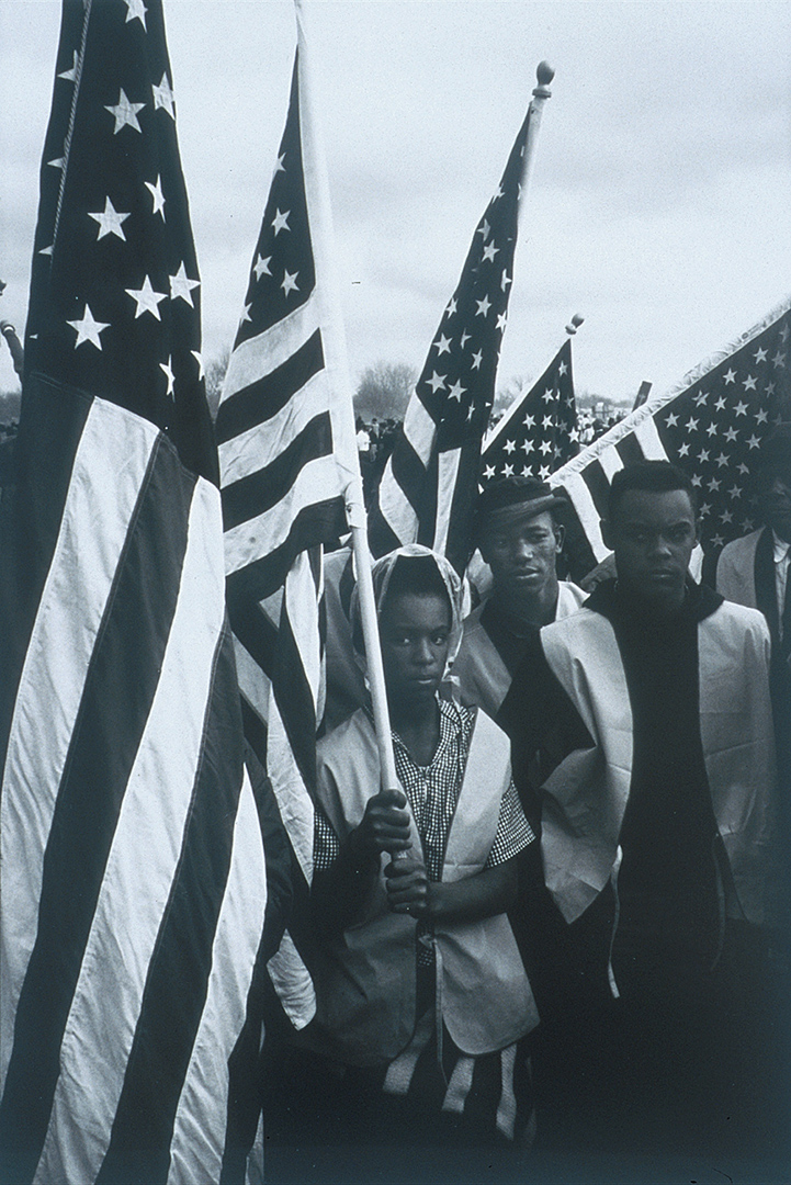
This black and white photograph, taken by photojournalist Dan Budnick in 1965, is one of a series that Budnick had hoped to publish in a Life magazine photo-essay. Taken during critical events of the civil rights movement, the photographic series captures such moments as the 1958 Youth March for Integrated Schools, the 1963 March on Washington, and Dr. Martin Luther King, Jr.’s I Have a Dream speech delivered that same day.

This image in particular depicts three young activists—Veronica Smith, Phillip Hunter, Jr., and Kent Carrington—holding the American flag while participating in the famous five-day march from Selma to Montgomery, Alabama. Led by Dr. King, the march protested the discriminatory laws suppressing black voters’ rights in the South and would eventually lead to the passage of the landmark Voting Rights Act. Stoic, calm, and courageous, Smith, Hunter, and Carrington are engulfed in a sea of stars and stripes—symbols of the freedom and equality for which they were fighting. The flags, acting as a visual barrier separating them from their fellow marchers, can perhaps be read as a metaphor for the segregation these activists sought to end.

While the civil rights movement often conjures struggles faced in the past, Dr. King’s call for racial equity, social justice, and religious tolerance is as relevant today as it was fifty years ago. Progress has no doubt been made since the 1960s, but it is also important to acknowledge that the fight against racism—in all its insidious and systemic forms—is not a past but current event. Many of us will celebrate Dr. King’s legacy by observing his birthday on Monday, January 15, but our individual efforts to achieve equal rights—for all marginalized communities—is an ongoing project that transcends a single day.

– Elisabeth Smith, Collections Coordinator

Image: Veronica Smith, Phillip Hunter Jr., and Kent Carrington, at the City of St. Jude staging area, March 25th, 1965, 1965, Dan Budnik, Gelatin silver photograph, 14 x 11 in., Gift of Getty Images, 2000.43, © Artist or Artist’s Estate

Wyeth’s Cast of Characters: Christina Olson

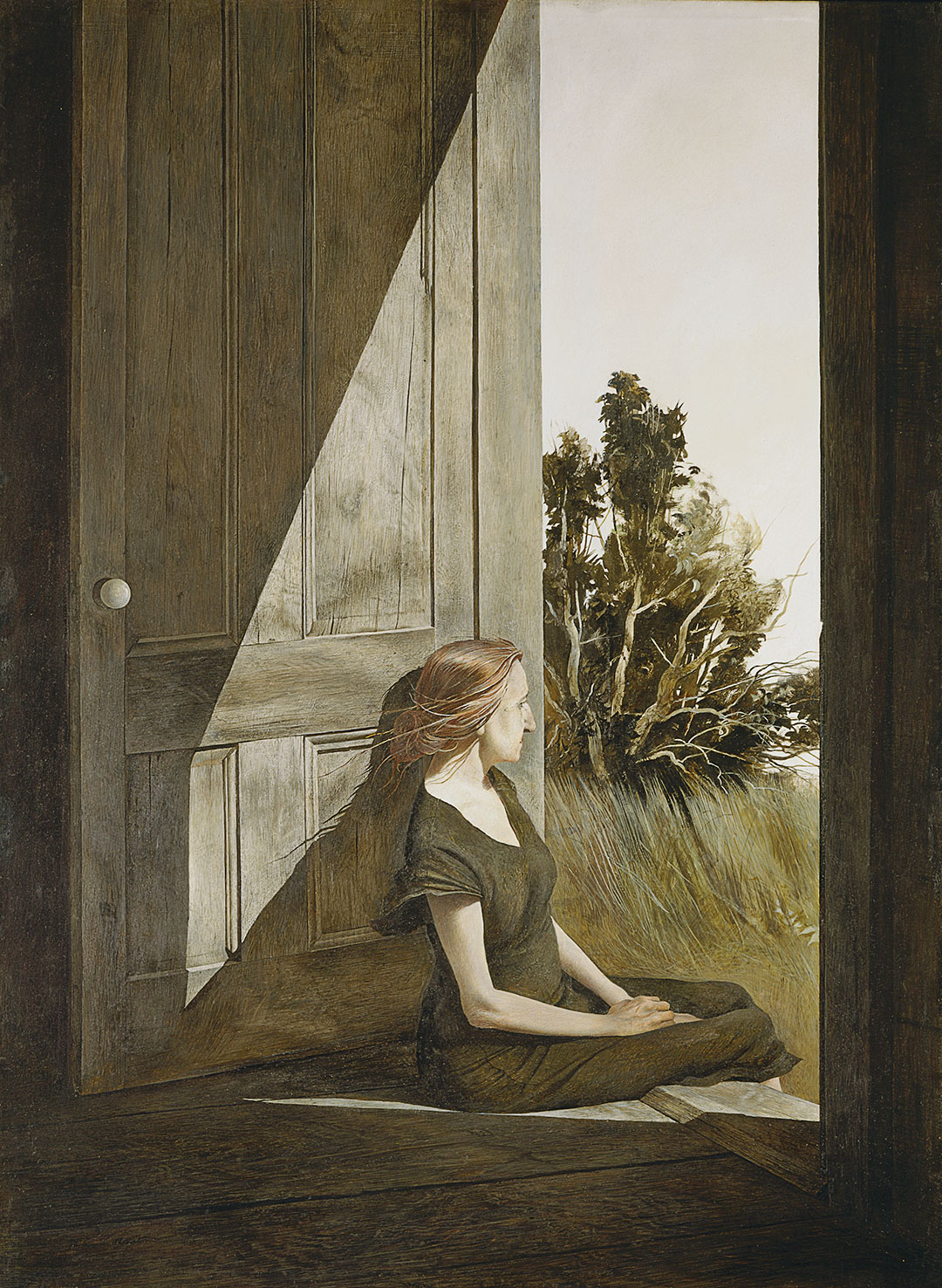
One day I came in and saw [Christina] on the back door step in the late afternoon. She had finished all her work in the kitchen and there she was sitting quietly, with a far-off look to the sea. At the time, I thought she looked like a wounded seagull with her bony arms, slightly long hair back over her shoulder, and strange shadows of her cast on the side of the weathered door, which had this white porcelain knob on it. ―Andrew Wyeth

Andrew Wyeth met Christina Olson through his wife Betsy and first painted her in 1947. He would paint Christina every summer in Cushing, Maine for the next 20 years until her death in January, 1968. As Betsy explains it, “The key to the Olson pictures is Andy’s relationship with Christina—absolutely at ease with him.” Christina Olson, a New-England native, refused a wheelchair for much of her life, despite being without the use of her legs. Rather, she used her upper body to pull herself through the fields and house where she lived and worked. Her tenacity and intelligence captivated Andrew Wyeth and their friendship blossomed easily.


I think one’s art goes as far and as deep as one’s love goes. I see no reason for painting but that. If I have anything to offer, it is my emotional contact with the place where I live and the people I do. – Andrew Wyeth

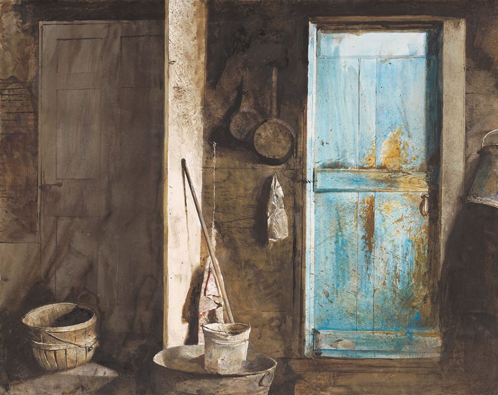
Even in death, Andrew continued to draw inspiration from Christina through her house and the objects that had defined her. Wyeth considered this painting of the two entrances to her home a double portrait of the siblings, Alvaro and Christina Olson. When first introduced to the Olson siblings, Andrew was initially taken with Alvaro and painted his portrait before he become focused on the indomitable Christina. Alvaro died on Christmas night, 1967, and Christina, without him, died only weeks later. The house and remnants left abandoned in their wake struck Wyeth as symbolic of the lives they lived—the shadowy Alvaro, who only posed for Wyeth once and remained always in the background as Wyeth painted in the Olson house; and, by contrast, the brilliant, captivating Christina.


The challenge to me was to do justice to her extraordinary conquest of a life which most people would consider hopeless . . . limited physically but by no means spiritually. – Andrew Wyeth

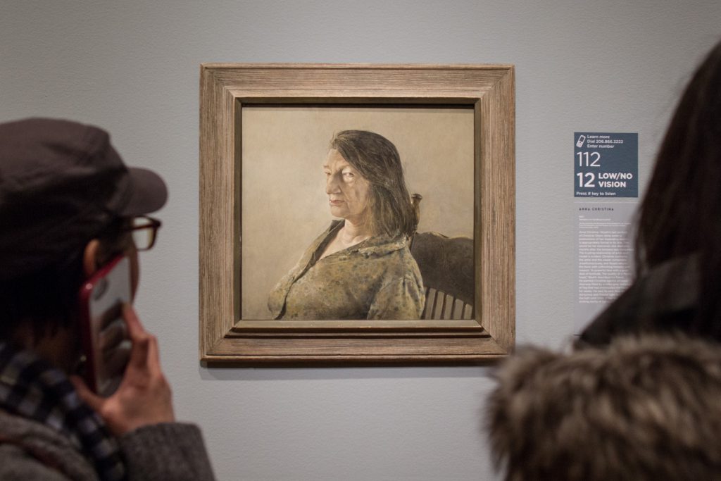
Anna Christina is Wyeth’s last portrait of Christina Olson. She died only months after the tempera was completed. The trusting relationship of artist and model is evident: Christina confronts the artist and the viewer completely unselfconsciously, and Wyeth returns the favor with unflinching honesty and respect. “A powerful face with a great deal of fortitude. The Quality of a Medici head,” Wyeth described his friend. He painted Christina against an open doorway filled by a milky gray rectangle of fog that had enshrouded the house for weeks.


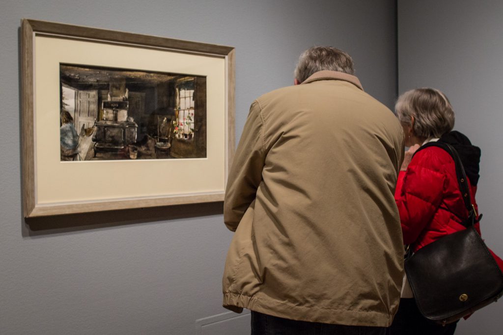
This drybrush is intended to be a portrait of the Olson house both outside and inside. Outside is total fragility. Inside is full of secrets. There’s Christina sitting in the kitchen, on the left, and everything’s in there—the stove, the geraniums, the buckets, and the trash. I had to overdo it here and reveal all the secrets. I like to paint in places that are not too nice. ― Andrew Wyeth

Andrew Wyeth saw the world around him resounding with hidden meaning. Occasionally considered a magical realist for his emphasis on the inner life of objects such as the stove or the bucket in this painting, Wyeth was certainly a storyteller. His paintings can be seen as stills in a moving image—the story of Christina’s Olson’s life surrounding her and continuing right outside the open door of her kitchen.


This curtain that had been lying there stale for year began slowly to rise, and the birds crocheted on it began to move. My hair about stood on end. – Andrew Wyeth

Christina Olson was a muse for Andrew Wyeth that helped launch his career. As a subject she is forever seated due to the degenerative disease that made her a paraplegic, but in Wyeth’s paintings, the figure of Christina stands out, singular and strong in the stories of Wyeth’s characters. See Andrew Wyeth: In Retrospect before it closes, January 15.

– Chelsea Werner-Jatzke, Content Strategist & Social Media Manager

Images: Christina Olson, 1947, Andrew Wyeth, American, 1917–2009, tempera on hardboard panel, 33 x 25 in., Myron Kunin Collection of American Art, Minneapolis, Minnesota, © 2017 Andrew Wyeth / Artist Rights Society (ARS). Alvaro and Christina, 1968, Andrew Wyeth, American, 1917–2009, watercolor on paper, 22 ½ x 28 ¾ in., Farnsworth Art Museum, Rockland, Maine, Museum Purchase, 1969, © 2017 Andrew Wyeth / Artist Rights Society. Installation views of Andrew Wyeth: In Retrospect at Seattle Art Museum, 2017. Photos by Natali Wiseman.

Get Your Winter Glow On: SAM Lights

If you live in Seattle, now is about the time when you might find yourself feeling lethargic, despondent, and perhaps a bit irritable. SAM’s got the fix for your Seasonal Affective Disorder and it’s not vitamin D, it’s SAM Lights! Thursday, December 14, 6–9 pm get outside despite the cold and join us at the Olympic Sculpture Park for a luminous evening amidst iconic sculptures. There’s something for everyone with performances, food trucks, art activities, and Z Path lit by luminaria. Here’s a preview from two of our partners who will be bringing interactive art activities into the park just for you.

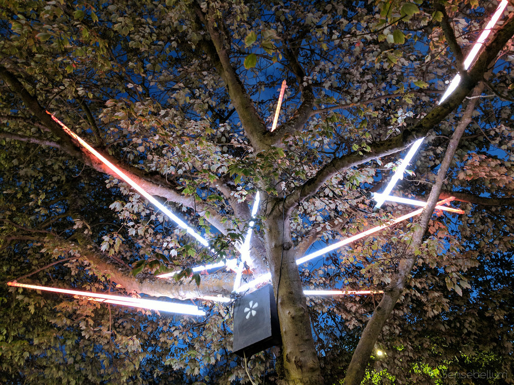
Sensebellum, a company specializing in blending interactive art and tech, is proud to present the Arborealis Tree Lighting System! Over 120+ light fixtures placed in 14+ trees around the Olympic Sculpture Park will light up the night as patrons walk around the grounds.

All of the trees are synchronized by custom software and are driven by an interactive kiosk where a map of the park becomes the interface. Press this button here and you hear a sound and see some light dance from branch to branch. What about that one over there? Better grab a friend because a good ol’ jam session just might occur! Whatever your style, it will sure to be a sight to see and we are sure very excited to bring out one of our favorite installations for all to enjoy!

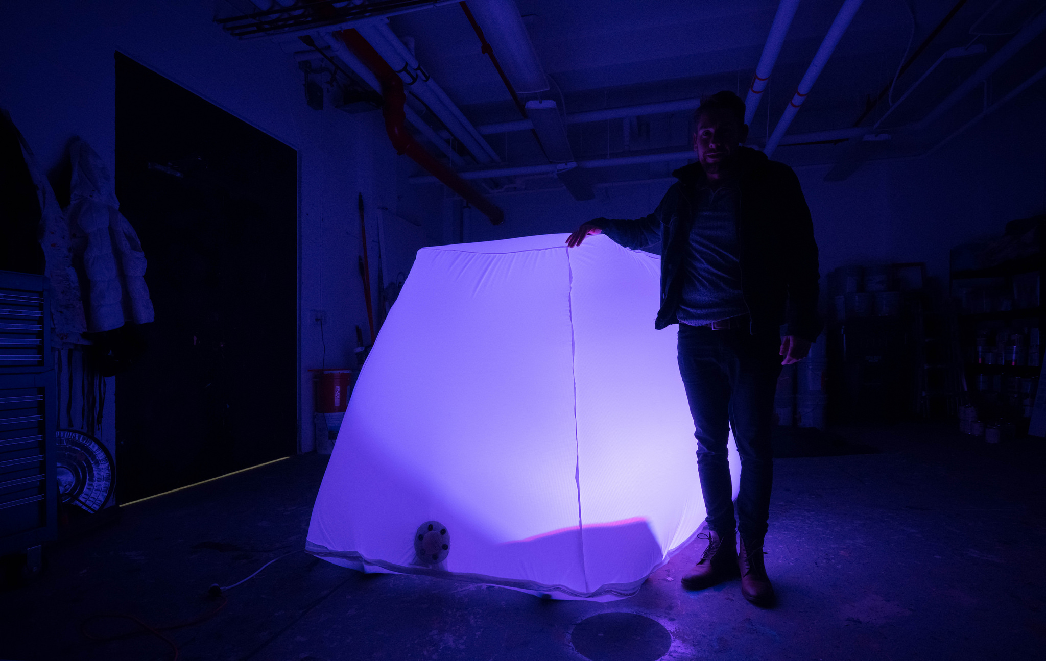
Bop Bags is an interactive inflatable installation by the Seattle Design Nerds. Partly inspired by fungi that sprout in the wet season these inflatables appear to have burst forth in colorful bloom and are a reminder that our rainy season is still a vibrant one. These eight cuddly orbs invite touch and play by shifting color when tapped or “bopped.” Visitors are encouraged to tap on the surface of this series of gigantic cuddly lanterns which respond by changing colors.

Work together to create a symphony of illumination! As visitors descend through the Gates Amphitheater, the inflatables lure passersby from the path with their subtle glow and bubbly personality. Placed in a sympathetic arrangement to Richard Serra’s Wake, the orbs reward both play and patience. The Seattle Design Nerds are an all volunteer non-profit organization dedicated to design in the public realm. We focus on making exciting things for the public that can be experienced in unexpected locations and ways.

Images: Courtesy of Seattle Design Nerds & Sensebellem.

Wyeth’s Cast of Characters: Helga Testorf

“The difference between me and a lot of painters is that I have to have a personal contact with my models . . . . I have to become enamored. Smitten. That’s what happened when I saw Helga.” – Andrew Wyeth

Andrew Wyeth painted Helga Testorf in secret for 13 years before the world, and his wife, saw the paintings for the first time. The secrecy and intimacy of these paintings stirred quite the scandal when they were first exhibited and they continue to be a source of much conjecture into the details surrounding Wyeth’s relationship with one of his greatest muses. Find out more about the character of Helga both within, and outside of, Wyeth’s life and paintings during a talk given by Patricia Junker, SAM’s Ann M. Barwick Curator of American Art, in the Andrew Wyeth: In Retrospect galleries.

“Remember, he’s a Bergman . . . He’s creating a world they [his models] don’t realize and they’re acting out a part without any script.” – Betsy Wyeth

Andrew Wyeth: In Retrospect is on view at Seattle Art Museum through January 15 and the next Wyeth Wednesday tour with Patricia Junker will take place January 3.

– Chelsea Werner-Jatzke, Content Strategist & Social Media Manager

Talent among Beauty at SAM

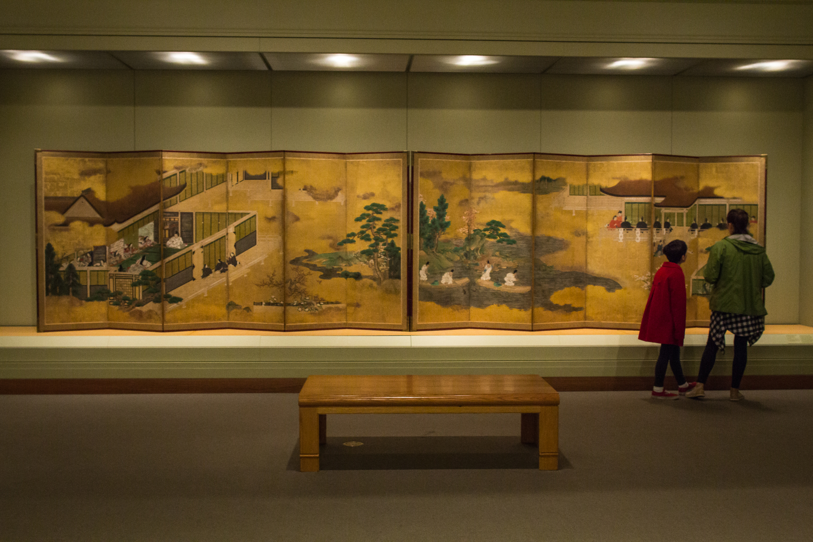
Downtown, we have two galleries dedicated to Chinese and Japanese art. So, while the Seattle Asian Art Museum is temporarily closed, get your fill of Asian art with the latest installation, Talents and Beauties: Art of Women in Japan, on view through July 15, 2018. “We know women as subjects; we see that all the time in artwork,” says Xiaojin Wu, SAM’s Curator of Japanese and Korean Art. “But to look at women as artists in addition to as a subject of art—that’s what you’ll see evidenced here from the 11th to the 21st century.”

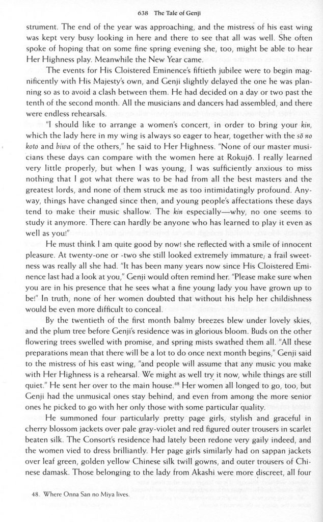
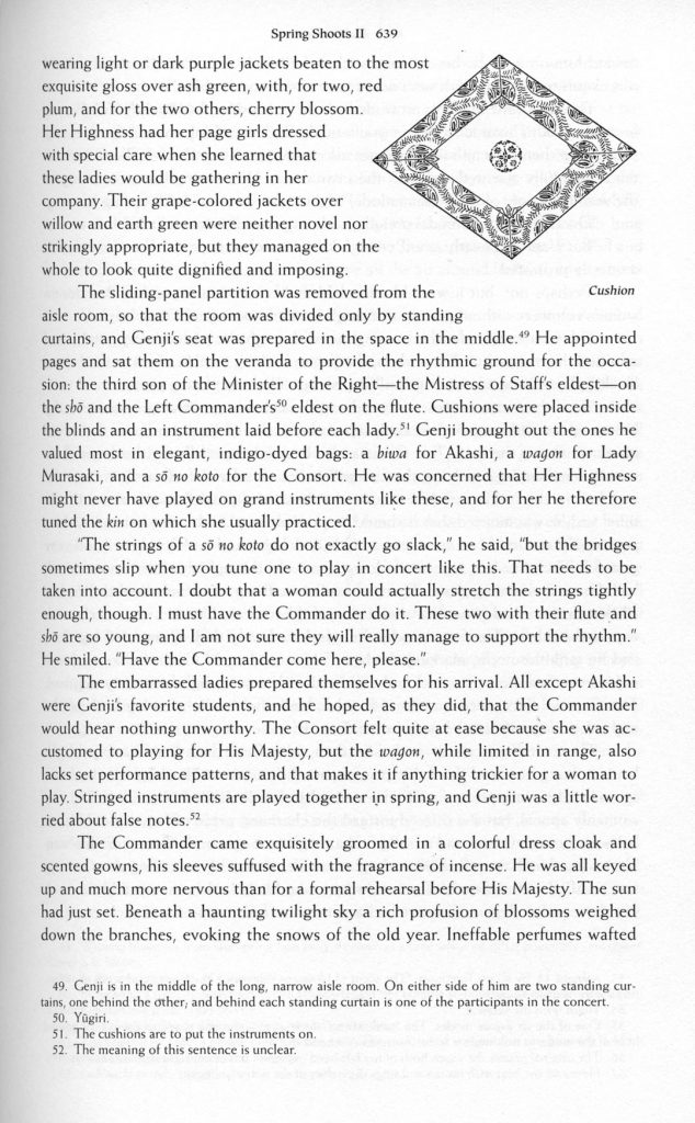
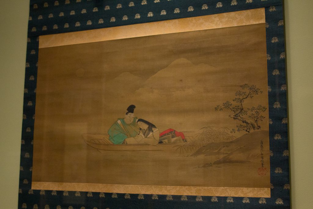
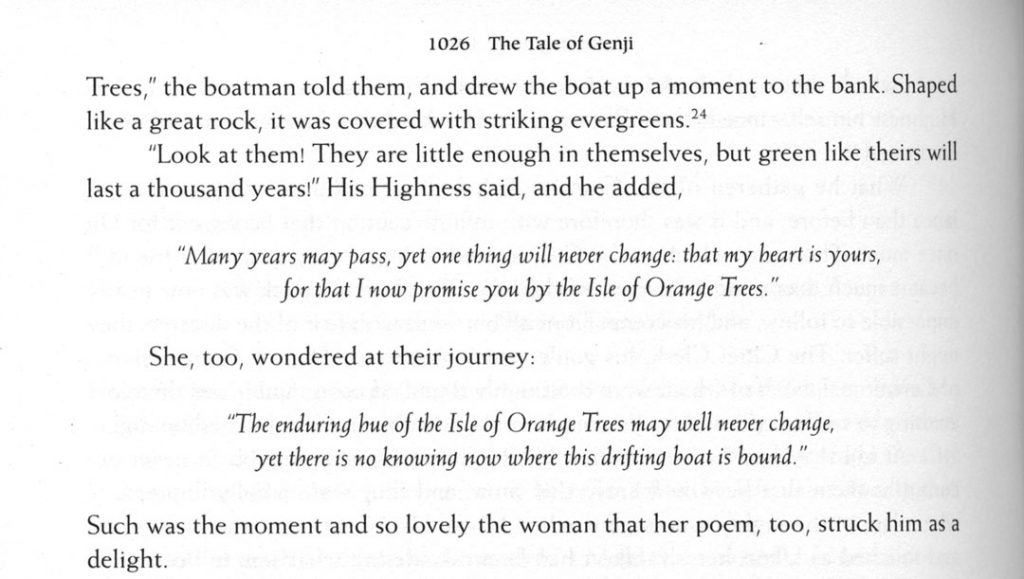
The heart of the installation features artworks inspired by The Tale of Genji. Written by Murasaki Shikibu in the 11th century and debated as the first novel ever written, the illustrations of this literary masterpiece may not be by women, but as Wu states, “How many women writers do we know from 1,000 years ago? How many artworks have been made from every scene in The Tale of Genji, including the contemporary manga? It’s just countless. In a way we are attributing all of these wonderful works back to the original writer, the woman who wrote the tale.” The two pages below excerpt the scene depicted in the right-hand panels of the screen above.

This excerpt and the page below refer to the right-hand panels of the image above.

Murasaki Shikibu wrote The Tale of Genji to entertain the members of her court. Because of this, it was written in an archaic court language that was little used and quickly lost to Japanese speakers. This accounts for one of the reasons why there are so many illustrations of the tale—as a classic piece of literature, the tale continued to be told in images and annotations across the centuries until in the 20th century when it was first fully translated into modern Japanese.


The Tale of Genji follows the life of  Hikaru Genji, the son of an ancient Japanese emperor, and his many romantic endeavors. Featuring over 400 characters that age throughout the book and whose family lineages are often intertwined, Genji is considered a feat of characterization consistency for having been written in installments of chapters over a long period time. Although the book does not have what we might consider a plot nowadays (events simply take place and the characters age), it is one of the first pieces of literature to feature a protagonist, supporting characters, strong characterization, and a sequence of events following the lifetime of the main character.

Xiaojin Wu is planning “. . . a sequence of installations that look at various patronage and audience groups. Following Talents and Beauties we’ll focus on aristocrats, and then samurai.” Make the time to visit this gallery for new perspectives on Asian art and culture.

– Chelsea Werner-Jatzke, Content Strategist and Social Media Manager

Images: Installation view Talents and Beauties: Art of Women in Japan, 2017, Seattle Art Museum, photo: Natali Wiseman.
Murasaki Shikibu, The Tale of Genji,  trans. Royal Tyler (New York: Viking Press, 2001)

SAM Gallery Artists on Seattle: Leslie Stoner, Liz Tran, Sheryl Westergreen, Stephen Rock

Seattle is one of those rare places where it isn’t considered droll to talk about the weather. The SAM Gallery artists in Color Excursion, on view December 8 through January 7, offer an escape from grey days into exuberant artwork. Below, three of the artists in this show share the ways that living in Seattle and the surrounding area impact the way they see the world. For such a moody and dramatic locale, you may be surprised by their vibrant, lively work. If you’re looking to recharge your senses, come to SAM Gallery for the Color Excursion Opening Reception on Thursday December 7, talk to the artists about their work, and find out how you can rent or buy artwork from SAM Gallery.

Leslie Stoner

This year I moved from Green Lake to Whidbey Island. Previously my work originated from a contemplative state of creation. I found inspiration through travel and memory and emotions but now living on Whidbey, I’m in it. On the island your surroundings are constantly in flux. The winds whip in and carry things away, the storms batter the shoreline leaving treasures on the beach. The nights are deep and dark and full of creatures. Everything feels alive and in a state of change. The beauty and the drama of my surroundings constantly barrage my eyes and fill my brain with endless creative ideas and the solitude of the island allows these ideas to come to fruition in my studio.

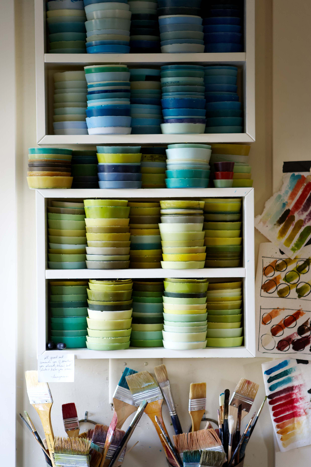
When invited to make a body of work for Color Excursion, I was elated. I’m addicted to color. I mix my own colors using wax and powdered pigments and when working with this medium it becomes something else, something more tactile. It’s hard to explain, it’s like I’m making a soup but I’m loading it with saturated color until it’s thick, and I want to eat it. That’s what initially drew me to encaustic painting and I think it’s what draws people to want to touch an encaustic painting.

Liz Tran

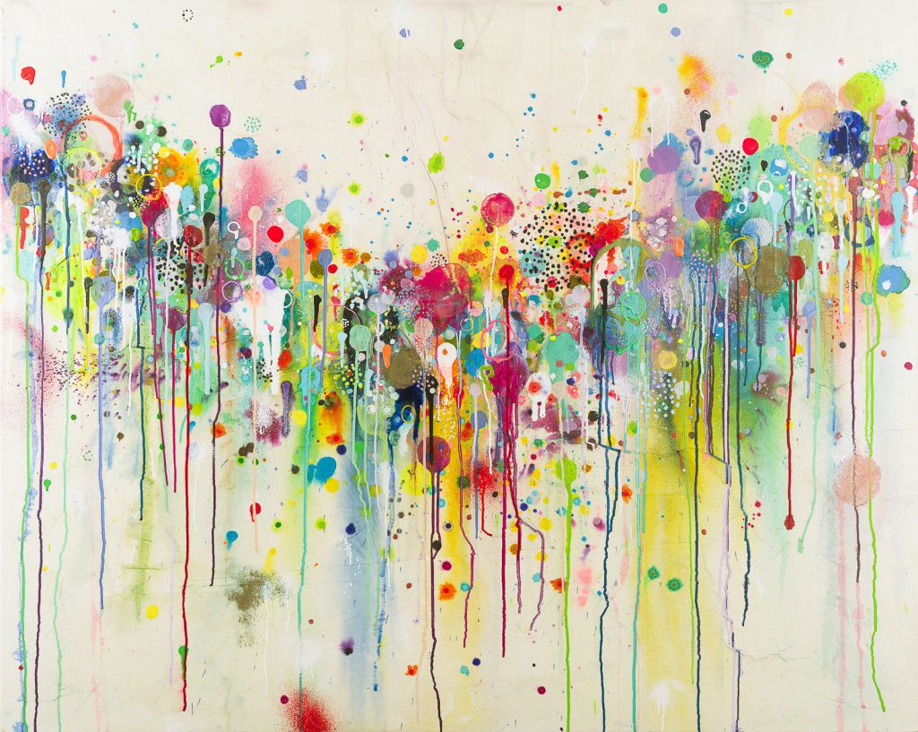
The use of color in my work is an unapologetic form of escapism from the long stretches of grey weather that continually blankets my Pacific Northwest home. Each year my palette of luminous, unnatural hues provides a defiant objection to winter’s approach. Pulsing fluorescent paints massage the naked eye with ultraviolet light, creating an energized glow impervious to dull environments. Maroon does not belong to me. Tubes of brown remain unopened. There is safety in muteness. My paintings speak to extroversion, experimentation, and play. Through color, I aim to activate.

Sheryl Westergreen

Color Excursion immediately brought to mind the idea of travel, taking an excursion lavish with color. My work in this show was inspired by a trip to South America one year ago. Although the paintings for this show do not reflect Seattle, much of my work is inspired by my daily routines and surroundings. For example, the Across the Lake, Cloud Dreams, Inside a Cloud, and Inside a Leaf series are all the result of my daily walks in my Seattle neighborhood.

I let my experiences germinate and then abstract them on the canvas, translating a memory of a place or an experience. I work in layers of color and compose the image while working. My paintings are oil on canvas or board. Working with oil means that each layer needs to have a bit of time to dry before the next layer can be applied. I find that when I return to the piece it changes and evolves in surprising ways.

Stephen Rock

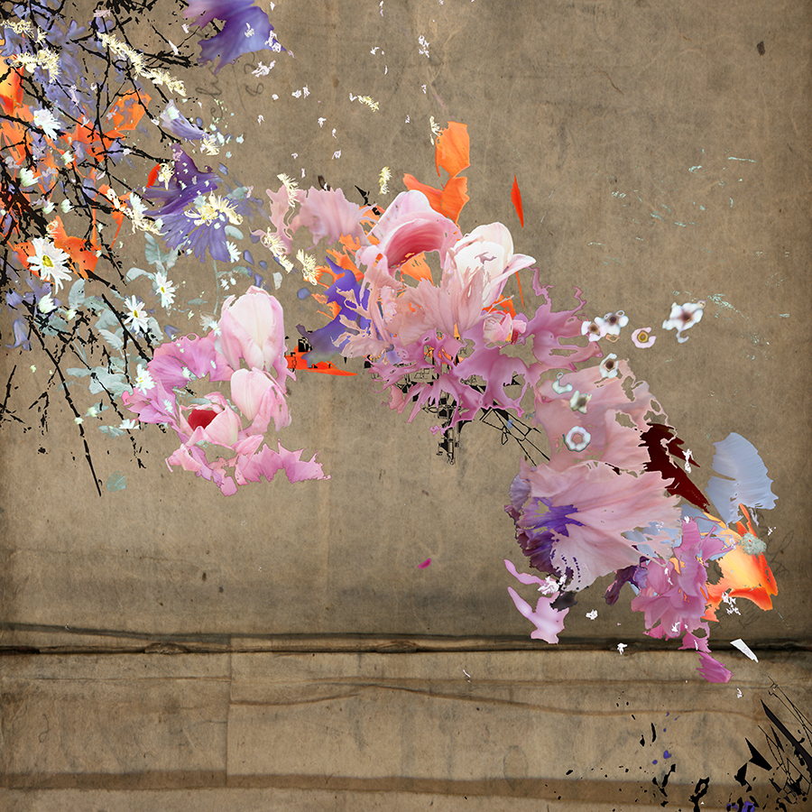
This new work at SAM Gallery is from a series of unique digital mixed media prints called the Gardeners Journal. The nature of the Northwest has always been a part of my life having grown up in eastern Washington. With this body of work, it becomes a touchstone away from the tech-focused culture of our evolving city. My digital print studio keeps me in front of a computer monitor much of the time. As a retreat from the stream of  social media I find refuge out my window, a slight turn of the head away from the monitor. I have found the organic shapes and colors of my garden to be a creative counterpoint to the drone of data. By exploring abstracted shapes and forms found in nature, this new work provides endless metaphors and narratives and visually blend the creative tools of traditional art making with new digital possibilities to find a balanced voice in the moods and aesthetics of the region.

Images: Detail of Leslie Stoner’s studio, photo: Alison Blomgren. Afterglow Two, Liz Tran, 30 x 24 in., mixed media on panel. Easter Island, Chile, Sheryl Westergreen, 36 x 36 in., oil on canvas. Like a garden splashed across the landscape, Stephen Rock, 36 x 36 in., pigmented print, watercolor, gouache.

Sondra Perry: Opening Up Through Technology and Media

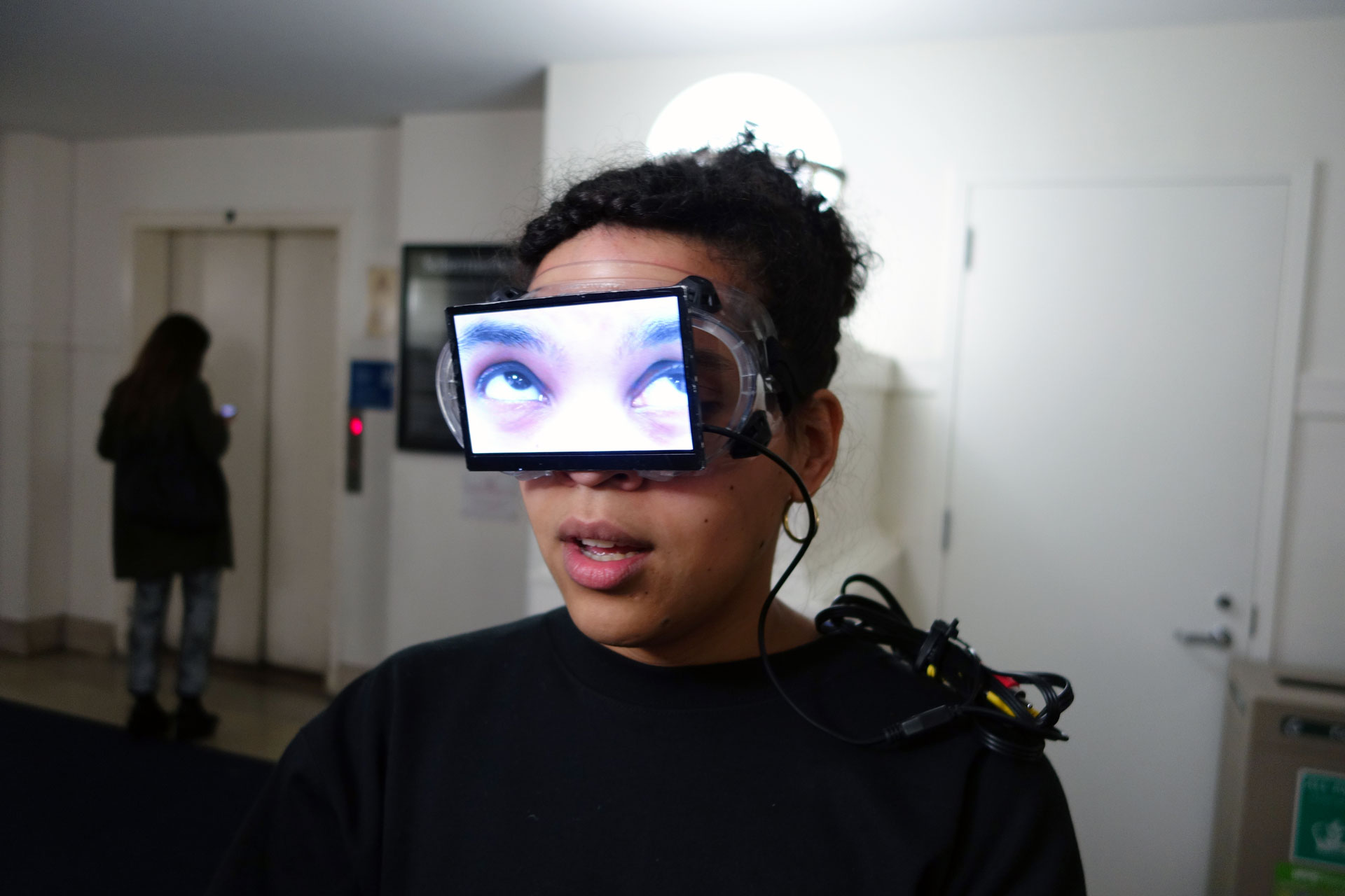
Artist Sondra Perry is the first video artist to win the Gwendolyn Knight and Jacob Lawrence Prize! Using a wide range of digital platforms and tools including 3-D avatars, blue screens, Chroma keys, and computer graphics software, Perry’s installations and performances draw from an eclectic mix of inspiration. She is focused on how a lens can turn a subject into an object. See Perry’s immersive and unique (bring your hard hat!) installation, Eclogue for [in]HABITABILITY from December 8, 2017 through July 1, 2018 at SAM.

Below, Perry discusses how the internet, technology, and her personal history factor into her investigations into representations of black identity. This is taken from a talk she gave to SAM staff this February. She opened the talk with a tutorial video from YouTube on how to play an Isley Brothers song on guitar, so we will too!

The interesting thing about this clip is that he’s talking about that soaring note at the beginning of the song. That’s an E Flat played backwards. In the sidebar, all of these people who have also done tutorials for this song reference this video for showing them how to play that note. This is a piece of internet archaeology that touches on my interest in the parallel; two things happening at the same time in this YouTube space. The original and the improvised other. And also, like he’s amazing. He reminds me of my uncle who played guitar for lots of different people.

I spend a lot of my time on YouTube. Tons, probably too much. Not too long ago, when there were many black people dying, being murdered at the hands of police. I found this YouTube channel that was not connected to any news agency that does 3-D renderings of space travel, biology, and crimes. One of their 3-D renderings was the slaying of Michael Brown in Ferguson. I am interested in the rendering of the body, of this man in a 3-D render space. I’m interested in circulation and how these images are represented outside of the video of someone being killed. That’s not what I’m interested in at all. I’m interested in how those things are able to happen.

When I was younger I read the Superman books. In the Superman Universe, the Phantom Zone is a parallel dimension that acts as a prison, an ethical one. Superman’s father, Kal-El, was the Security Minister on Krypton before it blew up, of course. He created this parallel dimension that was the Phantom Zone where you could send people to be rehabilitated. In the Phantom Zone you could see what was happening in your dimension, but you couldn’t interact with it. I’ve taken this Phantom Zone, spinning, 1980’s special effect to visualize some notions of double consciousness. I’m also playing with how a video can act as a space where there are multiple perspectives. So, you’re not just looking directly at an image—there are other things happening. I’m trying to encompass all these things into one really vibey piece of art.

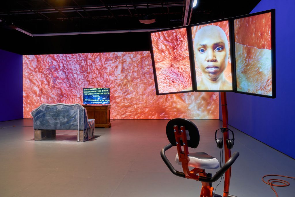
I’m interested in video and its production spaces. In 2016 at The Kitchen in New York I created an installation, Resident Evil. The back is a Flesh Wall—an animation of my skin with the contrast boosted. I do this through programs used to make 3-D renderings of things. The ocean modifier I used for this is supposed to help you make a realistic 3-D rendered ocean.

https://player.vimeo.com/video/197309087

This installation is where I transitioned from using the Chroma key green to the blue screen. The Chroma key is a video, film, and photo production technique that allows you to separate the foreground of an image and a background. So usually these images have a person in the foreground and in post-production you’re able to take that out and replace whatever kind of background you want in there.

The blue screen became interesting to me because it’s the technique you would use when you’re trying to replace a background with something that’s dark because of its relationship to the end of the spectrum. I like this idea of this blue space that is simultaneously a black space that is my grandmother’s house, a park at night, or the Avengers destroying Manhattan. I like the collapse of all of those things and that’s why I decided to start covering as much of the physical spaces I was putting these videos into in this color, that is also a space.

It’s also a proposition to myself and the viewership because it is a space of production. In thinking of these colors as spaces, they are not complete. I’m trying to propose that maybe we’re the ones who figure out what’s happening there. It’s a space of contemplation.

via GIPHY

Have you seen Coming to America? This movie is really funny, but there’s also a lot happening in it. You have two American men making a film about a fictional African country and there’s the contrast of Black folks from the states and Black folks from the continent. I was thinking about this family of upwardly mobile Black people who make a fortune on selling other Black folks things that change their visage in order to assimilate. There’s something complex about what it takes to be an upper-class, upwardly mobile Black person. Maybe you have to shapeshift. In that shapeshifting, there is this kind of grotesque thing that happens. They left a mark of themselves, like on this couch. I’d wanted to make this couch for a really long time and I finally did.

The bike is a workstation that comes with a desk. They’re sold to people that work at home and want to maintain their physical health while they’re working. I’ve been thinking a lot about these efficiency machines that do that capitalism thing. They fix a problem that is kind of inherent in these issues of overwork. People shouldn’t work as much as they do, but rather than change, we make objects like this is bike machine. I made an avatar of myself that kind of serves as the Operating System and it talks about being efficient, efficiency, what that does for you. I don’t primarily work in video, but when I do I like working on a multi-monitor workstation because it’s a lot easier; you have your preview monitor and you have a monitor where you can edit. This set up is just a way to produce video that I wanted to mimic in the installation.

Across all of this my interest is in the possibilities of blackness related to my body and also blackness as an idea of expansion, of radicalism. These things open themselves up to me through the technologies I use and through the media I gravitate towards. The issue I find with representation is that we assume that all we have to do is figure out the right way to look and we will know what something is or know what someone is. I think that’s an impossibility.

– Sondra Perry

Awarded bi-annually since 2009, the Gwendolyn Knight and Jacob Lawrence prize grants an early career black artist who has been producing work for less than 10 years with a $10,000 award, along with a solo show at SAM.

Images: Young Women Sitting and Standing and Talking and Stuff (No, No, No), April 21, 2015, Sondra Perry, performance at the Miriam & Ira D. Wallach Art Gallery in NYC with performers Joiri Minaya, Victoria Udondian, and Ilana Harris-Babou. Installation view of Resident Evil (Graft and Ash for a Three Monitor Workstation in foreground) at The Kitchen, 2016, Sondra Perry, Photo: Jason Mandella.

In the studio: Creating a K-12 art lesson on Wyeth

Going through Andrew Wyeth: In Retrospect you will see a white house over and over again. The house belongs to the Keurner’s, some of Wyeth’s neighbors. Wyeth was fascinated with Karl Keurner and his wife Anna and his paintings reveal that.

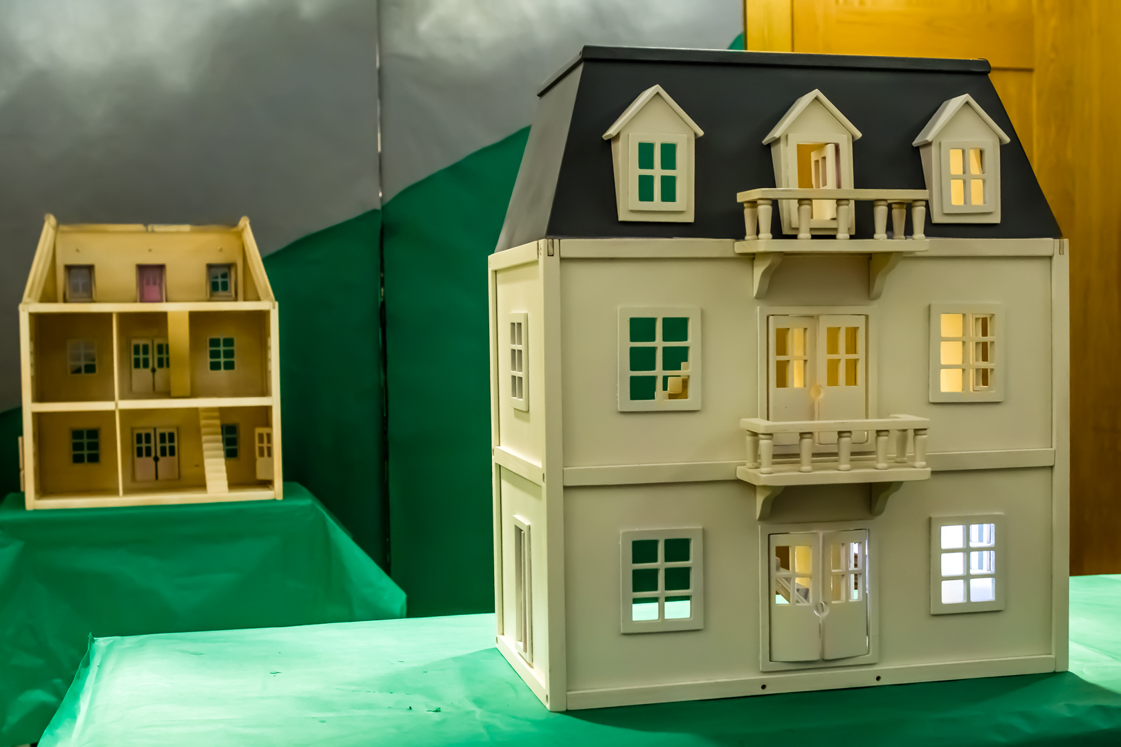
For students visiting the museum we wanted to create a lesson that captured the narrative point of view in Wyeth’s paintings in order to share how the artist’s perspective reveals much more than a hillside with a white house on it. We also wanted to bring in some of his process as an artist. Wyeth’s work is so technically beautiful that we were afraid students would be intimidated, so we decided to create a model in the studio. We bought a simple doll house, painted it white and grey, and paired it down to open rooms and windows with doors swinging partially open. Stories abound just looking at the house.

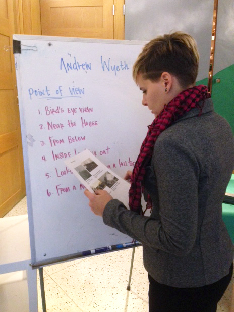
Students were first asked to look at Wyeth’s work and to find the large shapes in it. Wyeth often worked by breaking a scene down into large shapes, and sketching them out on paper. Students then translate it into their own looking experience. We created eight points of view based on the paintings in the show, ranging from bird’s-eye view in Northern Point to looking-up view, in Mother Archie’s Church, to the windswept view in Airborne. Students can choose their point of view, or if they can’t decide, they can roll some dice for a random pick.

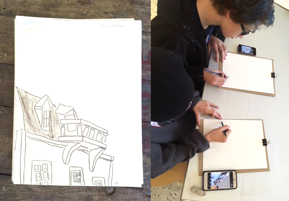
After all this, students begin drawing through observation. They are invited to move around the house to find a good spot, older students can take a photo with their phone if they want. All the while they should be thinking about the larger narrative. What information will help them tell their story? We are using water color pencils on watercolor paper and, once they have their sketch, they can activate the dry colors by using water, brushes, and blending to create fields of color. As students finish up their artwork they can create a visual story together with their class or table groups.

For more info on School Tours and Art Workshop Programs at SAM, please email or go visit our website. Try a variation of this lesson plan with your school group if you come for a self-guided tour!

– Lynda Harwood-Swenson, Program Associate for School and Educator Programs

Photos: Natali Wiseman, Elizabeth Humphrey, and Lynda Harwood-Swenson

Short Films and A Long Shot: Wyeth Film Sprint Winners

Judges’ Pick: Based on a cumulative score of the following categories: creativity, connection to Wyeth, and concept.
Winner: This Film Instead by Team Wyethian (Lead: Peter Moran // team members: Christen Leonard, Audrey O’Neil, Kelly Hennessey)

When we say that Andrew Wyeth: In Retrospect offers new perspectives on the life and career of this American master, one of the things we mean is that the exhibition explores the cinematic influence of Andrew Wyeth’s work. Wyeth drew inspiration from filmmakers such as King Vidor and Ingmar Bergman as well as visually influenced a wide range of moving image classics, from Twin Peaks to Texas Chainsaw Massacre. To imbue this new insight into Wyeth’s work with more dimension, SAM invited local filmmakers to create a short film over the course of a week inspired by paintings in Andrew Wyeth: In Retrospect during the Wyeth Film Sprint. There were very few rules, but the key was that the film had to incorporate one of the preselected Wyeth images.

Over 200 people attended the public screening on November 8 of 25 submitted films, followed by an awards ceremony honoring $500 each to three winning films. The judges were Patricia Junker, SAM’s Ann M. Barwick Curator of American Art; and local filmmakers and artists Clyde Petersen and Wynter Rhys. As well as the audience, which selected a winner. Here are the three winning films for your entertainment. We love them all. The Judges’ Pick, above, will linger with you, the Curator’s Pick grapples with the gossip surrounding Wyeth’s greatest muse, and the Audience Pick revels in the surreal oddity and dark humor that Wyeth dabbled in.

Curator’s Pick: Patti Junker selected a single film that she felt was most evocative of Wyeth’s practice and work.
Winner: Helga by Team Egg Tempera (Lead: Cody Whealy // team members: Sarah MacDonald)

Audience Pick: Visitors selected one film that was tallied at the end of the night.
Winner: New Tomorrow by Weird Dog Productions (Lead: Claire Buss // team members: Lindsay Gilbert, Amanda K. Pisch, Nick Shively, Andrew Hall, Dave Lubell)

SAM Gallery Artists on Seattle: Enid Smith Becker & Barbara Shaiman

The days are officially getting darker and the work on view the current SAM Gallery show is embracing it. Hanging in the ground floor SAM Gallery is Darks and Lights, featuring Enid Smith Becker, Deborah Bell, Nick Brown, Nichole DeMent, and Barbara Shaiman. The artists in this show contrast darks and lights as autumn turns to winter. Nature’s cycles, retreating to our roots, and finding home are all explored by our premier Northwest artists. Hear from two of the featured artists on what living and working in Seattle means to them and see the show yourself before it closes on November 19. SAM Gallery represents many local artists whose work you can rent or buy. This is one of the numerous ways that Seattle Art Museum supports the arts—by supporting artists.

Enid Smith Becker

My work explores our relationship with the land, time, and space. Despite the different ways each of us approach a place, the land and its beauty is always there. As I paint, I begin with the natural space and into that I layer the rectilinear forms that represent human impact on nature and the different ways that each of us sees the world. One of the things that draws people to Seattle is its natural beauty. As a Northwest native I spend a lot of time outdoors. The paintings in the show Darks and Lights are inspired by places in Washington that we visit on the weekend.

In my work, I am inspired the colors and textures of the natural world. I work in acrylic, but I also build real texture through the inclusion of art paper, junk mail, plant matter, loose-weave cloth, and thread. The constructive nature of combining paint and collage appeals to me. The layering of paint, natural and man-made materials becomes a kind of a metaphorical rebuilding of the land.


Barbara Shaiman<

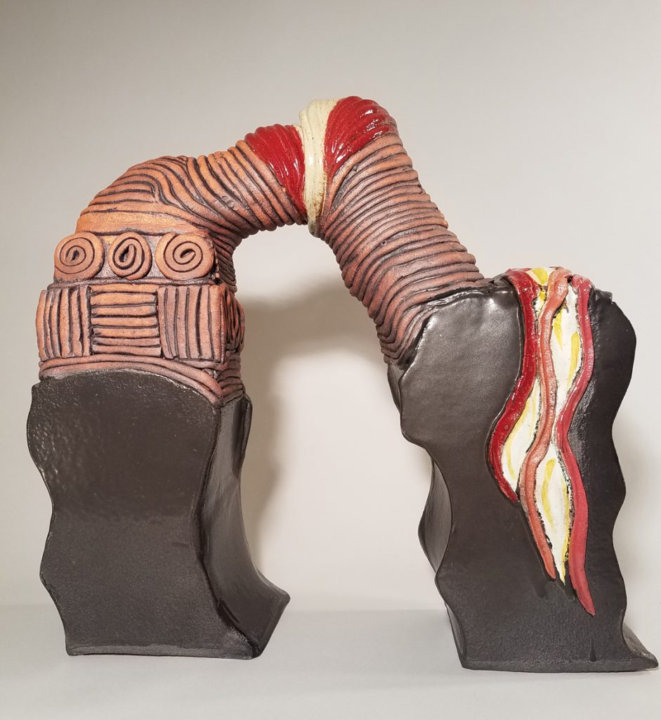
As a ceramic artist whose work references our natural environment and the affect of human activity on it, living in the Northwest plays a pivotal role in my imagery and ideas. Memories of the rock forms, arches, and cave entrances found in La Push and other areas of the Northwest coastline greatly influence my work.

Our relatively easy access to the ocean and mountains is a major part of  my love of Seattle, but I also value the intellectual and artistic stimulation of the city. Environmental justice issues are important to me, as are climate change and sustainability. While being at the coast inspires my awe and my imagery, an evening talking with friends in the city reminds me that we have a lot of work to do to conserve the beauty of our area and enable our neighbors and future generations to enjoy it as well.

While referencing issues such as climate change and  the intersection of natural and human-made environments, I prefer the work to be enigmatic, not to try to supply answers but to encourage us to think about our relationship to the environment with a somewhat altered vision.

Image: Planes, Enid Smith Becker, acrylic on canvas, 36 x 48 in. Transition Arch, Barbara Shaiman, glazed stoneware, 15.5 x 16 X 5 in. Photo: Hernan Celis

Wyeth’s Cast of Characters: N.C. Wyeth

“He’d look at me like a Brahman bull when he walked in the door to criticize my work, and if he was glowering, I braced myself. In a few incisive words he’d bit right at some puny characteristics in my nature.”
– Andrew Wyeth

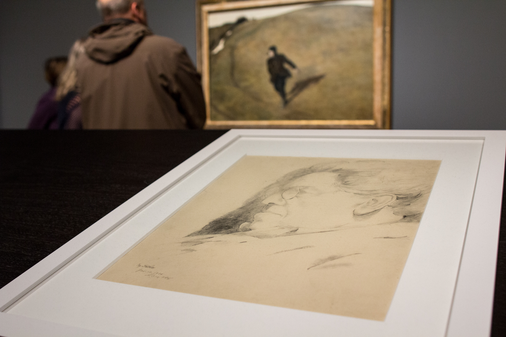
This unfinished sketch is the only portrait Andrew Wyeth ever made of his father, an imposing figure in the story of Andrew’s life. Newell Convers (N.C.) Wyeth was an accomplished illustrator with strong opinions. At 19 Andrew made this pencil portrait. The challenge of drawing the man who was not just father but also Andrew’s teacher and toughest critic must have been daunting. Though small in size, the portrait nevertheless conveys a looming figure. In life, N.C. Wyeth was domineering; in death, he haunted his painter son to the end of his life. Wyeth always regretted that he never painted his famous father before the man’s tragic death in 1945.

“The boy was me at a loss really. His hand, drifting in the air, was my hand almost groping, my free soul.”
– Andrew Wyeth

Throughout Andrew Wyeth’s paintings, the landscape of his neighbors’ farm appears repeatedly. Kuerner’s Hill rears up towards the viewer on occasion and, on others, slopes gradually toward the horizon. At the bottom of this hill are the train tracks where N.C. Wyeth was killed by an oncoming train. A few months later Andrew painted Allan Lynch, the boy who found N.C. Wyeth’s body, running down Kuerner’s Hill. Andrew Wyeth described the sensation of painting Kuerner’s Hill in Winter 1946 by saying that he could almost hear his father breathe. Andrew’s inspiration for the painting came from an afternoon of playing with Allan on Kuerner’s Hill, and yet the ominous and somber tone of the painting indicates the presence of his father in the landscape.

Installation view of Brown Swiss

“A hump in the earth. Hell—a nice shape, but it reminds you of your father. Where he’s buried.”
– Andrew Wyeth

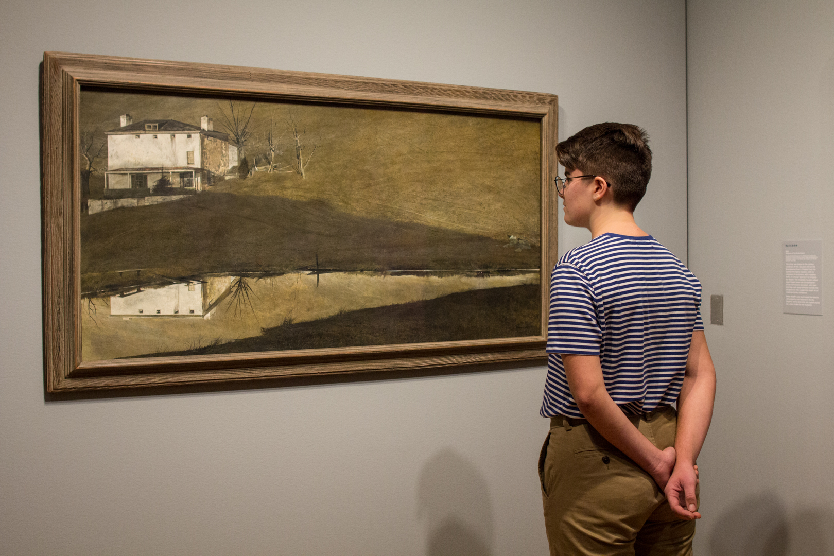
One November afternoon as he climbed Kuerner’s Hill, Wyeth looked over his shoulder and saw the Kuerner house mirrored, upside down, in the pond below. He worked in vain on a tempera that might recreate that vision. Betsy Wyeth criticized Andrew’s art process for being so meticulous and unable to take advantage of chance effect. Working on this painting, Andrew began changing this when he threw a watery mix of yellow-brown ochre and red-brown sienna tempera across the panel. Never able to escape the internalized critic of his father, you can see the shadow of Kuerner’s Hill cast across the middle of the painting—the shadow of death. This scene would not appear this way in reality because the lake would not be visible in shadow. Here Kuerner’s Hill becomes emblematic of the mournful loss of his father.

Installation view of Snow Hill

“A hump like a snow-hill”
– Herman Melville, Moby Dick

There is a lot going on in this painting but in the story Andrew Wyeth tells us about his father, this painting is unique for one small detail. This is the only painting that depicts the train tracks at the bottom of Kuerner’s Hill where N.C. Wyeth died. Titled from a quote taken from Moby Dick about the great white whale, once again Kuerner’s Hill, now covered in snow, becomes a metaphor for Andrew Wyeth’s own nemesis, his father N.C. Wyeth.

See Andrew Wyeth: In Retrospect, on view at SAM through January 15 and learn more about the characters and narratives that dominate the life and art of Andrew Wyeth.

—Chelsea Werner-Jatzke, Content Strategist and Social Media Manager

Images: Installation views of Andrew Wyeth: In Retrospect at Seattle Art Museum, 2017, photos: Natali Wiseman.

In The Studio: Molly Vaughan, 2017 Betty Bowen Award Winner

Molly Vaughan, winner of the 2017 Betty Bowen Award, comes from an academic background, however the background noise of a visit to her studio is the sound of a sewing machine. Vaughan is embroidering Four Corners, a poem written by one of her collaborators, Natalie Ann Martinez onto the fabric she will use to make the sleeves for her current garment in the ongoing series, Project 42. Though she didn’t study textile art, Molly Vaughan’s recent work includes the production of colorful and carefully crafted, hand-made garments.

Project 42 is named for the short life expectancy of transgender individuals in the United States. The age 42 is based on Vaughan’s own research since no official study can currently verify the average life expectancy of trans people. The National Transgender Survey was conducted two years ago and will be published soon as the most comprehensive analysis of the transgender community, Vaughan tells us.

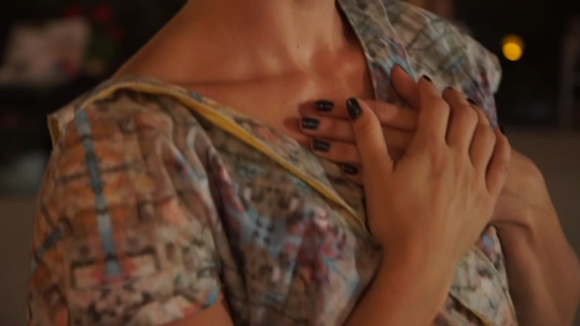
For each work in the series, the artist designs a garment that begins with an image of a murder location, which is digitally manipulated to create an abstract textile print. The garment is then activated by a collaborator or by the audience and visitors to the installation, as it will be when installed at SAM for Molly Vaughan: Betty Bowen Award Winner, in April 2018. Molly Vaughan describes this practice as rooted in the belief of labor as memorialization and in the physical object as tribute.

Help us celebrate the 2017 Betty Bowen Award Winner during the Award Ceremony and Reception on November 9 featuring a collaborative performance memorializing Fred Martinez Jr. by Natalie Ann Martinez, Catherine Uehara, and Amanda Pickler, and a talk by this multi-talented artist.
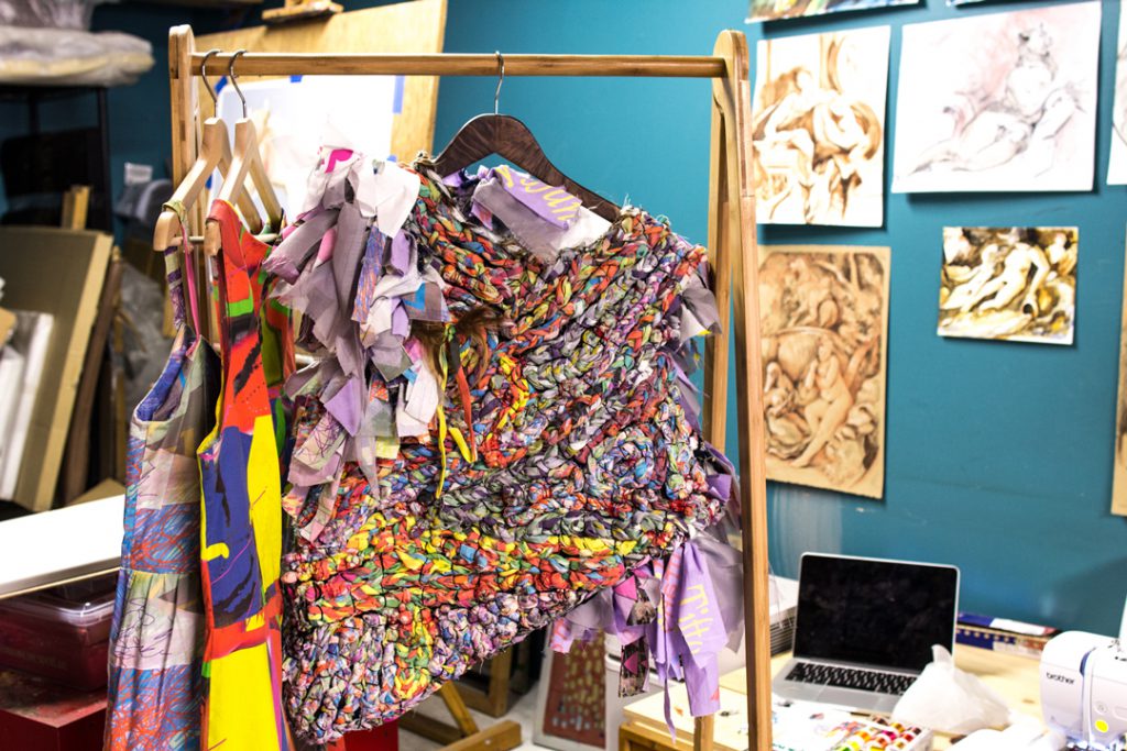
Heavier than it looks, this top includes fabric from every garment Molly Vaughan has made. This is the only piece Molly has made for herself and she intends for it to continue to grow.

SAM: Tell us how Project 42 got started.

Molly Vaughan: Project 42 began as a with a grant from Art Matters Foundation. I proposed a series of painting that were abstract paintings of locations where trans people had been murdered. Many people don’t want to have conversations about violence against trans people. Most people don’t know what abstract painting is about. They don’t know the history and the conceptual violence behind it. I wanted to use abstract painting to speak to that idea of something misunderstood, which ‘transness,’ I think, is very misunderstood.

How did you begin working with textiles?

The paintings were too static. They weren’t memorializing the individual in the way that I wanted them too. For a long time, I’d been talking to a dancer about collaborating, and I reached out to her to ask if I printed this pattern on fabric and made a garment, would she dance in it? That’s where it began. I stepped outside of my boundaries to make something outside of my traditional production and comfort zone.

How did do you decide how to abstract these geographical locations? Is there a specific school of abstraction or artists you’re influenced by as you create the patterns?

It’s responsive. Sometimes the patterns start with colors from photographs like skin tones or colors of clothing. Sometimes the patterns utilize screenshots of Google Earth street views where someone was murdered. They each include some type of symbolic action. In one garment many layers of lines are combined to form the pattern, each with 105 lines, a reference to the room number the individual was murdered in. There is also the design content—creating something that is visually appealing as a way to pull people into a discussion that they don’t recognize they want to have.
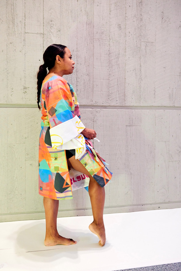
What role do your collaborators play in the creation of the garment?

I think of myself as the director of the project. The collaborators can engage in any type of action that they wish to share but we work closely to make sure that their memorialization is respectful and considered. Sometimes I do performance work too but I try not to be the focus. The last one was the result of a requirement by Anna Conner that couldn’t be facilitated unless the dress was cut off of her. Then I began to recognize the symbolic significance of sewing the dress back together as part of the performance. So that’s what we did.

The activations of these garments have taken place across multiple continents. Are these connected to the murder locations or otherwise location specific?

One of the original goals of the project was to offer stolen opportunities to the spirits of the people who were murdered. And an original conceptual element was the idea of travel. The first garment I made went to Ho Chi Minh City in Vietnam to be performed in by Emily Navara who wore the dress to her favorite park in the city. The second dress was sent to New York City and my friend Mia D’Avanza went to her favorite swing dancing club wearing it after sharing a large meal with her friends.

As a white artist, it would be inappropriate for me to dictate how the majority of these people are memorialized because the majority of these people are people of color. Though one part of my identity represents a shared experience, my experiences are so different than many of these individuals because of the intersectionality of their identities. This is more about the retuning of humanity and the sharing of missed opportunities. Eating at a cafe in Rome in one of these garments is a symbolic gesture, but is a symbolic gesture focused on the humanity of individuals who were treated so inhumanely.
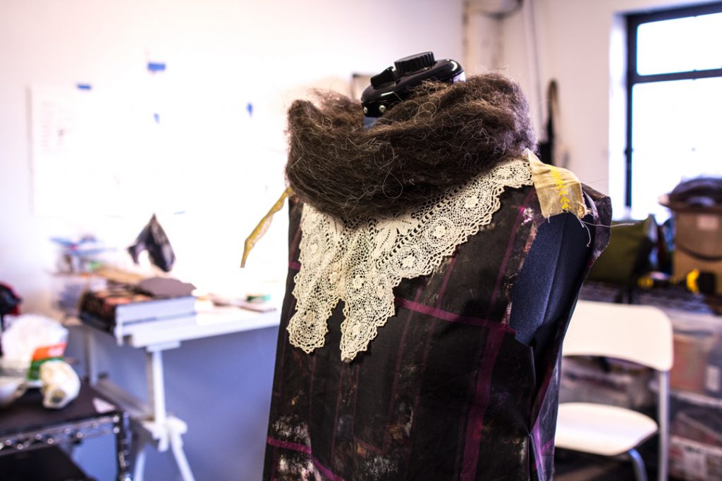
Work in progress for collaboration with Natalie Ann Martinez. Inkjet printed cotton poplin, antique lace, Navajo Churro sheep wool.

Will the installation at SAM in April include performance?

The installation at SAM will include three or four new pieces. They will be more sculptural since they will be on display for such a long period. The center piece will be a collaborative sculpture that visitors can contribute to by tying or manipulating fabric that has been prepared for them that will then be either sewn on to the garment by me or may actually be tied onto the garment by the museum goers themselves.

I’m pretty emotionally overwhelmed by the idea that to create these new pieces since the process requires me to immerse myself in the murders. I select who to memorialize by looking at the photographs of the individuals, and allowing them to step forward and ask, to speak to me. You have to get into a certain space to do that.

How much research do you do about these people’s lives or is it just the incident of their murder?

The amount of available information is dictated by the size of a person’s community. I want to treat everybody the same, so I decided not reach into, or out to, the communities the people were directly from. In some ways that sounds a little wrong, and in some ways, it is. But some of these individuals were prominent and well-known, and others nobody knew. I want to make sure everybody is treated with the same level of compassion, care, and respect no matter who they were.

Fred Martinez Jr., who we’re memorializing at the Betty Bowen Awards Ceremony and Reception, has had a documentary made about him (all research points to Fred’s use of male pronouns). How do I give the same amount of attention and respect to every individual? There’s also the question of me, as a stranger, impacting family and friends by revisiting the murder of their loved ones. This is not an easy project. And at times the critiques I place upon myself of how the project functions almost stops the process, but then another murder occurs, and I question how can I help to stop this violence. Raising awareness is important but so is considering the roles that we may all play in the larger questions of institutionalized violence, particularly against people of color.
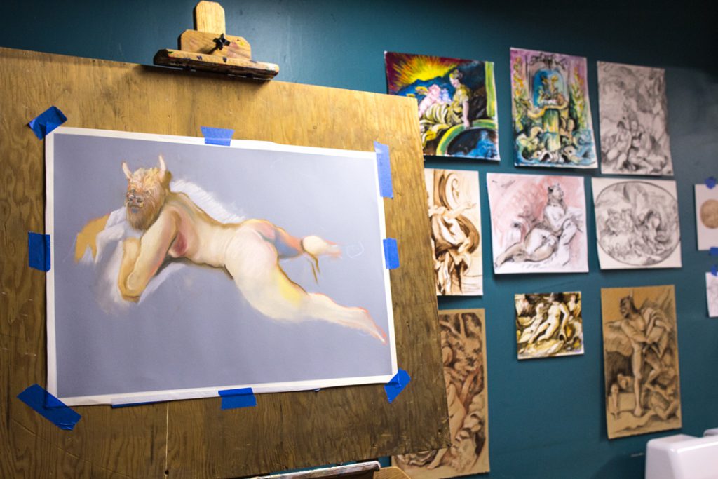
Work in progress from a series re-creating every drawing in “The Drawings of Francois Boucher” by Alastair Lang.

What else are you working on?

I just wrapped up Safety in Numbers for Disjecta in Portland. It’s focused on anonymity and its relationship to safety for myself as a trans person. I create anonymity for myself by turning people into clones of me through physical haircuts. I’ve done this twice now and in both cases, the haircut selected was based on a contemporary trend. This time it was the tasseled bob. The bob, in a historical context addresses notions of gender identity and freedom of gender cultural constructs.

In addition to that I’m working on a series of drawings and etchings. I’m re-creating every drawing in The Drawings of Francois Boucher by Alastair Lang and inserting trans bodies as a way to create a visual history for myself, which doesn’t exist. We know that trans people did exist, and in some cases, had very prominent roles in courts. I’m creating this history for myself through these drawings and they also include anamorphic creatures that I’ve been using for a number of years that hint to the disorientation that I had growing up about my identity.

– Chelsea Werner-Jatzke, Content Strategist & Social Media Manager

Images: Courtesy of the artist. Studio photos: Natali Wiseman. Molly Vaughan, Documentation of Project 42 performance by Anna Conner at the Henry Art Gallery, 2016, Commissioned by the Henry Art Gallery, Seattle, Washington, Photograph by Jonathan Vanderweit, Courtesy of the artist, © Molly Vaughan.
Andrew Wyeth’s Dog Life

“You know, dogs are the damnedest thing. They just take over the house.”
– Andrew Wyeth

Dig into the life and paintings of Andrew Wyeth and you’ll start to notice that there are dogs all over the place. As a dog owner, it seems Wyeth was as susceptible as anyone to sharing images of his favorite mutts—man’s best friend often makes an appearance in Wyeth’s paintings. Visit Andrew Wyeth: In Retrospect and keep your eye out in the galleries for K-9 companions, Rattler, Nell Gwyn, or neighborhood hounds. So how did Wyeth’s love for his four-legged friends influence his artwork?

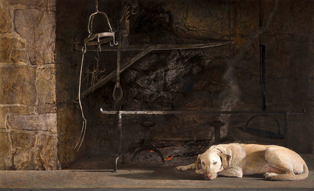
Old faithful isn’t just a geyser. Ides of March, above, shows Wyeth’s dog lying in front of the cooking fireplace in the Wyeth’s old home. Is this an idyllic domestic dog scene or a metaphor for the murder of Julius Caesar? Why not both? The title helps us see, perhaps, the detailed antique iron fireplace implements as spears and an emperor’s crown, its wearer dead and gone, his pyre or tomb protected by a loyal dog.


Installation view of Andrew Wyeth in Retrospect at Seattle Art Museum

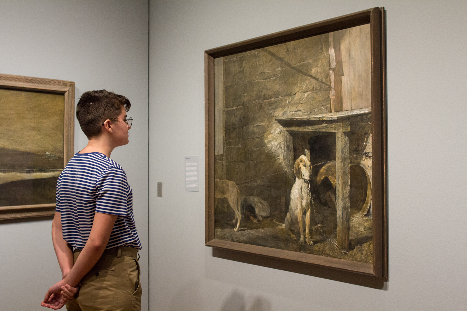
These poor pups! The occupant of this decrepit mill kept starving coon dogs tied up outside the old granary. We never promised cute-overload here, but the good news is that eventually Betsy Wyeth purchased the historic mill property and restored it as a new home for the Wyeths. We hope these dogs found better homes and treatment too.


Installation view of Andrew Wyeth: In Retrospect at Seattle Art Museum

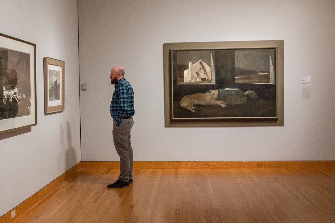
Is this guard dog asleep on the job? Wyeth’s dog, Nell Gwyn, sleeps on a bag: does the bag contain a secret? Does the dog guard the secret? Betsy imagined Andrew would move his studio into the mill house she renovated for them, but he refused. Wyeth was living a double life at the time this painting was made—painting a woman, Helga Testorf, in secret. This dog was named for the mistress of Charles II, which probably amused the artist since he admitted that the painting was an extension of his studies of a sleeping Helga.


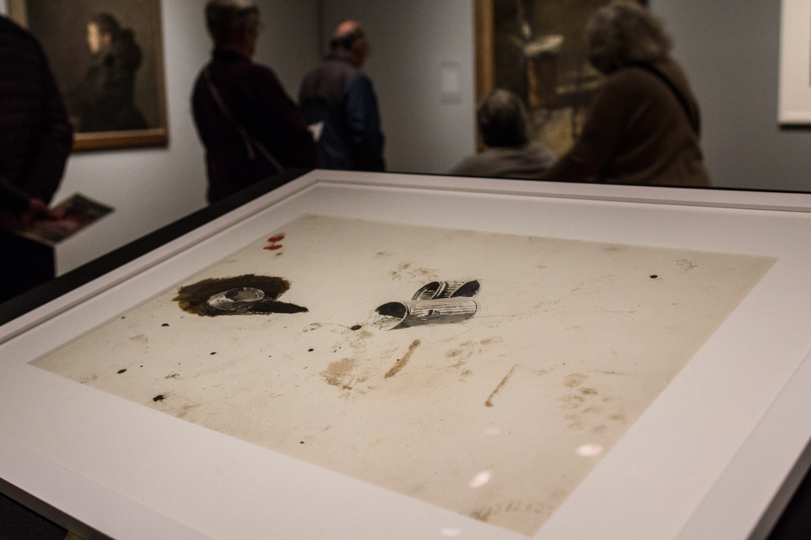
Adam (study)

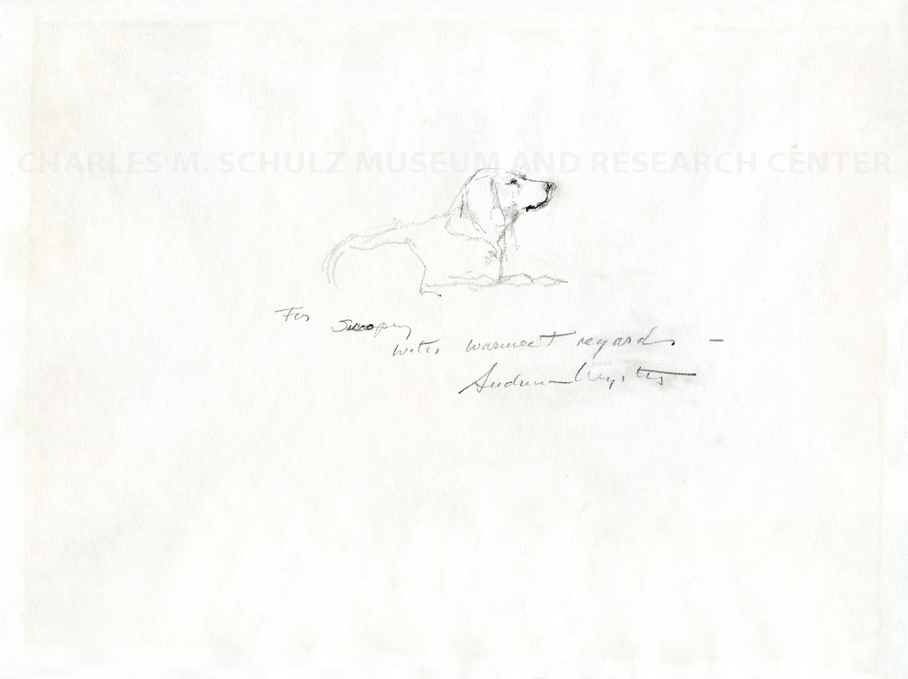
This study for his painting, Adam, does not include any dogs, so what’s it doing in this blog post about Andrew Wyeth’s dogs? Look closely. Moving across the sketch you can see paw prints. Perhaps Andrew Wyeth left this sketch on the floor of his studio to reference while producing the final painting and one of his dogs wandered in, without care for the artist at work—what does a dog care for fine art? Snoopy might have an opinion on that.


Obviously, Charles Schulz was a fan.


– Chelsea Werner-Jatzke, Content Strategist & Social Media Manager

Images: Ides of March, 1974, Andrew Wyeth, American, 1917–2009, tempera on hardboard panel, 24 ½ x 41 ½ in., Collection of Mr. and Mrs. Frank E. Fowler, © 2017 Andrew Wyeth / Artist Rights Society (ARS). Raccoon, 1958, Andrew Wyeth, American, 1917– 2009. tempera on hardboard panel 48 × 48 in. Brandywine River Museum of Art, Chadds Ford, Pennsylvania, Acquisition in memory of Nancy Hanks made possible by David Rockefeller, Laurance S. Rockefeller, Mimi Haskell, and the Pew Memorial Trust. Installation views of Andrew Wyeth: In Retrospect at Seattle Art Museum, 2017, photos by Natali Wiseman.
Andrew Wyeth’s Dramatic Genius

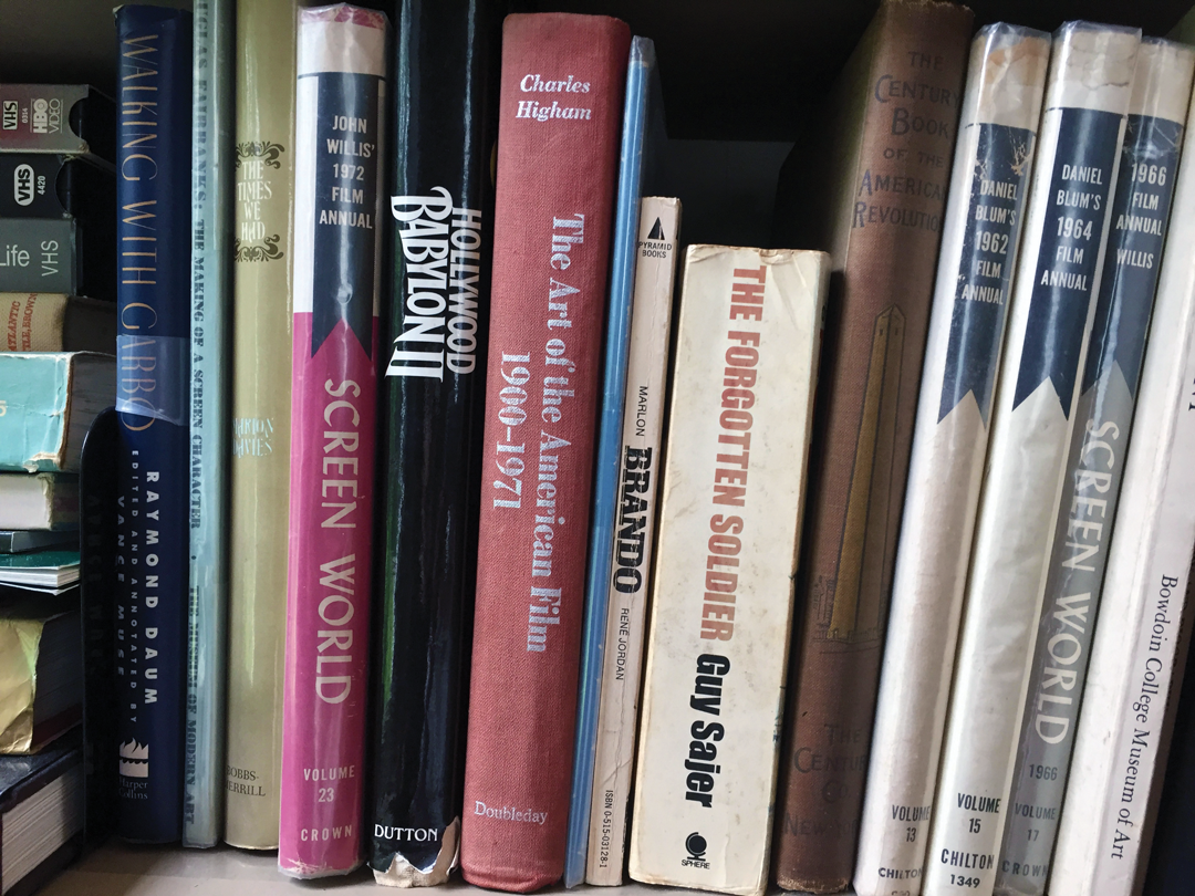
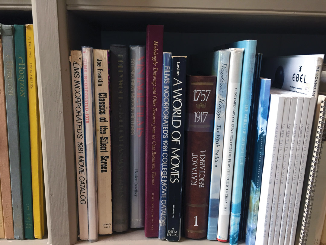
Andrew Wyeth’s studio was an old schoolhouse near his childhood home in Chadds Ford, Pennsylvania. His bookshelves there hold numerous titles on film. From movie rental catalogues to a Marlon Brando biography, to Classics of the Silent Screen, this view inside the American icon’s creative space sets Wyeth against a backdrop of the movies.

Film books in Wyeth's library

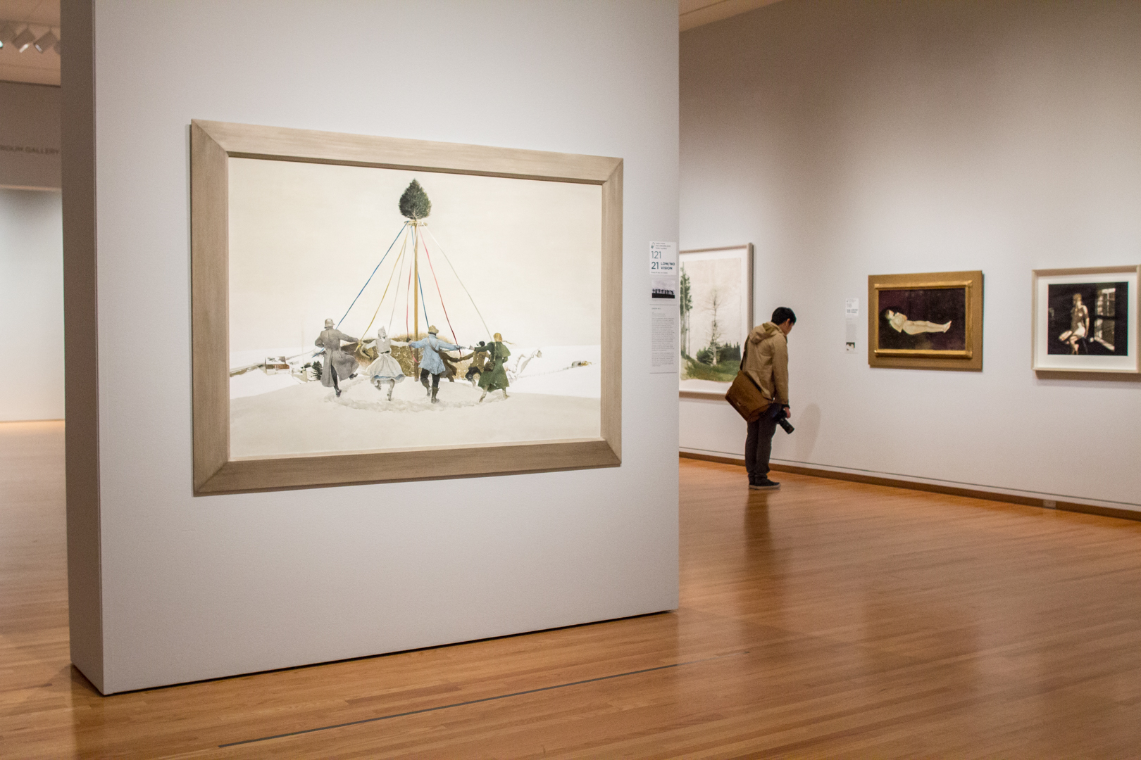
Wyeth is sometimes considered a realist in an abstract art world; however, this limited focus on his realism glosses over his strange and eerie images. But on the 100th anniversary of the artist’s birth, Andrew Wyeth: In Retrospect examines what creates Wyeth’s haunting effect on us and shows the influence of cinema on his art through his 75-year career. This major exhibition presents more than 100 of the artist’s finest paintings and drawings, including rarely seen loans from the Wyeth family.

“In the 1950s and ’60s, critical favor was given to abstraction and formal investigations into painting. Exhibitions and critical thinking about fine art didn’t include media, like films,” Patricia Junker, SAM’s Ann M. Barwick Curator of American Art points out. “Now that our concepts of fine art have broadened, Wyeth can be understood in the realm of modern filmmaking, as well as painting. He connected with an art form that used the human figure as a form for storytelling and was not abstract.”

Betsy Wyeth likened her husband to Swedish director Ingmar Bergman: “He’s creating a world they [his models] don’t realize and they’re acting out a part without any script.” In the 1989 painting Snow Hill, Wyeth’s Chadds Ford models, living and dead, dance on Kuerner’s Hill—a meaningful motif in Wyeth’s paintings—and recall Bergman’s dance of death from the iconic final scene of The Seventh Seal. Just as Death dances the players off to their graves in the film, Wyeth danced his characters off to their art-muse graves, and he would never use them again.

https://www.youtube.com/watch?v=abusPM-9mqQ

An owner of King Vidor’s 1925 silent masterpiece, The Big Parade, Wyeth claimed he watched these film reels hundreds of times. A young man running down Kuerner’s Hill in Wyeth’s Winter 1946 echoes the film’s hero hobbling down a hillside into the arms of a lost love. The Big Parade used objects to convey emotional states and inspired Wyeth to depict belongings and interiors as portraits, as in a pair of weathered doors that represent the deceased brother and sister in Alvaro and Christina (1968).

“Think of Wyeth’s paintings as movie stills—each as a frozen moment within some ongoing action,” says Junker. “What story do they tell?” Andrew Wyeth: In Retrospect offers a chance to piece together the story of Wyeth himself—his figures are characters acting out a role in the artist’s life, allowing us to understand him. The exhibition is an epic, the story of a great American artist told through the people and places he portrayed.

Widen your view into Wyeth’s World through SAM’s screenings of these, and other, films that either influenced Andrew Wyeth or vice versa. The Big Parade will be screened on November 15 and The Seventh Seal is presented as part of an Ingmar Bergman series on January 25. Find out more about all of SAM’s upcoming film events and get inspired.

– Chelsea Werner-Jatzke, Content Strategist & Social Media Manager

Object of the Week: Two Plane Vertical Horizontal Variation III

It’s early October and the sun is still shining in Seattle. These early fall days in the Northwest always feel like something special: a lull between the over-scheduled blaze of the summer and the damp grayness of winter, when Seattleites can still take advantage of the great outdoors. And what better way to do so than with a stroll through the Olympic Sculpture Park, visiting some old favorites—or maybe some sculptures you may have missed among the summer crowds.

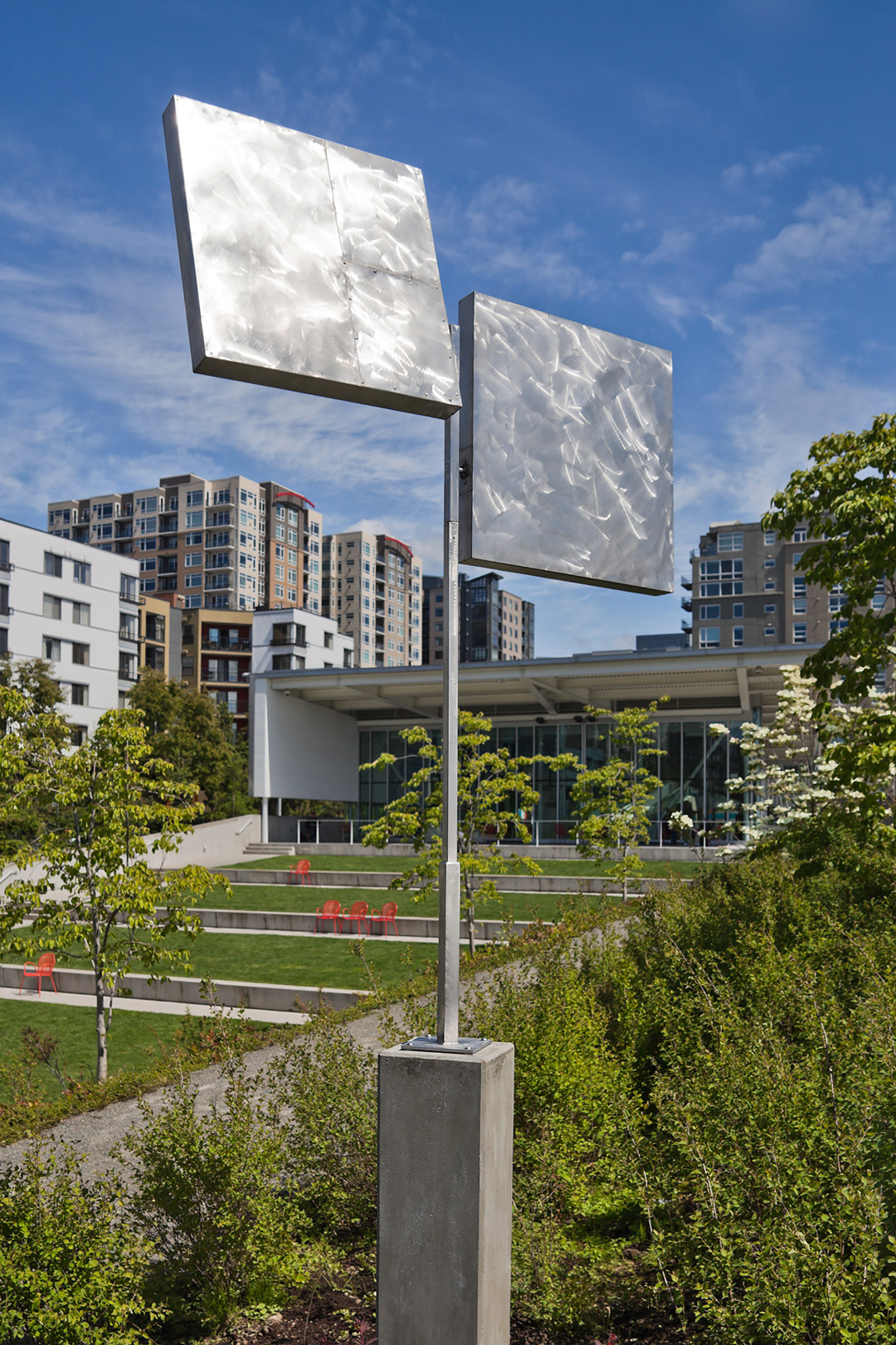
Tucked away at the top of the park’s signature Z-path is George Rickey’s Two Plane Vertical Horizontal Variation III (1973). A deceptively simple composition, the sculpture consists of two stainless steel square elements, mounted slightly offset from each other on a tall pole. The surfaces of the squares are burnished in a gestural, almost painterly pattern, perhaps belying Rickey’s early background as a painter. Overall, its simplified geometric forms, lines, and planes are reminiscent of a history of constructivism—an early 20th century avant-garde movement on which Rickey published a book in 1967—and the aesthetics of the New York minimalist artists who were his contemporaries. What really distinguishes Rickey’s work, though, is not its form or material, but a different element altogether: movement.

Rickey was one of the pioneers who brought movement to abstract sculpture. Referring to them as “useless machines,” his kinetic works are meticulously engineered so that their components shift, rotate, or spin with even the slightest breeze. In the case of Two Plane Vertical Horizontal Variation III, the seemingly simple squares are in fact compound pendulums, spinning around a central point (the heart of the plane) in parallel paths. They respond directly to the effects of nature, from the most dramatic windstorm to the lightest gust of air.

It is fitting that Two Plane Vertical Horizontal Variation III is located so near Alexander Calder’s iconic Eagle, as Calder’s kinetic sculptures were a major influence on Rickey’s own “useless machines.” But where Calder’s work exudes a playful, organic, biomorphic quality, Rickey’s is rooted in geometric exactitude, an interest in the poetry of a precisely engineered object. He recalls the development of these ideas when he began making kinetic works in 1949:

I committed myself to a completely new technology, a new esthetic, new criteria, a new kind of response from others and a new antiphony between myself and the new object I held in my hand. I had to wonder whether Calder had said it all; when I found he had not, I had to choose among the many doors I then found open. I had to learn to be a mechanic and to recall the physics I had learned at 16. . . . I had embarked on a long-term project—to make an art in which every object had to be preconceived and had to be able to go through its motions completely and satisfactorily, or I had made nothing at all.1

The sculpture is only truly activated when this order with which it was designed—based in an acute understanding of mathematics, engineering, and physics—comes into contact with the disorder of nature. Rickey intended this interaction—he meant for his kinetic sculptures to be installed outdoors, bearing all of the elements—and it is in this interplay between science and nature where the work is its most lyrical. So the next time you’re taking advantage of a sunny fall day in the sculpture park, I invite you to stay awhile and watch the sculpture at work—spinning precisely and gracefully as it heralds every change in the weather.

– Carrie Dedon, Assistant Curator of Modern and Contemporary Art

1 George Rickey, interviewed by John Gruen, in “The Sculpture of George Rickey: Silent Movement, Performing in A World of Its Own,” ArtNews, April 1980, p. 94.
Image: Two Plane Vertical Horizontal Variation III, 1973, George Rickey, stainless steel, 97 x 68 x 68 in., Gift of Martin Z. Margulies, 2007.263, Art © Estate of George Rickey/Licensed by VAGA, New York, NY

Art Champ: Lawrence Cenotto

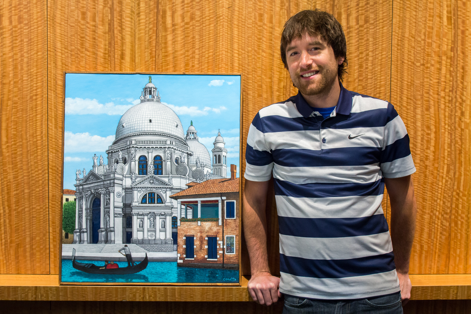
Lawrence Cenotto, SAM’s multi-talented Events and Group Sales Manager, was selected the crowd favorite in the SAM Staff Art Show that hung in the South Hall Community Gallery, August 30 to September 24. A SAM employee since 2012, Cenotto has been making art for much longer than that. He often feels as if he was born in the wrong era and wishes he could have been a court painter for some king or queen hundreds of years ago (and he would like to point out that if any royalty or rich benefactors are reading this that he is available).

A Washington native, Cenotto grew up in Lakewood (which he reminds us is where COPS was filmed) and went to Gonzaga in Spokane (the other place in the state where COPS was filmed, Cenotto points out). His two passions have long been art and sports, though eventually the art became his focus. He recently combined the two when he got to be on a private, after-hours tour of Yayoi Kusama: Infinity Mirrors with Russell Wilson and Ciara and take a picture of them in the Obliteration Room, a highlight of his five-and-a-half years here at SAM. This gets us to today, where we’ll be talking with Cenotto about his creative drive and his winning painting, Santa Maria della Salute.

SAM: When did you start painting? 

Lawrence Cenotto: My first memory of making art is drawing animals I found in books at my grandparent’s house or drawing football players on Monday Night Football while watching with my grandpa when I was about five or six years old. I’m sure there was some tempera or finger painting in there somewhere, but I didn’t really start painting until high school when I started making watercolors of The Beatles and landscapes from photos I found in the stacks of National Geographic magazines we had in the art lab.

Did you study art at Gonzaga?

I started as an art major there, yes, but an early morning class my first semester staring at slides of pre-historic art made me feel like I was sitting in Ben Stein’s class in Ferris Bueller’s Day Off so I switched to a business major while keeping art as a minor so I could still take the studio classes.

I see a lot of paintings of Venice on your website, did something about that specific location inspire you? Did the Seeing Nature exhibition strike a chord with you?

Venice is my favorite city, along with Paris. I‘ve always been a big fan of architecture. The uniqueness of the city, mixed with my northern Italian bloodline, made me fall in love with the city. I’ve always liked building things and my brain  is wired very much like an engineer, but my heart draws me to the art side of things. Had I gone to a different school I probably would have gone into architecture but Gonzaga did not have an architecture program. I respect the art form from a design perspective and all the planning that goes into it (I am very meticulous) and maybe painting buildings is my way of getting that out of my system like I’m George Costanza pretending to be an architect. Seeing Nature was definitely one of my favorite exhibitions that SAM has had (probably right behind Intimate Impressionism) because it incorporated a lot of paintings of Venice with my favorite art movement, Impressionism.

Can you tell me more about the two versions of you painting, Santa Maria della Salute and the 10 years between them? You mentioned that you hope that you’ll think back on this painting in 10 years like you think back on the original, what do you mean by this?  

Unfortunately the older version can’t be seen anymore unless you put it through an x-ray (because I painted the new one on top of the old one) but I do have pictures to show the difference. When I look at the newer version I think it is much better than the older version, so 10 years from now I hope to be able to continue to develop my painting techniques. In the meantime I can indulge myself in delusions of grandeur in envisioning future art historians putting my paintings through rigorous x-ray testing like I’m Leonardo da Vinci or something.

Do you often revisit paintings and paint them again? 

Not very often. This might be the second painting I have re-done, though I am currently working on one that I originally completed around the same time period. One of my biggest problems in painting is that I get too excited to start the painting itself so I rush through the drawing process and often find things I wish I had changed, which is hard to fix once the paint is wet. I think I’m saving myself time but it ends up taking longer than if I had just focused on finalizing the drawing. It’s like Charlie Brown trying to kick the football . . . he knows that Lucy is going to pull it at the last second but he can’t help himself.

What inspires you? 

I don’t claim that my art has any deep meaning or significance. I just try to capture moments and places that I find beauty in. Since I don’t have a knack for photography, painting is the way I best express that. Other artists definitely inspire me—I want to be able to see the world as they do and I want to challenge myself to see if I can compare to their skill. I am definitely more of a realist, although I would like to have more of a “painterly” style like Edouard Manet (my favorite artist). I have a hard time not trying to make my paintings look as real as possible. My other favorite artists are Diego Velasquez and Canaletto (who I am probably the most similar to in terms of style and subject matter and last name).

Lastly, how long have you been playing fantasy football? Because I have lost every game! 

I started the SAM league three years ago but I’ve played with my friends for about 15 years and it’s one of the most frustrating things I have ever subjected myself too. The stars aligned once and I won back in college but other than that it’s a never-ending cycle of disappointment and thinking I jinxed someone when they get injured which is why I never draft any Seahawks. To go back to the Charlie Brown example, I know I’m going to be mad at the end of the year and that the fantasy football gods are going to pull the football away from me at the last moment as soon as I get a glimmer of hope, but I can’t help myself from trying to kick it anyways.

– Chelsea Werner-Jatzke, Copywriter/ Content Strategist

Photo: Natali Wiseman

SAM Gallery Artists on Seattle: Iskra Johnson, Kate Protage, and Kellie Talbot

Have you read the recent Fall Arts Report, State of the Arts feature in the Seattle Times? The current show hanging at SAM Gallery features three artists whose artwork grapples with Seattle’s layers of history and industry. On view through October 15, Industrial Strength is a visual meditation on the objects, jobs, and people that shape the city. We’ve invited our SAM Gallery artists to get personal and offer their own state of the arts and how it impacts (or doesn’t) their creative output. Hear from Iskra Johnson, Kate Protage, and Kellie Talbot on how Seattle has helped, hindered, and influenced them and their artwork. Each of these artists utilizes the cityscape in their paintings and is fascinated by the unique underbelly of Seattle—from the texture of a wheat-paste wall, to the blur of rain reflections, to long-gone landmarks—Johnson, Protage, and Talbot are paying attention to their surroundings and sharing their thoughts on them with you below.

Iskra Johnson

Shadow Wall, Iskra Johnson

The Calligraphic Street, Iskra Johnson

I am a Seattle native and an unapologetic descendent of the Northwest Mystics. I like the sense of being on the edge of the continent and the brooding state of contemplation the natural environment inspires. The frontier also defines the ethics of my social interactions. I see conversation as a practice of risk-taking improvisation, and my personal motto has always been talk to strangers, how else are you going to make new friends? If I had an MFA I could call this “social practice” and get a grant for walking down the street, but unfortunately it’s just my way of being. I was born with a New York personality in a city of impenetrable Nordic reserve.

My work documenting construction sites might really just be about talking to somebody: these men in orange vests with stickers on their hats are the only people on the street not looking at their phones. Although my prints may look like pure contemplations of inanimate beauty, beneath the architectural structure is a confrontation with urban alienation and a path to transform it. All of my work involves photography in the field, and a bit of personal risk. My favorite social practice moment happened a few weeks ago when I was photographing a fire hydrant. A man shouted at me from across the street, are you that girl who takes pictures of fire hydrants? I saw you here last year. He then told me he has never seen fire hydrants the same way. That made my day.

Kate Protage

Bridge Blues, Kate Protage

Familiar Journey, Kate Protage

I left the corporate marketing world to become a full-time painter about 15 years ago. I live a smaller life now, but it’s a good life, and I’m doing what I love.

I couldn’t do it without Jody and the team at the SAM Gallery. They are so good at what they do that I struggle to keep up! I just focus on creating new work, and they handle everything else with ease and grace. Now if I could only figure out how to create faster! Budget, convenience, inspiration . . . all of these factors play into an artist’s ability to create. A home studio offers convenience, but a studio that’s part of a larger artist community can be a great source of inspiration. It turns out that for me, the best solution is a little of both. My husband Chris (also an artist) and I have work spaces at home, but we also share a small space at Equinox Studios in Georgetown, where we’ve found an incredible support system and a strong sense of community. One of my favorite things about Seattle is that a wide array of artistic trends are considered acceptable and cool. I’m surrounded by talent that reveals itself in a variety of shapes and forms and I feel encouraged to develop my own voice. Hearing that a painting of mine is the first piece of original artwork that someone has purchased is an amazing feeling. It is such a privilege and honor to be the catalyst for creating a new collector.

Making art is not just fun: I work longer hours now than I ever did as a marketer, and it’s hard work. As Seattle has become entrenched as a technology and e-commerce hub, our population has grown by leaps and bounds. I know some the challenges that this brings: as a perpetual renter, I’ve had to move further and further from the “popular” parts of town because they’re no longer affordable or accessible. But that population bump also brings more opportunities to connect and succeed as an artist. We live in a city where the possibilities are wide open.

Kellie Talbot

Boy Bar, Kellie Talbot

Market Liquor, Kellie Talbot

In the 28 years that I’ve lived in Seattle I’ve witnessed dramatic changes to the city. Being a professional artist will always have its challenges. Gone are the days of cheap rent but now we see art walks in every neighborhood—there’s even a touring art bus—so I feel the community has come a long way in supporting local artists. Because of my subject matter, I miss the blue-collar economy of the past—airplanes, fishing, ship building. I miss the general surliness of old Seattle. But this new economy has done more than raise housing costs. It has enabled working artists to sell locally and be a part of a vibrant art scene. The days of the Northwest School seem very romantic but I’m sure that is hindsight. I know they struggled with rent and the cost of living too. There will always be the challenge of balancing earning a living and being able to afford living in the city.

10 Surprising Facts About Yayoi Kusama

There are eleven days left to see Yayoi Kusama: Infinity Mirrors at Seattle Art Museum and by now, you’ve probably seen an infinite number of images of her artwork in your Instagram and Facebook feeds. Hopefully you’ve seen the exhibition in person as well! If not, learn more about Yayoi Kusama below and plan to line up at SAM for day-of timed tickets between now and September 10 to experience infinity through the immersive art of this icon, rebel, and visionary.

  1. Yayoi Kusama arrived in Seattle in 1957 with two kimonos and 200 paintings. This is the first city Kusama visited when she moved to the US.
  2. Kusama was pen pals with Georgia O’Keeffe, Richard Nixon, and the President of France.
  3. She partnered with Louis Vuitton to design a clothing line in 2012.
  4. Narcissus Garden, a rogue performance piece by Kusama, was installed outside of the 33rd Venice Biennale in 1966 with the support of one of the curators, however she was asked to leave the premises.
  5. She was making Pop art before Andy Warhol.
  6. Assemblage artist and filmmaker, Joseph Cornell and Kusama had an intimate friendship that prompted his mother to dump a bucket of water on them once when she caught them kissing.
  7. The quintessential polymath, Kusama has published numerous literary works.
  8.  A firm believer in love forever, Kusama performed a gay marriage way before gay marriage was legal.
  9. In 2016, she was ranked as the most expensive living female artist on aggregate.
  10. Yayoi Kusama has been producing art work for more than six decades.
Image: Yayoi Kusama with recent works in Tokyo, 2016, Courtesy of the artist, © YAYOI KUSAMA, Photo: Tomoaki Makino.

Object of the Week: Audience of a Prince

“I think of Chinoise as very much a part of the conversation of the global diaspora and the spreading of cultures from one place to another.” – Saya Woolfalk

Hear from mixed media installation artist Saya Woolfalk on her favorite things in SAM’s collection and gain a new perspective on the Chinoise Tapestries, one that layers the histories evident in the intricate embroidery of these objects. The Audience of a Prince tapestry is part of a suite of four European chinoiserie tapestries from the workshop of Judocus de Vos that depict imaginary interpretations of life in Asia. In the early eighteenth century (circa 1703-07), Judocus de Vos owned the largest workshop in Brussels, with twelve looms. The tapestries feature magical scenes of exotic figures clothed in flowing robes and elaborate headdresses, fantastic animals, botanical studies, and purely imaginative flights of fancy. This suite of Flemish tapestries was commissioned for the Duke Leopold-Philippe d’Arenberg’s residence in Brussels in 1717, when it was fashionable for wealthy Europeans to create rooms evoking an exotic, foreign atmosphere.The d’Arenberg family of Edingen (Enghien, Belgium) had a long history of collecting tapestries. Recent research in the d’Arenberg archives by Koenraad Brosens, University of Leuven, has uncovered three documents that record these tapestries. The earliest document records the original commission of 1717. The four tapestries in SAM’s collection are the only tapestries from this suite known to exist today.

Artwork: “Audience of a Prince”, Judocus de Vos, commissioned in 1717, Wool, silk, metallic threads, 146 7/16 x 58 1/4 in. (370.8 x 148 cm), Gift of Guendolen Carkeek Plestcheeff Endowment for the Decorative Arts, Anonymous, General Acquisition Fund, Mildred King Dunn, Richard and Betty Hedreen, Decorative Arts Acquisition Fund, Margaret Perthou-Taylor, Bill and Melinda Gates Foundation Art Acquisition Fund, Ann Bergman and Michael Rorick, Mr. and Mrs. David E. Maryatt, 2002.38.4.

SAM Gallery Artists on Seattle: Troy Gua

The life of the artist is often romanticized and misunderstood. Here at SAM we support artists on an international and local level through hanging their artwork in our exhibitions and installations, creating programs led by teaching artists, and showcasing artists in SAM Gallery where visitors can purchase art to begin their own collection. Learn about the experience of being a contemporary artist in Seattle by hearing from our SAM Gallery artists. First up is Troy Gua whose work is currently on view at TASTE Café in SAM through November 9, 2017. You can also see Troy’s work at the Washington State Convention Center via SAM Gallery through January 15, 2018, as well as at Out of Sight through August 2017 and Feast Art Center in Tacoma through September 16, 2017. Learn more about how living in Seattle impacts this pop-culture inspired, multi-media artist.

Of course, I can only speak for myself when I say that the state of being a working artist in Seattle has never been better. There are those who are struggling and would strongly disagree, but I’ve been fortunate enough to have found a path that works for me and that has developed into a sustainable income and way of life (fingers crossed), and it really all started, and continues, with my partnership with SAM Gallery. They’ve introduced my work to so many collectors—seasoned as well as first-timers just starting their collections with my work, to real estate developers and entrepreneurs looking to activate their spaces with art, all adding layers of engagement and connection that I could only fantasize about without them.

When I first signed on to work with Barbara Shaiman and SAM Gallery in 2009, it was huge for me. They sold a lot of paintings and got a lot of eyeballs in front of my work, but it wasn’t until the gallery was moved (at last!) into the museum building that things really took off. Jody Bento took the reins and honored me with the first show in the beautiful new space, which also happened to be the gallery’s first ever solo show, and it was beyond my wildest dreams. That was December 2013, and since then, the city has exploded in growth.

Now, there are two sides to everything, and urban growth and population explosions have their downsides, to be sure, but I’m looking at it from the standpoint of being given the opportunity to provide more folks with personal and cultural enrichment through art, and boy am I grateful for that opportunity. But I’m also sympathetic and not blind to the fact that the population boom is causing many artists to be priced out of the city, forced to move and they are taking their artistic energy with them, friends included. That’s a lose-lose situation and it sucks.

Having more people in your city doesn’t automatically translate into having more people in your gallery, though, and I know what a privilege it is to be affiliated with a space that is as accessible as an art gallery can possibly be, at the center of the city’s cultural hub, with staff that are engaging and nurturing, helpful and attentive, with not a whiff of pretension. I think the secret (which is no secret at all) is inclusivity. As Keith Haring said, ‘Art is for everyone’, and for those looking for it in Seattle, it’s everywhere.

There’s so much constantly going on that, even for those with the energy and wherewithal to try, it’s hard to keep up with. From the monthly gallery art walk nights in Pioneer Square, Georgetown, Capitol Hill, and just about every other neighborhood in the city, to the special (and oftentimes mind blowing) exhibitions at spaces like MadArt and Pivot in South Lake Union, from the city’s public art programming to DIY art spaces and the bounty of coffee shops, cafés, and restaurants that show local art, it really is everywhere—an abundance of favorable circumstances for folks to express themselves and experience creativity in our beautiful but changing city. Lucky us!

– Troy Gua, SAM Gallery artist

Images: Islands, Troy Gua, digital print and resin, 30 x 48 in. Tahoma (After Hokusai), Troy Gua, digital print and resin, 30 x 48 in. Heartland, from the Immaculate Disaster Series, Troy Gua, 24 x 36 in., digital print and resin.

In Memoriam: Jeffrey Hart Brotman

Doing the Right Thing

Jeffrey Hart Brotman
September 27, 1942 – August 1, 2017

When reflecting on the life of Jeff Brotman—one of our region’s greatest business, civic, and philanthropic leaders—it’s no surprise to note that, “Do the right thing” is an employee mantra of Costco, the retail giant he co-founded in 1983.

“Jeff was the very definition of a community leader,” says Winnie Stratton, President of SAM’s Board of Trustees.  “He was born in the northwest and spent his whole life making it a better place. He built one of our region’s most successful businesses, literally named the best company to work for in the country, all the while tirelessly working to make sure those around him thrived as well. Together with his wife Susan, Jeff volunteered and supported countless organizations focused on everything from the arts and education, to social services.”

Seattle Art Museum was lucky to be one of those organizations. In 1982, while planning for the opening of his very first retail warehouse, Jeff and Susan became members of SAM. It was the first step in a 35-year connection to the museum, one that has grown and strengthened just as rapidly as the business he was leading.

“It’s remarkable when you consider how much SAM, and our city, has developed in that time,” says Stewart Landefeld, Chairman of the Board. “Jeff became involved when Volunteer Park was our only site. As a team with Susan, Jeff had the vision to see SAM’s path to become a great American museum, and the human warmth and natural leadership to help take us there.”

Jeff’s support of SAM was driven by his passion for art. Avid modern and contemporary art collectors, lenders, and donors, he and Susan helped position the museum as a leader in those areas.

Jeff viewed his role as a collector and steward of SAM as one of great responsibility. From his earliest days, he inspired the museum to push itself artistically, and to dream big. There is little doubt that SAM would not have the exemplary exhibitions and programs it has today without him.

While Jeff passed away in August of this year, his unwavering commitment and inspiring vision for SAM, and the community we serve, will always be remembered.

“Jeff left an indelible mark on Seattle’s cultural landscape and it is hard to fathom SAM without him,” concludes Kim Rorschach, Illsley Ball Nordstrom Director and CEO. “We will be forever grateful for the innumerable ways he has made SAM stronger, and we will all remember him fondly as we enter our downtown museum, and the Brotman Forum named in his and Susan’s honor.”

The Ins and Outs of Acquisitions: A Newly Discovered French Masterpiece

Adding a piece to a museum collection is an involved process. In the case of Shipwreck Off the Coast of Alaska, a painting by Louis-Philippe Crépin, the first interaction was on a trip to London when Chiyo Ishikawa, SAM’s Susan Brotman Deputy Director for Art and Curator of European and Sculpture got an email from Christie’s auction house in London about a private sale of a uniquely important painting.

Museum curators continually consider art for the museum’s collection. They assess intellectual and historical importance of artworks, ownership, relevance to the larger collection, as well as condition, potential costs for conservation, framing, display, and storage. SAM’s collection includes approximately 25,000 objects, with 36 new artworks acquired so far in 2017.

To acquire a work of art, the curator has to first convince the director and then the Committee on Collections (COC), an advisory group of board members and community arts leaders, who, in turn, make recommendations to the Executive Committee of the Board, which has the final vote.

To give you a peek into the acquisition process, below is the curatorial argument for this newly acquired painting by Louis-Philippe Crépin.

This painting represents a shipwreck of two launches from the famous French Enlightenment-era expedition led by Count Jean-François de La Pérouse, which reached Alaska in July 1786. The ships were getting ready to leave Lituya Bay when two boats were caught up in violent tidal currents and one boat capsized. The second vessel may have tried to rescue the sailors but itself went under. This painting was commissioned by the family of two brother officers who were killed in this event, and it was enthusiastically reviewed when it was displayed at the 1806 Salon. It has been in the family since that time.

La Pérouse’s expedition into the Pacific Northwest followed celebrated efforts by Spanish and British explorers in the previous decade. Scientific inquiry was a primary motivation, but the explorers were also seeking political advantage for their governments. On July 2, 1786 the expedition arrived at a previously uncharted bay on the Alaskan coast. La Pérouse named it Port des Français, but we know it today as Lituya Bay. After successfully navigating the rocky entrance to the bay, the crews set up camp, planning to stay for a month to explore the bay and glaciers on the mainland at the northeast end of the bay. They concluded their investigations sooner than planned and made ready to leave on July 13. Two boats were sent ahead to sound the channel near the perilous entrance to the bay so that they could chart the depth; one officer miscalculated the distance from the rocks and found his boat engulfed by a sudden high tide. Both boats capsized, and twenty-one men were lost in ten minutes.

The painting closely follows La Pérouse’s own narrative of the disaster and draws on images by the professional artists who illustrated the Atlas du voyage de La Pérouse. The two endangered boats teeter in the foreground amid boulders and high waves as a third tries vainly to reach them. The two mother ships emerge from behind Observatory Island (after the tragedy, La Pérouse redubbed this Cenotaph Island). The urgent efforts of the sailors caught up in the roiling waves are set against the majestic backdrop of the Fairweather mountain range. At the right, gesturing from a rock, are two members of the Tlingit tribe, witnesses to the event, who searched in vain for survivors, according to La Pérouse. The interaction with the French and the story of the shipwreck would remain part of the Tlingit oral tradition.

Crépin captures the men’s desperate actions as conditions suddenly changed. The two La Borde brothers, in the boat at right, offer a line to their doomed comrades just before they too are swept under. The terrible drama is all in the foreground, at eye level. Beyond the turbulent waves in the pass the bay is calm, the mountains of the Fairweather range are impassively still, and the sky is clear and blue.

Born in Paris, Louis-Philippe Crépin was a specialist in marine painting who had trained under celebrated artists Claude-Joseph Vernet and Hubert Robert. His interest in marine subjects kindled by Vernet, Crépin made his debut at the Salon of 1796 with a painting of the port of Brest. His primary patron throughout his long career would be the Naval Ministry of the government. Many of his works are in the National Maritime Museum in Paris, while others are in provincial museums throughout France. This work would likely be the first painting by Crépin in an American museum.

This painting transcends the standard conventions of marine painting. It stands alone within the artist’s oeuvre, achieving a peak of clarity, drama, and pathos that are typical of more highly valued history painting. The prestige of the La Pérouse expedition, the spectacular American landscape, and the portraits of the Laborde brothers make this one of  Crépin’s most outstanding works. In his review of the 1806 Salon, Pierre-Jean-Baptiste Chaussard singled out the painting: “But the most beautiful painting by M. Crépin, and the one which most attracted the attention of art lovers and artists, was the Shipwreck of the Dinghies of M. de la Peyrouse. It is in this tragic event that he has deployed all his genius and all the resources of his art. The scene is represented with a touching simplicity, and yet with an energy which inspires at once terror and pity. There are no superfluous figures or accessories: all dramatic interest is in the truth of the action. . . . In sum, this painting promises that he is the rightful successor to Vernet, and that no other country has produced a rival to match this celebrated man.”

In addition to the painting’s superb quality, it has never been on the market, remaining in the family that commissioned it for over 200 years. This undoubtedly has contributed to its excellent state of preservation. The Empire frame, an impressive part of its visual impact, is from the same period as the painting.

Like the curators of the Salon, Ishikawa saw something exceptional in this work that lent itself to SAM’s focus. “It offers an insight into the European perspective of the Northwest as an uncharted area that hadn’t been recorded—the wonder and exoticism. Count Jean-François de La Pérouse who led the expedition to Lituya Bay, which at the time he named the Bay of the French, though it was clear by the trading skills of the Tlingit that this expedition was not the first to find this bay.” Ishikawa continues to point out that, “Crépin is not a famous artist but this is a painting that transcends its genre. It’s an impressive and successful example of human drama.” See this painting installed in Extreme Nature: Two Landscape Paintings from the Age of Enlightenment, opening December 23. Accompanied by the return of  Volaire’s much admired Eruption of Mount Vesuvius with Ponte della Maddalena in the Distance, painted around the same time as the Crépin and last seen hanging at SAM this spring in Seeing Nature: Landscape Masterworks from the Paul G. Allen Family Collection, this installation will instill a very human awe and fear in the face of nature’s power.

Image: Shipwreck Off the Coast of Alaska, 1806, Louis-Philippe Crepin, French, 1772-1851, oil on canvas, 40 15/16 × 58 11/16 in., Seattle Art Museum, European Art Acquisition Fund; Bill and Melinda Gates Foundation Art Acquisition Fund; by exchange Gift of Mrs. Lew V. Day in memory of her husband; Gift of Arthur F. Ederer; H. Neil Meitzler, Issaquah, Washington; Col. Philip L. Thurber Memorial; Gift of Mrs. Donald E. Frederick; The late Mr. Arrigo M. Young and Mrs. Young in memory of their son, Lieut. (j.g.) Lawrence H. Young; Phillips Morrison Memorial; Gift of Mrs. Oswald Brown, in memory of her parents Simeon and Fannie B. Leland; Gift of Miss Grace G. Denny in memory of her sister Miss Coral M. Denny; Gift of friends in memory of Frank Molitor; Purchased from funds contributed in memory of Henry H. Judson; Purchased from the bequest of Charles M. Clark; Gift of Mrs. John C. Atwood, Jr.; Norman and Amelia Davis Collection; Norman Davis Collection; Mrs. Cebert Baillargeon, in memory of her husband, 2017.15.

SAM Staff Reads: Kusama’s Turbulent Garden

Yayoi Kusama’s visual art output is prolific, but did you know that she was also a writer? Beyond penning her autobiography, Infinity Net, in 2002 she is also the author of Hustler’s Grotto (1992), a collection of three novellas written between 1983 and 1992, and various books of poetry. Stay tuned to this blog series for a focus on Violet Obsession (1998), a collection of Kusama’s poems paired with images of her performative work including her Happenings and her activations of her Infinity Mirror Rooms. We’ve invited SAM staff to spend some time with Kusama’s poems and select a piece that speaks to them. We’ll be sharing selections from Violet Obsession alongside the musings and inspirations of SAM Staff. The exhibition, Yayoi Kusama: Infinity Mirrors is on view at SAM through September 10.

SAM’s Copywriter and Content Strategist, and an author in her own right, Chelsea Werner-Jatzke, gets things started with with her thoughts on one of the more light-hearted poems in the collection.

TURBULENT GARDEN (AT THE PSYCHIATRIC HOSPITAL)

it’s a breeding ground of stray cats here
parent cats have mated with their children to produce children
brothers have mated with sisters to produce children
and now the place is teeming with cats
when beams of the crescent moon fell upon the garden
the cats ate that moon
stars adhered one by one to the garden
the cats played with the stars
it’s a garden of cats
where no one dies and the numbers only multiply

it’s an exceedingly strange
cat way of calculating
all the leaves from the treetops       fell upon the cats
when the lonely winter comes
the shadows of cats just keep on increasing
they’re playing with one another
in the deathless garden
the rotting tails of fish accumulate
left over rice too is put aside
things human beings have contributed

they’re all disfigured cats
some with only half a tail
some with an ear torn off
some lame
not one complete cat in the lot

No one appears to have died
it’s even more turbulent on windy days
“meow, meow”—they run around
busy f***ing
they leap about
I’m glad I’m not a cat
I wasn’t born a cat
because I’m not really fond of all that f***ing

(1983)

– Yayoi Kusama

For me, the first appeal of this poem is the repetition. Kusama’s concerns with reproduction ad infinitum are clearly linked with breeding in this poem in a way that a work like Infinity Mirror Room—Phalli’s Field only implies. But in this poem, as in her visual work, what she reproduces is imagery, not just words (though the refrain of “cats” does reverberate throughout). Disfigured cats nibbling on a sliver of moon or batting around stars, never dying and endlessly multiplying are the fish tails and rice (rather than meat and potatoes) of the poem. But, it’s the turn that occurs at the end, when Kusama interjects in the first person, that lifts the poem above a landscape of feral felines into a psychological setting, all too fitting given the subtitle of the poem. We are taken directly into Kusama’s self proclaimed issues with sex at the end of this poem in a straightforward way. In her autobiography she talks at length about her fear of the phallus as the impetus to creating the soft sculptures that have appeared often in her work: in frames on wall, on furniture and boats, and in her Infinity Mirror Room. In contrast to the sheer volume of this motif in her visual work, her quick mention of being glad she’s not a cat allows the poem to be a playful menagerie in some undying garden, only lightly touched by human influence.

I think immediately of Turtle, my childhood cat. For weeks my brother almost had me convinced that she was a robot, until I saw her give birth. My father found her on a construction site in Manhattan on his walk home from work. She must have already been pregnant when he brought her into our tiny apartment. A few weeks later my parents pulled me out of elementary school in the middle of the day to come witness the birth of two kittens. Turtle caused another kind of issue at school: inquiries as to if everything was OK at home in response to the large and numerous scratches on my arms. Turtle didn’t take to domesticity and ran away within the year. We eventually gave her kittens to a neighbor. Turtle might not have liked being a mother, but she taught me how to climb trees.

– Chelsea Werner-Jatzke, Copywriter & Content Strategist

Source: Kusama, Yayoi. Violet Obsession. Translated by Hisako Ifshin and Ralph F. McCarthy with Leza Lowitz. Edited by Alexandra Munro. Berkeley, CA: Wandering Mind Books, 1998.
Illustration: Natali Wiseman.


Get to Know SAM’s VSOs: Alexandrew Wong

Alexandrew (Alex) Wong is an artist and native Seattleite, raised in the south end of the city. He attended Franklin High School where he first learned to use wood tools to create art. At the University of Washington, Alex thrived and was accepted into the School of Art as a 3D4M major. He gained skill sets using tools to create multimedia sculptures with glass, wood, steel, and ceramics. Alex joined the SAM as a Visitor Services Officer (VSO) after he graduated. He’s been here for about a year and a half and truly enjoys it.

SAM: Yayoi Kusama: Infinity Mirrors opened June 30 and runs until September 10. What is your favorite piece in this exhibition?
Alex: My favorite piece in Yayoi Kusama is The Obliteration Room. The idea of creating a room and sticking colored dots on the living room surface is genius. The concept is so playful and colorful. One thing I struggled with in school was using color, I was terrible at it. But the room itself uses people to contribute to the art and has them color the piece themselves. Genius.

What is your favorite piece of art currently on display at SAM?
My favorite piece at SAM is the Native American house posts. The skill in creating those posts is phenomenal. Imagine the carver themselves, just chipping away at a log for hours to create the four things that hold your house up.

Who is your favorite artist?
Kendrick Lamar, his music keeps me going. When it’s time to get hyped, I start bumping his tunes. For those wondering put on “m.A.A.d City,” “Swimming Pools,” “HUMBLE,” “King Kunta,” and “Backseat Freestyle.” Tell me these don’t get you hyped up too.

What advice can you offer to guests visiting SAM?
The bathrooms in the forum are to the left at the end of John Grade’s Middle Fork (the south side of the tree).

Tell us more about you! When you’re not at SAM, what do you spend your time doing?
I work at an art co-op in Capitol Hill, Blue Cone Studios, where I create ceramic sculptures. So to whomever is reading this, come check my work out. I’ll teach you a thing or two about clay. I’ll provide materials and lessons. We do art walk every second Thursday. Come by and let’s talk art.

– Katherine Humphreys, SAM Visitor Services Officer

SAM Stories