Becoming American
By Carina A. del Rosario
Presented at Seattle Art Museum’s Migration Stories Program, February 2, 2017 on the occasion of Jacob Lawrence: The Migration Series. Everyone is invited to come share their personal stories of immigration, migration, displacement, and community and how their perspectives relate to the works on view in The Migration Series during an Open Mic event on March 9 at Seattle Art Museum. And don’t miss the chance to hear from other local legends, such as Carina A. del Rosario, as they share their experiences with us in The Migration Series gallery.
I aced my citizenship test and interview. The Immigration Officer asked me if I’d like to get sworn in at the next monthly group ceremony, or wait until the big one at Seattle Center on the Fourth of July. I opted for the soonest one. I didn’t need all that hoo-ha. It was 1994 and by that point, I had lived in the US for 19 years. I was already American. This swearing-in thing was just a formality.
On the designated day, I showed up at the Immigration and Naturalization Services building on the edge of the International District alone. I didn’t invite my partner. I didn’t dress up. No red, white, or blue anywhere on me. That just would have been too Fobby.
Like I said, I’d been here nearly two decades already, so I was thoroughly assimilated.
My lessons started soon after I arrived. I was six years old, fresh off the boat, and it was the start of the school year at my new school. Everyone started talking about Halloween and costumes. What was that? I was too shy to ask anyone. As soon as my mom came home from work, I rushed to her in a panic.
“It’s Halloween! I need a costume! Everyone is supposed to dress up!!!”
My mom was raising my brother, my sister, and me on her own while my dad continued to work in the Philippines. He didn’t have a work visa here, so we only got to see him twice a year until I was in sixth grade.
“What’s this? What costume?”
“I don’t know! I just need one! For Friday!”
“Okay, sweetheart. I’ll see what I can do.”
The next day after work, she went grocery shopping and there, in the section right by the registers, were racks lined with tiny plastic costumes. She picked one up that looked like it was for a girl. It was red, white, and blue. It was Raggedy Ann.
Friday came and I boarded the bus to school with my costume ready in my backpack. I got to the edge of the schoolyard and donned the plastic checked dress, snapping the one button on the back of my chubby neck.
I slipped on the white freckled face, rimmed with painted red locks, over my own. The plastic stuck to my face every time I took a breath. It made my cheeks clammy. I peeked through the eyeholes and quickly realized this was all wrong.
My classmates pranced around the schoolyard with these fantastic costumes of superheroes, cartoon characters, princesses. They looked so confident in their cool costumes.
I hid my shame behind that hideous mask, sucking in hot plastic air.
Second grade rolled around. We sat in a circle for read-aloud time. My turn came and I read: “THomas went to the train yard.”
Snickers rippled around the circle.
Ms. Murray said, “It’s ‘Thomas.’”
My cheeks flamed. I looked hard at the letters.
“But it’s ‘t-h.’”
“Yes, but it’s still pronounced ‘Thomas.’”
In my head, I rattled off all the “t-h” words I knew: think, thought, that, this, the, thou.
Ms. Murray cut off my silent argument. “The ‘h’ is silent. That’s just the way it is.”
Well that’s just stupid, I thought. I vowed to master English better than anybody. I read voraciously. I soaked in English from the TV. I spoke only English at home.
During all those grade school years, the only time that I didn’t try to hide my Filipina immigrant self was when my dad was in town. We’d go to the Redondo Beach Pier—far, far away from school. We’d stroll down the boardwalk, toting our rice cooker and condiments. Dad would go to the fishmongers and have them steam up a dozen crab and pounds of succulent shrimp. We spread newspapers all over the concrete picnic tables. We’d pound the crab shells with mortar and pistil, patiently claw all the meat out. I didn’t care about the strangers at the other tables, gawking at us. I pinched rice and crab into my finger tips. I dipped into garlic vinegar and pushed that steaming, tasty goodness into my mouth. I licked every finger clean.
But back at school, I ate gummy Wonder-bread sandwiches. Bologna and mayonnaise, or peanut butter and jelly. It was back to the grind of fitting in. By the time I was in high school, my English was perfect. Not a trace of accent. Grammatically correct—always—but peppered with enough California slang to make sure I didn’t stand out as an outsider. Sometimes I’d even slip in a little Valley Girl. Like many Filipinos, I became a mimic. It’s how we survive.
It wasn’t until college that I started seeing other possibilities. It wasn’t until then—until after 12 years of American education—that I first saw the word Filipino in a school textbook. It was in an Ethnic Studies class, of course. I learned about how Filipinos led strikes in California to establish the United Farm Workers. I read about how other Filipinos worked alongside Mexicans, Blacks, Native Americans, other Asian Americans, marched along with them. I learned how these different groups of people of color helped to build and shape this country, pushing it to live up to its promises of equality and freedom.
I was determined to carry on with the pushing. How much more American could that be?
After college, I drove up I-5 and parked in Seattle in 1992. I worked for the International Examiner as a reporter and editor. I covered all kinds of stories affecting the Asian American and Pacific Islander communities, but I really sunk my teeth into covering politics. I reported on President Clinton’s plans to reform welfare and immigration program budgets. He wanted to cut immigrants and refugees off Medicaid, food stamps and supplemental security income. Never mind that we contributed to this country with the taxes we paid into those very programs. Congress approved.
I decided to become a citizen because I wanted the power to vote people into office who weren’t going to screw us over, who weren’t just going to tell me, “We’ve got to cut the budget somehow. That’s just the way it is.”
When the day arrived for my swearing in ceremony, I rolled into the INS building in a loose shirt and shorts—looking like an average American Generation X-er in the 90s. I had the cynical attitude of one too. As the immigration judge addressed the 300 people in the packed waiting area, I had a running commentary going in my head.
“Our country is greater because of immigrants like you.”
Yeah, and we still get yelled at to go back to where we came from.
“America has a long history of welcoming the tired, the poor, the huddled masses…”
Yeah, and you take all our work, our talent and tax dollars, but if we fall on hard times, you turn your backs on us.
My back-talk was interrupted by a loud sniffle beside me. It came from a Southeast Asian man, probably Vietnamese. Tears were trickling down his face, dripping onto the lapels of his suit. I looked passed him and I saw another woman, perhaps Eastern European, also looking somber in her frilly white dress, a red ribbon in her hair.
I looked around some more. All around me, perched on plastic seats, were people dressed up like they were going to church. There was a lot of red and white, and blue and white, and even all three colors. People of all shades gripped the hands of loved ones beside them, or clutched one of the little American flags volunteers distributed at the door. I saw more people crying silently and others who were beaming earnestly.
Their unfettered emotions silenced the snide comments in my head. Instead, I began to wonder about all the things these new Americans went through to get here: the dictatorships and persecution they fled, the famines and other natural disasters. Maybe some of them were escaping family demons and chasing brighter opportunities. I thought of those who came before us, who faced fire hoses and billy clubs, marched for miles, risked their lives and sometimes lost them, just so we could stand here and claim our right to vote.
When it was time, I stood up with all of them. We raised our right hands and in one loud chorus, solemnly vowed to support and defend the Constitution and laws of the United States against all enemies, foreign—and domestic.
It’s been 23 years since that day. I’ve cast my ballot every single year. Sometimes, I still get a little cynical. But the cynicism is pushed aside by the images that come across my screen or appear in my memory—pictures of people who have passionately fought for me to be here. To be who I am, love who I love. To be granted due process and equal protection under the law.
It’s my turn to continue The Struggle, to make room for all of us yearning to be free.
THIS is just the way it is.
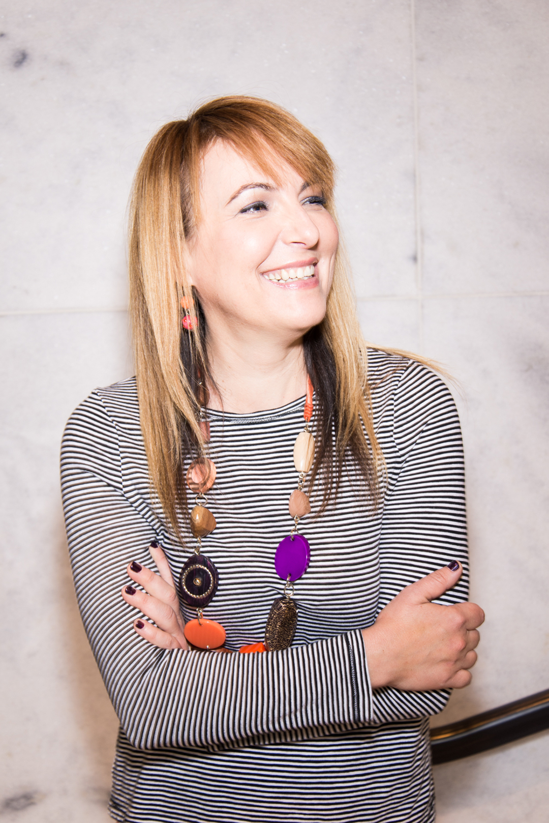
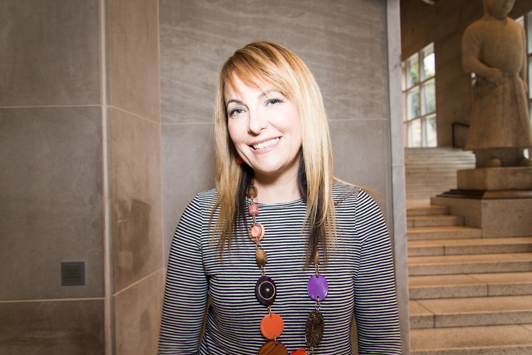
Carina del Rosario was born in the Philippines and immigrated to the United States as a young girl. She uses photography, digital media and visual art to explore the desire for community. She earned her BA in Communication from Santa Clara University in 1991. She has studied photography with Magnum Photographer Alex Webb, Rebecca Norris Webb, Raul Touzon, and Eddie Soloway. As a teaching artist she collaborates with non-profit organizations and educational institutions to help illustrate issues such as poverty, education, health, and civil rights. She is founder of the International District Engaged in Arts (IDEA) Odyssey, a collective that promotes cultural diversity, community development, and economic prosperity in Seattle’s International District/Chinatown neighborhood through visual arts.
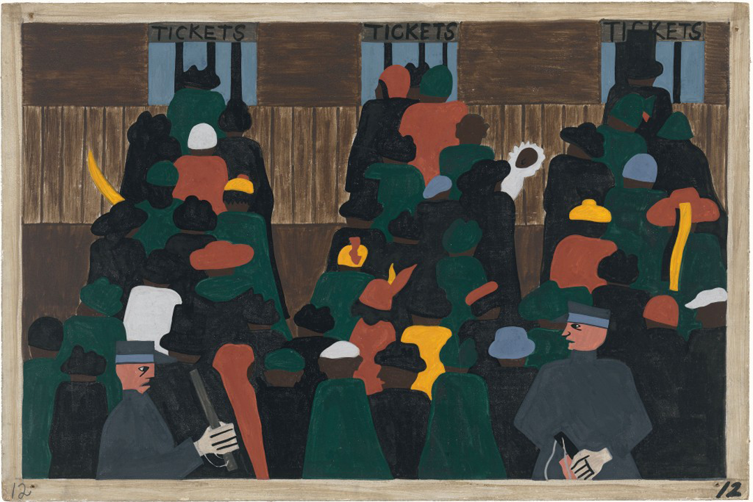
Image: The Migration Series, Panel 1: During World War I there was a great migration north by southern African Americans., 1940–41, Jacob Lawrence, American, 1917–2000, casein tempera on hardboard, 12 x 18 in., Acquired 1942, The Phillips Collection, Washington, D.C., © 2016 The Jacob and Gwendolyn Knight Lawrence Foundation, Seattle / Artists Rights Society (ARS), New York.