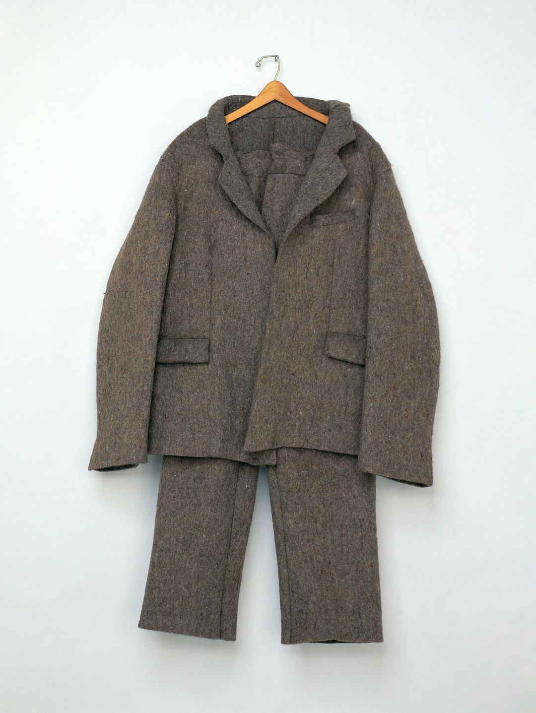
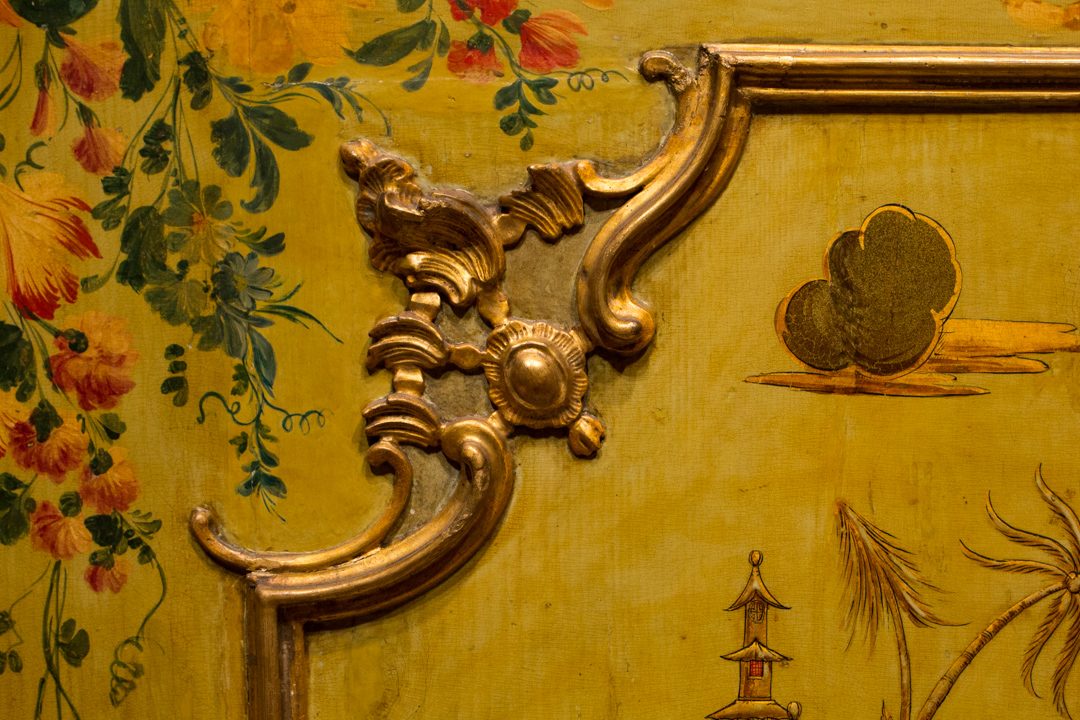
Norbert Herber on “Mobile Section”

“Everyone has a part to play in this tradition, whether you work with indigo or not. Anyone who wears blue jeans has a part to play in this tradition.” – Norbert Herber

What sound does a seed make? How about compost? Experience how digital images and color can translate to timber in the hands of Norbert Herber.

As you enter Mood Indigo: Textiles From Around the World you encounter a contemporary compliment to the historic scope of the exhibition exploring this vibrant dye. A collaboration between textile artist Rowland Ricketts and sound artist Norbert Herber, “Mobile Section” is a responsive and immersive installation combining a large-scale, hanging textile and field recordings of Ricketts’ indigo dyeing process synthesized using data from various conditions that produced the dye and color gradations of the cloth in the installation. Sensors in the gallery register people as they move around the installation and accelerate or decelerate the sound mix so that the audio element on “Mobile Section” will never sound the same twice.

See this work before it’s too late—it will be on view through October 9 in the exhibition Mood Indigo: Textiles From Around the World at the Asian Art Museum in Volunteer Park.

FTW! Wendy Wees Winning at Art

Wendy Wees is one of 41 talented artists exhibiting work in SAM’s kick-rear-end staff art show, on view through October 2 in the first floor Community Gallery off South Hall at Seattle Art Museum. Wees won recognition from her peers at the show’s opening on September 7, when her piece was selected by viewers as the favorite from this group of thoughtful, diverse artworks. One intriguing quality of Wees’s painting relates not to what it reveals, but to what it denies the viewer.

Her award-winning painting, titled Verticalverses017.ptg, is part of a new, exploratory series for the artist that she calls Vertical Verses. These colorful works, appropriately arranged in vertical bands, play with script in a way that recalls, and references, Mark Tobey’s “white writing.” In her process, Wees paints on the vertical bands in layers, in some passages allowing the color blocks to visibly overlap and bleed into one another. Then, using a range of tools, she carves beautifully calligraphic characters into the color blocks, scraping at the paint and revealing the layer beneath. These characters lead the eye fluidly down and back up the canvas. Within each band, Wees works in the same script style, filling the color block to create an all-over design pattern, and showing impressive control in doing so. From one color block to the next, the characters and their stylistic influences change: Wees varies the shape, curvature, and width of the marks, as well as their impression of energy. The final result is a lively piece that features a range of scripts resembling, in different passages, Latin and Islamic manuscripts, Chinese and Japanese calligraphy, and fanciful doodles.

The characters in Wees’s Vertical Verses draw us in, and then stunt our understanding. They are unintelligible, part of a category called “asemic” writing—a term that describes lettering with no semantic content. Literally speaking, the groupings of characters don’t mean anything. But the forms, as visual art, prove absorbing and more than capable of communicating.

More work from the Vertical Verses series by Wendy Wees

For Wees, as for other artists who have employed asemic marks, such as Tobey, the choice to imagine and invent characters rather than working with a known and recognized alphabet, is liberating. First, denying viewers the access to one straightforward message opens up myriad possibilities of individual readings. The work prods a lazy viewer into activity, as the viewer’s role in creating meaning, always present, comes to the fore. In this way the artwork’s ability to communicate becomes dramatically enhanced. Wees wants viewers to actively engage with her work, and her unintelligible script prompts this kind of interaction. “I find that people are drawn into the paintings because there are layers of ‘visual stories,’” she explains. “Viewers are searching for the meaning. I have seen them inspecting the work close up and then standing way back, and then being drawn in again.” Finally, the part of her work that is youthful and whimsical, maybe a reflection of her background as an illustrator, finds its best expression in an art that moves her viewers into an imaginative mode of thinking with bilateral idea-sharing. At the heart of Wees’s creativity is her belief in art’s transformative power. “Art is a powerful mode of communication which transports viewers to other worlds, other feelings and different thoughts and ideas,” says Wees. “It does not have to be a complex response,” she adds, pointing to the way her paintings communicate on a visceral level without stating anything explicitly.

Wees has worked for SAM for almost ten years and has devoted much of that time to the SAM Shop. In her current role as Retail Sales Associate, one of her responsibilities is to assist with crafting new shop displays, for which her team draws inspiration from SAM’s rotating special exhibitions. It’s a role that encourages and sparks Wendy’s creativity. As an artist, Wees also counts access to SAM’s permanent collection as an invaluable encouragement to her own work.

Her persistent efforts as a practicing artist have earned Wees representation at Gunnar Nordstrom Gallery in Bellevue, situated adjacent to Bellevue Square, where she received an exhibition in 2014. In addition to showing at Gunnar Nordstrom Gallery, Wees has exhibited at Soulard Art Gallery in St. Louis (2013); Rob Schouten Gallery on Whidbey Island (2012, 2010); Krab Jab Studio in Georgetown (2011); Columbia Art Gallery in Hood River, Oregon (2010); and the Frye Art Museum (2001).

Congratulations and thanks to Wendy for her thoughtful painting and her important work in the SAM Shop! You can see more of Wendy’s work at Gunnar Nordstrom Gallery’s website.

—Jeffrey Carlson, SAM Collections Coordinator

Images: Courtesy of Wendy Wees, from the series Vertical Verses.

Object of the Week Landscape: Autumn

With the onset of fall, some lament the end of summer, but the vivid beauty of the season and the assuring rhythm of change just make me grateful to be alive in such a scenic place. I find it worth musing on: Tuning into the natural artistry of the moment makes it easier to lose those long, warm summer days.

But if you’re still in need of centering, we’re your blog!

Helping us to embrace the autumnal mood, this six-panel Japanese folding screen depicting Autumn poetically pictures a misty chill over the water and the hillsides. Exposed but stubborn trees dot the landscape with green. All across the screen figures enjoy the waning bounty of land and sea, busily preparing for the coming winter: fishing, traveling, gathering. The screen embodies a visual poem to fall.

Landscape: Autumn

To lead you further down the path to fall zen, here is an offering of seasonal poems from the master of the haiku, Matsuo Bashō (1644-1694):

None is travelling
here along this way but I,
this autumn evening.

The first day of the year:
thoughts come—and there is loneliness;
the autumn dusk is here.

Autumn wind
through an open door—
a piercing cry.

On a withered branch
a crow has alighted:
nightfall in autumn.

—Jeffrey Carlson, SAM Collections Coordinator

Image: Landscape: Autumn, 16th century (Muromachi period, 1333-1573), Attributed to Sesson Shukei (Japanese, 1504-1589), ink and color on paper, 66 15/16 x 138 3/16 in. Seattle Art Museum, Eugene Fuller Memorial Collection, 68.127, Photos: Paul Macapia.

Get to Know SAM’s VSOs: Michelle Waits

MICHELLE WAITS
Originally from Cincinnati, Michelle lived in LA, Santa Barbara, and spent 20 years in Hawai’i before settling in Seattle four years ago. She has a degree in Cultural Anthropology and her career has been in communications as a writer, editor, and coordinator, and in theatre administration.

SAM: Big Picture: Art After 1945 opened in July. Which artist or piece do you like seeing the most?

Waits: The Rothko—it just takes my breath away. Part of the reason I love it is that I saw a Rothko exhibit at The Guggenheim some years ago where the pieces were displayed chronologically. The early pieces were in bright colors and the canvases gradually got darker and darker as the artist sank into extreme depression. I am so happy to see a painting of his that makes my heart soar instead of feeling sadness.

What is your favorite piece of art currently on display at SAM?
In the Go Tell It: Civil Rights Photography exhibit, there is a wonderful picture of Jackie Robinson. It’s meaningful to me because he was a close friend of my father-in-law and was my brother-in-law’s godfather.

Who is your favorite artist?
I couldn’t choose. My favorites change constantly as I discover and revisit art everywhere from the museum to the street. Unlike most VSOs, I don’t make art of have a degree in museum studies. I just have a great love for art.

What advice can you offer to guests visiting SAM?
My best advice is to spend time with the art rather than just taking pictures. You have an incredible opportunity to see some spectacular things in their original states. A photo may be a good memory but it’s nothing compared to the real thing right in front of you.

Tell us more about you! When you’re not at SAM, what do you spend your time doing?
I spend a lot of my time in my PJs on my sofa with my laptop working at my other jobs. I co-own Cut Bank Creek Press, a small press dedicated to publishing Native American writers. I also work with and coordinate speaking engagements for my friend and business partner Gyasi Ross, who is a brilliant speaker, author, mentor, and a myriad of other things. When there’s any time left over, I read and like to go listen to my friends’ bands.

Katherine Humphreys, SAM Visitor Services Officer

Photo: Natali Wiseman.

Object of the Week: Guanyin

Have you ever purchased something at full price, feeling slightly guilty about it, only to find a sale item that suits you even better? Something similar happened to Dr. Fuller in the early 1930s, as he was seeking to expand his Chinese art collection in new directions.

[Fuller] acquired . . . a large Guanyin in pale glaze with ivory tone from Yamanaka in 1931 for $2,500. With a dated inscription of 1615, the Guanyin is among the few extant figures commissioned by patrons of the Kaiyuan Temple in Zhanzhou (in modern-day Fujian province). Seven months after that acquisition, Fuller encountered a whiter blanc de chine Guanyin of similar size. It was allegedly bought from Spain after the revolution and was priced at $900 by Roland Moore. Fuller bought it at once. The price gap between the two Guanyin probably bothered Fuller, especially because the latter work is whiter and hence more attractive, with a more elaborately carved base positioning the Guanyin on an auspicious beast emerging from or riding on water. Commenting on the Yamanaka Guanyin from Zhangzhou, Fuller noted that ‘years of incense smoke discolored its crackled glaze.’ He proposed exchanging the Guanyin for a Tianlongshan sculpture in 1934 . . . and Yamanaka graciously accepted. Luckily, the Guanyin remained in Seattle. Yamanaka resold the work to Fuller for $750. He made the right decision to keep the Yamanaka Guanyin because it matches the Moore Guanyin beautifully.1

The best decision, as we all know, is to walk away with both! Not only do the two Guanyin complement each other in form, as former SAM Chinese art curator Josh Yiu notes, but the message carried by the Guanyin bodhisattva is one that resonates deeply today, and Dr. Fuller’s choice to buy back his original porcelain Guanyin doubly enhances its life-giving presence at SAM. Known as Lord of Mercy, Guanyin represents boundless love and compassion. In the Mahayana doctrine, extending love to all people figures as an important step on the path to enlightenment.

Guanyin

The second, whiter Guanyin purchased by Dr. Fuller will graciously greet you on your next visit to the Chinese art galleries at the Asian Art Museum.

—Jeffrey Carlson, SAM Collections Coordinator

1 Josh Yiu, A Fuller View of China, Seattle, Wash.: Seattle Art Museum, 2014; 56-63.
Image: Guanyin (detail), 17th18th century, Chinese, Qing dynasty (1644-1912), Dehua ware: porcelain, 33 1/2 x 9 x 9 in. Seattle Art Museum, Eugene Fuller Memorial Collection, 33.38, Photo: Natali Wiseman. Guanyin, 1615, Chinese, Ming dynasty (1368-1644), Dehua ware: porcelain, 34 x 10 x 9 1/4 in. Seattle Art Museum, Eugene Fuller Memorial Collection, 33.39, Photos: Natali Wiseman. Guanyin (detail).


Rowland Ricketts on “Mobile Section”

Mood Indigo: Textiles From Around the World is a chance to absorb a unique spectrum of global history from Flanders to Africa, tapestries to kimonos—the exhibition balances ancient fragments with the inclusion of an immersive contemporary installation by Rowland Ricketts, an artist working in traditional indigo dying techniques. “Mobile Section” is made up of a large, indigo-dyed textile, 11½ ft. tall by 30 ft. circumference, dried indigo plants, and a video illustrating the indigo cultivation and dying process. Watch this video with the artist for more information on his process and how, beyond the blue, indigo is about the deep connection of the physical labor that connects Ricketts to other people who have also worked with indigo.

Field recordings of Rickett’s indigo process—growing, processing, vatting, and dyeing—were synthesized in collaboration with sound artist Norbert Herber and the audio reacts to the movements of visitors in the gallery as they move around the large hanging textile. The work plays upon the notions of materiality and immateriality, and is a true multisensory experience.

You’ve got one more month to see Mood Indigo at the Asian Art Museum in Volunteer Park before it closes October 9. So go on, give yourself the blues.


Object of the Week: Keet Shagoon (Killer Whale)

Family, thresholds, and the mutually beneficial relationship between collecting and creating tell the story of Preston Singletary’s carved glass screen Keet Shagoon (Killer Whale).

Singletary was raised here in Seattle. His parents were artistic; his father painted and wrote poetry, and his mother wove textiles and crocheted. Their engagement with the arts encouraged Singletary to pursue art-making. As a young artist he studied with friend and mentor Dante Marioni at the renowned Pilchuck Glass School, where he would work with mentors Benjamin Moore and Lino Tagliapietra, among others. He joined and contributed to a studio glass movement driven by a close cohort of Pilchuck artists. He was also, intrinsically, part of a second family of artists, who were Native artists. On this side, Singletary lists Joe David, Robert Davidson, and Dempsey Bob as important influences. By the example and encouragement of Singletary’s Native peers, including Marvin Oliver, he was led to explore his ancestral history through his artistic practice, and he began incorporating Northwest Coast Native design into his work in 1987. In several ways SAM’s 2003 Keet Shagoon represents the culmination of that trajectory in Singletary’s career. It is a contemporary re-imagining of an interior house screen, one of the most important items of clan property, which served to display the clan’s heritage through images representing its ancestors and benefactors. The killer whale is Singletary’s family crest symbol.

Interior house screens held an important ceremonial role in Native life. In the cedar plank house, they separated the chief’s quarters from the rest of the living area and provided a portal through which he could make a dramatic entrance. The work’s form represents a threshold, and Singletary has also remarked on how the medium of glass can be “a threshold to the future for the cultural growth of Native people.” There’s more. In 2003, SAM exhibited 13 of Singletary’s works in the Native American Galleries in an exhibition called Preston Singletary: Threshold. In his artist statement Singletary explained the importance of the term for him, as he came to see himself standing at the nexus of ancient Northwest Coast Native traditions, his own world, and the future. Native art, with its roots in the physical world of cedar and pigment, and its spiritual significance, seemed to him a link between the earth and the cosmos. Finally, SAM’s purchase of Keet Shagoon memorialized another poignant moment of transition: the passing from life to death.

Yéil X’eenh (Raven Screen), ca. 1810, attributed to Kadyisdu.axch’.

Yéil X’eenh (Raven Screen), ca. 1810, attributed to Kadyisdu.axch’.

John H. Hauberg (1916-2002) was a successful businessman in forest resource management and lumber, a Native arts enthusiast, and an astute collector who worked directly with Native owners, dealers, and auctioneers to form an exceptional private collection. Hauberg’s generous gifts to SAM over the years 1983–1991 built the foundation of the museum’s notable Native American art collection. Acquiring Keet Shagoon in honor of Hauberg, a year after his passing, was a fitting choice. The Pilchuck Glass School, at which artist Preston Singletary had learned his craft, had been funded by Hauberg and his first wife, Anne Gould Hauberg in 1971; and SAM’s famous Raven Screen, which had directly inspired Singletary to produce Keet Shagoon before his 2003 show at SAM, had been donated by Hauberg in 1979. SAM wouldn’t have Keet Shagoon—and we all wouldn’t be able to enjoy it—without both of their contributions.

—Jeffrey Carlson, SAM Collections Coordinator

Images: Keet Shagoon (Killer Whale), 2003, Preston Singletary (Tlingit, born 1963), fused and sand carved glass, 72 x 92 x 3/8 in. Seattle Art Museum, Purchased in honor of John H. Hauberg with funds from the Mark Tobey Estate Fund, John and Joyce Price, the Native American Art Support Fund, Don W. Axworthy, Jeffrey and Susan Brotman, Marshall Hatch, C. Calvert Knudsen, Christine and Assen Nicolov, Charles and Gayle Pancerzewski, Sam and Gladys Rubinstein, SAM Docents, SAMS Supporters, Frederick and Susan Titcomb, and Virginia and Bagley Wright, 2003.12, © Preston Singletary, Photo: Susan Cole. Yéil X’eenh (Raven Screen), ca. 1810, attributed to Kadyisdu.axch’ (Tlingit, Kiks.adi clan, active late 18th-early 19th century), spruce, paint, 105 3/4 x 129 in. Seattle Art Museum, Gift of John H. Hauberg, 79.98, Photo: Paul Macapia.

Object of the Week: Tapestry of America

The tapestries of the continents that feature in Mood Indigo: Textiles from Around the World at the Asian Art Museum are simply stunning art objects, almost too much to see, each offering a near-constant barrage of decorative detail that takes time and energy to decipher. Happily, their aesthetic abundance encourages return visits. As particularly exaggerated allegorical portrayals, the tapestries provoke more thoughts about the values of the culture that produced them than the actual life of 17th-century inhabitants of Asia, Africa, and America. Or maybe we think Native women did lounge about, attended by tobacco-smoking cherubs, petting alligators?

Tapestry of America (detail)

As an American citizen, I find the Tapestry of America especially interesting to consider. On a staff tour of Mood Indigo, SAM curator Pam McClusky pointed out one detail that has echoed in my brain since, prodding me to think on it whenever I see the tapestry. Near the feet of the enthroned lady of America stand three stacks of gold coins, with a small pile next to them. The coins are ignored by the figures and occupy an unimportant place in the composition; they are as easily overlooked by the viewer as by America and her active attendants. With this detail, the makers of the tapestry commented on the value of money in cultures other than their own. America, we see, is laughably uninterested in gold and riches.

Tapestry of America (detail)

It’s clear that cultural tensions are surfacing here, but what exactly are they, and where do they originate? University of Washington professor of history Benjamin Schmidt helps us to identify what’s happening in the tapestry in his 2015 book Inventing Exoticism: Geography, Globalism, and Europe’s Early Modern World.

Writing on the late 17th and early 18th centuries in Europe, Schmidt points to maps and other material objects that reflect consistent opinions on what was European, what was not, and how the European related to things non-European. Of course, implicit in those ideas was an assumption that Europeans did it better. Take, for instance, commodities. Schmidt writes that “Europeans, even as they dearly coveted them, believed only they understood an object’s ‘true’ material value, while non-European peoples, notwithstanding their casual regard of them, failed to grasp the worth of those very goods they so richly possessed.”1 The maddening judgment present in the picture visualizes Schmidt’s thesis perfectly: Gold coins would sit at the feet of the Natives; they just didn’t understand true value.

Tapestry of America (detail)

A related point revealed in the tapestry is the Europeans’ readiness to take. Schmidt explains how, in their portrayals of exotic lands, early modern Europe developed a habit of thinking about the broader world as a consumable commodity, theirs for the taking.2 This “exotic” other world was essentially “agreeable” and ripe for plundering. So, even as the makers of the tapestry ridicule its subject for valuing anything above gold, we also see Europe’s greedy desire for tobacco reflected in the smoking cherub. Tobacco, like everything else, could probably be taken, because it probably wasn’t valued rightly.

Profound cultural differences and centuries of difficult history have made the Tapestry of America a charged work, one that is rewarding to engage.

—Jeffrey Carlson, SAM Collections Coordinator

1 Benjamin Schmidt, Inventing Exoticism: Geography, Globalism, and Europe’s Early Modern World, Philadelphia: University of Pennsylvania Press, 2015; 256-257
2 Schmidt, Inventing Exoticism, 228.
Images: Installation view of Mood Indigo: Textiles from Around the World at Asian Art Museum, © Seattle Art Museum. Photo: Natali Wiseman. Tapestry of America (detail), late 17th c., Jacob van der Borcht (Flemish) and Jan Cobus (Flemish), wool, 156 x 144 1/8 in. Seattle Art Museum, Gift of the Hearst Foundation, Inc., 62.1991, Photos: Natali Wiseman.

Object of the Week: Persephone Unbound

Beverly Pepper’s Persephone Unbound draws out a tension that is central to the human experience, echoed in our mythology, and enacted in both art and life: the contrast between restraints and the desire to be released from them.

A work in cast bronze, the varied textures of the sculpture’s several facets give the appearance, instead, of poured concrete, in various states of leveling and finish. Near its base the surface of the sculpture bears the kind of textural depth that marks stucco walls, but here they are magnified to the sculpture’s monumental scale. As the eye scans upward to take in ten feet of vertical mass, passing over gravelly sections and dripping globs, more discrete forms begin to emerge, and the visual impression of human manufacture and intervention becomes more acute. The sculpture’s tallest arm is clean-cut, smoothly finished. Where initially the work might seem a monolithic rock formation roughly hewn, it emerges as a precisely chosen crystallization of contrasts, something in between natural and (wo)manmade. It’s a work that strikes me as if it’s perpetually in formation.

The artist has given us a particularly leading title as a way into her thinking. Persephone’s role in Greek mythology elicits sympathy for the character, and for the reader, a sense bitter loss. Persephone is an aching reminder of what could be. Hers is a pure beauty only sometimes accessible; her abundance, pleasant as it is to enjoy, is fleeting, ever accompanied by the foreboding of its imminent end. She wishes to be free, we wish her to be free, but that’s not the way of things.

What would it mean if Persephone were unbound? What if the goddess of spring growth were also the goddess of growth all the time, everywhere, forever?

The myth explains the reality of changing seasons, an immutable truth of the natural world. But Persephone Unbound begs us to imagine what restrictive realities exist that are of our own making—how have we limited ourselves, and one another, by lack of imagination, or belief, or desire? What about our world is not as good as it could be?

Persephone Unbound is one of seven works by Beverly Pepper in SAM’s collection. A widely recognized sculptor, Pepper has been the subject of solo exhibitions at the Metropolitan Museum of Art, the Brooklyn Museum of Art, Ohio’s Columbus Museum of Art, the Albright-Knox Art Gallery, and the San Francisco Museum of Modern Art. The sculpture has been an integral part of the Olympic Sculpture Park since the park’s opening in January of 2007.

[youtube id=”z9lrVZdaluk” mode=”normal” autoplay=”no”]

—Jeffrey Carlson, SAM Collections Coordinator

Image: Persephone Unbound, 1999, Beverly Pepper (American, born 1924), cast bronze, 122 x 31 1/2 x 21 in. Seattle Art Museum, Gift of Jon and Mary Shirley, 2009.14 © Beverly Pepper, Photo: Paul Macapia.

SAM Book Club: The Last Painting of Sara de Vos

Welcome back to SAM Book Club! Today we’re here to discuss Dominic Smith’s newest novel, The Last Painting of Sara de Vos.

This is a book that’s hard to describe succinctly. In 1637 Amsterdam, artist Sara de Vos diverges from her training as a still-life painter to paint the landscape At the Edge of a Wood, an enigmatic work she makes as she mourns her daughter’s death. In 1957 Manhattan, the painting is stolen from the home of Marty de Groot, whose family has owned the work for 300 years. And in 2000 Sydney, renowned art historian Ellie Shipley is curating an exhibition of 17th century female Dutch artists when she learns that two versions of At the Edge of a Wood are traveling to her gallery: the original, and the forgery that she herself painted in 1957. Is your head spinning yet?

As difficult as it is to make an elevator pitch of the book’s plot, the three storylines mesh fairly seamlessly as Smith swerves between them—and as they begin to crash into each other. Although they are separated by centuries, the lives of the three main characters become intimately interwoven as they orbit around the painting.

In fact, I said there are three main characters, but you could make a case for four: Sara, Marty, Ellie, and At the Edge of a Wood. The painting itself has a presence, a personality, an impact on the events taking place. It certainly has a gravitational pull on the hapless artist, collector, and curator.

Harder to pinpoint than the plot itself is the category this book fits into. It could be considered a mystery, but the question of who stole the painting is answered on the book jacket. Some of the chapters read like historical fiction, but there’s a definite lean towards “fiction” over “history.” And I suppose there is a romantic relationship subplot, but it reads as more of a dysfunctional cat-and-mouse game than anything else to me. The easiest is to lump it with the seemingly ever-growing category of “art heist book”—think Donna Tartt’s The Goldfinch, Rebecca Scherm’s Unbecoming, and B.A. Shapiro’s The Art Forger*—but even that feels unsatisfying: the heist is hoisted in chapter one. What now?

Which brings me back to those four main characters. I think this is ultimately a book that is driven by characters, by relationships, and by the things we do to make, maintain, or break them. And ultimately it hinges not on relationships between people (although there is plenty of material there to armchair psychoanalyze), but on the relationship between people and objects. Or, I should say, one object, that fourth character which is the planet to Sara, Marty, and Ellie’s moons.

I suspect many of us have had a love affair with an art object: a work that moves you, that stays with you for years, that changes the way you think and maybe even changes the direction of your life. Isn’t that what drives us to art museums? The close encounter with art objects, and the chance to let them teach and inspire you?

But for the three human characters in the novel, the relationship with At the Edge of a Wood is anything but healthy. For Sara, painting it is an act of mourning she is driven to complete, as if it will assuage her grief or extend the too-short life of her daughter. For Marty, even as he seeks to reclaim the painting he suspects it has been a bad luck charm, blaming it for generations of ill health and unhappiness. And as for Ellie: what kind of self-destructive act is it to write a book about the very painting she forged, to spend a career shedding light on that one work, and to literally invite the crimes of her past to her doorstep? That is some serious projection of personal issues onto someone (or something) else.

As the plot thickens so do these issues until—they release. Sara finds happiness and love; Marty lives a long and happy (enough) life; and Ellie lets go of her demons, or they let go of her. And all three are able to rekindle a healthy relationship—a spark of new romance—with the object that inspired it all to begin with.

What did you think of The Last Painting of Sara de Vos? Tell us in the comments, and stay tuned for the announcement of next quarter’s book!

—Carrie Dedon, Curatorial Assistant, Modern & Contemporary Art

*See what I did there? Bonus books to tide you over until the next SAM Book Club installment! You’re welcome.

Photo: Natali Wiseman

Manson F. Backus: Print Collector, Book Collector

Did you know that the Bullitt Library is accessible to the public and often highlights books and resources related to our exhibitions for visitors to view? Visit the latest book installation related to Graphic Masters: Dürer, Rembrandt, Hogarth, Goya, Picasso, R. Crumb, on view just outside the Bullitt Library on the fifth floor of the Seattle Art Museum during the library’s public hours: Wednesday–Friday, 10 am–4 pm. Graphic Masters closes August 28, so hurry up and see it soon!

A Collector’s Collection

Several of the etchings by Rembrandt van Rijn (Dutch, 1606–1669) in the exhibition, Graphic Masters, are part of the Seattle Art Museum’s Manson F. Backus Memorial Collection. Manson Franklin Backus (American, 1853–1935) was a well-known, successful Seattle banker and philanthropist that, toward the later part of his life, became a learned collector of art objects. He traveled extensively to Europe and beyond amassing a large collection, over twenty-five years, of fine prints, other types of art, and a substantial library to support his learning.

Self Portrait with Saskia by Rembrandt

His engraving and etching collection was regarded with much esteem in the region. He regularly loaned prints to exhibitions at the Seattle Fine Art Society—an organization that would ultimately become the Seattle Art Museum—and then to the museum itself. In 1935, upon his death, his collection of more than 300 etchings and engravings was bequeathed to the Seattle Art Museum. Selected works from this collection have been exhibited over the years, notably in Manson F. Backus Memorial Exhibition: Etchings and Engravings in 1935; a three-part exhibition—Manson F. Backus Memorial Collection of Etchings by Masters—shown in 1937; and more recently, European Masters: The Treasures of Seattle, the companion exhibition to Rembrandt, Van Dyck, Gainsborough: The Treasures of Kenwood House, London in 2013.

“. . . a collector of etchings must be something of an artist in appreciation. . . . and judging by the prints on the walls of the entrance hall and the library of Mr. Backus’ Highlands home, his appreciation has been wide and sure.”
—“Second Hobby, Done Well, Is Found In M.F. Backus’ Etching Collection,” Seattle Sunday Times (February 1, 1931)

A Collector’s Library
In 1935, upon Backus’ passing, in addition to the print collection bequeathed, his extensive library on artists, technical aspects, and the collecting of prints was received by the Seattle Art Museum Library. The collection ranges from important titles of the 18th and 19th century, to titles that were likely purchased not long before his death. Each contains his distinctive bookplate that states: “Ex Libris, Confido in Deo [Trust in God], Manson Franklin Backus” and depicts a coat of arms with three doves and a chevron. We are pleased to be able to present a small sampling from the approximately 160 volumes that were willed to the library.

mb3

Among his library are a number of fine editions, but none is more unique and interesting than Etchings: A Collection of 50 Invitation Cards Sent by Eminent Artists and Etchers to Art Patrons, a bound volume of collected invitation cards and etchings. Included within is an etching by William Hogarth (English, 1697–1764) and original sepia drawings by Clarkson Frederick Stanfield, R.A. (English, 1793–1867) after Rembrandt and Meindert Hobbema (Dutch, 1638–1709). Not a lot of information is known about this work. An advertisement tucked into the volume confirms that the firm of George Bayntun in Bath, Somerset, England, bound the work, and that this was done sometime around 1900, but the person who compiled the collection is unknown. Additionally, no other edition of this work is known.

Hogarth print

—Traci Timmons, Librarian, Dorothy Stimson Bullitt Library

Object of the Week: Water Babies

Once a founding member of the Society of Independent Artists, a close friend of fellow member Marcel Duchamp, an artist called original and innovative, and an active participant in the programs of the Société Anonyme—John Covert lived and died, well, anonymously.

Given Covert’s very short career, we should not be surprised that he is not a household name. His period of creative maturity lasted eight years, from 1915 to 1923. A stay in Paris just before this period proved uncharacteristically unfruitful—Covert later lamented that he wasn’t able to connect with the artist-intellectual circle there—and the disappointment of the Paris trip was a harbinger of a sad fortune. Covert returned to the US and contributed to an important moment for modern art, playing his role as a founder of the Society of Independent Artists, and serving as its first secretary in 1917. Working from his studio in New York, Covert received brief visibility with a solo exhibition of his paintings at M. de Zayas Gallery. Little came of it; in the larger art world he remained unknown and unappreciated. Pressed by poverty, he found himself unable to eat regularly, with no income to show for his artistic endeavors. He finally closed his studio in 1923.

During the second quarter of the 20th century Covert’s work was known only to friends and one-time peers. So few of his works were seen publicly that the artist did not develop any kind of reputation. He was actually thought to have destroyed all his works when he closed his studio, but that widely held belief changed in 1959, when eight Covert paintings arrived at SAM. In fact, the artist’s friend Kathleen Lawler had preserved some of Covert’s works, and it was Lawler’s brother-in-law that donated them to the museum. On September 18 of that year, SAM director Dr. Richard Fuller wrote a note of thanks to the donor, Paul Denby Mackie, expressing his admiration for Covert’s work, saying “Although he is not well known he played an important part in the development of modern art which I feel sure will be more widely appreciated in years to come.” Kudos to Dr. Fuller for seeing what many directors, especially at that time, would not have seen.

The arrival of the Covert paintings at SAM encouraged new study of the artist’s work. The Dallas Museum for Contemporary Arts included Covert in its 1960 exhibition American Genius in Review. It’s cruel that he died a recluse that same year. The visibility of the Dallas exhibition provoked more interest, leading to graduate dissertations and theses that have placed Covert’s work amid the traditions of symbolist art and New York Dada. Four of Covert’s works have essentially been on permanent view since SAM’s expansion in 2007. He is, as Dr. Fuller anticipated, more widely appreciated than in 1959. However much Covert’s legacy grows in the future will depend to a large extent on SAM’s collection of Covert paintings (now seven), their exhibition and reception.

I find Covert’s work a quirky kind of fascinating, and especially magnetic to me is Water Babies. In this painting, the artist plays with the visual phenomenon of refraction. A peculiarity of physics, refraction makes our eye see an object bending and changing form as it is partially submerged under water, while our mind understands that the object itself remains unchanged. By painting the visual effect of refraction, Covert offers the viewer a chance to muse on reality, our perception of reality, and the slippery boundary that separates the two. The dolls would be creepy enough rendered as straight illustrations, but with certain parts disjointed and enlarged, they are like the beginnings of a bad horror film. Water Babies is memorable, even if the artist’s name isn’t.

John Covert's signature

At the lower right, Covert has signed the painting, with his fingerprint standing in to form the “O.” It’s not an especially graceful signature. To the left of the thumbprint, near its top, he incised the painting with a “C”, and opposite the thumbprint, a “V”—apparently an unsatisfactory first attempt. The finished signature, along the bottom of the thumbprint, seems to have been first incised and then traced in with graphite. The thumbprint, too, is encircled in graphite. Altogether, the signature serves as an odd, very personal, memento of a distinctive artist who may never be truly recognized.

—Jeffrey Carlson, SAM Collections Coordinator

Image: Water Babies, 1919, John Covert (born Pittsburgh, Pennsylvania, 1882; died Pittsburgh, Pennsylvania, 1960), oil on paperboard, 25 1/4 x 23 in. Seattle Art Museum, Gift of Paul Denby Mackie in memory of Kathleen Lawler and Nona Lawler Mackie, 59.152, © Seattle Art Museum, Photo: Paul Macapia.

Get to Know SAM’s VSOs: Mark Howells

Everyone knows museums have security guards, but not everyone gets to know the people behind the uniform. We spend our days with the works of artists such as Pablo Picasso, Donald Judd, Andy Warhol, and Claude Monet, learning the nuances of each piece.

Johan Idema wonderfully describes museum guards in his book How To Visit An Art Museum as follows:

In order to put up with picture takers, soda smugglers and amateur art critics, guards require both the alertness of a police officer and the empathy of a kindergarten teacher. Consider museum guards the ground troops of the art world, who deserve your utmost respect. Some of them actually have amazing knowledge of art – former guards include painters such as Jackson Pollock and Sol LeWitt.

Many guards would speak with great passion, if only we asked them. Therein lies your opportunity. Have your questions ready and make your move when the gallery is quiet. Whatever the conversation, you will likely find that guards are able to offer what is often lacking in museums: human interaction and a proper conversation about art.

With Idema’s words in mind, we invite you to get to know us, SAM’s Visitor Services Officers (VSOs), with a monthly spotlight.

MARK HOWELLS
Raised between Portland and Bellingham, Mark Howells has been in the Puget Sound region for 30 years. He did IT Security and Audit before coming into the museum scene. In 1974, he worked his first museum job at the Oregon Historical Society as a junior summer docent. However, what lead him down the path to guest services was his experience in visitor studies during an extension course at the UW where he volunteered with the Washington State History Museum. Mark has worked at SAM since November 2015.

SAM: Graphic Masters: Dürer, Rembrandt, Hogarth, Goya, Picasso, R. Crumb comes to an end on August 28. Which artist have you enjoyed the most in this exhibit?

Howells: R. Crumb. He’s my generation. I had to hide his comix from my mom when I was a kid. Alternative comix were a fun part of my kid-hood, so I guess the nostalgia factor with Crumb was the best part.

What is your favorite piece of art currently on display at SAM?
The Bierstadt (Puget Sound on the Pacific Coast). He got the gray of the Pacific Northwest skies just right. That’s hard to do. I know that the location was just from his own imagination, but I go down to that area at the mouth of the Columbia quite a bit and I always look to see if I can find “that place.”

Who is your favorite artist?
I’m a historian, not an artist. Recently, I’ve studied up on local Pacific Northwest artists, so maybe Philip McCracken right now.

What advice can you offer to guests visiting SAM?
Ask questions. Don’t be intimidated. It’s just art.

Tell us more about you! When you’re not at SAM, what do you spend your time doing?
I like to hike around the Puget Sound and nerd-out on the history all around us. I’m trying to learn more about the built history in our communities. I do volunteer history work for the Camp Harmony Executive Order 9066 Committee (the Puyallup Fairgrounds was an Internment Camp in 1942) and I’m on the Archives Committee for the Queen Anne Historical Society doing glamorous digitization projects for them.

—Katherine Humphreys, SAM VSO

Mark Howells with Philip McCracken’s War God. Photo: Natali Wiseman.

Object of the Week: Bell with five-pronged handle

SAM’s Bell with five-pronged handle, one of the works you can visit now at the Asian Art Museum, looks an angry and forbidding object. Pointed prongs wend upward from the bell’s handle, emanating from the mouths of snarling lions, curving like the teeth of a predator. A band of decoration on the handle features a circle of human faces, each one with its brow angrily furrowed. Come hither and ring me! it does not bid you. It looks like something that could just as easily be found here.

Yet the bell has a striking form, and looking more closely reveals the thoughtfulness of the work’s form and decoration. To dig into the concepts present in the work we have to think about vajra. A Sanskrit term, vajra means both “diamond” and “thunderbolt,” carrying the connotations of strength and power that those things embody—an indestructible jewel, a boom and flash of energy. More than a concept, the vajra is also a visual form. Looking back at the bell, the five prongs at the top make up a vajra. A vajra can feature different numbers of prongs, and elsewhere on the bell one will find single and three-prong vajras in decorative motifs, as well as the torture-y five-prong vajra at its top. The form of the vajra has specific meaning in the Buddhist visual language, in which it signifies the vow of a Buddha or bodhisattva. Everything on the bell has meaning: Lotus blossoms, enflamed jewels, and more vajras on the body of the bell signify the presence of the Buddha, his law, and his priesthood.

Detail of the base of the Bell

Situated in GOLD: Japanese Art from the Collection, the Bell with five-pronged handle joins other fine art and functional objects, including portable shrines, hanging scroll paintings, a sword stand, a fan, ceremonial kimono, netsuke, sake cups, and a folding screen. One of my other favorite works in the show lies somewhere between functional and purely formal: a Hooded Cape meant to be worn by the wife of a Japanese feudal lord on the specific occasion of a fire. I have to think the absurdity of that purpose essentially makes it a decorative object.

The bell and its company in GOLD reveal a culture that has infused religious and philosophical symbolism into its functional objects. “Used” or not in their first lives, they all now have a second existence as museum artworks, as examples of exceptional craftsmanship and markers of cultural stories. Gilt bronze amid other works in gold leaf, gold lacquer, gold thread, and pure gold, the bell shows, on the part of its maker, an appreciation for eye-catching aesthetics, complemented by a desire for stimulating thought.

—Jeffrey Carlson, SAM Collections Coordinator

IMAGE: Bell with five-pronged handle, 12th-13th century, Japanese, Late Heian period (794-1185)-early Kamakura period (1185-1333), gilt bronze, 9 1/4 x 4 1/4 x 1/4 in. Seattle Art Museum, Eugene Fuller Memorial Collection, 49.237, Photo: Natali Wiseman.

Object of the Week: High Level of Cat

CatDrumArtist PaletteThinking FaceFace Without Mouth

(When words fail, emoji. Inspired by the artist’s playful incorporation of visual puns into his work, I decided to unpack the layered concepts of High Level of Cat by David Hammons, now on view in Big Picture: Art After 1945, solely in emojis. We welcome your translations in the comments!)

ManNew York CityArtist PaletteSpeakerHaircutPaperclipThrowing away litter

CatSaxophoneDrum

CatSkull & CrossbonesCoffinWeary Cat Face

Confounded Face

Post OfficeArtist PaletteMuted SpeakerElderly Man

Hand Pointing Up

Artist PaletteRight Left ArrowMusic NotesTrumpetSaxophoneGuitar

Artist PaletteRight Left ArrowEarEyesNoseTongue

Confused Face

Artist PaletteMan With TurbanMan with Gua Pi MaoGirlElderly WomanRainbow

Artist PaletteFlag for United StatesFlag for TurkeyFlag for FranceFlag for JamaicaFlag for Cameroon

Face with Tears of Joy

Artist PaletteNo EntryMoney BagDollarsWealthy

Smiling FaceClapping Hands

Pile of PooArtist Palette

Angry Face

ManClapping Hands

—Jeffrey Carlson, SAM Collections Coordinator

IMAGE: High Level of Cat, 1999, David Hammons (American, b. 1943), wood, taxidermied cat and mixed media, 96 x 24 x 24 in. Seattle Art Museum, Gift of the Virginia and Bagley Wright Collection, in honor of the 75th Anniversary of the Seattle Art Museum, 2009.50, © David Hammons, Photo: Natali Wiseman.

The Late Caprichos of Goya: A Gift to the SAM Libraries

During the exhibition, Graphic Masters: Dürer, Rembrandt, Hogarth, Goya, Picasso, R. Crumb, the SAM Libraries is showcasing an exceptional work in the Lockwood Foundation Living Room near the exhibition entrance.

We are honored to present an important recent gift to the Dorothy Stimson Bullitt Library: Late Caprichos of Goya: Fragments from a Series (New York: Walker & Co., in association with the Department of Print and Graphic Arts, Harvard College Library, 1971). This limited edition illustrated book, with photomechanical lithograph reproductions and six original etchings, was donated in 2015 by Stuart and Beverly Denenberg.

Why is this work on Francisco José Goya y Lucientes (Spanish, 1746-1828), published in the 1970s, so special? In short: exceptional scholarship in a beautifully-produced volume, containing extremely rare prints. Written and compiled by Eleanor A. Sayre (American, 1916-2001), one of the first female curators at the Museum of Fine Arts, Boston, this work has been described as “a book of exceptional quality . . . and importance.” The Late Caprichos of Goya: Fragments from a Series was published in an edition of 150 copies, with the Bullitt Library’s copy being number 79. It is the only known publicly-accessible copy in the Pacific Northwest.

The rare prints that are included in this work were created from three double-sided copper plates Goya made in the 1820s. Thirty years after Goya’s death, the plates were purchased in Spain by an English diplomat, John Savile Lumley (British, 1818-1896), from Goya’s grandson. They eventually made their way to the London firm of P. & D. Colnaghi where they lay in a drawer for over a decade, until they were bought by Harvard librarian and print scholar, Philip Hofer (American, 1898-1984), in the 1930s—notice the PH embossed in each print at lower right.

Witch on a Swing

In the 18th century, according to the Royal Spanish Academy Diccionario de la lengua castellana (Madrid 1791), the word, “capricho” meant “In works of poetry, music, and painting, it is that which is done by the power of invention rather than by adherence to rules of art. It is also called fantasy.”

Goya completed these caprichos in 1825, a quarter century after the original series of 1799. Those earlier prints can be read as political and clerical critiques, and made Goya an important moralist to those contemporaries who truly understood their meaning. Goya published the original series during the reign of Carlos IV, hoping that enlightened men and women would see and heed his criticisms, and that some public good might result from the work. For this later series, which is believed to be only the fragmentary beginning, there are—unlike the original series—no titles or details which may have caused trouble. In her commentary, Sayre wonders: “We shall probably never know how great a risk the old artist intended to take.” He was then 80 years old and died three years later.

Maja, after Goya

goya-installation-3

To see the book and these late caprichos in person, visit the Lockwood Foundation Living Room, just inside the exhibition. While there, take time to peruse some of the great resources selected by the SAM Librarians in the pop-up library.

– Traci Timmons, Librarian, Dorothy Stimson Bullitt Library

Photos: Natali Wiseman.

Object of the Week: A Shepherdess Adorned with Flowers

In an old photo from SAM’s archive, we see the inimitable Dottie Malone examining the museum’s painting by Dutch master Gerrit van Honthorst before it was exhibited in the two newly finished Kress galleries in October, 1954. There’s something of straitlaced concern visible on her face; her left arm fully outstretched, she seems to be keeping the painting at a safe distance. She’s at least not visibly impressed. I wonder if the low-cut blouses of the three shepherdess figures, and the abundant flesh laid bare, didn’t quite meet with her approval. If she were scandalized in the ‘50s, she would have been far from the last. The painting is coming up on 400 years old and can still sometimes draw a blush or a stern look of disapproval. What an accomplishment!

Dottie Malone examining the painting

Besides being sexy, Honthorst’s A Shepherdess Adorned with Flowers is masterfully painted, rosy pinks and mellifluous yellows playing against the porcelain skin of its heroines. Theatrical light, a reminder of Caravaggio’s lasting influence on Honthorst, captures the figures as actors in a stage play—and in a sense, that’s what they are. Painted to accommodate courtly and aristocratic taste, pastoral scenes like this one offered a momentary escape from the pressures and strictures of the early modern world. Blatantly artificial, they conjured an idealized world of love and leisure, reflecting nostalgic desires for intimacy with nature and human desires for release from the morals and rituals that governed daily life. Responding to a world that disallowed dalliances, Honthorst imagines a more primal world that blithely sanctions them. Given the look of availability about the main figure, few would be surprised to hear that literary and visual traditions of the time linked the shepherdess and the sex worker.

Officially acquired in 1961, SAM had the painting seven years earlier than that. On May 12, 1954, Kress Foundation art director Guy Emerson wrote to Dr. Fuller with updates on the Foundation’s recent activities, including a mention of our fine Honthorst painting: “I am enclosing a photograph of a painting by our old friend Honthorst which we all saw at Knoedler’s last week and like very much. Mr. Kress thought that it ought to go to the National Gallery and Walker and Modestini felt that it was the best Honthorst they had seen in America. It is gay and fresh and full of color and life.” In short order, the Kress Foundation had acquired the painting with Dr. Fuller and SAM in mind.

Telegram

The Honthorst arrived in a batch of artworks from the Kress Foundation that also included Bernardo Strozzi’s Hagar and the Angel, Veronese’s Venus and Adonis, Abraham van Beyeren’s Banquet Still Life, and Massimiliano Soldani’s bronze The Lamentation over the Dead Christ. October 15, 1954 marked the first display of the Honthorst in Seattle, the grand opening of SAM’s Kress galleries, and the confirmation of an important relationship between the museum and the foundation.

–Jeffrey Carlson, SAM Collections Coordinator

A Shepherdess Adorned with Flowers, 1627, Gerrit van Honthorst (Dutch, 1590-1656), oil on canvas, 43 9/16 x 39 13/16 in. Seattle Art Museum, Samuel H. Kress Collection, 61.156, Photo: Paul Macapia.

SAM Book Club: Up Next – The Last Painting of Sara de Vos

Welcome back book lovers! It’s time to announce this quarter’s read for SAM Book Club.

For those who missed our inaugural installation of this new virtual club, here’s how it works: Once a quarter, I’ll be selecting a book about art to talk about here on SAM Blog. We’ll announce the book about a month before the book club date so that you can get your hands on a copy and read along. We’ll meet back here on the blog a month later to discuss in the comments.

This month we’ll be reading The Last Painting of Sara de Vos, by Dominic Smith. The publisher describes this newly-released novel as “a collision course between a rare landscape by a female Dutch painter of the golden age, an inheritor of the work in 1950s Manhattan, and a celebrated art historian who painted a forgery of it in her youth.” I mean, can you resist?

Pick up a copy, take it to the beach, or the pool—or wherever these sunny summer days are calling you—and meet me back here on August 25 to discuss The Last Painting of Sara de Vos!

—Carrie Dedon, Curatorial Assistant, Modern & Contemporary Art

Object of the Week: Bent-corner chest

Spewing facts can bore just about anyone, but there are some really good facts that are enchanting. Here’s a big hat tip to the Seattle Aquarium for its fun-fact billboards and ad banners around town, from which I’ve discovered how ridiculously sweet otters are and some other awesome tidbits. As in conversations about marine animals, facts figure importantly in talking about art because they illuminate the rare, remarkable, phenomenal aspects of great artworks. They lend substance to our imaginings on art and they can also inspire new thoughts and creative responses.

One simple fact about SAM’s Bent-corner chest spurred me on to investigate it further: The four sides of the chest have been formed from a single plank of wood. “Tell me more, chest!” I said.

Bent-corner chest

It boggles my mind to think about forming four sides of a box from a single plank of wood, and apparently it boggles many minds because the bent-corner technique is unique to Native artists of the Northwest Coast. Beginning with a long plank of wood, the artists would shape the walls of the box by carving some portions thinner, readying the plank for folds. At the points where the plank will bend, they cut notches across the plank, called kerfs. Cutting the kerfs carves out the needed space for the wood to fold into itself. The plank is steamed—traditionally over hot rocks and seaweed—making it pliable enough to bend. From there, the artists make three folds, bringing the walls together at 90-degree angles. The fourth corner is joined together with an adhesive. The joined corner remains visible, so the makers would orient that corner toward the back of the room where the chest is placed, and the whole decorative program for the chest would be planned out accordingly, with the primary designs on the opposite, frontal side. It’s a show of perfect craftsmanship and thoughtful presentation.

The designs on SAM’s chest were executed by Captain Richard Carpenter, who is especially important as one of only a handful of named Native artists of the 19th century. Captain Carpenter’s English name communicates his role as a carver and boat maker, and he was also a second-ranked chief. The evenly distributed, sinuous formlines we see are characteristic of Captain Carpenter’s style, as are the large areas of negative space, enlivened with bright blue and red paint.1

Bent-corner chest

Purpose and symbolism converge in the Bent-corner chest, which would have served as storage space—housing clan regalia and heirlooms—and as a seat for a chief. Literally supported by the chest and the items inside that represent the clan’s tradition, the chief has a physical connection to these objects of importance. He also assumes a position of symbolic power as the clan’s guide and protector, figuratively supported by its history.

What does your seat say about you?

—Jeffrey Carlson, SAM Collections Coordinator

1 Martha Black, Bella Bella: A Season of Heiltsuk Art, Toronto, Ontario, Canada: Royal Ontario Museum; Vancouver, B.C., Canada: Douglas & McIntyre; Seattle, Wash.: University of Washington Press, 1997: 110-111.
Bent-corner chest, ca. 1860, Captain (Richard) Carpenter (Du’klwayella) (Heiltsukw, Waglisla, 1841-1931), yellow cedar, red cedar, paint, 21 1/4 x 35 3/4 x 20 1/2 in. Seattle Art Museum, Gift of John H. Hauberg and John and Grace Putnam 86.278, Photo: Natali Wiseman.

Object of the Week: Black pottery vase in shape of hu

SAM’s remarkable Black pottery vase in shape of hu is among the museum’s earliest acquisitions. The vase’s object number, 33.6, communicates that it was the sixth piece formally accessioned in the museum’s inaugural year of 1933, and of the objects added to the collection that year, the vase is the first to survive deaccessioning; sadly, 33.1 through 33.5 are no longer with us.

Dr. Fuller purchased this Warring States period ceramic jar for $150 from a New York dealer named Roland Moore. Roland, the son of a Chinese dealer named Rufus, continued in the family business, selling mainly snuff bottles and ceramics.1  The vase is just one of 259 items that Fuller purchased from Moore, and though not every one of these selections was a home run, Fuller did benefit from the connection, establishing the beginnings of a strong Asian ceramics collection that we enjoy today.

Dr. Fuller, who has been proven over time a very successful collector, was still developing his taste at this early stage. He landed on the Black pottery vase in shape of hu at a moment when he was moving beyond his initial collecting interest—snuff bottles—and looking to jades and ceramics. While expanding the art forms he considered for acquisition, he simultaneously became interested in adding Chinese works from various dynasties to increase the breadth of the collection. This vase, with its intriguing decorative designs, and its 3rd-century B.C. date, added new dimensions to SAM’s Chinese collection.

For me, the vase is a tour de force in imitation. Though ceramic, it imitates bronze by its burnished shade of brown-black, echoing patina. The taotie mask that adorns two sides of the vase is a typically bronze decorative motif, but here it is, carefully worked onto the body of an earthenware piece. At the historical moment when the vase was made, ceramic offered an economic alternative to costlier bronze; hence we see a ceramic dressed up as a bronze.

Fascinating geometric and animal designs adorn the vase. As our eye scans it, we notice that horizontal ridges attempt to organize the decoration into separate registers. On the neck and on the largest register of the body, scaly beasts look backward toward curling tails. Jagged vertical lines mark the first register below the neck; the second register features nesting triangles interspersed with sawtooth serrations; in another register beneath that, irregular diamonds run across the vase, linked together by script-like horizontal lines.

Throughout the vase, an interesting dialogue occurs between the potter and the decorator—maybe a conflict between a regimented and more freeform approach to artistic decoration. The indented bands that separate the vase into its various registers would have been formed when the vase was initially thrown, probably on a potter’s wheel; the incised decoration was added later. On the middle of the vase, notice how the legs and feet of the dragon creatures transgress the boundaries of their register, creeping over the horizontal bands. I liken this decoration to coloring outside the lines. It’s as if the dragon, mysterious and powerful, refused to be contained by the space allotted to it. Elsewhere, too, we see incised design overlapping the structuring horizontal bands and playfully interacting with the form of the vase, creating a final impression of an artwork that is, itself, a conversation.

—Jeffrey Carlson, SAM Collections Coordinator

IMAGE: Black pottery vase in shape of hu, ca. 3rd century B.C., Chinese, Warring States period (481-256 B.C.), black earthenware with incised decoration, 13 13/16 in.; girth: 31 1/4 in.; diam. top: 4 1/2 in. Seattle Art Museum, Eugene Fuller Memorial Collection, 33.6, Photo: Paul Macapia.
1 Josh Yiu, A Fuller View of China, Seattle, Wash.: Seattle Art Museum, 2014; 36-37.

Object of the Week: Crystal Math

Don’t do this, but. . . If you were to bring a stack of Marvel comics to the Seattle Art Museum, ride the escalator to the third floor, take a left turn, pass the video installation, and look up at the wall to your left, you’d find installed on that wall a custom-built box that fits your comics perfectly. However, it’s sideways, and it’s a museum artwork.

The piece you’d be looking at is sardonically called Crystal Math. It visualizes a collaborative effort between brothers Oscar Tuazon and Eli Hansen. As brothers do, they’ve worked together on projects since their childhoods and this piece represents the particular interests of Tuazon in architecture and Hansen in glass art. Their collaborative art takes on traditional views that separate “high” and “low” art forms into different contexts. Crystal Math thoughtfully, playfully mingles them all.

The humble material of plywood, simply arranged into a box, contrasts the precious blown glass, artfully made. The cerebral architectural theory that informs the glass geodesic domes, which are references to the visionary Buckminster Fuller, contrasts the world referenced by the pipe-like spout on the upper dome, recalling drug paraphernalia. Then there’s the fact that Tuazon and Hansen have incorporated a box fashioned by their father for holding their comic books into an art installation on the wall of a major museum. Thinking about this piece in terms of high or low art forms, fine art or craft, really leads us nowhere; thinking about it as a creative act brings us to all kinds of fun readings.

Tuazon, who won the Betty Bowen Award in 2007, is a local artist with international appeal. He and his brother were born on the Port Madison reservation on the Kitsap Peninsula, just East of Poulsbo and North of Bainbridge Island, and they attended high school in Port Townsend. Tuazon studied at Cooper Union in New York and also completed the Independent Study Program through the Whitney Museum of American Art before moving back to the Northwest and working in Tacoma. He moved to Paris, a biographical detail that reflects his many connections abroad, and has now settled in Los Angeles. Tuazon has exhibited work in Zurich, Brussels, Berlin, Geneva, Rome, Oslo, Paris, and Tokyo, as well as in New York and LA.

Both Tuazon and Hansen participated in the residency program at Pilchuck Glass School, and right now Crystal Math joins works by other Pilchuck students, most notably Dale Chihuly, in SAM’s galleries. It also offers a point of connection to Graphic Masters: Dürer, Rembrandt, Hogarth, Goya, Picasso, R. Crumb. Not only does Graphic Masters feature the art of a legend in comics, R. Crumb, who I’m sure would be pleased to hear of Tuazon’s and Hansen’s comic book box, but it also juxtaposes work that many would consider traditional with Crumb’s notably anti-traditional illustrations. Plywood and print works, Picasso and pipes—they’re all coming together at SAM!

—Jeffrey Carlson, SAM Collections Coordinator

IMAGE: Crystal Math, 2007, Oscar Tuazon (American, b. 1975) and Eli Hansen (American, b. 1979), blown, cut, assembled glass and plywood, 36 x 30 in. Seattle Art Museum, Gift of Merrill Wright, in honor of the 75th Anniversary of the Seattle Art Museum, 2007.69, © Oscar Tuazon and Eli Hansen, Photo: Natali Wiseman.

Building a Digital Collection: Annual Reports at Seattle Art Museum

The following post is from two students who have been interning at SAM’s Dorothy Stimson Bullitt Library while completing their Master of Library and Information Science degrees at the University of Washington’s Information School.

We are Michael Besozzi and Kate Hanske, and we have been working with Librarian Traci Timmons in the Dorothy Stimson Bullitt Library on an exciting digital initiative for the culminating work of our degree program. At the University of Washington’s iSchool, every student must complete a Capstone project, which should apply classroom theory to address a real-world information problem. For our Capstone work, we decided to tackle an information gap presented by access to SAM’s institutional annual reports.

Dating back to 1932, the reports include information about specific accessions, ongoing museum activities, exhibitions, and other special events in addition to the financial statements for the year. In a survey of nearly 900 American museums and cultural institutions, only 171 host their annual reports online. Out of those 171 institutions, many have unaccountable gaps between years of published reports. In the library, we saw an opportunity for SAM to create a unique digital collection and exhibition that includes every annual report in the museum’s history. We decided to aim for three outcomes for the digital collection: accessibility, transparency, and posterity.

The Bullitt Library is composed of “open” and “closed” stacks. The “open” stacks consist of shelves containing materials that any member of the public, from curators to visitors, can browse and handle without the assistance of a staff member. The “closed” stacks, located in a back room, contain a number of historical special collections materials. Due to the fragility of special collections materials, the closed stacks are only accessible by staff and designated volunteers. Located in those closed stacks are the Seattle Art Museum’s annual reports, dated from 1932 to the present.

SAM Libraries Annual Reports Archives

In order to access a report from a particular year, a visitor must have a staff member physically walk into the collection, pull out the box from the time range, and bring it to the patron, who must browse the materials in the box for the desired information. Requests for annual reports are common, ranging from staff members attempting to research financial records to visitors researching the history of the museum and the museum’s collections.

Annual Reports 1940s

Typically, a patron will perform a search that will require several boxes to be pulled at one time, which can also take up a lot of physical space in the small library. To add to the problem, the physical annual reports are not easily searchable: if a patron wants to locate a specific individual, exhibition, or piece from the collection, the user must usually go through multiple boxes (and other resources) in order to find what they need. This process can be time-consuming and frustrating! Further, the frequent physical handling of the documents, particularly the most aged and fragile, can cause irreversible damage over time.

Annual Reports 1950s & 1960s

Annual Reports 1970s

The completion of this digitization project empowers patrons to conduct research with the reports without being physically present in the library and without requiring the assistance of library staff and volunteers. The reports are more fully accessible to the public, which facilitates institutional transparency, and they are preserved digitally for posterity.

To create this collection, we scanned all 71 annual reports into the PDF file format and ran a program to make sure that the documents themselves are searchable. We then created a spreadsheet to store essential metadata (title, contributors, year, etc.) for the files to make the collection easy to navigate in an online environment. We uploaded these files and the associated metadata to the online repository and platform called Omeka.net

Annual Reports 1980s

Annual Reports 1990s

Once uploaded, we set about building and developing an online exhibition. With Omeka.net, we were able to customize the exhibition display, organizing the reports by decade, and share the narrative history of the museum as told through the reports themselves. This is the first online collection of its kind for SAM and we are incredibly excited to finally make it available!

—Kate Hanske and Michael Besozzi, Dorothy Stimson Bullitt Library Interns

You can explore the annual reports via the Omeka website here.

And watch a short video overview of the project here.

Photos: Natali Wiseman.

Object of the Week: Crown (Ade)

Delicate beadwork, strung together in pleasing patterns and color combinations, blankets the surface of a Yoruba crown, or ade, made to be worn only by a king, or Oba. The great care and effort applied by the crown’s makers remain evident for us to see and appreciate.

Minute beads are artfully arranged over every inch of its surface. The crown, standing about one and a half feet tall, has an imposing presence even on its own. It comprises three sections, or registers. On the lowest register, a circular face looks out toward the viewer. His countenance is marked by big, protruding white eyes; triangles and a prominent “V” that suggest his forehead; vertical and horizontal bands that make for decorative cheeks; and a black mound that forms a nose. On either side of the face, diamond patterning alternates between blue, beige, gold, blue-striped white, and turquoise beads. The patterning leads around the crown to a second, identical head on the back that we can’t see as the piece is installed.

Crown (Ade) (detail)

A rung of horizontal beads separates the lower register with the faces from a second, higher register, marked by the striking verticals of four peaks, or towers. Three outer towers originate, at their base, in horizontal bands, progressing upward in alternating chevrons of white, blue, and pink beads, capped by more horizontal bands—looking a bit like wine bottle necks. The three outer peaks encircle a central tower that bears lively color bands of gold, green, pink, sky blue, and navy blue, culminating in a half-dome of swirling, intertwined gold and green beads.

Atop the central tower, and the tallest feature of the crown, rests a figure of two birds fused together at their mid-sections, one head facing toward us, and the other facing opposite. The whole piece is visually remarkable and worth admiring at close range for a good while.

Crown (Ade) (detail)

Many years now after its completion, the crown continues to exude reverence—aimed by its makers at its wearer. For the Yoruba, the crown transcends its widely applied role as a decorative accessory: It embodies the essence of kingship, marking the king as a mediator between heavenly and earthly realms. Consider that if the king is absent, and the crown is placed on his throne, the king’s subjects observe the same strict level of protocol as if the king himself were there. That is a tremendous amount of respect to accord headwear, and it’s a level of respect that has driven artists to produce wonderfully crafted pieces like SAM’s Yoruba Crown.

It was not only meticulously but thoughtfully done. Symbolic meaning lives in the patterns, colors, and imagery. Certain colors are associated with certain gods in the Yoruba pantheon, while the frontal face may represent Ododuwa (Odua), the mythic father of the Yoruba. By donning this crown of fabric and glass beads, the wearer boldly, visibly communicated that he could trace his lineage back to the mythical founder of the Yoruba kingdoms.

—Jeffrey Carlson, SAM Collections Coordinator

Image: Crown (Ade), Yoruba, 19th-20th century, cloth, glass beads, fiber, height: 17 in.; diameter: 8 in. Seattle Art Museum, Gift of Dr. Oliver E. and Pamela F. Cobb, 91.251, Photos: Natali Wiseman.

Below the Surface with Martha Rosler

“The montages were works that were not intended as art. I made them as Xeroxes. It used to be at demonstrations somebody would hand you this incredibly text-ridden sheet of mimeographs against war, and I had this idea not to have any text at all, just pictures to be handed out at demonstrations, and that’s where they went.”

–Artist Martha Rosler on the origin of her series House Beautiful: Bringing the War Home, 1967-’72

Martha Rosler: Below the Surface focuses on two series of photomontages by Martha Rosler—House Beautiful: Bringing the War Home (1967–72) and House Beautiful: Bringing the War Home, New Series (2004–2008). Rosler works across a range of media—including photography, video, writing, performance, sculpture, and installation—addressing social and political issues of the public sphere and everyday life, from gender norms and labor issues to consumer culture and urban development.

Back Garden by Martha Rosler, 2004

Back Garden by Martha Rosler, 2004

“This exhibition shows a selection of Rosler’s early work, which addresses political, social, and media issues that have remained at the forefront of her practice to this day. It is a special honor to present this exhibition at this time, as Rosler was singled out by the New Foundation Seattle as the recipient of its inaugural 100K Prize,” said Catharina Manchanda, SAM’s Jon and Mary Shirley Curator of Modern and Contemporary Art. The New Foundation Seattle established the prize as a biennial award to be presented to an influential, US-based woman artist in honor of her exemplary artistic achievements and enduring commitment to her practice.

Martha Rosler: Below the Surface is on view at Seattle Art Museum through July 4, 2016.

Images: Cleaning the Drapes, 1967-72, Martha Rosler, American, b. 1943, photomontage, 17 5/16 x 23 3/4 in., Courtesy of the artist and Mitchell-Innes & Nash, NY. Back Garden, 2004, Martha Rosler, American, b. 1943, photomontage, 20 x 24 in. Courtesy of the artist and Mitchell-Innes & Nash, NY.

Object of the Week: The Triumph of Valor over Time

As an arts institution situated in a once very isolated part of the country, the Seattle Art Museum grew and developed into the museum it is today only by the generosity and boldness of its supporters. Our co-founders, Dr. Richard Fuller and Margaret MacTavish Fuller, both played central roles in SAM’s success story. Another figure who became crucial to the museum in its formative years was Sherman E. Lee, who served as Assistant Director and Associate Director over four years at SAM, 1948–1952.

Lee was a specialist in Asian art, and Dr. Fuller brought him on board specifically to grow this part of the collection, but his impact would be felt in much broader ways. It was Lee who had the vision to convincingly lobby for Seattle to be included in a regional galleries program launched by the Kress Foundation during Lee’s tenure at SAM. The Kress Collection was a five-and-dime fortune converted into a nearly unmatched holding of European Old Master artworks. As a result of Lee’s ambition, Seattle and SAM became one of 18 regional sites selected to host pieces of the same prestigious collection that fills much of the Renaissance galleries at the National Gallery of Art in Washington, DC.

A full view of The Triumph of Valor over Time by Giovanni Battista Tiepolo

Not only was SAM chosen to receive some of the fine Kress pictures, but in a moment of plucky brilliance, Lee negotiated for an even better group of artworks than were originally intended for Seattle. In May 1950, Lee made his case to Kress Foundation art director Guy Emerson, writing that “our Ancient, Medieval, and Oriental collections contain many master works comparable to some of the famous paintings in the National Gallery and those in Mr. Kress’ marvelous living room. Consequently, we are interested in seeing our own Western tradition of painting represented by works which will bear comparison with the others.”1 His is a bold proclamation of Northwest arts pride, the fruits of which we’re still enjoying today, as the Kress artworks remain the core of SAM’s European painting and sculpture collection.

As good as Sherman Lee was for SAM, and for the Cleveland Museum of Art, where he would serve as director from 1958 until 1983, he and SAM almost missed big on one of the most memorable pieces in our collection. Looking over the original list proposed by the Kress Foundation, Lee was enthused about a sketch by Giovanni Battista Tiepolo but had reservations about the related ceiling fresco, transferred to canvas: “one or two of the proposed gifts are extraordinarily exciting, notably the Tiepolo sketch (incidentally, the ceiling itself is too large for us).”2

Too big?! Incidentally?! Thank goodness that wasn’t the end of the conversation. Imagine if we missed out on the remarkable Tiepolo ceiling The Triumph of Valor over Time because of its awesome dimensions. What a loss it would have been. In the end, accommodations were made, with SAM raising the ceiling height of its Kress-devoted gallery five feet in order to provide a suitably illusionistic viewing experience.

Installation view of SAM's Porcelain Room

Today, The Triumph of Valor over Time looms above the Porcelain Room, where its 18th-century aesthetic and pastel palette play well with the artfully arranged decorative objects filling the space. In a nearby gallery you’ll spot the masterful little bozetto, or painting sketch, that initially caught Sherman Lee’s eye.

—Jeffrey Carlson, SAM Collections Coordinator

IMAGES: The Triumph of Valor over Time, ca. 1757, Giovanni Battista Tiepolo (Italian, 1696-1770), fresco transferred to canvas, 200 x 90 in. Samuel H. Kress Collection, 61.170, Photo: Paul Macapia. Installation view of the Porcelain Room at the Seattle Art Museum, Photo: Paul Macapia.
1 Quoted by Marilyn Perry in “The Kress Collection,” in A Gift to America: Masterpieces of European Painting from the Samuel H. Kress Collection, ex. cat., New York: Harry N. Abrams, Inc. in association with the North Carolina Museum of Art; The Museum of Fine Arts, Houston; the Seattle Art Museum; and The Fine Arts Museums of San Francisco, 1994; p. 28.
2 Ibid., 29.

Object of the Week: Decorative Astrolabe

When SAM acquired a quiet and exquisite Persian Decorative astrolabe in 2009, it was enacting a throwback to the collecting philosophy of our founding director, Dr. Richard Fuller. A trained geologist who put great store in studying things closely—in practicing connoisseurship, to use a pretty untrendy word—Fuller aimed to detect the intricacies of art objects through time and attention. He was deeply interested in how things were made, a perpetual tinkerer. He also seems to have enjoyed discovering why things were made a certain way, and especially how they were first used. Many of us won’t think of an object’s function as particularly relevant to an assessment of that thing as art, but it definitely factored into Dr. Fuller’s deliberations.

In his memoir on the founding and growth of SAM, A Gift to the City, Dr. Fuller writes a straightforward apology for the museum’s collecting strategy: “Within our limited means we endeavor to acquire authentic items of high aesthetic quality and, if possible, functional interest. I strive for items that reflect the creative talent of each period and which, in geologic terms, serve as index fossils for their specific time and culture.”1

In sum, he looked for beautiful objects that told stories. In this framework it mattered significantly whether an object visibly reflected a certain people or time or place, and readily apparent signs of an original use or context were coveted. Functional objects were not only not avoided but embraced. There is logic to this: If we want to know something about people who are distanced from us, seeing their stuff and knowing exactly how it is, or was, used can be very helpful.

Decorative Astrolabe, Persian

I love the Persian Decorative astrolabe because it is an “index fossil” of the kind Dr. Fuller was always after, but it also has subtle and crafty ways of teaching us.

First, the ways that it falls into his categories: As the single most important astronomical tool of the Middle Ages, the astrolabe holds great functional interest. Astrolabes were, at one time, widely used by navigators, astronomers, mathematicians, and theologians to solve problems related to the motion of celestial bodies. The astrolabe stands as a symbol of the many scientific accomplishments of an era and the specific culture of medieval Islam. It’s also suitably small. Dr. Fuller bought many little things, maybe reflecting his reserved personality, but definitely reflecting his desire to leverage limited funds to the greatest effect. Finally, it has “high aesthetic quality,” to borrow Dr. Fuller’s geologic nomenclature. Precisely and carefully decorated, it would no doubt have passed this portion of the test. Calligraphic script dances across the surfaces of its interlocking discs, broken up by elegant decorative patterns.

In one clear way SAM’s Decorative astrolabe differs from Dr. Fuller’s expectations. It was likely never functional but always a decorative object. Other technologies began to replace the astrolabe for its functional use in the 17th century; this example, dating to the 19th century, was probably never needed for navigating the seas or charting planetary movements. It’s a vestigial tool, a once-functional object rendered obsolete.

So we look at this object, and it seems to, but doesn’t really, tell us how its original audience related to it. It’s cheeky, throwing us for a loop. Of course, that doesn’t mean that it doesn’t have stories. It just means the stories are different than what we expected to hear. It opens up so many new questions, like why, in the 19th century, in Persia, the memory of the astrolabe remained so strong that an artisan produced this fine example?

Decorative astrolabe, 19th c., Persian, Qajar period (1794-1925), brass, 4×3 in., Seattle Art Museum, Gift of Jeff Strickler, 2009.65.1, Photos: Natali Wiseman.
1 A Gift to the City: A History of the Seattle Art Museum and the Fuller Family, Seattle: Seattle Art Museum, 1993; p. 24.

Object of the Week: Elevator screen from the Chicago Stock Exchange

The unfortunate thing about clichés is that they disguise the nuance of truth. When we remember Louis Sullivan, we whip out the phrase “form follows function” and, by doing so, suggest the famed architect as a harbinger for a minimal style of building, one that came to define the modernist movement in architecture. SAM’s Elevator screen from the Chicago Stock Exchange shows Sullivan, instead, as a master of creative ornamentation. What gives?

Sullivan often gets the epithet “father of modern architecture.” His legacy might be a bit misunderstood by some. His most famous quote derives from an essay so drily titled that it’s a wonder anyone ever read it: “The Tall Office Building Artistically Considered.” It’s actually very dramatically written. He spells out his purpose for the treatise in a masterful passage of overblown rhetoric, posing this rhetorical:

“Problem: How shall we impart to this sterile pile, this crude, harsh, brutal agglomeration, this stark, staring exclamation of eternal strife, the graciousness of those higher forms of sensibility and culture that rest on the lower and fiercer passions? How shall we proclaim from the dizzy height of this strange, weird, modern housetop the peaceful evangel of sentiment, of beauty, the cult of a higher life?”1

In what follows, Sullivan lays out his philosophy on architecture. First of all, we find that, for Sullivan, “form” most closely meant ornamentation. So when he says “form ever follows function,” he means something like “ornamentation comes after use.” He is not saying that form (ornament) doesn’t matter—a misinterpretation that led many to understand him saying decorative elements were unnecessary. Sullivan’s approach was to address function first, and then get creative with the form, “to proceed step by step from general to special aspects.”2

Elevator Screen from the Chicago Stock Exchange by Louis Sullivan

How did he come to this conclusion? Everywhere in nature, he says, the essence of a thing is reflected by, and embodied in, its shape.3 Efficient shapes make for sensible things that work well and survive. Are we arrogant enough to go against what’s natural and sensible? For, Sullivan proclaims, “It is the pervading law of all things organic and inorganic, of all things physical and metaphysical, of all things human and all things superhuman, of all true manifestations of the head, of the heart, of the soul, that the life is recognizable in its expression, that form ever follows function. This is the law.”4

First things first, Sullivan argues: Let’s get the use right, and then, working from that base, let’s have fun making it look good. With the Chicago Stock Exchange building, a fine example of a “tall office building” of the late 19th century, Sullivan brought his ideas to fruition. He saw the chief characteristic of skyscrapers, as we know them, as being “lofty”: “The force and power of altitude must be in it.”5 We see that power in the tall and commanding screen that has a strong presence in SAM’s American art galleries.

Elevator Screen from the Chicago Stock Exchange by Louis Sullivan

In ornamentation, too, we see Sullivan’s philosophy at work: The geometric shapes that decorate the grill, futuristic-looking circles and spheres, were actually made to represent seed germs for this, the nation’s largest agricultural stock exchange. There’s an important place for ornamentation in Sullivan’s design. The details just had to be smart, and they had to fit.

–Jeffrey Carlson, SAM Collections Coordinator

Image: Elevator screen from the Chicago Stock Exchange, ca. 1893-1894, Louis Sullivan (American, 1856-1924), Lintel, columns and kick plates: cast iron electroplated with copper; Grilles: cast and wrought iron protected with a Bower and Barff finish; Decorative T-shaped elements: electroformed copper; 114 x 165 x 6 in. Seattle Art Museum, The Guendolen Carkeek Plestcheeff Endowment for the Decorative Arts, the Gates Foundation Endowment, the General Acquisition Fund, and an anonymous gift in honor of Julie Emerson, 2008.81
1“The Tall Office Building Artistically Considered,” in The Western Architect XXXI (January 1922): 3
2 3
3 10
4 11
5 4

Printmaking in the Digital Age

What does the word “printmaking” mean in our digital age?

SAM Gallery’s June show, Contemporary Printmakers, supplies answers as varied as the artwork on view.

From the digital images of Stephen Rock and Troy Gua, to the mélange of techniques used by Kate Sweeney and Iskra Johnson, these artists use printmaking for many reasons. On the practical side, Gua says collector demand led him from painting to digital mediums. Meanwhile, Kate Sweeney’s desire is to push a two-dimensional surface into revealing three-dimensional space.

Luck or Chance: Many universes are possible, simultaneous and interpenetrated by Kate Sweeney

Printmaking, simplified, is when an artist works on one surface and then applies or transfers that work to a different surface. You’re probably familiar with how a wood block, an acrylic stamp, or a metal plate can be pressed onto a sheet of paper—this is printmaking. The idea of the repeatable image, or part of an image, has held appeal as a way to reprise elements of an artwork for artists and art collectors for millennia. Think of Andy Warhol and how his repeated gestures are fundamental to understanding the work as well as the artist’s intent.

View Corridor by Iskra Johnson

Today’s printmakers come to the medium for similar reasons but their toolkit includes computers, cameras, traditional print presses, handmade “pressure” prints, photocopies, and just about anything else that can be scratched and used to make marks on a surface. Whether it is the psychedelia of color explosions in Gua, Sweeney, and Rock’s work; or the whisper of minimalism in Rachel Illingworth’s pieces, the printmaking process helps artists tell their story in a multitude of ways.

When Flowers Speak to Clouds by Stephen Rock / From the Terrace (A Study of Edges) No. 6 by Rachel Illingsworth

Johnson says it best: “the process forces a certain surrender of control . . . with work that appears to have ‘arrived’ rather than having been ‘made’.” Her current body of work revolves around the theme of impermanence. Sweeney is contemplating gravity waves, dark matter, and all things quantum-theory related. And although 20th-century artist Agnes Martin didn’t work extensively with prints, it’s easy to see that she is a favorite of Illingworth’s. Gua wants to pay homage to the beautiful imagery and composition of Japanese woodblock prints, but also Northwestern-ize his work by using familiar landmarks.

Artist Curt Labitzke, a University of Washington Art Department Professor who runs the print studio there says his work in this show isn’t a print, but rather a painting. However, he used techniques to bring scratched elements through the back of the paper surface. So is it a print, based on the definition above? SAM Gallery invites you to see this show and decide for yourself.

The show runs June 9–July 7 and features the work of Northwest artists Troy Gua, Rachel Illingworth, Iskra Johnson, Curt Labitzke, Stephen Rock, and Kate Sweeney.

SAM Gallery is located in the lower level of Seattle Art Museum’s downtown location and open the same hours as the museum. All of the artwork is for sale and members can try before they buy, with a low-cost art-rental program.

Images: Somerset (Cathedral), Troy Gua, resin coated metallic chromogenic print on panel, 30 x 48 in. Luck or Chance: Many universes are possible, simultaneous and interpenetrated, Kate Sweeney, acrylic on paper collage with digital print, monoprint, braille print and transfer print, 46 x 49 in. View Corridor, Iskra Johnson, archival pigment print, 33 x 61 in. When Flowers Speak to Clouds, Stephen Rock, pigmented print with watercolor, mounted on board, 36 x 24 in. From the Terrace (A Study of Edges) No. 6, Rachel Illingworth, monotype with Pochoir, 40 x 31 in.

Object of the Week: Untitled

“After many years in my studio I found that the light from the surface was my predominant media. The interface of light and surface . . . . While ‘light and surface’ is a rather technical triptych of words, my emotional concern is how it feels to make the art.”
—Larry Bell

In 1960s Los Angeles, a loosely-affiliated group of artists began working not with paint and canvas, clay and wood, charcoal and pen, but with two less concrete mediums: light and space. The so-called (perhaps unimaginatively) Light and Space artists were responding to new ideas about viewer perception in art, and experimenting with new materials that were suddenly widely available from Southern California-based industries: polyester resin, coated glass, Plexiglas, neon.

While artists in New York were working with similarly industrial materials and playing with the viewer’s perception of space, the emphasis on light as a medium became unique to the L.A. group. This seems to have been no accident, but a response to the place itself—there’s a certain quality of radiant light that exists in Southern California, where the sun always shines, reflecting on the waves and cars and surfboards and refracting through the immutable smog. Say what you will about L.A., but they don’t make light like that anywhere else.

So it stands to reason that Larry Bell in his Venice Beach studio, immersed in California light and with direct access to newly available materials, would become interested in the emotive potentials of light and surface. Bell began his career as a painter, but soon became fascinated with the properties of glass after working at a picture framing shop. He experimented simultaneously with abstract painting and small constructions of cracked glass, and it wasn’t long before the two parallel practices began to merge—until he added glass onto a painting itself:

“Adding glass [to a canvas] was totally intuitive. I liked the work’s feeling of simplicity, and the fact that the imagery now included the wall behind the canvas. This led to incorporating the light in front of the canvas in an ‘unpainterly’ way. I chose mirrors to replace the clear glass. I scraped away the silvering so that the reflected light and the transmitted light created the shape of a tesseract, which was also the shape of the canvases.

Representing volume, created with light, reflected and transmitted, was now part of my process. . . . Unconsciously, I had become a sculptor.”

Bell’s Untitled of 1967, on view in SAM’s Light and Space exhibition, is the result of this unconscious metamorphosis. A perfect cube made of coated glass, the work is a pure expression of volume, space contained and revealed. The thin, metal film which coats the glass allows the light filtering through the material to reflect and refract in unique ways. The edges emerge and disappear, and the sides darken and lighten as you move around the work. Though all six sides of the cube are identical, no two people will experience the same view of the whole—everything depends on your position in relation to the object, and its position in relation to a ray of light.

For many of the Light and Space artists, an artwork only reached its full potential when it was engaged in this relationship with a viewer—an object in an empty room without anyone to look at it is, in essence, not doing its job. Bell was no exception to this belief: “In my opinion all artwork is stored energy. The art releases its power whenever a viewer becomes a dreamer.” Dream on, friends, and come see what kind of energy this enigmatic box releases for you.

—Carrie Dedon, Modern and Contemporary Art Curatorial Assistant

Image: Untitled, 1967, Larry Bell, American, b. 1939, silicon-monoxide-coated glass and chrome-plated metal, 59 x 22 x 22in. Gift of Anne Gerber, 2000.168, ©Larry Bell, Photo: Natali Wiseman.
All quotes are excerpted from Larry Bell, Zones of Experience, exh. cat. (Albuquerque, NM: Albuquerque Museum, 1997).

Object of the Week: Pike Street, Seattle

“The Market will always be within me. Established back in 1907 by the farmers themselves—not for the tourist trade, but as a protest against the high prices paid to commission men—it has been for me a refuge, an oasis, a most human growth, the heart and soul of Seattle. . . .

For me every day in the Market was a fiesta. But, alas, wars came: the old men I had learned to know died; more and more stalls were empty; the Japanese were sent away. Mrs. Morgan, who ran a flower stand, said, ‘Mr. Tobey, the Market ist deadt’ The years dissolve, and I return to visit the Market. A few old friends remain—the brothers of the fish stall, but the interesting sign above their heads has been stolen. The chairs that ascended the incline directly below them, upon which tired shoppers used to rest, have been torn out. But the main part of the Market is still active, still varied, exciting, and terribly important in the welter of overindustrialization. There is the same magic as night approaches: the sounds fade; there is an extra rustle everywhere; prices drop; the garbage pickers come bending and sorting; the cars leave the street which reflects the dying sun. The windows are all that remain of light as the sun sets over the Olympics. A few isolated figures appear and disappear, and then the Market is quiet, awaiting another day.”1

Mark Tobey, Breaker of Art Traditions – Seattle Times, 1946

The Seattle Times published this bio sketch on Tobey on March 17, 1946. Author Margaret Callahan links Tobey’s penchant for working in the public market to the difficulty he faced in finding an affordable private studio.

ark Tobey and the Public Market

The Seattle Art Museum hosted an exhibition on Mark Tobey and the Public Market in August, 1963, leading to the publication of a book on the same topic: Mark Tobey: The World of a Market (1964). The back cover features this image of Tobey, at home among the papayas.

—Jeffrey Carlson, SAM Collections Coordinator

Image: Pike Street, Seattle, 1941-1942, Mark Tobey (American, born Centerville, Wisconsin, 1890; died Basel, Switzerland, 1976), opaque watercolor with pastel on paper mounted on paperboard, 28 1/4 × 21 3/8in. Gift of the Marshall and Helen Hatch Collection, in honor of the 75th Anniversary of the Seattle Art Museum, 2009.52.111 © Mark Tobey / Seattle Art Museum
1 Mark Tobey, Mark Tobey: The World of a Market, Seattle, Wash.: University of Washington Press, 1964, introduction
SAMBlog