19th-Century European Depictions of Africans: A Book Installation

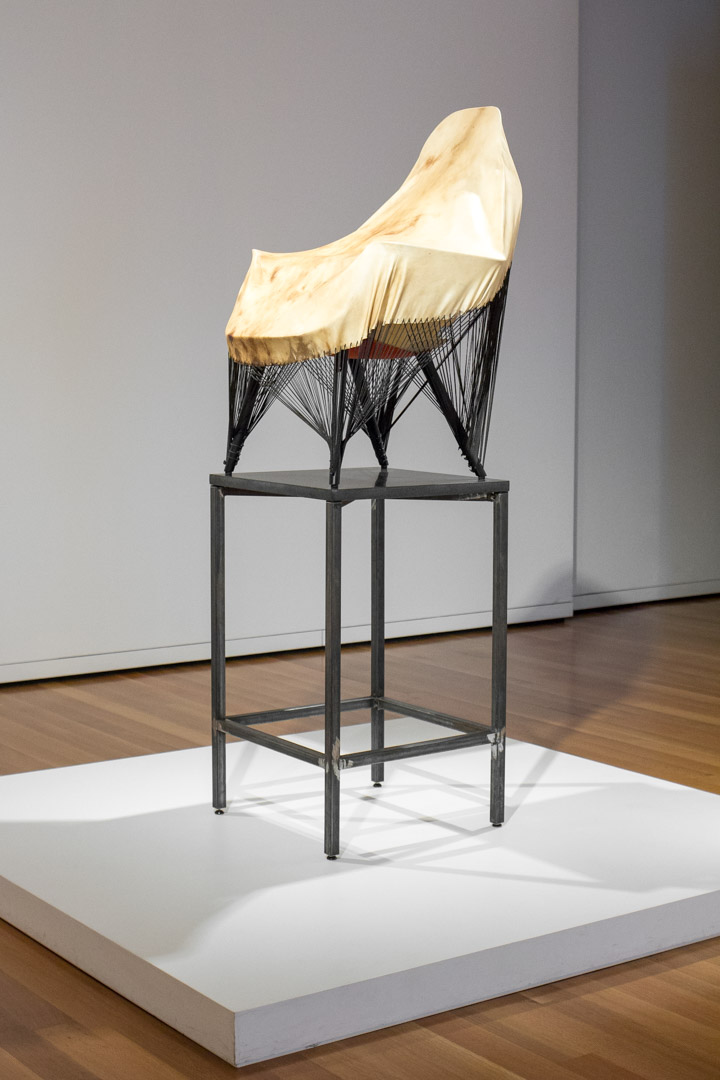
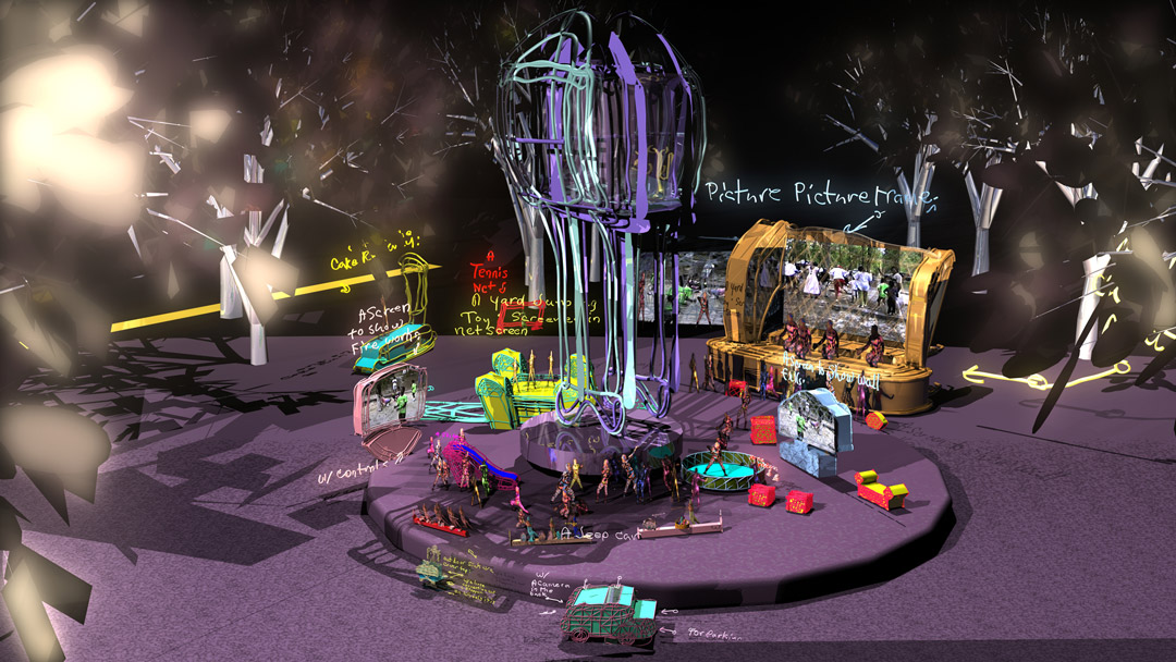
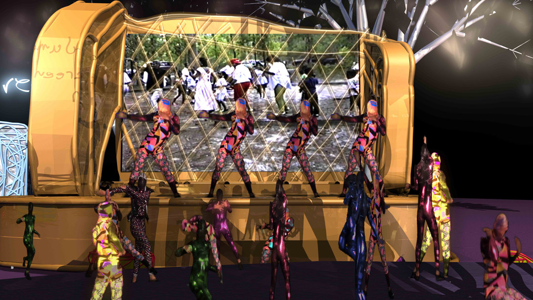
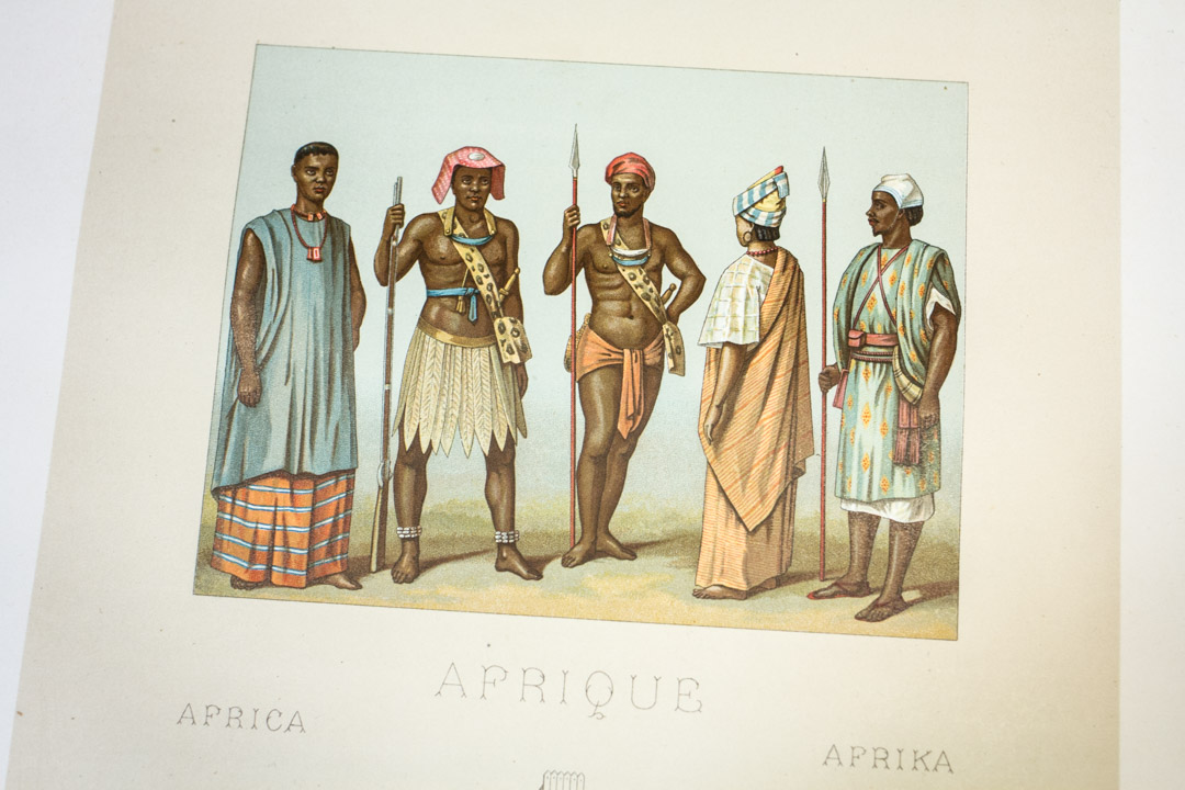
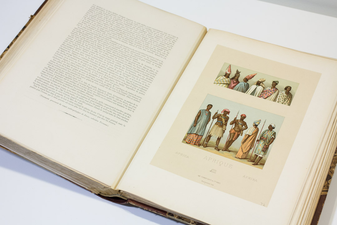
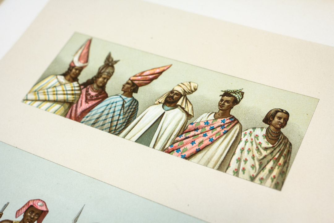
During the run of Kehinde Wiley: A New Republic, whose work addresses ideas about identity and representation, the Bullitt Library is featuring a book installation that considers ways in which people of Africa were depicted in 19th-century book illustrations. The works in this installation, considered “costume books,” depict African subjects with an emphasis on clothing, published with the intent of educating an otherwise unacquainted audience. This tradition, derived from European 16th-century illustrated costume books, was created to satisfy a demand for information on dress and manners of both homeland and foreign lands. The depictions of non-European subjects, though beautiful in their presentation, are problematic in that they project a distinctly Western perspective and a lack of drawing from firsthand observation.

19th-Century European Depictions of Africans

Le Costume Historique: Cinq Cents Planches, Trois Cents en Couleurs, or et Argent, Deux Cents en Camaïeu…

19th-Century European Depictions of Africans

Published in Paris by the firm of Firmin-Didot et Frères between 1876 and 1888, Le Costume Historique: Cinq Cents Planches, Trois Cents en Couleurs, or et Argent, Deux Cents en Camaïeu… by Auguste Racinet (French, 1825–1893) was considered the most wide-ranging study of clothing of its time. Here, Racinet depicts “Senegalese tribesmen and women, from the lands by the River Senegal in Western Sudan” who “are a handsome people who take great care of their appearance.” And although Racinet’s work is an exceptional example of chromolithography, images like the ones shown are derived from a long illustrative tradition whereby images of “exotic” peoples were based on written accounts or secondhand drawings.

19th-Century European Depictions of Africans

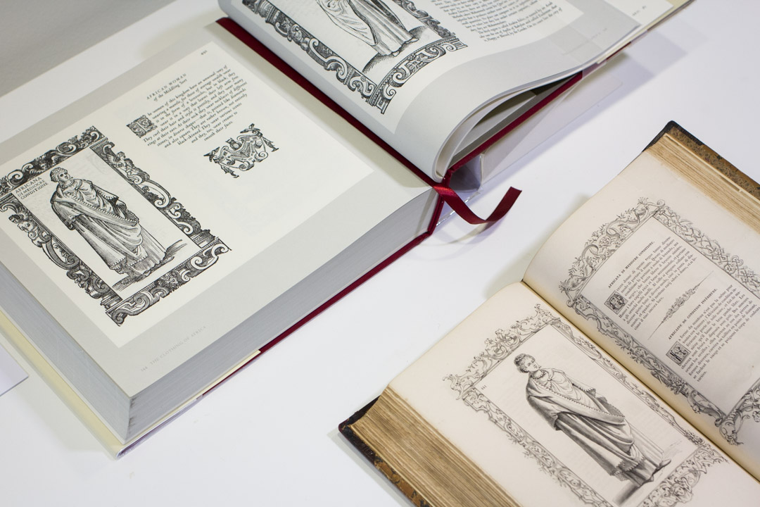
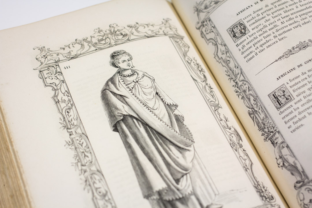
Another work published by Firmin-Didot et Frères is Costumes Anciens et Modernes, a 19th-century reproduction of Cesare Vecellio’s (Italian, 1521–1601) Habiti Antichi et Moderni di Tutto il Mondo, an early costume book published in Venice in an expanded edition in 1598. Firmin-Didot’s version is written in Italian and French and covers the same geographic regions covered by Vecellio’s work.

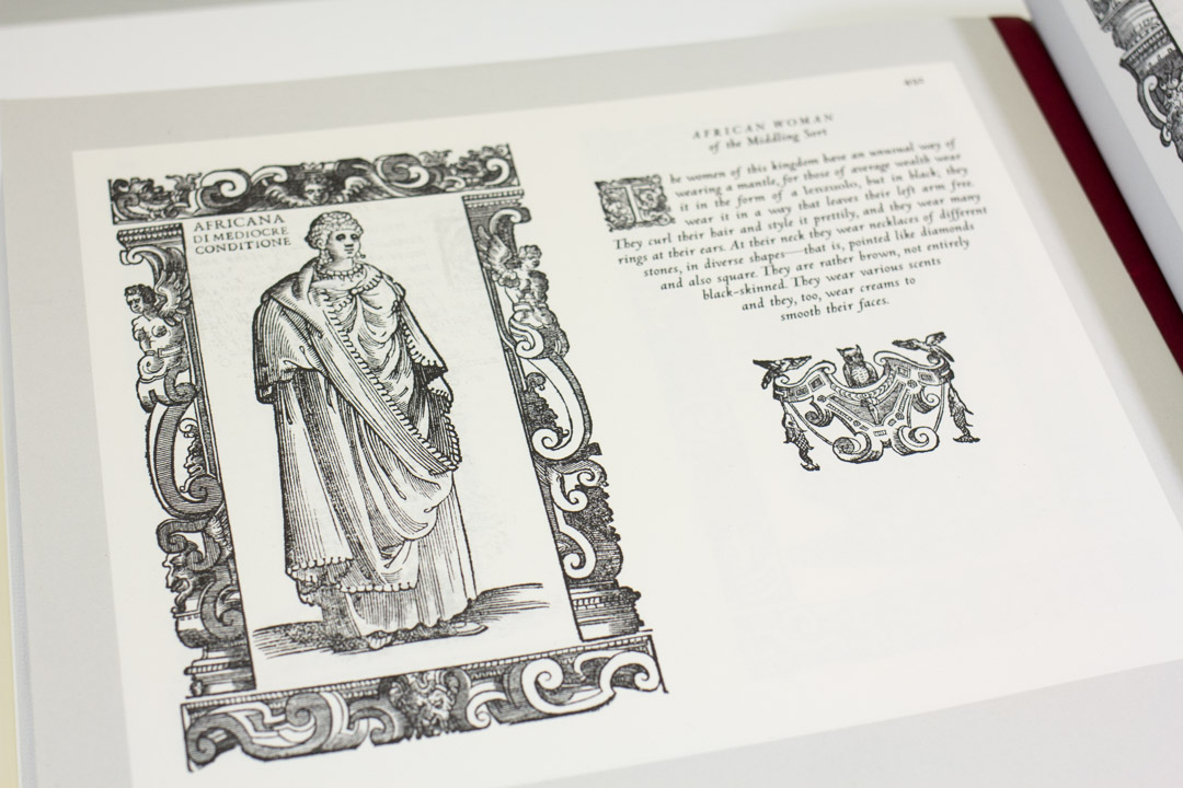
In this example, we see an ordinary African woman: “Africana di Mediocre Conditione/Africaine de Condition Inférieure.” Referring to Vecellio’s original depictions, one scholar has noted that the images of African costumes, in particular,

“…were participating in ‘translations’ of African dress into costumes for European paintings and theatre. During this process, they accumulated new meanings. The dressed figures were copied from art objects with varying degrees of removal from immediate African encounters and combined with texts from published travel narratives to create mythic bricolages of Africans.”

19th-Century European Depictions of Africans

The Clothing of the Renaissance World: Europe, Asia, Africa, the Americas: Cesare Vecellio’s Habiti Antichi et Moderni

19th-Century European Depictions of Africans

Costumes Anciens et Modernes

Additionally, when a comparison is made between Vecellio’s original image and Firmin-Didot’s replication of this particular subject, we see the result is a distinctly more Europeanized version.

This book installation is on view just outside the Bullitt Library on the fifth floor of the Seattle Art Museum during the library’s public hours: Wednesday-Friday, 10 am-4 pm.

—Traci Timmons, Librarian, Dorothy Stimson Bullitt Library

Images: Le Costume Historique: Cinq Cents Planches, Trois Cents en Couleurs, or et Argent, Deux Cents en Camaïeu… 1876-1888, Paris: Firmin-Didot, Auguste Racinet, French, 1825–1893, SPCOL GT 513 R23 v. 2. The Clothing of the Renaissance World: Europe, Asia, Africa, the Americas: Cesare Vecellio’s Habiti Antichi et Moderni, 2008 London; New York: Thames and Hudson, Margaret F. Rosenthal, American (birth date unknown), Ann Rosalind Rosenthal, American (birth date unknown), GT 509 V42 C57 2008. Costumes Anciens et Modernes = Habiti antichi et moderni di tutto il mondo, 1859-60, Paris: Firmin-Didot, Cesare Vecellio, Italian, 1521-1601, Ambroise Firmin-Didot, French, 1790-1876, From a private collection. Photos: Natali Wiseman.

Object of the Week: Mount Rainier, Bay of Tacoma—Puget Sound

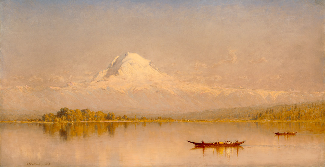
How great is SAM’s painting by Sanford Robinson Gifford of Mount Rainier, Bay of Tacoma—Puget Sound?

Consider:

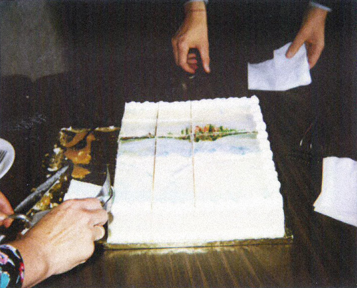
1. It’s been made into a cake. In 1990, when the museum acquired the painting, we celebrated its arrival with a cake that sported a frosting facsimile.

It's a cake with a painting on it!

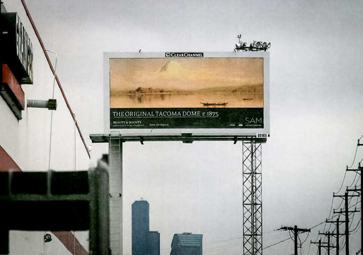
2. It features “the original Tacoma Dome.” In 2011, SAM’s awesome marketing team (still awesome, by the way) produced a pithy billboard with a reproduction of the Gifford painting, beckoning Seattleites to come see the Beauty and Bounty exhibition in which it starred that summer.

"The Original Tacoma Dome" billboard

3. Its artistic merits, of course. Gifford had an immaculate sense for atmospheric light and color that gave rise, in later scholarship, to the very appropriate term luminism.

4. The vision it provides of life in the Puget Sound at a time when natives lived here in harmony with the land.

Here’s the story. Gifford traveled to the Washington Territory in the summer of 1874, and he was clearly moved by the imposing view of Mount Rainier from Commencement Bay in Tacoma. He sketched out several different compositions in pencil from various vantage points across the bay. We even know the day when he produced the drawing that inspired this painting: September 1. Later, in the winter of 1875, he worked up the full painting in his New York studio.

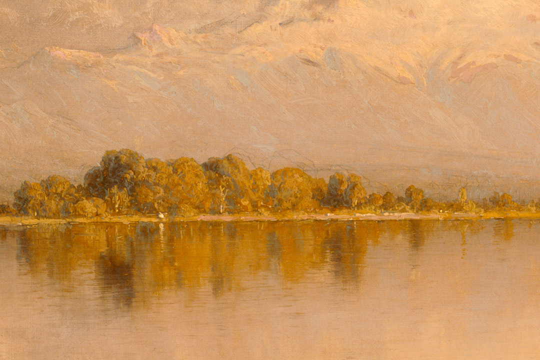
You can see Gifford's pencil lines demarcating the horizon line and dome of Rainier due to a thin paint layer that has become even more transparent with age.

You can see Gifford’s pencil lines demarcating the horizon line and dome of Rainier, due to a thin paint layer that has become even more transparent with age.

Gifford, like his rough contemporary Albert Bierstadt, excelled in producing romantic visions of the West that appealed to East Coast and, increasingly, international audiences, for whom the rugged terrain and the different lifestyle of the natives here carried the appeal of the exotic. Gifford’s Mount Rainier, Bay of Tacoma—Puget Sound is a romanticized view: He would have seen more evidence of the lumber industry beginning to transform the landscape around the time he visited. Still, the artist communicates a sense of awe and discovery that seems entirely genuine. His painting helps me see the true beauty of Mt. Rainier and the diverse landscape of Puget Sound with fresh eyes and a greater sense of appreciation. Gifford reminds us that in the Pacific Northwest, as much as anywhere, we have an abundance of natural beauty for which to be thankful, that we might appreciate it, enjoy it, and always aim to take good care of it.

—Jeffrey Carlson, SAM Collections Coordinator
Images:  Mount Rainier, Bay of Tacoma—Puget Sound, 1875, Sanford Robinson Gifford (American, born Greenfield, N.Y. 1823; died New York City 1880), oil on canvas, 21 x 40 in. Seattle Art Museum, Partial and promised gift of Ann and Tom Barwick and gift, by exchange, of Mr. and Mrs. Louis Brechemin; Max R. Schweitzer; Hickman Price, Jr., in memory of Hickman Price; Eugene Fuller Memorial Collection; Mr. and Mrs. Norman Hirschl; and the Estate of Louise Raymond Owens, 90.29, Paul Macapia. Photo: SAM Archive. Photo: SAM Archive. Mount Rainier, Bay of Tacoma—Puget Sound (detail).

Hey, we’re starting an art book club!

SAM staff members tend to be avid book lovers, and when we’re not talking about art, you’ll likely find us talking about books. The books we’re reading now, the books on hold at the library, and the books we stayed up too late last night finishing. The books we couldn’t put down, and the books we just… couldn’t get through. We compare reading lists, meet in lunchtime book clubs, and make mass trips to the library to pick up the next haul. And yet, we still can’t seem to get enough—so I’m bringin’ it to the internet, to talk about books with you.

Introducing: SAM Book Club. Once a quarter, I’ll be selecting a book about art to talk about here on SAM Blog. Fiction or nonfiction, old or new—it’s all fair game! About a month before each SAM Book Club post we’ll let you know what we’re reading this quarter so you can get a copy and read along, then meet back here to discuss it in the comments.

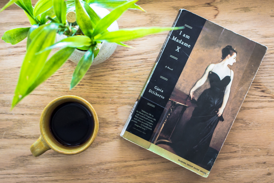
To inaugurate SAM Book Club, we’ll be reading I Am Madame X, by Gioia Diliberto—the fictionalized account of Virginie Gautreau, the stunning subject of John Singer Sargent’s painting, Portrait of Madame X (1883-4). I’m looking forward to learning about the rule-breaking, scandal-raising, modern woman behind Sargent’s most infamous work, and her life in belle époque Paris. So, dear readers, hit up your local library, grab a copy, and meet me back here on May 24 to talk about I Am Madame X!

Happy reading!

—Carrie Dedon, Curatorial Assistant, Modern & Contemporary Art

Object of the Week: Italian Room

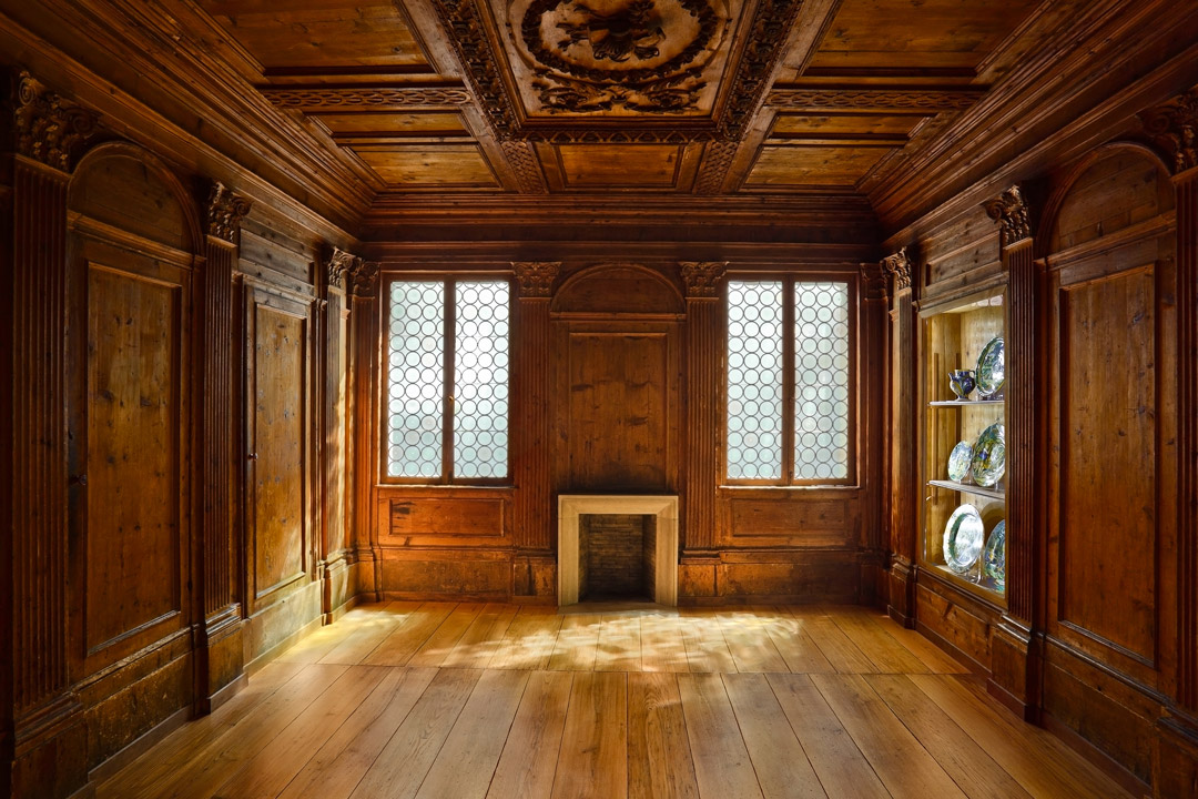
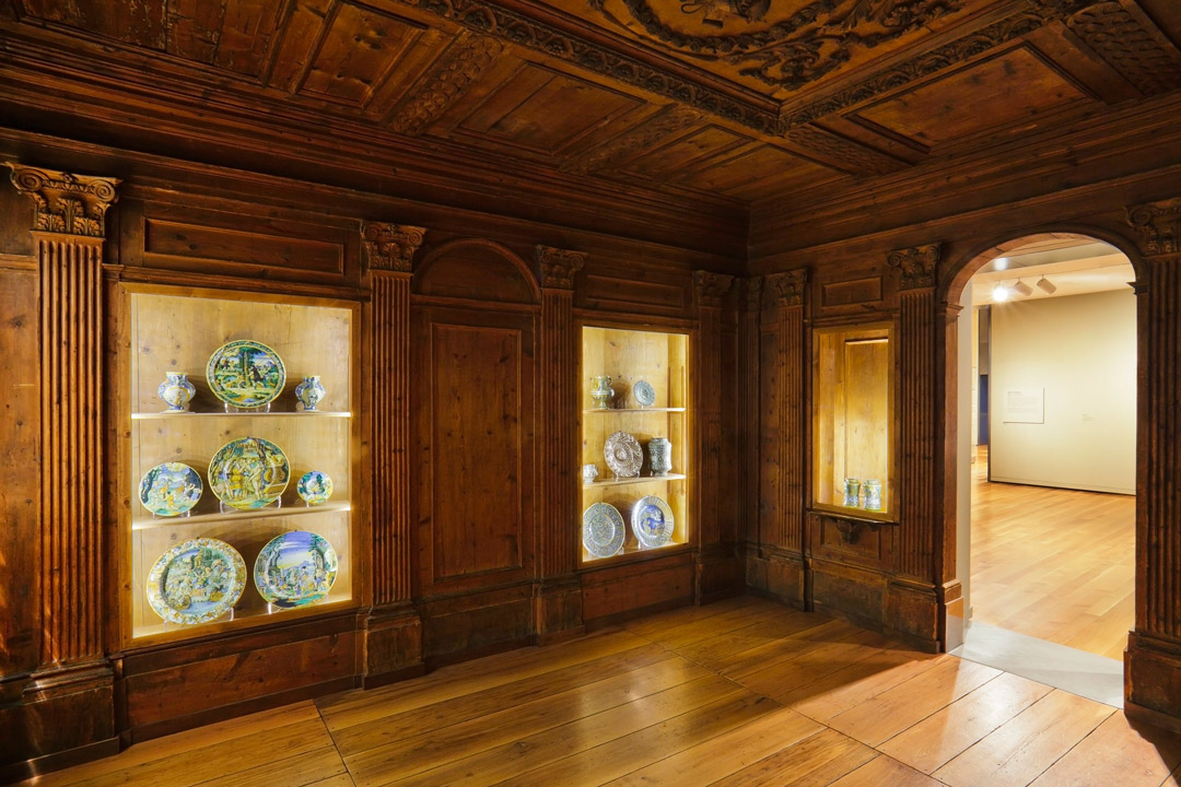
A powerful quality exclusive to older objects is their ability to spark our imagination as we reflect on where in the world these things have been before they arrived in front of us. It can be totally captivating. The display of historic artworks in our galleries at SAM is only the latest chapter in a long story for each of these pieces. The period room installed on the fourth floor—called the Italian Room a bit anachronistically but not without reason—is a great case study in the life of an art object.

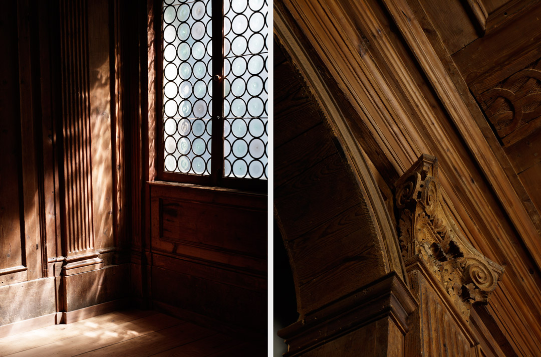
The wood panels hang in a metal stud framework erected during SAM’s expansion in the 2000s, but they are installed at the exact angles and dimensions of the historic room’s specifications. About 145 original pieces comprise the installation. How and why did they come here?

Details of the Italian Room at Seattle Art Museum

An Italian art dealer named Renato Bacchi acquired the room in the 1920s from its original installation in a building scheduled to be remodeled, perhaps “saving” it. The building was located in Chiavenna, a town in northern Lombardy, in a breathtakingly beautiful mountainous region. In the mid-1930s the room, in boards, passed from Bacchi to the German-born antiques dealer Adolph Loewi, who installed it in a Venetian palazzo that served as his gallery space. The Jewish Loewi was persecuted by the Fascist Italian government and moved, with his paneled room, to the U.S. in 1939. Loewi had become one of the most successful international dealers in period rooms, and he proved successful once again, finding a buyer in the notable Northwest architect John Yeon, who had encountered Loewi and his paneled room in Los Angeles. The room enjoyed another interesting chapter as Yeon’s dining room in the architect’s San Francisco flat. This custom installation was a highlight of Yeon’s renovation of the once-rundown building that housed it. Ed Hardy later rented that apartment.

After Yeon passed away in 1994 the building was sold, but Yeon’s partner, Richard Louis Brown, saw that the room was professionally de-installed that it might have another life somewhere else. From his own home in Portland, Brown set about finding a new home for the paneled room, and with SAM, he had a taker. The timing was just right; the museum, in plans for its expansion, would finally have the space to consider a permanent display for such a period room. In 2000, Brown officially donated the Italian Room, doing so in memory of John Yeon. Folks were invited to view the conservation and installation of the room in progress, and since the grand reopening of the expanded SAM in 2007, the Italian Room has been a focal point of the collection.

Italian Room at Seattle Art Museum

In the same year that he brought SAM’s Italian Room to the U.S., dealer Adolph Loewi imported another of the period rooms he would end up dealing: the Gubbio Studiolo now in the collection of the Metropolitan Museum of Art. See, old things have wonderful stories—not just about where they’ve been, but about who and what they’ve encountered along the way.

—Jeffrey Carlson, SAM Collections Coordinator
Images: Italian Room, ca. 1575-1600, spruce, willow, and fir, 171 9/16in. x 200 5/16 in. Seattle Art Museum, Gift of Richard Louis Brown in memory of John Yeon, 2000.218, Photo: Nathaniel Willson. Photo: Collin Shulz. Photo: Collin Shulz. Photo: Nathaniel Willson.

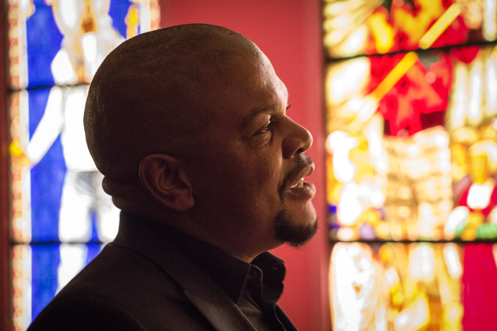
Kehinde Wiley’s Galvanizing Impact

“The history of painting by and large has pictured very few black and brown people, and in particular very few black men. My interest is in countering that absence.”

Kehinde Wiley

Experiencing a meteoric rise on the art scene, Los Angeles native Kehinde Wiley has assumed his place as an influential contemporary American artist. Graduating from the influential Yale School of Art, Wiley received his MFA from the program in 2001. The artist went from the Ivy League to a leading art program—residency at The Studio Museum in Harlem. It was there that a lot of things came together for Wiley in the context of the show he was working on: he found inspiration in the assertive and self-empowered young men of the neighborhood. This kicked off the artist’s serious work in portraiture on modes of representation and the black body.

Installation view of Kehinde Wiley: A New Republic

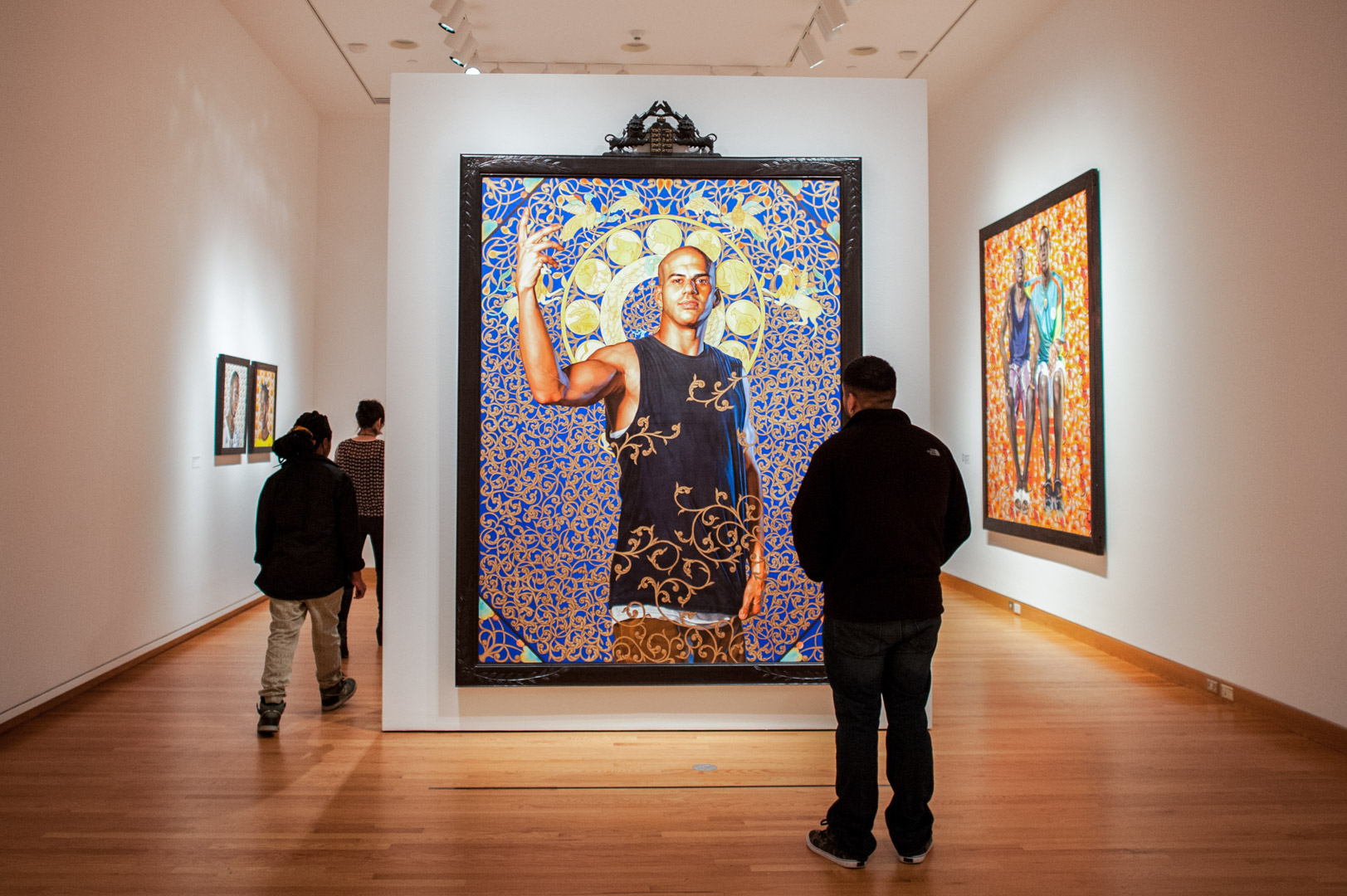
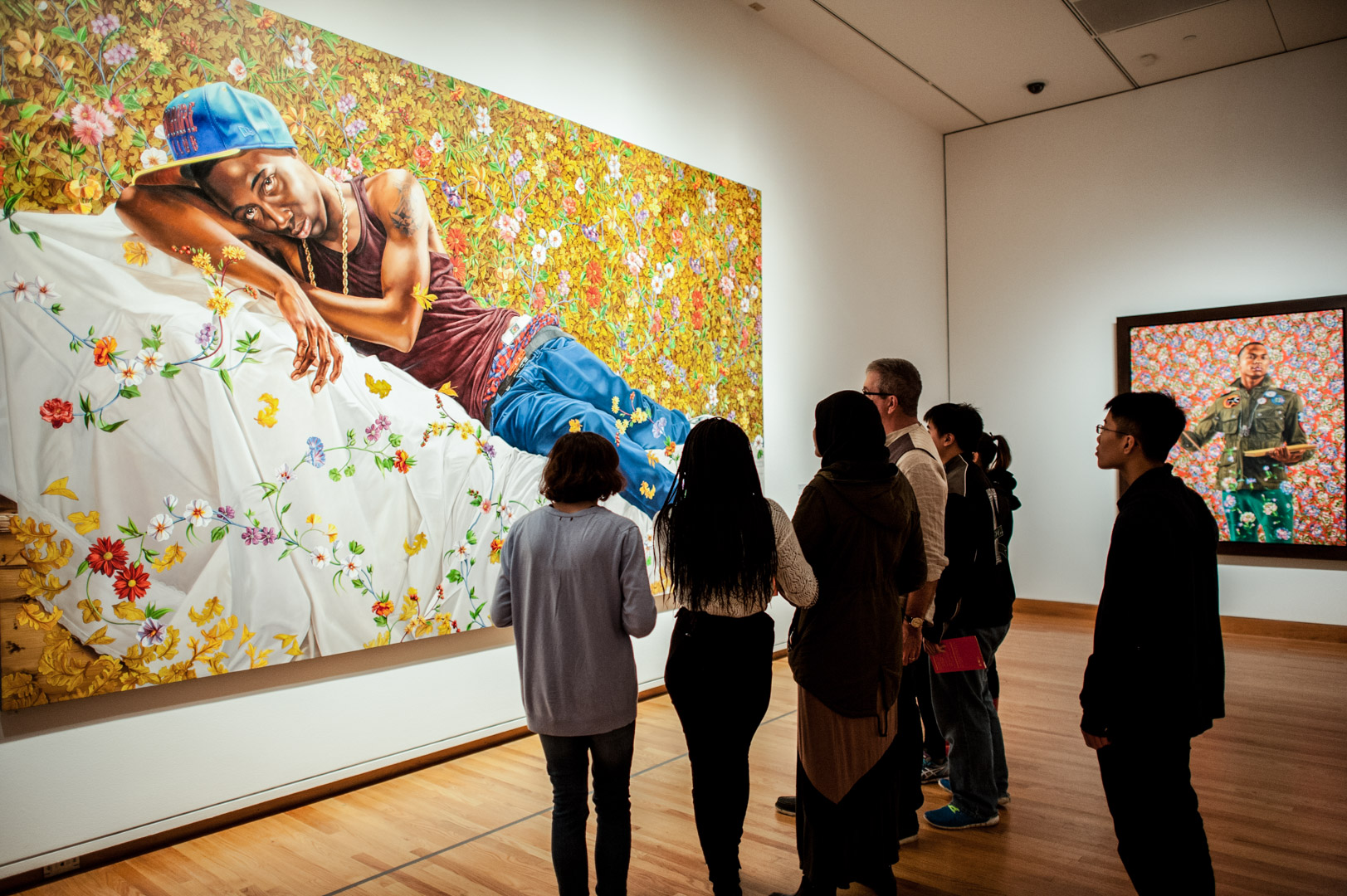
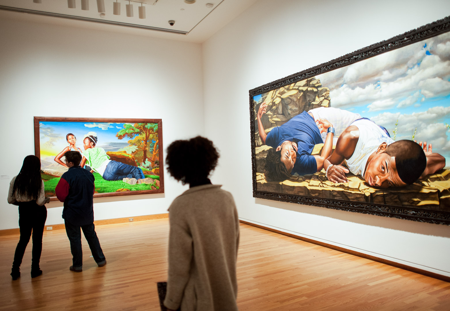
“It’s almost like he’s looking back into history to envision a new present and a new future,” said Catharina Manchanda, Seattle Art Museum’s Jon & Mary Shirley Curator of Modern & Contemporary Art. Kehinde Wiley: A New Republic is a 14-year retrospective of the artist’s work that features 60 works, including his signature portraits of African American men reworked in the grand portraiture traditions of Western culture, as well as sculptures, videos, and stained glass windows.

Installation view of Kehinde Wiley: A New Republic

The Brooklyn Art Museum organized the exhibition, which is traveling to a number of cities around the country, experiencing a rousing reception. “He’s received a great amount of attention in part because the work is so captivating, but perhaps what adds special urgency to the work are the political discussions Americans have been having over the course of the last year regarding the lives of black men and women in this country,” Manchanda said. “There is so much possibility in this moment. It’s my hope that this exhibition will engage viewers in an important conversation, as well as create a galvanizing experience that will last long after they leave the galleries.”

Installation view of Kehinde Wiley: A New Republic

Wiley does not copy traditional portraiture styles from the 18th and 19th centuries, but rather creates mashups where he’s drawing from many sources, like a jazz artist improvising or a hip hop artist mixing pieces of songs together using different ideas and references. The same process—mining elements and then combining them from various sources—fuels Wiley’s work: classic portraiture styles and floral wallpaper designs from the 19th century, among others, serve as inspiration. Altered in color as much as detailing, these compositions frame and elevate his contemporary subjects.

Also on view in the exhibition is the full length film, An Economy of Grace, which documents Wiley as he steps out of his comfort zone to create a series of classical portraits of African-American women for the first time. The exhibition includes works from this project and highlights Wiley’s collaboration with fashion designer Riccardo Tisci at the couture firm Givenchy to design gowns inspired by 19th- and 20th century paintings.

[iframe id=”https://www.youtube.com/embed/KeliRwSrt3w”]

Don’t miss this exhibition— which closes very soon on May 8! We also invite you to hear from scholar and independent curator Tumelo Mosaka, who will be at Seattle Art Museum on Thursday, April 14, to explore topics related to the exhibition and Wiley’s unapologetic ability to address the historical absence of the black figure by creating portraits of his own desire.

Images: Photo: Stephanie Fink. Installation views of Kehinde Wiley: A New Republic at Seattle Art Museum, Photos: Elizabeth Crook, © Seattle Art Museum.

Object of the Week: Buddha

Celebrations of spring are happening all around us. It’s opening week for baseball and Masters Tournament time in golf. Here in Seattle, the sun is shining, the flowers are blooming, and all of a sudden it’s like we live in a populous city. You never have a sense for how many people live (and vacation) here until the sun comes out!

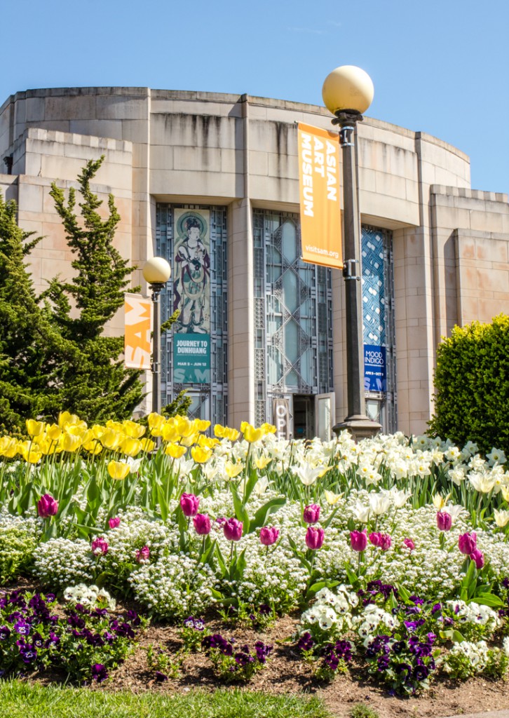
Flowers outside of the Asian Art Museum

Flowers bloomin’ outside of the Asian Art Museum

As wonderful and anticipated as these developments are, today we’re focused on another springtime celebration: It’s Buddha’s birthday!

To be precise, it’s Buddha’s birthday in the Japanese tradition; the same event is remembered on various dates in spring across the world. Many Asian countries commemorate Buddha’s birth on the first full moon of the 4th month in the Chinese lunar calendar (which falls in May). Japan adopted the Gregorian, or Western, calendar in the 19th century and moved its celebration of Buddha’s birthday up to April 8, about a month earlier.

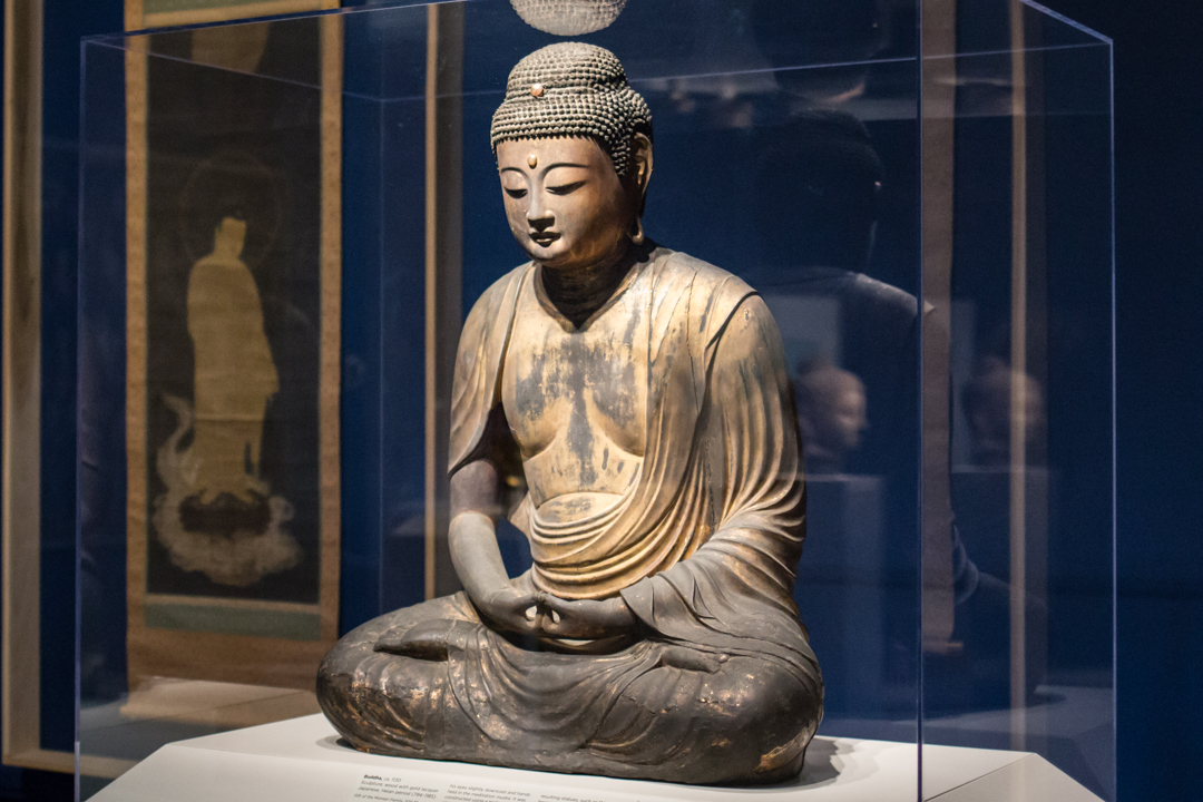
Thankfully for both our regular visitors and out-of-towners, we have a bevy of fine Buddhist art at the Asian Art Museum to help everyone celebrate appropriately. The new installation Awakened Ones: Buddhas of Asia highlights some of the finest representations of Buddha in the museum’s collection, including this stunning wood sculpture coated with gold lacquer. Called an Amida Buddha for its symbolic form, the figure was crafted during the late Heian period (794-1185) in Japan. Its maker used the yosegi-tsukuri technique, carving wood blocks, hollowing them out, and then assembling them together. The Buddha strikes a meditative pose that exudes total peace.

Installation view of Awakened Ones: Buddhas of Asia

In Japanese Buddhist traditions special connections exist between Buddha and the flower that make celebrating him in the springtime especially appropriate. Hana-Matsuri, the Floral Festival, is a memorial service performed at temples throughout Japan on Buddha’s birthday. Those who make pilgrimages to the temples bring offerings of fresh spring flowers and libations of tea. For its original installation in a Kyoto temple, this Buddha sculpture would have been seated on a lotus pedestal.

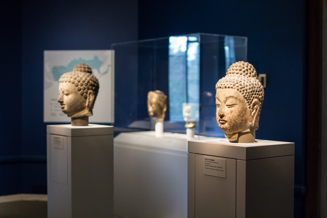
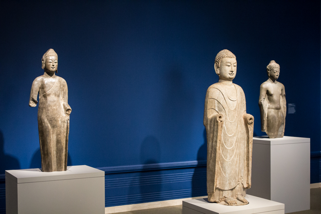
Installation view of Awakened Ones: Buddhas of Asia

The company he keeps in Awakened Ones, where he is surrounded by sculptures and paintings from China, India, Korea, Nepal, and Pakistan, leaves one with a sense for the wide reach of Buddhist teachings and the many ways Buddha is pictured and remembered.

—Jeffrey Carlson, SAM Collections Coordinator
IMAGES: Buddha, ca. 1130, Japanese, wood with gold lacquer, 37 1/4 x 27 x 17 in. Seattle Art Museum, Gift of the Monsen Family, 2011.39, Photo: Natali Wiseman. Photo: Natali Wiseman. Installation view of Awakened Ones:Buddhas of Asia at Asian Art Museum, © Seattle Art Museum, Photo: Natali Wiseman. Installation view of Awakened Ones:Buddhas of Asia at Asian Art Museum, © Seattle Art Museum, Photo: Natali Wiseman.

Spring into SAM Gallery for Flourishes

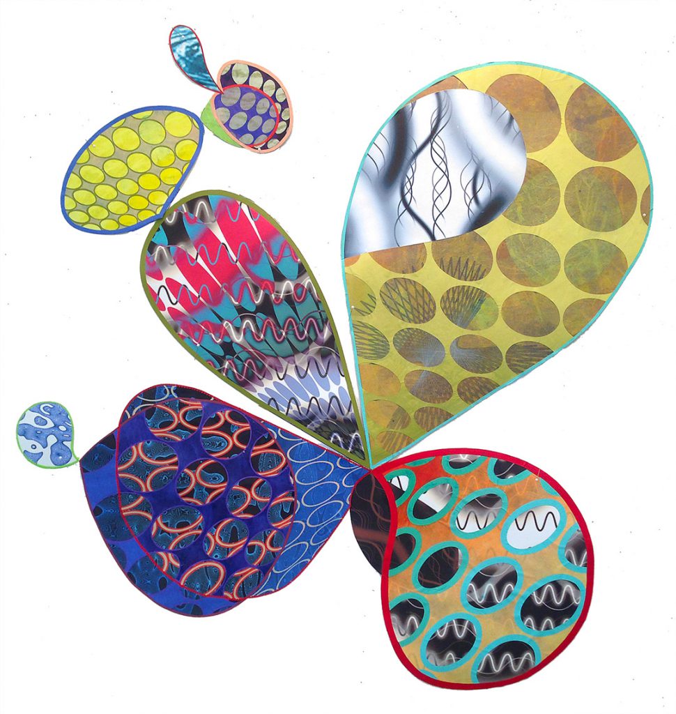
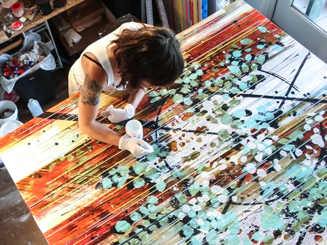
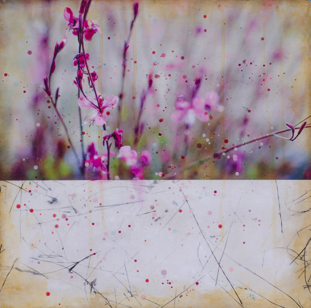
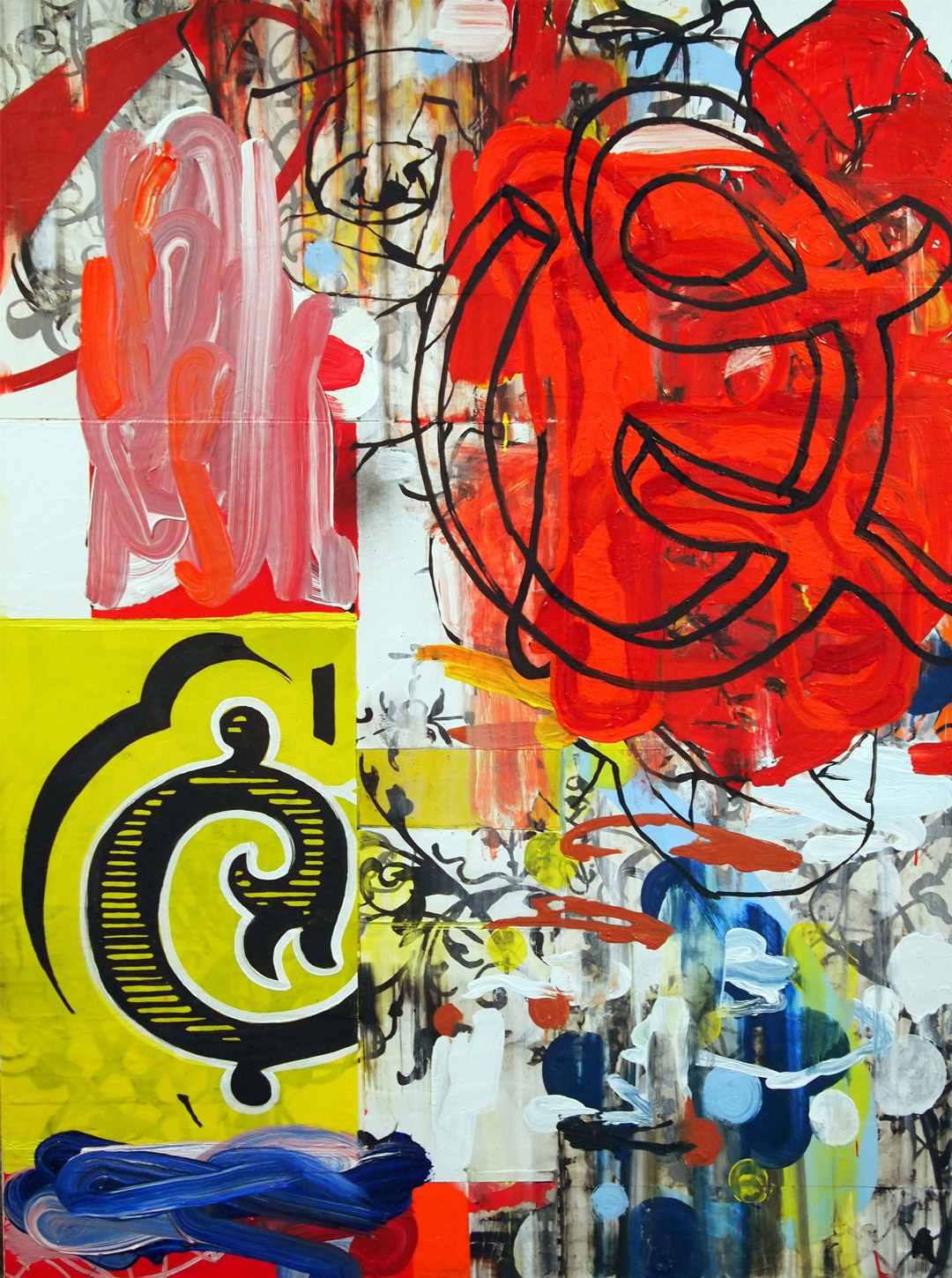
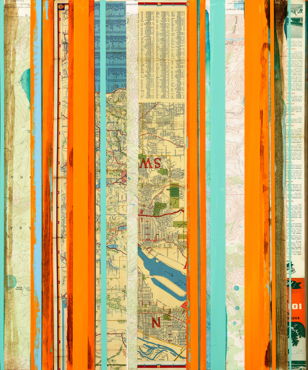
Now on view at SAM Gallery—Seattle Art Museum’s art sales and rental gallery—through April 21 is Flourishes, an exhibition featuring three Northwest artists whose work involves embellishments, ornaments, waves, fonts, and graffiti. We talked with each of the artists to learn how SAM Gallery increases their exposure and finds audiences for their work.


"Play of Light" by Nichole DeMent

Nichole DeMent
Exhibiting at SAM Gallery since 2011

What has been your experience of exhibiting at SAM Gallery so far?
I am extremely pleased to have my work as a part of SAM Gallery on an ongoing basis. Not only do I benefit through frequent rentals and sales, but I’m elated that part of my commission goes back to support such an important arts organization as the Seattle Art Museum. The entire staff at SAM Gallery is always welcoming and very professional. They are a joy to work with and I feel extremely comfortable sending friends, clients, and collectors to them.

How has showing your work at SAM Gallery impacted your career as an artist?
The other gallery on San Juan Island that represents my work first saw my work at SAM Gallery, and the staff were generous enough to share my info with her.


"Queen Bee" by Harold Hollingsworth

Harold Hollingsworth
Exhibiting at SAM Gallery since 2014

What has been your experience of exhibiting at SAM Gallery so far?
It’s been truly wonderful and encouraging, the enthusiasm for the work I make has made a big difference in my approach and experimentation. I’m very happy here.

How has showing your work at SAM Gallery impacted your career as an artist?
I had been wanting to show for some time, and thanks to the staff and interest by SAM Gallery, I’m able to showcase work that I have been showing out of Seattle, in places like Minneapolis, Los Angeles, Portland, Cincinnati, and Berlin.


"Pacific Northwest in Orange 1" by Nina Tichava

Nina Tichava
Exhibiting at SAM Gallery since 2010

How did exhibiting your work at SAM Gallery come about?
I had relocated to Seattle from Santa Fe and was looking for gallery representation—so many people that I met in Seattle referred me to SAM Gallery as having “the best artists in the Pacific Northwest.” I’ve been showing exclusively with SAM Gallery as my PNW representation since 2012.

How has showing your work at SAM Gallery impacted your career as an artist?
Through SAM Gallery my work has been introduced to new collectors (especially young collectors, which is often a “missing” demographic for many commercial galleries) and museum patrons—a much larger community of people who are looking at and experiencing art. Additionally, SAM Gallery has connected and introduced me to countless established and emerging artists in the Pacific Northwest—I often leave a SAM Gallery visit totally inspired to paint and excited to be in a strong, supportive (and growing!) arts community like Seattle.

Interested in buying or renting work from SAM Gallery? Find out more information and browse our inventory, or stop by!

Images: Photo courtesy of Nina Tichava. Play of Light, Nichole DeMent. Queen Bee, Harold Hollingsworth. Pacific Northwest in Orange 1, Nina Tichava.

Object of the Week: Stranger Here

I’m a stranger here
I’m a stranger everywhere
I would go home
But I’m a stranger there.

 I’d rather drink muddy water
I’d rather sleep on a hollow log
Than to stay here in this city
Being treated like a dirty dog.

 That’s why I got up this mornin’
And I put on my walkin’ shoes
I’m goin’ down the road, down the road
Cause I got them walkin’ blues

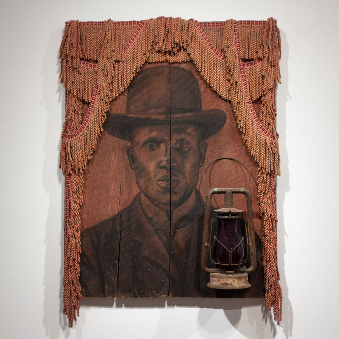
One of the newest works in the Seattle Art Museum collection is Whitfield Lovell’s Stranger Here. Lovell’s piece was inspired by a police mugshot, circa 1910s, depicting a sharp-dressed man of color, and its title comes from an old blues song, whose lyrics we share above. Stranger Here pays homage to a man whose story has been forgotten but whose image remains.

This three-dimensional portrait uses charcoal on found wood, fringe fabric, and an antique lantern to evoke the spirit of the time when the sitter’s picture was taken. The fringe, draped around the man’s bowler hat like drawn curtains, gives the piece a theatrical presence and also creates a sense that something significant is being revealed. In the theater, it’s a dramatic, expectant moment when the curtain is finally drawn and some anticipated spectacle unveils itself. Here, the curtain frames the image and encourages us to pay notice to what we find behind it.

The idea of anonymity, and being disconnected from one another, is especially important to Lovell’s work. Does it bother us that we don’t know the man? That we are denied his story? That we don’t understand all of what we are seeing or truly grasp its significance? In case we might have passed by, missing this quiet figure softly modeled in charcoal, the artist gives us a lantern by which to see.

One floor above Lovell’s piece, in our special exhibition Kehinde Wiley: A New Republic, hangs another stranger’s portrait inspired by a mugshot. Kehinde Wiley’s Mugshot Study from 2006 pictures a young person of color, his anonymity emphasized by the case number printed below his image. In life, these two men were separated by a century, but here at SAM they share more similarities than differences: both gaze out of their frame resolutely, meeting the viewer’s eye, embodying strength, yet expressing a sad tiredness from their life’s walk.

–Jeffrey Carlson, SAM Collections Coordinator
Image: Stranger Here, 2000, Whitfield Lovell (American, born 1959), charcoal on wood, with fabric and lantern, 42 x 29 1/2 x 8 in. Seattle Art Museum, Gift of Norman and Constance Rice, 2016.1, © Whitfield Lovell, Photo: Natali Wiseman.

Object of the Week: Camel

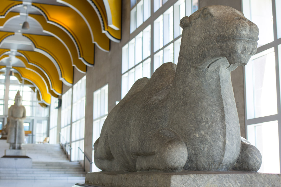
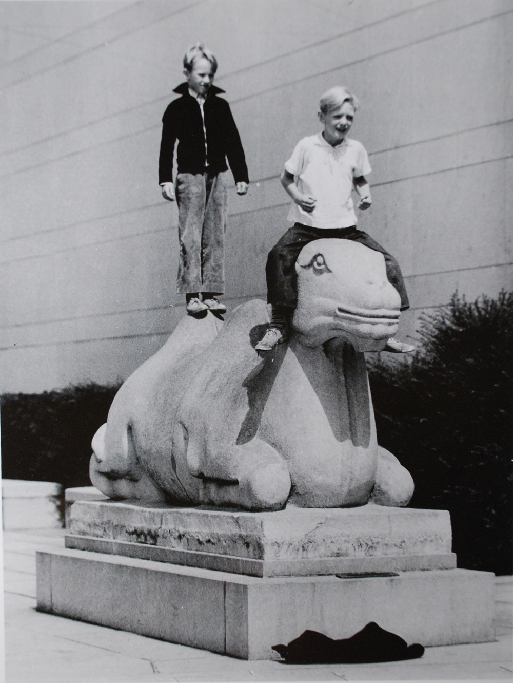
Of the nearly 24,000 objects in SAM’s collection, two sculptures have probably had the broadest impact on visitors’ experience of the museum since it opened in 1933. They have proven a popular attraction for visitors of all ages, newcomers and regulars alike. For a long time, though, they weren’t even physically in the museum. They’re the greeters, the guardians. They are: the camels.

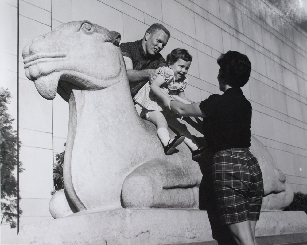
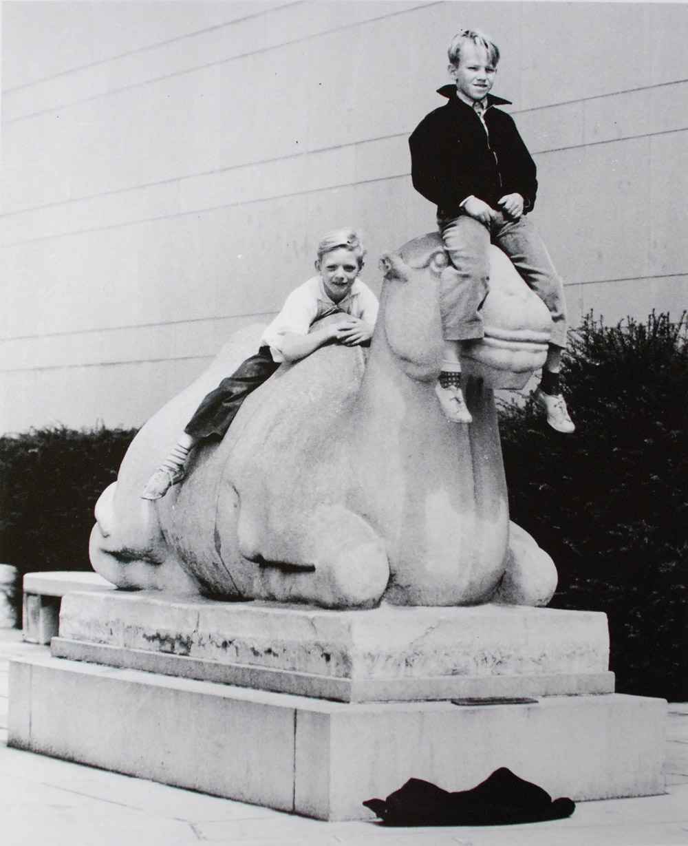
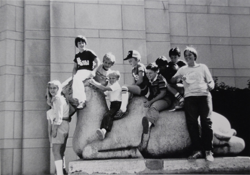
Writing in 1968—35 years after the arrival of our Chinese camels and the opening of our doors—SAM founding director Dr. Richard Fuller proclaimed the camels “unquestionably the most popular items” in the museum’s collection. No doubt this was partly because he enthusiastically encouraged kids to have a go at riding them.

Riding the Camel

Kids on the Camel

Standing on the Camel

Chosen specifically by Dr. Fuller and his mother, SAM co-founder Margaret MacTavish Fuller, to be the symbolic guardians of the museum, they were installed on either side of the front entrance. Former SAM curator and historian Josh Yiu reflected on their significance: “They were the first works of art that children and adults alike experienced at the Seattle Art Museum. The camels achieved an iconic status because they introduced art, the museum, and China to the general public.”1

Asian Art Museum Exterior in 1933

Dr. Fuller also clearly saw in the pair of marble bactrians an impressive aesthetic achievement, one that complemented the striking Art Deco design of SAM’s original building in Volunteer Park and echoed the cultural focus of its artworks. In his personal correspondence from 1933, Fuller wrote the following justification:

“Granting that the sculptor had made no attempt to achieve lifelike forms, I think that there is no question but that his results are great works of art…Viewed purely from the view-point of artistry, I personally think that it would be almost impossible to have modern sculpture designed that could have coincided more perfectly with the spirit that we endeavored to attain in the design of the building, and it seems especially fortunate that they should, at the same time, emphasize our interest in Oriental art.”

Camel

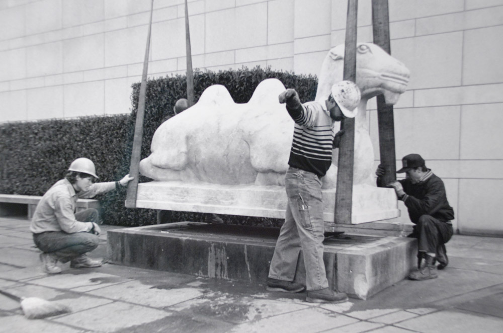
In 1986 conservation concerns won out, and the camel-riding tradition came to a sad, but necessary end (hundreds-of-years-old marble sculptures, folks). We no longer sanction it, at least! The Chinese camels journeyed downtown for the inaugural installation here in 1991, and today replicas flank the front doors to the Asian Art Museum.

Camel replica being installed

You can still see (not ride) the originals in our grand stairway.

—Jeffrey Carlson, SAM Collections Coordinator
1 Josh Yiu, A Fuller View of China, Seattle, Wash.: Seattle Art Museum, 2014; 46.

IMAGES: Camel, Chinese, late 14th-mid-17th century, marble, each 101 1/2 x 56 x 36 1/2 in. Seattle Art Museum, Eugene Fuller Memorial Collection, 33.814.1, 33.814.2, Photo: Jasmine Boothroyd. Photos: SAM Archive.

Object of the Week: Les Années 90 (The Nineties)

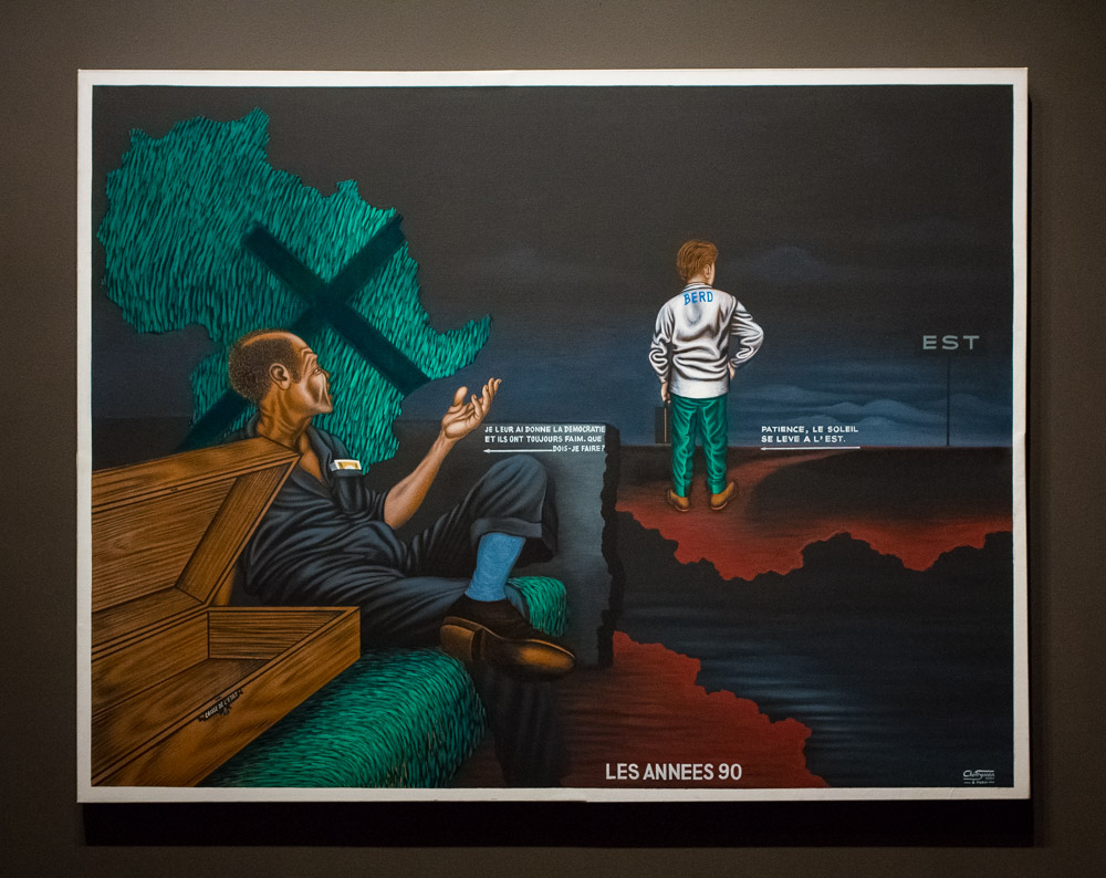
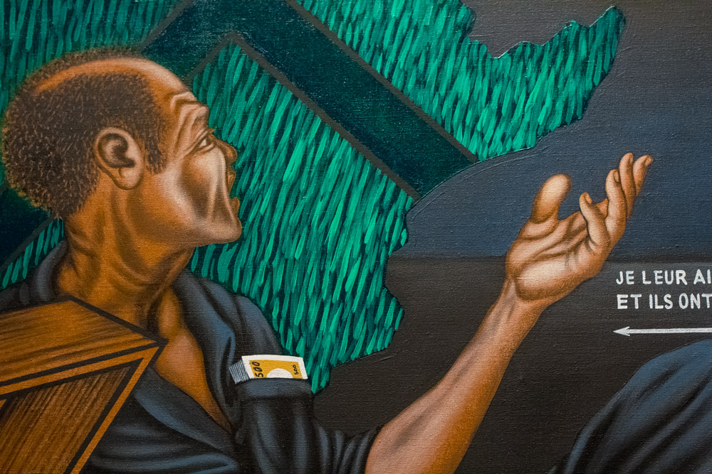
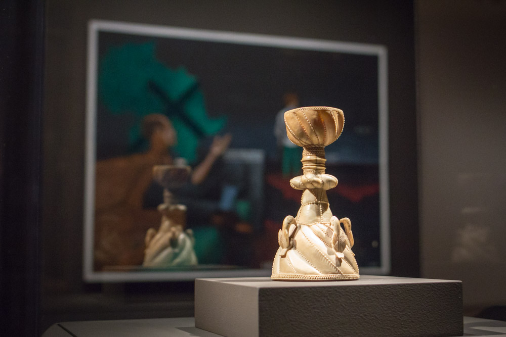
Congolese artist Chéri Samba has said that he likes to incorporate text into his narrative paintings because it keeps the viewer’s eye on the art longer. For visitors who find Samba’s acrylic painting of The Nineties in our Emblems of Encounter installation, it’s not just the French text that needs deciphering. Untangling what’s happening in the picture—as well as thinking about how the text informs the scene—all takes time and effort. Samba has created an image rich with symbolism and relationships for sorting out, and there’s plenty to delve into before even getting to the language.

Most clearly, the scene shows us two men. In the lower left, a figure in a blue suit, sleeves rolled up, lounges passively. His pocket is stuffed with cash, while the chest next to him is noticeably empty. His brown skin contrasts the fair skin of the second man. He looks and gestures toward this figure, who stands near the center of the composition, donning green pants and a white jacket, and gripping a briefcase in his left hand. He’s not looking back at the seated figure to receive the gesture. Instead, he gazes outward purposefully, toward the portion of the canvas where threatening clouds have lifted just a bit.

Les Années 90 (detail) by Cheri Samba

There’s a ground in a burnt sienna color very nearly connecting them both, except for a path of moody blue water. The scale of the figures—the man in the blue suit fills about twice as much of the canvas as the other man—also communicates to us that there’s distance between them. Our view of the water ends as it comes to what looks like a grey stone wall, its edge jagged like the irregular coastlines of the two land masses on which the figures stand. With the rough wall, forming a barrier between the men, there’s further separation where connection seems more natural.

The man in the blue suit is seated on a grassy green surface. Above and behind him, we see the outline of the continent of Africa, filled in with the same fertile green, composed of many short marks, as blades of grass in a field. The artist has laid a symbol onto the map, and because of its shape and function we’d expect this to be an “x”–only one arm of this symbol is significantly longer than the others, so the shape more closely resembles a cross.

Samba’s painting offers a biting satire of hypocrisy and greed, in a scene reflecting on corrupt leadership and rapacious opportunism. Judging by the work’s title, The Nineties, we imagine the artist is reflecting on a specific time period and likely responding to certain wrongs. That he painted this only in 1991 adds even more weightiness to the picture; it seems to be a dark vision of what he foresaw unfolding as much as a rebuke of events he had already witnessed.

Emblems of Encounter installation at Seattle Art Museum

In Emblems of Encounter, Samba’s thoughtful critique joins a group of objects that chart 500 years of the complex and difficult history of European-African interaction. Considering The Nineties, even without the specific narrative laid out, I’m reminded that our understanding of nuanced histories depends, to a large extent, on what side of the shore we stand as we perceive them.

—Jeffrey Carlson, SAM Collections Coordinator
Image: Les Années 90 (The Nineties), 1991, Cheri Samba (Congolese, born 1956), acrylic on canvas, 59 x 77 x 1 1/2 in. Seattle Art Museum, Margaret E. Fuller Purchase Fund, 93.81, © Cheri Samba. Les Années 90 (The Nineties) (detail). Salt cellar, ca. 1490-1530, Sapi culture, Sierra Leone, ivory, 6 3/4 x 3 5/8 in. Seattle Art Museum, Gift of Nasli and Alice Heeramaneck, 68.30.

Object of the Week: Head of a Woman

Our mission statement here—“SAM connects art to life”—truly guides much of our work and many of the decisions our leadership team makes. We see art as a response to life and as something that should be accessible to everyone in their different journeys. Believing our art is relevant, we want to show people how it’s relevant. It’s why we have a blog series where we talk about our collection objects!

In the museum space, we also connect art to art. When SAM expanded in 2007, the curators made a point of bringing their permanent collection displays together in thoughtful ways. We published a book at the time, called Bridging Cultures, which outlined the curators’ thinking. If art connects to life, and if all of us who share life are interconnected, then all art is somehow linked too. Finding those points of connection can be difficult. I love wandering our permanent collection galleries because these connections across people and across time become clearer and more meaningful to me.

Mexican American artist Emilio Amero was born in Ixtlahuaca in 1901. He trained at the Fine Arts School of San Carlos, and in 1924, he worked as an assistant to Diego Rivera on a mural project at the Ministry of Education Building in Mexico City. In 1955 Amero finally realized his own mural, not in his native Mexico, but in Norman, Oklahoma, where he had taken up a teaching post at the university about a decade earlier. He worked in a wide range of materials over his career, but his work in lithography was particularly significant. So, why are three Amero paintings, including this striking Head of a Woman, hanging in our gallery of Pacific Northwest Modernism, alongside works by Mark Tobey and Guy Anderson?

From 1941-1947, Amero brought his talents to Seattle. Invited to teach at the University of Washington on a Walker-Ames Fellowship, Amero established a reputation as a skilled artist and teacher. A 1942 advertisement for a print shop Amero ran quotes Walter F. Isaacs, then director of the School of Art at the University of Washington, who calls him “one of the most able and versatile art teachers in this country.” In 1943 Amero moved to the faculty at Cornish School of the Arts. For the school’s 30th year, opening of September that year, he served as director and instructor of painting, drawing, commercial and graphic arts—joined on the faculty, as he is today in our galleries, by Guy Anderson, who taught children’s art. Not to brag on us, but we have an important collection of Amero paintings that is a monument to his time here.

Amero Ad in Seattle Times

Like other notable artists working in Seattle at the time, many of whom grew up in the Pacific Northwest, Amero was geographically far from the forms of Modernism developing in New York. His vision was essentially different because it was rooted in Mexico. There, Modernism developed after the Social Revolution of 1910, as artists like Amero and Rivera shrugged off what had become an oppressive European influence, looking instead to ancient indigenous Mexican art. The heritage of Amero’s native Mexico inspired his form of Modernism much like the land and peoples of the Pacific Northwest inspired Tobey and Anderson.

—Jeffrey Carlson, SAM Collections Coordinator
Image: Head of a Woman, 1947, Emilio Amero (Born Ixtlahuaca, Mexico, 1901; died Norman, Oklahoma, 1976), tempera on panel, 18 1/4 x 15 1/2 in. Seattle Art Museum, Eugene Fuller Memorial Collection, 47.134, Photo: Natali Wiseman. Caption for ad: Seattle Daily Times, August 9, 1942, p. 30.

Object of the Week: Seated Figure with Conch Shell

Some historic cultures have made learning about them easy for us by producing the things they did. The size and significance of their monuments or the influence of their visual art and literature make sure that these people are known and remembered. Other cultures have left a quieter presence that requires investigating, digging, researching, and lots of thinking about relatively few objects. To me, these cases are all the more amazing because they show us how much we can learn with only a little bit to go on.

SAM’s Seated figure with conch shell (ca. 300 B.C.–A.D. 400) hails from one of these materially quiet cultures: early Colima, in West Mexico. The state of Colima, with its capital city also called Colima, lies straight West of Mexico City, and its landscape is dominated by the Volcán de Colima—or the Volcán de Fuego—one of the most active volcanoes in Central America.

Scholars in Pre-Columbian (before Europeans arrived) Mesoamerica (a region and grouping of indigenous cultures in what is now southern Mexico and northern Central America) have learned much of what they know about cultures in West Mexico from figures like this one. Unlike other regions of Mexico that are visibly marked by Aztec temple complexes and monumental stone sculptures, West Mexico has left today’s art historians much smaller mementos. In Colima, specifically, ceramic figures are the most common form of material culture to survive. A lot of these were found in burial tombs, so they likely had a significant place in the Colima people’s vision of the afterlife.

In SAM’s figure, the forms are essentialized and rounded. The facial features are simple shapes: a long, angular nose; oval, protruding eyes with slits across the middle that look a lot like coffee beans. Triangular ears point outwards from the sides of his head. The circular holes at their centers seem primed for functional use; maybe he once donned a pair of colorful earrings? He has a small mouth with lips turned down slightly, suggesting the seriousness of his role. The figure’s coloring comes from a slip with red pigment applied to the figure by its maker, and the black spots are patina. The all-over smoothness was accomplished by rubbing a stone along the clay surface.

Seated figure with conch shell

The conch shell has special importance to our understanding of this figure and to early Colima, where shell trumpets would sound to mark special ceremonies and community events. The conch also seems to have symbolized wealth and status, and that might have developed from people associating it with these important happenings.

Oh, and that’s a big damn shell! It’s enormous compared to the figure. It matches the length of his torso and has significantly more volume. Why is it so big? Maybe the people in early Colima found really huge conch shells. Maybe the scale is meant to emphasize the importance of the conch shell in the life of the community, with its role extending from important moments in life to the eternity of death. I wonder, too, if the scale suggests something about the size of the figure, meaning that this was a small person—even a child? Personally, I like that reading because it fits with the figure’s relaxed, kind of undignified pose. Imagine he’s just learning to play his shell trumpet, and he’s the figure someone picks to accompany you to the afterlife!

—Jeffrey Carlson, SAM Collections Coordinator
Image: Seated figure with conch shell, ca. 300 B.C.-A.D. 400, Mexican, West Mexico, Colima, ceramic, 14 1/4 x 12 5/16 x 9 5/8 in. Seattle Art Museum, Eugene Fuller Memorial Collection, 64.103, Photo: Natali Wiseman.

Can You Name Five Women Artists?

This March, Seattle Art Museum is participating in a social media campaign led by the National Museum of Women in the Arts (NMWA) to celebrate Women’s History Month in a new way.

The goal is for museums across the country to share information about women artists—their histories, birthdays, quotes, and more—using the hashtag #5womenartists to highlight works in their collections and exhibitions made by women.

The impetus for the project? According to the campaign’s press release:

“Through #5womenartists, the Women’s Museum hopes to help the public answer the question—without hesitation—‘Can you name five women artists?’” said NMWA Director Susan Fisher Sterling. “By calling attention to the inequity women artists face today as well as in the past, we hope to inspire conversation and awareness.”

We all know the artists that most people are able to list off automatically, right?  The list usually goes a little something like…Georgia O’Keefe, Frida Kahlo, Dorothea Lange, etc. And they are all fantastic women artists worthy of such recognition! But there’s so many more out there. Our goal at SAM is to share a wider range of women that may not be as well known, including women of color and more contemporary artists, all from our collection.

We’re going to share more than five women artists here, and here is the first: a collaboration by artists Dawn Cerny and Victoria Haven (under the group moniker DAFT KUNTZ) called SO GOOD IT COULD HAVE BEEN. The piece tends to speak for itself in terms of why we’re highlighting it first, and it was a comment made by a male colleague to the artists. How you choose to view it—as a compliment, or as a statement highlighting the fact that the art world still defines most achievements as defined by men—is up to you. But we love the work because it confronts the fact that there is a significant gender imbalance in the art world, (their representation, and exposure to them and their works) head-on.

A few other museums are participating in this campaign, including: Brooklyn Museum, The J. Paul Getty Museum, The National Gallery of Art, the New Museum, LACMA, and more.

Be sure to check back for more posts about women artists we think you should know from SAM’s collection.

We’d also love our readers’ participation in this important initiative. Who are #5womenartists everyone should know?

IMAGE: SO GOOD IT COULD HAVE BEEN, 2012, DAFT KUNTZ, Collaboration between Victoria Haven and Dawn Cerny, Victoria Haven, American, born 1964, Dawn Cerny, American, born 1979, Silkscreen on paper, 33 1/2 x 26 in., Seattle Art Museum, Gift of Matthew Offenbacher and Jennifer Nemhauser with funds from the 2013 Neddy Award in Painting, 2015.2.1, © Victoria Haven and Dawn Cerny, Photo: Natali Wiseman.

Object of the Week: Colored Vases

“An artist can only raise new questions and offer insight into social change after reflecting on the feelings of the time. I don’t see art as a highly aesthetic practice…Rather than thinking of my projects as art, they attempt to introduce a new condition, a new means of expression, or a new method of communicating. If these possibilities didn’t exist, I wouldn’t feel the need to be an artist.” –Ai Weiwei1

“At different times I’ve worked in different mediums. For me, the variation is not an artistic judgment, but a necessary choice. It’s just as normal to eat with chopsticks, as it is to eat with forks or hands. Different circumstances call for different tools. I try to express ideas with the most appropriate available materials and forms.” –Ai Weiwei2

“Making choices is how the artist comes to understand himself. These choices are correlated to one’s spiritual predicament, and the goal is a return to the self, the pursuit of spiritual values, and the summoning of spirits. These choices are inherently philosophical.” –Ai Weiwei3

Ai Weiwei is super active in the world of contemporary art, posting to his Instagram, posing as a drowned Syrian refugeedecorating Berlin’s Konzerthaus with 14,000 life jackets. Not all of the commentary about him is positive, and I’m sure that’s as he would like it. He’s stated in the past that he desires uneasiness; that he deliberately moves away from the self-indulgent comfort of creating things to use his skills or to get praise. He wants to think critically and to act on his convictions. He wants to unsettle and to motivate. Definitely from his own perspective, he is a conceptual artist, a political activist, and an advocate for self-discovery.

Ai’s art still depends—in a really essential way—on its visual impact. The striking visuals he’s able to concoct are the rhetoric he uses to promote his provocative agenda. He may not think of art as a “highly aesthetic practice,” but the work speaks for itself. Just think of his Sunflower Seeds. The work is less than compelling as a printed phrase: “One hundred million hand-sculpted, hand-painted porcelain beads, made to look like sunflower seeds.” As a realized artwork, it captivated people.

Ai thinks about the forms as a means to an end—his end is pointing others to self-consciousness, sparking in us a challenge to accepted systems of belief, provoking critical responses and inspiring action—but they’re still necessary means. They are his way of communicating. He can’t even be sure that his art will communicate what he wants it to do. All he can be sure of is that viewers will experience the physical artwork. Many of us who look at his works will come away with different conclusions; such is the open-endedness of art, politically-driven or otherwise. All we have is the thing, so I say, let’s look closely at it.

SAM’s one work by Ai Weiwei, Colored Vases, is on view at the Asian Art Museum in Volunteer Park. It delivers what it promises. Nine ceramic vases are arranged in a pattern much like a bowling pin setup—there are three rows, with four vases in the back row, three in the middle row, and two in the front row—only the headpin is missing. The artist has applied a base coat of industrial paint in a bold hue—such as yellow, pink, lime green, or plum—to each vase. A second color in high contrast to the base layer covers the lips and shoulder of the vase, then drips down the body. Some vases have long drips like the tendrils of a plant, while others are shorter, like polychrome stalactites. The paint drips are irregular, and they seem natural.

Contrast is especially important to this work: there’s contrast between the traditional form of the ceramic vases and the bright and contemporary paint colors applied to them; contrast between the two colors on one vase, and contrast in the range of colors among the whole group; contrast between the normally grainy texture of a ceramic pot and the flatness of industrial paint. There’s probably contrast, too, between what Ai Weiwei thought of and what you take away.

—Jeffrey Carlson, SAM Collections Coordinator
Sources:

“Reconsidering Reality: An Interview with Ai Weiwei.” In Ai Weiwei: According to What? Edited by Deborah E. Horowitz. Prestel Verlag: Munich, London and New York, 2012. Published in conjunction with the exhibition of the same name, organized by the Mori Art Museum, Tokyo, in association with the Hirshhorn Museum and Sculpture Garden, Smithsonian Institution, Washington, D.C., and displayed at the Hirshhorn Museum and Sculpture Garden, Washington, D.C., October 7, 2012-February 24, 2013; the Indianapolis Museum of Art, Indianapolis, Indiana, April 5-July 28, 2013; Art Gallery of Ontario, Toronto, Ontario, August 31-October 27, 2013; Pérez Art Museum Miami, Miami, Florida, November 28, 2013-March 16, 2014; and Brooklyn Museum, Brooklyn, New York, April 18-August 10, 2014.

“Making Choices.” Translated by Philip Tinari, from The Grey Book, November, 1997. Reproduced in Ai Weiwei. Phaidon Press: New York, 2009.


i. According to What, 38
ii. According to What, 39
iii. Ai Weiwei, “Making Choices,” 128

Image: Colored Vases, 2010, Ai Weiwei (Chinese, born 1957), ceramic with industrial paint, approx. 17 x 22 in. each. Seattle Art Museum, Purchased with funds from the Estate of Robert M. Shields, 2013.33, Photo: Nathaniel Willson.

Object of the Week: Salad Days

Giving tours to young people through our big Jane Lang Davis Gallery in the Modern and Contemporary collection can be difficult. It’s impossible to avoid the fact that there’s a really large painting of a naked woman on the wall! Even if, as the tour guide, one forgets about it momentarily, kids will always bring the attention straight to that piece. Their stifled laughter, or even outright laughter, will probably derail conversation about anything else happening in the gallery. Once my focus is drawn to it, I feel simultaneously uncomfortable and totally compelled by the image. I get why they’re staring and pointing.

There’s a name for the painting with the naked woman: Salad Days. She’s just one half of a two-panel piece that measures seven by fourteen feet, rendering relational discord on a huge scale. The artist is contemporary American painter Eric Fischl. He has been creating uncomfortably naked paintings since the early 1980s, and there are few artists out there who do it better, or with more unsettling creep factor.

Fischl has described himself as a storyteller, an artist who aims to create scenes that are full of meaning. Whether that meaning is positive or negative does not matter to him; whether the viewer’s senses are offended does not matter either. Instead, he’s interested in radical openness and honesty. Many of Fischl’s paintings focus on awkward territory: enduring down time in an unhappy relationship, singing in the shower, or lounging unceremoniously in the buff. Over and over, he confronts viewers with scenes that are unusual for their bare honesty.

Of course there’s a very long history of naked people in art, and Fischl is hardly the first, last, or only artist to engage the subject. Most of these artists are working in one of two traditions: nude art, or naked art. The nude is an idealized figure, on display for the viewer, situated in a context that justifies, or makes more art history appropriate, the lack of clothes. Nakedness is all about the lack of clothes and flying in the face of propriety. Fischl fits squarely in the naked camp.

Venus and Adonis by Paolo Veronese

SAM’s collection has great examples of the nude genre too…

Salad Days pictures a private moment, and in doing so, turns it into something highly public. The woman’s physical nakedness comes to represent a psychological nakedness, where her private thoughts and actions come to the surface. This, like much of Fischl’s work, is a voyeuristic, intimate vignette—not an idealized display set up for our consumption. Imagining two sides of a conversation happening over the phone, he invites us to imagine how others act when we can’t see them. You’ll be thinking about it the next time you’re on a call…

IMAGE: Salad Days, 1984, Eric Fischl (American, born 1948), oil on linen, two panels, 84 x 168 in. Seattle Art Museum, Gift of the Virginia and Bagley Wright Collection, in honor of the 75th Anniversary of the Seattle Art Museum, © Eric Fischl. Venus and Adonis, 1570s, Paolo Veronese (Italian, 1528-1588) and workshop, oil on canvas, 88 3/8 x 66 ¼ in. Seattle Art Museum, Samuel H. Kress Collection, Photo: Natali Wiseman.

“I’ve never seen anything in my life as beautiful as you are.”

Desire was never more perfectly pictured. Photographer George Hurrell captured a magic moment between the lovely Greta Garbo and debonair John Barrymore on the set of the 1932 film Grand Hotel. Here’s hoping your Valentine’s Day is just as dreamy!

—Jeffrey Carlson, SAM Collections Coordinator
Image: Greta Garbo and John Barrymore, ca. 1932, printed 1980, George Hurrell (American, 1904-1992), gelatin silver photograph, 16 1/6 x 18 7/8 in. Seattle Art Museum, Gift of Dr. Farel Rosenberg, 84.220.9.

Object of the Week: Mosaic from the House of Menander with Zeus

One of the things we sometimes say around here about Dr. Richard Fuller, SAM’s founding director, is that he liked to collect things he could hold in his hand, and that maybe this had something to do with his love for rocks and geology. Even while he was planning for the museum’s opening in 1933 and then seeing it through its first years, Dr. Fuller pursued his second passion at the University of Washington. He studied geology through the whole of the 1920s, first earning his bachelor’s, then his master’s, and finally his doctorate, in 1930. Beginning in 1926 he also taught part-time at UW, and that led to his being named research professor in 1940. His connections in the world of archaeology brought him a fortuitous letter that same year.

The letter, reproduced here, came from Charles Rufus “C.R.” Morey, a distinguished professor of art and archaeology at Princeton University. He had recently published a volume on excavation findings at the ancient city of Antioch (The Mosaics of Antioch, published by Longmans, Green and Co. in 1938), a book that would be one of his many contributions to the field of art history. He was also a founding member of the College Art Association, which still remembers C.R. with its annual Charles Rufus Morey Book Award.

Letter to Dr. Fuller from Charles Rufus Morey

Writing on behalf of the Committee for the Excavation of Antioch and its Vicinity, Morey offers Dr. Fuller and the Seattle Art Museum its pick of recently excavated mosaics. As Morey explains, they’re offered at bargain prices—25% to 50% off! Now, one of the reasons I feel a real kinship to Dr. Fuller is that he was always looking for a deal. He was wealthy, but not so wealthy, he figured, that he didn’t need to be smart with his resources and to push them as far as they would go. Thankfully for SAM, Dr. Fuller saw in Morey’s letter a great opportunity to build the museum’s collection of antiquities.

Dr. Fuller responded in a letter dated May 27, 1940, that the museum would like to purchase one item, the “fragment of the Sea God,” adding that he wished to “express our appreciation of the generous opportunity which you present for our participation in the extremely important excavations of your committee.” In SAM’s annual report for 1940, Dr. Fuller describes the chosen mosaic as a “very vigorous portrayal of Neptune.” This is the mosaic now hanging in our ancient art galleries on the fourth floor, titled Mosaic from the House of Menander with Zeus.

Later scholars have identified the main figure as Zeus, and not Neptune, but I would say that he’s very vigorous, indeed. He is seated on a throne, grasping a scepter in his left hand and reaching outward with his right. A halo or nimbus encircles his head and symbolizes his divinity. Almost unbelievably, SAM’s mosaic once formed part of the floor of a luxurious urban villa, about five miles outside of Antioch. Because they were durable and allowed for color and decoration, mosaics were actually used quite often as pavements in former provinces of the Roman Empire. I’ll speak for myself here, but my feet are totally unfit to tread on this, and I’m glad it’s hanging on the museum’s wall instead.

—Jeffrey Carlson, SAM Collections Coordinator
Images: Right: Mosaic from the House of Menander with Zeus, 3rd-4th century, Roman, limestone and marble tesserae, 38 11/16 x 32 1/4 in. Seattle Art Museum, Eugene Fuller Memorial Collection, 40.181.1; Left: Mosaic from the House of Menander with Figure, 3rd-4th century, Roman, limestone and marble tesserae, 15 x 23 1/4 in., Eugene Fuller Memorial Collection, 40.181.2, Photo: Natali Wiseman. Letter to Dr. Fuller from Charles Rufus Morey.

Journey to Dunhuang: Buddhist Art of the Silk Road Caves

In our February-May 2016 issue of SAM Magazine, our member-only publication, we featured an article about the Silk Road Caves in Dunhuang, China as a preview of our upcoming exhibition Journey to Dunhuang: Buddhist Art of the Silk Road Caves. Our space was limited in print, so we’re featuring the whole article here on the SAM Blog.

In 1943, James and Lucy Lo were newlyweds. Budding adventurers that they were, the couple set out to Dunhuang, China, by donkey cart for their honeymoon. In the remote town, there was no electricity or running water. A friend of theirs in India managed to find several thousand rolls of film for James to take with him for the trip to the area’s sacred cave-grottoes.

The nearly 500 caves are collectively called the Mogao Caves—now a UNESCO World Heritage site—and are carved into cliffs about 15 miles from the oasis town of Dunhuang on the edge of the Gobi Desert. At the start of the 20th century, European explorers discovered the caves, finding a treasure trove of sculptures, manuscripts, painted scrolls, and wall paintings inside. The cave temples range in date from about the 4th to the 14th centuries, and 2,000 Buddhist sculptures, 45,000 square meters of murals, and more than 60,000 texts are preserved today. Some caves were built and rebuilt over the millennium by the devout and they continue to be an astonishing experience for visitors.

View of the Northern Mogao Caves

The couple spent their time in Dunhuang documenting the interiors: brilliantly colored paintings that covered cave walls, ceilings, and floors, and the finely rendered stucco sculptures, some of which were of immense, towering Buddhas. The site reveals shifting artistic influences and ritual practices, attesting to a long and varied history of political, religious, and private patronage as well as local, court, and foreign military protection. That Dunhuang was a multicultural center is also attested to by surviving printed texts and hand-written manuscripts with calligraphy in the Chinese, Tibetan, Sanskrit, Uighur, and Tangut languages Visitors from the West couldn’t get to China without going through Dunhuang, as it is located at the crossroads of the northern and southern routes of the ancient Silk Road.

The Los photographed the caves for 18 months, producing an unparalleled set of black-and-white negatives, remarkable for their documentary value as well as their artistic quality. They were not the first photographers to arrive at the Mogao Caves, but they were the first to document the caves with artistic intention. Indeed, the Los established iconic ways to view Dunhuang. While at Dunhuang, the Los also collected manuscript fragments, including texts and pictures. This group is the largest collection in the U.S. and reflects their broad interests in unusual scripts and in a variety of painting techniques. Also while at Dunhuang, the Los met with famed Chinese painter (and infamous forger) Zhang Daqian (1899–1983), who was there repairing and making replicas of Mogao murals.

After moving to Taiwan in the 1950s, the Los became part of a community of artists and intellectuals. They invited a group of young artists to produce life-size copies of the Lo’s photographs. Some were done freehand, while others were tracings made by projecting the Lo slides on the wall. The artists then added color to the renderings by relying on the Lo’s comprehensive notes and their memories of the caves. These facsimiles are unique in their fidelity to the originals since they are collaborative and imaginative recreations.

James and Lucy Lo’s photographic archive, manuscript collection, and artist renderings belong to Princeton University’s Art Museum, P.Y. and Kinmay W. Tang Center for East Asian Art, and the East Asian Library. Their current exhibition, Sacred Caves of the Silk Road: Ways of Knowing and Recreating Dunhuang, formed the basis of scholarship for the exhibition, Journey to Dunhuang: Buddhist Art of the Silk Road Caves, coming to the Asian Art Museum in March. Together, with SAM’s Director Emerita Mimi Gates’ exhibition at The Getty Museum, Cave Temples of Dunhuang: Buddhist Art on China’s Silk Road, we are bringing Dunhuang to the West Coast in 2016.

An installation of Buddhist art will also be on view during the Dunhuang exhibition. The focus will be on the Buddha as depicted in Asian art, with both sculpted and painted works drawn from SAM’s own collection. The exhibition will be a geographically broad survey, and will represent works from various parts of Asia where Buddhism spread, including East Asia, Tibet, Nepal, and Southeast Asia.

IMAGES: Parinirvana, Mogao Cave 158, Middle Tang dynasty (781–848), Photograph taken in 1943–44, The Lo Archive. View of the Northern Mogao Cave, Photograph taken in 1943–44, The Lo Archive.

Object of the Week: Anthony of Padua

You simply can’t miss the eye-catching posters and banners all over Seattle advertising our next special exhibition, Kehinde Wiley: A New Republic. When you come for the free opening celebration this week—and do come!—you’ll see huge paintings from private and public collections across the world, including a gem from SAM’s own collection.

Anthony of Padua, a painting in the very traditional method of oil on canvas, measures six feet tall by five feet wide. The figure is imposing, the decoration bright and busy. His is an empowering posture borrowed from the aristocratic patrons of art history and conferred to a young person of color. The rococo frills that surround him speak of the joy of excess.

He brings together, as Kehinde Wiley’s work often does, two worlds of swagger. The original swagger portrait (a real term in art history used even by stuffy academics) developed in Europe in the 17th and 18th centuries. At the time, those who had the funds to do so might pay an artist to paint them in a very flattering pose, wearing elegant and expensive dress, accompanied by symbols of their knowledge or power. The idea was to show off your status, wealth, and noble character. You wanted to impress those around you and those who would see your painting long after you were gone.

More recently, swagger has been mostly informed by looks, attitudes, and language developed in street culture. Kehinde Wiley’s work picks up on both points of reference, which, when we think about it, are not so different. Urban Dictionary’s top definition describes swagger as “How one presents him- or herself to the world. Swagger is shown from how the person handles a situation. It can also be shown in the person’s walk.” The way to attain it has changed across cultures and across time, but swagger has always been about getting respect by portraying self-confidence. It’s always played out through language, body language, and dress.

To build his new swagger portraits, Wiley has developed a practice of “street-casting” to choose the models for his portraits. Wherever he might find himself looking—and Wiley has taken subjects from places as diverse as Brooklyn and Brazil, India and Israel—he strolls the streets, more or less living his life, but also waiting for a moment of connection with another individual. He’s allowing chance to play a role in selecting who makes it into these paintings, and then onto the walls of a gallery or museum. The models come to the artist’s studio with the instruction to wear everyday clothing and express their personal style. That’s just how the model for Anthony of Padua posed and is portrayed here: with his own coat and patches, teal pants, and octopus necklace.

Anthony of Padua in Seattle Art Museum's European Galleries

Anthony of Padua arrived at SAM in 2013, shortly after he was painted. Here, he was not destined for the Modern and Contemporary galleries, but found his home right away in the European Baroque galleries, surrounded by the likes of Veronese and Anthony van Dyck—one of the most successful to ever do a flattering portrait.

The historical figure who informs the title of SAM’s Kehinde Wiley painting is Anthony of Padua, who lived 1195-1231, and who was canonized in 1232. I like to think that SAM’s painting, if only because it shares his name and a resemblance to another artist’s depiction of him, carries some of the presence and virtues of the saint. In life, Anthony of Padua became known as a devoted student, one with a remarkable memory, and as a convincing, charismatic orator. In the Catholic tradition, he cares for, and hears prayers from, the poor, the elderly, expectant mothers, travelers, and seekers of lost things. Fittingly for us here in Seattle, he is also the patron of fishermen, domestic animals, and mariners.

—Jeffrey Carlson, SAM Collections Coordinator
Images: Anthony of Padua, 2013, Kehinde Wiley (American, born 1977), oil on canvas, 72 x 60 in. Seattle Art Museum, Gift of the Contemporary Collectors Forum, 2013.8, © Kehinde Wiley. Photo: Robert Wade.

Rowland Ricketts: The Extended Interview

In our February-May 2016 issue of SAM Magazine, our member-only publication, we featured an interview with indigo textile artist Rowland Ricketts in anticipation of our upcoming exhibition Mood Indigo: Textiles From Around the World. Our space was limited in print, so we’re featuring the whole interview here on the SAM Blog.

Setting the Mood

The upcoming exhibition heading to the Asian Art Museum, Mood Indigo, honors the unique ability of the color blue to create many moods in cloth. Drawn primarily from the Seattle Art Museum’s global textile collection, Mood Indigo illuminates the historic scope of this vibrant pigment. The exhibition features a set of tapestries from Belgium, a silk court robe from China, a vast array of kimonos from Japan, batiks and ikats from Indonesia and Africa, and ancient fragments from Peru and Egypt. An immersive contemporary installation devoted to indigo by Rowland Ricketts will be accompanied by a soundtrack by sound artist Nobert Herber that unveils the musical nuances indigo can suggest. From the sultry darkness of midnight to the vitality of a bright sky, come let the myriad blues in their multiple forms surround you.

Fields of Indigo by Rowland Ricketts

Rowland Ricketts’s Historical Processes For Creating Contemporary Textiles

Artist Rowland Ricketts adapts historical processes to create contemporary textiles. He came to indigo by way of a two-year apprenticeship in 1996. Today, Ricketts works with his wife and fellow artist, Chinami, as they handle indigo in all the stages of its inception: growing, processing, vatting, and dyeing. Read on to learn about this artist’s journey with indigo, from seed to cloth.

SAM: Hi Rowland! Thanks for speaking with us.

Rowland Ricketts: No problem!

SAM: What would you say your work is about at the heart? What are the central themes inherent in it?

Ricketts: On some level, it’s awe and wonder. That is a huge, meta-interest for me. Indigo is imbued with mystery. It’s an enigma of sorts in that it is a dye found throughout the world, and a dye found in synthetic forms. People have been drawn to it for millennia, working with it for millennia, and the end of the day, the color is immaterial, a wavelength of light. There are myriad connections indigo, from history, to plants and the environment, to art, time, etc. We (indigo makers) create these connections and at the end of the day, we’re making something immaterial. Part of the human condition is the drive to create beauty, and yet it is so immaterial. It’s all part of the bigger picture. On a smaller scale, planting, harvesting, and dye-making are all central to what I do.

Installation by Rowland Ricketts, Sound by Norbert Herber Museum of Fine Arts Boston August 28, 2015 - January 8, 2016. Dried indigo plants, indigo dyed hemp, interactive sound.

SAM: What inspired you to work with indigo? When did you start?

Ricketts: In 1996 I did a two-year apprenticeship in Japan, and spent one year working with a farmer and one with a dyer making indigo out of composted leaves. What inspired me was that I didn’t know what I wanted to do yet. I did photography, taught high school, and was developing black and white photos. I stopped eventually, pre-digital photography. I thought that there’s got to be more ways to create. I met people who were very conscious of their environment, very direct with it. I met them folks who dyed indigo, and worked with them on plants. They first told me about indigo and said to visit the Folk Art Museum in Osaka. When I went, there happened to be an indigo dyer exhibit up. I just started gardening and thought, “Wow, this is what I want to do.” It brought together my interests: working in a sustainable way with the environment, gardening, and farming.

SAM: Tell us about the work that you’ll have on view as a part of Mood Indigo.

Ricketts: The installation was a part of an exhibition at the Museum of Fine Arts Boston (Crafted: Objects in Flux, which was on view through January 10, 2016) and it will be reconfigured to fit the space. It’s coming SAM’s way next. It’s called “Mobile Sections.” For it, I collaborated with a sound artist, Norbert Herber, for an audio component. It’s made up of a large, indigo-dyed textile, 11½ ft. tall by 30 ft. circumference, dried indigo plants, and possibly a video projection. The inspiration for it was drawn from the process: field recordings of the harvesting, planting, drying, and positions of sound. It is playing with materiality and immateriality and it’s a thing that’s so much bigger in person.

SAM: For those of us who have yet to dye things with indigo, can you walk us through your indigo-making process?

Ricketts: Sure. There are four main steps:

STEP 1: GROWING
I plants seeds in late March, and transplant seedlings in early May and tend them, then harvest them in early July by cutting at the base to allow the leaves to dry.

Growing Indigo

STEP 2: PROCESSING

In the fall, these dry indigo leaves are put in a special shed, mixed with water, and composted for one hundred days to make the traditional Japanese indigo dye-stuff known as sukumo.

Processing Indigo

STEP 3: VATTING

By January, a concentrated compost with dye is left behind.

Vatting Indigo

STEP 4: DYEING

To dye cloth, I take the composed leaves, add wood ash lye, and mix them. Indigo bacteria removes oxygen to make the dyeing possible. The dye lasts from four months to a year, and the leaves used to make the dye are returned to the fields to nurture the next planting. With this process, the only thing taken from the leaves is the dye.

Dyeing Indigo

SAM: Okay, last question: What do you think people should know about indigo?

Ricketts: One connection people should definitely make: that the color they’re seeing comes from plants. I grew up in suburban America, and was driven by cars. I only became interested in plants after living abroad. People have been making indigo for millennia! I hope that after they leave the installation visitors think about what the color is, where it came from, and how it got there.

Mood Indigo will be on view at the Asian Art Museum April 9–October 9, 2016. Don’t miss it!

Images: Photos: Rowland Ricketts.

Object of the Week: The Judgment of Paris

I was raised up believing I was somehow unique,
like a snowflake, distinct among snowflakes, unique in each way you can see.
And now after some thinking, I’d say I’d rather be
a functioning cog in some great machinery,
serving something beyond me.

– “Helplessness Blues,” Fleet Foxes

Why do I visit museums and what do I hope to encounter there?

There are as many answers to that question as there are people to answer it, and actually more, because I would respond differently depending on the day. I might want something challenging and make it my goal to find something like that, or I might want to be awed by something made with otherworldly skill. But why would I go to the museum? What’s so significant about what’s here, and does it matter that I have to be here—and nowhere else—to see it? On some days I make the case for the museum by saying that the art in our galleries tells important stories in the history of the world, including ones that are still unfolding today.

Standing face-to-face with an original and unique artwork can be a deeply moving experience. I remember vividly when I “met” Michelangelo’s David at the Galleria dell’Accademia in Florence and Picasso’s Guernica at the Museo Nacional Centro de Arte Reina Sofía in Madrid. I would argue, though, that the uniqueness—the idea that this thing is one-of-a-kind, and that only when I am standing with my two feet here, at this specific spot in the world, can I know it this way—is only part of the specialness of the museum. What completes it is the network of art-making across the whole of human history. It wouldn’t matter much to us if this were the only David by Michelangelo if not for the artist’s role in shaping the visual art of his time and managing to influence artists hundreds of years after his death. That entire conversation is what makes this moment of emphatic punctuation so gripping.

SAM’s painting of The Judgment of Paris by Lucas Cranach the Elder is not exactly notable for its uniqueness (though it is a pristine original). It’s a great painting because of its place in the story.

A highly productive artist and one who was especially drawn to this theme, Cranach produced at least ten similar paintings. There are wonderful examples in the collections of the Kimbell Art Museum in Fort Worth, Texas; the Metropolitan Museum of Art in New York; the St. Louis Art Museum; and several European museums. Cranach has sometimes been criticized for the very fact that he was so productive. He established a studio and could be seen—from one perspective—as churning out pretty pictures, maybe investing less in the paintings, and making the artworks less remarkable.

The Judgment of Paris (detail)

From another perspective, he was a trailblazer: a skilled and highly successful artist. Cranach was a pioneer for the nude painting in Northern Renaissance art. In The Judgment of Paris, he’s couching his sexy idea in a scene from classical mythology that made it culturally acceptable. He paints the goddesses in three different, seductive poses. As the story goes, Paris, who is represented in the picture by the dozing fellow in armor, was on a hunting trip in the woods when he got lost, tied up his horse, and fell asleep. Mercury, here shown as an older man with an elaborate plumed costume, came to him in a dream to present him with Juno, Minerva, and Venus. His task: to choose the fairest. Maybe Cranach was remarking on the difficulty of rating goddesses when he painted these three almost indistinguishable nudes. That they are anatomically a bit awkward reflects the newness of the nude in Northern European art when Cranach was working.

The Judgment of Paris (detail)

While there are others like it, there are certain charms to this painting one can only enjoy in person. Cranach painted it on an unusually thick piece of oak that has gone back to its original curvature, as panels tend to do over time. The flat frame around the curved panel creates a quirky and interesting viewing experience. The intimate size of the painting and the precision of its detail are other features one can really only appreciate in the gallery. Apparently the painting is also magnetic to fingers: SAM conservators have had to care for it multiple times after folks put their grubby paws on it. If you feel so compelled, just think: it might be your last opportunity to see the original.

—Jeffrey Carlson, SAM Collections Coordinator
Images: The Judgment of Paris, ca. 1516-1518, Lucas Cranach the Elder (German, Wittenberg, 1472-1553), oil on wood, 25 x 16 1/2 in. Seattle Art Museum, LeRoy M. Backus Collection, 52.38.

Artist Yee Sookyung on embracing the imperfect

Beauty is often associated with symmetry; Order, even lines, and pleasing color palettes are all indicative qualities of something that aims to catch the eye. The earliest Western theory of beauty can be found in the works of Greek philosophers from the pre-Socratic period, such as Pythagoras. The Pythagorean school saw a strong connection between mathematics and beauty. Notably, they believed that objects proportioned to meet the golden ratio (two objects are in the golden ratio if their ratio is the same as the ratio of their sum to the larger of the two quantities) were more attractive. Many greats including Da Vinci and Dali have incorporated the number in their works. Artist Yee Sookyung—currently showing work in the exhibition Paradox of Place: Contemporary Korean Art at the Asian Art Museum—does not.

Rather than create pieces that follow this long-held belief, she takes existing pieces of art as well as broken shards, bits, and pieces of work made by traditional Korean master ceramicists (what she calls “ceramic trash”) and turns them into gold—literally.

“My concern is not about the history of Korean ceramics, but it is to play with the fragments which exist now, and this is different from the ceramics masters who produce all of the ceramics adhering to traditional methodology,” Yee said. “Korean traditional ceramic masters break almost 70% of the product that don’t reach up to the standards of masterpieces. So I put the broken bits and pieces of ceramic trash together, one by one, as if putting together a jigsaw puzzle. I covered them with 24k gold leaf, and I wanted to emphasize the crack. In Korean, the word for crack is also the same for gold.”

She describes the process of the pieces coming together in a rather romantic, predetermined way:

“A broken ceramic piece finds another piece, and they rely on each other,” Yee said.

The result is ultimately sculptural, anthropomorphic, and universally beautiful.

Watch the artist describe this process, the act of combining histories, and the many layered metaphors buried in her large-scale work. Experience Thousand and all of its perfect imperfections in Paradox of Place at the Asian Art Museum.

Object of the Week: Sea Bear Crest hat

An encounter with a sea bear would not be easily forgotten. Among the Haida people, oral histories sustain the memory of this imposing, magical spirit, with its origins at the beginning of the world. A hybrid animal with features of the whale and bear, the sea bear had all the subtle swiftness of the whale and the predatory power of the bear, carrying the mass and presence of both. Traversing land and sea freely, it commanded respect in all domains. Rows of intimidating teeth, set in powerful jaws, made it so. On the back of its neck, a dorsal fin gave him stability and agility in the water, and when he emerged from its surface, as we see him do here, whomever he encountered would take notice.

Before I learned a little bit about this Haida Sea Bear Crest hat, I might have called it (adjective) animated, pointing out that I see a quality of life and energy reflected in it. Turns out that its maker also intended it to be actively (verb) animated, or even danced. It’s a hat, after all, and it was worn as part of a ceremonial costume. The sea bear marked the crest of a particular family or lineage, so displaying it was a show of family pride. Carved wooden hats—for me, even worse to think about wearing something wooden on your head than wearing something wooden on your feet, so gimme clogs—were common in the art of the Northwest Coast Native peoples. In literature, they’re sometimes called “helmets,” and that is maybe a term we would have an easier time connecting to the sea bear.

Sea Bear Crest Hat (detail)

Over 150 years, wear to the paint and wood has made the hat’s features much more quiet than they would have been. Both carving and painted design were meant to contribute to a striking figure. Today, the red pigment that once animated the lips, tongue, and ears of the sea bear is only barely visible. Without looking closely, one might even miss his serious front claws.

Many people have played a part in the life of this piece, from its maker to its performers, and later, collectors. Two figures from this last category are especially significant to us. John H. Hauberg, who donated the piece in December of 1983, has been a hugely influential contributor to SAM. His foundational gifts established the Native art collection as a strength of the museum and placed it on a level of national regard. Interestingly, Hauberg actually acquired the piece from another well-known figure in this corner of the art world: Northwest Modern painter Mark Tobey.

Sea Bear Crest Hat (detail)

The Sea Bear Crest hat features in the display Pacific Currents, on view now in our third floor galleries. If you find him, peer under the brim of the “hat” to get a better sense for how this artwork would have been worn and performed (and to see the fine work of our world-class mount-makers).

—Jeffrey Carlson, SAM Collections Coordinator
Images: Sea Bear Crest hat (Tsa.an Xuu.ujee Dajangee), ca. 1870, Haida, red cedar and paint, 10 1/2 x 15 3/4 in. Gift of John H. Hauberg, 83.228. Photos by Natali Wiseman.

Meet Multidimensional Artist & Prizewinner Brenna Youngblood

We’re honored to share that the 2015 Gwendolyn Knight | Jacob Lawrence Prize Winner is Los Angeles-based visual artist, Brenna Youngblood, who incorporates symbols and elements—with strong but not-so-obvious references to everyday life—into her sculptures and atmospheric paintings. The Gwendolyn Knight | Jacob Lawrence Prize is awarded bi-annually to an early career black artist—an individual who has been producing mature work for less than 10 years.

Youngblood is a prolific artist with a rigorous studio practice where she experiments deeply with aspects of formalism, materials, and processes. Rooted in photomontage, she builds the surfaces of many paintings at once while contemplating the relationships between each object in formation. Mixed with humor, satire, and pure creative freedom, she embraces her intuition fully as she makes decisions about composition, line, form, and content. Abstract with a nod to conceptualism, figuration, and the real, Youngblood makes painterly work that is visually grounded by architectural, social, and political cues. She often refers to many of these beautifully messaged works as landscapes.

Her solo exhibition abstracted realities, which was guest curated by Sandra Jackson-Dumont, SAM’s former Kayla Skinner Deputy Director of Education and Public Programs and Adjunct Curator of Modern and Contemporary Art, (now at the Metropolitan Museum of Art in New York) is on view now through April 17, 2016.

Watch the artist discuss how her pieces explore the iconography of public and private experiences, as well as issues surrounding identity, ethics, and representation. And be sure to visit abstracted realities next time you’re at SAM!

Object of the Week: Gwendolyn Knight

When Jacob Lawrence was just a teenager in Harlem beginning to explore visual art as a way of commenting on the world around him, a local art teacher walked him straight into the local offices of the Works Progress Administration (WPA) to apply for an art project. The boy was too young, they were told, but he would be welcome to re-apply when he met the age requirement. Lawrence himself all but forgot about that invitation. His teacher, though, made sure he followed through, and one imagines the two were almost equally excited when Lawrence secured a project—his first paying art job, painting in the easel division of the Federal Arts Project.

The teacher was Augusta Savage, a well-known sculptor who had studied in Europe and in New York City, with Hermon MacNeil of the National Sculpture Society, among others. Her name carried a large amount of respect in the art community of Harlem, because she had talent and because she had settled back among her people after gaining education and exposure. She achieved a “professional” status that made her the admiration of students and local artists. There were moments in Savage’s career when her skill and grit brought financial and critical success: She earned commissions for portraits of race activists W.E.B. DuBois and Marcus Garvey, and also for a monumental piece displayed at the 1939 New York World’s Fair.

"Gwendolyn Knight" by Augusta Savage

Partly by her choice, and partly for the difficulty of her time, which was marked by economic depression and racial discrimination, Augusta Savage’s legacy would be her students. Through her Harlem Art Workshop, affiliated with the State University of New York, Savage directed one of the largest free art instruction programs in New York City. Her efforts earned her an appointment as director of the Harlem Community Art Center, supported by the WPA. Through these programs, Savage’s Harlem students were offered a rare technical training and art education.

Savage once said “I have created nothing really beautiful, really lasting”—and we might debate her on this point—“but if I can inspire one of these youngsters to develop the talent I know they possess, then my monument will be in their work.” We can safely say she accomplished what she set out to do: Jacob Lawrence, for one, listed her first among the people who encouraged him as a young artist. We might also like to thank Augusta for bringing together, through her studio, Jacob and the woman who would become his wife and muse, Gwendolyn Knight. It might have been Gwen’s sense of self-assuredness that inspired Augusta to create the memorable portrait we are looking at today.

Newspaper clipping featuring "Gwendolyn Knight" by Augusta Savage

SAM’s painted plaster portrait of Gwendolyn Knight perfectly illustrates Augusta Savage’s devotion to Gwen and all of her students. Masterfully made, it captures the nuances of Gwen’s facial features and exudes the grace and dignity for which the subject was known. Savage’s training in classical realism shines through in the portrait. It’s moving to consider that Savage had shown her work in such a hallowed space as the Grand Palais in Paris, but she debuted this portrait of Gwendolyn Knight in an exhibition of student work, held at the Harlem Y.W.C.A. in February, 1935. Not only that, but it was cast in fragile plaster and then painted; with few exceptions, Savage never had the funds to cast her works in lasting, costly bronze.

The students’ art at the 1935 Y.W.C.A. show, like Savage’s, drew on the culture and experiences of African Americans. It was a celebration of their solidarity. Augusta Savage’s lasting achievement was to create a place where aspiring artists could learn the skills of their craft while proudly exploring who they were, where they could be built up and encouraged, and made to believe in their value. Hers is a legacy worth considering as we celebrate Martin Luther King, Jr. Day this weekend.

—Jeffrey Carlson, SAM Collections Coordinator
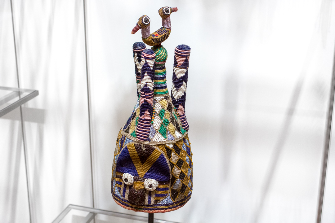
Images: Gwendolyn Knight, 1934-1935, Augusta Savage (born Green Cove Springs, Florida, 1892; died New York City, 1962), painted plaster, 18 1/2 x 8 1/2 x 9 in. Gift of Gwendolyn Knight Lawrence, 2006.86, Photo: Natali Wiseman. Gwendolyn Knight detail, Photo: Natali Wiseman. “Negro Students Hold Their Own Art Exhibition,” New York Herald Tribune, February 15, 1935, Reproduced from the Collections of the Manuscript Division, Library of Congress.

The Art of Storytelling

Storytelling is an essential tool for expressing our beliefs, culture, and creativity. We spend our lives collecting and sharing stories. Whether we’re recounting a childhood memory or teaching others about a historical event, stories help us make sense of, and connect to, the world around us.

Visual art and storytelling are closely associated. When we view a work of art with narrative potential, we are naturally inclined to interpret it. To understand an object, we think about what we see as well as what the object and its artist are communicating. Questions like “Who are the figures?” or “What is happening in this scene?” prompt us to construct stories to explain the object. With their stories, we might see artists sustaining, subverting, or expanding on traditions they’ve inherited.

Black-Figured Amphora with Herakles and Athena

The proliferation of narrative content in Greek art, particularly vase-painting, began at the turn of the sixth century B.C.[i] Without any text to explain what’s happening in these vases, our familiarity with the actions or attributes of the figures depicted is crucial in identifying the characters, and through them, the story in which they are involved. The 6th-century B.C. black-figured storage jar, or amphora, depicts a mythological battle scene. The lion skin worn by one of the figures tells us that the figure is Herakles and refers to the circumstances of its acquisition, the Twelve Labors. With his foot mid-air, Herakles steps forward to charge at his opponents. Athena, armed with her helmet and spear, stands either in front of Herakles on one side of the vase and behind him on the reverse side of the vase. Two of the three hoplites hasten away but look back, indicating their retreat mode and an impending victory for Herakles and Athena. The alliance between Herakles and Athena alludes to Athena’s role as a divine comrade to great heroes in mythology and art. The nature of narrative art like this amphora requires the viewer to access prior knowledge of visual cues and iconography to read the content. As the viewer begins to study the meaningful features, the story unfolds.

Some Living American Women Artists/Last Supper

Whereas the Greek vase was a propagation of an established narrative, Some Living American Women Artists/ Last Supper is a challenge to powerful narratives in the history of art and religion that have excluded women. The artist, Mary Beth Edelson, takes a reproduction of Leonardo da Vinci’s Last Supper and replaces the heads of Jesus and his disciples with photographs of women artists. “The most negative aspect of organized religion, for me,” says Edelson, “was the positioning of power and authority in the hands of a male hierarchy that intentionally excluded women from access to these positions…[The work] gave me a double pleasure of presenting the names and faces of the many women artists who were seldom seen in the art world of 1972 as ‘the grand subject’—while spoofing male exclusivity in the patriarchy.”[ii] The resulting work showcases women in a male context and connects art with religion. The poster not only commemorates women artists but also highlights the struggles women have confronted in their professions. The act of women taking the place of men in an important historical painting overturns gender constructs. By appropriating the message of the male-dominated Last Supper painting, Edelson effectively asserts the voices of women and their place at the table.

Nnada Okumkpa (Senior Leader’s Mask)

The narrative content of objects is not necessarily fixed. Objects can convey different and new stories depending on their environment, use, and audience. Masks, for example, are not simply static images; they are imbued with social relationships and act as vehicles for powerful storytelling. Wooden masks were one of the many elements used in okumkpa, a masquerade tradition of the Afikpo of southeastern Nigeria.[iii] The play essentially functions as a community theater, touching on issues exclusively known to the people of the village. Although the play primarily ridicules and satirizes community members and relevant events, it offers moral commentary on how residents have behaved, establishing a standard for how they should behave. The masked players embody mma, a type of spirit intended to protect the players and provide them the freedom to perform without restraint. The senior leader of the performance would wear the Nnada Okumkpa, direct the skit, and narrate the action. When the masks became animated, they interacted with the viewer and situated him as a participant in a performance. While admiring the staging of the masquerade performance on the fourth floor gallery, I overheard a visitor commenting to her friend, “I’m waiting for one of them to start moving.” Though still and silent, the mask in the museum is a suggestive remnant of the movement, sound, and drama of performance.

Visual storytelling involves an intimate interaction between an object and its audience. When we choose to become immersed in the objects, they bring out very personal responses. We may laugh, cry, or even critique the story we believe we see in the objects. Our engagement with art ultimately keeps the stories alive. I hope you will find a good story during your next visit to SAM!

—Fiona Dang, SAM Curatorial Intern

[i] Mertens, Joan R. How to Read Greek Vases. New York: The Metropolitan Museum of Art, 2010.
[ii] “Mary Beth Edelson.” Avalanche. 1973.
[iii] Ottenberg, Simon. Masked Rituals of Afikpo: The Context of an African Art. Seattle: The University of Washington Press, 1975.
Images: Manuscripts and Archives Division, The New York Public Library. “Work with schools : a librarian’s assistant telling a story to a group of Russian children in their native language, ca. 1910s.” New York Public Library Digital Collections. Accessed January 8, 2016. http://digitalcollections.nypl.org/items/510d47da-e5f7-a3d9-e040-e00a18064a99. Black-Figured Amphora with Herakles and Athena, Greek, 6th C., B.C. Gift of Norma and Amelia Davis, 82.83, Photo:Natali Wiseman. Some Living American Women Artists/Last Supper, Mary Beth Edelson, 1971. Purchased from artist by Seattle Art Museum, 98.14, Photo: Mark Woods. Nnada Okumkpa (Senior Leader’s Mask), Chukwu Okoro, Gift of Simon Ottenberg, in honor of the 75th Anniversary of the Seattle Art Museum, 2005.42, Photo: Natali Wiseman.

Object of the Week: Head from a statue of Pharaoh Thutmosis III

There are two terms you simply must hang onto in the event that you’re watching Jeopardy and “Art of Ancient Egypt” comes up as a column and pharaonic sculptures features in one of the answers: uraeaus and nemes. The nemes is the distinctive, striped headcloth donned by our Egyptian king here and probably best worn by King Tut himself—whose tomb treasures, coincidentally, featured in one of the most important exhibitions in SAM’s history: the 1978 Treasures of Tutankhamun. My personal all-time favorite photo from the SAM archives features our own Chris Manojlovic, Director of Exhibition Design, enraptured by Tut’s mask. The other term, uraeus, refers to the coiled cobra above the figure’s forehead, which was both a symbolic presence, signifying that its wearer was royalty, and a protective force, whose breath and venom would keep harm from coming to the king.

An installation photo from the 1978 exhibition "Tut"

This cool Egyptian head lives amid our ancient art collection on the 4th floor downtown. S/he has had a long and interesting journey. The Egyptian artist(s) who crafted it worked with simple saws and drills made of copper to carve out the head and a complete, life-size body that was once attached to it. When they had established the form, they created a smooth surface by using stone scrapers over the hard basalt. A lively first life for the statue might have included performance in rituals and standing guard in a festival or funerary temple.

Dating ancient material like this piece is very tricky and relies mostly on judgments of style. SAM’s sculpture has a date of mid-15th century B.C., in 18th Dynasty Egypt (about 1543 B.C.-1292 B.C.), but in the first years after it entered the museum’s collection, expert opinions placed it in the much later Ptolemaic period (305 B.C.-30 B.C.). Because ancient Egyptian art idealized individuals—aiming to show them as gods—even the subject is a matter of debate. We think it depicts Thutmosis III, but it’s possible that instead the face represents Queen Hatshepsut, the woman who totally stole his thunder, usurped his throne, and pushed him to the background for her more than 20 years of rule.

Our Head from a statue of Pharaoh Thutmosis III was cultivated from a 1937 excavation at the Temple of Armant in Egypt. Sir Robert Mond, pioneering chemist, collector, and archaeologist, financed the excavation, and notable archaeologist Oliver H. Myers directed the project. The basalt head was a highlight from their findings. Multiple restorations have the figure looking as good as s/he does now. Sections of the nose, cheek, uraeus, the upper lobe of the left ear, the upper and lower lobes of the right ear, and a segment of the headdress have been restored. One restoration, later reversed, is documented in the photo below, where simulations of the chin and right jaw are affixed to the original.

A historic photo of the Egyptian head documents a restoration to the chin and right jaw, now removed

For some time in 2002-2003, this striking sculpture joined Andy Warhol screenprints of Mick Jagger and Muhammad Ali, as well as Nigerian carved wood figures, for the SAM exhibition Hero/Antihero. Mounted at the same time as a show devoted to George Washington, Hero/Antihero explored the idea of the hero and the effect heroes have had on art and belief throughout history. The Egyptian pharaohs, each worshiped like or as God, offer a fascinating example of people venerating other people.

—Jeffrey Carlson, SAM Collections Coordinator
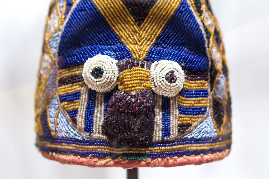
Images: Head from a statue of Pharaoh Thutmosis III, mid-15th century B.C., Egyptian, basalt, 11 1/2 x 14 x 11 in., Eugene Fuller Memorial Collection, 52.70. Installation photo from the 1978 exhibition “Tut”, Photo: Paul Macapia, Seattle Art Museum. A historic photo of the Egyptian head documents a restoration to the chin and right jaw, now removed, Photo: Seattle Art Museum

Object of the Week: Trapsprung

As we welcome 2016, SAM nears its 83rd anniversary as an institution. It’s an organization with a rich and, at points, dramatic history. From its early years SAM has also shown a commitment to being part of history as it develops—not becoming a place where we all gawk at history as it gathers dust.

Our founding director, Dr. Richard Fuller, set up a regular exhibition program for living Northwest artists. Much of the gallery space at the Asian Art Museum in Volunteer Park was, in the museum’s formative years, a site for rotating displays of contemporary work. Often Dr. Fuller would purchase a painting from a show on behalf of the museum, using money from his own pocket, but representing the museum, and later very informally accessioned it into the permanent collection. For the artists he deemed worthy, he provided complementary display space and buying power via SAM. In addition to his role as an important patron to Northwest artists—notably Mark Tobey, Morris Graves, and Kenneth Callahan—Dr. Fuller also worked out agreements with some artists to support them through living stipends. He employed some of them, like Callahan, to help him at the museum with installing, packing, and shipping art, or promoting shows in the local papers.

Kenneth Callahan

In the photo above, a smiling, sweeping Callahan oozes appreciation—and he should! While employed by SAM, and with the financial and emotional support of Dr. Fuller, he produced powerful work like First Seed into the Last Harvest (1943), a favorite of mine in Pacific Northwest Modernism.

First Seed Into Last Harvest

Our current director, Kim Rorschach, continues to encourage SAM’s engagement with contemporary art. One acquisition representative of her time at the helm is Lynette Yiadom-Boakye’s Trapsprung (2013), a remarkable oil painting that’s currently hanging in the Brotman Forum near our admissions desk. In the picture, a life-size ballerina emerges from a flat background, full of dynamism and grace in her movement.

Born in 1977, Yiadom-Boakye is a British artist of Ghanaian descent. In her work, Yiadom-Boakye is interested in making interventions in history and reality. Her work features human figures and can be called representational in that sense. The figures are almost always people of color, and they are always posed actively, portraying self-confidence, and not passive presences. They’re figures, but they’re not exactly portraits: Yiadom-Boakye works using her imagination rather than representing specific individuals from life studies or photos.

What makes her work especially compelling is her desire to insert people of color into monumental paintings (and the sometimes exclusive stories that have traditionally played out there), such as her ballerina in Trapsprung. She’s writing a new history, an inclusive one, and it’s freshly assertive, exciting, and imaginative.

Here’s to all that we know 2016 holds—including a blockbuster show for another artist interested in new histories, Kehinde Wiley—and to what we have yet to discover!

—Jeffrey Carlson, SAM Collections Coordinator
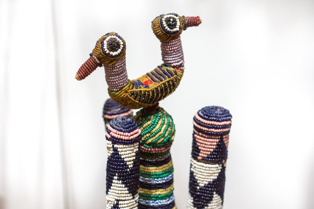
Images: Trapsprung, 2013, Lynette Yiadom-Boakye, British, b. 1977, oil on canvas, 78 3/4 x 70 7/8 in., Seattle Art Museum, General Acquisition Fund. Seattle Art Museum Archives. First Seed into Last Harvest, 1943, Kenneth Callahan, American, b. 1905, tempera on canvas, 14 1/2 x 18 1/4 in., Seattle Art Museum, Eugene Fuller Memorial Collection.

Impressionist Self-Portraits in Frontispieces

“A frontispiece must 1: please the eye, 2: do credit to the author and the artist, 3: help to sell the book.”
—Artist, Gérard de Lairesse (Flemish, 1640–1711)

A book’s frontispiece refers to the illustrative material facing the main title page. In Europe, frontispieces began to appear in books not long after the dawn of the printed book in the 15th century. They were often designed with elaborate stylistic architectural elements, or a portrait of the author, or an illustration of the book’s subject. The first known printed frontispiece alluding to an author was in Bernhard von Breydenbach’s (German, 1440–1497) Sanctae Peregrinationes, printed in Mainz in 1486.

As artists started to author their own printed books, self-portraits and depictions of the book’s subject—engraved by the artists themselves—began to appear on the frontispiece. Some early examples of this include works by: Albrecht Dürer (German, 1471–1528), Hans Holbein, the younger (German, 1497/1498–1543), Gian Lorenzo Bernini (Italian, 1598–1680), and Peter Paul Rubens (Flemish, 1577–1640).

Claude Monet

On view currently just outside the Dorothy Stimson Bullitt Library are more modern interpretations of the artist-portrait frontispiece, featuring the likenesses of artists whose works are exhibited in Intimate Impressionism.

These books offer a sample of frontispieces with artist portraits and self-portraits, produced in the early- to mid-20th century. As publishing converted to machine-produced methods and moved away from the hand-engraved images of the past, it is interesting to see that the use of frontispiece portraits has survived. These works, published from the 1930s through the 1960s, demonstrate how this centuries’ old tradition has endured.

Paul Gauguin

Two catalogues on French artists from Wildenstein & Company, Paul Gauguin, 1848–1903: A Retrospective Loan Exhibition… (1936) and Édouard Manet, 1832–1883: A Retrospective Loan Exhibition… (1937), demonstrate a mechanically-produced black and white image of Paul Gauguin’s self-portrait, and then a larger color reproduction of Édouard Manet’s self-portrait, respectively. In Cézanne: Biographical and Critical Studies, published by Skira in 1954, the method of “tipping in” an illustration is used—in this case, the self-portrait of Paul Cézanne (French, 1839-1906).

Édouard Manet

This book installation is on view just outside the Bullitt Library on the fifth floor of the Seattle Art Museum during the library’s public hours: Wednesday-Friday, 10 am-4 pm.

—Traci Timmons, Librarian, Dorothy Stimson Bullitt Library

Object of the Week: Virgin and Child

Wandering through our European art galleries at SAM one day, I overheard a visitor lamenting the space we had given to older art with Christian themes. His voice dripping with disdain, he said, “Oh, pictures of Mary and Jesus. I’d rather look at myself in the mirror!” Besides drawing laughter from his companion and from myself, his comment got me noodling and then writing this blog post.

Allow me to make a case for Mary-and-Jesus pictures this timely week.

A lot has changed since the holiday season of 1967, when SAM sent out a Christmas card with a reproduction of its great Francesco Bassano Adoration of the Magi painting, and since December 19, 1968, when the Beacon Hill News-Journal sported a similar reproduction of the Bassano, while inviting Seattleites to a long list of local Christmas services.

American museums today take the responsibility to honor the diversity of the human race , the American population, and the specific communities they serve very seriously by representing a range of viewpoints in the galleries. Religious as well as ethnic diversity and identity freedom are all at the forefront of these conversations. Diversity and inclusion are necessarily central to museum hiring practices, too. These core concepts represent steps forward to a more equitable global community. I believe SAM is rightly approaching diversity and inclusion with its focus and humility, understanding that it has areas in which to grow, aiming to address those head-on, and setting its sights on better serving our delightfully diverse city and world.

Painting on view at the Seattle Art museum

A painting like SAM’s Virgin and Child by the Master of San Torpè of Siena, dated to the end of the 13th century or early 14th century, does achieve a number of important goals for the museum. Simple in composition and small in scale, Virgin and Child has a very intimate presence. Whatever the artist’s ambition in creating the work—maybe a genuine sense of devotion to God or a devotion to being exceptionally good at his craft—he produced a picture of quality that has handsomely withstood 700 years.

Remarkable as a work of art, the painting shows a high level of craftsmanship and gives us a window onto a significant period in art history. Works produced in this Proto-Renaissance style of the 13th and 14th centuries directly precipitated, well, the Renaissance, with its focus on humanist ideas and a visual art that encouraged scientific perspective and a mimetic approach to representing the world. The religious subject, the Madonna and Child, is very representative of the time and place when it was painted, one of the most important themes for the period. I find the aesthetic really intriguing: the balance of heavenly gold and august blue gives the painting an appropriately impressive air, and the figures have oddly proportioned features like those crazy fingers.

Many of our visitors won’t experience a connection to the roles Mary and Jesus play in Christian theology, but quite a few more—I daresay all of our visitors—were born to mothers. The maternal affection Mary shows for her baby as she cradles him, the kind of loving, protective care that she embodies—these are essentially human feelings. To illustrate the longings of the human soul in visual art is, for me, one of the great challenges for an art museum, and one that this historical piece takes up well.

Very warm wishes to all this holiday season!

P.S. To those who celebrate Christmas, I hope it’s a very merry one!

—Jeffrey Carlson, SAM Collections Coordinator
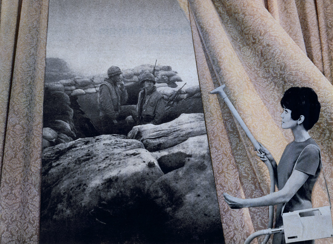
Images: Virgin and Child, ca. 1325, Master of San Torpè, Italian, active ca. 1290-ca. 1320, egg tempera and gold on wood, 21 1/8 x 14 1/8 in. Seattle Art Museum, Samuel H. Kress Collection, 61.152. Beacon Hill News-Journal, 1968.
SAM Stories