The concepts contained in words like ‘freedom’, ‘justice’, ‘democracy’ are not common concepts; on the contrary, they are rare. People are not born knowing what these are. It takes enormous and, above all, individual effort to arrive at the respect for other people that these words imply.
– James Baldwin, “The Crusade of Indignation,” The Nation, July 7, 1956
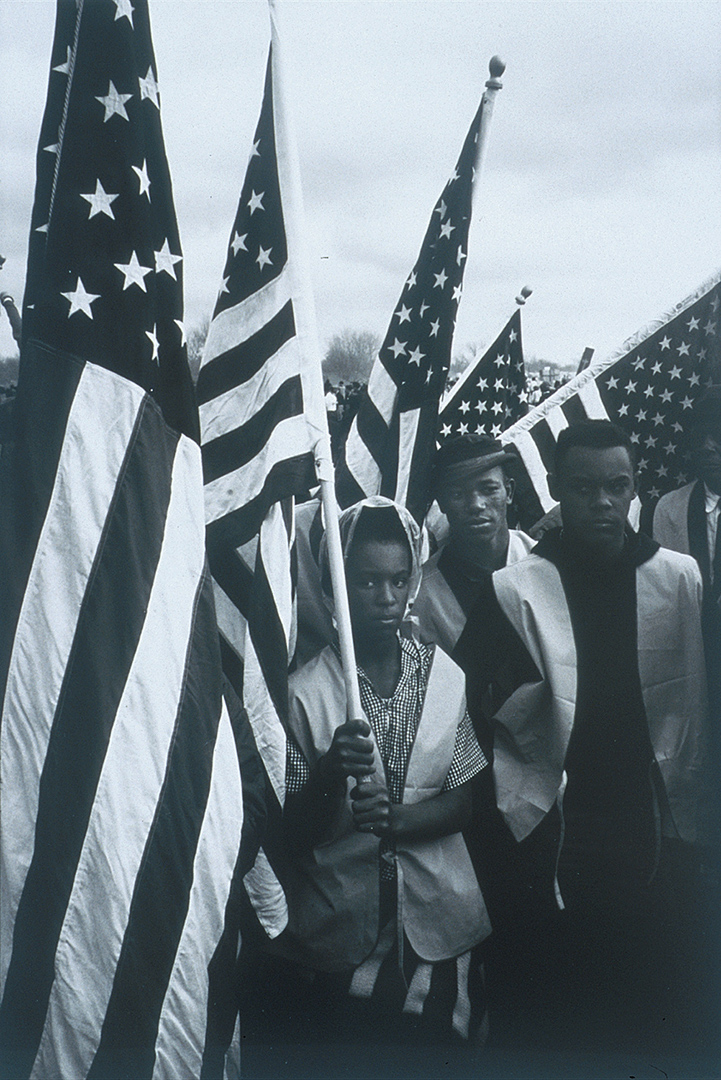
This black and white photograph, taken by photojournalist Dan Budnick in 1965, is one of a series that Budnick had hoped to publish in a Life magazine photo-essay. Taken during critical events of the civil rights movement, the photographic series captures such moments as the 1958 Youth March for Integrated Schools, the 1963 March on Washington, and Dr. Martin Luther King, Jr.’s I Have a Dream speech delivered that same day.
This image in particular depicts three young activists—Veronica Smith, Phillip Hunter, Jr., and Kent Carrington—holding the American flag while participating in the famous five-day march from Selma to Montgomery, Alabama. Led by Dr. King, the march protested the discriminatory laws suppressing black voters’ rights in the South and would eventually lead to the passage of the landmark Voting Rights Act. Stoic, calm, and courageous, Smith, Hunter, and Carrington are engulfed in a sea of stars and stripes—symbols of the freedom and equality for which they were fighting. The flags, acting as a visual barrier separating them from their fellow marchers, can perhaps be read as a metaphor for the segregation these activists sought to end.
While the civil rights movement often conjures struggles faced in the past, Dr. King’s call for racial equity, social justice, and religious tolerance is as relevant today as it was fifty years ago. Progress has no doubt been made since the 1960s, but it is also important to acknowledge that the fight against racism—in all its insidious and systemic forms—is not a past but current event. Many of us will celebrate Dr. King’s legacy by observing his birthday on Monday, January 15, but our individual efforts to achieve equal rights—for all marginalized communities—is an ongoing project that transcends a single day.
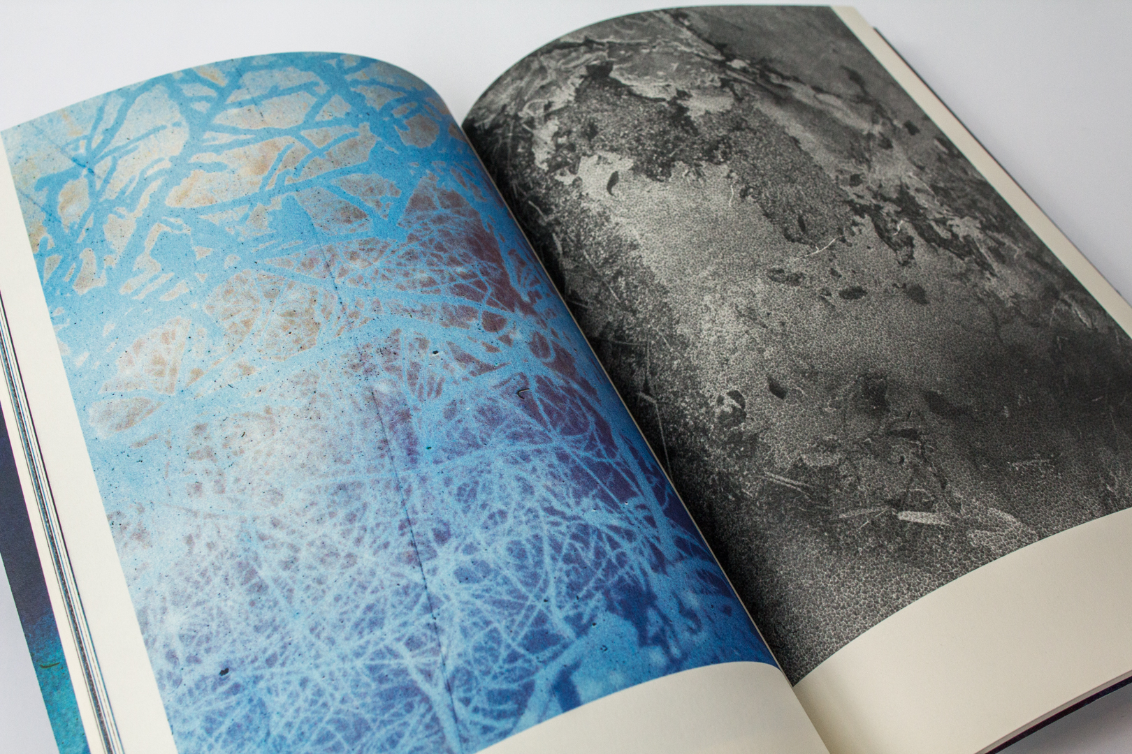
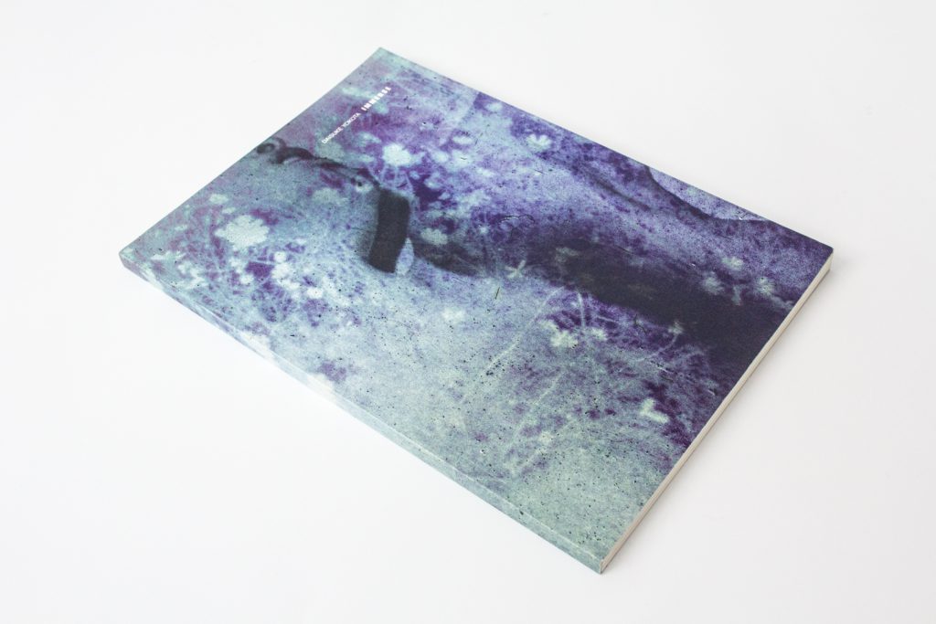
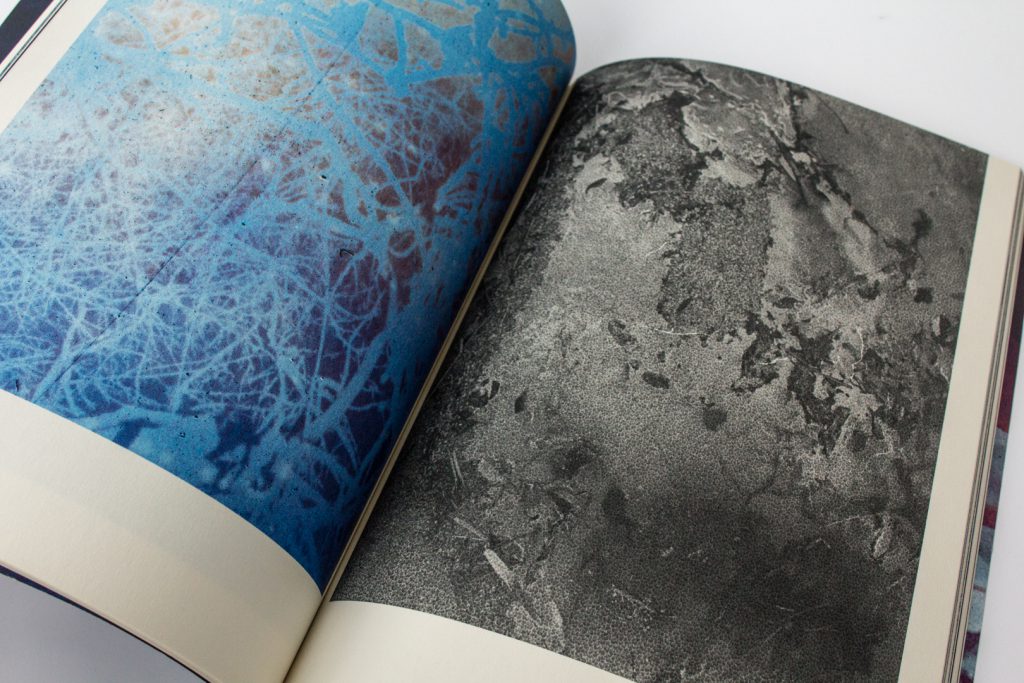
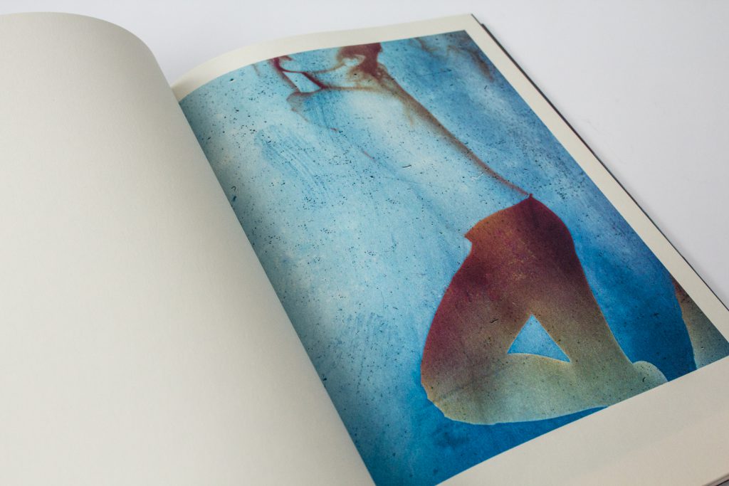
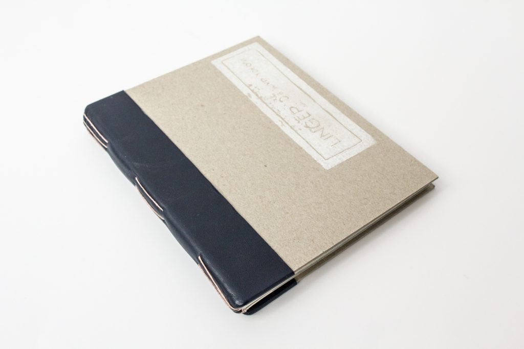
This is the second in a series of posts about an extraordinary photobook collection donated to the McCaw Foundation Library for Asian Art by collector, Chris Harris. Photobooks are photography-illustrated books which may or may not include additional text. The photography drives the content, rather than being supplemental to the written word. Often handmade, self-printed, or published in limited editions, these books are often considered works of art themselves.
People and Places in Harmony
Part of the Aomori Prefecture, Tsugaru is found at the far north of Japan’s main island of Honshu. The Sea of Japan meets its western shore, while the Pacific Ocean is to the east. Surrounded by water, this mountainous area is beautiful, remote, and endurably peaceful.
Map showing the Tsugaru Strait (https://en.wikipedia.org/wiki/Sea_of_Japan, access 8/9/17)
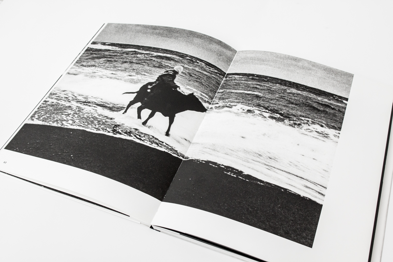
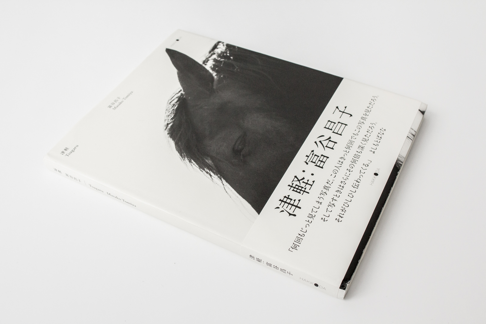
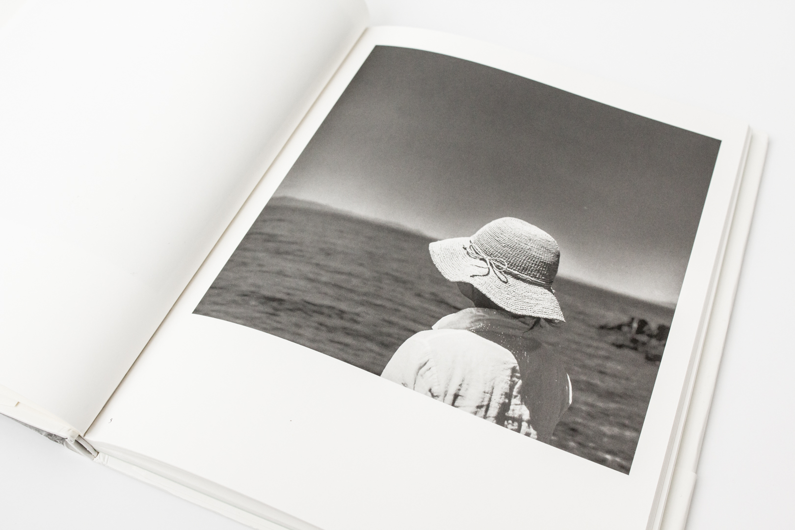
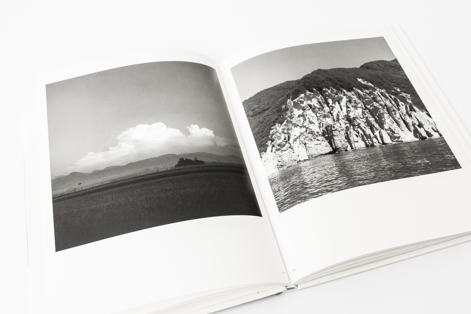
Two of the photobooks from the Harris collection give us glimpses of captivating people and places in Tsugaru.
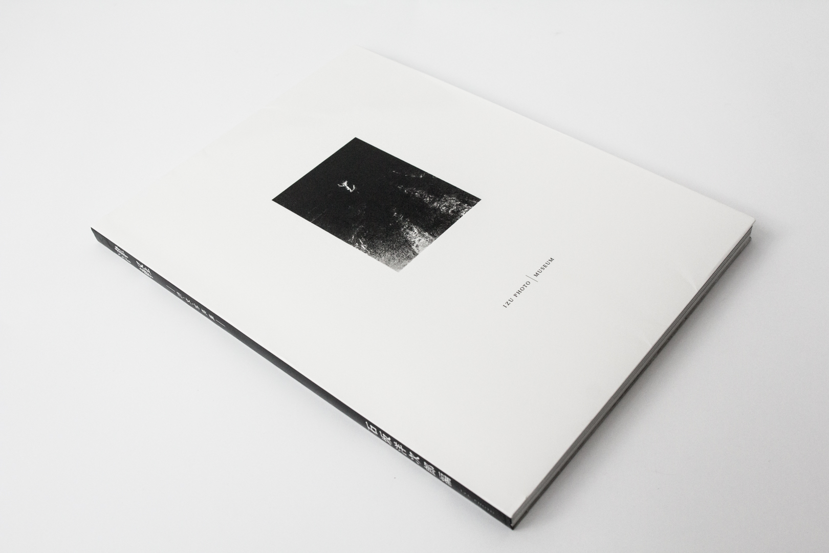
Rugged, Deep, Delicate Tsugaru: Shi, Bun, Shashinshu by Yojiro Ishizaka and Kojima Ichiro (Izu Photo Museum, 2014) opens a window that allows us to view everyday life in Tsugaru. The images that reach out from these pages convey the at-home attitude and the quiet sense of belonging expressed by the people who live in this vast, remote landscape.
Tsugaru: Shi, Bun, Shashinshu by Yojiro Ishizaka
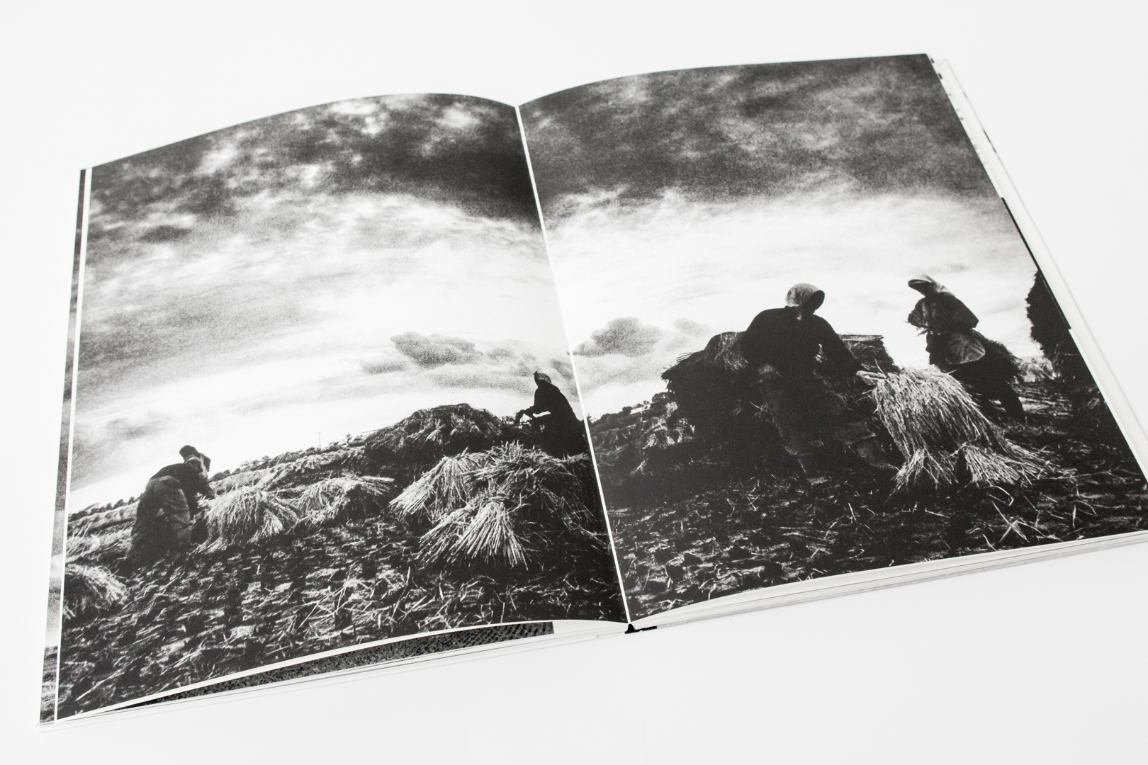
These stunning images capture the sense of eternal clarity that suffuses the landscape and the people of Tsugaru. This masterful work depicts people living in harmony within the natural world, using images that are artistically compelling and evocative.
Tsugaru: Shi, Bun, Shashinshu by Yojiro Ishizaka
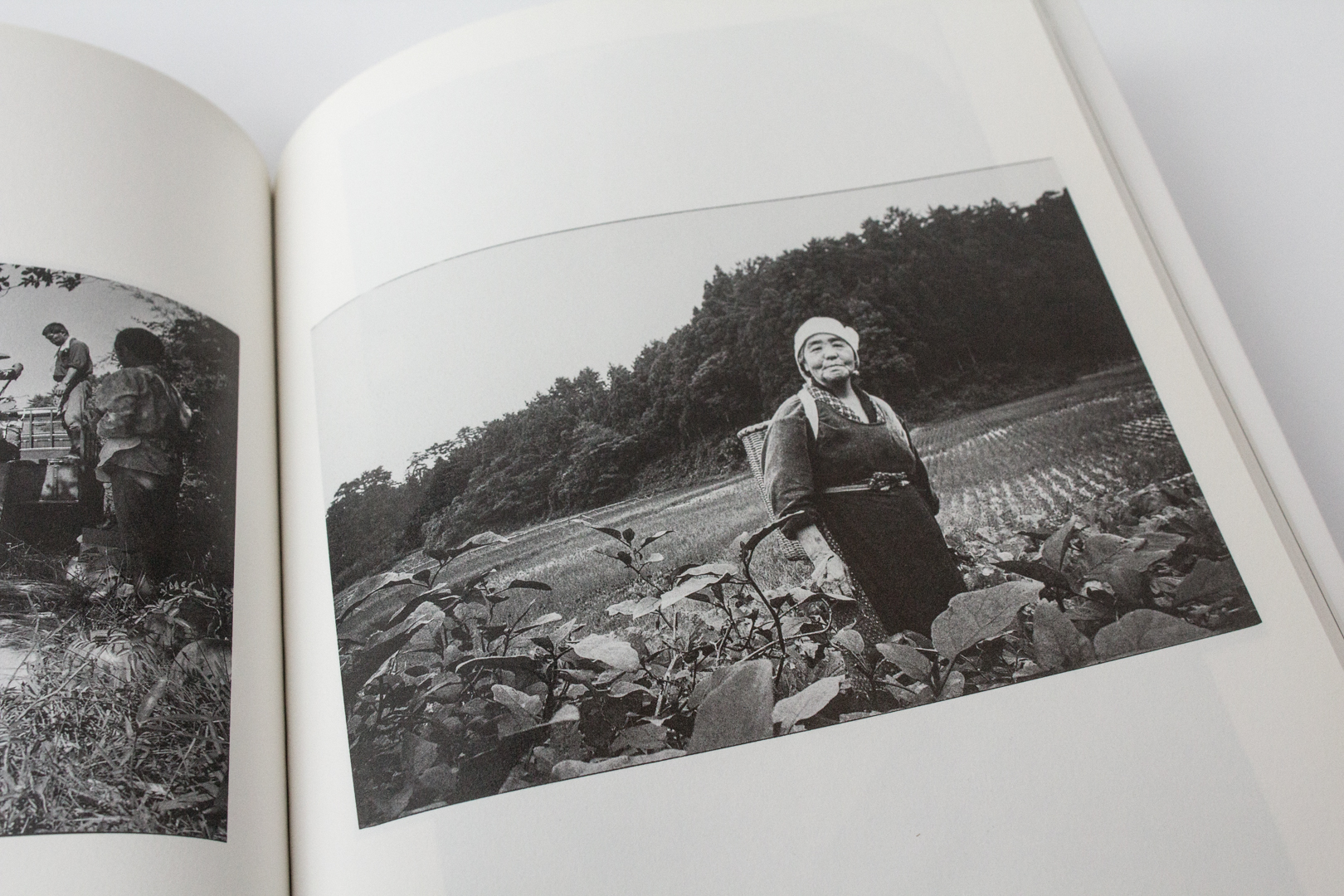
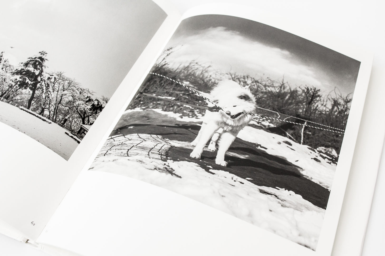
Integrity and Integration Masako Tomiya’s Tsugaru (self-published, 2013) is a study of individualists adapting to a beautiful, rugged world. The unique character of the landscape and people of Tsugaru is captured beautifully in this collection of black and white photographs.
Tsugaru by Masako Tomiya
It celebrates the majesty of the rugged rural terrain, whipped by fierce wind and snow in the winter, then bathed in summer’s balmy breezes. The people who live there are portrayed as the resourceful individuals they are, living life in tune with the call of the natural world.
Tsugaru by Masako Tomiya
These photobooks are available for consultation at the Dorothy Stimson Bullitt Library at the Seattle Art Museum downtown by appointment while the Asian Art Museum at Volunteer Park is undergoing renovation. When the Asian Art Museum and the McCaw Foundation Library reopen, the photobooks will be available there as an ongoing resource.
– Kate Nack, Library Volunteer, McCaw Foundation Library for Asian Art
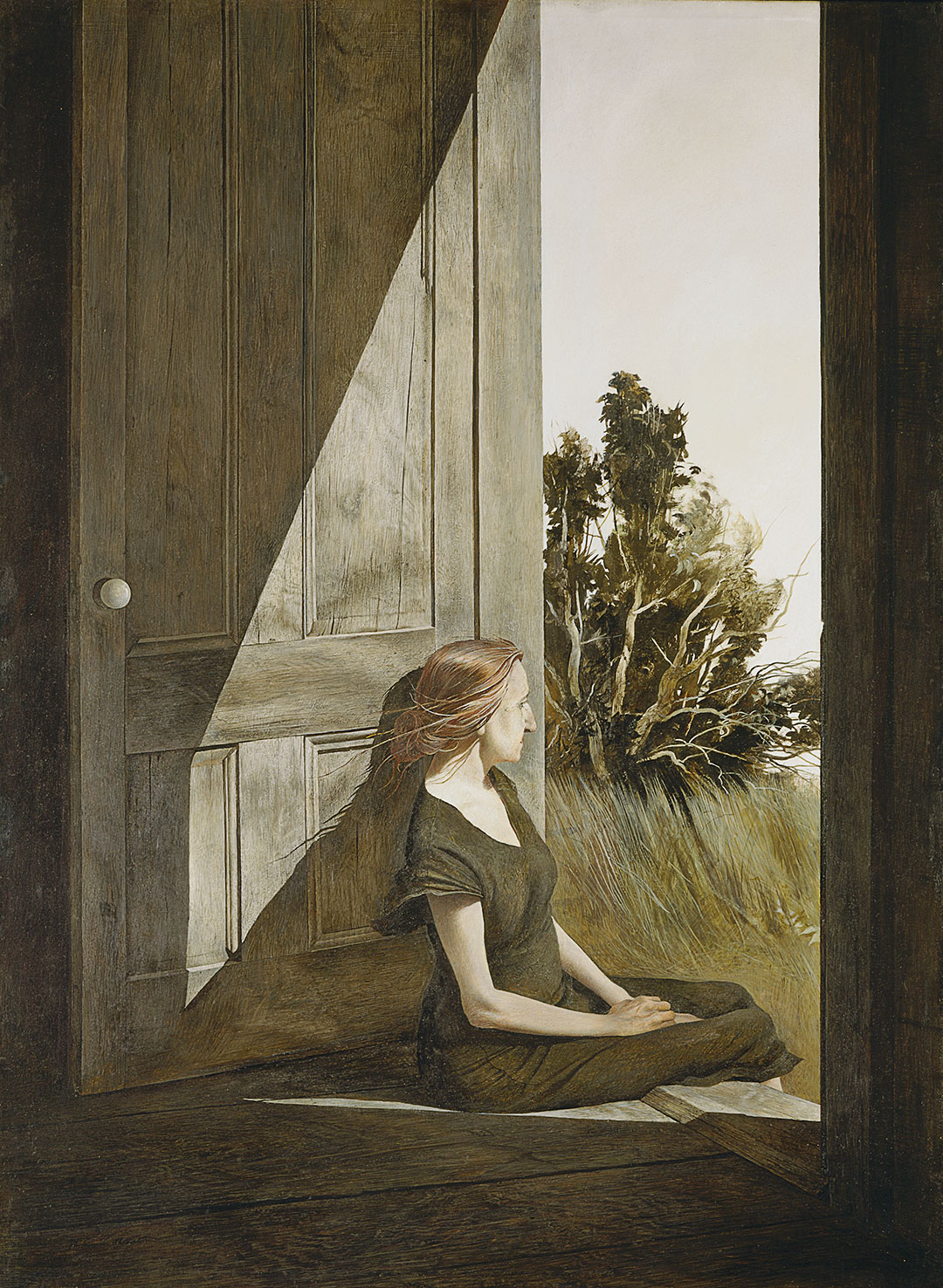
One day I came in and saw [Christina] on the back door step in the late afternoon. She had finished all her work in the kitchen and there she was sitting quietly, with a far-off look to the sea. At the time, I thought she looked like a wounded seagull with her bony arms, slightly long hair back over her shoulder, and strange shadows of her cast on the side of the weathered door, which had this white porcelain knob on it. ―Andrew Wyeth
Andrew Wyeth met Christina Olson through his wife Betsy and first painted her in 1947. He would paint Christina every summer in Cushing, Maine for the next 20 years until her death in January, 1968. As Betsy explains it, “The key to the Olson pictures is Andy’s relationship with Christina—absolutely at ease with him.” Christina Olson, a New-England native, refused a wheelchair for much of her life, despite being without the use of her legs. Rather, she used her upper body to pull herself through the fields and house where she lived and worked. Her tenacity and intelligence captivated Andrew Wyeth and their friendship blossomed easily.
I think one’s art goes as far and as deep as one’s love goes. I see no reason for painting but that. If I have anything to offer, it is my emotional contact with the place where I live and the people I do. – Andrew Wyeth
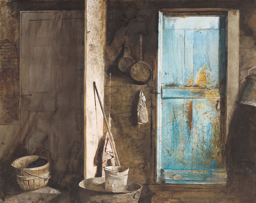
Even in death, Andrew continued to draw inspiration from Christina through her house and the objects that had defined her. Wyeth considered this painting of the two entrances to her home a double portrait of the siblings, Alvaro and Christina Olson. When first introduced to the Olson siblings, Andrew was initially taken with Alvaro and painted his portrait before he become focused on the indomitable Christina. Alvaro died on Christmas night, 1967, and Christina, without him, died only weeks later. The house and remnants left abandoned in their wake struck Wyeth as symbolic of the lives they lived—the shadowy Alvaro, who only posed for Wyeth once and remained always in the background as Wyeth painted in the Olson house; and, by contrast, the brilliant, captivating Christina.
The challenge to me was to do justice to her extraordinary conquest of a life which most people would consider hopeless . . . limited physically but by no means spiritually. – Andrew Wyeth
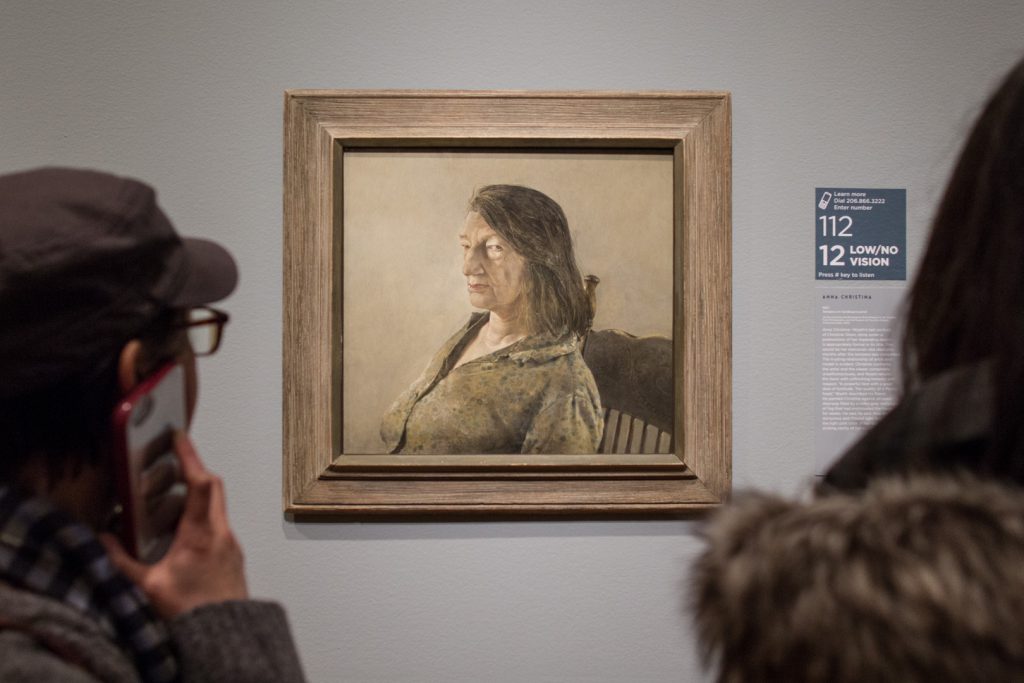
Anna Christina is Wyeth’s last portrait of Christina Olson. She died only months after the tempera was completed. The trusting relationship of artist and model is evident: Christina confronts the artist and the viewer completely unselfconsciously, and Wyeth returns the favor with unflinching honesty and respect. “A powerful face with a great deal of fortitude. The Quality of a Medici head,” Wyeth described his friend. He painted Christina against an open doorway filled by a milky gray rectangle of fog that had enshrouded the house for weeks.
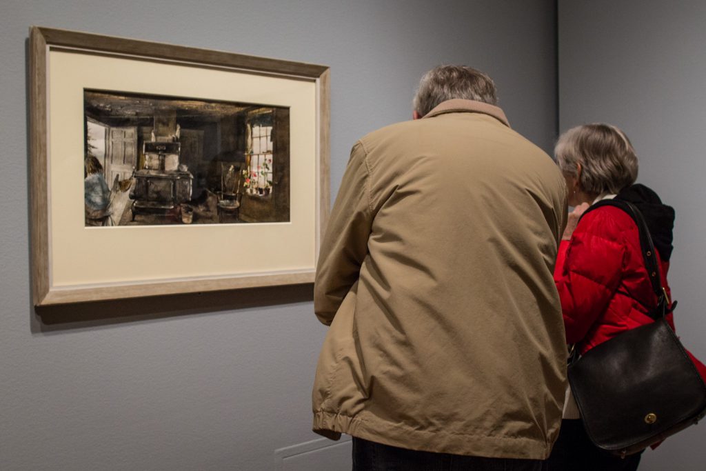
This drybrush is intended to be a portrait of the Olson house both outside and inside. Outside is total fragility. Inside is full of secrets. There’s Christina sitting in the kitchen, on the left, and everything’s in there—the stove, the geraniums, the buckets, and the trash. I had to overdo it here and reveal all the secrets. I like to paint in places that are not too nice. ― Andrew Wyeth
Andrew Wyeth saw the world around him resounding with hidden meaning. Occasionally considered a magical realist for his emphasis on the inner life of objects such as the stove or the bucket in this painting, Wyeth was certainly a storyteller. His paintings can be seen as stills in a moving image—the story of Christina’s Olson’s life surrounding her and continuing right outside the open door of her kitchen.
This curtain that had been lying there stale for year began slowly to rise, and the birds crocheted on it began to move. My hair about stood on end. – Andrew Wyeth
Christina Olson was a muse for Andrew Wyeth that helped launch his career. As a subject she is forever seated due to the degenerative disease that made her a paraplegic, but in Wyeth’s paintings, the figure of Christina stands out, singular and strong in the stories of Wyeth’s characters. See Andrew Wyeth: In Retrospect before it closes, January 15.
– Chelsea Werner-Jatzke, Content Strategist & Social Media Manager
Today—January 5—is National Bird Day. Established to raise awareness of the issues affecting avian populations around the world, National Bird Day brings public attention to the welfare of birds living in captivity, bird breeding mills, and other such topics.
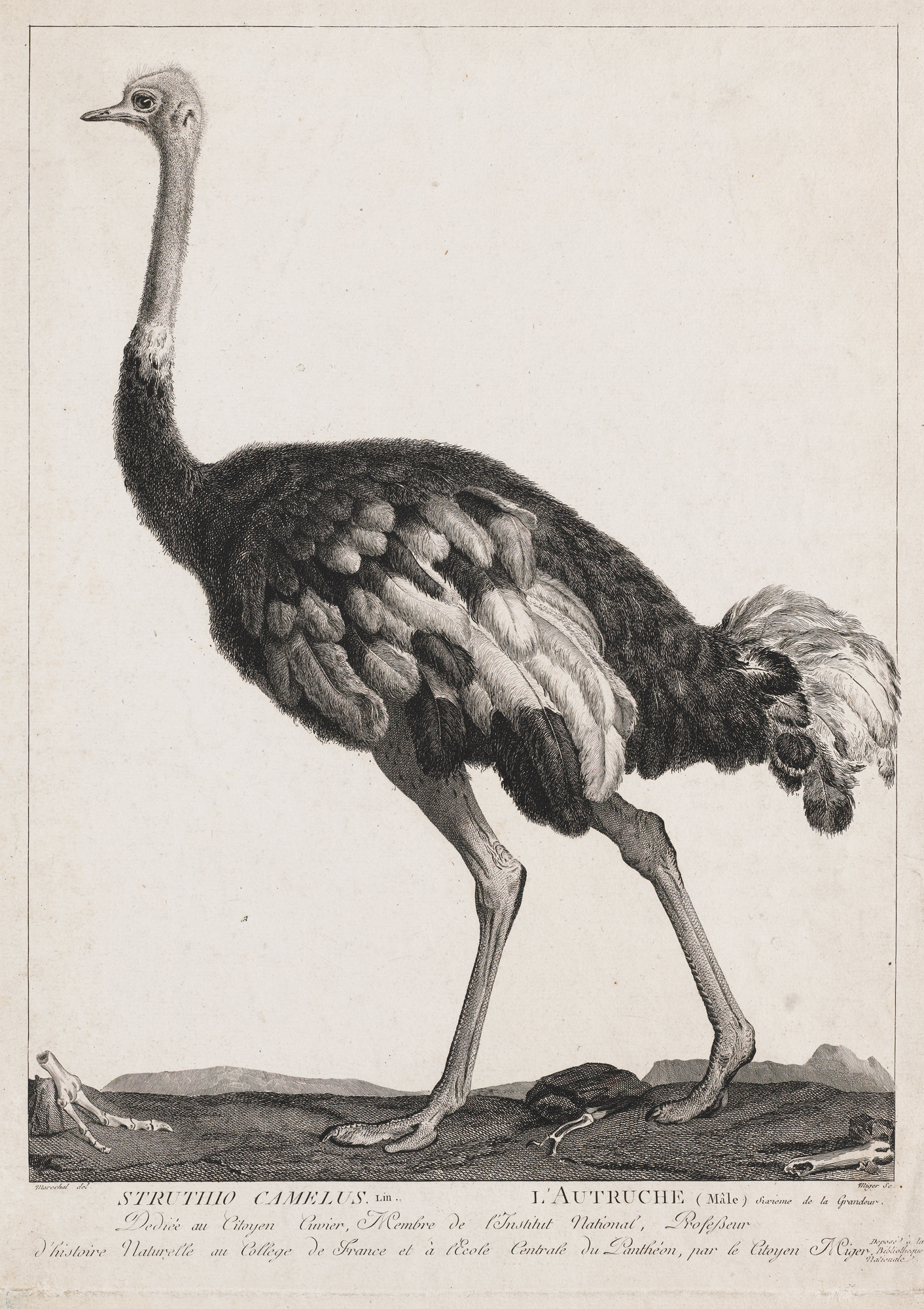
In the spirit of this feathered holiday, we highlight an engraving by French printmaker Simon Charles Miger, titled Ostrich. Created at the turn of the 19th century, this print was published in La Menagerie du Museum National d’Histoire Naturelle—a scholarly work that surveyed and catalogued various animal species on display at the Museum National d’Histoire Naturelle in Paris, France.
The 1801 engraving depicts an ostrich, with its long limbs and feathered body, strutting across a landscape reminiscent of the bird’s native Africa. Rendered in profile, the bird occupies the majority of the composition, making clear Miger’s interest in foregrounding its anatomical likeness.
While La Menagerie indeed illustrates animals who were at the time living in captivity, its production points to important advances made during the Enlightenment, a time when European interest in the natural world grew significantly. Like other artist-naturalists John James Audubon and Alexander Wilson, Miger made important contributions to our understanding of the natural world, producing works that supported the then-burgeoning conservation movement.
– Elisabeth Smith, Collections Coordinator
Image: Ostrich, 1801, Simon Charles Miger, engraving, 17 5/16 x 12 3/16 in., Gift of an anonymous donor, 70.55
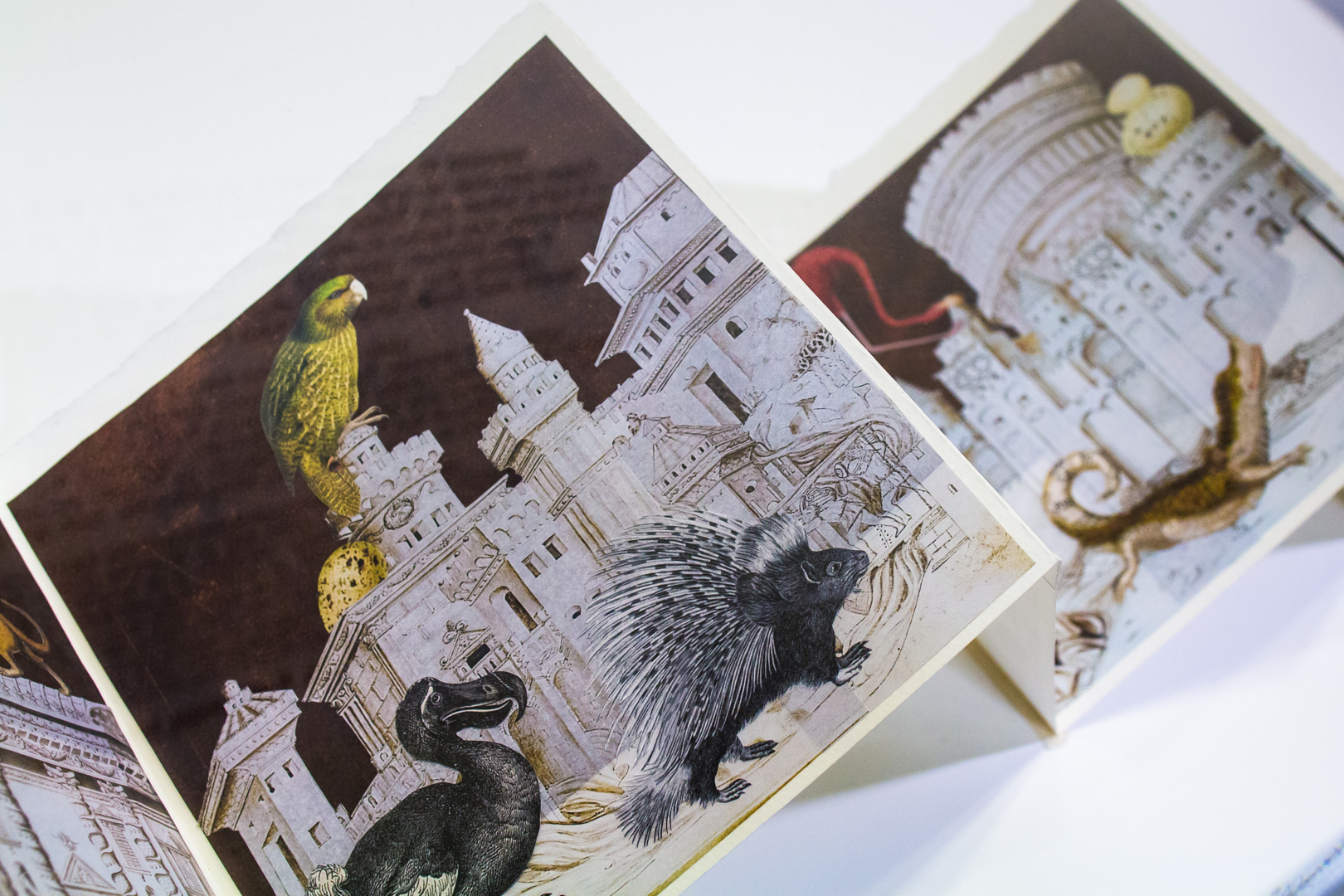
In Andrew Wyeth: In Retrospect, we see how Wyeth masterfully conveys a sense of place, constructing a certain reality or vision of landscapes, domestic spaces, and people of rural Pennsylvania and the coastal villages of Maine. For the Dorothy Stimson Bullitt Library‘s current book installation, we examine an artist’s book that also conveys a sense of place, one that is carefully constructed yet imagined.
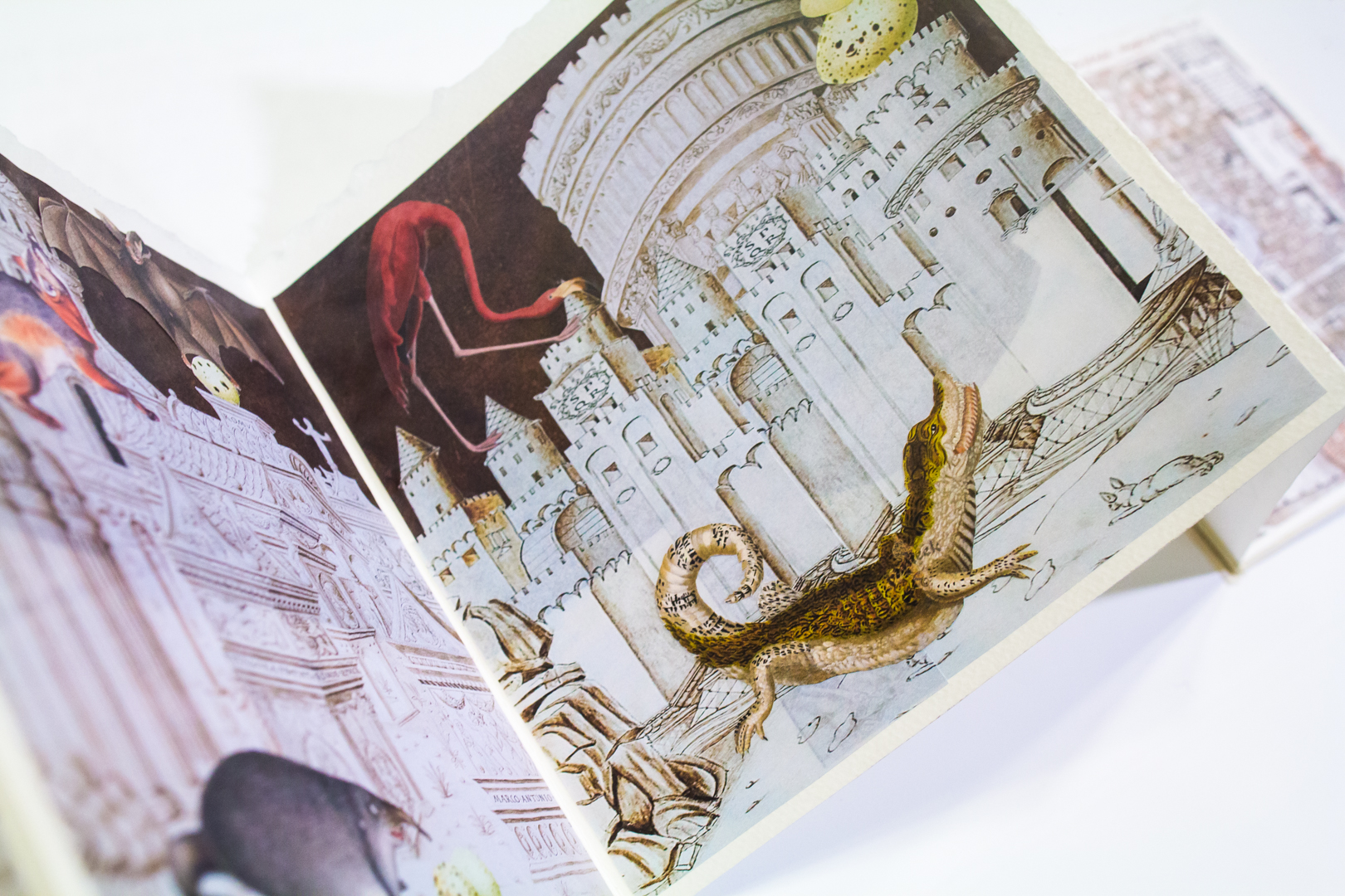
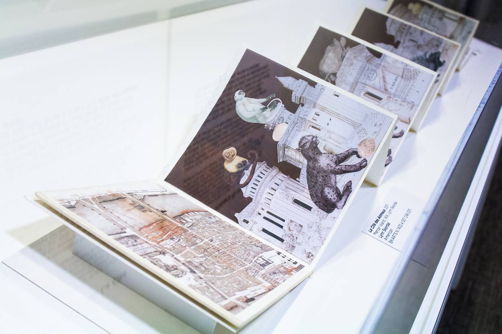
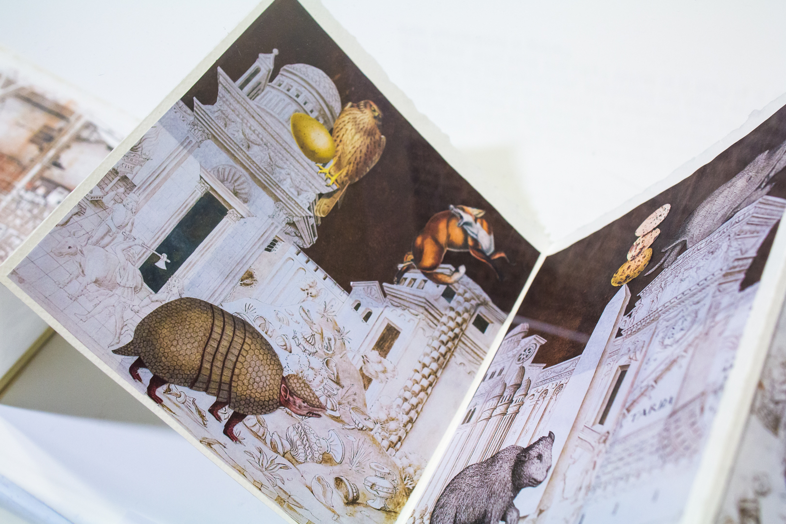
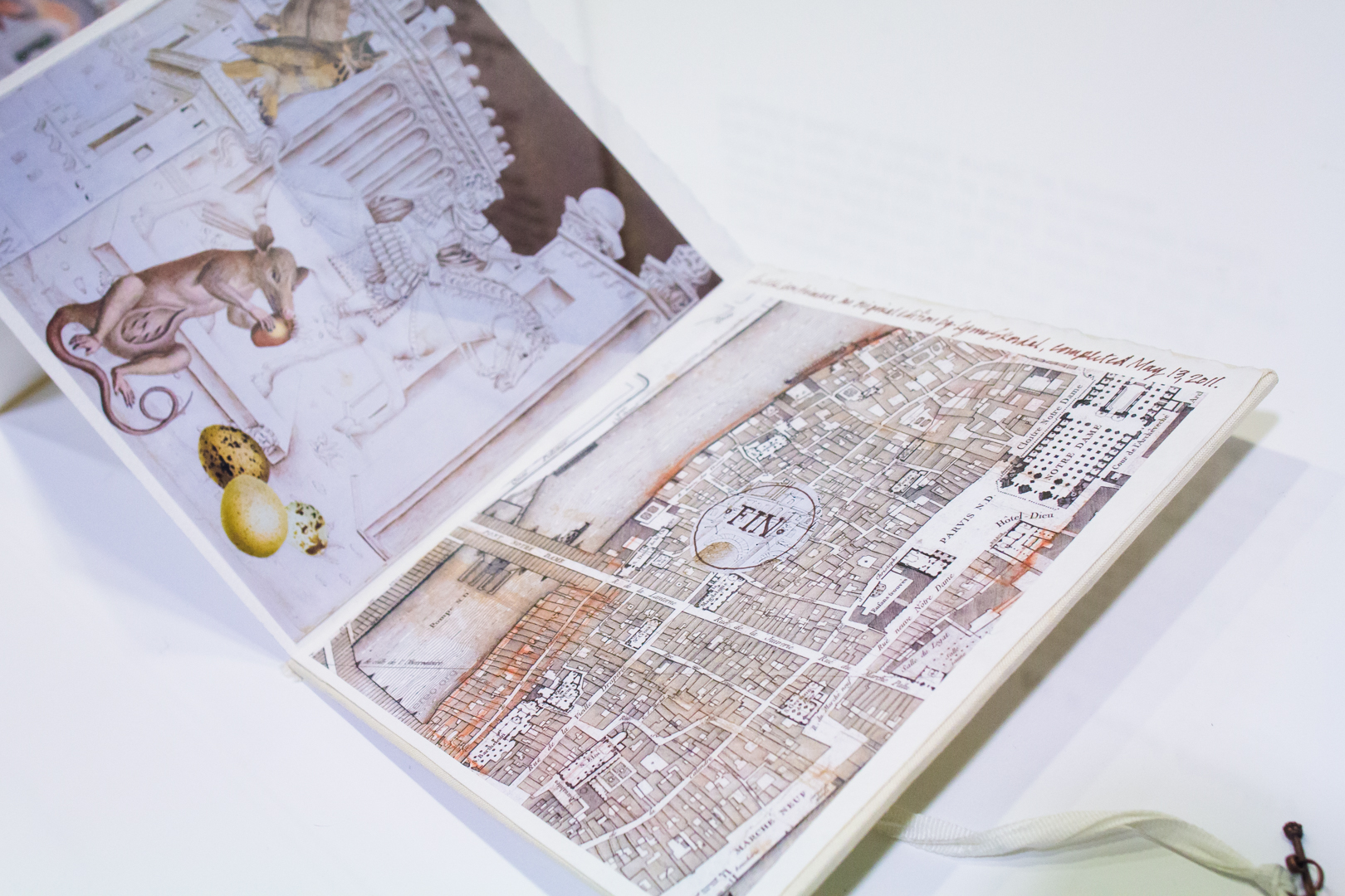
Washington artist Lynn Skordal considers herself a “paperworker.” After retiring from a career as an attorney nearly ten years ago, she returned to an early love—art. She now focuses on collage, artists’ books, and small works on paper that she creates from her collection of books rescued from local thrift stores, old magazines, used paper scraps picked up off the sidewalk, stamps and images torn from envelopes, cuttings from formidable reference works, and old engravings removed from disintegrating books. Her work has been described as “an exploration of real places that don’t exist.”1 One could certainly apply that idea to her thought-provoking artist’s book, La Cité des Animaux (Mercer Island, WA, 2011).
This unique, collaged, accordion-style artist’s book depicts “a parade of strange, whimsical animals creeping through a deserted white city under a chocolate sky.”2 Mammals, reptiles, birds, eggs, and stylized and extinct creatures are set against deserted architectural backgrounds, enclosed on both ends by maps. The artist asks, who built the city? What is it for? Is this what will happen after humankind is gone?3
From Natural History to a New Reality
Skordal’s source material for La Cité des Animaux included several antique works. One was Locupletissimi rerum naturalium thesauri accurata descriptio et iconibus artificiosissimis expressio, per universam physices historiam (Accurate description of the very rich thesaurus of the principal and rarest natural objects . . . ). This elaborately engraved thesaurus of animal specimens was the creation of scientist and collector Albertus Seba (Dutch, 1665–1736). The initial volume of the work was published in 1734, with several volumes issued posthumously through 1765.
Seba’s work was derived from his own “cabinet of curiosities,” a notion Skordal seems to reclaim by pulling the animals from the format of the scientific natural history book and inserting them into a smaller, precious book form. Whereas Seba’s intent was to record and illustrate the natural world truthfully, Skordal uses Seba’s images to construct a new reality.
I was charmed by the idea of animals taking over spaces built by man, but with man long gone. That thought comforts and amuses me. [My work conveys] both a sense of place and a story. I like to create new little worlds where the usual rules may not apply, and where there is a little bit of magic or mystery at work–an alternate reality. The goal is always to startle, amuse, or provoke.4
To get a closer look at these works, or other works in our Book Arts Collection, make an appointment to visit the Bullitt Library. Appointments typically take place Monday–Friday, 10 am–4 pm.
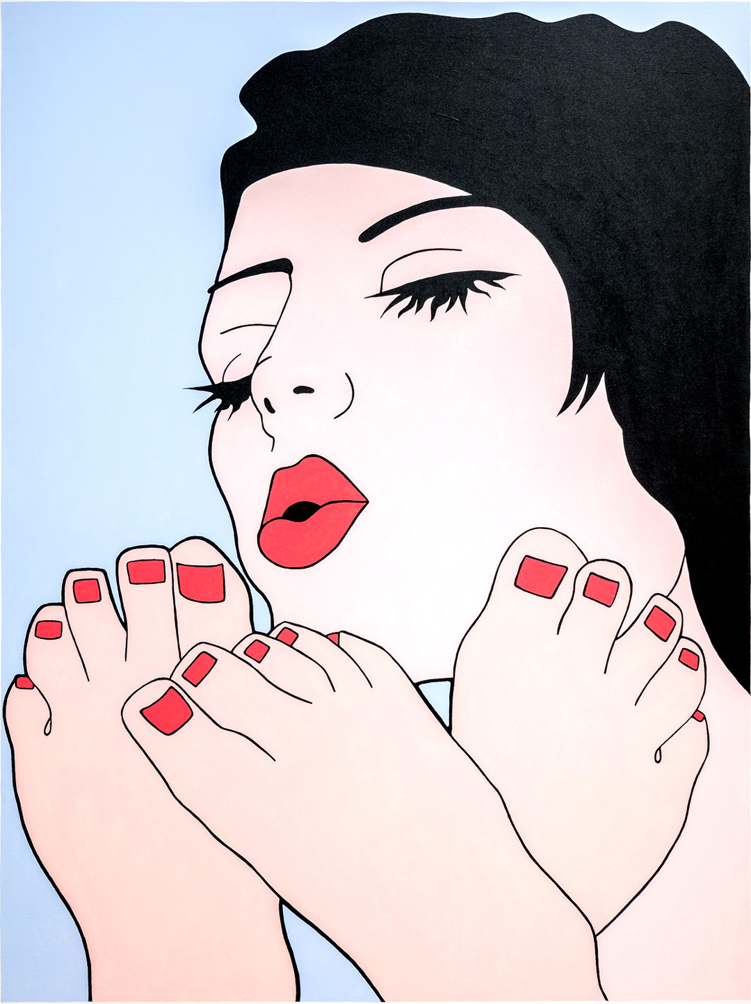
New Year’s Eve ushers in and allows for all sorts of behavior. For some, it might be a night to reflect on the past year while making resolutions for the next, but for others it is a social occasion during which one can celebrate freely, throwing caution—and social mores—to the wind. This work by John Wesley, titled Nail Police, seems to be a proponent of the latter.
At first the work appears relatively benign, with a cartoon-like image of a woman drying toenail polish—a standard beauty routine. Upon closer look, Nail Police reveals more erotic undertones, and raises further questions: Why are there three feet instead of two? Is the woman pictured even painting toes at all? Is the painting in fact an adult fantasy rendered ambiguous?
One of Wesley’s many strengths as an artist is his ability to create images that are at once explicit and enigmatic. And, like his highly stylized paintings, Wesley has defied easy categorization throughout his career. His flat, graphic figures and distinctive color palate of periwinkle blue and pale pink often align him with artists who share a Pop sensibility, although Wesley associates his uncanny, dreamlike compositions with Surrealism. However, his painting style, which bears little trace of the human hand, has also been espoused by many Minimalist artists, most notably Donald Judd.
Interested in our mass consumption of media, Wesley regularly begins his paintings by tracing images from publications such as newspapers and fashion magazines—dogs, birds, women, and cartoon characters—which are then converted into gouaches and, ultimately, acrylic paintings. This process allows certain characteristics to be reduced to their most basic elements. Here, this can be seen in the contours of the woman’s feet, or the treatment of her full lips and eyelashes.
Regardless of how you might read this image, the last night of the year is as good a time as any to paint the town—and maybe even your toenails—red. However you celebrate, Happy New Year!
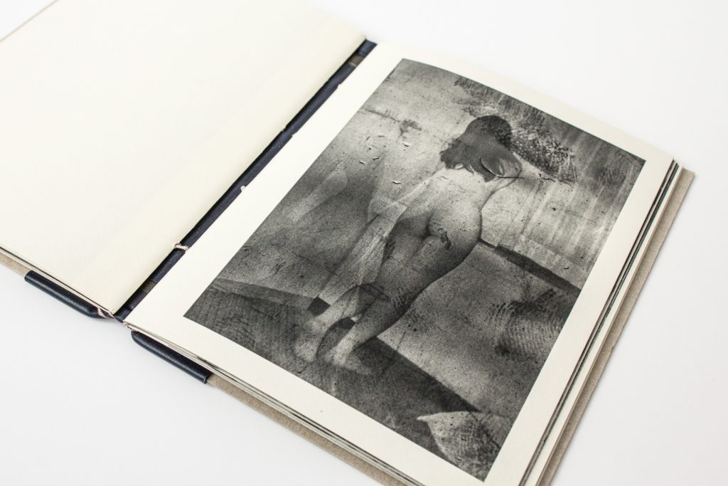
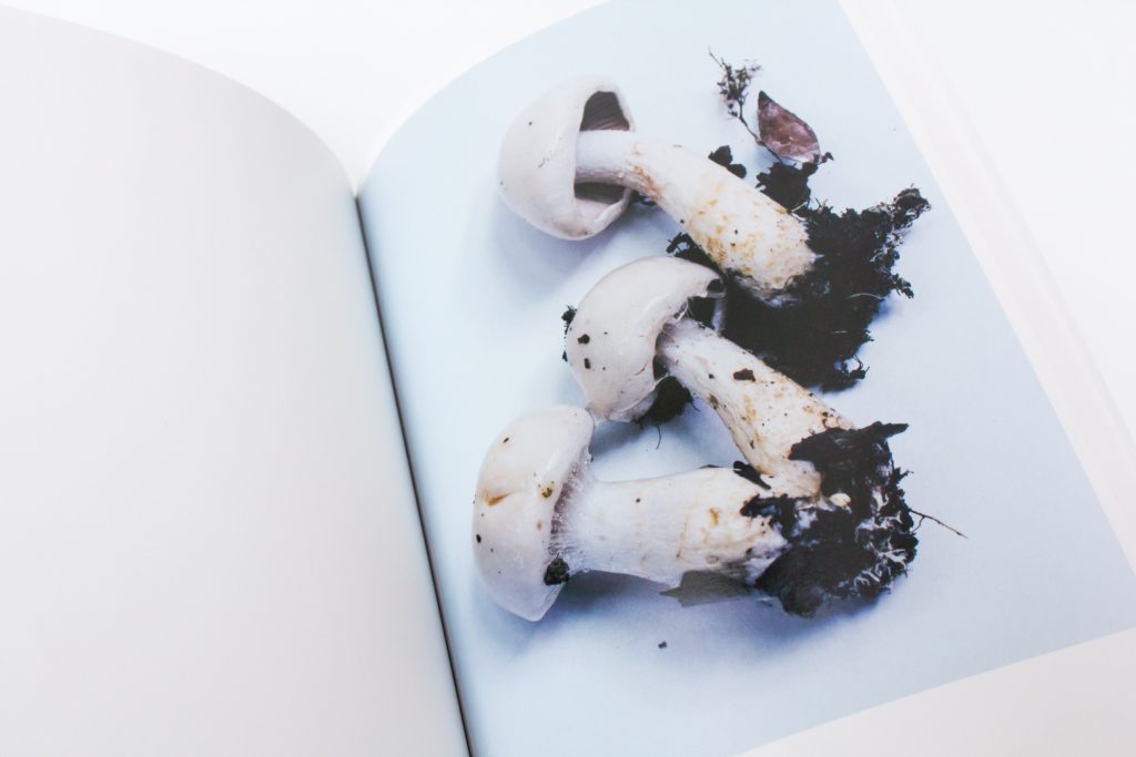
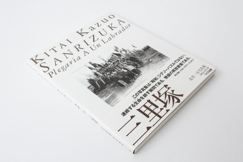
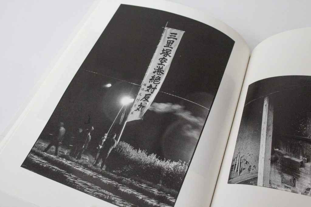
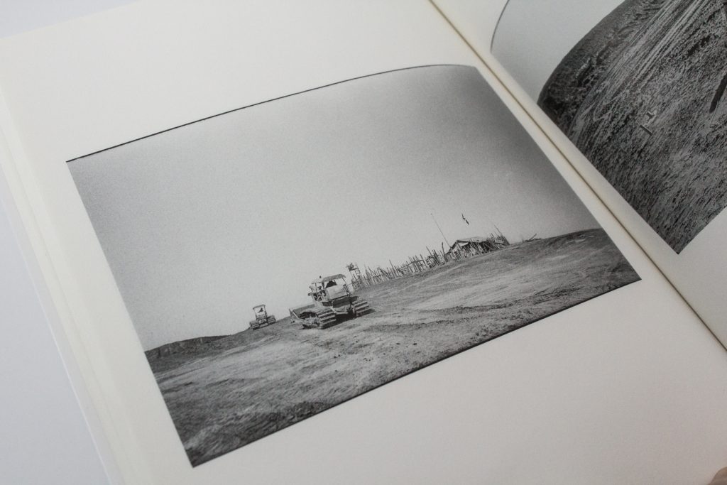
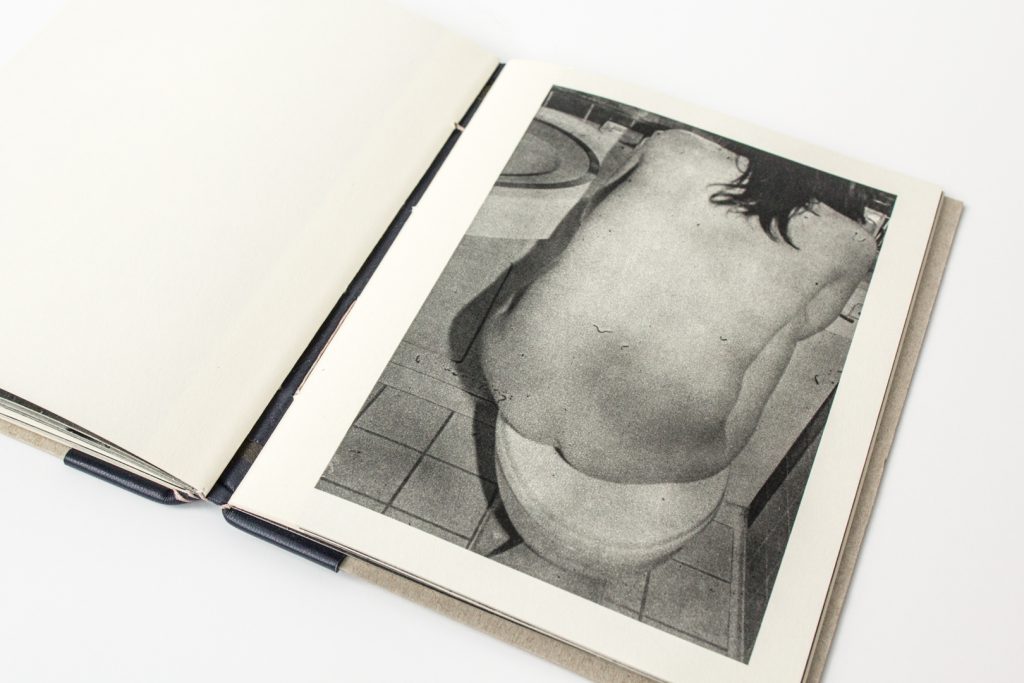
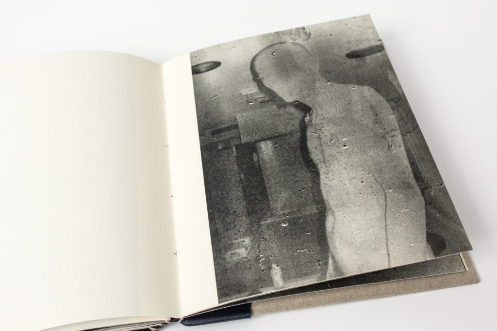
This is the first in a series of posts about an extraordinary photobook collection donated to the McCaw Foundation Library for Asian Art by collector, Chris Harris. Photobooks are photography-illustrated books which may or may not include additional text. The photography drives the content, rather than being supplemental to the written word. Often handmade, self-printed, or published in limited editions, these books are often considered works of art in themselves.
People, Places, and the Passing of Time
A recent donation of photobooks to the McCaw Foundation Library reminds us that all things are transitory. Chris Harris shares images with this generous and poignant gift from his personal collection of photobooks by important Japanese artists. These photobooks speak to us of family ties, of the natural world, and of ephemeral glimpses of urban life and landscapes. Focused mostly in Asian countries, these images are often haunting, sometimes playful, and entirely captivating.
Personal and Provocative
Love, time, and ties that bind.
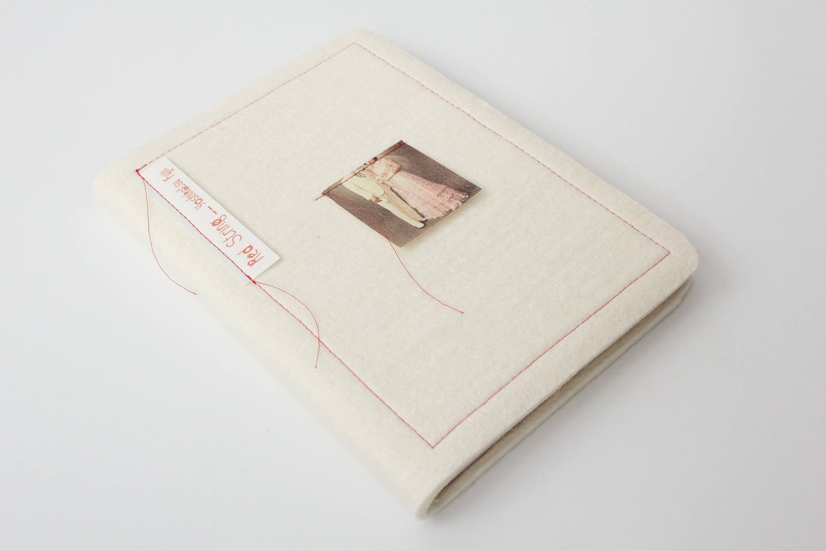
The Red String by Yoshikatsu Fujii
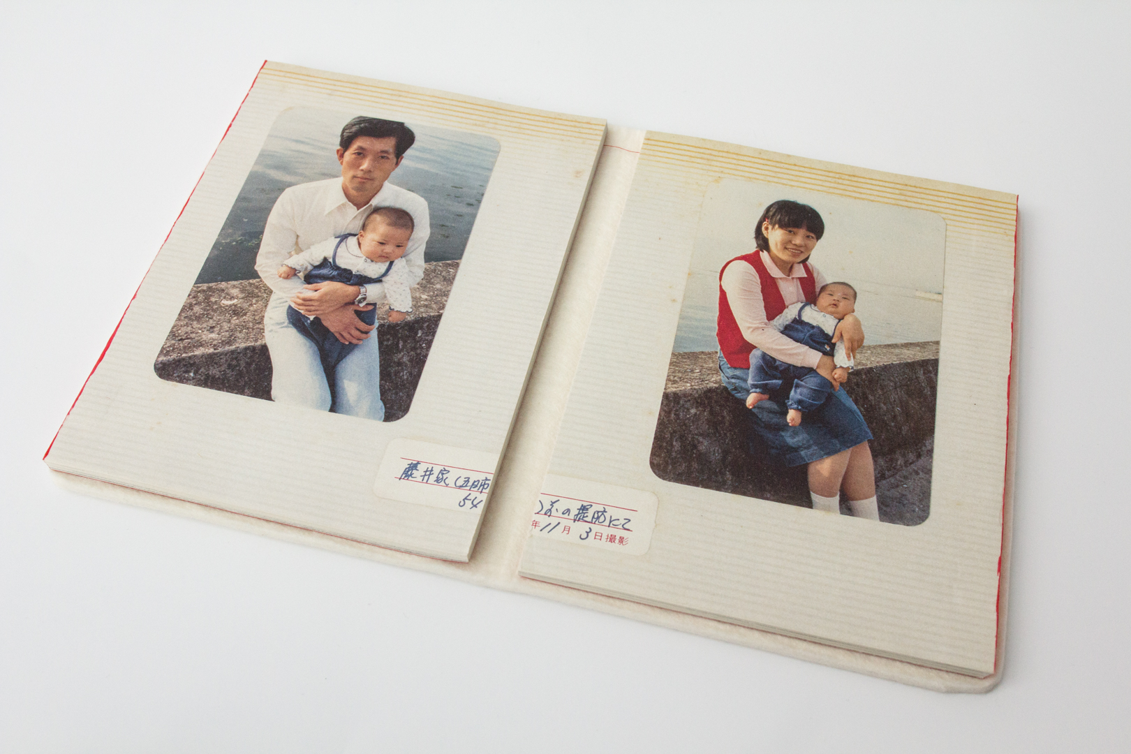
People are the focus of The Red String by Yoshikatsu Fujii (Fujii, 2014). This rare, handmade, and self-published photobook tells the story of a family’s transitions and partial dissolution. Fujii shares his achingly personal and bittersweet family history in the form of a family album. The images in the album include the family posed in rural landscapes, cities, casual snapshots, and formal portraits; there are also drawings and handwritten notes in Kanji (transcribed to English) that also carry the voice of intimate moments—moments that are mundane, yet precious. The author reflects:
“. . . legend has it that a man and a woman who have a predestined encounter have had each other’s little fingers tied together by an invisible red string since the time they were born. Unfortunately, the red string tying my parents together either came untied, broke, or perhaps it was never even tied to begin with. But if the two had never met, I would never have been born into this world. If anything, you might say it is between parent and child that there is an unbreakable red string of fate.”
– The Red String by Yoshikatsu Fujii
Progression: Person and Place Over Time
A return to the old home town . . . or is it?
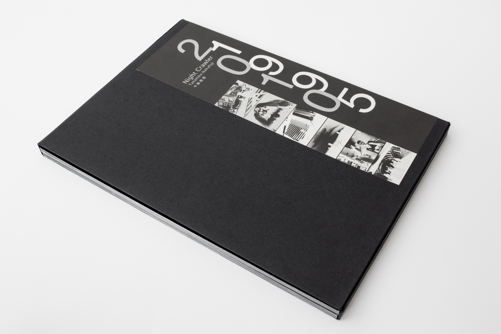
Night Crawler by Takehiko Nakafuji
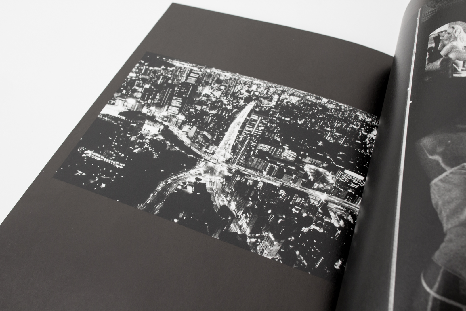
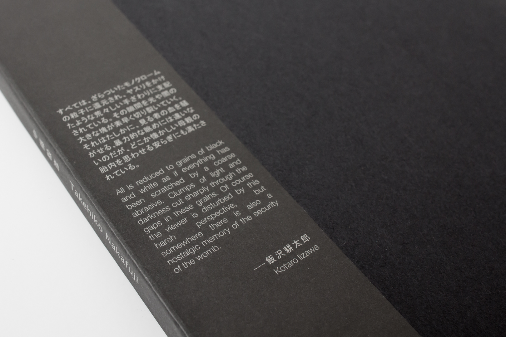
Tokyo is the place that we visit next with Night Crawler by Takehiko Nakafuji (Zen Foto Gallery, 2011). This is a collection of black and white photos of that city, captured during two significant periods of the artist’s life. The first series is comprised of gritty, sometimes eerie images taken in 1995. The street scenes and askew glances of the people in them share with us a youthful insider’s view of 1990s Tokyo.
Nakafuji returned over a decade later, in 2010, and generated a second series of photos. Even with the continuity provided by using black and white, gritty-grainy images for both time periods, it is evident that both the city and the artist have matured. It is the same city, the same artist . . . yet both are intrinsically, irrevocably transformed.
Night Crawler by Takehiko Nakafuji
These photobooks are available for consultation at the Dorothy Stimson Bullitt Library, downtown at the Seattle Art Museum downtown by appointment while the Seattle Asian Art Museum in Volunteer Park is undergoing renovation. When the Asian Art Museum and the McCaw Foundation Library reopen, the photobooks will be available there as an ongoing resource.
– Kate Nack, Library Volunteer, McCaw Foundation Library for Asian Art
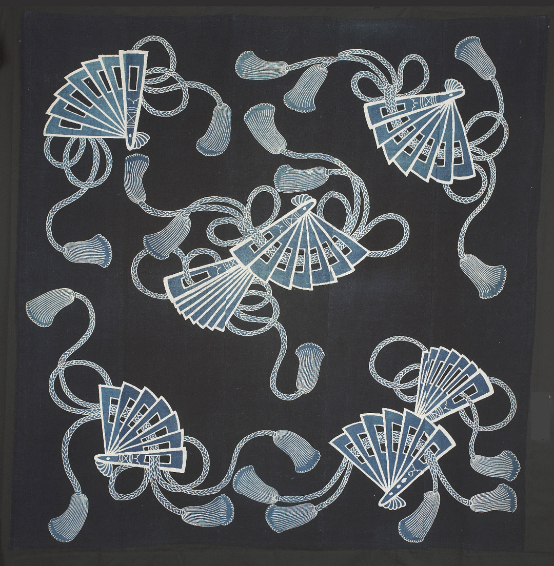
A riddle for you: what do you call a beautifully woven, dyed object that reveals itself while concealing others? A multi-purpose Japanese textile known as furoshiki, of course! With origins in the early 17th century, furoshiki is used today for a variety of purposes, ranging from utilitarian to purely aesthetic. (Hint: it also functions as great gift wrap . . . )
Dating as far back as the Edo period in Japan (1603–1868), furoshiki was first used to keep together one’s personal belongings while bathing in public bath houses. Since then, furoshiki has expanded to wrap and carry just about anything. This wrapping cloth in particular was created through a process of indigo dyeing that involves the application of paste as a resist. To make the fan and rope design, the artist would have painted the resist directly onto the fabric, which would in turn block the penetration of indigo dye into its cotton fibers. Before each submersion, the paste would be reapplied in order to achieve the subtle and varying shades of blue seen here.
In addition to being a work of art in its own right, furoshiki falls within a larger tradition of tsutsumi, the Japanese art of wrapping and packaging. Employing a number of different materials and techniques, tsutsumi was meant to protect, and often transport, gifts in a simple and elegant manner; traditionally, an artfully wrapped gift was meant to be contemplated before being opened, if opened at all.
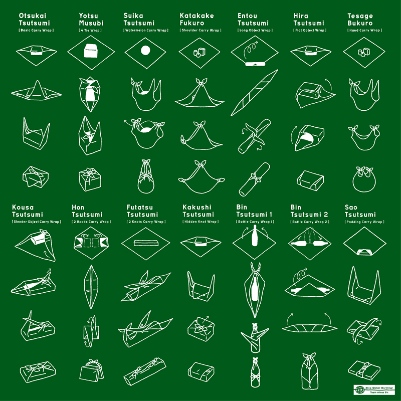
Beginning with a simple square of cloth, furoshiki can become any number of utilitarian (and reusable!) objects with a simple pleat, twist, or knot: a purse, a lunchbox, a bottle carrier, gift wrap—you name it. For a small sampling of its possible permutations and folded formats, just take a look at the graphic below. Christmas is in four days, so plenty of time to become furoshiki masters!
– Elisabeth Smith, Collections Coordinator
Image: Wrapping cloth (furoshiki), 1868-1912, Japanese, cotton, freehand paste-resist dyeing, 65 3/8 x 64 3/4 in., Gift of the Christensen Fund, 2001.500.
The winter months bring with them a wide range of traditions to which we look forward: holidays, gift-giving, new resolutions, and, of course, the good ol’ winter cold. We each develop our own methods of combatting (or coping with) stubborn winter germs, and this time of year often has me thinking about the ways in which we administer medicine and think about health more broadly. The history of medicine is of course a long and complicated narrative, but it is a history that would not exist without important contributions from the Muslim world.1
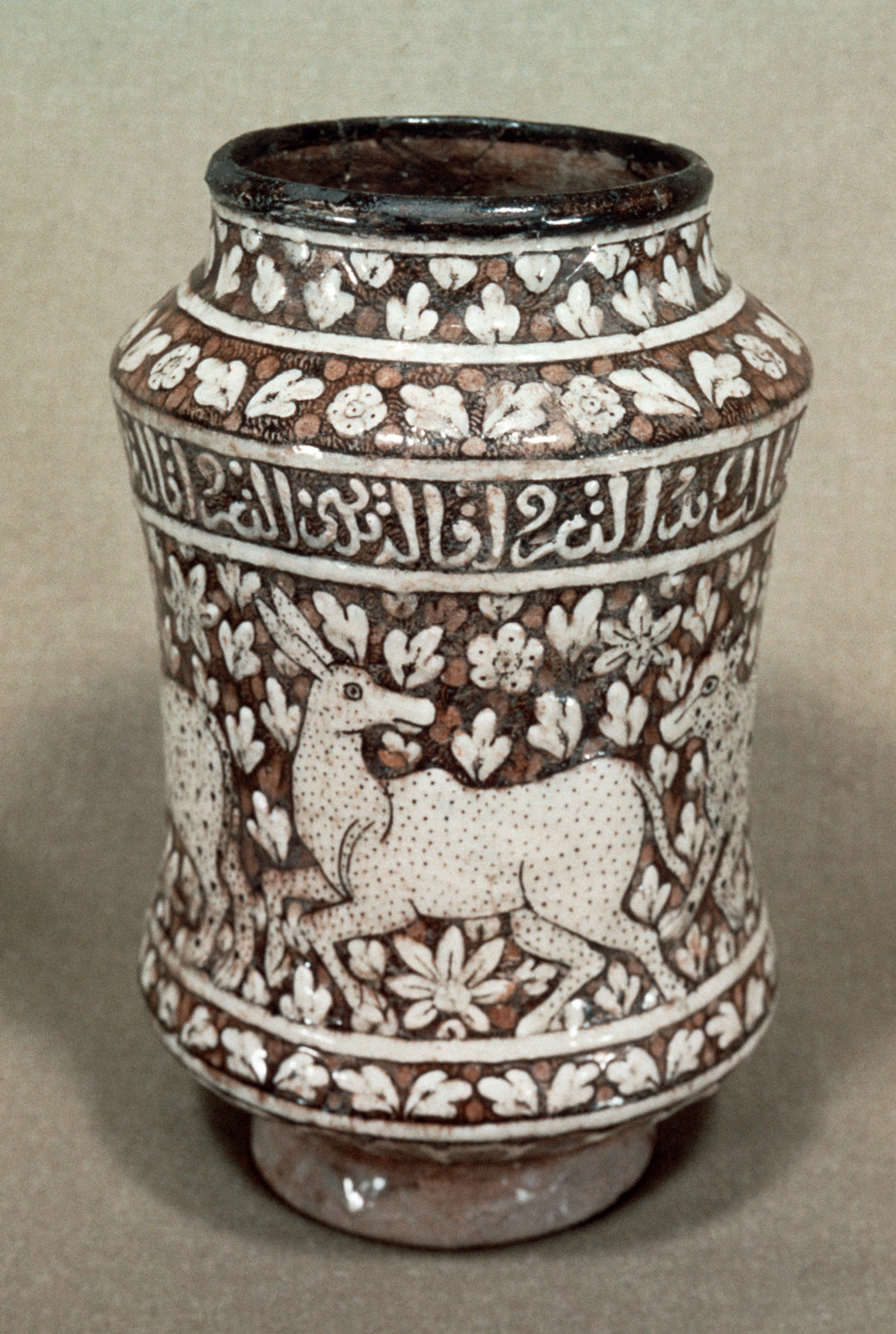
Dating back to the 14th century, this Islamic drug jar points to a rich moment of cross-cultural exchange and advances in science and medicine—fields all but forgotten during Europe’s Middle Ages, and that were fortunately recovered by Islamic scholars. During the medieval period, Muslim physicians saw significant advances in public health, diagnosing such major diseases as smallpox and measles, and the creation of urban hospitals and sanitation systems.
Vessels like this drug jar would have held medicinal herbs, roots, syrups, pills, or aromatic waters, and the top would have been covered with parchment and tied with string. The concave jar mimics the curved shape of bamboo stems, a formal homage to the material traditionally used to store medicines in Indonesia, a country that first felt the presence of Islam as early as the 9th century.
The choice to retain the shape of Indonesia’s bamboo containers is an interesting one that would eventually make its way into the ceramic traditions of Moorish Spain and Italy—clear evidence that more than just medical knowledge was shared during this period of global trade and expansion. Certainly, this earthenware jar is a far cry from the Emergen-C packets and plastic-encased medicine we buy today. Its very form acts as a reminder of the Muslim world’s role in both modern science and ceramics, as well as how differently we package and distribute medicine today.
Image: Drug jar, 14th century, Islamic, earthenware with white slip and glaze, 12 x 4 3/4 in., girth: 23 1/2 in., Eugene Fuller Memorial Collection, 60.44.
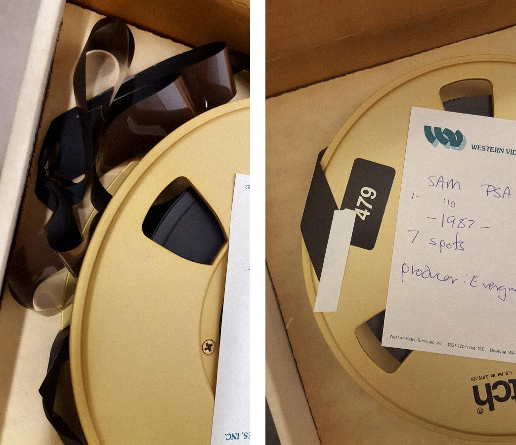
This blog post is a follow-up to our first post, Preserving SAM’S Historic Media Collection: Part One, where we introduced you to SAM’s Historic Media Collection and discussed the initial work being done to inventory, assess, and ultimately, preserve, and provide access to its contents. As a quick recap, the collection contains valuable SAM-related audio and video content from the 1930s to the present, held on media in various time-based formats, such as: reel film, cassette tape, and DVD. Due to the importance of the content and the fragility of the media, it was determined that this collection had urgent preservation needs. The Historic Media Collection includes rich content associated with the museum, but also includes content on important community members, architecture, and more. Recognizing the community impact and institutional value of the collection, a donation from an anonymous donor and a 4Culture Heritage Collections Care grant have assisted in creating a stewardship project to develop and preserve this notable collection.
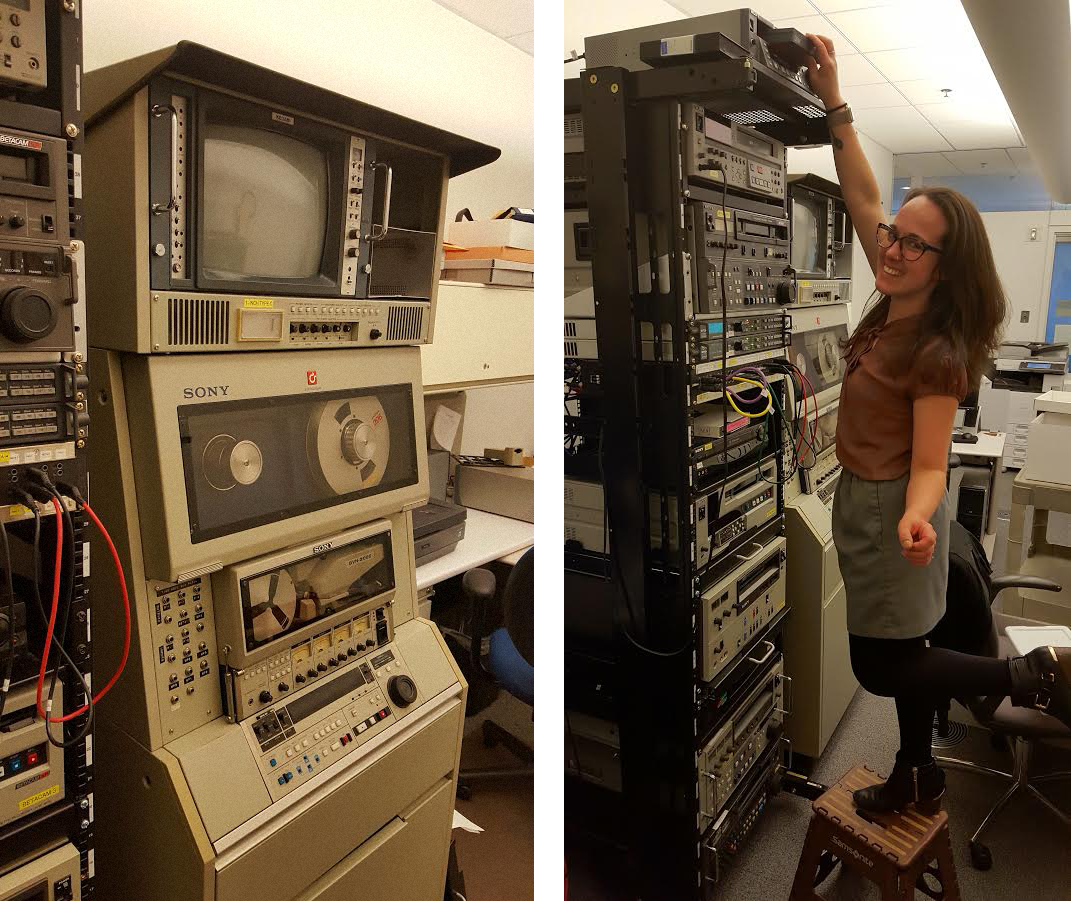
One dimension of the project was to reach out to local community experts for advice and recommendations. At least 400 items in the collection are on formats not readily viewable on available equipment at the museum’s Dorothy Stimson Bullitt Library, including ¾” U-matic, Betacam (SP and Digital), Hi8, and 1-inch Type C tape. In order to evaluate these items, we reached out to MIPoPS (Moving Image Preservation of Puget Sound), another recipient of funding from 4Culture. MIPoPS is a nonprofit corporation formed to help preserve the cultural heritage of Puget Sound by assisting archives, libraries, and other organizations with the conversion of analog video recordings to digital formats according to archival best practices.
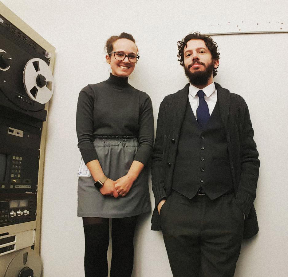
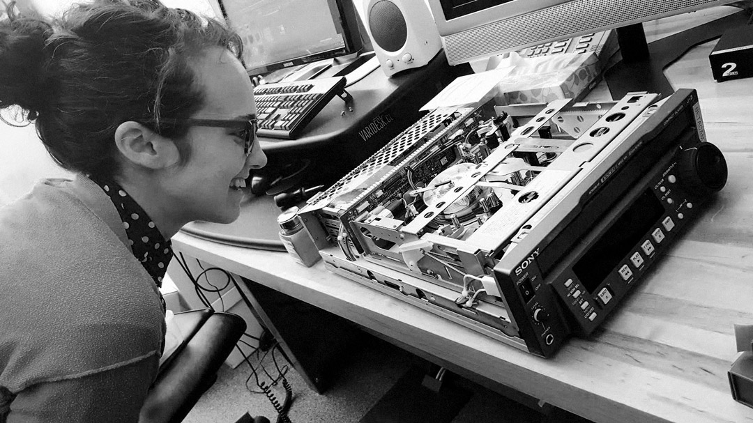
The team at MIPoPS (Rachel Price and Libby Hopfauf) graciously offered to assist with the evaluation of these materials and to provide budget recommendations for the digitization process. I have been viewing media at MIPoPS bi-weekly, stuffing a large black bag full of videotapes and hauling the media to their location in Seattle City Hall. Along with evaluating media items, Libby has been training me on the digitization process and on the usage of a variety of media players. Due to a lack of documentation formatted to instruct archivists or individuals without a production background on maintenance of equipment and image quality control, Libby has created a manual to aid in the instruction of collaborating institutions. Libby believes that it is essential to share this knowledge with other archives due to the impending magnetic media crisis.
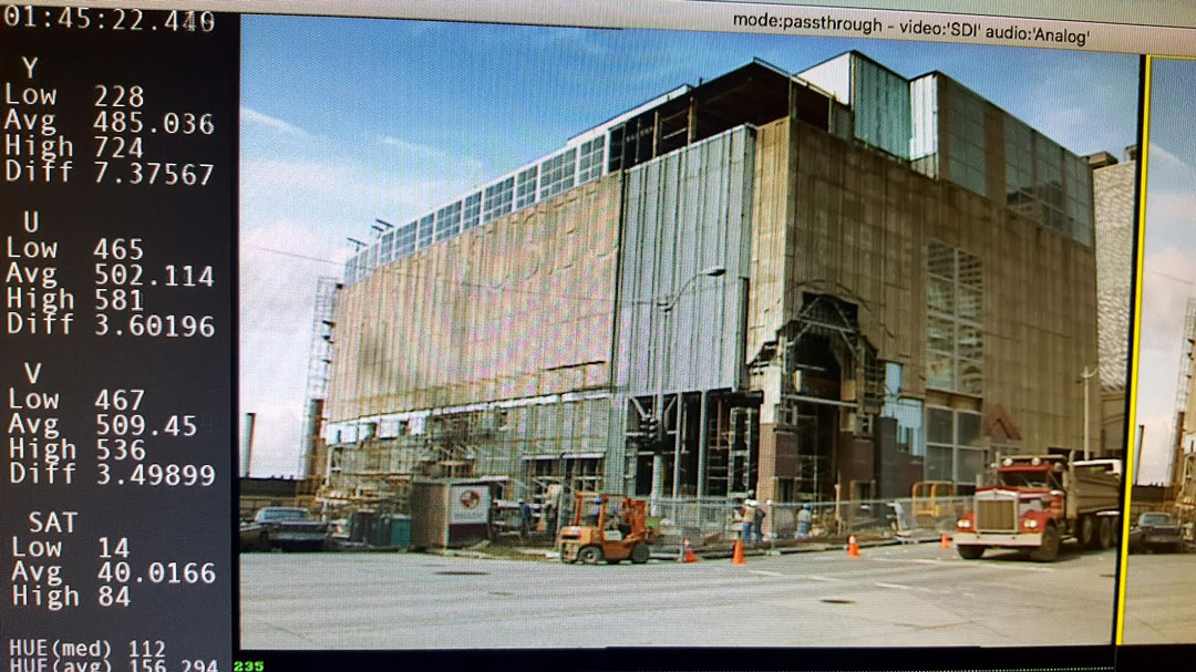
Months of viewing materials have unearthed some fascinating content, including the silent footage of the 1933 opening of the Volunteer Park building (the original location of the museum and current location of the Seattle Asian Art Museum). The film features such Seattle luminaries as Mayor John F. Dore and museum founders Dr. Richard E. Fuller and Margaret MacTavish Fuller. Other found footage is the inspection and construction of the downtown location prior to its opening in 1991. This footage presents an entirely different downtown environment than we see today, highlighting SAM’s involvement with neighborhood development.
We have digitized several tapes in order to promote the collection and raise awareness of the types of content available. This ongoing and time-consuming process emphasizes the urgent necessity of preserving these materials. The footage has been useful not only in the context of the museum, but also in shedding light on the magnetic media crisis. In February, MIPoPS hosted their second Moving History screening night, Moving History Returns: Saving Our Magnetic Media, at the Northwest Film Forum to highlight material digitized recently by partnering institutions. View the digitized version of that black and white silent film of Volunteer Park and the building and opening of the Seattle Art Museum in 1933 below:
If you have any questions about this project, please post them in the comments section below.
If you have questions about MIPoPS, you can contact Libby Hopfauf at libby@mipops.org.
– Michael Besozzi, former Project Coordinator: Historic Media Collection, Seattle Art Museum and Libby Hopfauf, Program Manager/Audiovisual Archivist, MIPoPS
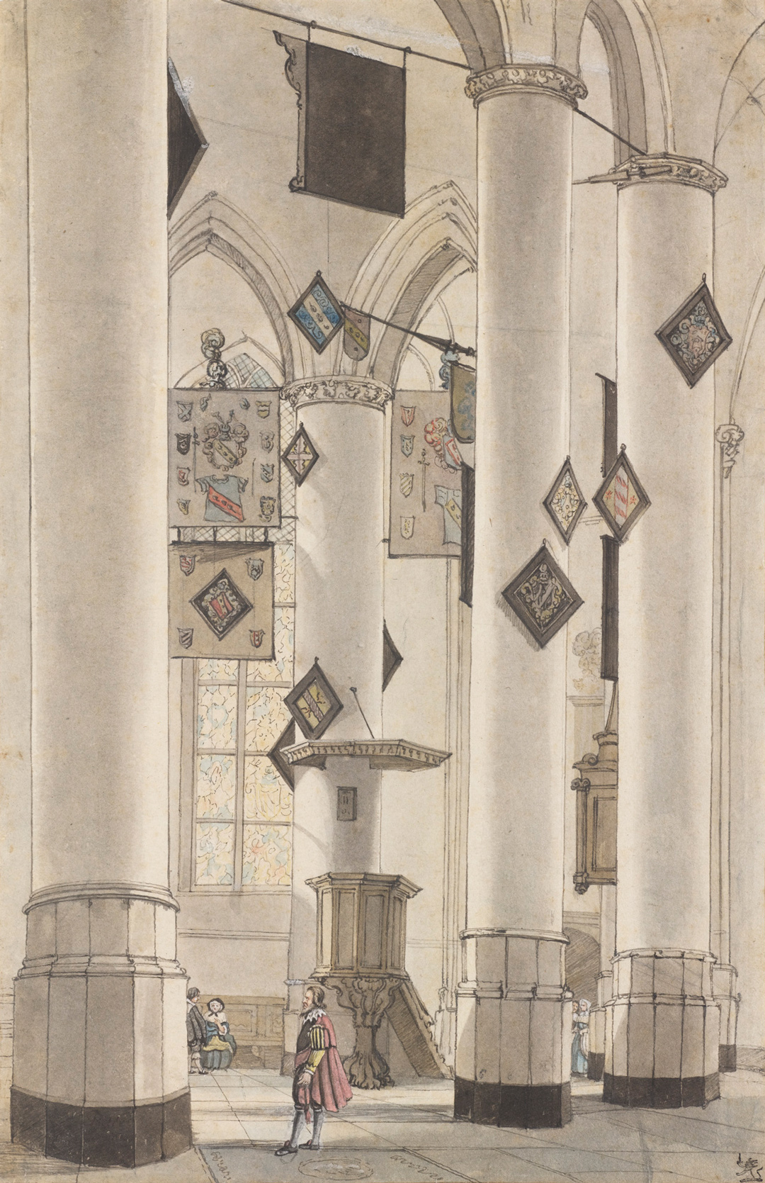
This week we’re looking an important art historical genre: portraiture. Only, this “portrait,” by Dutch artist Anthony van Borssum, features not the human figure, but a 17th-century church interior as its subject.
Choir of Pieterskerk, Leiden presents a detailed rendering of Leiden’s late-Gothic Pieterskerk church. However, absent from the scene are the ornate religious sculptures and paintings that one would expect to find in a Catholic church. Stripped bare after the iconoclasm (or beeldenstorm) of the Protestant Reformation, this Dutch Reformed church’s whitewashed walls and columns appear austere, decorated only by heraldic banners that obscure the stained glass windows behind them. The materials used to create this work—pen, bistre (a pigment made from soot), and watercolor—only add to the church’s restrained and unadorned appearance.
As the Dutch empire grew during the 17th century, so did its art market, and church interiors like this one (as well as still lifes, landscapes, and portraits) were popular during the period. Characterized by soaring verticality, vaulted ceilings, and dramatic lighting—all of which diminish the presence of the human figure—the church interior, as a genre, conveys a sense of spirituality, despite the near total absence of religious iconography.
Dutch Reformed churches were non-secular spaces, but van Borssum and his contemporaries approached church interiors to explore light, color, spatial volume, and perspective. In this context, Pieterskerk becomes less a religious site than a patient sitter, a creative subject readily awaiting its likeness to be captured.
– Elisabeth Smith, Collections Coordinator
Image: Choir of Pieterskerk, Leiden, 17th century, Anthony van Borssum, pen, bistre, and watercolor on paper, 14 9/16 x 9 1/4 in., LeRoy M. Backus Collection, 52.34
“The difference between me and a lot of painters is that I have to have a personal contact with my models . . . . I have to become enamored. Smitten. That’s what happened when I saw Helga.” – Andrew Wyeth
Andrew Wyeth painted Helga Testorf in secret for 13 years before the world, and his wife, saw the paintings for the first time. The secrecy and intimacy of these paintings stirred quite the scandal when they were first exhibited and they continue to be a source of much conjecture into the details surrounding Wyeth’s relationship with one of his greatest muses. Find out more about the character of Helga both within, and outside of, Wyeth’s life and paintings during a talk given by Patricia Junker, SAM’s Ann M. Barwick Curator of American Art, in the Andrew Wyeth: In Retrospect galleries.
“Remember, he’s a Bergman . . . He’s creating a world they [his models] don’t realize and they’re acting out a part without any script.” – Betsy Wyeth
Andrew Wyeth: In Retrospect is on view at Seattle Art Museum through January 15 and the next Wyeth Wednesday tour with Patricia Junker will take place January 3.
– Chelsea Werner-Jatzke, Content Strategist & Social Media Manager
Downtown, we have two galleries dedicated to Chinese and Japanese art. So, while the Seattle Asian Art Museum is temporarily closed, get your fill of Asian art with the latest installation, Talents and Beauties: Art of Women in Japan, on view through July 15, 2018. “We know women as subjects; we see that all the time in artwork,” says Xiaojin Wu, SAM’s Curator of Japanese and Korean Art. “But to look at women as artists in addition to as a subject of art—that’s what you’ll see evidenced here from the 11th to the 21st century.”
The heart of the installation features artworks inspired by TheTale of Genji. Written by Murasaki Shikibu in the 11th century and debated as the first novel ever written, the illustrations of this literary masterpiece may not be by women, but as Wu states, “How many women writers do we know from 1,000 years ago? How many artworks have been made from every scene in TheTale of Genji, including the contemporary manga? It’s just countless. In a way we are attributing all of these wonderful works back to the original writer, the woman who wrote the tale.” The two pages below excerpt the scene depicted in the right-hand panels of the screen above.
This excerpt and the page below refer to the right-hand panels of the image above.
Murasaki Shikibu wrote The Tale of Genji to entertain the members of her court. Because of this, it was written in an archaic court language that was little used and quickly lost to Japanese speakers. This accounts for one of the reasons why there are so many illustrations of the tale—as a classic piece of literature, the tale continued to be told in images and annotations across the centuries until in the 20th century when it was first fully translated into modern Japanese.
TheTale of Genji follows the life of Hikaru Genji, the son of an ancient Japanese emperor, and his many romantic endeavors. Featuring over 400 characters that age throughout the book and whose family lineages are often intertwined, Genji is considered a feat of characterization consistency for having been written in installments of chapters over a long period time. Although the book does not have what we might consider a plot nowadays (events simply take place and the characters age), it is one of the first pieces of literature to feature a protagonist, supporting characters, strong characterization, and a sequence of events following the lifetime of the main character.
Xiaojin Wu is planning “. . . a sequence of installations that look at various patronage and audience groups. Following Talents and Beauties we’ll focus on aristocrats, and then samurai.” Make the time to visit this gallery for new perspectives on Asian art and culture.
– Chelsea Werner-Jatzke, Content Strategist and Social Media Manager
Images: Installation view Talents and Beauties: Art of Women in Japan, 2017, Seattle Art Museum, photo: Natali Wiseman.
Murasaki Shikibu, The Tale of Genji, trans. Royal Tyler (New York: Viking Press, 2001)
Seattle is one of those rare places where it isn’t considered droll to talk about the weather. The SAM Gallery artists in ColorExcursion, on view December 8 through January 7, offer an escape from grey days into exuberant artwork. Below, three of the artists in this show share the ways that living in Seattle and the surrounding area impact the way they see the world. For such a moody and dramatic locale, you may be surprised by their vibrant, lively work. If you’re looking to recharge your senses, come to SAM Gallery for the Color Excursion Opening Reception on Thursday December 7, talk to the artists about their work, and find out how you can rent or buy artwork from SAM Gallery.
This year I moved from Green Lake to Whidbey Island. Previously my work originated from a contemplative state of creation. I found inspiration through travel and memory and emotions but now living on Whidbey, I’m in it. On the island your surroundings are constantly in flux. The winds whip in and carry things away, the storms batter the shoreline leaving treasures on the beach. The nights are deep and dark and full of creatures. Everything feels alive and in a state of change. The beauty and the drama of my surroundings constantly barrage my eyes and fill my brain with endless creative ideas and the solitude of the island allows these ideas to come to fruition in my studio.
When invited to make a body of work for Color Excursion, I was elated. I’m addicted to color. I mix my own colors using wax and powdered pigments and when working with this medium it becomes something else, something more tactile. It’s hard to explain, it’s like I’m making a soup but I’m loading it with saturated color until it’s thick, and I want to eat it. That’s what initially drew me to encaustic painting and I think it’s what draws people to want to touch an encaustic painting.
The use of color in my work is an unapologetic form of escapism from the long stretches of grey weather that continually blankets my Pacific Northwest home. Each year my palette of luminous, unnatural hues provides a defiant objection to winter’s approach. Pulsing fluorescent paints massage the naked eye with ultraviolet light, creating an energized glow impervious to dull environments. Maroon does not belong to me. Tubes of brown remain unopened. There is safety in muteness. My paintings speak to extroversion, experimentation, and play. Through color, I aim to activate.
Color Excursion immediately brought to mind the idea of travel, taking an excursion lavish with color. My work in this show was inspired by a trip to South America one year ago. Although the paintings for this show do not reflect Seattle, much of my work is inspired by my daily routines and surroundings. For example, the Across the Lake, Cloud Dreams, Inside a Cloud, and Inside a Leaf series are all the result of my daily walks in my Seattle neighborhood.
I let my experiences germinate and then abstract them on the canvas, translating a memory of a place or an experience. I work in layers of color and compose the image while working. My paintings are oil on canvas or board. Working with oil means that each layer needs to have a bit of time to dry before the next layer can be applied. I find that when I return to the piece it changes and evolves in surprising ways.
This new work at SAM Gallery is from a series of unique digital mixed media prints called the Gardeners Journal. The nature of the Northwest has always been a part of my life having grown up in eastern Washington. With this body of work, it becomes a touchstone away from the tech-focused culture of our evolving city. My digital print studio keeps me in front of a computer monitor much of the time. As a retreat from the stream of social media I find refuge out my window, a slight turn of the head away from the monitor. I have found the organic shapes and colors of my garden to be a creative counterpoint to the drone of data. By exploring abstracted shapes and forms found in nature, this new work provides endless metaphors and narratives and visually blend the creative tools of traditional art making with new digital possibilities to find a balanced voice in the moods and aesthetics of the region.
Images: Detail of Leslie Stoner’s studio, photo: Alison Blomgren. Afterglow Two, Liz Tran, 30 x 24 in., mixed media on panel. Easter Island, Chile, Sheryl Westergreen, 36 x 36 in., oil on canvas. Like a garden splashed across the landscape, Stephen Rock, 36 x 36 in., pigmented print, watercolor, gouache.
As we prepare for the last 31 days in our 2017 calendars, it becomes clear how quickly time flies. Where did the year go? In this 1956 work by Northwest artist Wendell Brazeau, Still Life with Calendar, time is certainly a preoccupation, as well as developments in abstraction imported from Europe during the years following World War II.
A painting that could only exist after the pictorial revolution brought about by Cubism, and Paul Cézanne before that, this work is a marker of an important moment in American painting when European theories made their way to artists living and working in the United States. Like many, Brazeau studied in Paris and worked first-hand with the European avant-garde, bringing such ideas back to the Northwest and pollinating the region with new modernist theories.[1]
One of the main genres of Western art, the still life takes many forms; whether arrangements of symbolic objects that point to the brevity of human life,[2] or celebrations of material wealth, the still life has fascinated artists for centuries. In more recent art history, the still life has become a foundation for formal experimentation.
Indeed, here flat geometric forms and bright planes of color unify a spatially ambiguous plane. We see lemons or limes perched precariously on the left-hand corner of the table, as well as a chair, coffee pot, flower vase, and fruit basket, all nearly sliding from their fixed positions. Behind this array of multi-toned vessels and objects we also see a small section of an incomplete calendar—a tongue-in-cheek inclusion that seems to simultaneously honor and scrap the genre’s interest with the passage of time. A knowing departure from the still life paintings of the 16th and 17th centuries, Still Life with Calendar playfully explores the possibilities of abstraction while wittily honoring the subject’s antecedents.
[1] Brazeau studied art at the University of Washington for both his undergraduate and graduate degrees. For more, please see Barbara Johns, Modern Art from the Pacific Northwest in the Collection of the Seattle Art Museum (Seattle: Seattle Art Museum, 1990), 16.
[2] Vanitas, for example, contain objects—such as musical instruments, skulls, candles, and flowers—that serve to remind the viewer of their own mortality, as well as the worthless pursuit of earthly goods and pleasures.
Artist Sondra Perry is the first video artist to win the Gwendolyn Knight and Jacob Lawrence Prize! Using a wide range of digital platforms and tools including 3-D avatars, blue screens, Chroma keys, and computer graphics software, Perry’s installations and performances draw from an eclectic mix of inspiration. She is focused on how a lens can turn a subject into an object. See Perry’s immersive and unique (bring your hard hat!) installation, Eclogue for [in]HABITABILITY from December 8, 2017 through July 1, 2018 at SAM.
Below, Perry discusses how the internet, technology, and her personal history factor into her investigations into representations of black identity. This is taken from a talk she gave to SAM staff this February. She opened the talk with a tutorial video from YouTube on how to play an Isley Brothers song on guitar, so we will too!
The interesting thing about this clip is that he’s talking about that soaring note at the beginning of the song. That’s an E Flat played backwards. In the sidebar, all of these people who have also done tutorials for this song reference this video for showing them how to play that note. This is a piece of internet archaeology that touches on my interest in the parallel; two things happening at the same time in this YouTube space. The original and the improvised other. And also, like he’s amazing. He reminds me of my uncle who played guitar for lots of different people.
I spend a lot of my time on YouTube. Tons, probably too much. Not too long ago, when there were many black people dying, being murdered at the hands of police. I found this YouTube channel that was not connected to any news agency that does 3-D renderings of space travel, biology, and crimes. One of their 3-D renderings was the slaying of Michael Brown in Ferguson. I am interested in the rendering of the body, of this man in a 3-D render space. I’m interested in circulation and how these images are represented outside of the video of someone being killed. That’s not what I’m interested in at all. I’m interested in how those things are able to happen.
When I was younger I read the Superman books. In the Superman Universe, the Phantom Zone is a parallel dimension that acts as a prison, an ethical one. Superman’s father, Kal-El, was the Security Minister on Krypton before it blew up, of course. He created this parallel dimension that was the Phantom Zone where you could send people to be rehabilitated. In the Phantom Zone you could see what was happening in your dimension, but you couldn’t interact with it. I’ve taken this Phantom Zone, spinning, 1980’s special effect to visualize some notions of double consciousness. I’m also playing with how a video can act as a space where there are multiple perspectives. So, you’re not just looking directly at an image—there are other things happening. I’m trying to encompass all these things into one really vibey piece of art.
I’m interested in video and its production spaces. In 2016 at The Kitchen in New York I created an installation, Resident Evil. The back is a Flesh Wall—an animation of my skin with the contrast boosted. I do this through programs used to make 3-D renderings of things. The ocean modifier I used for this is supposed to help you make a realistic 3-D rendered ocean.
https://player.vimeo.com/video/197309087
This installation is where I transitioned from using the Chroma key green to the blue screen. The Chroma key is a video, film, and photo production technique that allows you to separate the foreground of an image and a background. So usually these images have a person in the foreground and in post-production you’re able to take that out and replace whatever kind of background you want in there.
The blue screen became interesting to me because it’s the technique you would use when you’re trying to replace a background with something that’s dark because of its relationship to the end of the spectrum. I like this idea of this blue space that is simultaneously a black space that is my grandmother’s house, a park at night, or the Avengers destroying Manhattan. I like the collapse of all of those things and that’s why I decided to start covering as much of the physical spaces I was putting these videos into in this color, that is also a space.
It’s also a proposition to myself and the viewership because it is a space of production. In thinking of these colors as spaces, they are not complete. I’m trying to propose that maybe we’re the ones who figure out what’s happening there. It’s a space of contemplation.
Have you seen Coming to America? This movie is really funny, but there’s also a lot happening in it. You have two American men making a film about a fictional African country and there’s the contrast of Black folks from the states and Black folks from the continent. I was thinking about this family of upwardly mobile Black people who make a fortune on selling other Black folks things that change their visage in order to assimilate. There’s something complex about what it takes to be an upper-class, upwardly mobile Black person. Maybe you have to shapeshift. In that shapeshifting, there is this kind of grotesque thing that happens. They left a mark of themselves, like on this couch. I’d wanted to make this couch for a really long time and I finally did.
The bike is a workstation that comes with a desk. They’re sold to people that work at home and want to maintain their physical health while they’re working. I’ve been thinking a lot about these efficiency machines that do that capitalism thing. They fix a problem that is kind of inherent in these issues of overwork. People shouldn’t work as much as they do, but rather than change, we make objects like this is bike machine. I made an avatar of myself that kind of serves as the Operating System and it talks about being efficient, efficiency, what that does for you. I don’t primarily work in video, but when I do I like working on a multi-monitor workstation because it’s a lot easier; you have your preview monitor and you have a monitor where you can edit. This set up is just a way to produce video that I wanted to mimic in the installation.
Across all of this my interest is in the possibilities of blackness related to my body and also blackness as an idea of expansion, of radicalism. These things open themselves up to me through the technologies I use and through the media I gravitate towards. The issue I find with representation is that we assume that all we have to do is figure out the right way to look and we will know what something is or know what someone is. I think that’s an impossibility.
– Sondra Perry
Awarded bi-annually since 2009, the Gwendolyn Knight and Jacob Lawrence prize grants an early career black artist who has been producing work for less than 10 years with a $10,000 award, along with a solo show at SAM.
Images: Young Women Sitting and Standing and Talking and Stuff (No, No, No), April 21, 2015, Sondra Perry, performance at the Miriam & Ira D. Wallach Art Gallery in NYC with performers Joiri Minaya, Victoria Udondian, and Ilana Harris-Babou. Installation view of Resident Evil (Graft and Ash for a Three Monitor Workstation in foreground) at The Kitchen, 2016, Sondra Perry, Photo: Jason Mandella.
Around this time of year, the cornucopia could very well be the most ubiquitous Western symbol of abundance, evoking a more agrarian past. However, this Tlingit “berrying basket” (kadádzaa yéit)—made by Tlingit women and children for harvesting berries—holds similar cultural (and more practical) significance for the indigenous peoples of the Pacific Northwest, as it would be used to collect special foods for the culmination of potlatch feasts.1
The potlatch ceremony, as practiced by the Tlingit (as well as many other indigenous groups in the Pacific Northwest and Canada2), centers on gift-giving. Potlatches take place for a variety of reasons, ranging from births and deaths to weddings and house building. Often replete with dancing, singing, storytelling, and the distribution of gifts, an important aspect of these lavish celebrations is the communal feast, to which such baskets contribute.
As both a practical and aesthetic object, this berrying basket features a traditional Tlingit embroidery design identified as “head of salmon berry,” a modern motif likely copied from an oil cloth pattern.3 Decorative yellow triangles and trapezoids punctuate the zigzagging black and brown bands. Slightly wider than it is tall, flared baskets such as this would be used to collect berries by knocking them right off the bush.
While the imagery of baskets overflowing with corn, squash, and grapes might appear hackneyed during these autumn months, food plays an undeniably central role in our social gatherings. Whether your get-togethers take years to plan (as is the case with some potlatches!), a few weeks, days, or hours (there is no shame in take-out . . . ), these celebrations with friends and family surely incorporate enough food to fill a berrying basket, many times over.
– Elisabeth Smith, Collections Coordinator
1 This basket in particular was one of many produced in the late 19th and early 20th centuries, sold as souvenirs to tourists. Though derivative of traditional Tlingit berry and cooking baskets, it features the traditional geometric embroidery designs developed by the Tlingit.
2 This includes the Haida, Kwakwaka’wakw, Makah, Nuxalk, and Tsimshian, to name only a few.
3 Frances Lackey Paul, Spruce Basketry of the Alaska Tlingit (Lawrence, Kansas: Haskell Institute, 1944).
Image: Kak (basket) Kadádzaa yéit (berrying basket), ca. 1900, Tlingit, spruce root, maidenhair fern stem, and grass (twining and false embroidery), 11 1/2 x 10 in., Gift of John H. Hauberg, 83.234
Judges’ Pick: Based on a cumulative score of the following categories: creativity, connection to Wyeth, and concept.
Winner: This Film Instead by Team Wyethian (Lead: Peter Moran // team members: Christen Leonard, Audrey O’Neil, Kelly Hennessey)
When we say that Andrew Wyeth: In Retrospect offers new perspectives on the life and career of this American master, one of the things we mean is that the exhibition explores the cinematic influence of Andrew Wyeth’s work. Wyeth drew inspiration from filmmakers such as King Vidor and Ingmar Bergman as well as visually influenced a wide range of moving image classics, from Twin Peaks to Texas Chainsaw Massacre. To imbue this new insight into Wyeth’s work with more dimension, SAM invited local filmmakers to create a short film over the course of a week inspired by paintings in Andrew Wyeth: In Retrospect during the Wyeth Film Sprint. There were very few rules, but the key was that the film had to incorporate one of the preselected Wyeth images.
Over 200 people attended the public screening on November 8 of 25 submitted films, followed by an awards ceremony honoring $500 each to three winning films. The judges were Patricia Junker, SAM’s Ann M. Barwick Curator of American Art; and local filmmakers and artists Clyde Petersen and Wynter Rhys. As well as the audience, which selected a winner. Here are the three winning films for your entertainment. We love them all. The Judges’ Pick, above, will linger with you, the Curator’s Pick grapples with the gossip surrounding Wyeth’s greatest muse, and the Audience Pick revels in the surreal oddity and dark humor that Wyeth dabbled in.
Curator’s Pick: Patti Junker selected a single film that she felt was most evocative of Wyeth’s practice and work.
Winner: Helga by Team Egg Tempera (Lead: Cody Whealy // team members: Sarah MacDonald)
Audience Pick: Visitors selected one film that was tallied at the end of the night.
Winner: New Tomorrow by Weird Dog Productions (Lead: Claire Buss // team members: Lindsay Gilbert, Amanda K. Pisch, Nick Shively, Andrew Hall, Dave Lubell)
With the night sky subsuming our ever-shortening days, darkness takes on new meaning. Some might embrace these early evenings and winter constellations, while others surely count the days until the spring. No matter where we land on the spectrum, I think we can all agree that it is increasingly difficult to appreciate darkness as a larger force in our lives, especially with all the technology helping us override our circadian rhythms.
At the risk of sounding like a horoscope, a new moon begins tomorrow evening, November 18, and our night sky will be even darker than usual. While we might not be as in tune with the lunar calendar as preceding generations (or, if we are, we likely use an app), for the Tabwa people in the Democratic Republic of the Congo, the moon—and its absence—is certainly worth noting.
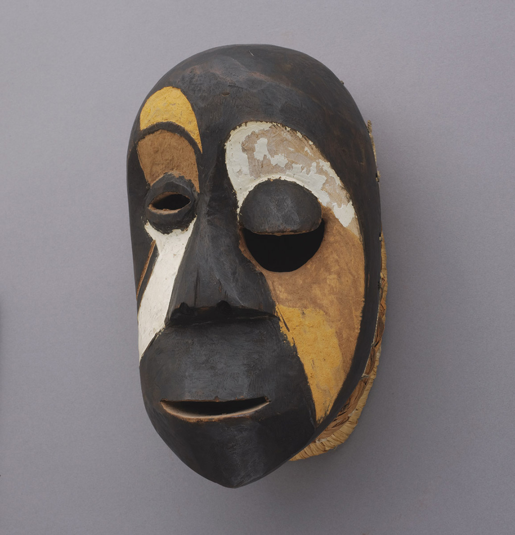
Though hard to make out, this figurative male Tabwa sculpture features traditional iconography called balamwezi, triangular patterns that reference the rising of the new moon and lunar phases. Balamwezi roughly translates to “the rising of a new moon,” and is a metaphor that contains both darkness and light. A moment of transition and rebirth, the new moon brings complete darkness while also holding the promise of illumination. To quote the scholar Allen F. Roberts, “balamwezi patterning was a visual proverb insofar as it conveyed its sense of uncertainty, transformation, and . . . the courage to persevere, even in the darkest hours.”1
In Tabwa culture, darkness—representing obscurity, ignorance, danger, and destruction—is balanced by more positive attributes such as light, wisdom, safety, and hope.2 Ultimately, forging a nuanced connection between darkness and light makes inextricable their disparate attributes and associations. Perhaps this way of thinking can change our own behaviors and attitudes toward darkness, and what better time than during the onset of tomorrow’s new moon!
– Elisabeth Smith, Collections Coordinator
1 Allen F. Roberts, A Dance of Assassins: Performing Early Colonial Hegemony in the Congo Page (Bloomington: Indiana University Press, 2013), 87.
2 Rosalind Hackett, Art and Religion in Africa (New York: Cassell, 1996), 126.
Image: Male figure with balamwezi (the rising of the new moon) pattern, Tabwa, wood, 34 x 7 3/4 x 8 in., Gift of Katherine White and the Boeing Company, 81.17.790.
The days are officially getting darker and the work on view the current SAM Gallery show is embracing it. Hanging in the ground floor SAM Gallery is Darks and Lights, featuring Enid Smith Becker, Deborah Bell, Nick Brown, Nichole DeMent, and Barbara Shaiman. The artists in this show contrast darks and lights as autumn turns to winter. Nature’s cycles, retreating to our roots, and finding home are all explored by our premier Northwest artists. Hear from two of the featured artists on what living and working in Seattle means to them and see the show yourself before it closes on November 19. SAM Gallery represents many local artists whose work you can rent or buy. This is one of the numerous ways that Seattle Art Museum supports the arts—by supporting artists.
Enid Smith Becker
My work explores our relationship with the land, time, and space. Despite the different ways each of us approach a place, the land and its beauty is always there. As I paint, I begin with the natural space and into that I layer the rectilinear forms that represent human impact on nature and the different ways that each of us sees the world. One of the things that draws people to Seattle is its natural beauty. As a Northwest native I spend a lot of time outdoors. The paintings in the show Darks and Lights are inspired by places in Washington that we visit on the weekend.
In my work, I am inspired the colors and textures of the natural world. I work in acrylic, but I also build real texture through the inclusion of art paper, junk mail, plant matter, loose-weave cloth, and thread. The constructive nature of combining paint and collage appeals to me. The layering of paint, natural and man-made materials becomes a kind of a metaphorical rebuilding of the land.
Barbara Shaiman<
As a ceramic artist whose work references our natural environment and the affect of human activity on it, living in the Northwest plays a pivotal role in my imagery and ideas. Memories of the rock forms, arches, and cave entrances found in La Push and other areas of the Northwest coastline greatly influence my work.
Our relatively easy access to the ocean and mountains is a major part of my love of Seattle, but I also value the intellectual and artistic stimulation of the city. Environmental justice issues are important to me, as are climate change and sustainability. While being at the coast inspires my awe and my imagery, an evening talking with friends in the city reminds me that we have a lot of work to do to conserve the beauty of our area and enable our neighbors and future generations to enjoy it as well.
While referencing issues such as climate change and the intersection of natural and human-made environments, I prefer the work to be enigmatic, not to try to supply answers but to encourage us to think about our relationship to the environment with a somewhat altered vision.
Image: Planes, Enid Smith Becker, acrylic on canvas, 36 x 48 in. Transition Arch, Barbara Shaiman, glazed stoneware, 15.5 x 16 X 5 in. Photo: Hernan Celis
There’s something intimate about this hanging silk scroll by Japanese artist Ito Shōha. In the rural scene we see a young working woman, in layers of white and indigo-dyed clothing, carrying freshly cut flowers. These details help her appear specific, individual. Set against a hazy ochre background and soft green leaves, her unassuming beauty is echoed throughout the bucolic image. Modest in both style and composition, this unpretentious scene might appear banal to today’s viewers, but it is exactly this ordinariness that makes the work radical.
Shōha—one of the leading artists of her day—painted Woman Selling Flowers in the mid-1920s. This work reflects many of the artistic changes that took place during the Taishō (1912–1926) and early Shōwa (1926–1989) periods in Japan. On the heels of the Meiji Restoration, the Taishō era in particular saw years of unprecedented cultural transformation. Many artists during this time were exposed to Western art, and their exposure resulted in a shift away from the conservative artistic traditions that defined previous generations.
This painting by Shōha is best categorized as bijinga, a traditional Japanese genre that takes up beautiful women as its subject. Bijinga most often depicts geishas and courtesans, and helped establish an ideal standard of female beauty in Japan. In Woman Selling Flowers, however, Shōha offers up a more modern take on the genre, naturalistically representing a middle-class woman from Shirakawa (a northeast suburb of Kyoto) conducting her daily business.1 Absent are the highly stylized elements that typify bijinga, such as hair, dress, and makeup. Rather than representing an idealized female form, the woman here appears beautifully ordinary.
Shōha’s brand of bijinga was met with critical acclaim for depicting the contemporary life of women without idealization.2 No doubt her own experiences as a woman informed the treatment of her subject in Woman Selling Flowers, and earned her a leading role as a bijinga artist. Shōha’s intimate—and authentic—focus on the daily life of women in Japan connects this scroll to the other works on view in Talents and Beauties: Art of Women in Japan, the newest installation on view in our Japanese galleries. A visit to Talents and Beauties offers an important and wide-ranging glimpse into the diverse ways women are represented in Japanese art, and many works, such as this one, carry larger social and political significance.
– Elisabeth Smith, Collections Coordinator
Image: Woman Selling Flowers, late 1920’s, Ito Shōha, ink and colors on silk. 84 1/2 x 22 7/8 in., Gift of Griffith and Patricia Way, in honor of the 75th Anniversary of the Seattle Art Museum, 2010.41.56
1 Michiyo Morioka and Paul Berry, Modern Masters of Kyoto: The Transformation of Japanese Painting Traditions (Seattle, WA: Seattle Art Museum, 1999), 268.
2 For more on the life and work of Ito Shōha, please see Morioka and Berry, 266-267.
Ever wonder what it’s like to be a Visitor Services Officer (VSO) at SAM? Well, our VSOs are here to tell you. Learn about these familiar faces in the galleries and find out what artworks they spend the most time looking at. This month, we speak with David Yamato! Originally from Houston, Texas, Yamato earned his bachelor’s degree in Illustration from the California College of the Arts in San Francisco. After his graduation, he returned to Houston and worked as an art teacher in the public school system. He decided to start a new career when he moved with his family to Seattle. Inspired by the experience of being surrounded with artwork on the many field trips he took his students on, he jumped at the chance to join the SAM team two years ago.
David Yamato: The first thing that surprised me is the number of works that are in this exhibition. Looking at a painting felt like meditating to me and there sure is a lot to meditate on here. The second surprise was how much thought and emotion Andrew Wyeth put into every single painting. I highly recommend everyone who comes to see the show joins one of our tours.
What is your favorite piece of art currently on display at SAM?
Although I’m deeply in love with every painting from our Australian Aboriginal collection, I still have to say my favorite thing at SAM is the museum itself. The 2004 to 2007 downtown expansion credited to architect Brad Cloepfil is my favorite part of all. While the building masterfully focuses on and showcases the museum collection, the architecture itself is also a masterpiece of light and space. I really hope more people will notice and talk about the building.
Who is your favorite artist?
My favorite is Vincent van Gogh because behind all the glory, fame, and perfection, the life of an artist can be a very very difficult path to take. As a practicing artist, the story of his life helps and inspires me to keep doing my work. I can’t tell you how many times I have cried when I have seen his paintings in real life.
What advice can you offer to guests visiting SAM?
I remember a patron once asked me the meaning behind some minimalist art on view. I’m still asking myself this question about everything in the museum. Although we might very well find a direct answer in books or from a curator, I think it is very rewarding to search for a personal answer to that question. If you ever feel lost surrounded by all the artworks in the museum, it is time to do some detective work! Look for hints, not just from the artwork and its description, but also in terms of the time period it was made in and its relationship with other works in the museum.
Tell us more about you! When you’re not at SAM, what do you spend your time doing?
I’m a comic book artist who works under a pen name which I prefer to keep secret (If you’re one of the rare few who know who I am, don’t go ruining the fun for everyone!). The styles I’m working in range from mystery to historical fiction to slices of life. I’m also conducting independent research on art censorship with a focus on comics and sequential art around the world. The world of comics is huge and I’m still discovering news and issues from places and countries that I never expected to have this problem. Drop me a note if you know anything interesting in regards to art censorship!
“He’d look at me like a Brahman bull when he walked in the door to criticize my work, and if he was glowering, I braced myself. In a few incisive words he’d bit right at some puny characteristics in my nature.”
– Andrew Wyeth
This unfinished sketch is the only portrait Andrew Wyeth ever made of his father, an imposing figure in the story of Andrew’s life. Newell Convers (N.C.) Wyeth was an accomplished illustrator with strong opinions. At 19 Andrew made this pencil portrait. The challenge of drawing the man who was not just father but also Andrew’s teacher and toughest critic must have been daunting. Though small in size, the portrait nevertheless conveys a looming figure. In life, N.C. Wyeth was domineering; in death, he haunted his painter son to the end of his life. Wyeth always regretted that he never painted his famous father before the man’s tragic death in 1945.
“The boy was me at a loss really. His hand, drifting in the air, was my hand almost groping, my free soul.”
– Andrew Wyeth
Throughout Andrew Wyeth’s paintings, the landscape of his neighbors’ farm appears repeatedly. Kuerner’s Hill rears up towards the viewer on occasion and, on others, slopes gradually toward the horizon. At the bottom of this hill are the train tracks where N.C. Wyeth was killed by an oncoming train. A few months later Andrew painted Allan Lynch, the boy who found N.C. Wyeth’s body, running down Kuerner’s Hill. Andrew Wyeth described the sensation of painting Kuerner’s Hill in Winter 1946 by saying that he could almost hear his father breathe. Andrew’s inspiration for the painting came from an afternoon of playing with Allan on Kuerner’s Hill, and yet the ominous and somber tone of the painting indicates the presence of his father in the landscape.
“A hump in the earth. Hell—a nice shape, but it reminds you of your father. Where he’s buried.”
– Andrew Wyeth
One November afternoon as he climbed Kuerner’s Hill, Wyeth looked over his shoulder and saw the Kuerner house mirrored, upside down, in the pond below. He worked in vain on a tempera that might recreate that vision. Betsy Wyeth criticized Andrew’s art process for being so meticulous and unable to take advantage of chance effect. Working on this painting, Andrew began changing this when he threw a watery mix of yellow-brown ochre and red-brown sienna tempera across the panel. Never able to escape the internalized critic of his father, you can see the shadow of Kuerner’s Hill cast across the middle of the painting—the shadow of death. This scene would not appear this way in reality because the lake would not be visible in shadow. Here Kuerner’s Hill becomes emblematic of the mournful loss of his father.
“A hump like a snow-hill”
– Herman Melville, Moby Dick
There is a lot going on in this painting but in the story Andrew Wyeth tells us about his father, this painting is unique for one small detail. This is the only painting that depicts the train tracks at the bottom of Kuerner’s Hill where N.C. Wyeth died. Titled from a quote taken from Moby Dick about the great white whale, once again Kuerner’s Hill, now covered in snow, becomes a metaphor for Andrew Wyeth’s own nemesis, his father N.C. Wyeth.
See Andrew Wyeth: In Retrospect, on view at SAM through January 15 and learn more about the characters and narratives that dominate the life and art of Andrew Wyeth.
—Chelsea Werner-Jatzke, Content Strategist and Social Media Manager
Images: Installation views of Andrew Wyeth: In Retrospect at Seattle Art Museum, 2017, photos: Natali Wiseman.
For my first Object of the Week post as SAM’s new Collections Coordinator, I have chosen to highlight Untitled (2 Pieces) (1978) by American sculptor Richard Nonas. With a personal interest in modern and contemporary art, I have always found Nonas to be an under-recognized figure with an elusive body of work. But what is Object of the Week for, if not to engage deeper with art even if we feel challenged or uncomfortable in the process? We should never expect art to be straightforward—an important fact that challenges us to ask questions in order to better understand and appreciate an object’s history, meaning, and making—no matter how difficult or elusive it may be.
In Untitled (2 pieces) two steel brick-like forms, each measuring 6 x 2 x 22 inches, rest one on top of the other. Despite the weight of their physical makeup, there is a certain lightness to the stacked arrangement—a tenderness if you will. The patina on the steel surfaces further softens the cold, industrial material, adding a sense of age to these familiar yet enigmatic objects.
For decades, Nonas has created sculptural installations defined by their minimal aesthetic, intimate scale, geometric forms, and use of everyday materials such as wood, granite, and steel. Unlike his Minimalist contemporaries Donald Judd, Carl Andre, and Robert Morris, Nonas was distinctly interested in the emotional and spiritual qualities of artwork, rather than the removal of such expressions (a hallmark of Minimalism). For Nonas, the physical presence of his sculptures is just as important as the relationship—and emotional interaction—between object and viewer.
Prior to entering the art world in the 1970s, Nonas was an anthropologist. For ten years he conducted field work in northern Ontario, the Yukon Territory, Mexico, and Arizona.1 Speaking about his time in Mexico, the artist recalled “the extraordinary way those people conceived and perceived the world spatially, the ways they situated themselves contextually were unlike anything I knew in my own culture.”2 Nonas translated his observations and experiences as an anthropologist into an artistic practice aimed at challenging our notions of place and time.
His sculptural installations treat space as a medium, and transcend the cultural and historical associations we might bring to them. Just as the field of anthropology demands that we ask critical questions about cultures, objects, and the people who make them, Nonas’s sculptures, too, force us to search for meaning within the works and ourselves:
And making sculpture? I start with memories of how places feel. The ache of that desert, those woods, that room opening out. Places I’ve been, places I’ve seen and felt. And felt always with some component of unease, apprehension, disquiet, fear even, discomfort certainly. Memories of places that seem always slightly confusing, slightly ambiguous. Places whose meaning slips away, but not too far away.3
The world and spaces we occupy are constantly in flux, and Nonas seeks to embrace this contingent and ever-shifting aspect of our lived experience through his sculpture. Holding no singular interpretation or prescribed meaning, his pared down objects readily accept our all-too-human responses of uncertainty and doubt.
In addition to examining one of two Nonas sculptures in our collection, my hope is that Untitled (2 Pieces) might also act as an introduction and larger framework for future Object of the Week posts: By looking closely at SAM’s collection and asking questions what can we learn about an object, artist, people, or culture? And what can we learn by opening ourselves up to a particular work?
– Elisabeth Smith, Collections Coordinator
Image: Untitled (2 pieces), 1978, Richard Nonas, steel, 6 x 2 x 22 in. and 6 x 2 x 20in., The Dorothy and Herbert Vogel Collection: Fifty Works for Fifty States, a joint initiative of the Trustees of the Dorothy and Herbert Vogel Collection and the National Gallery of Art, with generous support from the National Endowment for the Arts and the Institute for Museum and Library Services, 2008.29.21
1 Susan Cross, Richard Nonas: The Man in the Empty Space (North Adams, MA: MASS MoCA, 2016), 4.
2 Alex Bacon, “In Conversation: Richard Nonas with Alex Bacon,” Brooklyn Rail, March 4, 2013, http://brooklynrail.org/2013/03/art/richard-nonas-with-alex-bacon.
3 Cross, Richard Nonas: The Man in the Empty Space, 4.
“You know, dogs are the damnedest thing. They just take over the house.”
– Andrew Wyeth
Dig into the life and paintings of Andrew Wyeth and you’ll start to notice that there are dogs all over the place. As a dog owner, it seems Wyeth was as susceptible as anyone to sharing images of his favorite mutts—man’s best friend often makes an appearance in Wyeth’s paintings. Visit Andrew Wyeth: In Retrospect and keep your eye out in the galleries for K-9 companions, Rattler, Nell Gwyn, or neighborhood hounds. So how did Wyeth’s love for his four-legged friends influence his artwork?
Old faithful isn’t just a geyser. Ides of March, above, shows Wyeth’s dog lying in front of the cooking fireplace in the Wyeth’s old home. Is this an idyllic domestic dog scene or a metaphor for the murder of Julius Caesar? Why not both? The title helps us see, perhaps, the detailed antique iron fireplace implements as spears and an emperor’s crown, its wearer dead and gone, his pyre or tomb protected by a loyal dog.
These poor pups! The occupant of this decrepit mill kept starving coon dogs tied up outside the old granary. We never promised cute-overload here, but the good news is that eventually Betsy Wyeth purchased the historic mill property and restored it as a new home for the Wyeths. We hope these dogs found better homes and treatment too.
Is this guard dog asleep on the job? Wyeth’s dog, Nell Gwyn, sleeps on a bag: does the bag contain a secret? Does the dog guard the secret? Betsy imagined Andrew would move his studio into the mill house she renovated for them, but he refused. Wyeth was living a double life at the time this painting was made—painting a woman, Helga Testorf, in secret. This dog was named for the mistress of Charles II, which probably amused the artist since he admitted that the painting was an extension of his studies of a sleeping Helga.
This study for his painting, Adam, does not include any dogs, so what’s it doing in this blog post about Andrew Wyeth’s dogs? Look closely. Moving across the sketch you can see paw prints. Perhaps Andrew Wyeth left this sketch on the floor of his studio to reference while producing the final painting and one of his dogs wandered in, without care for the artist at work—what does a dog care for fine art? Snoopy might have an opinion on that.
Obviously, Charles Schulz was a fan.
– Chelsea Werner-Jatzke, Content Strategist & Social Media Manager
As Halloween approaches and our thoughts turn to the weird and witchy, we wanted to highlight an early-nineteenth-century firefighter’s coat, called hikeshibanten, since it features a spooky spider. Made in the Edo period in Japan, these firefighter’s coats were reversible, and this design is actually on the interior of the jacket, only visible when the jacket has been turned inside out. A large spider—with an endearing face—looms over the shoulder of the jacket, where it hovers menacingly over an abandoned go board (Pacific Northwesterners may have unnerving flashbacks to the giant house spiders that descend on Seattle in the autumn). The range of tonalities centers on indigo, white, black, and greyish-brown, with red accents on the fan; this color palette visually unites the work, creating parallels between the spider’s eyes and the go pieces.
The method of dyeing used, tsutsugaki, is a type of resist dyeing. The design was drawn on the cotton using rice paste, and these initial lines are visible now as the lightest areas of the design. The spider and the go board were dyed their respective colors, and covered with more rice paste to block any other dye from entering the area. Then the fabric was dipped into indigo multiple times, dried, soaked in hot water again, and the rice paste was scraped off to reveal the layering of colors; this whole process could take 20 days.[1]
But why is this spider on a firefighting jacket at all? The jacket tells a story from the life of Minamoto no Yorimitsu (948–1021), a warrior-hero. The story is as follows: Yorimitsu was sick, and was resting in bed. He was visited by a priest—but the priest was actually a giant spider (tsuchigumo) in disguise! Yorimitsu, being very clever, sees through the disguise, and attacks the spider with his sword, wounding him. Yorimitsu’s four attendants, called the Four Heavenly Kings, were playing a game of go while guarding him, and leapt up to track the spider back to his den.[2]
This narrative was popular in theatrical productions, and there was a song in Noh theatre specifically about tsuchigumo, the intimidating earth spider. The story appears frequently in woodblock prints in the nineteenth century as well. The jacket shows the moment when the go game was abandoned, with tsuchigumo retreating back to his web. So great was the hurried effort to find the spider that the attendants left behind their personal effects, scattering go pieces in their haste.
The human figures in this story are removed from the jacket’s design and the firefighter symbolically takes their place. The firefighter becomes imbued with Minamoto no Yorimitsu’s special powers as a warrior-hero, and the design works as a talisman to protect the firefighter from harm. Firefighting was an especially important occupation in Edo, where most of the buildings were made of wood. The job was both dangerous and glamorous, valorized as a crucial masculine exemplar in Edo.[3] So while these jackets were for a real, practical, dangerous job, they are also imbued with a sort of glamour, which helps explain why such an effort was taken to dye the jackets with symbolic designs. After battling a fire, the coats would be worn reversed to make the designs visible, a stunning effect that visually linked the clothing to success and survival.[4]
Listed in our records as a “commoner’s firefighting jacket,” the ordinariness of the hikeshibanten is one of the things I find so compelling about it. These jackets were objects of both use and beauty, and of hidden, personal importance to the wearer. There are several Edo firefighter’s coats in SAM’s collection, and this one is my favorite. Textiles often have an intimate history with their owners, and this firefighter’s coat makes me think about the capacity for cloth to protect us, define us, and celebrate us. This firefighter, whose name is now lost to time, found solace in Yorimoto’s defeat of tsuchigumo, literally clothing himself in a hero narrative.
– Anna Wager, Blakemore Intern
Image: Commoner’s firefighting jacket (hikeshibanten), Japanese, cotton cloth with indigo dye (sashiko and tsutsugaki), 38 1/2 x 50 in., Gift of the Christensen Fund, 2001.414
[1] Richard Mellott, “Katazome, Tsutsugaki, and Yuzenzome,” in Beyond the Tanabata Bridge: Traditional Japanese Textiles, Seattle: Thames and Hudson and the Seattle Art Museum, 1993, 51-57, 55.
[2] For more on this narrative and related woodblock prints, see Kuniyoshi: From the Arthur R. Miller Collection, edited by Timothy Clark, London: Royal Academy of Arts, 2009, 268.
[3] Michiyo Morioka, “Sashiko, Kogin, and Hishizashi,” in Beyond the Tanabata Bridge: Traditional Japanese Textiles, Seattle: Thames and Hudson and the Seattle Art Museum, 1993, 107-129, 121.
I had the amazing privilege of serving as Andrew Wyeth’s conservator for the last 12 years of his life. Conservators dream about being able to speak with the artists and ask them questions while making decisions about treating their works. (When I worked as senior conservator for the treatment of Whistler’s Peacock Room 1988–1992, we joked about how wonderful it would be to be able to have a séance in order to ask Whistler questions such as “just how shiny do you want the final varnish to be?”) And there Andrew Wyeth would be, live and in person, visiting my paintings conservation studio at Winterthur just about once a month, when I was treating one of his works or works by artists he especially admired, including Howard Pyle and N. C. Wyeth.
He would sometimes give instructions that I might not have intuited without him present: “inpaint this scratch (from handling) but don’t inpaint this other scratch; it makes the stone wall look older and rougher.” The egg medium in his tempera paint sometimes produces a white efflorescence that looks a bit like spray Christmas snow. He would ask me to LEAVE this white powdery substance on areas of snow in his winter landscapes, but to remove it where it took away the “snap” of the brown or black tree trunks. If a part of a gessoed panel had gotten wet and a few areas had flaked away, we would work out together how to inpaint the missing areas after I carried out consolidation and filling; twice we did this jointly.
Additionally I would be invited to cocktails at the Mill with Betsy and Andrew Wyeth; I typed extensive notes each night when I got back to my computer and have about two linear feet of notebooks detailing conversation topics, comments they’d make, and challenging questions they would ask all visitors; cocktails beside the Wyeths’ fireplace was never relaxing. (The pointy fireplace tongs, etc. give you a hint.) Often Andrew Wyeth would be “unveiling” a new tempera and the only faux pas would be NOT to have a lot to say—what does this remind you of? “Princess Diana in the tunnel where she died?” (That was Sparks.) While looking at a new tempera you had to produce a stream-of-consciousness monologue featuring your personal reactions and meaningful associations. Or you might hear Andrew in front of The Carry: “THIS calm area of water represents me doing temperas, but THIS turbulent water represents my ‘wild side’—doing watercolors.” For the same painting, Betsy said, “THIS turbulent water is me during the Helga crisis, but this calm area is after I got over the Helga crisis!” Andrew then said, “DID YOU get over the Helga crisis?” Dead silence in the room. I gave a cheery hostess-type laugh and changed the subject quickly to help retrieve equanimity.
On one occasion when we were walking into the Winterthur Research Building together to look at a treatment in progress, he patted my hair and said, “I like your hair, can I paint you?” (Richard Meryman, Wyeth’s biographer, had told me that he had always regretted saying he was too busy to pose when he was asked.) So I answered immediately: “Send up a flare and I’ll be there!” Wyeth looked puzzled, so I said “Absolutely!” He said, “I’ll call you” and asked what time I came in to work each day, and I said “8:15.” (I regretted this instantly because I don’t usually come in that early, but now I had to.)
Almost a month went by of sitting by the phone each morning. I’d come up with excuses to drive paintings up Route 100 to consult him. Then on one visit to the Mill, Andy and Betsy told me that Anna Kuerner had just died, and the Kuerner family had given Anna’s pink raincoat to Betsy. It didn’t fit Betsy so she asked me to try it on. It fit perfectly, so Andrew took my hand and said, “come on!” He led me into the Granary building, adjacent to the Mill, and began drawing me. This was May 1999. After a few hours he showed me a beautiful drawing and then said “now I’ll turn it into a watercolor.” I almost involuntarily shouted ”NO” because the drawing was so elegant, and my first thought was not to hide it with paint.
Luckily he ignored me, opened his large metal tool box full of tubed watercolors and began painting. He had me posed looking away, out of a window, which was disappointing for me as a conservator—I wanted to watch him paint. I kept trying to sneak little glimpses without being caught. However, I had heard from others that if things aren’t going well, or you’re too wiggly as a model, he closes the sketchbook and says, “that’s all for now, let’s go to lunch” and that’s that. I’d heard that Helga tried to be so still that she fainted at one point. So I tried to be especially still and cooperative, but he’d keep suggesting we take breaks. There were three half-day posing sessions in all, but he didn’t show me the finished work, and I didn’t know it actually was finished. Other models told me “you never know—either it came to naught, or later you might see it hanging at the Whitney.” But he had it framed and presented it to me for the following Christmas! (It hangs in my studio at the Research Building at Winterthur under a special shade which I pull up ONLY when someone is looking; conservators are very concerned about light levels for watercolors.)
While I was posing it had to be a secret from everyone except Betsy, who had given me the pink coat; I would have occasional teas with Helga, but I wasn’t allowed to tell her. You weren’t welcome in Wyeth World if you couldn’t keep secrets. Other paintings Helga would know about, but then they would be a secret from Betsy. I don’t believe Wyeth ever gave Helga a Helga painting (he did give her drawings he did of her four children). I wondered for a while why he gave me my portrait. I now think that he knew exactly what he was doing. As one artist told a group of conservators, “You are our pediatricians; you take care of our children!” He knew that as a conservator I would now in the future never turn down a request to see about one of his paintings.
– Joyce Hill Stoner, Conservator
See Sparks and The Carry in person when you visit Andrew Wyeth: InRetrospect, on view at Seattle Art Museum through January 15. The exhibition features over 100 of the artist’s finest paintings and drawings and reveals new perspectives on his work and influences.
This ancient Funerary Portrait uses Greco-Roman methods to honor the deceased and allows us to lock eyes with a 2,000 year-old Egyptian tradition. One of the most extraordinary aspects of Egyptian art is the consistent portrayal of the human form. Developed around the year 2900 BC, during the Predynastic period, this style of portraying the human form remained consistent for 3,000 years, through the time of the Romans, and remains recognizable to most contemporary viewers. Maybe there’s something else recognizable about this Funerary Portrait?
Image: Egyptian Funerary Portrait, 1st–2nd century, tempera on wood, 16 5/16 x 8 1/2 in., Eugene Fuller Memorial Collection, 50.62.
Andrew Wyeth’s studio was an old schoolhouse near his childhood home in Chadds Ford, Pennsylvania. His bookshelves there hold numerous titles on film. From movie rental catalogues to a Marlon Brando biography, to Classics of the Silent Screen, this view inside the American icon’s creative space sets Wyeth against a backdrop of the movies.
Wyeth is sometimes considered a realist in an abstract art world; however, this limited focus on his realism glosses over his strange and eerie images. But on the 100th anniversary of the artist’s birth, Andrew Wyeth: In Retrospect examines what creates Wyeth’s haunting effect on us and shows the influence of cinema on his art through his 75-year career. This major exhibition presents more than 100 of the artist’s finest paintings and drawings, including rarely seen loans from the Wyeth family.
“In the 1950s and ’60s, critical favor was given to abstraction and formal investigations into painting. Exhibitions and critical thinking about fine art didn’t include media, like films,” Patricia Junker, SAM’s Ann M. Barwick Curator of American Art points out. “Now that our concepts of fine art have broadened, Wyeth can be understood in the realm of modern filmmaking, as well as painting. He connected with an art form that used the human figure as a form for storytelling and was not abstract.”
Betsy Wyeth likened her husband to Swedish director Ingmar Bergman: “He’s creating a world they [his models] don’t realize and they’re acting out a part without any script.” In the 1989 painting Snow Hill, Wyeth’s Chadds Ford models, living and dead, dance on Kuerner’s Hill—a meaningful motif in Wyeth’s paintings—and recall Bergman’s dance of death from the iconic final scene of The Seventh Seal. Just as Death dances the players off to their graves in the film, Wyeth danced his characters off to their art-muse graves, and he would never use them again.
https://www.youtube.com/watch?v=abusPM-9mqQ
An owner of King Vidor’s 1925 silent masterpiece, The Big Parade, Wyeth claimed he watched these film reels hundreds of times. A young man running down Kuerner’s Hill in Wyeth’s Winter 1946 echoes the film’s hero hobbling down a hillside into the arms of a lost love. The Big Parade used objects to convey emotional states and inspired Wyeth to depict belongings and interiors as portraits, as in a pair of weathered doors that represent the deceased brother and sister in Alvaro and Christina (1968).
“Think of Wyeth’s paintings as movie stills—each as a frozen moment within some ongoing action,” says Junker. “What story do they tell?” Andrew Wyeth: In Retrospect offers a chance to piece together the story of Wyeth himself—his figures are characters acting out a role in the artist’s life, allowing us to understand him. The exhibition is an epic, the story of a great American artist told through the people and places he portrayed.
Widen your view into Wyeth’s World through SAM’s screenings of these, and other, films that either influenced Andrew Wyeth or vice versa. The Big Parade will be screened on November 15 and The Seventh Seal is presented as part of an Ingmar Bergman series on January 25. Find out more about all of SAM’s upcoming film events and get inspired.
– Chelsea Werner-Jatzke, Content Strategist & Social Media Manager
Hear from Harold Hollingsworth, the artist whose work is hanging at TASTE Café in SAM on adulthood and art life in ever-changing Seattle. See how the textures of travel, the shapes of imagination, and the colors of Seattle’s urban ephemera all combine into the abstract and graphic work of this talented SAM Gallery artist. On view through February 4, all the artworks on view in TASTE are available for purchase and SAM members have the option to rent to buy!
The question as to being an artist in Seattle is a ever fluid one in my case. I’ve been here most of my adult life so it’s part of me and I feel a part of her. The city, like myself, is in a constant state of change, trying out new things, celebrating when it can, and admitting mistakes the best it can, openly. I use the city as a partner in collaboration, seeing graphics I can borrow, from a wall with paint or flyers, or a sign coming apart ever so beautifully. I travel away from her from time to time, seeking new inspiration from other places or cities, but I always return and see her again in a new and dynamic way. I’ve had studios in the center of the city and to the south and now the north of her. These places contribute to my work in small and ongoing ways. I keep my eyes open when I move around the city whether on a bike, on foot, or in a car. My camera is always ready for an assist, a sample of something I can use in a new painting—there’s always something available to those who stay attentive.