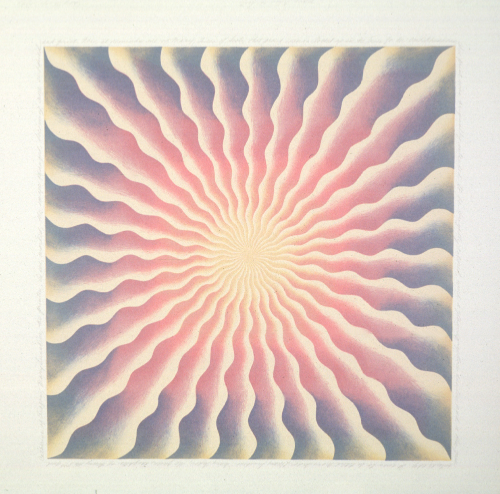
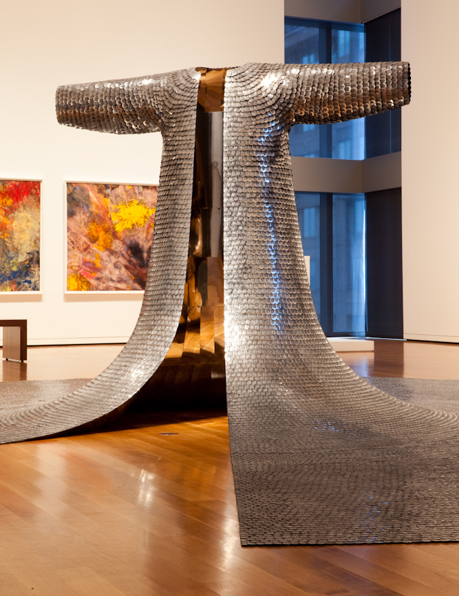
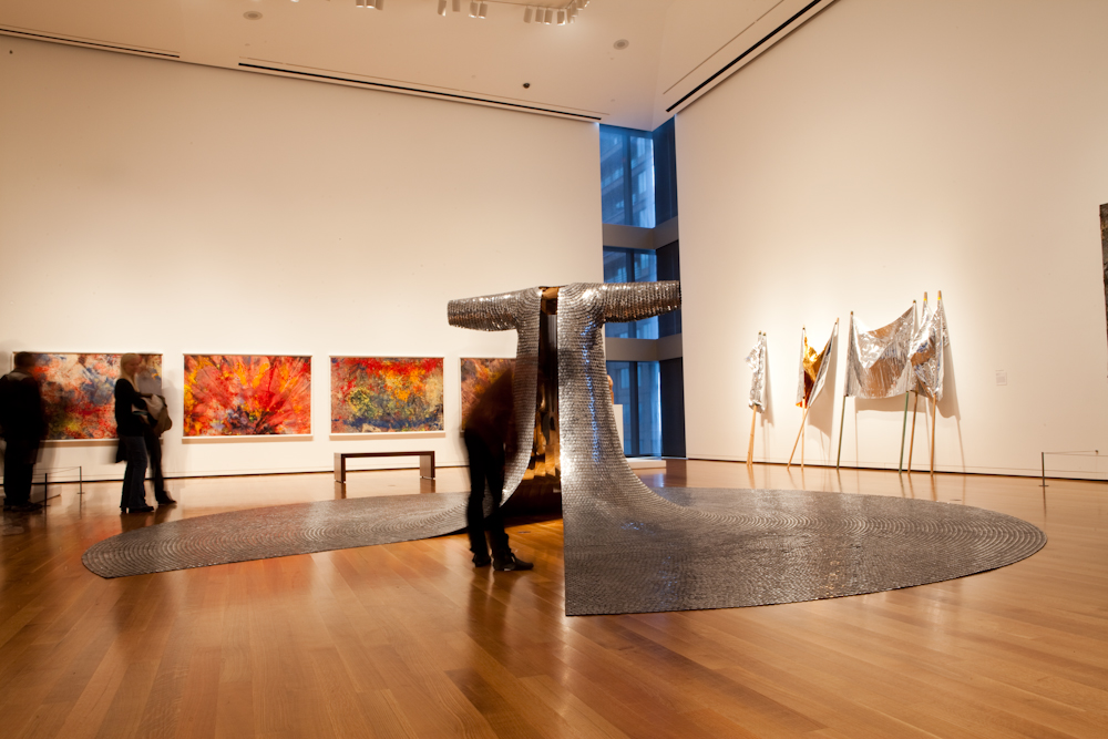
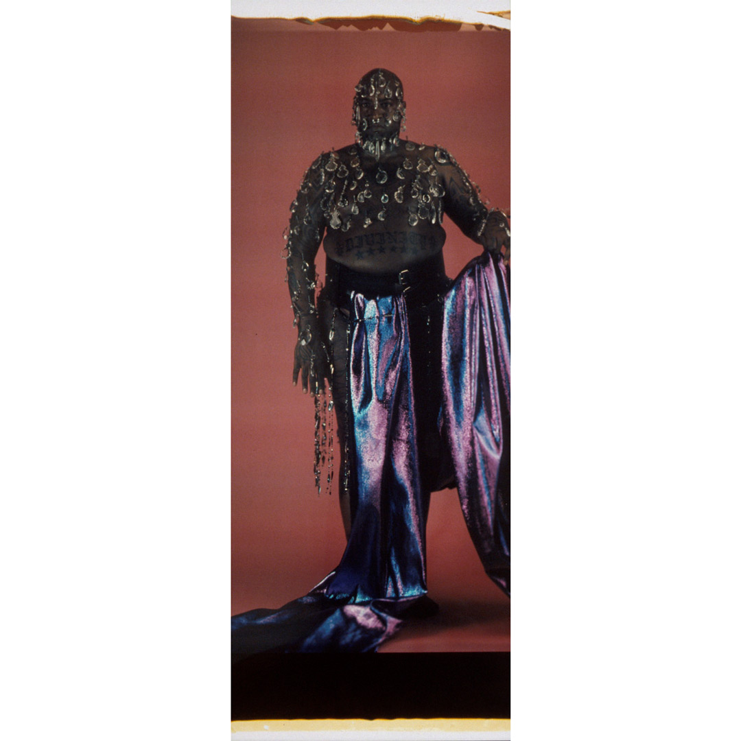
Object of the Week: ChimaTEK Virtual Chimeric Space

Want is the desire to possess or do, or the feeling of lack or being short of something desirable. As long as you’re wanting, you’re usually in a space of trying to gain something for yourself and yourself only. This is a result of individualized thinking, which is one of the pillars of the Western-American ideology. So what does freedom from want look and feel like? And what does it require of us to consider living free from want?

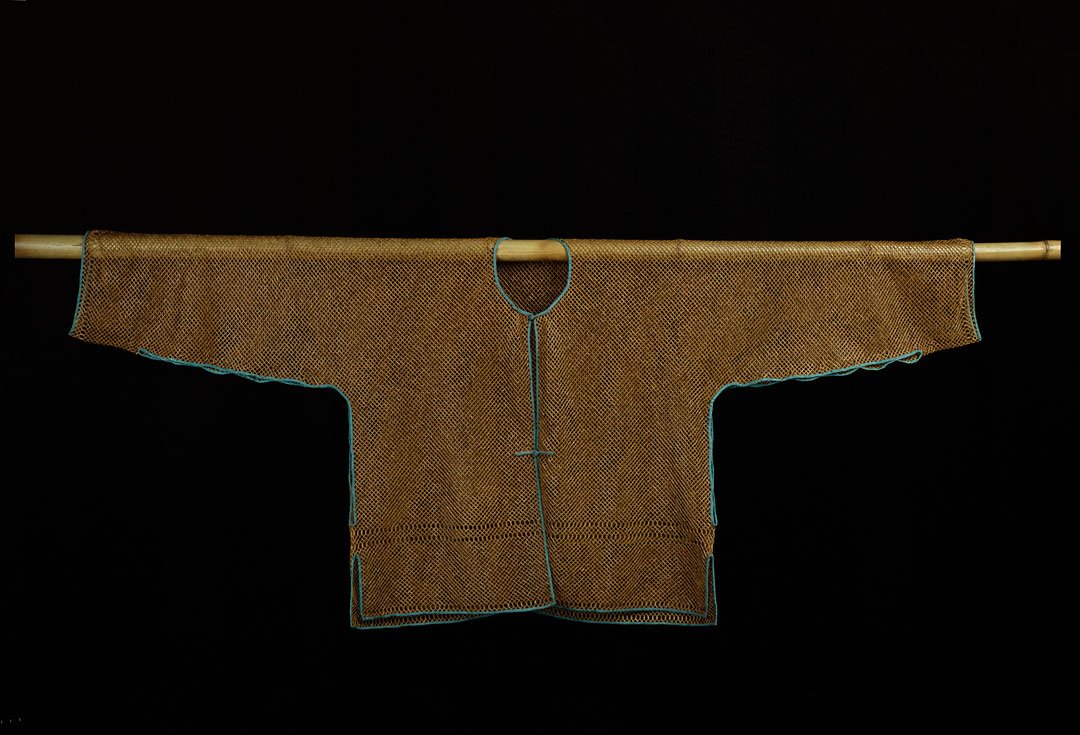
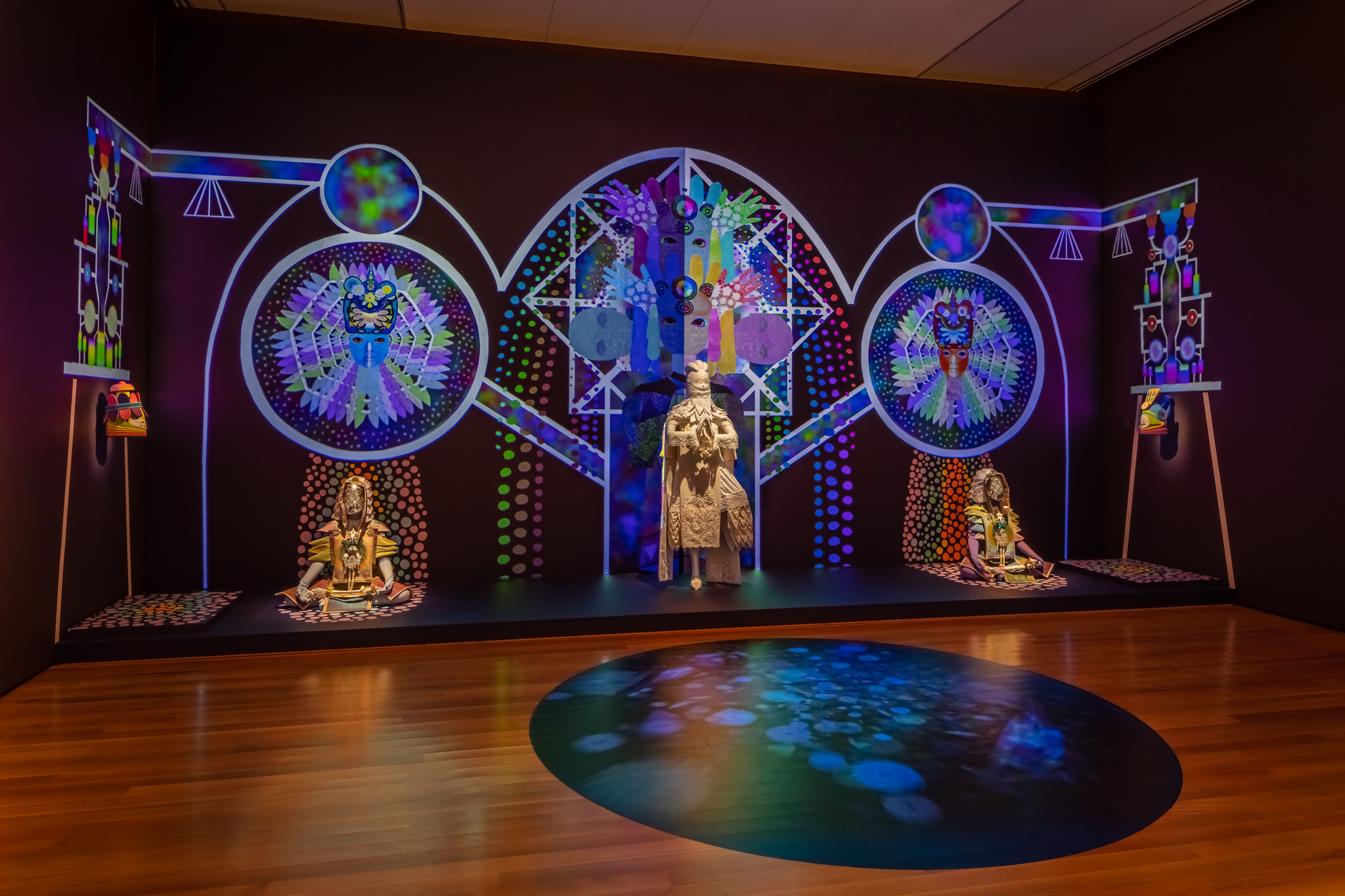
This possibility is explored by Saya Woolfalk, a New York-based artist who uses science fiction and fantasy to reimagine the world in multiple dimensions. With her multi-year projects No Place: A Ritual of the Empathics and ChimaTEK: Virtual Chimeric Space—the latter of which is on view in Lessons from the Institute of EmpathyWoolfalk creates a world of Empathics, a fictional race of women who are able to alter their genetic make-up and fuse with plants. With each body of work Woolfalk says, “I want a person to experience something that simultaneously makes them slightly uncomfortable about the potential of the world that I have created, but also gives them an excitement about a harmonious, multi-cultural society.”

While seemingly very different from human beings, the Empathics actually reflect our multicultural society in myriad ways. Through these beings, who have developed the ability to think collectively, we learn just how powerful the effects of empathy are when honed and used to empower a society in the direction of cultural evolution.

Freedom from want has the potential to take us to a place where this kind of evolution can be realized. In this free state, we are enabled to shift our focus from individual want to helping others gain what they require in order to experience the satisfaction of their needs. With the pressures of scarcity and fear eliminated, a new form of thinking emerges from a place of equity and equality.

Moving closer to freedom from want as a reality—as opposed to an out-of-reach ideal—challenges us to consider others instead of only the self. It challenges us to remove the ego—to listen and understand. It challenges what we consider necessary in order to live happy and successful lives. It challenges us to move beyond individualized, self-centered thinking and towards an elevated level of collective thinking, which is necessary for harmonious living and ultimately stimulates our capacity for acceptance, benefiting every global citizen.

– Adera Gandy, Visitor Services Officer

Image: Installation view of Lessons from the Institute of Empathy at Seattle Art Museum, 2018, © Seattle Art Museum, photo: Nathaniel Willson

Object of the Week: Dream of the Language Wheel

Freedom of worship is one of the founding principles of American democracy. After all, the First Amendment forms our constitutional religious rights: it protects the free exercise and establishment of religion. In President Franklin D. Roosevelt’s 1940 State of the Union, delivered before the United States’ entry into World War II, he reminded the American people that the United States was committed to securing a future in which four essential human freedoms are upheld, the second of which is, in his words, the “freedom of every person to worship God in his own way—everywhere in the world.”

This is a powerful and important message, especially today. And while there are many works in SAM’s collection that give visual form to the freedom of worship, there are also a number of works that represent the opposite narrative: religious freedoms being taken away. For example, there are a number of objects in our Native American galleries whose value and function during potlatches tell a different story of persecution, as such ceremonies were banned by in 1885. Unfortunately, there are too many stories like this told through our material and visual culture. So, when thinking about freedom of worship, we must also ask who is free to worship.

In the piece pictured here, Dream of the Language Wheel, Guy Anderson offers up a unifying religious message. A member of the Northwest School, Anderson was a peer of Mark Tobey and Morris Graves and known for his abstract “mystic” paintings that incorporated motifs ranging from Zen Buddhism to Hinduism to Native American cosmologies, among others. Formally, the painting exhibits a degree of visual tension due to its divided canvas with dark and light elements. Embedded within the upper half are symbols from Northwest Coast groups—such as a fish and raven, whose treatments reference the iconic formline style of the Tlingit, Haida, and Tsimshian peoples. In the lower half, we see early Christian symbols similarly contained within an abstract field.

While this work could be interpreted through a lens of cultural appropriation, Anderson’s blending of spiritual practices and cultures other than his own evinces the artist’s freedom of worship, developing a unique brand of spirituality which manifested itself artistically. It is also no accident that Anderson brings together Native American and early Christian iconography, given the long and fraught history between Native communities and Christian colonizers; however, the title of the work—Dream of the Language Wheel—holds, I think, an important key to the work’s meaning. A tool used to help find and translate words among different languages, a language wheel is meant to make things synonymous—that is, forge similarities. Perhaps Anderson believed that art was that thing, like a language wheel, that could unite us rather than divide us, showing us how we are more similar in our religious beliefs than we are different.

– Elisabeth Smith, Collections Coordinator

Image: Dream of the Language Wheel, 1962, Guy Anderson, oil on canvas, 81 x 48 in., Gift of the Marshall and Helen Hatch Collection, in honor of the 75th Anniversary of the Seattle Art Museum, 2012.15.3 © Guy Anderson and Deryl Walls

Object of the Week: Power Plant I

Born in 1880, Arthur Dove was a master of abstraction, light, and color, always seeking to capture the hidden rhythms and feeling of his given environments—whether natural or man-made. In Power Plant I (1938), Dove transforms a looming building into shifting planes of color and shape. The plant, its smoke stacks, and surrounding telephone poles are in reality solid and immutable, but Dove renders them formless, with all dimensionality equalized on the canvas.

One of four artists recently installed in our American galleries, Dove (like the rest of his cohort) is celebrated for his unique approach to abstraction, which evokes—rather than describes—the world around us. Below is an excerpt from an essay by Dove, titled “Me and Modern Art,”[1] that sheds light on his thinking and approach to painting that sheds light on his thinking and approach to painting:

It is sometimes refreshing just to be painting with no plans; by that I mean pure painting, with no further intention.

            It has a tendency to make one feel the two-dimensionality of a canvas, a certain flatness which is so important in the balance of things, and often so difficult to attain.

            I have seen a child of five do it beautifully, and after three years in school be absolutely unable to accomplish it again. How well I remember the answer when two grown ups came in and asked the child what he was thinking of when he painted those things. Simply “I wasn’t thinking of anything, I was just painting.”

            Pure painting is extremely helpful in finding one’s own instincts. It helps us to see how much stronger is our imagination than our intellect. There is too much of the intellectual in art nowadays, and pure painting tends twoard [sic] the elimination of this intellectual forcing process.

            We must learn by our own mistakes and find our own find. Profiting by the mistakes of others, and building up knowledge through the findings of others may make an artist successful but it will never make him creative.

            They may say that we cannot create anything, that everything has been done. Perhaps, it doesn’t matter—if we have not done it. That may be the real reason that I am writing this—because I have never done it.,[sic]—instinctively I dislike the idea of writing “about” things and painting “about” things. Have always felt that it is much better to write things and paint things that exist in themselves and do not carry the mind back to some object upon which they depend for their existence. We lean too heavily on nature. I would rather look at nature than to try to imitate it. In the same way I enjoy looking at a Greco, a Cezanne [sic], or an Afircan [sic] sculpture, but have no desire to do one. And if we find at any time that we are depending too much on any one thing, we will also find that it is by just that much that we have missed finding our own inner selves.

Elisabeth Smith, Collections Coordinator

Image: Power Plant I, 1938, Arthur Dove, oil on canvas, 25 x 35 in., Partial and promised gift of Mr. and Mrs. Howard S. Wright, in honor of the Museum’s 50th year, 84.64 ©
Artist or Artist’s Estate
[1] Arthur Dove essay, “Me and Modern Art,” not after 1946. Arthur and Helen Torr Dove papers, 1905-1975, 1920-1946. Archives of American Art, Smithsonian Institution.

Object of the Week: Mary, Queen of Scots

“…I could not believe that all these seemingly important contributions of women had been omitted from the mainstream of culture, be it in art, literature, history, or philosophy. My discoveries intersected with the values of my upbringing—which had emphasized the possibility of radical transformation—and led me to conclude that the only real solution to the problems I was facing lay in the creation of an entirely new framework for art: one that included, rather than excluded, women, along with women’s ways of being and doing, which, I was convinced, could be quite different from men’s.”

– Judy Chicago, Beyond the Flower: The Autobiography of a Feminist Artist, 1996

It would be an understatement to summarize Judy Chicago as simply “a pioneering feminist artist,” for her impact is far greater than those four words can suggest. Perhaps best known for her 1979 work The Dinner Party, which celebrates the achievements of women in Western culture, Chicago has throughout her decades-long career dedicated herself to the research and representation of women artists, writers, thinkers, and historical figures. Deploying a wide range of female symbols and domestic craft traditions typically considered “women’s work,” Chicago has redefined the art historical canon and inserted herself—and other women—within it.

In the years prior to The Dinner Party, from 1972 to 1973, Chicago created a series of paintings entitled Great Ladies, dedicated to historical queens such as Marie Antoinette, Catherine the Great, and Queen Victoria. Considered “abstract portraits,” these paintings served to represent the lives of important women in history and “challenge the overriding presumption that women had no history to speak of.”[1] The pictured lithograph, Mary, Queen of Scots (1973), is based on paintings from the series and bears Chicago’s signature visual style: radiating spiral lines that resemble that of flower petals or sunrays, rendered in soft, muted pastels. Chicago once described her formal approach to the series as an attempt “to make my form-language and color reveal something really specific about a particular woman in history, like the quality of opening and blockage and stopping, the whole quality of a personality.”[2]

In fact, bordering the image is text, written by Chicago in Palmer Method cursive: “This print was originally intended to be brightly colored with a glowing yellow center and a blue-green outside edge. It was to be titled Mary Tudor/Mary Sunshine—Mary Tudor, the Queen, daughter of Henry the 8th and Catherine of Aragon; Mary Sunshine, the printer. As I’ve worked, the image changed, becoming more subdued and quiet. Now it reminds me of Mary, Queen of Scots, the proud woman locked up in the tower for her ambitiousness.” This first-person description sheds light on Chicago’s process, as well as the specificity and closeness she feels to the women she portrays.

Despite the historical debates that still center on Mary, Queen of Scots, Chicago celebrates her accomplishments as an ambitious woman and role as a major political figure in 16th-century Europe. In the words of the artist, “One reason for my staunch and abiding commitment to feminism is that I believe its principles provide valuable tools for empowerment—and not only for women. In my view, feminist values are rooted in an alternative to the prevailing paradigm of power, which is power over others. By contrast, feminism promotes personal empowerment, something that, when connected to education, becomes a potent tool for change.”[3]

– Elisabeth Smith, Collections Coordinator

[1] Judy Chicago, Beyond the Flower: The Autobiography of a Feminist Artist (New York: Penguin Books, 1996), 36.

[2] https://www.nytimes.com/2018/02/07/t-magazine/judy-chicago-dinner-party.html

[3] Chicago, 27.

Image: Mary, Queen of Scots, 1973, Judy Chicago, lithograph, 20 x 20 in., Gift of Bruce Guenther, 82.189.

Object of the Week: A Woman with Red Hair

A picture frame is, or should be, more than an adjunct to a work of art. If properly made, it is itself a work of art.

– Bill Barol, “The Carrig-Rohane Frame,” 1989

William McGregor Paxton’s Woman with Red Hair is an exemplar late work by the Boston School artist. Well-known for his attention to detail—especially capturing the effects of light—Paxton’s portraits often depict elegant women in minimally decorated rooms. However, unlike his earlier and larger body of work, the sitter here is removed from an interior setting and set against a rich, nearly impasto teal background. Our focus as viewers is placed solely on the woman, her features, and Paxton’s mastery of light and color.

Yet, there is one more element of the work that is impossible to ignore: its frame. Meticulously carved and gilded, it is a piece of art in its own right. All too often frames are overlooked for what they surround, but this Carrig-Rohane frame, designed and fabricated by Herman Dudley Murphy in 1911, holds its own and complements the Paxton painting.

Prior to his career as a framemaker, Murphy studied at the Boston Museum School and worked as an illustrator. Like many young artists he moved to Paris, and for five years (1891–1896) studied with artist James Abbott McNeill Whistler. Whistler believed, quite radically for the time, that a frame and a painting should be in harmony, and as a result manufactured his own frames. Murphy’s relationship with Whistler proved formative and, upon his return to the United States in 1897, Murphy taught himself how to carve and gild. Discouraged by the poor quality of American frames, he eventually opened his own business in 1903—Carrig-Rohane—in the basement of his Winchester, Massachusetts home.[1]

As evidenced by Whistler, a new appreciation and consideration of the frame as integral to the display of painting emerged in the late-19th and early-20th centuries, part of a larger artistic and aesthetic shift toward the handmade that defined the Arts and Crafts movement. The importance of the frame during this period is encapsulated in the writing of art critic Percy Fitzgerald, who in 1886 described the gold frame as that which “seems to enrich everything it touches.” He also penned that the frame “suggests the notion of an abstract boundary or zone between the vulgar surrounding world and the sort of spiritual life of Art.”[2] Both the Carrig-Rohane frame and Paxton painting are currently on view in the American Galleries, so I encourage you to see—and judge—for yourself.

Elisabeth Smith, Collections Coordinator

[1] “Continuing the Tradition: Grundmann Studios,” in The Boston School Tradition: Truth, Beauty and Timeless Craft (Boston: Vose Galleries, 2015), 53.
[2] Percy Fitzgerald, The Art Journal (London: J.S. Virtue & Co., 1886), 40.

Image: A Woman with Red Hair, 1922, William McGregor Paxton, oil on canvas, 30 x 25 in., Gift of the Estate of Bruce Leven, 2018.5.1.

Object of the Week: Whale Effigy Charm

There is, one knows not what sweet mystery about this sea, whose gently awful stirrings seem to speak of some hidden soul beneath . . . for here, millions of mixed shades and shadows, drowned dreams, somnambulisms, reveries; all that we call lives and souls, lie dreaming, dreaming, still; tossing like slumberers in their beds; the ever-rolling waves but made so by their restlessness.

– Herman Melville, Moby Dick, Chapter 111: The Pacific

This past week there have been a few heart-wrenching whale stories circulating the news, the most difficult of which centers on Tahlequah, a grieving mother orca who has carried her dead calf for over ten days in the waters near Victoria, British Columbia. The widespread sadness surrounding Tahlequah’s loss points to our human impulse to anthropomorphize and, more importantly, to empathize. And while this tendency to project our human emotions onto animals is often discouraged by scientists, orcas are among the most cognitively, socially, and emotionally sophisticated mammals on the planet and, for good reason, have been venerated by different cultures for millennia.

Perceived by many as the sovereigns of the world’s oceans, whales are magnificent creatures. This whale effigy charm is a testament to the whale’s status in Chumash culture, even in 1200-1600. Measuring three inches in length, this effigy of a whale—believed to be an orca—is rendered with an undeniable smile. Even its inlaid eyes exude a certain kindness. Indeed, according to anthropologist Robert L. Hoover, “the killer whale [orca] was regarded by the Chumash as a benevolent creature which drove schools of porpoises and whales ashore where they could be utilized by man.”[1] Carved from soapstone (steatite) likely obtained from Catalina Island, this effigy also possesses a bone tube which, coupled with the functional blowhole, is suggestive of a pipe mouthpiece.

According to Chumash historians and legend, such carved stone effigies were used as charms to ensure luck in fishing or hunting along the Southern California coast (from present-day Malibu to Morro Bay). The magical qualities of these effigies were believed to be obtained from the guidance of a spirit helper, and useless to anyone except its owner.[2] The question of whale hunting has been debated for decades, but the Chumash did not actively hunt orca whales; they were eaten only when they were washed on shore. Swordfish were significant marine animals for this reason, fabled to drive whales onto the beach and provide food during the winter months.

It is very hard not to anthropomorphize this charming whale effigy (for me, at least . . .), especially when the object itself bears human traits and evidences just one of our many emotional, cultural, and spiritual connections to these amazing creatures—these sovereigns of the sea.

– Elisabeth Smith, Collections Coordinator

[1] Robert L. Hoover, “Some Observations on Chumash Prehistoric Stone Effigies,” The Journal of California Anthropology 1, no. 1 (1974): 34.

[2] “Chumash Indian Fish Effigy,” California Department of Parks and Recreation, accessed August 8, 2018, http://www.parks.ca.gov/?page_id=23549.

Image: Whale effigy charm: “Cloud Blower”, 1200-1600, Chumash, steatite, 3 x 1 1/2 in., L.: 3 3/4 in., Eugene Fuller Memorial Collection, 59.55

Object of the Week: Some/One

For artist Do Ho Suh, clothing is the “smallest, most intimate habitat that one person can carry. And when you expand that idea, it becomes architecture.”¹ Indeed, Some/One—a monumental armor sculpture made from thousands of military dog tags—embodies the architectural possibilities that Suh sees in clothing.

Answering the question “How much space does one need to be an individual?” Suh explores the relationship between individual and collective, redefining how we might perceive this dichotomy. Some/One in particular is informed by Suh’s experience in the Korean military, which is mandatory service for young men. Unified as one coat of armor, the chain mail-like sculpture is comprised of unique metal tags—each one bearing a sequence of random letters and numbers.² The sculpture somehow manages to defy gravity despite the imagined weight of its 30,000-plus stainless steel tags. Additionally, the piece’s large fanning base serves dual purposes: it supports the sculpture structurally, as well as makes physical and metaphorical space to consider the work’s footprint.

Dog tags are inherently a marker of individualism used to identify soldiers, but they also connect a troop to a larger collective and, ultimately, nation. In the words of the artist, “When you see a person, you don’t just see the person standing in front of you—you see their background, their family or ancestors, the invisible webs of relationship or information.”³ When we see one person’s tag, we see so much more than a name, place of birth, or unit—we see their life.

Further, the reflective surface and mirrored interior of Some/One underscores the artist’s desire for viewers to see themselves—literally and figuratively—in the work. Whether the sculpture serves as a monument honoring fallen troops or highligts the anonymity of their service (or carries other readings altogether) is willfully left open to the viewer. This work is not currently on view but it will be exhibited when the Seattle Asian Art Museum reopens in late 2019.

– Elisabeth Smith, Collections Coordinator

Image: Some/One, 2001, Do Ho Suh, stainless steel military dog-tags, nickel-plated copper sheets, steel structure, glass fiber reinforced resin, rubber sheets, diameter at base: 24 ft. 4 in.; Height: 81 in., Gift of Barney A. Ebsworth, 2002.43 © Do Ho Suh. Photo: Justin Gollmer.
[1] C. Carr, “In the House with Do-Ho Suh: World of Interiors,” Village Voice, June 23,  2003, http://www.lehmannmaupin.com/artists/do-ho-suh/press/127.
[2] Do Ho Suh, “’Some/One’ and the Korean Military,” interview by Art21, Art21, 2003, https://art21.org/read/do-ho-suh-some-one-and-the-korean-military.
[3] Geoffrey Cruickshank-Hagenbuckle, “Do-Ho Suh ReflectionBrooklyn Rail, March 7, 2008, https://brooklynrail.org/2008/03/artseen/reflection.

Object of the Week: Ideas for Zanzibar with Dancer from Parade Triple Bill

A pioneering Pop artist, David Hockney has throughout his career pivoted effortlessly from medium to medium, continuously exploring his visual style. Though perhaps best known for his iconic paintings of Southern California swimming pools, Hockney has produced a much larger body of work, ranging from abstract paintings to photo collages to iPhone drawings. However, arguably lesser known is his work in stage and costume design: he has been involved in productions of Stravinsky’s Rake’s Progress and Mozart’s Magic Flute, both at the Glyndebourne Opera in England, and Parade at the New York Metropolitan Opera, for which this drawing was created.

Grouped under the title Parade, the Met Opera’s 1981 triple bill brought together three pieces: Parade, a ballet written by Jean Cocteau with music by Erik Satie; Les Mamelles de Tiresias, an opera with libretto by Guillaume Apollinaire and music by Francis Poulenc; and L’Enfant et Les Sortileges, an opera with libretto by Colette and music by Maurice Ravel. Hockney designed the sets and costumes for all three performances.

Satie’s Parade, first presented at the Théâtre du Châtelet in Paris on May 18, 1917—during the height of World War I—takes place in a world of circus acts and street fairs. Though written in 1903, Les Mamelles de Tiresias similarly premiered during the war, in June 1917. The surrealist play was described by one critic as “high-spirited topsy-turveydom” whose deeper themes are about the need to repopulate a France ravaged by war.¹ Lastly, L’Enfant et Les Sortileges, commissioned in 1915, is a “fairy ballet” exploring the inner emotional world of a child, where toys and animals come to life.

There is a long history of artists collaborating on theater and dance productions. Merce Cunningham frequently collaborated with Jasper Johns and Robert Rauschenberg, for example, and both the scenery and costumes for Satie’s original Parade were designed by none other than Pablo Picasso. For New York Times theater critic John Russell, Hockney’s designs for the 1981 presentation Parade are “not [Picasso’s] Parade redone from scratch. It is the Parade of 1917 revisited as if in a dream, with Picasso very much in mind, both as the original designer and as the poet of Les Saltimbanques—the tumblers and harlequins who turn up over and over again in the work of Picasso’s Rose period.”²

Largescale painted environment with separate elements based on Hockney’s design for Les Mamelles de Tiresias

Hockney produced many drawings for Parade, but the one in SAM’s collection is for the second opera in particular: Les Mamelles de Tiresias, set in Zanzibar, an imaginary town in France. Taking into account the circumstances surrounding the opera’s 1917 premiere, when the war was at its worst, Hockney incorporated details such as gas masks, helmets, searchlights, and barbed wire, the latter of which is included in this drawing.³ Though the unfinished blue sky suggests a certain incompleteness, it is important to keep in mind that this is, after all, a preparatory drawing. And despite the war-time setting, Hockney still manages to bring his bold, graphic, and colorful style to the mise en scène. In the image above, which more fully depicts Hockney’s playful cubist-inspired world, we get a sense of how such drawings were crucial for his development of these operatic worlds.

–Elisabeth Smith, Collections Coordinator

Images: Largescale painted environment with separate elements based on Hockney’s design for Les Mamelles de Tiresias, from the 1983-84 Walker Art Center exhibition Hockney Paints the Stage. Ideas for Zanzibar with Dancer from Parade Triple Bill, 1980, David Hockney, Crayon on paper, Framed: 28 x 33″, Paper size: 19 x 24″, Gift of Robert and Honey Dootson Collection, 2010.37.26, © David Hockney.
¹Jeremy Sams, “Poulenc, Francis,” in The Penguin Opera Guide, ed. Amanda Holden (London: Penguin Books, 1997), 282.
²John Russell, “David Hockney’s Designs for Met Opera’s ‘Parade’,” in The New York Times, February 20, 1981, 1.
³ Russell, 1.

Object of the Week: Model Totem Pole

The black stone used for this carving by Haida artist Charles Edensaw is argillite, a carbonaceous kaolinite shale. Truly unique, this sedimentary rock is found in only one place in the world: Haida Gwaii. Formerly known as the Queen Charlotte Islands, the archipelago in British Columbia is home to this very special material and the similarly distinct Haida artistic traditions that have arisen from it. More specifically, argillite comes from the Slatechuck Mountain. And while Haida peoples have accessed the Slatechuck quarry and produced such argillite carvings for centuries, it was not until 1941 that the quarry site (measuring approximately 18 hectares) was officially designated as land belonging to the Skidegate band, assuring that access would remain theirs in perpetuity.[1]

For those who might not identify as geologists, or even amateur geologists, the slate’s black color comes from its high levels of carbon. A kaolinite shale, it is composed of clay material that has been subjected to heat and pressure over geologic time, resulting in a highly uniform and workable rock.[2] For example, it ranks at two and a half on the Moh’s scale of mineral hardness (on a scale of one to 10, with 10 being diamond-hard).[3]

Measuring 19 inches tall, this model totem pole (qwa.a gyaa.angaa) was expertly carved out of one piece of argillite. Perhaps it goes without saying, but the larger the carving, the more difficult it is to do successfully, as natural imperfections in the shale grain can result in fine fractures. Further, argillite is sensitive to its environmental surroundings, and can absorb and desorb moisture quickly; it is essential that freshly quarried argillite is slowly and carefully dried, otherwise it is prone to cracking.

Currently on view in the third floor Native Art of the Americas galleries, this piece makes clear just how skilled and masterful Edensaw was as a Haida carver. The figures on the pole from top to bottom are: a bear holding five stacked cylinders—representing a ringed basketry hat—above an eagle’s head; two human heads on either side, also wearing ringed hats; a bear, holding its tongue; and another bear, holding a seal-like figure with a fish-like tail. Though quite a lot to fit into 19 inches, compositionally, each animal and human figure bears exquisite incising and detail.

Such model poles were primarily made for commercial sale as Haida contact with Americans and Europeans increased during the 1800s. In fact, around the time that this piece was made (circa 1885), argillite carving experienced a surge in output corresponding with an exploration of new forms. As traditional Haida ceremonial objects and practices were increasingly banned by the Canadian government, new forms of creative expression thus emerged.[4] Edensaw was an important figure during this period, whose personal style influenced many other Haida artists living in Skidegate and Masset. With a deeper understanding of argillite’s geological properties, rarity, and cultural significance, this carving by Edensaw is all the more impressive.

– Elisabeth Smith, Collections Coordinator

Image: Model totem pole (qwa.a gyaa.angaa), ca. 1885, Haida, argillite, 19 x 3 x 2 3/4 in., Gift of John H. Hauberg, 91.1.129
[1] “Haida Argillite,” Simon Fraser University, Museum of Archaeology & Ethnology, accessed July 11, 2018, https://www.sfu.ca/archaeology/museum/exhibits/virtual-exhibits/haida-argillite.html.
[2] “Care of Argillite,” Government of Canada, accessed July 10, 2018, https://www.canada.ca/en/conservation-institute/services/conservation-preservation-publications/canadian-conservation-institute-notes/care-argillite.html.
[3] Peter L. Macnair and Alan L. Hoover, The Magic Leaves: A History of Argillite Carving (Victoria, B.C.: British Columbia Provincial Museum, 1984), 17.
[4] Macnair and Hoover, 113.

Object of the Week: Atifofoe Susuavor Adanudo

The beauty of this Ghanaian textile lies not only in its striking colors and bold patterning, but in its deeper message of unity. Made with strips of woven cloth crafted by over twenty Ewe weavers, this vibrant adanudo (which translates roughly as “skilled or wise cloth”) highlights the beauty that can be found in bringing together unique artistic voices and, ultimately, difference.

Kente cloth, which originated in the Asante region of Ghana, is today an iconic and widely-produced textile, but it is important to remember that it initially functioned in a royal and ceremonial context within the Asante kingdom. The Ewe, like their Asante neighbors, have a rich textile tradition, and one that relies on a style of horizontal loom-weaving similar to that of Kente cloth. However, unlike the Asante, the Ewe never united to form an autocratic government; this, among other things, resulted in a distinct brand of creative autonomy. Free from the strict designs that would otherwise be determined by a royal court, Ewe weavers—regardless of their region—have been able to explore their own personal style and visual language.

With its high-keyed color palate and dazzling contrasts between warp and weft (a hallmark of such Kente textiles), this adanudo—titled Atifofoe Susuavor Adanudo (A Cloth of Multiple Designs and Much Skill—Even Difference Can Be Unified)—is replete with intricate geometric patterning and inlaid motifs. The creativity and idiosyncrasies inherent in this piece are again a testament to the liberties Ewe artists can take, not to mention their skill. This piece in particular also has an especially interesting backstory: It was created in 2004 by a community of Ewe artists working together with Gilbert “Bobbo” Ahiagble, who was born into a family of master weavers of Ewe Kente cloth. Led by Ahiagble, twenty four artists created and contributed to this adanudo, chosen by Ahiagble for the Seattle Art Museum as an exemplar work from his community and workshop. Indeed, the piece is a feast for the eyes and an amazing display of craftsmanship on a community-wide level.

The syncopated patterning and visual rhythm of Atifofoe Susuavor Adanudo might be composed of seemingly disparate and irreconcilable elements, but, literally woven together, the piece illustrates the power of diversity and the strength to be gained by working together. The whole really is greater than the sum of its parts.

– Elisabeth Smith, Collections Coordinator

Image: Atifofoe Susuavor Adanudo “A cloth of multiple designs and much skill – even difference can be unified”, 2004, Ghanaian, cotton, 106 x 85 1/4 in., African Art Purchase Fund, in honor of the 75th Anniversary of the Seattle Art Museum, 2005.29 © Gilbert Bobbo Ahiagble

Object of the Week: Aerial View, Tulsa, Oklahoma

There is something peculiar about the way we attribute the clarity of some photographs to the world itself. I try to reinforce that paradox by making photographs that convince the viewer that those revelations, that order, that potential for meaning, are coming from the world and not the photograph.

– Frank Gohlke, 1979

Aerial View, Tulsa, Oklahoma is a photograph by American photographer Frank Gohlke, taken in 1981. One of 10 artists included in the groundbreaking 1975 exhibition New Topographics: Photographs of a Man-Altered Landscape, Gohlke emerged as an important voice challenging then-prevailing trends in modern photography.[1] Working against romanticized depictions of nature, Gohlke and others in the exhibition produced photographs described by the curator, William Jenkins, as “eschewing entirely the aspects of beauty, emotion and opinion.”[2]

Though Jenkins felt otherwise, one could certainly argue that Gohlke’s Aerial View, Tulsa, Oklahoma is in fact a beautiful and emotive image. Sure, it is far from the Platonic ideal of nature, but the photograph’s composition—with its nested and overlapping arcs, dramatic shadows, and abstract patterning—contains within it a certain beauty. It might not be Ansel Adams’s Half Dome, but it is a photograph that elevates otherwise banal and unattractive subject matter, poetically calling attention to man’s impact on the natural world.

Importantly, Gohlke and his New Topographics cohort reinforced the notion of landscape as a manmade concept. It is a word and idea predicated on a human subject who turns the land into an object and, artistically, into an image. The very definition of the word hinges on an aestheticized understanding of nature. In Aerial View, Tulsa, Oklahoma, Gohlke deftly mobilizes photography to highlight the extent to which the landscape is indeed a manmade image, as well as an object—or resource—to be taken and transformed.

The “new” American topography on offer in 1975’s New Topographics was no longer unspoiled or pristine wilderness, but a country comprised of suburban sprawl, connecting interstates, and parking lots. Whether or not we find that beautiful is up to us to decide. Luckily, this work and others from SAM’s permanent collection are on view in the upcoming New Topographics exhibition on view in the third floor Modern and Contemporary Galleries.

– Elisabeth Smith, Collections Coordinator

Image: Aerial View, Tulsa, Oklahoma, 1981, Frank Gohlke, gelatin silver photograph, 6 1/8 x 16 in., Pacific Northwest Bell, the Photography Council, the Polaroid Foundation, Mark Abrahamson, and the National Endowment for the Arts, 83.69.5 © Frank Gohlke
[1] The other artists featured in the exhibition were Robert Adams, Lewis Baltz, Joe Deal, Nicholas Nixon, John Schott, Stephen Shore, Henry Wessel, Jr., and Bernd and Hilla Becher.
[2] William Jenkins, New Topographics: Photographs of a Man-Altered Landscape (Rochester, New York: International Museum of Photography at the George Eastman House, 1975), n.p.

Object of the Week: Untitled, Divinity

This image by Catherine Opie contains within it a number of seemingly oppositional elements: freedom and constriction, embellishment and erasure, intensity and ease, pain and restraint. The subject of the portrait, Divinity Fudge (born Darryl Carlton), stands with confidence, gracefully—if not stoically—lifting the opulent purple fabric that drapes his body, chandelier crystals embedded in his skin.

Over the course of her thirty-year career, Opie has photographed a number of American individuals and communities—most notably her lesbian and S&M leather community—and Untitled, Divinity is one of a larger series of photographic works by the artist, created in 2000 for the Estate Project for Artists with AIDS. Conceived in 1991 by the Alliance for the Arts in New York, Estate Project was established as an advocacy effort aimed at addressing “the protection of America’s cultural heritage during the AIDS crisis.”[1] Opie was among a number of artists commissioned by the organization to create artwork for the cause, and the result was her Polaroids series. The 13-Polaroid series, dedicated to her friend and artist Ron Athey, benefited the Estate Project organization, and half of the proceeds went to an artist living with AIDS. For Opie, “The whole project was a tribute to Ron and his S/M performance work.”[2]

In his performance practice, Athey employs S&M techniques and body modification to explore pain, trauma, transformation, and “allegorize the experience of survival, anger, and loss during the first decades of the AIDS crisis.”[3] Divinity, who is featured in two other photographs in the Polaroids series, appeared frequently in Athey’s work, such as the 1994 performance at the Walker Art Center—Four Scenes in a Harsh Life—which gained much national attention and notoriety. In a scene titled “Human Printing Press,” Athey cut 1 1/2 inch patterns into Divinity’s back. Impressions of Divinity’s wound were poetically transformed into prints on paper towels, which were then placed on a clothesline pulley and extended over the audience.[4]

In the Opie’s own words, “The 13 images in the series work as a journey through the ideas, actions and personas in [Ron Athey’s] performances, little vignettes from larger parts of Ron’s work. . . . The whole cast is not there, but the relationship with Divinity Fudge, who has performed with Ron for the past decade, is represented. There are images that I make in the series that have nothing to do with the performances, but act as pauses, offstage for a moment.”[5] Untitled, Divinity is one such offstage beat.

A master at capturing subjects as diverse as high school football players, lesbian families, surfers, freeways, and mini-malls, Opie has redefined American photography. Dedicated to expanding notions of queer identity—especially its subcultures that are too often misunderstood and overlooked—Opie’s project aims to highlight the beauty of this community as well as the importance of our individual differences.

– Elisabeth Smith, Collections Coordinator

Images: Untitled, Divinity, 2000, Catherine Opie, photograph, 103 x 43 in., Gift of the Collectors’ Forum, 2000.114 © Artist or Artist’s EstateRon Athey blots blood from the back of Divinity Fudge during Four Scenes in a Harsh Life, 1994.
[1] “Biographical/Historical Information,” Estate Project for Artists with AIDS records, The New York Public Library Archives & Manuscripts, accessed June 13, 2018, http://archives.nypl.org/mss/4798#overview.
[2] Maura Reilly, “The Drive to Describe: An Interview with Catherine Opie,” Art Journal, vol. 60, no. 2 (Summer 2001): 82-96.
[3] David J. Getsy, Review of Pleading in the Blood: The Art and Performances of Ron Athey, edited by Dominic Johnson, Contemporary Theatre Review, vol. 24, issue 3 (2014): 299-400.
[4] Erroneous reports quickly circulated that blood dripped from the prints, exposing audience members to HIV-positive blood (Athey is HIV-positive, Divinity is HIV-negative). Hardly a factual account or an intended outcome of the performance, this hysterical response would later be misappropriated by conservative politicians to decrease federal funding of the arts.
[5] Catherine Opie, “Flash: On Photographing Ron Athey,” in Pleading in the Blood: The Art and Performances of Ron Athey, ed. Dominic Johnson (London: Intellect and Live Art Development Agency, 2013), 143.

Object of the Week: Bamboo Netting Jacket

One of the many “eco-friendly” fashion trends that graced the United States during the aughts was bamboo clothing. You could find it in just about every form: bamboo shirts, hoodies, socks, athletic wear—you name it. However, this woody grass has long been used in a variety of ways due to its wide-ranging properties, and bamboo undergarments, such as this netting jacket, were prominent in China as early as the Ming dynasty (1368-1644). Modern bamboo textiles cannot hold a candle to them.

Made from cut sections of fine bamboo, this garment was constructed by sewing together hollow bamboo segments to create a woven mesh-like textile. The result is a simple but functional fabric that allows air to flow, keeping its wearer cool and dry (especially in the hot and humid climate of southern China). Further, this additional layer would protect outer garments, often made out of more expensive materials, from being stained and ruined. Despite the fact that this netting jacket would not be seen, its maker possessed an exquisite attention to detail and its construction; together, the mesh design, blue trim, and fasteners all enhance the elegant utility of the piece.

During the late 1800s, bamboo was already beginning to be mixed into other fibers to create alternative fabric blends. However, it was not until the 1990s that textile manufacturers realized bamboo could be substituted in producing rayon, a man-made fiber created from wood pulp and processed cellulose. As Syl Tang writes in Disrobed: How Clothing Predicts Economic Cycles, Saves Lives, and Determines the Future, rayon “was revolutionary for clothing makers. It felt like silk, yet was much cheaper to produce and did not insulate heat, which made the fabric perfect for hot climates.”[1] Add to this the fact that bamboo is an environmental powerhouse—it grows densely and quickly, regenerates after being cut, mitigates greenhouse gases—it is no wonder that bamboo was packaged as a better, safer, and greener option to other textile blends.

For the most part, many clothing companies touting the environmental and health benefits of bamboo during the 2000s were really just selling rayon (or viscose). Taking advantage of the green movement and the devotion of its consumers, such companies were able to get away with perverting a natural material that, as we see in this jacket, needs nothing else.

– Elisabeth Smith, Collections Coordinator

[1] Syl Tang, Disrobed: How Clothing Predicts Economic Cycles, Saves Lives, and Determines the Future (London: Rowman & Littlefield, 2017), 74.
Image: Bamboo netting jacket, 19th century, Chinese, Bamboo, beads, 29 x 25 1/4, Eugene Fuller Memorial Collection, 33.1062.

Object of the Week: Dog Hedge

The teapot is a centuries-old vessel whose origins are firmly rooted in China. Features of the teapot have evolved over time, depending on the culture and period, but for the most part the vessel is a straightforward formula with certain basic elements: a spout, a handle, a lid, and, of course, a container for hot water. Tried and tested, right? Enter Peter Shire.

For decades, Los Angeles-based Shire has worked at the intersection of fine art, craft, and industrial design, experimenting with a variety of mediums and methods to produce iconic ceramic works and furniture that challenge the modernist maxim “form follows function,” first coined by American architect Louis Sullivan. The form of this ceramic teapot, titled Dog Hedge, does not immediately align with its understood function. In fact, many of Shire’s teapots (an ongoing and touchstone series in his practice), don’t pour tea properly—they are objects meant to be looked at. In the words of the artist, they are “referentially functional.”

One of the original members (and first American) of the 1980s Italian design collective Memphis Group, Shire has proven himself a master of surfaces and mimicry. Interested in the plasticity of materials such as clay, he approaches his practice with playful rigor. In this 1982 work, orange, lime green, and red geometric shapes overlap with rectilinear planes of speckled pink and blue to form a postmodern constructivist composition. The various ceramic components balance precariously, testing the limits of the teapot’s utility.

For this work, Shire found inspiration in such diverse sources as Stonehenge, aqueducts, post and beam architecture of the 1950s, the architecture of Luis Barragán, and the “anthropomorphic qualities of the [teapot’s] spout as a mouth and the lid as eyes.” In Shire’s hands, the teapot—as both an object and an idea—becomes deconstructed and reimagined on his own personal, conceptual, and architectural terms. Appearing from one angle as a dog in profile, the piece’s title also references Stonehenge—a monument whose unclear use and construction no doubt finds a parallel in Shire’s own work.

– Elisabeth Smith, Collections Coordinator

Images: Dog Hedge, 1982, Peter Shire, ceramic with glaze, 9 1/2 x 14 x 9 1/2 in., Gift of Anne Gould Hauberg, 86.138 © Artist or Artist’s Estate

Object of the Week: Stone Pavement with Earth

Afoot and light-hearted I take to the open road,
Healthy, free, the world before me,
The long brown path before me leading wherever I choose.
Walt Whitman, Song of the Open Road

Imagine being blindfolded and asked to throw a dart at a map to determine the trajectory of an artist’s work, sending them virtually anywhere in the world. Your dart then sets in motion a series of events that drive the artist to choose a completely random site from which an artwork is fabricated. Now, imagine that this artist is not just one, but four people, and that the four collaborators are in fact a family. This ambitious project—titled World Series—was initiated by Boyle Family (Mark Boyle, Joan Hills, and their children Sebastian and Georgia Boyle) as part of their 1968 exhibition Journey to the Surface of the Earth.

It is, no doubt, an involved process that led to the creation of the pictured piece, Stone Pavement with Earth (1973–77). Upon arriving at the selected location—chosen at random by friends and visitors to the 1968 exhibition—this specific six-by-six foot site was determined by throwing a carpenter’s right angle and seeing where it landed. From there, Boyle Family cordoned off the area and recorded it with resin and paints, incorporating whatever material and visual information was on the site—in this case: York stone, earth, and other debris (my favorite area is the footprint). The work evades clear definition. Situated somewhere between painting and sculpture, it also flirts with photography in the way it accurately documents the topography of its original location, a mix of the natural and the man-made. Add to this the performative, experiential, and democratic element of the World Series project, and you can perhaps see why Boyle Family is celebrated for their unique combination of Dada, Fluxus, and conceptual strategies.1

Ultimately, what begins as a chance encounter turns into an attempt to objectively capture and represent the world as-it-is. I know what you’re thinking and, yes, it is an impossible task, but a task, I believe, that is willfully impossible. Exactly 1,000 random sites were selected for World Series—some more accessible and likely to be recorded than others; however, this quasi-scientific project, as David Thompson suggests, is less about highlighting the infinite scope of our world, and more about “the limits of man’s capacity to see it.”2 Presenting viewers with largescale fragments of our environment, Boyle Family takes on ideas of assemblage and the readymade, turning the very world in which we live into art. We just have to look closely.

– Elisabeth Smith, Collections Coordinator

1 For more on the art historical contextualization of Boyle Family, I recommend: Chris Townsend, “Mark Boyle and Joan Hills at the Gemeentemuseum, The Hague,” British Art Studies, Issue 3 (Summer 2016), http://www.britishartstudies.ac.uk/issues/issue-index/issue-3/boyle-1970.
2 David Thompson, “Afterword,” in Beyond Image: Boyle Family (London: Arts Council of Great Britain, 1986), 53.
Image: Stone Pavement with Earth, 1973 – 77, Boyle Family, stone, earth, and fiberglass, 72 1/16 x 72 1/16 in., Purchased with funds from the Contemporary Arts Council and Contemporary Acquisition fund, 78.34 © Artist or Artist’s Estate

Object of the Week: Swamps West of Nyrripi

Home is often hard to define, and even harder to depict. It can be a place where our childhood myths and memories reside, a more present-tense sense of community, or, perhaps, a place linked to a specific person. In Swamps West of Nyrripi (My Father’s Country) by Australian artist Ngoia Pollard Napaltjarri, the concept of home is represented through a language of symbolic abstraction.

Beautifully irregular red ovals punctuate the variegated surface of the canvas. From afar, the undulating patches of light and dark gray appear as cross hatching, but closer inspection reveals that this is an optical effect—the background is in fact black, with meticulously placed white dots inside and around the red contours. These imperfect and lopsided ovals, stacked precariously one on top of the other, can also be read from an aerial perspective, and thus take on a more topographical or map-like quality.

For Napaltjarri, these ovals signify abundant areas of water—such as swamps and lakes—that are found throughout the region of her father’s homeland, a sacred Warlpiri territory. The white dots, too, carry symbolic meaning: they represent the dry earth cracking as water evaporates. On a more spiritual level, the artist’s act of painting honors the sacred power of the watersnake who resides in the region, and acts as the custodian of the area’s lakes and swampland. The presence and absence of water are environmental conditions constantly in tension, but Napaltjarri manages to find the harmony in such oppositional forces.

Swamps West of Nyrripi (My Father’s Country) is featured in the new exhibition Walkabout: The Art of Dorothy Napangardi, in conversation with work by another Australian artist, Dorothy Napangardi, whose meticulous paintings are similarly connected to her homeland, the Tanami Desert region, and the specificity of that place. With their intricate dotting and abstract patterns, these large-scale paintings are even more awe-inspiring in person.

Elisabeth Smith, Collections Coordinator

Image: Swamps West of Nyrripi (My Father’s Country), 2006, Ngoia Pollard Napaltjarri, acrylic on Belgian linen, 46 × 60 in., Gift of Agatha and Stephen Luczo, 2017.1.3 © Artist or Artist’s Estate

Object of the Week: The People Work

But American workers did contribute at least one lasting legacy to the international movement for working-class liberation…. That holiday is May Day, not Labor Day.

– Jonah Walters, Jacobin, 2015

May Day’s origins go as far back as the ancient world, where it was a festival celebrating spring, but more recently has become a day to honor workers and the labor movement. Although the United States officially observes Labor Day in September, May Day remains a day of international significance whose beginnings can be traced back to Chicago’s Haymarket riot of 1886.

In this lithograph by Benton Spruance circa 1935, titled The People Work: Noon, the artist captures the bustling and dynamic energy of New York City at noon. One of a series of four prints by the artist, each print captures a moment in the day: Morning, Noon, Evening, and Night. In Noon, it as if we see a play in two simultaneous acts. On the bottom level, construction workers take a break from their digging and hammering to eat lunch. Sitting and standing in small groups—surrounded by I-beams, ladders, and an excavator—this moment of respite is at odds with the scene above. With an energy akin to Pike Place Market at lunchtime, the street-level scene is replete with traffic and crowds of people donning suits and dresses. The few individuals not in a rush lean over the railing to view the construction site below.

Widely considered the artist’s most successful and ambitious series, “they [The People Work] present a wealth of scenes and imagery, tied together in space and in simultaneity by various witty and ingenious devices.”[1] Indeed, by dividing Noon into sections, we are privy to the kinds of work—and leisure—that are vital to our daily lives, as well as the imagined identities of the city’s inhabitants.

Though Spruance’s juxtaposition of work and relaxation might appear straightforward, it is important to remember that the universal eight-hour workday is an element of our modern workweek, and a hard-fought battle at that. In fact, it was not until 1938 that Congress passed the Fair Labor Standards Act (FLSA), limiting our workweeks to 40 hours. And while Spruance may not have intentionally broken his series into a structure resembling the slogan of the Eight-Hour Movement–“eight hours for work, eight hours for rest, and eight hours for what you will”—it’s an important reminder this May Day.

– Elisabeth Smith, Collections Coordinator

[1] Carl Zigrosser, The Artist in America (New York: Knopf, 1942), 87.
Image: The People Work: Noon, ca. 1935, Benton Spruance, lithograph, 14 x 19 in., Eugene Fuller Memorial Collection, 38.37 © Benton Spruance

Object of the Week: Labret

This beautiful gold object—known as a labret—was crafted circa 900-1500 AD in Pre-Columbian Mexico, either by the Mixtec or Aztec. Labrets have an extensive history and appear in cultures beyond Central and South America, in Africa, the Middle East, and Pacific Rim cultures. Despite its size, a mere 1 1/2 x 1 x 1 1/8 inches, this precious piece of jewelry was likely worn by a high-ranking person—perhaps a dignitary or warrior. A symbol of status, such ornaments would fit piercings in the lower lip; the flat backing would rest inside the mouth, while the decorated portion would extend away from face.

While much more elaborate labrets do exist, sometimes representing animals or featuring moveable elements (see this serpent labret with an articulated tongue for a rare example of both), this relatively simple labret bears an intricate spiral patterning on its reverse. Though not overly ornamental, the curved shape could certainly be interpreted as an abstraction of an animal form, perhaps a fang or beak, as birds and serpents were among many figures commonly depicted.

Gold has, throughout time and across cultures, proven to be an extremely precious metal. In Aztec culture, gold was sacred and understood literally as the excrement of the gods (from teocuitlatlteotl, meaning ‘god’, and cuitlatl, meaning ‘excrement’). Unfortunately, when Spanish colonizers arrived to the Americas, many prized gold objects such as this labret were melted down in order to facilitate their transportation back to Europe and subsequent trade. Small gold objects from this period are rare, making this labret an exciting new acquisition that helps shed light on the important goldworking traditions of Mixtec and Aztec cultures.

– Elisabeth Smith, Collections Coordinator

Image: Labret, ca. AD 900-1500, Mixtec or Aztec, gold, 1 1/2 × 1 × 1 1/8 in., Gift in honor of Assen Nicolov, 2018.3.5

Object of the Week: Trio A

Yvonne Rainer’s Trio A is a masterpiece in movement. The work, choreographed over a period of six months in 1966, is part of a larger work titled The Mind is a Muscle. Currently on view in the contemporary galleries is a solo performance of the same piece, filmed in 1978 on 16-millimeter film in Merce Cunningham’s studio.

Today Rainer is celebrated for her many contributions to modern dance and film. Continually exploring the relationship between dancer and audience, she pushes against the conventions of classical and modern dance. The video of Trio A captures, in a way photographs cannot, the subtlety of her actions. Bending, tapping, gliding, twisting, pacing, turning (all without looking at the camera!) the precision of Rainer’s seemingly simple gestures is mesmerizing.

The simplicity, or ordinariness, of her movements is one of the many reasons Trio A is considered canonical. Indeed, her sequence of small gestures read as ordinary; however, when art historian Julia Bryan-Wilson—who has studied, screened, and analyzed the performance countless times—found herself learning the choreography directly from Rainer in 2008, she found a new appreciation for the exacting nature of the work:

I could not always reconcile what I knew to be the required gesture…with the limitations of my body as I wobbled, tripped, and fell. My knees didn’t bend the way they were supposed to; my sense of my center of gravity and balance was totally off; and as Rainer once said to me, her brow furrowed with concern, “Do you even know how to run?” For it turns out that most of our received ideas about this dance are slightly misleading; it is not full of “everyday” actions (for instance, it includes a free handstand in the middle of the room, and balance en demi pointe while wearing tennis shoes).

Rather, it is exhausting, it is strenuous, it is very physically challenging, and Rainer has incredibly precise ideas about the ways the body needs to configure itself, where exactly the gaze should land, how even the fingers should be positioned. One does not sloppily move through a series of somewhat improvised or random motions; every tiny movement is prefigured, and it takes a great deal of concentration and work. Far from a free-form, unstructured terrain of unconstrained movement, Rainer’s instructions were a reminder that dance, though it can be deeply pleasurable, is equally a discipline, concerned with techniques of training and regimes to shape the body.[1]

After rereading Bryan-Wilson’s “Practicing Trio A,” I had the privilege of going down to Big Picture: Art after 1945 on the third floor and watching the work again. My experience was dramatically different this time around; with extra attention paid to the smallest of Rainer’s gestures (which the film’s “Details” section facilitates), it became clear how much intentionality is imbedded in every action. There is magic in the way Rainer effortlessly configures herself in space, but it is far from effortless—each moment is measured and calculated. Rainer just makes it look easy.

– Elisabeth Smith, Collections Coordinator

Image: Trio A, 1978, Yvonne Rainer, digital video transferred from 16mm, 10:30 min., Modern Art Acquisition Fund, 2017.13 © Artist or Artist’s Estate
[1] Julia Bryan-Wilson, “Practicing Trio A,” October 140 (Spring 2012): 59. If interested in reading the essay, you can access the PDF here: http://arthistory.berkeley.edu/pdfs/faculty%20publications/Bryan-Wilson/jbwpracticingtrioa.pdf.


Object of the Week: Mending the Tears

This etching, Mending the Tears, by Winslow Homer is often celebrated for its quiet dignity, beauty, and composition. Scholars look to, for example, “the strong but simple modeling of the two girls, the boldness of their silhouettes against the misty background, and the play of the erect girl’s posture against that of the bent-over mender,” and “the relaxed crossing of feet or the curl of hair casually freeing itself from the formality of a bun,” as examples of Homer’s mastery.[1]

Homer is rightly renowned for his contributions to American painting and printmaking, but less addressed in the scholarship surrounding this work are the actions of the depicted women—mending a net and darning a sock—from which the title bears its name. Once we consider the date of Mending the Tears, made during the middle of the women’s suffrage movement in 1888, this romanticized image of women doing domestic work takes on different meaning.

The women’s suffrage movement, which began in 1848 in Seneca Falls, New York, is inextricable from the history of women’s labor in the United States. At the time, many working class women, enduring 14-hour shifts in garment factories and textile mills, would participate in the kind of work pictured in Mending the Tears, albeit on a much larger scale and in less picturesque settings. However, as early as 1844, women activists were speaking out against the working conditions of these workplaces: women working in the textile mills of Lowell, Massachusetts formed the Lowell Female Labor Reform Association (LFLRA); in 1866, shoe stitchers formed the first national women’s labor union, the Daughters of St. Crispin; and, that same year, newly freed black women in Jackson, Mississippi also formed a union demanding higher wages, The Washerwomen of Jackson. The list of such accomplishments, driven by women workers across the country, goes on.

The labor movement was largely inspired by the republican values of a just society, social equality, and virtuous labor, as well as the socialist theories of David Ricardo. Mending the Tears, based on a watercolor made by Homer in 1882 while in England, beautifully captures one version of 19th-century life—and the role of women within it—but it is an idyllic one, and one at odds with much of the social and political changes taking place in the United States during the late 19th century.

– Elisabeth Smith, Collections Coordinator

[1] Philip C. Beam, Winslow Homer at Prouts Neck (Lanham, Maryland: Down East Books, 1966), 58; Doug Gruse, “‘Impressions’ of a master,” The Post-Star, October 5, 2008.
Images: Mending the Tears, 1888, Winslow Homer, etching, 17 3/4 x 22 7/8 in., Josephine and Windsor Utley Purchase Fund, 98.21. Photograph by Lewis Hine. Women strikers in the early 19th century.

Object of the Week: Some Living American Women Artists/Last Supper

In recognition of International Women’s Day, as well as Women’s History Month, this week we look at Mary Beth Edelson’s Some Living American Women Artists/Last Supper. Printed during a historic decade of feminist activity, this 1972 lithograph takes Leonardo da Vinci’s iconic Last Supper and replaces the biblical male figures with contemporary female artists. Jesus, represented instead as Georgia O’Keeffe, sits at the center of the (literal and proverbial) table alongside a number of other pioneering women artists: Miriam Schapiro, Hannah Wilke, Yoko Ono, Faith Ringgold, Lee Bontecou, Eleanor Antin, Agnes Martin, Lee Krasner, Carolee Schneeman, Lynda Benglis, Alice Neel—the list goes on. In the spirit of this feminist work, one that gives representation to an international and overlooked roster of women, below are four quotes from four generations of feminist writers, philosophers, and activists: Simone de Beauvoir (1908-1986), Luce Irigaray (b. 1930), bell hooks (b. 1952), and Chimamanda Ngozi Adichie (b. 1977).

 To emancipate woman is to refuse to confine her to the relations she bears to man, not to deny them to her; let her have her independent existence and she will continue nonetheless to exist for him also: mutually recognising each other as subject, each will yet remain for the other an other. The reciprocity of their relations will not do away with the miracles—desire, possession, love, dream, adventure—worked by the division of human beings into two separate categories; and the words that move us—giving, conquering, uniting—will not lose their meaning. On the contrary, when we abolish the slavery of half of humanity, together with the whole system of hypocrisy that it implies, then the ‘division’ of humanity will reveal its genuine significance and the human couple will find its true form.

– Simone de Beauvoir, The Second Sex, 1952[1]  

How can I say it? That we are women from the start. That we don’t have to be turned into women by them, labeled by them, made holy and profaned by them. That that has always already happened, without their efforts. And that their history, their stories, constitute the locus of our displacement. It’s not that we have a territory of our own; but their fatherland, family, home, discourse, imprison us in enclosed spaces where we cannot keep on moving, living, as ourselves. Their properties are our exile.

– Luce Irigaray, This Sex Which Is Not One, 1977[2]

Visionary feminism is a wise and loving politics. It is rooted in the love of male and female being, refusing to privilege one over the other. The soul of feminist politics is the commitment to ending patriarchal domination of women and men, girls and boys. Love cannot exist in any relationship that is based on domination and coercion. Males cannot love themselves in patriarchal culture if their very self-definition relies on submission to patriarchal rules. When men embrace feminist thinking and practice, which emphasizes the value of mutual growth and self-actualization in all relationships, their emotional well-being will be enhanced. A genuine feminist politics always brings us from bondage to freedom, from lovelessness to loving.

– bell hooks, Feminism Is For Everybody: Passionate Politics, 2000[3]

Some people ask: “Why the word feminist? Why not just say you are a believer in human rights, or something like that?” Because that would be dishonest. Feminism is, of course, part of human rights in general—but to choose to use the vague expression human rights is to deny the specific and particular problem of gender. It would be a way of pretending that it was not women who have, for centuries, been excluded. It would be a way of denying that the problem of gender targets women.

– Chimamanda Ngozi Adichie, We Should All Be Feminists, 2014[4]

[1] Simone de Beauvoir, The Second Sex (New York: Knopf, 1952), 767.

[2] Luce Irigaray, This Sex Which Is Not One, trans. Catherine Porter (Ithaca: Cornell University Press, 1985), 212.

[3] bell hooks, Feminism Is For Everybody: Passionate Politics (New York: Routledge, 2000), 123-124.

[4] Chimamanda Ngozi Adichie, We Should All Be Feminists (New York: Anchor Books, 2014), n.p.

– Elisabeth Smith, Collections Coordinator

Image: Some Living American Women Artists/Last Supper, 1972, Mary Beth Edelson, offset lithograph, 37 1/2 in. x 20 3/4 in., Leonardo Lives Exhibition Fund, 98.14 © Mary Beth Edelson

Object of the Week: Xing ware-type

Sometimes I find myself struck by the contemporaneity of ancient objects, how something made hundreds or thousands of years ago can embody an aesthetic or message relevant to today. Take this Chinese Xing ware-type ewer, for example. Created during the 10th century, the porcelain vessel—with its white glaze and spontaneously placed markings—feels, to me at least, like it could have been made this past century, alongside works by artists such as Lucy Rie or Mary Heilmann.

Ceramics have no doubt made a comeback in the art world, a trend which suggests that the once rigid division between art and craft (and therefore ceramics) is no more. As art critic Roberta Smith rightly articulated in 2009, “It can’t be said enough that the art-craft divide is a bogus concept regularly obliterated by the undeniable originality of individuals who may call themselves artists, designers, or artisans.”[1]

Though today we might be less inclined to differentiate between artists and artisans, in 10th-century China there would have certainly been a distinction between makers commissioned by imperial courts and those who produced commercially. Xing ware, produced in what would today be China’s Hebei province, caught the attention of the Tang imperial court and epitomizes Tang-era porcelain: the purity of its clay was unusually low in iron and titanium oxides (contaminants) and very fine grained. Fired in the kiln at 1250 degrees Celsius or higher, this porcelain was unparalleled in its sturdiness, translucence, and pure white color.

Similar in form to late Tang dynasty ceramic ware, this ewer is especially unique due to the greenish-brown splashes of glaze on its porcelain-white body. Used as a wine bottle, this vessel bears similarities to many late Tang wares, though it was unlikely to have been produced in a Xing kiln.[2] Perhaps it is the simplicity of form and coloration that makes this work feel so modern, or, conversely, that so many contemporary ceramicists find (for good reason) inspiration in the rich ceramic traditions of China, where porcelain was perfected and produced exclusively for centuries.

– Elisabeth Smith, Collections Coordinator

[1] Roberta Smith, “Crucible of Creativity, Stoking Earth Into Art,” New York Times, March 19, 2009, http://www.nytimes.com/2009/03/20/arts/design/20dirt.html.
[2] The shape and glaze of this ewer is similar to Xing porcelain, but the clay texture is not nearly as fine. For more on this work and Chinese porcelain more broadly, see Julie Emerson, Jennifer Chen, and Mimi Gardner Gates (Porcelain Stories: From China to Europe, Seattle: University of Washington Press, 2000), 38.
Image: Xing ware-type, 10th century, Chinese, porcelain with white glaze on white slip, green-brown stripes, 5 1/2 x 2 13/16 in., Thomas D. Stimson Memorial Collection, 51.122

Object of the Week: X

Malcolm [X] . . . preferred to illuminate the bitter calculus of oppression, one in which a people had been forced to hand over their right to self-defense, a right enshrined in Western law and morality and taken as essential to American citizenship, in return for the civil rights that they had been promised a century earlier.

– Ta-Nehisi Coates, “The Legacy of Malcolm X,” 2011

In this work by Brenna Youngblood, a nearly monochromatic black field is punctuated by intersecting white lines, forming an ‘X’ at the center. Engaging in the history of abstraction as well as photo-montage and collage, Youngblood weds vernacular modes of representation with the language of abstract painting.

Upon closer look, this black painting, titled X, is in fact full of definition and color: small specks of red, blue, and yellow appear ready to burst through the topography of the black surface. A trained photographer, Youngblood uses her experiences behind the lens to explore the intersections between image, illusion, and objecthood, often building up the surfaces of her canvases. In this context, the equally precise and messy ‘X’ acts as a spatial element—its white incisions accentuating the black ground. It also functions as an ‘X’—both a letter and symbol of negation—as well as a reference, and perhaps homage, to Civil Rights leader Malcolm X.

Within SAM’s contemporary galleries, this piece is on view just around the corner from Barnett Newman’s The Three. An exemplar painting by Newman, the black and white composition bears certain formal similarities to X, but more interesting is the way in which Newman considered the function of line in his work:

I think of a line as a thing that involves certain possibilities. It acts as a contour and moves in relation to a shape; it also acts as something that divides space. . . . I hope that my painting has the impact of giving someone, as it did me, the feeling of his own totality, of his own separateness, of his own individuality, and at the same time his connection to others, who are also separate.[1]

The New York School artist’s poetic interpretation adds even more meaning when thinking about the lines in Youngblood’s X—that the marks function, formally and emotionally, as both a dividing and uniting element in her work. With the title reference to Malcolm X, as well, the above message of possibility and hope takes on even more meaning in our current political climate—that despite our divisions, connection and unity is possible.

– Elisabeth Smith, Collections Coordinator

[1] Barnett Newman, Selected Writings and Interviews (New York: Alfred A. Knopf, 1990), 257.

Image: X, 2015, Brenna Youngblood, paper and acrylic on canvas, 72 x 60 in., General Acquisition Fund, 2016.7.2 © Brenna Youngblood Courtesy the artist and Honor Fraser Gallery

Object of the Week: Study for the Munich Olympic Games Poster

I always loved running—it was something you could do by yourself and under your own power. You could go in any direction, fast or slow as you wanted, fighting the wind if you felt like it, seeking out new sights just on the strength of your feet and the courage of your lungs.

— Jesse Owens

One of 29 artists commissioned to design a poster for the 1972 Summer Olympic Games in Munich, Jacob Lawrence chose to highlight the achievements of Black athletes.[1] In his Study for the Munich Olympic Games Poster, five runners, depicted in Lawrence’s characteristic graphic flatness, recall the figurative style of Greek vase painting—an apropos homage on the occasion of the Games of the XX Olympiad.

The iconic colors of the five interlocking Olympic rings—blue, yellow, black, green, and red—recur throughout the study, from batons and jerseys to shorts and shoes. Framed by the curvature of the track, the runners’ physicality and strength are difficult to ignore. Together, their musculature, movement, and form encapsulate the excitement and competitive finish of the relay—where gold, silver, and bronze are determined by mere tenths of seconds.

Known for his stylistic experimentation and depictions of African American life, Lawrence’s commission also has special importance within the context of the Civil Rights Movement and history of the modern Olympic Games. Created only four years after the 1968 Mexico City Summer Olympics, and on the occasion of the first Olympics held in Germany since 1936, his representation of Black athletes is especially meaningful.

In the 1968 Olympic Games, American athletes Tommie Smith and John Carlos respectively won the gold and bronze medals in the 200 meter race.[2] Upon climbing the podium, with the Star Spangled Banner playing behind them, both Smith and Carlos, donning black gloves, raised their right and left fists and bowed their heads—a symbol of protest and strength on an international stage.[3] Though interpreted by many as an explicit demonstration of Black Power, for Smith, it was a human rights salute: “It was a cry for freedom and human rights. We had to be seen because we couldn’t be heard.”[4]

Just 32 years earlier, in 1936, the Summer Olympics were held in Berlin. Though Germany had won the bid in 1931, prior to the rise of the Nazi Party, Adolf Hitler’s rhetoric of white supremacy and antisemitism was already well established. For Hitler, the Olympics became a stage upon which Germany could prove his theories of racial superiority. It was within this Olympic setting—in which athletes of color and Jewish heritage were openly discriminated against—that Owens won four gold medals, set two world records, and came away the most successful athlete of that year’s games.

For Smith, Carlos, and Owens, these Olympic victories allowed them to transcend—and publically challenge—the political divisions and discrimination taking place in the United States and abroad. Similarly, Lawrence’s Study for the Munich Games Poster, depicting all Black athletes, is an important work that finds its place within this complicated history of the Olympic Games.

– Elisabeth Smith, Collections Coordinator

[1] Other artists included Hans Hartung, Oskar Kokoschka, Pierre Soulages, David Hockney, and Josef Albers, to name just a few.
[2] Tommie Smith won the 200 meter race with a world-record time of 19.83 seconds.
[3] It is believed that Smith raised his right fist, and Carlos his left, to represent Black unity, forming “an arch of unity and power.” BBC News, “1968: Black athletes make silent protest,” http://news.bbc.co.uk/onthisday/hi/dates/stories/october/17/newsid_3535000/3535348.stm.
[4] Rick Campbell, “An Olympic moment—from 1968,” Houston Chronicle, August 5, 2008, http://blog.chron.com/40yearsafter/2008/08/an-olympic-moment-from-1968.
Images: Study for the Munich Olympic Games Poster, 1971, Jacob Lawrence, gouache on paper, 35 1/2 x 27 in., PONCHO, 79.31 © Jacob Lawrence. Tommie Smith (center) and John Carlos (right) extend gloved hands skyward during the playing of the Star Spangled Banner in Mexico City on October 16, 1968. Jesse Owens running at 1936 Olympics in Berlin.


Object of the Week: Untitled (Woman standing)

Weems, desiring freedom while poised in the face of a troubling historical ground, beckons the viewer with the question: can you see me, which is not a matter of faculty but one of recognition.

– Adrienne Edwards, “Scenes of the Flesh: Thinking-Feeling Carrie Mae Weem’s Kitchen Table Series Twenty-Five Years On,” 2016

Untitled (Woman standing) is one of 20 carefully staged photographs in the Kitchen Table Series by Carrie Mae Weems. Focusing on the daily life and domestic space of a subject played by the artist, the photographs are often read as autobiographical. While self-representation is no doubt central to this body of work (loosely based on Weems’s own experiences), Untitled (Woman standing)—and the rest of the Kitchen Table Series—is a meditation on the way Black women are represented in American culture more broadly.

Together, the photographic series stages intimate scenes, all taking place around the kitchen table. Captured from the same vantage point, we see a range of quotidian moments: Weems’s character embracing—and being embraced by—her lover, playing cards with her daughters, seeking consolation from friends, and, every once in a while, by herself in moments of sadness, contemplation, happiness, pleasure, and, in this instance, confidence. The series represents the various roles she inhabits as a mother, friend, daughter, romantic partner, and sexual being.

Interested in systems of power and oppression, Weems mobilizes photography to challenge the medium’s assumed authenticity and explore its fictional possibilities, ultimately controlling the narrative she presents to viewers. And while Weems’s character is often the focus, she is never the sole subject of the composition—the evolution of her relationships is a central topic. In addition, curator Adrienne Edwards calls attention to the role the table plays in the series, addressing its presence as an important conceit:

Along with Weems, it [the kitchen table] is a recurring figure in the photographs. The table’s symbolic significance is a direct reference to the structures that shape and reinforce the intersection of the concepts of race, gender, and class that are at the center of Weems’s art.[1]

Throughout the series, the table acts as a witness to the cast of characters in the domestic space. Here, it is as if Weems, pressing down on the table surface, is pushing against its stability and order in an attempt to upend it. Similarly, the hanging lamp can be seen as a metaphor for illumination—shedding light on “fundamental issues concerning American society and culture and black women’s role in it”—while also pointing to another use for such a light: interrogation.[2]

In the words of the artist, “My responsibility as an artist is to work, to sing for my supper, to make art, beautiful and powerful, that adds and reveals; to beautify the mess of a messy world, to heal the sick and feed the helpless; to shout bravely from the rooftops and storm barricaded doors and voice the specificity of our historical moment.”[3]

– Elisabeth Smith, Collections Coordinator

[1] Adrienne Edwards, “Scenes of the Flesh: Thinking-Feeling Carrie Mae Weems’s Kitchen Table Series Twenty-Five Years On,” in Carrie Mae Weems: Kitchen Table Series (Bologna, Italy: Damiani, 2016), 10-11.
[2] Edwards, 14.
[3] Lauren Hansen, “Meet MacArthur Award Winner Carrie Mae Weems,” The Week, http://theweek.com/captured/459535/meet-macarthur-award-winner-carrie-mae-weems.
Untitled (Woman standing) from the “Kitchen Table” Series, 1990, Carrie Mae Weems, gelatin silver print, 28 1/4 x 28 1/4 in., Gift of Vascovitz Family, 2012.13.3, © Carrie Mae Weems. Clockwise from left: Untitled (Man and mirror), Untitled (Woman and phone), Untitled (Woman and daughter with children); Untitled (Woman playing solitaire) from the “Kitchen Table Series,” 1990, Carrie Mae Weems.

Object of the Week: Money Tree

In honor of Black History Month, Object of the Week will—throughout the month of February—highlight works by celebrated black artists in the SAM Collection.

Walk through Harlem any given day and you will see David Hammons’ work. The work he does for people who cannot go to SoHo and gallery-hop. The people that he knows. The people he comes from. Bottles stuck on top of bare branches protruding from the ground. From vacant lots and cracks and crevices in the sidewalk. Hammons transforms them. Creates visual music and something to smile about in an environment that doesn’t offer a lot in the way of jokes.  

— Dawoud Bey, “David Hammons: Purely and Artist,” 1982

David Hammons is often described as an elusive figure, an artist who has openly rebuked and skirted the art world, despite his successes within it.[1] A master of materials and the meanings they carry, Hammons deftly reworks objects—often found or discarded—in novel ways, representing Black experience through symbol and metaphor, “physically composed from the material elements of his experience.”[2] As Hammons once put it: “outrageously magical things happen when you mess around with a symbol.”[3] Well, when he messes around with a symbol.

Working outside traditional arts institutions, Hammons imbues his sculptures, installations, photography, and performance with potent signifiers mined from materials grounded in Black urban life. Take, for example, the tree pictured here: pierced with a circular band, the trunk becomes a sculptural object whose form and tongue-in-cheek title, Money Tree, obliquely reference a basketball hoop. Despite the endless wealth to which the title alludes, the rather barren scene warrants a more nuanced interpretation.

For Hammons, basketball—a sport dominated by Black athletes—is not a guarantee of economic success, but rather acts as both a “foil and object of devotion” in Black communities.[4] Though speaking specifically to a 1983 piece titled Higher Goals (pictured below), a sculptural work that also mobilizes basketball as metaphor, Hammons’ own words can provide some insight:

It’s an anti-basketball sculpture. Basketball has become a problem in the black community because kids aren’t getting an education. They’re pawns in someone else’s game…. It means you should have higher goals in life than basketball.[5]

Treated with equal parts empathy and irony, Money Tree acknowledges the reality that, for many Black communities, basketball is regarded as an opportunity to excel within a society whose systems unfairly work against people of color. In a country that deeply reveres professional sports and its athletes, basketball is thus seen as an avenue to success. Yet, Money Tree also undercuts this very notion, simultaneously functioning as a cautionary tale and pointed commentary on race and class in America.

– Elisabeth Smith, Collections Coordinator

[1] In the essay “Wreaking Havoc on the Signified: David Hammons,” Coco Fusco articulates: “No account of Hammons’ art is entirely devoid of references to his streetwise, resolutely anti-elitist persona. He has become infamous for his acerbic appraisals of high art, and his willed cultivation of a split between a black interpretative community to which he directs his messages, and a now admiring (once indifferent) white art world he loves to snub, tease and confuse.” Coco Fusco, “Wreaking Havoc on the Signified: David Hammons,” Frieze, May 7, 1995, https://frieze.com/article/wreaking-havoc-signified.
[2] Kellie Jones, “The Structure of Myth and the Potency of Magic,” in David Hammons: Rousing the Rubble (Cambridge, MA: MIT Press, 1991), 16.
[3] Holland Cotter, “David Hammons Is Still Messing With What Art Means,” The New York Times, March 24, 2016, https://www.nytimes.com/2016/03/25/arts/design/david-hammons-is-still-messing-with-what-art-means.html.
[4] Franklin Sirmans, “Searching for Mr. Hammons,” in David Hammons: Selected Works (New York: Zwirner & Wirth, 2006), np.
[5] David Hammons quoted by Douglas C. McGill, “Hammons’ Visual Music,” in The New York Times, July 18, 1986, section 3, p. 15. Image: Higher Goals, 1983, fifty-five foot tall basketball poles, 121st Street and Frederick Douglas Boulevard, Harlem.
Image: Money Tree, 1992, David Hammons, gelatin silver photograph, 16 1/2 x 11 in., Gift of Greg Kucera and Larry Yocom, 97.77, © David Hammons. Higher Goals, 1983, David Hammons, 55′ tall basketball poles, 121st Street and Frederick Douglas Boulevard, Harlem. Photo: Dawoud Bey. © David Hammons

Object of the Week: Chop Plate

When you think of Rockwell Kent, Herman Melville’s 1930 edition of Moby Dick might first come to mind, as his illustrations for the great American novel are, for many, as beloved as the story of the whale itself. A celebrated draughtsman, printmaker, author, and explorer, Kent’s highly stylized brand of social realism was reproduced in many contexts, and has since become inextricable from the American visual culture of the 1930s and 40s. The artist’s prolific output is difficult to summarize, but a large majority of his work depicts human figures set against the natural world—compositions informed by his interest in transcendentalist philosophy.

Also a self-proclaimed pacifist and socialist, Kent’s political leanings often imbued his work with a proletarian sentiment: images of the working class transitioning from an agrarian to industrial society. With this in mind, Kent’s predilection for working in mediums that saw mass production and widespread distribution—such as bookplates, book jackets, prints, advertisements, and posters—might also explain his willingness to work with California-based Vernon Kilns on designs for a line of dinnerware, perhaps the most utilitarian of the aforementioned objects.

Adapted from the illustrations Kent created for his 1935 book titled Salamina, a chronicle of his life and travels while in Greenland, this hand-tinted chop plate (a round platter) focuses our attention on the strong, kneeling body of a beautiful young woman: Salamina.[1] Rendered with Kent’s characteristic graphic sensibility, her body and surrounding landscape are comprised of geometric highlights and shadows. In the middle ground, between her feet and the mountains behind her—colorful triangles of blue, yellow, and brown—are an adobe-style house and bird’s nest. While these details are suggestive of the American Southwest, they are likely of Greenland (during the summer, of course) and present a romanticized portrait of both a person and a place, basking in golden hour light. With the addition of the doves and flowers, it evinces an air of nostalgia for a time when human beings lived in harmony with the natural world.

Unfortunately for Kent, this line of dinnerware (as well as two others made for Vernon Kilns) is a lesser-known aspect of his career. Due to its short production span and the fallout resulting from the artist’s outspoken political views, many people are unaware of the series and Kent’s contributions to the American decorative arts.[2]

– Elisabeth Smith, Collections Coordinator

Image: Chop plate, 1939, Rockwell Kent, ceramic with hand-tinted decoration, 1 x 13 7/8 in., Decorative Arts Purchase Fund and General Acquisition Fund, 98.37
[1] Salamina, Kent’s housekeeper and romantic companion while living in Greenland, is understood as the model for this work, after which the dinnerware set is named.
[2] During the McCarthy era, Kent was called before the House Un-American Activities Committee in 1953 to clarify his political views and associations. Though he denied being a member of the Communist Party, his reputation plummeted; the subsequent blacklisting resulted in decreased sales, exhibitions, and overall popularity.

Object of the Week: Mask Okpesu Umuruma (Frighten Children)

If your social media feeds were anything like mine this past week, they were full of artful (and not-so-artful) selfies matched with portrait doppelgängers in museums around the world. Thanks to the Google Arts & Culture app, the public is now able to see their best selfies instantly paired with paintings in over 1,200 museum collections.

What fascinates me about the viral popularity of this app is its simplicity—that one’s photographic likeness with a historical subject can generate such universal entertainment. But what is it that we seek to learn about ourselves through this mediated experience? Or, perhaps this activity is less about self-realization than it is a performative gesture allowing us to—however momentarily—embody the identity of someone other than ourselves.

Though markedly different, this performative and participatory impulse lies at the heart of many masquerades that take place in African communities. Such events vary dramatically from village to village, but masquerades incorporate masks, costumes, sound, and performance to explore human nature, spirituality, and social relationships. This notion of masking and disguise allows performers to distance themselves from both player and audience, an escapism facilitated by activated personification. This Okpesu Umuruma mask by Nigerian artist Chukwu Okoro, with its asymmetrical and contorted features, is meant to frighten children—its very presence a symbol and cautionary tale of greed and self-interest. (I wonder what they would have to say about selfies . . . ) Worn during the Afikpo play known as Okumpka, the mask becomes just one of a large cast of characters that satirically expose the actions—both good and bad—of members in the Afikpo community.

No doubt the history of masquerade is a long one, with contemporary examples taking place on occasions such as Halloween, Día de Muertos, Purim, Mardi Gras—the list goes on. The Google Arts & Culture app, a by-product of the selfie age in which we currently live, underscores the degree to which self-interest drives much of our digital lives these days. In fact, I wonder if these activities, in which so many of us participate, point to a deeper desire for truly shared experiences such as masquerades and parades—activities which require an active and communal participation in person.

– Elisabeth Smith, Collections Coordinator

Image: Mask Okpesu Umuruma (Frighten Children), 1960, Chukwu Okoro, Mgbom village, Afikpo, wood with raffia backing, pigment, 10 x 5 3/4 x 5 1/2 in., Gift of Simon Ottenberg, in honor of the 75th Anniversary of the Seattle Art Museum, 2005.50 © Chukwu Okoro

Object of the Week: Ostrich

Today—January 5—is National Bird Day. Established to raise awareness of the issues affecting avian populations around the world, National Bird Day brings public attention to the welfare of birds living in captivity, bird breeding mills, and other such topics.

In the spirit of this feathered holiday, we highlight an engraving by French printmaker Simon Charles Miger, titled Ostrich. Created at the turn of the 19th century, this print was published in La Menagerie du Museum National d’Histoire Naturelle—a scholarly work that surveyed and catalogued various animal species on display at the Museum National d’Histoire Naturelle in Paris, France.

The 1801 engraving depicts an ostrich, with its long limbs and feathered body, strutting across a landscape reminiscent of the bird’s native Africa. Rendered in profile, the bird occupies the majority of the composition, making clear Miger’s interest in foregrounding its anatomical likeness.

While La Menagerie indeed illustrates animals who were at the time living in captivity, its production points to important advances made during the Enlightenment, a time when European interest in the natural world grew significantly. Like other artist-naturalists John James Audubon and Alexander Wilson, Miger made important contributions to our understanding of the natural world, producing works that supported the then-burgeoning conservation movement.

– Elisabeth Smith, Collections Coordinator

Image: Ostrich, 1801, Simon Charles Miger, engraving, 17 5/16 x 12 3/16 in., Gift of an anonymous donor, 70.55

Object of the Week: Nail Police

New Year’s Eve ushers in and allows for all sorts of behavior. For some, it might be a night to reflect on the past year while making resolutions for the next, but for others it is a social occasion during which one can celebrate freely, throwing caution—and social mores—to the wind. This work by John Wesley, titled Nail Police, seems to be a proponent of the latter.

At first the work appears relatively benign, with a cartoon-like image of a woman drying toenail polish—a standard beauty routine. Upon closer look, Nail Police reveals more erotic undertones, and raises further questions: Why are there three feet instead of two? Is the woman pictured even painting toes at all? Is the painting in fact an adult fantasy rendered ambiguous?

One of Wesley’s many strengths as an artist is his ability to create images that are at once explicit and enigmatic. And, like his highly stylized paintings, Wesley has defied easy categorization throughout his career. His flat, graphic figures and distinctive color palate of periwinkle blue and pale pink often align him with artists who share a Pop sensibility, although Wesley associates his uncanny, dreamlike compositions with Surrealism. However, his painting style, which bears little trace of the human hand, has also been espoused by many Minimalist artists, most notably Donald Judd.

Interested in our mass consumption of media, Wesley regularly begins his paintings by tracing images from publications such as newspapers and fashion magazines—dogs, birds, women, and cartoon characters—which are then converted into gouaches and, ultimately, acrylic paintings. This process allows certain characteristics to be reduced to their most basic elements. Here, this can be seen in the contours of the woman’s feet, or the treatment of her full lips and eyelashes.

Regardless of how you might read this image, the last night of the year is as good a time as any to paint the town—and maybe even your toenails—red. However you celebrate, Happy New Year!

Elisabeth Smith, Collections Coordinator

Image: Nail Police, 2002, John Wesley, Acrylic on canvas, 63 x 48 in. (160 x 121.9 cm), Gift of American Academy of Arts and Letters, New York and Hassam, Speicher, Betts and Symons Funds, 2004.90, © Artist or Artist’s Estate.
SAMBlog