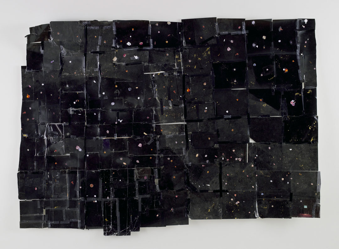
Object of the Week: 400 Men of African Descent

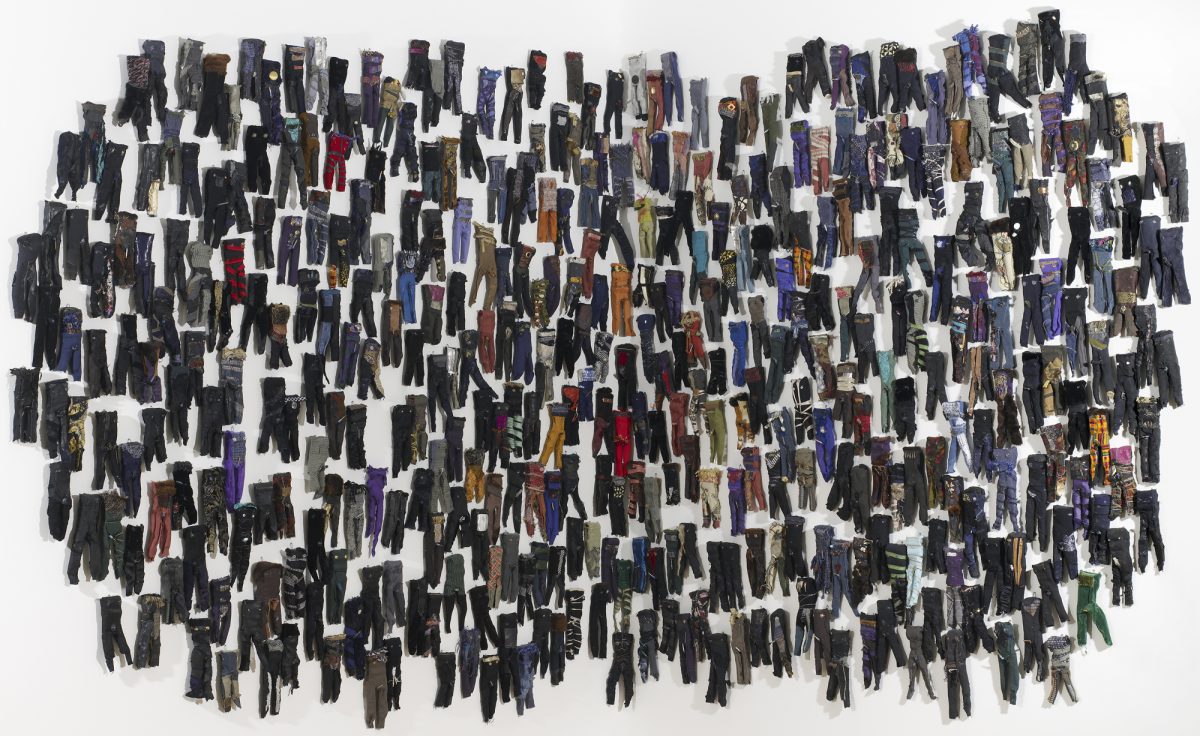
Seattle-based artist Marita Dingus has two works in the Seattle Art Museum’s collection: 400 Men of African Descent, acquired in 1998, and 200 Women of African Descent, acquired in 2009. Both were completed in 1997 as companion installations. These works are described as a “Hail Mary, a visual prayer” by the artist, where repetition serves as a spiritual act of catharsis (the pieces took over a year to complete) and a mode of reflection on the horrific conditions of slavery that became clear during a visit to West Africa.  

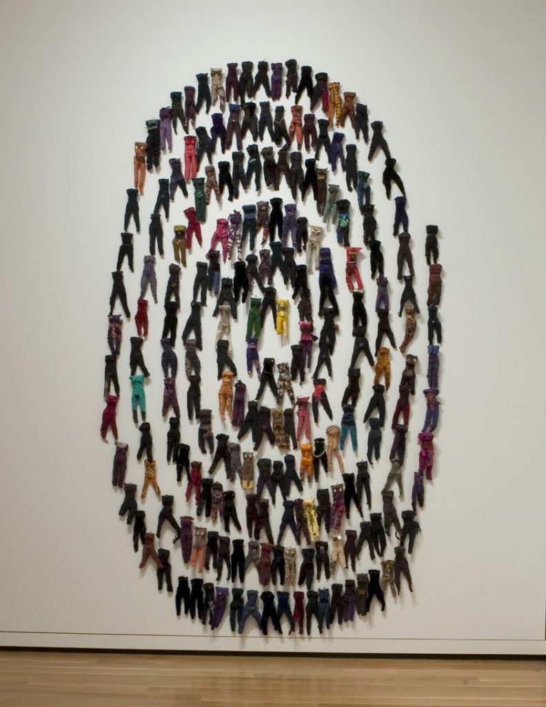
Dingus was inspired to create these works after visiting Elmina Castle, a Ghanaian fort where for two centuries enslaved Africans were held captive. She walked into rooms where 400 men and 200 women were held in dungeons of extreme confinement, with little light and almost no air. There, they spent their last days before the Middle Passage––a term that fails to capture the atrocities of the slave trade and the conditions of being shipped over the Atlantic. Upon her return, Dingus made a man or woman each day to mark this memory. Each becomes a new form of monument to honor the 200 women and 400 men held captive in Elmina Castle, the aggregate total of figures a powerful and haunting reminder of the conditions of chattel slavery.

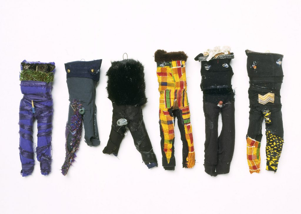
As in Dingus’s larger sculptural practice, the miniature figures in 400 Men and 200 Women are comprised of discarded materials, in this case elements such as zipper pulls, Christmas light bulbs, and textile fragments. As articulated in Dingus’s artist statement, “My art draws upon relics from the African Diaspora. The discarded materials represent how people of African descent were used during the institution of slavery and colonialism then discarded, but who found ways to repurpose themselves and thrive in a hostile world.”[1]

400 Men of African Descent came into the museum through an unusual museum experiment.  In 1997, the installation was included in a unique exhibition in which museum visitors chose, via ballot, the acquisition of a work of art featured in the show. The options ranged from photographs and sculptures by contemporary African artists, to installations like this one by a  contemporary Black American artist.

Knowing that the Seattle community chose for this work to enter the collection is an important and, perhaps today, lesser-known element of the work’s history. More than twenty years later, 400 Men and 200 Women of African Descent continue to alert viewers to questions and ignite conversations about slavery, colonialism, and systemic racism. Hopefully, they might also be seen as an offering, an emblem of a community’s support for important dialogue and change.

– Elisabeth Smith, SAM Collections & Provenance Associate


[1] Marita Dingus, Artist’s Statement, https://www.travergallery.com/artists/marita-dingus/
Image: 400 Men of African Descent, 1997, Marita Dingus, cloth and mixed media, African Art Acquisition Fund, 98.43 © Marita Dingus. 200 Women of African Descent, 1997, Marita Dingus, cloth and mixed media, Gift of the artist and Francine Seders Gallery, 2009.54 © Marita Dingus.

Object of the Week: As One III & IX

Historically, museums have been spaces of hegemony. My practice has often been about finding space for critique within that history. As an artist I believe that my role in museums can be to challenge our understanding of how museums and their powers operate.

– Brendan Fernandes

Many reading this post might recall the 2015 exhibition Disguise: Masks and Global African Art, co-curated by SAM’s curator of African and Oceanic Art, Pam McClusky, and Seattle-based curator Erika Dalya Massaquoi. The show traveled to the Fowler Museum in Los Angeles, and later on to the Brooklyn Museum in New York. Living in neither Seattle, Los Angeles, or Brooklyn at the time, I missed this celebrated show. However, luckily for me and others who missed it, there is a trove of reviews, writings, videos, images, and responses to the exhibition that continue to bring its resonant ideas and artists to life, five years later.

Such exhibition research provides a necessary foundation for contextualizing two recent acquisitions by Brendan Fernandes––photographs titled As One III and As One IX––who was one of twenty-five artists included in Disguise. Born in Nairobi, Kenya to a Goan, Indian family who later immigrated to Toronto, Canada, Fernandes is a truly transnational artist. Working at the intersection of dance and visual art, his work seeks to push against notions of a fixed or essential identity. Once a dancer himself, his current body of work uses movement and choreography (among other mediums) to examine issues of cultural displacement, migration, labor, and queer subjectivity.

For the video As One in Disguise––a precursor to As One III and As One IX––Fernandes selected masks from SAM’s collection and staged compositions in collaboration with the Pacific Northwest Ballet, as well as a live performance with Etienne Cakpo. He writes, “The Ballet and the Museum are pivots of Western culture that have greatly shaped our image of what counts as culture. When first placed in French museums, African culture was pictured as ‘other’––primitive, exotic, uncivilized, etc. . . . Using gestures derived from classical French ballet, two dancers address the masks with the formality and etiquette that is not how they have ever been approached before. Movements and bows in the French court were loaded with hierarchical order. Here they are offered to masks that observe these ritualized actions, but cannot dance themselves. Just as European countries like France removed masks and emptied out their meaning, these dancers now dance in a way that is deemed the epitome of elegance, but is also a representation of a power struggle.”[1]

As a direct extension of this work and line of thinking, As One III and As One IX were produced for a 2017 exhibition at the University of Buffalo Art Gallery, titled The Language of Objects. The conceit of the show was to push against Adorno’s claim that museums and mausoleums are innately connected and that, once objects enter a museum, they are removed from culture and, neutralized, cannot accrue new meanings. Fernandes deftly upends this notion, working with Lauren Post and Grayson Davis of the American Ballet Theater to animate and complicate the objects from the University of Buffalo collection.

Fernandes’s museological interventions facilitate important conversations surrounding cultural hegemony and colonial history, both within and outside of museum walls. Importantly, they also point to Fernandes’s aspirations for institutions such as SAM and the communities they serve. To quote once more from the artist, “There is a sense that as our world becomes increasingly privatized and profit-driven, and as artists make the ties between profit and violence more apparent, that [museums and galleries] should use their resources and influence to push back. I believe that one way these spaces can do this is to create space for artists and audiences to experience and experiment with new forms of agency and to imagine what future forms of freedom might look like. I think this is an important and political function of museums and galleries: imagining future freedoms, imagining future ways to show and consider art.”[2]

Elisabeth Smith, SAM Collections & Provenance Associate

Images: As One IX, 2017, Brendan Fernandes (Canadian, born Kenya), 1979, digital print, 34 x 48 in., Gift of Christopher and Alida Latham, 2019.27.2 © Artist or Artist’s Estate. As One III, 2017, Brendan Fernandes (Canadian, born Kenya), 1979, digital print, 34 x 48 in., Gift of Christopher and Alida Latham, 2019.27.1 © Artist or Artist’s Estate. Installation view of As One, 2015, Brendan Fernandes, Canadian, born Kenya, 1979, in the exhibition Disguise: Masks and Global African Art, June 18–Sept. 7, 2015, photo: Nathaniel Wilson. Brendan Fernandes on June 14, 2020, at the Drag March for Change in Chicago. Photo: Erin Hooley/Chicago Tribune.
[1] Brendan Fernandes, Disguise: Masks and Global African Art label.
[2] “Artist Brendan Fernandes On the Dance Floor as a Space for Resistance and Resilience.” Interview with Saisha Grayson, Smithsonian American Art Museum, June 6, 2019, https://americanart.si.edu/blog/artist-brendan-fernandes-dance-floor-space-resistance-and-resilience.

Object of the Week: I’ll Be a Monkey’s Uncle

In honor of Black History Month, Object of the Week will highlight works by celebrated Black artists in SAM’s collection throughout the month of February.

Kara Walker’s particular mode of engaging with our attention spans—her visual and conceptual provocations—have often caused furor, first from the generation above her, now not infrequently from the generation below. For when it comes to the ruins of history, Walker neither simply represents nor reclaims. Instead she eroticizes, aestheticizes, fetishizes, and dramatizes.

Zadie Smith, What Do We Want History to Do to Us?, The New York Review of Books, February 2020

With a prolific and controversial career spanning decades, Kara Walker is perhaps best known for her use of cut-paper installations that give visual form to the histories of racism, violence, and subjugation in the antebellum South. Walker’s unsettling images mine eighteenth- and nineteenth-century stereotypes and ideologies and consider the legacies of slavery today.

This lithographic print in SAM’s collection, I’ll Be a Monkey’s Uncle, is a relatively modest work compared to larger installations and sculptures since realized by Walker. However, the print is an early work, dating to 1995-96—one year after receiving her MFA from the Rhode Island School of Design, and two years before receiving the MacArthur “Genius” award at just 27 years old. Walker has since gone on to produce major sculptural works, such as Fons Americanus (2019-20) in the Tate Modern’s Turbine Hall, and A Subtlety, or the Marvelous Sugar Baby (2014) sited in Brooklyn’s Domino Sugar Factory. 

In this graphic work, a woman holds a dripping rope or do-rag[1] before a monkey—a recurring figure in Walker’s work and, together with the title, often read as an allusion to the scientific racism used to justify the enslavement of African women, men, and children. Regarding her use of the silhouette figure, Walker explains:

The silhouette technique announced itself to me as I was researching the cultural identity of early America. In many ways as a form it succeeded in being both a minimal reduction and a means to cover a lot of territory. With the technique one is talking both about the shadow as a form by making a paper cut, but also shadow as the subconscious in psychology. I surprised myself, actually, when I began working [by] how well it…seemed to exemplify the experience of women and blacks as second class citizens. This was a craft form that was (and is) everywhere, but rarely attains a high status. Silhouette cutting, for me, was my rebellion against high art and painting, and to me a way of undermining the patriarchal tendency in Western art.[2]

Producing work that has received praise and criticism in equal parts, Walker is a provocative and challenging contemporary figure who offers a challenging portrait of American history. Probing the intersections of race, gender, sexuality, and power, Walker intends to make work where, as she describes, “viewer[s]…get pulled into history, into fiction, into something totally demeaning and possibly very beautiful.”[3]

Elisabeth Smith, SAM Collection and Provenance Associate


[1] Julia Szabo, “Kara Walker’s Shock Art,” The New York Times, March 23, 1997, https://www.nytimes.com/1997/03/23/magazine/kara-walker-s-shock-art.html
[2] Kara Walker, “Art Talk with Kara Walker,” interview by Paulette Beete, National Endowment for the Arts, February 1, 2012, https://www.arts.gov/art-works/2012/art-talk-kara-walker
[3] “Kara Walker,” ArtNet, accessed February 12, 2020, http://www.artnet.com/artists/kara-walker/
I’ll Be a Monkey’s Uncle, 1995-96, Kara Walker, lithograph, 39 1/2 x 35 in., Print Acquisition Fund and gift of P. Raaze Garrison, 99.61 1995-96 © Kara Walker

Object of the Week: Wounded Eagle No. 10

In honor of Black History Month, Object of the Week will highlight works by celebrated Black artists in SAM’s permanent collection throughout the month of February.

“I wait until intuition moves me, and then I begin.”

– James Washington, Jr.

Though born and raised in Mississippi, James Washington, Jr. is proudly remembered as a seminal Northwest artist and member of the Northwest School. Close to other notable artists from the region, like George Tsutakawa, Mark Tobey, and Morris Graves, Washington shared an affinity for the natural world. Surely informed by his upbringing—his father was a Baptist minister—Washington’s work also possessed spiritual elements, further connecting him to his cohort of Northwest artists. In Washington’s words, “art is a holy land where initiates seek to reveal the spirituality of matter.”

Before moving to Seattle in 1944, Washington taught as a WPA artist in Mississippi. Upon his arrival in the Pacific Northwest, he worked in the Bremerton Naval Yard as an electrician. Then a painter, he was soon introduced to Mark Tobey, who would become a lifelong friend and mentor. As Washington continued to navigate Seattle’s arts community, he also traveled and, in 1951, visited the famed social realist painters Diego Rivera and David Siqueiros in Mexico. Although this meeting was the impetus for the trip, it was another experience altogether that altered Washington’s artistic trajectory: when visiting the ancient pyramids of Teotihuacán, he was drawn to a piece of volcanic rock which he couldn’t leave behind—this stone would be the first of many sculptures Washington would carve, and the reason for his move away from painting.

Wounded Eagle No. 10 (1963) is just one of seven stone sculptures by Washington in SAM’s collection. It is a tender and sorrowful image, rendered delicately by the artist despite its granite medium. And while Washington would carve a variety of animals and humans, birds were a recurring subject—the eagle, in particular, for its symbolism of salvation and ascension. Guided by a self-described ‘spiritual force’ intrinsic to his geologic materials, Washington would alter his stones only slightly, preferring instead to let their natural form, shape, and coloration determine the subject matter. Moved by intuition, he considered himself a conduit through which art would reveal itself.

Elisabeth Smith, SAM Collection and Provenance Associate

Wounded Eagle No. 10, 1963, James Washington, Jr., granite, 8 x 10 5/8 x 13 1/4 in., Eugene Fuller Memorial Collection, 68.159 © James W. Washington

Object of the Week: Rat water dropper

Made from ceramic, bronze, copper, or even jade, water droppers are small vessels used in calligraphy and brush painting. Designed with two small holes, one for adding water and one for dispensing water, only a few drops fall out at a time—a crucial feature when preparing liquid ink, which involves grinding a stick of ink against an inkstone with water.

Though an unassuming instrument, water droppers have a long history. The earliest known examples of Chinese water droppers can be dated to the 5th and 6th centuries, while Japanese water droppers date to the 8th century. Centuries later, during the Edo period (1603-1868) and into the Meiji period (1868-1912), Japan saw the emergence of more complicated water droppers in various shapes and sizes, ranging from plants and deities to animals and fruits.

Such decorative droppers became popular accessories for the nobility and literati, and were often inscribed or made in auspicious forms. The zodiac animals are a set of calendar symbols that came to Japan from ancient China, and their representation served to invoke good luck and prosperity. This 19th-century dropper in SAM’s collection, modeled in the shape of an undeniably expressive and charming rat (the first animal in the zodiac), was likely intended to symbolize success, creativity, and intelligence.

Elisabeth Smith, SAM Collection and Provenance Associate

Image: Water dropper modeled as a rat, 19th century, Japanese, bronze, 1 5/8 x 3 1/2 x 1 7/8 in., Gift of Frank D. Stout, 92.47.119

Object of the Week: Confrontation at the Bridge

This 1975 screenprint by Jacob Lawrence was commissioned on the occasion of the United States’ bicentennial. The prompt: to create a print that reflects an aspect of American history since 1776. Lawrence, one of 33 artists to contribute to the portfolio An American Portrait, 1776-1976, chose to depict the infamous incident in Alabama known as ‘Bloody Sunday’.

On Sunday, March 7, 1965, hundreds of unarmed protesters—led by civil rights leaders such as Martin Luther King, Jr. and John Lewis—organized a 54-mile march from Selma to the state’s capitol, Montgomery, advocating for the voting rights of African Americans. As demonstrators began their route out of Selma, they were met by a barrage of state troopers at Edmund Pettus Bridge. With orders from Alabama Governor George Wallace “to use whatever measures are necessary to prevent a march,” the state troopers attacked the activists—resulting in the death of 26-year-old Jimmie Lee Jackson—using clubs and tear gas. Though the march dissipated due to this senseless violence, two days later the protesters safely reached Montgomery (thanks to court-ordered protection) and numbered nearly 25,000.

As horrible as these events were, what took place on March 7—publicized nationally and internationally—helped galvanize public opinion and finally mobilize Congress to pass the Voting Rights Act, which was signed into law by President Lyndon Johnson five months later.

In Lawrence’s screenprint, the troopers’ brutal actions are represented through the presence of a vicious, snarling dog. To its right, we see African American men and women of various ages clustered together, their political solidarity conveyed through their visual unity. A tumultuous sky surrounds them, whose jagged cloud forms find likeness in the choppy waters below.

This horrible event would leave an indelible mark on our nation’s history and is remembered today for the courage shown by the thousands of activists who marched for a more equitable world. When articulating his choice to depict this important moment, Lawrence recalled: “I thought [the Selma-to-Montgomery march] was part of the history of the country, part of the history of our progress; not of just the black progress, but of the progress of the people.”

– Elisabeth Smith, SAM Collection and Provenance Associate

Image: Confrontation at the Bridge, 1975, Jacob Lawrence, serigraph; ink on paper, 19 1/2 x 25 15/16 in., Anonymous gift in honor of Jacob Lawrence and Gwen Knight, 92.10 © Jacob Lawrence

Object of the Week: The Important an Unimportant

Since John Baldessari’s death last week, there has been a commensurate stream of articles recounting his outsized influence as a pioneering artist and educator, with a prolific career spanning decades.

With beginnings as a painter, Baldessari, like many artists of the 1960s and 70s, eventually gravitated toward conceptual art and the pre-eminence of ideas over objects. However, unlike many of his contemporaries, Baldessari imbued his conceptual art practice with humor and wit, employing “a sort of Dada irony and sometimes colorful Pop Art splashes . . . to rescue conceptual art from what he saw as its high-minded self-seriousness.”[1]

Baldessari’s enduring interests included the relationship between text and image—which often meant pitting them against one another to challenge their assumed accuracy—and the appropriation of images from photography and film. His 1999 painting, The Important an Unimportant (from the Tetrad Series), in SAM’s collection is an exemplar work in this regard, a combination of digital printing, hand lettering, and acrylic paint on canvas.

The composition, made up of quadrants, juxtaposes square images—a glass with red daisies, a woman’s finger pointing down, and two skeleton hands playing an organ—with a textual element that reads, “the important an unimportant.” If these sequences appear heterogeneous and somewhat anachronistic, it is because they are. For example, the excerpt in the upper right is lifted from Goya’s 1797 painting The Duchess of Alba, painted while the duchess mourned her husband’s death. In the lower left, a still from Erich von Stroheim’s 1928 silent film, The Wedding March, is a not-so-subtle harbinger of the fate which befalls the romance and aristocratic aspirations of the film’s protagonist lovers. The text in the lower right, even, is an excerpt from Portuguese writer Fernando Pessoa (1888-1935), “for whom nullity was a muse.”[2]

Taken together, these citations enrich our understanding of Baldessari’s wide range of influences. And whether we know the exact origins of his chosen references or not, the appropriated images and texts are here imbued with new meaning. We are invited—and, importantly, required—to participate as viewers to consider their relationship to one another and the history of visual representation more broadly.

A serial creator, Baldessari always adhered to his now-famous maxim to “not make any more boring art.” A simple enough credo, such a motivation directly impacts us as viewers, who are on the receiving end—simultaneously empowered and challenged by his work. Perhaps best articulated by New York Times art critic Roberta Smith, “[Baldessari’s] work amuses, unsettles, questions and makes you look twice and think thrice; laugh out loud; and in general gain a sharpened awareness of the overlapping processes of art making, art viewing, and art thinking.”[3]

Elisabeth Smith, SAM Collection & Provenance Associate

Image: The Important an Unimportant, 1999, John Baldessari, digital printing, hand lettering, and acrylic paint on canvas, 94 x 94 in., Gift of the Virginia and Bagley Wright Collection, in honor of the 75th Anniversary of the Seattle Art Museum, 2014.25.6 ©️ Artist or Artist’s Estate
[1] Jori Finkel, “John Baldessari, Who Gave Conceptual Art a Dose of Wit, Is Dead at 88,” The New York Times, Jan. 5, 2020, https://www.nytimes.com/2020/01/05/arts/john-baldessari-dead.html.
[2] Adam Kirsch, “Fernando Pessoa’s Disappearing Act,” The New Yorker, Aug. 28, 2017, https://www.newyorker.com/magazine/2017/09/04/fernando-pessoas-disappearing-act.
[3] Roberta Smith, “Tweaking Tradition, Even in Its Temple,” The New York Times, Oct. 21, 2010, https://www.nytimes.com/2010/10/22/arts/design/22baldessari.html.

Object of the Week: Cedar Bark Mat

While this Haida cedar bark mat from ca. 1900 reads like a painting—mounted and viewed two-dimensionally—its function was primarily utilitarian. This mat, meticulously woven from cedar bark, and others like it would serve a multitude of purposes: such mats could be found on walls or in doorways to prevent cold drafts and rain, or used as room dividers. Other times they might be used when foraging and drying berries, or for comfort when digging clams and cleaning fish. On more special occasions, these mats would be presented as potlatch gifts or as ceremonial ground cover.

A number of things can be fashioned from cedar—its bark is especially versatile, processed and turned into what is in essence a thread. Cedar tree people appear throughout Haida oral tradition, and cedar bark, essential to everyday life, is known as “every woman’s elder sister.” Like an older sister, cedar bark deserves respect and helps its younger sister by providing material for clothing, baskets, and other important items. The mat itself, with its overlapping bands and geometric gridding, was also woven by a Haida woman. (The painting on the mat was likely added by another—male—Haida artist.)

Yaqui poet Richard Walker wrote a poem, The Cedar Tree (excerpted below), which celebrates the importance of the cedar tree for First Nations and Northwest Coast peoples, and the wide-ranging activities and traditions that are passed on from one generation to the next as a result:

And what else do we know, but that

This tree continued the life,

growing to great heights,

providing shelter for birds and

other animals,

providing bark fiber for clothing,

and for fishing nets,

providing bark fiber for baskets

in which to collect berries or cook shellfish,

fine woven baskets that are passed from

mother to daughter, and from grandmother

to granddaughter?

Elisabeth Smith, SAM Collection & Provenance Associate

Image: Cedar bark mat, ca. 1900, Haida, painted cedar bark mat mounted on burlap and panel board, 70 x 35 in., Gift of R. Bruce and Mary-Louise Colwell, 2019.3.7

Object of the Week: Bulul

Hailing from the Philippines, bulul figures are perhaps the most common and well-known of Ifugao sculptural traditions. An isolated and landlocked province surrounded by rugged and precipitous terrain, Ifugao and its people long resisted Spanish colonization, which left much of their culture, religion, and artistic traditions intact.

For the Ifugao people, known for their elaborate terrace farms and complex irrigation systems, rice is a cornerstone of daily life. Representing a rice deity, bulul are highly stylized and carved from a single piece of wood. Standing bulul figures are often depicted with hands resting on their knees, slightly bent, while the arms of seated bulul figures are typically folded. Most often carved in male and female pairs, figures could also be androgynous.

The figures are understood as fundamental in ensuring a good harvest, as well as guarding the season’s crop from thieves. They also represent the harmonious union of oppositional elements and the promise of good fortune. Every harvest, bulul would be brought out to share in the bounty of rice, chicken, pig, and rice wine. The rich, mottled patina of the bulul in SAM’s collection demonstrates its use in various rituals and ceremonies, which would include smoke and grease from food offerings.

Bulul can be venerated and passed down for generations, ultimately overseeing many harvest seasons, as well as a number of ceremonies celebrating the abundance and generosity of the earth.

Elisabeth Smith, SAM Collection & Provenance Associate

Image: Bulul, late 19th, early 20th century, Philippines, wood, 22 x 6 x 6in., Gift of Georgia Schwartz Sales, 2003.96

Object of the Week: Foolish Extravagance

This etching by Francisco José Goya y Lucientes (1746-1828), titled Foolish Extravagance, is part of series titled Los Disparates (The Follies) from 1815/16–1823/24. Completed by an artist who lived through the oppressive Spanish Inquisition, among other sociopolitical events, each print from the series variously address themes of foolishness, misrepresentation, abuse of power, and fear.

Disparates was published posthumously in 1864 by The Royal Academy of San Fernando, from the 18 (of 22) plates in their possession. When The Royal Academy first produced this edition, they did so under the title Los Proverbios, sending scholars on a quest to match the prints with their respective proverbs. Later proofs by the artist—with handwritten titles beginning with the word “disparates”—shifted their meaning: these images were not illustrative of proverbs, but rather of follies. In the time since, the series has evaded clear interpretation, and “any promise of clear symbolic meaning that these things might offer is empty.”[1]

In Foolish Extravagance, four bulls twist, jerk, and careen one on top of another, seemingly free-falling against an amorphous black background. Offering little information, this black void heightens the sense of disorientation and absurdity that the image conveys. Lacking any rationalism that would be signaled by a horizon line, or other compositional cues, this and other etchings from Los Disparates evidence an absence of reason and coherent meaning.

Elisabeth Smith, SAM Collection & Provenance Associate

Image: Foolish Extravagance, 1815, Francisco José Goya y Lucientes, aquatint and etching, 8 5/16 x 12 3/4 in., Manson F. Backus Memorial Collection, 35.133
[1] Douglas Cushing, “Beyond All Reason: Goya and his Disparates,” Blanton Museum of Art, February 23, 2015, https://blantonmuseum.org/2015/02/beyond-all-reason-goya-and-his-disparates-2/.

Object of the Week: Couplet

Oracle-bone script (jiaguwen) is a form of Chinese writing that emerged during the Shang Dynasty—dating from the 14th–11th century BCE—and is considered the earliest known form of systematic Chinese script.

Some of the oldest oracle-bone inscriptions were short texts inscribed on the flat shoulder blade bones of oxen and shells of tortoises. Such bones were used for divination, a process which involved the inscription of a question with a bronze pin—lending the script its characteristic angularity—and then heating the bone to reveal cracks, which would be divined for answers.

The symbols used eventually became words, which were later developed into a Chinese script that is recognized today as part of China’s long tradition of calligraphic arts. This work by Rao Zongyi, titled Couplet, utilizes the ancient script, brought to life for a contemporary audience.

Rao—a poet, calligrapher, painter, and scholar of the humanities—produced the couplet in 1971 while a visiting professor at Yale University. Composed by Rao, the poem describes in red ink a kun-style operatic performance by Chang Ch’ung. Together the two scrolls read: The wind makes the snow dance amidst the sunlight, the music hangs like clouds on her garments.

Elisabeth Smith, SAM Collection and Provenance Associate

Couplet, 1971, Rao Zongyi, red ink on paper, 74 5/16 x 14 3/16 in., Gift of Chang Ch’ung-ho and Hans Frankel from their collection, 2010.9.6.1-.2 © Artist or Artist’s Estate

Object of the Week: Time-(B)

Two identical, white clocks sit on a scale. One—reading 12:15—appears the heavier of the two, sitting ever so slightly below its counterpart at 12:04. Of course, the minute discrepancy (pun intended) between the weights of the two clocks—correlating with their respective times—is impossible, but the power of the photographic image lies in its ability to convince us otherwise.

Ever a master of the conceptual punchline, photographer Kenji Nakahashi plays with our interpretation of time and its assumed objectivity. His longstanding interest in the documentary value and, again, assumed objectivity of photography—a time-based medium—is also at play, and clearly inextricable. In his characteristically understated way, Nakahashi tackles the subjectivity of both time and photography in one fell swoop.

Born in present-day Ibigawa, Japan, Nakahashi moved to New York City in 1973, where he lived until his death in 2017. His time in Japan was formative, but living and working in the United States is where Nakahashi developed a robust studio practice centered on everyday objects and materials. This is when he began turning the mundane—such as two clocks and a scale—into a source of poetic beauty, conceptual rigor, and humor. For Nakahashi, such small observations and actions became an important activity that allowed him to render the world anew.

Elisabeth Smith, Collection and Provenance Associate

Time-(B), 1980, Kenji Nakahashi, ektacolor print, sheet: 11 x 14 in., Gift of Mr. and Mrs. Kazuo Kondo, 95.35 ©Artist or Artist’s Estate

Object of the Week: Tsuba

A tsuba is a hand guard of a Japanese sword, mounted between the handgrip and the blade, to protect the user’s hand. Either carved or molded, they also help balance the sword, which is comprised of a number of complicated—but equally important—components.

While highly practical in its purpose, there is, as with all things, room for ornamentation and embellishment. This 19th-century example in SAM’s collection, made of copper alloy with gold and silver inlay, depicts an elegant nighttime landscape. Under the arc of the crescent moon, the spray of gold plants and flowers appear to be basking in the moonlight, also gold.

Prior to the 17th century, the functionality of a tsuba was more important than its decoration. From the 17th century onward, tsuba became more elaborate, with carving and molding techniques more sophisticated. Designs on tsuba—such as this one—often draw their subject matter from Japanese folklore and nature, and importantly signal the status of the sword’s owner.

Currently, on view in SAM’s third-floor galleries, this tsuba is part of the exhibition Gentleman Warrior: Art of the Samurai, which explores lesser-known aspects of samurai culture, including patronage of the arts. From the tea ceremony to Noh theater, the samurai class helped advance various artistic practices in the service of showcasing both their military might and cultural prowess.

Elisabeth Smith, SAM Collection and Provenance Associate

Image: Tsuba: Plants in Landscape and Moon in Inlay, 19th century, Japanese, copper alloy with gold and silver inlay, 2 5/8 x 2 1/2 x 3/16 in., Eugene Fuller Memorial Collection, 34.95. Photo: Elizabeth Mann

Object of the Week: Milk Container

The fall weather has arrived and, with it, decorative gourd season. [1] This Pokot gourd, however, is not purely decorative or ornamental, but carries with it important food traditions and community symbolism.

Like this elegant vessel, inscribed with geometric patterns, such milk containers are made by Pokot women to contain a thick, yogurt-like dairy beverage (also known as mala ya kienyeji or kamabele kambou) that is prepared from cow’s or goat’s milk, and mixed with the ashes of the cromwo tree—a tree endemic to western Kenya. Produced by Pokot communities for generations, the beverage is prepared by fermenting milk inside dried hollow gourds, later adding cromwo ash for its antiseptic properties, aromatic flavor, and distinctive color.

To make the gourd vessel, the hard skin of a calabash gourd is hollowed out, dried, and smoked using cromwo wood. The milk is then poured into the gourd, whose natural bacteria magically assists in the fermentation and acidification process. Once the milk begins to coagulate, whey is removed and fresh milk is added. This process repeats for one week, with the addition of an occasional shake.

Historically a staple of the Pokot diet, ash yogurt’s presence has decreased significantly due to shifts in livestock farming, as well as other environmental and economic factors. While the yogurt beverage is still made by some families, it is far less abundant. Still, the tradition persists. As poetically described by a food activist and scholar of global fermentation processes: “the gourd itself is the vehicle of perpetuation.”[2]

Elisabeth Smith, SAM Collection & Provenance Associate

[1] Colin Nissan’s “fist-pumping celebration of fall” was first published online by McSweeney’s in 2009 and has since proven to have consistent longevity on the internet, in no small part due to the efficiency with which the essay captures the American mania for autumn.
[2] Sandor Ellix Katz, The Art of Fermentation: An In-Depth Exploration of Essential Concepts and Processes from Around the World (White River Junction, Vermont: Chelsea Green Publishing, 2012), pp. 181-182.
Image: Milk container, Pokot, gourd, leather, and metal, 7 1/2 in., diam.: 4 1/4 in., Gift of Katherine White and the Boeing Company, 81.17.1053

Object of the Week: We Are All in This Together

The words “we are all in this together” announce themselves in bold, sans-serif force, asserting the urgency and agency of the message. Created by artist Mark Mumford in 2002, the work—whose title is the same as the text—was created in the context of and in response to the protests that took place before the Bush administration’s invasion of Iraq in 2003.

As with many artists who work with language, Mumford is interested in the slippages of syntax and the ways in which words carry a multitude of meanings. In the case of We Are All in This Together, the message can be read as either empowering and uplifting, or apathetic and resigned. For the artist, “meaning hovers on the threshold of realization, and where the knotty relationships between seeing and reading, reading and believing, believing and seeing are given a full and lively expression.”

Currently on view in the Brotman Forum, the work transforms the entrance of the Seattle Art Museum into a shared textual experience that is visible from the outside of the museum as well. Though made over 15 years ago, the work carries more political significance than ever. The words especially ring true today—a day designated for climate strikes around the world—when millions of people will march for urgent climate action. As is the case with any issue, we can choose either action or resignation; whichever you choose, there’s no denying that we are all in this together.

Elisabeth Smith, Collection & Provenance Associate

Images: We Are All in This Together, 2002, Mark Mumford, vinyl lettering produced from CD formatted for a MAC with both a FreeHand and an EPS version of the artwork, dimensions variable, Gift of Carlos Garcia and James Harris in honor of Kimberly Richter Shirley, 2003.60 © Mark Mumford. Installation view, Seattle Art Museum, 2019.

Object of the Week: Four Seasons series: Indian Summer

In Indian Summer, a bucolic scene is obviously staged. There is a printed mountain backdrop, a cut-out cardboard deer, fake plants, and Western-themed props strewn across a manicured bed of Astroturf. The Native artist Wendy Red Star sits poised amid the artificial flora and fauna. She wears traditional Apsáalooke (Crow) regalia and stares stoically into the distance.

Indian Summer is from the larger photographic series Four Seasons, which includes Fall, Winter, and Spring. When I first viewed Indian Summer, I was reminded of bright, color-saturated storefronts with eerie mannequins and design sets—frozen behind walls of glass. In Four Seasons, Red Star plays on the commercialism of Native identity and satirically recalls the dioramas of Native people exhibited at natural history museums.

Red Star was raised on the Apsáalooke (Crow) reservation in Montana, and received the Seattle Art Museum’s Betty Bowen Award in 2016. Through reclamatory, unsettling, and playfully witty art that is also collaborative and intergenerational, Red Star dismantles the narratives of Natives by white photographers, archives, and media: depictions that remove Native agency and preserve stereotypes of Natives as stoic, passive, and distant.

In an interview with SAM, Red Star reflected on her role as an artist and cultural archivist: “Native voices have historically been silenced, unable to explain or even place our own narrative within the larger society. As a Native person I have witnessed the lack of inclusion for Native artists in particular in the contemporary art world, many of whom struggle for inclusion in important exhibitions.”

“Also troubling is a prevailing but antiquated expectation of what Native art should be, whether from the 19th century or the 21st. This leaves many Native artists feeling segregated into categories of “traditional” work and without a place in the contemporary art world. I consider my practice and the act of annotating, revealing, and erasure a reclamation of my own history and identity. The act is so much more than a rejection of the colonial gaze, it is a deliberate act to take authority and rewrite histories in humanist way.”

This week, fireworks, barbecues, patriotic fanfare, and heavy traffic usher in another 4th of July holiday. Prior to yesterday’s processions at the White House, Trump had tweeted “It will be the show of a lifetime!” ensuring more tanks and military planes. In the wake of continued injustices toward immigrants in this country, it remains precisely that: a show. Ongoing histories of racism, genocide, nativism, and imperialism get to masquerade as nationalism under a venerating sheen of red-white-and-blue. On the cultural archive of Native experience and presence, Wendy Red Star removes and probes these veneers of unaccountable histories—dismantling and rewriting false colonial narratives to engage Native voices past, present, and future.

Rachel Kim, SAM Curatorial Intern

Images: Four Seasons series: Indian Summer, 2006, printed 2016, Wendy Red Star, Archival pigment print on Sunset Fiber rag, Sheet: 23 × 26 in. (58.4 × 66 cm), Image: 21 x 24 in., Gift of Loren G. Lipson, M.D., 2016.13.4. Four Seasons series: Fall, 2006, printed 2016, Wendy Red Star, Archival pigment print on Sunset Fiber rag, Sheet: 23 × 26 in. (58.4 × 66 cm), Image: 21 x 24 in.. Gift of Loren G. Lipson, M.D., 2016.13.1. Four Seasons series: Winter, 2006, printed 2016, Wendy Red Star, Archival pigment print on Sunset Fiber rag, Sheet: 23 × 26 in. (58.4 × 66 cm), Image: 21 x 24 in., Gift of Loren G. Lipson, M.D., 2016.13.2, ©️ Wendy Red Star. Four Seasons series: Spring, 2006, printed 2016, Wendy Red Star, Archival pigment print on Sunset Fiber rag, Sheet: 23 × 26 in. (58.4 × 66 cm), Image: 21 x 24 in., Gift of Loren G. Lipson, M.D., 2016.13.3, ©️ Wendy Red Star.

Object of the Week: untitled (cosmos)

As the first official week of summer comes to a close, a palpable shift has taken place. With longer days and later nights, more time is already spent outdoors, whether on a porch, patio, or campground. Personally, summer often equates with more time spent looking at the night sky, along with a whole host of other associations—certain smells, foods, activities, and feelings.

In untitled (cosmos) by William Cordova, a fragmented expanse of black space is peppered with stars and planets, evoking the universe. Closer inspection reveals that among these celestial bodies are also archaeological artifacts and other suspended objects. Functioning then as a fictional astronomical and astrological map, it references the relationship that ancient cultures, such as the Inca, had with the cosmos—determining, or at least heavily informing, human events and actions.

Like the act of observing the night sky, the fragility and fugitive nature of this photographic map—held together by mere electrical and scotch tape—serves to remind us of our own ephemerality, and perhaps even make space for the contemplation of time and space, spirituality and identity.

Born in Lima, Peru, Cordova moved to Miami at an early age. He later lived in Houston, Chicago, and New York, but Peruvian cosmology, Andean architecture, and his personal history continued—and continue—to inform his work. Often working with found and discarded materials, Cordova’s varied and multimedia practice also means to address the economies of certain materials and objects, “challenging the functionality of art as a purely aesthetic pursuit.”[1]

Elisabeth Smith, SAM Collection & Provenance Associate

[1] “William Cordova,” Sikkema Jenkins & Co., https://www.sikkemajenkinsco.com/william-cordova.
Image: untitled (cosmos), 2006-09, William Cordova, exposed photo and paper collage, electrical and scotch tape, 61 × 86 in., Gift of Dennis Braddock and Janice Niemi, 2018.15. © Artist or Artist’s Estate

Object of the Week: Imogen Cunningham and Grandchildren at Fun House

I still feel that my interest in photography has something to do with the aesthetic, and that there should be a little beauty in everything.

– Imogen Cunningham

See Imogen Cunningham: A Retrospective at Seattle Art Museum, November 18, 2021–February 6, 2022

Imogen Cunningham was a seminal female American photographer, active in the Pacific Northwest (where she was born and raised) and the San Francisco Bay Area. This image of the artist and her grandchildren, taken in the reflection of a fun house mirror, is representative of Cunningham’s larger practice that spanned decades: experimental, technical, and the stuff of everyday life.

Cunningham is perhaps best known for her abstracted botanical photography, though she also produced images of the human nude, industrial landscapes, and street scenes. Here, her subject matter is much more personal and takes on an emotional valence.

It is often perpetuated that Cunningham was forced to choose between her career and motherhood, ultimately choosing the latter when she closed her portrait studio. However, this narrative is not quite accurate—Cunningham managed her responsibilities as both a mother and an artist, developing a photographic practice that blended art and life seamlessly. Neither roles were without sacrifice, of course, but Cunningham did her best to juggle her identities as a mother and artist—identities that, to this day, are either presented as mutually exclusive or not discussed nearly as much as they should be.

Moyra Davey’s Mother Reader is a major achievement in this regard. Published over fifteen years ago, the volume brings together testimonials, diaries, and essays by women artists, writers, and creative thinkers whose lives were forever altered—both positively and negatively—by pregnancy, childbirth, and motherhood. It is an amazing resource that focuses on the intersection of motherhood and creative life, honestly exploring the varied experiences of being a mother. In Margaret Mead’s essay “On Being a Grandmother,” Mead, a cultural anthropologist and contemporary of Cunningham, writes:

However, I felt none of the much trumpeted freedom from responsibility that grandparents are supposed to feel. Actually, it seems to me that the obligation to be a resource but not an interference is just as preoccupying as the attention one gives to one’s own children. I think we do not allow sufficiently for the obligation we lay on grandparents to keep themselves out of the picture—not to interfere, not to spoil, not to insist, not to intrude—and, if they are old and frail, to go and live apart in an old people’s home (by whatever name it may be called) and to say that they are happy when, once in a great while, their children bring their grandchildren to visit them.

When taken into consideration with this photograph, one can’t help but wonder what Cunningham’s experience was like as a grandmother. Was she able to spend real time with her daughter’s children? Did she feel a similar tension between acting as a resource and an interference? How did being an artist and grandmother differ from being an artist and mother? This early selfie suggests that she and her grandchildren had some adventures and joyful times, but it is just one glimpse into their relationship after all. Even still, we’re fortunate Cunningham chose to share it with us—there’s certainly a little beauty in it.

Elisabeth Smith, SAM Collection & Provenance Associate

Image: Imogen Cunningham and Grandchildren at Fun House, San Francisco, 1955, Imogen Cunningham, gelatin silver print, 8 3/4 x  7 1/8 in., Gift of John H. Hauberg, 89.38 (1955), 2009 ©Imogen Cunningham Trust

Object of the Week: Thicket

In honor of Black History Month, Object of the Week will—throughout the month of February—highlight works by celebrated Black artists in the SAM Collection.

I never did Minimalist art. I never did, but I got real close. . . . I looked at it, tasted it, and I spat it out.

– Martin Puryear, 1978

Known for his highly crafted, abstract sculptures, Martin Puryear since the 1970s has created three-dimensional works that defy easy interpretation and categorization, at once evoking Modernist sculptures by Noguchi, Arp, and Brancusi, while calling to mind African sculptural traditions and Scandinavian design.

A former painter, Puryear’s hand-crafted sculptures offer a highly original response to the Minimalism of the 1960s. And while he indeed embraces Minimalism’s penchant for reductive sculptural forms, his material and fabrication choices evince a commitment to elevating craft and its complement: the handmade. Using materials such as wood, stone, tar, bronze, and wire, Puryear’s greatest collaborator—the natural world—is made clear.

From a young age Puryear was fascinated by how things are made, and would often construct his own objects from wood—whether it be a guitar or a canoe. Decades later, while volunteering with the Peace Corps in Sierra Leone, Puryear observed and absorbed local artistic traditions like woodworking, pottery, and weaving. Together, these experiences—coupled with his time at the Swedish Royal Academy of Art in Stockholm, where he studied furniture design—helped shape Puryear’s practice and interest in mobilizing design, sculpture, and craft in the service of examining identity, culture, and history.

The work pictured here, Thicket, is inspired by the shape and volume of a small rock Puryear found while on a trip to the Alaskan wilderness in 1980. Interwoven basswood and cypress give the piece a complex, tangled appearance. Both orderly and chaotic, the crisscrossed beams, struts, and posts are informed by the low Arctic vegetation that houses and protects the snowshoe hare—a rare breed endemic to the region.

In the words of the artist:

I want to make objects that somehow have their own history and their own reason for being and their own sense of themselves. I’m not concerned just with the object’s formal meaning, although it should be an intelligible artifact, a thing of one’s own culture and time. It’s equally crucial that there exist in the work a recognition of the maker, of who I am.[1]

Puryear’s sculptures manage to transcend time and space—blending together artistic traditions from around the world. Further, he is still one of the most important and influential artists working today, a fact confirmed by the recent announcement that he will represent the United States at the 58th Venice Biennale in the spring.

 – Elisabeth Smith, Collection & Provenance Associate

[1] John Ederfield, Martin Puryear (New York: Museum of Modern Art, 2007), 173.
Image: Thicket, 1990, Martin Puryear, basswood and cypress, 67 x 62 x 17 in., Gift of Agnes Gund, 90.32 © Martin Puryear (1990)

Object of the Week: Dr. Martin Luther King Jr. after Delivering His “I Have a Dream” Speech

This black and white photograph, taken by photojournalist Dan Budnik in 1963, is one of a series that Budnik had hoped to publish in a Life magazine photo-essay. His subject is none other than Dr. Martin Luther King, Jr., photographed minutes after delivering a speech that would forever be defined by four indelible words: “I have a dream.”

The image is unrelenting is its focus, framing Dr. King’s face so that he takes up over half of the composition. King, glancing down and to the side, bears a calm demeanor—stoic and pensive. Surely he would have been surrounded by a large group of friends and colleagues, or even a crowd of fellow activists, but Budnik denies us any context in which to situate King. Without the title of the photograph, Dr. Martin Luther King Jr. after Delivering His “I Have a Dream” Speech, August, 1963, we would have no way to know that this image portrays him after one of the most important speeches in American history.

King’s “I Have a Dream” speech is arguably his most famous, but in the spirit of honoring his legacy and rhetorical dynamism, I share below an excerpt from his Nobel Peace Prize acceptance speech, given one year after this photograph was taken, in 1964.  King’s continued call for racial equity, social justice, and religious tolerance—delivered with unfettered optimism—is, I believe, an urgent and important message for our present time:

I accept this award today with an abiding faith in America and an audacious faith in the future of mankind. I refuse to accept despair as the final response to the ambiguities of history. I refuse to accept the idea that the “is-ness” of man’s present nature makes him morally incapable of reaching up for the eternal “ought-ness” that forever confronts him.

I refuse to accept the idea that man is mere flotsom and jetsom in the river of life unable to influence the unfolding events which surround him. I refuse to accept the view that mankind is so tragically bound to the starless midnight of racism and war that the bright daybreak of peace and brotherhood can never become a reality.

I refuse to accept the cynical notion that nation after nation must spiral down a militaristic stairway into the hell of thermonuclear destruction. I believe that unarmed truth and unconditional love will have the final word in reality. This is why right temporarily defeated is stronger than evil triumphant.

I believe that even amid today’s motor bursts and whining bullets, there is still hope for a brighter tomorrow. I believe that wounded justice, lying prostrate on the blood-flowing streets of our nations, can be lifted from this dust of shame to reign supreme among the children of men.

I have the audacity to believe that peoples everywhere can have three meals a day for their bodies, education and culture for their minds, and dignity, equality and freedom for their spirits. I believe that what self-centered men have torn down, men other-centered can build up. . . .

This faith can give us courage to face the uncertainties of the future. It will give our tired feet new strength as we continue our forward stride toward the city of freedom. When our days become dreary with low-hovering clouds and our nights become darker than a thousand midnights, we will know that we are living in the creative turmoil of a genuine civilization struggling to be born.

– Elisabeth Smith, Collection & Provenance Associate

Image: Dr. Martin Luther King Jr. after Delivering His “I Have a Dream” Speech, August 1963, 1963, Dan Budnik, gelatin silver photograph, 11 x 14 in., Gift of Getty Images, 2000.34 © Artist or Artist’s Estate

Object of the Week: Hat

Winter in Seattle calls for warm hats, often beanies, which are worn for necessity more than anything else. In Kuba culture, hats are important visual indicators of social position and wealth. Composed of woven cloth, cowrie shells, beads, leather, and feathers, this cap is richly ornamented—its form, bright colors, and patterning all speaking to the status of its wearer.

Topped with four coral-colored feathers, this hat is a striking example of Kuba beadwork and appliqué; in addition, its materials carry symbolic significance. Prior to the colonial presence in Africa, cowrie shells and beads were used as currency. Further, white and blue colors are considered positive attributes, associated with purity, prominence, and leadership. The additional shells at the base of the hat move when worn, making a gentle sound meant to attract the attention of passers-by. Together, these details and materials point to the importance of communicating power and prestige within the Kuba community.

The Kuba Kingdom, established in the 17th century, is in what is today the Democratic Republic of the Congo. Known for its artistic production (see here for the wide variety of Kuba works in SAM’s collection), Kuba society is comprised of about 18 distinct subgroups with their own internal political structures and hierarchies. This is where hats such as this one come into play. A marker of status, these hats signal the wearer’s identity. The hats vary in form—the more elaborate the hat, the more powerful the person. Importantly, these caps are worn by men and women alike, received at different stages in life, corresponding with personal growth.

– Elisabeth Smith, Collection & Provenance Associate

Hat, Kuba, cloth, cowrie shells, beads, metal, and leather, 4 1/2 in., diam.: 7 in., Gift of Katherine White and the Boeing Company, 81.17.859

Object of the Week: Untitled (Louisiana)

A pioneer of color photography (sometimes even referred to as “the godfather” of color photography), William Eggleston is, for many, synonymous with photographs that evocatively capture the mundane, trivial, and everyday. In the 1960s and 70s, at a time when color photography was largely associated with commercial advertising, Eggleston managed to elevate it into a fine-art form.

Born and raised in Tennessee, Eggleston largely focused his attention on the rural South but has traveled across the United States documenting post-war American life and culture. His compositions are unmistakable—they embody a slowness and stillness that, despite the certainty suggested by their documentary quality, grows more complex and complicated over time. Landscapes, buildings, signage, trash, restaurants, the contents of a freezer or oven—all is fair game for Eggleston. Peter Schjeldahl once wrote that to view Eggleston’s work was to be “pummeled by eccentric beauty, and to wonder about it.”[1]

Untitled (Louisiana) is an exemplary work in this regard. Its geometry, framing, lavish color, light, and shadow are quintessential Eggleston. Taken from the neutral vantage point of a restaurant tabletop, the image focuses our gaze on an unlikely cast of characters: a few scattered menus, hot sauce, salt, pepper, and a Winston cigarette lighter. Other details we might also overlook, like the poor paint job or stack of napkins in the background, are hard to ignore. Contrary to the relative emptiness of the photograph, there is an overwhelming amount of visual information to absorb.

In today’s rich media landscape, such moments of stillness are increasingly hard to find. And while our smartphones have turned us all into amateur photographers, sharing everyday observations and experiences on social media, how many of us really sit with an image we find scrolling through our feeds, taking the time to dissect and analyze the story being shared—to wonder about it?

– Elisabeth Smith, Collections Coordinator

[1] Peter Schjeldahl, “Local Color: William Eggleston at the Whitney,” New Yorker, November 17, 2008, https://www.newyorker.com/magazine/2008/11/17/local-color-peter-schjeldahl.
Image: Untitled (Louisiana), 1980, William Eggleston, dye transfer print, 16 1/16 x 19 7/8 in., Pacific Northwest Bell, the Photography Council, the Polaroid Foundation, Mark Abrahamson, and the National Endowment for the Arts, 83.55 © Artist or Artist’s Estate.

Object of the Week: Study for Nude for Balzac F.

For those familiar with the French writer Honoré de Balzac, and the iconic monument produced by Auguste Rodin in his honor, it might be hard to reconcile this study in SAM’s collection as a related work. Indeed, the bronze sculpture, headless and unclothed, leaning backward as if a Greek god seems—at first glance—to be a far cry from the finished piece, in which Balzac dons a monk’s habit with long, disheveled hair.

Rodin was commissioned to execute a monument of the late Balzac in 1891, much to the chagrin of certain members of the Société des Gens de Lettres (who may or may not have been informed by Emile Zola of the meeting to select the artist for the monument).[1] Still, Rodin took the appointment in stride, writing that, “I have always been interested in this great literary figure, and have often studied him, not only in his works but in his native province.”[2] As a method actor assumes a role in its entirety, so too did Rodin embark on an intense study of all Balzacian iconography and literature before he began his work. According to French journalist and art critic Gustave Geffroy, “Rodin had read and reread not only all the works of Balzac, but also all that has been written about Balzac.”[3]

The subject occupied Rodin’s time for several years, and he produced study after study—nearing fifty in total. Around 1895, he grew dissatisfied with his direction, feeling the sculptures were either too derivative of other portraits or were too realistic. In fact, this study, created circa 1896, “marks an important stage in the development of Rodin’s thoughts about the monument. All ideas of verisimilitude have evidently been abandoned in favor of the creation of a figure that symbolizes the nature of Balzac’s genius.”[4]

By August of 1896, the final accouterments for the piece would be decided, as chronicled by a French journalist:

One or two months ago, M. Rodin finished a maquette which gives him the satisfaction he searched for so untiringly. Balzac will be represented standing, in a strong, simple posture, his legs slightly apart, his arms crossed. He will be dressed in a sort of long robe without a belt, which will fall down to his feet.[5]

By developing the Balzac’s body and head separately but simultaneously, Rodin prioritized the idea of Balzac over achieving a physical likeness. Indeed, Balzac’s creative vitality, power, and energy are conveyed in both the study as well as the finished piece. Lucky for us, the study is currently on view in France: Inside and Out in the European galleries on the Fourth Floor.

– Elisabeth Smith, Collections Coordinator

Image: Study of Nude for Balzac F., ca. 1896, Auguste Rodin, bronze with black patina, 36 x 15 x 12 1/4 in., Gift of Mr. and Mrs. Richard C. Hedreen in memory of Anthony Callison and the Modern Art Purchase Fund, 89.181.
[1] John L. Tancock, The Sculpture of August Rodin (Philadelphia: Philadelphia Museum of Art, 1976), 428.
[2] Excerpt from a letter dates July 3, 1891, quoted in L’Echo de Paris, Paris, August 29, 1896.
[3] “L’Imaginaire,” Le Figaro, Paris, August 29, 1893, 1.
[4] Tancock, 440.
[5] Le Temps, Paris, August 19, 1896.

Object of the Week: White Night

Cloud cover in the Pacific Northwest makes stargazing difficult at times, but that didn’t stop Mark Tobey from painting White Night in 1942.

Featuring the artist’s signature “white writing” treatment—a dense and abstract calligraphic mode of painting—White Night manages to evoke a sense of spirituality while also conjuring the night sky. After the artist’s conversion to the Baha’i Faith in 1918 and subsequent study of Zen painting in Kyoto, Japan, Tobey would indeed, throughout his long career, explore the relationship between the spiritual and the abstract in art. In the words of the artist, “I believe that painting should come through the avenues of meditation rather than the canals of action.”

It is a difficult endeavor to paint something felt rather than known. Yet somehow Tobey is able to capture the awesome power and energy of the night sky. Of course, the sky we see today is very different from what Tobey would be giving representation to in 1942. The first satellite was launched into space fifteen years later, ushering in a new era of space exploration and forever altering our relationship with the cosmos. In this context, White Night becomes a rather prescient painting—somehow predicting the invisible activity that would soon populate the night sky, and the images of space such satellites would capture.

The Geminid meteor shower is tonight, and while we might not be able to experience it through the winter clouds, we can still look up and recall this painting’s dynamic and mysterious energy.

– Elisabeth Smith, Collections Coordinator

Image: White Night, 1942, Mark Tobey, tempera on paperboard mounted on composition board, 22 1/4 x 14 in., Gift of Mrs. Berthe Poncy Jacobson, 62.78 © Mark Tobey / Seattle Art Museum

Object of the week: Box with the Sound of Its Own Making

Honoring the life and legacy of Robert Morris, who passed away last Wednesday, this week’s Object of the Week highlights his iconic 1961 piece, Box with the Sound of Its Own Making.

A founder of Minimalism, Morris’s 1966 series of essays Notes on Sculpture cemented his reputation as a pioneering sculptor as well as a critical thinker. Among his many contributions to contemporary art of the 1960s and 70s (and beyond) was the prioritization of the relationship between viewer, artwork, and environment. Such hallmarks of Minimalism as repetition, scale, and an absence of expressive content were key elements in many of his works, forcing viewers to consider the spatial arrangement and scale of the sculptures themselves. In the words of New York Times art writer Ken Johnson, “Because the [minimalist] sculptures lacked the complex internal relationships of traditional composition, the viewer would focus on the object’s relationship to the architecture of the room and its effect on his or her perceptual experience of space, light and shape.”[1]

Rebelling against the notion of an artwork as something precious or finely crafted, Morris often worked with simple, everyday materials like plywood, felt, and mirrors. Throughout his decades-long career, Morris worked in a wide array of modes that explored the experiential nature of art and sculptural possibilities of space, ranging from labyrinths and performance to earthworks and environments with sound systems.

Box with the Sound of Its Own Making is an exemplary work in this regard. The piece is, cheekily, exactly what the title suggests: a seemingly ordinary box with a soundtrack of its own construction—three and a half hours of sawing, sanding, and hammering. Morris deftly does away with the mystery of artistic creation, pulling back the curtain to reveal a document of the physical labor necessary to create the work itself. What might otherwise be interpreted as precious, mute, and opaque is, in fact, a dynamic, narrative sculpture that highlights duration, process, and provisionality. See this piece at SAM, on view in Big Picture: Art after 1945.

– Elisabeth Smith, Collections Coordinator

[1] Ken Johnson, ‘Robert Morris, 87, Dies; Founding Minimalist Sculptor With Manifold Passions,” The New York Times, November 29, 2018 https://www.nytimes.com/2018/11/29/obituaries/robert-morris-dead.html.
Image: Box with the Sound of Its Own Making, 1961, Robert Morris, wood, internal speaker, wooden cube: 9 3/4 x 9 3/4 x 9 3/4 in., overall: 46 x 9 3/4 x 9 3/4in.; TRT 3.5 hours, Gift of the Virginia and Bagley Wright Collection, 82.190 © Estate of Robert Morris

Object of the Week: Ai-Apec Stirrup Spout Vessel

Among their many achievements, Mochica (also known as Moche) society is well-known for their innovations in and mastery of ceramics. Celebrated for their figurative vessels—often resembling animals, plants, deities, and even adult activities—Mochica ceramicists produced a variety of exquisite forms whose painted and sculpted surfaces reflect the vibrant life, religion, and culture of the Mochica people.

Mochica stirrup spout vessels, in particular, would take on complex and figurative scenes. Named for their resemblance to stirrups, such vessels are identifiable due to their wide body, which connects to an elegant circular hollow handle. Though unsure of exactly what was stored in these vessels (until recently it was believed that their purpose was mainly funerary), it is likely that they contained beverages like corn beer (chicha). Equal parts beautiful and versatile, stirrup spout vessels were also functional: in the high elevation deserts of Peru, the narrow spout would prevent the evaporation of the vessels’ liquid contents.

In this Ai-Apec Stirrup Spout Vessel on view in the exhibition Cosmic Beings in Mesoamerican and Andean Art, an anthropomorphic figure stands surrounded by six peaks topped with snail shells, which also share anthropomorphic features. Holding a staff, the stoic figure—Ai-Apec, the chief deity of the Mochica—dons a patterned tunic and pendant earrings in the form of feline heads, as well as a helmet with two more feline figures.

Generally, Mochica vessels are slip-painted and bichrome, with red decoration on a white or cream background. However, this Ai-Apec vessel is much darker—a type of ceramic known as blackware; the dark color is achieved through a firing process that removes oxygen from the kiln, causing iron compounds in the clay to turn black. Not only does this piece represent a mythical continuity between the Mochica and later Chavín and Chimú cultures, but it represents an artistic continuity as well—such blackware ceramics were also made by the Chavín and Chimú.

– Elisabeth Smith, Collections Coordinator

Image: Ai-Apec Stirrup Spout Vessel, ca. AD 200-500, Mochica, blackware ceramic, 10 × 8 1/2 × 8 in., Gift in honor of Assen Nicolov, 2018.3.2


Object of the Week: Royal Incubator

Widely regarded as one of the most important American sculptors of the 20th century, David Smith once described his early sculptures of the 1940s and 50s, like Royal Incubator, as “drawings in space.” Smith, a welder, often used wrought and soldered metals such as steel, bronze, and silver, arranged in a highly visual and pictorial arrangement. As explained by art historian Richard J. Williams, “[these sculptures] were really only legible as three-dimensional pictures, albeit abstract ones.”[1]

Smith’s early work prioritized the act of viewing from a fixed perspective, and while experiencing his pieces in space—and in the round—is important, Royal Incubator’s legibility as a single plane, much like the Cubist paintings of Picasso, is tantamount. In addition to finding influence in Cubism, the dream-like imagery in such early works evidences the heavy influence Surrealism had on Smith. However, thanks to its location installed in Big Picture: Art after 1945, now on view in SAM’s Modern and Contemporary Galleries, Royal Incubator’s association with Abstract Expressionism is also made clear. In many ways, it can be seen as a three-dimensional equivalent to the active, monumental, and gestural paintings by Pollock, Krasner, and Gorky nearby.

Born and raised in Indiana, Smith first worked as a welder and riveter at the Studebaker automobile plant in South Bend. Later, during World War II, Smith worked for the American Locomotive Company, working to fabricate trains and M7 destroyer tanks. These experiences proved formative, advancing his welding skills and relationship with metalwork. Smith’s early works bring together the real, often in the form of found metal scraps, with the imagined, resulting in a unique and at times deeply autobiographical visual style. For example, in Royal Incubator, metal spigots become birds of flight in a dream-like composition that defies clear interpretation.

Delta Air Lines, the Official Airline of the Seattle Art Museum, is a generous sponsor of Big Picture. Their support makes it possible to share this incredible post-war collection with our community.

– Elisabeth Smith, Collections Coordinator

[1] Richard J. Williams, After Modern Sculpture: Art in the United States and Europe, 1965-70 (Manchester, England: Manchester University Press, 2000), 23.
Image: Royal Incubator, 1949, David Smith, steel, bronze and silver, 37 x 38 3/8 x 9 7/8 in., Gift of the Virginia and Bagley Wright Collection, in honor of the 75th Anniversary of the Seattle Art Museum, 2016.17.5 © Estate of David Smith

Object of the Week: Triplicate vase

Some things never go out of style, but some words do. Take, for example, fuddle (verb) ca. 16th century: 1. confuse or stupefy (someone), especially with alcohol; 2. a state of confusion or intoxication. Fuddle, related to a more common and modern derivative, befuddle (which dates to 1873), was once so in vogue that it was incorporated into drinkware terminology: the fuddling cup.

This Triplicate vase, also known in England as a fuddling cup, is really three mugs in one. Joined together by slip prior to the kiln, these three uniform mugs are connected internally so that liquid can flow from one to another as emptied and imbibed. The cups’ intertwined handles add further illusion to the nature of their fabrication.

The German porcelain factory Höchst, which produced this delicate piece, was founded in 1750 by the Elector of Mayence, near Mainz, just outside of Frankfurt. The lightly colored floral design is representative of the manufactory’s early painting style (not to mention the eighteenth-century European predilection for botanical motifs), which helps dates the fabrication of this piece circa 1755.1

In England, such vessels were usually associated with taverns, and considered “‘joke’ drinking pots.”2 The modest size of each individual vessel would deceive the uninitiated drinker, who was encouraged to finish the contents of a single mug, when in reality they would be consuming the alcohol in all three; the result would be confusion from the practical joke as well as from the volume of their alcohol consumption. Confusion and intoxication are inextricable when fuddling cups are involved, no matter how delicate and unassuming they may appear.

–Elisabeth Smith, Collections Coordinator

1 Julie Emerson, Jennifer Chen, and Mimi Gardner Gates, Porcelain Stories: From China to Europe (Seattle: Seattle Art Museum, 2000), 235.
2 “Fuddling Cup,” V&A Collection, accessed November 7, 2018, http://collections.vam.ac.uk/item/O21042/fuddling-cup-unknown/.
Image: Triplicate vase, ca. 1755, German, Höchst, hard paste porcelain, 4 1/2 in. height, 19 1/2 in. girth, 2 1/16 in. diameter, Gift of Martha and Henry Isaacson, 69.175.

Object of the Week: Ruth Asawa Family and Sculpture

Though this 1957 photograph is by Imogen Cunningham, its subject is Bay Area artist Ruth Asawa (1926–2013). For decades Asawa has been little known beyond the West Coast, and is all too belatedly finding herself rewritten into the history of American art. Rather than concentrate on photographer Cunningham, this post focuses on Asawa, her diaphanous wire sculptures, and her complex identity as a Japanese-American woman artist.

Cunningham’s photograph is a quiet yet evocative image: Asawa sits with her face occluded by the semi-transparent curvature of one of her hanging wire sculptures. She’s surrounded by her four children, ranging from toddler to six years old. Each, including Asawa, is engaged in and absorbed by his or her own activity: reading, playing, observing, drinking, and making. The iconic photograph has often been read in gendered terms, focusing on Asawa’s demonstrated domesticity, femininity, and passivity. Like too many women artists, Asawa has been positioned primarily as a wife and mother—identities that override her identity as an artist, which can and should include these other identities. As curator Helen Molesworth discusses in her recent paper delivered last month at the Smithsonian, “Ruth Asawa: ‘San Francisco Housewife and Mother’,” this image has additional import, positioning art making as a social activity, and Asawa, therefore, as a citizen above all else.

As a child, Asawa would draw and make art while in a World War II internment camp with her Japanese parents. She was not an outside or self-taught artist though, for she attended Black Mountain College and studied for three years and two summers (1946–49) with Josef Albers, Merce Cunningham, and Buckminster Fuller, among others. For Asawa, “Black Mountain gave you the right to do anything you wanted to do. And then you put a label on it afterwards. I think that’s the nice thing about what Black Mountain did for its students. It was like they gave you permission to do anything you wanted to do. And then if it didn’t fit they’d make a category for you. But I think Black Mountain helped make something with weaving and with printmaking, and it gave people the freedom to make something of each category.”¹

Black Mountain was a transformative place and time for Asawa, creatively as well as socially: incorporated into Black Mountain’s utopian environment was an attitude that expanded what art can do for society. Therefore, to be an artist is to be a citizen—engaging actively in the world and making choices alongside others.² Though Cunningham’s photograph captures Asawa in her home, surrounded by her four (of six) children, central to the visual narrative is her artwork, which is inextricable from her role as an artist, wife, mother, and citizen.

– Elisabeth Smith, Collections Coordinator

Image: Ruth Asawa Family and Sculpture, 1957, Imogen Cunningham, Gelatin silver print, 10 3/8 x 10 3/8 in. (26.4 x 26.4 cm), Gift of John H. Hauberg, 89.43
¹Ruth Asawa, “Oral history interview with Ruth Asawa and Albert Lanier, 2002 June 21-July 5,” interview by Mark Johnson and Paul Karlstrom, Archives of American Art, https://www.aaa.si.edu/collections/interviews/oral-history-interview-ruth-asawa-and-albert-lanier-12222#transcript.
²Helen Molesworth, “Ruth Asawa: ‘San Francisco Housewife and Mother’,” filmed September 12, 2018 at Smithsonian Institution, Washington, D.C., video, 1:07:05, https://americanart.si.edu/videos/clarice-smith-distinguished-lecture-series-scholar-helen-molesworth-154476.

Object of the Week: A Tango Against Time

The scene is a disturbing one: a woman’s silhouette, engulfed in flames, is set against a backdrop of further destruction—homes, pools, lawn chairs, and other debris are also mired in the far-reaching blaze. Painted by Hollis Sigler in 1983, A Tango Against Time is just one example of the artist’s intensely psychological and often autobiographical style.

Receiving her MFA from the School of the Art Institute of Chicago and later teaching at Columbia College in Chicago, Sigler was no doubt influenced by the Chicago Imagists, a group of artists whose figurative and folk-influenced work impacted her then-developing visual language. Hardly derivative, there is a certain way in which Sigler’s graphic style can be contextualized within the legacy of Imagists like Roger Brown and Philip Hanson.

However, Sigler’s faux-naïve mode of painting was purely her own and, after 1976, had political motivations as well. That is, her shift away from abstract expressionism and photorealism was a way for the artist to “disengage from what she viewed as a male-dominated academic tradition.”[1] Her evolution as an artist was thus inextricable from her feminist views.

In 1985, two years after the completion of A Tango Against Time, Sigler was diagnosed with breast cancer. Her struggle with cancer ended up informing her work for the next decade and a half. During this period her paintings took on pointed responses to the devastating illness and the psychological complexities of fighting what would eventually become a terminal disease for the artist. Much of this later work is formally similar to A Tango Against Time—with proscenium-like staging, vibrant colors, and surrealist undertones—but instead of human subjects, the paintings’ dramas focus on things. The absence of human figures heightens the roles that the various objects play, acting as metaphors for Sigler’s deeply personal narratives.

In this context, the presence of a female subject—soon to disappear from Sigler’s paintings—and the chaos surrounding her in A Tango Against Time takes on additional poignancy, foreshadowing the challenging personal and artistic changes that were to come. See this painting in person at SAM, it’s currently on view in On the Edge.

– Elisabeth Smith, Collections Coordinator

Images: A Tango Against Time, 1983, Hollis Sigler, oil on canvas, 47 7/8 × 59 3/4 in., Mary Arrington Small Estate Acquisition Fund, 84.142 © Hollis Sigler. The Young and Self Conscious, 1991, Roger Brown, oil on canvas. St. Anthony Pleasure Park, July 1968, Philip Hanson, etching in black, hand-colored in watercolor, on off-white wove paper. Renewed Hope of Recovery Fill Her Thoughts Every Day, 1998, Hollis Sigler, oil, pastel on paper with painted frame.
[1] Holland Cotter, “Hollis Sigler, 53, Painter Whose Theme Was Her Illness,” The New York Times, April 3, 2001, https://www.nytimes.com/2001/04/03/arts/hollis-sigler-53-painter-whose-theme-was-her-illness.html.
SAMBlog