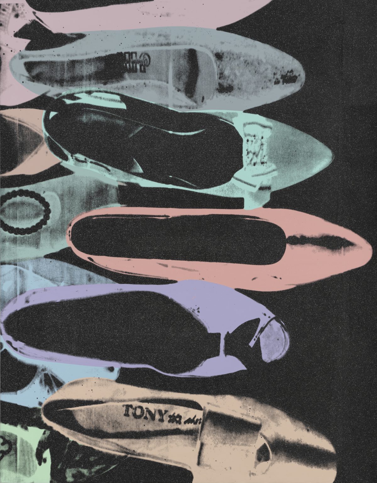
Object of the Week: Diamond Dust Shoes

“I’m doing shoes because I’m going back to my roots. In fact, I think I should do nothing but shoes from now on.”[1]

– Andy Warhol, July 24, 1980

When invoked, Andy Warhol brings to mind a near-infinite number of iconic images. From soup cans to politicians to celebrities, his Pop aesthetic and reputation lives on: “With an irreverent attitude toward art and a glorification of glamour, Warhol, paradoxically, fused high art, low culture, high society, and the avant-garde, transforming the art of an age and cultivating a lifestyle of celebrity.”[2]

Throughout the 1960s and 70s, Warhol was a prolific explorer of painting, photography, printmaking, drawing, fashion, television, and film. The Factory cemented Warhol’s reputation and legacy. However, in the 1980s, the last decade of his life, Warhol pivoted away from the images of celebrity that made him a household name, and returned to what in 1966 he had referred to as “just a phase [he] went through”: painting.[3]

It was in this context that Warhol began a body of work known as his Diamond Dust Shoes. Searching for a new direction to take his work, he honed in on earlier subjects and processes. In the case of the Shoes series, Warhol went “back to [his] roots” as a commercial artist, working in the 1950s for Vogue, Harper’s Bazaar and I. Miller and Sons, where he illustrated, among many things, women’s footwear.[4]

Harkening back to what was once an ad-campaign assignment for Halston, Warhol purchased a selection of women’s shoes that he arranged on the floor. After taking photographs of the strewn compositions, he sent the images to his printer, Rupert Smith, to be screened and coated with diamond dust.[5] Diamond Dust Shoes (1980-81)in SAM’s collection—a gift of the Virginia and Bagley Wright Collection last year—is acrylic, silkscreen ink, and diamond dust on linen. The graphic contrast of pastel purples, greens, and blues is striking when set against the dark black background, and further heightened by the subtle glittering of diamond dust.

Diamond Dust Shoes rather poignantly connects Warhol’s later work to his origins as a young illustrator in New York, collapsing the time, space, and difference between the two modes of artistic production. The throughline, of course, is Warhol’s continued involvement and fascination with fashion, cultural consumption, mass-produced images, celebrity, advertising, and a little (or lot of) glamour.

– Elisabeth Smith, SAM Collections and Provenance Associate

[1] Andy Warhol, entry for Thursday, July 24, 1980, in The Warhol Diaries, ed. Pat Hackett (New York: Grand Central Publishing, 1989), 206.
[2] Joseph D. Ketner, “Warhol’s Last Decade: Reinventing Painting,” in Andy Warhol: The Last Decade (Munich, Germany: Delmonico Books-Prestel), 15.
[3] Andy Warhol in an interview with Gretchen Berg, “Andy Warhol: My True Story,” Nov. 1, 1966, in I’ll Be Your Mirror: The Selected Any Warhol Interviews, 1962–1987, ed. Kenneth Goldsmith (New York: Carroll & Graf Publishers, 2004), 88.
[4] “A la Recherche du Shoe Perdu Portfolio by Andy Warhol,” Guy Hepner, www.guyhepner.com/artist/andy-warhol-art-prints-paintings/a-la-recherche-du-shoe-portfolio-by-andy-warhol/.
[5] Philips Auction, “Andy Warhol’s ‘Diamond Dust Shoes,” www.phillips.com/article/29694970/warhol-diamond-dust.
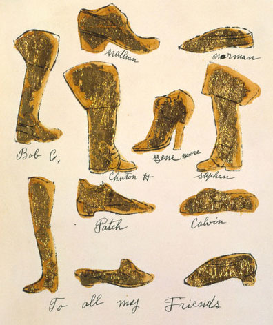
Images: Diamond Dust Shoes, 1980-81, Andy Warhol, acrylic, silkscreen ink, and diamond dust on linen, 90 x 70 in., Gift of the Virginia and Bagley Wright Collection, in honor of the 75th Anniversary of the Seattle Art Museum, 2020.15.38 © The Andy Warhol Foundation for the Visual Arts, Inc. “To All My Friends”, ca. 1957, Andy Warhol, American, 1928-1987 (artist), gold leaf and ink on Strathmore paper, 9 x 8 in., 1998.1.2055, The Andy Warhol Museum, Pittsburgh; Founding Collection, Contribution The Andy Warhol Foundation for the Visual Arts, Inc. © The Andy Warhol Foundation for the Visual Arts, Inc.

Object of the Week: The Important an Unimportant

Since John Baldessari’s death last week, there has been a commensurate stream of articles recounting his outsized influence as a pioneering artist and educator, with a prolific career spanning decades.

With beginnings as a painter, Baldessari, like many artists of the 1960s and 70s, eventually gravitated toward conceptual art and the pre-eminence of ideas over objects. However, unlike many of his contemporaries, Baldessari imbued his conceptual art practice with humor and wit, employing “a sort of Dada irony and sometimes colorful Pop Art splashes . . . to rescue conceptual art from what he saw as its high-minded self-seriousness.”[1]

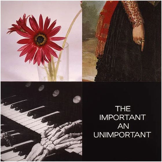
Baldessari’s enduring interests included the relationship between text and image—which often meant pitting them against one another to challenge their assumed accuracy—and the appropriation of images from photography and film. His 1999 painting, The Important an Unimportant (from the Tetrad Series), in SAM’s collection is an exemplar work in this regard, a combination of digital printing, hand lettering, and acrylic paint on canvas.

The composition, made up of quadrants, juxtaposes square images—a glass with red daisies, a woman’s finger pointing down, and two skeleton hands playing an organ—with a textual element that reads, “the important an unimportant.” If these sequences appear heterogeneous and somewhat anachronistic, it is because they are. For example, the excerpt in the upper right is lifted from Goya’s 1797 painting The Duchess of Alba, painted while the duchess mourned her husband’s death. In the lower left, a still from Erich von Stroheim’s 1928 silent film, The Wedding March, is a not-so-subtle harbinger of the fate which befalls the romance and aristocratic aspirations of the film’s protagonist lovers. The text in the lower right, even, is an excerpt from Portuguese writer Fernando Pessoa (1888-1935), “for whom nullity was a muse.”[2]

Taken together, these citations enrich our understanding of Baldessari’s wide range of influences. And whether we know the exact origins of his chosen references or not, the appropriated images and texts are here imbued with new meaning. We are invited—and, importantly, required—to participate as viewers to consider their relationship to one another and the history of visual representation more broadly.

A serial creator, Baldessari always adhered to his now-famous maxim to “not make any more boring art.” A simple enough credo, such a motivation directly impacts us as viewers, who are on the receiving end—simultaneously empowered and challenged by his work. Perhaps best articulated by New York Times art critic Roberta Smith, “[Baldessari’s] work amuses, unsettles, questions and makes you look twice and think thrice; laugh out loud; and in general gain a sharpened awareness of the overlapping processes of art making, art viewing, and art thinking.”[3]

Elisabeth Smith, SAM Collection & Provenance Associate

Image: The Important an Unimportant, 1999, John Baldessari, digital printing, hand lettering, and acrylic paint on canvas, 94 x 94 in., Gift of the Virginia and Bagley Wright Collection, in honor of the 75th Anniversary of the Seattle Art Museum, 2014.25.6 ©️ Artist or Artist’s Estate
[1] Jori Finkel, “John Baldessari, Who Gave Conceptual Art a Dose of Wit, Is Dead at 88,” The New York Times, Jan. 5, 2020, https://www.nytimes.com/2020/01/05/arts/john-baldessari-dead.html.
[2] Adam Kirsch, “Fernando Pessoa’s Disappearing Act,” The New Yorker, Aug. 28, 2017, https://www.newyorker.com/magazine/2017/09/04/fernando-pessoas-disappearing-act.
[3] Roberta Smith, “Tweaking Tradition, Even in Its Temple,” The New York Times, Oct. 21, 2010, https://www.nytimes.com/2010/10/22/arts/design/22baldessari.html.

Object of the Week: Slow Cooker

With these works, we have created art pieces that serve as cultural and historical artifacts that value and document the experiences, struggles, and achievements of those who have found their way, often through migration and exceptional sacrifice, to new places where they now work to contribute meaningfully within their communities.

  – Margarita Cabrera

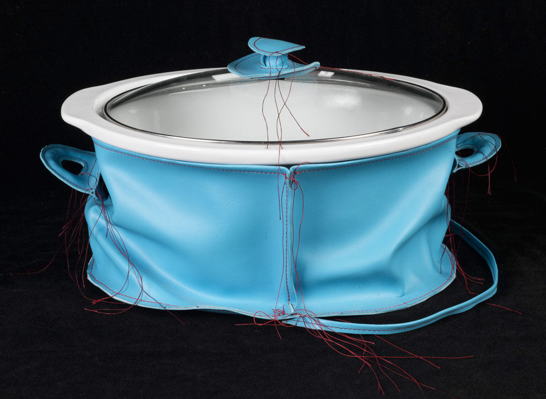
Soft vinyl covers the customary porcelain, metal, and glass of this trusty kitchen crockpot. While the clear lid is left exposed, plush fabric replaces the sturdy handles and appliance parts. Red stitching adds a playful contrast against the sky blue base, and the remaining long, loose threads speak to homemade craftsmanship.

Slow Cooker is part of artist Margarita Cabrera’s soft sculpture series, which reimagines commercial objects from bicycles and cars to household tools and cleaning supplies. Cabrera was a featured artist in Pop Departures, a 2014 exhibition at SAM that explored contemporary artists who look to Pop Art for artistic inspiration or critique. The malleable and everyday forms of Cabrera’s sculptures draw on stylistic elements of works by Pop artist Claes Oldenburg.

Cabrera is an artist, activist, and community organizer. She infuses her art with socio-political and personal reflection as a Mexican American. Topics of cultural identity, migration, violence, inclusivity, labor, and empowerment—with a focus on US-Mexico border issues—are at the forefront of Cabrera’s art practice.[1] In her transformative justice initiatives, Cabrera organizes artistic collaborations in local communities. For her 2010 outreach project, Space in Between, Cabrera partnered with Latinx immigrants from Mexico and Central America to create sculptures of Southwestern US desert plants.[2] Using fabric from the uniforms of Border Patrol forces, the soft sculptures recall embroidery techniques from Los Tenangos, Hidalgo, Mexico and traditions of Otomi Indigenous communities. The workshops empowered the participants to share their journeys of tremendous danger and sacrifice, crafting dialogues of unity, healing, and resistance.

Playful and interactive, the collapsible textures of Slow Cooker invite touch and public engagement. The bold, bright colors are illustrative of traditional woven Mexican designs. Slow Cooker provokes us, and perhaps teases us, as consumers and viewers, to reconsider these unassuming objects and the hands that made them. Cabrera shatters the invisibility of immigrant laborers in factory, farm, and service jobs—engaging the need for active listening and policy change at the ground level, igniting a political conversation that remains urgent and necessary.

Rachel Kim, SAM Curatorial Intern

[1] “Margarita Cabrera.” © Margarita Cabrera, https://www.margaritacabrera.com/sample-page/
[2]“Margarita Cabrera: Space in Between. February 10 – June 10, 2018.” Ruth and Elmer Wellin Museum of Art, Hamilton College, https://www.hamilton.edu/wellin/exhibitions/detail/margarita-cabrera-space-in-between-1-1-1-1-1-1-1
Image: Slow Cooker, 2003, Margarita Cabrera, vinyl, thread, and appliance parts, 13 × 8 × 10 in., Modern Art Acquisition Fund and General Acquisition Fund, 2015.7.2 © Artist or Artist’s Estate

Object of the Week: Ideas for Zanzibar with Dancer from Parade Triple Bill

A pioneering Pop artist, David Hockney has throughout his career pivoted effortlessly from medium to medium, continuously exploring his visual style. Though perhaps best known for his iconic paintings of Southern California swimming pools, Hockney has produced a much larger body of work, ranging from abstract paintings to photo collages to iPhone drawings. However, arguably lesser known is his work in stage and costume design: he has been involved in productions of Stravinsky’s Rake’s Progress and Mozart’s Magic Flute, both at the Glyndebourne Opera in England, and Parade at the New York Metropolitan Opera, for which this drawing was created.

Grouped under the title Parade, the Met Opera’s 1981 triple bill brought together three pieces: Parade, a ballet written by Jean Cocteau with music by Erik Satie; Les Mamelles de Tiresias, an opera with libretto by Guillaume Apollinaire and music by Francis Poulenc; and L’Enfant et Les Sortileges, an opera with libretto by Colette and music by Maurice Ravel. Hockney designed the sets and costumes for all three performances.

Satie’s Parade, first presented at the Théâtre du Châtelet in Paris on May 18, 1917—during the height of World War I—takes place in a world of circus acts and street fairs. Though written in 1903, Les Mamelles de Tiresias similarly premiered during the war, in June 1917. The surrealist play was described by one critic as “high-spirited topsy-turveydom” whose deeper themes are about the need to repopulate a France ravaged by war.¹ Lastly, L’Enfant et Les Sortileges, commissioned in 1915, is a “fairy ballet” exploring the inner emotional world of a child, where toys and animals come to life.

There is a long history of artists collaborating on theater and dance productions. Merce Cunningham frequently collaborated with Jasper Johns and Robert Rauschenberg, for example, and both the scenery and costumes for Satie’s original Parade were designed by none other than Pablo Picasso. For New York Times theater critic John Russell, Hockney’s designs for the 1981 presentation Parade are “not [Picasso’s] Parade redone from scratch. It is the Parade of 1917 revisited as if in a dream, with Picasso very much in mind, both as the original designer and as the poet of Les Saltimbanques—the tumblers and harlequins who turn up over and over again in the work of Picasso’s Rose period.”²

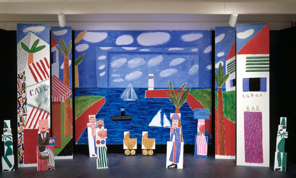
Largescale painted environment with separate elements based on Hockney’s design for Les Mamelles de Tiresias

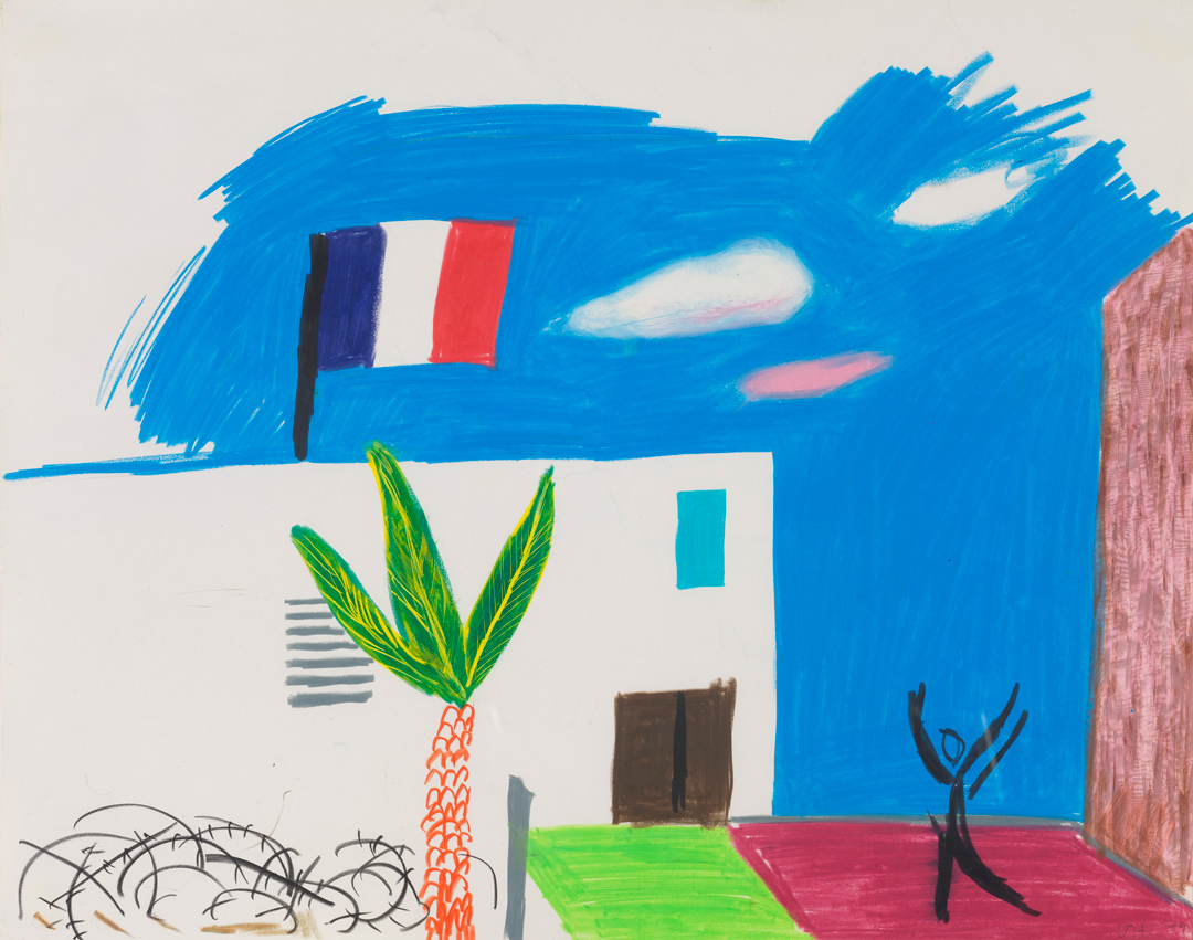
Hockney produced many drawings for Parade, but the one in SAM’s collection is for the second opera in particular: Les Mamelles de Tiresias, set in Zanzibar, an imaginary town in France. Taking into account the circumstances surrounding the opera’s 1917 premiere, when the war was at its worst, Hockney incorporated details such as gas masks, helmets, searchlights, and barbed wire, the latter of which is included in this drawing.³ Though the unfinished blue sky suggests a certain incompleteness, it is important to keep in mind that this is, after all, a preparatory drawing. And despite the war-time setting, Hockney still manages to bring his bold, graphic, and colorful style to the mise en scène. In the image above, which more fully depicts Hockney’s playful cubist-inspired world, we get a sense of how such drawings were crucial for his development of these operatic worlds.

–Elisabeth Smith, Collections Coordinator

Images: Largescale painted environment with separate elements based on Hockney’s design for Les Mamelles de Tiresias, from the 1983-84 Walker Art Center exhibition Hockney Paints the Stage. Ideas for Zanzibar with Dancer from Parade Triple Bill, 1980, David Hockney, Crayon on paper, Framed: 28 x 33″, Paper size: 19 x 24″, Gift of Robert and Honey Dootson Collection, 2010.37.26, © David Hockney.
¹Jeremy Sams, “Poulenc, Francis,” in The Penguin Opera Guide, ed. Amanda Holden (London: Penguin Books, 1997), 282.
²John Russell, “David Hockney’s Designs for Met Opera’s ‘Parade’,” in The New York Times, February 20, 1981, 1.
³ Russell, 1.

Guest Blogger: Barbie’s Five Faves from SAM

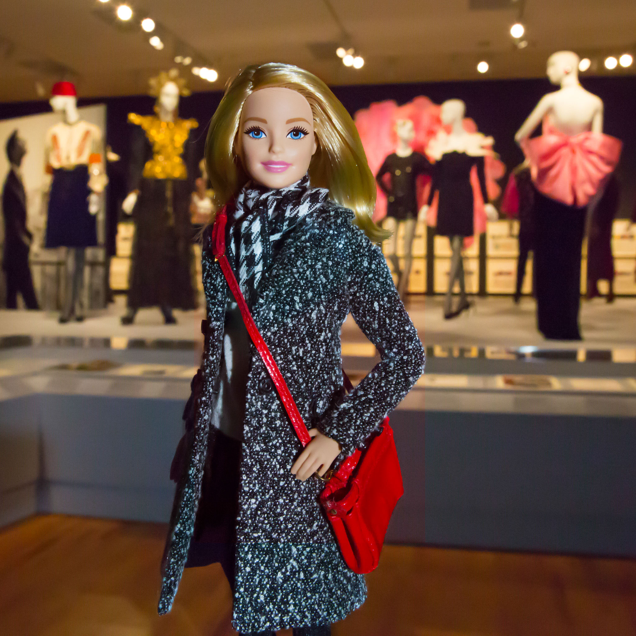
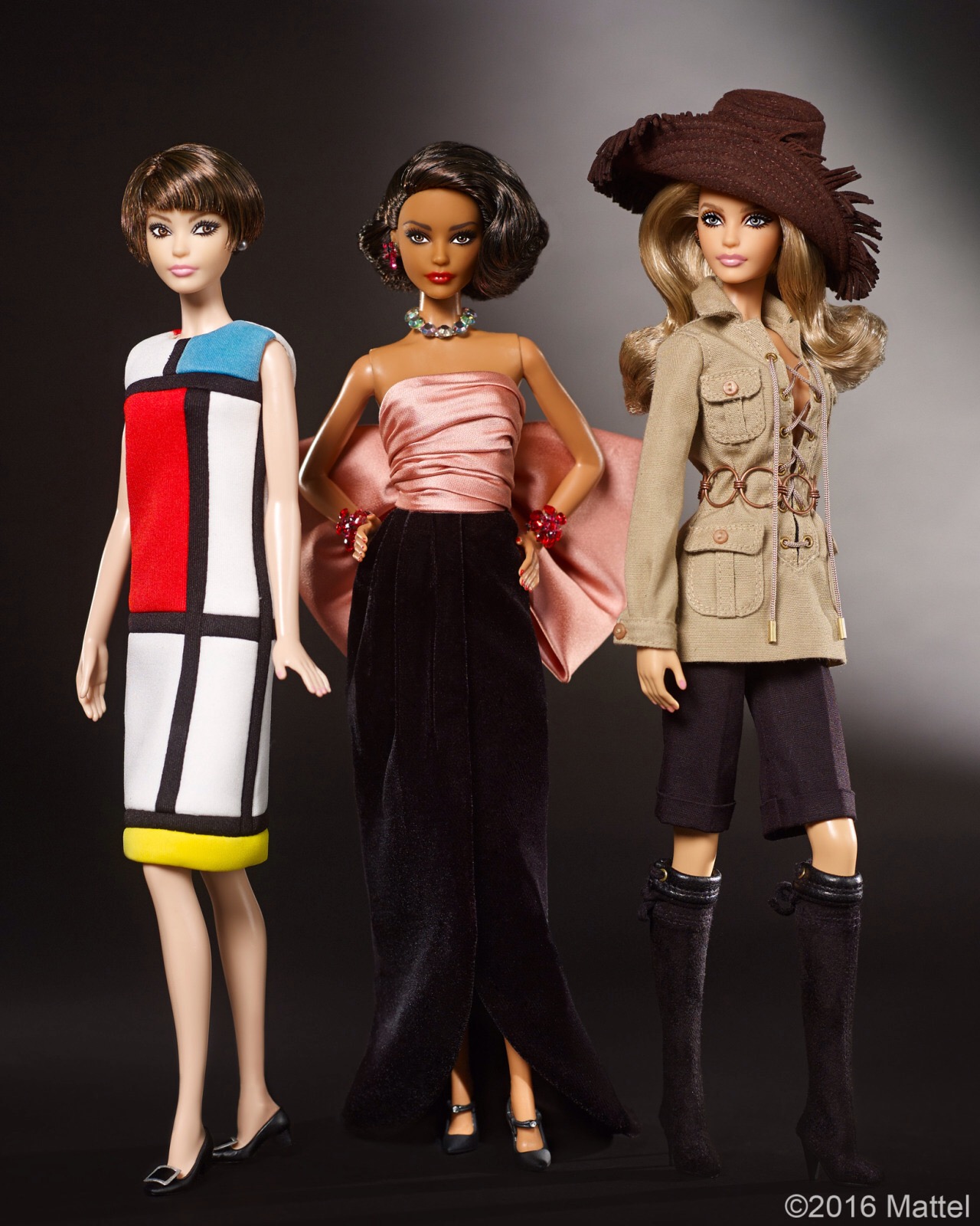
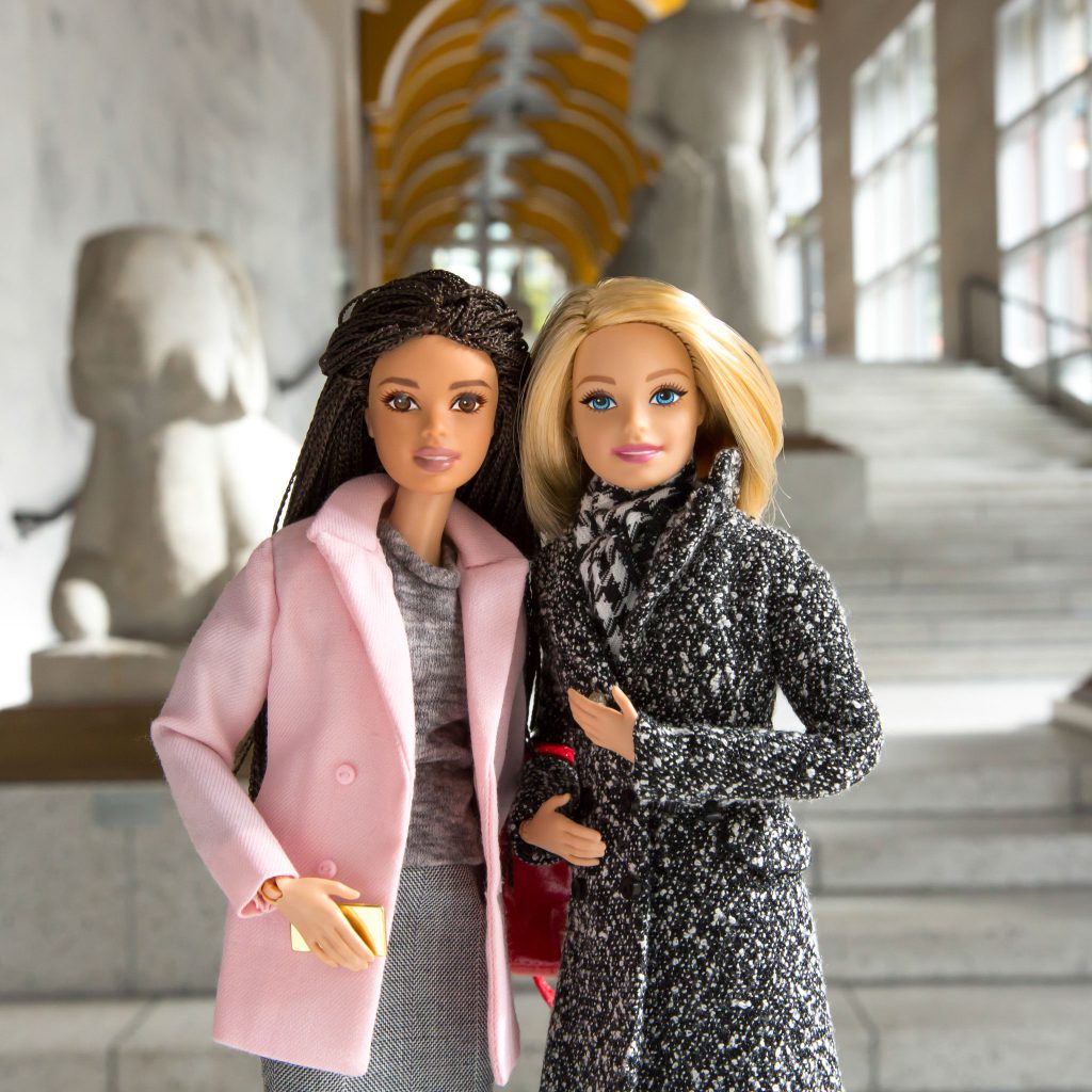
In October I took a trip to Seattle for opening day of Yves Saint Laurent: The Perfection of Style at Seattle Art Museum. And how perfect it was! Seattle delivers everything you might expect—great coffee, abundant shopping, cool culture, and endless opportunities to accessorize for rainy weather. But the reason for the season was an exclusive first look at the my-sized recreations of the defining designs on display as part of the exhibition at SAM.

Life can be so busy but it’s nice to stop and reflect on recent experiences. So here are my five favorite things from my visit to the Seattle Art Museum to take in the stunning style of Yves Saint Laurent. Spoiler alert, I have more than five favorites but you’ll just have to get to the exhibition during closing weekend (that’s this weekend, Jan 7 & 8) and see it for yourself!

  1. The Bow Dress

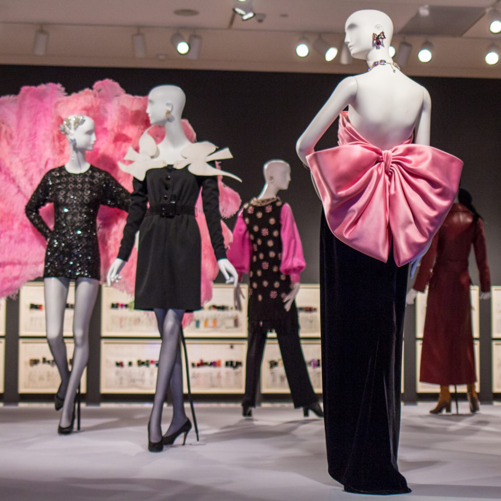
Yves Saint Laurent’s style is superb. In the photo above, the evening gown behind me from Autumn-Winter 1983, with its giant and oh-so-pink silk satin bow, is a perfect example of flawless color and shape combos. I was thrilled to get to see this dress, one of Saint Laurent’s most well known, in person.

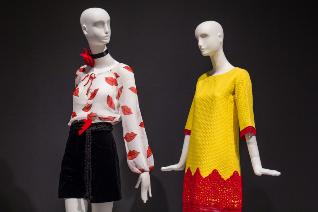
  1. The Pop Moment

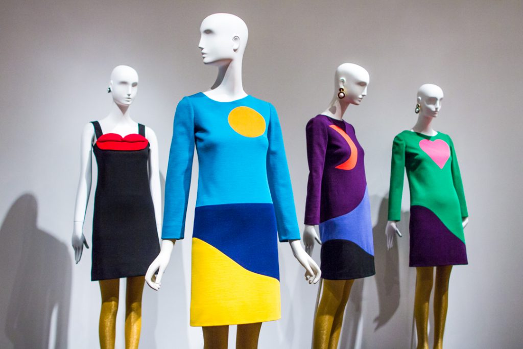
I’m a big fan of bright colors! And, like Yves Saint Laurent, I find literature, theater, and film inspiring. In this gallery you can see how the art of his time had an impact on Saint Laurent’s designs. The geometric shapes and strong hues of these dresses draw directly from Pop art. I’m all about this wearable art.

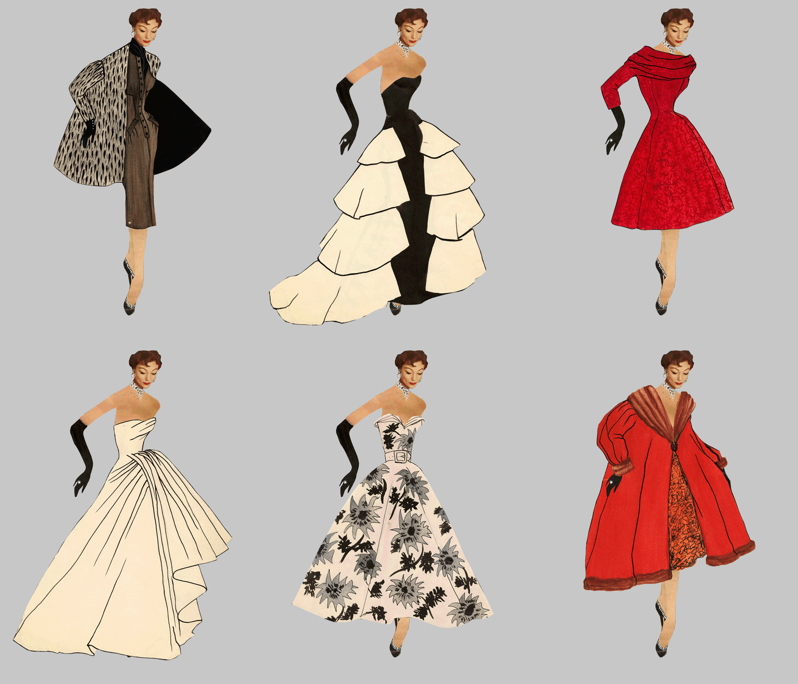
YSL Paper Dolls

  1. The Prodigy’s Paper Dolls

I wish I’d had paper dolls this fancy to play with as a kid! Yves Saint Laurent made these paper dolls from magazines when he was a teenager and this is the first time they’ve been shown in the United States. I feel so lucky that they are at the Seattle Art Museum right now and I got to see them up close!

  1. A Modular Wardrobe

Yves Saint Laurent changed the fashion industry forever when he opened his first boutique, SAINT LAURENT – rive gauche. The store sold prêt- à-porter clothes, which means, “ready to wear.” Thanks to him, now we can all shop for a slice of high fashion for a fraction of the price! Now if only I could find this white silk crepe blouse with red lips in stores still.

  1. Catching up with a Friend

Traveling means getting to reconnect with old friends! I love getting to discuss all the thoughts that come up after seeing world-class art and it’s so important to have a good friend to talk about creative ideas with. Visiting Yves Saint Laurent: The Perfection of Style at the Seattle Art Museum wouldn’t be that same without someone to gush over the beautiful fashions with.

—Barbie

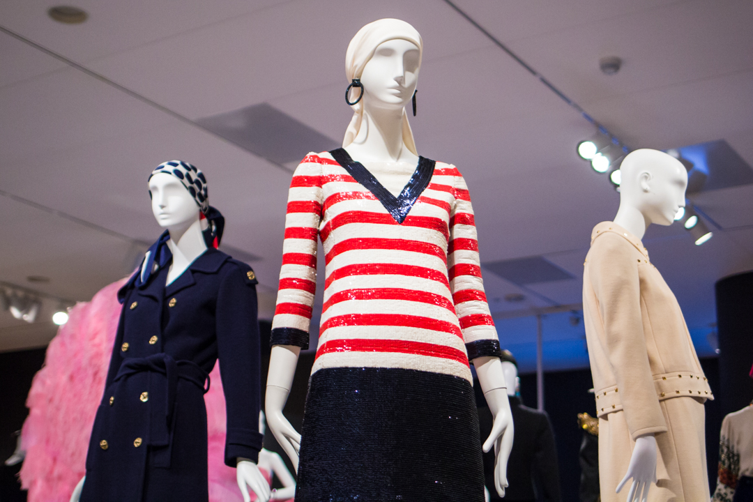
IMAGES: Barbie photos courtesy of Mattel. Installation views of Yves Saint Laurent: The Perfection of Style, Photos: Natali Wiseman.

Yves Saint Laurent: The Perfection of Exhibition Design

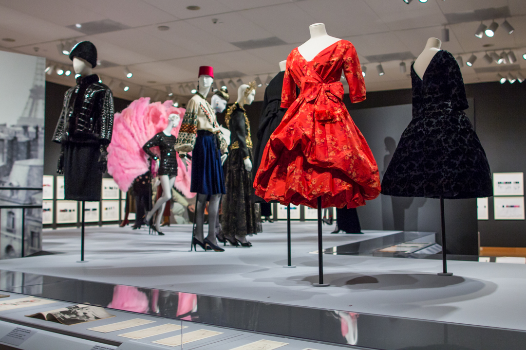
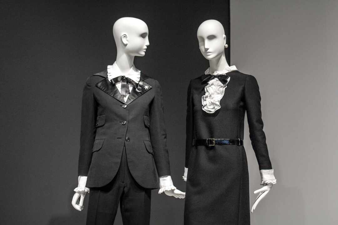
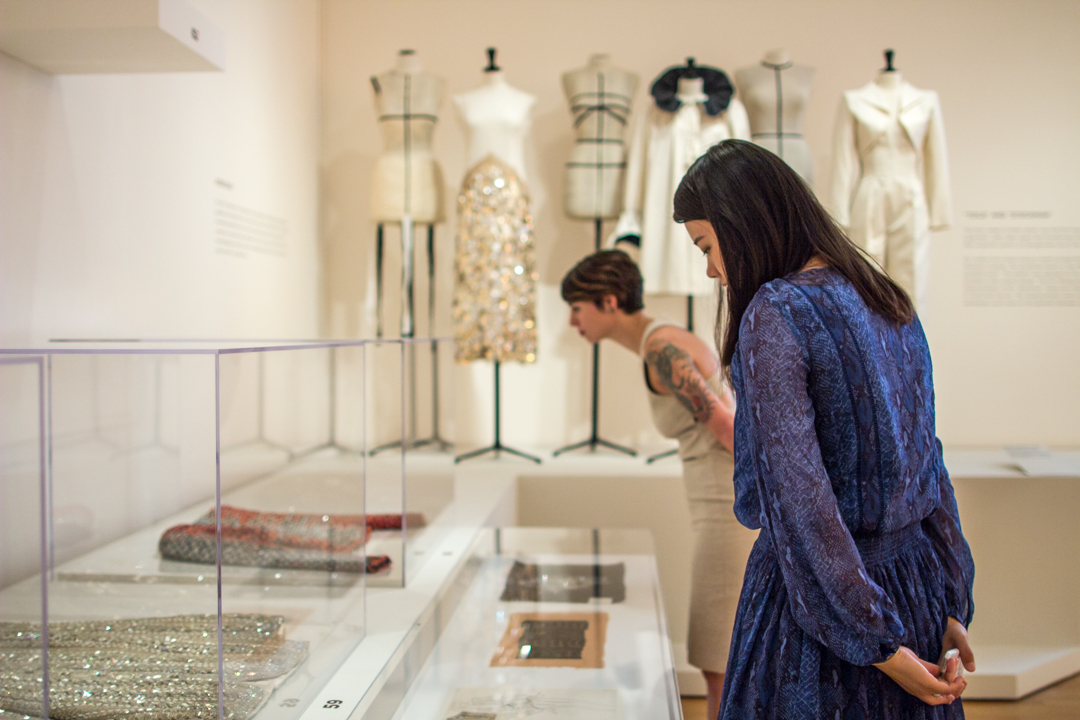
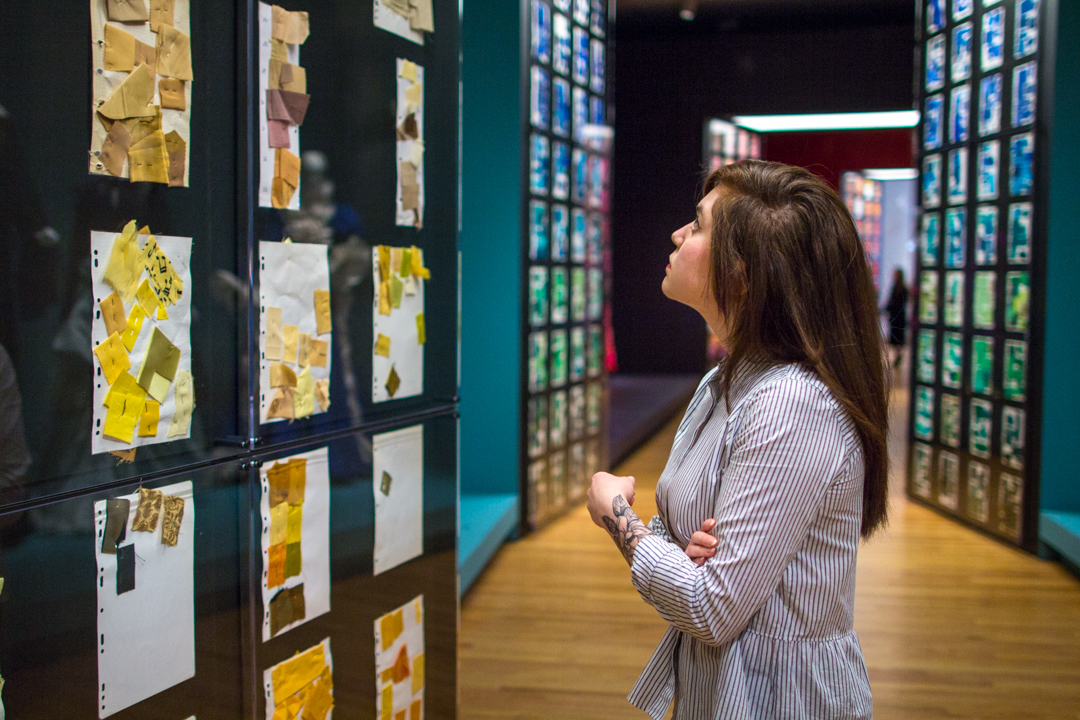
The design and installion of the Yves Saint Laurent: The Perfection of Style exhibition was a large undertaking and involved constructing elaborate stages and catwalks. The galleries are completely transformed to create an experience unique to the art of fashion. By building out into the galleries to execute this design, our capacity is limited. If you’re purchasing tickets online or in person and notice that we are selling timed tickets, this exhibition layout is the reason why. Each section of the exhibition approaches a different era or design technique used by Yves Saint Laurent. Take a quick walk through it with us!

The Little Prince of Fashion - Installation view of Yves Saint Laurent: The Perfection of Style at Seattle Art Museum

The Little Prince of Fashion
Beginning with the Winter 1955 collection, Dior, the world’s most celebrated couturier, began to include his young assistant’s designs in the collections. A black dress draped with a white scarf caused a sensation when it appeared in the now-iconic photograph by Richard Avedon, Dovima with Elephants.

The Beatnick Couturier
In 1962, Yves Saint Laurent and Pierre Bergé co-founded the haute couture house at 30 bis rue Spontini in Paris. From that moment, the collections drew their inspiration from street life and pop culture. Saint Laurent proclaimed, “You no longer need to be rich to have style.” In 1966, Saint Laurent and Bergé launched the SAINT LAURENT rive gauche label. A pioneer in luxury ready-to-wear, the brand succeeded beyond their wildest expectations, enjoying worldwide acclaim. The shy young man in the black tie had evolved into a long-haired beatnik couturier. He exemplified the synchronicity between appearance and lifestyle.

The Celebrity Couturier
During the 1970s, Saint Laurent’s status went from fashionable couturier to superstar on a par with Mick Jagger or David Bowie. This emboldened him to court scandal personally and in his work. In November 1971, to promote his men’s fragrance Pour Homme, he released a nude photograph of himself taken by Jeanloup Sieff. Saint Laurent told the press: “I wanted to shock.”

A Living Legend
From the 1980s until the maison de couture’s closing, every move by the couturier contributed to the creation of his mythic persona. The first such event was the large retrospective exhibition in 1983 at the Metropolitan Museum of Art in New York. Curated by Diana Vreeland, it celebrated twenty-five years of creations. It was the first time that a living couturier was the subject of a museum show. Saint Laurent was only forty-seven years old. Another global milestone was reached in 1992, this time in Seville, where Saint Laurent’s iconic styles were shown in a fashion retrospective at Expo 92.

The Genders - Installation view of Yves Saint Laurent: The Perfection of Style at Seattle Art Museum

The Genders
The play between masculine and feminine is seen in Saint Laurent garments that borrow from menswear: the Winter 1963 motorcycle jacket, the Winter 1967 pantsuit inspired by film noir gangsters, the trench coat drawn from British World War I officers, and the jumpsuit, the uniform of aviators. The exploration of fashion that transcends gender culminated in the redesign of the safari jacket, inspired by big game hunters of France’s colonial past. In an emblematic photograph from 1969, Saint Laurent and Betty Catroux stand together, wearing nearly identical safari jackets that express their own new gender. Worn with thigh-high boots, Betty Catroux exemplifies rock and roll while Yves adopts an androgynous pose. Saint Laurent proposed that men concede part of their virility to women and that women accept men’s feminine side.

A Modular Wardrobe
The younger generation, which had adopted jeans and T-shirts as a sign of belonging to a more egalitarian society, saw haute couture as a symbol of inequality. With his ready-to-wear line, Saint Laurent offered an alternative to haute couture, creating styles that were more affordable and easier to wear. “Attitude” replaced “well-dressed.”

The Alchemy of Style - Installation view of Yves Saint Laurent: The Perfection of Style at Seattle Art Museum

The Alchemy of Style
The production of an haute couture garment was a complex process that began with a sketch. Saint Laurent’s drawings included specifics about ergonomics, “drape” and the equilibrium that must be maintained between the fabric and the body. He would then meet with his chefs d’ateliers (workshop heads) to give them his drawings to be translated onto a toile, the preliminary garment made of white cotton. The toile was then fitted on the mannequin cabine (fitting model) and presented to Saint Laurent. Once Saint Laurent had approved the toile after three or four fittings, it was time to choose the fabrics, colors and adornments, such as exclusively-made buttons. Then the toile was laid flat to create the paper pattern that would be used to cut the fabric. If the fabric was to be embroidered, the motif was either drawn in pencil or a paper cutout of the motif was applied to the toile. Sometimes the process was simplified, by draping the fabric directly onto the model’s body. Saint Laurent declared, “I can’t make any decisions without them.” The models were, he said, his “reality.” Finally, a few days before the fashion show, in the large Second Empire style salon, Saint Laurent would choose among the many accessories displayed on trays and other embellishments.

The Pop Moment
Saint Laurent’s first incorporation of fine art into fashion was the iconic Mondrian dress from 1965. Its design was based on Piet Mondrian’s signature geometric compositions from the 1920s, which marked a breakthrough in modern painting. The designer would next turn his attention to the artists of his own time who embodied the youthful spirit of Pop Art. Tom Wesselmann, Roy Lichtenstein, and Andy Warhol found inspiration for their boldly colored imagery in advertising, comic books, and ordinary mass-produced objects. Experimentation, humor, and a sense of freedom also emerged in popular music and film—and through Saint Laurent, in fashion. He later said, “I participated in the transformation of my era. I did it with clothes, which is surely less important than music, architecture, painting . . . but whatever it’s worth, I did it.”

From Darkness to an Explosion of Color - Installation view of Yves Saint Laurent: The Perfection of Style at Seattle Art Museum

From Darkness to An Explosion of Color
The next galleries conduct you through a large selection of pages of échantillons de tissu—fabric samples that he used as a reference to his preferred hues, including his favorites, pink and blue. Near these pages, color-coordinated gowns from forty years of his career display key elements of the Saint Laurent style. The young Saint Laurent used a rather dark color palette. When he discovered Morocco in 1966 he was shocked by the intensity of the blue sky, the beauty of the Majorelle Garden which Pierre Bergé and he saved from destruction and bought in 1980, and the varied hues of traditional garments worn in the medina. In addition, his admiration for the paintings of Henri Matisse helped Saint Laurent to expand his palette into an explosion of intense colors that would become a strong element of his style going forward. From black, which he considered a real color, to the exploration of this colorful palette, Saint Laurent’s sensitivity to color is noticeable in every aspect of his style.

Images: Installation views of Yves Saint Laurent: The Perfection of Style at Seattle Art Museum, Photos: Natali Wiseman.

Happy birthday, Ed Ruscha!

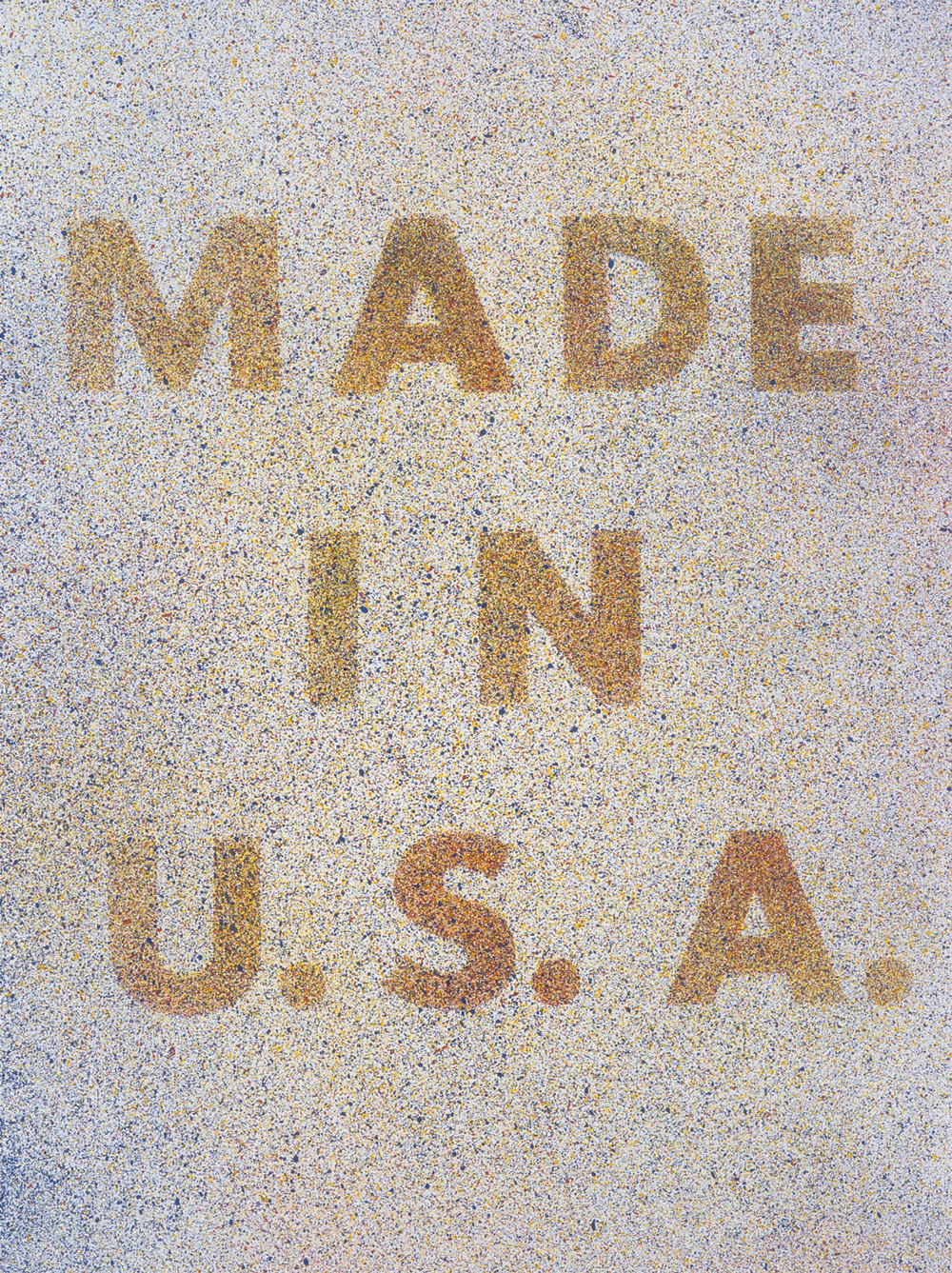
“Made in U.S.A.” It’s a familiar phrase. A distinctive feature of the phrase is that it always comes attached to an object. The statement makes no sense when detached from an object because it lacks the first element of any sentence: a subject. What was made in the U.S.A.? Whatever it’s printed on. This is what one might call an index. Where we see the words has a direct relationship to the meaning we draw from them.

American Pop artist Ed Ruscha chose the language carefully. The physical lithograph that he called America Her Best Product was imagined and then printed within the boundaries of the U.S. The Pop movement that it represents was also distinctly American—cleverly responding to a boom in consumerism during the third quarter of the 20th century with a new brand (pun intended) of satire. The American Dream and the drive to buy that supports it are two more products referenced here. Are they the most telling ones?

America Her Best Product came to SAM as part of a 12-piece art portfolio titled Spirit of Independence, which also featured print works by artists such as Robert Indiana, Alex Katz, and Jacob Lawrence, and which celebrated the country’s 200th year in 1976. The portfolio assembled works symbolizing American creativity and freedom. Curtis H. Judge, president of the donor Lorillard Co., wrote that Spirit of Independence “reflects and projects American independence as interpreted by 12 of America’s foremost artists.”

As Ruscha points out, one of the great parts about freedom is the ability to question the direction of one’s own country.

Happy birthday, Ed Ruscha!

Jeffrey Carlson, SAM Collections Coordinator

Image: America Her Best Product, 1974, Ed Ruscha (American, born 1937), lithograph, 31 3/8 x 23 1/2 in. Gift of the Lorillard Co., N.Y.

Mr.’s Caterpillar (or: The Importance of Living On)

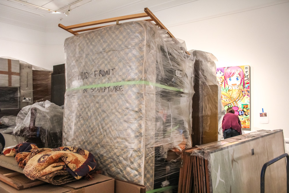
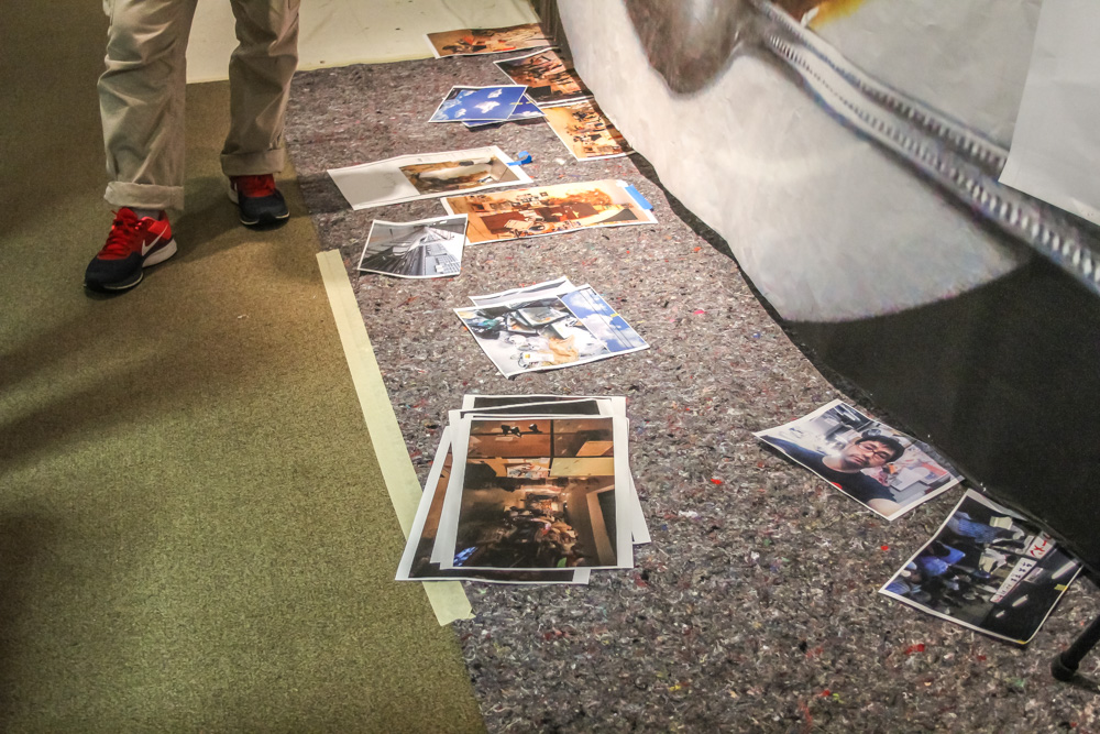
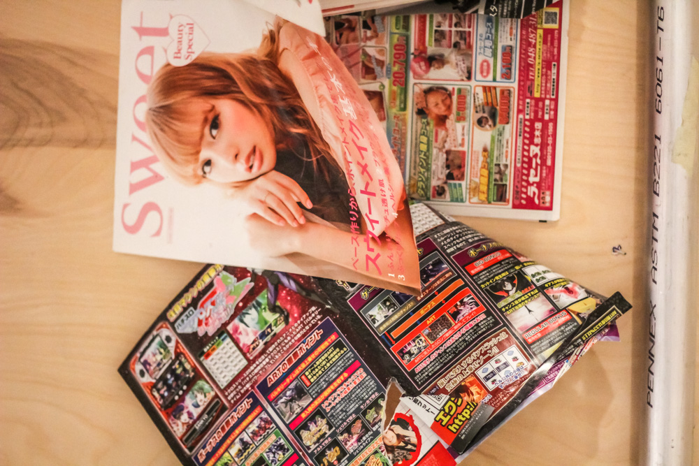
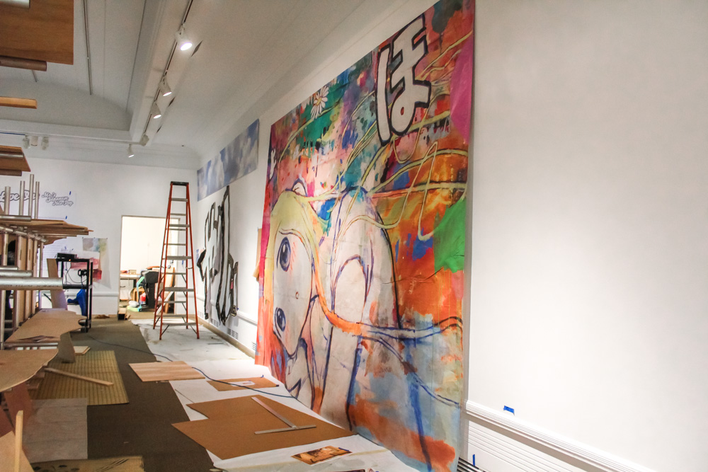
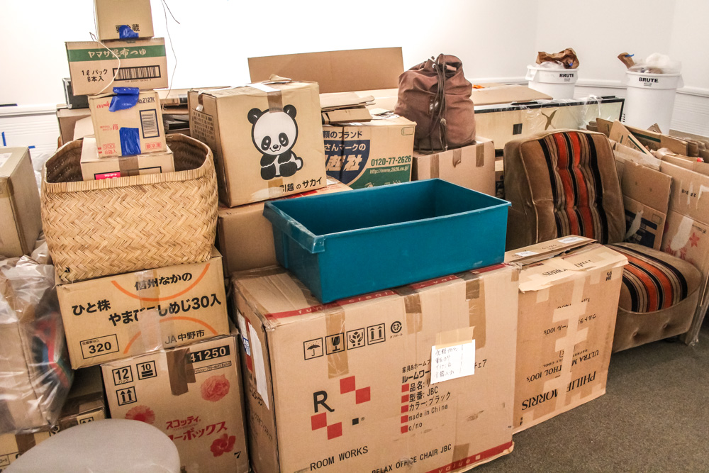
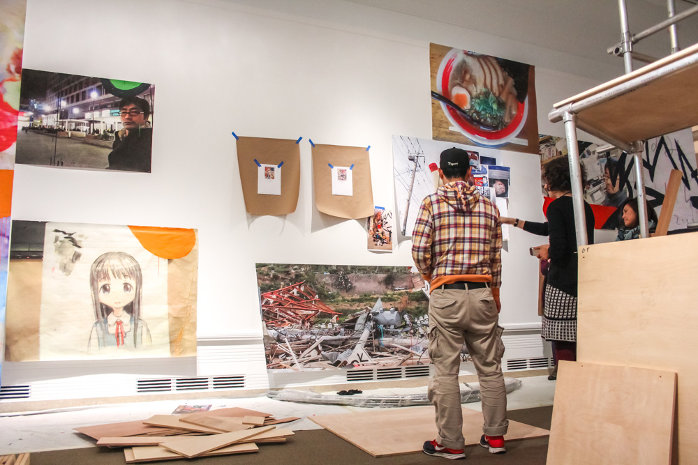
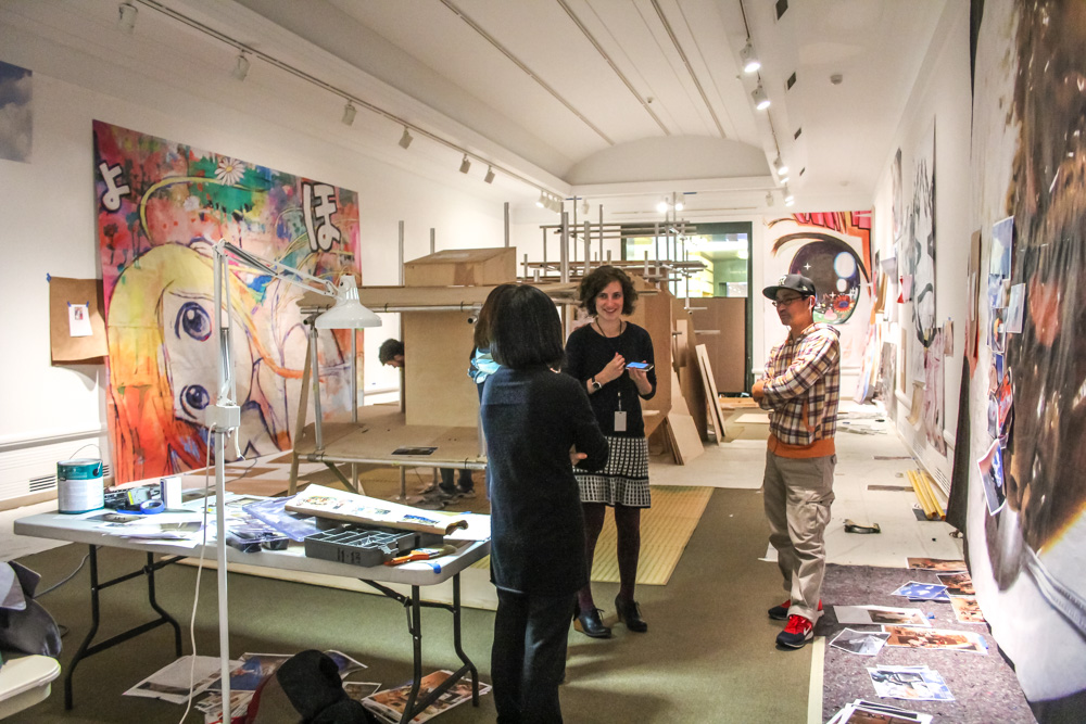
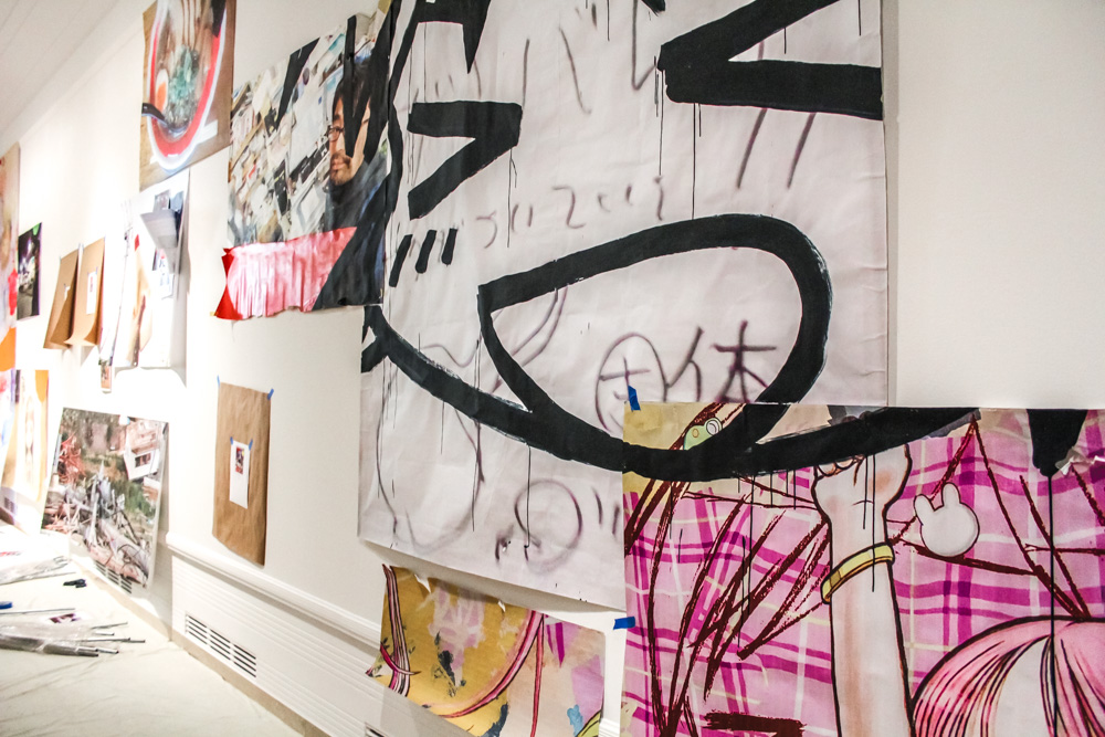
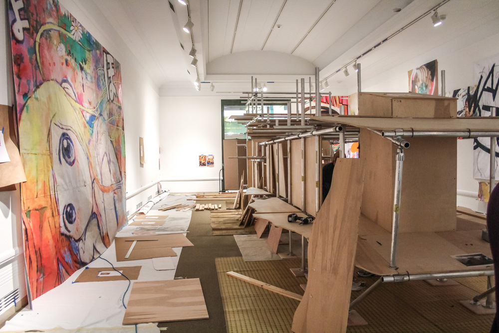
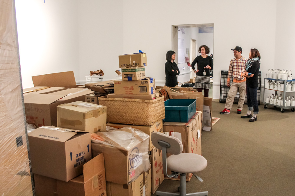
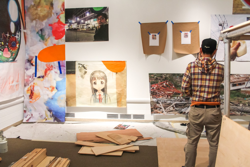
When we arrive at the Asian Art Museum, the Tateuchi Galleries are filled with cardboard boxes. Each room has a low tower built up in the middle, away from the walls. You can see flashes of a panda sticker on many of them, the logo of a moving company. Some of Mr.’s paintings are already hung, and a few are leaning against the walls. In a couple of places, an 8.5×11 piece of paper with a picture of a painting is taped to the wall with masking tape, giving us a clue of what will be going there.
mrs-caterpillar-22

mrs-caterpillar-7

mrs-caterpillar-21

mrs-caterpillar-25

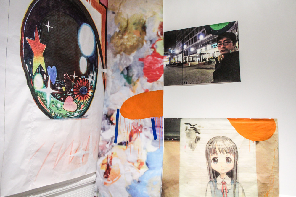
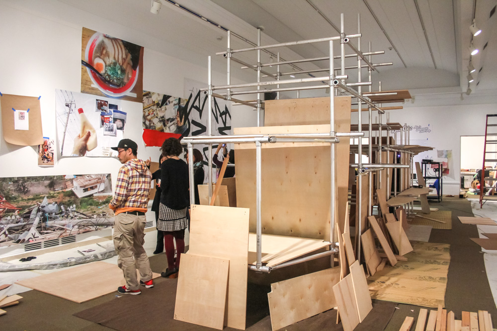
The paintings are huge—much larger than we would have guessed—the size of entire gallery walls. We watch as four art preparators carefully lift and place one panel of three, sliding it along a rail toward the other two until you can just barely discern the seam.

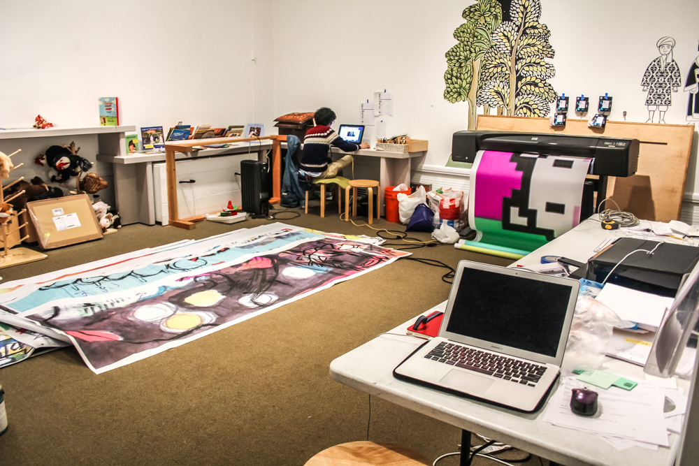
Mr. is sitting at a folding table, working on a laptop. He’s surrounded by printouts of his paintings, plans that show how to build the installation in front of him, and photographs he’s taken. He wears a striped hoodie and glasses and jeans, and he seems perfectly happy to take a break and talk about what he’s working on. He doesn’t speak much English, and I speak no Japanese, so we chat with the aid of SAM’s Curator of Japanese and Korean Art, Xiaojin Wu, and Mr.’s assistant, Kozue, who’s also based here in Seattle. The necessary triplicate of the interview means we move through the galleries slowly, standing amidst the cardboard boxes and the sounds of drills nearby. Everyone is so patient it’s hard to tell how much time is passing.
mrs-caterpillar-17

mrs-caterpillar-2

mrs-caterpillar-19

mrs-caterpillar-3

The installation he’s stationed in front of is the centerpiece of the exhibition, a tribute to the March 11, 2011 Tōhoku tsunami and ensuing earthquake. Most recently, it was shown at the Lehmann Maupin Gallery in New York. When it’s finished, it’s about the size of a train car, made up of what Mr. calls “stuff.”

Right now, it’s just a skeleton made from pipes and plywood. It looks something like an erector set, and Mr. refers to it affectionately as the “caterpillar.” The art preparators working in this gallery say that it’s like putting together a puzzle. They have sketches to follow, but they’re not exact, and they’re figuring it out with Mr. as they go. It will be a massive structure, made up of hundreds of everyday objects of Japanese life that Mr. spent three months collecting. Some crates were shipped from New York City, where they were stored after the Lehmann Maupin show. Some crates were shipped from Japan. Mr.’s translator points out a box of curry, emphasizing that all of these are real things used every day in Japan. I ask if the installation changes every time he constructs it, and he says it’s hard to keep it the same, so by nature it varies. Mr. is creating new paintings with which to surround the installation. And this is the first time that Mr.’s photographs of the aftermath of the tsunami will be on display.
mrs-caterpillar-10

mrs-caterpillar-11

mrs-caterpillar-16

mrs-caterpillar-14

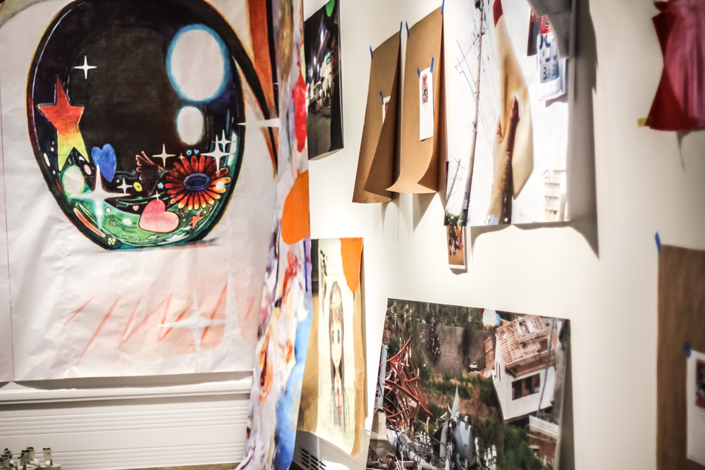
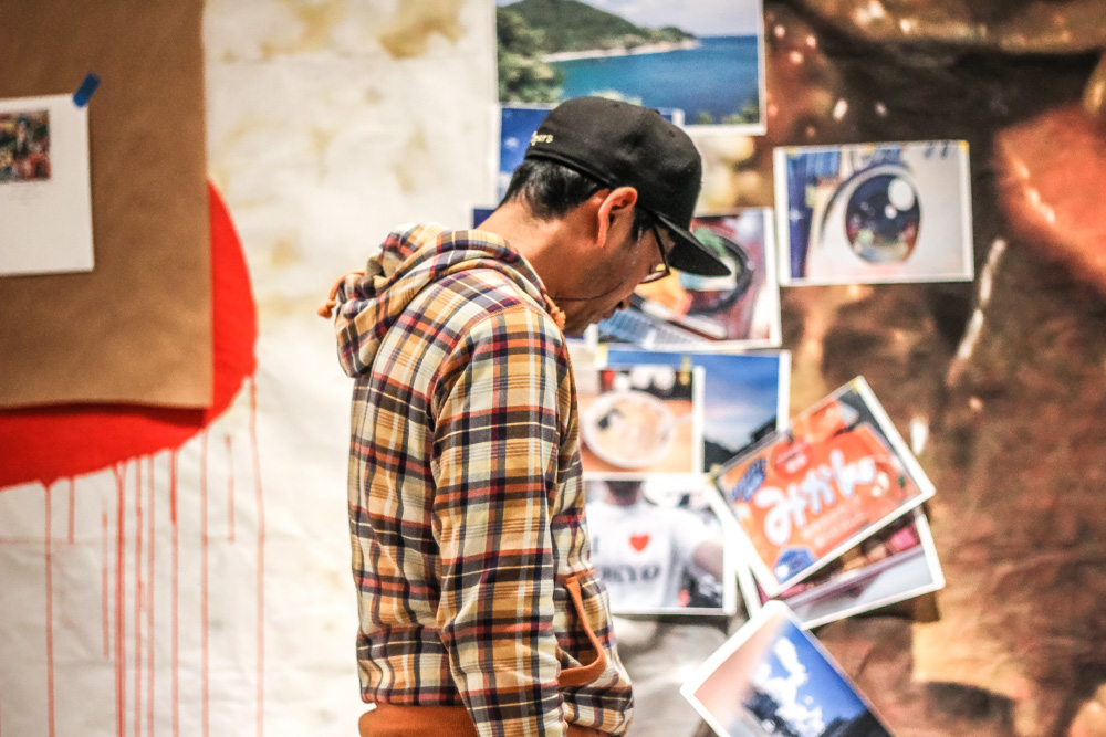
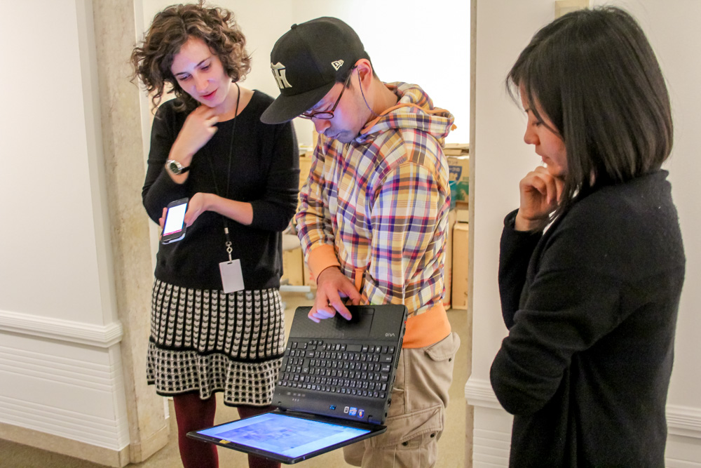
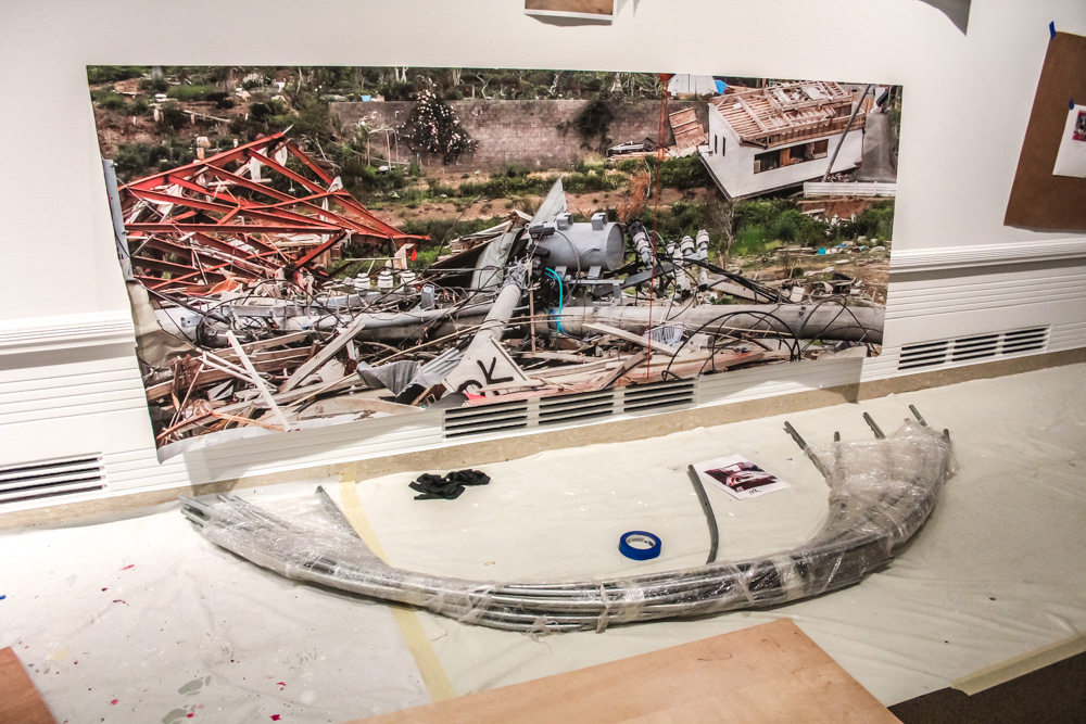
During the tsunami, Mr. was living in Saitama, Japan, just outside of Tokyo. One hundred days after the tsunami hit, Mr. went to the site and took hundreds of photographs. He pulls his laptop off the table to show me some of the pictures and brings it with us as we look at the wall where they’ll be plastered in a collage from bottom to top.

“I went,” Mr. says, which sound a bit like a pronouncement because in the midst of all the Japanese, he says it in English. Which—this one is. He went there. He saw it in person. He witnessed.

A hundred days after the tsunami, he explains, means it was almost summer. There was a factory nearby that had been making canned fish, and it smelled terrible. While Mr. looks through his photos to find what he wants to show me, I ask Xiaojin why she thinks it’s important that Seattle see the artwork.

“I think at the beginning we were attracted to Mr.’s work because of the tsunami installation. The tsunami was such a huge event that impacted so many Japanese people’s lives that you can look around and almost all the Japanese contemporary artists, in some way, have responded to it. But Mr.’s response is quite unique. He uses the daily items he collected. But he also went to the place and documented the aftermath, so I think it’s very meaningful for us to show that. And somehow, even though his main body of works is made up of paintings, some of the works he made even earlier tie into that idea of disaster and how we respond to it. We think it will be very interesting for the Seattle audience to see a different perspective of Japanese Pop art. Even though the paintings look like anime/manga, they are not just about this—even they have more to them, a little bit deeper meanings. You can get a bit deeper, see beyond the surface…beyond those big eyes, those smiles.” Xiaojin laughs suddenly as she references the happy-go-lucky anime faces, like there’s something bubbly just in talking about it.

Mr. draws my attention to his laptop and shows me the photos of collapsed buildings, tipped cars, downed power lines. Everything looks askew, and gray, covered in silt and dust. In some photos, Mr. is wearing a mask.
mrs-caterpillar-23

mrs-caterpillar-4

“When you first went to the tsunami site, did you experience it more as an artist, looking to make artwork, or were you just there to see and experience it as a citizen, as a civilian who’d been part of this disaster?” I ask.

Both Xiaojin as she listens to my question in English, and then Mr. as she translates it into Japanese, nod solemnly. Mr. talks for a long time.

“He was saying the tsunami just impacted everybody in Japan, everyone in the entirety of Japan,” Xiaojin starts. “So he never thought, I’ll go in there as an artist. He just wanted to go and see and experience, but after this experience, his thoughts have just changed so much, and the Fukushima nuclear disaster was also, after…it’s still going on.”

Mr. starts speaking again as Xiaojin slow down. She murmurs in agreement as he talks, a thoughtful sound.

“He says there are two types of people that the tsunami had an impact on. One is directly those people who lived there, lost their home, and really, they probably had the worst damage. But the second kind is just like him, who didn’t really directly experience the tsunami but they lost power, or water, or the supermarket didn’t have enough supplies, so they experienced it indirectly. But just on different levels, everybody was involved.”
mrs-caterpillar-20

mrs-caterpillar-6

mrs-caterpillar-8

mrs-caterpillar-13

The next week, when I go back to the Asian Art Museum, the installation is nearly complete. Above the screen that blocks gallery access, I can see a mattress, folded into a u shape over the top of the structure. The installation crams so many pieces of life together that it seems impossible it will hold, in the way an over packed suitcase may burst open at any moment. It’s about trauma, but also about the possibilities of what will come next.

The title of the installation? Give Me Your Wings – think different. No wonder Mr. has nicknamed the skeletal structure the caterpillar.

Live On: Mr.’s Japanese Neo-Pop is now on view at the Asian Art Museum.

Words: Maggie Hess, Copywriter
Photos: Natali Wiseman & Stephanie Fink
SAM Stories