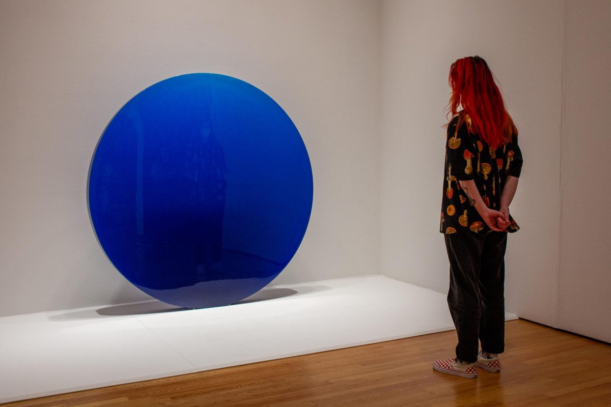
Object of the Week: Circle Blue

By the time De Wain Valentine moved to Los Angeles in 1965, the artist was already working with plastics. He had been introduced to them by his junior high shop teacher after the then-recent military declassification of the material following World War II and had been working with them on a small-scale ever since. Now in California, Valentine began sharing his experiences while working as a part-time faculty member at UCLA.

Having spent most of his life until that point in Colorado, Valentine has explained how the move influenced his art: “In Colorado, you don’t notice the sky so much because it’s crystal clear: always blue and always so beautiful.” In fact, the Latin name for the Colorado state flower is coerulea, which translates to “sky blue.” But as Valentine continued in a 2011 interview with the Getty Conservation Institute, “you can’t see [the sky in Colorado], so you always forget about it. But the sky in LA is very different: You can really see that—the smog and the fog.”1

For folks from the California coast, the “fog” is really the marine layer, a coastal air mass, usually occurring in the morning, which creates overcast skies that “burn off” around noon. The smog, however, especially in 1960s Los Angeles, was not only something you really could see, but threatened its own weather in the region. A front-page news report in the Los Angeles Times from October 1964 notes that “[s]weltering temperatures helped produce another blanket of smog over the Los Angeles basin Tuesday and touched off lightning storms which started at least three fires in the mountains.” In the next column over, a weather brief states “Light to moderate smog today.”2

Valentine is quoted saying that his extensive series of large-scale polyester resin sculptures are “all about the sea and the sky” and that being in Los Angeles allowed him to see “a new avenue to make sculpture that was completely atmospheric or like a chunk of the ocean cut out.”3 The translucent circles, columns, curved slabs, and sometimes UFO-shaped disks, come in a wide array of colors, from warm rose and orange to more New Age-y lavenders and turquoise, and many are several feet tall or wide. For example, his massive Gray Column (1975–76), made with black pigment that grows transparent and smoky as it tapers at the top, is an impressive 12 feet, like a slab carved from a smog-filled sky. 

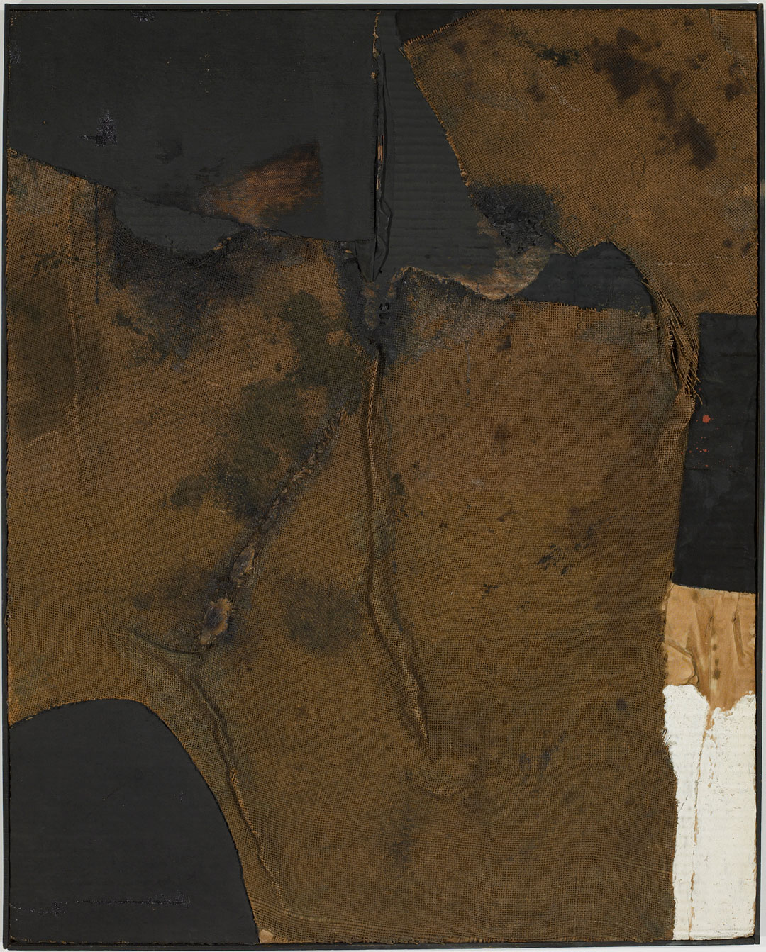
Circle Blue, with its cerulean gradient, however, is the work that most clearly evokes the ocean and sky, and, with its round shape, the planet. Like the other tall translucent sculptures, Circle Blue is made from a proprietary blend of polyester resin. Working with the manufacturer Hastings Plastics in Santa Monica, California, Valentine produced Valentine MasKast Resin in 1966 that, unlike previous polyester resins, could be used to create large, thick objects cast in a single-pour rather than in thin layers, without cracking or overheating. 

After polyester resin’s initial use in the military and aerospace arenas, the cheap, sturdy, and durable material was quickly adopted by the automotive and maritime industries, but also used for small common objects like buttons and bowling ball cores. Polyester resin has a highly complex chemical structure that requires “curing” to transform the liquid resin to a solid. This part of the production process is probably the most toxic, as the most common agent used for curing is styrene, which the National Toxicology Program of the US Department of Health and Human Services has listed as “reasonably anticipated to be a human carcinogen.”4 Polyester resin is also a plastic, and therefore made from fossil fuels. 

Despite the material’s industrial applications, Valentine never really outsourced the production of his sculptures to a fabricator, a common practice for artists using industrial materials, including his peers in the Light and Space movement and in other Minimal Art groups. Pictures of him and his studio assistants clad in PPE (personal protective equipment) show the very hands-on process taken: weeks of sanding and buffing with hand-held machines usually found in an auto-body shop. Citing health concerns, Valentine later turned to using glass for some of his sculptures, but mainly so he could install his works outside: UV light and the potential for surface scratches could destroy the polyester resin sculptures.5 What the material afforded him, however, was a way to examine not just the surface of sculpture, but the (light and) space in between. “[T]he interior of the sculpture is so essential.”6

Reflecting on Circle Blue’s origins in 1960s and 70s Southern California’s smog, sea spray, and glittering oceans against today’s heightened climate crisis, the piece becomes not just an imaginative chunk of the sky, but also a transparent, precious, and conflicting sample of our world. It is both beautiful and a little toxic, strong but also fragile. At almost six feet in diameter, we can see ourselves in its surface, but we also see in and beyond it. Now on view in Our Blue Planet: Global Visions of Water at SAM, Circle Blue—in addition to many other works on display—prompts questions about our relationship to the planet: How might we preserve a chunk of the sea or sky today? How might we look beyond today and imagine our blue planet in the future? 

– Mia C. Ferm, Project Manager, SAM Historic Media Collection

1 Tom Learner, Rachel Rivenc and Emma Richardson, “From Start to Finish: De Wain Valentine’s Gray Column” (Los Angeles: The Getty Conservation Institute, 2011), 7.

2 “Heat, Smog, Lighting and Fires Pile Up Southland Weather Woes,” Los Angeles Times (Los Angeles, CA), Oct 7, 1964.

3 Tom Learner, Rachel Rivenc and Emma Richardson, “From Start to Finish: De Wain Valentine’s Gray Column” (Los Angeles: The Getty Conservation Institute, 2011), 7.

4 National Toxicology Program, “Report on Carcinogens, Fifteenth Edition” (report, Research Triangle Park, NC: U.S. Department of Health and Human Services, Public Health Service, 2021).

5 Dorothy Newmark and Dewain Valentine, “An Interview with Dewain Valentine, Sculptor of Plastic,” Leonardo 4, no. 4 (1971). 

6 Tom Learner, Rachel Rivenc and Emma Richardson, “From Start to Finish: De Wain Valentine’s Gray Column” (Los Angeles: The Getty Conservation Institute, 2011), 12.

Image: Natali Wiseman.

Object of the Week: Leaves

White flecks on a black background, over and over, could be an invitation to savor minimalism, or is it also something else? Viewers have guessed that it is fur, feathers, or seaweed floating in a tide pool.  Then the label gives it away with the title, Leaves, and suddenly you’re watching a maze of leaves fly in the air. An abundance of layered, swirling movement surrounds you. A closer look reveals how strategic the painter is. She places each stroke of paint so carefully that no two leaves merge, but barely touch each other. Something is being said when the crowd is composed of leaf after leaf, each made distinctive with infinitesimal difference.

In the fall season in the Northwest, leaves are letting loose everywhere.  We may notice them as masses, but often may not recognize their other properties. Gloria Petyarre, whose home is in the center of Australia near Alice Springs, is honoring leaves filled with medicine. She was taught by her mother to mix fat from kangaroos and echidnas with crushed leaves to make an ointment to apply to one’s face and hair. The ointment carries a powerful aroma and is a potent aid in helping fight off colds. Kurrajong, the source of the leaves, is also known as the perfect shade tree (Brachyohiton Populneus). It is a tree that only grows in the sun, has deep roots to survive droughts, is a host to butterflies, is fire resistant, and drops its leaves only in dry winters.

Petyarre’s family is famous for painting to enlighten outsiders about their knowledge of their homeland. Her shimmering waves of leaves—created by powerful ancestors—convey their value in her interactive world. Now is the ideal time to take a hint from her and appreciate leaves for the botanical wonder they offer.

– Pam McClusky, Oliver E. and Pamela F. Cobb Curator of African and Oceanic Art

Images: Leaves, 2002, Gloria Tamerr Petyarre, Synthetic polymer paint on canvas, 70 7/8 x 157 1/2 in., Gift of Margaret Levi and Robert Kaplan, in honor of Virginia and Bagley Wright, and in honor of the 75th Anniversary of the Seattle Art Museum, 2012.21 © Gloria Petyarre.

Object of the Week: Form 19-3

“The act of kneading clay and creating shapes connects me to the thoughts and memories deep in my heart.”1

– Fujino Sachiko

Form 19-3, a new acquisition, is now on view in Folding Into Shape: Japanese Design and Crafts. It is a recent work by the Japanese artist Fujino Sachiko (born 1950), who began her art practice in textiles and fashion design, and later studied ceramics under the pioneering artist Tsuboi Asuka (born 1932). Inspired by the abstract ceramic works of avant-garde artists such as Yagi Kazuo (1918–1979), Suzuki Osamu (1926–2001), and Yamada Hikaru (1924–2001), Fujino ventured into ceramics, finding that the medium allowed her to express her artistic ideas most freely.2  

Drawing on her background in fashion design, Fujino manipulates clay as if folding and shaping fabric. This sculpture’s intricate form is built up from geometric shapes, and balanced with irregular folds in gradations of grey. The folds create beautiful silhouettes like those of a dress, such as the one by Issey Miyake also on view in Folding Into Shape. The elegant texture of the surface was created by the application of matte slip through an airbrush.

Image: Xiaojin Wu.

Fujino creates her clay sculptures through the laborious process of coil-building and hand-sculpting without the use of maquettes. With an aim to create works that have a dynamic appearance from different angles, she shapes the clay intuitively and does not know the final form of the work until it is complete. Many of her recent ceramic artworks began with geometric forms but turned into more organic forms in the process. While the biomorphic sculpture takes on a floral form, it also invites the viewer to think beyond petals and blossoms. The artist has remarked: “My interest in the mystery of plants has been deeply rooted since my childhood, even though my work is not a direct image of flowers.” Indeed, seen from above, the sculpture evokes a painting by Georgia O’Keeffe.

– Xiaojin Wu, Atsuhiko & Ina Goodwin Tateuchi Foundation Curator of Japanese and Korean Art


1 Online exhibition catalogue, Forming a Voice, www.mirviss.com/exhibitions/forming-a-voice, p. 3.

2 Interview with the artist produced by Joan B Mirviss LTD in April 2021: https://vimeo.com/551679336.

Image: Form 19-3, 2019, Fujino Sachiko, Stoneware with matte glaze in white and gradations of grey, 19 1/2 x 18 1/8 x 17 3/4 in., Purchased with funds from Gordon Brodfuehrer in honor of the Monsen Family, 2021.19© Artist or Artist’s Estate.

Object of the Week: Untitled

“One of the most modernist gestures of the last century was the effort of liberation. Creative work is not just about representation, or creating a cultural mirror. . . . Creation, whether in writing, music and visual making, has also been about inventing a form or space to exist, especially if the world didn’t let one be free.”[1]

– Julie Mehretu

For over two decades, Julie Mehretu (born 1970, Addis Ababa, Ethiopia) has produced a body of work defined by a commitment to the politics of abstraction.[2] Through mark making, layering, and other techniques, Mehretu’s drawings and paintings are built up of complex symbols and historical referents—architectural fragments and art/historical citations—that are celebrated for their articulation of the contemporary moment in which we live.

Mehretu’s drawing in SAM’s collection, Untitled, is an earlier work by the artist, created in 2001. A palimpsest of frenzied marks—seeming to emerge from nowhere—is interspersed with arching lines of yellow and blue and muted forms of mauve and mint green. Both abstract and representational, the contoured forms at once advance and recede, creating a visually dynamic composition that teems with energy. As the eye moves, one can make out architectural elements from various perspectives: a hall of arcades, industrial posts and beams, wide stairways, and cantilevered balconies; however, just as these elements come into focus, they morph and blend into the geometric forms and marks around them (rubble? fire? explosions?)—all mutable and contingent.

The topographical nature of this drawing connects it to Mehretu’s larger practice, which engages, among many things, in a form of mapping “of no location.”[3] Collapsing time, space, and place, Mehretu creates new cityscapes and narratives that encapsulate the tensions between evolution and destruction, growth and dissolution, stability and entropy. Her personal biography and experiences, too, inform her investment in these themes, exploring the complexities and possibilities inherent in forces such as globalization, migration, diaspora, capitalism, political conflict, and climate change.[4]

Perhaps best articulated by art historian Julia Bryan-Wilson:  “[Mehretu’s] canvases, richly layered and replete with visual incident, evoke a number of urgent themes: the simultaneous decentering and consolidation of power, the frenzied temporalities that cannot be captured by simplistic narratives of progress or regression, the continuing ascendance of ethnonationalism, and the possibility that many small, accumulated gestures might gather momentum and propel change.”[5]

– Elisabeth Smith, SAM Collections and Provenance Associate


Image: Untitled, 2001, Julie Mehretu, Ink and pencil on Mylar, 21 1/2 x 27 3/8in., Gift of the ContemporaryArtProject, Seattle, 2002.30

[1] Mark Benjamin, “An Interview with Julie Mehretu: The Mark of an Artist,” in Rain Magazine, September 3, 2000, rain-mag.com/julie-mehretu-the-mark-of-an-artist.
[2] Julia Bryan-Wilson, “Julie Mehretu,” in Artforum, February 2020, http://www.artforum.com/print/reviews/202002/julie-mehretu-81917.
In her review of the current mid-career retrospective organized by the Los Angeles County Museum of Art and Whitney Museum of American Art, Bryan-Wilson contends that Mehretu’s abstraction is an “abstraction that is insistently Black, insistently feminist, and . . . insistently queer.”
[3] “Julie Mehretu,” Whitecube, whitecube.com/artists/artist/julie_mehretu.
[4] “Julie Mehretu,” Whitney Museum of American Art, whitney.org/exhibitions/julie-mehretu.
[5] Wilson, Artforum, http://www.artforum.com/print/reviews/202002/julie-mehretu-81917.

Object of the Week: Map of the World

Brenna Youngblood’s abstract paintings are invariably more layered—literally and figuratively—than first meets the eye. Originally trained as a photographer, Youngblood works with an extensive personal archive of photographs and objects that she collages onto the surfaces of her densely painted canvases. In a 2013 interview she discussed the importance of this textured surface, and the integration of everyday objects into it:

“Surface is and has always been integral to my practice. The transformation of the surface of my paintings mimics objects, materials, and textures from the real world (i.e. rusted metal, wood). . . . I like introducing familiar objects like the light bulb, the door handle, and wood grain. The paintings are ‘a slice of life’, if you will. They definitely reflect the everyday not just for myself, I think for others as well. They are not only for looking at.”[1]

Youngblood is part of long tradition of artists who incorporate everyday objects into their work—we may immediately think of artists like Jasper Johns, with his thermometers imbedded into the canvas, or Robert Rauschenberg, with his photographs collaged onto their surfaces. In Youngblood’s paintings, the objects that she includes often go beyond the language of abstraction and allude to social or political topics. They are, as she says, “not only for looking at,” but speak to larger real-world issues.

In Map of the World (2015), a map of former colonial territories is embedded in the upper left quadrant of the painting, layered over an otherwise abstract, painterly surface. The political borders indicated on the map are long outdated, but the histories of colonialism that they represent still hold very real ramifications today. The sense of these histories bleeding into the present is suggested by the dripping paint that runs off the map, and the patchwork of rectangular forms just underneath that are themselves reminiscent of political boundaries.

We know that maps are never neutral—the distortions that privilege the northern hemisphere in most map projections are ubiquitous and well-documented, and the political claims they represent are contentious at best. However, they also become such a banal part of our everyday life that we stop looking at them critically, or consider what they really signify. In blending the map of the world (or one version of it) with the formal language of abstraction, Youngblood subtly but pointedly refers to these larger issues, asking us to dive deeper into the surface.

– Carrie Dedon, SAM Assistant Curator of Modern and Contemporary Art

[1] Brenna Youngblood, interview with Rosanna Albertini, “Not Only for Looking At,” in Flash Art, September 2013, http://honorfraser.com/pdf/press/2013FlashArtBY
Image: Map of the World, 2015, Brenna Youngblood, map, acrylic, and construction paper on canvas, 60 x 60 in., General Acquisition Fund, 2016.7.1 © Brenna Youngblood Courtesy the artist and Honor Fraser Gallery

Virtual Tour with Susan Kegel

SAM Docent, Susan Kegel is taking us downtown to the Seattle Art Museum to do some close looking at an abstract painting by Auguste Herbin on this virtual tour. Kegel has been a school tour docent at SAM since 2007. She loves touring with students because they have fresh and amazing insights about the art, and are not afraid to share them. 

Auguste Herbin’s painting  Fleur (Fruit) (translated to Flower and Fruit) is abstract. Rather than painting flowers and fruit exactly how they look, Herbin chose to think about the essence of them, focusing on color and shape. Mathematicians make things abstract, too. For example, the number three is an abstraction. We can’t see three! We can see three trees, three cats, or three triangles, but three-ness is a mathematical abstraction. Abstraction can sometimes  be confusing and unapproachable, but  we can explore abstraction by borrowing a simple approach from Dan Finkel and Katherine Cooke of Math for Love. Take a look at the artwork above and ask three questions: What repeats? How many? What if?

You can try this at home. What repeats?

I see lots of shapes that repeat: triangles, semi-circles, circles, and rectangles. Some stand out because Herbin used strongly contrasting colors—warm colors layered on top of cool and vice versa. Other shapes are more subtle. For example, did you see the orange rectangle in the lower left side?

Let’s look closely at the triangles. Triangles are shapes with three sides, but the lengths of the sides can vary. Some triangles appear to have two sides of the same length—these are isosceles triangles. Equilateral triangles have all three sides of the same length. Can you find any triangles with no matching sides? There are three: one is orange, one is blue, and one is yellow. These are scalene triangles. 

How many triangles are there? This is tricky because there are also implied triangles, where the artist has not quite finished the edges but your eye fills in the missing parts. Shall we count? I see 14.  

Besides shapes, what else repeats? What about the colors? Are there any colors that don’t repeat? Why do you suppose the artist chose to have only one sky blue shape?

Now, let’s imagine what if: what if the painting were hung upside down?  

When right-side up, the shapes seem to be balanced on top of each other or on top of imaginary horizontal lines. When upside down, the shapes are tumbling down towards the floor.  It feels quite different to me. What differences do you notice when imagine the painting upside-down?

We typically learn mathematics starting with physical things, such as counting apples or blocks. Only later do we learn how to manipulate the abstract numbers. Artists often progress in the same way, first learning how to draw realistically before experimenting with more abstract styles. Herbin’s early works were much more realistic.

– Susan Kegel, SAM Docent

Image: Fleur (Fruit), 1945, Auguste Herbin, oil on canvas, 38 × 28 3/4in., Gift of Gladys and Sam Rubinstein, 2014.26.14 © Estate of Auguste Herbin/Licensed by Artists Rights Society (ARS), NY

Virtual Art Talks: Abstract O’Keeffe

SAM’s locations may be temporarily closed, but our curators are still here to connect you to art! Here’s Dr. Theresa Papanikolas, SAM’s Ann M. Barwick Curator of American Art, to give you an overview of Georgia O’Keeffe: Abstract Variations. This installation featuring 17 works by this American master opened just one week before we had to make the difficult decision to close for the safety of our community. Tune in for a lecture developed just for you and learn more about the works on view at SAM. We can still appreciate these artworks and the artist who made them, even if can’t visit them at the moment.

Georgia O’Keeffe: Abstract Variations features 17 works from the 1910s to the 1930s. At the heart of the installation is Music, Pink and Blue, No. 1, a recent addition to SAM’s collection and a gift of late Trustee Barney A. Ebsworth. The first complete expression of O’Keeffe’s personal brand of modernism, Abstract Variations brings Music, Pink and Blue, No. 1 together with Music, Pink and Blue, No. 2, from the collection of the Whitney Museum of American Art, for the first time in Seattle, along with loans from museums across the country.

If you value the ways SAM connects art to your life, consider making a donation or becoming a member today!

Stay Home with SAM is supported in part by
This image has an empty alt attribute; its file name is OAC_logoblack-rgb-150x150.png

Inside Georgia O’Keeffe: Abstract Variations

Stay home with SAM and see inside Georgia O’Keeffe: Abstract Variations, zoom in on some early O’Keeffe drawings using our online interactive, and make some art of your own following along with the activity below.

“I found that I could say things with color and shapes that I couldn’t say any other way—things that I had no words for.”

– Georgia O’Keeffe

These words from a 20th-century artist best known for her paintings of flowers and desert landscapes may be surprising. “She had a very particular iconography, so we don’t typically think of her as an abstractionist,” says Theresa Papanikolas, SAM’s Ann M. Barwick Curator of American Art. Abstract Variations offers us a chance to broaden our perspective on this celebrated artist through a focused selection of 15 of her paintings and drawings, as well as portraits of her by Alfred Stieglitz, the photographer who eventually became her husband. The accompanying catalogue examines O’Keeffe’s pioneering innovations into abstraction.

You may be familiar with Music, Pink and Blue, No. 1, O’Keeffe’s first major oil painting, now in SAM’s collection. Abstract Variations also includes Music, Pink and Blue, No. 2, a loan from the Whitney Museum of American Art, bringing these two landmark paintings together in Seattle for the first time. Experiencing them alongside other works from this pivotal period in O’Keeffe’s career offers a glimpse into her practice. “There’s a tangible tension between geometry and curvilinearity in these early works,” says Papanikolas. “When you see them in person, they look as if they’re vibrating.”

Zoom in on Georgia O’Keeffe’s Drawings »

Take a good look at all the details in these charcoal drawings from the collection of the National Gallery of Art in Washington, D.C. Like many of us right now, these precious drawings have to stay home. O’Keeffe’s earliest works on paper are extremely fragile and therefore unable to travel, but we can still enjoy them—just click or tap on the image above!

Art Making Activity

The painting above by Georgia O’Keefe is called Music, Pink and Blue, No. 1. Like many paintings the artist made, its shapes and colors are inspired by music. Can you make a drawing of a song?

  • Choose a song that makes you feel happy, sad, calm, or excited. Close your eyes and think about what you hear: What lines, shapes, and images appear? What colors do you see? What more can you imagine?
  • Find a pencil and a piece of paper and listen to the song a second time. This time, take a deep breath and let your hand move around the paper to draw lines and shapes that connect to the music. You can draw fast or slow, whatever feels natural to you. Try not to think too much, just draw and capture the images from your imagination.
  • When the song is finished, you can add to or change the drawing that you have started. You might choose to press your pencil down to shade some areas darker and leave some areas light. You might choose to erase some sections and add additional shapes and lines. You might use other materials to add color or texture to your drawing.
  • When you have finished, display your drawing on the floor, a table, or pinned onto the wall or refrigerator. See what it looks like up close and far away. Ask people around you what looking at your drawing makes them think about or feel. Does it bring any music to their mind?

These process images are an example of Lauren Kent, SAM’s Museum Educator for School Programs & Partnerships, drawing to “Wuthering Heights” by Kate Bush at her kitchen table. We want to see your artwork! Share a photo of your drawing and the song that inspired you with us via email or on social media using #StayHomewithSAM!

If you value the ways SAM connects art to your life, consider making a donation or becoming a member today!

Artwork: Georgia O’Keeffe, American, 1887–1986, Music, Pink and Blue, No. 1, 1918, oil on canvas, 35 x 29 in., Seattle Art Museum, Gift of Barney A. Ebsworth, 2000.161, photo: Paul Macapia

Object of the Week: Hester Diamond Tribute

What lasts

This abstract composition is pieced together from fragments of ordinary things—corrugated cardboard, painted fabric, and wrinkled burlap. The surface is pierced, stained, and gouged, painfully reminiscent of scarred skin. It comes from a series called Sacchi (sacks), which use humble materials to create compositions that hover between painting and sculpture. Alberto Burri, who had been a doctor in the Italian army during World War II, started making art when he was a prisoner of war in Texas in 1943. As much as anything, the Sacchi seem to be about the temporary nature of materials, experiences, life—for many viewers in the 1950s, they seemed to express the suffering and darkness of the war years.

Burri created Sacco in 1955 when he was staying in New York. He had become friends with Harold and Hester Diamond, a young New York couple with an interest in art (Harold, a schoolteacher, would go on to become a prominent art dealer). Harold’s brother owned the Upper West Side building where Mark Rothko had his studio, and the Diamonds, who lived upstairs, arranged for Burri to use the studio. He included the sleeve of one of Harold Diamond’s discarded shirts in the lower right of this work, and presented the work to the Diamonds at the end of his stay.

Decades later in 1995, Hester Diamond gave Sacco to the Seattle Art Museum in memory of the artist, who had died that same year. Harold Diamond had passed away in 1982, and Hester, with her second husband Ralph Kaminsky, had become a friend of SAM and a supporter of the Seattle Opera, whose Ring cycle brought her to Seattle numerous times. Over the years she gave three more works to SAM, all very different from the Burri.  

One of them is this wonderfully strange family portrait of Leda, Jupiter in the form of a swan, and their three children, hatched from eggs—a work by the mid-16th century Flemish painter Vincent Sellaer. The combination of appealing and unsettling visual qualities is typical of Mannerism, a style which attracted Hester’s interest beginning in the early 1990s. Previously devoted to 20th-century art, she fell in love with the refined technique, inventiveness, and beauty of 15th- and 16th-century European painting and sculpture and shifted her collecting focus.

Hester Diamond was an enthusiastic and generous friend to international art institutions, artists, curators, scholars, and gallerists. The seriousness of her commitment to art was matched by her sense of humor and love of adventure as she explored new fields. A lifelong New Yorker, Hester had a close relationship with the Metropolitan Museum of Art and made significant gifts to her hometown museum over the decades. SAM is fortunate that she also recognized how works from her collection could make a difference here in Seattle.

Hester’s collecting interests could encompass a post-war collage roughly fashioned out of the ephemeral everyday, as well as a painting superbly crafted to last forever. Both are now valued works in our collection which future generations will be able to enjoy thanks to her generosity. Sadly, they outlast Hester herself, who died on January 23, 2020 at the age of 91. She will be greatly missed.

Chiyo Ishikawa, Susan Brotman Deputy Director for Art and Curator of European Painting and Sculpture

Images: Sacco (Sack), 1955, Alberto Burri, burlap, cardboard, muslin, and paint, 35 1/2 x 28 1/4 in., Gift of Hester Diamond in memory of Alberto Burri, 95.134 © Artist or Artist’s Estate. Leda and the Swan and Her Children, ca. 1540, Vincent Sellaer, oil on wood panel, 43 1/2 x 35 1/16 in., Gift of Hester Diamond in honor of Chiyo Ishikawa on the occasion of the 75th anniversary of the Seattle Art Museum, 2004.31. Photograph ©️ Carla van de Puttelaer, 2019.

Object of the Week: Fountain

Situated beside the sublime glass and steel edifice of the Seattle Public Library Central branch stands Fountain of Wisdom (1958–60), designed by George Tsutakawa. This piece was the artists’ first public fountain commission after a prolific career as a painter, sculptor, and teacher in the Pacific Northwest. Within the Seattle Art Museum’s collection is Fountain (1971), a bronze metal sculpture that helps tell the story of Tsutakawa’s unique Japanese-American experience.

Tsutakawa was born in Seattle in 1910 and spent his early years in Capitol Hill, not far from Volunteer Park. At the age of seven, like many American-born kibei, he was sent to Japan for an education in Japanese art and culture. When he returned to Seattle a decade later, he studied sculpture at the University of Washington and spent his summers working in the Alaska canaries. Drafted into the US Army during World War II, Tsutakawa returned to UW as a graduate student on the GI Bill. Soon after, he began his teaching career in the School of Art.

During the mid-1950s, artist Johsel Namkung introduced Tsutakawa to a book called Beyond the High Himalayas. Included were descriptions of ritually stacked stone structures accumulated by travelers at mountain passes as private and public spiritual offerings.[1] The influence of these obos proved to be profoundly impactful on Tsutakawa, forming the basis of much of the rest of his life’s work. After creating a series of abstract wooden sculptures, Tsutakawa translated obos into metal sculptures and public fountains.

Fountain stands over five feet tall and is composed of a single vertical axis that holds a stack of abstract forms: a footed base, a pronged shallow bowl, intersecting parabolic-shapes, and a hallowed ovoid. It is easy to imagine this sculpture as a fountain, water flowing over and through the bronze forms; the symmetry adding to its geometry.

From 1960 until his death in 1997, Tsutakawa designed and fabricated over 70 fountains. His work can be found all along the West Coast, as well as in Washington, DC, Florida, Canada, and across Japan. Fortunately for Seattleites, a crowd-sourced map has been created to help us locate this important artists’ public works.

– Steffi Morrison, SAM Blakemore Intern for Japanese and Korean Art

[1] Kingsbury, Martha. George Tsutakawa. Seattle: Bellevue Art Museum and University of Washington Press, 1990.
Image: Fountain, 1971, George Tsutakawa, welded sheet bronze, 65 x 37 x 45 in., Gift of Mr. and Mrs. Langdon S. Simons, Jr., 86.276 © George Tsutakawa Estate

Artists on Art: Carla Rossi

“Approach the art, do not cross the line, look, turn to your friend and say, ‘my kid could do that,’ and then walk away!”

– Carla Rossi

https://www.youtube.com/watch?v=R1jlanSSplo

Follow Carla Rossi, an immortal trickster and your unofficial tour guide through Jeffrey Gibson: Like a Hammer. Gibson’s contemporary art combines powwow, pop culture, and punching bags to explore what modernity means within Indigenous cultures. Carla Rossi combines drag, clowning, and entitlement to address complacency, and the confusion of “mixed” identities. See through Carla’s eyes when you visit Like a Hammer.

This video is one of a series presenting Northwest Native American artists responding to Gibson’s work. The character of Carla was created by Anthony Hudson, a multidisciplinary artist, writer, performer, and filmmaker. Hudson, a member of the Grand Ronde tribe, started performing as Carla as an art project in 2010 and has since turned Carla into a full-fledged persona, body of work, and occupation. Hudson prefers the term “drag clown” over “drag queen” because he’s not trying to emulate women. Carla is a tool for critique. When he performs as Carla, Hudson wear whiteface in direct allusion to whiteness, clowning, and as a critical inversion of blackface.

Jeffrey Gibson believes, “everyone is at the intersection of multiple cultures times, histories. . . . that there’s a lot more to be gained at the space in between mapped points then there is at the mapped points. . . . I’m always looking for these in-between spaces of things.” Similarly, Anthony Hudson (Grand Ronde), is interested in “in the edge – that line between satire and sincerity, between critique and reification—as a site where transgression and transformation occur.”

Jeffrey Gibson is of Cherokee heritage and a citizen of the Mississippi Band of Choctaw Indians. He grew up in urban settings in Germany, South Korea, the United States, and England, and his work draws on his experiences in different cultural environments. In his artwork, materials used in Indigenous powwow regalia, such as glass beads, drums, trade blankets, and metal jingles, are twined together with aspects of queer club culture as well as the legacies of abstract painting. Jeffrey Gibson: Like a Hammer is a major museum exhibition presenting a significant selection of this contemporary artist’s exuberant artwork created since 2011. The presentation in Seattle closes on May 12.


Pop-Art Video: I Put a Spell on You, Jeffrey Gibson

How many Everlast punching bags has Jeffrey Gibson turned into hanging sculptures? What number did Nina Simone’s “I Put a Spell on You” reach on the Billboard chart? What do these two things have to do with each other? Visit Jeffrey Gibson: Like a Hammer and find out before it closes May 12!

Jeffrey Gibson: Like a Hammer is a major museum exhibition presenting a significant selection of this contemporary artist’s exuberant artwork created since 2011. Gibson’s complex work reflects varied influences, including fashion and design, abstract painting, queer identity, popular music, and the materials and aesthetics of Native American cultures. The more than 65 works on view include beaded punching bags, figures and wall hangings, abstract geometric paintings on rawhide and canvas, performance video, and a new multimedia installation.

Object of the Week: Royal Incubator

Widely regarded as one of the most important American sculptors of the 20th century, David Smith once described his early sculptures of the 1940s and 50s, like Royal Incubator, as “drawings in space.” Smith, a welder, often used wrought and soldered metals such as steel, bronze, and silver, arranged in a highly visual and pictorial arrangement. As explained by art historian Richard J. Williams, “[these sculptures] were really only legible as three-dimensional pictures, albeit abstract ones.”[1]

Smith’s early work prioritized the act of viewing from a fixed perspective, and while experiencing his pieces in space—and in the round—is important, Royal Incubator’s legibility as a single plane, much like the Cubist paintings of Picasso, is tantamount. In addition to finding influence in Cubism, the dream-like imagery in such early works evidences the heavy influence Surrealism had on Smith. However, thanks to its location installed in Big Picture: Art after 1945, now on view in SAM’s Modern and Contemporary Galleries, Royal Incubator’s association with Abstract Expressionism is also made clear. In many ways, it can be seen as a three-dimensional equivalent to the active, monumental, and gestural paintings by Pollock, Krasner, and Gorky nearby.

Born and raised in Indiana, Smith first worked as a welder and riveter at the Studebaker automobile plant in South Bend. Later, during World War II, Smith worked for the American Locomotive Company, working to fabricate trains and M7 destroyer tanks. These experiences proved formative, advancing his welding skills and relationship with metalwork. Smith’s early works bring together the real, often in the form of found metal scraps, with the imagined, resulting in a unique and at times deeply autobiographical visual style. For example, in Royal Incubator, metal spigots become birds of flight in a dream-like composition that defies clear interpretation.

Delta Air Lines, the Official Airline of the Seattle Art Museum, is a generous sponsor of Big Picture. Their support makes it possible to share this incredible post-war collection with our community.

– Elisabeth Smith, Collections Coordinator

[1] Richard J. Williams, After Modern Sculpture: Art in the United States and Europe, 1965-70 (Manchester, England: Manchester University Press, 2000), 23.
Image: Royal Incubator, 1949, David Smith, steel, bronze and silver, 37 x 38 3/8 x 9 7/8 in., Gift of the Virginia and Bagley Wright Collection, in honor of the 75th Anniversary of the Seattle Art Museum, 2016.17.5 © Estate of David Smith

Object of the Week: #10

As part of the For Freedoms’ 50 State Initiative put on by artists Hank Willis Thomas and Eric Gottesman, we’re contextualizing works in SAM’s collection within today’s political atmosphere. The program is inspired by American artist Norman Rockwell’s paintings of Franklin D. Roosevelt’s Four Freedoms (1941)—freedom of speech, freedom of worship, freedom from want, and freedom from fear.

For this week’s post, we’re focusing on freedom from fear by looking at Frederic Edwin Church’s A Country Home painted in 1854, just seven years before the American Civil War. The painting illustrates an idyllic landscape, lush with vegetation and a tranquil pond. The mood is calm and serene with the sun casting a warm, comforting glow. Church, a member of the Hudson River School, paints the American landscape as a modern-day Eden. The artist’s view of his time and place is one of optimism, hope, and contentment.


As we compare Church’s work to Mark Rothko’s abstraction #10, painted in 1952, the differences couldn’t be greater. Rothko’s work was completed just 98 years after A Country Home, but during this period humanity witnessed two world wars (the second of which perhaps had the greatest impact on the views of artists). How much did their views of America change, as well as the times they lived in? After the horrors of World War II, how could one paint idyllic landscapes? Yet, even though freedom won the War, fear persevered—the ugly side of the human race was exposed. As a result, art turned abstract and humanity collectively wept.

So this brings us to today: even if divisiveness, racism, and hatred are overcome, what lasting effect will these times have on our art and how we view our time and place? If equality, respect, and compassion win politically, will we still be free from fear? Or is it too late and have we already exposed the darker sides of ourselves?

– Manish Engineer, SAM Chief Technology Officer

Images:
#10, 1952, Mark Rothko, oil on canvas, 81 3/4 x 42 1/2 x 2 1/4 in. (207.65 x 107.95 x 5.72 cm), Gift of the Virginia and Bagley Wright Collection, 91.98, © Artist or Artist’s Estate. A Country Home, 1854, Frederic Edwin Church, oil on canvas, 32 x 51 in. (81.3 x 129.5 cm.), Gift of Anna Robeson Baker Carmichael, 65.80.

Object of the Week: Power Plant I

Born in 1880, Arthur Dove was a master of abstraction, light, and color, always seeking to capture the hidden rhythms and feeling of his given environments—whether natural or man-made. In Power Plant I (1938), Dove transforms a looming building into shifting planes of color and shape. The plant, its smoke stacks, and surrounding telephone poles are in reality solid and immutable, but Dove renders them formless, with all dimensionality equalized on the canvas.

One of four artists recently installed in our American galleries, Dove (like the rest of his cohort) is celebrated for his unique approach to abstraction, which evokes—rather than describes—the world around us. Below is an excerpt from an essay by Dove, titled “Me and Modern Art,”[1] that sheds light on his thinking and approach to painting that sheds light on his thinking and approach to painting:

It is sometimes refreshing just to be painting with no plans; by that I mean pure painting, with no further intention.

            It has a tendency to make one feel the two-dimensionality of a canvas, a certain flatness which is so important in the balance of things, and often so difficult to attain.

            I have seen a child of five do it beautifully, and after three years in school be absolutely unable to accomplish it again. How well I remember the answer when two grown ups came in and asked the child what he was thinking of when he painted those things. Simply “I wasn’t thinking of anything, I was just painting.”

            Pure painting is extremely helpful in finding one’s own instincts. It helps us to see how much stronger is our imagination than our intellect. There is too much of the intellectual in art nowadays, and pure painting tends twoard [sic] the elimination of this intellectual forcing process.

            We must learn by our own mistakes and find our own find. Profiting by the mistakes of others, and building up knowledge through the findings of others may make an artist successful but it will never make him creative.

            They may say that we cannot create anything, that everything has been done. Perhaps, it doesn’t matter—if we have not done it. That may be the real reason that I am writing this—because I have never done it.,[sic]—instinctively I dislike the idea of writing “about” things and painting “about” things. Have always felt that it is much better to write things and paint things that exist in themselves and do not carry the mind back to some object upon which they depend for their existence. We lean too heavily on nature. I would rather look at nature than to try to imitate it. In the same way I enjoy looking at a Greco, a Cezanne [sic], or an Afircan [sic] sculpture, but have no desire to do one. And if we find at any time that we are depending too much on any one thing, we will also find that it is by just that much that we have missed finding our own inner selves.

Elisabeth Smith, Collections Coordinator

Image: Power Plant I, 1938, Arthur Dove, oil on canvas, 25 x 35 in., Partial and promised gift of Mr. and Mrs. Howard S. Wright, in honor of the Museum’s 50th year, 84.64 ©
Artist or Artist’s Estate
[1] Arthur Dove essay, “Me and Modern Art,” not after 1946. Arthur and Helen Torr Dove papers, 1905-1975, 1920-1946. Archives of American Art, Smithsonian Institution.

Object of the Week: Mary, Queen of Scots

“…I could not believe that all these seemingly important contributions of women had been omitted from the mainstream of culture, be it in art, literature, history, or philosophy. My discoveries intersected with the values of my upbringing—which had emphasized the possibility of radical transformation—and led me to conclude that the only real solution to the problems I was facing lay in the creation of an entirely new framework for art: one that included, rather than excluded, women, along with women’s ways of being and doing, which, I was convinced, could be quite different from men’s.”

– Judy Chicago, Beyond the Flower: The Autobiography of a Feminist Artist, 1996

It would be an understatement to summarize Judy Chicago as simply “a pioneering feminist artist,” for her impact is far greater than those four words can suggest. Perhaps best known for her 1979 work The Dinner Party, which celebrates the achievements of women in Western culture, Chicago has throughout her decades-long career dedicated herself to the research and representation of women artists, writers, thinkers, and historical figures. Deploying a wide range of female symbols and domestic craft traditions typically considered “women’s work,” Chicago has redefined the art historical canon and inserted herself—and other women—within it.

In the years prior to The Dinner Party, from 1972 to 1973, Chicago created a series of paintings entitled Great Ladies, dedicated to historical queens such as Marie Antoinette, Catherine the Great, and Queen Victoria. Considered “abstract portraits,” these paintings served to represent the lives of important women in history and “challenge the overriding presumption that women had no history to speak of.”[1] The pictured lithograph, Mary, Queen of Scots (1973), is based on paintings from the series and bears Chicago’s signature visual style: radiating spiral lines that resemble that of flower petals or sunrays, rendered in soft, muted pastels. Chicago once described her formal approach to the series as an attempt “to make my form-language and color reveal something really specific about a particular woman in history, like the quality of opening and blockage and stopping, the whole quality of a personality.”[2]

In fact, bordering the image is text, written by Chicago in Palmer Method cursive: “This print was originally intended to be brightly colored with a glowing yellow center and a blue-green outside edge. It was to be titled Mary Tudor/Mary Sunshine—Mary Tudor, the Queen, daughter of Henry the 8th and Catherine of Aragon; Mary Sunshine, the printer. As I’ve worked, the image changed, becoming more subdued and quiet. Now it reminds me of Mary, Queen of Scots, the proud woman locked up in the tower for her ambitiousness.” This first-person description sheds light on Chicago’s process, as well as the specificity and closeness she feels to the women she portrays.

Despite the historical debates that still center on Mary, Queen of Scots, Chicago celebrates her accomplishments as an ambitious woman and role as a major political figure in 16th-century Europe. In the words of the artist, “One reason for my staunch and abiding commitment to feminism is that I believe its principles provide valuable tools for empowerment—and not only for women. In my view, feminist values are rooted in an alternative to the prevailing paradigm of power, which is power over others. By contrast, feminism promotes personal empowerment, something that, when connected to education, becomes a potent tool for change.”[3]

– Elisabeth Smith, Collections Coordinator

[1] Judy Chicago, Beyond the Flower: The Autobiography of a Feminist Artist (New York: Penguin Books, 1996), 36.

[2] https://www.nytimes.com/2018/02/07/t-magazine/judy-chicago-dinner-party.html

[3] Chicago, 27.

Image: Mary, Queen of Scots, 1973, Judy Chicago, lithograph, 20 x 20 in., Gift of Bruce Guenther, 82.189.

Object of the Week: Abstraction

At first glance, this collage appears to be a simple study— a convergence, or construction, of differently colored shapes floating in a seemingly infinite space. A closer look, however, reveals that the work encompasses many of Hungarian-born avant-gardist László Moholy-Nagy’s beliefs about the role of art in the modern era.

Moholy-Nagy established himself as an artist in Berlin in the aftermath of World War I and spent much of the 1920s teaching at Germany’s famous school of art and design, the Bauhaus. Finding inspiration in the newly industrialized city, he saw potential for employing modern production processes for the creation of art.[1] He found that the city dweller was confronted with an array of new visual and aural stimuli—cars, buses, factories and crowds of people—as well as previously unheard of perspectives. One could now look down on the city from a skyscraper and look up a those tall buildings from a speeding car. For someone who had grown up in the quiet countryside these new experiences could be overwhelming. The artist concluded that artwork of the period should confront the urban condition and set out to find new, appropriate modes of artistic production.[2] Along this live of thought, Moholy-Nagy famously ordered paintings from a German sign factory in 1923 and, with the help of a mechanic and architect, produced a kinetic light sculpture in 1930. However, despite his embrace of new technology, painting remained for Moholy-Nagy the ultimate space within which to experiment.[3]

The metallic sheen of the copper and silver forms in Abstraction suggests newly invented industrial paints. The tall rectangles recall the shapes of recently constructed skyscrapers and the perspective suggests an aerial view. What better way for the modern urbanite to relate to the new spatial relationships of the city than to have those relationships abstracted on a small scale? If nothing else, a small French customs stamp on the back of the work reveals that the piece retained significance for Moholy-Nagy, as it followed him from Germany to France and then the United States, where he eventually settled.

– Murphy Crain, Asian Art and Gardner Center Coordinator

[1] László Moholy-Nagy, “Abstract of an Artist,” The New Vision and Abstract of an Artist (New York: George Wittenborn, Inc., 1947), 72.
[2] László Moholy-Nagy, Painting, Photography, Film, (Cambridge, Mass: M.I.T. Press, 1969), 43.
[3] Joyce Tsai makes this argument in “Technology’s Surrogate: On the Late Paintings of László Moholy-Nagy.” László Moholy-Nagy: Retrospective, ed. Max Hollein and Ingrid Pfeiffer (Munich: Prestel Verlag, 2009): 136-167.
Image: Abstraction, 1923-28, Laszlo Moholy-Nagy, collage of cardboard, tempera, ink, crayon, 18 3/8 x 22 5/8 in., Eugene Fuller Memorial Collection, 56.39 © Artist or Artist’s Estate

The Art of Ikebana

The art of Ikebana, creating forms with cut branches and flowers, traces it origins back to the 8th century when monks began placing flower offerings on the Buddhist shrines. In order to understand the essence or soul of the art, however, it is helpful to go back much further to its ancient roots in the Shinto tradition. It is stated in the early verses of the Nihongi, “The Chronicles of Japan,” that everything has its own voice. The mountains, the waters, the plants, the teapot, everything speaks to us. People who practice Ikebana become continually aware that the many different plants have many different voices. Listening carefully to what they say is the key. Becoming intimate with nature in this way, one grows ever more appreciative of life’s precious moments, which in turn provides focus along with a sense of rest and tranquility.

Perhaps this helps explain how, in the 16th century, the art evolved from a strictly monastic practice into a samurai warrior discipline. Doing Ikebana before battle provided warriors sharp focus, and Ikebana afterwards allowed them to express gratitude for another day of life. And now in modern times, Ikebana is practiced by people from every culture around the world. Along with creating beautiful forms, one experiences presence in the moment along with a sense of peace in one’s own heart.

Ikebana differs radically from western floral design in that rather than gathering a multitude of flowers into one space and having them speak in a chorus, Ikebana strives to provide each element with a solo appearance highlighting its own unique voice. The idea is to provide a conversation among the various materials used in the design. As with any good conversation, the key word is space. Ikebana is essentially an art of space. Space in which to listen, space in which to speak. When you view an Ikebana piece and you feel drawn in, then the designer has been successful and the work can be considered good Ikebana.

Evolving from its traditional classical forms, Ikebana in the early 20th century underwent a similar transformation as did western art. Rather than trying to imitate nature, artists began creating out of their own personal impressions of what they saw simply with their eyes. This has led to abstract expressionism in the art of Ikebana as well. The spirit, the soul of Ikebana, is sometimes referred to as a flowing river whose waters cannot be stopped. It will continue to engender new forms on into the distant future. And this is at it should be.

Seattle’s Chapter 19 of Ikebana International, a worldwide organization of Ikebana teachers and students, will hold its 59th annual exhibit downtown in the University street entrance of Seattle Art Museum on the weekend of  May 26 and 27. View works from Ikebana’s classical periods as well as its modern abstract expressions along with demonstrations at 1 pm on both days.

– Charles Coghlan, Hana Design Ikebana Instructor

Images: Nina Dubinsky

SAM Gallery Artists on Seattle: Jason Gouliard, Patty Haller, and Anna Macrae

What does it mean to be local in a city that is rapidly growing? This month hear from two of SAM Gallery’s newest artists whose work is on view in New Art, New Artists through February 5. One of these artists transplanted to Seattle four years ago and the other comes from a family that has lived here for four generations. Hear how Seattle influences the creative output of these artists and then come see work by some of SAM Gallery’s newest regional artists in all their complexity, interest, and beauty, regardless of where they are from.

Jason Gouliard

Having moved from Austin, Texas to the Pacific Northwest four years ago to pursue a career in the tech industry, I wouldn’t say that my work is specifically inspired by Seattle—Though I do try to create work that is as complex and layered as the city I now call home. My paintings explore the intersection between abstraction and meaning. Abstract assemblages with recognizable reference points. I think of them as earnest attempts at condensing rich, complex subject matter down to drips of paint through juxtaposing traditional abstract expressionist painting methods with cartography, proofreader’s marks, and amateur roadside museum techniques of display, classification, and critique.


Patty Haller

I’m a fourth generation Seattleite, most comfortable in a mossy wet forest in the fog, on a darkening late-November afternoon, even. My paintings explore complexity in the forest, analyzing the layers of plant growth we see all around us in the Pacific Northwest. I have a studio at Magnuson Park where I’m surrounded by soccer families, dog walkers, and artists. Every day I see people doing healthy things together, and I truly appreciate how Seattle values this. Showing at SAM Gallery only amplifies my pride of place. It’s a hub for art lovers. I’m meeting new people and enjoying Seattle’s active social media community. I love that our SAM Gallery show coincided with Andrew Wyeth: In Retrospect, whose work is an enduring influence on me. I remember seeing an image of Helga Testorf in a book in my Nathan Hale High School art class. Helga’s braids! I couldn’t get enough. Last week I looked so closely at Wyeth’s brushwork I nearly broke the barrier that would set off an alarm. I should be more careful, but I just love the art that much. Resources like SAM help me to dream of the paintings I’ll make next.

Anna Macrae

We emigrated to Seattle from England in 2001. My new environment certainly changed my art making—from small realist watercolor paintings, to large bold abstract renderings. I feel that shift was largely due to scale, for a start the walls are so much bigger here, and I can move a 48 x 60″ canvas in my car! Seattle embodies an abundance of extremes and contradictions that generates a rich influence and narrative for art making. From a very young age I had always made, played, and explored. I feel this has continued to be present in my art practice. I have always allowed myself the freedom of discovery through “mistakes”. For me, there are no wrong choices when making art, I trust in my intuition and value those unexpected awkward marks that can only present themselves when you truly surrender to the process.
Images: Act V, Romeo & Juliet Abstract, Jason Gouliard, paint and mixed media on paper under plexiglass, 12 x 24 in. Fort Casey Big Data, Patty Haller oil on panel, 36 x 24 in.  Follow your lead, 2017, Anna Macrae, oil and mixed medium, 48 x 48 in.

Object of the Week: Still Life with Calendar

As we prepare for the last 31 days in our 2017 calendars, it becomes clear how quickly time flies. Where did the year go? In this 1956 work by Northwest artist Wendell Brazeau, Still Life with Calendar, time is certainly a preoccupation, as well as developments in abstraction imported from Europe during the years following World War II.

A painting that could only exist after the pictorial revolution brought about by Cubism, and Paul Cézanne before that, this work is a marker of an important moment in American painting when European theories made their way to artists living and working in the United States. Like many, Brazeau studied in Paris and worked first-hand with the European avant-garde, bringing such ideas back to the Northwest and pollinating the region with new modernist theories.[1]

One of the main genres of Western art, the still life takes many forms; whether arrangements of symbolic objects that point to the brevity of human life,[2] or celebrations of material wealth, the still life has fascinated artists for centuries. In more recent art history, the still life has become a foundation for formal experimentation.

Indeed, here flat geometric forms and bright planes of color unify a spatially ambiguous plane. We see lemons or limes perched precariously on the left-hand corner of the table, as well as a chair, coffee pot, flower vase, and fruit basket, all nearly sliding from their fixed positions. Behind this array of multi-toned vessels and objects we also see a small section of an incomplete calendar—a tongue-in-cheek inclusion that seems to simultaneously honor and scrap the genre’s interest with the passage of time. A knowing departure from the still life paintings of the 16th and 17th centuries, Still Life with Calendar playfully explores the possibilities of abstraction while wittily honoring the subject’s antecedents.

– Elisabeth Smith, Collections Coordinator

Image: Still Life with Calendar, 1956, Wendell Brazeau, oil on board, 41 3/4 x 46 in., Northwest Annual Purchase Fund, 56.254 © William A. Brazeau
[1] Brazeau studied art at the University of Washington for both his undergraduate and graduate degrees. For more, please see Barbara Johns, Modern Art from the Pacific Northwest in the Collection of the Seattle Art Museum (Seattle: Seattle Art Museum, 1990), 16.
[2] Vanitas, for example, contain objects—such as musical instruments, skulls, candles, and flowers—that serve to remind the viewer of their own mortality, as well as the worthless pursuit of earthly goods and pleasures.

SAM Art: Abstract and American

The multiplicity of things which lie in no man’s land just beyond the realm of appearances enchants me.

-Charmion von Wiegand, 1947

Charmion von Wiegand was among a dedicated band of U.S. supporters of the Dutch painter Piet Mondrian.  Mondrian spent his final four years (1940-1944)  in New York City, and von Wiegand became one of his closest friends.  Von Wiegand’s career as a painter followed Mondrian’s arrival in New York in 1940, and she exhibited frequently from 1942 onward.  Her best works, dating from the mid- to late-1940s, merges the structure of geometry with a ceaseless flow of organic shapes. Von Wiegand regularly exhibited with the American Abstract Artists group, which formed the core of support for U.S. abstract art before the emergence of the abstract expressionists.

Abstraction, 1945, Charmion von Wiegand (American, 1898-1983), tempera on board, 19 3/4 x 15 in., Gift of Zoe Dusanne, 60.54, © Charmion von Wiegand. Currently on view in Elles: SAM – Singular Works by Seminal Women Artists, Modern and Contemporary art galleries, third floor, SAM downtown.
SAMBlog