“I wanted to make my paintings the way I want people to see me, you know, I just wanted to show Blackness in a different way. Why can I not be Black and be happy?”
– Amoako Boafo
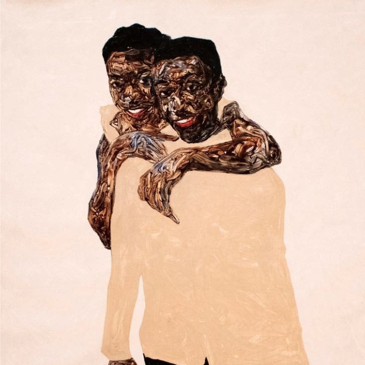
After witnessing a rare moment of playfulness between his siblings in 2019, Amoako Boafo decided to commemorate the moment in a portrait. Happy Siblings marks the first of Boafo’s paintings to include members of his immediate family.
Despite the portrait’s use of muted colors, Boafo still finds the painting to be joyful. Brightness, he says, does not equate beauty. Tune in to the eighth stop of the SAM-exclusive smartphone tour of Amoako Boafo: Soul of Black Folkson our SoundCloud to learn more about this work and how the artist incorporates his family into his art. Or, if you’re in the galleries, scan the QR code next to this work to access this and nine other recordings related to the exhibition. Soul of Black Folks closes this Sunday, September 10—get your tickets to see it at SAM’s downtown location before it’s too late!
Happy Siblings, 2019
NARRATOR: Boafo painted this portrait of his siblings in 2019.
AMOAKO BOAFO: It’s not often that I see them playful like that. So, when I saw it, I’m like, let me capture this moment and let me just put it down.
NARRATOR: The portrait was a way of including the artist’s family in his practice.
AMOAKO BOAFO: I wanted to find a way to get my family into my painting because they have an idea of what painting is, and they like what I’m doing, but they don’t really know much about it.
I mean, the thing is that they don’t come to the studio, you know, because they have other things to do, and they feel like when they come, they will disturb me, which I don’t think it is true; but instead of waiting for them to come around I want to go to them.
NARRATOR: Interestingly, for this joyful image, Boafo has chosen a muted paint color, buff titanium, for his brother’s shirt.
AMOAKO BOAFO: I don’t think it has to be bright to be beautiful. Because this color palette has a lot of white in the background, which is plain. So it gives it a lot of shine.
NARRATOR: It also makes a strong contrast with his siblings’ skin color.
AMOAKO BOAFO: You know, dark… dark helps with light.
NARRATOR: This image of light and joy is important for Boafo.
AMOAKO BOAFO: I have done a lot of paintings on my struggle. But then I had to change that for myself. I wanted to make my paintings the way I want people to see me, you know, I just wanted to show Blackness in a different way. Why can I not be Black and be happy?
– Lily Hansen, SAM Marketing Content Creator
Image: Happy Siblings, 2019, Amoako Boafo, oil on canvas, 63 x 63 in., Jesse Williams Collection.
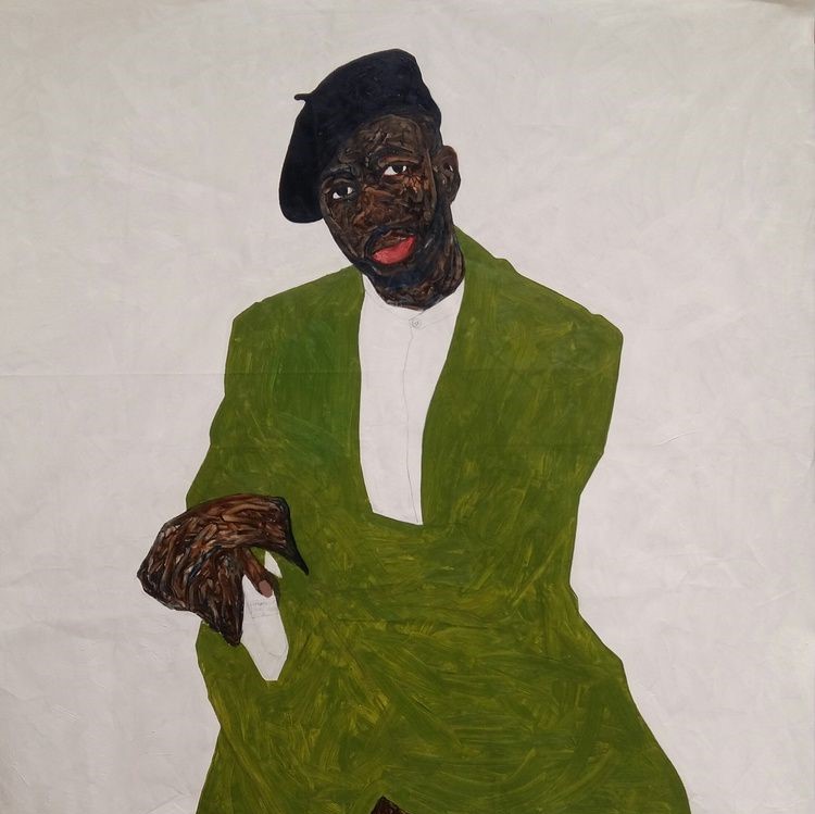
This 2018 portrait is of Steven Onoja, a well-known contemporary photographer and close friend to Amoako Boafo. Although Onoja typically finds himself behind the camera, Boafo asked the Nigerian photographer to take a chance in front of his canvas and allow him to paint his portrait. The result is an intimate painting that highlights Boafo’s early foray into sculpting the skin of his subjects through finger painting.
From his choice in clothing and facial expression, it’s clear Onoja is well-respected in his industry. This was a deliberate choice by Boafo. In discussing this painting on the seventh stop of the SAM-exclusive smartphone tour of Amoako Boafo: Soul of Black Folks, the artist explains how choices such as these inform the spirit and character of his subjects. Although viewers likely do not know Onoja personally, the way Boafo artistically depicts him gives you insight into the man he is.
Learn more about Boafo’s intentional artistic choices by exploring all nine stops of the exhibition’s audio tour on our SoundCloud. If you’re in SAM’s galleries, use your phone to scan the QR code accompanying select works to be routed to the adjoining recording. Soul of Black Folks closes in just a few weeks at SAM—get your tickets to see the exhibition before it closes on Sunday, September 10!
Steven Onoja, 2018
AMOAKO BOAFO: Steven is a photographer that I know. I like the kind of pictures that he takes; the way he poses; and just the way he carries himself; and I wanted to just capture that.
NARRATOR: As so often in Boafo’s work, fashion plays an important role.
AMOAKO BOAFO: Now you don’t know Steven, but in just the way he’s dressed, you can already sense who he is; and for me, fashion… it gives you a bit of the person and their character and their image and their spirit without you… or without them saying anything.
NARRATOR: The painting dates from 2018 and it gives an insight into Boafo’s evolving practice.
AMOAKO BOAFO: You can see clearly like this is an old painting, or early stages of me developing my language with my finger painting and my color palette, and you can tell this is all flat tones with just the face as the busy space.
NARRATOR: The flatness of the painted surface, together with the simplified forms, allow Boafo to incorporate abstraction into his art.
AMOAKO BOAFO: Figuration can also be abstraction in a way. You can see this is clearly a figure. But then you cannot really tell how the jacket is worn. You cannot tell from where the trousers and the arm of the jacket meets. I mean, I like the idea of painting figures and portrait because it tells a certain story that I like and I want to explore in that area, but that doesn’t mean that I don’t have or add a bit of abstraction to my work as well.
– Lily Hansen, SAM Marketing Content Creator
Image: Steven Onoja, 2018, Amoako Boafo, oil on canvas, 63 x 55 in., Courtesy of Derek Forjour Collection, New York City.
“We’re not just [that which] we’ve been visually assigned, there’s a lot more layers. And I think this exhibition offers that on a multitude of levels.”
– Larry Ossei-Mensah, Curator of “Amoako Boafo: Soul of Black Folks”
Larry Ossei-Mensah first introduced himself to Amoako Boafo in 2018 via a DM on Instagram. A friend of Ossei-Mensah’s, artist Kehinde Wiley, had sent him Boafo’s profile and thought they might hit it off considering their shared Ghanaian heritage. In 2023, Boafo’s debut solo museum exhibition, Soul of Black Folks, is touring throughout the US, with Ossei-Mensah serving as the exhibition curator.
A few days before the exhibition opened its doors at the Seattle Art Museum in July, we sat down with Ossei-Mensah to discuss what drew him to Boafo’s artwork, the collaborative process they shared in developing Soul of Black Folks, and what he hopes viewers take away from encountering Boafo’s powerful finger painted portraits in SAM’s galleries.
Watch our interview with Ossei-Mensah above, then get your tickets to see the exhibition at SAM before it closes on Sunday, September 10!
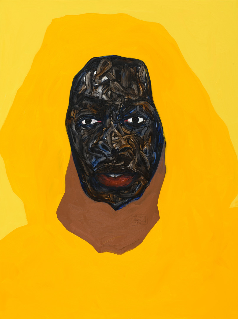
Before entering the galleries of Amoako Boafo: Soul of Black Folks at SAM, visitors are greeted by a 2020 portrait of contemporary fashion designer and stylist Jean Jacques Ndjoli. Hanging amidst a wall covered in Boafo’s well-known Monstera plant print, the portrait offers an introduction to the artist’s signature style with its vibrant yellow hues and the apparent use of his distinct finger painting technique.
Learn more about this artwork and eight more of Boafo’s portraits by tuning in to our free smartphone tour of the exhibition on our SoundCloud. Or, if you’re in the galleries, scan the QR code accompanying each work to be directed to the relevant stop on the tour. The exhibition closes Sunday, September 10—get your tickets to see it before it’s gone!
Jean Jacques Ndjoli, 2020
AMOAKO BOAFO: This is a painting I did in LA [where] it’s sunny all the time. You know, you are guaranteed to get your fresh pressed orange juice.
NARRATOR: To capture that mood, the artist focuses on one color.
AMOAKO BOAFO: You have three shades of yellow. So, the overall pullover is the cadmium yellow hue, and then the background, I tinted it with white, and then I added a bit of brown to the yellow hue to have that inner pullover.
NARRATOR: Boafo is a figurative painter. In other words, he paints recognizable figures and objects. But this image goes beyond straightforward representation. The flat, simplified forms of the hooded pullover become abstract areas of color.
They also create a strong visual tension with the thickly finger-painted skin of the face.
AMOAKO BOAFO: I think of colors that, you know, just highlight the face and the figure.
NARRATOR: The important thing for Boafo is to elevate and celebrate his characters.
AMOAKO BOAFO: I consciously think about how to elevate the characters and place element or colors that only elevates them or complement them and not compete and take away from them.
I think the thing with celebration is that we don’t do it that often, and I think it would be good that we celebrate others more often: for people to know that we see what they are doing, and they are appreciated and noticed for what they are doing.
– Lily Hansen, SAM Marketing Content Creator
Image: Jean Jacques Ndjoli, 2020, Amoako Boafo, oil on canvas, 40 x 30 in., Collection of Josef Vascovitz and Lisa Goodman, courtesy of Roberts Projects, Los Angeles.
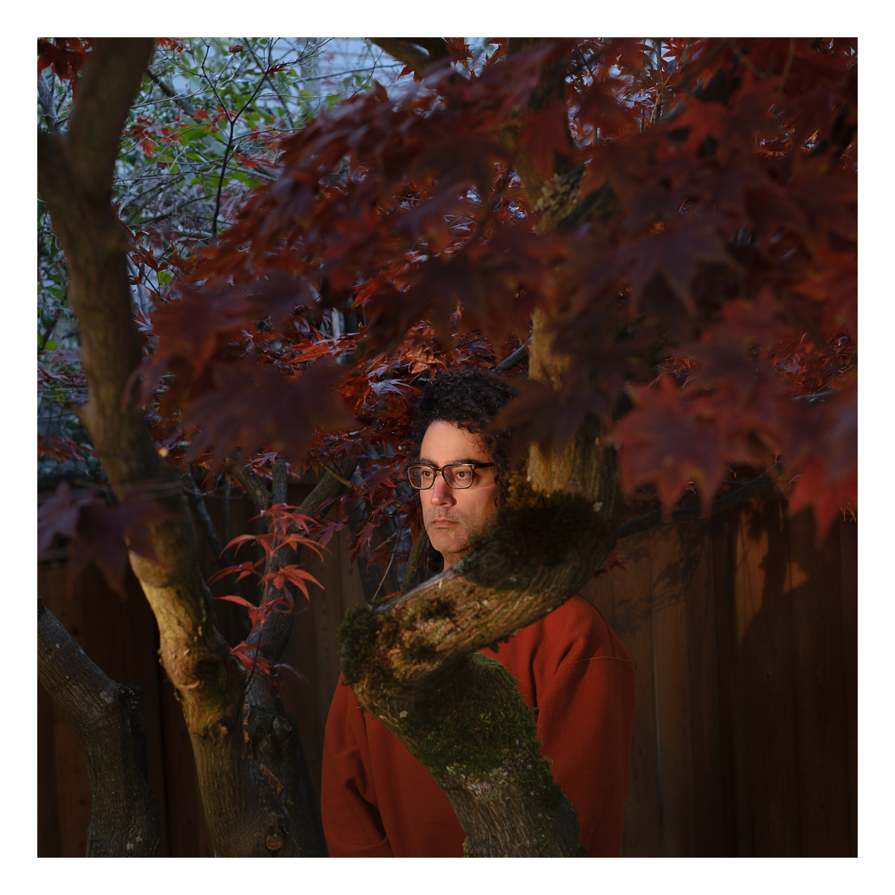
SAM’s photographers are getting in on the fun of SAM Photo Club too! While Dawoud Bey & Carrie Mae Weems: In Dialogue(November 17, 2022–January 20, 2023) is on view at SAM, we’re announcing photography submissions to three of the defining motifs of these legendary photographers’ artistic careers: self-portraits, street photography, and family & community.
Submissions to our first theme, self-portraits, are now open and will close this Friday, December 9. As we continue to round up submissions received from SAM’s Instagram community, we’re taking this time to highlight a few self-portraits by SAM staff photographer Alborz Kamalizad and asking him to share his favorite portrait by either Dawoud Bey or Carrie Mae Weems.
Self-Portrait, 2022
For me, self-portraiture is a strange photographic endeavor — in order to make a self-portrait a painter or sculptor doesn’t (and can’t) physically get out in front of their own art-making process like a photographer can (and has to). I’ve never tried to make self-portraits before so the #SAMPhotoClub presented a good reason to try. It was a daunting task at first, so I decided to think of a theme to bounce off of to help me get started.
I’ve recently relocated to the Seattle area from Los Angeles so where I am physically and the idea of “home” is top of mind. I’ve also been working on a separate photo project that has to do with our relationship with, and distance from, the natural world. With those two broad ideas in mind, an off-camera flash, and a self-timer on the camera shutter, I created these.
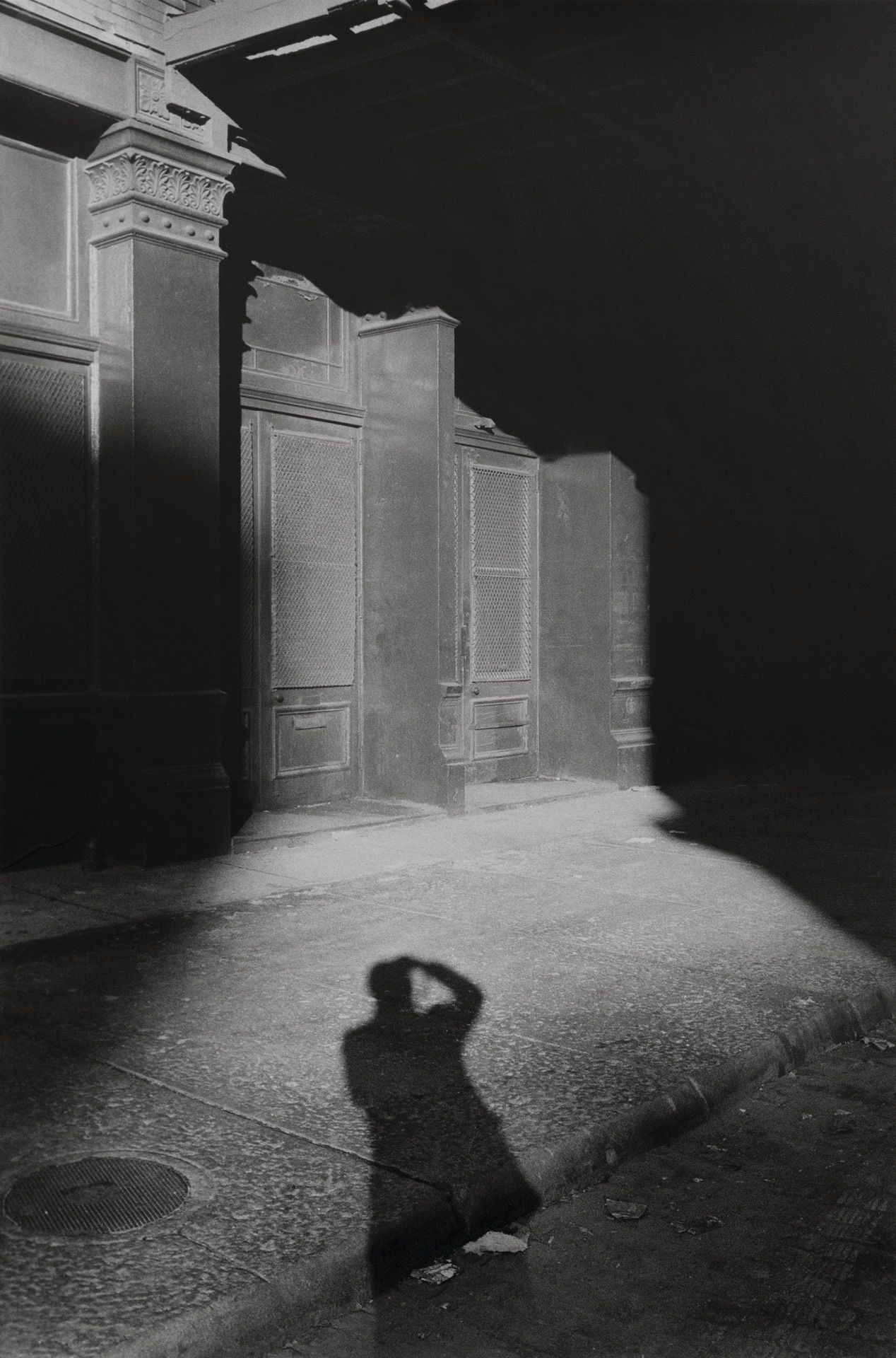
Self and Shadow, New York, NY, 1980,Dawoud Bey, 1980
It’s reassuring that probably everyone who’s ever had a camera in their hands has at some point taken a picture of their own shadow. These photographs aren’t only self-portraits, they also capture the presence of the camera, where the person is, and the sun. All are in perfect physical alignment.
Alborz Kamalizad (he/him) is a visual artist who moves between photography, animation, documentary filmmaking, and illustration. He was born in Iran, raised in the US, and currently works as a staff photographer for the Seattle Art Museum. As a visual journalist and photographer, his work has been featured by Los Angeles’s NPR affiliate, Mother Jones Magazine, the United Nations, The Nature Conservancy, MasterClass, and the Getty.
Join #SAMPhotoClub by sharing your own self-portrait on Instagram and tagging us through December 9. Every week, we’ll share a few of the photographs we’ve been tagged in on our Instagram stories. Stay tuned as we announce submissions for our next two themes—street photography and family & community photography—in the coming weeks.
“The story that’s happening right now is we are in a struggle to be more human.”
– Barbara Earl Thomas
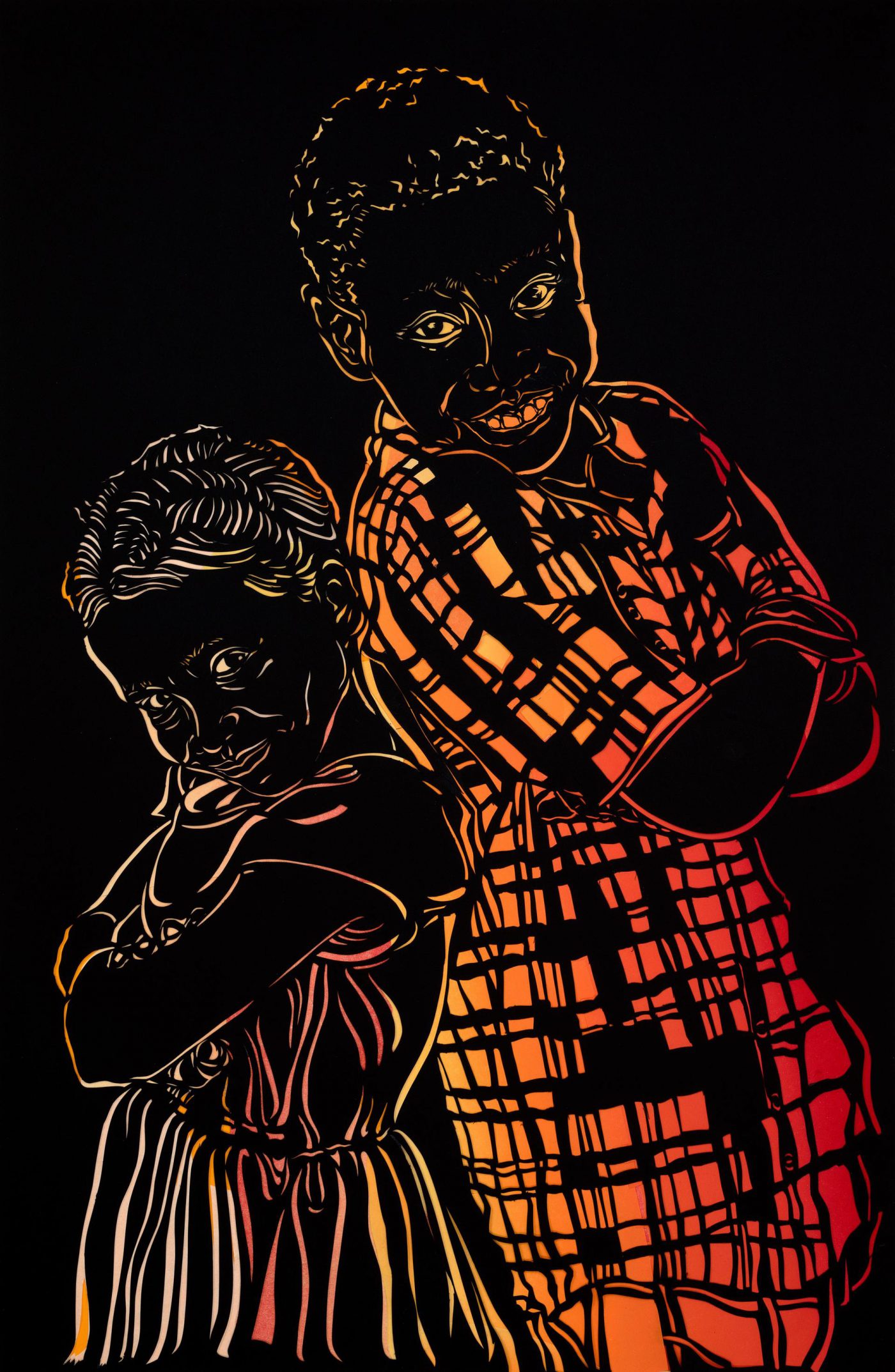
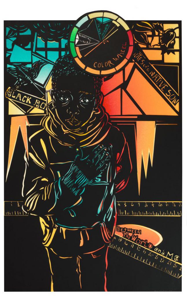
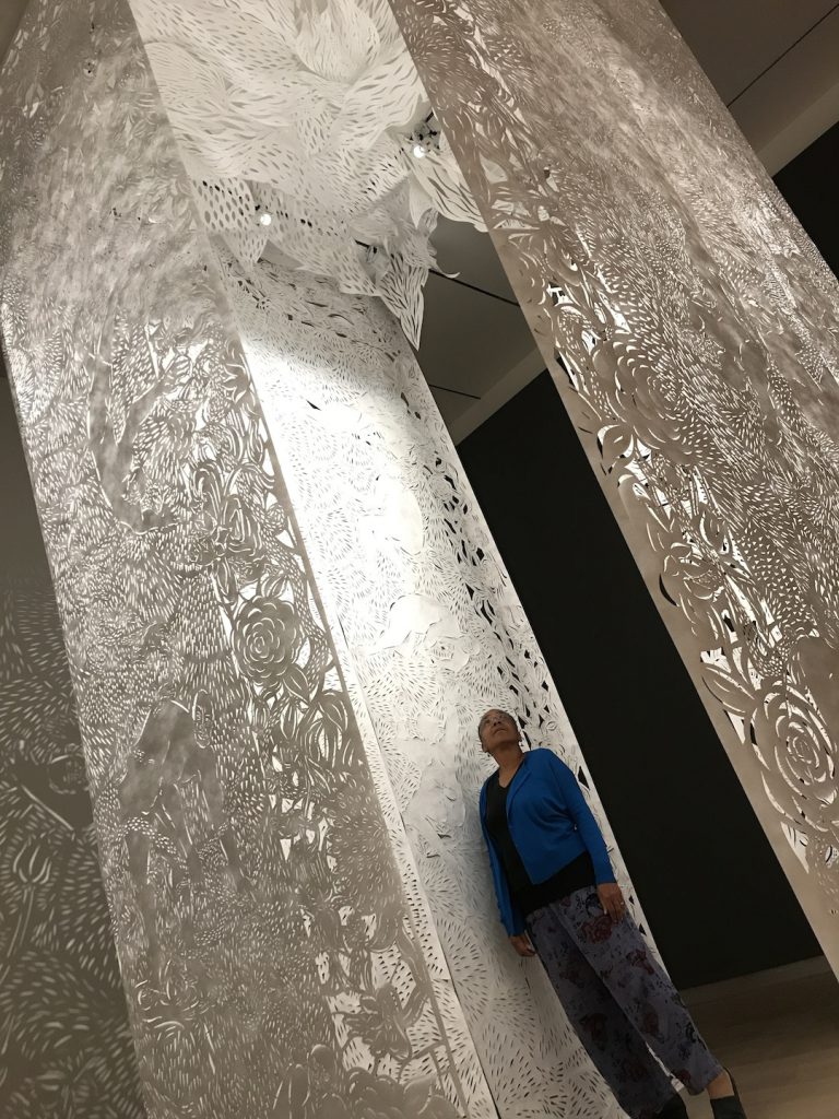
For more than a year, SAM visitors were mesmerized by the intricate and detailed cut-paper artwork of Seattle-based artist Barbara Earl Thomas in The Geography of Innocence. On the final few days of the installation, SAM sat down with Thomas to discuss how her breathtaking installation came together.
Watch this video to learn about the importance Barbara placed on bringing light into her work, her experiences working with children as models, the story behind the catechism in the installation, and the lessons she hopes her portraits impart.
Barbara Earl Thomas: The Geography of Innocence, which will be on view for a year at SAM, centers Black youth in a series of all-new artworks at once delicate and resilient. This Seattle-based artist uses cut-paper and glass portraits and transforms an entire gallery into a luminaria. A place for reflection, the works cut to the core of the fundamental values we assign to light and dark. The disarming expressions of children in Thomas’ portraits ask us to consider how we see each other and how we internalize and project innocence and guilt. Drawn from a community of family and friends, The Geography of Innocence celebrates young lives and their futures in full consciousness of the pervasive violence against Black children. SAM’s Jon and Mary Shirley Curator of Modern and Contemporary Art, Catharina Manchanda interview this important artist in anticipation of the upcoming exhibition. Tickets to visit the galleries will be available starting November 1!
Catharina Manchanda: Biblical narratives form the backdrop of many of your works, and you bring the symbolism of light and shadow to bear on the political situation in this country. What narratives do you explore in The Geography of Innocence?
Barbara Earl Thomas: It’s the two-way mirror through which I see the world. It’s narrated to me in my grandmother Phoebe’s voice with whom I often spent the weekends and summers; where at each exit to the bathroom, kitchen, or bedroom, she’d say, “I’ll be right back, God willing.” This set a tone for the temporality of each moment of this life as she moved through her day. Her God ruled every moment and was the reason for everything good. The devil, his dark wily opposite, was the root of all evil. She loved and admonished us in those terms. Everything was literal. When I misbehaved, the devil had gotten into me. This meant I was not quite responsible for my misdeeds, but in some moment of inattention, I’d let down my guard, and admitted the demon who caused me to climb that tree and fall out, or say some bad words to my cousins who were also full of devils. She reminded me that hell was paved with hot stones, filled with fire, and it came out of your eyes, nose, ears, and mouth. I saw this, clear as day. My grandfather admonished her because he knew by nightfall, I’d be so crazed with this idea of the devil, that instead of sleeping on the couch, I might have to sleep with them. These were some of my first stories heard, sung, and repeated. They formed the backdrop of beauty and mystery of my world.
As a young person I was drawn to the oratorical language of the sermon and its talk of miracles and prophecy—none of which I’d seen. It was the music I listened to, the silences from the adults as I entered the room, and the ladies who prayed over me when I was sick. The ritual and the shape of sanctuary no matter the denomination—Catholic, Jewish, Baptist, Lutheran and Evangelical—was all the same to me. I’d wander into Holy Names Cathedral just off Union Street, or accompany a friend to one of the many Pentecostal churches often set up in temporary store fronts, fleeting in their residence. During these services accompanied by full bands, there were people who sang as each member became possessed by a holy spirit. There were the Jewish people walking to synagogue on Saturday. All these places in my small world were little fires of community where deep emotion and imagination converged. There were stories, food, songs, candles, holy water, and scenes of strange happenings from some mythical past about some next world.
I was intrigued by the language and cultural references around how we describe victims when we think and speak about the violence so prevalent in our country. There is something of heaven and hell to this: violence spirals down from police shootings of young Black men, to nightclub massacres, to random sniper killings of the oldest and then to the youngest among us, our children. I thought, this is where it will stop, with the children. Certainly every adult will draw the line when it comes to the wholesale slaughter of children. Sadly, that was not the case, but what emerged for me from the myriad mass shootings—with Sandy Hook most notably—was the language around sympathy, guilt, and innocence. In thinking about why we as adults couldn’t put children first, I was drawn to studies that demonstrated how we, as a culture, see our children. Here young Black children are seen as less innocent and, therefore, less worthy of public grief than white children.
My ideas for this exhibit surfaced after several readings of Junichiro Tanizaki’s In Praise of Shadows and a subsequent re-reading of a mid-1980’s James Hillman essay, Notes on White Supremacy. Prescient in its content, Hillman explores the deep-seated world of mythology around the concepts of light and dark, black and white. As I’d read the essay so long ago, I’d forgotten Hillman’s reference to Tanizaki’s book. It was a happy connection. Both the book and essay deal with how deeply imprinted our associations with language and its usage of the words and concepts are associated with darkness and light. From guilt to innocence they hold a deep well of our associated fears of the unclean and besmirched. Conversely, we associate light and white with all that is pure, clear, clean, and, therefore, innocent and unblemished.
Light and dark. Light and shadow. What is seen and unseen. What is clear and what is mystery—these kinds of experiences are part of my story in addition to my formal education. This is the base that provided the vocabulary and shaped my narrative of the world. As a Black person, I can’t help but see myself in the landscape and imagine how others might experience me based on how I appear to them. I search myself to see how I react to and employ my thoughts and opinions, because aside from being Black I’m also human and subject to the world’s influences.
In this new body of work, I use multiple images of Black children: bold, frontal, and almost life size, so that their faces engage the viewer. In my cuts, I explore youth and its innocence imprinted in and on the subjects’ expressions. I purposefully insist on this particular view and stance because it’s not the one most given to us often in the media or popular culture. The backgrounds may hold contrasting stories that compete with the figures and their stance—the push and pull of the opposites; the yin and yang.
CM: Elsewhere you noted: “I create stories from the apocalypse we live in now and narrate how life goes on in the midst of chaos.” This statement is acutely felt right now—can you talk about it in relationship to the work that will be on view at SAM?
BET: As a child of the ‘60s and ‘70s, now as then, there was much ado and action around issues of inequity. The utopian movements that sprang up were numerous. Like formal religion, these communities and/or cults were created as foils to the many disasters life holds. We are afraid and terrified; there is nothing new in that. We construct magic circles and ritual movements to distract and protect ourselves from floods, storms, fires, famines, diseases and yes, now plagues. It is my observations and my experiences that interest me, so like a good witness I note, record, and echo back to my viewer my literal experience of the world through visual stories.
CM: You call yourself “artist, writer, thinker.” We also know that you are an engaged reader. How does your reading and writing practice inform your visual work?
BET: Reading is life. As an active reader I’ve always used literature and all of my reading to inform my world. I read and write to get at truth and to clarify my own thought process. It’s easy for me to talk about my thoughts and correct or rephrase as I go. There is something about being in a room and engaging in a conversation that can make even confused thought processes sound plausible. But when I write I am forced to create clear sentences and connect thoughts and see if they hold water. When I read, I’m looking for the rigor and willingness in the author to think things all the way through. Writers like James Baldwin, August Wilson, and John Edgar Widman are American writers who do that for me. Poets like Pablo Neruda and Rilke capture truth in a nonlinear image condensed. Most recently, I’ve been reading Colin Thurbron’s travel writing, Pico Iyer, and rereading Robert D. Kaplan. I love good travel writing as it is a way to see the world through others’ eyes and be in other parts of this world without traveling. What all these authors share is clear thinking and hard truth telling, which is something I demand of myself in my own work.
CM: You are making a lot of new work for the exhibition, which include different kinds of processes. Would you tell us about the use of the negative space in your paper cuts (you say you draw with the knife!) compared to the wall hangings?
BET: The negative space allows the light to shine in contrast. It heightens the experience. When paired with the positive it creates shadows and mystery. The concept demonstrates that both are needed to create the particular magic that is this story. Both positive and negative space are needed to create a world that exists as sculpture in the round—one that is not flat or one-dimensional. Both are needed to create the emotional response that I seek. When people are surrounded, they are forced to surrender their senses for a moment.
CM: You are pairing your cut paper works with illuminated glass panels for the installation at SAM, what prompted you to pair these in the two adjacent galleries?
BET: I think of this exhibition as one installation made up of several parts. Each separate element has its role in the installation of the paper-cut portraits. Most of the figures are inspired by children of friends and neighbors, some are random portraits I’ve found. All are chosen because there is a way for me to show the part that I think is missing in many of our depictions of the innocence that lives in and marks the dark face of a child. I’m creating a space that holds the viewer in light and shadow to demonstrate something about illusion and how our imagination creates the monsters in the shadows even when there is nothing there. In this case I’m cutting the beautiful from the darkness and placing viewers in the shadows to make them a part of the world they observe. The portraits are cast as precious objects, surrounded by what feels like sacred objects—my candelabras. The hand-cut wallpaper is designed to create fountains of movement as the viewer is invited to the suspended centerpiece, Bodies in the Matrix.
Images: Siblings, 2020, Barbara Earl Thomas, American, cut paper and hand-printed color backing, 40 x 26 in., Courtesy of Claire Oliver Gallery, photo: Spike Mafford. Color Wheel, 2020, Barbara Earl Thomas, American, cut paper and hand-printed color backing, 40 x 26 in., Courtesy of Claire Oliver Gallery, photo: Spike Mafford.
In honor of Women’s
History Month, Object of the Week will highlight works by celebrated women
artists in SAM’s permanent collection throughout the month of March.
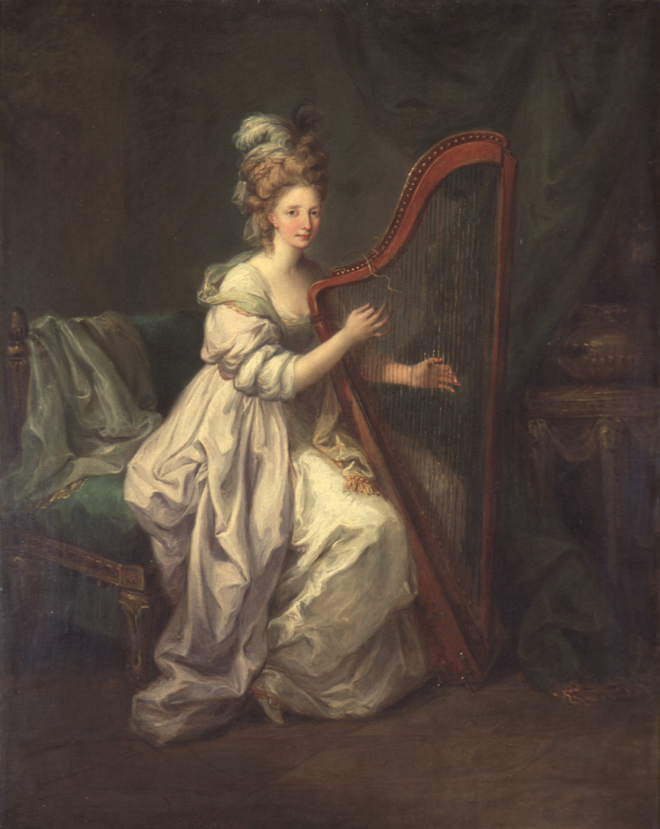
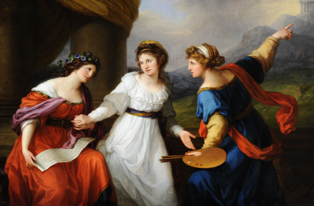
Angelica Kauffman (1741-1807) was born in Switzerland, but she traveled extensively throughout Europe in her early life. She started painting by assisting her father, a muralist, but she was somewhat of a child prodigy who quickly developed her own career as a history painter and portraitist, which soon supported both her and her father. At age 25, she moved to London, where she made such an impact on the arts community and market that a contemporary quipped, “The whole world has gone Angelica-mad.”[1] At age 27, she was elected as one of two female members of London’s newly-formed Royal Academy of Arts (RA). Kauffman’s trademark was to put female subjects first and foremost, and she often used her own likeness. Her Neoclassical personifications of art were more than the inert Renaissance damsels commonly used: they were women artists (see Self-Portrait Hesitating Between the Arts of Music and Painting below). Pretty impressive stuff.
Self-Portrait Hesitating Between the Arts of Music and Painting
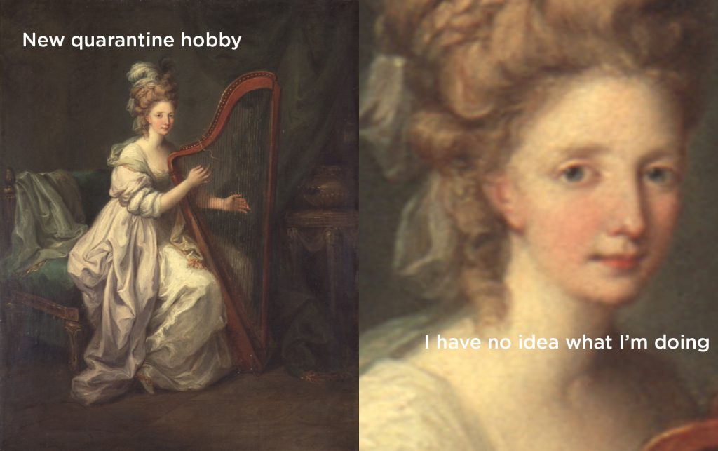
But even knowing this illustrious resume, the feeling that pervades this possible self-portrait Woman Playing a Harp (ca. 1778) is one of uncertainty. The woman’s fingers seem too hesitant to be making any sound, and her eyes telegraph a wariness of her audience. My reading could be influenced by the strange times we currently find ourselves in, but I don’t think it’s just me. A Seattle Art Museum staff member, working from home, gave this painting new life as a quality art meme.
The more I looked into Angelica Kauffman’s work, the more I witnessed refreshing moments of “un-confidence.” Just look at Self-Portrait Hesitating Between the Arts of Music and Painting (1791). Kauffman was a talented cellist and singer, and as a young woman she was torn between a career in painting and one in the opera. This self-portrait honestly portrays the common agony of having to choose a life path, decades after Kauffman chose painting. Many women today can likely identify with this feeling: you can be London’s finest hostess, speak five languages, take the art world by storm, and still feel completely unsure and inadequate sometimes. And that’s okay.
Admittedly, there are benefits to being multi-talented. Kauffman was commissioned not only for portraits and history paintings, but also for decorative work that adorned some of England’s greatest estates. However, her practice was not easily categorized in a culture of male super-painters, and this brought its own challenges. In the words of painter and Kauffman scholar Sarah Pickstone, “She was so flexible as an artist, making furniture decorations, ceiling decorations, that when the Victorians came along, they dismissed her as a purely decorative artist, and I think that can sometimes happen to women’s work.”[2] Kauffman’s history as a founding member of the RA was largely erased after her death, and over a century passed before the academy elected any more female members.[3]
Kauffman’s legacy has started to shift, however, as creative
historians have come to appreciate her complex life and practice, including
those “feminine” decorative arts. It follows a promising trend toward women
being valued for their professional activities and qualities outside of a patriarchal
framework. The RA is bringing Kauffman back into their history by planning a
major exhibition of her work for Summer 2020. Though it may likely be postponed,
as the museum is temporarily closed due to the coronavirus, that’s just another
uncertainty we will have to embrace.
Images: Woman Playing a Harp, ca. 1778,Angelica Kauffman, oil on canvas, 34 7/8 x 27 1/4 in., Gift of Mrs. Lew V. Day in memory of her husband, 66.63. Self-portrait of the Artist hesitating between the Arts of Music and Painting, 1794, Angelica Kauffman, oil on canvas, 70 x 98 in., Nostell Priory, West Yorkshire
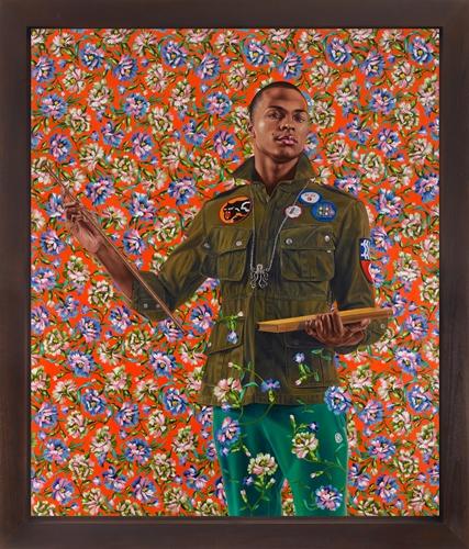
An ingenious interpreter of grand Western portraiture traditions, Kehinde Wiley is one of the leading American artists to emerge in the last decade. This spring, the museum acquired the artist’s most recent work.
Since ancient times the portrait has been tied to representations of power. Wiley’s paintings are highly stylized and staged, and draw attention to the interplay between a history of aristocratic representation and the portrait as a statement of power and the individual’s sense of empowerment. For this canvas—based on a Jean-Auguste-Dominique Ingres stained glass window depicting St. Anthony of Padua—Wiley asked a young man in New York to be his model. The formal pose contrasts sharply with the man’s contemporary street clothes, objects and emblems, including a Black Panther patch.
As the newest PR intern, it is slightly embarrassing for me to say that I have never been to SAM Remix, but this March 8 will be my very first time. As disconcerting as my lack of experience may be, I have made up for it with enthusiastic research and comprehensive interviews, which I believe present an authentic representation of the evening. It is my deepest desire that the following information may help other Remix newbies better prepare themselves for the upcoming SAM Remix. Read More