Poke in the Eye Object Spotlight: American Gothicware
Poke in the Eye: Art of the West Coast Counterculture is now on view at SAM! This homegrown exhibition features 87 ceramics, sculptures, paintings, and drawings from SAM’s collection—some of which are being shown for the first time. Throughout the run of the exhibition, we’ll be periodically sharing insight on a few of the eclectic artworks on view. Stay tuned for more object spotlights to come.
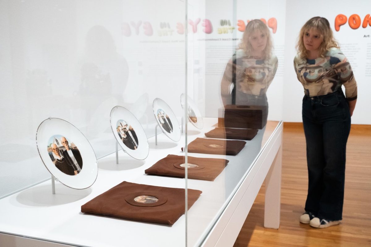
Howard Kottler’s American Gothicware from 1972 spoofs the well-known painting by Grant Wood, American Gothic, made in 1930. By placing a decal of the image on four plates and adding his own twist to each one, dinnerware becomes Gothicware à la Kottler!
During the start of the Great Depression (1929–1939), Grant Wood painted this now-iconic couple (the models were actually Wood’s dentist and sister) looking somber and proper in front of their farmhouse. Many viewers interpreted Wood’s painting as satire of older generations and outdated traditional values, while others saw it as a reflection of the resilience of farmers like these in the face of tough times. Since then, this painting has been parodied and reproduced in many forms, symbolic of one particular view of what it means to be an American.
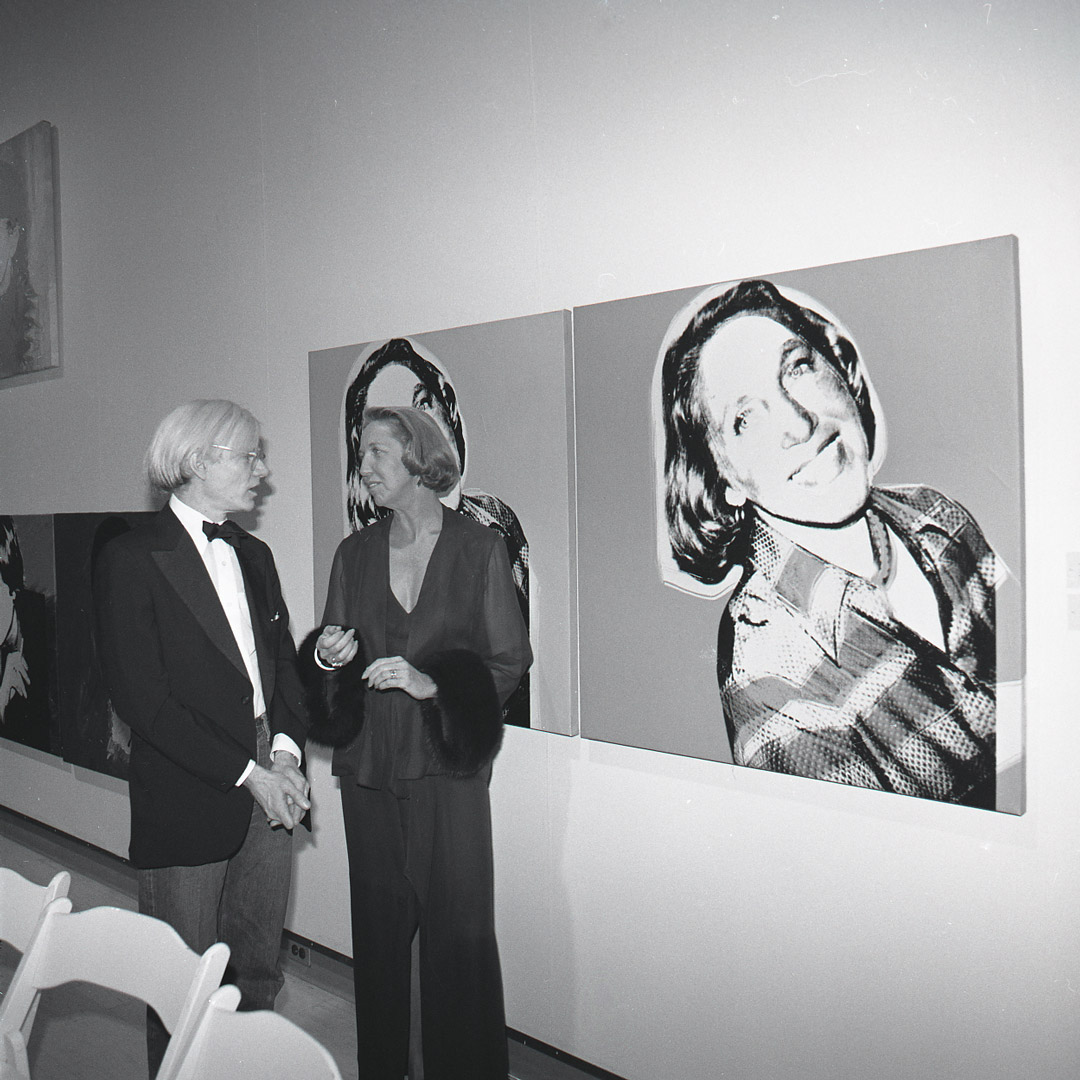
Howard Kottler, working 40 years later, was a ceramicist in Seattle who taught at the University of Washington. Kottler was inspired by Pop Artists like Andy Warhol who experimented with reproducing famous images from pop culture and the art world. After World War II when the American economy was booming, artists were fascinated with the way that consumer goods and images could be mass-produced and identically replicated. Along with that, artists were also drawing from earlier movements like Dadaism and the idea of the readymade to challenge hierarchical definitions of art.
Kottler decided to use an everyday material that one could easily overlook, ceramic dishware, to bring politics to the table. American Gothicware conveys Kottler’s subversive attitude toward American life by altering Grant Wood’s painting across four plates: Look Alikes, Personal Possession, American Minstrels, and The Silent White Majority. Each plate offers a visual confrontation of the original painting by Wood and with it mainstream American values.

Look Alikes duplicates the man’s face and places it on the woman’s body, transforming them into a gay couple of sorts, or identical twins. In Grant’s painting, each character is strongly associated with their gender roles—the woman in her apron with houseplants on the porch behind her indicating her role as caretaker of the home, while the man is in overalls and a coat, holding a pitchfork and aligned with the red barn over his shoulder. While their stern expressions already made these two look alike, Kottler adds ambiguity about gender and the relationship between the characters. Kottler himself was a gay man and often included these questions and hidden meanings in his artworks.
In Personal Possession, a painted landscape seeps into the bodies and faces of the two characters, covering everything except their facial features and hair. Their skin is the color of the sky and their clothes have been replaced by a forest scene with some signs of human development: a bridge in the background and a tunnel to the right. The pioneer settlers who took the land as their own personal possession now wear the land as part of their clothes. It has become part of their identity as farmers who tend the land, but Kottler seems to ask if it was ever theirs to claim, critiquing the history of Manifest Destiny that is often taught in US history.
American Minstrels also delves into more unpleasant parts of American history. This image subtracts color from the skin of the two farmers to make them appear as white as the plate itself, making their whiteness literal. The title implies this could be seen as whiteface, an inverse of blackface minstrel shows wherein white performers would dress up as Black characters and parody their speech and behavior. Black performers would also participate in these minstrel performances, exaggerating their differences from white society. Minstrel shows were popular entertainment throughout the 1800s and perpetuated stereotypes that still linger today. Kottler’s reference to minstrels leaves the work open to more questions—what is being performed here and in the original American Gothic?
The Silent White Majority also critiques whiteness in America, co-opting a phrase that President Richard Nixon coined in 1969 for the American voters who did not vocally join in the counterculture and political discourses surrounding the Vietnam War. Here, the pair’s faces are mask-like with white covering the mouths but leaving their eyes and noses exposed. Their literal whiteness again calls attention to race, but even in their silence, they have power as a majority to influence politics in their favor, maintaining the status quo.
By modifying the recognizable symbol of Grant Wood’s American Gothic, Kottler subverted and questioned prevailing ideas about American identity in terms of gender, sexuality, race, and national history. Alongside these political messages, American Gothicware challenges the medium of art too, transforming the humble ceramic plate into an artwork that offers a visual and conceptual feast
– Nicole Block, SAM Collections Associate
Photos: Alborz Kamalizad.