How SAM’s Interpretation Team Brought Poke in the Eye to Life
Have you ever wondered who creates interactives at SAM? Hi! We’re Emily and Ramzy and we design interpretive experiences at all three of SAM’s locations. We work on SAM’s Interpretation team which creates educational in-gallery experiences designed to spark creativity, connect visitors to the art, and share dynamic storytelling.
We hear from visitors regularly that they are hungry for more opportunities to interact with the exhibitions on view, learn about the art in our galleries, and show off their creativity. We considered Poke in the Eye: Art of the West Coast Counterculture to be the perfect opportunity to pull out all the stops and create a cohesive suite of interpretive offerings that further explore the exhibition’s themes. In close collaboration with Carrie Dedon, SAM Associate Curator of Modern & Contemporary Art and the exhibition curator of Poke in the Eye, and Justin Scoltock, SAM Exhibition Designer, we developed four interpretive offerings: a ceramic touch table, a counterculture response wall, a hands-on art activity, and rotary phone audio guides.
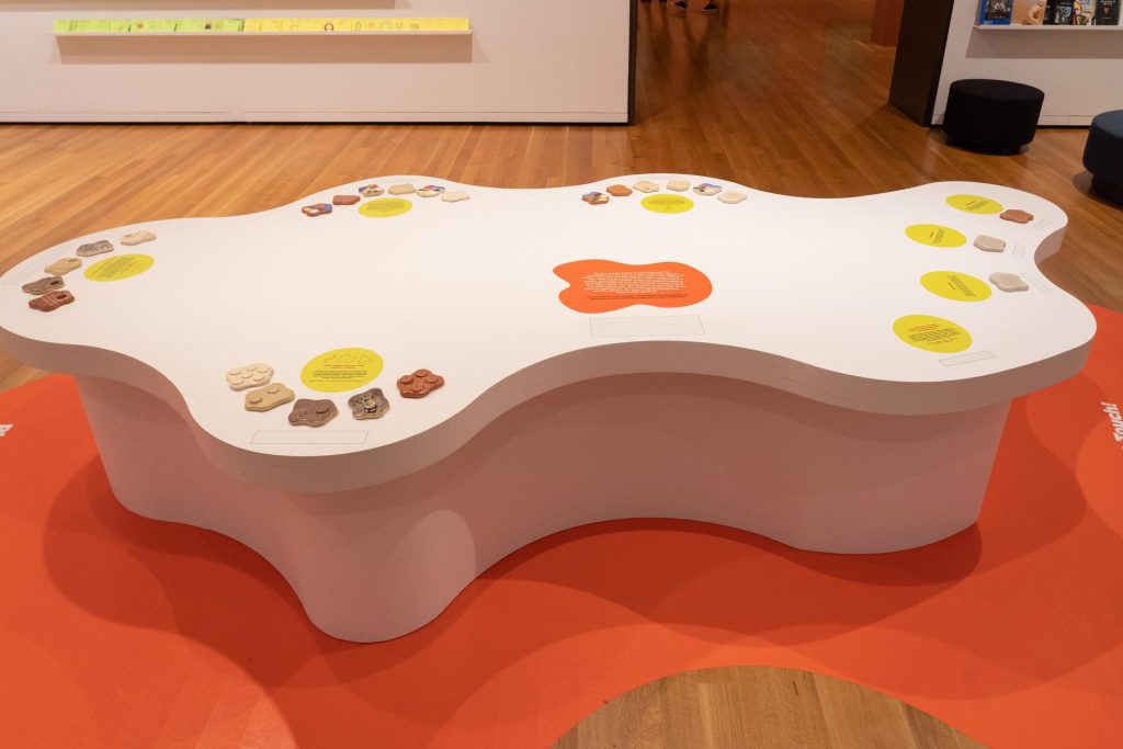
Ceramic Touch Table
How many times have you been in an art museum and thought “I wanna touch that”? For the average art museum, encouraging visitors to touch is a rarity. Making museums multi-sensory allows visitors to show up as their whole selves, ensuring museum-going can be more memorable, educational, and welcoming to all.
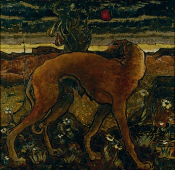
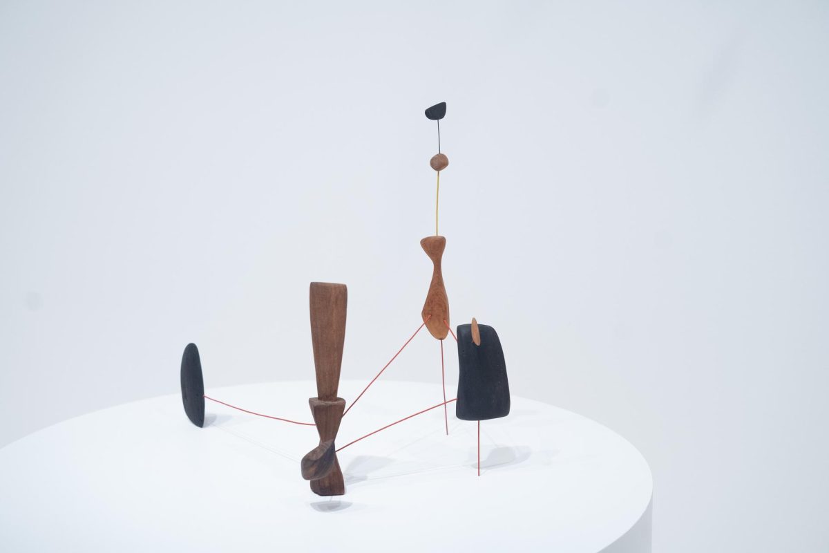
Since Poke in the Eye focuses so heavily on ceramics, we wanted to ensure that people had the chance to experience all the shiny, globby, sharp, and rough textures that make the ceramic works what they are. This led us to develop the centerpiece of the interpretive gallery space: a giant blob-shaped table we affectionately call the “touch table.” The table features 25 samples covering the various stages of the ceramics process, all with completely different textures, colors, and glazes, that any visitor can walk up and touch.
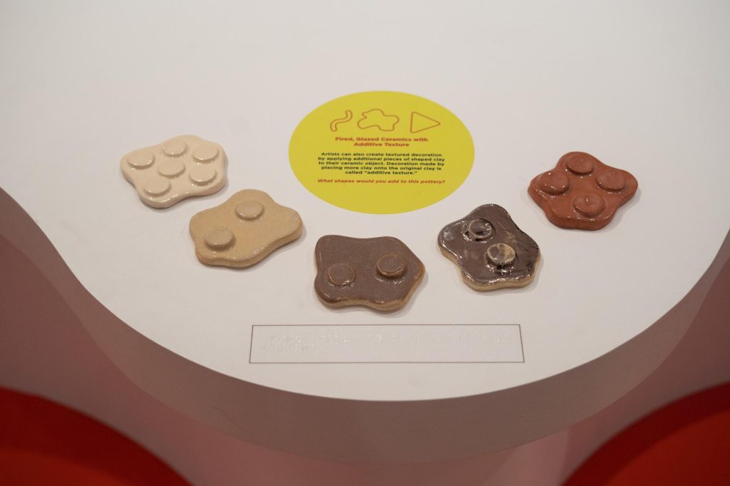
To guide visitors as they touch, we wrote accessible didactic signage to accompany each type of ceramic. This presented a natural opportunity to try something new for SAM: incorporating braille labels into the galleries. We hope this is one small step of many toward SAM’s progress in making art and interactives more accessible.
So far, it has been clear that people simply love to touch stuff. Visitors respond with visible and often audible joy when they see the words “please touch” in the galleries. There’s also a huge variation in how people engage with this table. Some read every word of the educational signage, some talk out loud with a friend about the different textures they’re touching, and others don’t read any signage and just touch the ceramics. Any of the above is fine by us!
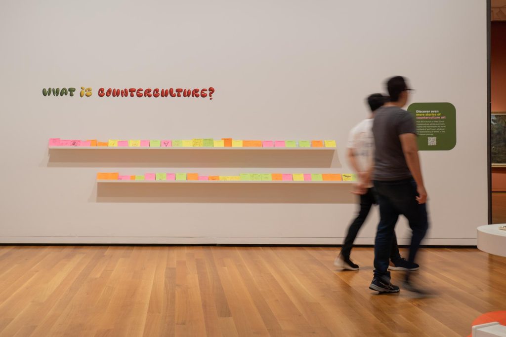
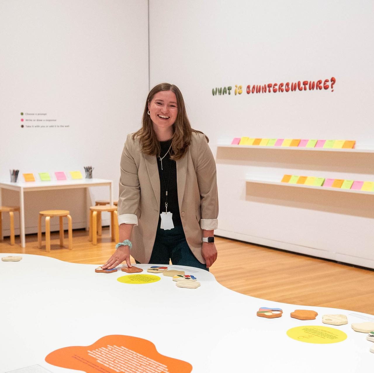
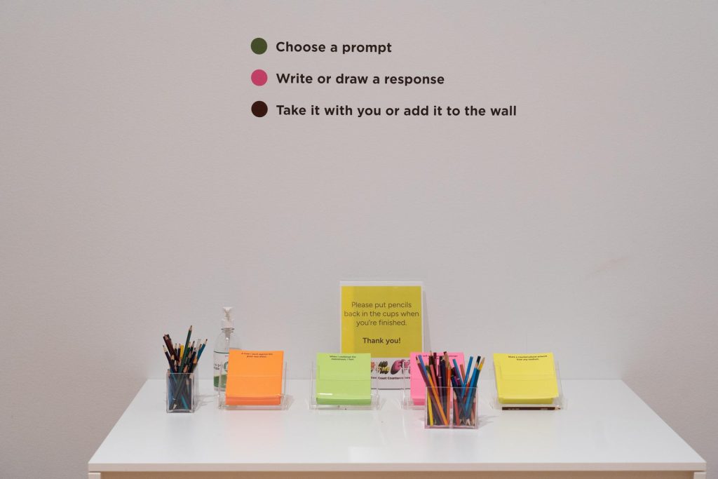
Counterculture Response Wall
We knew the interpretive space wouldn’t be complete without an opportunity for visitors to express themselves and share their ideas. Counterculture is a key throughline of the exhibition, and we wanted to give visitors a chance to understand the concept more concretely by making it personal and related to their own lives, not just as an abstract idea from the 1960s and 70s. After selecting one of four prompt cards about counterculture, visitors can respond however they’d like using colored pencils: with words, with illustration, or most popularly, a mix of both.
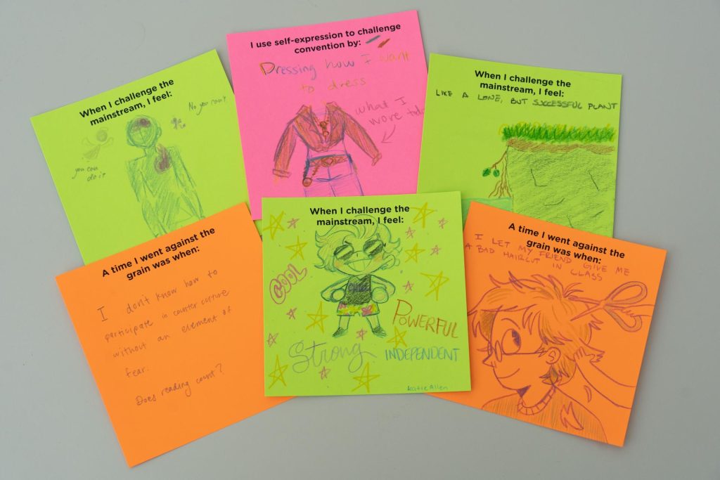
An unexpected but welcome outcome of this interactive is how much visitors love reading other visitors’ responses. Any time we pop into the interpretive space, we’re bound to see visitors looking at others’ responses and pointing, smiling, or remarking on the ideas, impressive illustrations, or multiple languages they see on the shelves. We’ve been blown away by the creativity that people are exhibiting in their responses to these prompts.
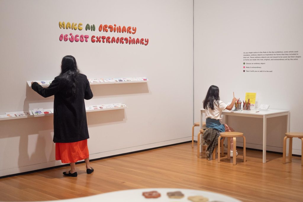
From Ordinary to Extraordinary Art Activity
Expressing yourself conceptually in response to a prompt is a great way to share your personal connection to the exhibition’s themes, but why stop there? We know that a dose of creativity is powerful for both learning and well-being, so we wanted to provide a more visual opportunity for visitors to create.
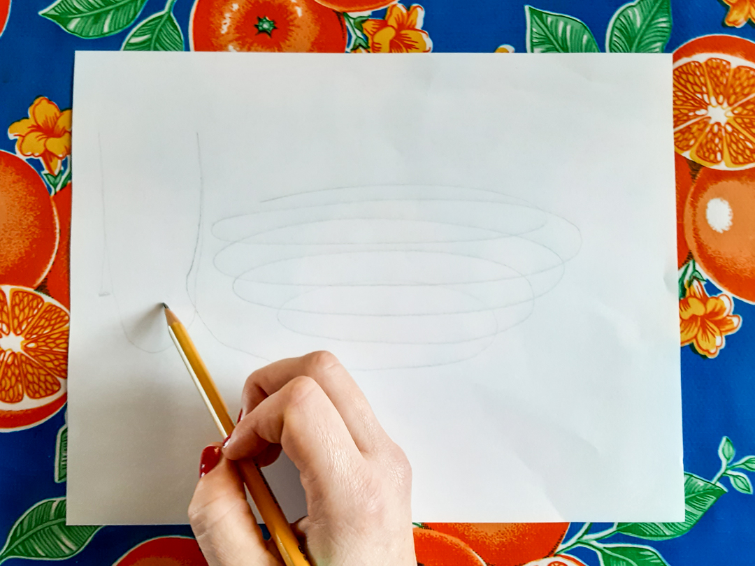
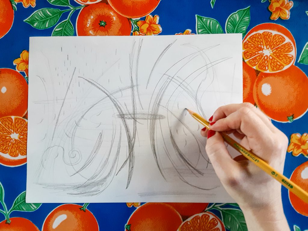
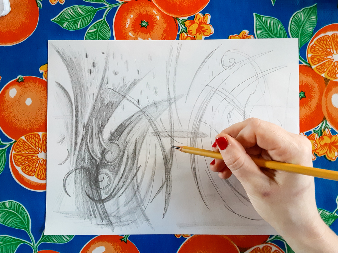
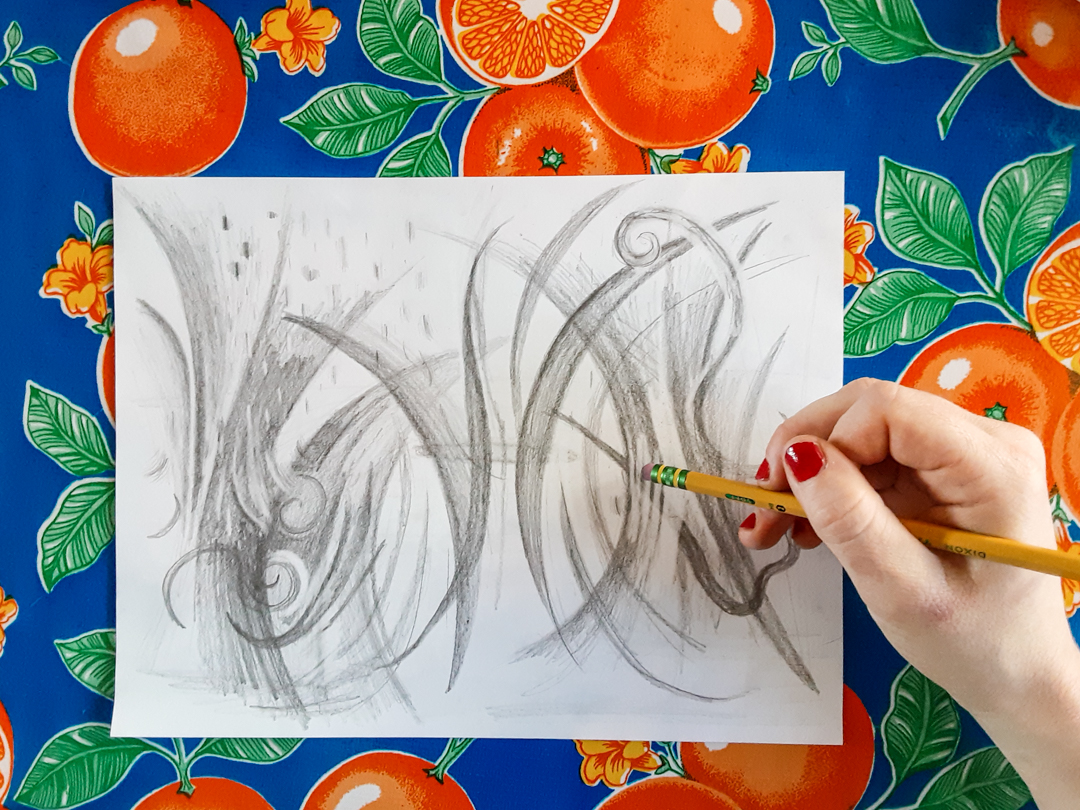
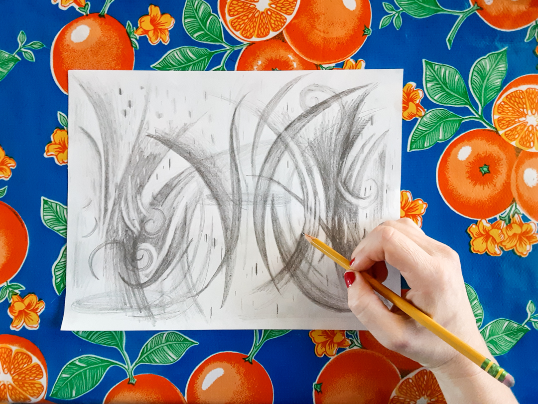
Many of the artists featured in Poke in the Eye use mundane, everyday objects as inspiration for forms that they included in their art. These ordinary objects are transformed into new, original, and extraordinary art by the artist. We wanted to give people a glimpse into this perspective and a chance to try out a version of this process themselves, by transforming an illustration of a trailer, a toilet, a teacup, or a rotary phone into something extraordinary.
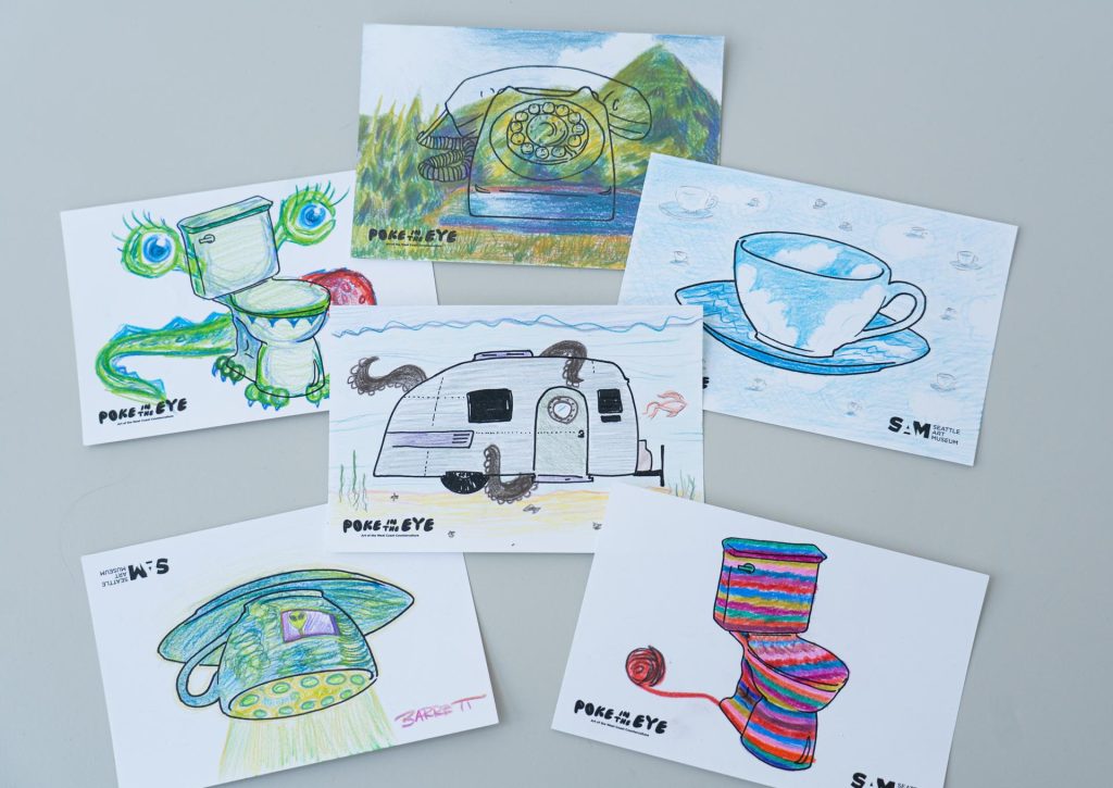
And wow, “extraordinary” is an understatement! Our visitors have really understood the assignment. As of mid-August, visitors have transformed about 7,000 object cards. It seems that the rotary phone is one of the most popular cards that visitors choose to transform. As designers, we’re thrilled to know that visitors are engaging with both the activities in the interpretive gallery and our final interpretive offering which is sprinkled throughout the exhibition: the rotary phone audio guides.
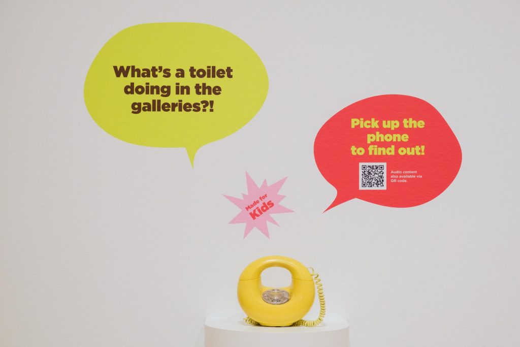
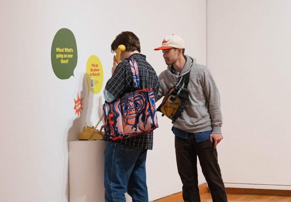
Rotary Phone Audio Guides
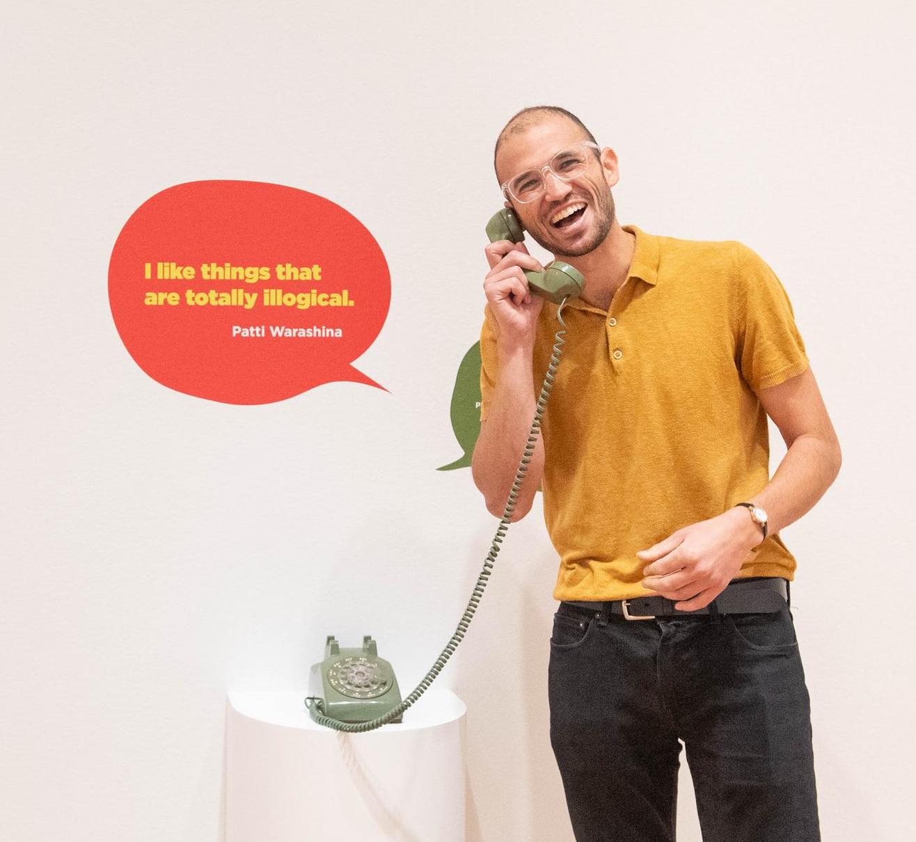
While exploring Poke in the Eye at SAM, you may have noticed a few old-school rotary phones in several of the exhibition’s galleries. Pick one up and you’ll hear exclusive content about some of the artworks on view in the exhibition. These phones are part of the Interpretation team’s latest efforts to break out of the box and put a new spin on a classic museum offering: the audio guide.
To create this retro experience, we tackled two major obstacles: hacking 60 year-old rotary phones to play MP3 files, and developing engaging audio content to connect our visitors with the art. To hack the rotary phones, we called in Sasha Falsberg, SAM Systems Engineer, who took each one apart, studied the mechanics, and reassembled them with a tiny raspberry pi computer. Now when you pick one up, the pins on the phone trigger the Pi and an MP3 plays until you place it back down— it’s magic!
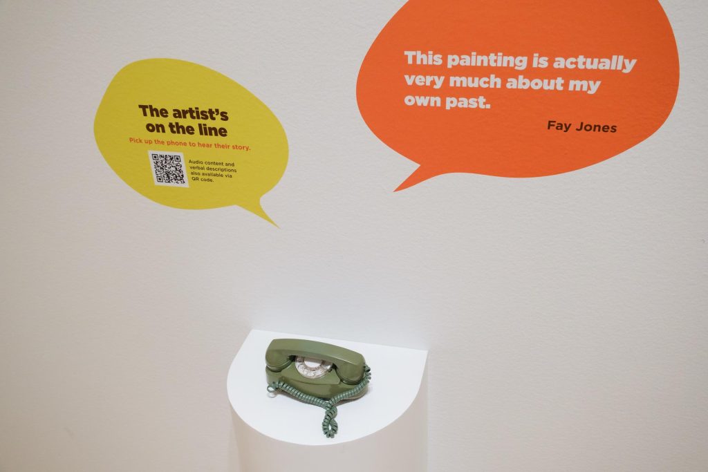
For the audio content development, we had two main goals: 1. Feature the voice of artists and 2. Develop family-friendly content. We interviewed artists Fay Jones, Patti Warashina, and Jeffry Mitchell, who shared their unique perspectives on creativity, process, and the stories behind their artwork. For the family stops, we developed scripts in the form of a thoughtful dialogue between a teeanger and a kid, encouraging close-looking and connection to the art. This kind of scripted, theatrical conversation was a new approach for SAM, so we collaborated closely with educators, parents, and kids to ensure that the content would land with our younger visitors.
Since opening Poke in the Eye in June, we’ve seen the phones spark joy in our visitors, regardless of age. Even though we designed the family stops with kids in mind, it’s been a pleasant surprise to see that adults have been enjoying the rotary phones just as much, if not more, than kids! There’s something about the tactile and playful experience of picking up a vintage phone in the galleries sparks the curiosity of visitors of all ages, leading to meaningful connections with each other and the art.
What’s Next?
Creating interpretive experiences for Poke in the Eye has been an incredibly rewarding experience for our team. From hands-on experiences, to art-making and rotary phones, we’ve had the opportunity to flex our creativity and collaborate across departments throughout the museum. In the last two months, it’s been exciting to see firsthand the impact on the visitors’ experiences at SAM. In the galleries, we see friends showing off the everyday objects they’ve transformed, toddlers using the step stool to reach for the ceramic touch table, and kids leading their parents to the vintage phones in the next gallery. We can’t wait to continue this momentum into our future exhibitions at SAM, designing interpretive experiences that foster creativity, belonging, and connection with the art for all of our visitors.
– Emily Gardner, SAM Assistant Manager for Gallery Learning, & Ramzy Lakos, SAM Digital Interpretation Specialist
Photos: Chloe Collyer.


 Have you ever wanted to know more about local art and artists? What motivates artists, how they see the world and how that is different from your world view? All of these discoveries are part of what we do every day at the Seattle Art Museum. We support local art and artists in many ways and one of the most popular is