How SAM’s Interpretation Team Brought Poke in the Eye to Life

Have you ever wondered who creates interactives at SAM? Hi! We’re Emily and Ramzy and we design interpretive experiences at all three of SAM’s locations. We work on SAM’s Interpretation team which creates educational in-gallery experiences designed to spark creativity, connect visitors to the art, and share dynamic storytelling.
We hear from visitors regularly that they are hungry for more opportunities to interact with the exhibitions on view, learn about the art in our galleries, and show off their creativity. We considered Poke in the Eye: Art of the West Coast Counterculture to be the perfect opportunity to pull out all the stops and create a cohesive suite of interpretive offerings that further explore the exhibition’s themes. In close collaboration with Carrie Dedon, SAM Associate Curator of Modern & Contemporary Art and the exhibition curator of Poke in the Eye, and Justin Scoltock, SAM Exhibition Designer, we developed four interpretive offerings: a ceramic touch table, a counterculture response wall, a hands-on art activity, and rotary phone audio guides.
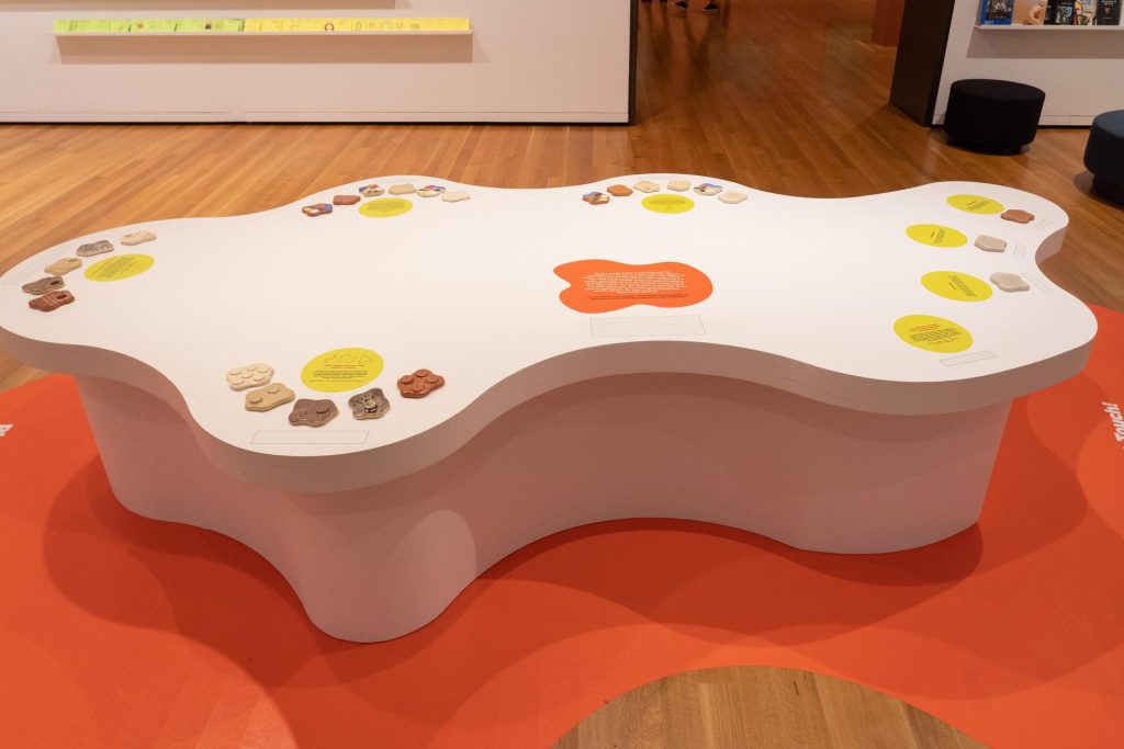
Ceramic Touch Table

How many times have you been in an art museum and thought “I wanna touch that”? For the average art museum, encouraging visitors to touch is a rarity. Making museums multi-sensory allows visitors to show up as their whole selves, ensuring museum-going can be more memorable, educational, and welcoming to all.

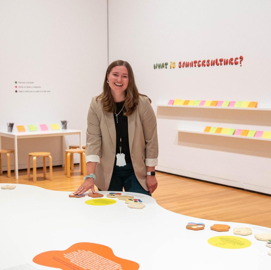
Since Poke in the Eye focuses so heavily on ceramics, we wanted to ensure that people had the chance to experience all the shiny, globby, sharp, and rough textures that make the ceramic works what they are. This led us to develop the centerpiece of the interpretive gallery space: a giant blob-shaped table we affectionately call the “touch table.” The table features 25 samples covering the various stages of the ceramics process, all with completely different textures, colors, and glazes, that any visitor can walk up and touch.
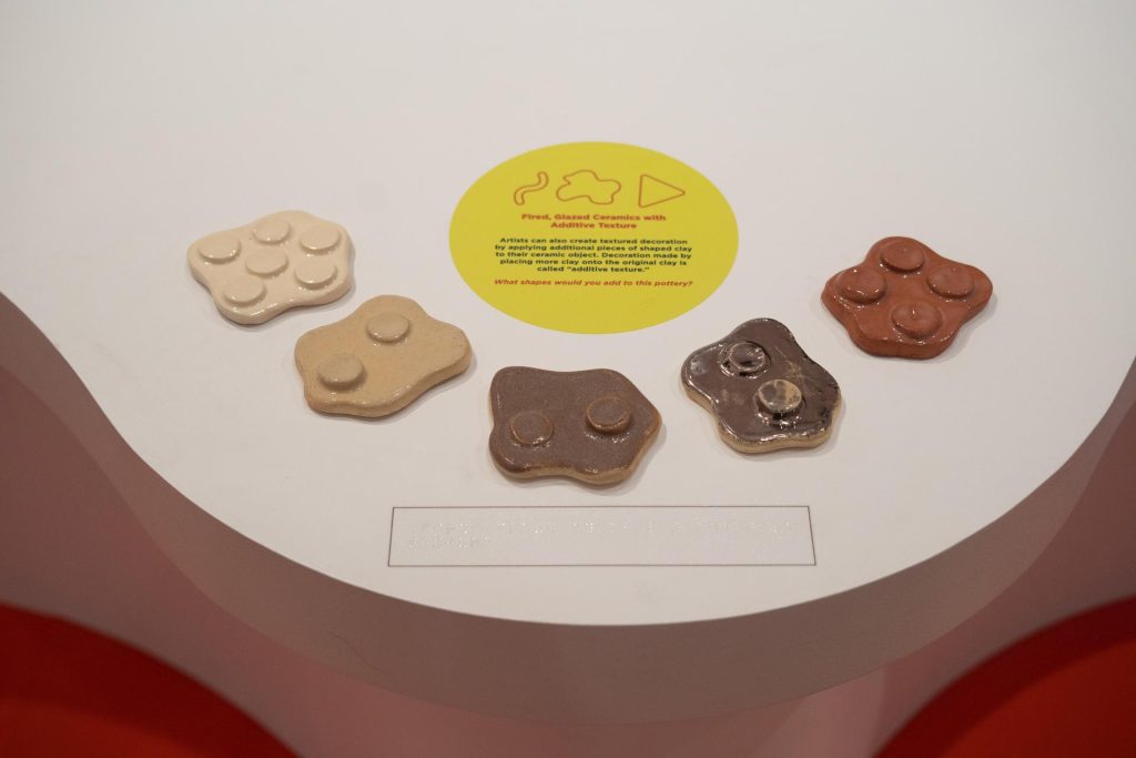
To guide visitors as they touch, we wrote accessible didactic signage to accompany each type of ceramic. This presented a natural opportunity to try something new for SAM: incorporating braille labels into the galleries. We hope this is one small step of many toward SAM’s progress in making art and interactives more accessible.

So far, it has been clear that people simply love to touch stuff. Visitors respond with visible and often audible joy when they see the words “please touch” in the galleries. There’s also a huge variation in how people engage with this table. Some read every word of the educational signage, some talk out loud with a friend about the different textures they’re touching, and others don’t read any signage and just touch the ceramics. Any of the above is fine by us!
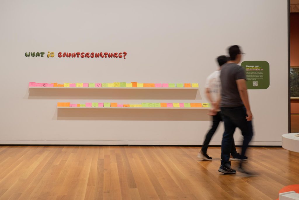
Counterculture Response Wall

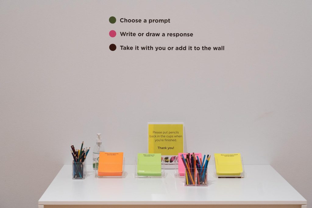
We knew the interpretive space wouldn’t be complete without an opportunity for visitors to express themselves and share their ideas. Counterculture is a key throughline of the exhibition, and we wanted to give visitors a chance to understand the concept more concretely by making it personal and related to their own lives, not just as an abstract idea from the 1960s and 70s. After selecting one of four prompt cards about counterculture, visitors can respond however they’d like using colored pencils: with words, with illustration, or most popularly, a mix of both.
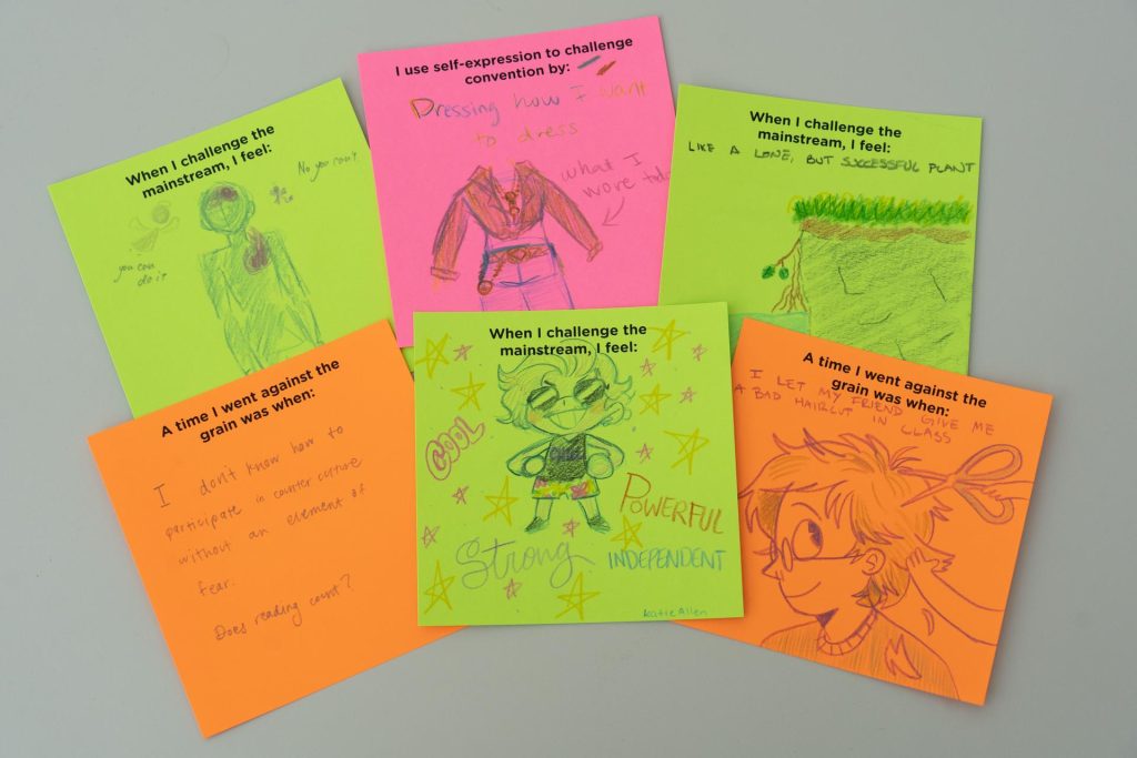
An unexpected but welcome outcome of this interactive is how much visitors love reading other visitors’ responses. Any time we pop into the interpretive space, we’re bound to see visitors looking at others’ responses and pointing, smiling, or remarking on the ideas, impressive illustrations, or multiple languages they see on the shelves. We’ve been blown away by the creativity that people are exhibiting in their responses to these prompts.
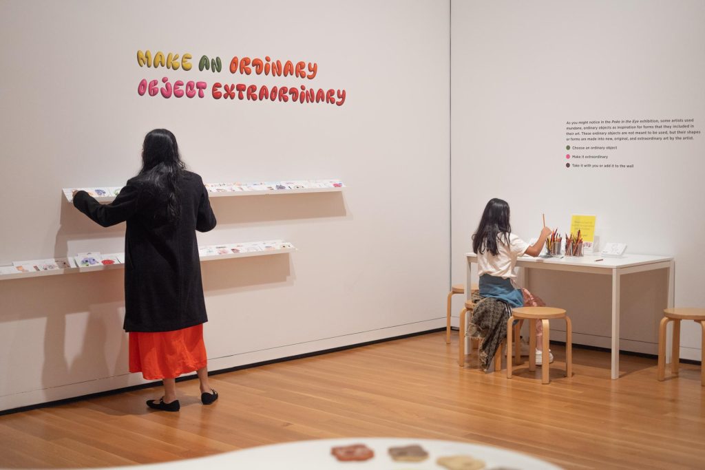
From Ordinary to Extraordinary Art Activity

Expressing yourself conceptually in response to a prompt is a great way to share your personal connection to the exhibition’s themes, but why stop there? We know that a dose of creativity is powerful for both learning and well-being, so we wanted to provide a more visual opportunity for visitors to create.

Many of the artists featured in  Poke in the Eye use mundane, everyday objects as inspiration for forms that they included in their art. These ordinary objects are transformed into new, original, and extraordinary art by the artist. We wanted to give people a glimpse into this perspective and a chance to try out a version of this process themselves, by transforming an illustration of a trailer, a toilet, a teacup, or a rotary phone into something extraordinary.
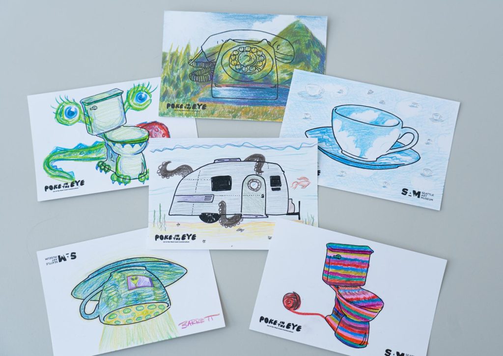
And wow, “extraordinary” is an understatement! Our visitors have really understood the assignment. As of mid-August, visitors have transformed about 7,000 object cards. It seems that the rotary phone is one of the most popular cards that visitors choose to transform. As designers, we’re thrilled to know that visitors are engaging with both the activities in the interpretive gallery and our final interpretive offering which is sprinkled throughout the exhibition: the rotary phone audio guides.
Rotary Phone Audio Guides

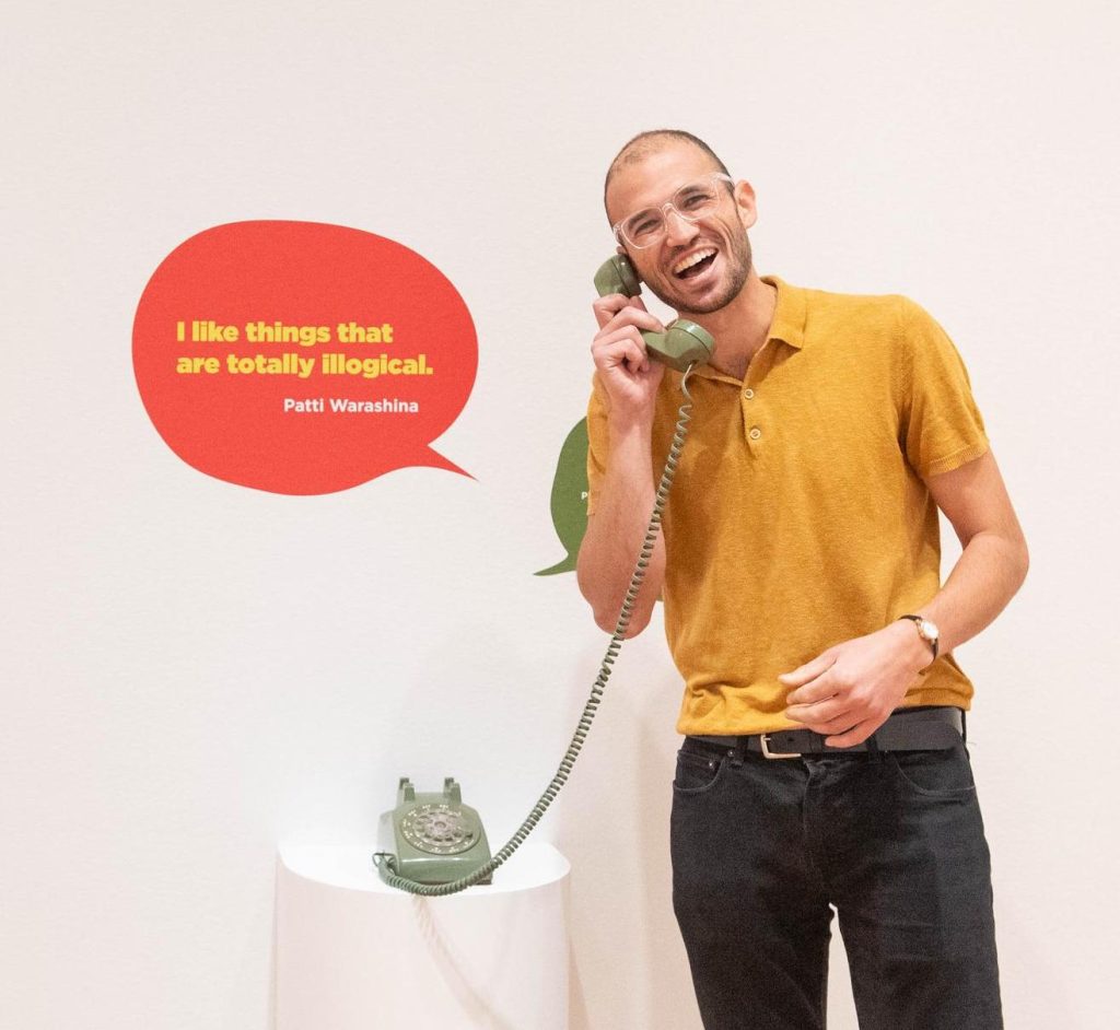
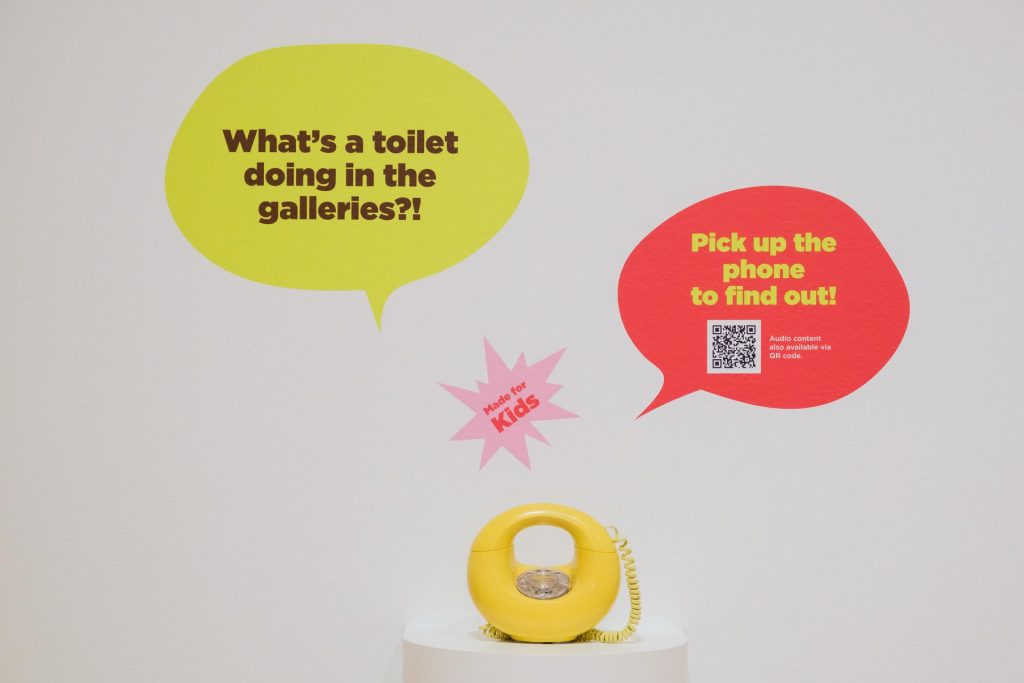
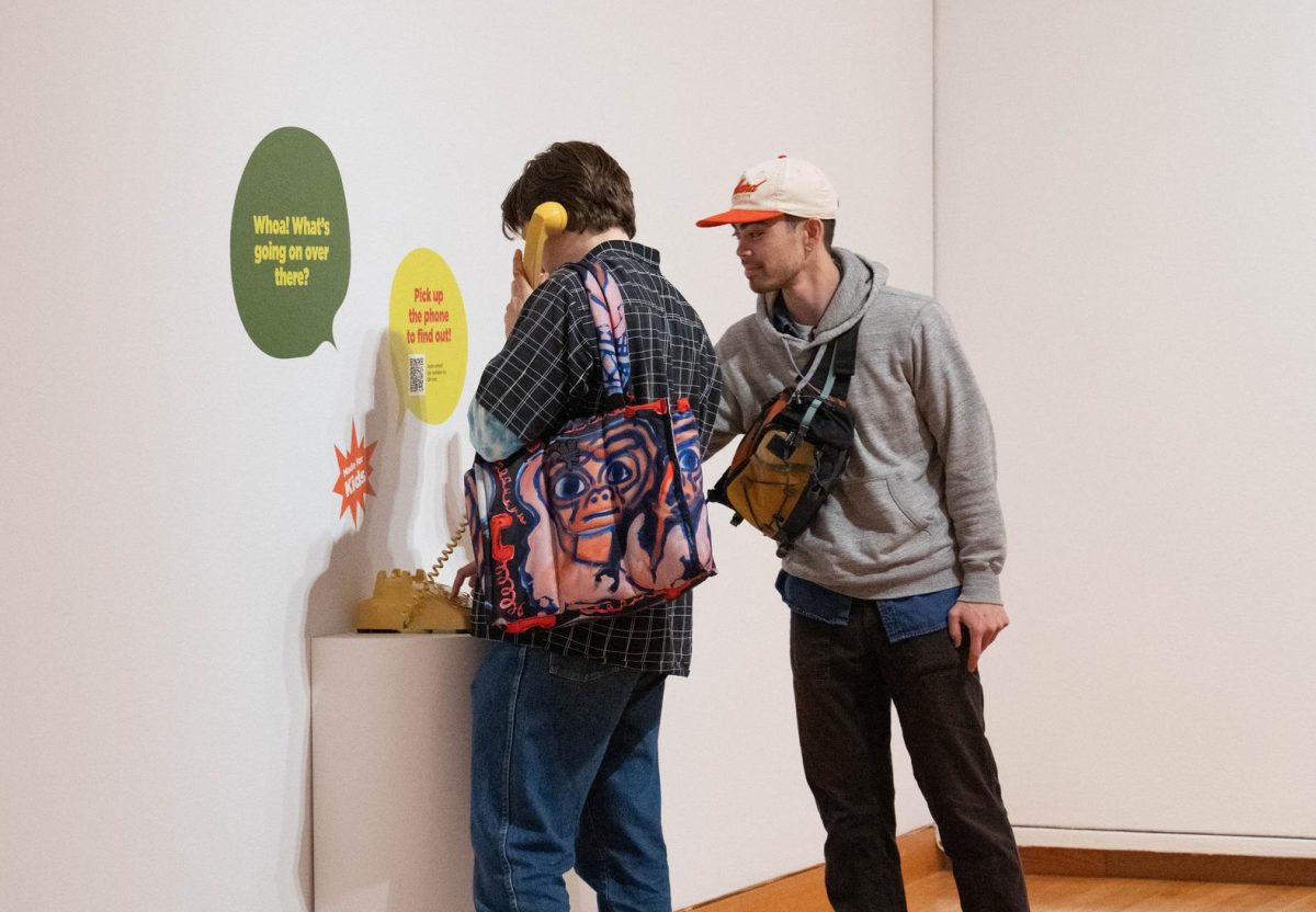
While exploring Poke in the Eye at SAM, you may have noticed a few old-school rotary phones in several of the exhibition’s galleries. Pick one up and you’ll hear exclusive content about some of the artworks on view in the exhibition. These phones are part of the Interpretation team’s latest efforts to break out of the box and put a new spin on a classic museum offering: the audio guide.

To create this retro experience, we tackled two major obstacles: hacking 60 year-old rotary phones to play MP3 files, and developing engaging audio content to connect our visitors with the art. To hack the rotary phones, we called in Sasha Falsberg, SAM Systems Engineer, who took each one apart, studied the mechanics, and reassembled them with a tiny raspberry pi computer. Now when you pick one up, the pins on the phone trigger the Pi and an MP3 plays until you place it back down— it’s magic!
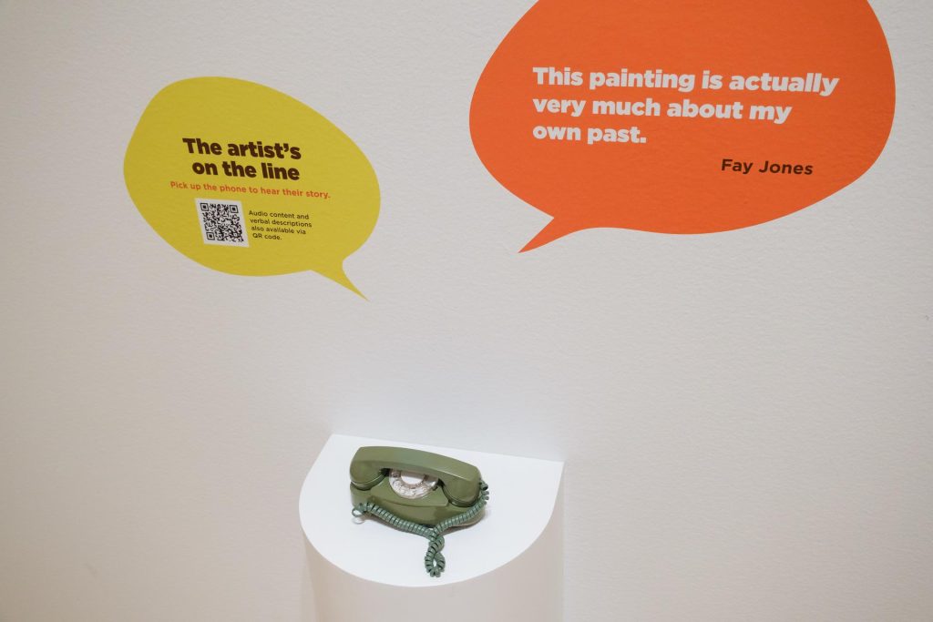
For the audio content development, we had two main goals: 1. Feature the voice of artists and 2. Develop family-friendly content. We interviewed artists Fay Jones, Patti Warashina, and Jeffry Mitchell, who shared their unique perspectives on creativity, process, and the stories behind their artwork. For the family stops, we developed scripts in the form of a thoughtful dialogue between a teeanger and a kid, encouraging close-looking and connection to the art. This kind of scripted, theatrical conversation was a new approach for SAM, so we collaborated closely with educators, parents, and kids to ensure that the content would land with our younger visitors.

Since opening Poke in the Eye in June, we’ve seen the phones spark joy in our visitors, regardless of age. Even though we designed the family stops with kids in mind, it’s been a pleasant surprise to see that adults have been enjoying the rotary phones just as much, if not more, than kids! There’s something about the tactile and playful experience of picking up a vintage phone in the galleries sparks the curiosity of visitors of all ages, leading to meaningful connections with each other and the art.
What’s Next?

Creating interpretive experiences for Poke in the Eye has been an incredibly rewarding experience for our team. From hands-on experiences, to art-making and rotary phones, we’ve had the opportunity to flex our creativity and collaborate across departments throughout the museum. In the last two months, it’s been exciting to see firsthand the impact on the visitors’ experiences at SAM. In the galleries, we see friends showing off the everyday objects they’ve transformed, toddlers using the step stool to reach for the ceramic touch table, and kids leading their parents to the vintage phones in the next gallery. We can’t wait to continue this momentum into our future exhibitions at SAM, designing interpretive experiences that foster creativity, belonging, and connection with the art for all of our visitors.

– Emily Gardner, SAM Assistant Manager for Gallery Learning, & Ramzy Lakos, SAM Digital Interpretation Specialist

Photos: Chloe Collyer.
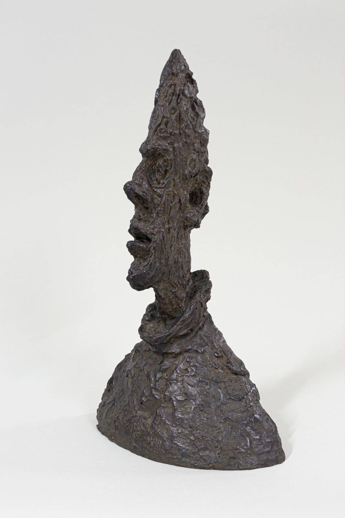
Alberto Giacometti: Tall Thin Head

“When viewed from different vantage points, Tall Thin Head seems to be two distinct heads. From the front the head is narrow; the effect is like looking straight on at a knife edge. From the side, the profile is full-bodied and dramatically silhouetted, completely contradicting the frontal view.”

– Valerie Fletcher

Alberto Giacometti used a variety of artistic devices to disrupt the viewers’ interpretation of space. His 1954 portrait bust Tall Thin Head—or Grand tête mince—was just one of a series of busts made by the artist in the 1950s which played with scale, perspective, and texture. From the front, the sculpture looks flat and vague, but when viewed from the side, however, a detailed portrait emerges revealing the angular features of a male figure.

The sculpture, modeled after his brother, Diego Giacometti, falls into a familiar trend seen across Giacometti’s artistic career. Since the beginning of his artistic life, Giacometti preferred to work with those closes to him as models, especially Diego and his wife Annette. Sitting for him required long hours of concentration, and both his brother and wife also assisted with various aspects of managing his studio and career. For the artist, working with consistent models allowed him to better pursue his vision, unveiling the stranger beneath the familiar.

This audio recording marks the third stop in SAM’s free smartphone tour which accompanies Alberto Giacometti: Toward the Ultimate Figure. Listen now to experience a close-looking art activity led by SAM educator and teaching artist Lauren Kent and tune in to all eight stops in the tour when you visit the exhibition at SAM’s downtown location through October 9.

Tall Thin Head, 1954

NARRATOR: Perspective can change everything in a sculpture, and that rings true especially for Giacometti’s later work. Here’s SAM educator Lauren Kent to guide you in a close looking activity for Tall Thin Head.

LAUREN KENT: As you approach Tall Thin Head, position yourself so that you are in front of the sculpture, looking at the face straight on. What do you see? What do you think about what you see? What do you wonder? Does this sculpture express an emotion or remind you of anything?

Slowly move about a foot in one direction around the sculpture, then stop. What do you notice now? What do you see that you didn’t before? What has changed?

Move another foot in a circle around the sculpture and stop once more. What do you notice here? What do you see now that you didn’t before? What has changed?

Continue moving in a full circle around the head. Observe how it expands and contracts. Observe all of the different ways that it looks and feels at each angle. You can keep an eye on Tall Thin Head as you walk through the rest of this gallery.

 Lily Hansen, Marketing Content Creator


1 Alberto Giacometti: 1901-1966, Valerie Fletcher, p.180.

Image: Tall Thin Head, 1954, Alberto Giacometti, Swiss, 1901–1966, bronze, 64.5 × 38.1 × 24.4 cm, Fondation Giacometti, © Succession Alberto Giacometti / ADAGP, Paris, 2022 ALL IMAGES: © Succession Alberto Giacometti / ADAGP, Paris, 2022.

Asian Art Activity: Palampore

Inspired by a 19th-century Palampore, or bed covering, from SAM’s Asian art collection, teaching artist Amina Quraishi leads an art activity focused on shapes, patterns, and symmetry. With just a pencil, eraser, tracing paper, and a sheet of construction paper—and a few other optional art materials—Amina offers a tutorial on pattern building and repetition. Drawing from childhood memories of traveling to India and henna patterns applied to her hands in celebration of Eid al-Fitr, Amina encourages artists to think about meaningful objects and symbols in their culture. How can these be incorporated into the work?

Take a closer look at this Palampore and compare it to a contemporary work by artist Faig Ahmed by watching SAM’s Asian Art Spotlight: Oiling & Palampore video. And, find more educational videos of works on view at the Seattle Asian Art Museum in our Eyes on Asia Youtube playlist.

The Seattle Asian Art Museum is open, though school tours are not available at this time. SAM continues to connect art lovers of all ages to our rich collection of art through a variety of virtual experiences which align with Washington State learning standards in Visual Art and English Language Arts. The Eyes on Asia video series is designed to be used as a supplemental learning tool in virtual classrooms, at home by parents and caregivers, and by friends hanging out online. Once you’ve watched the videos in the playlist, visit the museum to see the featured artworks in person!

Photo: Amina Quraishi

SAM Creates: Wishing You a Happy Diwali!

Family festivals at the Seattle Asian Art Museum connect families with performances, art activities, and other programming related to SAM’s Asian art collection. While our Asian Art Museum remains closed, families at home can make art and learn more about Asian art, as well as our wonderful community partners.

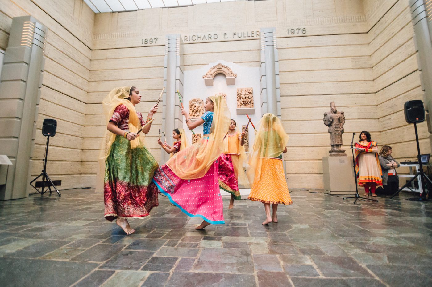
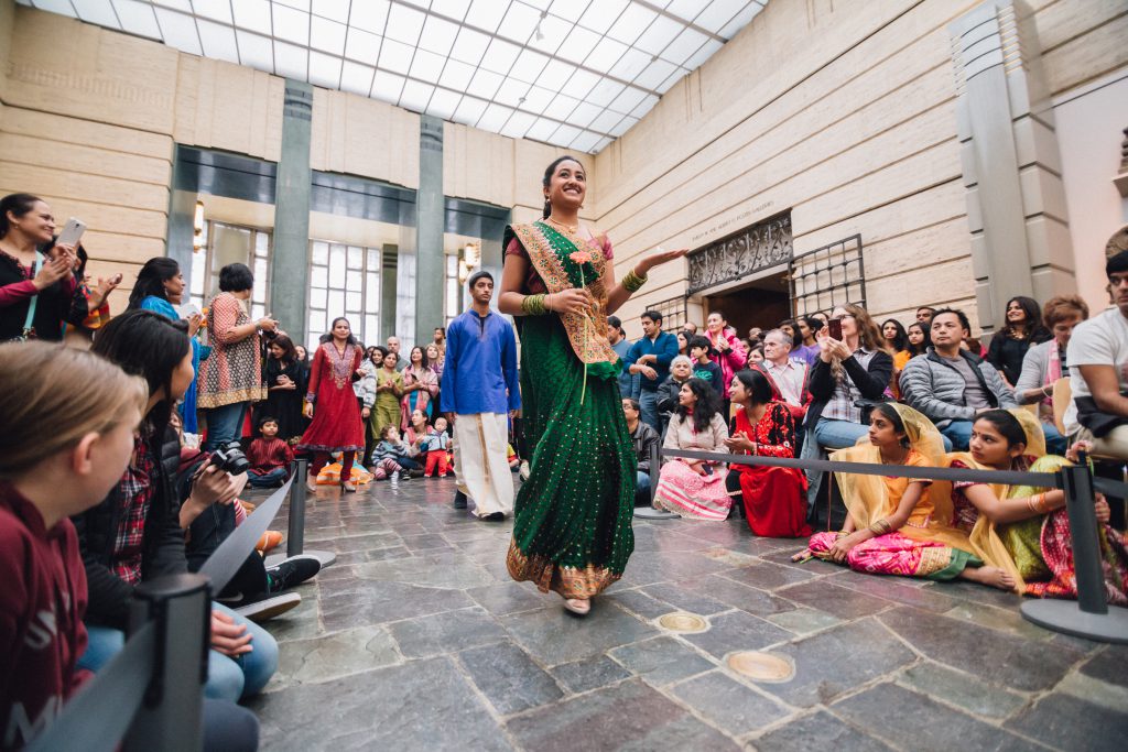
Diwali is the Indian festival of lights, celebrated by many people throughout South Asia, as well as in Seattle. For the past 10 years, in collaboration with our community partner, Junior Asha, SAM has organized a Diwali celebration for families held at the Seattle Asian Art Museum each November. Junior Asha is the youth chapter of the Asha for Education – Seattle Chapter. Asha is a non-profit organization that is dedicated to bringing about socio-economic change in India primarily through education. In addition to raising funds for education, Junior Asha members also support the local community by volunteering at events such as the Diwali Family Festival at the Asian Art Museum. 

Free First Saturday, Diwali Family Festival, Asian Art Museum

Each year members of Junior Asha have dedicated their time to creating programming for the festival. This has included dance performances showcasing different types of Indian dance. Festivities performed by members of Junior Asha. One component that has remained constant across many celebrations is the youth and Tiny Tots fashion show led by Junior Asha. Members also spent time in the months leading up to the event learning about the art on view at the Seattle Asian Art Museum and working with SAM docents to create their own My Favorite Things tour of the museum. Members presented their tours at the Diwali Family Festival sharing their own unique opinions on artwork with the community. 

Although we won’t be gathering in person this year, we’re happy to highlight our incredible partnership with Junior Asha and to share an art activity from last year’s Diwali Family Festival for families to create at home. We’re looking forward to once again gathering together in celebration in the future.

Free First Saturday, Diwali Family Festival, Asian Art Museum

ART ACTIVITY: LUMINOUS LANTERNS

For ages 6-10+

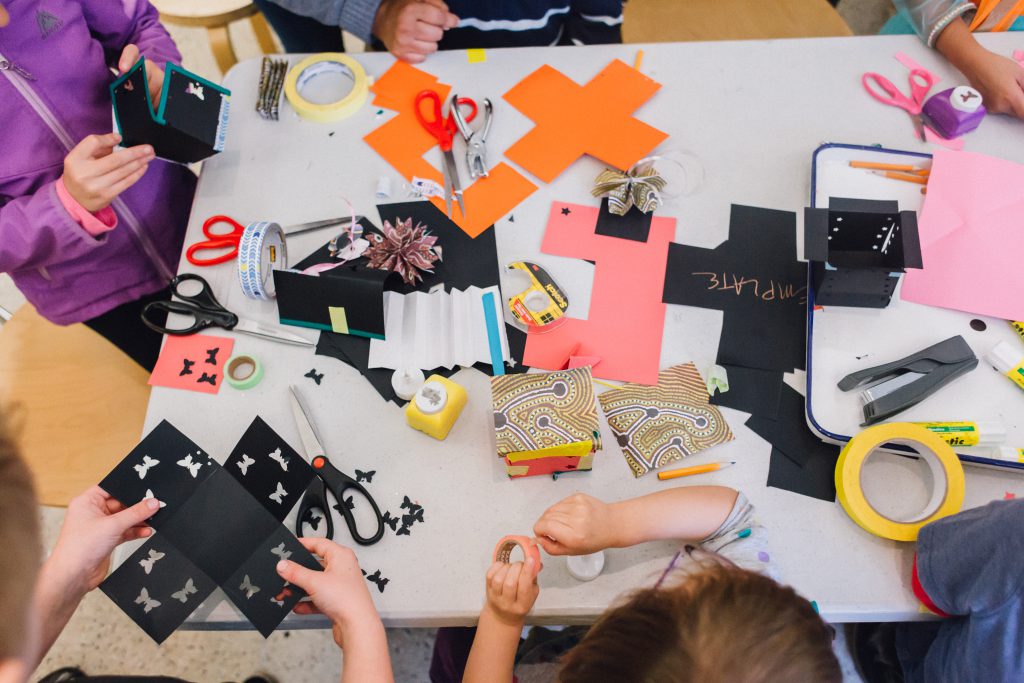
Add a bit of color and light as you celebrate Diwali from home! Design and decorate a paper lantern with cutouts, tissue paper, and more. You can then place a light source inside when it gets dark out and see your creation come to life. 

What You’ll Need

  • Construction paper or cardstock 
  • Pencil
  • Scissors 
  • Tape or washi tape
  • Hole punch, push pin, or X-acto knife (optional, requires adult assistance)
  • Tissue paper (optional)
  • Markers (optional)
  • Tea light candle or flameless LED candle (optional)
  1. Cut a piece of square construction paper in the shape of a plus-sign, with four equal sides surrounding a square in the middle. If your piece of construction paper is rectangular, you can make it a square by folding over a corner and cutting off the extra paper on the bottom.
  2. The middle of the plus-sign will be the bottom of your lantern, so you can leave that alone for now. With pencil, sketch out a design or pattern on each of the other four sides that you can easily cut out or trace later. This can be inspired by something you see in your home or an artwork in the Asian Art Museum.
  3. Using scissors, a hole punch, push pins, or an X-acto knife, cut out or trace the design that you created. You can bend the sides of the paper over and cut out symmetrical shapes using scissors. Remember to have a grownup help you if you are using push pins or an X-acto knife. If you like, you can tape pieces of tissue paper over the cutouts to add different colors to your lantern.
  4. You can turn your plus-sign around and add decorative tape or other designs in marker. Once you have finished with what you want to cut out and add, fold the four sides of the plus-sign up to create a box without a top. You can add more decorations by cutting out and folding smaller pieces of paper, then taping them on the sides.
  5. Once you’re happy with your lantern, wait until the sun sets and place a light source inside. How do the colors and shapes change when there’s a light inside? During Diwali, people put up many lights to celebrate the special day. You can make even more lanterns in different colors, shapes, and sizes too!

KEEP LEARNING WITH A STORY

Learn more about the lights, food, and festivities of Diwali in the book Binny’s Diwali by Thrity Umirgar, illustrated by Nidhi Chanani. You can follow along with a read aloud of the book, check it out through the King County Library System, or purchase it from a bookseller.

Yaoyao Liu, SAM Museum Educator

Photos: Jen Au

SAM Creates: Assemble Assemblages à la Rauschenberg

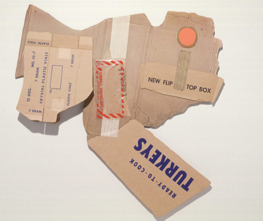
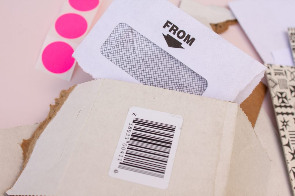
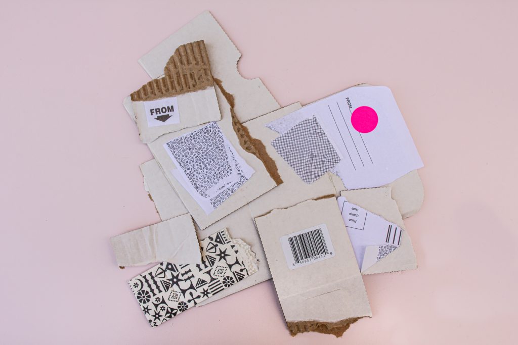
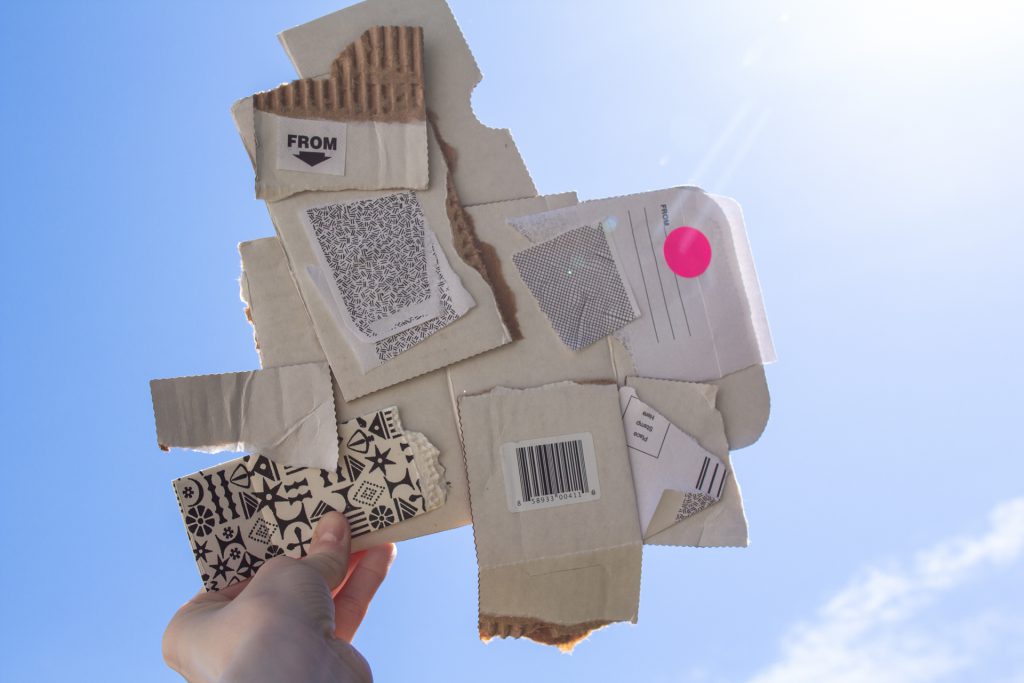
In his original Cardbirds, Robert Rauschenberg used discarded cardboard boxes he found on the street to create this flock of birds. Notice that he isn’t just using cardboard, but he rips the edges so the corrugation inside shows and the writing is prominently featured. These objects are supposed to feel like they were pulled out of a dumpster. By using everyday or discarded objects to make art, Rauschenberg was inviting us to rethink the value system of fine art.

Rauschenberg was an innovator, known for his works combining painting and sculpture called combines. This was a radical blending of materials and methods in the 1950s and 60s and expanded the traditional boundaries of art. Combines and assemblages are like collage but are three dimensional with found objects projecting out from the base.

Create your own assemblage

What you’ll need

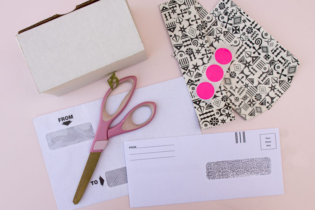
  • Cardboard or other materials that can be ripped, torn, and reassembled (phone books, toothpicks, or other recycled materials like scrap wood)
  • Glue, stapler, paper clips, rubber bands
  • Scissors
  • Markers or paint
  • Pencil or pen

As a starting point go outside and observe birds or other creatures. Think about Rauschenberg’s title: Cardbirds. Base your creation on something you see outside.

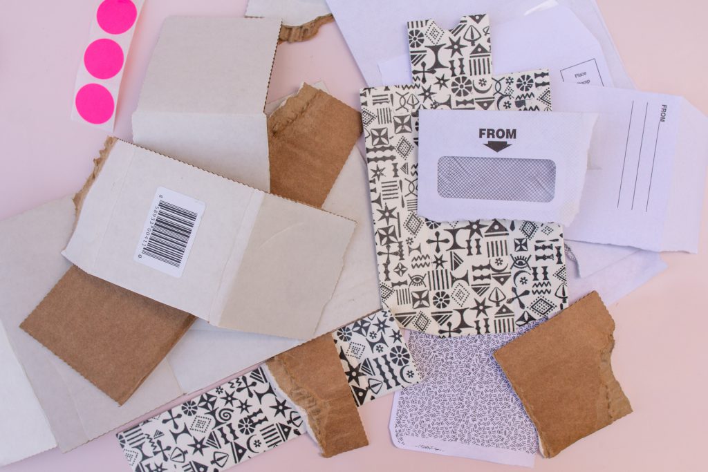
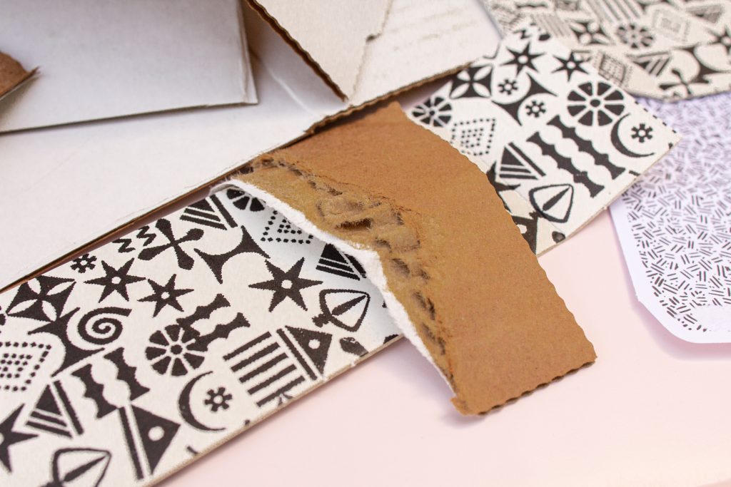
Consider cutting up cardboard pieces in preparation so there is a large assortment of sizes and textures. Peel off the top layer over the corrugated cardboard to show its interesting texture.

Gather your materials and take some time to arrange them in different ways. Think about pattern and texture as you let the materials speak to you, they will have their own story. Leave the evidence of their previous life visible, notice how Rauschenberg used the existing words “Turkey” or “Frozen” stamped on the cardboard.  What history do your objects have? Can it help inform the work you’re making? 

Next, use simple shapes to represent the animal or object you saw outside. Try cutting out or ripping ovals, triangles, and rectangles as well as organic shapes.

As you assemble your work try using a variety of attachment techniques, slot cuts are the simplest: cut straight into two separate pieces and slot them into each other at opposite angles. Layer and stack pieces together thinking about the use of symmetry as well as asymmetry, to create unity and interest. Glue objects together and allow time to dry or set. Consider painting with gesso or clear acrylic to help unify the piece. 

Make a few versions of your object or invite a friend to collaborate. Collaboration was an ongoing practice for Rauschenberg who said, “Ideas are not real estate.”

 We would love to see the artwork you make while you #StayHomeWithSAM!

– Lynda Harwood-Swenson, SAM Assistant Manager for Studio Programs  

We are humbled by the generosity of our donors during this unique time. Your financial support powers SAM Blog and also sustains us until we can come together as a community and enjoy art in the galleries again. Thanks to a generous group of SAM trustees, all membership and gifts to SAM Fund will be matched up to $500,000 through June 30!

Images: Cardbird III, 1971, Robert Rauschenberg, collage of corrugated cardboard, tape, offset photolithograph, and screen print, 35 1/2 x 36 in., Gift of the Robert B. and Honey Dootson Collection, 81.62.2 © Robert Rauschenberg Foundation. Natali Wiseman.

SAM Creates: Dance Like Lynette Yiadom-Boakye Is Watching

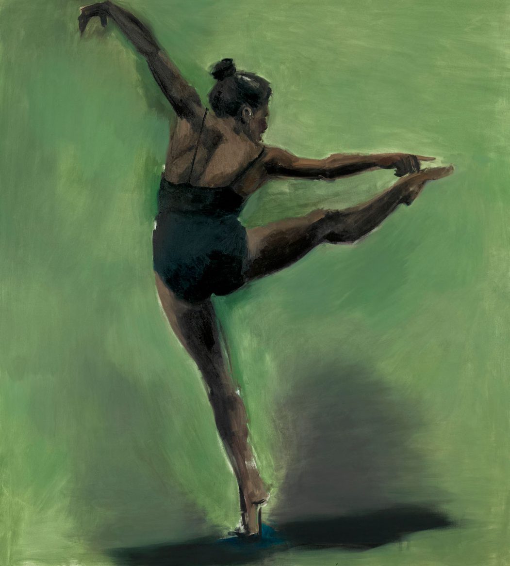
Does this painting make you want to dance?! Artist Lynette Yiadom-Boakye paints her artworks, like this one, in a single day based on her memory or imagination. Its sense of movement may make you want to join in and move! Try to pose or stand like this figure. Make sure you have enough space. Is it hard to pose like this? How long can you hold this pose for? Below is a perspective on this artwork from choreographer Donal Byrd. Give it a listen as you think about the painting and also about dance as an art form. Then do some dancing yourself and see if you can sculpt a pose! Find a one-page lesson plan based on this artwork designed for grades K–2 and translated into English, Spanish, and Chinese in SAM’s Education Resource Center catalogue. There’s more where that came from—check out more Look and Make Lessons on our website!

Movement Activity: Freeze Dance

  • Pick one of your favorite songs and have a family member or friend begin playing it. Dance around to the music! Move all parts of your body from your fingers to your toes.
  • Have your family member or friend press pause randomly to surprise you!
  • When the music stops, freeze! You’ve just struck a pose! Hold it until the music starts playing again. 
  • Press play on the music and pause again when you’re ready to strike another pose. This time try something different.
  • Repeat!

Art Actvity: Create a sculpture of a person out of aluminum foil!

Materials

  • Aluminum foil
  • Scissors
  1. Cut slits in the foil: One on the bottom for the legs and two at the top for the head and arms.
  2. Squeeze the middle of the foil to make the waist.
  3. Squeeze each leg and arm to make more of a cylinder shape.
  4. Crunch in the foil on top to make a head.

When you’re done, shape it into the pose of your favorite dance move! Remember how it feels to move like this every time you look at it!

Keep Learning with A Story

Watch I Got the Rhythm by Connie Schofield-Morrison or Hip Hop Lollipop, by Susan McElroy Montanari read aloud. These picture books are about a young girls who are moved by rhythm and dance.

– Lindsay Huse Kestin, SAM Assistant Manager for Kids and Family Programs, Yaoyao Liu, SAM Museum Educator & Lauren Kent, SAM’s Museum Educator for School Programs & Partnerships

Trapsprung, 2013, Lynette Yiadom-Boakye, oil on canvas, 78 3/4 x 70 7/8 in. (200×180 cm). General Acquisition Fund, 2014.11 © Lynette Yiadom-Boakye. Courtesy of the artist and Jack Shainman Gallery, New York and Corvi-Mora, London. photo: Elizabeth Mann.

SAM Creates: Rubbings Revealed from Wu Liang Shrine

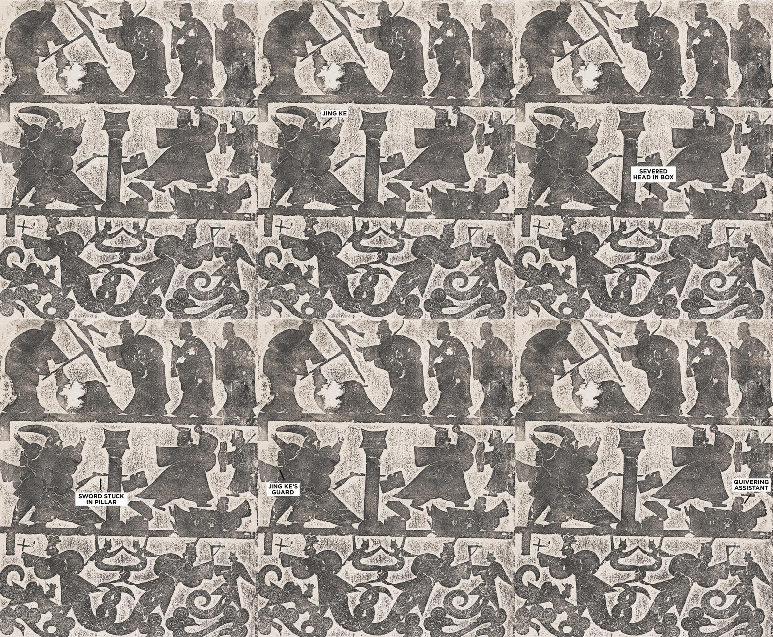
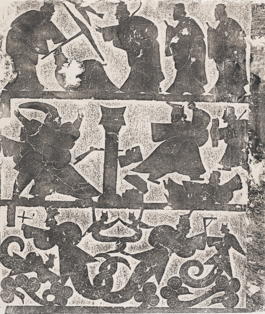
Located in present-day Jiaxiang in Shandong province, the Wu Family Ancestral Shrine built during the 2nd century in the Eastern Han dynasty (25–220) is among the best-known works in Chinese art history. Take a virtual tour of the shrine.

The simple graphic images you see from the Wu Liang Shrine were made from laying paper against the stone carvings that are inside the shrine and rubbing with ink to transfer the images onto paper. Learn more about this rubbing in our Object of the Week series.

The center line in this image depicts the story of a failed assassination attempt on Emperor Qin Shi Huang by Jing Ke. The figures, mostly in silhouette, move across the page presenting many parts of the story in one frame. This is an example of simultaneous illustration. Listen to a lecture on Telling a Story with Pictures to learn more about the differences between Eastern and Western visual narratives.

Create your own rubbing!

What you will need

  • Paper: A few sheets of lighter weight paper, along with some heavier paper or light cardboard (think drawing paper or cereal box).
  • Scissors or exacto knife
  • Pencil, crayon, chalk, or pastel

Warm up: Layer a small piece of the heavier paper under your lightweight paper. Take your pencil or crayon and rub over it, where the edges of the heavy paper sit, the crayon will be darker revealing the shape. Keep this in mind as you make a larger work. 

Next, start with something easy as you consider what story you want to tell with your rubbing. What are you currently watching or reading? Who is the main character? Follow the lead of the artists who carved the stone of the Wu family shrines and use simple shapes to depict your protagonist on the heavier paper. Draw each limb or clothing article as a separate shape, and draw their head in profile. You don’t need any detail, just flat non-dimensional shapes, like a paper doll.

Once you have these basic shapes, cut them out of your paper, and layer them together to make your character. Lay the thinner paper over them and rub with your pencil. You can add interesting textures by adding cuts to your figure’s shapes or by layering materials around the house like bubble wrap, or sandpaper.

Reuse the cutouts to animate your character across the page. What is your character doing? Think about an action that helps tell a story. For each move your character makes rearrange the paper cut outs and lay the lighter weight paper on top. Rub your crayon or pencil over the paper to make an impression, then move the cut outs for the next action and rub again.

We’d love to see your artwork—share it with us while #StayHomeWithSAM.

– Lynda Harwood-Swenson, SAM Assistant Manager for Studio Programs  

We are humbled by the generosity of our donors during this unique time. Your financial support powers SAM Blog and also sustains us until we can come together as a community and enjoy art in the galleries again. Thanks to a generous group of SAM trustees, all membership and gifts to SAM Fund will be matched up to $500,000 through June 30!

Wu Liang Shrine: Chinese History and Mythology, ca. 1920s, Han Dynasty (206 BCE–220 CE), Eugene Fuller Memorial Collection, ink rubbing on paper, 35.587.2

SAM Creates: Collage Covered with Teresita Fernández

“I want you to feel like you are moving through a landscape painting or movie rather than within the landscape itself, blurring the lines between your presence as participant and observer.”

 – Teresita Fernández

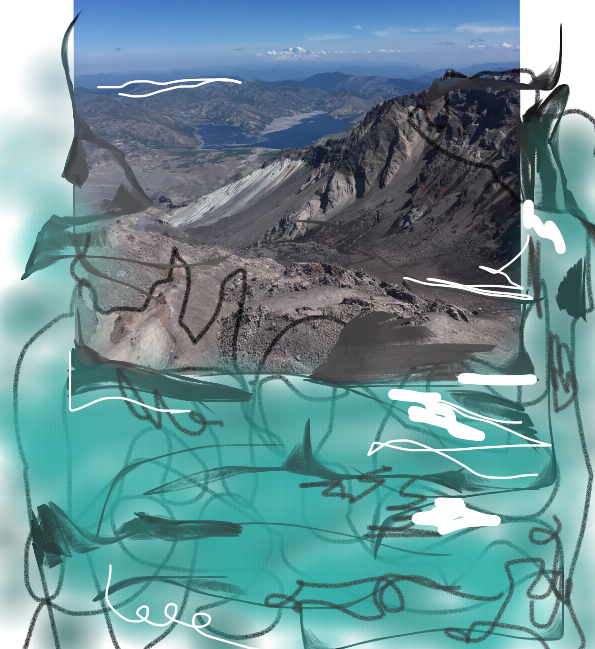
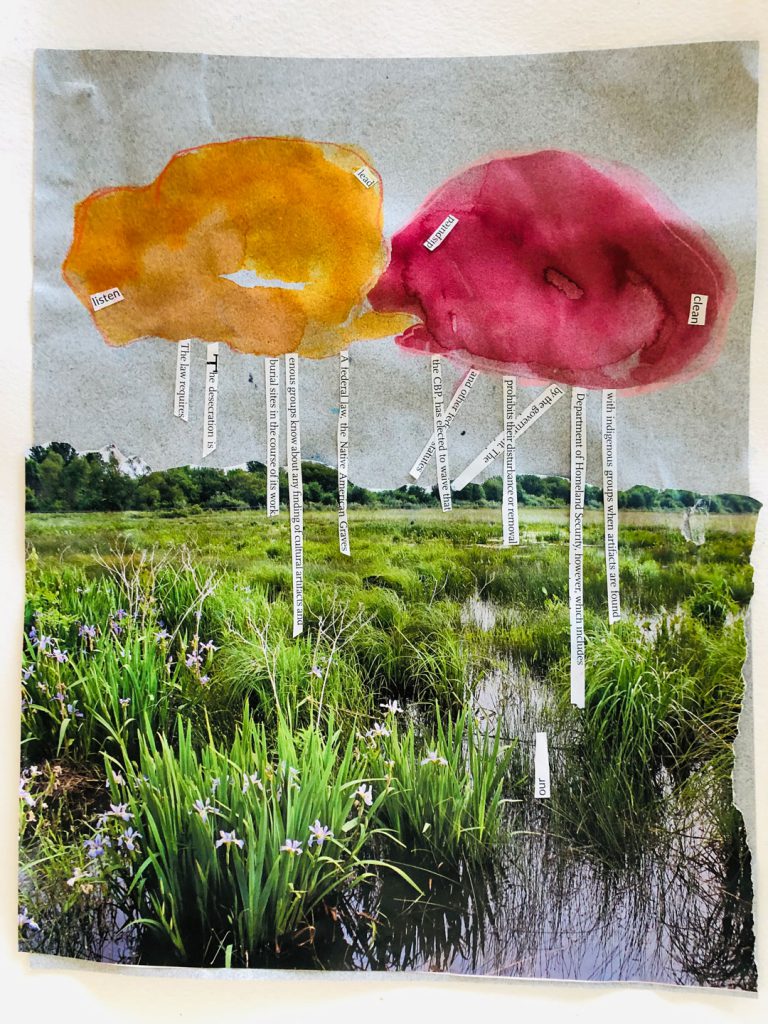
Teresita Fernández’s atmospheric work Seattle Cloud Cover uses ideas of place, pattern, and color to create an experience for the viewer that is their own. The work is site-specific, commissioned by SAM to act as a bridge connecting the city with the waterfront. With those three elements—place, pattern, and color—we’ll create an artwork inspired by Fernández’s Seattle Cloud Cover, layered with symbolism and meaning. Watch this video for a better look at the artwork before getting started.

What you’ll need

  • Paper
  • Landscape images
  • Pencil or pen
  • Watercolors or semi-transparent markers, or colored pencil

You can also create this work entirely on the computer through Kleki, a free, image-editing and creation website. 

Place: Choose an image from your collage materials that has some meaning to you or is appealing to your senses. In Seattle Cloud Cover, Fernández uses images of Miami sunsets where she was born. You can tear or cut up your image and place the pieces around the page or use the whole image. Before you glue down your collage pieces think about how you might want to incorporate the elements of pattern and color into your composition. 

Pattern: In Seattle Cloud Cover, Fernández uses Ben-Day dots to create a polka-dot grid, which she calls “porthole.” Through these cut out dots you can catch glimpses of the Seattle landscape. Ben-Day dots are typically used in comic books to create tone. On sunny days, the Ben-Day dots act as spotlights for the sun to shine through, transforming the space and the people in it. How might a pattern change your collaged place? Where could you add this pattern? Is there something in the image that could be the beginning of a pattern? 

Color: The deep oranges, reds, violets and blues in Fernández’s Seattle Cloud Cover create their own sensation within the work. What colors will add another layer of meaning or symbolism to your work? Color can be added to the pattern, layered into the landscape, or used as a way to enhance and connect the work.

– Kelsey DonahueSAM Assistant Manager for Gallery Learning & Lynda Harwood-Swenson, SAM Assistant Manager for Studio Programs  

We’d love to see your work! Share your completed piece using the hashtag #StayHomeWithSAM

We are humbled by the generosity of our donors during this unique time. Your financial support powers SAM Blog and also sustains us until we can come together as a community and enjoy art in the galleries again. Thanks to a generous group of SAM trustees, all membership and gifts to SAM Fund will be matched up to $500,000 through June 30!

Images: Seattle Cloud Cover, design approved 2004; fabrication completed 2006, Teresita Fernández, laminated glass with photographic design interlayer, approx. 9 ft. 6 in. x 200 ft. x 6 ft. 3 in., Olympic Sculpture Park Art Acquisition Fund, in honor of the 75th Anniversary of the Seattle Art Museum, 2006.140, © Teresita Fernández.

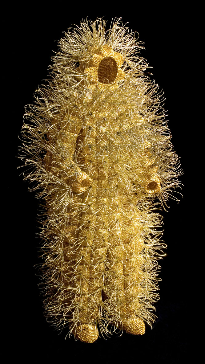
SAM Creates: Suit Up with Walter Oltmann

While a human-caterpillar hybrid such as Walter Oltmann’s Caterpillar Suit I, may seem strange, it’s completely appropriate for these strange times that we’re currently living in. The tiny hairs that encompass the insects referenced in Walter Oltmann’s work are called setae. The function of these hairs are practical—they’re connected to nerve-endings and give caterpillars a sense of touch—as well as a defense mechanism. A recent study showed that the longer and denser the setae, the less likely predators were to eat the caterpillars. 

Looking at Oltmann’s work in the era of coronavirus brings to mind biomimicry. Biomimcry is described by the Biomimcry Institute as “the practice of applying lessons from nature to the invention of healthier, more sustainable technologies for people.”[1] Another way to understand this concept is through antennae-inspired outfits, designed to help with social distancing.

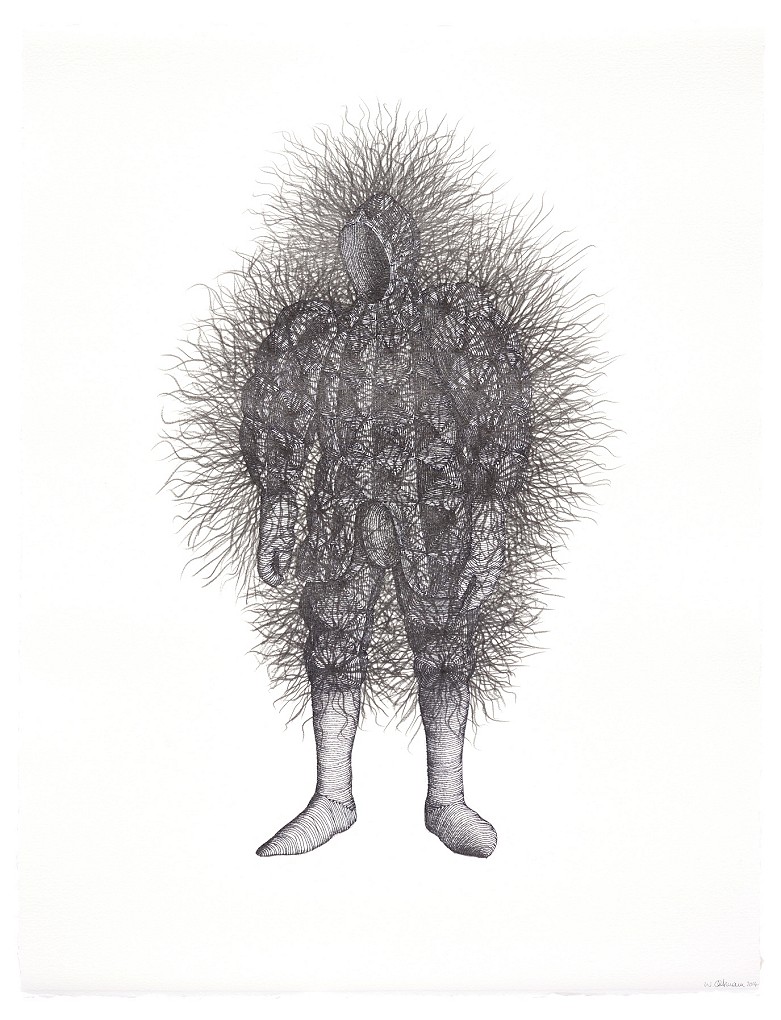
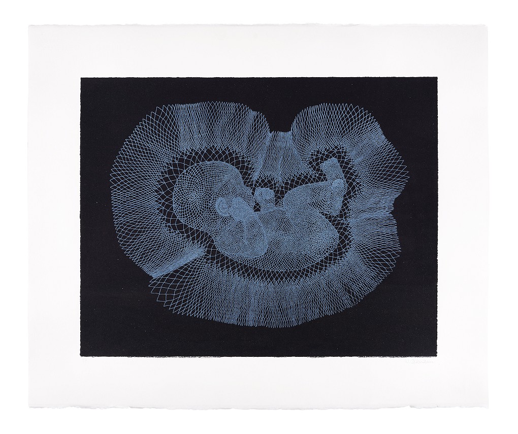
What ways can nature spur ideas to help us adapt to our new normal? Come up with your own biomimicry design for coronavirus through drawing. Oltmann makes more than sculptures, he also creates drawings and prints with similar designs as his sculptures. We’ll use this approach for our activity.

What you’ll need

  • Paper
  • Pencil
  • Eraser
  • Fine-tipped marker or pen.

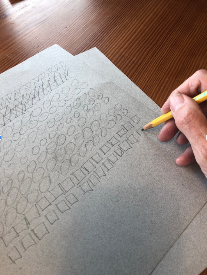
With drawing, like any physical activity, you may want to start with a warm up. Try sketching some simple shapes to warm up your drawing muscles!

Sketch a figure drawing of yourself or have someone in your home pose for you!

First, draw in pencil, then outline the essential lines in marker or pen. Erase the pencil marks. Your figure should be a very simple form, like a gingerbread man shape.

Next, think about ways that nature, your favorite animal, or an ecosystem protects itself. For caterpillars, it might be a visible attribute, such as setae protecting against predators, but it could also be a non-visible process, like how they consume poisonous milkweed without getting sick. For inspiration check out asknature.org.

Draw this natural defense attribute onto the figure you’ve drawn using lines, shapes, or patterns.

Share your innovative ideas with us by posting using the hashtag #StayHomewithSAM and celebrate everyone working hard in the midst of this pandemic to find practical ways of protecting us from the coronavirus.

– Kelsey DonahueSAM Assistant Manager for Gallery Learning & Lynda Harwood-Swenson, SAM Assistant Manager for Studio Programs

1 https://toolbox.biomimicry.org/about-the-toolbox/
Image: Caterpillar Suit I, 2007, Walter Oltmann, anodized aluminum and brass wire, 46 7/16 x 23 1/4 x 16 9/16 in., Gift of Josef Vascovitz and Lisa Goodman in honor of Kimerly Rorschach, 2019.25.1, © Walter Oltmann.

Object of the Week: Magnolia Blossom, Tower of Jewels

Photographer Imogen Cunningham was not naturally inclined to stay home. Throughout her long and prolific career she travelled and exhibited widely, was celebrated for her portraits ranging from the rich-and-famous to the anonymous citizens of San Francisco, and even became a minor celebrity late in her life, appearing on the Tonight Show with Johnny Carson and easily identified walking her hometown’s streets with her iconic black cape and peace sign pin.

For a brief period in between all of this activity, Cunningham was more-or-less bound to her home. In 1917, she moved with her 18-month-old son from Seattle to San Francisco to join her husband; less than one month later, she gave birth to twins. As the mother of three young children, her life was suddenly largely circumscribed by the boundaries of the family’s Oakland home. But Cunningham did not allow these circumstances to impede her work—her ambition and drive would, simply, not allow for it. Instead, she turned inward to subjects within her home—or more accurately, created subjects within her home—by cultivating a garden in her backyard.

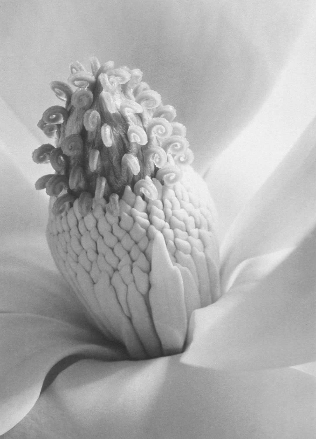
In a 1959 interview, Cunningham recalled: “The reason I really turned to plants was because I couldn’t get out of my own backyard when my children were small.”[1] And later, with her characteristic sharp wit: “I photographed the plants in my garden and steered my children around at the same time.”[2] True enough about the circumstances, but these direct statements belie the care and attention with which Cunningham shot her celebrated botanical works, such as Magnolia Blossom, Tower of Jewels (1925).

Tightly framing her composition, Cunningham makes the subject of this work not the plant as a whole, but rather the innermost folds and stamen of the blooming magnolia flower. The luscious gradients of white in the petals, the play of shadows on the stamen, and the sharpness with which these details are captured serves to abstract the blossom, allowing us as viewers to see this familiar subject in a new way. This technique was at the heart of a new form of modernist photography, and Cunningham’s experimentations in her own garden were at the forefront of this aesthetic shift. It would not be until 1932 when a group of artists—including Cunningham, along with Ansel Adams, Edward Weston, and others—would formalize this style of photography under a collective they dubbed Group f/64, named for the smallest aperture setting that captures the kind of sharpness we see in Magnolia Blossom, Tower of Jewels.

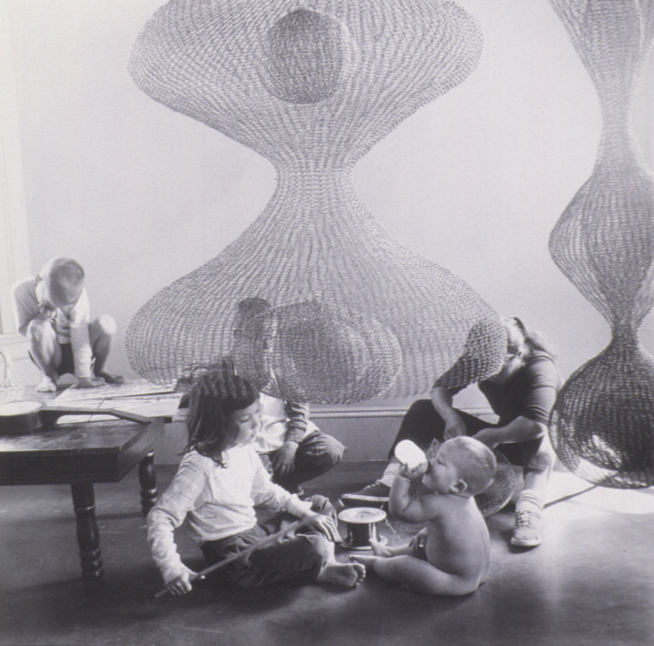
Years later in 1957, after her children had grown and she’d long-since left the garden to experiment with other techniques and subjects, Cunningham returned to her earlier themes by capturing another artist and mother, at home and at work, in her portrait of Ruth Asawa with four of her children. The scene must have been familiar to Cunningham, and it was no mistake that she framed Asawa’s biomorphic, hanging sculpture at the center of the composition: at the heart of it all, she seems to suggest, is the work that drives us.

When SAM reopens its doors, you will be able to find Ruth Asawa Family and Sculpture in the exhibition Exceptionally Ordinary: Mingei 1920-2020. And November 2021 will bring together nearly 200 of Cunningham’s photographs, along with sculpture by Asawa, in the exhibition Imogen Cunningham: A Retrospective. Until then, as we all stay home, may their work inspire you to continue the work that drives you, whatever that may be.

Carrie Dedon, SAM Assistant Curator, Modern and Contemporary Art

If you value the ways SAM connects art to your life, consider making a donation or becoming a member today! Your financial support powers Stay Home with SAM and also sustains us until we can come together as a community and enjoy art in the galleries again.

[1] Imogen Cunningham and Edna Tartaul Daniel, Imogen Cunningham: Portraits, Ideas, and Design (Berkeley: University of California Regional Cultural History Project, 1961), 26.
[2] Imogen Cunningham, in Brooks Johnson, ed., Photography Speaks: 150 Photographer On Their Art (New York: Aperture, 2005), 120.
Images: Magnolia Blossom, Tower of Jewels, 1925, Imogen Cunningham, gelatin silver print, 11 1/4 x 8 1/4 in., Gift of John H. Hauberg, 89.67 © (1925), 2009 Imogen Cunningham Trust. Ruth Asawa Family and Sculpture, 1957, Imogen Cunningham, Gelatin silver print, 10 3/8 x 10 3/8 in., Gift of John H. Hauberg, 89.43
Stay Home with SAM is supported in part by
This image has an empty alt attribute; its file name is OAC_logoblack-rgb-150x150.png
SAM Stories