Connecting Art to Life in Every Way: Accessibility Updates from SAM

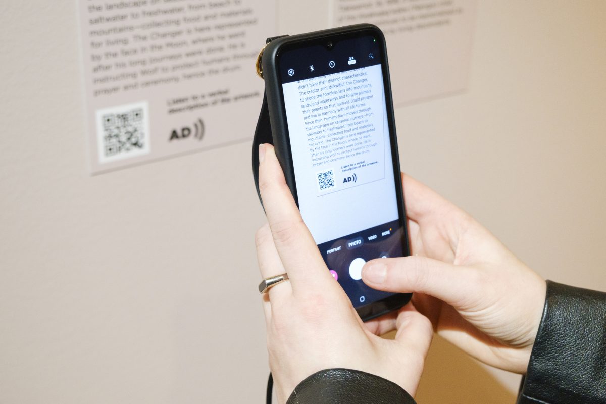
“This bronze sculpture of a seaweed stalk sits on a freestanding pedestal a few feet off the ground. The overall shape is abstracted, made of rounded, wavy, leaf-like shapes. The surface color is a dark, chocolatey brown that blends with lighter patches of deep caramel. As you move around the sculpture, the color shifts as light reflects off the patina from different angles.”

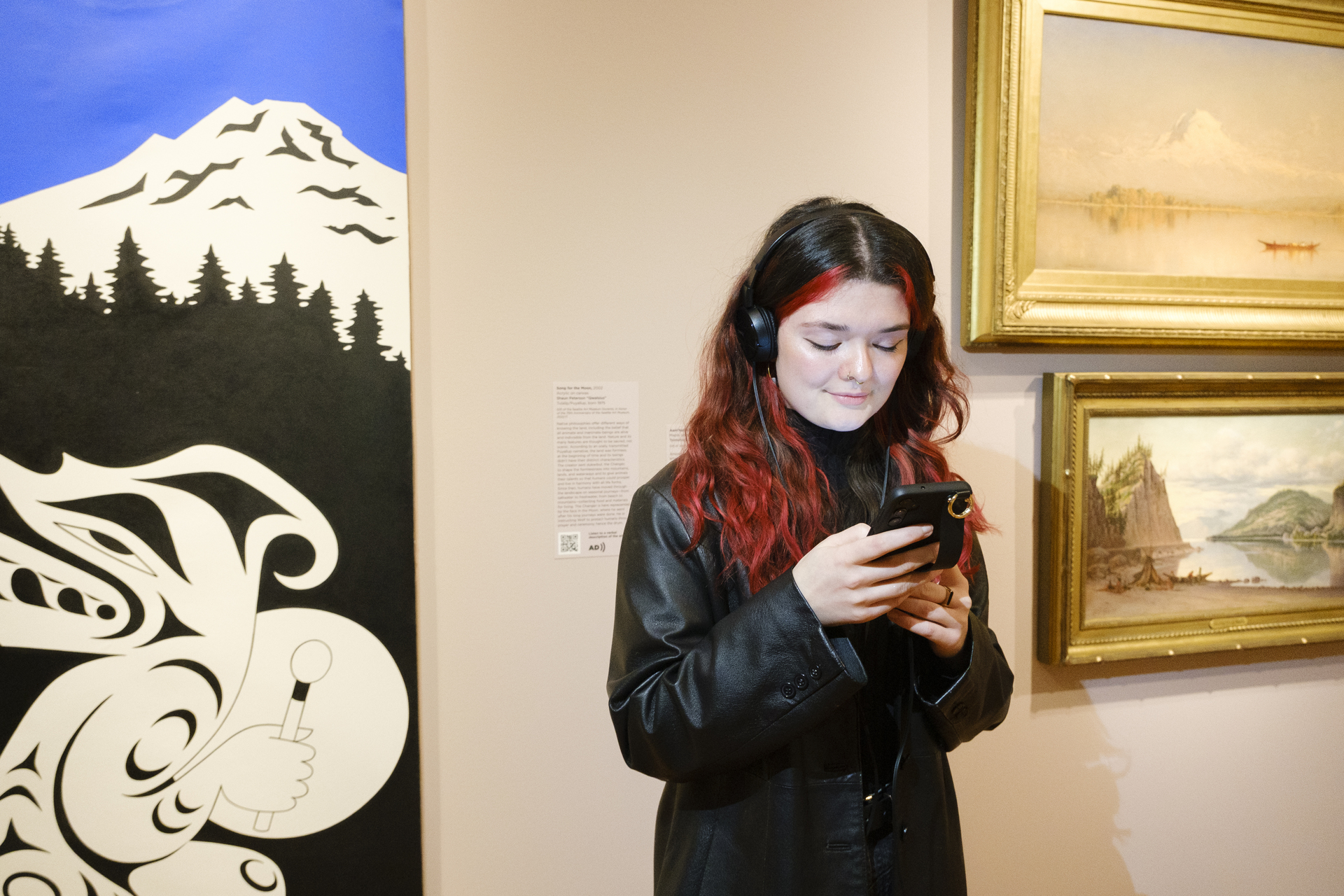
This is an excerpt from the verbal description for the collection work Mo (Seaweed) (1977) by George Tsutakawa. These detailed audio explanations bring artworks to life for visitors with low or no vision and are available for smartphones via QR codes.

With the guidance of an accessibility trainer and contributions from community members—including SAM Visitor Experience Representative Derek Bourcier and former SAM docent Donnie Wilburn—we’ve revamped our production of verbal descriptions. In addition to creating them for many artworks in special exhibitions, such as Jaune Quick-to-See Smith: Memory Map and Calder: In Motion, The Shirley Family Collection, we are also working to create them for collection galleries such as American Art: The Stories We Carry at the Seattle Art Museum and Boundless: Stories of Asian Art at the Seattle Asian Art Museum.

“We want our verbal descriptions to meet the needs of the people they’re serving,” says Ramzy Lakos, SAM Museum Educator for Digital Learning, who leads their development. “The goal is to have one for every artwork on view. We get a little closer to achieving that every year.”

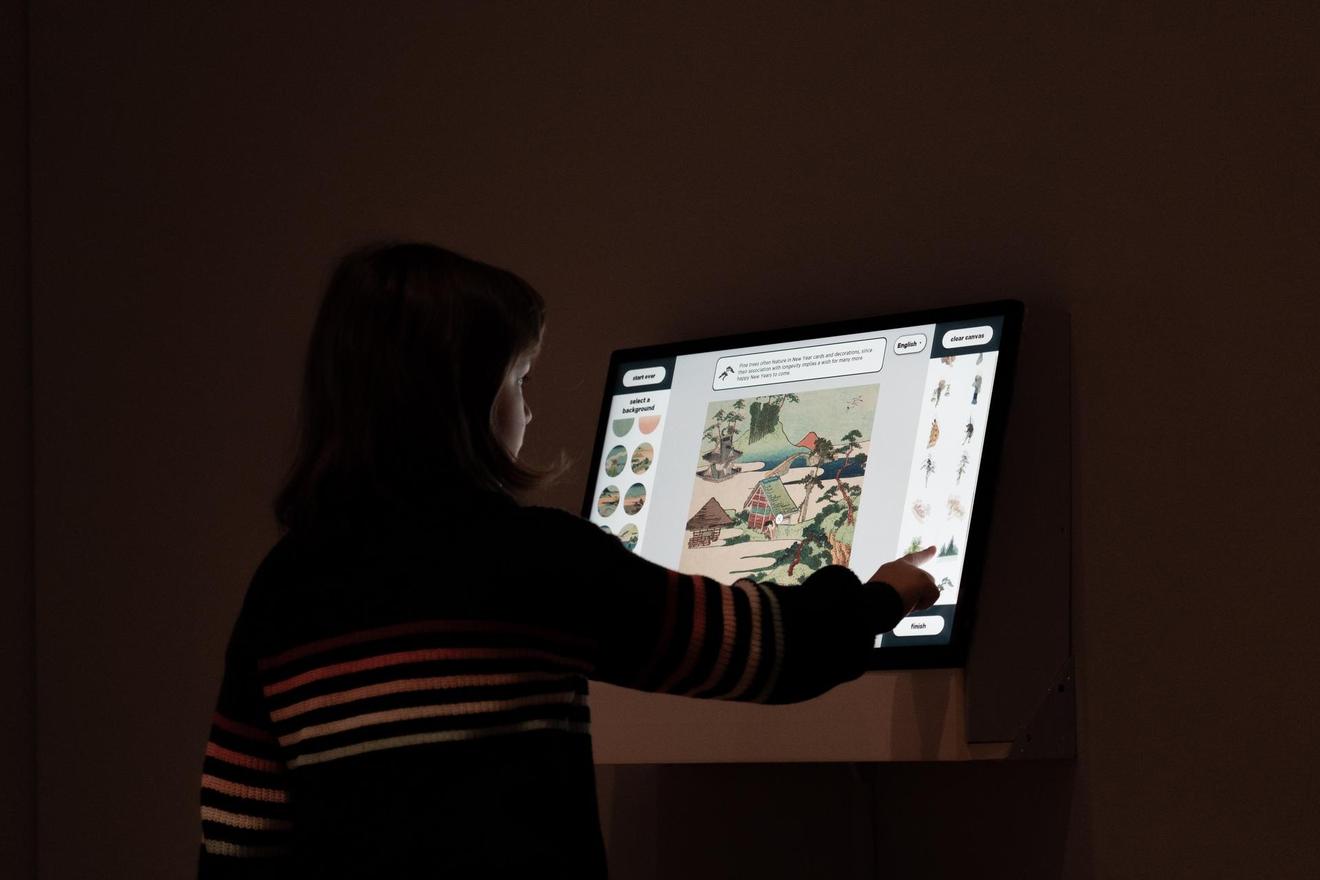
In addition to verbal descriptions, the museum offers large-print copies of the object labels for select exhibitions as well as transcripts of all smartphone tours. SAM also offers ASL interpretation upon request. At Coat Check, visitors can borrow baby carriers and strollers, canes, stools, wheelchairs, disposable magnifying glasses, earplugs, large-print maps, colorblind glasses, a text telephone device, and Android phones with headphones for accessing online audio tours and descriptions.

“It’s all about progress,” says SAM Visitor Experience Manager Chelsea Leingang. “It’s about acknowledging that SAM can do better and actively working to make the artwork in our galleries more accessible to visitors.”

Check out visitsam.org/accessibility or call us at 206.654.3210 for more information about our accessibility options, to request accommodations, or obtain a large-print version of SAM magazine.

– Lily Hansen, SAM Marketing Content Creator

This article first appeared in the February through May 2024 edition of SAM Magazine and has been edited for our online readers. Become a SAM member today to receive our quarterly magazine delivered directly to your mailbox and other exclusive member perks!

Photos: Alborz Kamalizad.

Improving Your Museum Experience with Technology: Emerging Arts Leader Shuprima Guha Reflects

I’ve always enjoyed spending time in art museums. With ambling hallways and multiple rooms featuring a variety of historic and contemporary art, it’s the excitement of not knowing what I’ll discover next that first got me interested in working at one. I joined SAM with the intention of learning more about how different museum departments come together to facilitate ideas. Suffice to say, I checked off this goal during my first few weeks at SAM. 

As an interpretation intern, I learned how SAM uses technology and verbal descriptions to improve accessibility for different audiences at the Olympic Sculpture Park. Verbal descriptions explain a work of art in terms of its color, size, texture, and other features so that individuals with low or no vision can better experience the piece. I developed the skill of writing for auditory purposes in this process. Conducting research on the most inclusive ways to approach writing these descriptions—along with the continuous feedback provided from the rest of the verbal description team—helped me overcome this learning curve of shifting from writing for reading purposes to writing for listening purposes and led me to produce some of my best work. 

While conducting this work, I began to ask questions about the smartphones that museum visitors can check out while browsing the galleries—part of SAM’s effort to improve in-gallery accessibility. This led to important conversations about how we envision visitors interacting with these devices and what museums can do to support such interactions (thank you to the visitor experience team for their expertise). Beyond these tasks, I also helped in developing the interpretive elements of Hokusai: Inspiration and Influence from the Collection of the Museum of Fine Arts, Boston, including the touch cart, in-gallery guide, and the digital collage interactive.

The support I received from the museum’s staff, security, volunteers, and my fellow interns played a tremendous role in how I approached my work. Asking questions to people from different departments created a system of support in which I knew everyone at the museum was eager to help. From isolating digital elements of Hokusai prints with the design team to prototyping a touchscreen interactive with staff from multiple departments, I believe collaboration was essential to my time at SAM. Deciding which topics to research and conducting meetings related to the Hokusai interactive taught me about not only project management, but also about Japanese culture and history. In writing the guide the exhibition’s interpretive touch cart, I also became familiar with the materials used in Japanese woodblock printing—thank you Jessica and Sorrel for your help!

As I began my SAM internship, it was exciting to see all of the tasks that SAM’s staff had planned for me; there was so much to do and so little time! Prioritizing tasks was one of the most important skills I developed. Although each new day was filled with exciting events and meetings, I made important decisions on which ones I attended and which I did not to ensure I could independently complete my tasks within a timely manner. Another skill I learned through this internship was networking. I learned how to ask questions about different staff members’ experiences and took advantage of the opportunity to get to know new people in the office, kitchen, elevators, and galleries. These skills are something I will carry forward in my academic and professional life. 

This internship showed me the initiatives the museum takes in making art accessible to visitors— something that I am particularly passionate about. Knowing that so many people care about the same things gives me immense hope for the future of museums. From accompanying docent-led tours to conducting surveys in the galleries, I learned how to engage with the public and lead conversations about art. As someone who has always been a bit hesitant to voice my opinion in large groups, my newfound confidence and eagerness to speak in public is one of the most valuable lessons I learned at SAM.

None of this would have been possible without the support of my incredibly supportive and encouraging coworkers. I want to particularly thank my supervisor, SAM Educator for Digital Learning Ramzy Lakos, whose creative ideas played an integral role in shaping my SAM experience. His optimism and sense of humor always made even the most challenging task feel simple. I want to thank everyone on the education team as well. Their excitement about the museum’s future shines through in everything they do. Lastly, I am grateful to everyone who I reached out to at various points in the last few months: thank you for making me feel like a part of the SAM community. I look forward to carrying these experiences into the next step of my career.

– Shuprima Guha, SAM Emerging Arts Leader in Interpretation

Photos: Alborz Kamalizad.

Inside SAM’s World of Compelling Cloth: French Coverlet

While many of us source our coverlets—more commonly referred to today as a bedspread—from big-name companies, in 18th century France these objects were typically handwoven and dyed with meticulous precision by local artisans. They often featured intricate embroidery details that took hours to craft. In the sixth stop of our smartphone tour of Ikat: A World of Compelling Cloth at SAM, we take a close look at a French coverlet from the late 18th century and explore its fabric, known as Chiné à la branche. Browse all seven stops of our free smartphone tour from the exhibition’s galleries before it closes on Monday, May 29 or in your own time here.

How was Chiné à la branche used?
European ikat fabrics were incredibly expensive to produce, which is one of the reasons Chiné à la branche is most closely associated with royalty. Marie Antoinette had a particular affinity for the fabric, having her court clothes and palace furnishings made of various Chiné à la branche designs. The more popular designs in court were soft, blurred floral patterns, which were used for everything from dresses to upholstery.

How did industrialization affect ikat?
Industrialization led to the French abandoning the slow and costly production of ikat. Rather than hand-dying individual bundles, they were able to print patterns directly onto the warp threads. The dress shown above is stylized to look like ikat, but technically does not follow the traditional ikat process.

Verbal Description of French Coverlet

This coverlet was made in the late 18th century and measures five feet, six inches tall and four feet, nine inches wide. The ikat top layer of this coverlet is made of silk and linen thread and the back is made of silk. The layers are connected by quilted embroidery. This coverlet—or, bedspread—has both the colorful print-like pattern of the weave and a textured pattern created by the quilting process that joins the ikat fabric with other layers of the piece. The backing of this bedspread is a pink silk fabric. Between the silk backing and the ikat top layer, there’s about half an inch of batting—or, filling—that would make the coverlet a more effective warming layer for a bed.

First, we’ll examine the woven pattern of the ikat, which is precise in its execution, but has an intentional blurry quality around the edges. The pattern is a repeat of vertical stripes: a powder-blue stripe about three inches wide sits next to a cream colored stripe about five inches wide. This set of stripes is repeated six times across the coverlet. Within the cream colored stripe, there’s more detail. Thin lines on both edges of the cream stripe in pale yellow, dusty rose, and black frame an abstract design of flowers.

The stems and leaves of the flowers are a soft, mossy green and run down the center of the cream stripe in alternating curved lines that are reminiscent of vines. Splashes of the same dusty rose color form the blossoms of the flowers. Both the blossoms and the stems have irregular edges that artists in France nickname ‘flambé’—or, flaming—an aesthetic that was desirable at the time. On the sides of the coverlet, there are two strips of the fabric that have been cut off and attached perpendicularly to the rest of the bedspread, making the pattern horizontal on the edges.

Now let’s focus on the quilting that joins the layers together. The quilted stitching is done in a clear thread so that the lines themselves are only visible by the indentation and texture they create on the surface of the bedspread. In the center of the piece, there is a circle surrounded by eight symmetrical petal shapes, forming a simple flower shape like a large daisy. The daisy has three rings encircling it and then diamond shapes fill up most of the coverlet until about a foot from the edges where they are boxed in. Around the diamonds, small hearts and daisies alternate in a border to the quilting.

– Lily Hansen, SAM Marketing Content Creator

Photo: French Coverlet, late 18th century. Collection of David and Marita Paly. Silk, warp ikat, linen weft, quilted embroidery. 66 in. x 57 in. Marie Antoinette, Archduchess of Austria by Joseph Ducreux. 1769. Pastel on parchment. © Château de Versailles. Robe à la Française, French, 1760–70, Silk. © The Metropolitan Museum of Art.

Inside SAM’s World of Compelling Cloth: Woman’s Robe (Mashru)

Mashru is an Arabic word meaning ‘permitted’ or ‘allowed.’ In many Islamic cultures, a mashru is a garment made of a silk-cotton blend worn my individuals of all social classes. This stop of the smartphone tour of Ikat: A World of Compelling Cloth explores the history of mashru garments with additional content not found in SAM’s galleries. Learn about these garments below and see an example for yourself by visiting the exhibition at SAM’s downtown location before it closes Monday, May 29. Plus, explore all of the stops in SAM’s free verbal description tour on SoundCloud.

One ikat textile that has traveled across Asia is the satin-woven fabric known in India as mashru. This type of silk-cotton blend is called mashru. Mashru cloths were worn by men and women across the Islamic world. In some Islamic cultures, Muslims are not permitted to wear pure silk garments, so textile makers in India experimented by adding cotton into the silk weave, creating a garment that was soft and lightweight, but also acceptable to wear.

Verbal Desciption of Woman’s Robe (Mashru)

This garment is a mashru. Mashru is spelled M-A-S-H-R-U. The robe was made in Syria in the 19th century and measures five feet, six inches tall by four feet, five inches wide. The garment is made of silk and cotton thread and metallic embroidery. The robe is hung on a ‘T’ frame with the arm sleeves stretched out and the back of the garment facing the viewer. A dense pattern of stripes and arrowhead shapes defines this woman’s robe from Syria. The robe’s hem extends down to the wearer’s knees and the long sleeves reach to the wrists.

Let’s start by talking about the pattern on the outside of the garment. Long, thin vertical stripes alternate in cherry red, black, and light pink. Layering on top of these stripes are horizontal bands of white arrowhead shapes which create a complex illusion of depth. By contrast, the inside of the robe is lined with a soft cream white cotton. The inside of the sleeves are decorated with a cotton ikat cloth with blue and white stripes.

Now, let’s focus on the structure of the robe. The body of the robe is made three vertical panels of fabric—roughly equal in size—that hang down separate from one another so you can imagine how they might sway and twirl as the wearer moved about. To join these panels together and close up the robe, the wearer would fasten a series of balls and loops found along the edge of each panel which is scalloped with reprieving triangle patterns. As we zoom into that edge, notice how metallic thread is embroidered into decorative designs, adding weight and stiffness.

The rest of the robe is thin and lightweight; the surface is silky smooth. This comes from the blend of fibers used here: silk for the warp threads—which run vertically—and cotton for the weft threads which run horizontally. This type of silk-cotton blend is called a mashru, an Arabic word meaning permitted or allowed. Mashru cloths were worn by men and women across the Islamic world. In some Islamic cultures, Muslims are not permitted to wear pure silk garments so textile makers in India experimented by adding cotton into the silk weave, creating a garment that was soft and lightweight, but also acceptable to wear.

– Lily Hansen, Marketing Content Creator

Photos: Mushruu (woman’s Ottoman robe), 19th century, Silk Road (garment made in Ottoman world; ikat cloth possibly Syrian), silk warp ikat and cotton weft, metallic embroidery, 53 x 66 in., Collection of David and Marita Paly. Traditional Mashru Weaving in Gujurat, India.

Inside SAM’s World of Compelling Cloth: Chief’s Poncho

This stop on SAM’s smartphone tour of Ikat: A World of Compelling Cloth explores an indigo and cream poncho created by the Mapuche people of Chile in the late 19th century. It includes photos and text not found in the exhibition’s galleries as well as a verbal description of the textile intended for visitors with low to no vision, or anyone interested in taking a closer look at the artworks.

Scroll below to learn about Chile’s Mapuche people, the connection between weaving and land rights, the significance of stepped crosses on Mapuche textiles, and a thorough explanation of one particular poncho on view in SAM’s galleries. You can explore all seven stops of the exhibition’s smartphone tour and thirteen available verbal descriptions while visiting SAM or on your own time. And don’t forget: Ikat is on view at SAM’s downtown location through Monday, May 29—don’t miss it, get your tickets today!

Who are the Mapuche?

The Mapuche are the largest group of indigenous people in Chile and make up about 9% of the country’s population. Mapuche culture has existed in Southern Chile and Southwestern Argentina since 500 BC, but the current relationship between the Mapuche and the Chilean State is fraught. The government has stripped away land rights from the indigenous groups, and has met protests with a variety of human rights abuses.

How are land rights and weaving connected?

As the Mapuche people lose their land, they also lose access to the raw materials used in traditional crafts, such as weaving. Indigenous forests are being cut down and replaced with more profitable logging materials, like eucalyptus and pine. Many of the indigenous species being destroyed are used by the Mapuche for dying wool, creating drums, and even in medicines.

What is a Stepped Cross?

A stepped cross, also known as a gemil, or chief’s mantle, is a design featured frequently in Mapuche weaving. It represents the art of handcrafting, science, and knowledge. A poncho with these bold geometric patterns and deep indigo hue would be worn by a distinguished leader in the community. The deep, almost black, indigo color indicates the “celestial vault”. On a man’s garment, this signifies the wearer is accomplished beyond the parameters of humanity.

Verbal Description of Mapuche Poncho

Woven in Chile by the Mapuche people in the late 19th century, made of sheep’s wool and dyed with indigo. It is four feet and ten inches tall by four feet and eleven inches wide. This poncho is made by the Mapuche, which is the largest group of Indigenous people in Chile. It would be worn by a chieftain, a mature man of elevated position in their community. Lying flat, the poncho is a square shape. There is a vertical slit in the middle of the square meant for a person’s head to fit through. When worn, the front and back sides of the poncho hit just below the waist of an average sized man. The poncho appears to be black and white, but upon closer inspection, the colors are the deepest shade of indigo and a warm beige. The indigo hue was achieved from months of dyeing and oxidation, creating a color so rich and intense it seems almost darker than black. The pattern on the poncho is made of geometric designs of stepped crosses and lines in indigo with the surrounding space being a warm cream color. Nine equidistant vertical lines cover the poncho. Sitting on the lines are staggered stepped crosses. The stepped crosses look like pixelated diamonds, with three steps on each side. An indigo fringe sits on two edges of the poncho—what would be the front and back when worn by a person. Symmetry is a very important part of the textile. If you folded the poncho onto itself in any direction, it would create a perfect inversion every time. The poncho is made of woven Spanish merino wool; thick and rough but still pliable. When worn by a chieftain, the fabric wouldn’t simply fall flushed to its wearer, but pucker and lift as the sturdy wool tries to maintain its shape.

– Lily Hansen, SAM Marketing Content Creator

Photos: Mapuche, late 19th century, Chile, warp ikat sheep’s wool, indigo, 58 x 59 in., Collection of David and Marita Paly. Mapuche protesters wearing traditional clothing © Negro Ramírez. Loom and weaving with “cacique’s mantle” design Nancy Epulef Barra, Mapuche, b. 1971 wood, wool yarn, vegetal dye/dyes © National Museum of the American Indian. Chief’s Mantle (Manta de Cacique) Chile, Mapuche, 20th century wool; ikat © Minneapolis Institute of Art.

Inside SAM’s World of Compelling Cloth: Agbada

Not all of the stops on SAM’s smartphone tour of Ikat: A World of Compelling Cloth feature artist interviews and other audio content. Some stops, such as this one focused on a traditional Yoruba agbada, offers additional exhibition information via pictures and text accompanied by a verbal description of the artwork on view. Look below to learn about the importance of these traditional men’s tunics and how they’re made. Browse through all seven stops of the exhibition’s free smartphone tour and listen to its thirteen available verbal descriptions now, then purchase your tickets to see the exhibition at SAM’s downtown location before it closes on Monday, May 29.

What is an Abgada?
An agbada is a long, flowing robe with wide sleeves worn by men in some parts of West Africa, often decorated with embroidery. Traditionally, agbada were prestigious garments associated with royalty. These days, agbada are more common with a wide variety of styles to fit the occasion.

What is Aso-Oke?

Agbada are traditionally made from Aso-Oke fabric, which is a hand-loomed cotton cloth of the Yoruba people in Nigeria. The style of Aso-Oke fabric featured on the garment in this gallery is known as ‘Etu,’ which is made to imitate the striped blue and white colors of the Guinea Fowl for which it is named.

Verbal Description of Agbada

This garment is called an agbada—spelled A-G-B-A-D-A—which is the Yoruba word for a men’s tunic. This garment dates from the early 20th century. The garment is exceptionally oversized to create a strong impression, as it measures four and a half feet tall by five feet wide. The agbada is Aso-Oke strip-woven, which is a Yoruba term that specifically describes this type of handwoven cloth, which incorporates cotton, ikat, and cotton hand-embroidery. The base fabric in this garment is a dark blue cotton, resembling denim. Layering over the blue cotton are thinner strips that gradually shift from red to white. The stripes are vertical on the bodice of the garment, but horizontal on the sleeves. At the center of the garment, are two pockets for resting your hands, like the pockets on a hoodie. Along the neckline, adorning the front of the agbada, around the frontal pockets, is intricate white embroidery. If you look closely at the embroidery, you can see where the red stripes have bled onto the white thread, turning them light pink. The neckline’s embroidery appears as point-side down adjacent triangles that give the impression of a lacey necklace. The embroidery on the front consists of eleven rounded medallion-like shapes that form a symmetrical grouping around the pockets. The medallions are about the size of a fist and their shapes resemble chain links. The embroidery around the pockets is similar to the neckline with lacey pointed bands encircling the pocket openings.

– Lily Hansen, SAM Marketing Content Creator

Photos: Agbada (tunic) and pants, mid-20th century, Africa (Yoruba), cotton, tunic: 47 x 88 in., pants: 36 x 32 in., Collection of David and Marita Paly. Ori of Otun, photograph by William Buller Fagg. Nigeria, 1949-1950. Royal Anthropological Institute London. © RAI. A late C19th image of an aso oke weaver, one of the earliest known photos of aso oke production. Photographer unknown, courtesy Foreign & Commonwealth Office Archive, London.

SAMBlog