Object of the Week: The Important an Unimportant

Since John Baldessari’s death last week, there has been a commensurate stream of articles recounting his outsized influence as a pioneering artist and educator, with a prolific career spanning decades.

With beginnings as a painter, Baldessari, like many artists of the 1960s and 70s, eventually gravitated toward conceptual art and the pre-eminence of ideas over objects. However, unlike many of his contemporaries, Baldessari imbued his conceptual art practice with humor and wit, employing “a sort of Dada irony and sometimes colorful Pop Art splashes . . . to rescue conceptual art from what he saw as its high-minded self-seriousness.”[1]

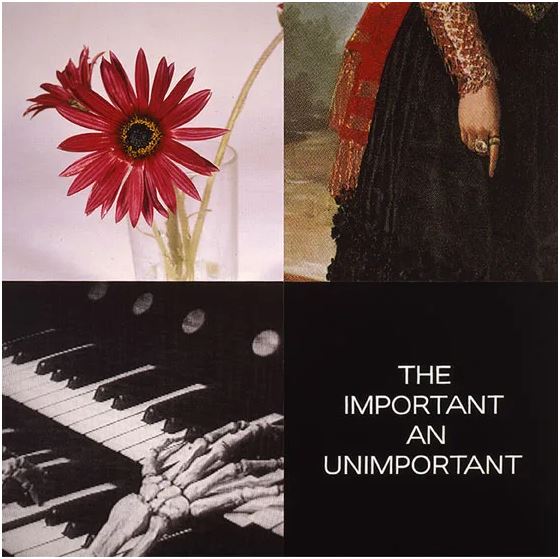
Baldessari’s enduring interests included the relationship between text and image—which often meant pitting them against one another to challenge their assumed accuracy—and the appropriation of images from photography and film. His 1999 painting, The Important an Unimportant (from the Tetrad Series), in SAM’s collection is an exemplar work in this regard, a combination of digital printing, hand lettering, and acrylic paint on canvas.

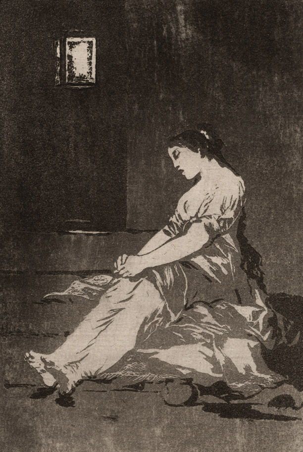
The composition, made up of quadrants, juxtaposes square images—a glass with red daisies, a woman’s finger pointing down, and two skeleton hands playing an organ—with a textual element that reads, “the important an unimportant.” If these sequences appear heterogeneous and somewhat anachronistic, it is because they are. For example, the excerpt in the upper right is lifted from Goya’s 1797 painting The Duchess of Alba, painted while the duchess mourned her husband’s death. In the lower left, a still from Erich von Stroheim’s 1928 silent film, The Wedding March, is a not-so-subtle harbinger of the fate which befalls the romance and aristocratic aspirations of the film’s protagonist lovers. The text in the lower right, even, is an excerpt from Portuguese writer Fernando Pessoa (1888-1935), “for whom nullity was a muse.”[2]

Taken together, these citations enrich our understanding of Baldessari’s wide range of influences. And whether we know the exact origins of his chosen references or not, the appropriated images and texts are here imbued with new meaning. We are invited—and, importantly, required—to participate as viewers to consider their relationship to one another and the history of visual representation more broadly.

A serial creator, Baldessari always adhered to his now-famous maxim to “not make any more boring art.” A simple enough credo, such a motivation directly impacts us as viewers, who are on the receiving end—simultaneously empowered and challenged by his work. Perhaps best articulated by New York Times art critic Roberta Smith, “[Baldessari’s] work amuses, unsettles, questions and makes you look twice and think thrice; laugh out loud; and in general gain a sharpened awareness of the overlapping processes of art making, art viewing, and art thinking.”[3]

Elisabeth Smith, SAM Collection & Provenance Associate

Image: The Important an Unimportant, 1999, John Baldessari, digital printing, hand lettering, and acrylic paint on canvas, 94 x 94 in., Gift of the Virginia and Bagley Wright Collection, in honor of the 75th Anniversary of the Seattle Art Museum, 2014.25.6 ©️ Artist or Artist’s Estate
[1] Jori Finkel, “John Baldessari, Who Gave Conceptual Art a Dose of Wit, Is Dead at 88,” The New York Times, Jan. 5, 2020, https://www.nytimes.com/2020/01/05/arts/john-baldessari-dead.html.
[2] Adam Kirsch, “Fernando Pessoa’s Disappearing Act,” The New Yorker, Aug. 28, 2017, https://www.newyorker.com/magazine/2017/09/04/fernando-pessoas-disappearing-act.
[3] Roberta Smith, “Tweaking Tradition, Even in Its Temple,” The New York Times, Oct. 21, 2010, https://www.nytimes.com/2010/10/22/arts/design/22baldessari.html.

Graphic Content: Aquatint

This week on Graphic Content we discuss aquatint, another intaglio method of printmaking. This is a oft-used method of Goya’s in his Los Caprichos series. Speaking of . . . you’ve only got two more weeks to see 80 prints from the Los Caprichos series in Graphic Masters: Dürer, Rembrandt, Hogarth, Goya, Picasso, R. Crumb.

This huge exhibition showcasing over 400 print works created across 500 years closes August 28. That means, you’ve got one more Press & Print: Drop-in Studio where you can experiment with the techniques you see in the exhibition. Also, coming up is the final My Favorite Things tour of the exhibition with Jessixa Bagley.

Aquatint

Goya was so adept at this technique he could create a print entirely in aquatint. Check out plate thirty-two of Los Caprichos in this show and see if there is an etched line in sight.

A variation of the etching process, aquatint allows for areas of printed tone in order to achieve a more painterly effect. Instead of a uniformly brushed on ground, powdered rosin is dusted onto the plate until the desired coverage is achieved. The acid eats away the unprotected portions of the plate between the rosin particles, resulting in a rich, speckled effect.

Los Caprichos: Por que fue sensible. (Because she was susceptible.), 1796–1797, Francisco Goya

Goya used aquatint to create a dank, gloomy prison cell that mirrors the despair of this unfortunate young lady.

IMAGES: Illustrations: Tim Marsden. Los Caprichos: Por que fue sensible. (Because she was susceptible.), 1796–1797, Francisco Goya, Spanish, 1746–1828, aquatint, 8 7/16 × 6 in., Private Collection.

Graphic Content: What is a Print?

Get a primer on the printmaking techniques of the masters in Graphic Masters: Dürer, Rembrandt, Hogarth, Goya, Picasso, R. Crumb. Try making your own prints at home after you’ve been inspired by your visit to SAM, or check out our Press & Print: Drop-In Studio sessions while at you’re at the museum and put these tips into practice with the guidance of local artists.

Let’s start simple!

What is a print?
At its most basic, a print is a work of art on paper that’s produced in multiples from an inked surface. While various types of printmaking exist, the basic components are the same—an inked wood block or plate, a sheet of paper, and a press that transfers the ink to the paper. The process is repeated many times, resulting in multiple impressions of the same image. Voila, a print edition!

How to make a Potato Print!

The development of printmaking
Following the invention of the printing press in the 15th century, printmaking gained popularity as an inexpensive way to disseminate visual information to a mass audience. Early prints—typically illustrations in books or reproductions of famous paintings—tended to be relatively small, affordable, and easily transportable. While fine paintings by important artists were too expensive for most people, prints were within reach.

The Development of Printmaking

Prints did not remain purely illustrative for long. Printmaking came to be seen as a distinct mode of expression capable of producing works of fine art. Artists like Albrecht Dürer established a tradition of virtuoso printmaking. His episodic handling of narrative through print series, like The Large Passion, laid the groundwork for later generations of graphic artists from William Hogarth to R. Crumb.

The technical innovations of artists like Rembrandt van Rijn and Francisco Goya pushed the boundaries of the medium and further elevated printmaking as an art form. Connoisseurs began to build collections of particularly fine impressions. Rembrandt’s Christ Healing the Sick was so sought after that it fetched prices usually associated with oil paintings, earning it the nickname “The Hundred Guilder Print.” But in general, prints remained accessible works of art meant to be viewed and appreciated up close.

Intaglio

Tools of the Trade

Intaglio (Italian for “carving”) is the opposite of relief. A linear design is carved into the surface of a polished metal plate, usually copper. Ink is worked into the entire plate and then the surface is wiped clean, leaving ink only in the recessed grooves and pits. As the printing process wears down the plate, the artist can rework the design to pull more impressions. Altering the plate surface results in a new version, or state. Some artists, Rembrandt in particular, used this opportunity to make dramatic changes to their compositions.

Christ Healing the Sick (The Hundred Guilder Print) by Rembrandt van Rijn

There are several types of intaglio printing: engraving, drypoint, etching, and aquatint. Artists may use just one technique at a time or a combination of several in a single print. We’ll cover each type of intaglio printing in the weeks to come, stay tuned!

IMAGES: Illustrations: Tim Marsden. Christ Healing the Sick (The Hundred Guilder Print), 1643, Rembrandt van Rijn, Dutch, 1606–1669, etching and drypoint, 11 1/8 × 15 1/4 in., Private Collection.
SAMBlog