SAM Creates: Collage Covered with Teresita Fernández

“I want you to feel like you are moving through a landscape painting or movie rather than within the landscape itself, blurring the lines between your presence as participant and observer.”
– Teresita Fernández
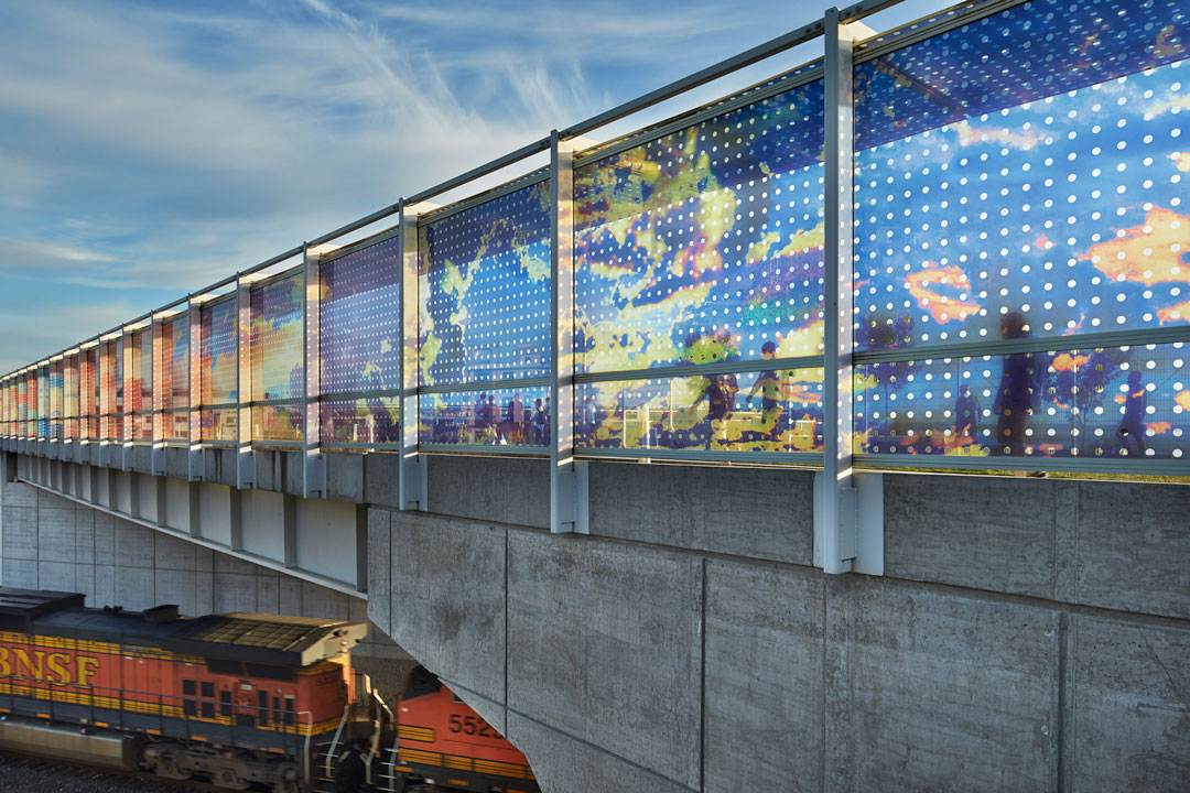
Teresita Fernández’s atmospheric work Seattle Cloud Cover uses ideas of place, pattern, and color to create an experience for the viewer that is their own. The work is site-specific, commissioned by SAM to act as a bridge connecting the city with the waterfront. With those three elements—place, pattern, and color—we’ll create an artwork inspired by Fernández’s Seattle Cloud Cover, layered with symbolism and meaning. Watch this video for a better look at the artwork before getting started.
What you’ll need
- Paper
- Landscape images
- Pencil or pen
- Watercolors or semi-transparent markers, or colored pencil
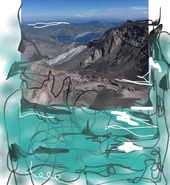
You can also create this work entirely on the computer through Kleki, a free, image-editing and creation website.


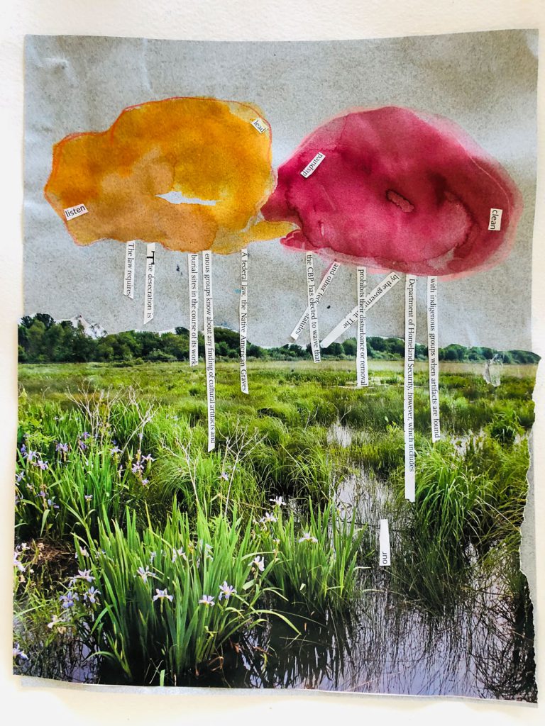
Place: Choose an image from your collage materials that has some meaning to you or is appealing to your senses. In Seattle Cloud Cover, Fernández uses images of Miami sunsets where she was born. You can tear or cut up your image and place the pieces around the page or use the whole image. Before you glue down your collage pieces think about how you might want to incorporate the elements of pattern and color into your composition.
Pattern: In Seattle Cloud Cover, Fernández uses Ben-Day dots to create a polka-dot grid, which she calls “porthole.” Through these cut out dots you can catch glimpses of the Seattle landscape. Ben-Day dots are typically used in comic books to create tone. On sunny days, the Ben-Day dots act as spotlights for the sun to shine through, transforming the space and the people in it. How might a pattern change your collaged place? Where could you add this pattern? Is there something in the image that could be the beginning of a pattern?
Color: The deep oranges, reds, violets and blues in Fernández’s Seattle Cloud Cover create their own sensation within the work. What colors will add another layer of meaning or symbolism to your work? Color can be added to the pattern, layered into the landscape, or used as a way to enhance and connect the work.
– Kelsey Donahue, SAM Assistant Manager for Gallery Learning & Lynda Harwood-Swenson, SAM Assistant Manager for Studio Programs
We’d love to see your work! Share your completed piece using the hashtag #StayHomeWithSAM
We are humbled by the generosity of our donors during this unique time. Your financial support powers SAM Blog and also sustains us until we can come together as a community and enjoy art in the galleries again. Thanks to a generous group of SAM trustees, all membership and gifts to SAM Fund will be matched up to $500,000 through June 30!