Twice as Nice: SAM Staff Artists Tie FTW

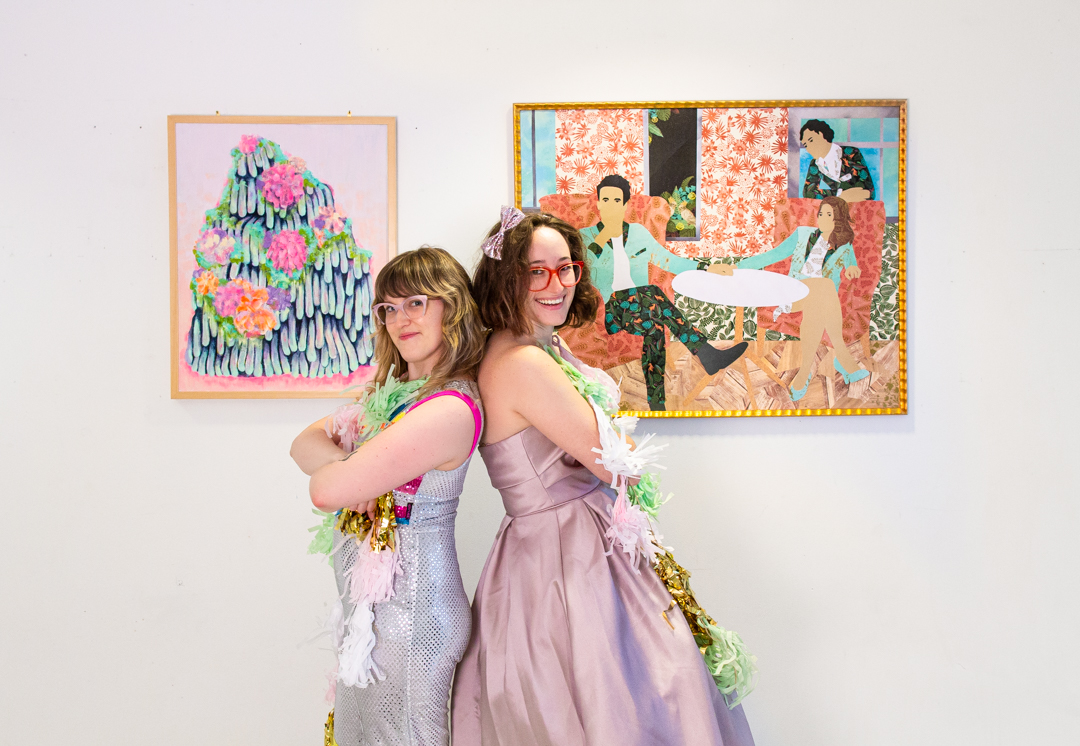
Every year Seattle Art Museum’s Community Gallery is dedicated to artwork by its staff and the eclectic outcome is a thing of true beauty—as colorful and strange as all the art lovers and artists that work here. This year, in a true testament to the volume of excellent work that was on view July 31 to September 1, not one but two talented SAM staff members were voted as faves by their peers. Ashley Mead, Assistant Registrar-Rights and Reproductions, and Natali Wiseman, Design Studio Manager, tied for our hearts this time around. Learn more about these two artists their obsessions with color, and their love for SAM’s Australian Aboriginal collection in this interview!

SAM: How does this work fit into your larger artmaking practice? Have you always worked in this medium?

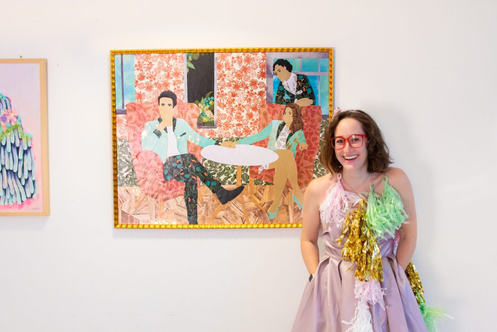
Ashley Mead: It doesn’t? Or rather, because I’m inconsistent in my practice it totally fits with my larger artmaking practice. I just couldn’t tell you how. I’ve worked with paper for a few years and in collage for one year, and only because I agreed to do a portrait before I remembered that I can’t draw. Other than that, I dabble in just about every medium I can get my hands on—hence the inconsistency.

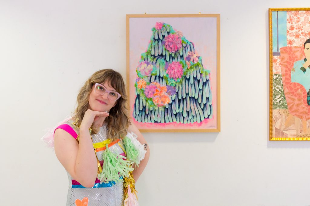
Natali Wiseman: I have always painted, but this is the first painting I’ve made in a few years. Previously I did a lot of really detailed illustrative painting, which completely broke me, so I took a long break. I wanted to try something a lot looser with less clean edges. Playing with dimensional paint was fun and new. For the last several years I have mostly been doing screen printing and collage, so it was nice to get back into painting.

What inspired the piece in the art show? Is there a story behind the work or is it part of a series?

Mead: It’s based on a photo of me, Ted, and Michael Besozzi taken at the Smith Tower on my birthday two years ago. We looked so good I wanted to know what we’d look like in paper—we’re definitely more colorful and less serious in this work than in the photo.

Wiseman: I have a 1960s craft book from my mom that has detailed instructions on making “chemical gardens”, also known as ammonia gardens (or sometimes you can buy them in kits, called “magic gardens”). The gardens are these melty piles of color, which I felt compelled to paint with overgrown fungal-looking flowers. There is something interesting to me about creating synthetic gardens.

What artists or artworks are inspirations to you in general?

Mead: Oh goodness. I’m a fan of color, that’s probably the biggest thing that draws me to a piece or artist. Specifics though, Van Gogh has always been a favorite. Mickalene Thomas is a more recent love. Oh, and I love our Australian Aboriginal collection. That’s just a short hodgepodge list.

Wiseman: This is hard! Color is a big deal for me. I love Sister Corita Kent’s work. I really like the Light and Space movement and color field painting. I also love Judy Chicago, Lynda Benglis, Richard Tuttle, Kenneth Noland, Jack Whitten, Gehard Richter, Wayne Thiebaud, Helen Frankenthaler, David Hockney . . . I suppose there could be a theme there. I love surrealism, particularly Rene Magritte, Man Ray, and Leonora Carrington. At SAM, I find the work in the Aboriginal Australian gallery to be very inspiring and meditative.

What other art projects are you working on right now or looking forward to?

Mead: All of them! I have about a half dozen commissions and half-million ideas, so good luck to me on figuring out what to focus on next.

Wiseman: More gardens, and I have some collages in the works. Hoping to do more large-scale screen printing, too. And I really want to get into ceramics! 

– Chelsea Werner-Jatzke, SAM Content Strategist & Social Media Manager

Photos: Lawrence Cenotto

Object of the Week: Untitled

“After many years in my studio I found that the light from the surface was my predominant media. The interface of light and surface . . . . While ‘light and surface’ is a rather technical triptych of words, my emotional concern is how it feels to make the art.”
—Larry Bell

In 1960s Los Angeles, a loosely-affiliated group of artists began working not with paint and canvas, clay and wood, charcoal and pen, but with two less concrete mediums: light and space. The so-called (perhaps unimaginatively) Light and Space artists were responding to new ideas about viewer perception in art, and experimenting with new materials that were suddenly widely available from Southern California-based industries: polyester resin, coated glass, Plexiglas, neon.

While artists in New York were working with similarly industrial materials and playing with the viewer’s perception of space, the emphasis on light as a medium became unique to the L.A. group. This seems to have been no accident, but a response to the place itself—there’s a certain quality of radiant light that exists in Southern California, where the sun always shines, reflecting on the waves and cars and surfboards and refracting through the immutable smog. Say what you will about L.A., but they don’t make light like that anywhere else.

So it stands to reason that Larry Bell in his Venice Beach studio, immersed in California light and with direct access to newly available materials, would become interested in the emotive potentials of light and surface. Bell began his career as a painter, but soon became fascinated with the properties of glass after working at a picture framing shop. He experimented simultaneously with abstract painting and small constructions of cracked glass, and it wasn’t long before the two parallel practices began to merge—until he added glass onto a painting itself:

“Adding glass [to a canvas] was totally intuitive. I liked the work’s feeling of simplicity, and the fact that the imagery now included the wall behind the canvas. This led to incorporating the light in front of the canvas in an ‘unpainterly’ way. I chose mirrors to replace the clear glass. I scraped away the silvering so that the reflected light and the transmitted light created the shape of a tesseract, which was also the shape of the canvases.

Representing volume, created with light, reflected and transmitted, was now part of my process. . . . Unconsciously, I had become a sculptor.”

Bell’s Untitled of 1967, on view in SAM’s Light and Space exhibition, is the result of this unconscious metamorphosis. A perfect cube made of coated glass, the work is a pure expression of volume, space contained and revealed. The thin, metal film which coats the glass allows the light filtering through the material to reflect and refract in unique ways. The edges emerge and disappear, and the sides darken and lighten as you move around the work. Though all six sides of the cube are identical, no two people will experience the same view of the whole—everything depends on your position in relation to the object, and its position in relation to a ray of light.

For many of the Light and Space artists, an artwork only reached its full potential when it was engaged in this relationship with a viewer—an object in an empty room without anyone to look at it is, in essence, not doing its job. Bell was no exception to this belief: “In my opinion all artwork is stored energy. The art releases its power whenever a viewer becomes a dreamer.” Dream on, friends, and come see what kind of energy this enigmatic box releases for you.

—Carrie Dedon, Modern and Contemporary Art Curatorial Assistant

Image: Untitled, 1967, Larry Bell, American, b. 1939, silicon-monoxide-coated glass and chrome-plated metal, 59 x 22 x 22in. Gift of Anne Gerber, 2000.168, ©Larry Bell, Photo: Natali Wiseman.
All quotes are excerpted from Larry Bell, Zones of Experience, exh. cat. (Albuquerque, NM: Albuquerque Museum, 1997).
SAMBlog