Decorative Arts, Porcelain Tea Sets, and Mr. Darcy
Archives and exhibitions intern Kaley Ellis joins us again to talk about her discoveries in SAM’s archival holdings.
This month, after an impressive 37 years working at SAM, Julie Emerson, the Ruth J. Nutt Curator of Decorative Arts, is retiring. In recognition of Julie and her career, I am writing this blog entry on an exhibition that featured decorative arts. I am currently cataloguing the exhibition Worcester Porcelain: The Klepser Collection, which ran from August to September of 1985, and featured works that remain in SAM’s collection today.
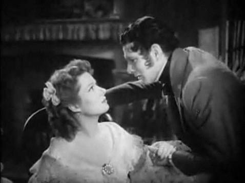
Upon researching Worcester Porcelain, I was immediately drawn to the film screenings – highlighted in the 1985 Member’s Preview brochure – that were shown throughout the duration of the exhibition, including Tom Jones, Barry Lyndon, That Hamilton Woman, and Pride and Prejudice (the romantic black and white – but slightly less accurate – version, for those of you who know your Austen multimedia). Laurence Olivier plays the dashing hero in both That Hamilton Woman and Pride and Prejudice, and while he is the war hero in That Hamilton Woman – including missing limb and roguish eye patch – I remain drawn most strongly to his portrayal of Mr. Darcy (shocking, I know, but it’s hard to beat his reluctant fall for Ms. Elizabeth Bennet, played by the timeless beauty Greer Garson). These romanticized depictions of 18th century England (excluding, of course the rather depressing tale of Barry Lyndon’s misfortunes) offer their viewers a look at both the time period and the grand estates where these porcelain objects would have been found.
And if these classic films weren’t enough to lure visitors to the exhibition, there was also the promise of a reenactment of the tea scene from Oscar Wilde’s The Importance of Being Earnest (a delightfully witty play – later made into a movie starring Reese Witherspoon, Rupert Everett, and Colin Firth, who also played Mr. Darcy in the most famous version of Pride and Prejudice). Here, the actors demonstrate the tea ceremony, a tradition in 18th century England in which a proper tea set was required – according to the exhibition catalogue – containing 48 pieces plus the additional eight mugs required for sipping chocolate (a necessary addition, in my opinion).
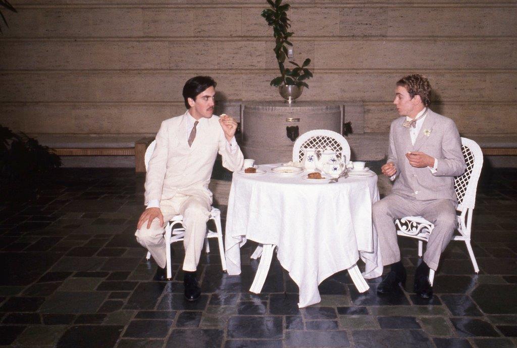
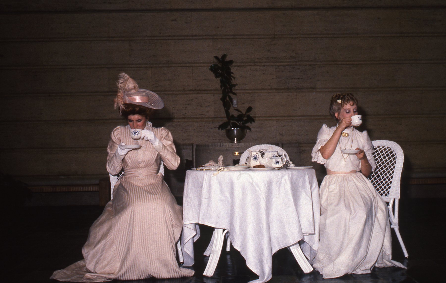
Tea scenes from The Importance of Being Earnest. Performed on August 11th 1985 at Volunteer Park.
Although these films do not specifically reference 18th century English porcelain, they offer the viewer a glimpse at what would have been their natural setting, in which these objects would have served both an aesthetic and functional purpose. The elegant, romantic, vividly colored, and often Asian-influenced designs of the Worcester porcelain objects hint at the type of lifestyle found on the elaborate English estates during that period – one of luxury and everyday grandeur. In many cases the exhibition space for Worcester Porcelain: The Klepser Collection reflected the dual role of these art works – their functional role as serve ware arranged on elegant tables and their decorative role that shows them displayed in large wall cabinets or featured in individual cases that highlight their artistic value.

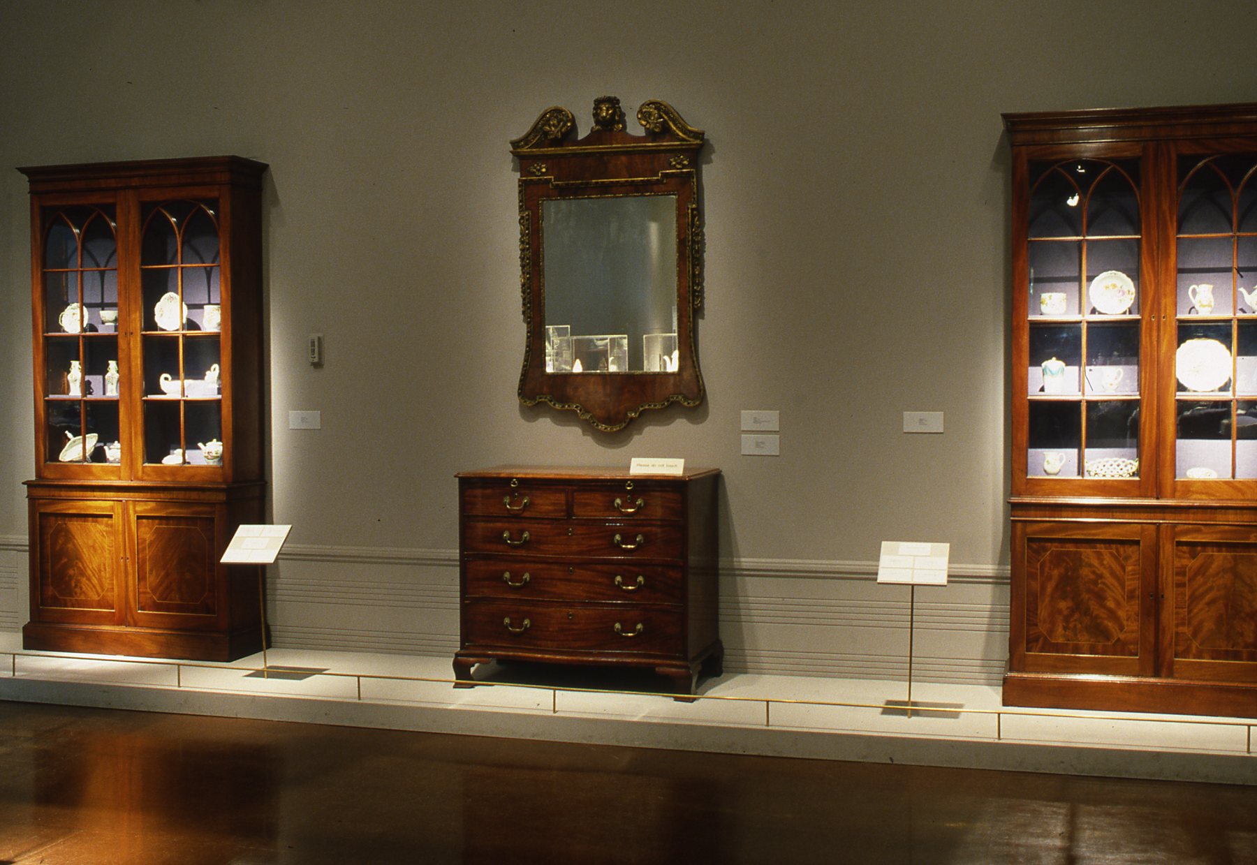
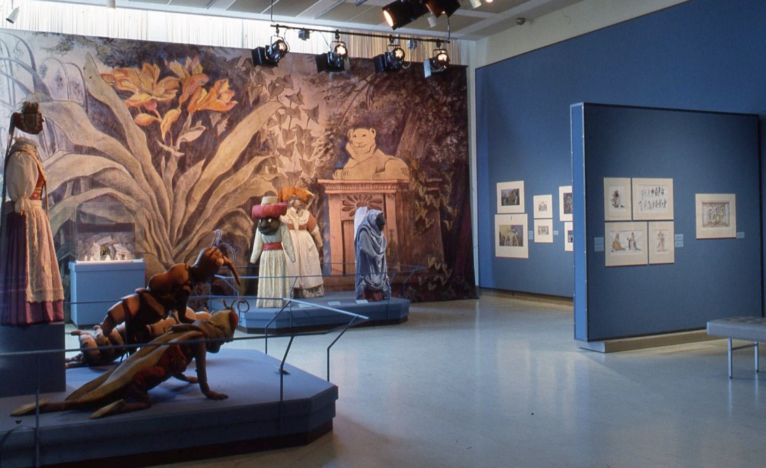
Installation views from Worcester Porcelain: The Klepser Collection (Volunteer Park), 8/8/85 – 9/22/85
The production of Worcester porcelain is separated into three main categories based on the period it was created, between the years 1751 and 1776. The first period (1750-55) saw the manufacturing location for porcelain shift from Bristol to Worcester. This period emphasized rococo styled European-scenes (think Fragonard and Boucher) in addition to oriental decorative influences (specifically Chinese – a result of Chinese porcelain that was being imported during the 17th and 18th centuries to England) seen in the graceful landscapes, floral varieties, long flowing robes worn by the central figures, and the animals portrayed. One example from this period can be found at SAM (seen below). The floral decorative pattern and color usage on this vase reflect the stylistic impact that Chinese arts had on the European porcelain market. The second phase of production (1755-65) saw hand-painted designs replaced by a new technique called overglaze transfer-printing, which allowed these luxury goods to be produced at a faster rate and resulted in a period of rapid growth in the porcelain business. The use of this technique – in which patterns and designs become standardized – allowed these pieces to be reproduced quickly and more economically. Furthermore, the sturdy quality of the glaze made it possible for it to hold boiling water without cracking unlike other porcelain products of the time, creating a significant advantage over their competition. Finally, the period from 1765-76, appears to have been one of the most lucrative periods, in which the decorative aspects are increasingly praised, blue underglaze transfer-printing reaches its pinnacle, and color grounds are mastered (Worcester now has the largest array of colors in England, including yellow, green, pink, purple, several shades of blue, and red).
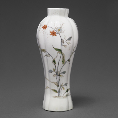
Fluted Vase, 1962. English, Worcester. Seattle Art Museum, Kenneth and Priscilla Klepser Porcelain Collection, 94.103.1
In the end, Kenneth Klepser – Seattle businessman and owner of this impressive collection – viewed these works of art in much the same way as their original owners in 18th century England, as something to be cherished and integrated into his home. These objects act simultaneously as works of art as well as pieces of functional history, creating a more complete picture of the historical setting from which they originated. The combination of the exhibition’s installation space – which highlighted the dual function of these objects – and the events associated with the exhibition provided a successful lens through which audiences could view these art works. However, viewers don’t dismay! While this exhibition is no longer on view, the Seattle Art Museum has a gallery (curated by Julie Emerson) that is dedicated solely to porcelain! This rather splendid room – organized by color and theme – accentuates the intricate patterns and Asian-influences comparable to those highlighted in the Worcester Porcelain exhibition and offers contemporary viewers a chance to see these elegant styles favored by Europeans during the 17th and 18th centuries. Come visit, and see if you can find all the porcelain objects from the Kenneth and Priscilla Klepser Porcelain Collection.
See Julie Emerson’s guide to SAM’s Porcelain Room here.