Object of the Week: Pool with Splash

Having grown up in Los Angeles, there is something uniquely comforting about the scene of a sun-drenched swimming pool. David Hockney, of course, is one artist whose pools come immediately mind: his bright, seductive paintings of the 1960s and 70s are highly evocative images of life and culture in Southern California, and have rendered his name nearly synonymous with the subject matter. 

David Hockney, A Bigger Splash, 1967

For Hockney, “In the swimming pool pictures, I had become interested in the more general problem of painting the water, finding a way to do it. It is an interesting formal problem; it is a formal problem to represent water, to describe water, because it can be anything. It can be any color and it has no set visual description.”[1]

If Hockney’s iconic pools are, broadly speaking, defined by their spatial flatness, color relationships, and reduction of form through painting, Robert Arneson’s sculptural Pool with Splash is a perfect counterpoint. His exploration of the pool and its contents takes shape through ceramics: each ripple and refraction of light is represented as an immutable piece⁠—fitted together like a puzzle⁠—with blue and green glazes. And much like Hockney’s A Bigger Splash, Arneson’s Pool is punctuated with a foamy burst, invoking the presence of a swimmer.

Along with his contemporaries Peter Voulkos, Bruce Conner, Viola Frey, Jay DeFeo, and others, Arneson is considered part of the “Funk Art” movement⁠—a loose affiliation of artists originally included in the 1967 exhibition curated by Peter Selz, Funk, at the University Art Museum at the University of California, Berkeley.

Arneson’s irreverent work and playful sense of humor, along with an interest in everyday objects and personal narrative, are just some of the movement’s characteristics⁠ (a reaction to the non-objectivity of abstract expressionism that dominated the 1950s). Arneson’s commitment to ceramics is also notable, and part of a larger effort to elevate the medium which, at the time, was considered merely decorative or utilitarian, and pejoratively relegated to a realm of “craft.” Measuring nearly 12 feet wide at its largest point, Pool with Splash is hardly utilitarian and its use as decoration is up for debate. Here, Arneson wryly upends the once-strict divisions separating “fine art” and “craft,” all the while making clear his mastery of ceramics. Now, if only we could swim in it!

– Elisabeth Smith, SAM Collections and Provenance Associate


[1] Matthew Sperling, “The Pull of Hockney’s Pool Paintings,” in Apollo Magazine, February 2017, www.apollo-magazine.com/david-hockney-pool-paintings.
Images: Pool with Splash, 1977, Robert Arneson, ceramic with glaze, 18 1/2 x 145 x 116 in., Gift of Manuel Neri, 82.156. A Bigger Splash, 1967, David Hockney, acrylic on canvas, 95 1/5 x 96 in., Tate Modern, London

Object of the Week: Ideas for Zanzibar with Dancer from Parade Triple Bill

A pioneering Pop artist, David Hockney has throughout his career pivoted effortlessly from medium to medium, continuously exploring his visual style. Though perhaps best known for his iconic paintings of Southern California swimming pools, Hockney has produced a much larger body of work, ranging from abstract paintings to photo collages to iPhone drawings. However, arguably lesser known is his work in stage and costume design: he has been involved in productions of Stravinsky’s Rake’s Progress and Mozart’s Magic Flute, both at the Glyndebourne Opera in England, and Parade at the New York Metropolitan Opera, for which this drawing was created.

Grouped under the title Parade, the Met Opera’s 1981 triple bill brought together three pieces: Parade, a ballet written by Jean Cocteau with music by Erik Satie; Les Mamelles de Tiresias, an opera with libretto by Guillaume Apollinaire and music by Francis Poulenc; and L’Enfant et Les Sortileges, an opera with libretto by Colette and music by Maurice Ravel. Hockney designed the sets and costumes for all three performances.

Satie’s Parade, first presented at the Théâtre du Châtelet in Paris on May 18, 1917—during the height of World War I—takes place in a world of circus acts and street fairs. Though written in 1903, Les Mamelles de Tiresias similarly premiered during the war, in June 1917. The surrealist play was described by one critic as “high-spirited topsy-turveydom” whose deeper themes are about the need to repopulate a France ravaged by war.¹ Lastly, L’Enfant et Les Sortileges, commissioned in 1915, is a “fairy ballet” exploring the inner emotional world of a child, where toys and animals come to life.

There is a long history of artists collaborating on theater and dance productions. Merce Cunningham frequently collaborated with Jasper Johns and Robert Rauschenberg, for example, and both the scenery and costumes for Satie’s original Parade were designed by none other than Pablo Picasso. For New York Times theater critic John Russell, Hockney’s designs for the 1981 presentation Parade are “not [Picasso’s] Parade redone from scratch. It is the Parade of 1917 revisited as if in a dream, with Picasso very much in mind, both as the original designer and as the poet of Les Saltimbanques—the tumblers and harlequins who turn up over and over again in the work of Picasso’s Rose period.”²

Largescale painted environment with separate elements based on Hockney’s design for Les Mamelles de Tiresias

Hockney produced many drawings for Parade, but the one in SAM’s collection is for the second opera in particular: Les Mamelles de Tiresias, set in Zanzibar, an imaginary town in France. Taking into account the circumstances surrounding the opera’s 1917 premiere, when the war was at its worst, Hockney incorporated details such as gas masks, helmets, searchlights, and barbed wire, the latter of which is included in this drawing.³ Though the unfinished blue sky suggests a certain incompleteness, it is important to keep in mind that this is, after all, a preparatory drawing. And despite the war-time setting, Hockney still manages to bring his bold, graphic, and colorful style to the mise en scène. In the image above, which more fully depicts Hockney’s playful cubist-inspired world, we get a sense of how such drawings were crucial for his development of these operatic worlds.

–Elisabeth Smith, Collections Coordinator

Images: Largescale painted environment with separate elements based on Hockney’s design for Les Mamelles de Tiresias, from the 1983-84 Walker Art Center exhibition Hockney Paints the Stage. Ideas for Zanzibar with Dancer from Parade Triple Bill, 1980, David Hockney, Crayon on paper, Framed: 28 x 33″, Paper size: 19 x 24″, Gift of Robert and Honey Dootson Collection, 2010.37.26, © David Hockney.
¹Jeremy Sams, “Poulenc, Francis,” in The Penguin Opera Guide, ed. Amanda Holden (London: Penguin Books, 1997), 282.
²John Russell, “David Hockney’s Designs for Met Opera’s ‘Parade’,” in The New York Times, February 20, 1981, 1.
³ Russell, 1.

Seeing Nature through The Eyes of Curators: The Grand Canyon

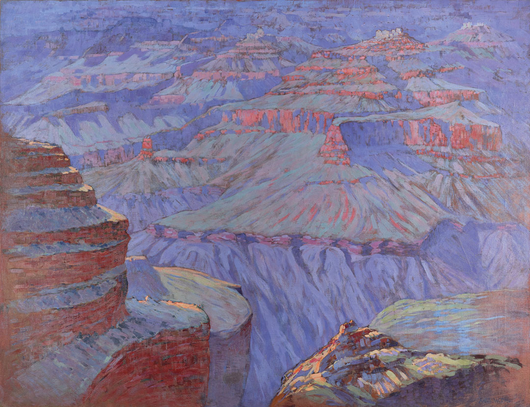
The first time I saw Cosmic Cities, I found it hard to believe that the Arthur Wesley Dow who I was familiar with could paint so large and boldly. This is what the Grand Canyon did for him. Dow was famous as a teacher at Columbia Teachers College. He developed a course of composition study based on Japanese prints, on filling the page or canvas through flat patterns and linear rhythms. This is what he taught to people like Georgia O’Keeffe, a new modern way of looking. In his own practice, he created beautiful little wood cut prints and tiny paintings done in the landscape around his Massachusetts home. But when he went west it changed him completely.

When Arthur Wesley Dow got to the Grand Canyon, he said it compelled him to think about pictures in three different ways. One was color, because the sedimentary rock, sand, and shell shimmered, changing colors all day long and giving a glittery quality to the atmosphere and the surfaces. He said the immersive experience of the Grand Canyon made him think differently about the structures of pictures—he loved that disorienting quality, the feeling that we have no footing, that we might tumble into the scene. He also said he saw nature’s innate architecture. In Cosmic Cities, this strange architecture looks like it could have come from some ancient builders, but it is the product of nature itself. This painting was commented on by critiques as a great breakthrough for American painting at this time in 1912. Because of its large scale and its all-over, painterly color pattern, it doesn’t look like a Victorian-era painting—it looks like it could have been painted today.

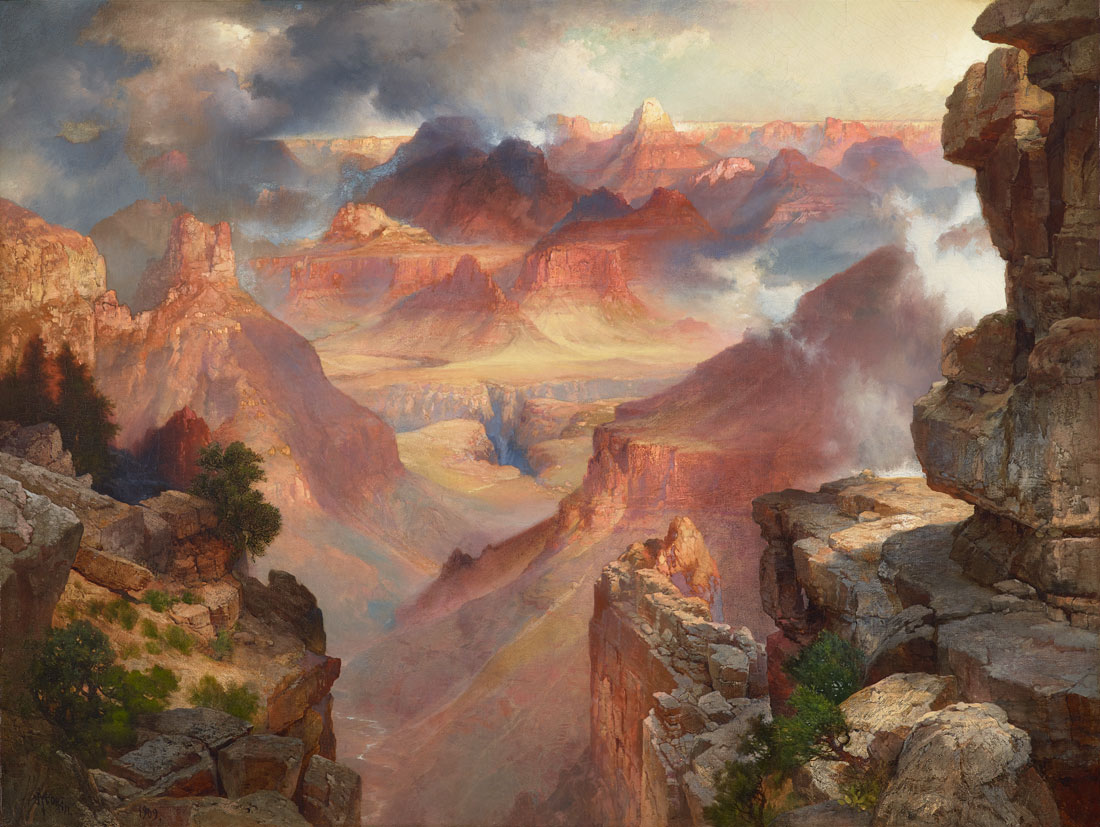
Dow went to the Grand Canyon because he saw paintings like Thomas Moran’s Grand Canyon, also in the Allen collection. Moran visited the Grand Canyon repeatedly. His trips were paid for by the Santa Fe Railroad and the Fred Harvey Hotel. The Santa Fe Railroad extended its tracks right up to the south rim of the Grand Canyon and built the famous Fred Harvey Hotel there. It was a tourist destination for a long time before Theodore Roosevelt designated the Grand Canyon a national monument in 1908. When you look out across the vast space, you see the horizon in the Moran painting, and so you get a sense of firm grounding, and of deep landscape. It’s a very different effect from Dow’s boundless, dizzying place.

–Patricia Junker, Ann M. Barwick Curator of American Art

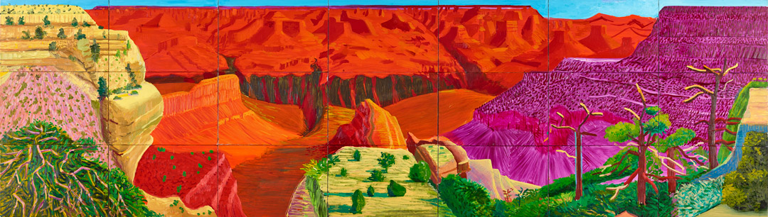
I don’t know how many of you have been to the Grand Canyon, but the drama of the Grand Canyon is just extraordinary. When you stand on the rim of the Grand Canyon you can hardly ever see straight down to the Colorado River because it is so deep. What you see is this texture of different planes that unfold in front of you. I have this idea that Dow painted the Grand Canyon at sunrise because once I got up at four in the morning to see the sunrise over the Grand Canyon and the lavender tones start coming out. In David Hockney’s Grand Canyon, on the other hand, I see sunset colors because that’s when there are intense orange and yellows. You can’t believe how much purple there can be in a rock! Of course, Hockney exaggerates since these are not natural colors.

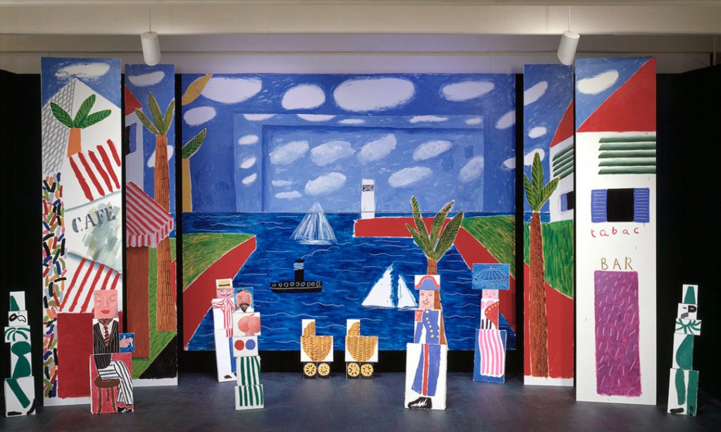
A British artist who spends a lot of time in Los Angeles and travels to the Grand Canyon, David Hockney did some work designing stage sets. I think that’s especially pronounced in his Grand Canyon. He uses these small squares of canvas corresponding to photographs he took at the Grand Canyon. Initially he planned a photographic series. He took all these photographs, taped them together, and then decided the photographic representation wasn’t successful. So he painted the Grand Canyon in three different versions. This one is called The Grand Canyon and conceptually, if you think of stage design, the purple form would be one slice that you roll onto stage and the yellow form could be another. There’s a way in which he was learning from his experience in stagecraft for the composition of this scene. The stroke of genius here, that tiny sliver of sky—which when you’re standing there, would instead feel enormous—puts so much pressure on the entire composition. It’s really an extraordinary painting.

–Catharina Manchanda, Jon and Mary Shirley Curator of Modern and Contemporary Art

Bring your own experience of the Grand Canyon to Seeing Nature: Landscape Masterworks from the Paul G. Allen Family Collection and compare it to three wildly divergent depictions of this natural wonder. Seeing Nature presents 39 exquisite, highly detailed paintings as a platform for visitors to consider their own experience with the world through sight, touch, smell, sound, and taste. On view through May 23, don’t miss it!

Images: Cosmic Cities, Grand Canyon of Arizona, 1912, Arthur Wesley Dow, American, 1857-1922, oil on canvas, 61 x 79 in., Paul G. Allen Family Collection.
Grand Canyon of Arizona at Sunset, 1909, Thomas Moran, American, born England, 1837–1926, oil on canvas, 30 x 40 in., Paul G. Allen Family Collection. David Hockney, British, b. 1937, The Grand Canyon, 1998, oil on canvas, 48 ½ x 14 ft. 1 in. overall, Paul G. Allen Family Collection, © David Hockney.
SAMBlog