Adventures in Fur – A Q&A with SAM Designer, Rebecca Nickels

Rebecca Nickels is one of our designer extraordinares on staff here at SAM. Recently she had the idea to create tactile wall lettering for the upcoming Nick Cave: Meet Me at the Center of the Earth galleries. Cara Egan, SAM’s PR Director, recently interviewed Rebecca about this most unusual task.
Q. How did you come up with idea to create “faux fur” signage for the Nick Cave galleries?
A. It started out as me half joking. I was sitting at my computer, mocking up creative directions for how the wall would look, and it just came to me. Most of the marketing creative for the show involves a reverse out of the type with Soundsuit textures, and I was trying that as an option where it would be printed onto vinyl. But I was just sort of like, “wouldn’t this be rad if it were actual fur?”…Still not being all that serious, mostly because I knew that it wouldn’t be all that straightforward. But I just kept bringing it up, and then I realized, I wasn’t joking.
Q. What was your process of creating the letters? How long did it take you?
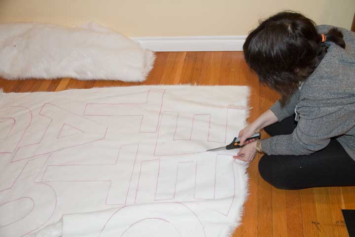
A. I’ll admit that I did much of the work at home. I’m pretty much a perfectionist, so I knew if I took this on, I was going to need the time to do it right. This is part of the reason why I started out joking, but it was too good of an opportunity to pass up. I’m actually not sure hours wise, but I can tell you, at a leisurely pace (measuring, tracing and cutting), I gave myself two weeks.
Having letters made by a graphics company helped a lot. I don’t think I could have done this if I would have had to make tracing templates myself, and I couldn’t have done the project without tracing the letters. Measuring was also a challenge. I think I probably measured the wall, the graphics, and the template files about twenty times. That was probably the most stressful part of the project. I couldn’t eat and I was dreaming measurements and letters in Gotham for about a week. If I got just one thing wrong, it would be too late to go back and fix it once we were installing.
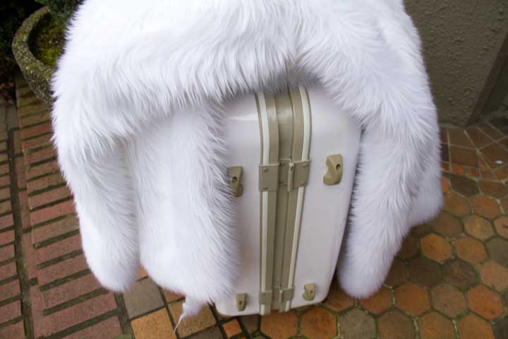
After I cut everything out, I then had to get the fur and myself to the museum via taxi (which by the way looked diva fabulous). I got a lot of comments about “traveling in style.” I don’t think it helped that the case happened to match the white fabric (really not intentional), and that it was a Benetton (also just a coincidence, I swear).
I think the worst part of the whole process was the fur. When you cut, it has a tendency to shed. A lot.
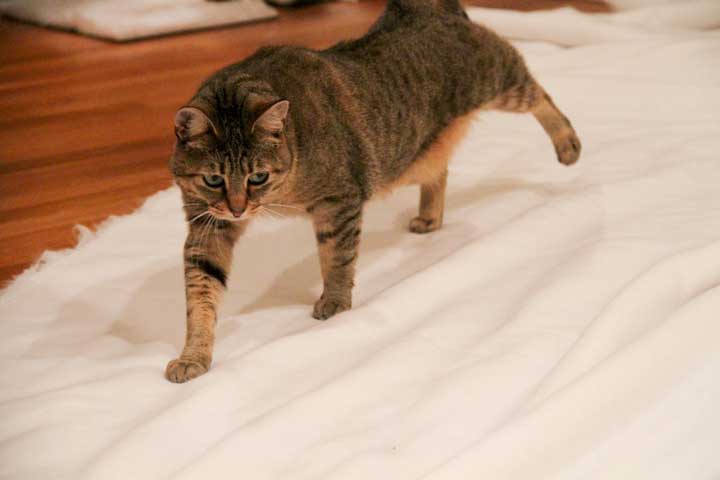
Being a pet owner I’m used to my share of the occasional dust-fur-bunny, but this went to a whole new level on the scale of annoying. I would be eating and I’d find it in my food, or I wouldn’t touch it for days, be in bed and painfully discover I had a piece in my eye. It gets all over your clothes, in your hair, in your mouth, in your nose and in your eyes.
Q. Why did you choose white fur?
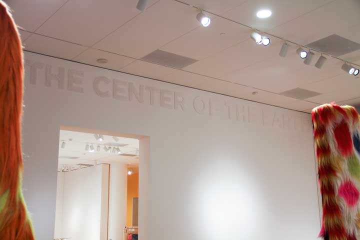
My thought was that the show really lends itself to tactile textures that make you want to reach out and touch them, and it just made sense that the title should relay that sentiment, without being too obnoxious or distracting from the artwork. It took a couple of phone calls until I found a place that had it. I knew I wanted white and that it needed to be shag. Visualize a large baby Harp seal, double it in size, and you’ve got what I was dragging out of the store. The final product is something you have to see, to really see it, if that makes sense. It is very subtle and from every angle it reacts differently to the light.
Q. Will you be wearing faux fur to Remix on March 11?
A. Probably, as the worst part of this process is still sticking to every bit of clothes I own.


