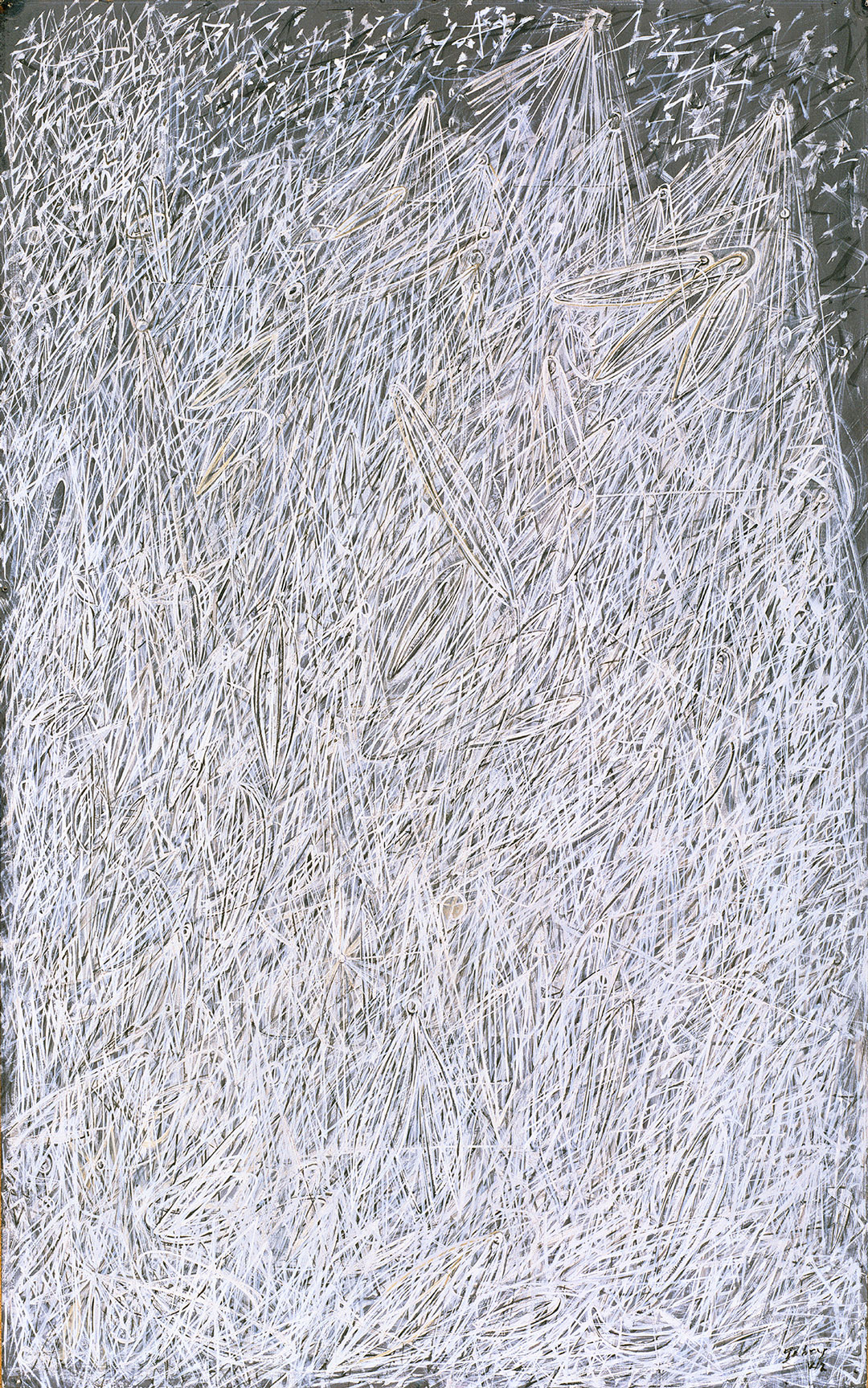
Object of the Week: Northwest Field Recording – WA (12”/B side)

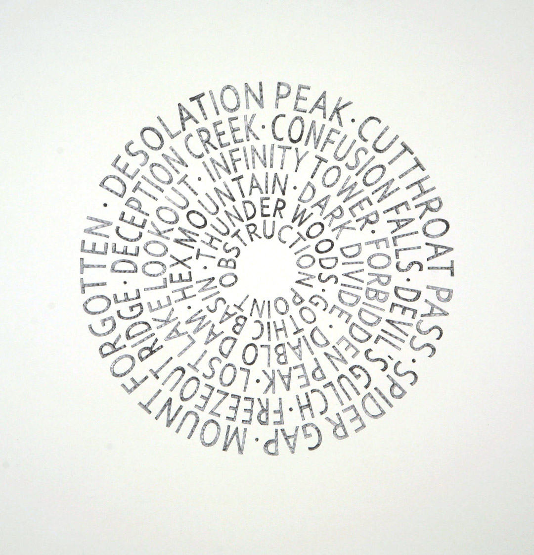
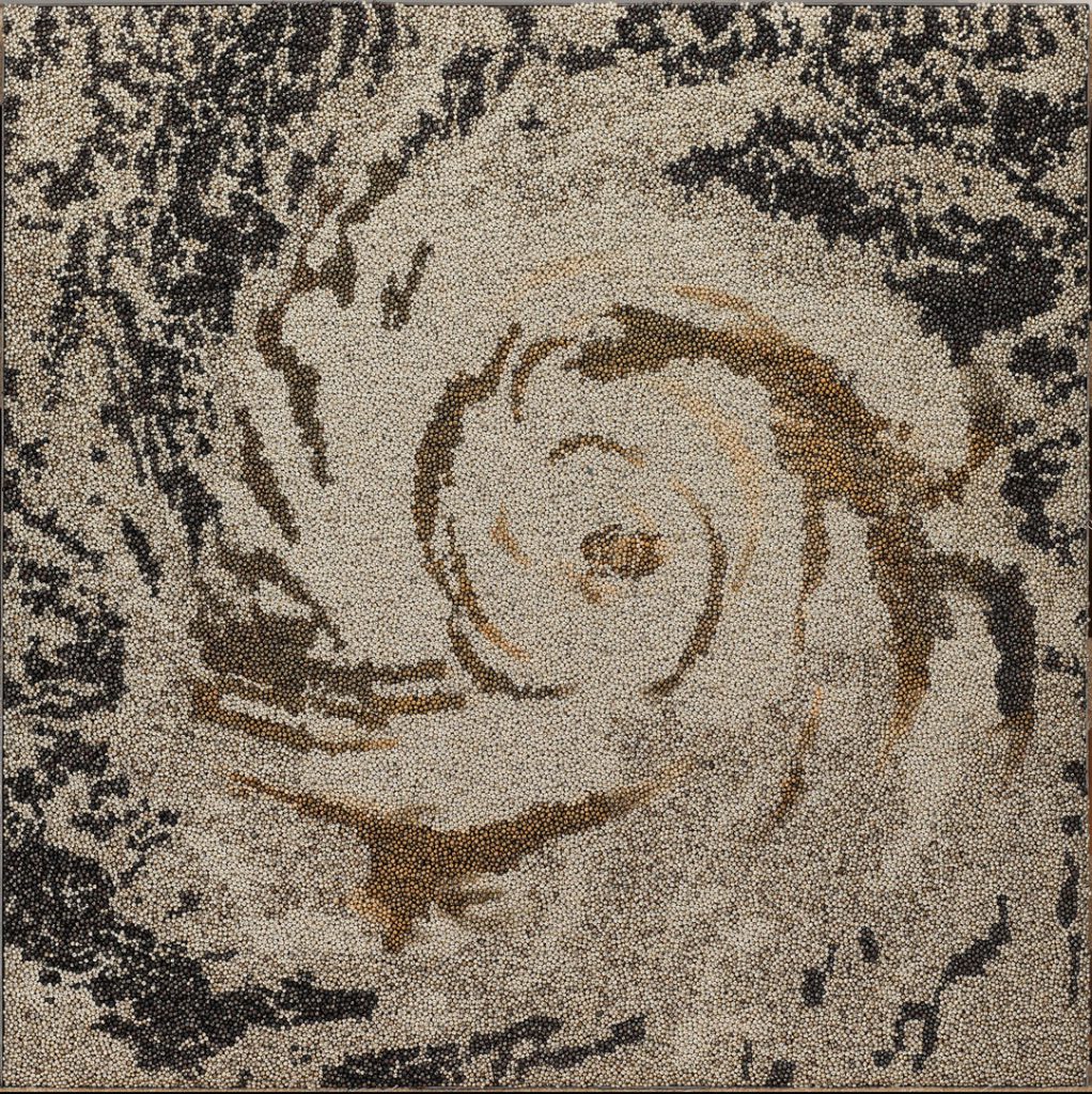
Victoria Haven’s Northwest Field Recordings explore how abstracted language can evoke a personal experience. In Northwest Field Recording – WA (12”/B side), the names of important Pacific Northwest trailheads and natural formations are called out: Desolation Peak, Cutthroat Pass, Mount Forgotten, Confusion Falls, Forbidden Peak, Obstruction Point—to name a few. And while these locales could certainly be anywhere (and join a long list of despairing-sounding sites around the world), they are importantly here.

Rendering these locations in a form that recalls the 12 inch format of an LP, Haven creates an equivalence between the names and the circular grooves on a record. Given the work’s relationship to the natural landscape of the Northwest, it is also meant to reference the cross-section of a tree, revealing its life-span and time on earth. Taking into account the Pacific Northwest’s storied landscapes, both cultural and natural, the work deftly addresses two aspects of our region that loom large as defining qualities and points of pride.

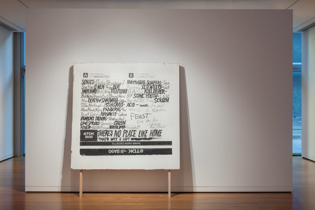
With each peak, pass, gap, and lookout folding in on itself, the drawing lures the eye inward, forcing a cyclical reading that—like a spinning record—is hard to break. The more one reads these poetic names, the more evocative and abstracted they become. As described by arts writer Stephanie Snyder, “the proliferation of language [in Haven’s work] oscillates into a gorgeous and captivating tangle of ideas and emotional associations.” Though this work is not on view in the upcoming exhibition Sound Affect, another work by Haven is, Portable Monument – There’s no place…, and similarly explores the history of Seattle’s music scene and the region’s shifting social and cultural landscape.

Elisabeth Smith, Collection & Provenance Associate

Images: Northwest Field Recording – WA (12″/B side), 2010, Victoria Haven, ink on paper, 18.5 x 18 in., Gift of Rebecca and Alexander Stewart and an anonymous donor, 2011.9.2, © Victoria Haven. Portable Monument – There’s no place…, 2009-2012, Victoria Haven, acrylic paint, sheetrock, studs, 92 × 75 × 6 in., Gift of The New Foundation Seattle, 2013.1, © Artist or Artist’s Estate.

Object of the Week: 205 kmph-950 hPa

Monday is Earth Day—a day designated for the demonstration of support for our planet and its protection. Personally, it feels harder and harder to celebrate this day with a clear conscience, knowing how we are fully responsible for bringing ourselves to the brink of irrevocable environmental damage. The pressure placed on us as individuals to solve the issue of climate change (as if it is just one issue) through lifestyle choices distracts from the need for major policy changes and collaborative global initiatives on the highest level.

In the words of David Wallace-Wells, from his new book The Uninhabitable Earth: Life After Warming:

The slowness of climate change is a fairy tale, perhaps as pernicious as the one that says it isn’t happening at all, and comes to us bundled with several others in an anthology of comforting delusions: that global warming is an Arctic saga, unfolding remotely; that it is strictly a matter of sea level and coastlines, not an enveloping crisis sparing no place and leaving no life undeformed; that it is a crisis of the “natural” world, not the human one; that those two are distinct, and that we live today somehow outside or beyond or at the very least defended against nature, not inescapably within and literally overwhelmed by it; that wealth can be a shield against the ravages of warming; that the burning of fossil fuels is the price of continued economic growth; that growth, and the technology it produces, will allow us to engineer our way out of environmental disaster; that there is any analogue to the scale or scope of this threat, in the long span of human history, that might give us confidence in staring it down.

Environmental activism is urgent and necessary, and art can act as the medium through which politics emerge. Take Vibha Galhotra’s work—205 kmph-950 hpa and 60 kmph-998 hPA from 2015—which directly addresses globalization and climate change. The patterns in each are derived from satellite images of hurricanes and typhoons (which have only increased in size, power, and occurrence) and are identified by the strength of the storm. 205 kmph-950 hpa references 1994’s Hurricane Gilma while 60 kmph-998 hPA refers to Typhoon Vongfong, the most intense tropical storm to take place in 2014, causing significant damage to Japan. Vongfong’s intense winds and rain created sediment plumes that were visible from space. I repeat: visible from space.

Based in New Delhi, Galhotra’s larger practice is dedicated to examining the environmental and social impact of globalization and urban growth—both in New Delhi and beyond. For this reason she employs local women in her studio, many of whom lack jobs and are unable to find work outside the home. She often uses culturally specific objects such as ghungroos, small metal bells traditionally worn by Indian dancers, to make explicit the close connection between mass production of goods, urban growth, and environmental impact. In the words of the artist, “Global warming is a real threat and so is terrorism. On the one hand, we are replacing natural landscapes with man-made things and then in a bid to snatch these, we spread terror.”

Elisabeth Smith, Collection & Provenance Associate

Images: 205 kmph-950 hPa, 2015, Vibha Galhotra, nickel-coated ghungroos, fabric, polyurethane coat, 48 × 48 in., Asian Art Acquisition Fund, 2016.19.1 © Vibha Galhotra.  Courtesy of the artist and Jack Shainman Gallery, New York. 60 kmph-998 hPa, 2015, Vibha Galhotra, nickel-coated ghungroos, fabric, polyurethane coat, 48 × 48 in., Asian Art Acquisition Fund, 2016.19.2 © Vibha Galhotra. Courtesy of the artist and Jack Shainman Gallery, New York.

Object of the Week: Mizusashi (water jar) with bamboo

A few weeks ago I had the privilege of attending a traditional Japanese tea ceremony at a Zen Center in the Bay Area. It was one of those days when spring felt imminent—no longer a distant dream.

The tea house at Green Gulch was a sacred site in many ways. Set off from the rest of the property, the building and its surrounding garden were a tranquil respite, maintained impeccably; entering the tea house required intentionality and following certain rites, such as the washing of hands and kneeling to take off shoes before entering.

Once inside the tea house, I and the other nine guests were asked to take in the immediate environment, to observe the details and beauty of that which surrounded us. The thatched roof, tatami mat floor, textured walls (made from clay and straw), and aroma of the interior—cedar, used to heat the water—were some of the first things I noticed and appreciated. As the tea was made, served, and consumed, the ceremony was replete with actions and gestures grounded in gratitude.

As the ceremony progressed, the importance of tools became clear. Generally, different utensils are used for different occasions and seasons. For example, at this tea ceremony in early spring, the kettle hung from the ceiling while in other seasons it would be lower, below the floor. Other utensils included a water jar, water scoop, tea scoop, and whisk—each carefully selected for their express purpose.

One of the most important components of the Japanese tea ceremony, water jars hold fresh water for the making of matcha green tea. This water jar, or mizusashi, in SAM’s collection, with a black lacquer lid is beautifully decorated with stalks of blue bamboo—a subtle but striking illustration. The piece is by Eiraku Myōzen, one of only a few female ceramicists who were able to have a successful career in early 20th-century Japan. After Myōzen’s husband—also an artist—passed away, she took his place leading the Eiraku workshop in Kyoto, one of the leading manufacturers of ceramics in the region.

While this new acquisition will not be used in the tea ceremonies at SAM, tea ceremony demonstrations—or chado, “the way of tea”—take place on third Thursdays at 5:30 pm and third Sundays at 2:30 pm. I have a feeling it will change the way you look at and think about everyday—and not-so-everyday—utensils.

Elisabeth Smith, Collection & Provenance Associate

Images: Mizusashi (water jar) with bamboo, early 20th century, Eiraku Myozen, porcelain with blue glaze, 7 7/8 × 7 1/2 × 6 in., Gift of Mary and Cheney Cowles, 2018.2. Photos: Elisabeth Smith.

Object of the Week: Inflammatory Essays

Originally plastered around New York City without attribution in the late 1970s and early 80s, Jenny Holzer’s Inflammatory Essays were made to confront passersby. Though she was relatively unknown at the time, Holzer’s careful combination of poetics and politics soon drew international attention and acclaim. In 1990, she became the first woman to officially represent the United States at the Venice Biennale, and was awarded the Golden Lion—the Biennale’s top prize. Just six years prior, Seattle Art Museum’s Contemporary Art Council sponsored the installation of Essays along a wall at Second Avenue and Pike Street in 1984. The posters would resurface 16 years later at SAM as part of the 2001 exhibition, Art of Protest.

Each essay, comprising 100 words and neatly arranged in 20 lines, is laden with conflicting views. As Leah Pires recently wrote in Art in America, “The concision and conviction of the language invites easy agreement—a feeling that is quickly complicated by the contradictions that become apparent when the statements are read together.” The commercial history of offset printing, coupled with Holzer’s typographic choices (the essays’ typeface is reminiscent of billboard advertisements), suggests a mass-distributed message in an aggressively declarative tone. The first line in one essay reads: “FEAR IS THE MOST ELEGANT WEAPON, YOUR HANDS ARE NEVER MESSY.”

These texts do not mirror Holzer’s own sentiments, but are rather drawn from the writings of anarchists, dictators, and revolutionaries around the world. Such voices include Emma Goldman, Adolf Hitler, Vladimir Lenin, Mao Tse-tung, and Leon Trotsky. Whether directly stated or implied through irony, Inflammatory Essays critiques power and control, sex and abuse—themes that continue to inform Holzer’s practice today. Her work is meant to provoke, but Holzer is well aware of the weight words carry. In a 2016 interview with Even Magazine, she says, “Later I found it necessary and proper at times to be careful…I’ll put tough stuff out, but not what might incite gratuitous, hideous violence. I’m pro-expression but not pro-murder…I think it is utterly irresponsible and reprehensible…to incite violence in a political campaign, or anywhere else. One should not do it. We are a murderous species. We don’t need encouragement. Once we get rolling, it’s hard to stop.” 

Produced 40 years ago, Inflammatory Essays feels eerily contemporary. In a polarized era marred by fake news, the quick dismissal of credible journalism, and our self-imposed curation of media, Holzer urges us to question the statements we are bombarded with on a daily basis. Through their challenging and, at times, aggressive statements, Inflammatory Essays continues to elicit critical public discourse by means of self-examination.

Rachel Hsu, SAM Exhibitions Coordinator

Images: Inflammatory Essays, 1979-82, Jenny Holzer, offset posters on paper 17 x 16 3/4 in., Gift of the Contemporary Art Council of the Seattle Art Museum, 2012.9.20 © Artist or Artist’s Estate. Poster Project, Seattle, Washington, USA, 1984, © 1984 Jenny Holzer, member Artists Rights Society (ARS), NY. Installation view Art of Protest, Seattle Art Museum, 2001, photo: Nathaniel Wilson. Inflammatory Essays, 1979-82, Jenny Holzer, offset posters on paper 17 x 16 3/4 in., Gift of the Contemporary Art Council of the Seattle Art Museum, 2012.9.16 © Artist or Artist’s Estate. Inflammatory Essays, 1979-82, Jenny Holzer, offset posters on paper 17 x 16 3/4 in., Gift of the Contemporary Art Council of the Seattle Art Museum, 2012.9.21 © Artist or Artist’s Estate.

Object of the Week: Lucie Léon at the Piano

Berthe Morisot, once dismissed with her fellow Impressionists as a “lunatic” by a contemporary critic, is now the subject of an international touring exhibition that confirms her singular contribution to the movement. After seeing it, New Yorker art critic Peter Schjeldahl concluded that she was “the most interesting artist of her generation.” This 180-degree swing in critical appreciation over time is by now familiar—mocked then and later adored—especially with the Impressionists.

An upper class Parisian woman, Morisot could not paint the cabarets, racetracks, and cafés that her male colleagues depicted. Though her subject matter was limited to the domestic realm, she was radical in her bold approach to painting. Her slashing brushwork and sophisticated color animated scenes of women reading or getting ready to go out for the evening, a maid hanging up the laundry, and children in the garden, for example.

Woman at her Toilette, 1875/80 Art Institute of Chicago

Woman at her Toilette, 1875/80
Art Institute of Chicago

In the Garden at Maurecourt, 1884 Toledo Museum of Art

In the Garden at Maurecourt, 1884 Toledo Museum of Art

Woman Hanging Laundry, 1881 Ny Carlsberg Glyptotek, Copenhagen

Woman Hanging Laundry, 1881
Ny Carlsberg Glyptotek, Copenhagen

Morisot exhibited her paintings in all but one of the eight Impressionist exhibitions between 1874 and 1886. In the 1890s her style changed. Her angular brushwork, which in the ’70s and ’80s had created a kind of vibration between figure and background, relaxed. Contour and outline now fixed the figure in place, as in the Seattle Art Museum painting of a young pianist looking up from her practice to pose. The slowed-down brushwork and blue palette contribute to a melancholy quality, which is typical of Morisot’s work in the ’90s and perhaps influenced by the new Symbolist movement practiced by Edvard Munch, Paul Gauguin, and her friend the poet Stéphane Mallarmé.

Lucie Léon was a musical prodigy who would go on to have an illustrious professional career. But Morisot’s daughter Julie, who was present for the painting sessions in their home, recalled that Lucie was a reluctant sitter who “would have preferred to play croquet.” You can hear her piano playing here:

Berthe Morisot died of the flu in 1895 at the age of 54. During her lifetime she sold no more than 40 works out of over 400 paintings. The exhibition Berthe Morisot/Woman Impressionist, shown in Quebec City, Philadelphia, Dallas, and Paris, will introduce her to many new fans.

– Chiyo Ishikawa, Susan Brotman Deputy Director for Art and Curator of European Painting and Sculpture

Image: Lucie Léon at the Piano, 1892, Berthe Morisot, oil on canvas, Overall: 38 x 33 in., Image: 24 3/4 x 20 1/2 in., Gift of Mr. and Mrs. Prentice Bloedel, 91.14.

Object of the Week: Veronica

Veronica is a telling image from a larger body of work that examines what it’s like to be an erotic dancer. For the photographer, this series sheds light on the commitment artists make to produce meaningful work.

Erika Langley (American, born 1967) moved across the country in 1992 after attending the Rhode Island School of Design and working as an aspiring photojournalist. She quickly learned that photojournalism work in Seattle was hard to come by, being turned down by several potential employers. One told her to go out and do something “really gutsy and personal” and then come back.[1]

Upon arriving in Seattle, Langley had noticed Seattle’s many topless bars and thought she could do a project on strippers. She stumbled upon the Lusty Lady–the legendary peep show establishment formerly located across First Avenue from the Seattle Art Museum—and was intrigued to learn it was women-run, that the dancers were protected from the patrons, and that they were paid a reasonable wage in 1990s dollars: $9/hour to start with a $1/hour raise every week if you came in on time and were doing well. Some dancers made $27/hour. This operation was defying industry stereotypes.[2]

There was one catch. If she wanted to take photographs, she had to become a dancer. “If you really want to understand this, you have to work here,” she was told by one of the supervisors. “You have to dance to gain people’s trust and be taken seriously.” There was no access to the locker room until she was a Lusty Lady employee. So, she became a dancer. “I want to learn about a world I know nothing about, I want to see what I’m capable of.” She took the stage name, Virginia, after her home state: Southern, Gothic, exotic. She got to know her co-workers. They were married and single, straight and queer, some were doting mothers, and some had degrees or were working their way through school. She was interested in “showing these women as whole women…it’s just a job.”[3]

In 1997 the body of work she’d created at the Lusty Lady was transformed into a book produced by European publisher Scala called The Lusty Lady. She delivered a copy of the book with a handwritten note–“Howdy, neighbor!”–to then SAM Deputy Director of Art/Jon and Mary Shirley Curator of Modern and Contemporary Art, Trevor Fairbrother. Shortly thereafter, he encouraged her to be part of a group show. In 1999, several of her works–from the Lusty Lady series, including Veronica—were included in the exhibition, Hereabouts: Northwest Pictures by Seven Photographers, one of the Documents Northwest: The PONCHO Series exhibitions. SAM ultimately brought five of Langley’s photographs into the collection.[4]

Langley’s work reminds us that women like Veronica (that’s her stage name) work legal jobs, just like other women. “There are no venues like this for women, this is the intersection of public sex and fast food. Sometimes I feel like a naked waitress—other times, a quarter-operated social worker. It’s not so unlike other jobs. I punch a time clock, look forward to my breaks, and then I go home. But I love it best when my friends and I are howling with merriment in the shadow of Hammering Man.”[5]

“Had the Lusty Lady not told me I’d have to dance to photograph, I’m sure I’d have made some competent but average pictures. Instead, working there changed my life, how I looked at myself and my sexuality, and it taught me about my own erotic power.” — Erika Langley[6]

– Traci Timmons, SAM Senior Librarian

[1] Peggy Andersen, “An f-stop and a G-string Mark Woman’s Dual Career” in The Seattle Times (January 30, 2000), p. B4.
[2] Erika Langley, The Lusty Lady (Berlin: Scala, 1997), p. 10 and Andersen, p. B4.
[3] Langley, p. 7, 13 and Andersen, p. B4.
[4] Andersen, p. B4 and Trevor Fairbrother, Documents Northwest: The PONCHO Series: Hereabouts: Northwest Pictures by Seven Photographers (Seattle: Seattle Art Museum, 1999), p 3.
[5] Langley is referring to Hammering Man, the monumental public sculpture by Jonathan Borofsky, sited in front of the Seattle Art Museum. Learn more here. Fairbrother, p. 3.
[6] Langley, p. 7.
Image: Veronica, 1993, Erika Langley, Gelatin silver photograph, 16 x 20 in. (40.6 x 50.8 cm), Mark Tobey Estate Fund, 2000.57, © Artist or Artist’s Estate.

Object of the Week: Illumination from the Book of Kells

No celebration of Women’s (or Womxn’s, if you prefer) History Month would be complete without a mention of International Women’s Day, a holiday in March celebrated worldwide with roots in early 20-century Socialist demonstrations for increased visibility and support for female workers.[1] Although International Women’s Day 2019 has already passed, Theodora L. Harrison’s meticulous reproduction of a medieval illumination is a wonderful reminder of the value of artistic work created by women.

Harrison (born in Ireland in 1890) lived in Seattle for over 20 years and enjoyed a prolific career as an illustrator, watercolorist, local art gallery director, and president of the Women Painters of Washington association. Throughout her life, Harrison achieved international success as an illustrator, and championed diverse artists at the Little Gallery in the Fredrick and Nelson department store, right here in Seattle.

This illustration is a precise rendering of the Latin text “Tunc crucifixerant,” from folio 124r from the Book of Kells, one of the most famous illuminated manuscripts in Western European Medieval History, created sometime in the ninth century.[2] The original work is famed for its intensely detailed illustrations, featuring teeming organic forms which bring its religious text to life. These illustrations were incredibly labor intensive and show an undeniable level of devotion, labor, and skill. A millennia later, Harrison’s renderings demonstrate an equal level of devotion and exertion, though for a different cause. Her vibrant pigments sharply contrast with the blank white background, forcing the viewer to focus on minuscule details and dizzying intertwined forms, which she recreates deftly.

Her fantastic illustration, along with numerous other reproductions of medieval manuscripts, was sponsored as part of the Public Works of Art Project (PWAP) in an effort to instill public confidence in government-subsidized projects following the Great Depression. Along with changing public perception, this federally funded project also aimed to catalog and elevate the work of artists in the United States, showing a commitment to the social and economic value of artistic labor. Along with works of so-called fine art, this project also elevated other types of art production in the United States, including illustration and arts and crafts, which featured far more works by women.

Harrison’s valued contributions to the PWAP show an estimation of her time, effort, and skill as a female working artist. Her work in the Seattle Art Museum’s permanent collection help continues to celebrate her contributions to the artistic community in Seattle, and participate in the long legacy of hard work and dedication of women artists.

Siri Benn, Curatorial Intern

Image: Illumination from the Book of Kells, from the Series, Examples of Illumination and Heraldry, Federal Public works of Art Project, Region #16, Washington State, 1934 or 1935, Theodora Harrison, ink and watercolor on simulated vellum, sheet size: 7 3/4 x 10 3/4 in., Federal Public Works of Art Project, Region #16, Washington State, 2013.6.8 © Artist or Artist’s Estate

[1] “International Women’s Day History | International Women’s Day | The University of Chicago,”  https://iwd.uchicago.edu/page/international-womens-day-history#1909TheFirstNationalWoman’sDayintheUS

[2] “Book of Kells,” https://digitalcollections.tcd.ie/home/index.php?DRIS_ID=MS58_003v

Object of the Week: Square Bowl

In honor of Women’s Herstory Month, I would like to give a shout out to two awesome Asian women. First is 34-year-old Marie Kondo, an entrepreneur who turned her passion for tidying into a consulting business starting at age 19. Her method of organizing is known as KonMari method. After watching Tidying Up with Marie Kondo on Netflix, I appreciated her philosophy that everything from a container to a t-shirt has a purpose if it sparks joy.

This idea of everyday objects having purpose and sparking joy reminds me of the folk art movement, mingei 民芸. Mingei celebrates beauty in everyday ordinary and utilitarian objects. A few criteria of mingei are that the objects are produced by hand, used by the masses, functional in daily life, and representative of the regions in which they were produced.

To me, this square bowl, ca. 2000, is mingei.

Square bowl

The second awesome Asian woman is Kim Yik Yung 김익영.  At 84 years old, she is one of Korea’s most celebrated and respected ceramic artists, and a pioneer in the ceramic arts. In the museum, this bowl is art, and it certainly is—it’s beautiful, flawless, made with ancient techniques, but with modern sensibilities. However, if I brought this home to my mom, this bowl would be a banchan 반찬 (small side dish) dish. I love that that’s the first thing that came to mind when I saw this object. It brings wonderful, tasty memories of eating at home with my family, or eating at Korean BBQ restaurants with my friends. In our culture, all dishes are served at once to share, rather than in courses. So the table is filled to the edges with lots of simple and flawless small dishes and bowls!

In an interview with Seoul Magazine on the future of Korean ceramics, Kim Yik Yung said Koreans need to protect and develop this culture. “We don’t need to protect and preserve things just because they are old. We need to protect and develop things because they have value. This Korean culture is a global idea we can share with all humanity.”

I think Kim and Kondo and I should go out for KBBQ and soju.

#toastingwithtina

– Tina Lee, Exhibitions and Publications Manager

 Image: Square bowl, ca. 2000, Kim Yik-yung, porcelain with clear glaze, 2 1/4 x 8 3/4in., Gift of Frank S. Bayley III, 2008.15 © Kim Yik-yung.

Object of the Week: Moon Jar

In honor of Women’s History Month, Object of the Week will—throughout the month of March—highlight works by women artists in the SAM Collection.

Though its surface appears to be seamless, Park Young-sook’s Moon Jar is actually made from joining two halves in the heat of the kiln. The process dates back to the Choson period (1392–1910) in Korea, when spherical porcelain moon jars decorated the imperial court and the homes of the nobility. In alignment with the Choson royalty’s Confucian practices, the simplicity of these jars symbolized purity and austerity.[1] Through integrating the techniques of this period, Park has created her own moon jars, which infuse the traditional ceramic form with her own contemporary artistic vision.

In addition to referencing imperial tradition, Moon Jar also reflects Park’s upbringing. She grew up near Bulguksa, a historic Buddhist temple. “If you dig just inches into the ground, the earth was full of ancient ceramics,” she discusses in a 2016 interview. “Bulguksa was my childhood playground. As a child, I’d explore all the ancient histories that surrounded me, which had an enormous impact on who I was to become.”[2] While studying those histories and experimenting with materials as an emerging ceramicist, she connected with mentors in the field. She cites their guidance as essential to the creation of her world-renowned moon jars.

Though Park honors the Choson vessels of the past, Moon Jar is not an exact recreation. She spent years developing her practice and choice of materials in order to produce jars that are more elongated with thinner walls. Drawn from specific deposits to produce the desired white hue of her jars, the clay she uses takes six to 10 years to mature. She is also highly attentive to conditions in the kiln, monitoring aspects such as air flow and variations in temperature. Owning and operating her own kiln since 1982, Park has carefully perfected her methods.

However, she speaks frankly about the precarious undertaking of creating a single moon jar, even when everything is done correctly. Nine out of ten jars will not survive in the high temperatures of the kiln due to splitting or collapsing. As a finished product, Moon Jar appears effortless in its resemblance to the full moon. Though unseen, the immense amount of labor and history that undergirds the work only adds to its luminosity. This work is not currently on view but it will be exhibited when the Seattle Asian Art Museum reopens in late 2019.

Yaoyao Liu, Museum Educator

[1] Lee, Soyoung, “In Pursuit of White: Porcelain in the Joseon Dynasty, 1392–1910,” Heilbrunn Timeline of Art History, October 2004, http://www.metmuseum.org/toah/hd/chpo/hd_chpo.htm.
[2] Kim, Hong Nam. “A Conversation With the Artist Young Sook Park in Her Studio, A White Porcelain Story,” July 29, 2016, http://www.yspceramicart.com/interview/2016/7/29/u8ic37xwa0djfi2qvct8jic2hs51h6.
Image: Moon Jar, 2007, Park Young-sook, porcelain with clear glaze, 20 x 19 1/2in., Gift of Frank S. Bayley III, in honor of the 75th Anniversary of the Seattle Art Museum, 2007.86 © Young Sook Park

Object of the Week: Dug Up from Kitchen Weeds

Ebony G. Patterson wanted to be an artist from a young age. Born in Jamaica to parents raised in rural poverty, Patterson credits her parents for encouraging her to follow her dreams. “Allow her to express herself,” her father said when young Patterson argued with her mother. “Don’t tell her to shut up.” Today the artist is widely recognized for her accomplished work, and last January she was named a recipient of the United States Fellowship Award in the visual arts.

The mixed-media artist explores issues of race, class, and gender. First motivated by the treatment of Tivoli Garden’s working-class community during the 2010 incursion in West Kingston, Jamaica, Patterson is especially concerned with the visibility of social injustices and the value of black and brown bodies.

In Dug Up from Kitchen Weeds,* colorful, patterned paper, and fabric come together with rhinestones and glitter to create a monumental collage garden, measuring seven-by-five feet. Its effect is mesmerizing. In the center of the overgrown flower bed, a figure lies hidden and obscured. Patterson doesn’t offer a face, just a striped t-shirt, animal-print pants, yellow Chuck Taylors, and a red bandana. Remnants of a life. The body itself is present, and yet . . . invisible.

With her highly ornamented works, the artist’s love for fashion and bling is clear. She wants to lure viewers into this beautiful world, then challenge them to look closer. Who is—or was—this person? It is a memorialization to those living on the margins, the viewer’s opportunity to bear witness to this death. When asked about the seemingly dark theme, Patterson responds, “Is it simply dark because we choose not to acknowledge it? . . . Well I’m choosing to turn the light on. . . . Violence happens everywhere. . . .  That’s the truth, and it’s all our problem.”

This is reality, seen through Patterson’s eyes, and she argues for attention and empathy.

– Jenae Williams, Curatorial Associate

*Read the poem that inspired this work: “Brief Lives” by Jamaican poet and short story writer Olive Senior.

Image: Dug Up from Kitchen Weeds, 2014, Ebony G. Patterson, mixed media photo collage on paper, 62 1/2 x 91 1/2 x 2 1/2 in., Bill and Melinda Gates Foundation Art Acquisition Fund, 2016.6 © Ebony G. Patterson

Object of the Week: Jacob

Jacob Lawrence and Gwendolyn Knight Lawrence were married for 59 years, in a harmonious partnership of two prolific and engaged creators that was both romantic and artistic. Though it was Jacob whose star would rise over the years, becoming celebrated around the world for his dynamic pictorial style of historical narratives, Gwendolyn continued her studies—in painting, drawing, design, and dance—and served vital roles in the cultural community of their adopted city of Seattle.

With this intimate portrait of her husband (Jacob, 1986), Gwendolyn explores her own artistic project, distinct from her husband’s grand themes of history and social justice. Instead, she pursues an expressive and personal idiom, reflecting the emotional truths of the immediate world around her.

Gwendolyn—or Gwen, as she was affectionately known—began the portrait in 1960, when the couple was still living in New York City. But she kept returning to it, with final retouches in 1986, when they would firmly be ensconced in their lives in Seattle. She found it a compelling challenge to create a portrait of the person she saw every day, in all of the moods and changes that an individual necessarily undergoes over the years. Instead of a frozen moment in time, we instead see the process of a person becoming.

Jacob’s face fills nearly the entire frame, even going out of the bounds of the canvas in one corner. His skin is rendered in broad and unusual strokes of brown, green, and yellow, reflecting against the hint of a red shirt at the neck and glimpses of orange in the background. He wears a calm smile and a somewhat inquisitive brow, exuding kindness.

In the catalogue for Never Late for Heaven: The Art of Gwen Knight, a 2003 solo show held at the Tacoma Art Museum, curator Sheryl Conkleton noted, “As her work developed, Knight became more committed to the interpretation and communication of visual delight in the world around her. It superseded the need to tell a story or to explore the larger meaning of what it meant to be a modern painter.”

When artist Gwendolyn Knight Lawrence died on February 18, 2005—almost exactly 14 years ago—she’d lived in Seattle for 34 years. The city was lucky to have her.

Rachel Eggers, Manager of Public Relations

Image: Jacob, 1986, Gwendolyn Knight Lawrence, oil on canvas, 14 1/4 x 10 1/4 in., Gift of the Marshall and Helen Hatch Collection, in honor of the 75th Anniversary of the Seattle Art Museum, 2009.52.59 © Estate of Gwendolyn Knight Lawrence/Licensed by Artists Rights Society (ARS), NY

Object of the Week: Thicket

In honor of Black History Month, Object of the Week will—throughout the month of February—highlight works by celebrated Black artists in the SAM Collection.

I never did Minimalist art. I never did, but I got real close. . . . I looked at it, tasted it, and I spat it out.

– Martin Puryear, 1978

Known for his highly crafted, abstract sculptures, Martin Puryear since the 1970s has created three-dimensional works that defy easy interpretation and categorization, at once evoking Modernist sculptures by Noguchi, Arp, and Brancusi, while calling to mind African sculptural traditions and Scandinavian design.

A former painter, Puryear’s hand-crafted sculptures offer a highly original response to the Minimalism of the 1960s. And while he indeed embraces Minimalism’s penchant for reductive sculptural forms, his material and fabrication choices evince a commitment to elevating craft and its complement: the handmade. Using materials such as wood, stone, tar, bronze, and wire, Puryear’s greatest collaborator—the natural world—is made clear.

From a young age Puryear was fascinated by how things are made, and would often construct his own objects from wood—whether it be a guitar or a canoe. Decades later, while volunteering with the Peace Corps in Sierra Leone, Puryear observed and absorbed local artistic traditions like woodworking, pottery, and weaving. Together, these experiences—coupled with his time at the Swedish Royal Academy of Art in Stockholm, where he studied furniture design—helped shape Puryear’s practice and interest in mobilizing design, sculpture, and craft in the service of examining identity, culture, and history.

The work pictured here, Thicket, is inspired by the shape and volume of a small rock Puryear found while on a trip to the Alaskan wilderness in 1980. Interwoven basswood and cypress give the piece a complex, tangled appearance. Both orderly and chaotic, the crisscrossed beams, struts, and posts are informed by the low Arctic vegetation that houses and protects the snowshoe hare—a rare breed endemic to the region.

In the words of the artist:

I want to make objects that somehow have their own history and their own reason for being and their own sense of themselves. I’m not concerned just with the object’s formal meaning, although it should be an intelligible artifact, a thing of one’s own culture and time. It’s equally crucial that there exist in the work a recognition of the maker, of who I am.[1]

Puryear’s sculptures manage to transcend time and space—blending together artistic traditions from around the world. Further, he is still one of the most important and influential artists working today, a fact confirmed by the recent announcement that he will represent the United States at the 58th Venice Biennale in the spring.

 – Elisabeth Smith, Collection & Provenance Associate

[1] John Ederfield, Martin Puryear (New York: Museum of Modern Art, 2007), 173.
Image: Thicket, 1990, Martin Puryear, basswood and cypress, 67 x 62 x 17 in., Gift of Agnes Gund, 90.32 © Martin Puryear (1990)

Object of the Week: 1974 calendar

Serizawa Keisuke’s 1974 calendar series is a collection of twelve paper stencils done in the katazome style. This is a technique that Serizawa adopted from textile design in which the artist applies a type of resist paste through a stencil before dyeing the fabric.[1] Paper provided a cheaper medium than cloth during the scarcity of wartime, and in the following years Serizawa began producing stenciled calendars like this one.[2] Serizawa’s stencils were later called kataezome, which distinguishes the pictorial quality of his work—e meaning picture in Japanese.[3]

In the 1974 calendar, while every month has similar elements, each one also maintains a unique style, with distinct sets of colors and images. In the January calendar, for example, orange is the dominant color, providing a patterned board upon which the dates are alternatingly carved into or out of. The orange is echoed in the foliage of the trees that sprawl above the calendar, and underneath the two figures that flank the grid of dates on either side. Despite the profuse design, the images themselves are minimal in detail.

In the calendar for the month of May, while orange accents are visible, blue is the dominant color. The neatly patterned grid from January is abandoned, and a procession of figures walks straight through the second and third weeks of the month on what ambiguously resembles a path, a tree branch, or perhaps a river. A bird flies overhead, drawing attention to the misalignment of the weekday letters.

Serizawa was associated with mingei, a folk art revival movement that was established in the early decades of the twentieth century. The movement lauded ideals of the anonymous craftsperson who made inexpensive objects that served daily utilitarian purposes. In this case, Serizawa is not anonymous, but his stencils exhibit several characteristics of mingei.

While mingei looked for beauty in everyday objects, Serizawa’s calendar makes every day into a thing of beauty. As we approach the final days of January, time marches on, much like the figures who cut through the May calendar. Here’s to beautiful days ahead, whether neatly organized or eclectically crafted.

– Maria Phoutrides, Curatorial Intern

[1] Susanna Kuo, Katagami: Japanese Textile Stencils in the Collection of the Seattle Art Museum, (Seattle: Seattle Art Museum, 1985): 1-3
[2] Hugh Cortazzi, “Keisuke Serizawa (1895-1984),” Arts of Asia, 25, no. 2 (1995): 79
[3] Joe Earle, Serizawa: Master of Japanese Textile Design, (New York: Japan Society, 2009): 94
Images: 1974 calendar, 1974, Serizawa Keisuke, stencil, 14 1/2 x 11 in., Gift of Frances and Thomas Blakemore,98.53.132.5 © Artist or Artist’s Estate. 1974 calendar, 1974, Serizawa Keisuke, stencil, 14 1/2 x 11 in., Gift of Frances and Thomas Blakemore, 98.53.132.1 © Artist or Artist’s Estate

Object of the Week: Dr. Martin Luther King Jr. after Delivering His “I Have a Dream” Speech

This black and white photograph, taken by photojournalist Dan Budnik in 1963, is one of a series that Budnik had hoped to publish in a Life magazine photo-essay. His subject is none other than Dr. Martin Luther King, Jr., photographed minutes after delivering a speech that would forever be defined by four indelible words: “I have a dream.”

The image is unrelenting is its focus, framing Dr. King’s face so that he takes up over half of the composition. King, glancing down and to the side, bears a calm demeanor—stoic and pensive. Surely he would have been surrounded by a large group of friends and colleagues, or even a crowd of fellow activists, but Budnik denies us any context in which to situate King. Without the title of the photograph, Dr. Martin Luther King Jr. after Delivering His “I Have a Dream” Speech, August, 1963, we would have no way to know that this image portrays him after one of the most important speeches in American history.

King’s “I Have a Dream” speech is arguably his most famous, but in the spirit of honoring his legacy and rhetorical dynamism, I share below an excerpt from his Nobel Peace Prize acceptance speech, given one year after this photograph was taken, in 1964.  King’s continued call for racial equity, social justice, and religious tolerance—delivered with unfettered optimism—is, I believe, an urgent and important message for our present time:

I accept this award today with an abiding faith in America and an audacious faith in the future of mankind. I refuse to accept despair as the final response to the ambiguities of history. I refuse to accept the idea that the “is-ness” of man’s present nature makes him morally incapable of reaching up for the eternal “ought-ness” that forever confronts him.

I refuse to accept the idea that man is mere flotsom and jetsom in the river of life unable to influence the unfolding events which surround him. I refuse to accept the view that mankind is so tragically bound to the starless midnight of racism and war that the bright daybreak of peace and brotherhood can never become a reality.

I refuse to accept the cynical notion that nation after nation must spiral down a militaristic stairway into the hell of thermonuclear destruction. I believe that unarmed truth and unconditional love will have the final word in reality. This is why right temporarily defeated is stronger than evil triumphant.

I believe that even amid today’s motor bursts and whining bullets, there is still hope for a brighter tomorrow. I believe that wounded justice, lying prostrate on the blood-flowing streets of our nations, can be lifted from this dust of shame to reign supreme among the children of men.

I have the audacity to believe that peoples everywhere can have three meals a day for their bodies, education and culture for their minds, and dignity, equality and freedom for their spirits. I believe that what self-centered men have torn down, men other-centered can build up. . . .

This faith can give us courage to face the uncertainties of the future. It will give our tired feet new strength as we continue our forward stride toward the city of freedom. When our days become dreary with low-hovering clouds and our nights become darker than a thousand midnights, we will know that we are living in the creative turmoil of a genuine civilization struggling to be born.

– Elisabeth Smith, Collection & Provenance Associate

Image: Dr. Martin Luther King Jr. after Delivering His “I Have a Dream” Speech, August 1963, 1963, Dan Budnik, gelatin silver photograph, 11 x 14 in., Gift of Getty Images, 2000.34 © Artist or Artist’s Estate

Object of the Week: Hat

Winter in Seattle calls for warm hats, often beanies, which are worn for necessity more than anything else. In Kuba culture, hats are important visual indicators of social position and wealth. Composed of woven cloth, cowrie shells, beads, leather, and feathers, this cap is richly ornamented—its form, bright colors, and patterning all speaking to the status of its wearer.

Topped with four coral-colored feathers, this hat is a striking example of Kuba beadwork and appliqué; in addition, its materials carry symbolic significance. Prior to the colonial presence in Africa, cowrie shells and beads were used as currency. Further, white and blue colors are considered positive attributes, associated with purity, prominence, and leadership. The additional shells at the base of the hat move when worn, making a gentle sound meant to attract the attention of passers-by. Together, these details and materials point to the importance of communicating power and prestige within the Kuba community.

The Kuba Kingdom, established in the 17th century, is in what is today the Democratic Republic of the Congo. Known for its artistic production (see here for the wide variety of Kuba works in SAM’s collection), Kuba society is comprised of about 18 distinct subgroups with their own internal political structures and hierarchies. This is where hats such as this one come into play. A marker of status, these hats signal the wearer’s identity. The hats vary in form—the more elaborate the hat, the more powerful the person. Importantly, these caps are worn by men and women alike, received at different stages in life, corresponding with personal growth.

– Elisabeth Smith, Collection & Provenance Associate

Hat, Kuba, cloth, cowrie shells, beads, metal, and leather, 4 1/2 in., diam.: 7 in., Gift of Katherine White and the Boeing Company, 81.17.859

Object of the Week: Untitled (Louisiana)

A pioneer of color photography (sometimes even referred to as “the godfather” of color photography), William Eggleston is, for many, synonymous with photographs that evocatively capture the mundane, trivial, and everyday. In the 1960s and 70s, at a time when color photography was largely associated with commercial advertising, Eggleston managed to elevate it into a fine-art form.

Born and raised in Tennessee, Eggleston largely focused his attention on the rural South but has traveled across the United States documenting post-war American life and culture. His compositions are unmistakable—they embody a slowness and stillness that, despite the certainty suggested by their documentary quality, grows more complex and complicated over time. Landscapes, buildings, signage, trash, restaurants, the contents of a freezer or oven—all is fair game for Eggleston. Peter Schjeldahl once wrote that to view Eggleston’s work was to be “pummeled by eccentric beauty, and to wonder about it.”[1]

Untitled (Louisiana) is an exemplary work in this regard. Its geometry, framing, lavish color, light, and shadow are quintessential Eggleston. Taken from the neutral vantage point of a restaurant tabletop, the image focuses our gaze on an unlikely cast of characters: a few scattered menus, hot sauce, salt, pepper, and a Winston cigarette lighter. Other details we might also overlook, like the poor paint job or stack of napkins in the background, are hard to ignore. Contrary to the relative emptiness of the photograph, there is an overwhelming amount of visual information to absorb.

In today’s rich media landscape, such moments of stillness are increasingly hard to find. And while our smartphones have turned us all into amateur photographers, sharing everyday observations and experiences on social media, how many of us really sit with an image we find scrolling through our feeds, taking the time to dissect and analyze the story being shared—to wonder about it?

– Elisabeth Smith, Collections Coordinator

[1] Peter Schjeldahl, “Local Color: William Eggleston at the Whitney,” New Yorker, November 17, 2008, https://www.newyorker.com/magazine/2008/11/17/local-color-peter-schjeldahl.
Image: Untitled (Louisiana), 1980, William Eggleston, dye transfer print, 16 1/16 x 19 7/8 in., Pacific Northwest Bell, the Photography Council, the Polaroid Foundation, Mark Abrahamson, and the National Endowment for the Arts, 83.55 © Artist or Artist’s Estate.

Object of the Week: Winter Landscape on the Banks of the Seine

“An artist should express his feeling with the harmony or idea of color which he possesses naturally. He should not copy the walls, or objects on a table, but he should, above all, express a vision of color, the harmony of which corresponds to his feeling.”[1] – Henri Matisse

During the rise of modernism, which occurred between the late 19th century to the early 20th century,[2] artists began to move away from representation towards abstraction, and they changed the types of painting that were traditionally accepted in the Western world. At this time, artists started to return to the basic natures of paintings such as colors, lines, shapes, and textures, rather than words and representations in order to communicate and interact with their audience.

Winter Landscape on the Banks of the Seine, which Matisse began in 1904 and finished in 1905, contains quick vibrant dabs of color pigments against the dreary grey and stark white background of the canvas. Matisse did not literally paint a winter setting along Paris’ River Seine. He painted the emotions that this setting produced within him. By arranging cool and warm tones on a two-dimensional canvas, Matisse was able to successfully convey the feeling of gentleness and serenity within his work. He left behind these emotions for Seattle Art Museum visitors to explore and perceive.

Widely recognized as one of the most important and innovative colorists during the post-impressionism movement, Henri Matisse focused on creating harmonious, unified, and balanced arrangements of colors on two-dimensional canvases to evoke emotions within his audience. Though Henri Matisse’s mother was a painter, he did not have a direct path into the world of art. He began to study law in Paris and even though he considered it to be tedious and uninteresting, he still passed the bar exam in 1888. He reluctantly started to practice law after he graduated because his father arranged a job for him in a law office. His career path was altered, however, when he received art supplies from his mother in 1889. “From the moment I held the box of colors in my hands, I knew this was my life,”[3] Matisse stated.

Happy birthday to Henri Matisse (December 31, 1869–November 3, 1954)! Thank you for your legacy and contribution to the world of art.

– Trang Tran, SAM’s Emerging Arts Leader Intern

[1] Jack D. Flam, Matisse On Art (New York: Phaidon Press Limited, 1973), 51.
[2] “What is Modern Art?” Museum of Modern Art, accessed 20 Dec 2018, https://www.moma.org/learn/moma_learning/themes/what-is-modern-art/
[3] “The Personal Life of Henri Matisse,” Henri Matisse, accessed 23 Oct 2018, http://www.henri-matisse.net/biography.html.
Image: Winter Landscape on the Banks of the Seine, ca. 1904-05, Henri Matisse, oil on canvas, 12 3/4 x 15 3/4 in., Gift of Norman Davis, 91.88

Object of the Week: Study for Nude for Balzac F.

For those familiar with the French writer Honoré de Balzac, and the iconic monument produced by Auguste Rodin in his honor, it might be hard to reconcile this study in SAM’s collection as a related work. Indeed, the bronze sculpture, headless and unclothed, leaning backward as if a Greek god seems—at first glance—to be a far cry from the finished piece, in which Balzac dons a monk’s habit with long, disheveled hair.

Rodin was commissioned to execute a monument of the late Balzac in 1891, much to the chagrin of certain members of the Société des Gens de Lettres (who may or may not have been informed by Emile Zola of the meeting to select the artist for the monument).[1] Still, Rodin took the appointment in stride, writing that, “I have always been interested in this great literary figure, and have often studied him, not only in his works but in his native province.”[2] As a method actor assumes a role in its entirety, so too did Rodin embark on an intense study of all Balzacian iconography and literature before he began his work. According to French journalist and art critic Gustave Geffroy, “Rodin had read and reread not only all the works of Balzac, but also all that has been written about Balzac.”[3]

The subject occupied Rodin’s time for several years, and he produced study after study—nearing fifty in total. Around 1895, he grew dissatisfied with his direction, feeling the sculptures were either too derivative of other portraits or were too realistic. In fact, this study, created circa 1896, “marks an important stage in the development of Rodin’s thoughts about the monument. All ideas of verisimilitude have evidently been abandoned in favor of the creation of a figure that symbolizes the nature of Balzac’s genius.”[4]

By August of 1896, the final accouterments for the piece would be decided, as chronicled by a French journalist:

One or two months ago, M. Rodin finished a maquette which gives him the satisfaction he searched for so untiringly. Balzac will be represented standing, in a strong, simple posture, his legs slightly apart, his arms crossed. He will be dressed in a sort of long robe without a belt, which will fall down to his feet.[5]

By developing the Balzac’s body and head separately but simultaneously, Rodin prioritized the idea of Balzac over achieving a physical likeness. Indeed, Balzac’s creative vitality, power, and energy are conveyed in both the study as well as the finished piece. Lucky for us, the study is currently on view in France: Inside and Out in the European galleries on the Fourth Floor.

– Elisabeth Smith, Collections Coordinator

Image: Study of Nude for Balzac F., ca. 1896, Auguste Rodin, bronze with black patina, 36 x 15 x 12 1/4 in., Gift of Mr. and Mrs. Richard C. Hedreen in memory of Anthony Callison and the Modern Art Purchase Fund, 89.181.
[1] John L. Tancock, The Sculpture of August Rodin (Philadelphia: Philadelphia Museum of Art, 1976), 428.
[2] Excerpt from a letter dates July 3, 1891, quoted in L’Echo de Paris, Paris, August 29, 1896.
[3] “L’Imaginaire,” Le Figaro, Paris, August 29, 1893, 1.
[4] Tancock, 440.
[5] Le Temps, Paris, August 19, 1896.

Object of the Week: White Night

Cloud cover in the Pacific Northwest makes stargazing difficult at times, but that didn’t stop Mark Tobey from painting White Night in 1942.

Featuring the artist’s signature “white writing” treatment—a dense and abstract calligraphic mode of painting—White Night manages to evoke a sense of spirituality while also conjuring the night sky. After the artist’s conversion to the Baha’i Faith in 1918 and subsequent study of Zen painting in Kyoto, Japan, Tobey would indeed, throughout his long career, explore the relationship between the spiritual and the abstract in art. In the words of the artist, “I believe that painting should come through the avenues of meditation rather than the canals of action.”

It is a difficult endeavor to paint something felt rather than known. Yet somehow Tobey is able to capture the awesome power and energy of the night sky. Of course, the sky we see today is very different from what Tobey would be giving representation to in 1942. The first satellite was launched into space fifteen years later, ushering in a new era of space exploration and forever altering our relationship with the cosmos. In this context, White Night becomes a rather prescient painting—somehow predicting the invisible activity that would soon populate the night sky, and the images of space such satellites would capture.

The Geminid meteor shower is tonight, and while we might not be able to experience it through the winter clouds, we can still look up and recall this painting’s dynamic and mysterious energy.

– Elisabeth Smith, Collections Coordinator

Image: White Night, 1942, Mark Tobey, tempera on paperboard mounted on composition board, 22 1/4 x 14 in., Gift of Mrs. Berthe Poncy Jacobson, 62.78 © Mark Tobey / Seattle Art Museum

Object of the week: Box with the Sound of Its Own Making

Honoring the life and legacy of Robert Morris, who passed away last Wednesday, this week’s Object of the Week highlights his iconic 1961 piece, Box with the Sound of Its Own Making.

A founder of Minimalism, Morris’s 1966 series of essays Notes on Sculpture cemented his reputation as a pioneering sculptor as well as a critical thinker. Among his many contributions to contemporary art of the 1960s and 70s (and beyond) was the prioritization of the relationship between viewer, artwork, and environment. Such hallmarks of Minimalism as repetition, scale, and an absence of expressive content were key elements in many of his works, forcing viewers to consider the spatial arrangement and scale of the sculptures themselves. In the words of New York Times art writer Ken Johnson, “Because the [minimalist] sculptures lacked the complex internal relationships of traditional composition, the viewer would focus on the object’s relationship to the architecture of the room and its effect on his or her perceptual experience of space, light and shape.”[1]

Rebelling against the notion of an artwork as something precious or finely crafted, Morris often worked with simple, everyday materials like plywood, felt, and mirrors. Throughout his decades-long career, Morris worked in a wide array of modes that explored the experiential nature of art and sculptural possibilities of space, ranging from labyrinths and performance to earthworks and environments with sound systems.

Box with the Sound of Its Own Making is an exemplary work in this regard. The piece is, cheekily, exactly what the title suggests: a seemingly ordinary box with a soundtrack of its own construction—three and a half hours of sawing, sanding, and hammering. Morris deftly does away with the mystery of artistic creation, pulling back the curtain to reveal a document of the physical labor necessary to create the work itself. What might otherwise be interpreted as precious, mute, and opaque is, in fact, a dynamic, narrative sculpture that highlights duration, process, and provisionality. See this piece at SAM, on view in Big Picture: Art after 1945.

– Elisabeth Smith, Collections Coordinator

[1] Ken Johnson, ‘Robert Morris, 87, Dies; Founding Minimalist Sculptor With Manifold Passions,” The New York Times, November 29, 2018 https://www.nytimes.com/2018/11/29/obituaries/robert-morris-dead.html.
Image: Box with the Sound of Its Own Making, 1961, Robert Morris, wood, internal speaker, wooden cube: 9 3/4 x 9 3/4 x 9 3/4 in., overall: 46 x 9 3/4 x 9 3/4in.; TRT 3.5 hours, Gift of the Virginia and Bagley Wright Collection, 82.190 © Estate of Robert Morris

Object of the Week: Ai-Apec Stirrup Spout Vessel

Among their many achievements, Mochica (also known as Moche) society is well-known for their innovations in and mastery of ceramics. Celebrated for their figurative vessels—often resembling animals, plants, deities, and even adult activities—Mochica ceramicists produced a variety of exquisite forms whose painted and sculpted surfaces reflect the vibrant life, religion, and culture of the Mochica people.

Mochica stirrup spout vessels, in particular, would take on complex and figurative scenes. Named for their resemblance to stirrups, such vessels are identifiable due to their wide body, which connects to an elegant circular hollow handle. Though unsure of exactly what was stored in these vessels (until recently it was believed that their purpose was mainly funerary), it is likely that they contained beverages like corn beer (chicha). Equal parts beautiful and versatile, stirrup spout vessels were also functional: in the high elevation deserts of Peru, the narrow spout would prevent the evaporation of the vessels’ liquid contents.

In this Ai-Apec Stirrup Spout Vessel on view in the exhibition Cosmic Beings in Mesoamerican and Andean Art, an anthropomorphic figure stands surrounded by six peaks topped with snail shells, which also share anthropomorphic features. Holding a staff, the stoic figure—Ai-Apec, the chief deity of the Mochica—dons a patterned tunic and pendant earrings in the form of feline heads, as well as a helmet with two more feline figures.

Generally, Mochica vessels are slip-painted and bichrome, with red decoration on a white or cream background. However, this Ai-Apec vessel is much darker—a type of ceramic known as blackware; the dark color is achieved through a firing process that removes oxygen from the kiln, causing iron compounds in the clay to turn black. Not only does this piece represent a mythical continuity between the Mochica and later Chavín and Chimú cultures, but it represents an artistic continuity as well—such blackware ceramics were also made by the Chavín and Chimú.

– Elisabeth Smith, Collections Coordinator

Image: Ai-Apec Stirrup Spout Vessel, ca. AD 200-500, Mochica, blackware ceramic, 10 × 8 1/2 × 8 in., Gift in honor of Assen Nicolov, 2018.3.2


Object of the Week: Royal Incubator

Widely regarded as one of the most important American sculptors of the 20th century, David Smith once described his early sculptures of the 1940s and 50s, like Royal Incubator, as “drawings in space.” Smith, a welder, often used wrought and soldered metals such as steel, bronze, and silver, arranged in a highly visual and pictorial arrangement. As explained by art historian Richard J. Williams, “[these sculptures] were really only legible as three-dimensional pictures, albeit abstract ones.”[1]

Smith’s early work prioritized the act of viewing from a fixed perspective, and while experiencing his pieces in space—and in the round—is important, Royal Incubator’s legibility as a single plane, much like the Cubist paintings of Picasso, is tantamount. In addition to finding influence in Cubism, the dream-like imagery in such early works evidences the heavy influence Surrealism had on Smith. However, thanks to its location installed in Big Picture: Art after 1945, now on view in SAM’s Modern and Contemporary Galleries, Royal Incubator’s association with Abstract Expressionism is also made clear. In many ways, it can be seen as a three-dimensional equivalent to the active, monumental, and gestural paintings by Pollock, Krasner, and Gorky nearby.

Born and raised in Indiana, Smith first worked as a welder and riveter at the Studebaker automobile plant in South Bend. Later, during World War II, Smith worked for the American Locomotive Company, working to fabricate trains and M7 destroyer tanks. These experiences proved formative, advancing his welding skills and relationship with metalwork. Smith’s early works bring together the real, often in the form of found metal scraps, with the imagined, resulting in a unique and at times deeply autobiographical visual style. For example, in Royal Incubator, metal spigots become birds of flight in a dream-like composition that defies clear interpretation.

Delta Air Lines, the Official Airline of the Seattle Art Museum, is a generous sponsor of Big Picture. Their support makes it possible to share this incredible post-war collection with our community.

– Elisabeth Smith, Collections Coordinator

[1] Richard J. Williams, After Modern Sculpture: Art in the United States and Europe, 1965-70 (Manchester, England: Manchester University Press, 2000), 23.
Image: Royal Incubator, 1949, David Smith, steel, bronze and silver, 37 x 38 3/8 x 9 7/8 in., Gift of the Virginia and Bagley Wright Collection, in honor of the 75th Anniversary of the Seattle Art Museum, 2016.17.5 © Estate of David Smith

Object of the Week: Triplicate vase

Some things never go out of style, but some words do. Take, for example, fuddle (verb) ca. 16th century: 1. confuse or stupefy (someone), especially with alcohol; 2. a state of confusion or intoxication. Fuddle, related to a more common and modern derivative, befuddle (which dates to 1873), was once so in vogue that it was incorporated into drinkware terminology: the fuddling cup.

This Triplicate vase, also known in England as a fuddling cup, is really three mugs in one. Joined together by slip prior to the kiln, these three uniform mugs are connected internally so that liquid can flow from one to another as emptied and imbibed. The cups’ intertwined handles add further illusion to the nature of their fabrication.

The German porcelain factory Höchst, which produced this delicate piece, was founded in 1750 by the Elector of Mayence, near Mainz, just outside of Frankfurt. The lightly colored floral design is representative of the manufactory’s early painting style (not to mention the eighteenth-century European predilection for botanical motifs), which helps dates the fabrication of this piece circa 1755.1

In England, such vessels were usually associated with taverns, and considered “‘joke’ drinking pots.”2 The modest size of each individual vessel would deceive the uninitiated drinker, who was encouraged to finish the contents of a single mug, when in reality they would be consuming the alcohol in all three; the result would be confusion from the practical joke as well as from the volume of their alcohol consumption. Confusion and intoxication are inextricable when fuddling cups are involved, no matter how delicate and unassuming they may appear.

–Elisabeth Smith, Collections Coordinator

1 Julie Emerson, Jennifer Chen, and Mimi Gardner Gates, Porcelain Stories: From China to Europe (Seattle: Seattle Art Museum, 2000), 235.
2 “Fuddling Cup,” V&A Collection, accessed November 7, 2018, http://collections.vam.ac.uk/item/O21042/fuddling-cup-unknown/.
Image: Triplicate vase, ca. 1755, German, Höchst, hard paste porcelain, 4 1/2 in. height, 19 1/2 in. girth, 2 1/16 in. diameter, Gift of Martha and Henry Isaacson, 69.175.

Object of the Week: Chukwu Okoro Masks

“This is one of the best places I’ve seen masks installed because normally they would hang it on the wall. But doing it this way, with the costumes and everything, also gives it character because these masks were not really meant to be hanging on the wall like that.” – Emeka Ogboh

Remember when Disguise: Masks and Global African Art was on view in 2015? We’re bringing you a flashback to Nigerian sound artist Emeka Ogboh discussing masks by Chukwu Okoro in SAM’s collection, why he chose them as one of his favorite things in the museum, and their significance in regards to the soundscapes he created for Disguise. Currently, these masks can be viewed in our African art galleries as part of Lessons from the Institute of Empathy where three Empathics have surrounded themselves with works from our African art collection as a way to help visitors awaken their own empathy. The Empathics display their trademarked process for transformation and ask you to consider the other artwork around you. Come see what we mean.

Image: Installation view Chukwu Okoro Masks at Seattle Art Museum, 2016, photo: Natali Wiseman.

Object of the Week: Ruth Asawa Family and Sculpture

Though this 1957 photograph is by Imogen Cunningham, its subject is Bay Area artist Ruth Asawa (1926–2013). For decades Asawa has been little known beyond the West Coast, and is all too belatedly finding herself rewritten into the history of American art. Rather than concentrate on photographer Cunningham, this post focuses on Asawa, her diaphanous wire sculptures, and her complex identity as a Japanese-American woman artist.

Cunningham’s photograph is a quiet yet evocative image: Asawa sits with her face occluded by the semi-transparent curvature of one of her hanging wire sculptures. She’s surrounded by her four children, ranging from toddler to six years old. Each, including Asawa, is engaged in and absorbed by his or her own activity: reading, playing, observing, drinking, and making. The iconic photograph has often been read in gendered terms, focusing on Asawa’s demonstrated domesticity, femininity, and passivity. Like too many women artists, Asawa has been positioned primarily as a wife and mother—identities that override her identity as an artist, which can and should include these other identities. As curator Helen Molesworth discusses in her recent paper delivered last month at the Smithsonian, “Ruth Asawa: ‘San Francisco Housewife and Mother’,” this image has additional import, positioning art making as a social activity, and Asawa, therefore, as a citizen above all else.

As a child, Asawa would draw and make art while in a World War II internment camp with her Japanese parents. She was not an outside or self-taught artist though, for she attended Black Mountain College and studied for three years and two summers (1946–49) with Josef Albers, Merce Cunningham, and Buckminster Fuller, among others. For Asawa, “Black Mountain gave you the right to do anything you wanted to do. And then you put a label on it afterwards. I think that’s the nice thing about what Black Mountain did for its students. It was like they gave you permission to do anything you wanted to do. And then if it didn’t fit they’d make a category for you. But I think Black Mountain helped make something with weaving and with printmaking, and it gave people the freedom to make something of each category.”¹

Black Mountain was a transformative place and time for Asawa, creatively as well as socially: incorporated into Black Mountain’s utopian environment was an attitude that expanded what art can do for society. Therefore, to be an artist is to be a citizen—engaging actively in the world and making choices alongside others.² Though Cunningham’s photograph captures Asawa in her home, surrounded by her four (of six) children, central to the visual narrative is her artwork, which is inextricable from her role as an artist, wife, mother, and citizen.

– Elisabeth Smith, Collections Coordinator

Image: Ruth Asawa Family and Sculpture, 1957, Imogen Cunningham, Gelatin silver print, 10 3/8 x 10 3/8 in. (26.4 x 26.4 cm), Gift of John H. Hauberg, 89.43
¹Ruth Asawa, “Oral history interview with Ruth Asawa and Albert Lanier, 2002 June 21-July 5,” interview by Mark Johnson and Paul Karlstrom, Archives of American Art, https://www.aaa.si.edu/collections/interviews/oral-history-interview-ruth-asawa-and-albert-lanier-12222#transcript.
²Helen Molesworth, “Ruth Asawa: ‘San Francisco Housewife and Mother’,” filmed September 12, 2018 at Smithsonian Institution, Washington, D.C., video, 1:07:05, https://americanart.si.edu/videos/clarice-smith-distinguished-lecture-series-scholar-helen-molesworth-154476.

Object of the Week: A Tango Against Time

The scene is a disturbing one: a woman’s silhouette, engulfed in flames, is set against a backdrop of further destruction—homes, pools, lawn chairs, and other debris are also mired in the far-reaching blaze. Painted by Hollis Sigler in 1983, A Tango Against Time is just one example of the artist’s intensely psychological and often autobiographical style.

Receiving her MFA from the School of the Art Institute of Chicago and later teaching at Columbia College in Chicago, Sigler was no doubt influenced by the Chicago Imagists, a group of artists whose figurative and folk-influenced work impacted her then-developing visual language. Hardly derivative, there is a certain way in which Sigler’s graphic style can be contextualized within the legacy of Imagists like Roger Brown and Philip Hanson.

However, Sigler’s faux-naïve mode of painting was purely her own and, after 1976, had political motivations as well. That is, her shift away from abstract expressionism and photorealism was a way for the artist to “disengage from what she viewed as a male-dominated academic tradition.”[1] Her evolution as an artist was thus inextricable from her feminist views.

In 1985, two years after the completion of A Tango Against Time, Sigler was diagnosed with breast cancer. Her struggle with cancer ended up informing her work for the next decade and a half. During this period her paintings took on pointed responses to the devastating illness and the psychological complexities of fighting what would eventually become a terminal disease for the artist. Much of this later work is formally similar to A Tango Against Time—with proscenium-like staging, vibrant colors, and surrealist undertones—but instead of human subjects, the paintings’ dramas focus on things. The absence of human figures heightens the roles that the various objects play, acting as metaphors for Sigler’s deeply personal narratives.

In this context, the presence of a female subject—soon to disappear from Sigler’s paintings—and the chaos surrounding her in A Tango Against Time takes on additional poignancy, foreshadowing the challenging personal and artistic changes that were to come. See this painting in person at SAM, it’s currently on view in On the Edge.

– Elisabeth Smith, Collections Coordinator

Images: A Tango Against Time, 1983, Hollis Sigler, oil on canvas, 47 7/8 × 59 3/4 in., Mary Arrington Small Estate Acquisition Fund, 84.142 © Hollis Sigler. The Young and Self Conscious, 1991, Roger Brown, oil on canvas. St. Anthony Pleasure Park, July 1968, Philip Hanson, etching in black, hand-colored in watercolor, on off-white wove paper. Renewed Hope of Recovery Fill Her Thoughts Every Day, 1998, Hollis Sigler, oil, pastel on paper with painted frame.
[1] Holland Cotter, “Hollis Sigler, 53, Painter Whose Theme Was Her Illness,” The New York Times, April 3, 2001, https://www.nytimes.com/2001/04/03/arts/hollis-sigler-53-painter-whose-theme-was-her-illness.html.

Object of the Week: #10

As part of the For Freedoms’ 50 State Initiative put on by artists Hank Willis Thomas and Eric Gottesman, we’re contextualizing works in SAM’s collection within today’s political atmosphere. The program is inspired by American artist Norman Rockwell’s paintings of Franklin D. Roosevelt’s Four Freedoms (1941)—freedom of speech, freedom of worship, freedom from want, and freedom from fear.

For this week’s post, we’re focusing on freedom from fear by looking at Frederic Edwin Church’s A Country Home painted in 1854, just seven years before the American Civil War. The painting illustrates an idyllic landscape, lush with vegetation and a tranquil pond. The mood is calm and serene with the sun casting a warm, comforting glow. Church, a member of the Hudson River School, paints the American landscape as a modern-day Eden. The artist’s view of his time and place is one of optimism, hope, and contentment.


As we compare Church’s work to Mark Rothko’s abstraction #10, painted in 1952, the differences couldn’t be greater. Rothko’s work was completed just 98 years after A Country Home, but during this period humanity witnessed two world wars (the second of which perhaps had the greatest impact on the views of artists). How much did their views of America change, as well as the times they lived in? After the horrors of World War II, how could one paint idyllic landscapes? Yet, even though freedom won the War, fear persevered—the ugly side of the human race was exposed. As a result, art turned abstract and humanity collectively wept.

So this brings us to today: even if divisiveness, racism, and hatred are overcome, what lasting effect will these times have on our art and how we view our time and place? If equality, respect, and compassion win politically, will we still be free from fear? Or is it too late and have we already exposed the darker sides of ourselves?

– Manish Engineer, SAM Chief Technology Officer

Images:
#10, 1952, Mark Rothko, oil on canvas, 81 3/4 x 42 1/2 x 2 1/4 in. (207.65 x 107.95 x 5.72 cm), Gift of the Virginia and Bagley Wright Collection, 91.98, © Artist or Artist’s Estate. A Country Home, 1854, Frederic Edwin Church, oil on canvas, 32 x 51 in. (81.3 x 129.5 cm.), Gift of Anna Robeson Baker Carmichael, 65.80.

Object of the Week: ChimaTEK Virtual Chimeric Space

Want is the desire to possess or do, or the feeling of lack or being short of something desirable. As long as you’re wanting, you’re usually in a space of trying to gain something for yourself and yourself only. This is a result of individualized thinking, which is one of the pillars of the Western-American ideology. So what does freedom from want look and feel like? And what does it require of us to consider living free from want?

This possibility is explored by Saya Woolfalk, a New York-based artist who uses science fiction and fantasy to reimagine the world in multiple dimensions. With her multi-year projects No Place: A Ritual of the Empathics and ChimaTEK: Virtual Chimeric Space—the latter of which is on view in Lessons from the Institute of EmpathyWoolfalk creates a world of Empathics, a fictional race of women who are able to alter their genetic make-up and fuse with plants. With each body of work Woolfalk says, “I want a person to experience something that simultaneously makes them slightly uncomfortable about the potential of the world that I have created, but also gives them an excitement about a harmonious, multi-cultural society.”

While seemingly very different from human beings, the Empathics actually reflect our multicultural society in myriad ways. Through these beings, who have developed the ability to think collectively, we learn just how powerful the effects of empathy are when honed and used to empower a society in the direction of cultural evolution.

Freedom from want has the potential to take us to a place where this kind of evolution can be realized. In this free state, we are enabled to shift our focus from individual want to helping others gain what they require in order to experience the satisfaction of their needs. With the pressures of scarcity and fear eliminated, a new form of thinking emerges from a place of equity and equality.

Moving closer to freedom from want as a reality—as opposed to an out-of-reach ideal—challenges us to consider others instead of only the self. It challenges us to remove the ego—to listen and understand. It challenges what we consider necessary in order to live happy and successful lives. It challenges us to move beyond individualized, self-centered thinking and towards an elevated level of collective thinking, which is necessary for harmonious living and ultimately stimulates our capacity for acceptance, benefiting every global citizen.

– Adera Gandy, Visitor Services Officer

Image: Installation view of Lessons from the Institute of Empathy at Seattle Art Museum, 2018, © Seattle Art Museum, photo: Nathaniel Willson

Object of the Week: Dream of the Language Wheel

Freedom of worship is one of the founding principles of American democracy. After all, the First Amendment forms our constitutional religious rights: it protects the free exercise and establishment of religion. In President Franklin D. Roosevelt’s 1940 State of the Union, delivered before the United States’ entry into World War II, he reminded the American people that the United States was committed to securing a future in which four essential human freedoms are upheld, the second of which is, in his words, the “freedom of every person to worship God in his own way—everywhere in the world.”

This is a powerful and important message, especially today. And while there are many works in SAM’s collection that give visual form to the freedom of worship, there are also a number of works that represent the opposite narrative: religious freedoms being taken away. For example, there are a number of objects in our Native American galleries whose value and function during potlatches tell a different story of persecution, as such ceremonies were banned by in 1885. Unfortunately, there are too many stories like this told through our material and visual culture. So, when thinking about freedom of worship, we must also ask who is free to worship.

In the piece pictured here, Dream of the Language Wheel, Guy Anderson offers up a unifying religious message. A member of the Northwest School, Anderson was a peer of Mark Tobey and Morris Graves and known for his abstract “mystic” paintings that incorporated motifs ranging from Zen Buddhism to Hinduism to Native American cosmologies, among others. Formally, the painting exhibits a degree of visual tension due to its divided canvas with dark and light elements. Embedded within the upper half are symbols from Northwest Coast groups—such as a fish and raven, whose treatments reference the iconic formline style of the Tlingit, Haida, and Tsimshian peoples. In the lower half, we see early Christian symbols similarly contained within an abstract field.

While this work could be interpreted through a lens of cultural appropriation, Anderson’s blending of spiritual practices and cultures other than his own evinces the artist’s freedom of worship, developing a unique brand of spirituality which manifested itself artistically. It is also no accident that Anderson brings together Native American and early Christian iconography, given the long and fraught history between Native communities and Christian colonizers; however, the title of the work—Dream of the Language Wheel—holds, I think, an important key to the work’s meaning. A tool used to help find and translate words among different languages, a language wheel is meant to make things synonymous—that is, forge similarities. Perhaps Anderson believed that art was that thing, like a language wheel, that could unite us rather than divide us, showing us how we are more similar in our religious beliefs than we are different.

– Elisabeth Smith, Collections Coordinator

Image: Dream of the Language Wheel, 1962, Guy Anderson, oil on canvas, 81 x 48 in., Gift of the Marshall and Helen Hatch Collection, in honor of the 75th Anniversary of the Seattle Art Museum, 2012.15.3 © Guy Anderson and Deryl Walls

Object of the Week: Painting Number 49, Berlin

This Object of the Week is inspired by SAM’s special tour series, part of “For Freedoms’ 50 State Initiative,” which features programming held at arts institutions across the US to create civic dialogue about the 2018 midterm elections. Reflecting on artwork and exhibitions on view at SAM, staff members are presenting in-gallery tours that consider each of the four freedoms and connect to contemporary society.

“For Freedoms,” a collaborative project founded by artists Hank Willis Thomas and Eric Gottesman, is inspired by artist Norman Rockwell’s paintings of Franklin D. Roosevelt’s “Four Freedoms” (1941)—freedom of speech, freedom of worship, freedom from want, and freedom from fear.

This week’s post by SAM staff member Rachel Eggers explores freedom of speech in the work of Marsden Hartley.

Marsden Hartley (1877–1943) was an innovative Modernist artist, incorporating elements of abstraction, Expressionism, Cubism, and Primitivism in his paintings. Born in Lewiston, Maine, Hartley is known for expressive visions of his home state, including landscapes and portraits of fisherman.

But Hartley was more than a regionalist. Perhaps his most intriguing body of work is his “German officer paintings,” created while living in Berlin from 1914 to 1915. SAM has one of these extraordinary paintings in its collection, and Painting Number 49, Berlin is now on view in tribute to the late arts patron and collector, Barney A. Ebsworth, who gifted it to the museum. The painting’s thick brushstrokes, vivacious primary colors, and mysterious abstracted symbolism reveal an artist enraptured and enrapturing, enticing the viewer with a deeply personal vision that melds the physical and spiritual—and, sometimes uncomfortably, the political.

Hartley arrived in Berlin in May 1913, though it felt to the artist like a homecoming. The imperial German capital was a hub of industrial innovation and social life; it also had a relatively liberal attitude toward homosexuality. He was delighted by the city’s grand military parades, with their ostentatious display of banners, flags, plumage, and men on white horses. In them, he saw a heroic ideal of Man.

He had befriended a Prussian officer named Karl von Freyburg, who may have been the love of his life. When von Freyburg died in battle at the age of 24, Hartley plunged into a deep grief—and eventually to the creation of this fascinating series of paintings.

Painting Number 49, Berlin is exuberant, loose, and colorful—but, at its heart, it’s a memorial portrait rendered in abstracted symbols. At the center is the Iron Cross, the medal for bravery that von Freyburg was awarded. There’s an officer’s plumed helmet and epaulets; the number “24” refers to Karl’s age when he was killed. Across the bottom blooms a setting sun, radiating red: the color of martyrdom.

The painting bursts with uncomfortable—even heartbreaking—tensions between youth and death, the state and the individual, openness and restriction, color and darkness. Unable to express his sexuality and his love, Hartley turns to a network of symbols and signs. In his unimaginable grief, he merges the physical, the spiritual—and of course, the political—inventing a highly personal visual language.

–Rachel Eggers, Manager of Public Relations

Image: Painting Number 49, Berlin, 1914-15, Marsden Hartley, oil on canvas, 47 x 39 1/2 in., Partial and promised gift of Barney A. Ebsworth, 2001.1067.
SAMBlog