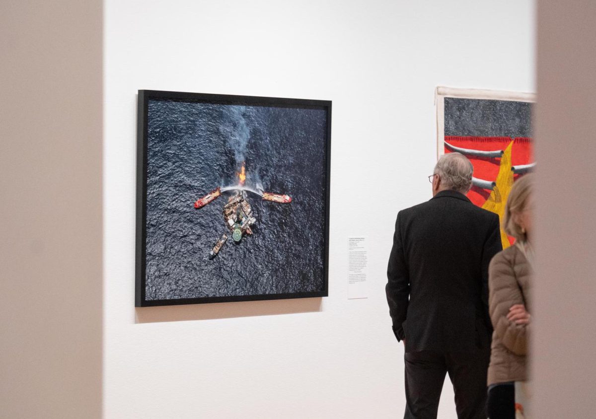
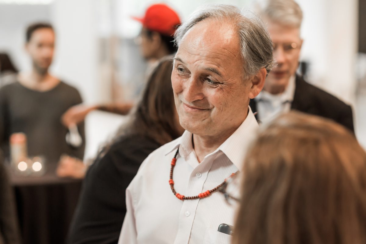
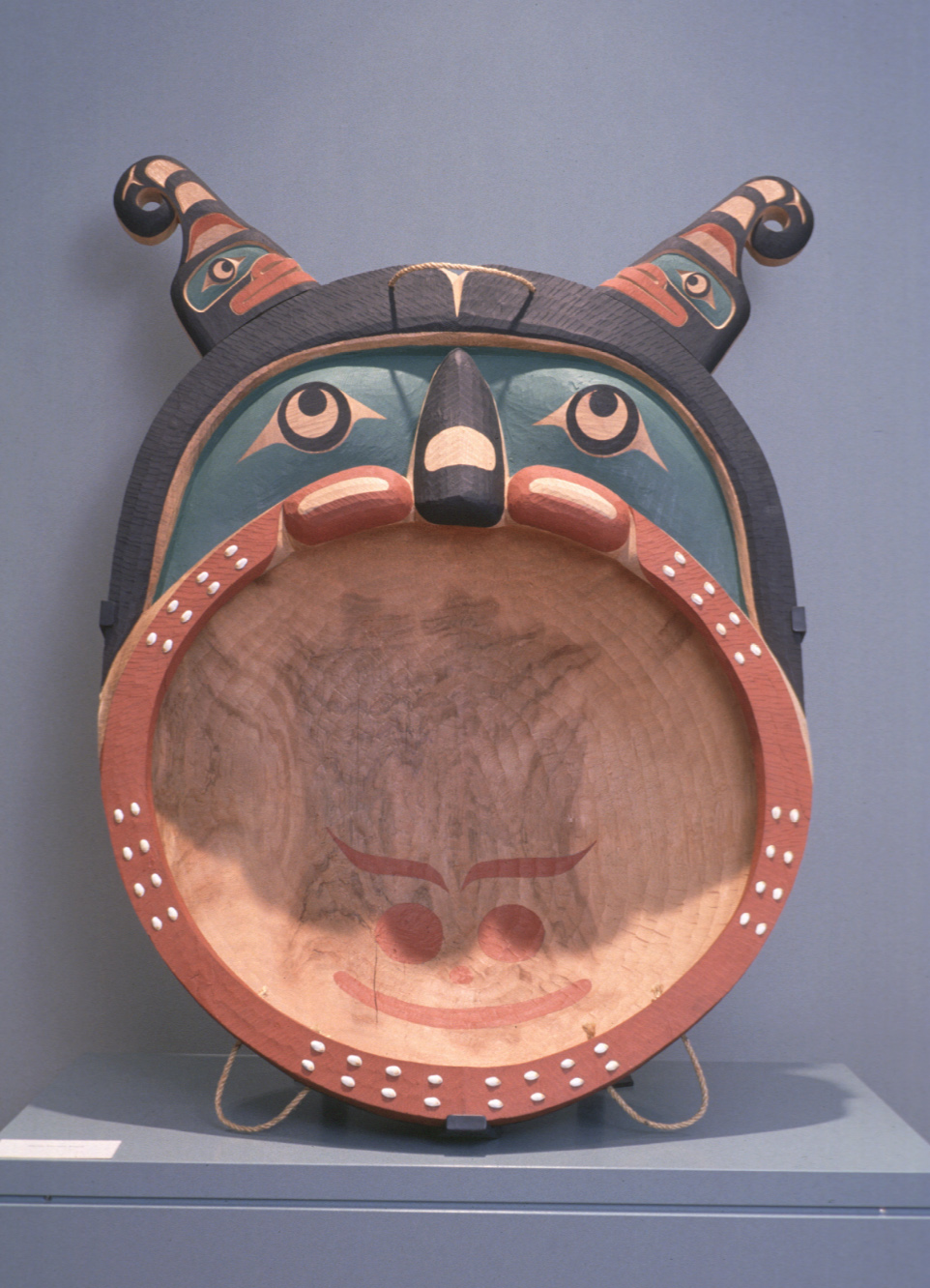
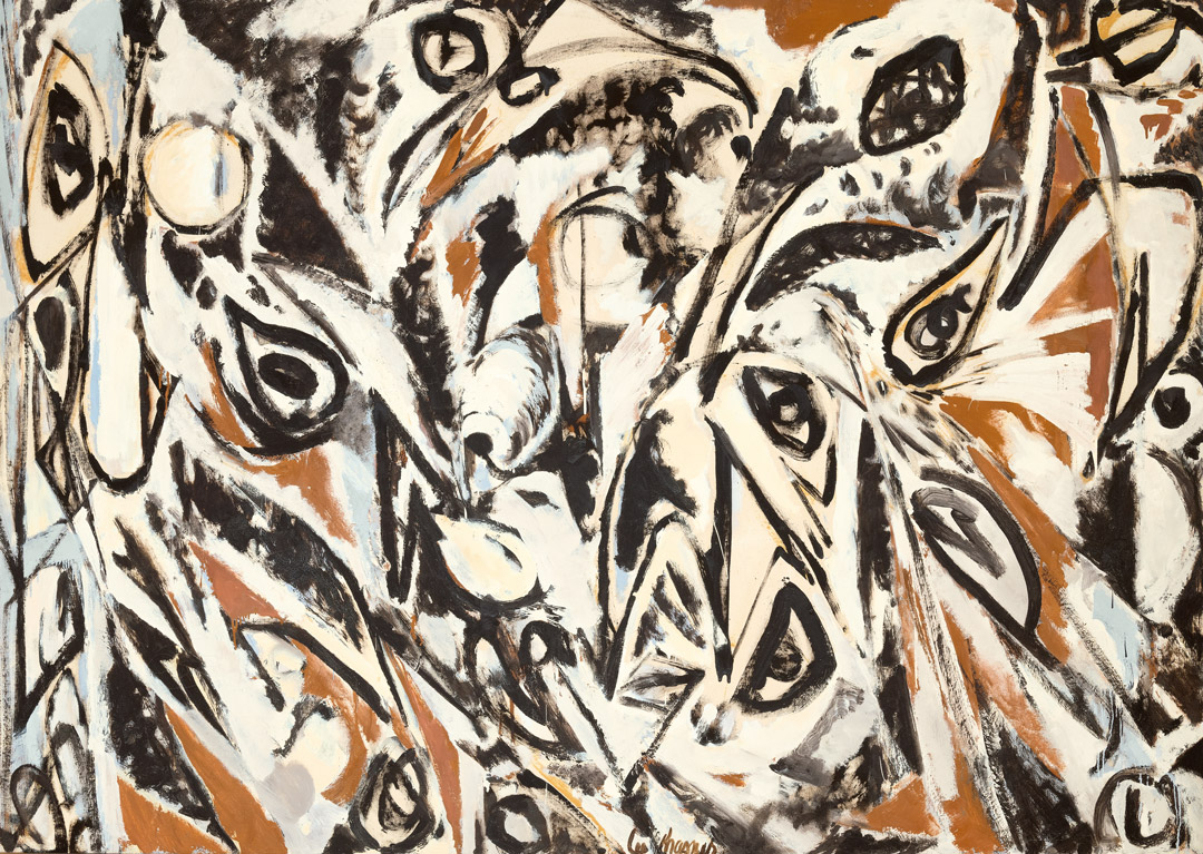
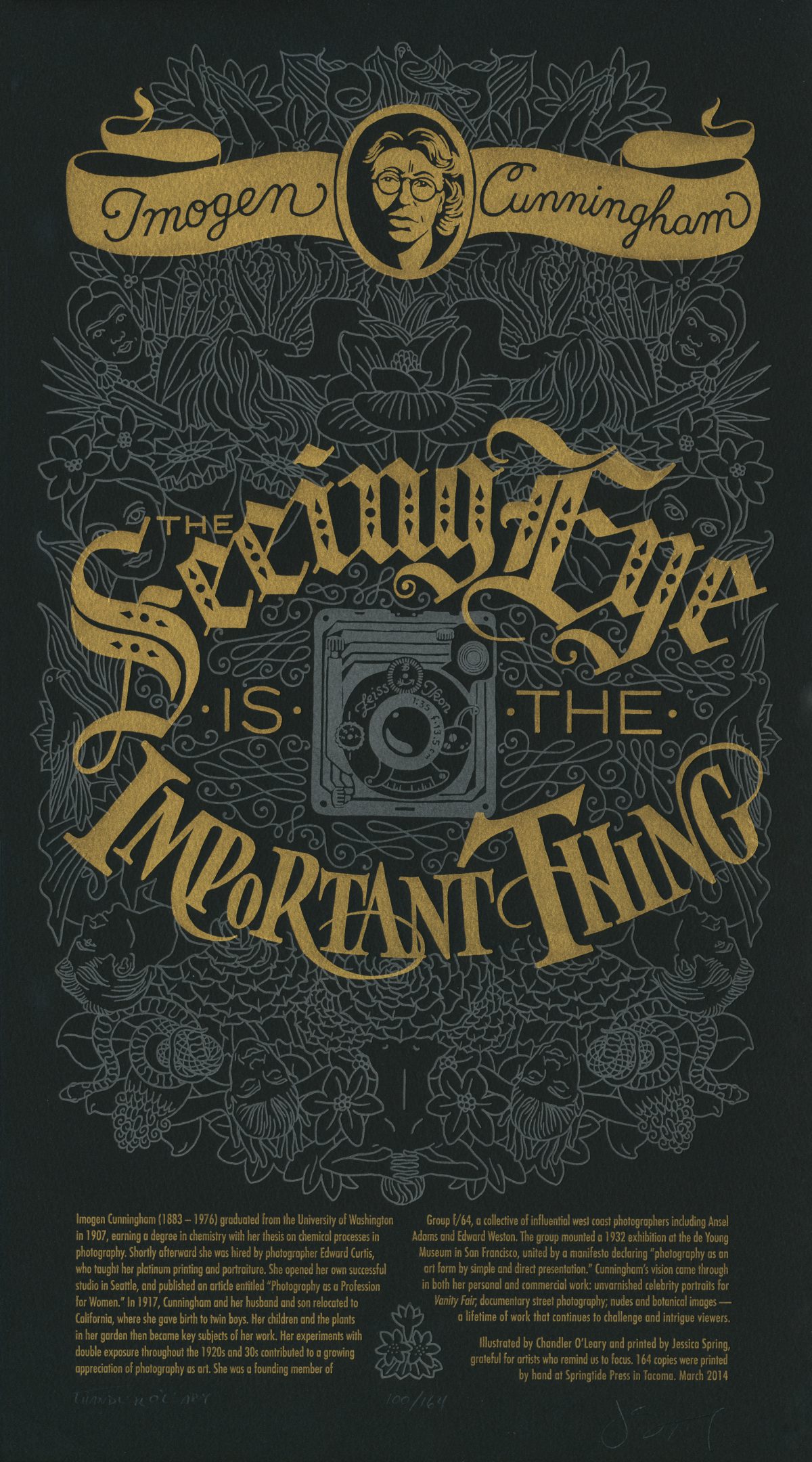
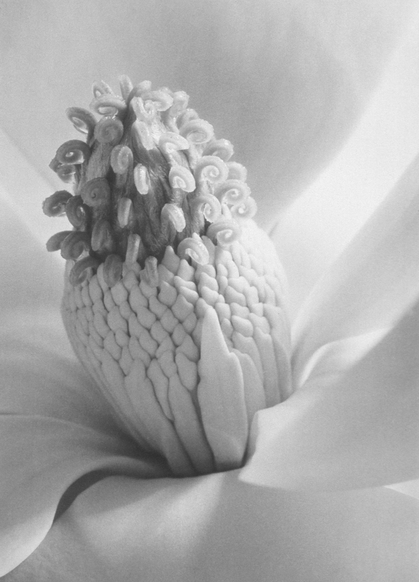
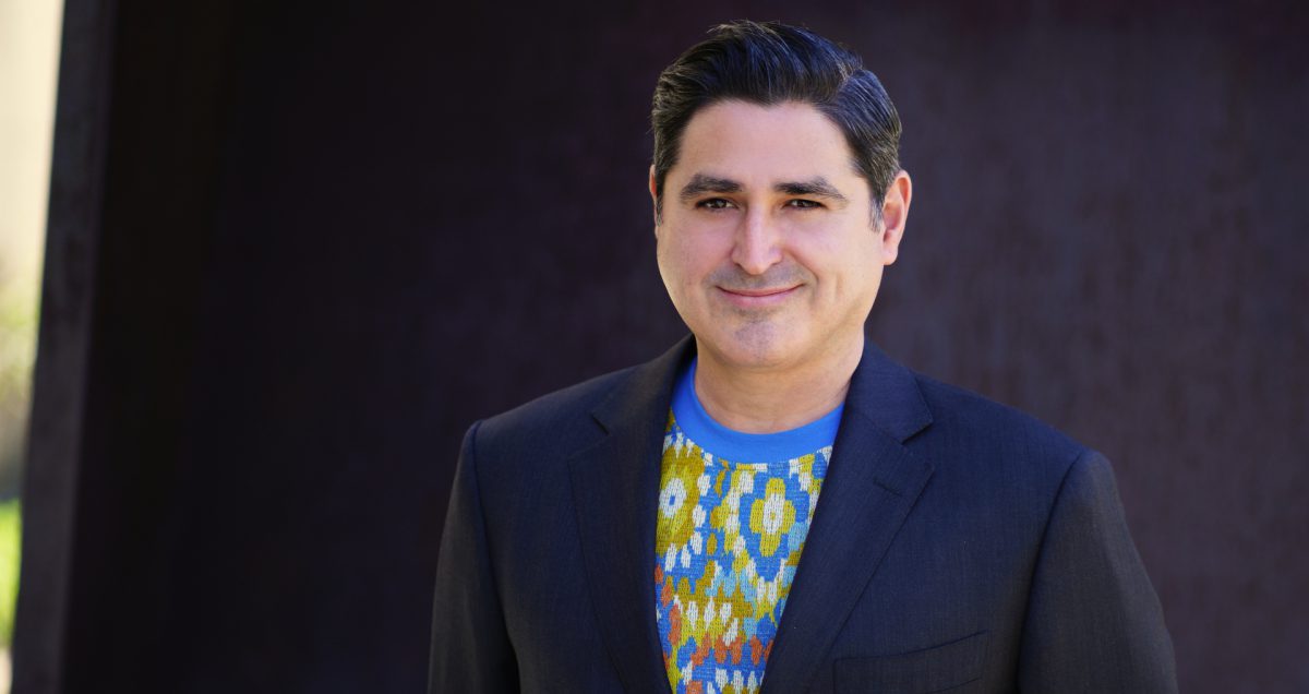
A New Era at SAM: Welcome, José Carlos Diaz!

“I’m a total optimist. I believe museums are places where people can find inspiration. I want SAM to inspire the next generation of curators and artists and patrons. This is something that museum curators are discussing — we’ve been discussing this for years, but it’s more urgent now.”

– José Carlos Diaz

Following a months-long international search, SAM is proud to announce José Carlos Diaz as its new Susan Brotman Deputy Director for Art. Diaz comes to SAM from The Andy Warhol Museum in Pittsburgh, Pennsylvania, to oversee SAM’s eight brilliant curators in developing thoughtful exhibitions and maintaining the museum’s collections, publications, and libraries across SAM’s downtown location, the Seattle Asian Art Museum, and the Olympic Sculpture Park. He succeeds Chiyo Ishikawa who retired in 2020 after 30 years at SAM.

In celebration of his new role, we spoke with Diaz about his background, hopes for SAM, and becoming a part of Seattle’s artistic community. Read below for the full interview and check out his interview in The Seattle Times to learn even more about what Diaz will bring to SAM when he starts on July 1.

SAM: Tell us about your new role. Why is it important at a museum?

José Carlos Diaz: In this role, I will be part of the senior leadership team and responsible for ensuring we develop a relevant and ambitious curatorial program across all three of our sites. I bring management, administrative, and fundraising experience and possess a track record of creating dynamic exhibitions and projects. This role also has a direct impact on what SAM audiences will see in SAM’s galleries. The exhibitions we’ll be designing going forward will be the result of the needs and wants of our visitors and will uphold SAM’s mission of connecting art to life.

SAM: What drew you to this position, and this position with SAM, in particular?

JCD: I actually have a background working in multi-site institutions! I previously worked at Tate Liverpool, which is part of the Tate Museums in the UK. I’m also coming directly from The Andy Warhol Museum, which is part of the Carnegie Museums of Pittsburgh. So, managing the curatorial team of a multi-site institution isn’t too foreign for me.

I think what drew me most to SAM was its vast collection which spans across period and place. In college, I studied art history and cultural history. So, to have access to a collection which combines historical and contemporary art is very exciting to me. When you visit any SAM location, you’re bound to encounter a combination of painting, sculpture, drawing, architecture, costume, and more. From a curation standpoint, the versatility SAM has to offer is thrilling.

Not only that, but the museum is in the artistic center of a great American city known for having a robust cultural landscape. I think it has the potential to be one of the top art cities in the country—almost even rivaling New York or London. Plus, Seattle is home to a strong Latinx population and LGBTQ community which I am looking forward to joining and representing. I’m really excited to bring more representation to these communities at SAM and highlight the work of artists from these communities.

SAM: You’re stepping into a leadership role from a curatorial one: what lessons and skills from curation will you bring? Also, will you still be curating?

JCD: As a curator, I form ideas and craft narratives using art. This process requires creative thinking, problem-solving, teamwork, research, and a direct connection to the mission of the institution—and these are all really important skills to me. These are skills that I will bring to this new role while building a unified and creative team of curators and exhibitions. Occasionally I would love to curate if there’s the opportunity or if a certain curator needed support because of the robust exhibition and programming schedule, but I’m mostly focused on looking ahead and rebuilding a strong museum as we continue to navigate the effects of the COVID-19 pandemic.

SAM: Even though this will take some time to develop, what are some of your goals or ideas for this role, and overseeing a global collection and large team of curators across disciplines?

JCD: One of the top goals is understanding the internal climate at SAM and how to best contribute to its existing environment. At the same time, I want to consider what the city and its artistic community want from SAM, and how we can do better and be better. With a vast collection of artworks across three locations and the varied curatorial expertise of our team, I’d love to unify our offerings and collaborate to build awareness across the city that would allow SAM to explore a broad range of ideas and themes in its exhibitions. Perhaps some of our artworks could also travel to other cities for public art commissions, publications, and/or exhibitions.

SAM: An easy one: Why is art important?

JCD: Art, in my opinion, is a form of expression, but also a form of self-care, especially in these times. It’s as simple as that.

SAM: What role do museums serve in a city and for the communities they serve?

JCD: Museums are places to inspire and seek inspiration. They’re also social spaces which continuously evolve and improve. SAM shows historic works, but also global and local creativity through its incredible collections. It features limited-run exhibitions as well as ongoing installations, while continuously rotating its collection and introducing new narratives, often around current affairs and through multiple voices. So, using SAM as an example, I think museums in general seek civic excellence through varied representation.

SAM: Tell us more about you! Outside of art curation, what do you like to do with your time?

JCD: I’m originally from Miami, but my family is from Mexico so I’m Latin American. My husband is an oceanographer and we share a dog named Elvira, Mistress of Bark. I have a fraternal twin who’s a Latin Grammy Award-winning and Grammy-nominated children’s music artist named Lucky Diaz and the Family Jam Band. I love to travel and go to the beach. On my time off, you can often find me on a boat or somewhere by the water. It’s just my happy place.

– Interview conducted by Lily Hansen, Marketing Content Creator

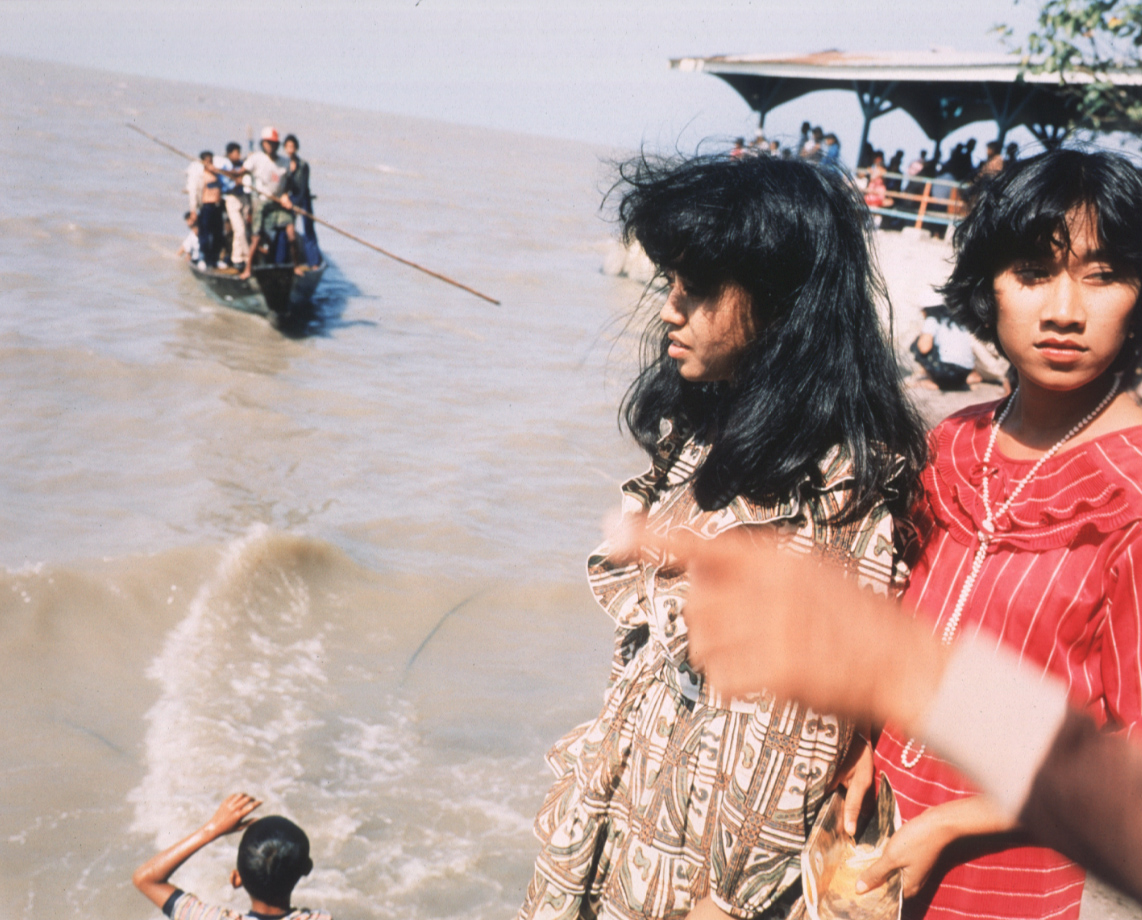
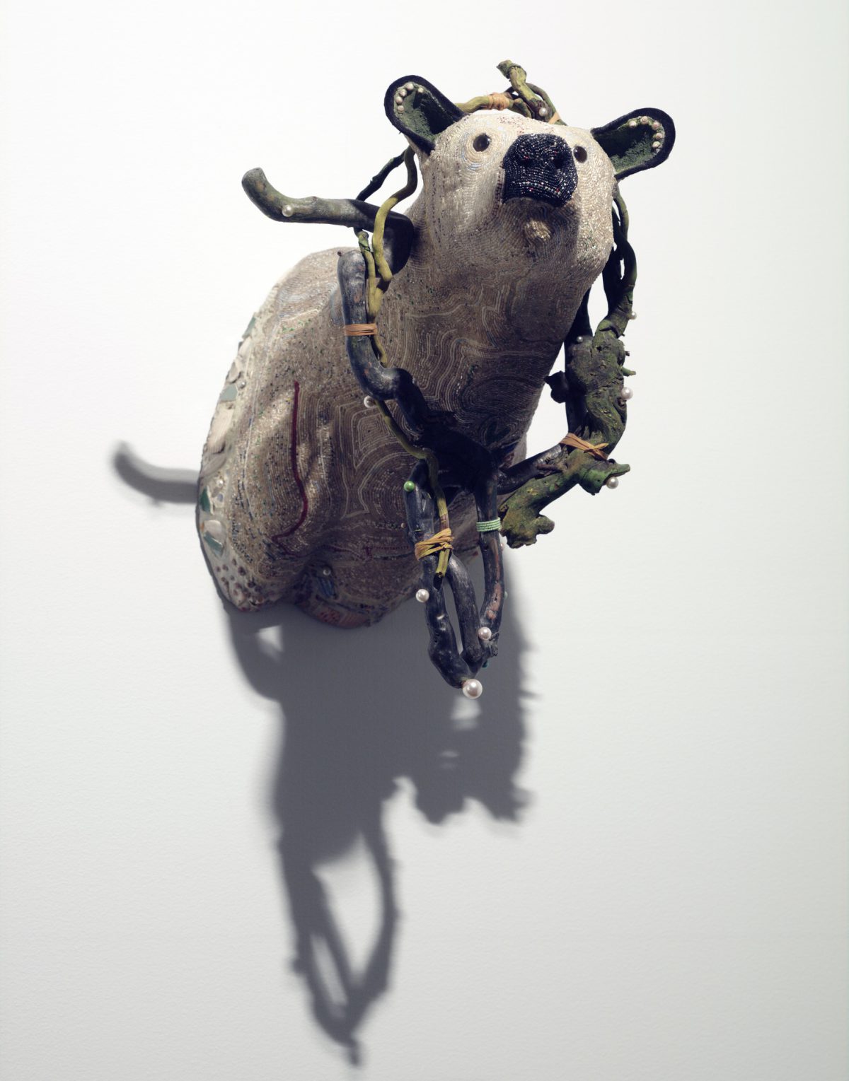
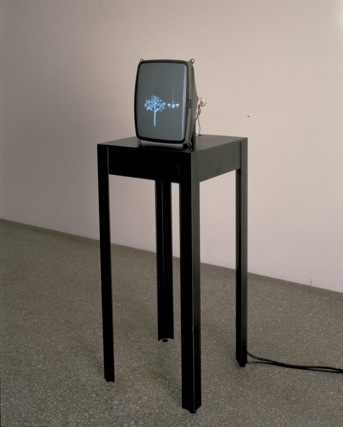
Image: Alexis Gideon.

Object of the Week: Indian Warrior

Alexander Phimister Proctor was an American artist renowned for his bronze sculptures depicting the western frontier. Toward the end of 1896, he received the prestigious Rinehart Scholarship to practice in Paris on a three year contract. The scholarship committee commissioned Indian Warrior for the Rinehart Prix de Paris Collection. 

In the fall of 1895, Proctor traveled to Glacier National Park in Northwestern Montana and stayed at a Blackfeet reservation where he studied two Blackfeet men. He started the cast for Indian Warrior there, and later finished it in New York and Paris. The model for the figure was a man named Weasel Head, while the horse was owned by a mutual colleague named Dixon. A New York lawyer, Dixon allowed Proctor to borrow the horse for the piece.

Proctor brought the lessons he learned in Paris to his practice of American naturalism. In Paris, he absorbed the Beaux-Arts style which upheld classicism in sculpture. As for the naturalistic element, he was interested in depicting realistic scenes from the American West. In this piece, the figure sits calmly above a trotting horse in action. Where they are going is beyond what the viewer knows. Yet, the figure’s spear draws itself parallel to the nape of the horse in a way that honors the spiritual connection of the two main subjects. Personal interdependence lies in the body language of them both: proud and secure.

Proctor’s appreciation of Native American culture is a layer of protection provided to historically white Western artists. Proctor’s privilege lies in his freedom to determine Native Americans worthy enough to sculpt. The concept of the Noble Savage stems from this privilege and calls this artwork into question. Indian Warrior does not find a hold in contemporary Native American representation-nor does it attempt to. It functions as Proctor’s own interpretation of Natives existing within their culture and doesn’t leave room for further understanding.

Folding back these layers does not detract from Proctor’s artistic excellence. He was a master of his craft. Augustus Saint-Gaudens, a fellow acclaimed American sculptor and friend to Proctor, knew this. Theodore Roosevelt, a continued supporter and avid commissioner of Proctor’s work, expected it. Yet, this piece is only poignant because of its subject matter. The way in which the horse and Weasel Head are both stopped in a moment in time. Admiration can fill the subsequent space. But admiration is nothing without reflection. And reflection is nothing without the impulse for more. To follow this piece to where they are going.

The responsibility of responding to Native American monuments lies with every person that views Indian Warrior. These snapshots of moments in time are a careful reminder of what it means to be valiant beyond the circumstance. Proctor’s technical excellence in Indian Warrior is made possible by who he is representing. This work is emotive and communicative because of the history it depicts. It is not Proctor’s touch that carries this work, but the themes that it reflects on Native Americans being represented by white mainstream artists. If there are accolades to be given to this work, its honor should be in the identity of Weasel Head, and the legacy of Native American heritage. Where is the horse taking Weasel Head? Or where is Weasel Head taking the horse? Beyond the space of the Seattle Art Museum, to the future in sight, for all to see.

– Moe’Neyah Holland, SAM Emerging Arts Leader Intern

Images: Chloe Collyer.

Object of the Week: Kurtal

An azure blue circle becomes a stop sign in this canvas now on view in Our Blue Planet: Global Visions of Water at SAM through May 30. The circle is a jila, or sacred waterhole, in the Great Sandy Desert that you do not dare get too close to. Kurtal is the moral protector of this source of water and can be seen as a swirling black snake. In the painting, Kurtal has called in clouds which appear as horseshoe shapes set against the sky to unleash rain which enables dots of bush onions to grow around the waterhole.

ArtistNgilpirri Spider Snell was once part of a remarkable act of activist painting in 1997 when he joined 42 others to paint a giant canvas mapping all the waterholes and major features of their country around Lake Prinini. It became a document in an appeal for native title legislation and was presented to the Australian government in Canberra where Spider danced on it, wearing a headdress in the shape of a long rain cloud, and revealing his renowned position as a ceremonial dancer.  

For the next ten years, this canvas, called the Ngararra Canvas, traveled around Australia and Spider often appeared as part of the delegation to explain what features of the country were being claimed. 

By 2007, a Native Title settlement confirmed that what outsiders called “stories” were legal documents, and that paintings were evidence to prove land ownership. Soon thereafter, a major victory gave 80,000 kilometers of land back to its original owners. However, Kurtal’s site was not included, and Spider continued to agitate—taking his grandson back to visit Kurtal in 2015—a trip that became the centerpiece of a film whose clip gives a brief glimpse of his allegiance to the snake spirit and the enormous power he unleashed in the year before his death.

For an account from the Australian Broadcasting Corporation about how the large group painting became an activist force for legal change, this short segment follows the painting back to Lake Prinini with some of the painters in 2018.

– Pam McClusky, SAM Oliver E. and Pamela F. Cobb Curator of African Art

Image: Kurtal, 2005, Ngilpirri Spider Snell, (1930-2016), Australian Aboriginal, Wangkajungua People, Fitzroy Crossing, Kimberley, Western Australia, Synthetic polymer paint on canvas, 83 7/8 x 59 13/18 inches (213 x 152 cm.), Gift of Margaret Levi and Robert Kaplan, 2019.20.14.

Object of the Week: Oil Spill #5

One of the thrills of working on Our Blue Planet: Global Visions of Water was the chance to collaborate with my colleagues, Barbara Brotherton and Natalia Di Pietrantonio. Of the many outstanding photographs that emerged from a collection that Natalia was familiar with, Edward Burtynsky’s Oil Spill #5 is now on view with other efforts to document how our species is enacting the desecration of water.  Here is Burtynsky in his own words:

“When I first started photographing industry, it was out of a sense of awe at what we as a species were up to. Our achievements became a source of infinite possibilities. But time goes on, and that flush of wonder began to turn. The car that I drove cross-country began to represent not only freedom, but also something much more conflicted. I began to think about oil itself: as both the source of energy that makes everything possible, and as a source of dread, for its ongoing endangerment of our habitat.”

– Edward Burtynsky

This image is of the Deepwater Horizon oil spill in the Gulf of Mexico. The colors of the red emergency vehicles, the orange flare of the well flame, and the arc of water sprays appear minuscule against the backdrop of a blackening sea. 

One of the agonies of curating is the need to reduce an artist’s corpus to a short paragraph, so I’d urge you to move on to hear from this artist to learn more about his process and intentions. Oil Spill #5 is part of a series he narrates in this video, Water—Where I Stand: A Behind the Scenes Look.

On April 12, 2022, Edward Burtynsky was awarded a SONY World Photography Award in London. In his acceptance speech, he spoke as the son of Ukrainian immigrants to Canada, and deferred his contribution to honor others, saying, “Photography is about light conquering darkness. And as we speak, Ukrainian photographers are conquering an unimaginable form of darkness. I can think of no more outstanding contribution to photography than that.” More about Ukrainian photographers that he is supporting can be found on his website.

– Pam McClusky, SAM Oliver E. and Pamela F. Cobb Curator of African Art

Image: Chloe Collyer.

Object of the Week: Coulee Dam Construction

With its natural beauty and landscape, a huge influx of people began moving to the West during the 19th and 20th centuries. The construction of dams throughout America’s landscape was considered an outstanding achievement for the nation’s economy and became a defining moment in America’s history. In the 1930s, President Franklin D. Roosevelt implemented the New Deal’s Public Works Administration (PWA), a government-sponsored relief program meant to subside the economic impacts of the Great Depression. The creation of this program resulted in the creation of many iconic structures throughout the country, such as what we now know as the Grand Coulee Dam. Artist Z. Vanessa Helder spent two years documenting and painting the formation of the Coulee Dam, creating a series of works that tell the dynamic story of its completion. 

In Coulee Dam Construction: Skip Way and Grout Shed, Helder captures the dam’s evolution in its final years of construction in her bold precisionist style. The perfectly straight diagonal lines formed from the building equipment draw our eyes to the man-made gash in the mountains, formed by several years of hard labor done by local industrial workers. The red construction buildings and materials provide a bold contrast between themselves and the gray and beige background of the dirt and debris of fallen rock. Further contrasting the soil and shale foreground, the mountain top and sky boast brilliant shades of green, orange, and blue. These stark contrasts between the focal points of Helder’s painting showcase the commanding presence of the industrial boom in the Northwest and the strength and perseverance of the environment around it. 

Today, the Grand Coulee Dam still stands, and the impacts that it has had on the environment continue to develop since its construction that Helder captured in the 1930s. Dam construction left a colonial imprint on the landscape, contributing to the loss of local biodiversity, flooding, pollution, and poorer water quality. While there was a high amount of public support of projects such as the dam due to the increase in local jobs and increased infrastructure, it has become time to re-evaluate our means of energy production. Human intervention in nature is a prevalent theme that emerges from the art of Helder. Looking at Coulee Dam Construction: Skip Way and Grout Shed, we can re-examine the reasoning for why these dams were built and how the environment and people are affected nearly a century after its completion.

– Kari Karsten, SAM Emerging Museum Professional Curatorial Intern

Image: Coulee Dam Construction: Skip Way and Grout Shed, 1939, Z. Vanessa Helder, American, 1904–1968, Transparent watercolor, 18 1/4 x 14 7/8 in., Framed: 30 1/4″ x 27 3/4″ in., Eugene Fuller Memorial Collection, 39.54.

Object of the Week: In the Superexpress Station, Atami

Just as the shinkansen, Japan’s bullet train, began to pull out of Atami station, photographer Leo Rubinfien captured the joy of high-speed rail transit in a fleeting moment. A businessman bursts out with laughter, his face framed by the black window frame and white curtains of his train carriage as he embarks on the four hour journey to Okayama along Japan’s southeastern coast. The blue horizontal paint that runs along the exterior of the train carriage draws the viewer’s eye horizontally, as if our eyes are tracing the movement of a train in-motion through a static image.

This 1984 photograph, In the Superexpress Station, Atami, is part of a series taken over an eight-year period in East and Southeast Asia in Rubinfien’s attempt to subjectively present and characterize his surroundings. Having spent his early life in Tokyo, Rubinfien moved through over seven countries between 1979 and 1987. His images tell a compelling and truthful, yet un-romanticized story of the people and culture he encounters on this trip. The subjects of his images—including both tourists and locals—are said to successfully depict “how the East views itself,” while simultaneously illustrating “how the West constantly assaults but never quite conquers it.”

Rubinfien’s photographs were last on view in SAM’s galleries over 27 years ago in Leo Rubinfien: A Map of the East. However, today, they are just as relevant as ever. As contemporary documentary photographers still grapple with questions of “othering” and face the challenges of conveying lived experiences without appropriation through a single snapshot, Rubinfien’s photographs act as a blueprint. Similarly, as local transport systems across the globe continue to expand, and we become more cognizant of the impending doom that is the planet-wide climate crisis, rail transportation is more important than ever. Rubinfien, through both In the Superexpress Station, Atami and other images in his series, relays questions surrounding pollution, transportation, and globalization over the last 30+ years to viewers. Rubinfien captures people and moments, despite decades aged, that remain topical and vibrant to contemporary discussions.

– Arielle Murphy, SAM Accessibility Lead

Images: In the Superexpress Station, Atami, Leo Rubinfien, 1984, American, Born 1952, Kodak Type C print, 20 x 24 in. (50.8 x 60.96 cm). Gift of Lee Friedlander, 93.88. A Watch Repairer’s, Chungking, 1984, Leo Rubinfien, American, born 1953, Kodak Type C print, 20 x 24 in. (50.8 x 60.96 cm), Gift of Lee Friedlander, 93.92. On The Breakwater At Kenceran Beach During Idul Fitri, Surabaya, 1982, Leo Rubinfien, American, born 1953, Kodak Type C print, 20 x 24 in. (50.8 x 60.96 cm), Gift of Lee Friedlander, 93.93.

Object of the Week: Circle Blue

By the time De Wain Valentine moved to Los Angeles in 1965, the artist was already working with plastics. He had been introduced to them by his junior high shop teacher after the then-recent military declassification of the material following World War II and had been working with them on a small-scale ever since. Now in California, Valentine began sharing his experiences while working as a part-time faculty member at UCLA.

Having spent most of his life until that point in Colorado, Valentine has explained how the move influenced his art: “In Colorado, you don’t notice the sky so much because it’s crystal clear: always blue and always so beautiful.” In fact, the Latin name for the Colorado state flower is coerulea, which translates to “sky blue.” But as Valentine continued in a 2011 interview with the Getty Conservation Institute, “you can’t see [the sky in Colorado], so you always forget about it. But the sky in LA is very different: You can really see that—the smog and the fog.”1

For folks from the California coast, the “fog” is really the marine layer, a coastal air mass, usually occurring in the morning, which creates overcast skies that “burn off” around noon. The smog, however, especially in 1960s Los Angeles, was not only something you really could see, but threatened its own weather in the region. A front-page news report in the Los Angeles Times from October 1964 notes that “[s]weltering temperatures helped produce another blanket of smog over the Los Angeles basin Tuesday and touched off lightning storms which started at least three fires in the mountains.” In the next column over, a weather brief states “Light to moderate smog today.”2

Valentine is quoted saying that his extensive series of large-scale polyester resin sculptures are “all about the sea and the sky” and that being in Los Angeles allowed him to see “a new avenue to make sculpture that was completely atmospheric or like a chunk of the ocean cut out.”3 The translucent circles, columns, curved slabs, and sometimes UFO-shaped disks, come in a wide array of colors, from warm rose and orange to more New Age-y lavenders and turquoise, and many are several feet tall or wide. For example, his massive Gray Column (1975–76), made with black pigment that grows transparent and smoky as it tapers at the top, is an impressive 12 feet, like a slab carved from a smog-filled sky. 

Circle Blue, with its cerulean gradient, however, is the work that most clearly evokes the ocean and sky, and, with its round shape, the planet. Like the other tall translucent sculptures, Circle Blue is made from a proprietary blend of polyester resin. Working with the manufacturer Hastings Plastics in Santa Monica, California, Valentine produced Valentine MasKast Resin in 1966 that, unlike previous polyester resins, could be used to create large, thick objects cast in a single-pour rather than in thin layers, without cracking or overheating. 

After polyester resin’s initial use in the military and aerospace arenas, the cheap, sturdy, and durable material was quickly adopted by the automotive and maritime industries, but also used for small common objects like buttons and bowling ball cores. Polyester resin has a highly complex chemical structure that requires “curing” to transform the liquid resin to a solid. This part of the production process is probably the most toxic, as the most common agent used for curing is styrene, which the National Toxicology Program of the US Department of Health and Human Services has listed as “reasonably anticipated to be a human carcinogen.”4 Polyester resin is also a plastic, and therefore made from fossil fuels. 

Despite the material’s industrial applications, Valentine never really outsourced the production of his sculptures to a fabricator, a common practice for artists using industrial materials, including his peers in the Light and Space movement and in other Minimal Art groups. Pictures of him and his studio assistants clad in PPE (personal protective equipment) show the very hands-on process taken: weeks of sanding and buffing with hand-held machines usually found in an auto-body shop. Citing health concerns, Valentine later turned to using glass for some of his sculptures, but mainly so he could install his works outside: UV light and the potential for surface scratches could destroy the polyester resin sculptures.5 What the material afforded him, however, was a way to examine not just the surface of sculpture, but the (light and) space in between. “[T]he interior of the sculpture is so essential.”6

Reflecting on Circle Blue’s origins in 1960s and 70s Southern California’s smog, sea spray, and glittering oceans against today’s heightened climate crisis, the piece becomes not just an imaginative chunk of the sky, but also a transparent, precious, and conflicting sample of our world. It is both beautiful and a little toxic, strong but also fragile. At almost six feet in diameter, we can see ourselves in its surface, but we also see in and beyond it. Now on view in Our Blue Planet: Global Visions of Water at SAM, Circle Blue—in addition to many other works on display—prompts questions about our relationship to the planet: How might we preserve a chunk of the sea or sky today? How might we look beyond today and imagine our blue planet in the future? 

– Mia C. Ferm, Project Manager, SAM Historic Media Collection

1 Tom Learner, Rachel Rivenc and Emma Richardson, “From Start to Finish: De Wain Valentine’s Gray Column” (Los Angeles: The Getty Conservation Institute, 2011), 7.

2 “Heat, Smog, Lighting and Fires Pile Up Southland Weather Woes,” Los Angeles Times (Los Angeles, CA), Oct 7, 1964.

3 Tom Learner, Rachel Rivenc and Emma Richardson, “From Start to Finish: De Wain Valentine’s Gray Column” (Los Angeles: The Getty Conservation Institute, 2011), 7.

4 National Toxicology Program, “Report on Carcinogens, Fifteenth Edition” (report, Research Triangle Park, NC: U.S. Department of Health and Human Services, Public Health Service, 2021).

5 Dorothy Newmark and Dewain Valentine, “An Interview with Dewain Valentine, Sculptor of Plastic,” Leonardo 4, no. 4 (1971). 

6 Tom Learner, Rachel Rivenc and Emma Richardson, “From Start to Finish: De Wain Valentine’s Gray Column” (Los Angeles: The Getty Conservation Institute, 2011), 12.

Image: Natali Wiseman.

Our Blue Planet: Five Quick Questions with Claude Zervas

Our Blue Planet: Global Visions of Water documents the stories and histories of water in our world. Pulling exclusively from local loans and works in SAM’s permanent collection, the expansive exhibition features paintings, sculptures, textiles, and multimedia works by over 70 artists from around the world. Over the next 10 weeks, we’ll be talking with some of the contemporary artists involved with the exhibition about their artwork and the importance of water in their lives.

Born in 1963, Claude Zervas is best known for his light and video installations focusing on the topography and topology of the Pacific Northwest. In the 1980s, Claude attended Western Washington University to pursue a degree in geology and moved to Paris, France following his graduation. Although he spent many years working as a software engineer, Claude eventually decided to return to Washington and fully commit to his art practice and art production. Discover the story behind Claude’s 2005 sculpture, Nooksack, now on view in Our Blue Planet at SAM below.

1. What is your name and where are you currently based?

My name is Claude Zervas and I am based just outside of Bellingham, Washington.

2. What is the title of your artwork and how does it fit in with the themes explored in Our Blue Planet?

The title of my work is Nooksack. It’s a part of SAM’s permanent collection and has previously been on view in a couple of exhibitions at the museum. When piecing Our Blue Planet together, I think the curators thought to include my work because of its connection to one of our local waters. After deciding to include my work, I worked a bit with SAM’s conservation team to give the sculpture new life. We had to replace all of the lamps which proved difficult because the tiny little fluorescent bulbs I used are now, more or less, obsolete technology. Back in the day, they were used in scanners and back light for video displays but they’re not used so much anymore and are getting harder to find. But, I really like the delicate and thin light that they put out—nothing else really puts out that kind of light.

3. What thoughts, ideas, and/or perspectives do you want visitors to take away from your artwork in Our Blue Planet?

Nooksack stems from this really personal relationship to the Nooksack River that I had as a kid growing up near the water. And for some reason, as an adult, I still feel a kinship to it. I’m not totally sure why, but it’s a beautiful river. And this piece is an ode to the river based on my memory of it and acts as a sort of ‘thank you’ to it. In seeing my work, I want visitors to consider the bodies of water which exist around us and thank them for all that they do for us.

4. What other artworks in the exhibition stood out to you?

All of the works in this exhibition are incredible, but what really stood out to me was a quote I saw on the floor of the exhibition by Abby Yates. I don’t know why her words so deeply affected me, but they did. Just to see a voice representing the Nooksack people and the river I care about so much was a beautiful experience.

5. How do art and activism intersect? Why do you think it’s important for museums like SAM to curate exhibitions around environmental and societal issues such as water?

I’m not much of an activist but I think we can all agree on the importance of water on Earth. It’s hard to overstate considering we’re 90% water and without it we’d all be dead. It’s essential for us to continuously investigate and discuss the role it plays in our lives. Overall, I’m just pleased SAM thought it important to publicly acknowledge and highlight the various ways water impacts all of our lives—and I’m honored they decided to include my work in the exhibition.

– Lily Hansen, SAM Marketing Content Creator

Images: L. Fried & Natali Wiseman.

Object of the Week: Sea Bear

At first glance, this might look like a typical trophy head found in a mountain lodge, but Sherry Markovitz has turned the conventional idea of a hunting trophy on its head in the creation of Sea Bear.

“I am after beauty, with an edge of uncertainty, vulnerability, and power,” she says of her artistic process. “I use animal metaphors to explore issues of intimacy, closeness, and separation.”1 Sea Bear’s tranquil and inquisitive stare is a powerful celebration of peace and gentleness, highlighting a species historically honored as a dynamic part of a balanced ecosystem.

As the subject matter of countless forms of creative expression, polar bears may have appeared in art as early as 17,000 years ago in the Paleolithic cave of Ekain in the Basque Country of Northern Spain. Below, two outlines resembling an adult and juvenile can be seen on the ceiling. Their elongated bodies look remarkably like polar bears. Perhaps they drifted south with pack ice off the coast of England during the icier years rounding out the Pleistocene.2 What we can be sure of is that they’ve been depicted in art and lore ever since.

Among the shared spiritual beliefs of the Inuit, polar bears are a living representation of resilience and determination, imbued with souls and regarded as brothers in a time when we did not take pre-eminence over other animals. Nanook, an almost man-like master of bears decided if hunters deserved success in their endeavors or punishment for violating taboos.3

This bear, crafted of wood, beads, shells, fabric, paint, and papier-mâché, is the culmination of intertwined memories and experiences the artist had with nature and her loved ones.

“Emotionally, Sea Bear is circular, all the stuff on it is traceable to significant walks. Walks with my mother in Florida, walks in Port Townsend with Peter (during which time her son Jake was conceived), walks alone to find the ‘root’ pieces at Discovery Park. Walking on the beach is such a drifting and wonderful activity.”4

From a distance, Sea Bear offers up the impression of a familiar creature. Its intricate and subtle beadwork appears at first to be deceptively monochromatic. A step closer, however, reveals an otherworldly figure clad in the ocean’s bounty emerges. The beads are revealed to be six or seven shades of color, like gentle eddies of ermine pebbles undulating over sand. The eye is drawn towards the shadows cast by exhibition lighting on the bear’s outstretched neck and jaw, flowing into the sinuous curves of its pelagic collar.

“I see the ‘collar’ as directional—the wood shape and the bear shape working in tandem was the key (formally) on this one. I think the large pearls pulled the shape back to the bear. It’s funny, as I get further away from a piece, it is, in fact, the abstract concerns that remain the most visible to me.”5

Seattle is treasured for the water which surrounds it. From Lake Washington, fed by so many vital creeks and rivers, to the misty solitude of salt-scoured beaches along the Olympic Peninsula. Water inexorably affects our physical and cultural landscapes, it sustains and determines our way of life, and shapes our histories slowly over time like glaciers carving mountains.  Sea Bear is an opportunity to reconnect to this life-giving force, to step outside of our immediate reality and transport us to the shores of our minds choosing where we can know the peace of our own walk along the water’s edge.

See this work on view now in Our Blue Planet: Global Visions of Water at our downtown location through May 30.

– Danelle Jay, SAM Curatorial Division Coordinator

1 Sherry Markovitz, quoted in 50 Northwest Artists: A critical  Selection of Painters and Sculptors Working in the Pacific Northwest, ed. Bruce Geunther, San Francisco: Chronicle Books, 1983, pages 80–81.

2 Digitized interior of Ekain, courtesy of the Society of Sciences Aranzadi.

3 C.R. Harrington, The Evolution of Arctic Marine Mammals, ed. A. Berta, Ecological Applications, Volume 18, Issue sp2, 2008, pages S23–S40.

4 Sherry Markovitz, Channel 7 News, Linda Farris Gallery, Seattle, 1992.

5 Sherry Markovitz, letter to Vicki Halper, August 14, 1991.

Image: Sea Bear, 1990, Sherry Markovitz, wood, beads, shells, fabric, paint, papier mâché, 25 x 17 x 29 in., Gift of Terry Hunziker, 90.3, © Sherry Markovitz.

Our Blue Planet: Five Quick Questions with Ken Workman

Our Blue Planet: Global Visions of Water documents the stories and histories of water in our world. Pulling exclusively from local loans and works in SAM’s permanent collection, the expansive exhibition features paintings, sculptures, textiles, and multimedia works by over 70 artists from around the world. Over the next 10 weeks, we’ll be talking with some of the contemporary artists involved with the exhibition about their artwork and the importance of water in their lives.

Born and raised in Seattle, Ken Workman is a member of the Duwamish Tribe, the first people of Seattle, and the fifth generation great-grandson of Chief Seattle. A former Systems and Data Analyst at Boeing, Ken previously served as a Duwamish Tribal Council member and Duwamish Tribal Services President. He also currently sits on the board of two non-profit organizations, the Duwamish River Cleanup Coalition and the Southwest Seattle Historical Society. Read below to learn about Ken’s involvement in Our Blue Planet.

1. What is your name and where are you currently based?

My name is Ken Workman and I live in West Seattle.

2. What is the title of your artwork and how does it fit in with the themes explored in Our Blue Planet?

I serve as the introductory speaker for Our Blue Planet. The curators of this exhibition reached out and asked if I would say a few words in my native language, Lushootseed, and welcome people onto this land. In the video, I welcome everyone to the area, to the museum, and into the galleries in my native language—and I was honored to be asked to do it.

3. What thoughts, ideas, and/or perspectives do you want visitors to take away from your artwork in Our Blue Planet?

For so long, the Duwamish people weren’t allowed to speak our language on our land. Being a part of this exhibition, and being given the opportunity to speak Lushootseed publicly, is very special to me. I consider it an honor any time I am able to share our ancestral sounds with the public. What I think is most important in watching this introductory video is hearing my voice and my language. Water is such a broad topic which affects every community and person in the world, so I want visitors to learn about and understand the Duwamish people’s relationship to water while I speak in my community’s native language.

4. What other artworks in the exhibition stood out to you?

The one that really caught my eye was Tracy Rector’s Clearwater: People of the Salish Sea. She uses a combination of audio recordings and visual media to tell the story of the annual Canoe Journey, an inter-tribal event from Alaska to Oregon that celebrates the return of traditional canoe culture and water protection. In watching the video, what I realized was that I was actually a part of it! In addition to the drumming and native songs playing in the background, I suddenly heard my own voice and remembered that Tracy had asked record me speaking in Lushootseed many years ago. When I first watched the film, I was a bit surprised to hear my voice as I didn’t know I was a part of it but it was wonderful to discover that Tracy had included me in her work.

5. How do art and activism intersect? Why do you think it’s important for museums like SAM to curate exhibitions around environmental and societal issues such as water?

It’s important for us to recognize the importance of our natural resources. Around the world, potable water is in short supply. Our glaciers—in the Alps and here in America—are melting and our access to drinking water is shrinking. Bringing attention to these issues, like Our Blue Planet does so well, is more important than ever. Through experiences like these, I hope people will wake up and think more about using and conserving limited resources like these.

– Lily Hansen, SAM Marketing Manager

Photo: Beau Garreau.

Objects of the Week: Cage-Corset and New Clothes for the Emperor

No matter where I encounter them, Naiza Khan’s artworks always transport me back to a classroom on the campus of SOAS, University of London. It was in one such space where I had the privilege of hearing the artist speak about her series Henna Hands and The Skin She Wears—both deeply connected to Cage-Corset (2007) and New Clothes for the Emperor (2009), currently on view at the Seattle Asian Art Museum as part of the exhibition Embodied Change: South Asian Art Across Time.

Embodied Change at Seattle Asian Art Museum

These works and series illustrate Khan’s preoccupations with the female body. In thinking through the function of attire as a construct, Cage-Corset and New Clothes for the Emperor present clothing as a strategy to discuss gender. This is all the more relevant placed within the context of the back-and-forth between feminist activism and Islamicization in Pakistan that began in the 1960s and 70s, and gained much greater traction in the 1980s. As scholar Iftikhar Dadi has noted, in Khan’s works “the female body finally becomes visible in modern South Asian “Islamic” art as a subject itself, rather than simply remaining a decorative motif.”[1]

Part of her Heavenly Ornaments series, in which Khan turned to metal to fabricate armor, corsets, chastity belts and lingerie, Cage-Corset and New Clothes for the Emperor highlight the artist’s engagement with the Bihishti Zewar, an Urdu text written by the Islamic scholar and Sufi Ashraf Ali Thanawi. Written in the beginning of the twentieth century, the text prescribes morals and behaviors pertinent to young Muslim women and girls. Noteworthy, the Bihishti Zewar was written with state and social reform in mind. It posited that Muslim women were capable of becoming educated and moral actors just as equally as men. Thus, the Bihishti Zewar paradoxically asked, why should women conform to the authority of men or the state?

Through her artworks, Khan also references the presence/absence of women within the public sphere, particularly in the context of the roll-back of numerous rights for Pakistani women under the Zia regime of the late 1970s and 80s. Despite these retrogressions, huge numbers of women entered both the formal and informal labor sectors, and the applications of female students to higher educational institutes significantly increased. While the Zia regime attempted to control the presence of women in the public sphere, it inadvertently brought attention to the emergence of the publicly visible female body as an issue that could not simply be “rolled back.” In other works, Khan, unlike women artists before her, made use of the calligraphic form that was purported by the state as within the line of its official policy. Thus, Khan’s artworks demonstrate that simply opposing any state sanctioned idioms and logics are not enough to ensure the freedom of women.

Khan’s Cage-Corset and New Clothes for the Emperor demonstrate the entanglement of social, political, religious, and spatial relations that inform questions of subjectivity, freedom, and control imposed upon females. Then, as a starry-eyed master’s student, as now, the quiet subtlety of Khan’s artworks ring true. The artist does not simply claim her works as agents of freedom for those living under repressive regimes, but rather, brings attention to the ways in which such systems and its mechanisms, just like her corsets, are constructed, negotiated and navigated.

– Ananya Sikand, PhD Candidate, University of Washington


[1] Iftikhar Dadi, Modernism and the Art of Muslim South Asia (Chapel Hill: University of North Carolina Press), 2010, 198.

Images: Cage-corset, 2007, Naiza Khan, Metal and fabric, 11 13/16 x 11 13/16 x 11 13/16 in., Purchased with funds from Dipti and Rakesh Mathur, 2022.1.1, Ⓒ Artist or Artist’s Estate. Installation view of Embodied Change: South Asian Art Across Time at Seattle Asian Art Museum, 2021, photo: Natali Wiseman. New Clothes for the Emperor (II), 2009, Naiza Khan, Black & white digital photograph on archival Canson Infinity paper, 33 x 22 1/2 in., Purchased with funds from Dipti and Rakesh Mathur, 2022.1.2, Ⓒ Artist or Artist’s Estate.

Object of the Week: The Studio

One of the most influential Black American artists of the 20th century, Jacob Lawrence spent the latter years of his life living and working in Seattle, serving as a professor at the University of Washington’s School of Art. In 1977, seven years after his move, Lawrence painted The Studio, depicting himself in the attic of his Seattle studio. The Studio narrates Lawrence’s artistic journey of growing up in Harlem, moving westward, and his subsequent artistic development. Outside the window, Harlem tenement buildings scatter the view, connecting his relationships between Seattle and New York. In a 2000 interview, Jacob Lawrence spoke about this painting:

Yes, that’s my studio here, in Seattle. Not in this apartment, but it’s Seattle. And this is what my studio looked like going up the steps. And my neighbor, our neighbor is an architect. And these buildings back here bring somewhat of the tenements of New York. In reality, this is an empty wall. So I decided to put that back, to use that as a sort of symbol of my thinking of the big city, of New York.1

Lawrence grew up in Harlem after his mother relocated the family there in 1930 when he was thirteen years old. Wanting to encourage her son’s creative expression, his mother enrolled him in an after-school arts program shortly after their arrival in New York. Due to financial hardships, Lawrence was unable to finish his high school education. Yet, he continued to take classes at the Harlem Art Workshop, where he was mentored by the painter Charles Alston.

Lawrence’s upbringing in Harlem was one of the most formative periods of his life, and he frequently referred to those memories and experiences in his work, regardless of his geographical location. He specialized in scenes from Black American life and culture, taking inspiration from the stories of elders within his communities and transferring them into his paintings.

While best known for his paintings of workers from various professions, The Studio offers a glimpse into his work as an artist and teacher as he welcomes the viewer into his own studio. Lawrence referred to his style of painting as “dynamic cubism,” inspired by the colors and shapes of Harlem. The Studio showcases his use of vivid colors, bold linear movements, and mastery of geometric form.

– Kari Karsten, SAM Emerging Museum Professional Curatorial Intern


1 Jackson Frost, Interview with Jacob Lawrence at his home in Seattle, April 2000, transcript, The Phillips Collection Archives, lawrencemigration.phillipscollection.org/sites/default/files/Jacob-Lawrence-2000-interview-transcript.pdf © The Phillips Collection.

Image: The Studio, 1977, Jacob Lawrence, Gouache on paper, 30 x 22 in., Overall h.: 37 3/8 in., Overall w.: 29 in., Partial gift of Gull Industries; John H. and Ann Hauberg; Links, Seattle; and gift by exchange from the Estate of Mark Tobey, 90.27 ©️ Jacob Lawrence.

Object of the Week: Me and Pops

 An artist whose work defies easy definition, Aaron Fowler’s “memoiristic, maximalist bricolage” sculptures are comprised of carefully sourced found materials and second-hand objects that have the “feel of human in them.”1 Taking compositional cues from American history painting, religious iconography, and family lore, Fowler’s work includes both imagined narratives and real stories from his own experiences as well as those of his friends and family.

Me and Pops—included in the artist’s 2020 solo exhibition at SAM, titled Aaron Fowler: Into Existence—depicts the artist in the foreground, ironing used clothing that will later be incorporated into a sculpture. He works alongside his father, a relationship that he hoped to continue building. The background includes references to other works (then in-progress) that were also included in his SAM exhibition—a nod to moments in the past as well as hopes for the future—while the canopy structure overhead refers to a shared dream with his father to build a home on their own land. Fowler describes his mirrored self-portrait as a means by which others can see themselves within the personal dreams he is relaying, lending them a more universal message: “I’m having these experiences to share with others…So whether it’s good, bad or ugly—I feel these experiences I’m having are not just for myself.”

A sense of optimism, ambition, and aspiration underscore Fowler’s practice. Me and Pops, like so many of his works, depicts a poignant subject and action that the artist wished to manifest, borrowing from the words of encouragement spoken by his grandmother: “you need to speak it into existence.”

Elisabeth Smith, SAM Collections and Provenance Associate


1 Press Release, “Aaron Fowler: Exceedingly and Abundantly Blessed,” François Ghebaly, http://ghebaly.com/wp-content/uploads/2018/11/2018Fowler_PR.pdf.

Image: Me and Pops, 2019, Aaron Fowler, Mixed media, 97 × 74 × 6 1/2 in., General Acquisition Fund, 2020.25, ©️ Artist or Artist’s Estate.

Object of the Week: Distant Echoes of Dreams

What if you turned on the faucet in your bathroom or kitchen and no water flowed out? How far would you have to go to obtain enough water for your family’s needs for one day? How much do we take our immediate access to clean water for granted? 

Aida Muluneh was hired by an international organization, WaterAid, to help shed light on the extreme inequities in access to clean water. WaterAid has the statistics to make their case—working in 34 countries for the poorest and most marginalized people—who they have served since 1981.1 One water historian contends that, “the struggle to command increasingly scarce, usable water resources is set to shape the destinies of societies and the world order of the 21st century.”2

Called upon to be a truth teller, Muluneh created a series of twelve striking photographs that focus on the burden women bear in finding and carrying water. She set the stage for most of the photographs in an Ethiopian region called the Danakil Depression, one of the hottest and driest places on Earth. Its salt lakes and the air and gas from hot sulfur springs and boiling lava lakes accentuate the sense of being on another planet. In Distant Echoes of Dreams, women move across this primordial geography carrying water in clay pots tied to their backs. 

Star Shine, Moon Glow, 2018, Aida Muluneh, Archival digital photograph, 31 1/2 x 31 1/2 in.

I first saw Muluneh’s series in London and heard the artist speak about it, as you can too in this short segment. This photograph was just recently acquired into SAM’s collection and will be on view in Our Blue Planet: Global Visions of Water, opening March 18. The small image on your screen does not reveal the details, texture, and visceral impact of the Muluneh’s original work. Accompanying this image in SAM’s galleries will be a video that takes you to Ethiopia with the artist as she creates this indelible series.

Pam McClusky, SAM Oliver E. and Pamela F. Cobb Curator of African and Oceanic Art


1 https://www.wateraid.org/uk/media/striking-exhibition-from-afrofuturist-photographer-aida-muluneh-on-impact-of-unclean-water-on.

2 Water: the Epic Struggle for Wealth, Power and Civilization, by Steven Solomon, 2010, Harper and Collins, NYC, pg. 367.

Photo: Distant Echoes of Dreams, 2018, Aida Muluneh, Archival digital photograph, 31 1/2 x 31 1/2 in., General Acquisition Fund, 2021.40© Artist or Artist’s Estate.

Object of the Week: Monday, March 16, 2020

Since 2005, Fred Tomaselli has developed a body of work in which he uses the front page of The New York Times as the starting point for fantastic and at times surreal or psychedelic collages. Transforming newsprint into complex abstractions, the artist simultaneously responds to and divorces his imagery from current events, addressing the absurdity of our ever-spiraling news cycles.

Monday, March 16, 2020 is an exemplar piece in this regard. Made in the early days of the COVID-19 pandemic, Tomaselli looked to the front page of the March 16 edition of The New York Times, turning a still-haunting headline and image into an altered and abstracted space. “FED CUTS RATES TO NEAR ZERO; VIRUS TOLL SOARS” hovers above a lone traveler in an eerily empty Grand Central Station, the void through which they pass transformed with a multi-colored rainbow arch. In describing the ambiguous tone of the image, the artist has said, “This woman is walking into the unknown. I wanted to make her really stark and make her really isolated, but I also wanted to talk about hope.”1

This print, made almost two years ago now, is a harrowing reminder of all that we have endured in the days and months since March 16, 2020. Still mired in a pandemic with COVID-19 rates soaring, it can be challenging to imagine a future beyond this. And yet, perhaps as Tomaselli suggests, this print—like all great art—can inspire and offer some hope that we will soon be on the other side.

– Elisabeth Smith, SAM Collections and Provenance Associate


1 James Cohan Gallery, “New Print by Fred Tomaselli,” October 24, 2020, https://www.jamescohan.com/news/new-print-by-fred-tomaselli.

Image: Monday, March 16, 2020, 2020, Fred Tomaselli, Archival inkjet print and silkscreen on paper, 15 1/2 x 16 in., Framed: 18 1/4 x 18 1/2 x 1 1/4 in., Gift of Jane and James Cohan in honor of Virginia Wright, 2021.5 © Artist or Artist’s Estate.

Object of the Week: Goryeo Celadon

Kintsugi (golden seams or joinery) is the centuries-old Japanese art of repairing ceramics. Through mixing lacquer with powdered gold, silver or platinum, broken pottery is pieced back together—a second life made visible through glistening veins of metal. Like a palimpsest, objects bearing traces of kintsugi reveal a material history and process. Rather than devalue, kintsugi‘s mended fractures imbue a given object with new meaning. Imperfections are embraced and celebrated.

This 11–12th century celadon gourd-shaped bottle, currently on view in Boundless: Stories of Asian Art, illustrates such signs of kintsugi mending. Celadon ware of the Goryeo dynasty is considered a trademark of the period and the main type of ceramics produced. Its variably grey-green and green-blue coloring comes as a result of specific materiality and conditions: “the presence of iron in the clay and of iron oxide, manganese oxide, and quartz particles in the glaze—as well as to the firing conditions inside the kiln.”1

With its unique green hue, delicately incised floral pattern, and pleasantly attenuated proportions, this bottle finds many visual connections within the Color in Clay installation at the Seattle Asian Art Museum. However, unlike the other celadon works in its vicinity, additional streaks of gold set it apart from the rest.

– Elisabeth Smith, SAM Collections and Provenance Associate


1 Soyoung Lee, “Goryeo Celadon,” Metropolitan Museum of Art, October 2003, https://www.metmuseum.org/toah/hd/cela/hd_cela.htm.

Images: Celadon ceramics on view in the Color in Clay installation in the exhibition Boundless: Stories of Asian Art, Seattle Asian Art Museum. Photo: Nathaniel Willson.

Object of the Week: Yakima River at Thorp, WA, January 17, 1980

Unlike summer, with its durational heat and drought, winter in the Pacific Northwest brings with it water—and lots of it. We’re only two weeks into 2022 and we’ve seen over six inches of rain already, thanks to a deluge of atmospheric rivers.1

With water as its subject, this photograph by Johsel Namkung (1919–2013)—taken almost exactly 42 years ago on January 17, 1980—focuses on the swirling, glistening eddies of the Yakima River. One can feel the temperature of the waters—once snowmelt—merely by looking at the image. Rocks and sediment visible through the river’s crystal-clear waters are in rhythmic balance with translucent currents of refracted light and bubbles.

With a background in classical music, studying at the Tokyo Conservatory of Music and later the University of Washington School of Music, Namkung possessed a penchant for visual composition as well. However, his studies of nature are more than mere documentation, they express “the impression of sound, music, emotion or philosophy.”2 In a 1989 interview he described his attraction to the “beauty in the lowly humble clumps of, or groups of plants, and weeds, and things like that. I think that is the essence or a component of a great nature.”3

Namkung’s work will be on view in the upcoming special exhibition, Our Blue Planet: Global Visions of Water, opening March 18 at our downtown location. Showcasing a diverse range of artists and practices, the exhibition examines water’s pleasures and perils, as well as its changing role in our lives.

– Elisabeth Smith, SAM Collections and Provenance Associate


1 Seattle Weather Blog, “2022 Rainfall,” https://www.seattleweatherblog.com/rain-stats/rainfall-2022/.

2 Delores Tarzan Ament, “Namkung, Johsel (1919-2013),” HistoryLink.org, March 3, 2003, https://www.historylink.org/File/5346.

3 Archives of American Art, “Oral history interview with Johsel Namkung, 1989 Oct. 5-1991 Feb. 25,” https://www.aaa.si.edu/collections/interviews/oral-history-interview-johsel-namkung-12201#transcript.

Image: Yakima River at Thorp, WA, January 17, 1980, 1980, Johsel Namkung, Chromogenic digital laser print, 40 × 50 in., Gift of Barney A. Ebsworth, 2006.114 © Johsel Namkung.

Object of the Week: Kali (I’m a Mess)

Colorful, riotous, and vibrant are but three words that come to mind when thinking about Dr. Chila Kumari Singh Burman’s neon artworks. Burman’s neon lights first appeared on the Tate Britain’s façade in 2020 for her commission Remembering a Brave New World, which disrupted the neoclassical building’s exterior with a roar of color. Her installation was awarded the 2021 Dezeen Award for Design of the Year.1

Photo: © Tate 2020/Joe Humphrys.

The artist traces her love for neon to childhood visits to Blackpool, a seaside resort known for its annual lights festival. While traditional glass neon lights were not conducive to achieving the shapes and structures that Burman wanted, new developments in the medium allowed her to bend and shape silicon neon lights to create complex and multi-colored sculptures. Some of her signature works include pouncing tigers, images of Hindu deities, uplifting quotes, and her father’s ice cream van. Burman’s Tate Britain installation was unveiled in time for Diwali, the South Asian festival of lights, but also in the midst of the global Black Lives Matter movement and raging COVID-19 pandemic.

With all of this in mind, Burman communicated an uplifting message, but, more importantly, highlighted the significant role and contributions of Black and Asian British artists in the United Kingdom. Burman has also noted that the neon works are an extension of her previous practice, stating, “paradoxically, [the installation’s] concerns are the same themes I explored back in the 80s along with my colleagues in the Black British Arts Movement [that] are still so prevalent today…”

“It’s undeniable that the Tate Britain commission I was awarded was finally a step in the right direction, in acknowledging the significance of my work and practice—as well as the significant contributions of my contemporaries—that have, to be frank, been overlooked for so long,” Burman said. “In doing so, Tate have sought to re-address the biases and hypocrisy often prevalent in both our British art establishments and the wider art sector. This shift, inevitably signifies a slow erosion of the inequalities prevalent in the art world.”

“That being said,” she continued, “I saw my selection for this commission not as a final step in this process of erosion but as a beginning. I was adamant, therefore, that my commission serve as an opportunity to critique the role of the Tate—and by extension all of our British establishments—in much the same way as I have done throughout my practice.” 

SAM acquired one of Burman’s neon works, Kali (I’m a Mess) with funds from the Richard E. Lang and Jane Lang Davis Acquisition Fund for Global and Contemporary Art, and additional support from the E. Rhodes and Leona B. Carpenter Foundation. Previously perched atop the Tate Britain’s pediment, obscuring the statue of Britannia, the piece will be on view in the upcoming exhibition, Embodied Change: South Asian Art Across Time, opening January 14 at the Seattle Asian Art Museum.2

Kali (I’m a Mess) brings both a disruptive and inclusive message of liberation and rebellion. Through this artwork, Burman asks: Can Kali fast forward us into a brave new world where we will no longer be in a mess?

Ananya Sikand, PhD Candidate, University of Washington

The author wishes to thank the artist, Dr. Chila Kumari Singh Burman, as well as the artist’s studio team, especially Kemi Sanbe, for kindly providing answers to interview questions. Thanks also to Dr. Natalia Di Pietrantonio, SAM’s Assistant Curator of South Asian Art, for providing the opportunity to write this blog post.


1 https://www.dezeen.com/awards/2021/winners/remembering-a-brave-new-world/#

2 Britannia is the embodiment of Britain in female form as a symbol of British national pride and unity, but also, more troublingly, a long-lasting symbol of colonialism, extraction, and violence.

Image: Kali (I’m a Mess), 2020, Chila Kumari Burman, 6mm 12v silicone LED neon, galvanized weld mesh, 12v switch mode transformers, IP67 plastic box, 137 13/16 x 70 7/8 × 1 3/16 in., Richard E. Lang and Jane Lang Davis Acquisition Fund for Global and Contemporary Art, 2021.25 © Artist or Artist’s Estate.

Object of the Week: The Sacrifice of Isaac

When talking about biblical studies, Rabbi Emily Meyer once said, “every translation is a commentary.” This is true, not only for verbal and written languages, but also for the language of visual art, particularly when it comes to biblical interpretation, where artistic design choices can change the context of the narrative. Alessandro Algardi’s Early Modern Italian relief sculpture, The Sacrifice of Isaac, is a prime example of how art can act as its own biblical commentary, both through image alone and in conjunction with verbal interpretation.

The Sacrifice, or Binding of Isaac narrative, is found in Genesis, the first book of Torah, also called the Hebrew Bible, chapter 22. In the chapter, Abraham is told by God to sacrifice his son Isaac, but he is stopped at the last moment by an angel, who tells Abraham he has proved his fear of God, and he instead sacrifices a nearby ram (or lamb in some interpretations).

In the original narrative, the angel calls out to Abraham as he is about to strike.1 Abraham simply responds, “Here I am.” Yet, in Algardi’s visual interpretation, the angel grabs onto the knife mid-swing, as if needing to physically halt Abraham’s actions, removing some of the sense of agency Abraham may have had in the original text; it is not Abraham’s choice to pause in his actions, but a result of forceful intervention by the angel. This compositional choice therefore acts as visual biblical commentary, adding to, and expanding upon, interpretations of the original text.

Similarly, Algardi chose to portray Isaac as an older adolescent kneeling on the altar with his head hung low, as if resigned to his fate. Much religious commentary has been written about Isaac’s age, as the story found in Torah does not mention any detail about Isaac, his thoughts, or his actions. Some interpretations portray him as an innocent young boy who is complacent and oblivious to his fate, others as a young man, aware and accepting of his fate. These varying interpretations can change the meaning of the narrative for different religious groups and are reflected in visual depictions across almost 2,000 years. Algardi’s Isaac falls closer to the “aware and accepting” interpretation. This tracks with Christian interpretations of the narrative, in which the character of Isaac is viewed as typological, a precursor or prefiguration to the sacrifice of Jesus. Considering that this object was undoubtedly made in and for a Christian setting, this compositional choice is no surprise.

It is a worthy endeavor to look at different portrayals of the Sacrifice of Isaac from across different religious groups, geographical backgrounds, and time periods to understand how the same original text may change—or maintain—meaning, representation, importance, and impact depending on its context. Each visual translation of the story, from contemporary versions like the painting by Marc Chagall, to late antique portrayals like the mosaics found in the 6th century CE Beit Alpha Synagogue in Israel and Basilical of San Vitale in Italy, truly is its own commentary.

– Abby Massarano, SAM Blakemore Intern for Japanese and Korean Art


1 10And Abraham picked up the knife to slay his son. 11The angel of the LORD called to him from heaven: “Abraham, Abraham!” And he answered, “Here I am.” 12And he said, “Do not raise your hand against the boy, or do anything to him. For now I know that you fear God, since you have not withheld your son, your favored one, from Me.” 13When Abraham looked up, his eye fell upon a ram, caught in a thicket by its horns. So Abraham went and took the ram and offered it up as a burnt offering in place of his son.” Jewish Publication Society, JPS Hebrew-English Tanakh: The Traditional Hebrew Text and the New JPS Translation, 2nd ed. (Philadelphia: Jewish Publication Society, 1999), 40.

Image: The Sacrifice of Isaac, ca. 1638-39, Alessandro Algardi, Terracotta with white paint, 31 1/2 x 22 1/4 x 4 in., Overall h.: 33 in., Overall w.: 24 in., Overall diam.: 6 in., Eugene Fuller Memorial Collection, 55.109.

Object of the Week: Kifwebe

Striations animate this mask to help us see the moon as a benevolent star that connects us to the world of benign dead. In simplified terms, it is said, “to chase away, or put in flight, death.” Now’s the time for it to allure Robert Farris Thompson (1932-2021), as he cartwheels his way into the cosmos, looking for a good cosmogram, as a hero of African art history should. 

I first saw Bob appear at an academic conference whose schedule said a Yale professor would give a summation. When the doors to the quiet auditorium opened, a wave of people swarmed in. A Black family took seats next to me—a grandmother and her grandson—whose excitement was contagious. Once the place was packed, Bob began walking toward the podium and yelled, “Turn the lights down so they can’t see how white I am!” Then he gave a talk like none other—filled with call and response, drumming, dancing, parables in multiple languages—and the crowd cheered, laughed, and collectively sighed. Here was someone whose love of art had put him in touch with Africa and transformed him into an oracle for recognizing the depth of its teachings. 

A few years later, he came to Seattle for a press conference when the museum announced its acquisition of the Katherine White Collection, which he knew well, having curated and written African Art in Motion. He admired Katherine enormously, yet he launched into revelations about the art she collected as a tribute to her, and told me, “small people talk about people, big people talk about ideas.”

He became a constant source for guidance on exhibitions and books, such as Praise Poems and Long Steps Never Broke a Back. Whenever I need a boost, I reached for research notebooks filled with his drawings and cryptic commentary, and considered another one of his sayings, “with African art, the evidence machine of Western thinking doesn’t work.” 

Page from Robert Farris Thompson’s notebook from 1972 notes on the Katherine White Collection, SAM archives.

SAM hosted his exhibition, Face of the Gods: Art and Altars of the Black Atlantic World. We cared for live altars, recreated a beach altar with tons of sand, placed a cosmogram on the floor, involved priests and priestesses, and got to revel in his unpacking of iconography. We also took walks in the Central District where he would find yards that impressed him and knock on doors to say, “Hi, I’m Bob, and I’d like to talk about your artistry.”

So, if you haven’t come across his name before, I hope this might nudge you to look into his writing and thinking. We’re also reviewing recordings of his appearances in Seattle, including one about his book Tango: The Art History of Love. For now, here’s a quote from an interview he did with Rolling Stone to demonstrate his way with words. Ashe, Master T. 

“[The people of Africa] stand like giants in teaching us how to live. There is a moral voice imbedded in the Afro-Atlantic aesthetic that the West can’t grasp. They don’t see the monuments, just barefoot philosophy coming from village elders. But the monument is a grand reconciling art form that tries to morally reconstruct a person without humiliating him. 

These are the canons of the cool: there is no crisis that cannot be weighed and solved; nothing can be achieved through hysteria or cowardice; you must wear and show off your ability to achieve social reconciliation. Step back from the nightmare. It is a call for parlance, for congress and for self-confidence.”1

– Pam McClusky, SAM Oliver E. and Pamela F. Cobb Curator of African and Oceanic Art


1 Fred Iseman, “Robert Farris Thompson: Canons of the Cool,” Rolling Stone, November 22, 1984, https://www.rollingstone.com/culture/culture-news/robert-farris-thompson-canons-of-the-cool-58823.

Image: Kifwebe (Mask), late 19th century, Congolese, Luba, Wood, raffia, bark, pigment, twine, 36 1/4 x 24 x 12 in., Gift of Katherine White and the Boeing Company, 81.17.869.

Object of the Week: Liminal Objects #5

Computer-generated liminal spaces and objects are familiar to video gamers—and maybe more so to those who are just not very good at video games, flailing halfway between a corner, or punching through a character that is more background than plot. These virtually possible in-between spaces become perceptible at the moment a player engages with the limits of a game’s designed environment. In Seattle-based artist Gary Hill’s video installation series Liminal Objects, however, it is within the absence of a designed environment where the computer-generated objects themselves interact, and with disregard for each other’s limits.

Each work in the series shows two black-and-white unrelated computer-generated objects on a 14-inch Cathode Ray Tube (CRT) monitor that has had its housing removed. One object is still, while the other moves back-and-forth and around, indiscriminately slicing the stationary object. In Liminal Objects #5 (1996), it is a stationary tree and a swinging chandelier. Through these shadowless animations, “Hill has avoided the spectacle of computer art and instead embraced the simple fact that the ‘program’ doesn’t care if objects penetrate each other’s solidity.”1 It’s a bit absurd, and in the case of #5, perhaps a touch romantic.

Placing the work among other video art and time-based media of its era, Liminal Objects’ sculptural presence stands out. During the 1990s, contemporary art saw a “cinematic turn,” with a proliferation of large-scale video projection within the gallery space. Video art “forged a link with cinema and its giganticism” as projected images began to engulf entire walls.2 This was a departure from the previous decade, where CRT monitors—the small boxy televisions so different from today’s large flat LCD screens—were the norm (and sometimes only option) for displaying video art. But in the 1990s, many artists sought to loosen video from default connections to sculpture and the domestic in favor of the more immersive experiences that newer technologies could support.

Hill’s Liminal Objects series doubles down on the sculptural qualities of the CRT monitor while also disengaging it from connotations with the domestic: first, by removing the monitor from its casing, thereby “exposing the circuit boards and cathode tubes, and rendering them dangerous and vulnerable sculptural objects;”3 and second, as in Liminal Objects #5, by placing the monitor vertically atop its small steel table. All of these works would originally use laser disc to play the video loops, a common format for video art at the time due to laser disc’s accuracy for synchronization and potential higher quality as compared to tape-based formats.

Engaged in a silent loop, the tree and chandelier of #5 act as ghost-like semaphores: “a compositional practice of electronic linguistics.”4 But in thinking through the considerable questions for how to continue to display such time-based artworks in the future, another riff on ‘liminal’ comes to mind. “[L]iminal or borderline states are anywhere that something is about to undergo a phase transition or turn into something else.”5 As we all know, formats will become obsolete and technology will fail (just look to your smart phone). CRT monitors are not as easily sourced today and the laser disc has long been eclipsed by the digital file.

That time-based artworks can potentially inhabit future hardware, software, and display mechanisms without losing their inherent meaning, highlights a certain liminality too. How will artists like Hill and tomorrow’s conservators imagine the “phase transition” of these works into the future?  

– Mia Ferm, SAM Project Manager, Historic Media Collection


1 Kunstmuseum Wolfsburg, Gary Hill: Selected Works and Catalogue Raisonné (Cologne: DuMont, 2002): p. 196.

2 Laurenson, Pip, “Developing Strategies for the Conservation of Installations Incorporating Time-Based Media with Reference to Gary Hill’s Between Cinema and a Hard Place,Journal of the American Institute for Conservation, Vol. 40, No. 3, 2001, pp. 259-266: p. 261.

3 Laurenson, Pip, “Developing Strategies for the Conservation of Installations Incorporating Time-Based Media with Reference to Gary Hill’s Between Cinema and a Hard Place,Journal of the American Institute for Conservation, Vol. 40, No. 3, 2001, pp. 259-266: p. 261.

4 Quasha, George, An Art of Limina: Gary Hill’s Works and Writings (Barcelona: Ediciones Polígrafa, 2009): p. 90.

5 Quasha, George, An Art of Limina: Gary Hill’s Works and Writings (Barcelona: Ediciones Polígrafa, 2009): p. 219.

Image: Liminal Objects, No. 5, 1996, Gary Hill, Monitor mounted on metal stand, digital disc player, and recorded video laser disc, 48 1/2 x 16 x 16 in., Purchased in honor of Shirley and Donald Young with funds from the Collectors’ Forum and the Mark Tobey Estate Fund, 98.51 © Gary Hill (1996).

Checking in on Environmental Restoration Efforts at the Olympic Sculpture Park

Salmon, sea lions, seals, rabbits, hummingbirds, eagles, and Cooper’s hawks—SAM’s Olympic Sculpture Park is a refuge for Seattle’s wildlife. Today is World Wildlife Conservation Day, a holiday intended to spread awareness about the natural world and its habitants, and we’re offering an update on ongoing habitat restoration projects taking place at the park.

In 1910, the park’s site was developed as a fuel storage and transfer facility byUnion Oil of California (UNOCOAL). By the time the museum purchased the property in collaboration with the Trust for Public Land in 1999, the soil and ground water had been severely contaminated by petroleum products. In acquiring the land, SAM resolved to return the site to a functioning ecosystem, while simultaneously creating a safe space for public recreation and the display of outdoor sculptures.

As SAM trustee, collector, and arts philanthropist Martha Wyckoff previously explained to SAM, “Community can include everyone in Seattle and anyone who comes to visit. As we developed the project, we realized it also included the salmon, and the plants, and the future, by making sure there’s more green, natural settings in the downtown core for all to enjoy. Where else has a major city art museum created salmon habitat in partnership with a national nonprofit land conservation group?”

After an exhaustive international search featuring 52 applicants, Weiss/Manfredi Architects of New York was selected to design the park. The designers developed a 2,200-foot Z-shaped configuration to create four distinct landscapes that reflect the native ecosystems of the Pacific Northwest. This innovative design allowed for the implementation of several environmental restoration projects, including brownfield redevelopment, the creation of a salmon habitat restoration, and the capture and use of rainwater on-site.

Construction at the Olympic Sculpture Park © Seattle Art Museum.

On land, designers introduced a three-foot-thick layer of engineered soil that dramatically reduces runoff and allows rainfall to percolate and drain out to Elliott Bay. The planting of dense tree canopies, under-story vegetation, and ground covers also contribute to the retention of rainfall above the soil’s surface. By restoring the original topography of the land, the designers were able to reintroduce microclimates that allow for greater diversity in the plant and animal life which occupies the park.

Meanwhile, on the shoreline, designers focused on the creation of a nearshore habitat which serves as a refuge and foraging ground for juvenile Chinook salmon that migrate through the Green and Duwamish Rivers. They also opted to relocate rip-rap rocks from the shoreline to develop a pocket beach which created a shallow subtidal habitat bench suitable for the planting of native vegetation.

Since opening to the public in 2007, these environmental restoration projects have only continued to flourish. As SAM‘s Facilities and Landscape Manager Bobby McCullough explained, at this point, it’s all about maintaining the work first implemented while the park was being designed.

“Our efforts these days are mainly focused on watching the park grow and letting it do what it was meant to do,” he said.

The shoreline of the Olympic Sculpture Park. Image: Joe Finn.

That doesn’t mean there isn’t more progress to be made in returning the park and others across Seattle to their original environmental conditions, however. For the last year, Bobby has participated in a taskforce formed by Seattle Parks and Recreation aimed at creating and grooming more pollinator corridors throughout the city.

“The City of Seattle is really leading the charge right now in rethinking the landscapes of Seattle’s parks,” he said. “We’re often walking the waterfront, attending meetings, and coming up with new ideas about how we can increase the number of pollinator species that inhabit our parks.”

For 14 years, the Olympic Sculpture Park has served as a haven for art- and wildlife-enthusiasts alike. In addition to hosting thousands of visitors each day, the park often sees researchers from the University of Washington studying the growth of juvenile salmon and other organisms near the shoreline, as well as members of the Seattle Audubon Society observing its natural wildlife populations.

“The growth in wildlife that we’ve seen in the last few years around here has been really fantastic,” Bobby said. “Looking forward, I think these numbers are only going to grow.”

 Lily Hansen, SAM Marketing Content Creator

Image: Joe Finn.

Object of the Week: Feast Dish

Crafted out of wood, paint, and opercula shells, Calvin Hunt’s monster Feast Dish, is a testament to the importance of food, community, and potlatch culture to the Kwakwaka’wakw peoples of British Columbia. Born in 1956, Calvin Hunt is known for his monumental sculptures and is a well-respected artist from the Kwagu’l band located in Fort Rupert. Hunt’s feast dish provides a remarkable contrast to the typical Kwakwaka’wakw dishes.

As many partake in Thanksgiving celebrations, it is pertinent to recognize the cultural significance of the potlatch for the First Nations, along with the impact of the Canadian potlatch ban that restricted Indigenous peoples from practicing their traditions for over sixty years, only officially ending in 1951. The word potlatch, in Kwak’wala means “to give.” Potlatching for theKwakwaka’wakw continues to this day and has been practiced for as long as spoken and written history can remember.

Feast bowls are carefully carved and ornamented by their creators, specifically designed for their use at potlatches that will hold delicious foods such as eulachon fish oil, seal meat, cranberries, and cinquefoil roots. Hunt’s bowl, however, was crafted specifically for SAM to coincide with the Chiefly Feasts exhibition in 1994. The feast bowl is modeled after Sisiutl, a three-headed sea serpent from Kwakwaka’wakw mythology, who can change between human and animal, along with morphing into a self-propelling canoe whose owner must feed with seals. Operculum shells encircle the mouth of the bowl. In nature, these shells protect marine gastropods (snails) from predators along with preventing the gastropod from drying up if they are exposed to air. With these operculum shells adorning the mouth of Hunt’s bowl where feast food is placed, along with this piece having been created shortly after the potlatch ban was lifted, it can be inferred that these shells are protecting the sacred tradition of potlatching from predatory laws.

Today, and every day, is an occasion to give thanks to Indigenous communities.

Seattle Art Museum acknowledges that we are on the traditional homelands of the Duwamish and the customary territories of the Suquamish and Muckleshoot Peoples. As a cultural and educational institution, we honor our ongoing connection to these communities past, present, and future. We also acknowledge the urban Native peoples from many Nations who call Seattle their home.

– Kari Karsten, SAM Emerging Museum Professional Curatorial Intern

Image: Lukwalil (feast dish), 1994, Calvin Hunt (Tlasutiwalis), Wood, paint, opercula shells, Margaret E. Fuller Purchase Fund, 94.63 © Calvin Hunt.

Object of the Week: Night Watch

Night Watch (1960) by Abstract Expressionist artist Lee Krasner is part of a body of work often referred to as her “Night Journeys.” Grieving the loss of her husband, Jackson Pollock (1912–1956), and her mother, Anna Weiss Krassner (d. 1959), Krasner found herself in a challenging and painful emotional space. Suffering from intense insomnia, she painted almost exclusively at night during this period. In her words, “I painted a great many [paintings] because I couldn’t sleep nights. I got tired of fighting insomnia and tried to paint instead. And I realized that if I was going to work at night I would have to knock out color altogether, because I couldn’t deal with color except in daylight.”1

Though previously known for her dramatic use of color, Night Watch, along with other works made in the early 1960s, uses a reduced palette of black, ochre, and creamy white, with gray accents. The title alludes to one of Rembrandt’s celebrated 17th-century paintings of a militia company and, with punctuating eyes as a recurring motif, alludes simultaneously to the militia’s duty of keeping watch as well as a self-referential proclamation. Painting, for Krasner, was always autobiographical, and she maintained that “Painting is not separate from life. It is one.”2

Despite their reduced palette and somber origins, Krasner’s Night Journeys were an exciting artistic development. In a 1981 review of the exhibition The Abstract Expressionists and their Precursors at the Nassau County Museum in Roslyn, New York Times critic John Russell writes that Night Watch proves “Lee Krasner was able to go on turning the screw of her art at a moment in time when most of her colleagues were . . . beginning to lose momentum.”3 Indeed, Night Watch—with its swirling brushwork and rhythmic composition—mines a deeply personal moment in the name of self-expression.

Elisabeth Smith, SAM Collections & Provenance Associate


1 Richard Howard, “A conversation with Lee Krasner,” in Lee Krasner Paintings 1959–1962 (New York: Pace Gallery 1979), p. 3.

2 The Metropolitan Museum of Art, Night Creatures, 1965, Lee Krasner, https://www.metmuseum.org/art/collection/search/486683.

3 John Russell, “Gallery View; Delights, Surprises—and Gaps,” New York Times, March 8, 1981, https://www.nytimes.com/1981/03/08/arts/gallery-view-delights-surprises-and-gaps.html.

Image: Night Watch, 1960, Lee Krasner, Oil on canvas, 70 × 99 1/4 in. (177.8 × 252.1 cm), Gift of the Friday Foundation in honor of Richard E. Lang and Jane Lang Davis, 2020.14.4 © ©️2021 The Pollock-Krasner Foundation / Artists Rights Society (ARS), New York.

Object of the Week: Focal Point

This week’s object is from the SAM Libraries’ collections. The Dorothy Stimson Bullitt Library and McCaw Foundation Library collect book arts such as photobooks, artists’ books, zines, and broadsides. A broadside is a large sheet of paper printed on only one side. Historically, they were ephemeral works plastered onto walls or folded into pamphlets and distributed. Typical broadsides include public decrees and proclamations, event posters, commentaries, or advertisements. Today, broadsides are an important artistic form created via various printmaking and hand-drawn processes which are held by libraries and museums worldwide.

Focal Point [Imogen Cunningham] is a broadside from the Bullitt Library’s collection created by Tacoma artists, Chandler O’Leary and Jessica Spring. The work is part of their limited-edition broadside series entitled Dead Feminists. Originating in 2008, they have released 31 broadsides focused on historical feminists: political figures, activists, environmentalists, scientists, artists, and more. Each broadside is letterpress-printed on a Vandercook Universal One press from hand-drawn lettering and illustrations and includes a quote as well as biographical information about the subject(s).

If you’re familiar with the series, you might notice that unlike the other works printed on white paper, Focal Point [Imogen Cunningham] is one of only two printed on black paper. This decision helped the artists “pull the focus” onto Cunningham’s quote: “The seeing eye is the important thing.” O’Leary and Spring thought it “provided a beautiful backdrop for a tribute to someone who spent her life creating black-and-white images.”1 Lettering was done with a metallic ink (a recipe that Spring developed) that includes real gold powder. This broadside was printed in an edition of 164 as a nod towards Cunningham being a founding member of Group f/64, a group of photographers devoted to exhibiting and promoting a new direction in photography. F/64 refers to the small aperture setting on the large format camera used by the group’s members.

When asked what drew the artists to Cunningham, Spring said, “The print was made in 2014, and we were definitely feeling the pull of social media, a world full of distractions, and a desire to focus back on our work as artists. As makers ourselves, we recognize the power of observation and the artist’s eye.”2 And observe, they did. Every aspect of this work was carefully considered, from the choice of metallic silver filigree that mimics the traditional silver-gelatin photographic process to the pastiche of images drawn from Cunningham’s photographic subjects. If you look closely, you might recognize several images from Cunningham’s work in SAM’s collection—Magnolia Blossom (Magnolia Blossom, Tower of Jewels) (1925, 89.67) and Frida Kahlo, Painter 3 (1931, 89.28).3 Look for these and other images when you visit Imogen Cunningham: A Retrospective, on view at SAM from November 18 through February 6, 2022.

In addition to this single broadside, the Bullitt Library also holds O’Leary and Spring’s book, Dead Feminists: Historic Heroines in Living Color (Sasquatch Books, 2016), which details the entire series in brilliant color and a set of reproduction postcards. Currently, the SAM Libraries are still closed to visitors, but we encourage you to see these items in person when we reopen. In the meantime, the book and the reproduction postcards are available in the SAM Shop during the run of Imogen Cunningham: A Retrospective. The entire Dead Feminists series is also currently on view at the University of Washington Libraries, Special Collections in an exhibition titled, And Then She Said: Voices of Feminists Past and Present.

– Traci Timmons, SAM Senior Librarian

Image: Focal Point [Imogen Cunningham], 2014, Chandler O’Leary and Jessica Spring, Broadside print, 46 x 26 cm, Image courtesy of the artists. Magnolia Blossom (Magnolia Blossom, Tower of Jewels), 1925, Imogen Cunningham, Gelatin silver print, Img/sht: 11 1/4 x 8 1/4 in., Gift of John H. Hauberg, 89.67 © Imogen Cunningham Trust.

1 O’Leary, Chandler and Jessica Spring. “Focal Point.” Dead Feminists blog, March 18, 2014. http://www.deadfeminists.com/focal-point/.

2 Email interview with Jessica Spring and Chandler O’Leary, November 2, 2021.

3 Frida Kahlo became the subject of O’Leary and Spring’s 26th Dead Feminist broadside, Estados Divididos, in 2017.

Object of the Week: Nguzu Nguzu

News from Glasgow’s UN Climate Change conference is full of speeches, protests, and debate. Among all the words being spoken, dire predictions of rising sea levels and fresh water scarcity are two issues ringing bells at the museum as we prepare texts and concerns about an exhibition titled Our Blue Planet: Global Visions of Water to be featured next March. For those who want to augment the news, the exhibition aims to offer a multidimensional exploration based on selections from the museum’s permanent collection and other contemporary works that have been created to help us pause and consider how water is shaping our destiny on this planet. 

A face from the past is an example of art that leads to a haunting reality check. It’s a spirit who stares us down, with wide open eyes, while carefully holding a man’s head. Originally, this spirit was placed as the guardian of a canoe carrying up to 35 men into warfare, or on a quest to chase schools of bonito fish. The stare would have cut through the waves at the prow of the canoe and served to protect the canoe from enemies, difficult waters, or to help keep track of the silvery blue bonito who are known for their speed and unpredictability. Just as this face is adorned with exquisite patterns of shell inlay, so too was the entire canoe, which had towering prows and sterns. Moving into the 21st century, Solomon Islanders continue to create canoes that have guardian prows and vivid decoration that make for astonishing arrivals at festivals.  

However, another Solomon Island offers a tragic story, as seen in a recent BBC trip to the island of Kale. In it, we recognize how talk about the effects of rising sea levels is no longer abstract, but a lived reality.  Please stay tuned for more updates as we prepare our special exhibition for many diverse views of art devoted to water around the world.  

– Pam McClusky, Oliver E. and Pamela F. Cobb Curator of African and Oceanic Art

Image: Canoe prow figure (Nguzu Nguzu), 19th century, Melanesian, Wood, nautilus shell, 10 5/8 x 7 7/8 in., L: 5 in., Gift of Katherine White and the Boeing Company, 81.17.1443.

Object of the Week: Dawn Shapes

Organized by artists in an empty storefront on East 9th Street, the now-iconic 1951 Ninth Street Show was “a boisterous call for attention by a new generation,” and marked a formal announcement of Abstract Expressionism.1 Despite initial discussion about whether the inclusion of women would negatively impact the exhibition’s reception, Helen Frankenthaler was one of eleven women (and sixty-one men) who participated in the watershed presentation. At 22 years old, she was also the youngest.

Considered the progenitor of Color Field painting, Frankenthaler’s process involved “diluting her paints to the fine consistency of watercolors, she applied the liquid to unprimed canvas, laid on the floor, so that it soaked through in broadly spreading stains, creating opalescent veils of color, bright yet soft, not quite like anything seen before.”2

This technique was acknowledged by many of her fellow artists and art critics as a revelation.

Painted in 1967, close to twenty years after the Ninth Street Show, Dawn Shapes is a large-scale exemplar of her pioneering soak stain technique. Currently on view in Frisson: The Richard E. Lang and Jane Lang Davis Collection, the painting is also given scholarly treatment by Elizabeth A. T. Smith in the accompanying catalogue:

Of foremost significance in Dawn Shapes is how Frankenthaler configured and manipulated the predominant area of ochre at the painting’s center. Here, she achieved a nuance range of yellow and more earthen hues—from dark mustard to dusky orange to peach—applied through a combination of pouring and brushwork to enhance the subtlety of the variations in density and tone. The resulting form, while emphatic, lacks clear definition, evoking various possible associations, from the mutable conditions of visibility at dawn to the gathering of storm clouds and the emergence of sunbeams peeking around and through them. This suggested condition of indistinctness gave rise to the title she ultimately chose for the work.3

As penned in a Museum of Modern Art press release for a 1989 retrospective of her paintings, “All of Frankenthaler’s works suggest a kind of place. Some call on the experiences of her travels within this country and in Europe; others of her living and working in New York City, Connecticut, and Cape Cod. Her titles evoke places of personal and artistic interest as well: natural, religious, mythological, and imaginary. For the artist, the physical painting in itself becomes a place, an environment into which we look.”4 Indeed, painted during a highly productive time in her career, Dawn Shapes exemplifies Frankenthaler’s achievement of spatial tension between pools of contrasting color and their relationship with areas of unprimed canvas. The result is an atmospheric painting whose complex shapes and subtle colors pull us in and ask us to stay a while.

– Elisabeth Smith, SAM Collections and Provenance Associate


[1] Claudia Roth Pierpont, “How New York’s Postwar Female Painters Battled for Recognition,” The New Yorker, Oct. 8, 2018, www.newyorker.com/magazine/2018/10/08/how-new-yorks-postwar-female-painters-battled-for-recognition.

[2] Ibid.

[3] Elizabeth A. T. Smith, “Helen Frankenthaler: Dawn Shapes, 1967,” in Frisson: The Richard E. Lang and Jane Lang Davis Collection (Seattle: Seattle Art Museum, 2021): p. 154.

[4] “Helen Frankenthaler: A Paintings Retrospective, June 5 – August 20, 1989,” Press Release, Museum of Modern Art, assets.moma.org/documents/moma_press-release_327543.pdf?_ga=2.188142184.1750926861.1635457018-948855472.1630077759.

Image: Dawn Shapes, 1967, Helen Frankenthaler, Acrylic on canvas, 77 1/4 × 94 1/2 in., Gift of the Friday Foundation in honor of Richard E. Lang and Jane Lang Davis, 2020.14.5 © Artist or Artist’s Estate.

Object of the Week: Street

Located in the far northwest corner of the contiguous United States, Seattle is oriented more to the Pacific than to Europe, and many of its artists looked to Asia in shaping the region’s singular form of modernism. Some practiced sumi-e (ink painting) and calligraphy as pathways to abstraction; others discovered in Zen a model of self-knowledge and unmitigated expression; still others traveled to Japan and China and made contact with those cultures directly. Artists of Asian descent experienced, on balance, an inclusive artistic environment, despite facing discrimination within the larger community, most tragically during World War II.

Alongside Kamekichi Tokita, Paul Horiuchi, and Geoge Tsutakawa, Kenjiro Nomura was one of Seattle’s leading Japanese American artists. Together, their stories reflect the historical diversity of the Pacific Northwest and its artists, adding further depth to 20th-century American art. As Issei (first-generation Japanese American), Nomura was raised in a traditional Japanese family and educated in the arts and culture of his parentage. He immigrated with his family to the United States in 1907, at the age of eleven. When he was sixteen, his parents returned home, but he stayed on and settled in Seattle to build a successful business and career as an artist.

A self-described “Sunday painter” with little formal training, he specialized in the realist style and vernacular subject matter associated with 1930s American Scene painting. Street, with its formal clarity and unmistakable awareness of place, is typical of his regionalism. Yet, even as he mastered this decidedly Western approach, he also maintained expertise in traditional Japanese painting, whose conventions of color, composition, and line inspired him to approach nature intuitively and on his terms.

Street immortalizes the busy intersection of Fourth Avenue and Yesler Way, the epicenter of Seattle’s thriving Japanese American community during the 1920s and 1930s. Here, Nomura launched Noto Sign Co., a signage manufacturer and popular gathering place for artists, and the headquarters from which he and his business partner, Tokita, established themselves on the local exhibition circuit.

In 1933, Nomura exhibited Street at the Seattle Art Museum’s Annual Exhibition of Northwest Artists and with it secured the prestigious Katherine B. Baker Award and a place in the permanent collection of the newly formed museum. When SAM officially opened its doors that same year, it was with a solo exhibition of Nomura’s work. His success, however, was cut short with the Great Depression and resulting forced closure of Noto Sign Co. During World War II, anti-Japanese sentiment and hostility led to his forced internment at the Minidoka Relocation Center in Idaho. When he returned to Seattle three years later, it was to continued discrimination and limited opportunities for Japanese Americans. Yet, Nomura continued to paint and participate in Seattle’s mid-20th-century cultural scene, sharing common cause with his fellow Northwest Modernists.

Nomura’s work is on view at SAM in the exhibition Northwest Modernism: Four Japanese Americans, and at the Cascadia Art Museum in the major retrospective, Kenjiro Nomura, American Modernist: An Issei Artist’s Journey.

– Theresa Papanikolas, Ann M. Barwick Curator of American Art

Image: Street, ca. 1932, Kenjiro Nomura, Oil on canvas, 23 3/4 x 28 3/4 in., Gift of West Seattle Art Club, Katherine B. Baker Memorial Purchase Award, 33.225.

Object of the Week: Leaves

White flecks on a black background, over and over, could be an invitation to savor minimalism, or is it also something else? Viewers have guessed that it is fur, feathers, or seaweed floating in a tide pool.  Then the label gives it away with the title, Leaves, and suddenly you’re watching a maze of leaves fly in the air. An abundance of layered, swirling movement surrounds you. A closer look reveals how strategic the painter is. She places each stroke of paint so carefully that no two leaves merge, but barely touch each other. Something is being said when the crowd is composed of leaf after leaf, each made distinctive with infinitesimal difference.

In the fall season in the Northwest, leaves are letting loose everywhere.  We may notice them as masses, but often may not recognize their other properties. Gloria Petyarre, whose home is in the center of Australia near Alice Springs, is honoring leaves filled with medicine. She was taught by her mother to mix fat from kangaroos and echidnas with crushed leaves to make an ointment to apply to one’s face and hair. The ointment carries a powerful aroma and is a potent aid in helping fight off colds. Kurrajong, the source of the leaves, is also known as the perfect shade tree (Brachyohiton Populneus). It is a tree that only grows in the sun, has deep roots to survive droughts, is a host to butterflies, is fire resistant, and drops its leaves only in dry winters.

Petyarre’s family is famous for painting to enlighten outsiders about their knowledge of their homeland. Her shimmering waves of leaves—created by powerful ancestors—convey their value in her interactive world. Now is the ideal time to take a hint from her and appreciate leaves for the botanical wonder they offer.

– Pam McClusky, Oliver E. and Pamela F. Cobb Curator of African and Oceanic Art

Images: Leaves, 2002, Gloria Tamerr Petyarre, Synthetic polymer paint on canvas, 70 7/8 x 157 1/2 in., Gift of Margaret Levi and Robert Kaplan, in honor of Virginia and Bagley Wright, and in honor of the 75th Anniversary of the Seattle Art Museum, 2012.21 © Gloria Petyarre.

Object of the Week: Blanket Stories

Every blanket tells a story. From their weaving structure, hems, threads, and wear, one can uncover the many unspoken stories of both the blanket and its owners, past and present.

Marie Watt is an Indigenous artist from the Seneca Nation whose practice deliberates the intricacies of history, community, and storytelling. For Blanket Stories: Three Sisters, Four Pelts, Sky Woman, Cousin Rose, and All My Relations, Watt collected blankets through an open call to the public, with some blankets coming from donations from her community. Some of the blankets have visible tags that state the owner’s name and story. These blankets hold the memories and stories of those who donated them, while simultaneously sharing personal connections, community history, and Iroquois creation stories. In the words of the artist:

“As I fold and stack blankets, they begin to form columns that, to me, hold many references: linen closets, architectural braces, memorials (e.g. the Trajan Column), sculpture (e.g. Brancusi), the great totem poles of the Northwest, and the giant conifers among which I grew up. In Native communities, blankets are given away to honor people for witnessing important life events, births, and comings-of-age, graduations and marriages, namings, and honorings. Among Native people it is as much of a privilege to give a blanket away as to receive one.”

– Marie Watt

Raised by her Seneca mother in the Pacific Northwest, Watt was taught the importance of the continuation and celebration of Indigenous culture. In Blanket Stories, she credits the Iroquois story of The Three Sisters, as one of the many sources of inspiration for this piece. The Three Sisters discusses the themes of home, community, and sharing. The three sisters, Corn, Beans, and Squash, spent their days in a field when, one day, they were visited by a young native boy. Curious about the boy, the sisters followed him home, one after the other. Discovering the warmth and comfort of the boy’s home—and because it was getting colder by the day—the sisters decided to stay and keep the dinner pot full for the boy and his family. The stack of blankets represents how the sisters rely on each other throughout the season to feed our people, highlighting the importance of food, family, and oral history within Indigenous heritage.

Living and working in the Northwest, Watt has stacked blankets so that they rise from floor to ceiling, reminiscent of the totems, or welcome figures, seen in this area of the United States. By visually and thematically connecting two vibrant Indigenous cultures from opposite coasts, Watt welcomes viewers and tells of how we are all connected through the stories that we share. Indigenous people look to the past for guidance from our ancestors, while also thinking towards future generations. These blanket stacks illustrate the histories that they hold, while also demonstrating the comfort and security that they have left to offer.

Every blanket has a story. What is yours?

– Kari Karsten, Emerging Museum Professional Curatorial Intern

Image: Blanket Stories: Three Sisters, Four Pelts, Sky Woman, Cousin Rose, and All My Relations, 2007, Marie Watt, Wool blankets, satin binding, with salvaged industrial yellow cedar timber base, 150 x 40 x 40 in., General Acquisition Fund, in honor of the 75th Anniversary of the Seattle Art Museum, 2007.41 © Marie Watt.

SAMBlog